A u-shaped kitchen is a highly coveted layout for a househunter since they offer so much space for cabinetry. The u-shaped layout places units around the cook on three sides with the top of the ‘u’ left open for a doorway or an open plan living room. U-shaped kitchens can be combined with dining areas or even a kitchen island if the width of the room allows. An open plan room often presents the opportunity to make one arm of the ‘u’ into a peninsula that can be accessed from both sides, such as for use as a breakfast bar or as a dual sided storage volume. Find all this and more in this inspirational gallery.
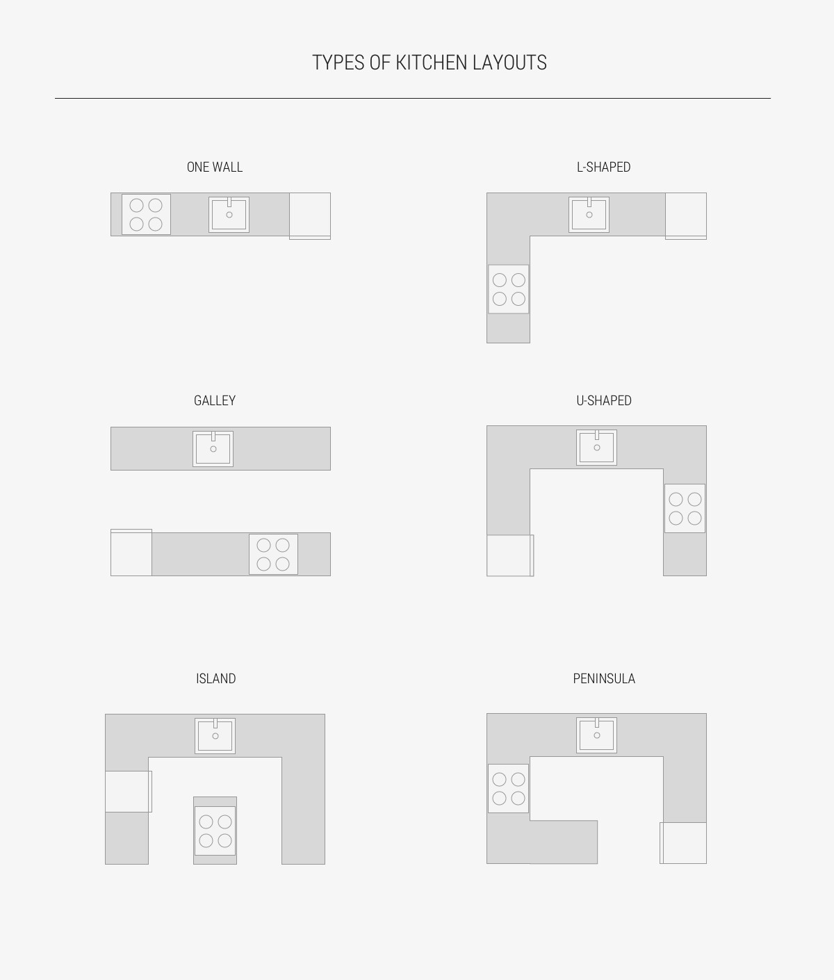
Generally speaking, there are six types of kitchen layouts: The One Wall, Galley, L-shaped, U-shaped, Island and Peninsula. There are no strict positions in which to order the stove, fridge or sink, and a kitchen can be combinations of one or more of the typical layouts. For example, you could have an L-shaped kitchen with an island or a peninsula, or a galley kitchen that is linked at one end. In designing a functional kitchen, the kitchen work triangle should be considered, which means that the distance between the sink, stove and fridge should be no more than 1200mm apart. Though, the concept of the kitchen working triangle is now evolving further to take into account multiple cooks, as well as new gadgets and appliances. In comparison to when the concept originated in the 1940s, where kitchens were a utilitarian place typically home to the housewife, our kitchens and equality have come a long way. Microwaves, separate cook tops to ovens, prep stations with an additional mini sink and teamwork all interrupt the traditional triangle. As modern kitchens present an increase in dedicated task zones, secondary triangles become commonplace.
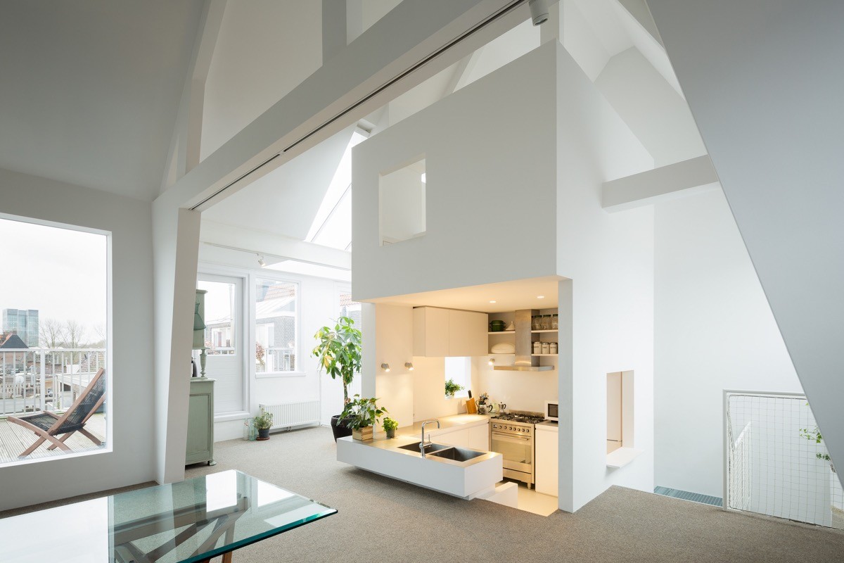
Play with floor levels. This unique u-shaped kitchen is sunken below the floor level of the open plan living room, allowing onlookers a birds-eye view.
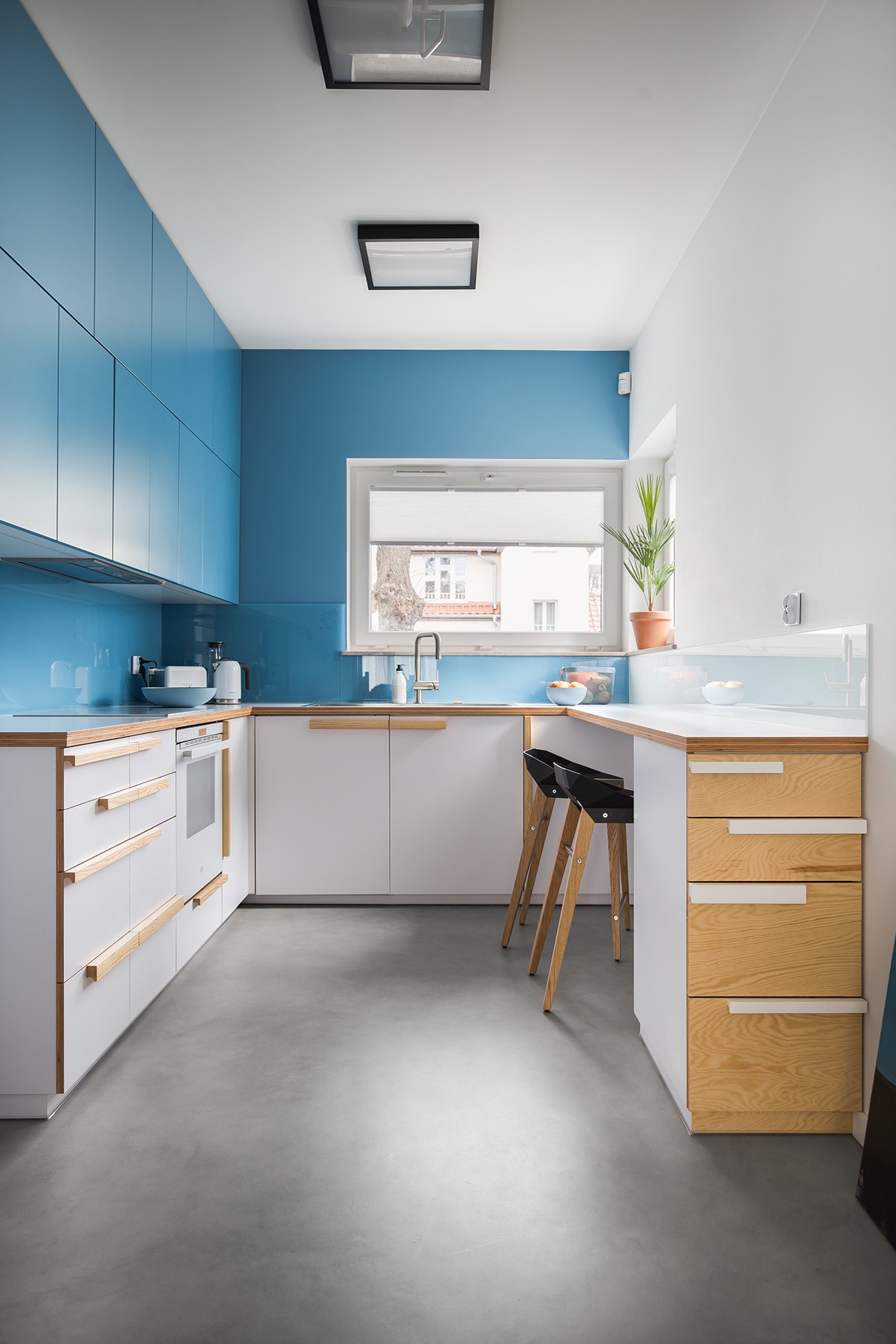
Colour coordinate upper units with the wall colour. The wall cabinets in this blue kitchen have been used as reference for the room’s paint colour. Colour coordinating the paint with the units in this way helps the space appear more open.
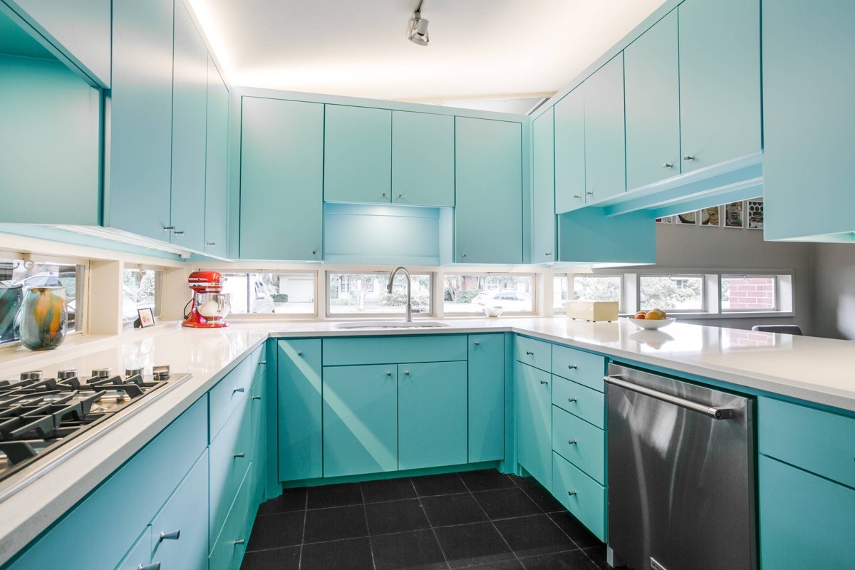
A different tack has been taken in this blue kitchen, with wall cabinets placed around the full u-shape. However, one side of the arrangement is open to the dining room, and windows run around the rest of the countertop level bringing plenty of airiness to the scheme. Cleaning the backsplash after cooking dinner in this kitchen becomes an exercise in window washing!
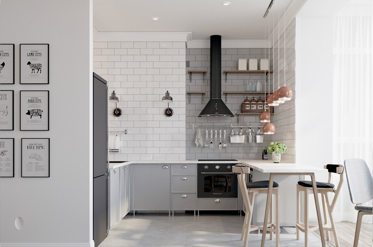
Forget the plinths. With the abundance of cabinets typical to a u-shaped kitchen you may be looking for new ways to help your design look more open and spacious. Leaving off the base plinths can help expand the look of your floor space - though do be prepared to get down low to clean out the recess regularly if you’re dropsy with your vegetable choppings.
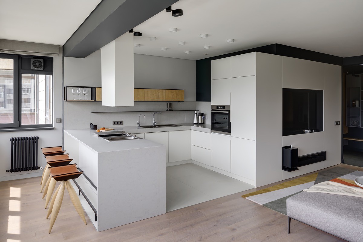
Create a wrap around storage volume to an adjacent area. The tall height of the oven housing unit and fridge freezer housing has been continued around the corner into the lounge in this open plan home. The extension is used as a media unit surrounding the tv facing the lounge.
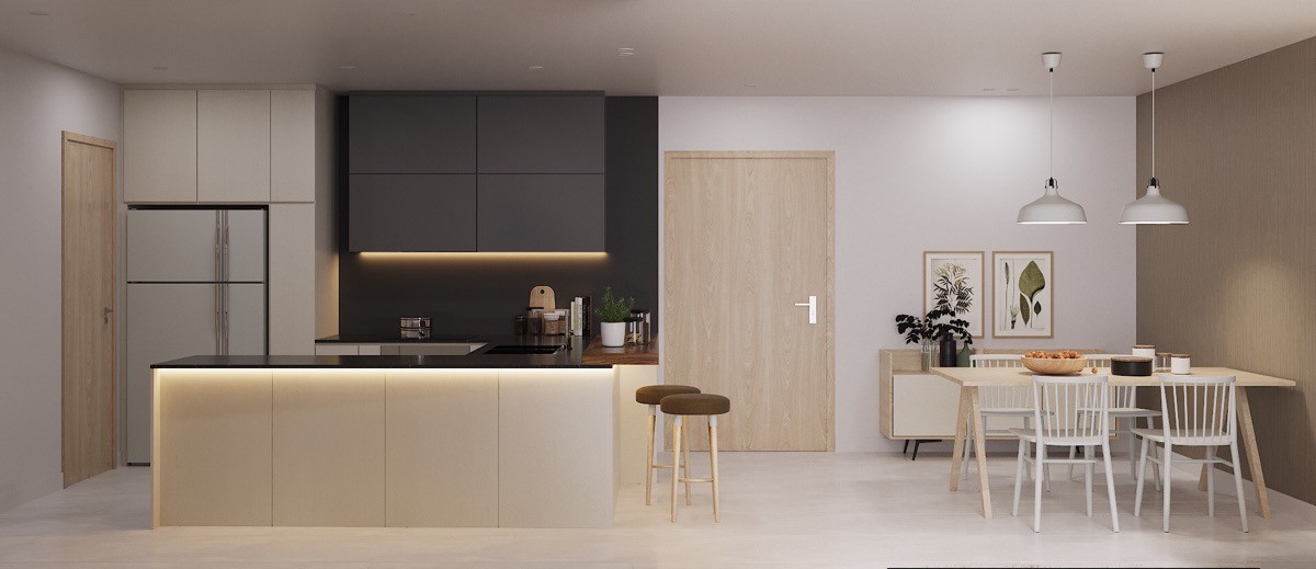
Define edges with lighting. LED strips placed just beneath the lip of a kitchen countertop and wall units create an ambient glow. The upholstered bar stools provide comfortable seating.
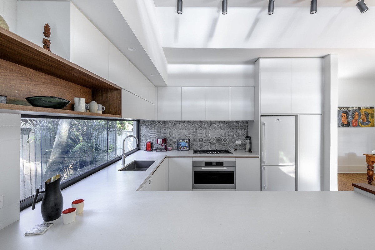
Make a feature of a niche shelf by picking it out in a different colour. A dark wood tone adds sophisticated flair to an all white kitchen.
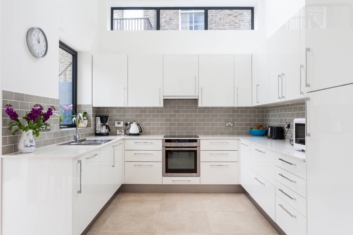
Match the baseboard to the backsplash. This grey and white kitchen brings in grey not only through a tiled backsplash but with a coordinated kickboard.
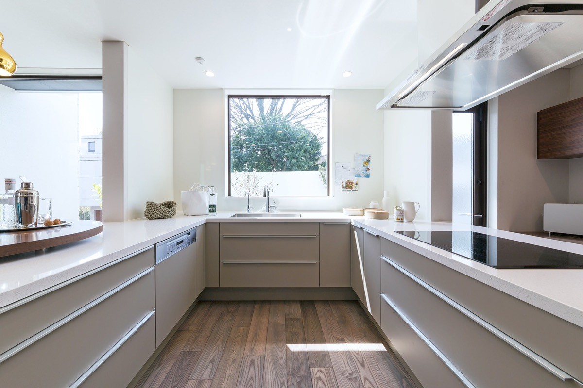
In a long open home, a mid-way u-shaped kitchen can be used to effectively divide the floor plan.
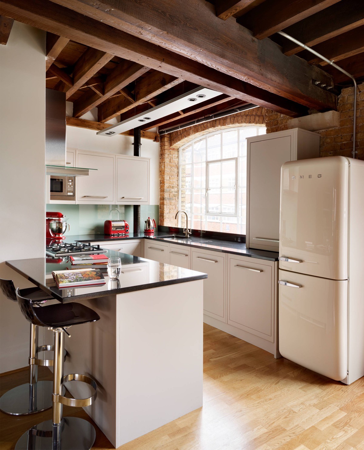
Bring in colour with countertop appliances and accessories. This red kitchen set looks great with warm rustic brick walls.
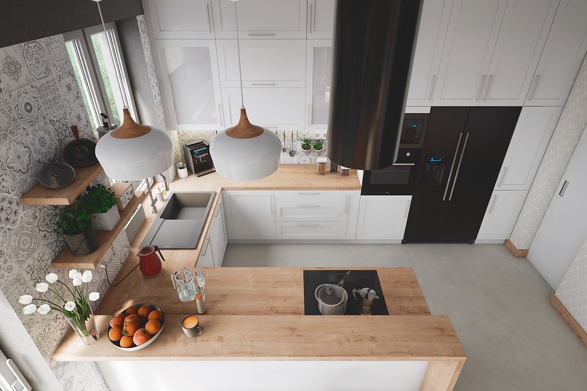
Black appliances in a white kitchen look punchy and modern. This design has black pieces situated on each of the three straights of the u-shaped kitchen to maintain balance.
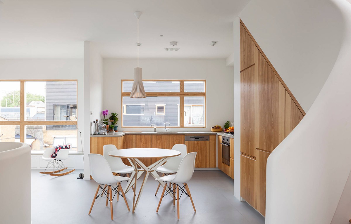
Shortening the returns of a u-shaped kitchen can leave room for a fully-fledged dining set.
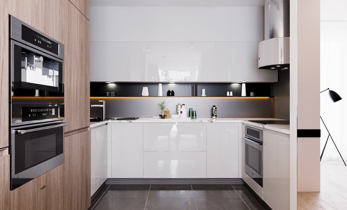
Combine cabinet finishes, like this wood grain and white gloss modern kitchen.
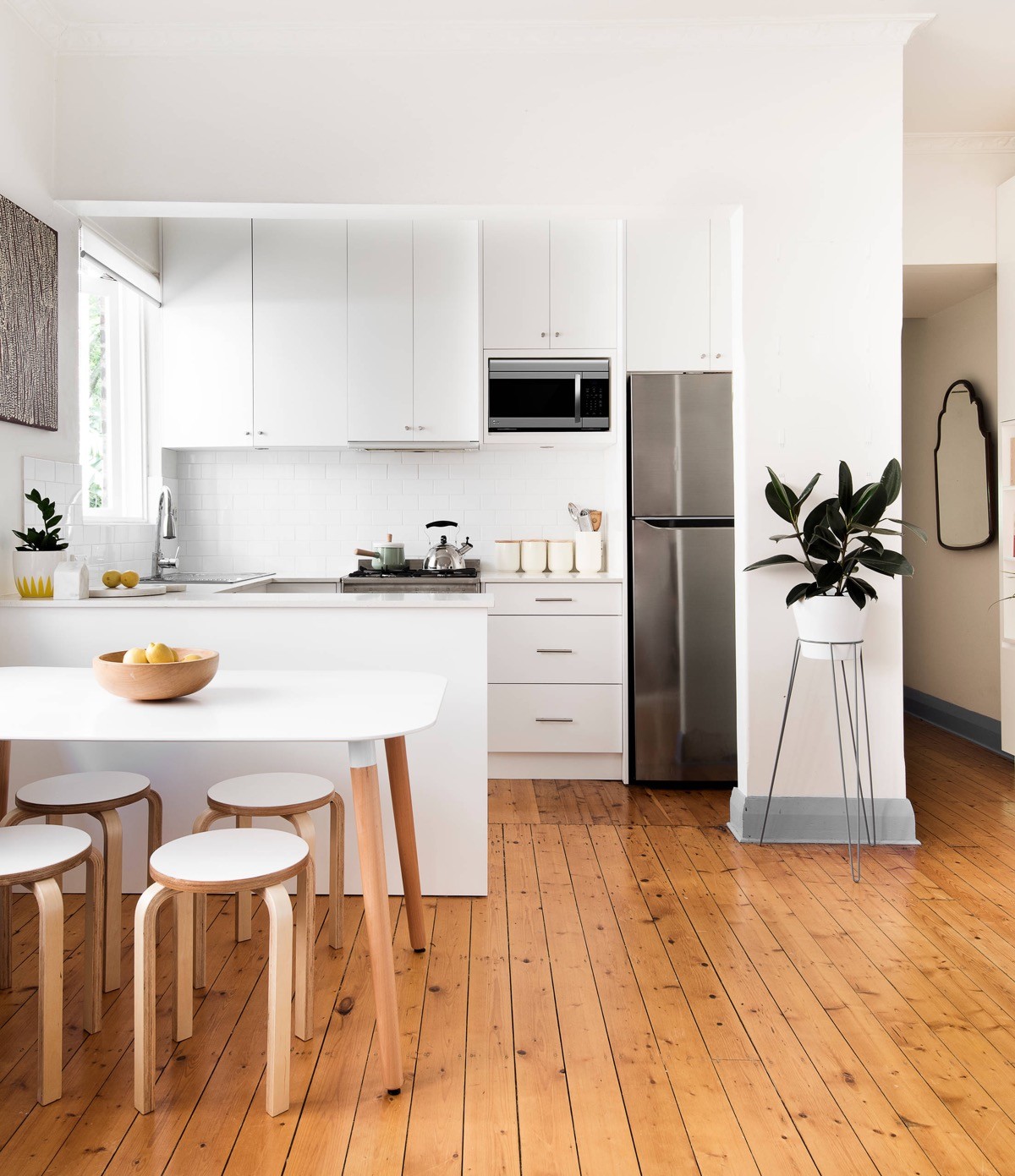
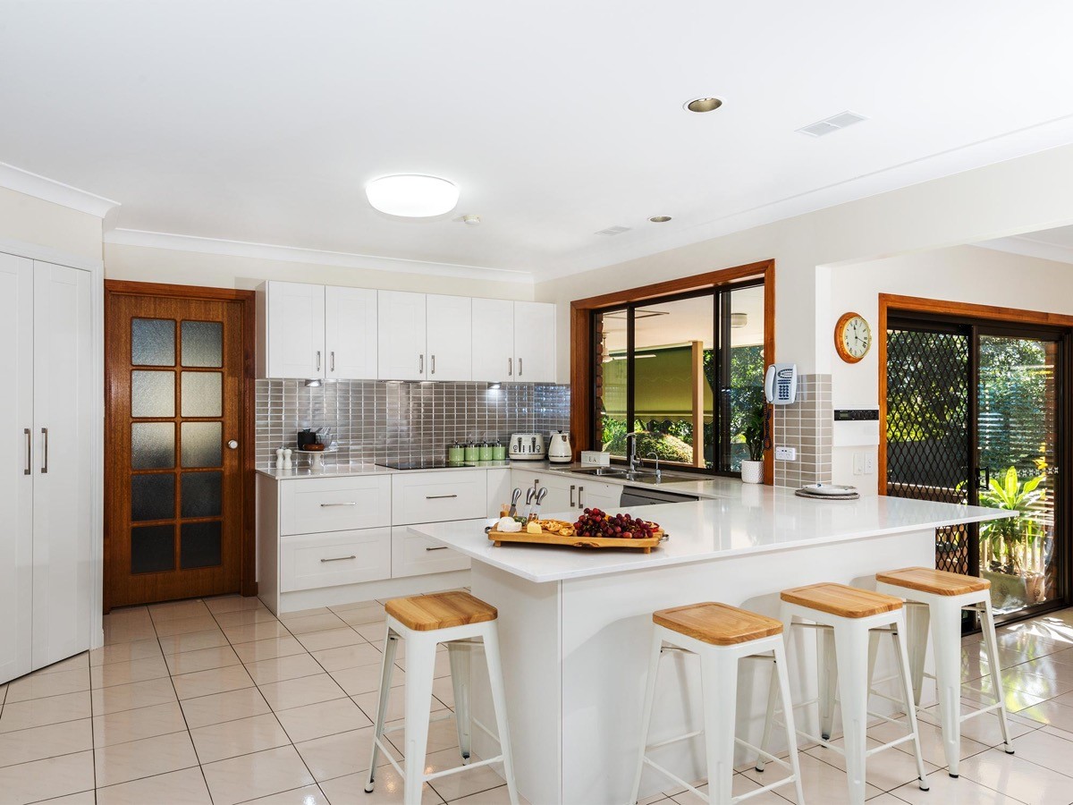
Let your budget inspire you rather than restrict. Choosing Scandinavian kitchen style can be a cost effective exercise, since the magic of the Scandi aesthetic is simplicity. Wooden bar stools from Ikea drive in the look.
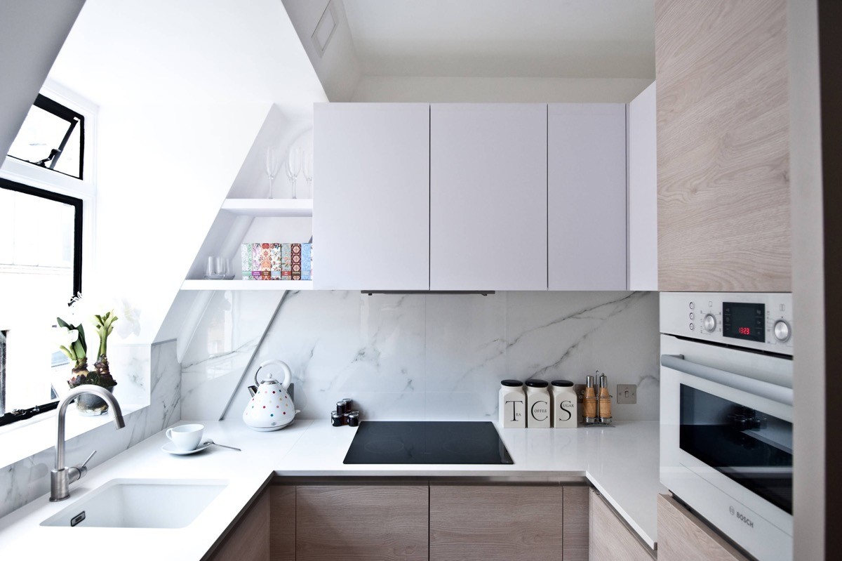
Use every nook and cranny for storage in a tiny u-shaped kitchen. Shape shelves into the eaves.
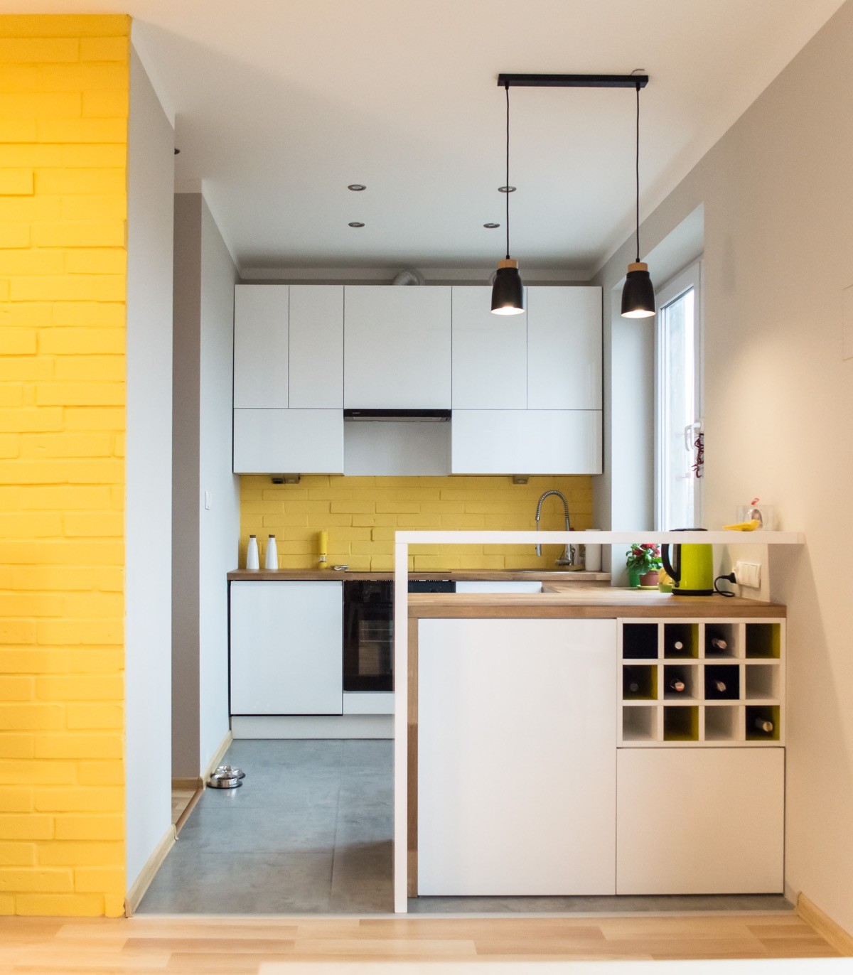
Tailor the design to suit your own lifestyle. One side of this setup has cabinets facing out to the living room where a wine rack on hand. A raised bench is in place where you can easily pop the cork.
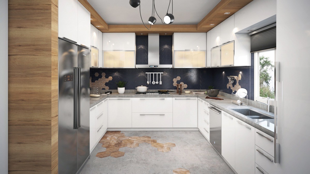
Build a lighting soffit. A wood effect soffit has been installed around the ceiling perimeter of this white kitchen, complete with recessed spotlights.
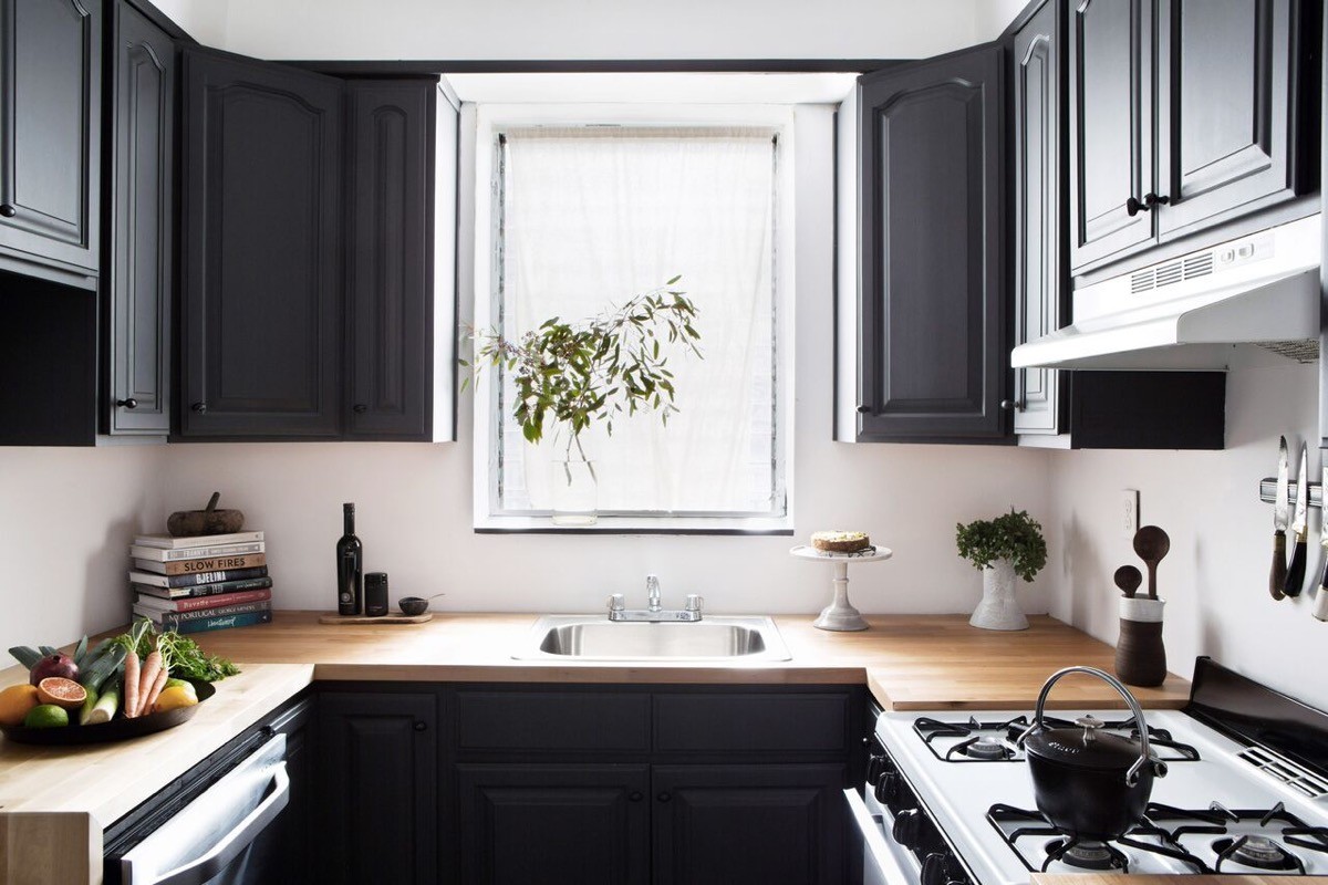
Where there is plenty of natural light, don’t be afraid to go dark with the cabinetry.
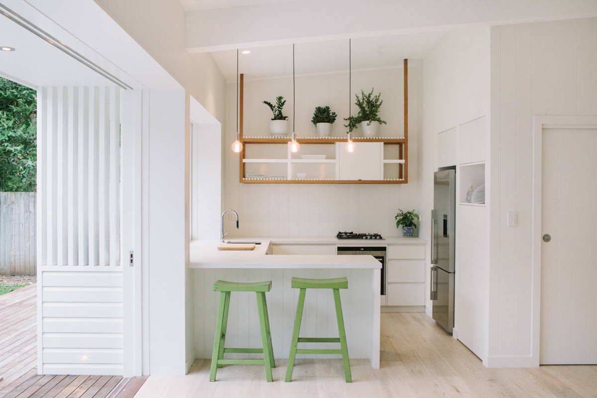
Add hints of green with indoor plants, or add colour with kitchen stools. It helps when the countertops are super-clean — no messy dishes, plates or knife holders in sight!
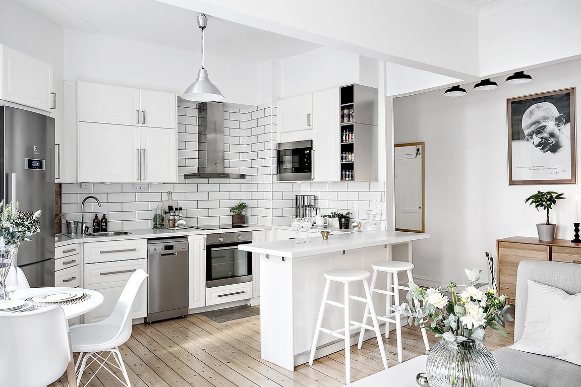
Take tiling to the top. This white kitchen has metro tiles stacked almost to the rafters. Dark grout accentuates the tile design.
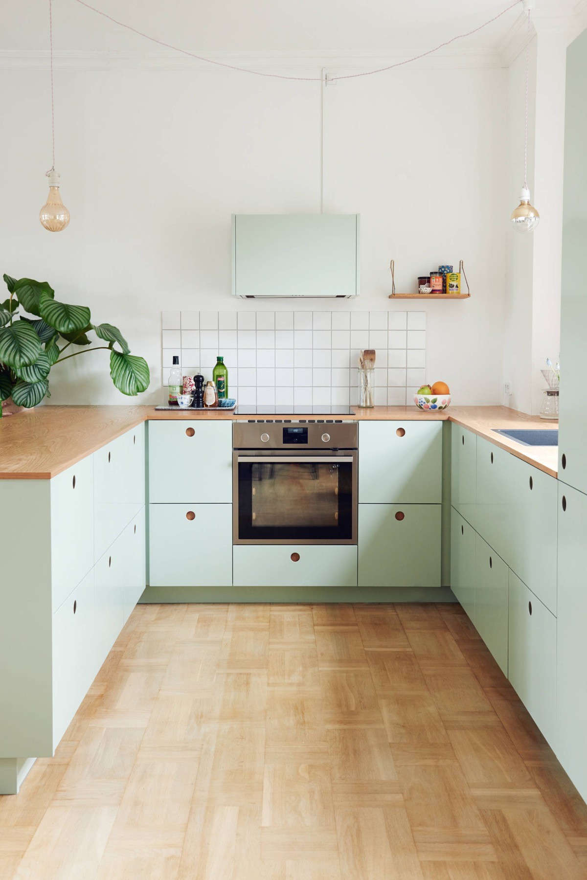
Get wired - without any hassle. If you don’t want to punch holes in the ceiling for spotlights or install a lighting soffit, how about positioning some exposed bulb kitchen pendant lights. With exposed electrical wiring being on trend you can feel free to string wires from a single power point. If you fancy a bit of colour then go for lengths of brightly bound electrical wire; there’s the pick of the rainbow available out there.
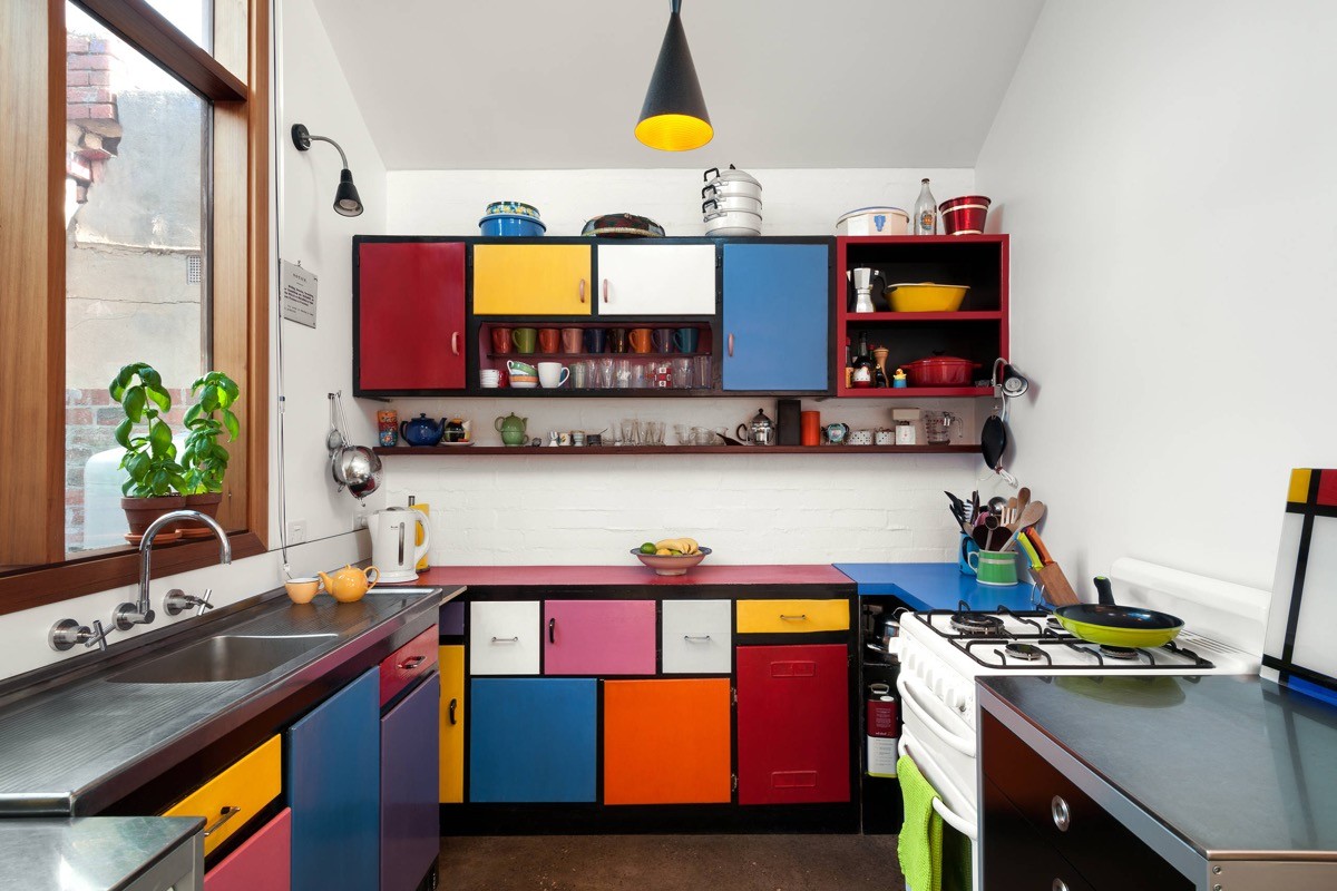
Just can’t decide on a kitchen cabinet colour? No problem. Go multicoloured with Mondrian inspired interior design.
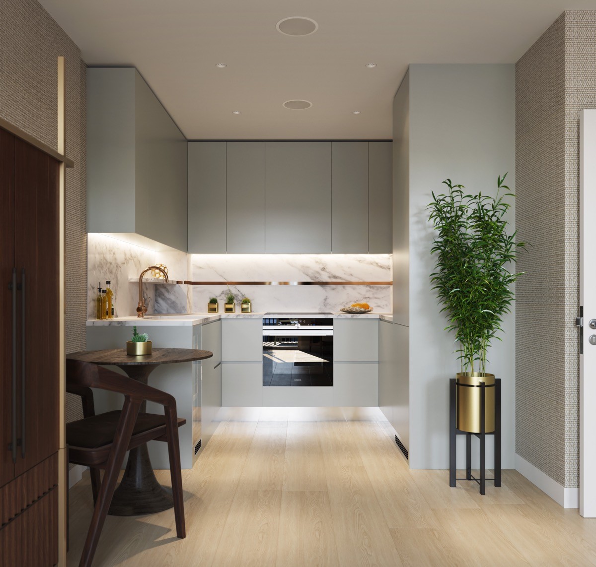
The golden touch. Take your kitchen scheme upmarket with a flurry of gold finishing touches. Try a gold faucet, cabinet handles, tile trims or planters. Leave out your best cooking oils too, they will decorate the countertop with their own golden essence.
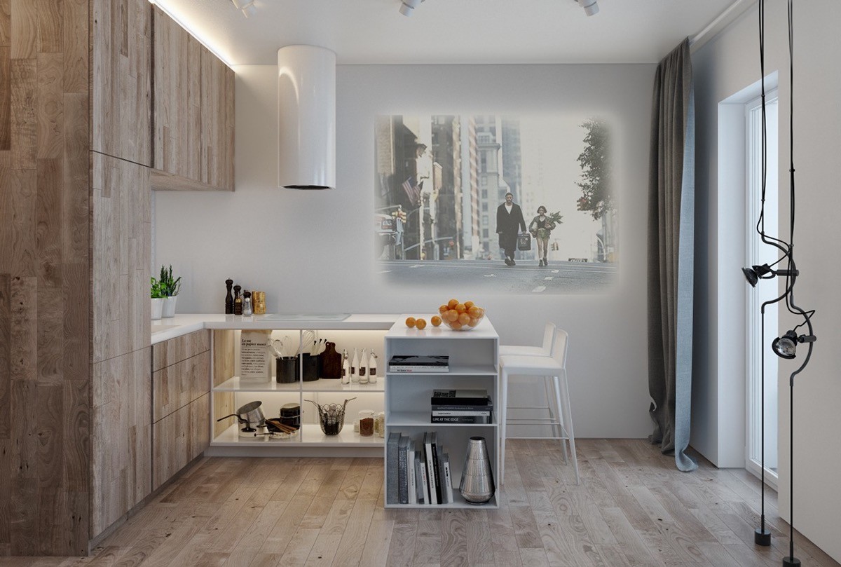
Forget making do with a tiny kitchen tv - go big using a projector.
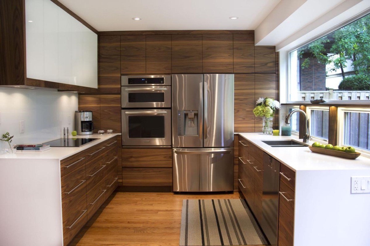
Break with stereotypes. The positioning of the fridge with an adjacent oven at the neck of the ‘u’ in this layout is quite unconventional. The tall units at the back make the plan feel almost like a galley kitchen. The fridge and oven are often situated in tandem in modern kitchens, though some manufacturers warn that the proximity is detrimental to your fridge by making it work harder to achieve the desired internal temperature.
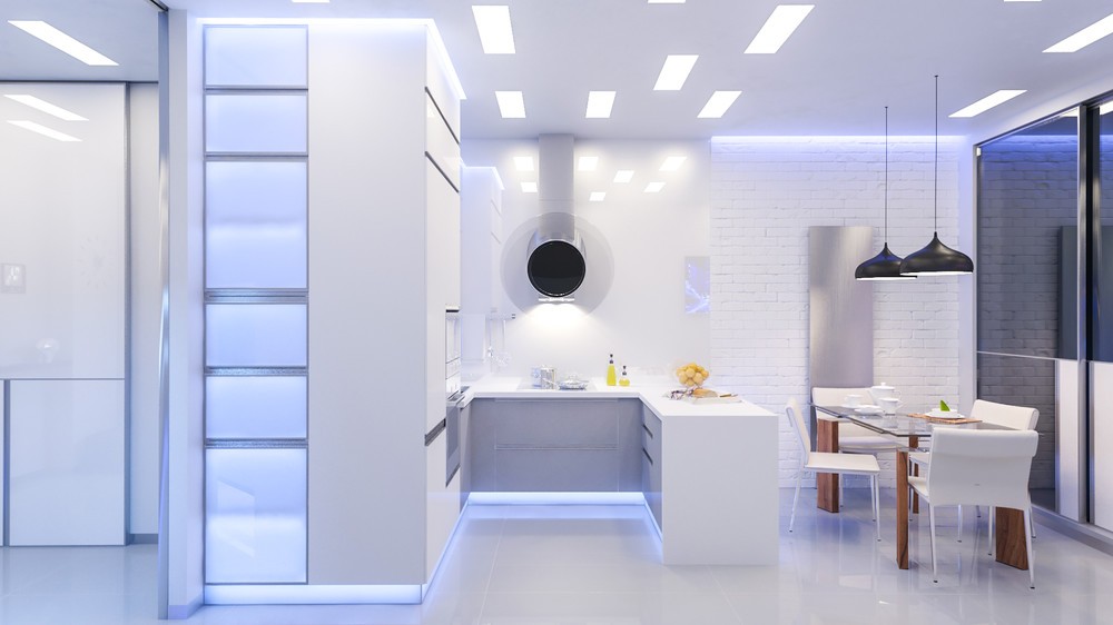
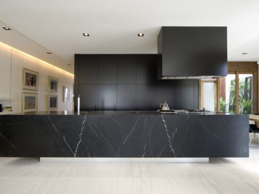
Select an extractor unit to be the main feature.
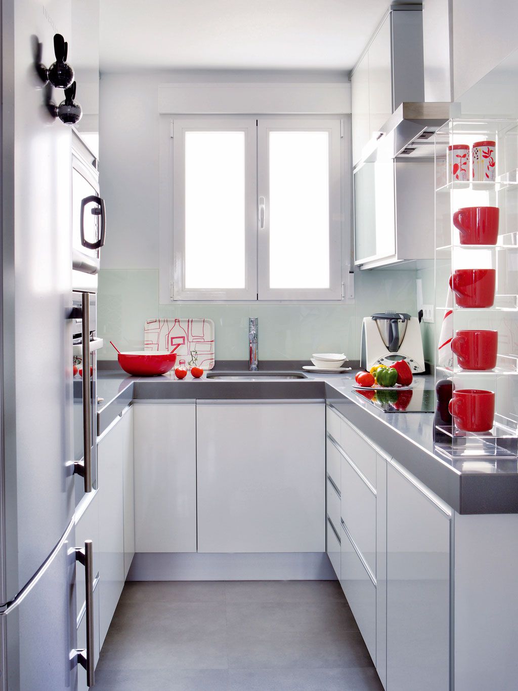
If you tire of colour schemes quickly, use easily replaceable items to colour the room. Keep bold colours confined to mugs, trays and tea towels to make a decor change gentle in effort and low on price.
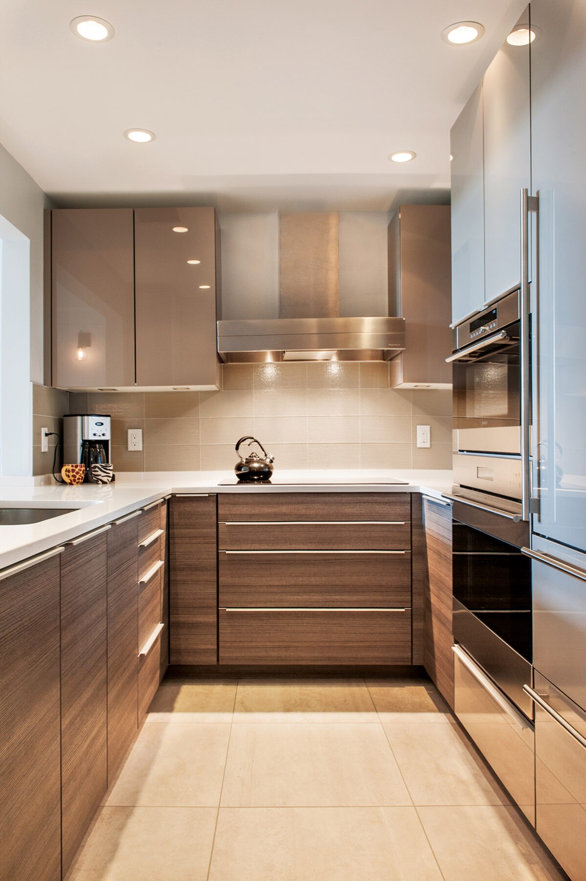
Use similar tones but different materials. These coffee coloured wall cabinets match with the walnut wood grain below - yet the change in texture brings interest and makes the space appear less crowded.
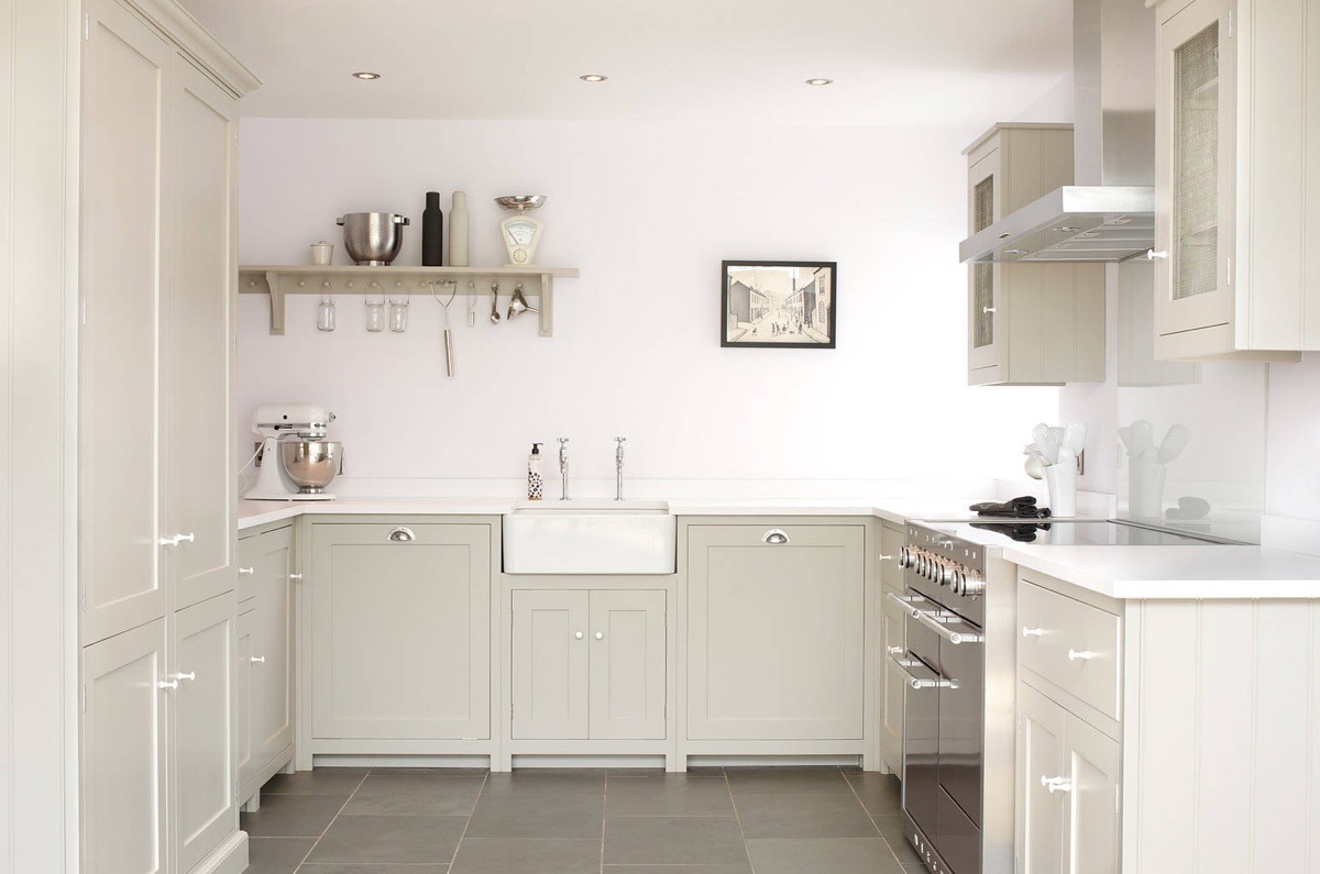
Leave a wall free of upper cabinets to make a space appear larger.
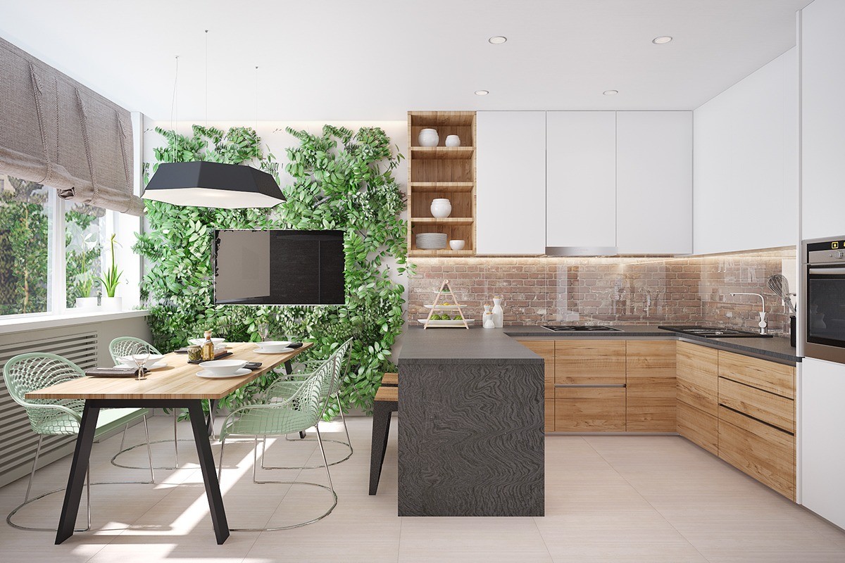
Take an indoor kitchen to the great outdoors with a living wall. This one brings a lovely quirk to a tv wall.
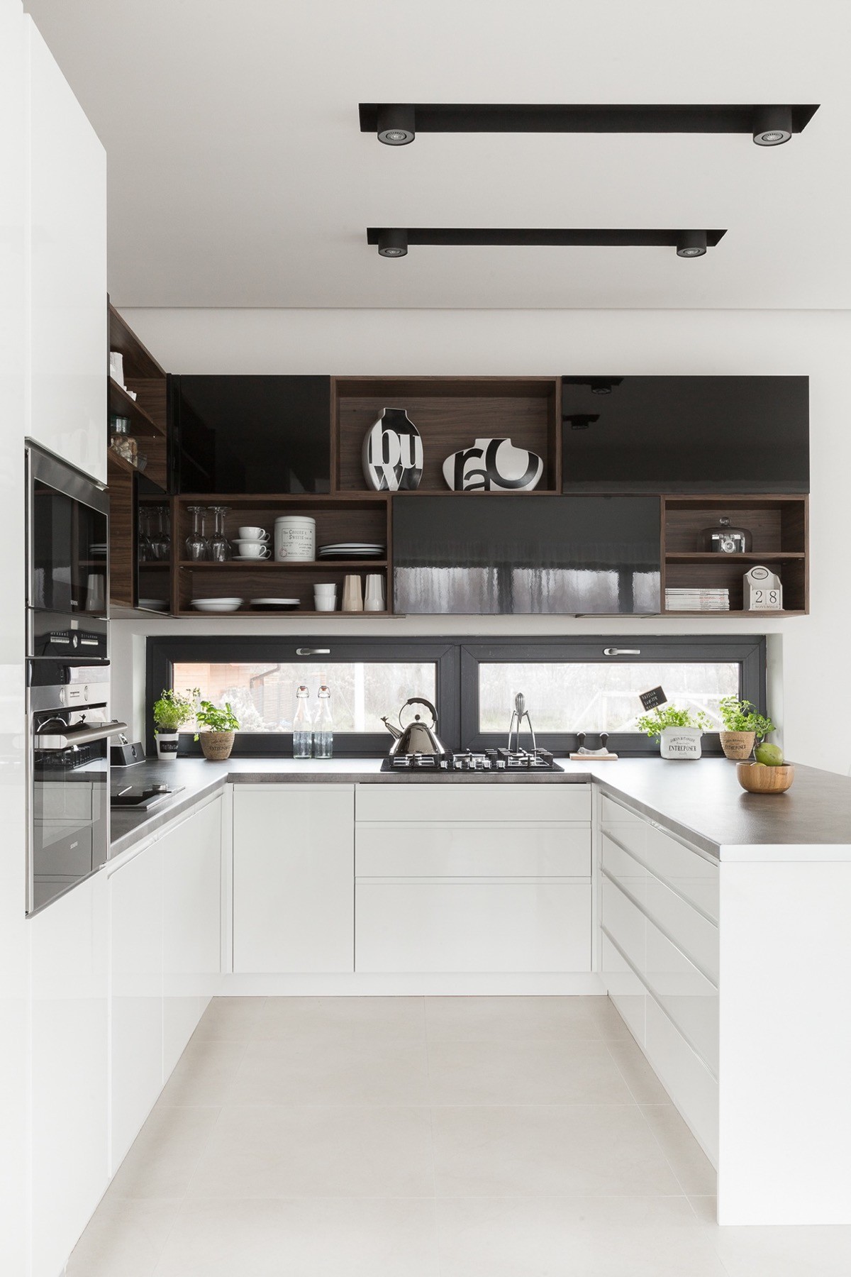
Open shelving dipped within a bank of wall cabinetry gives the scheme added depth.
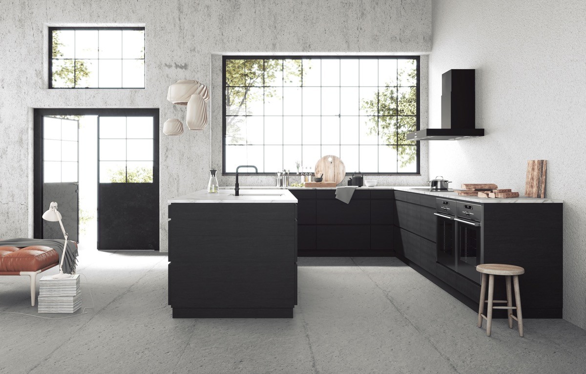
Draw inspiration from a raw concrete kitchen floor, and install an industrial kitchen design.
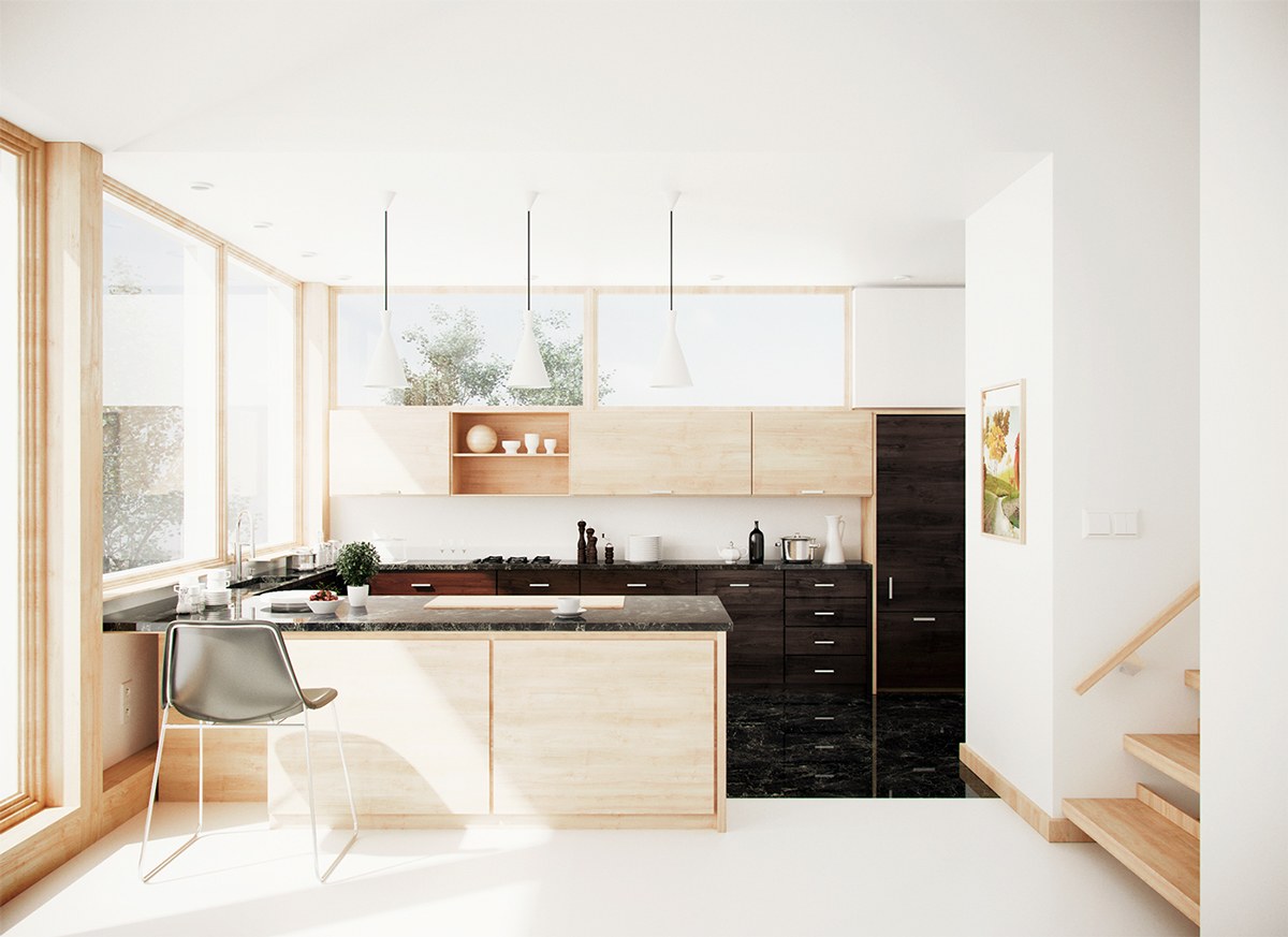
Kitchen flooring can zone the cooking area from the rest of an open living room.
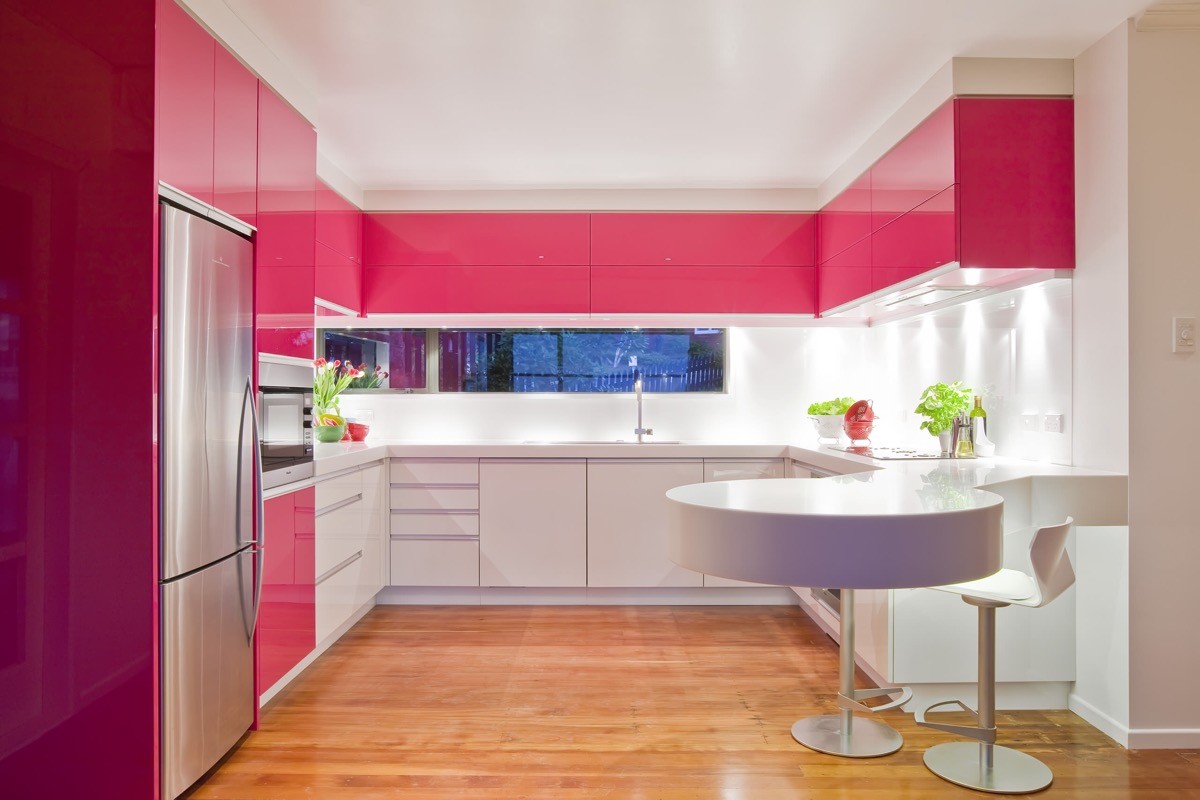
Create a colour stripe, like in this red and white u shaped kitchen with peninsula.
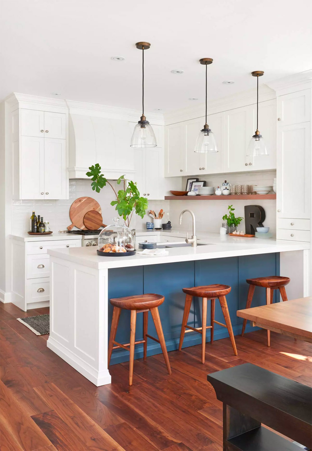
Colour the opposite side of a peninsular to fit with dining room or lounge decor.
In a large layout, a peninsular can be dedicated entirely to dining, with prep taking place only along an L-shape.
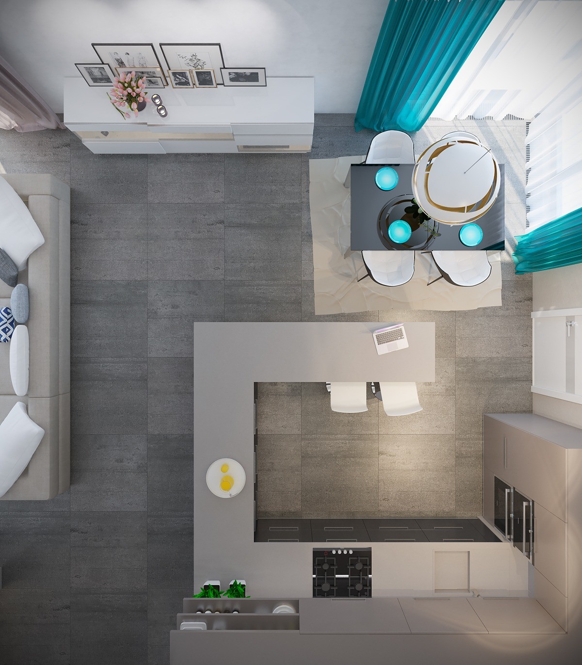
Similarly, if space allows, situate seating on the inside of the peninsular to look outward over the rest of an open plan room.
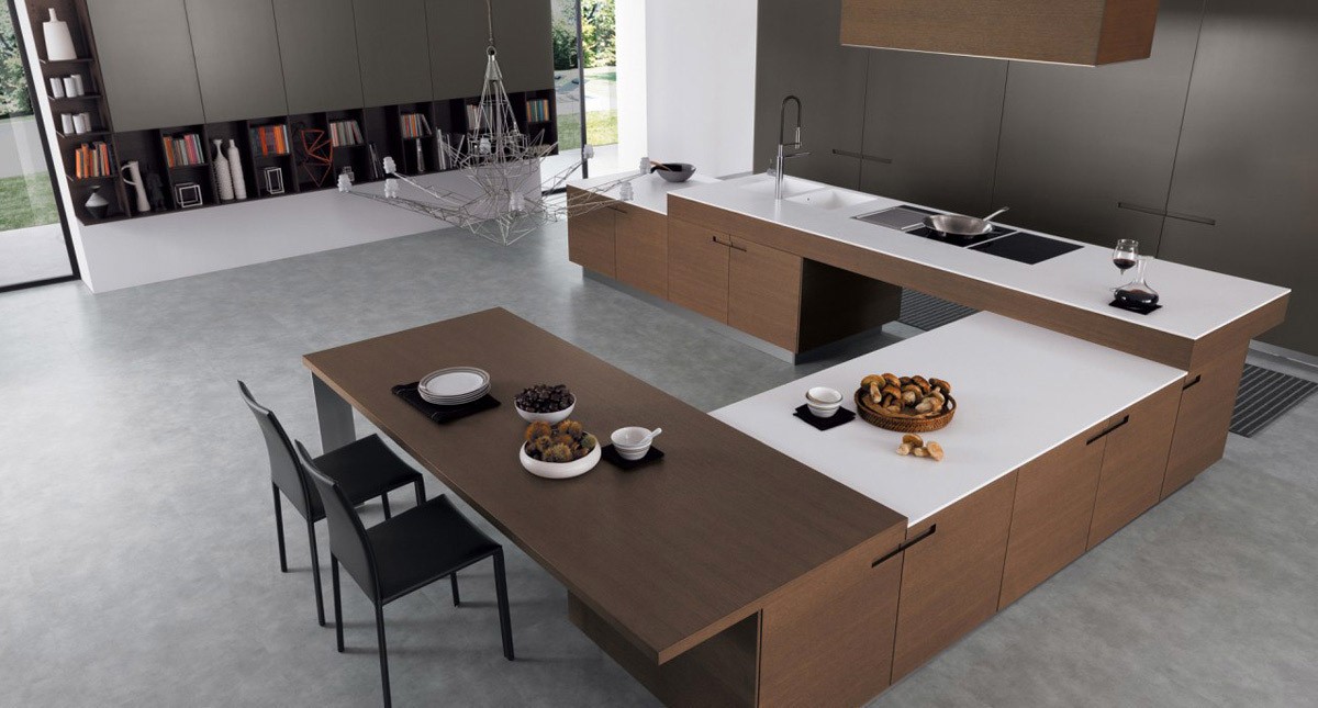
Think on another level. This u-shaped kitchen is a collection of optical illusions and undulating bench heights.
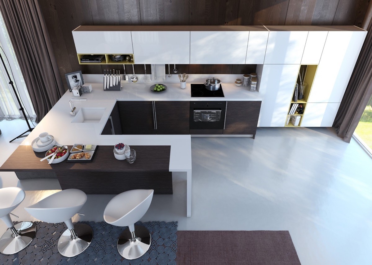
Mark out a dining area using a contrasting countertop.
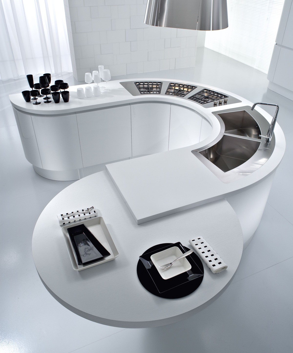
For a true ‘u’, how about this curvaceous little number?...
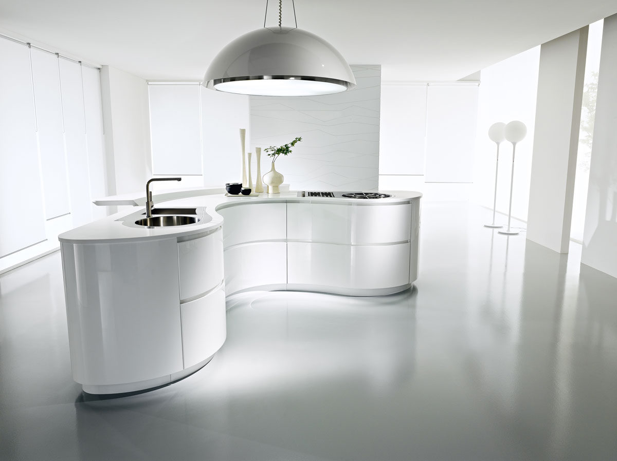
… Or this sleek u-shaped kitchen island.
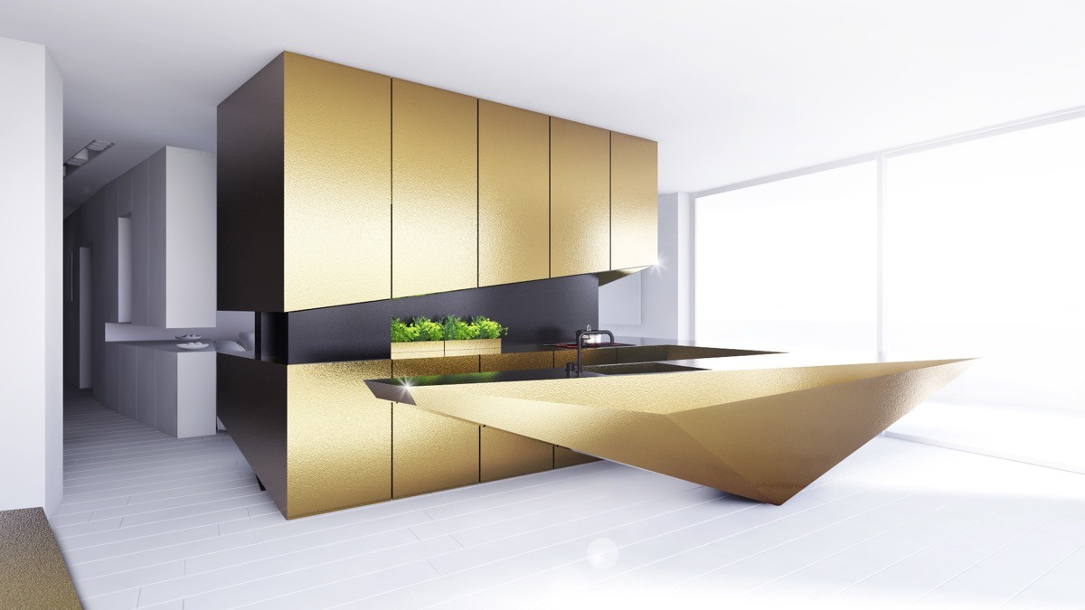
Create interesting angles where there are none. This geometric peninsula is matched by a diagonal cut baseline across the wall units.
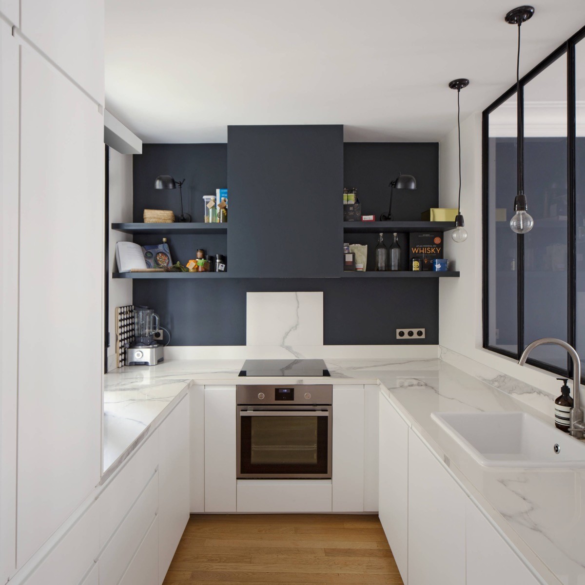
Camouflage a kitchen extractor unit against wall decor, or distract the eye with colourful accessories on adjacent shelving.
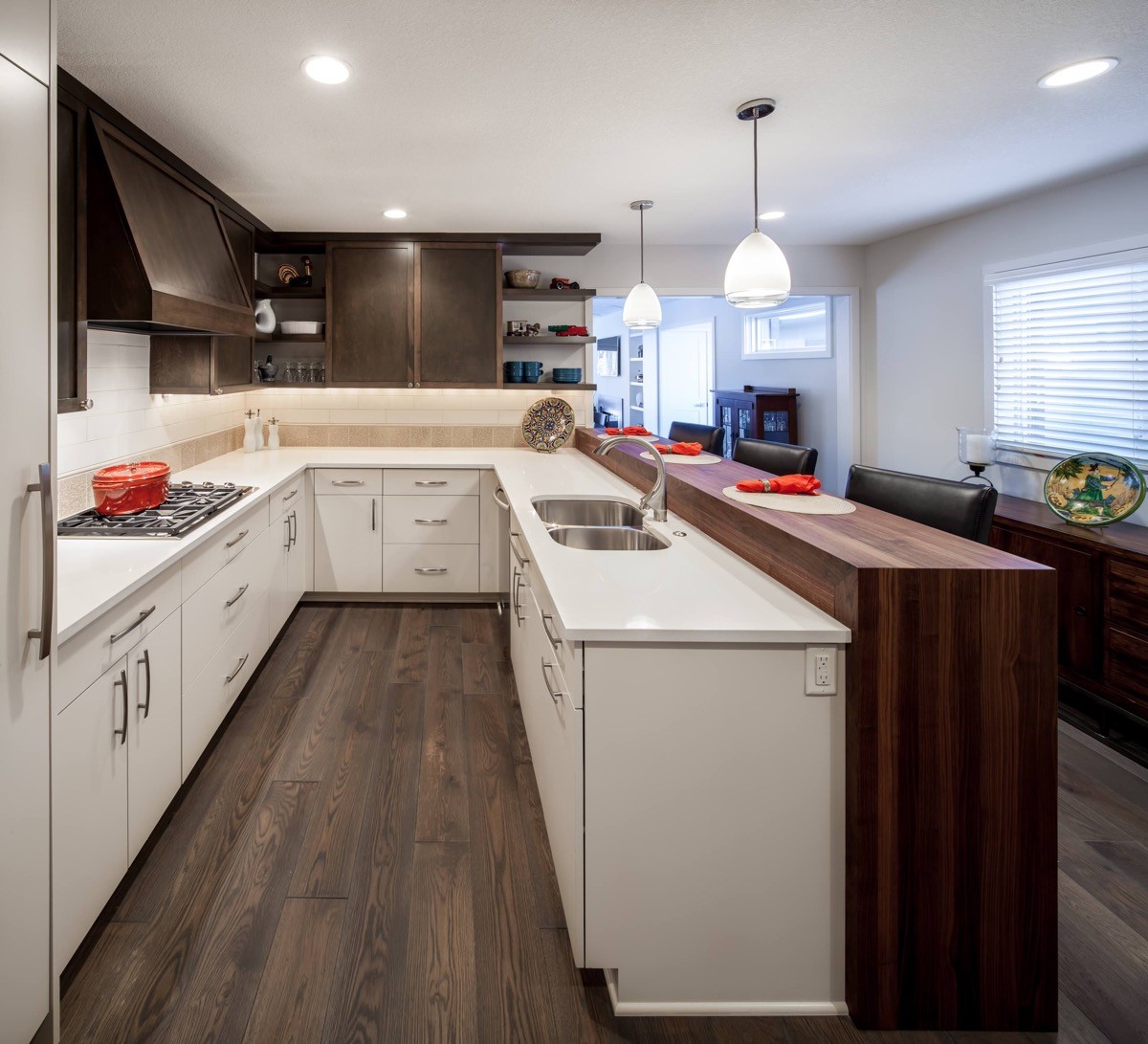
This u-shaped kitchen installation allows footfall to move straight past without anyone disturbing the cook.
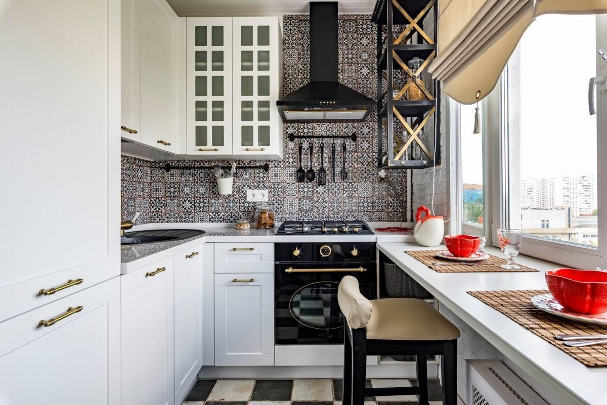
Use bold wall tiles to add wow factor to a white kitchen…
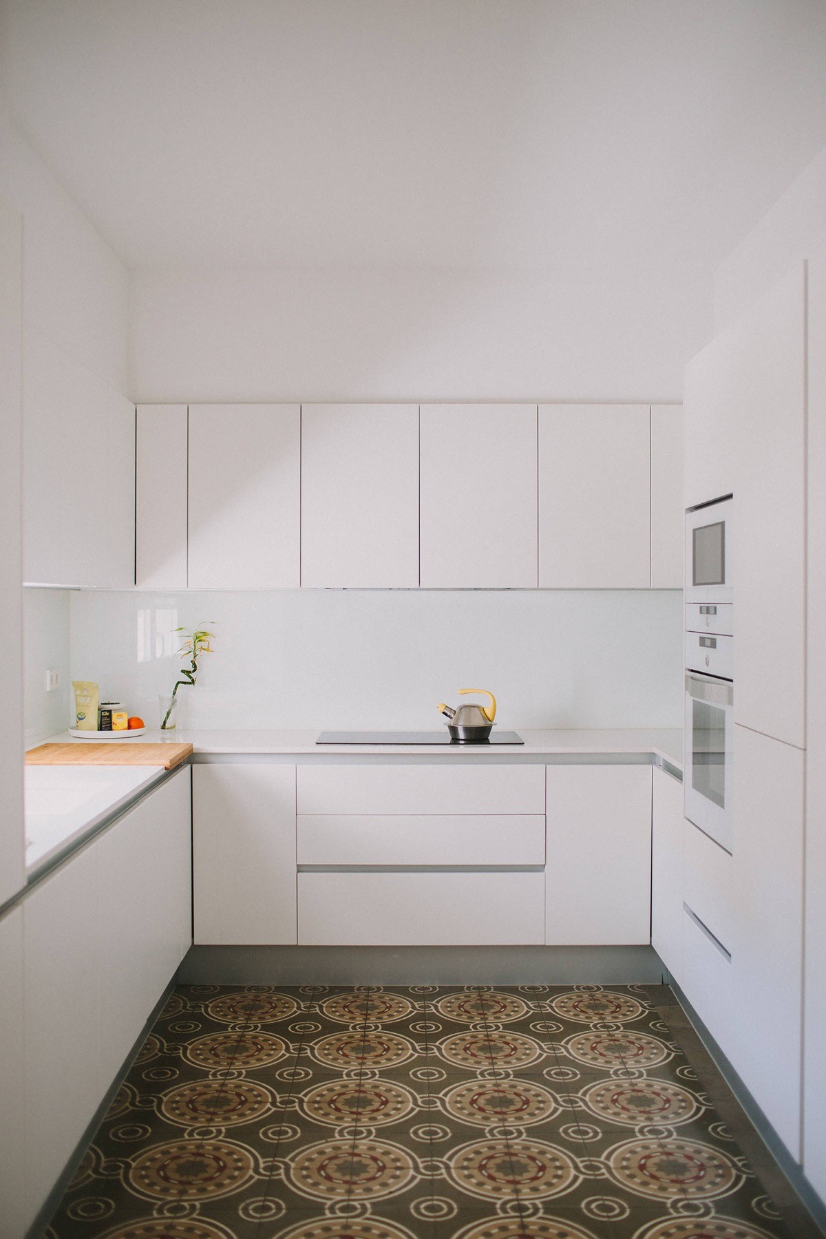
… Feature floor tiles work well too.
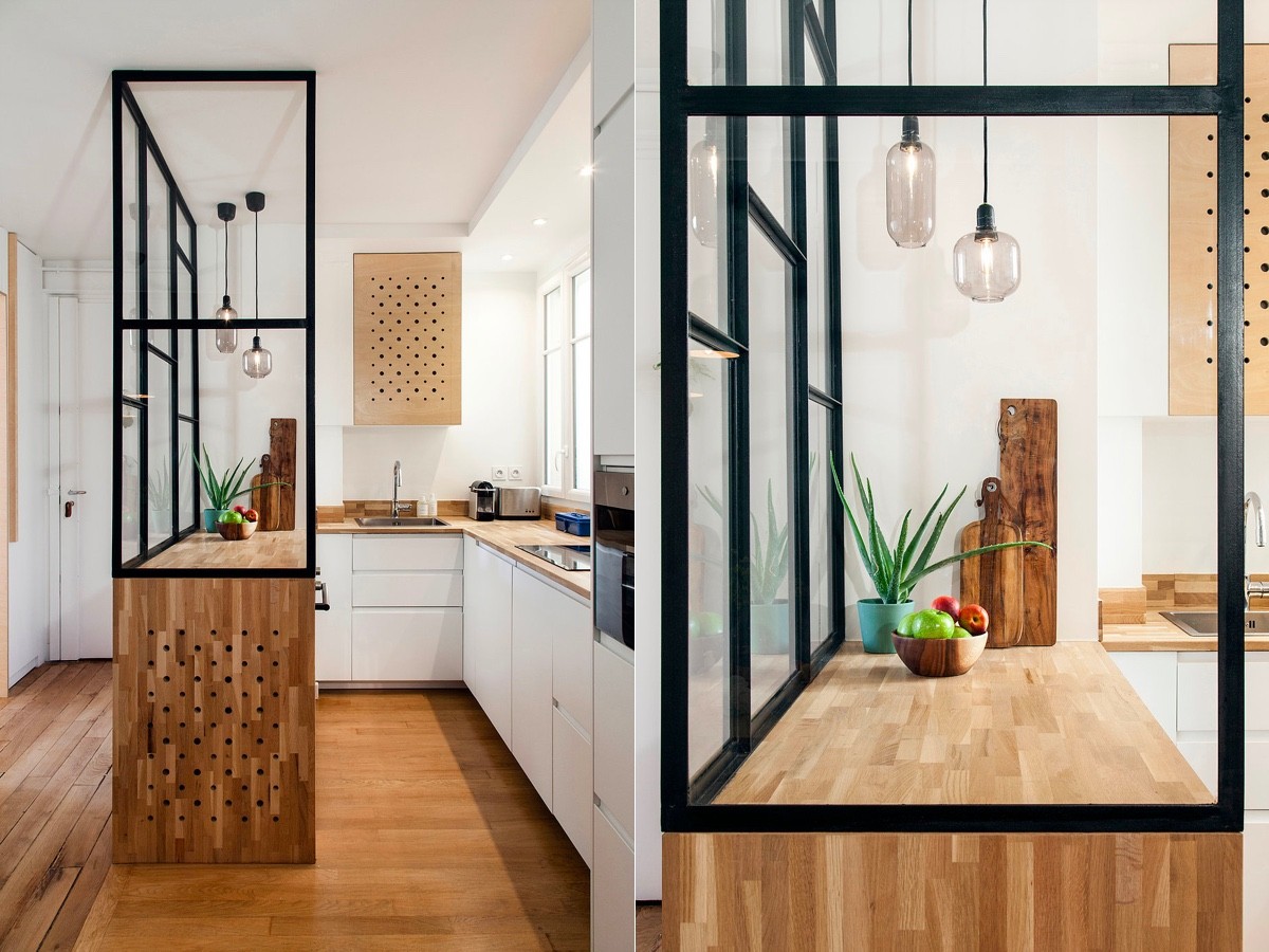
Fashion a glass divide across the length a peninsular to contain cooking splashes or prep mess.
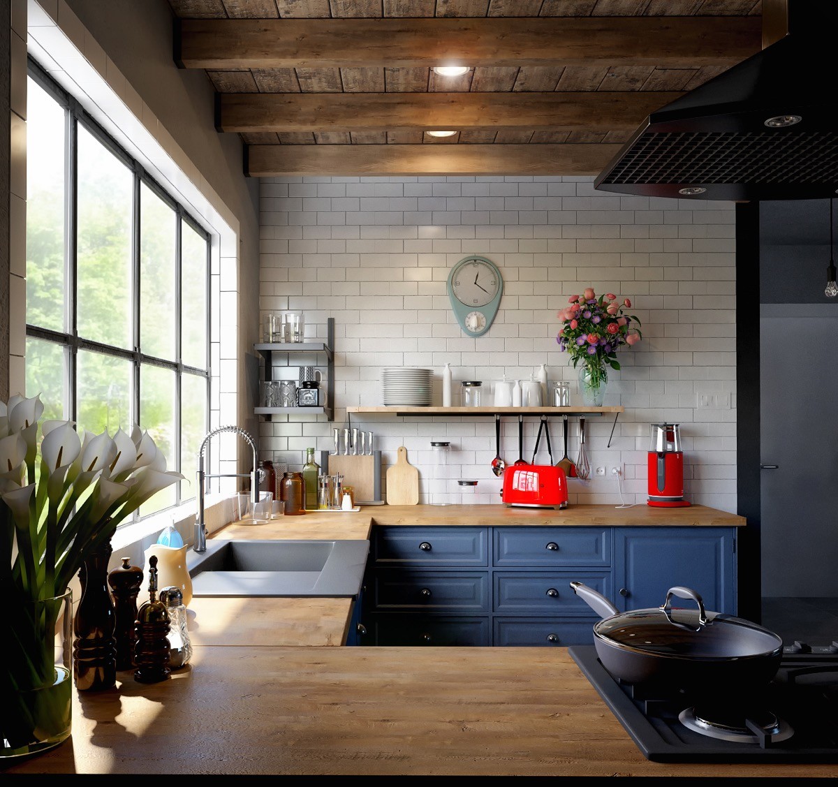
Revamp a tired rustic u-shaped kitchen with some cheerfully painted cabinets and contrasting accessories.
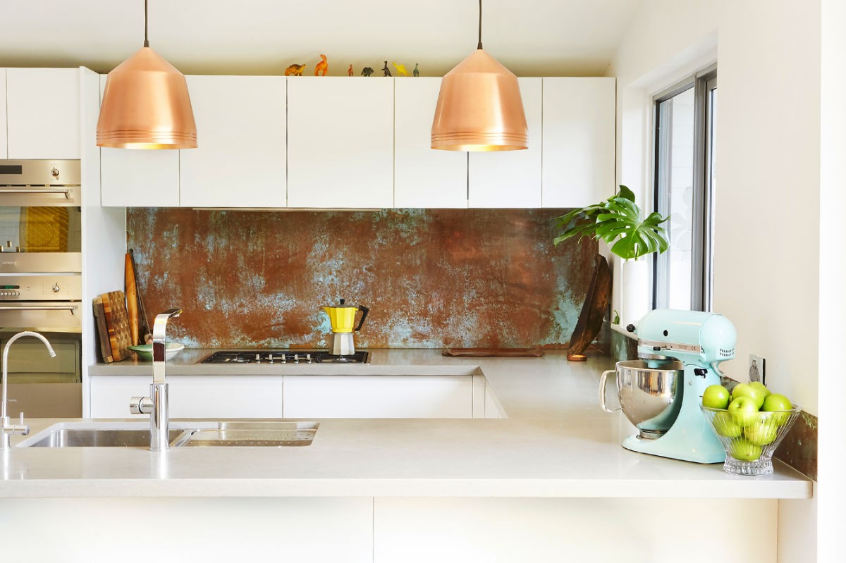
Add personality with unexpected touches. These copper pendant lights and kitchen backsplash give this white kitchen a unique energy.
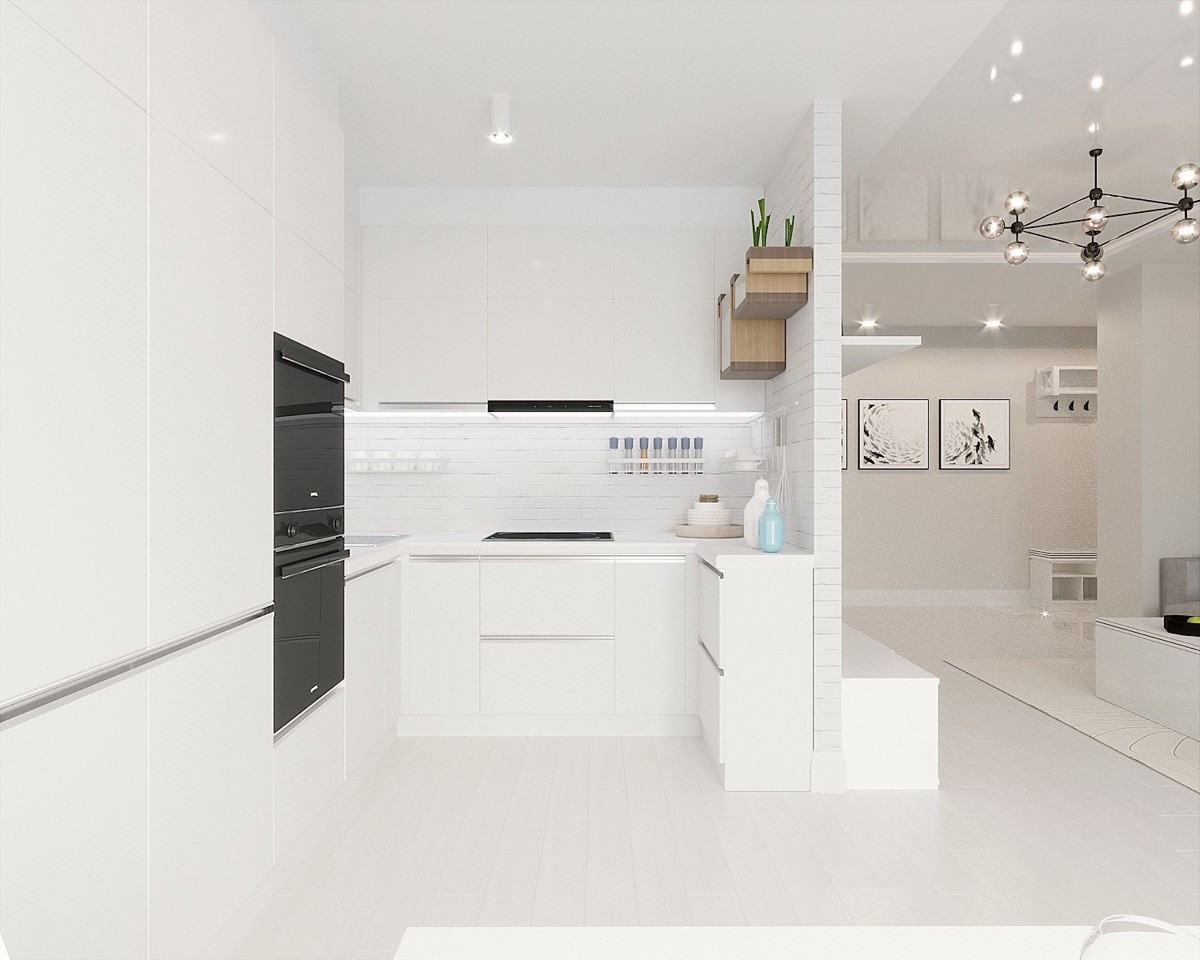
Don’t think you have the space to complete a u-shaped design? Half depth units can be used along one of the walls to create the effect.

