When you think about the idea of indulgent of decadent design, your mind may immediately turn to thoughts of gold plated appliances and overstuffed club chairs -- homes of a stuffy upper class from days of yore. But today, one of the most indulgent popular styles is actually minimalism. These simple homes, devoid of clutter and even color, are representative of an aspirational lifestyle for most of us. White on white design melts perfectly in with the idea of minimalism, keeping even colors practically missing from an interior. It's clean and stylish, if not entirely practical. But as you explore the two homes featured in this piece, you'll get a chance to see for yourself just how versatile and luxurious a white home can feel.
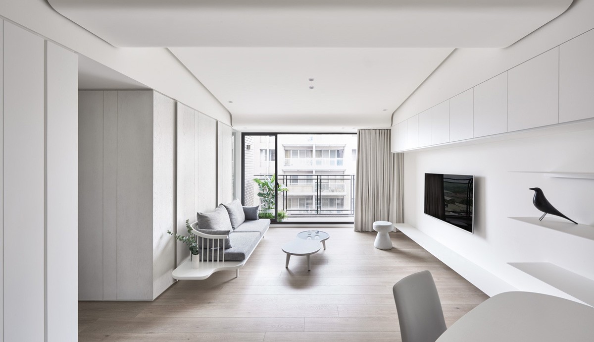
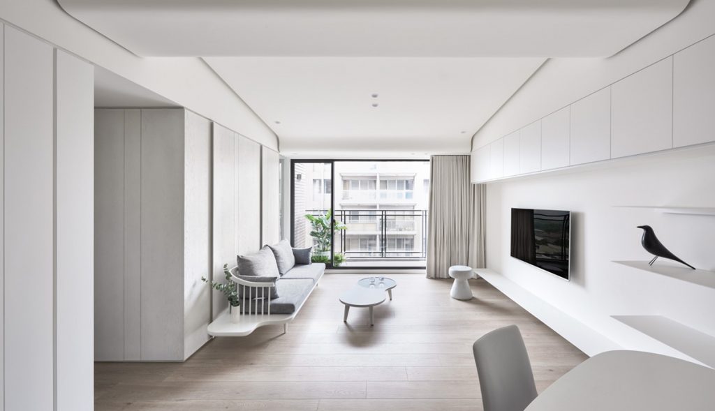
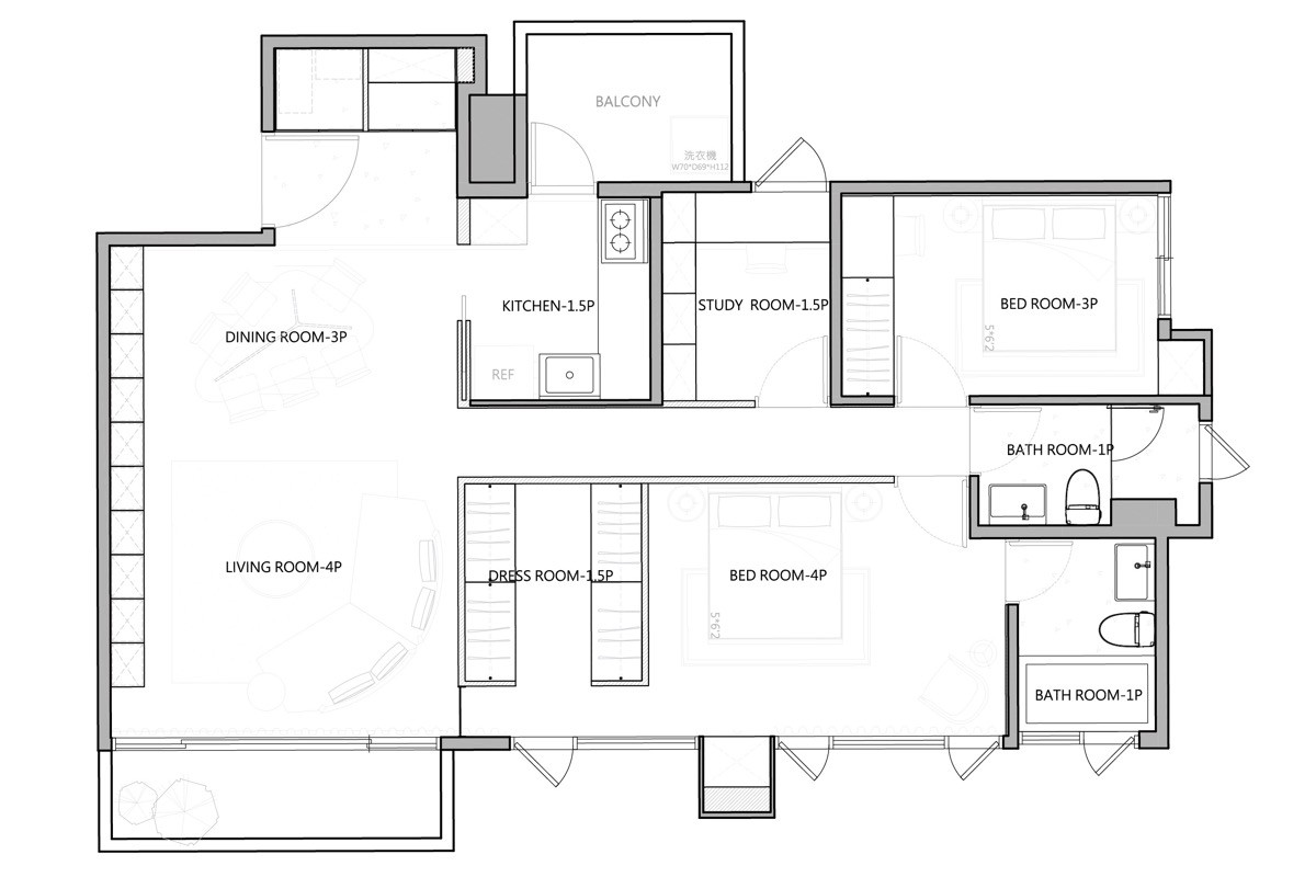
The first home features is an 890 square feet (82 square meters) home designed for a newly married couple.
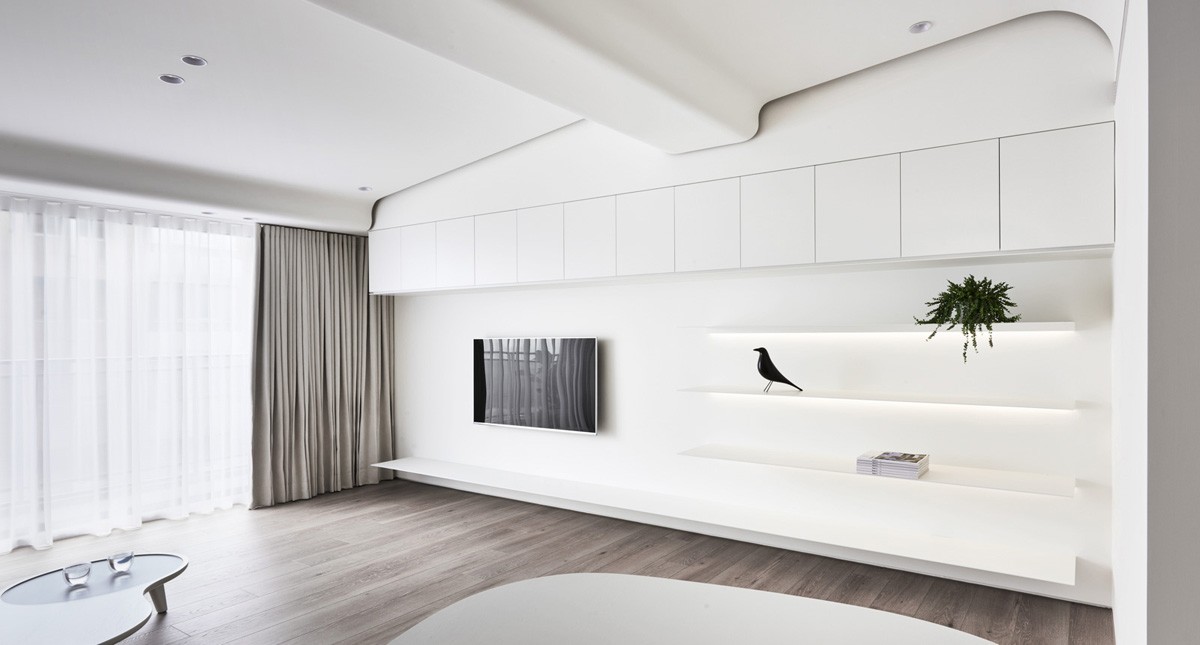
The couple had a traditional Chinese wedding, consisting of lots of vibrant red accessories, but wanted their home, from its flooring to its wall shelves, to be much more subdued.
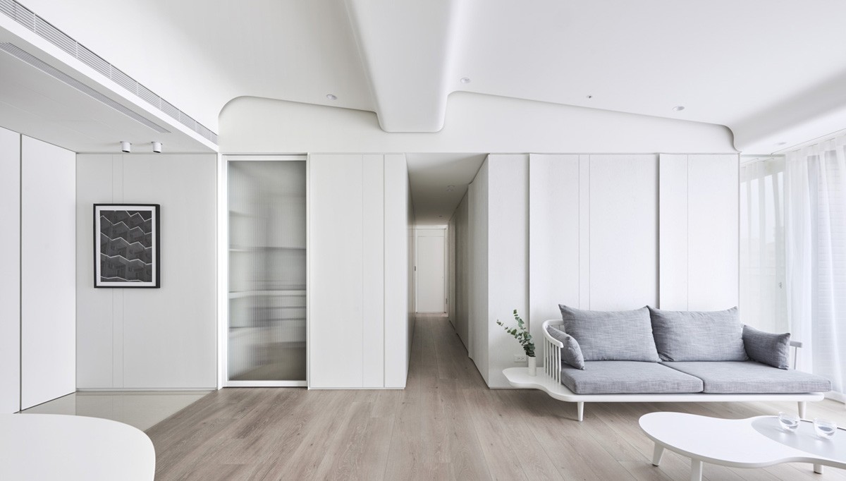
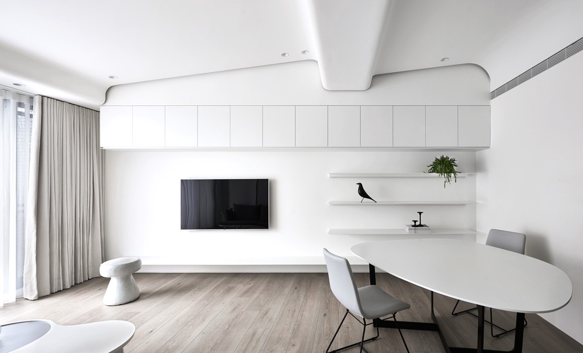
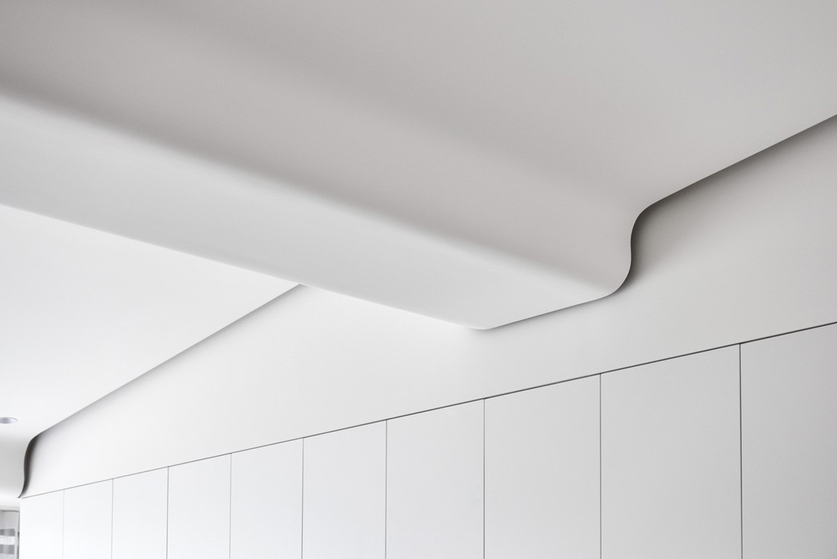
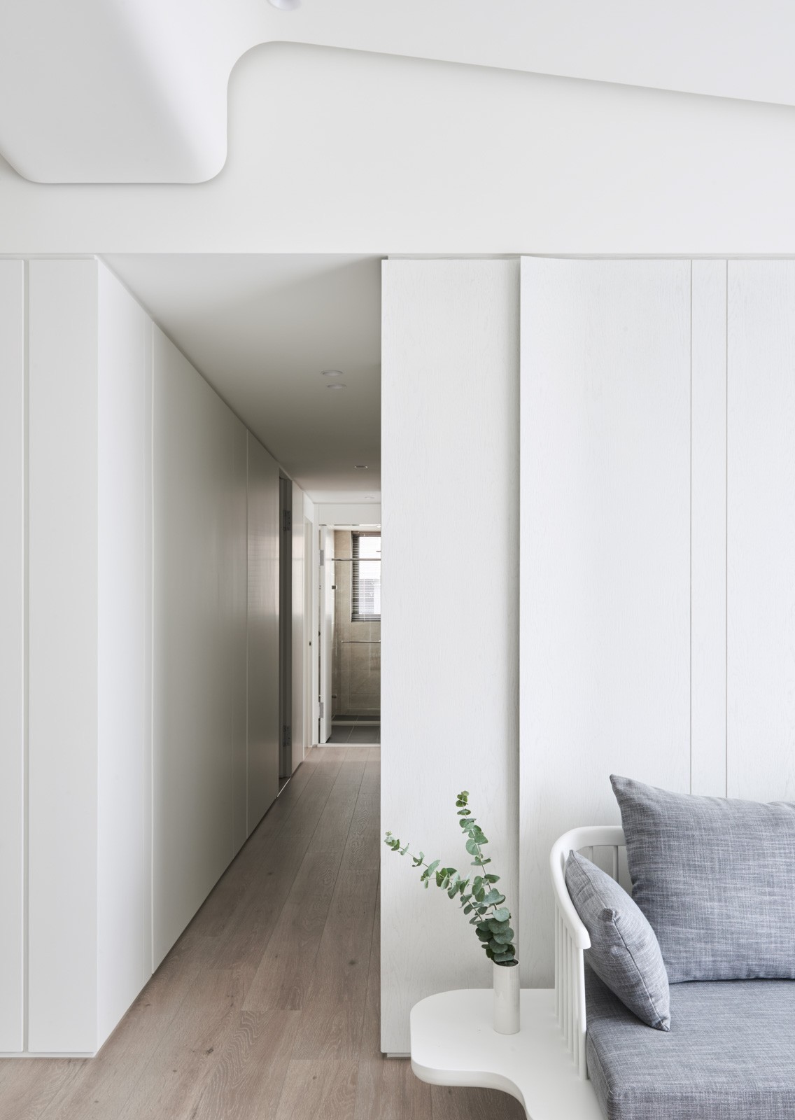
Being able to find a version of white that can match in varied materials, like ceiling, walls, and coffee tables, can be a challenge in the minimalist design project.
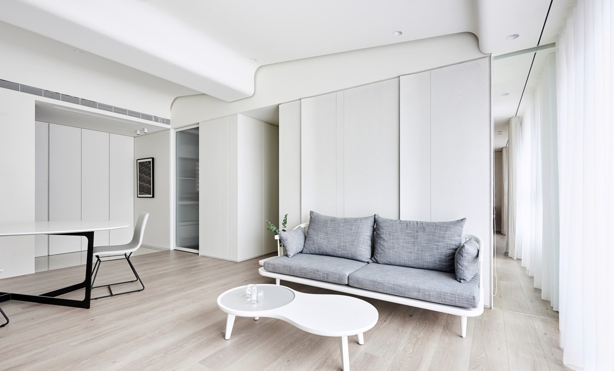
Shades of white can differ just as much as shades of grey, with undertones that are blue or yellow, cool or warm.
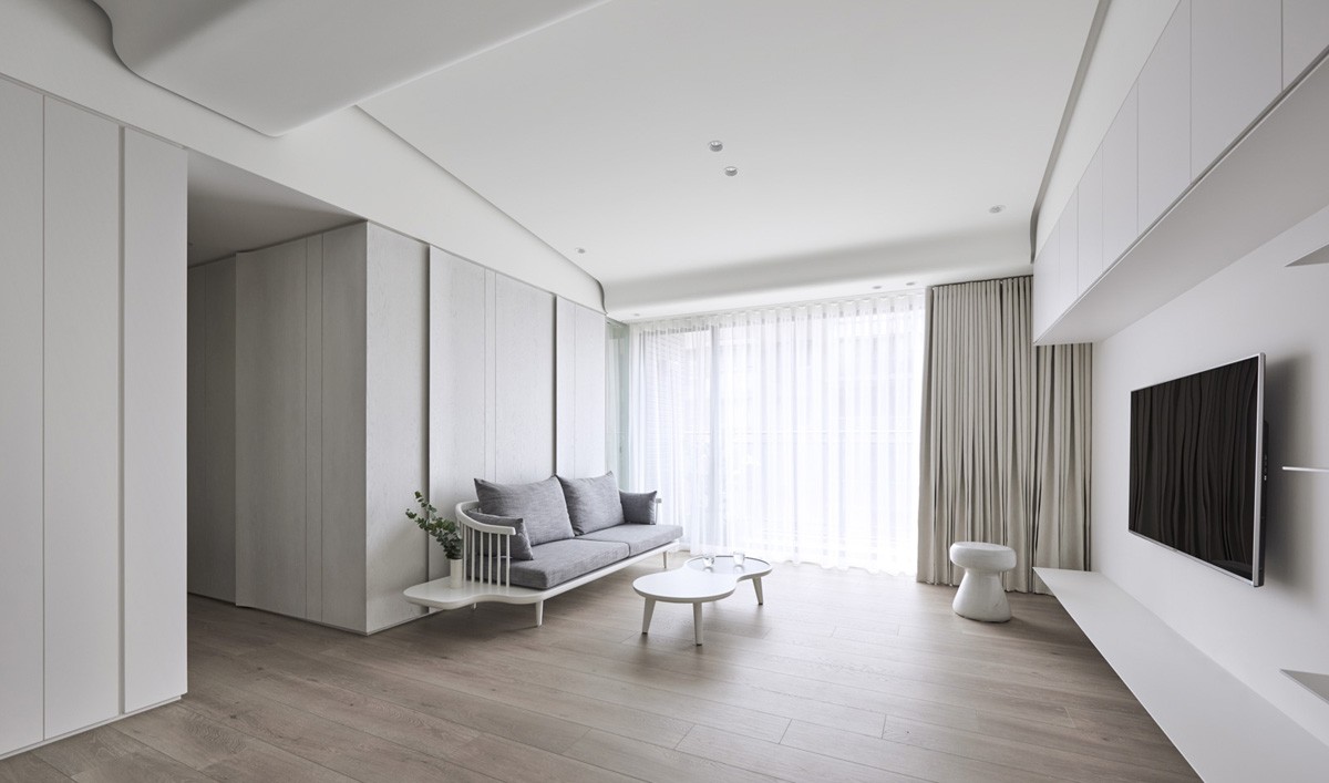
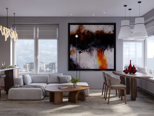
The white in this particular home is a cooler tone, allowing for cool wood flooring as well as gray upholstery for the sofa.
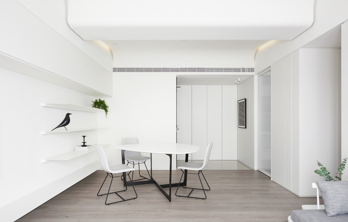
The simple white dining area features modern dining chairs and a dining table, both with black bases, bringing a dark element into the space.
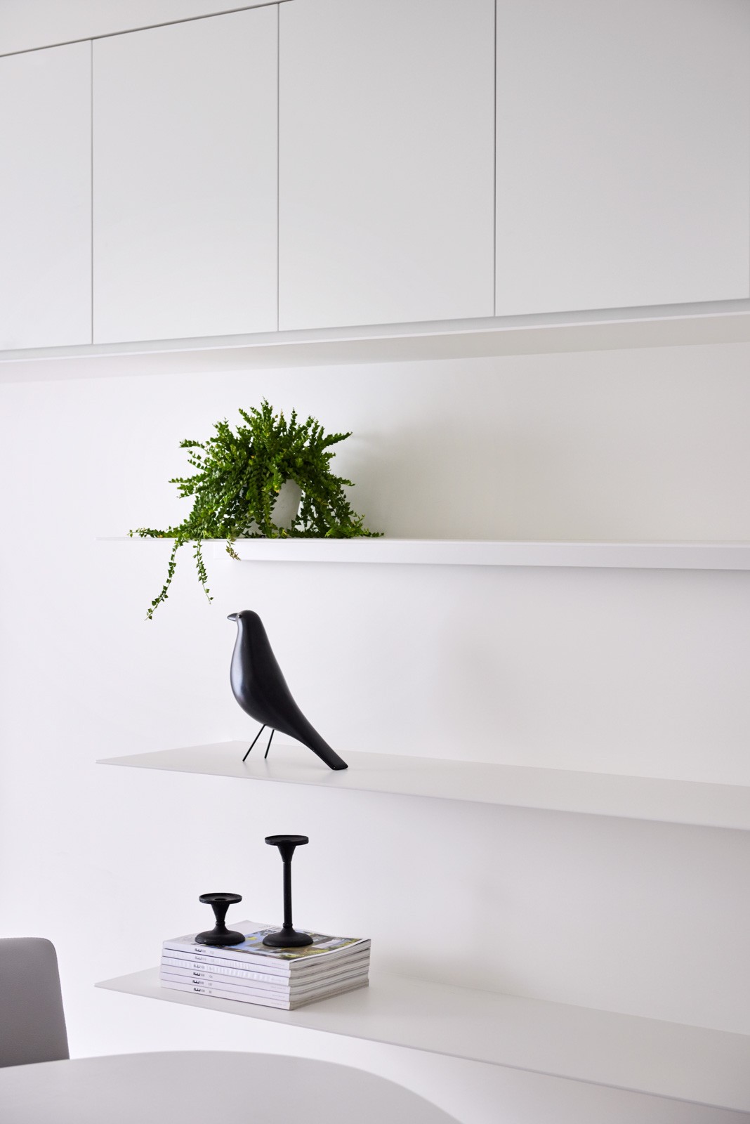
On the shelf in the dining room, an Eames Bird and indoor house plant add a spark of personality to the minimalist space.
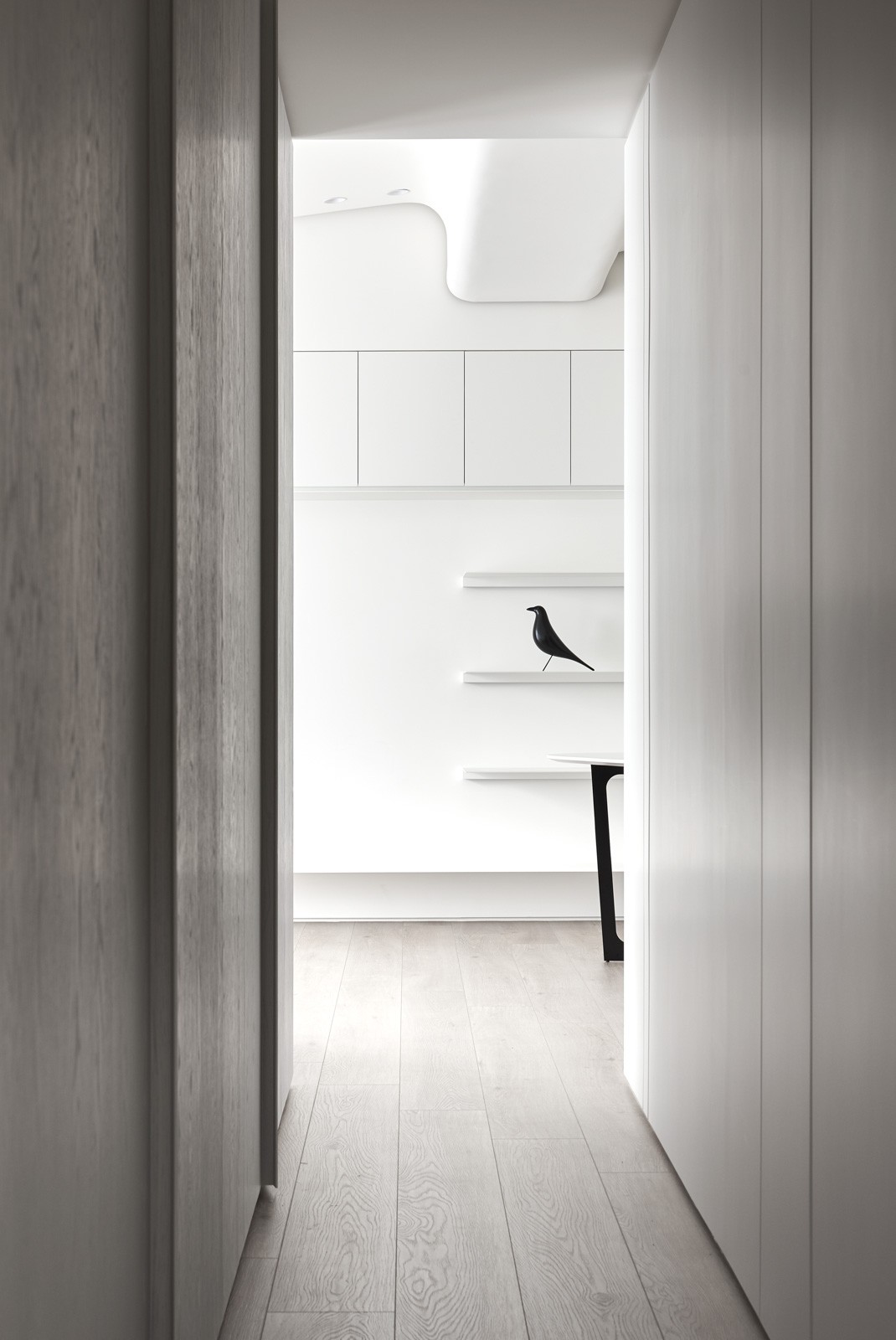
Of course, the use of white can also make a space feel much more open and therefore bigger than it otherwise might.
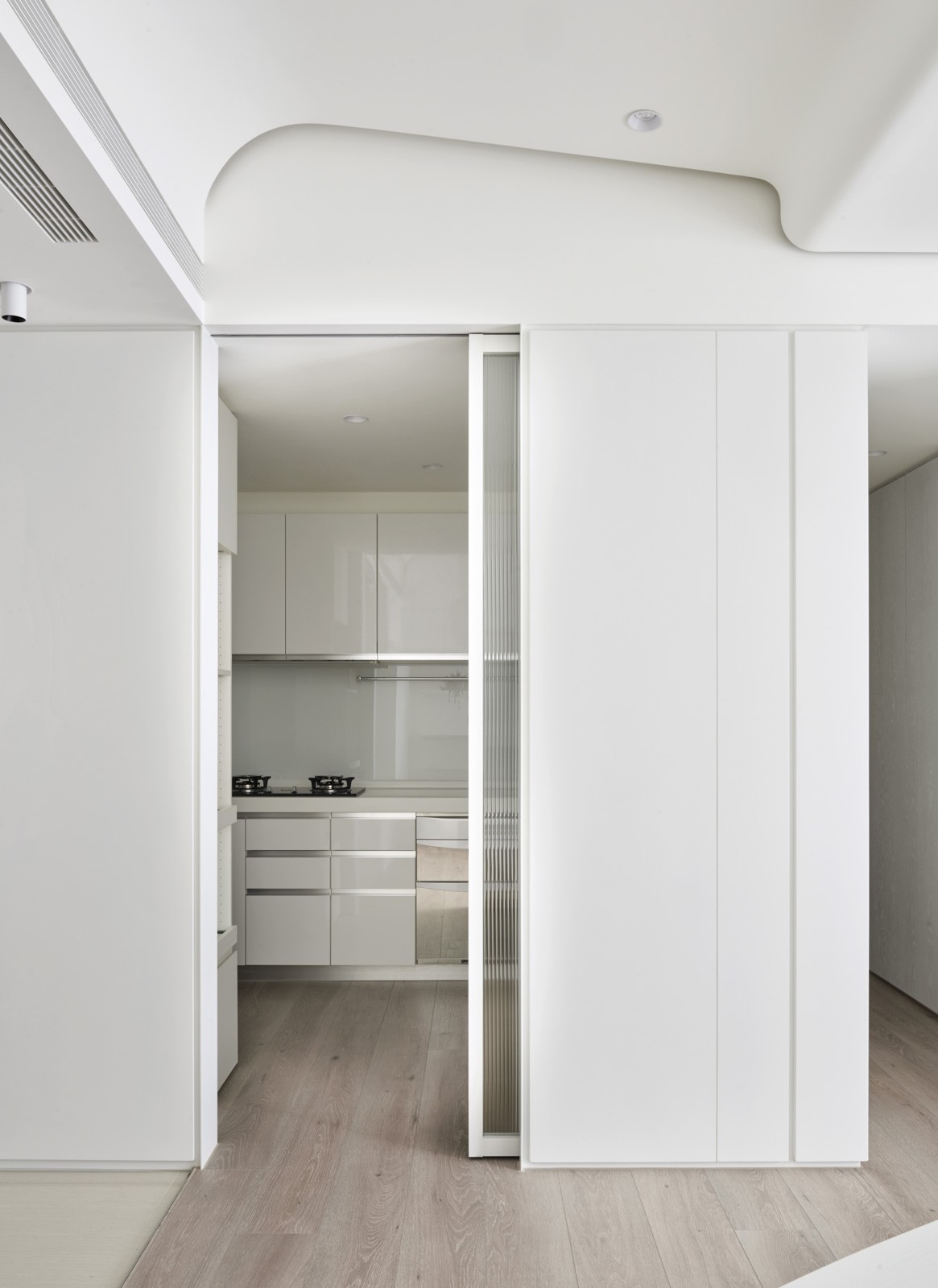
The white kitchen should come as no surprise, but the option to close the kitchen off from the rest of the house is a bit unique in modern interiors, which tend to favor open plans.
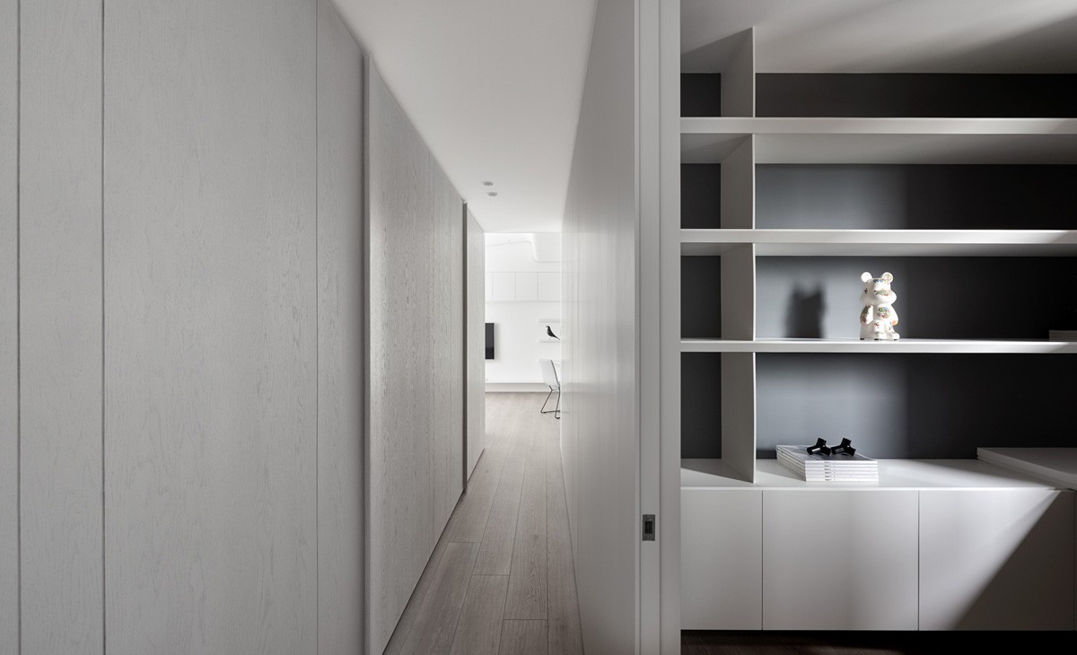
In another area of the house, dark gray serves as the backdrop for white shelving, which can create almost an optical illusion of more depth and therefore more space.
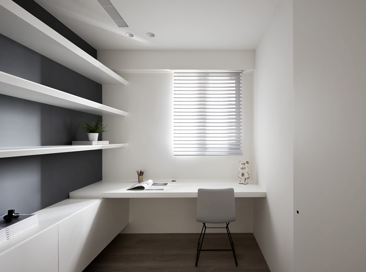
This home work space, with its work chair and desk, is not much more than a cozy closet, but the use of color and design makes it feel much bigger.
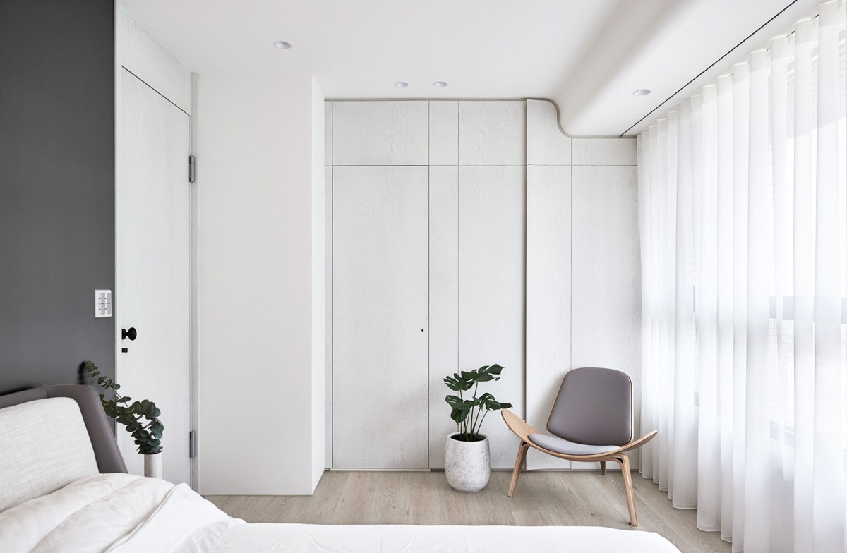
In the bedroom as in the living room, natural light plays a huge part of the design, which is lucky for the potted Swiss cheese plant.
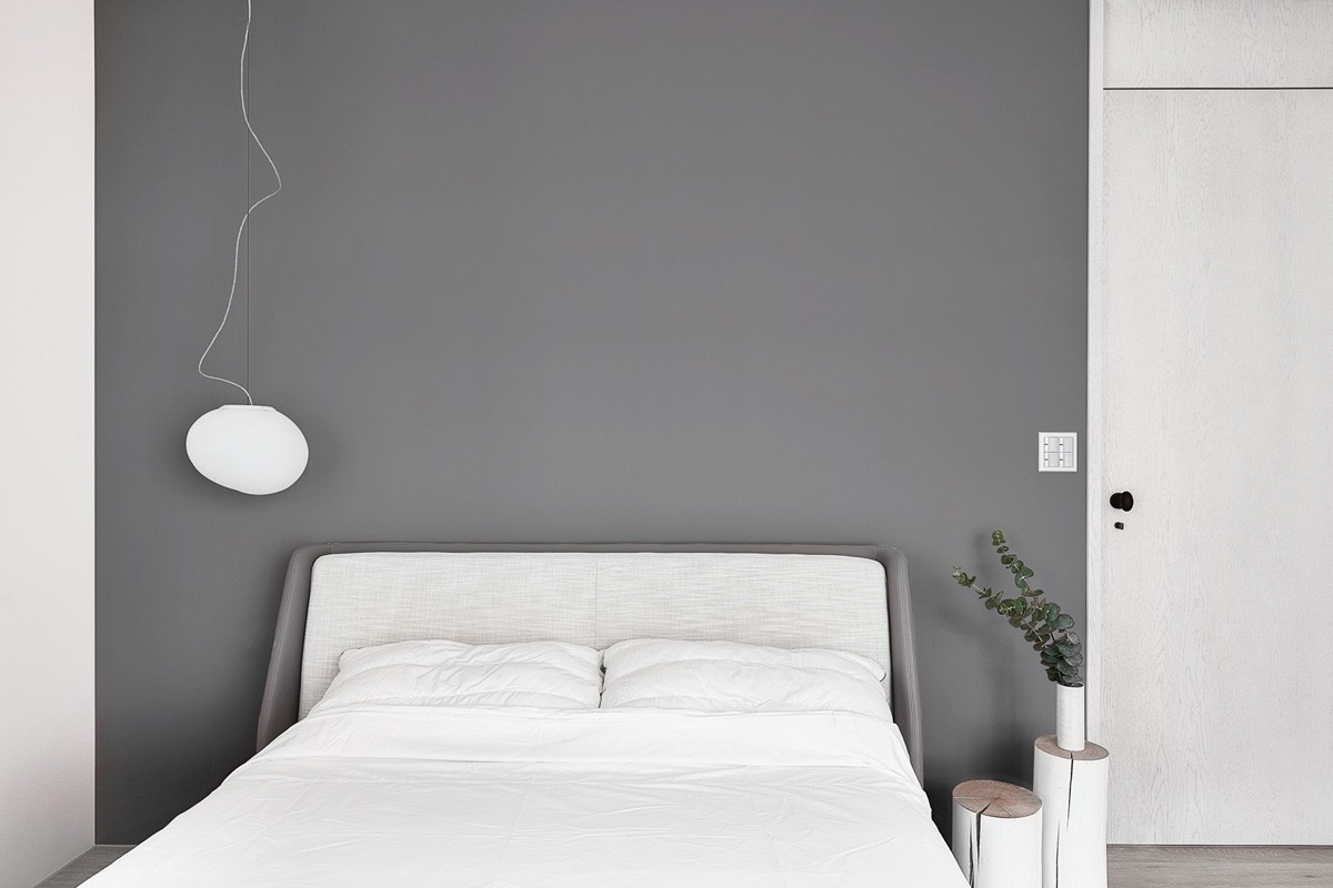
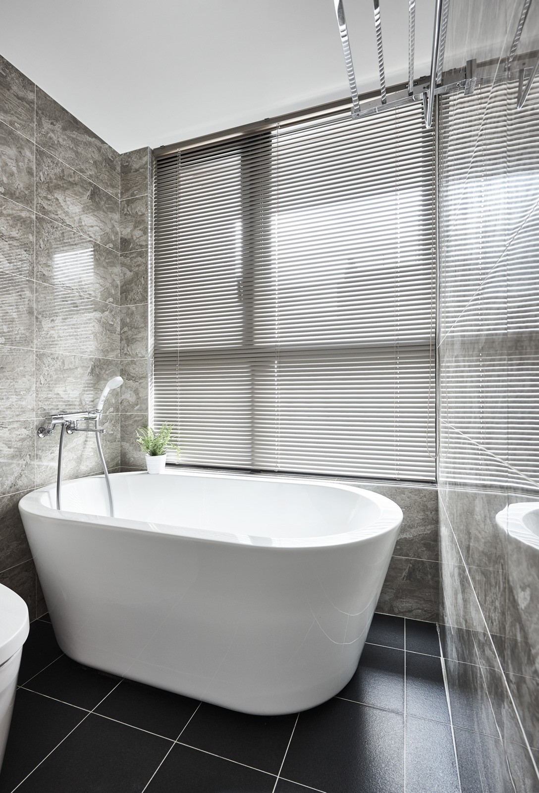
The dark gray element in the bedroom, as well as the home office, reflects an idea of cloudiness and quiet, making this room perfect for relaxation and sleep.
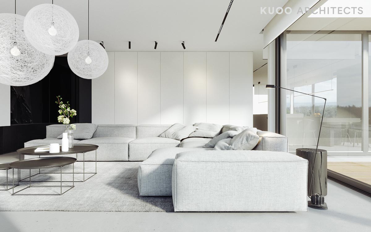
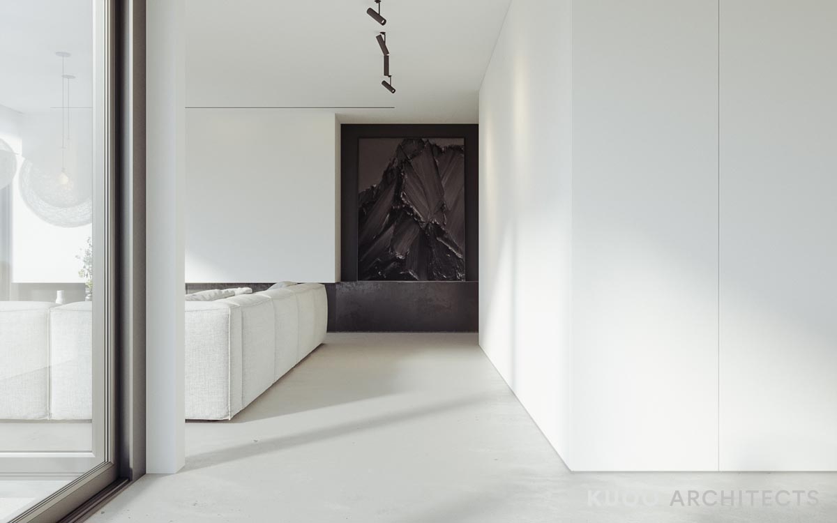
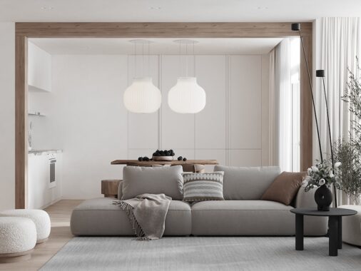
The second home is a house in Belgium that features many of the same colors (or lack thereof) but as a distinctly different minimalist feel, starting with a large modern sofa.
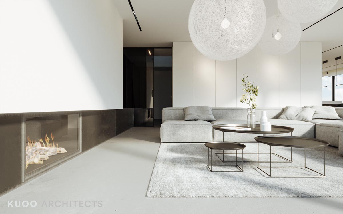
Indeed, despite the minimalist color palette, there is quite a bit going on in this main living area.
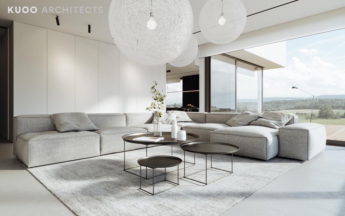
Nesting coffee tables, an enormous sofa, oversized light fixtures -- all make big statements despite their gray and white coloring.
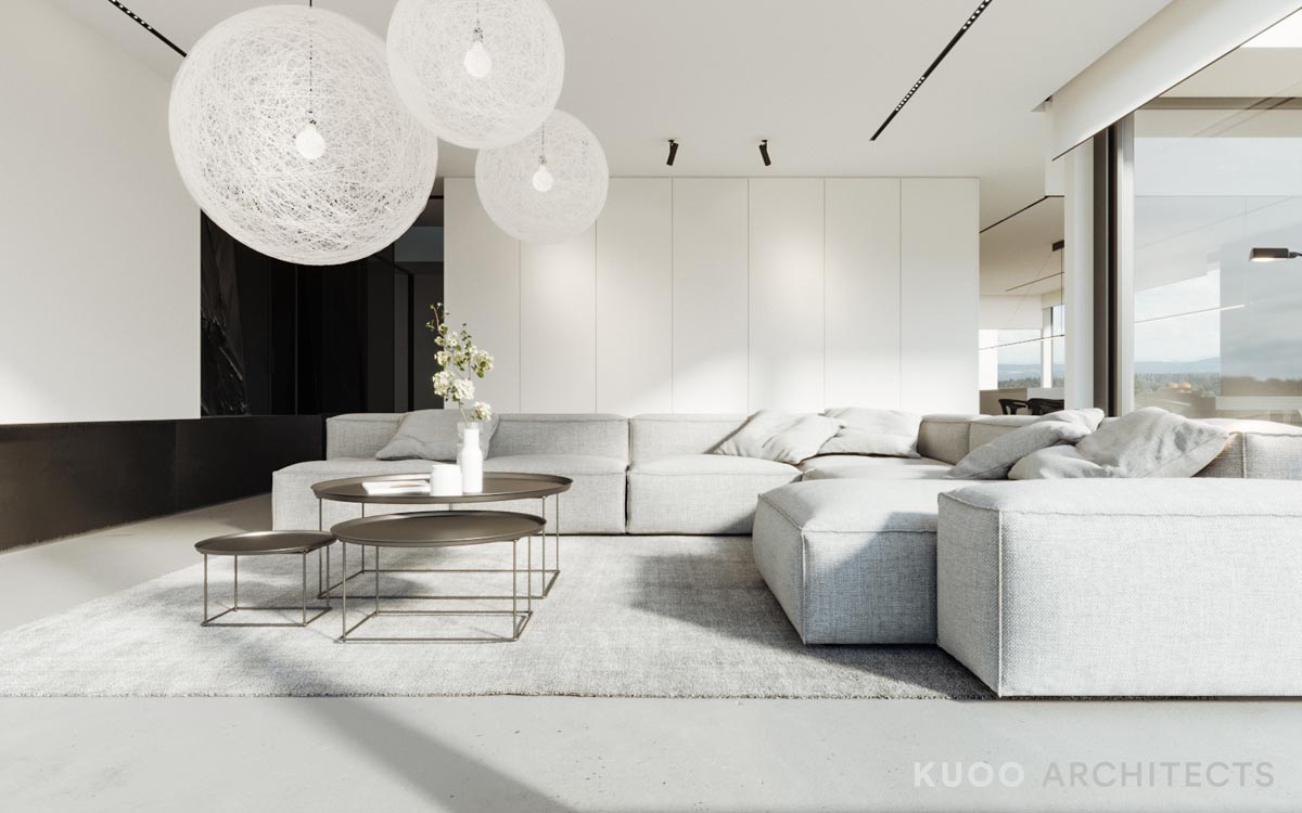
Even unique floor lamps that hinge out over the sofa have a bit of pop.
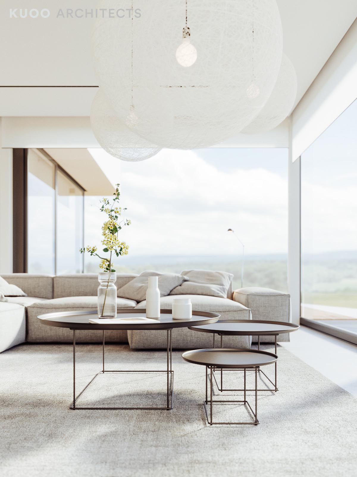
This home clearly demonstrates that the minimalist aesthetic does not have to avoid decoration altogether, as seen with the decorative vases nestled together on the coffee table.
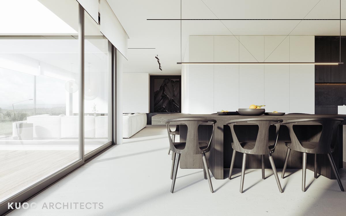
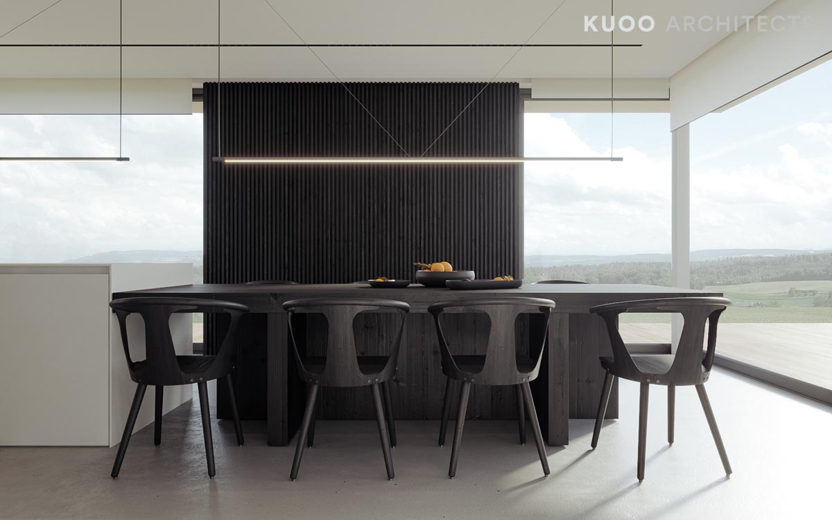
In the open dining area, Scandinavian style chairs and fruit bowls each offer their own version of practicality.
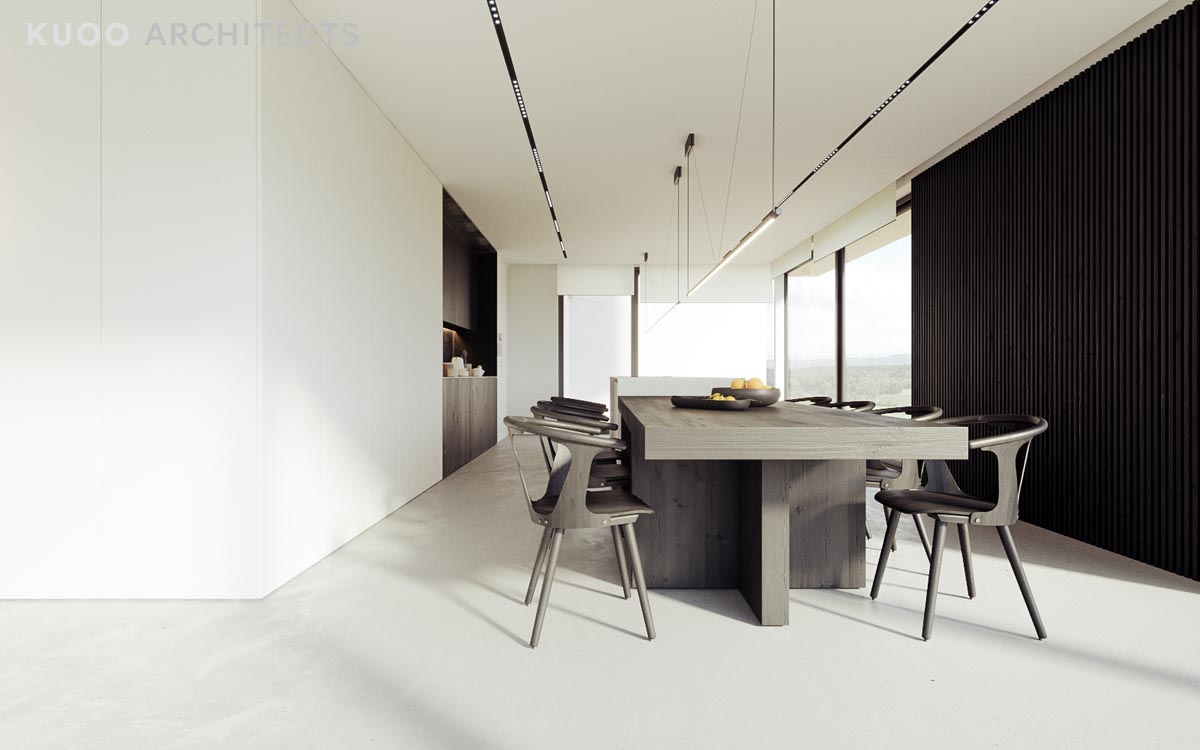
The interesting thing about this dining design is that it looks wildly different depending on the lighting. With plenty of light, it appears almost to be a light gray.
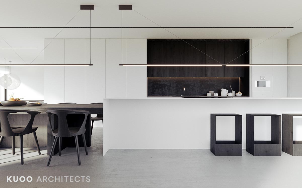
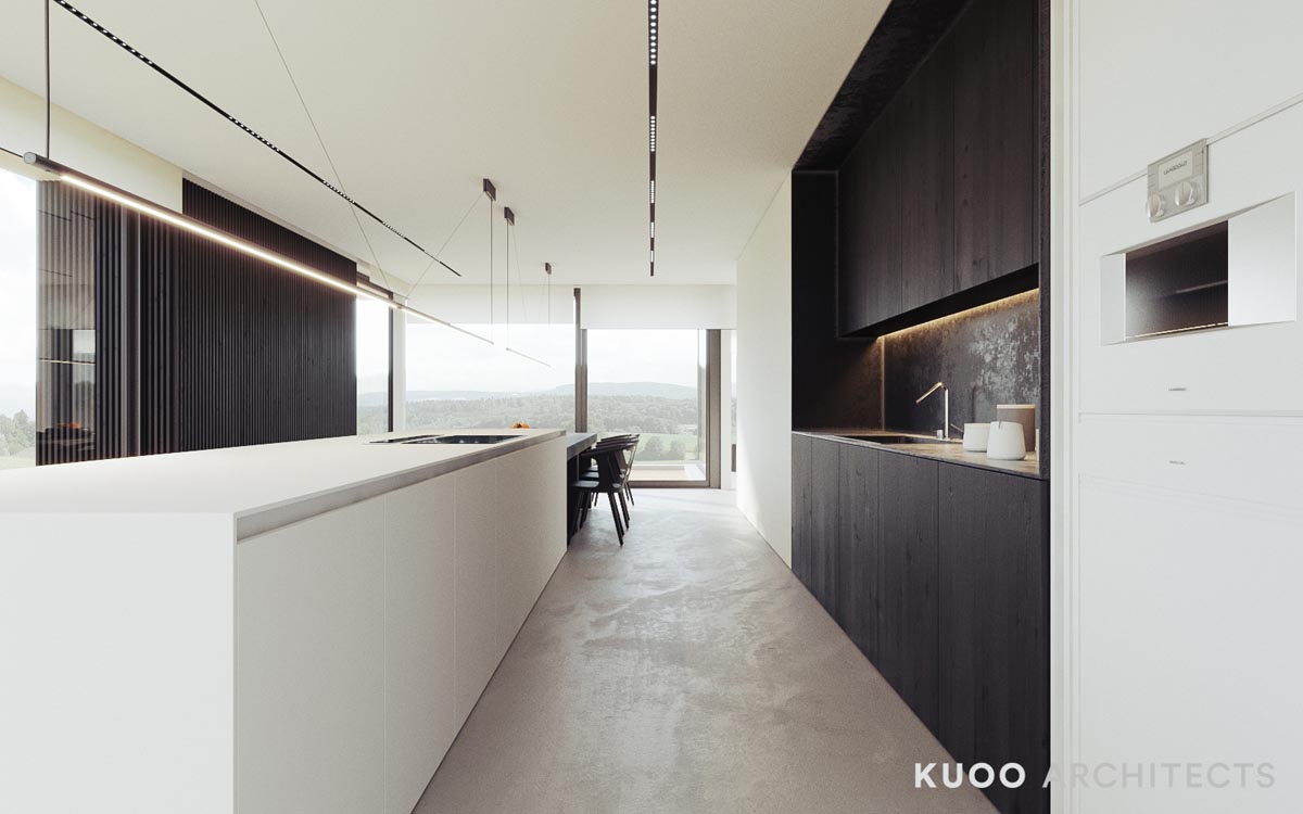
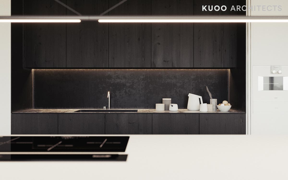
As an example for black and white kitchens, this simple design does well.
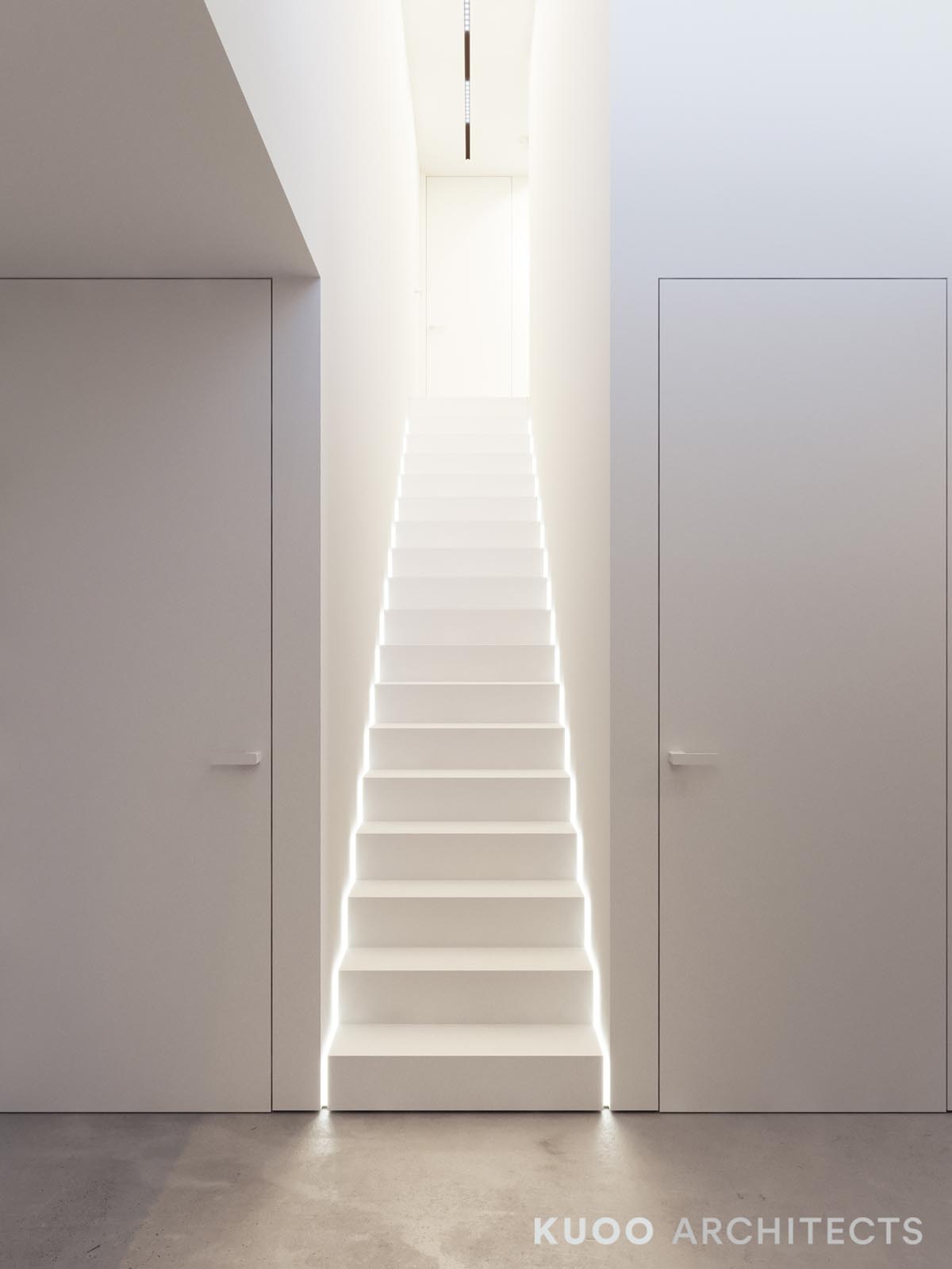
As for cool staircases, it does not get much cooler than stairs that are illuminated from underneath.
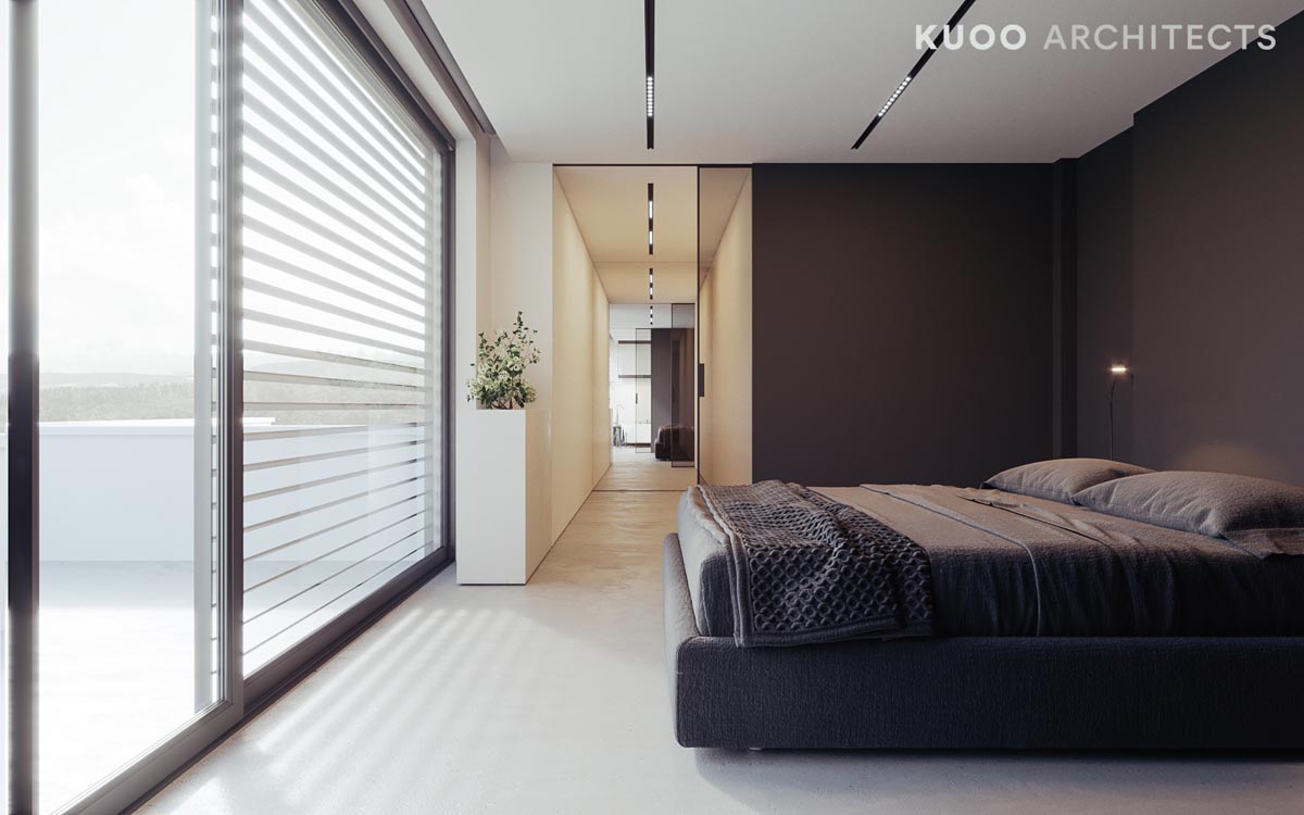
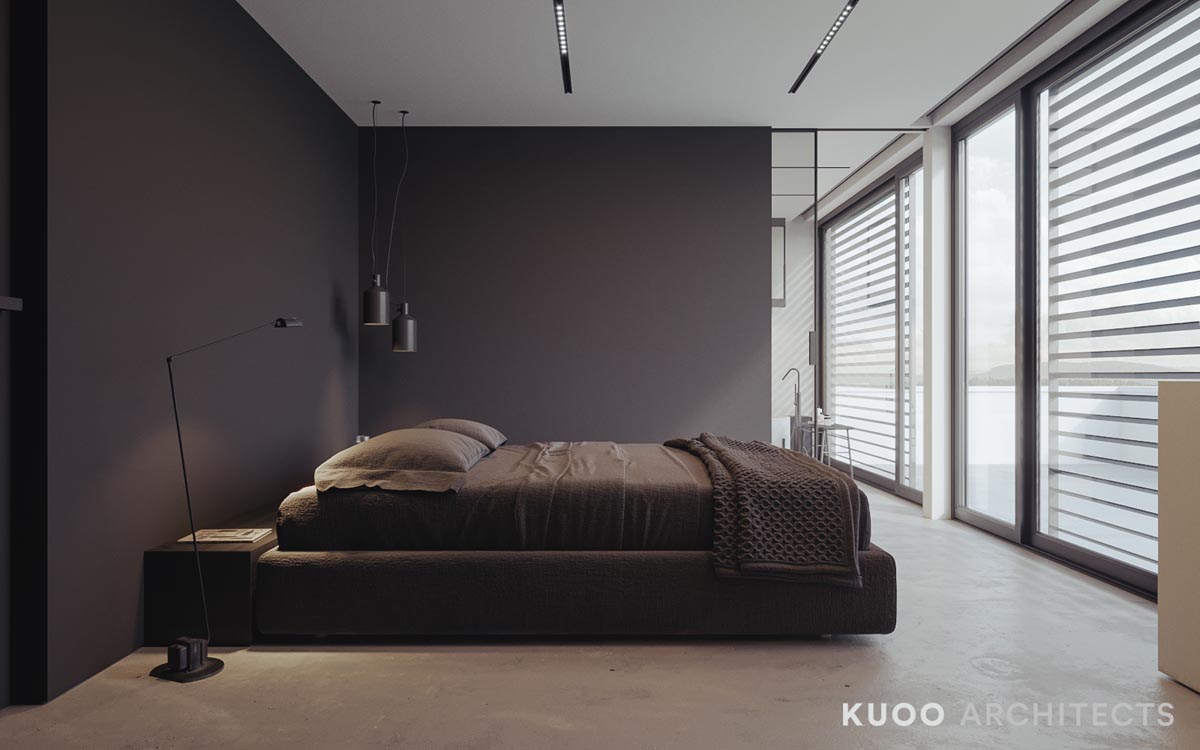
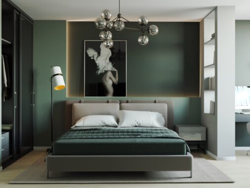
With dark gray walls and lots of natural light, this bedroom is comfortable no matter what time of day.
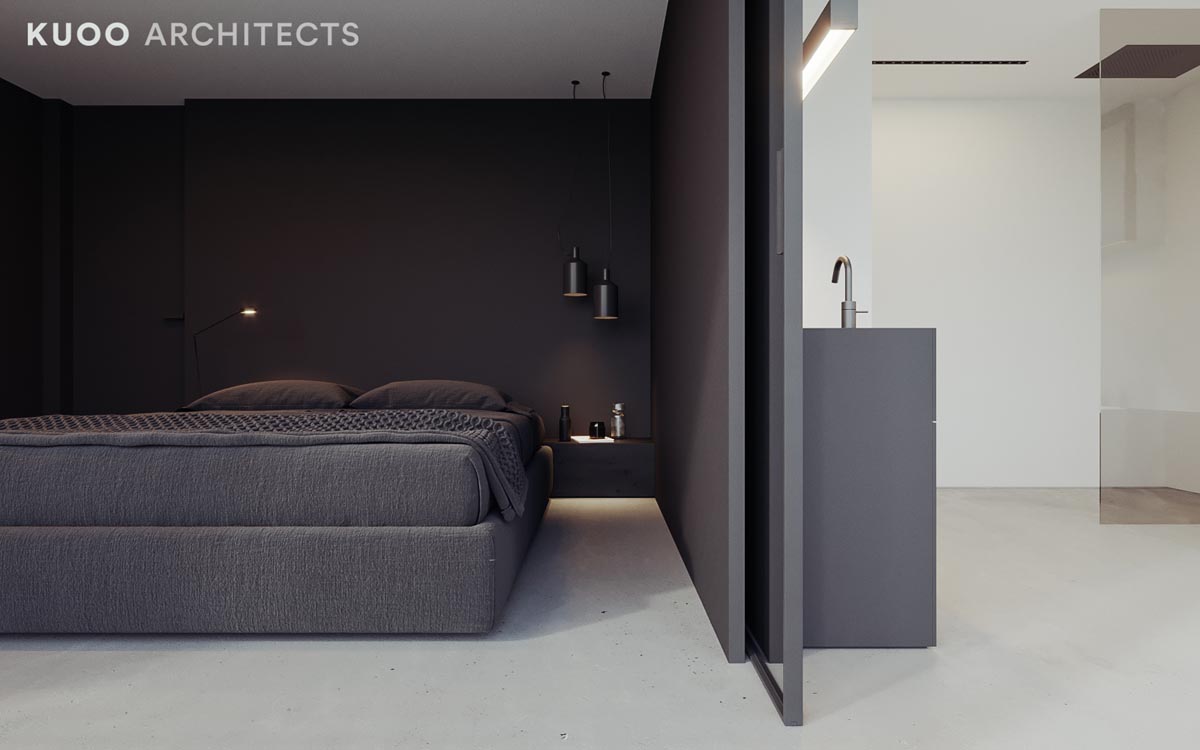
Next to the bed, bedroom pendant lights add a very subtle decorative element.
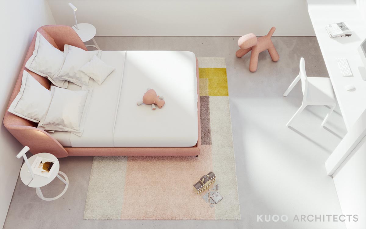
And in the little girl's room, we see modern options for kid's decor.
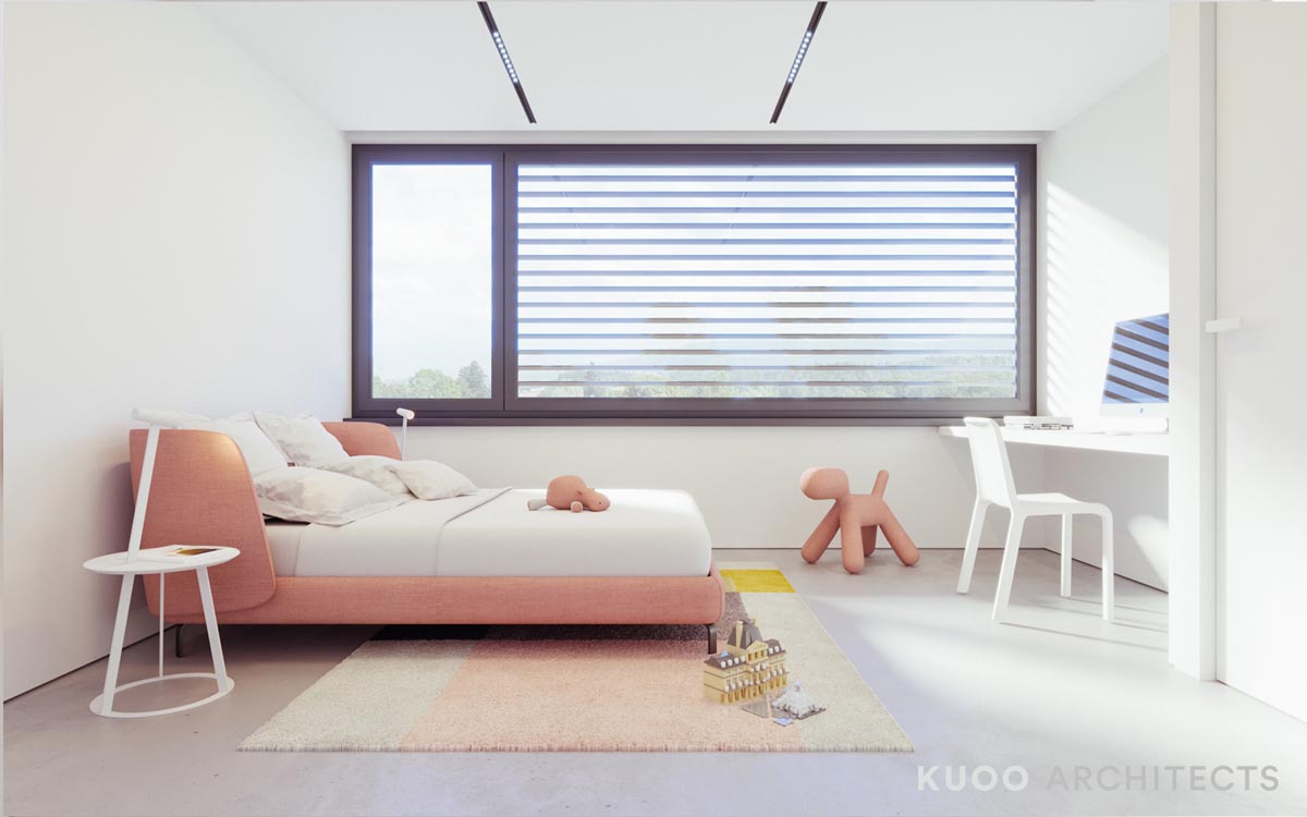
A pretty pink grapefruit kids' bed and cute, citrusy colors make for a bright and playful room.
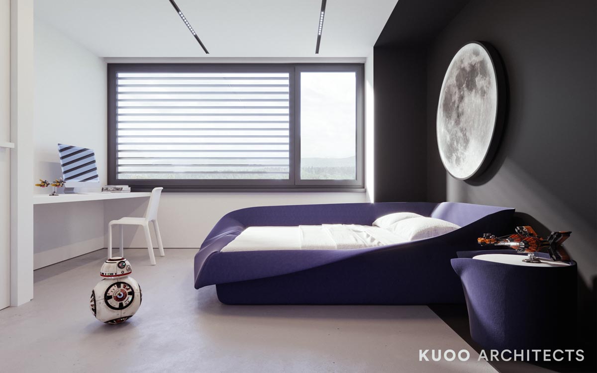
For an older child, Star wars decor is the perfect choice. The moon over the bed is a creative way to indulge in space decor while still keeping the design somewhat minimalist.
