Modern minimalism is everywhere – and there's no question as to why. It's the go-to choice for staging interior architecture concepts, it's a versatile backdrop for furniture ads, and magazines rightfully feature the residents of these meticulous spaces whenever an innovative example pops up. This post looks at two minimalist homes with open concept living rooms and striking high-contrast neutral palettes. Both incorporate luxurious details in different inspiring ways. The first adds hints of high-end materials like brass and marble, and the second builds around artfully sculpted furniture by renowned designers.
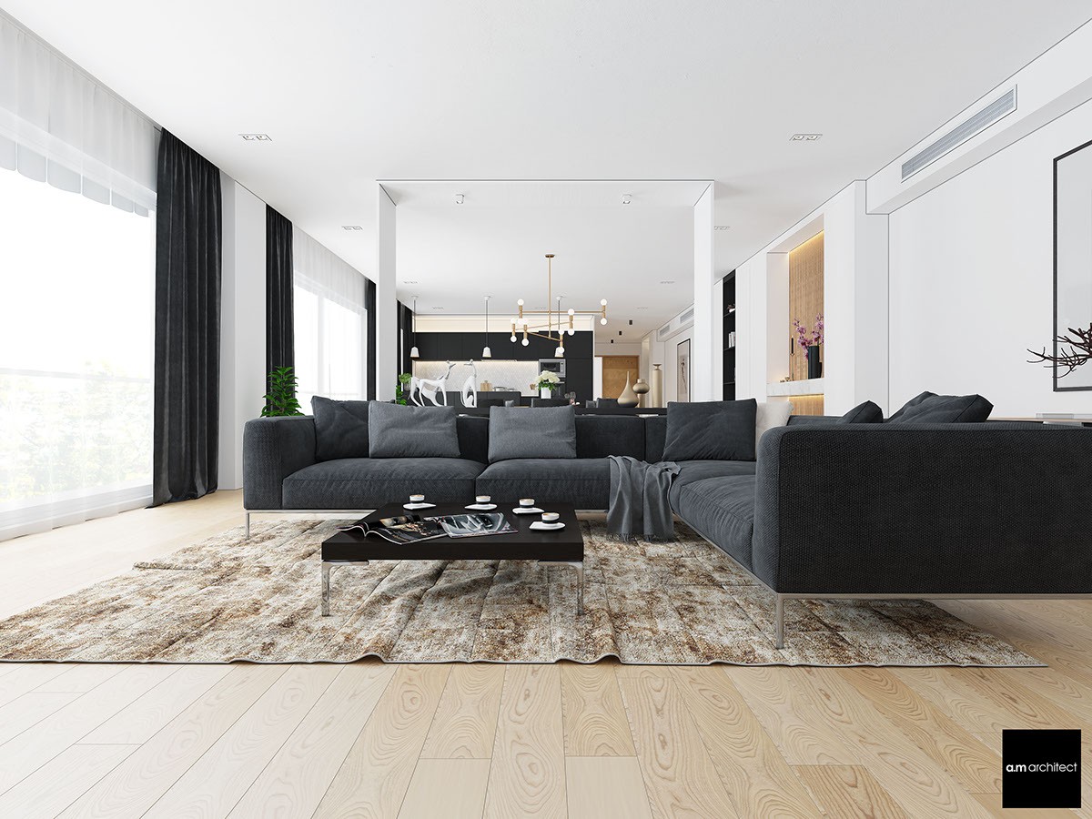
First, let's look at a home that uses its open concept living area in a unique way. There's not very much outright decor in this part of the house but more decorative details appear the closer you get to the kitchen at the end of the room. A low sofa allows residents to take in the entire space at once and stretches the versatility of the few decorations to their fullest potential.
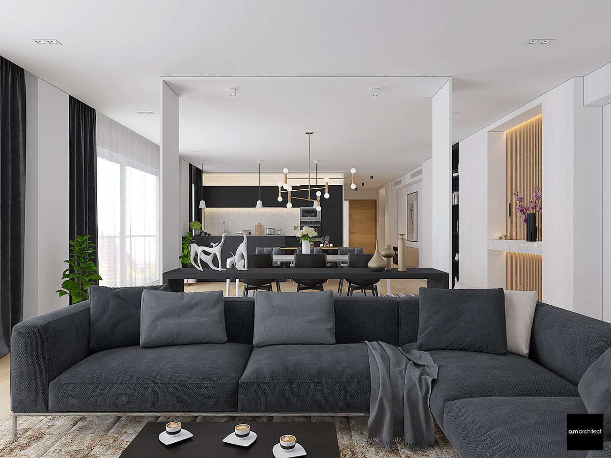
The view is streamlined yet elegantly layered, the continuity punctuated low table contained by thin walls to create a "room within a room" effect. One side opens to a beautiful urban view, the other hosts shelves outfitted with a few vases and books.
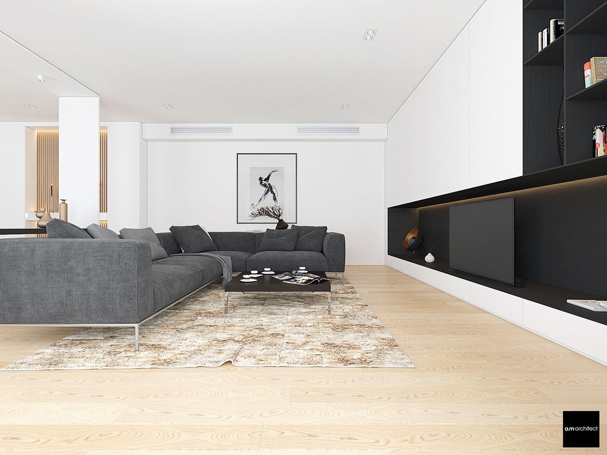
A built-in media center keeps things nice and simple. Notice the position of the television – nice and low, a focused choice.
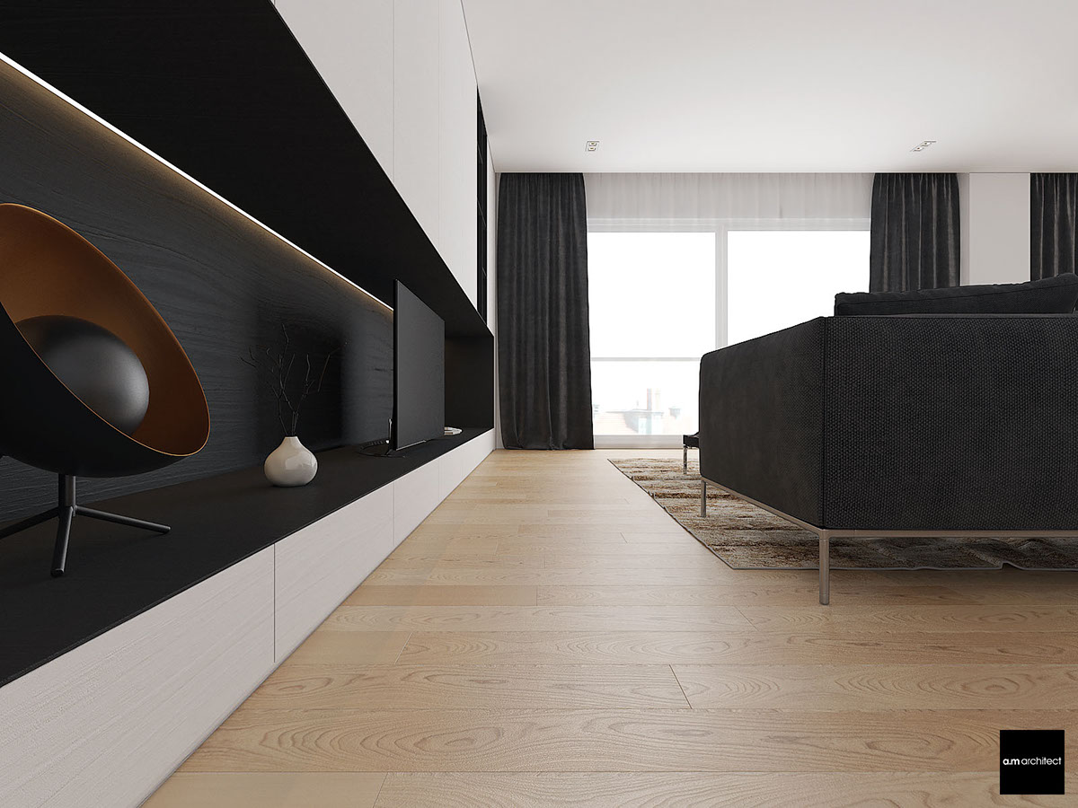
The black background has two benefits. First, it doesn't distract the eye while viewing. Second, it allows the electronics to blend in unobtrusively while powered off.
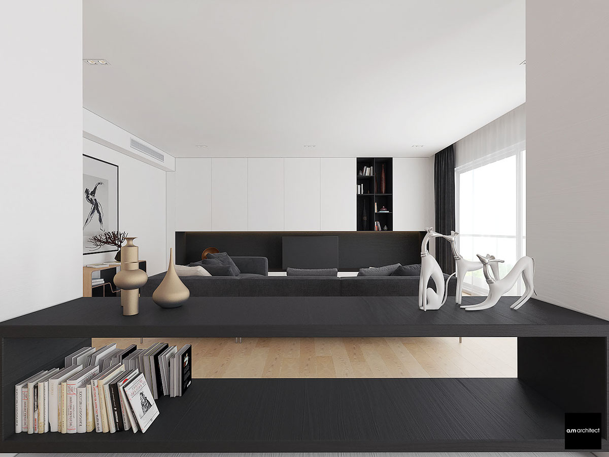
Tasteful sculptures line the central table, with ample space for books underneath. If one were to pull up a chair, it could make a nice place to work on a laptop while catching up on a favorite show.
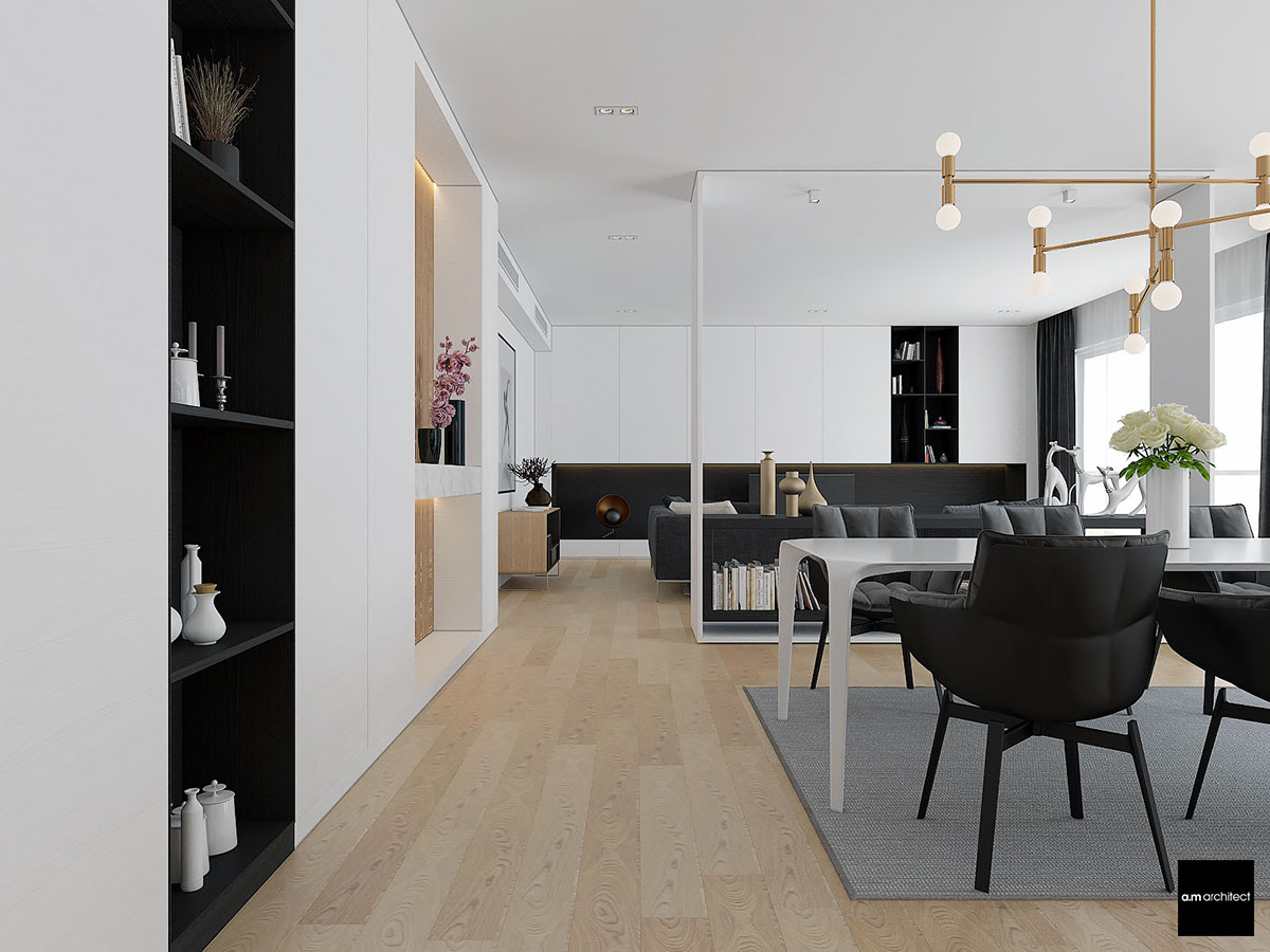
And the dining arrangement is just as beautiful. It employs a pretty clever aesthetic technique with the nearby shelves displaying an inverted take on its stark black and white color theme.
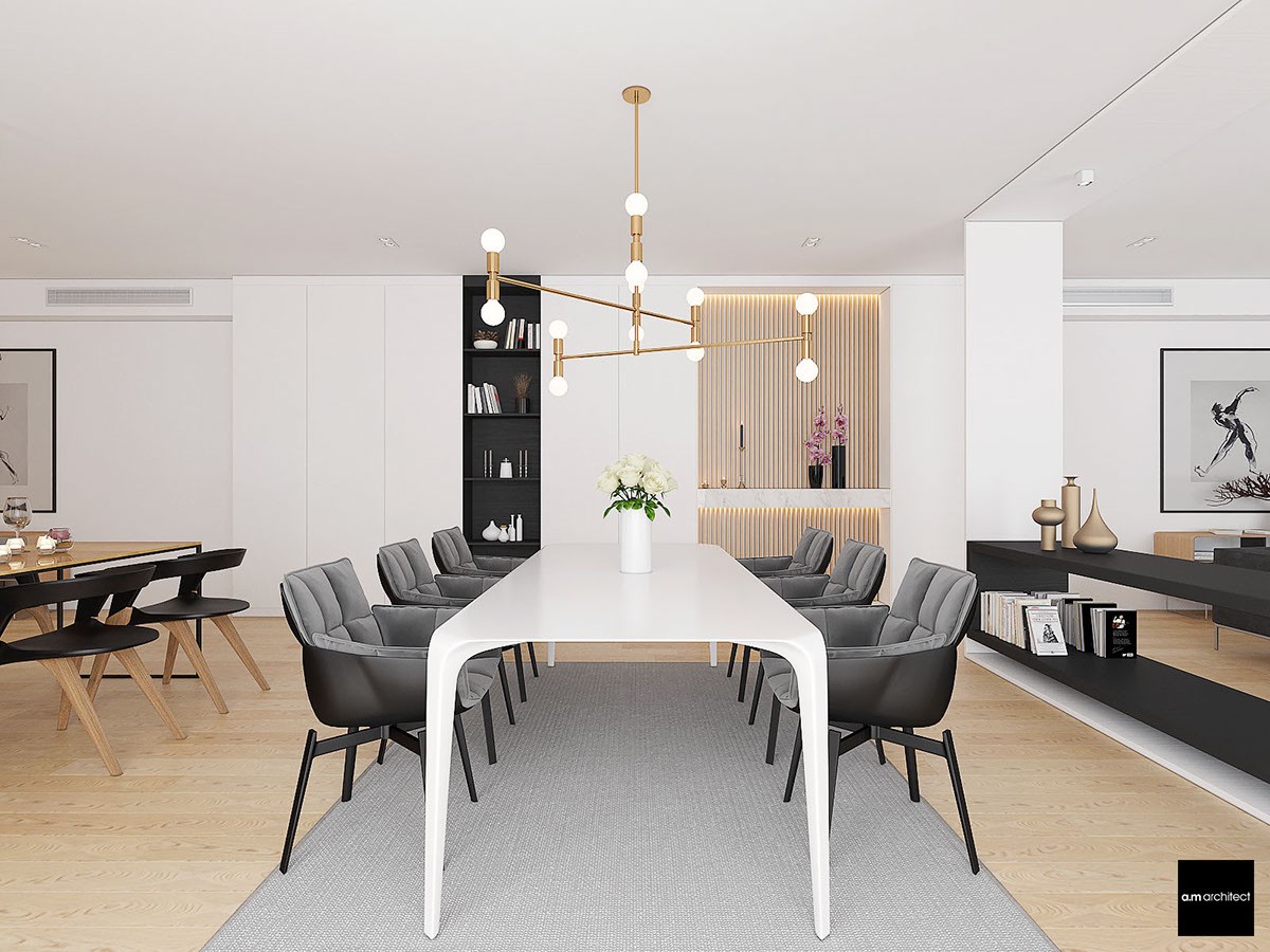
Patricia Urquiola's stylish Husk Chair lines the large setting, with a Lambert et Fils Atomium Chandelier illuminating the table from above. The brass lighting fixture is one of the most obvious luxury touches in a room that mostly employs understated elegance.
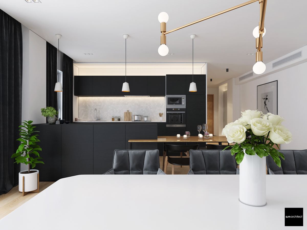
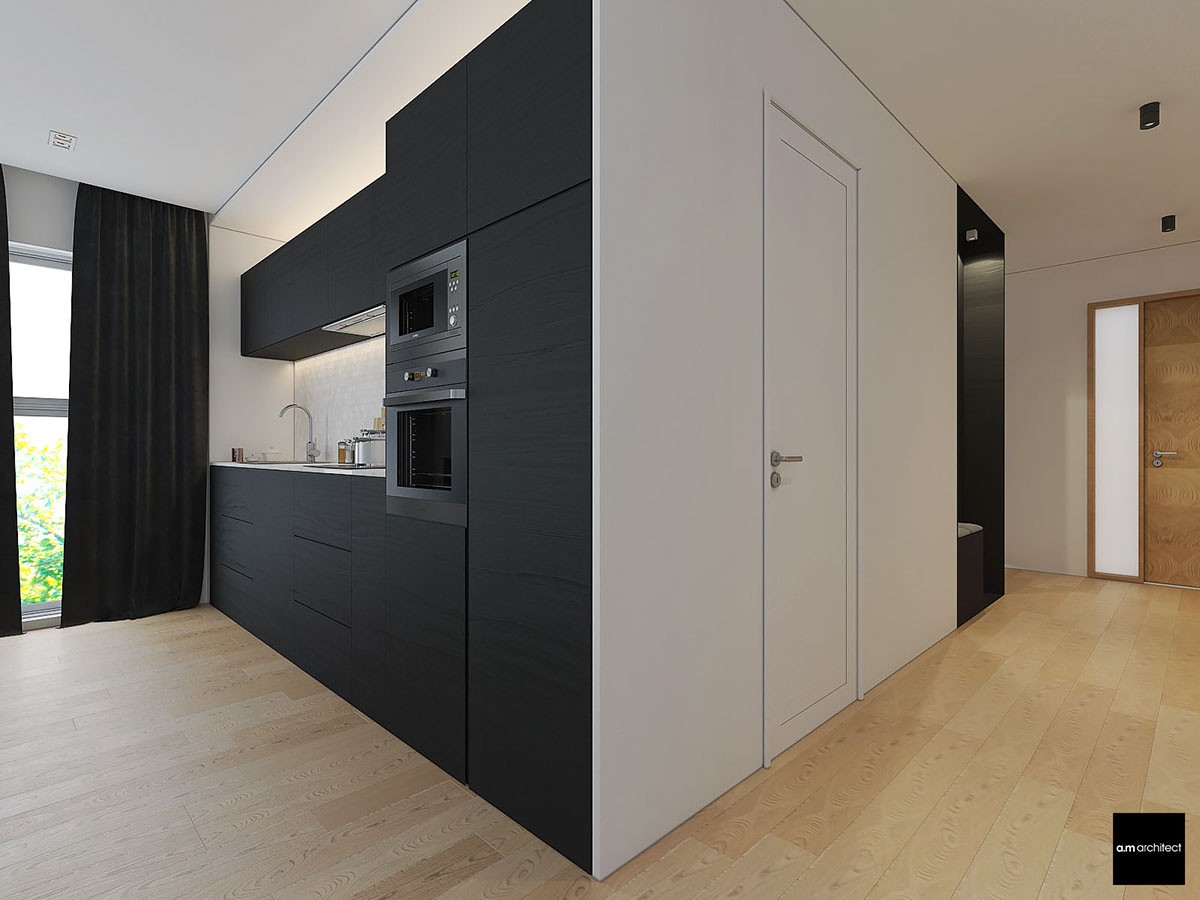
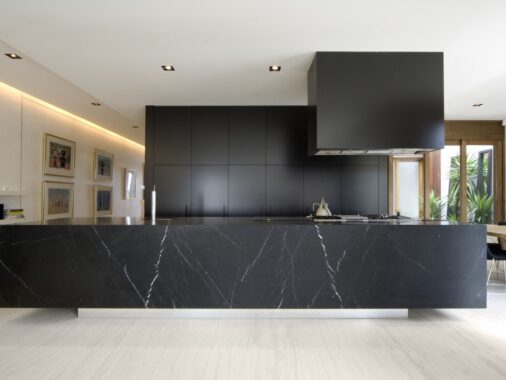
The kitchen's matte cabinetry makes a wonderful backdrop to the white table and the simple pendant lights. Small tiles bring character to the backsplash without stealing the spotlight or distracting from the overall composition.
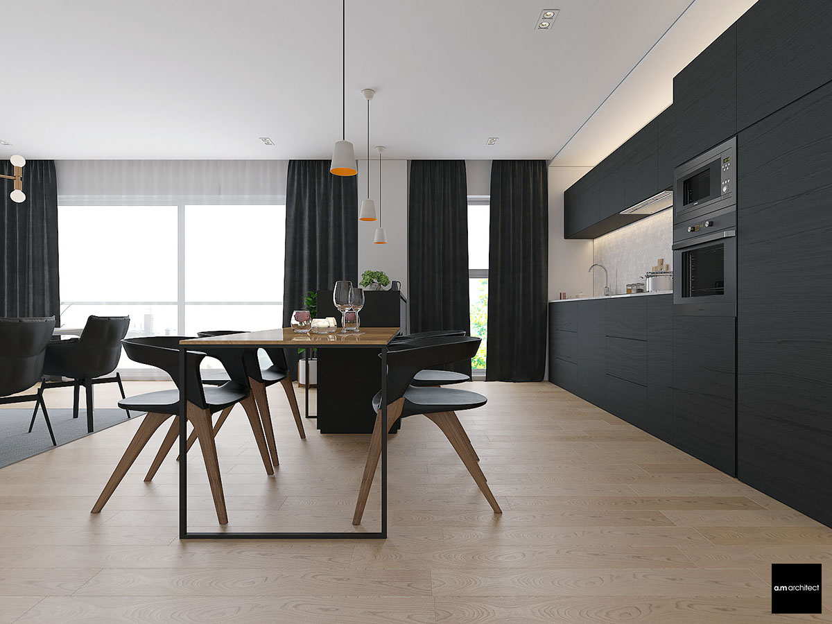
Extra dining space occupies this fantastic extension from the island. It serves as extra workspace when not being used as a breakfast table, and surely makes a nice little place for guests to chat while the host prepares drinks or snacks.
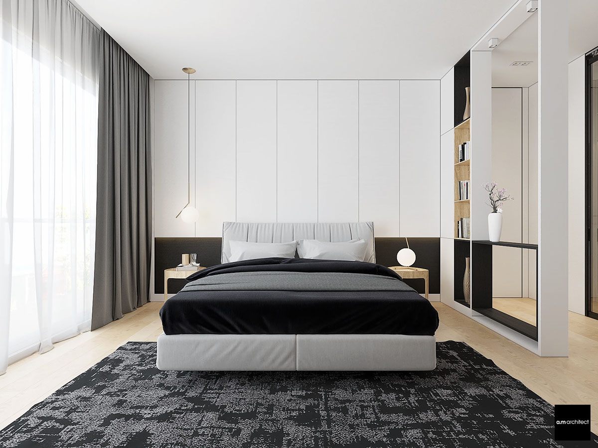
Upstairs, the black and white bedrooms continue the sharp high-contrast theme.
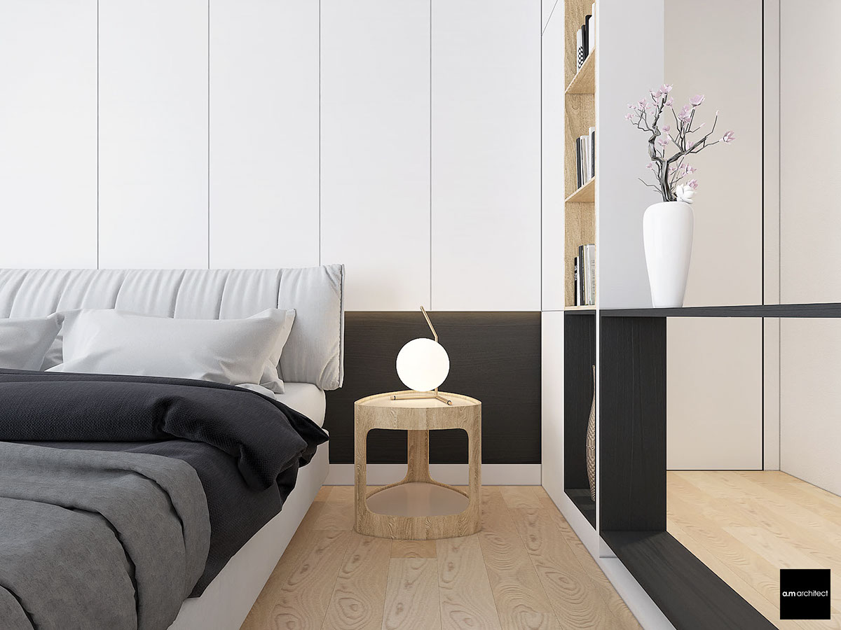
This comfortable space includes small brass details just like the living room. The bedside lamps are from the IC Collection by Michael Anastassiades.
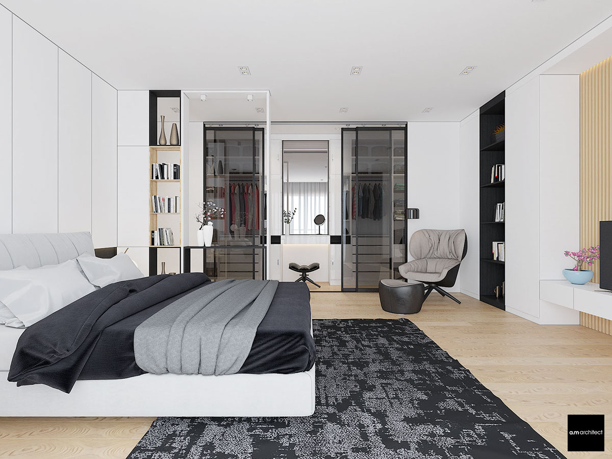
The small wall between the bed and closet creates a small pseudo-hallway, a purely symbolic boundary that still allows sunlight to continue toward the functional areas on the other side.
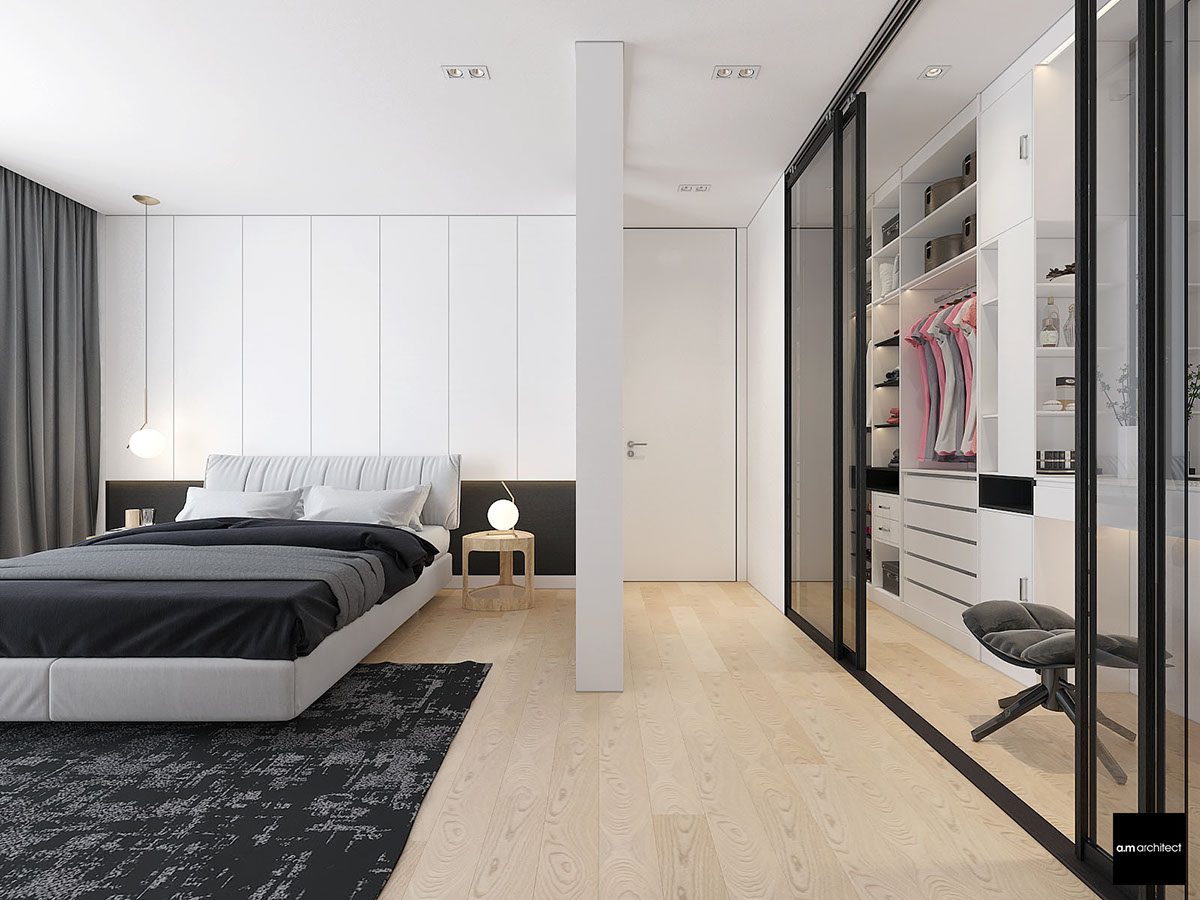
And the walk-in closet arrangement is certainly enviable, especially if you're serious about staying organized. There's a niche or a drawer for every accessory.
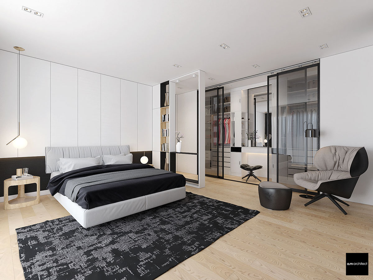
A little built-in vanity occupies the space between two sections of shelves and drawers. It has everything the resident needs for an effective one-stop morning routine.
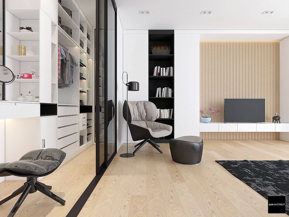
The comfortable reading chair is the work of Patricia Urquiola, called Tabano. It's paired with a lovely adjustable floor lamp to easily adjust lighting intensity for dusk or nighttime reading.
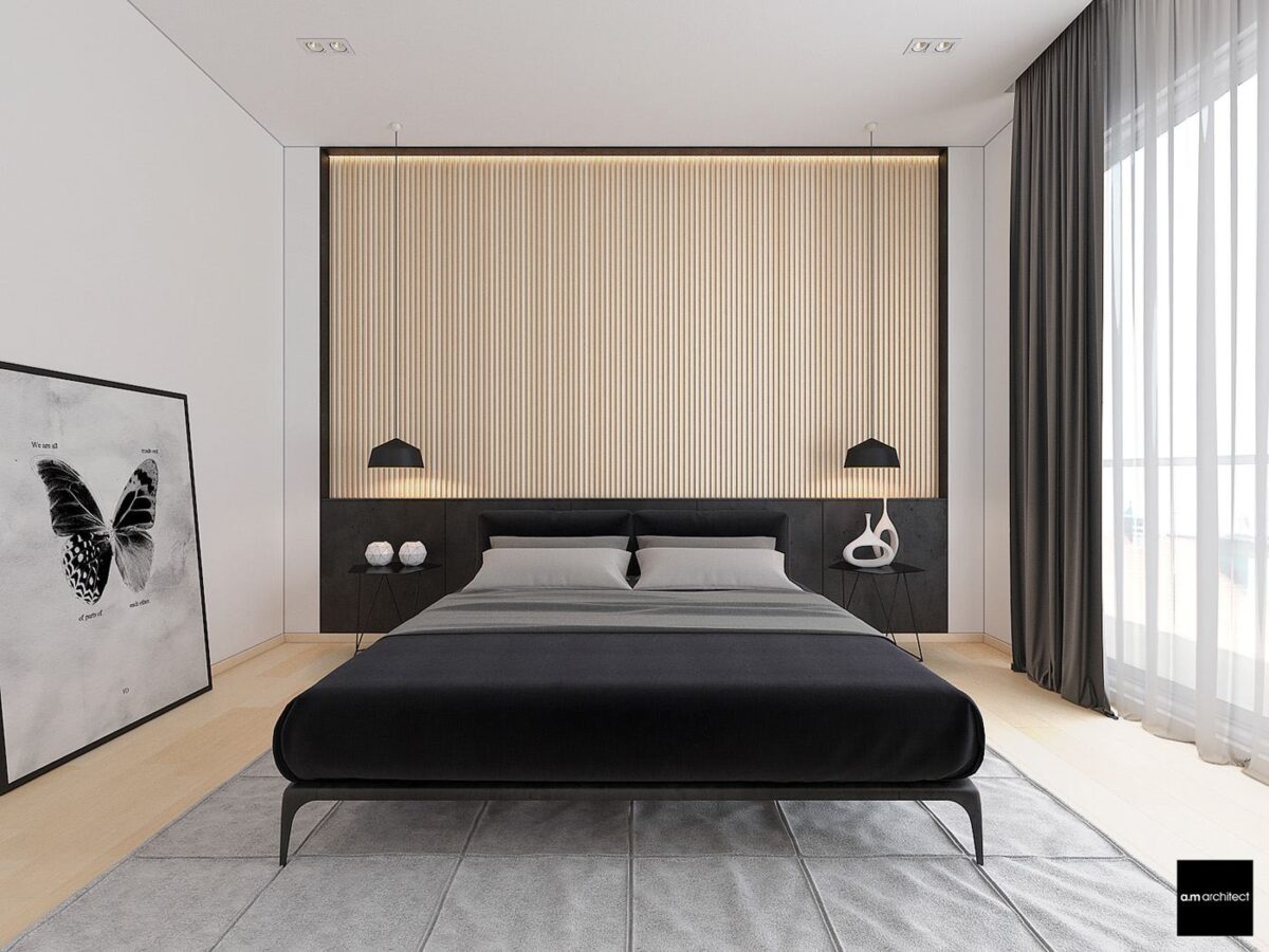
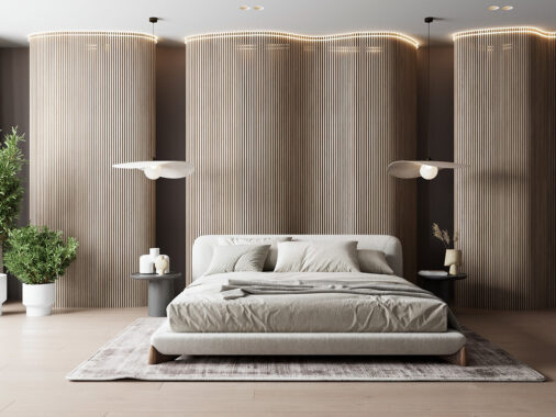
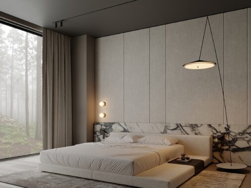
The other bedroom makes use of all the same materials as the first, but this time with an even more minimalistic approach. The headboard wall is especially impressive, taking the familiar textured panels from the last bedroom and bringing it to scale.
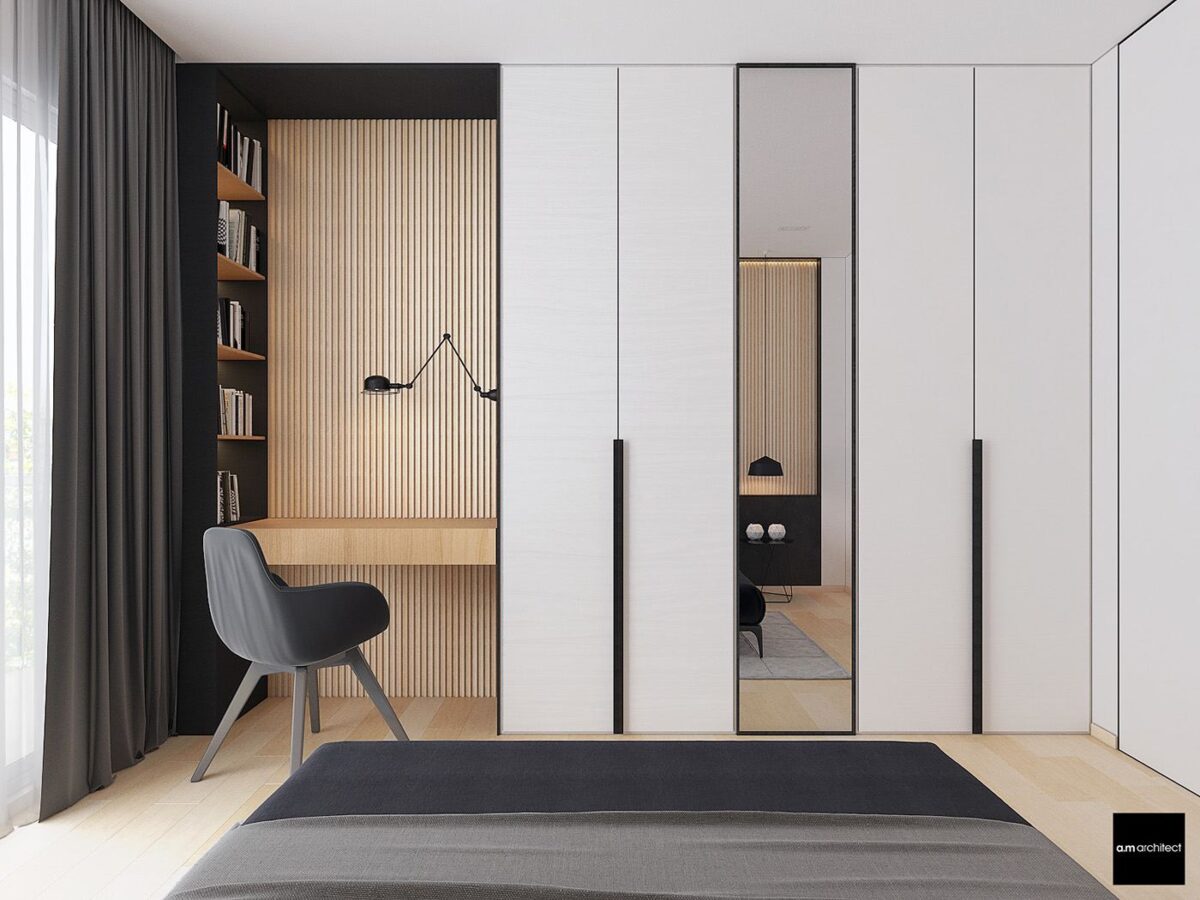
The reading nook is extra cozy. An iconic Jieldé lamp provides focused or ambient lighting in turn, easy to swivel upward if the resident needs to seek out books on the handy shelf to the left.
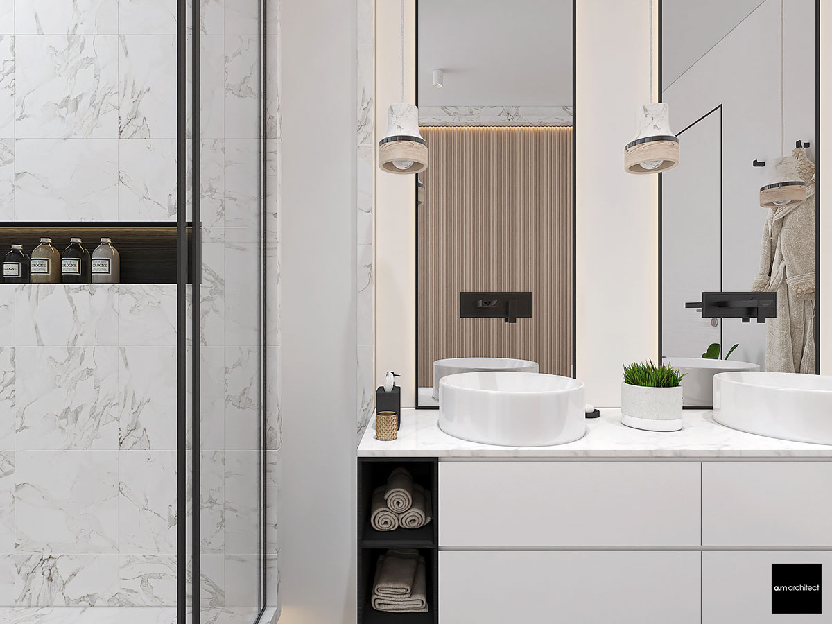
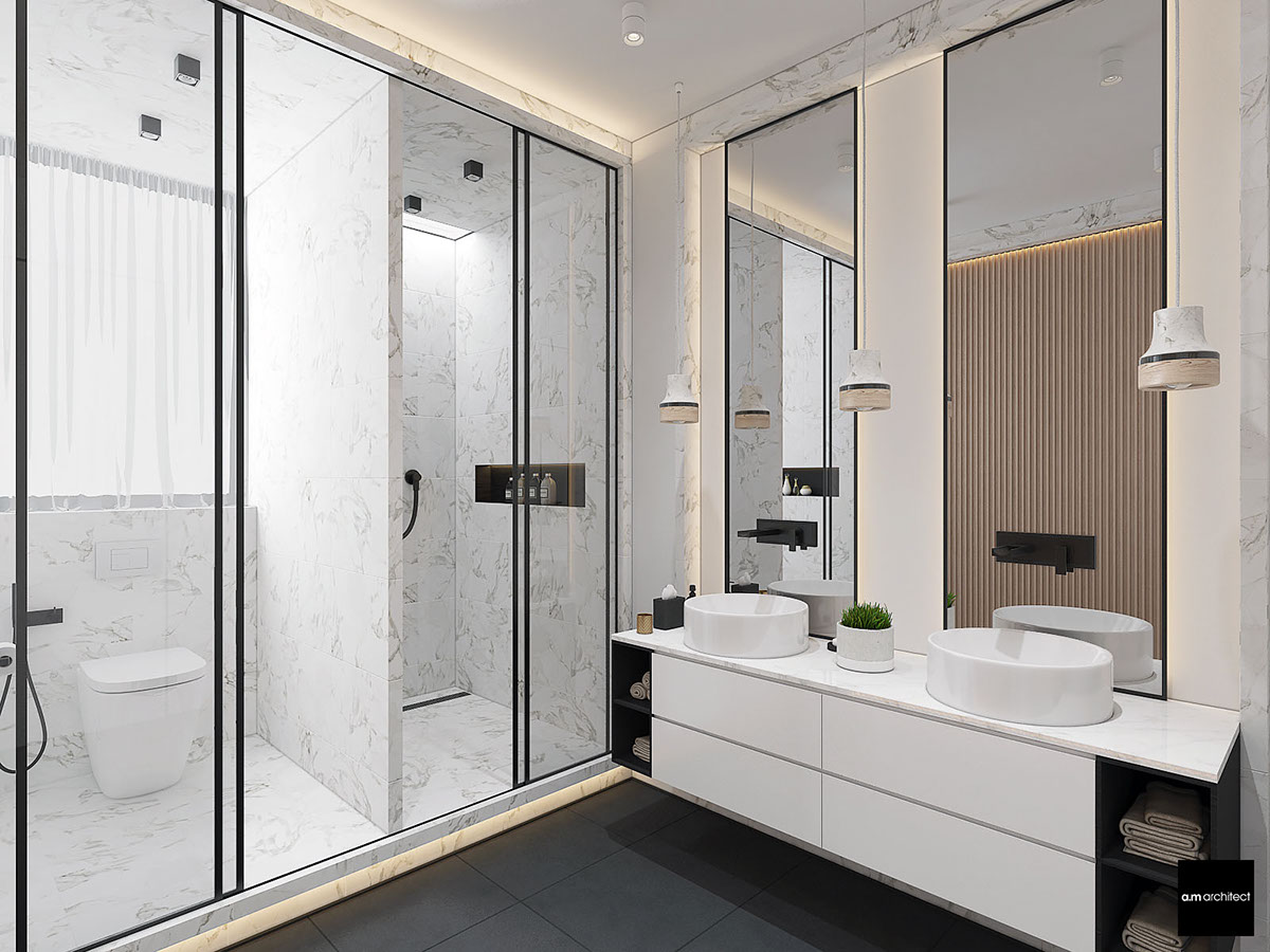
The master bathroom isn't shy about using higher end materials. Marble tiling makes the sink stand out and even makes a subtle stand at the edge of the mirrors.
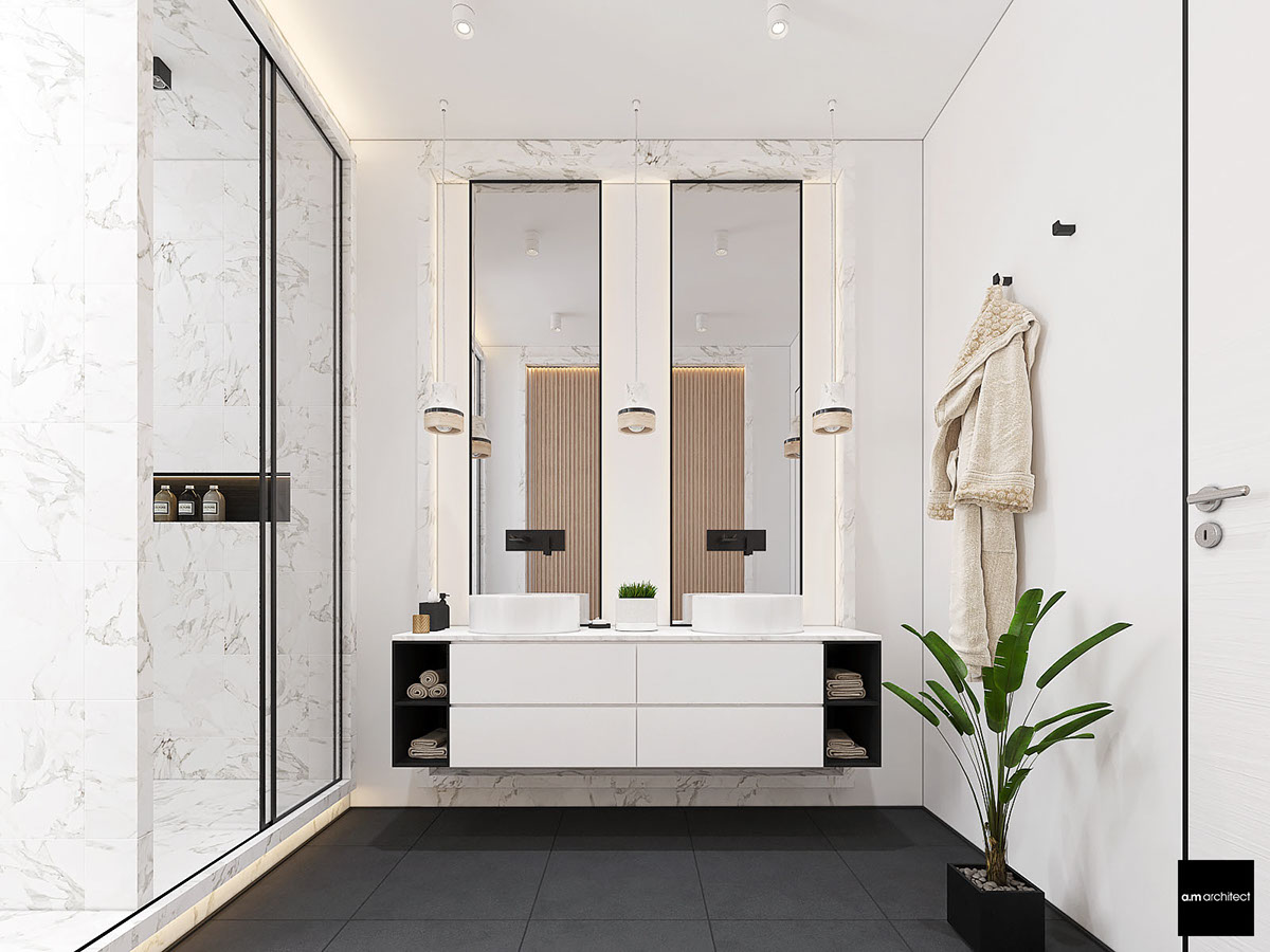
In the reflection, you'll see that the modern wood paneling makes another appearance. Like the marble, it finds balance in small details like the edge of the pendant lampshades.
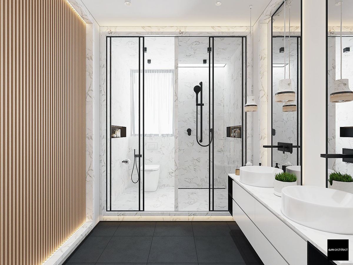
And who wouldn't love this split shower and bathroom arrangement? A full window occupies the left, with a ceiling window preserving privacy on the right.
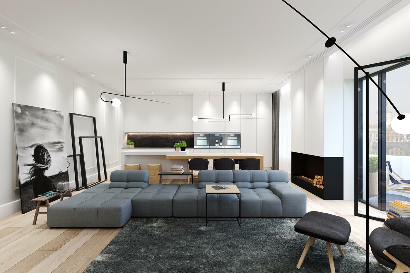
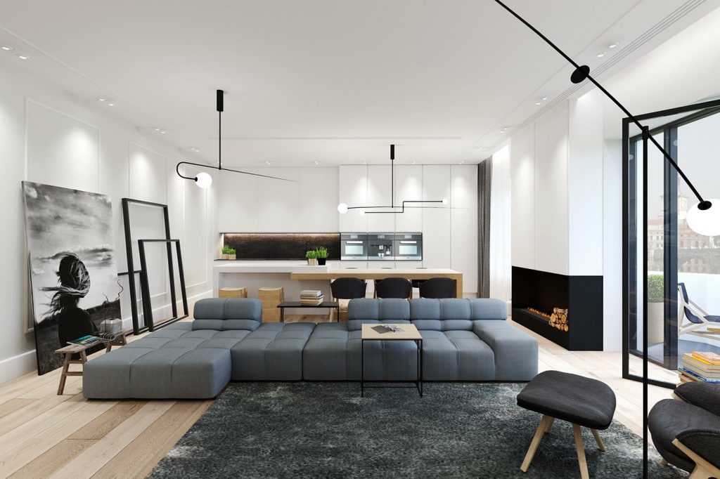
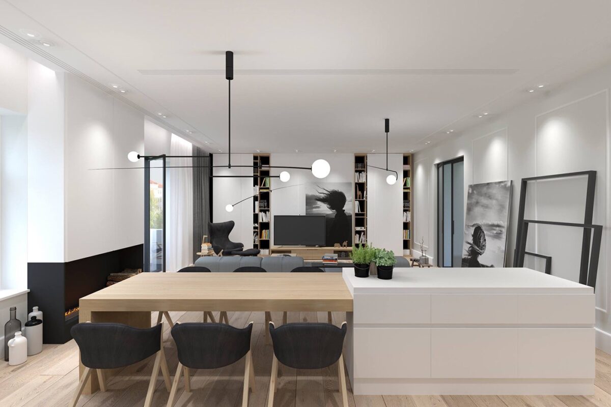
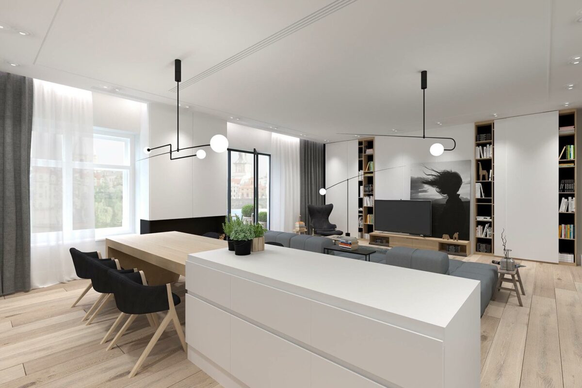
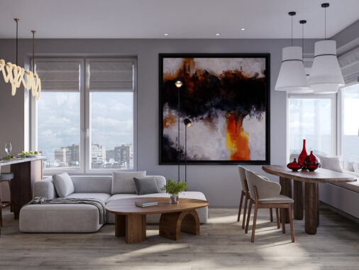
This second apartment takes a more curated approach to luxurious design. Rather than opting for high-end materials or bold architectural elements, this space makes its grand statement with sculptural furniture and accessories. While the large-scale artwork and frames contribute their own decorative appeal, the furniture itself is the star of this show.
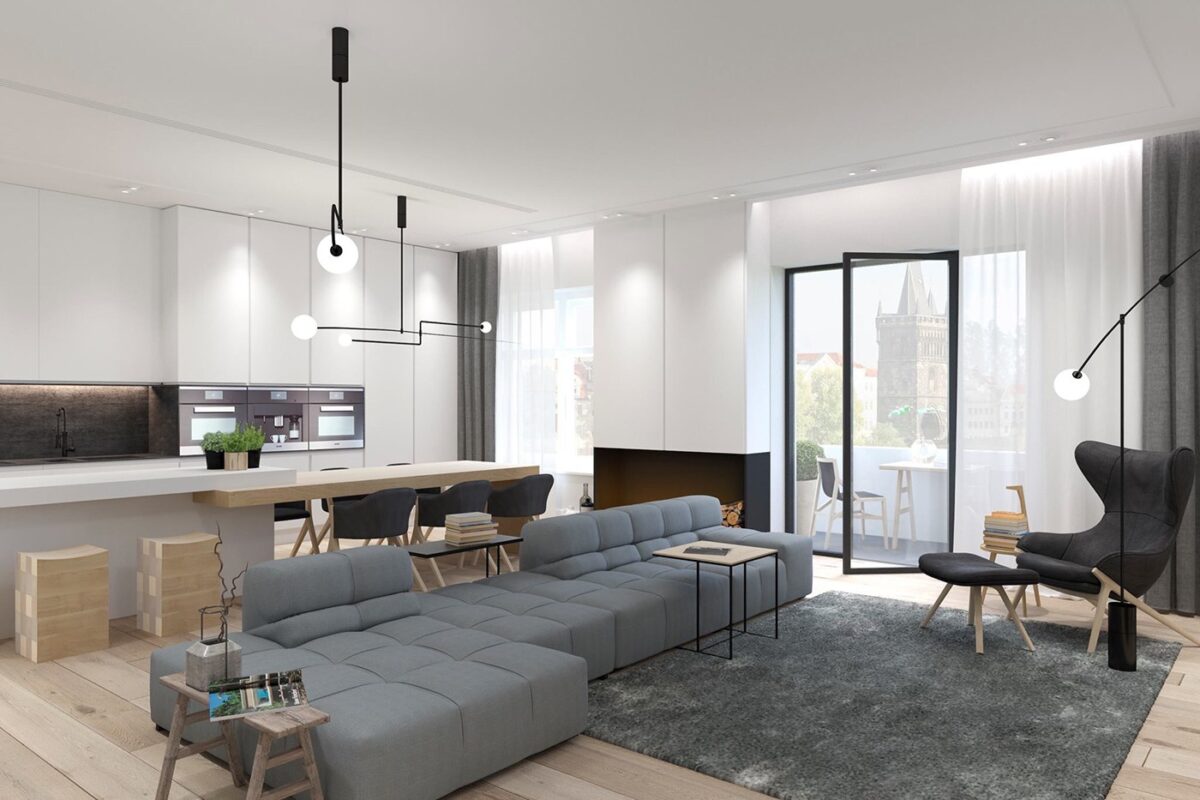
One of the most impressive investments includes the lighting choices by Michael Anastassiades, their sweeping lines generating an immediate sense of movement and energy.
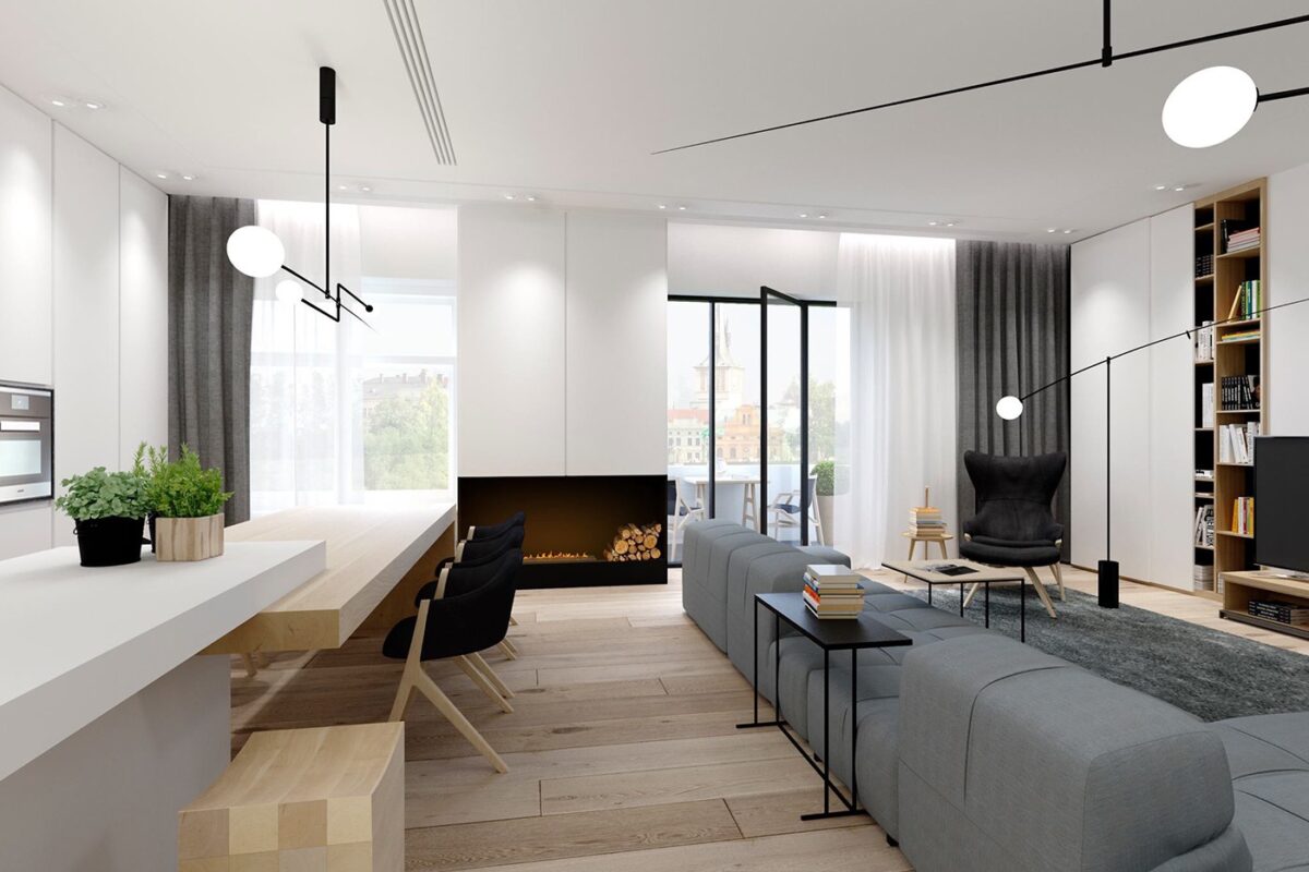
The palette remains especially subdued. Light wood floors, greyscale furniture, and pristine while walls serve as the perfect background for the stylish objects within.
