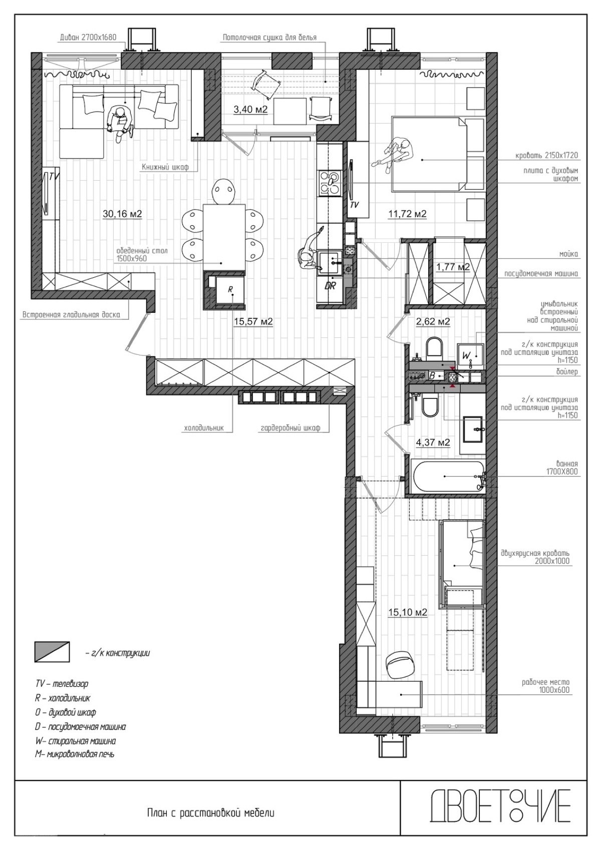
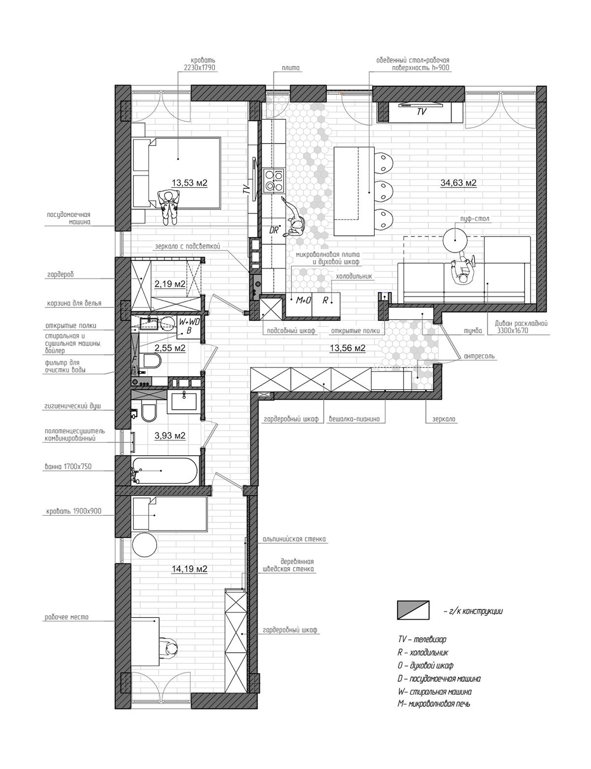
Have you ever wondered what your home would look like had you chosen a different decor theme? After all the colors are picked out and all the decorations are in place, it can be difficult to imagine it any other way (at least until you decide to do it all over again). But this interior designer used visualization software to explore this concept even further – this post tours two homes with the exact same compact floor plan but two completely different themes and arrangements. The first home is bright and casual with an eternally spring-like atmosphere, but the second home is darker and moodier with a more refined aesthetic.
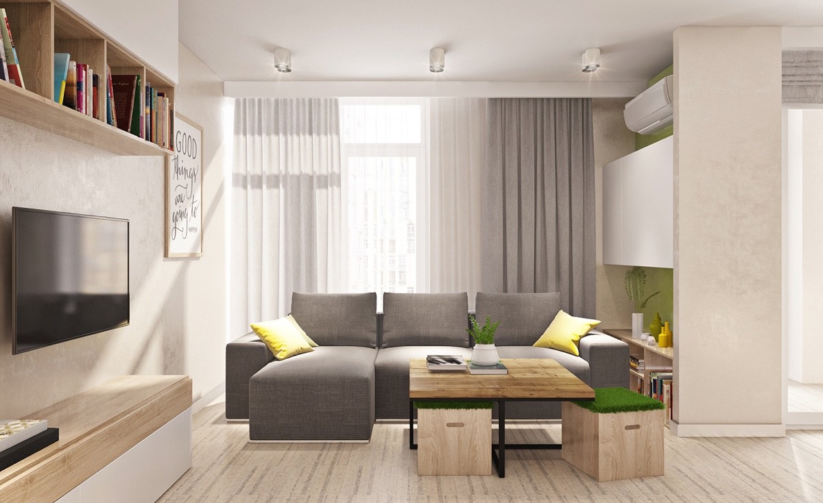
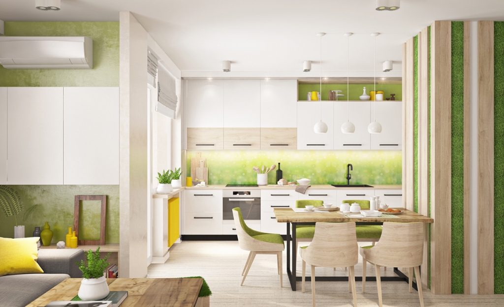
Simple natural influences make this apartment feel as bright as a fresh spring day. Pastel greens, sunny yellows, and lots of light wood bring the outdoors in – and sometimes the theme goes even further, like adding fake grass to the top of the ottomans you see snugly tucked beneath the table here in the living room.
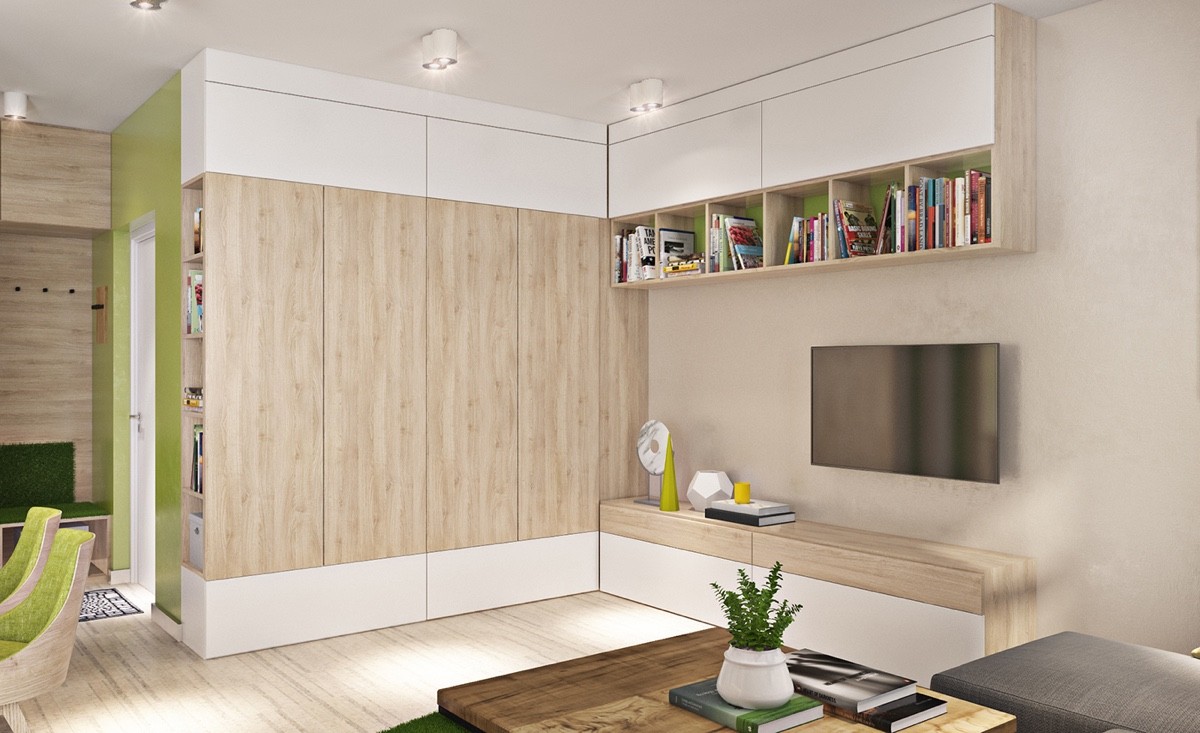
Elsewhere, the earthy and organic theme pops with modern geometric accents like these lovely sculptures. It's all a matter of balance and thematic contrast.
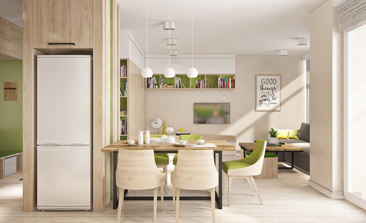
Because this apartment has an open layout, the spot-on color coordination is a huge asset to the visual continuity of the space. While color blocking is the easier and more flexible route, this carefully curated apartment is a perfectionist's dream.
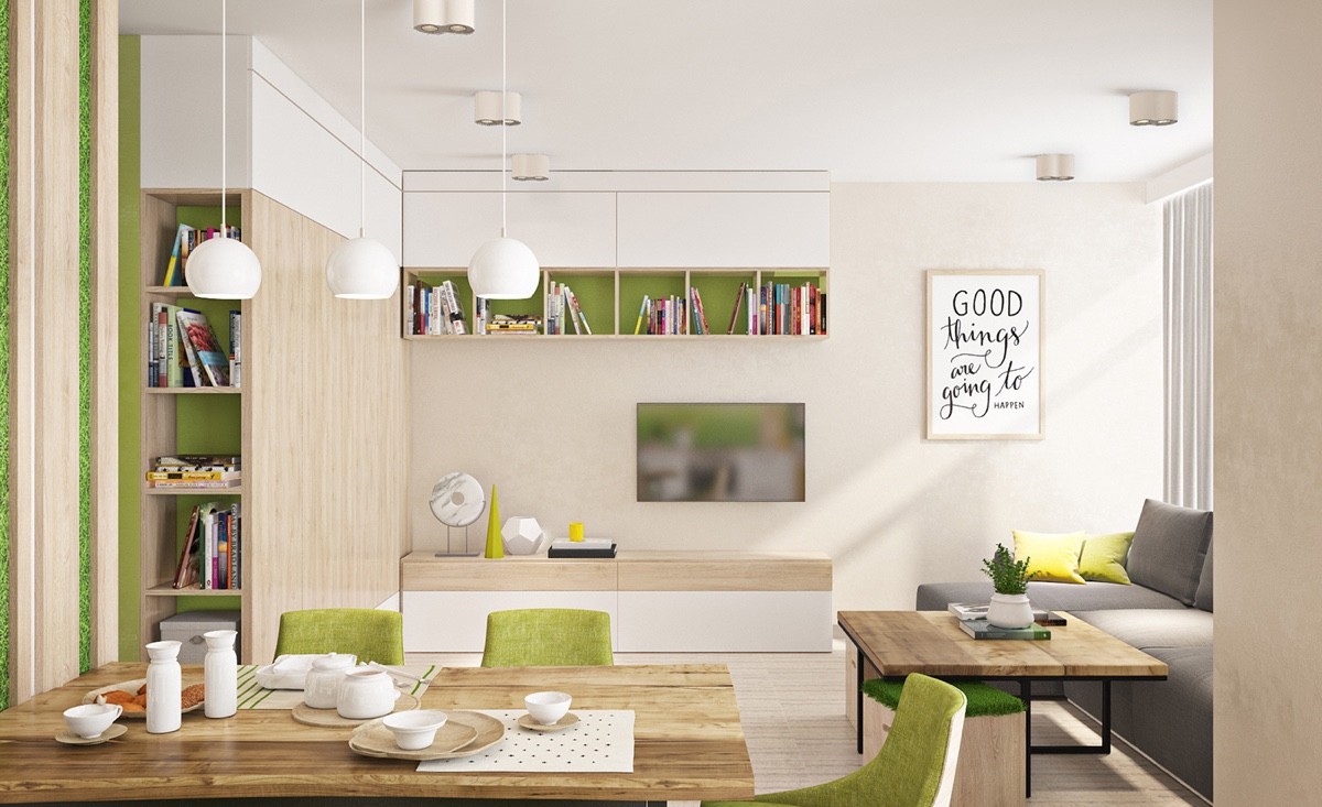
While color flourishes at every turn, it's important to note that the accents will be easy to change later. The insides of the cabinets, for example, are easy to make with DIY paper inserts.
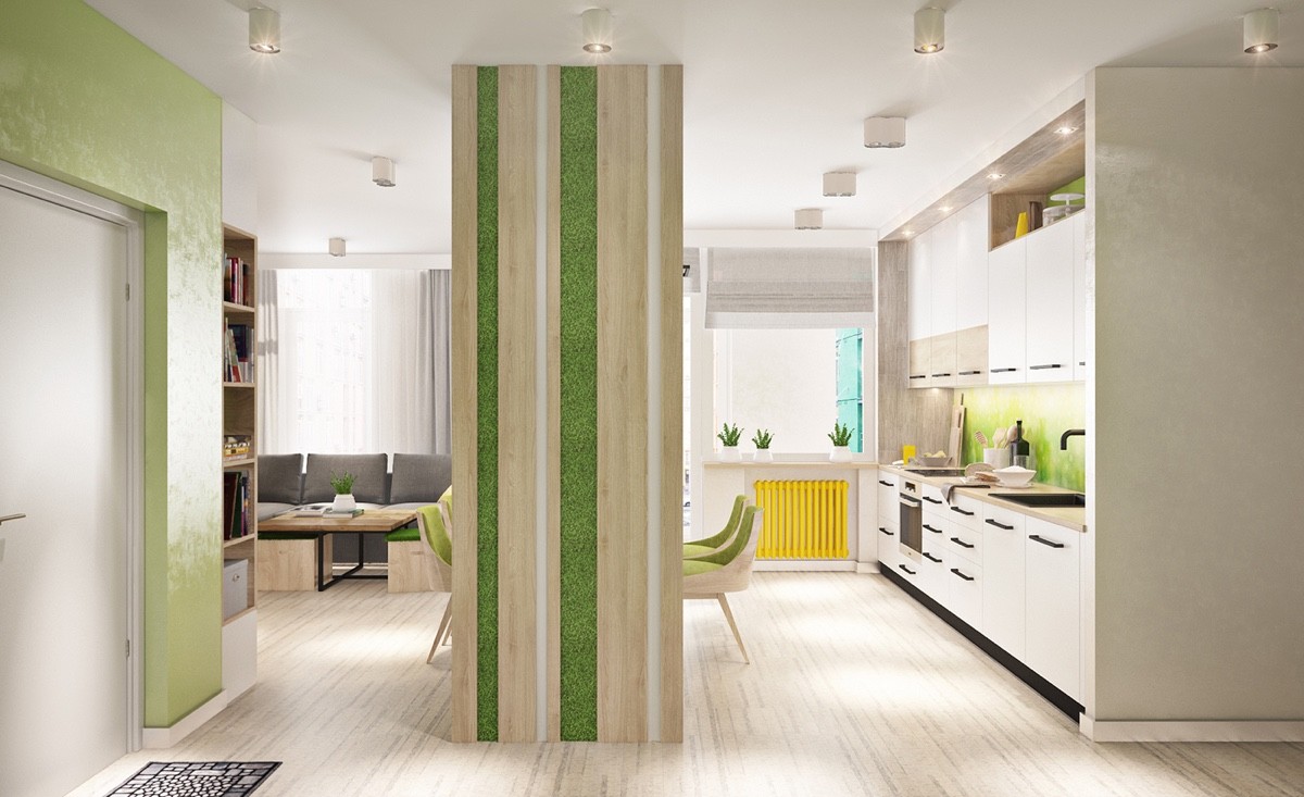
One of the bolder details is this mossy vertical garden wedged into this central wall. It's actually a housing to contain the refrigerator but becomes a stunning large form sculpture with this aesthetic addition.

The moss-covered wall also helps provide some division between the kitchen and living room. Here, the dining table finds a sensible home.
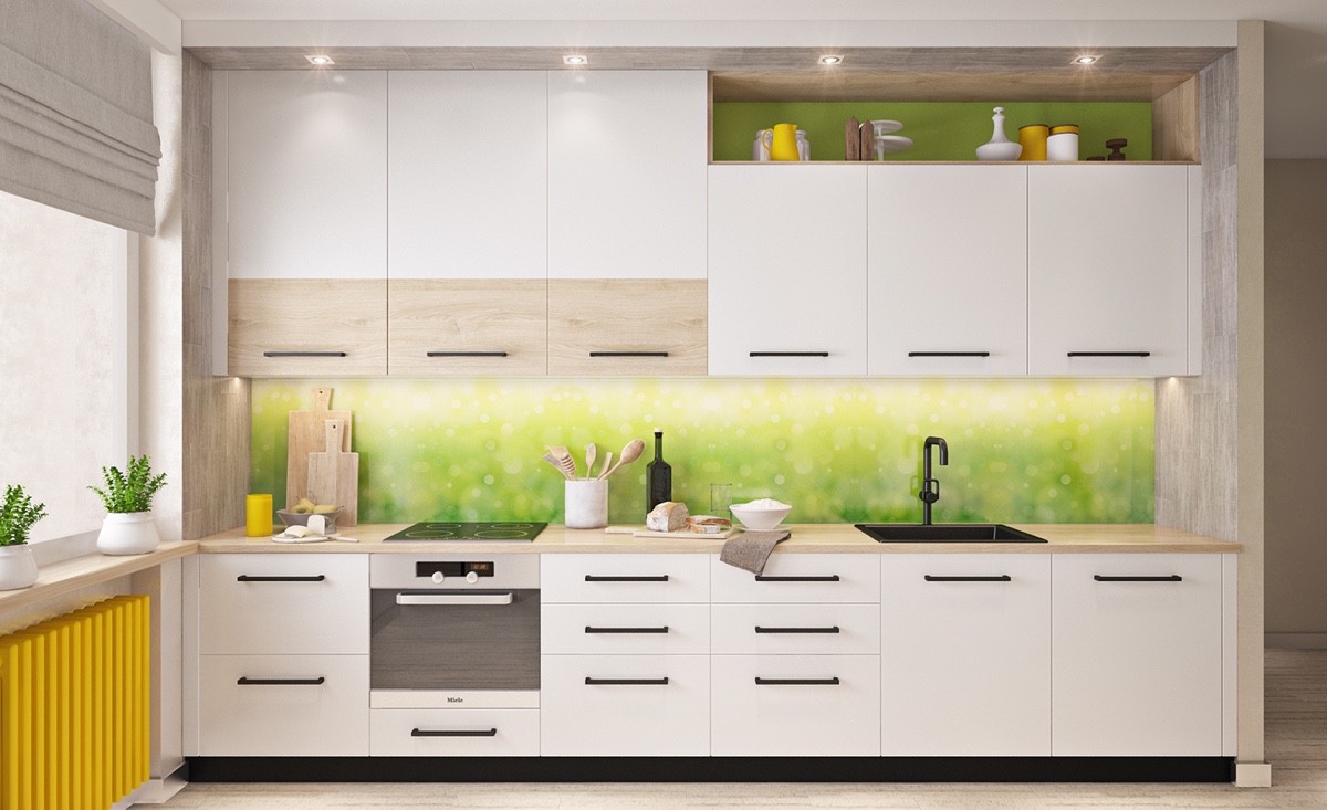
And we cannot ignore this backsplash. Its photographic quality matches the "sunny spring day" theme, transporting the viewer to the lens of a camera covered with morning dew.
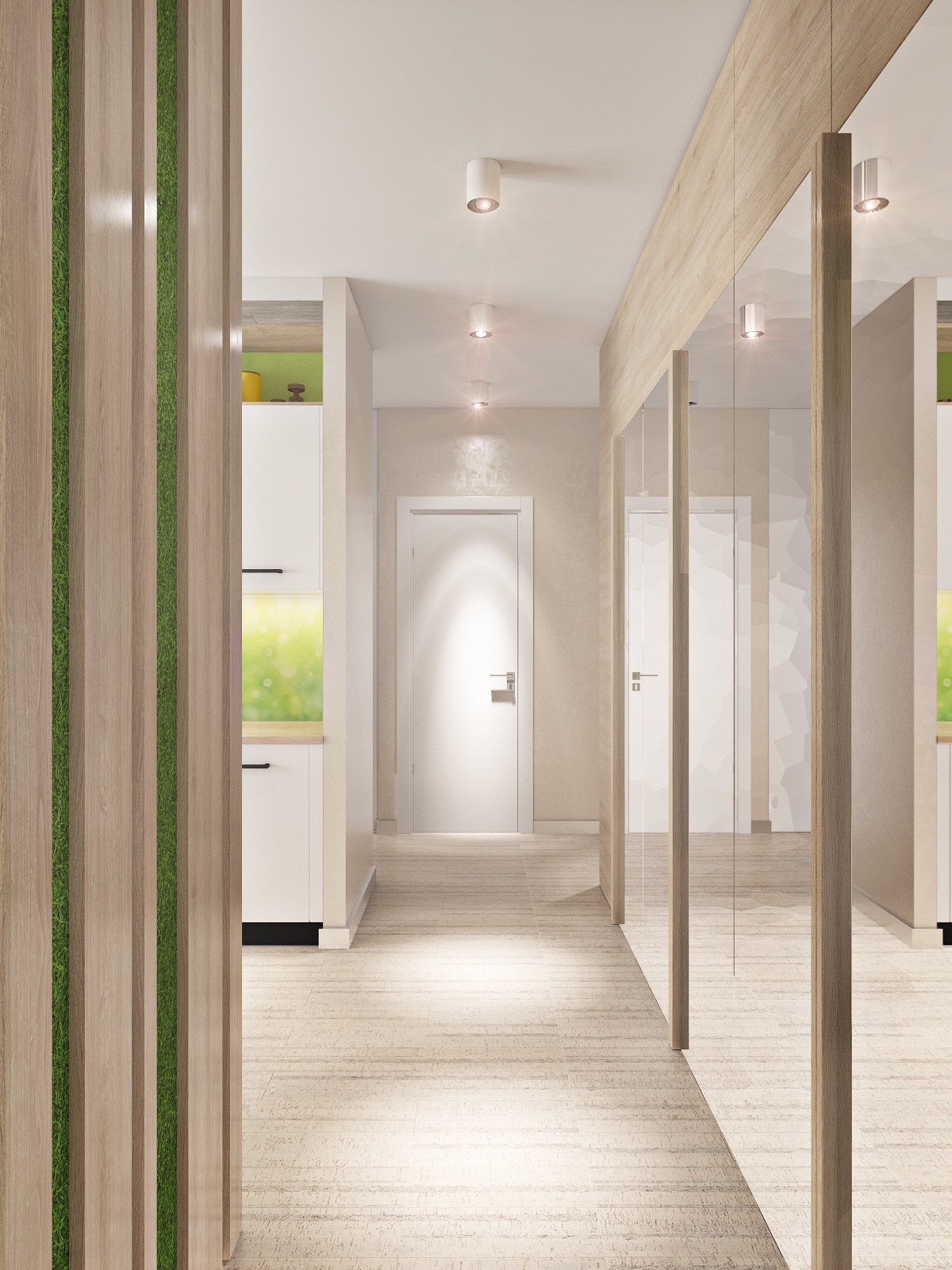
The private areas of the home are accessible by the mirror-covered hallway. Extra storage space hides behind each reflective door.
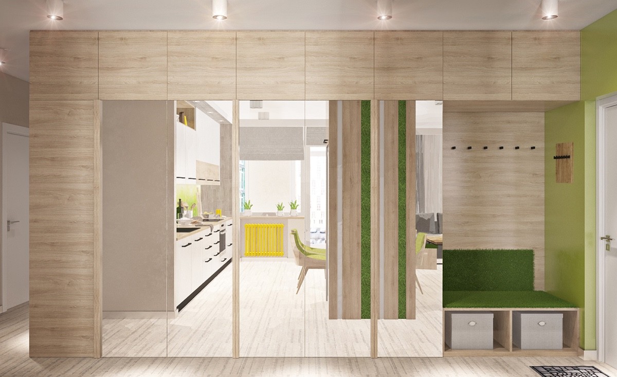
This entryway niche is just too perfect. It has plenty of space to sit, with convenient coat hooks and stylish shoe storage concealed beneath.
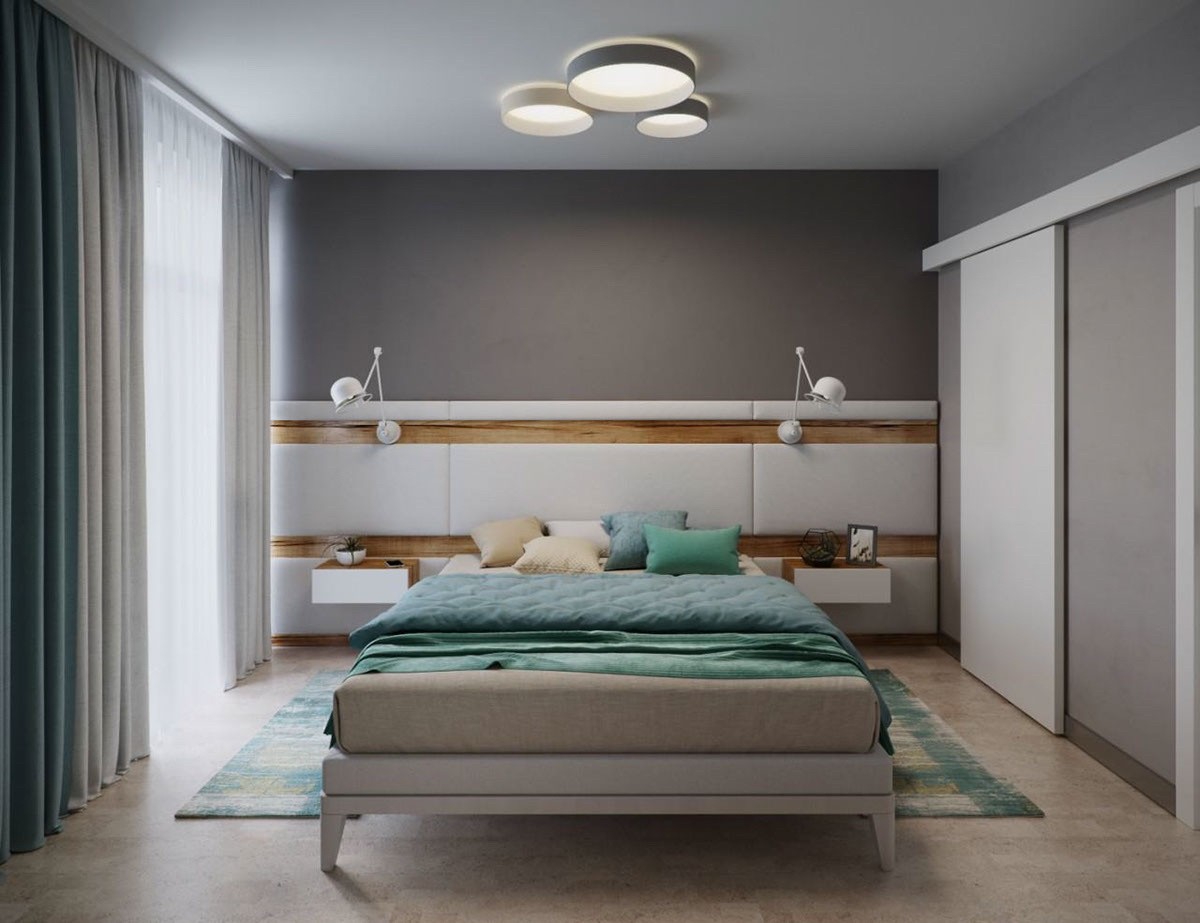
Now onto the bedrooms! This master suite tones down the theme present throughout the rest of the house, using a palette of greys and teals to create a relaxing environment for the parents after a long day of work.
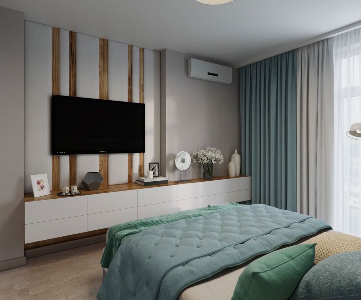
Rather than the sunny springtime theme of the main living space, this bedroom adopts a more rainy day vibe. It's easy to imagine picking these colors from a photograph of a foggy morning on the lake.
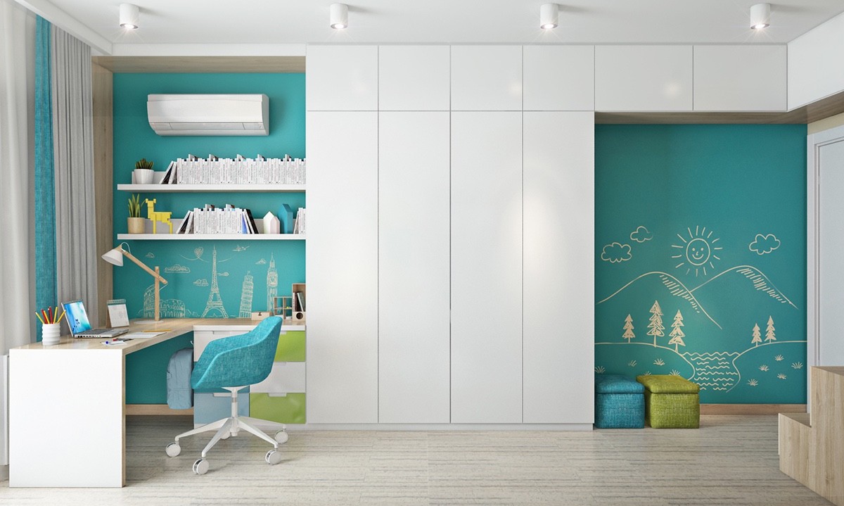
The bedroom for the children brings back the bright colors in a big way. Bold blue accents – that double as chalkboards – are just bursting with energy.
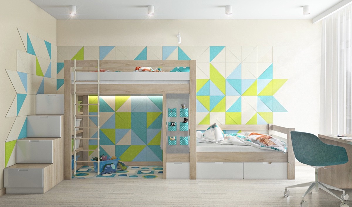
The other side of the room has so many admirable features. The modular wall panels are modern design goals, and the smart storage in the staircase and beneath the bed are just too perfect. We love how the lofted bed makes space for a small playroom.
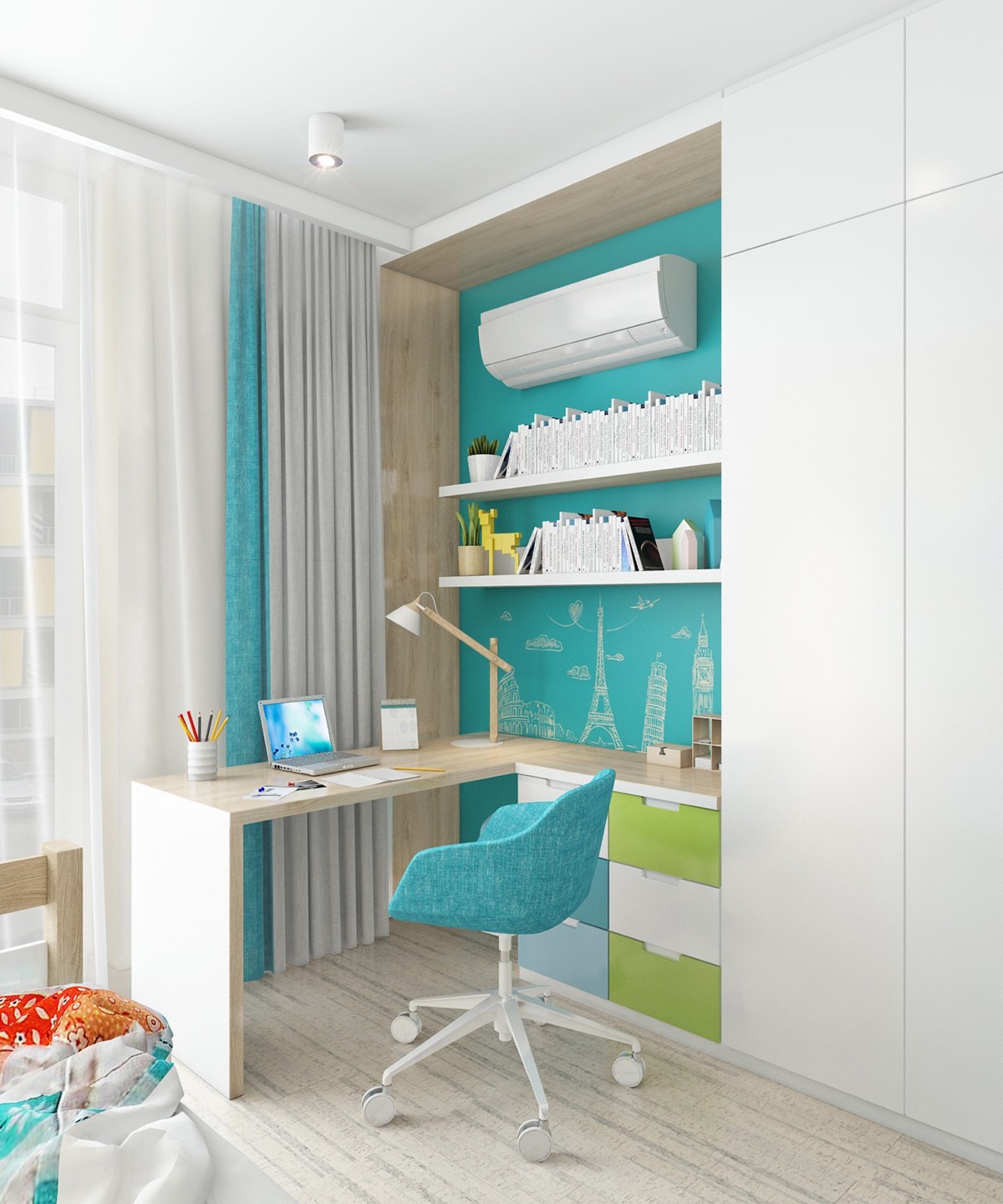
And the desk is super-functional too. Open shelves, lots of drawers, and the fun office supply organizers help the kids stay neat and tidy while working on assignments for school.
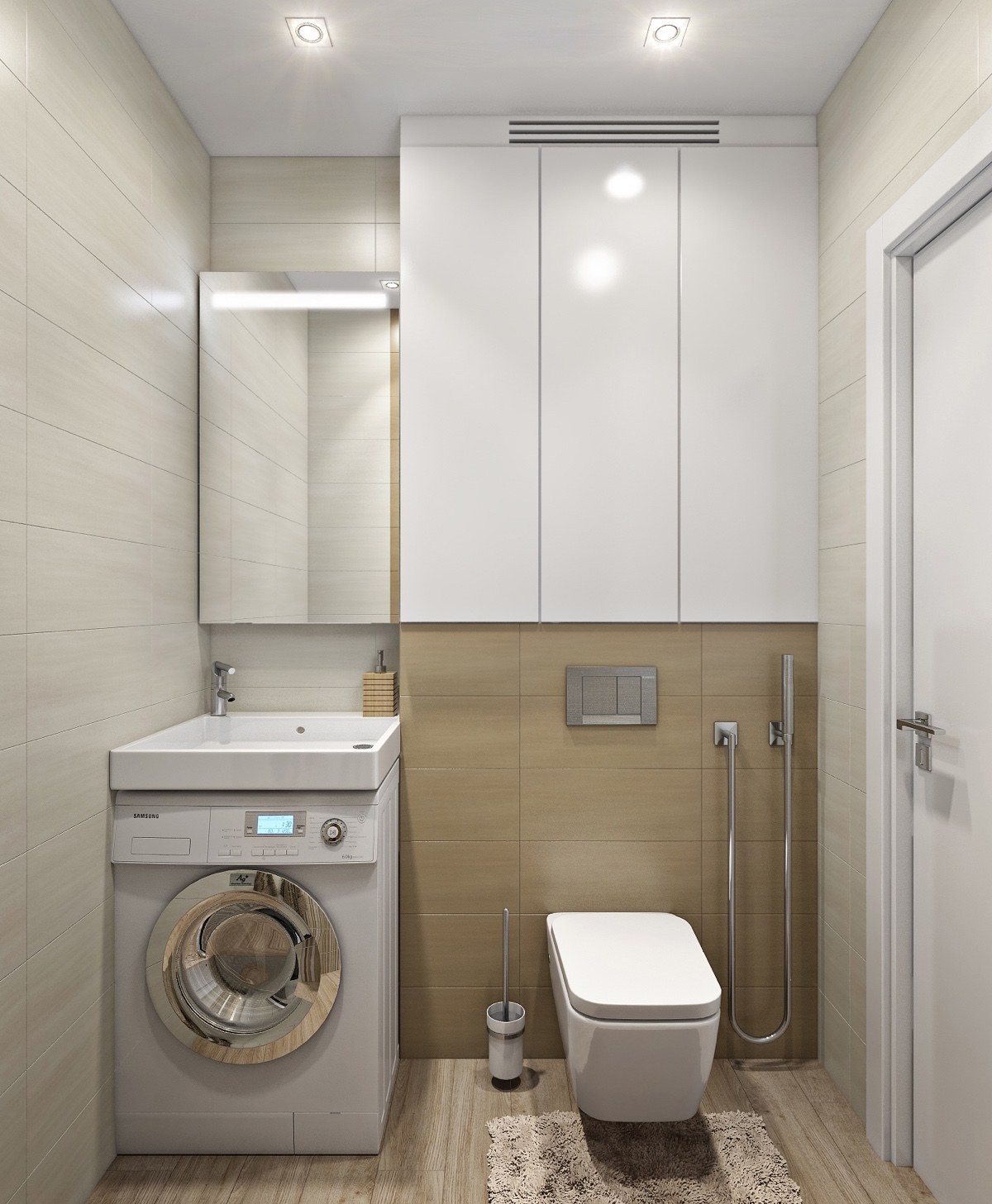
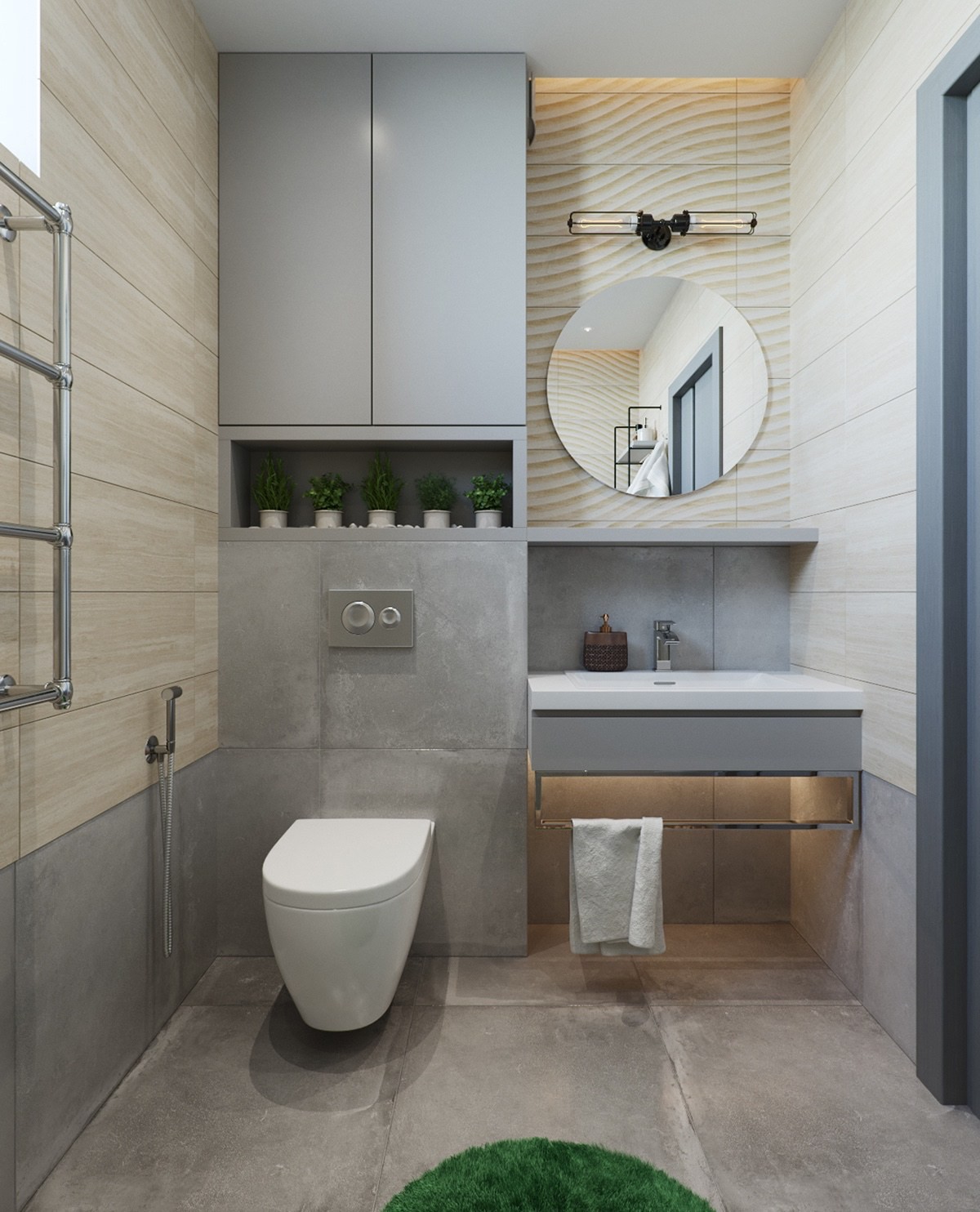
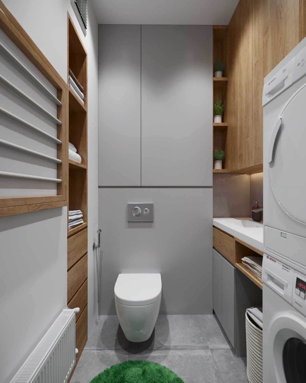
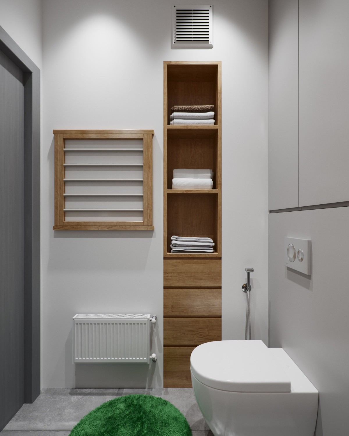
Wow – the efficiency of this bathroom is breathtaking, but the way it continues the natural theme from the rest of the home is impressive as well.
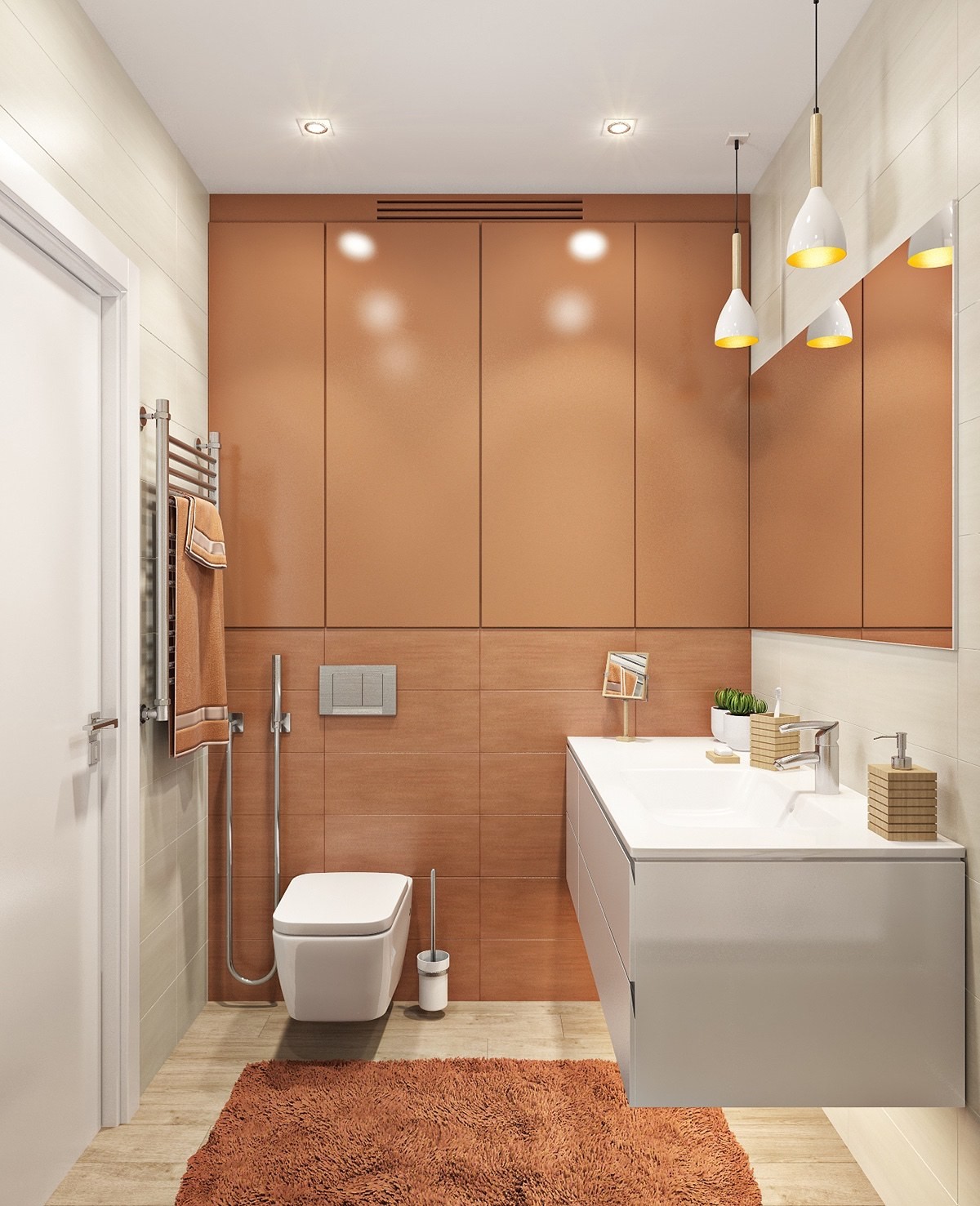
And the other bathroom also adopts a nature-inspired palette, this time with a red clay tone. It's warm and comforting and includes just a touch of wood to bring it back in line with the overall home aesthetic.
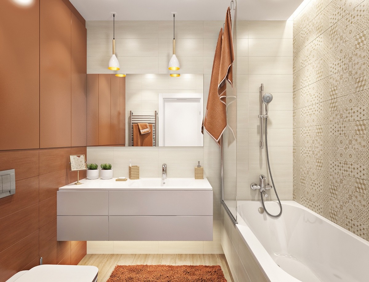
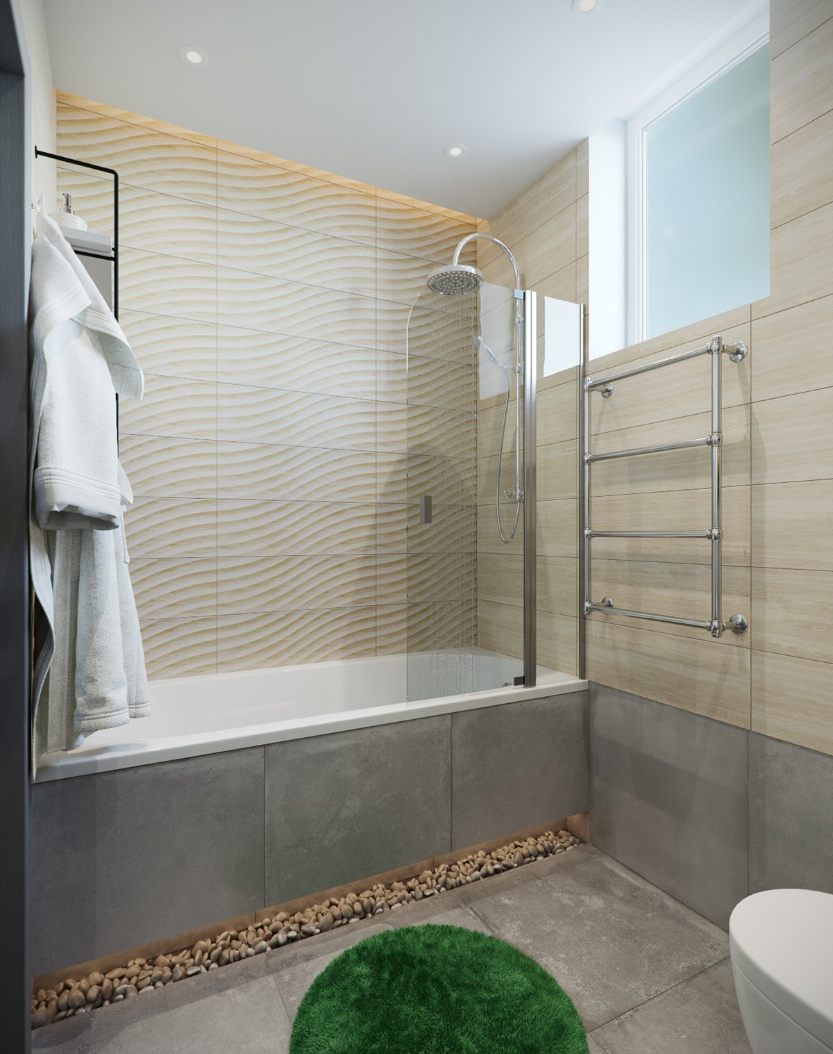
All of the sources of hidden lighting banish shadows and make the room feel larger. The strip of inset lighting above the bathtub almost looks like sunlight!
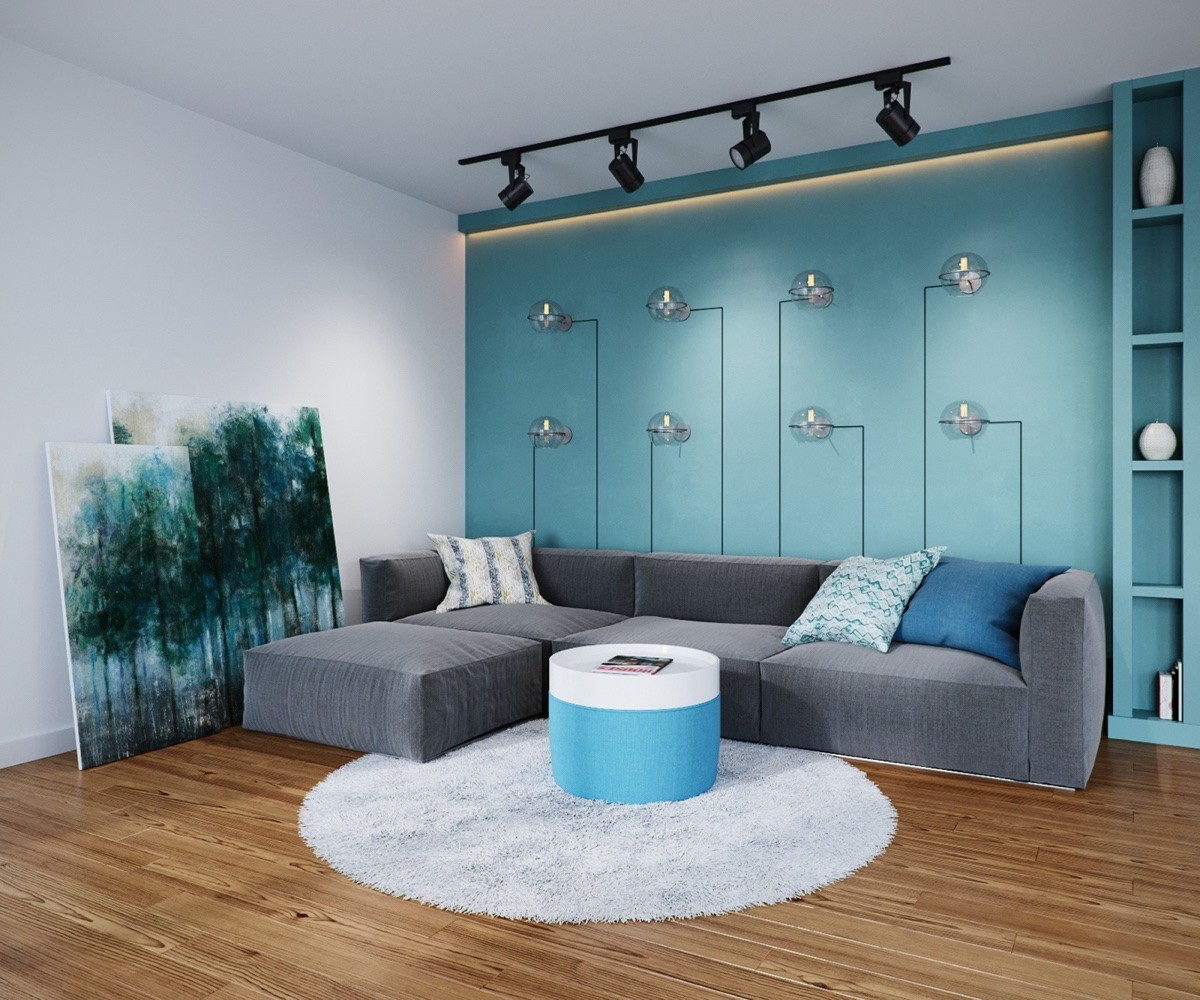
The second home starts with a much more subdued color theme, this time in all in the blue spectrum, almost like a lake or a foggy evening. It combines linear and rounded forms, playing with geometric contrast at every turn. Like the previous home, this one revolves around an F-shaped floor plan but uses an entirely different arrangement.
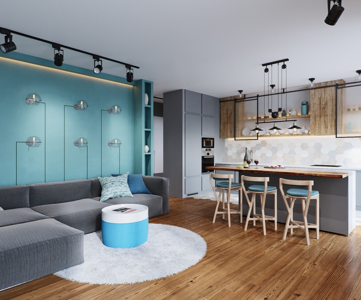
The open living room and dining room are more connected in this home visualization than the last. Rather than a dining table, this space makes use of a handsome breakfast bar attached to a longer kitchen island.
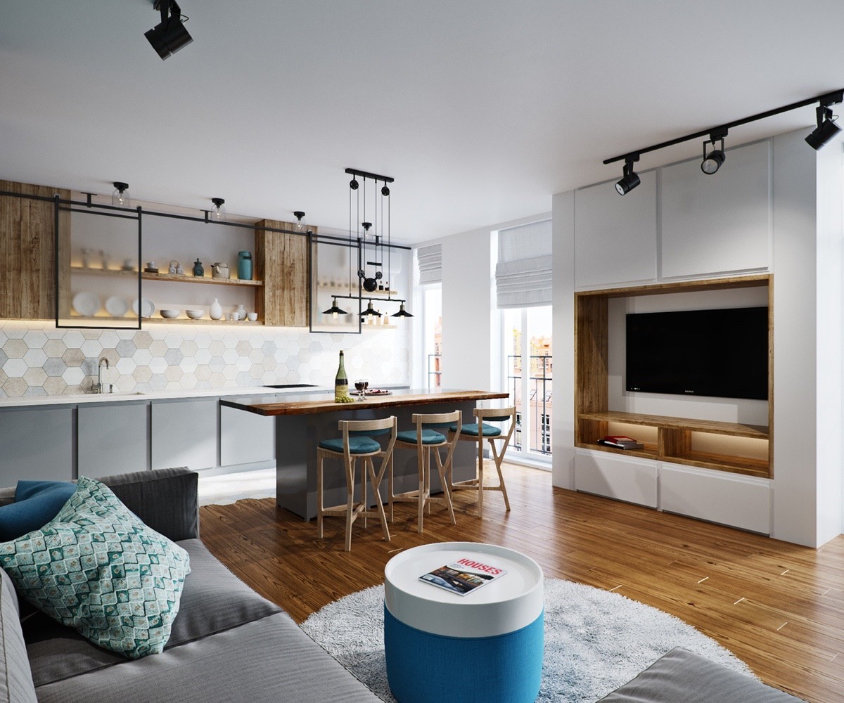
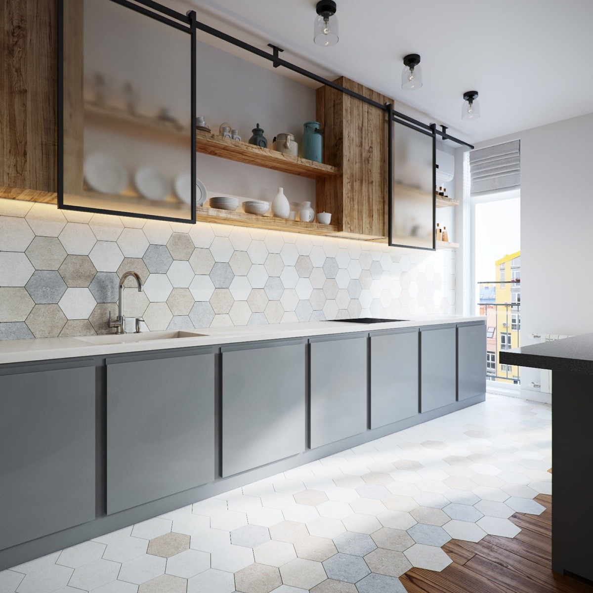
Geometric tiles and open cabinets make the kitchen feel connected to the rest of the interior. Patterned pillows and a cylindrical table bring the geometric theme to the living room.
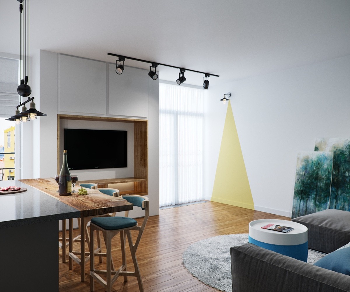
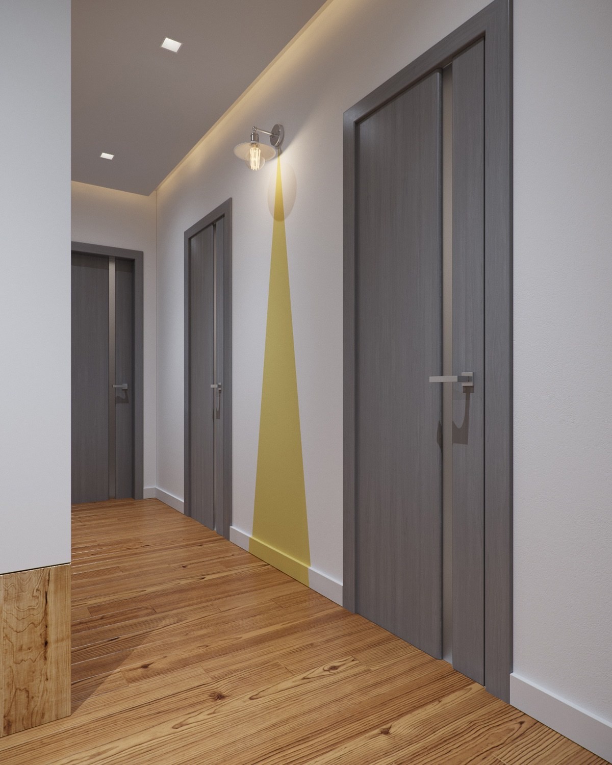
The wall sconces are so cute! Triangles of yellow paint bring them in line with the rest of the open layout theme.
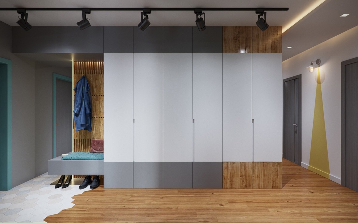
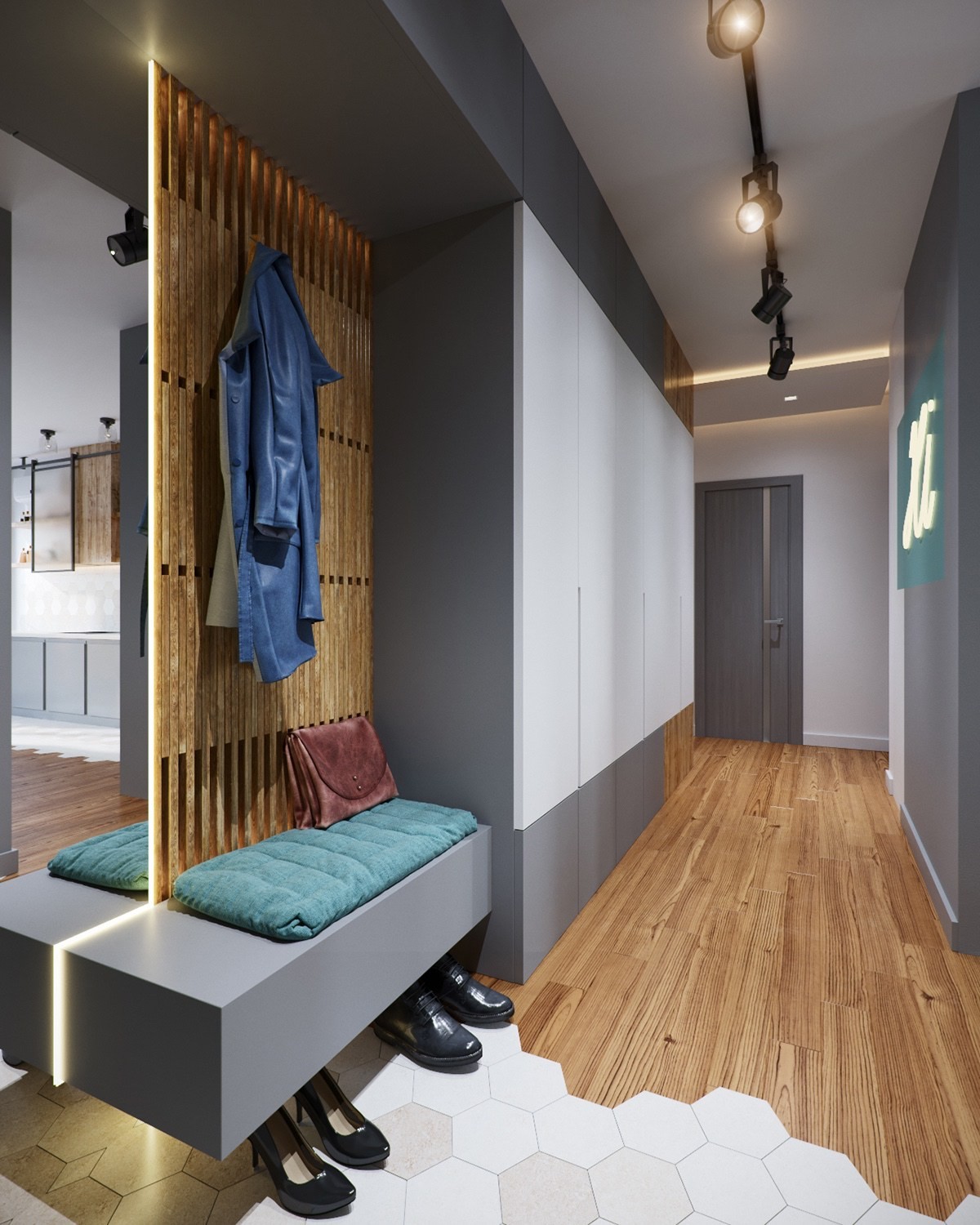
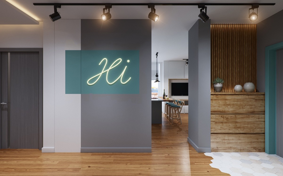
Just look at that incredible transition between wood floors and hexagonal tiles! Expert woodworking isn't cheap or easy, but the result is unforgettable.
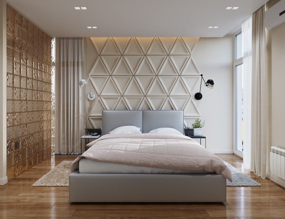
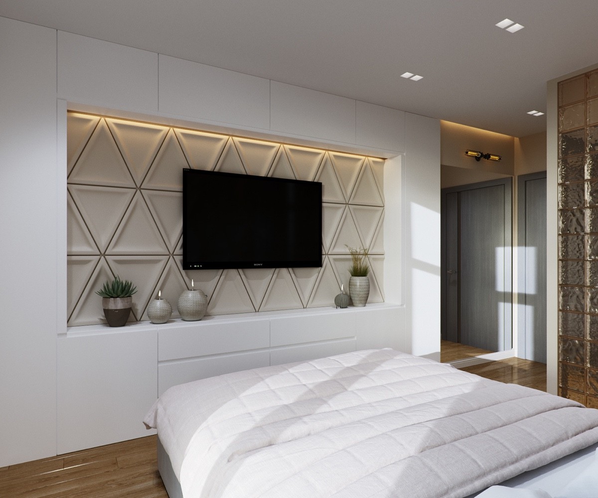
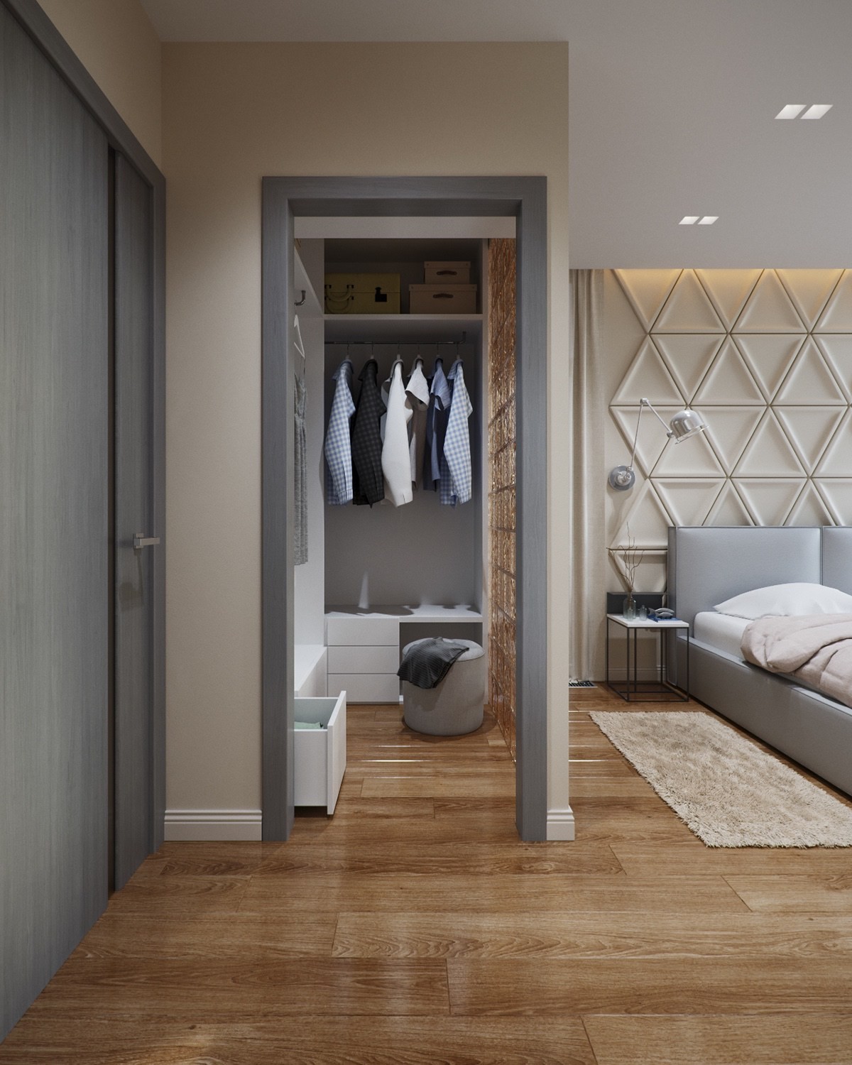
The master bedroom includes gorgeous triangular wall panels, sure to play with the pendant lights after dark.
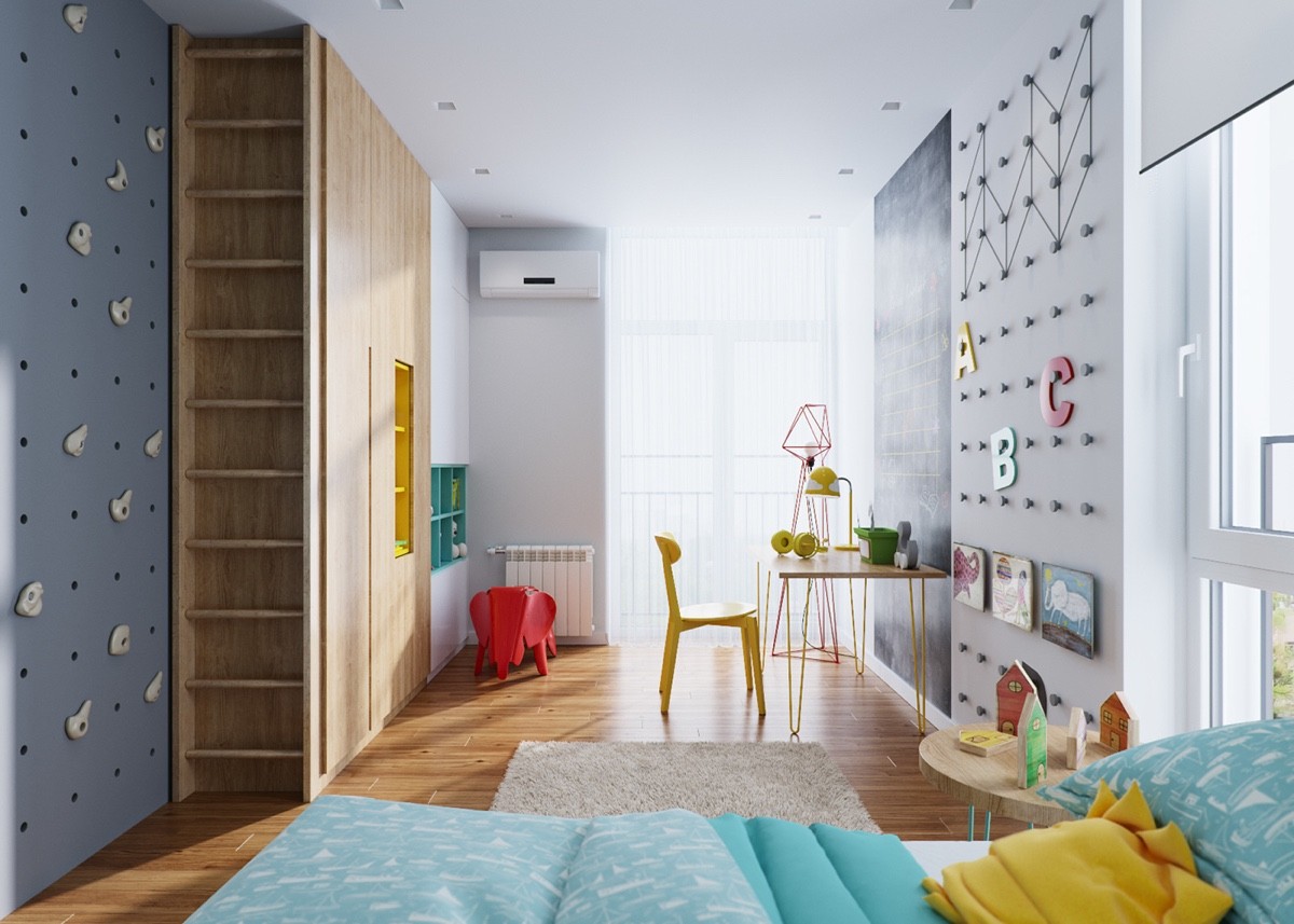
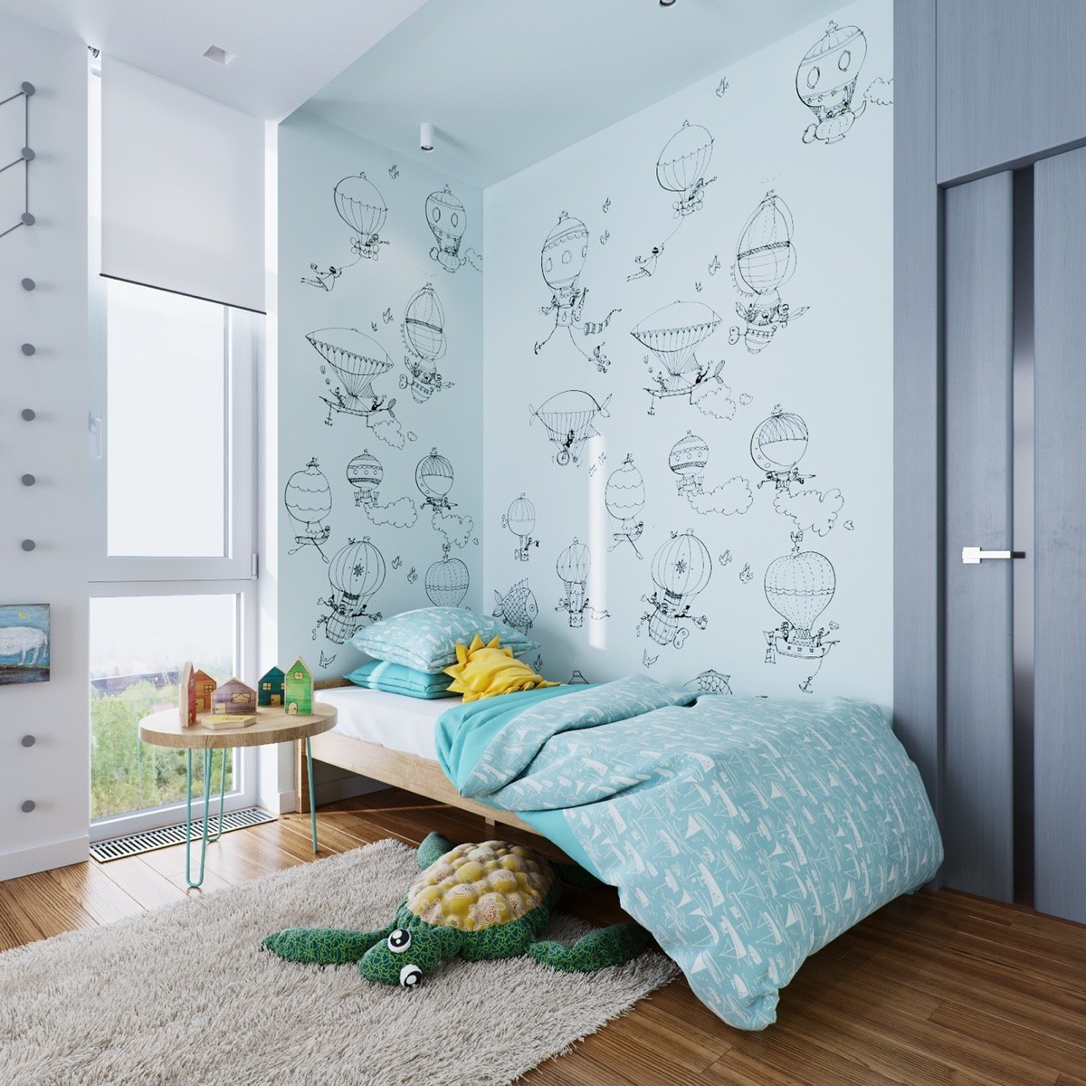
And here's the kid's bedroom, complete with two pegboard walls: one for climbing and one for hanging artwork.
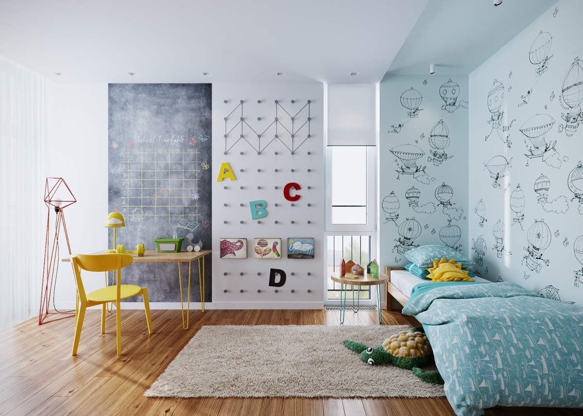
Adorable hot-air balloons and infinitely creative pegboards ensure this bedroom caters to the imagination before anything else.
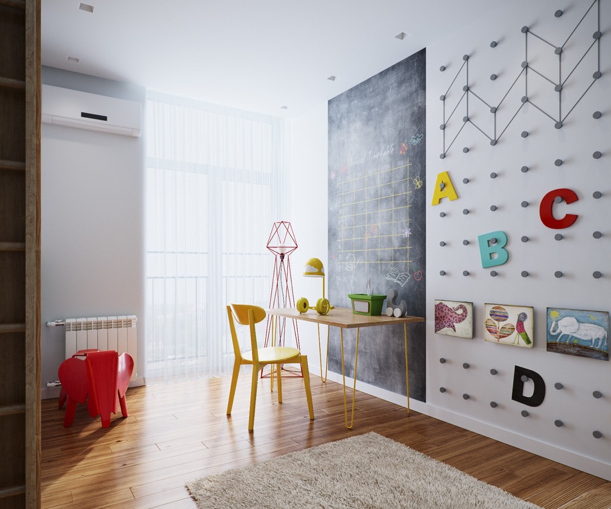
The pegboard wall and tall chalkboard leave so much room for imaginative play. The child can practice their ABCs or arrange artwork on the pegs, while keeping track of homework right beyond the desk.
