Sometimes it's hard to find inspiration for simple interior design. When you're working with a limited color palette or a spare furniture theme, every element makes a huge impression – one little detail can make or break the design. This post explores three modern homes with neutral colors and streamlined decor, each one taking a different approach. The first interior is smooth and sophisticated with subtle industrial themes, the second makes a bold impact with high-contrast tones, and the third home feels softer and more decorative. Each one is worth admiring!
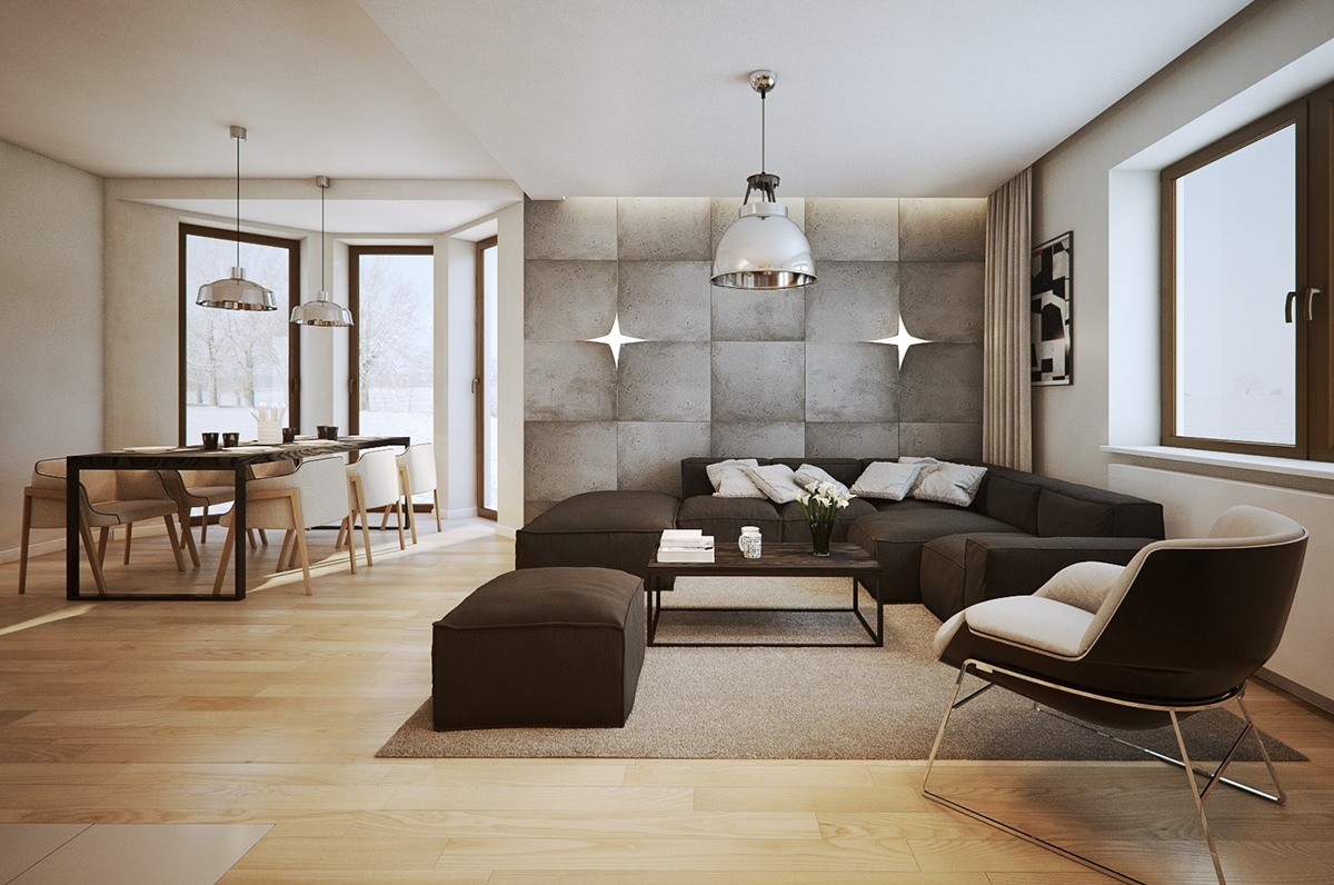
This streamlined interior belongs to a modern one-bedroom home in Tenczynek, Poland, just outside Krakow. While the decor themes remain simple throughout, unique architectural features definitely catch the eye around every turn.
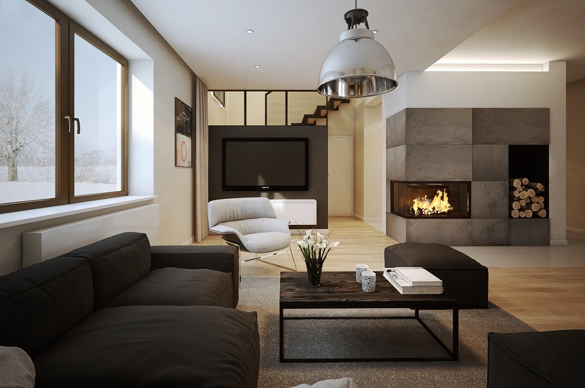
The furniture layout focuses on gathering with friends and family. Notice how the television is present but isn't the anchor of the living room – in fact, it's set entirely away from the seating arrangement.
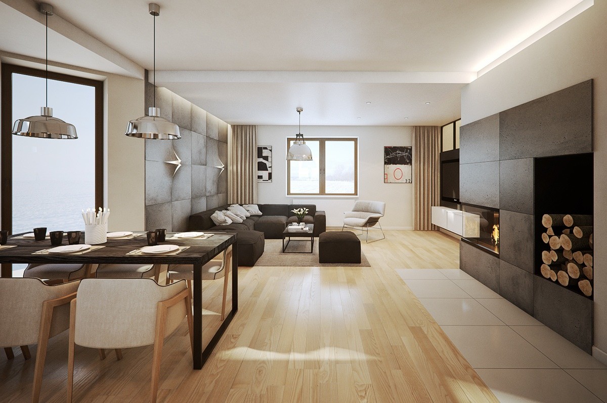
Industrial elements bring urban character into the otherwise wood dominated decor motif. Metal lighting, textural concrete paneling, and linear furniture prevent the room from looking too rustic or cottage-like.
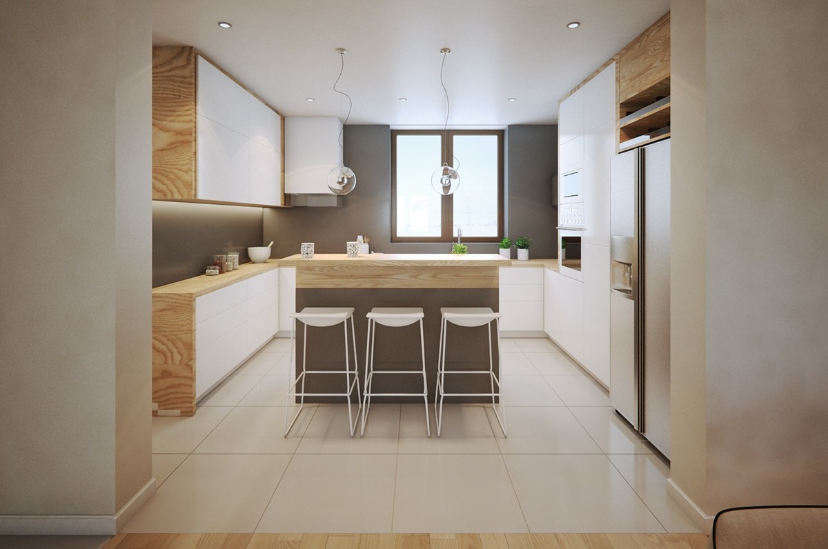
Design themes remain unified throughout the home. Here's a peek at the kitchen, recessed into its own private cove. Wood floors transition to glossy white tile, the entire room warmed by richly grained lumber in strategic places. Patricia Urquiola’s popular Last Minute kitchen stools add to the simplistic beauty of this space.
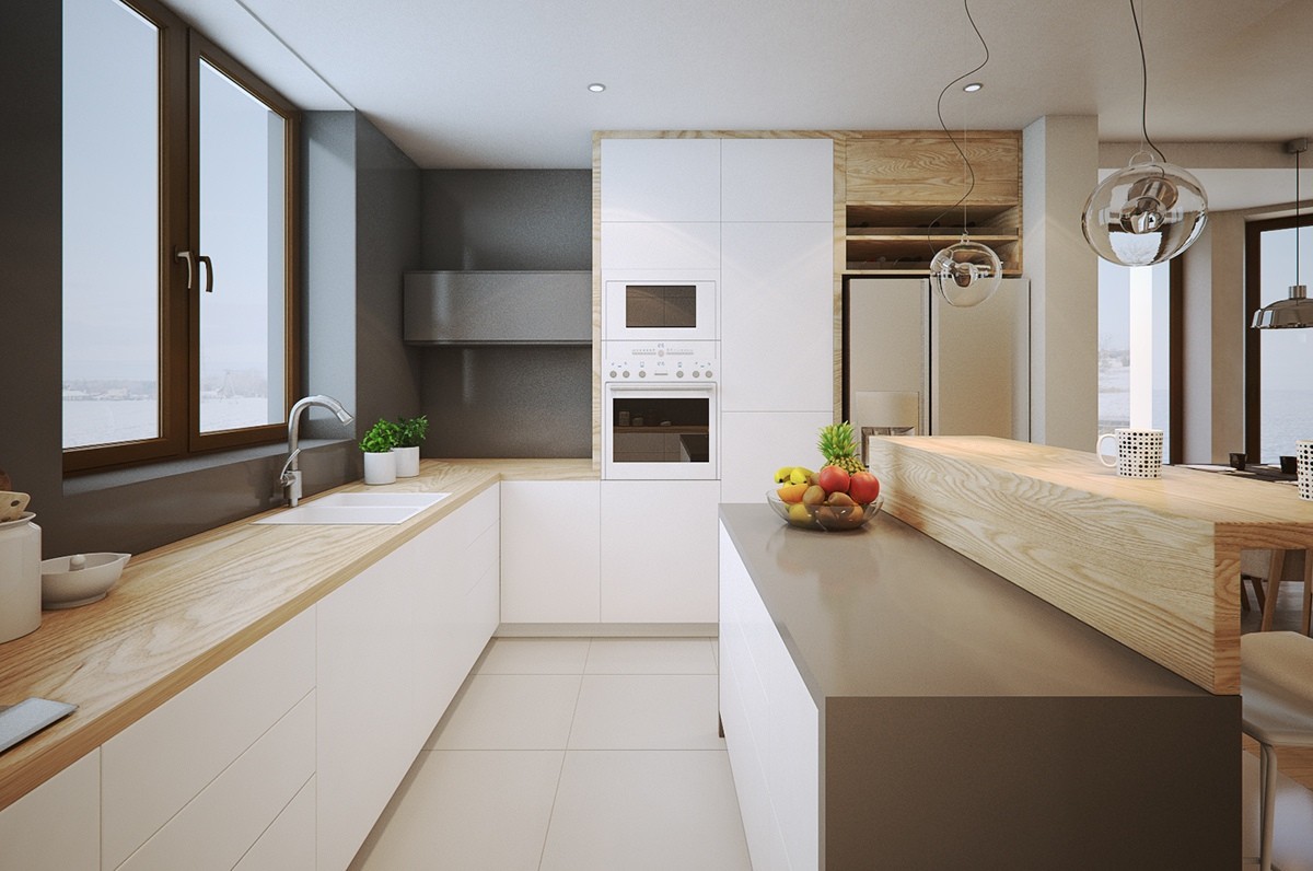
This breakfast bar is especially interesting. One side extends the kitchen workspace with its glossy surface, a great place to work with ingredients that might stain the wood countertops.
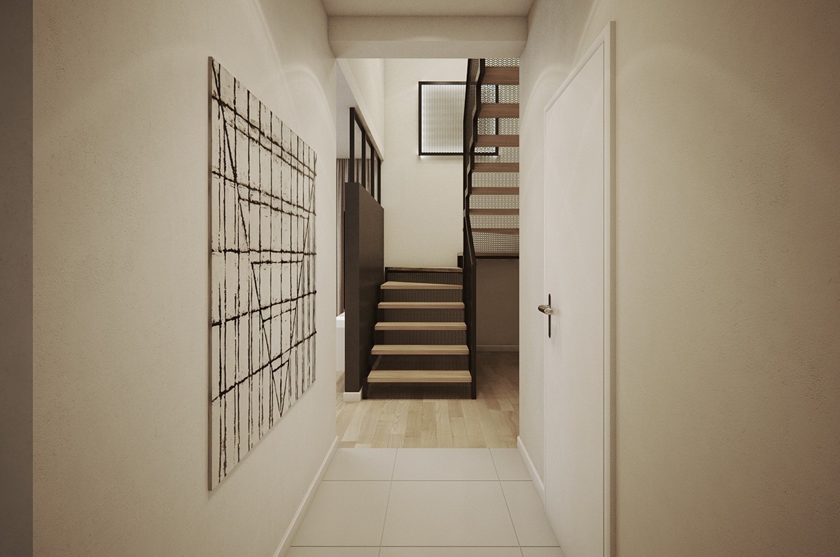
Public spaces occupy the ground floor. The bedroom and office takes the high ground. Without access to windows, the wire mesh risers play an important role by allowing light to penetrate into the stairwell.
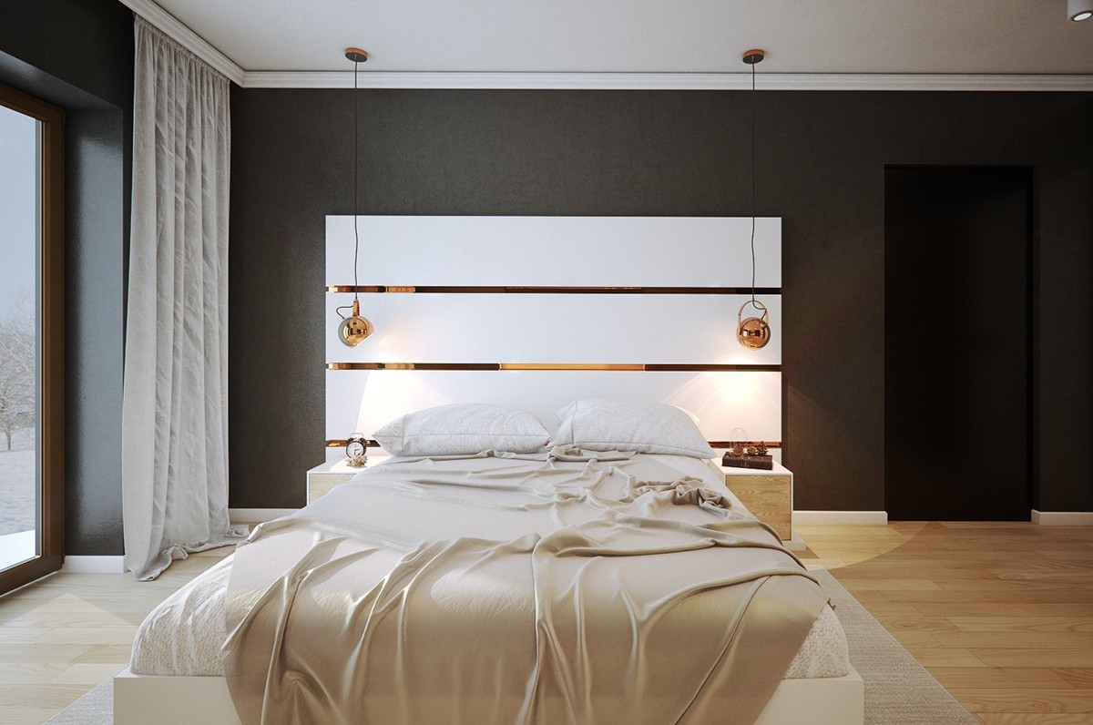
What a gorgeous bedroom! White furniture stands out against the eggshell-textured black background, simple yet attractive. Copper accents maximize the sense of luxury and capture the light wherever they can.
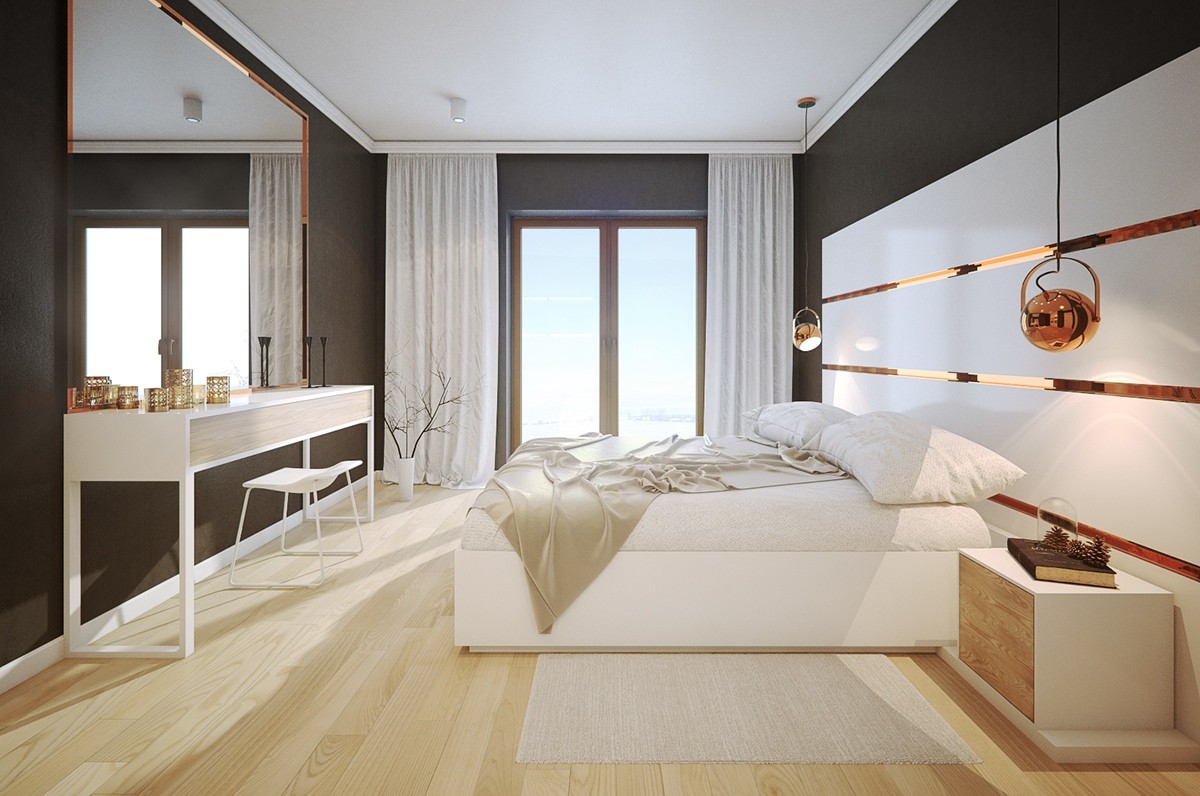
A large mirror also extends the effect of the room's single window. The sideboard table makes a wonderful vanity complete with a simple sled leg stool. Additional copper decorations continue the sophisticated theme.
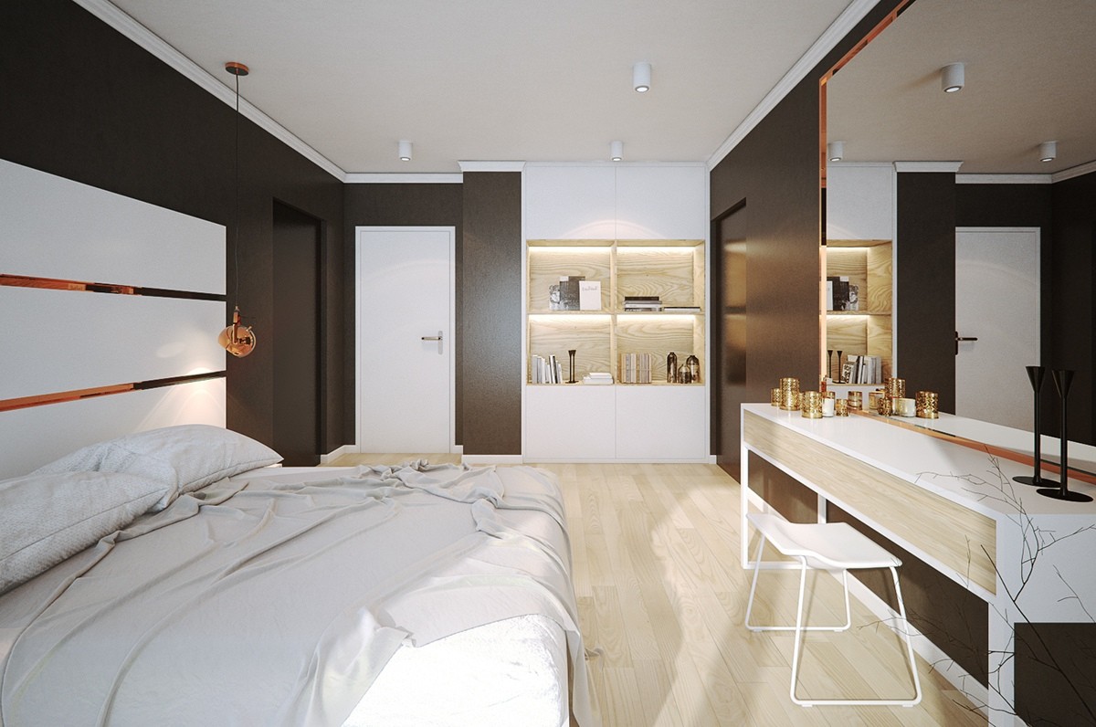
The other side of the room features distinctive cabinets, the upper and lower portions enclosed with the middle units serving as oversized open shelves. Clever backlighting draws the eye toward the decorations within.
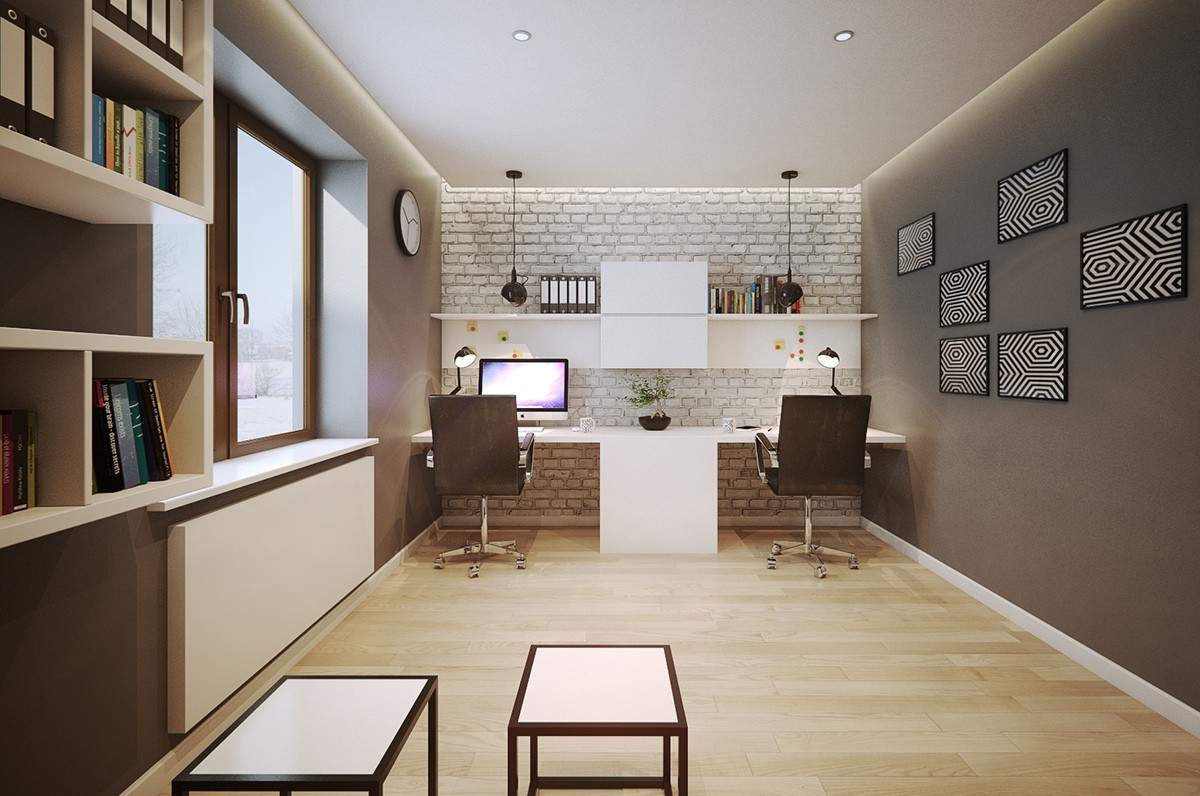
Simple yet handsome, the office has plenty of room to accommodate both computer-based work and pen and paper tasks. An exposed brick wall sets a homey tone and geometric prints bring the decor up-to-date.
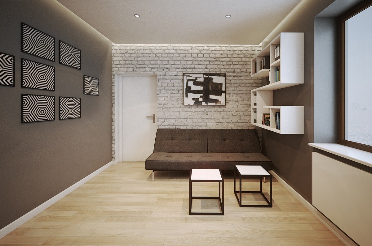
Another distressed brick wall caps off the other side of the room. The comfortable meeting area resides next to a distinctive series of shelves with plenty of reference material and books to read during work breaks.
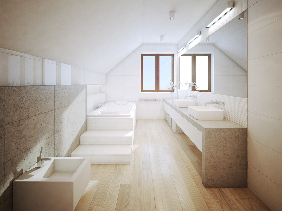
And finally, the first home tour ends with a look at the bright and welcoming bathroom. Tiled stairs lead up to the enviable soak tub, perfectly positioned to enjoy a lovely view from the window.

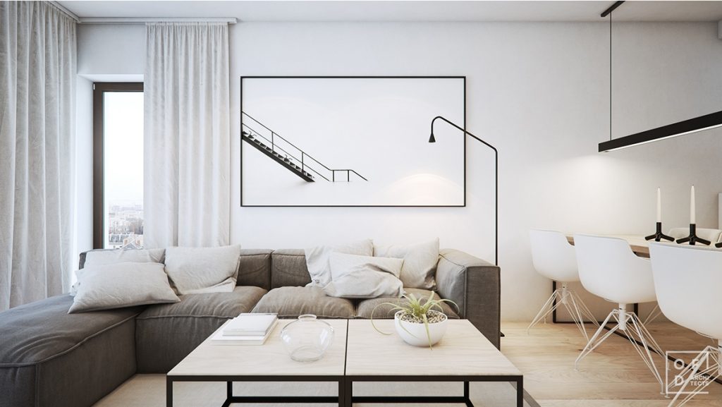
This home is located in Krakow proper. Its modern high-contrast interior adopts a much stricter aesthetic, almost minimalist in its focus. Black and white make up the foundation of the color scheme but middling greys and browns help to soften the look.
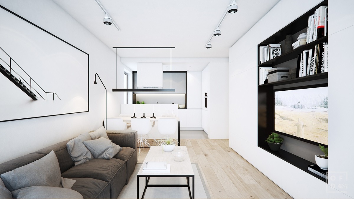
Linear forms guide the eye along the length of the open layout living and kitchen arrangement. Strong horizontal elements echo the same of the room, with the diagonally focused print and lamp serving as a subtle focal point.
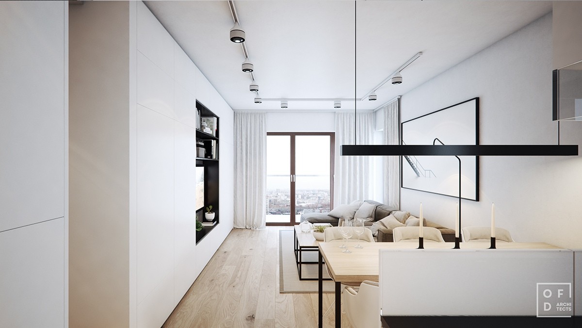
Bright white surfaces help stretch the effect of the single window toward the end of the room. Within a dark interior, the kitchen and dining areas would feel robbed of their brightness.
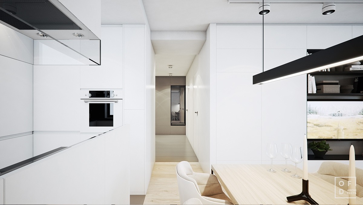
Private rooms exist in the portion of the home that hides around the bend from the kitchen. Here, wood floors and white walls transition to a solid palette of warm grey.
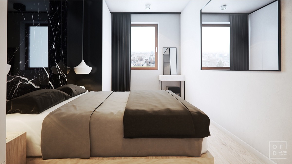
The bedroom decor introduces a warmer aesthetic with more middle-toned neutrals. It's simple, sparely furnished, and makes good use of its narrow layout.
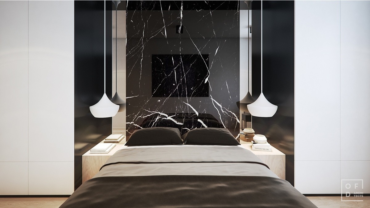
Dramatic black marble definitely turns the bed into an incredible focal point. Thin mirrors border the slab on either side, surely amplifying the effect of the Beat lights that hang in the foreground.
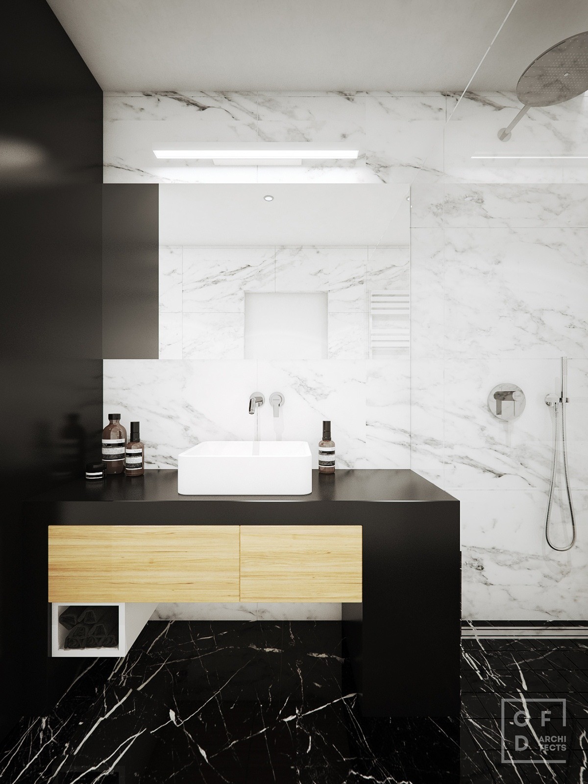
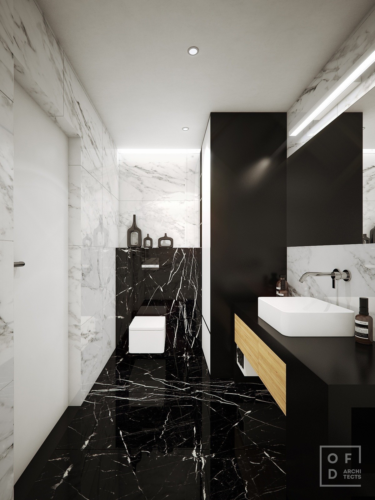
The same black marble reoccurs as the bathroom floor, with luminous Carrara on the walls. As brilliant as these materials really are, it's the surprising dash of wood that serves as the primary focal point.
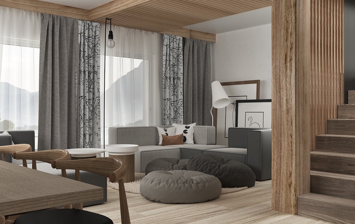
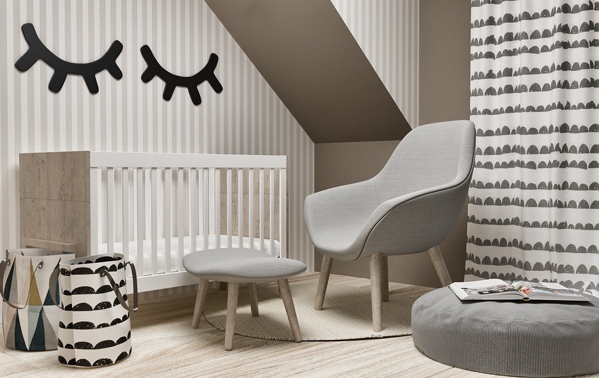
Designed for a young and growing family, this 150 square meter home has a softer aesthetic than the previous spaces. It introduces more variation in neutrals – a great range of the greyscale spectrum in addition to various light and dark wood choices.
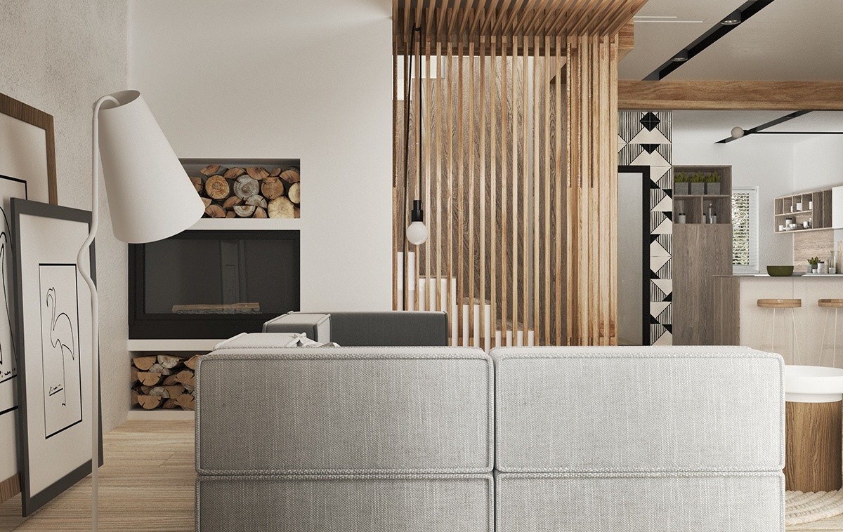
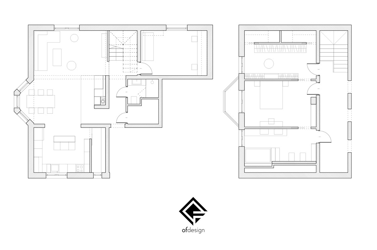
The downstairs floor plan is primarily open but each functional area feels unique thanks to the creatively staggered layout.
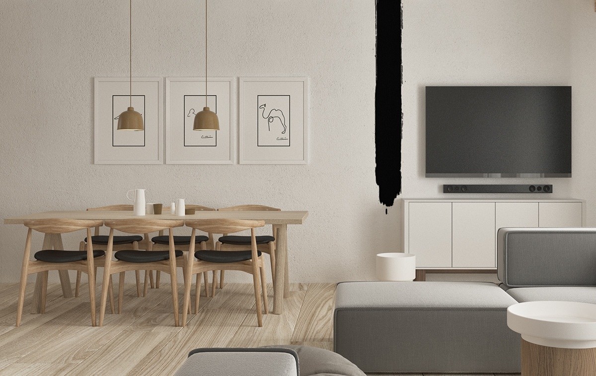
While the living room focuses on greyscale design, the dining room is all about natural wood tones. A wide stripe of black paint visually separates the two spaces.
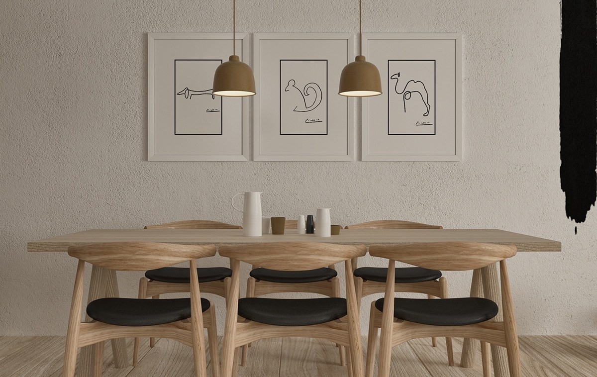
It's hard to go wrong with the classics. The animal-themed prints are the work of Pablo Picasso, and the chairs are from Hans Wegner's Wishbone series.
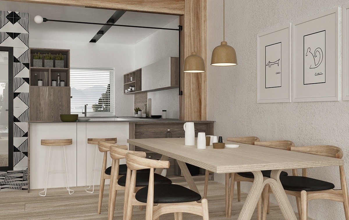
Line of sight persists from kitchen to dining room to living room. This makes it easier for the residents to remain in constant contact with guests while entertaining.
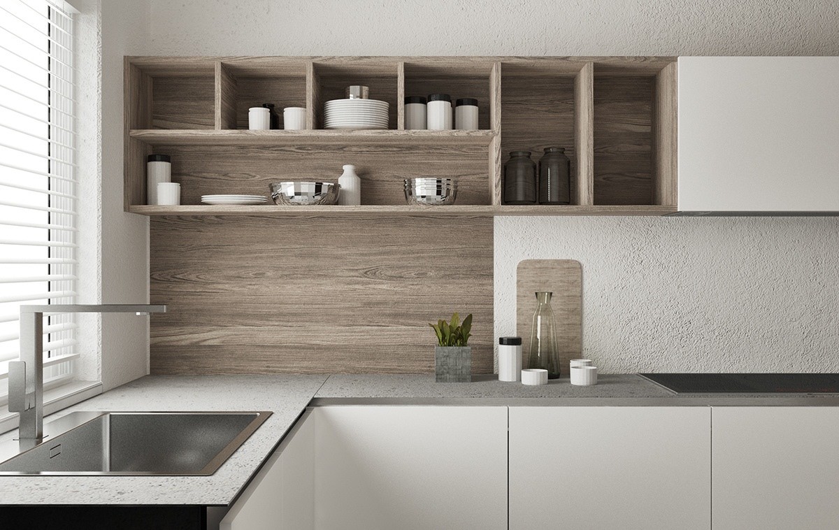
An attractive combination of textures makes the kitchen unique despite its simplicity. Smooth wood grain, composite stone countertops, and rough white walls feel homey yet modern.
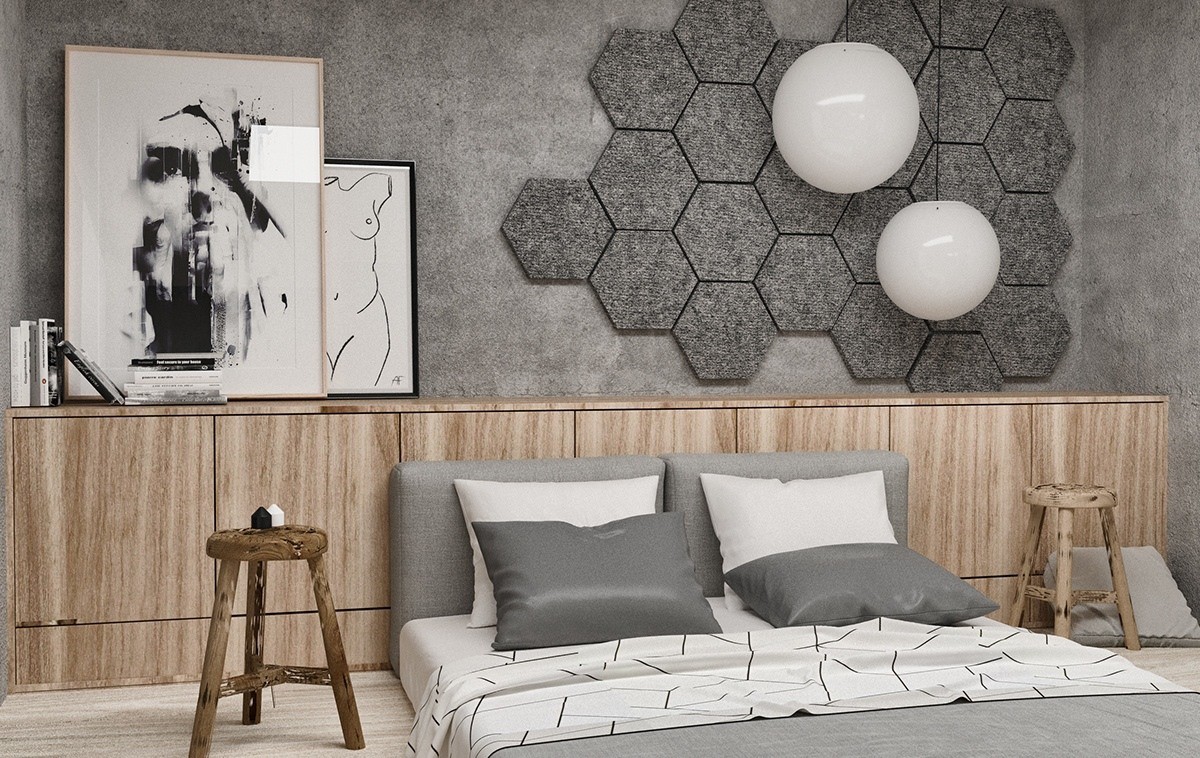
Upstairs, the master bedroom feels more expressive than the common areas on the ground floor. Geometric decor feels modern, whereas the low-profile furniture keeps things casual.
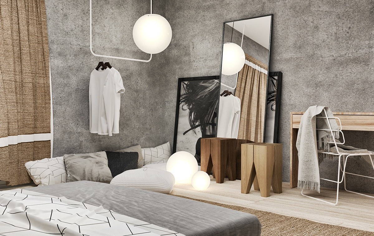
Layering plays a huge role in the decor. Varied pendant lights, a mountain of plush pillows, an arrangement of art and mirrors… it feels like home.
