A sweets baker resides in this 49.57 square meter(534 square feet) Banqiao, Taiwan based home, created by A Lentil Design. The project, sweetly entitled ‘Meio’s kitchen’ was designed to include many details, with every single corner crafted with focus on refinement and exquisite taste, whilst still reading as clean and unadorned - just like one of Meio’s classic scones. “People who don't love scones only never eat good scones.” says the baker. The designers explain that this minimal, relaxing space has been cooked to be enjoyed with a cup of tea, and to house two people - oh, and one furry friend (who probably gets to enjoy a lot of cake crumbs).
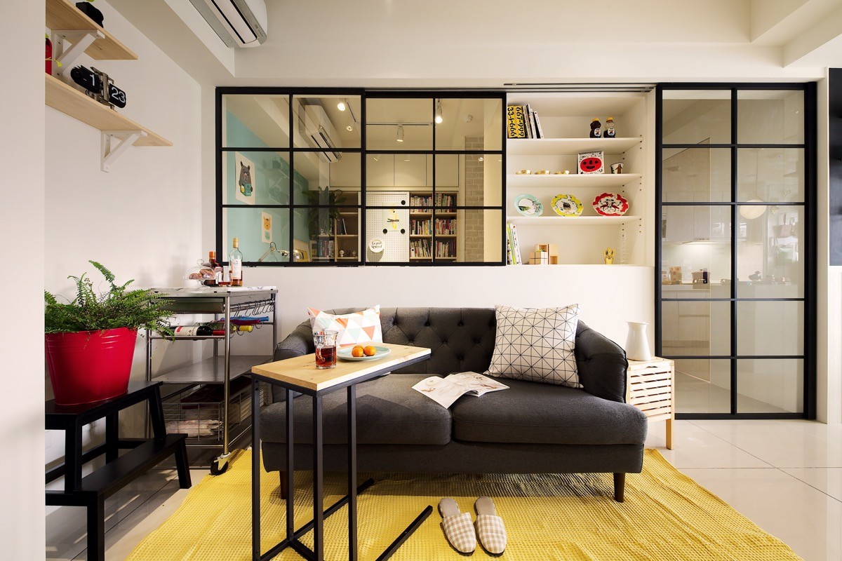
Besides the bathroom, but including the bedroom, there are only two separate rooms in this modest scaled apartment. We begin in the sitting area of the open plan living room, where a small tufted back loveseat sits in front of a sliding window and door. The small space is packed with side tables and a step to reach up to high shelves that doubles as a plant stand. A cart in the corner doubles as an all-in-one bar, with plenty of space for bottles and wine decanters and more.
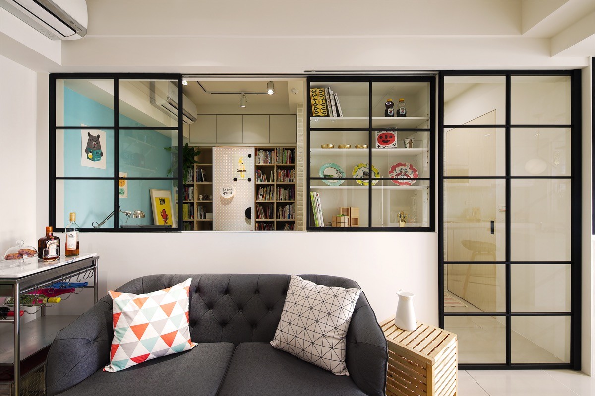
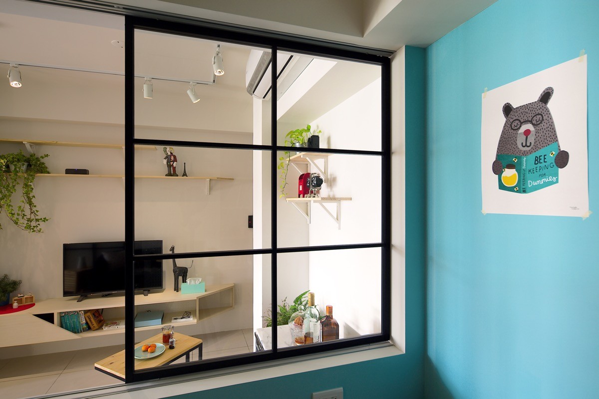
One side of the black aluminum framed window slides open over an adjacent recessed shelving unit. The displaced glass appears as an attractive display cabinet door in its secondary position.
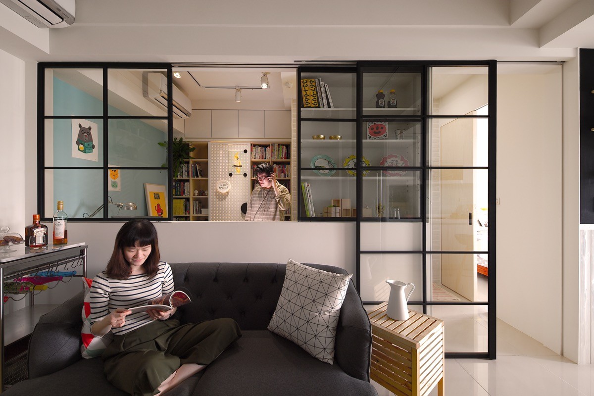
The sliding door too moves into position over the display case, where the black frames align so as not to obstruct the view of the contents.
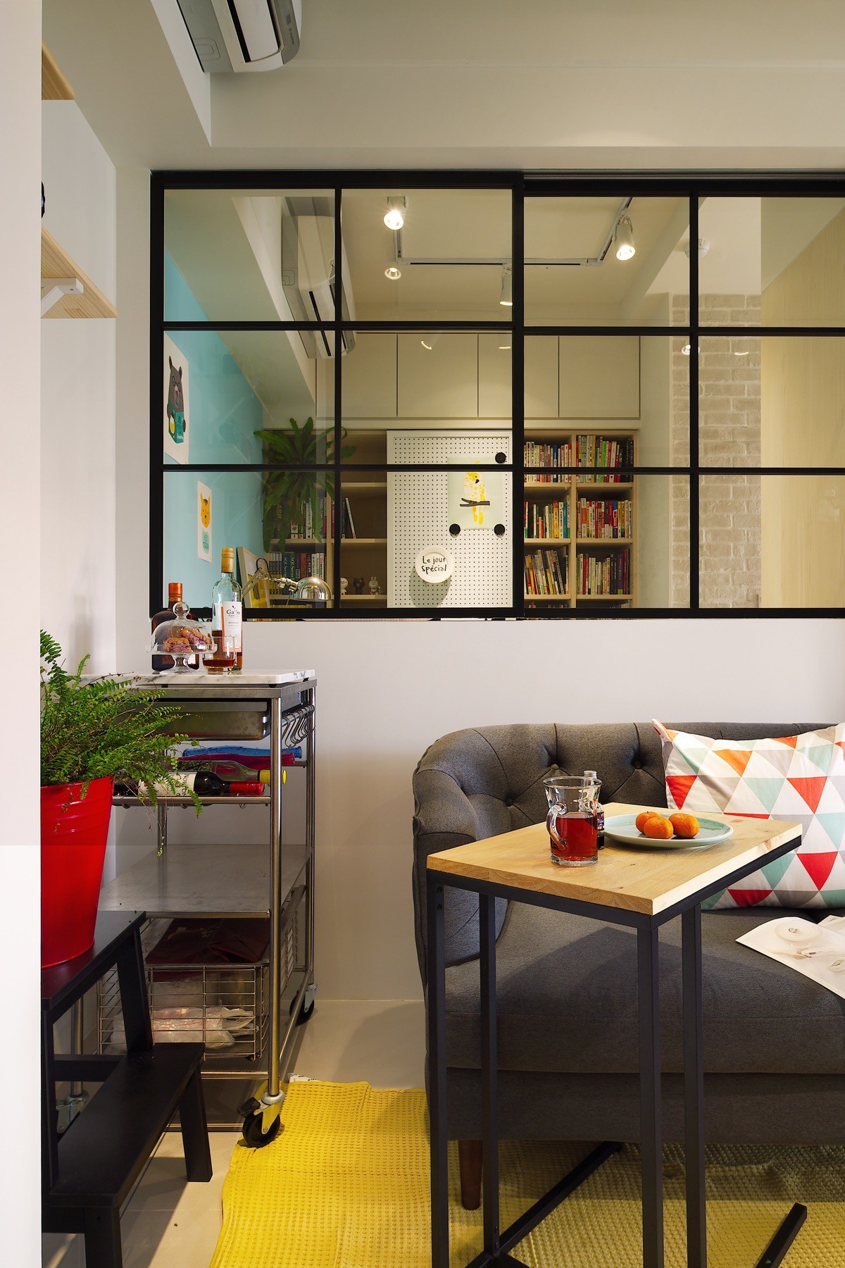
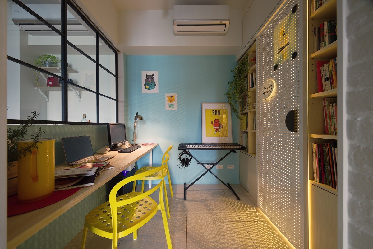
A desk has been placed in a passage of space between the living room, bedroom, bathroom and a storage area. From here the homeowners are able to see through the glass of the sliding window into the living room. When the window is closed, the study area becomes a quieter place for working, particularly as one of the inhabitants works in music. Opening the window up allows the option of a more sociable space when the desk is not in use, or when the user is just casually perusing the internet or using social media.
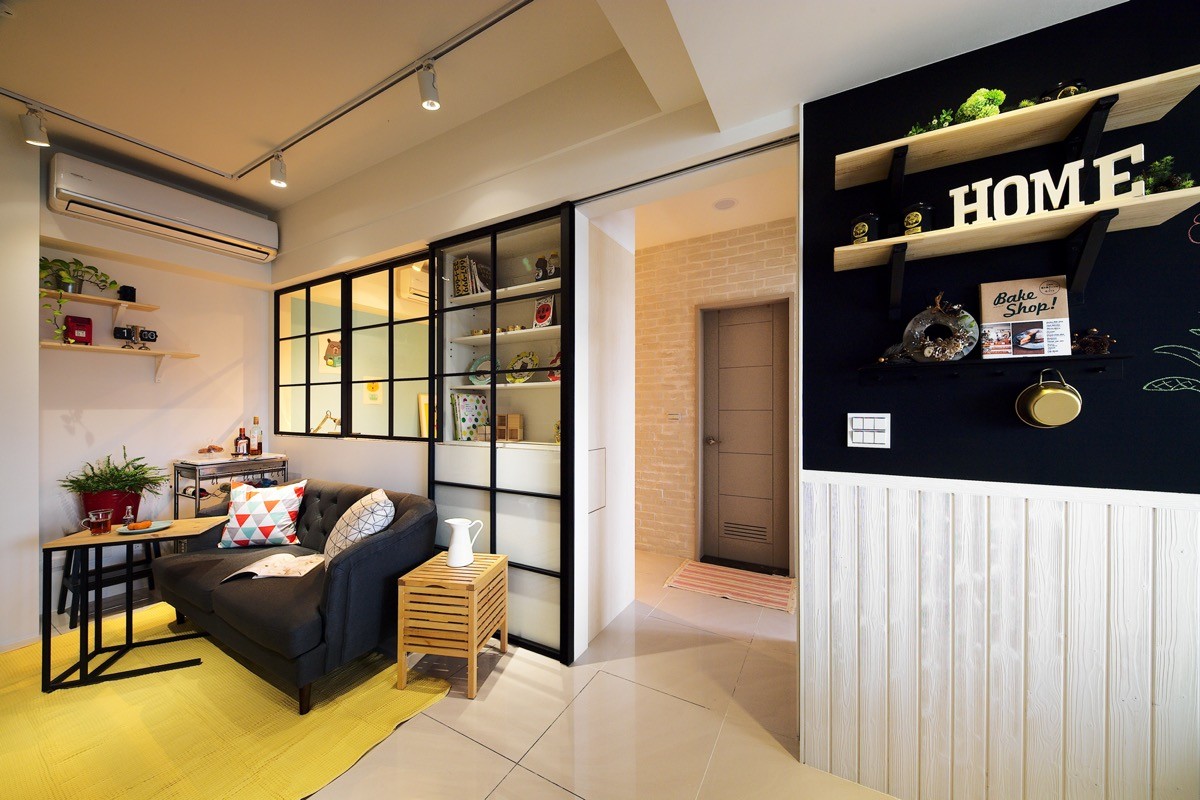
The bathroom is located opposite the living room door, directly past the study area. The only bedroom is located to the right.
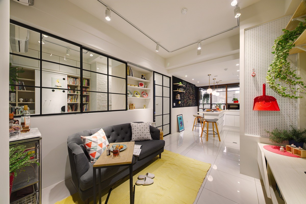
A cheerful yellow rug zones the living room off from the kitchen-diner. In front of the sofa, a console unit and shelves house a few indoor plants. A pegboard wall to the left of the console provides a handy place to hang a few frequently used items. Instead of trying to hide away the utilitarian equipment, they have been picked out in a bright hue to bring colour to the small space. The entire floor is covered in a white gloss tile to give the packed room a smooth and cohesive finish.
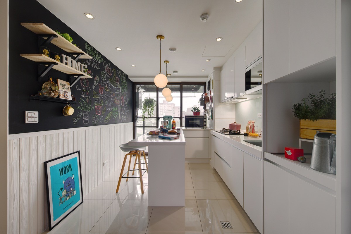
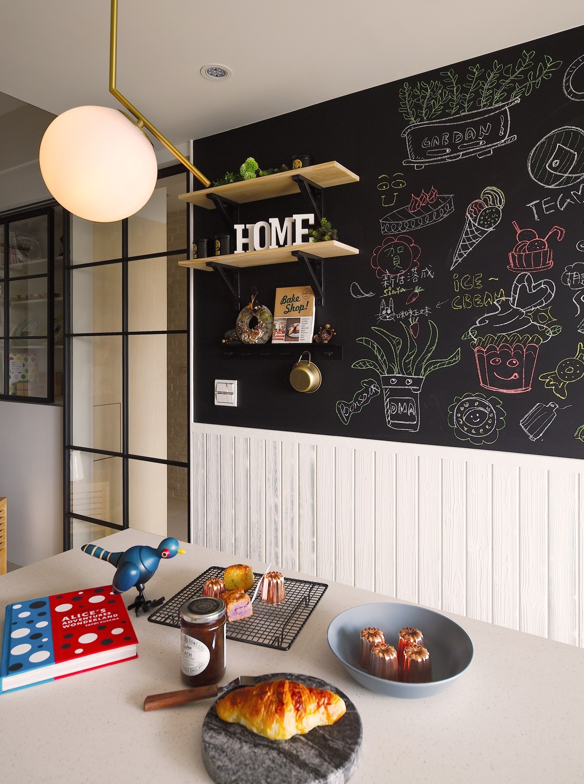
Leading straight off the lounge area, a fresh white kitchen has an extensive run of base and wall cabinets that are installed in a ‘U’ shape, ending with a breakfast bar - or is it a cake-bar in this bakers home? The surface is littered with baking equipment and yummy treats! A french window bathes the cooking area in bright natural light.
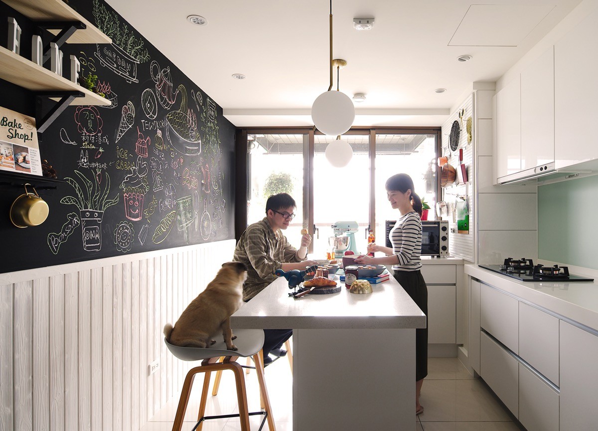
A kitchen chalkboard feature wall sits above a run of white tongue-and-groove, and is covered in illustrations of more sweet treats.
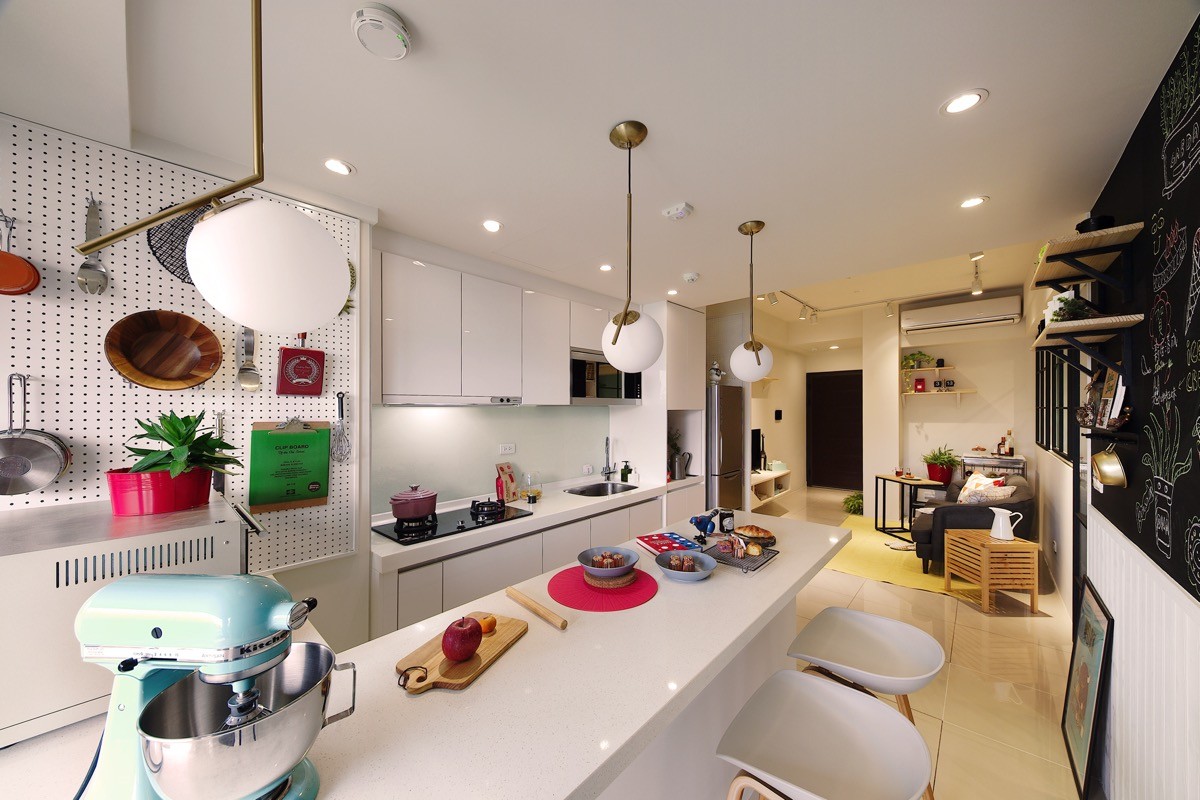
The kitchen utilises another pegboard wall to hold pots, pans and cooking tools. Three orb pendant lights mark out the only eating area in the home.
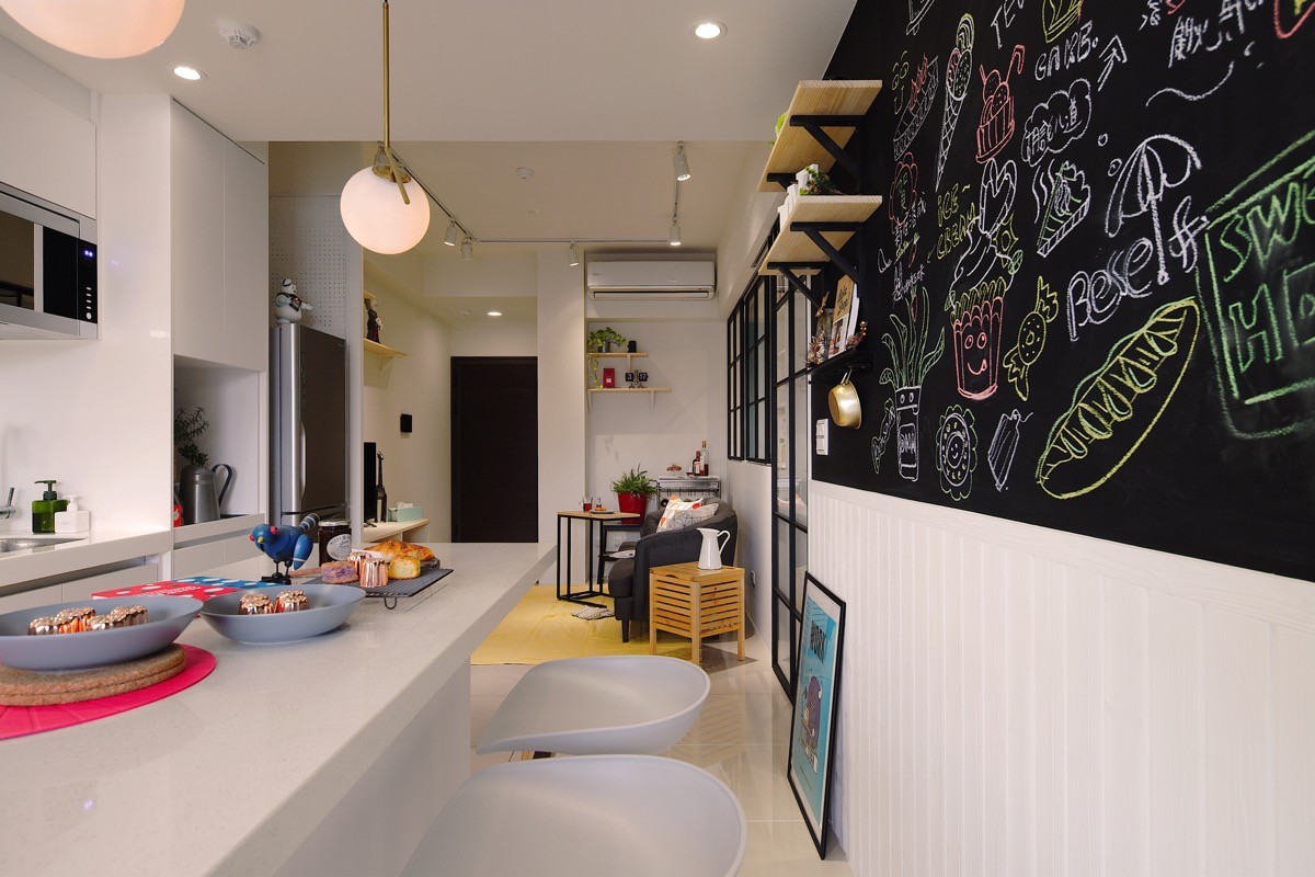
The countertop and kitchen bar stools are all matched to the cabinets in a pure white finish, to keep the limited space looking clean and uncluttered.
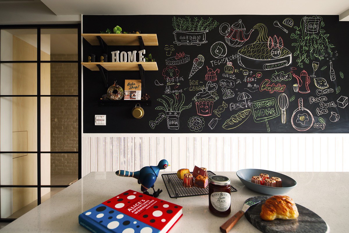
The well equipped kitchen can be used as a small baking studio, which gives further importance to the implementation of the dividing door. The private space beyond this point can be kept screened off, whilst the clear glass keeps each side looking bright and spacious.
The expense associated with property located in the metropolitan area means that homes are of a small scale. Therefore careful space planning is imperative to achieve a practical and comfortable home.
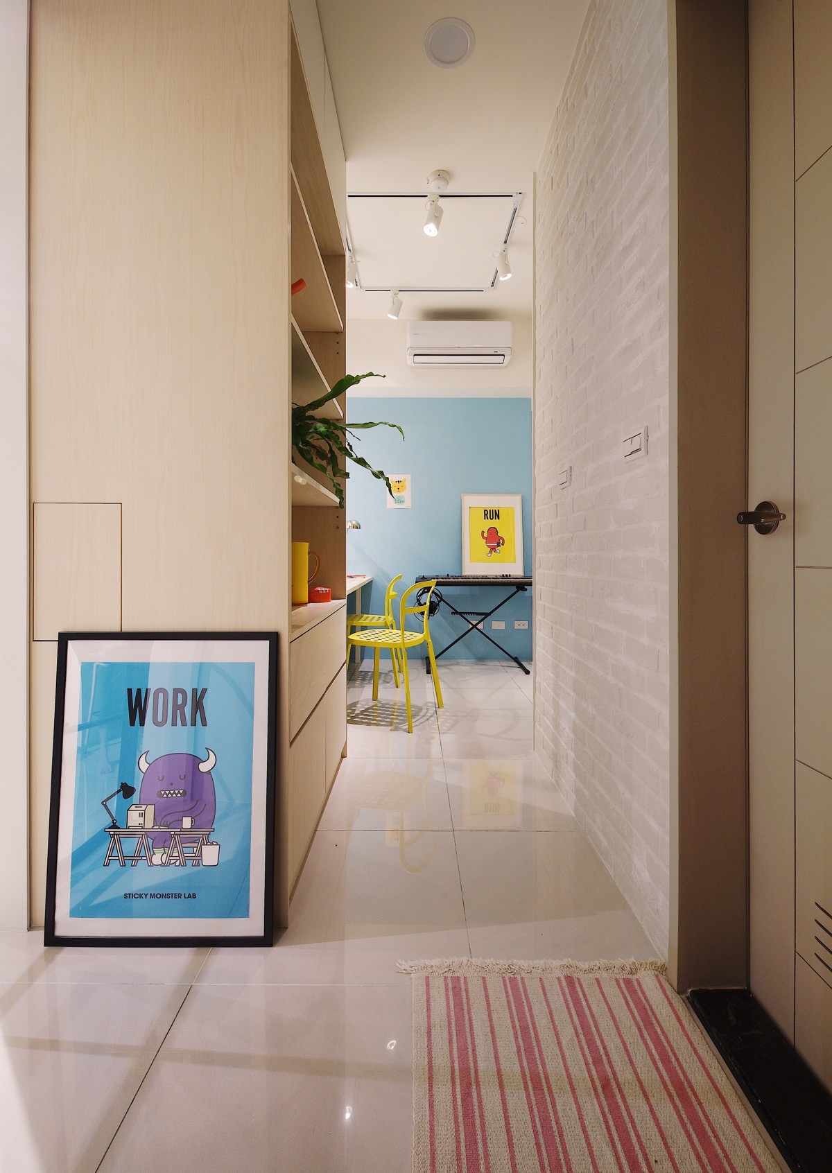
An independent room with plenty of neat storage space was an important part of the brief. The designers managed to incorporate 1.65 square meters of functional storage for large reference books and an electronic piano. Despite the small scale and multi-use of this core area, the space remains clear and tidy.
Whilst plain white paintwork is the backdrop to the rest of the living area, this core zone is painted in bright blue.
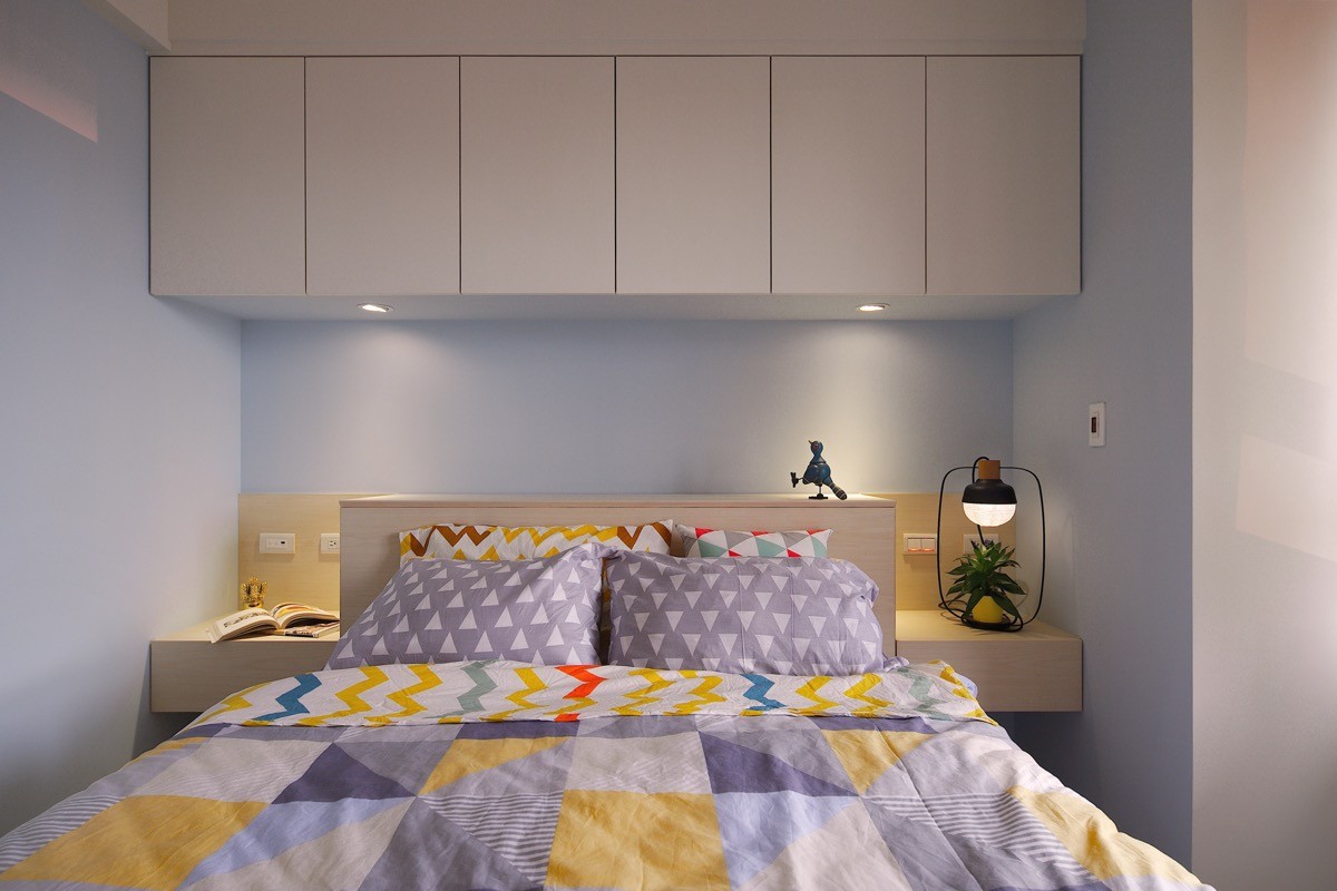
Sitting somewhere in the middle of the spectrum, pale sky blue paints a relaxing scene across the bedroom. Zany geometric bedclothes energise the scheme and bring in additional pops of warm yellow and bright red. A little bird ornament sweetly marches along the headboard.
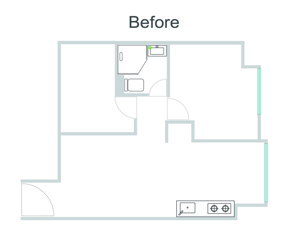
The study/storage zone was initially a separate private room with its own door, offering no open walk-through. The cooking area was just a tiny kitchenette.
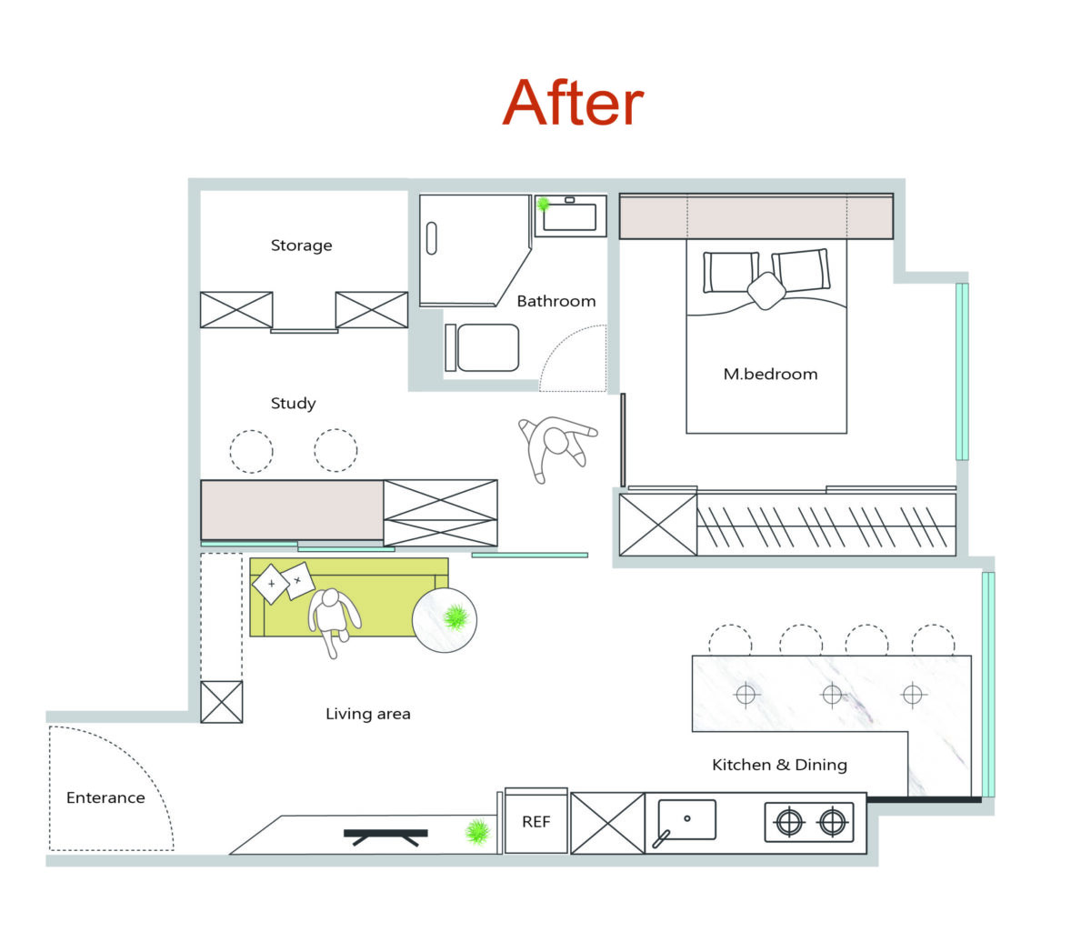
By opening up the third room to become a core area, the designers have provided an extended living space with multiple uses, better flow and a sociable feel. Removing sections of the partition wall between this and the living room connected the space further and created an opportunity for the attractive recessed shelving unit at the sliding window. A fully grown complete kitchen gives the homeowner a dream kitchen for conducting her baking in, despite the potentially limiting proportions of her home.

