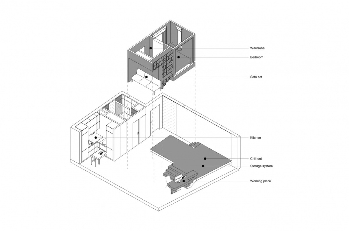
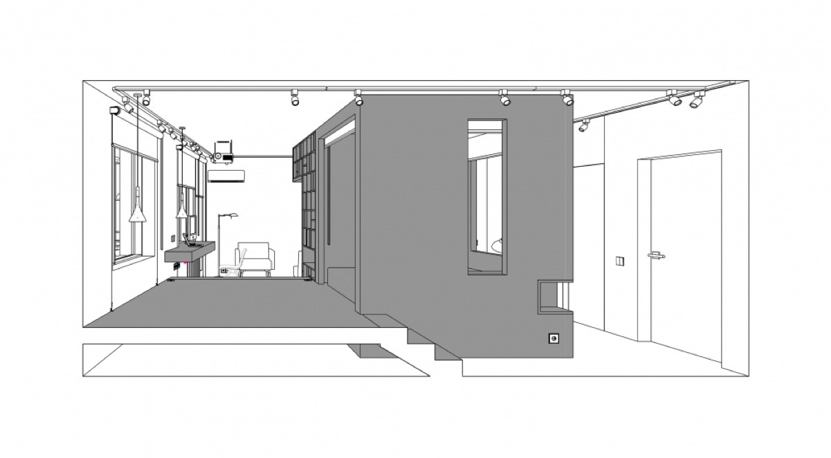
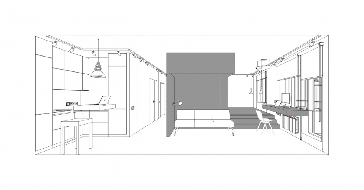
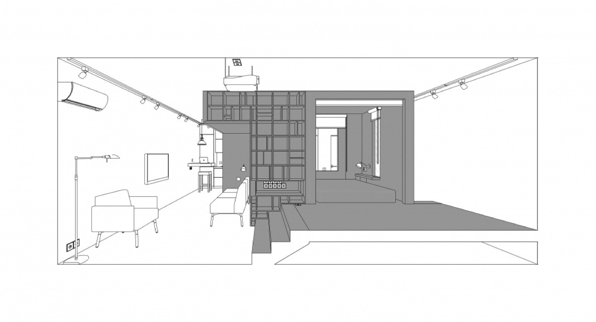
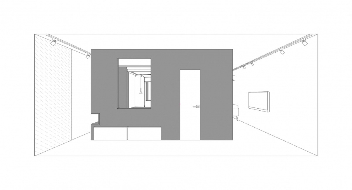
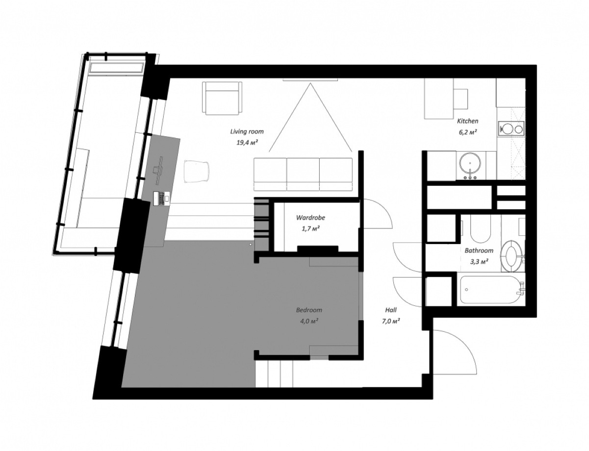
Innovation in interior design often results from restrictions. Smaller apartments and lofts are common examples of living spaces needing an open plan feel. What happens when your living space is under 50sqm? This Russian space, measuring just under 43sqm, is a challenge to any designer. Modern in feel and urban Japanese in décor, it segments different living spaces in one smart central unit. Designed by Rue Temple, each living area is broken off into a series of hallways – a kitchen, living room, relaxation space, storage space, bedroom and bathroom – to unite the space as a whole. Take a peek below.
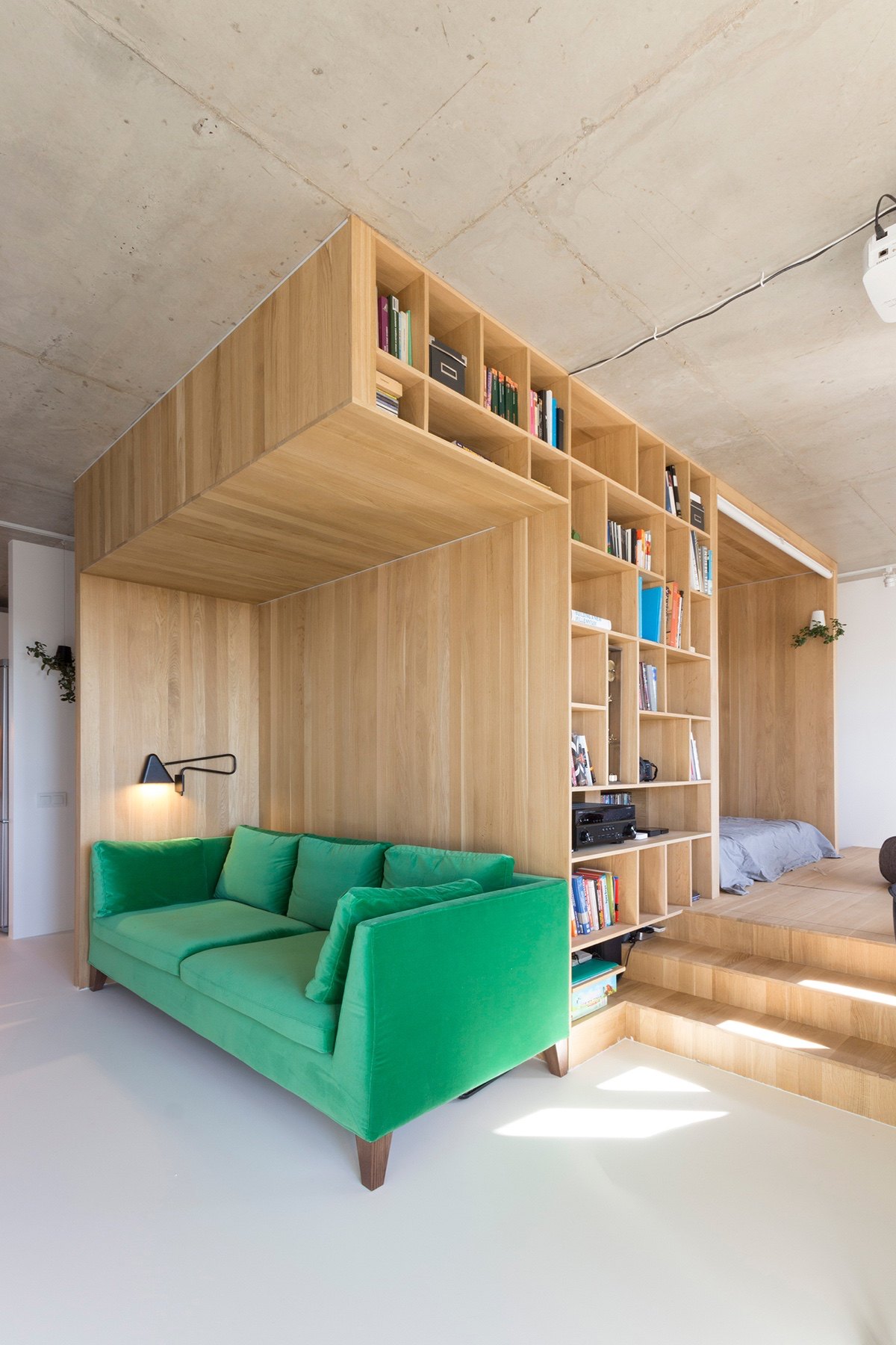
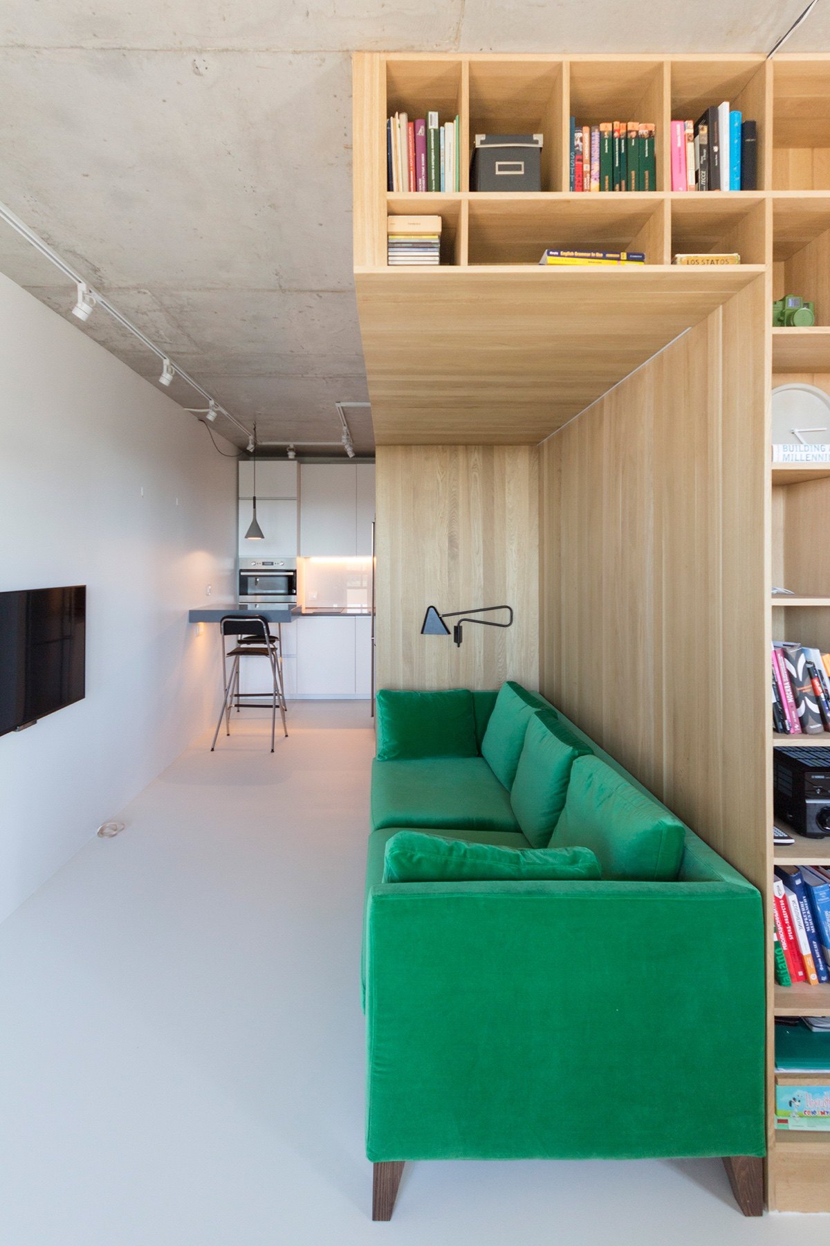
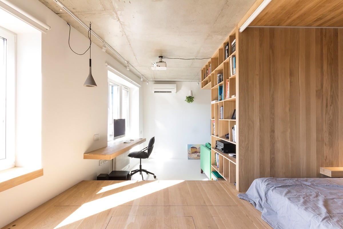
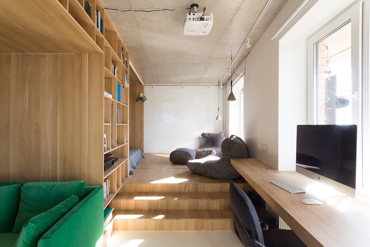
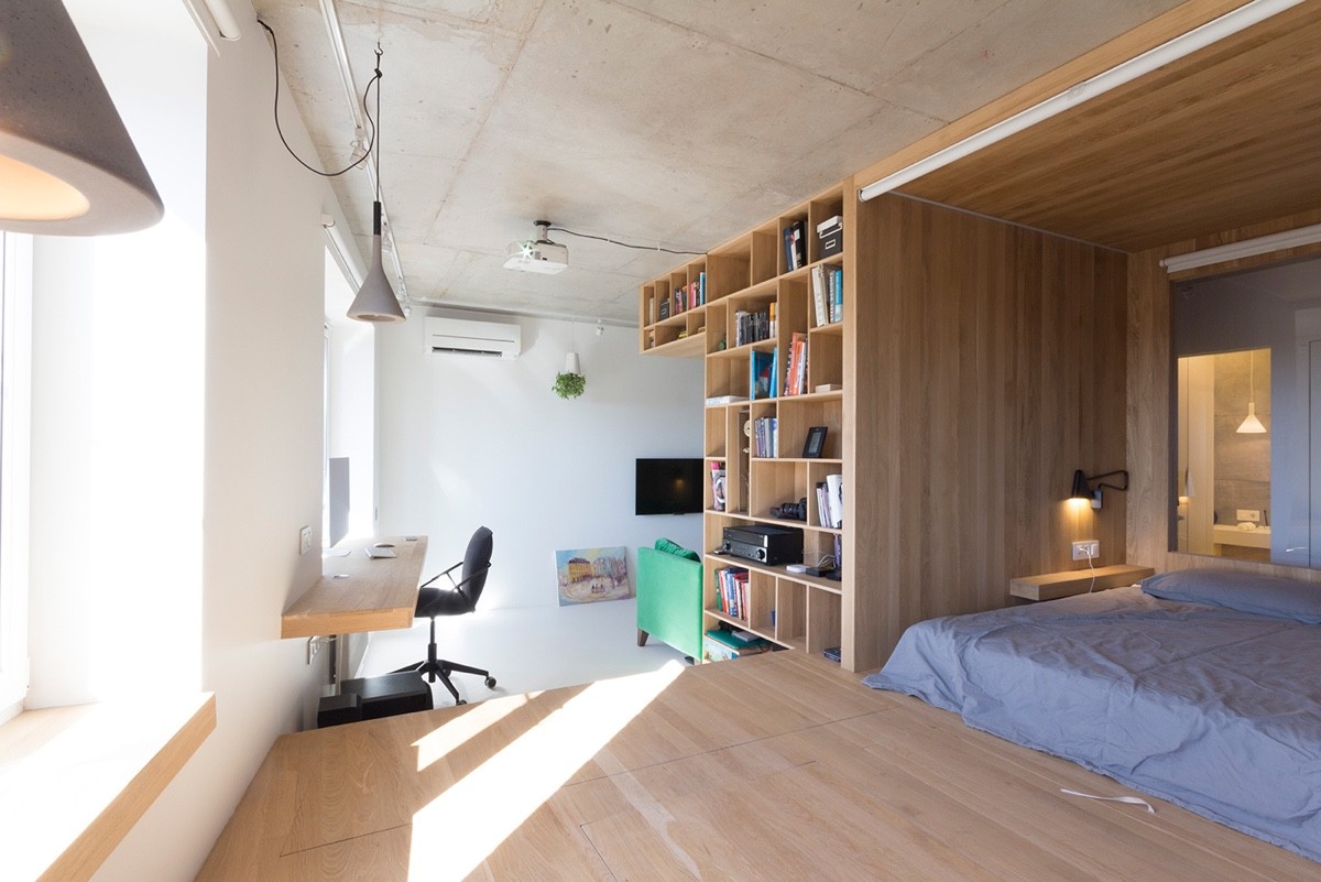
Framed by a concrete ceiling and stone-coloured floor, a wooden compartment acts the central feature. Separating several spaces in one, the room taken is multiplied tenfold in utility. A leaf green velvet couch marks the living room, lit by a triangular black wall light. Backgrounded by a bookcase and facing a flat screen TV, its foreground doubles as a hallway. The kitchen lurks beyond.
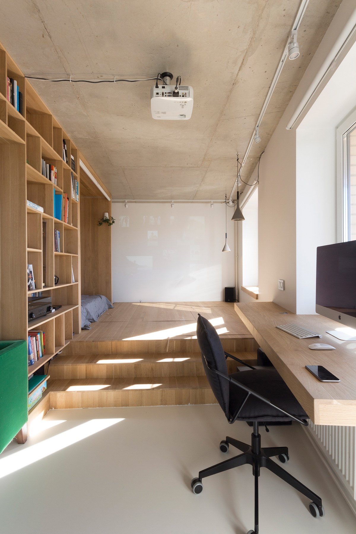
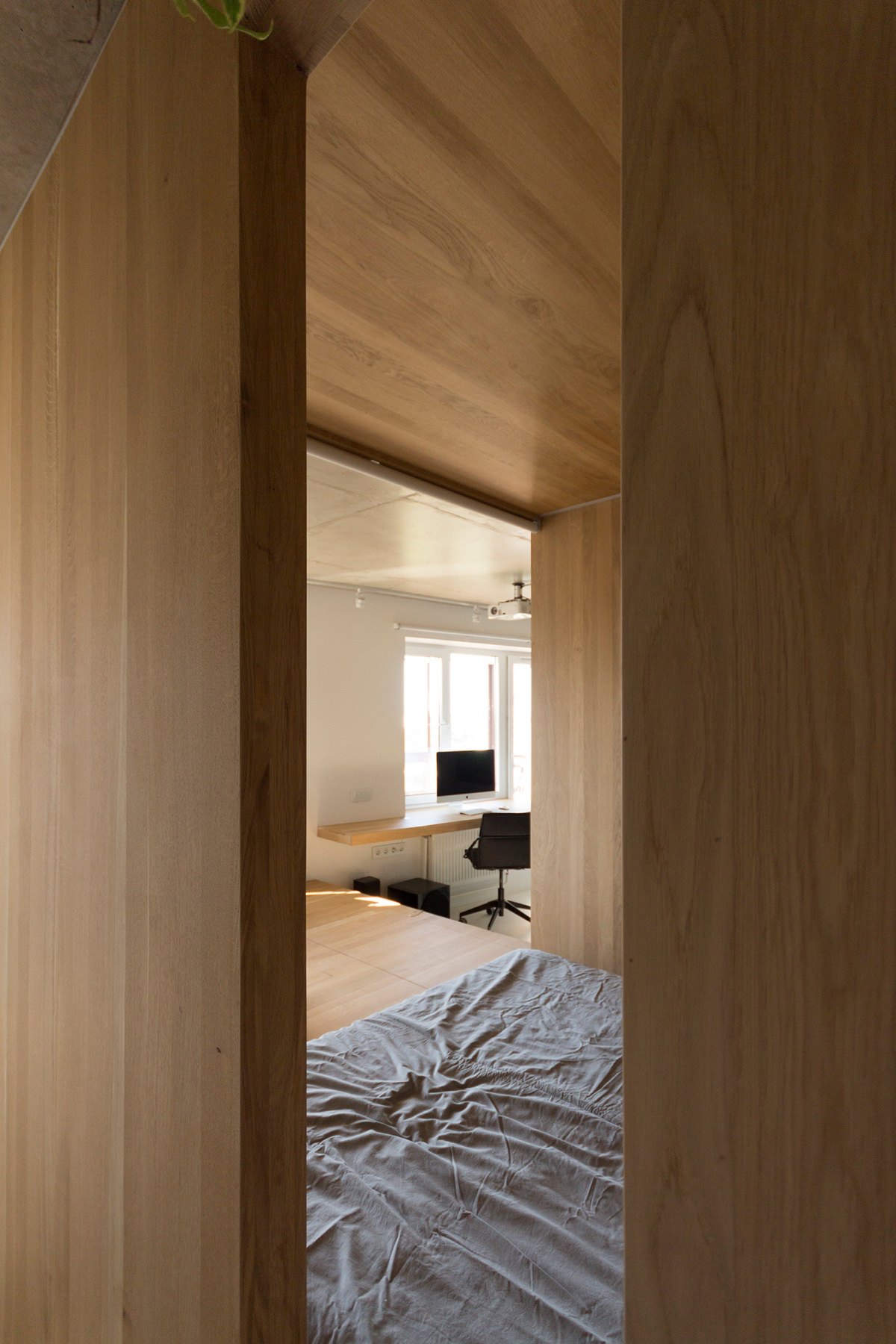
Just past the couch, a corridor opens. Clothed in top-to-toe light wood, a desk juts out in the same material. A thin-lined stylish desk chair eats less room and mirrors the flat screen.
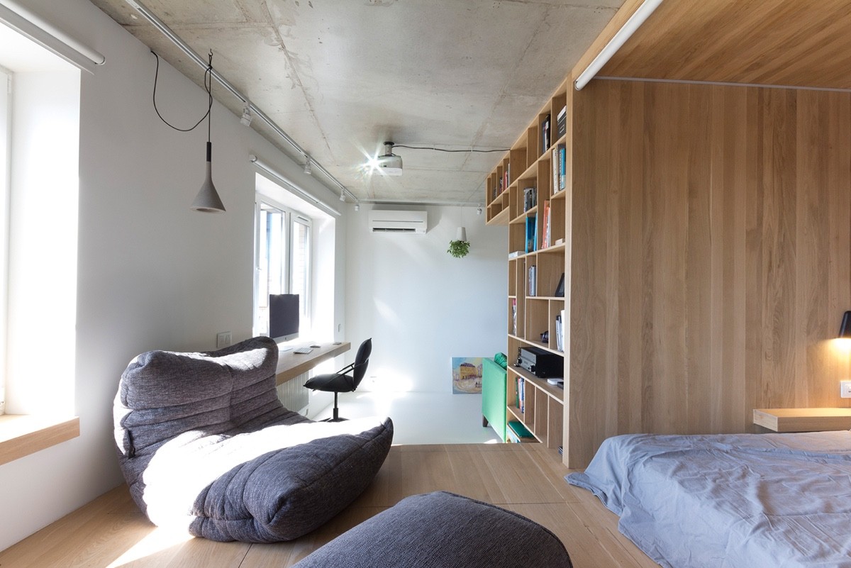
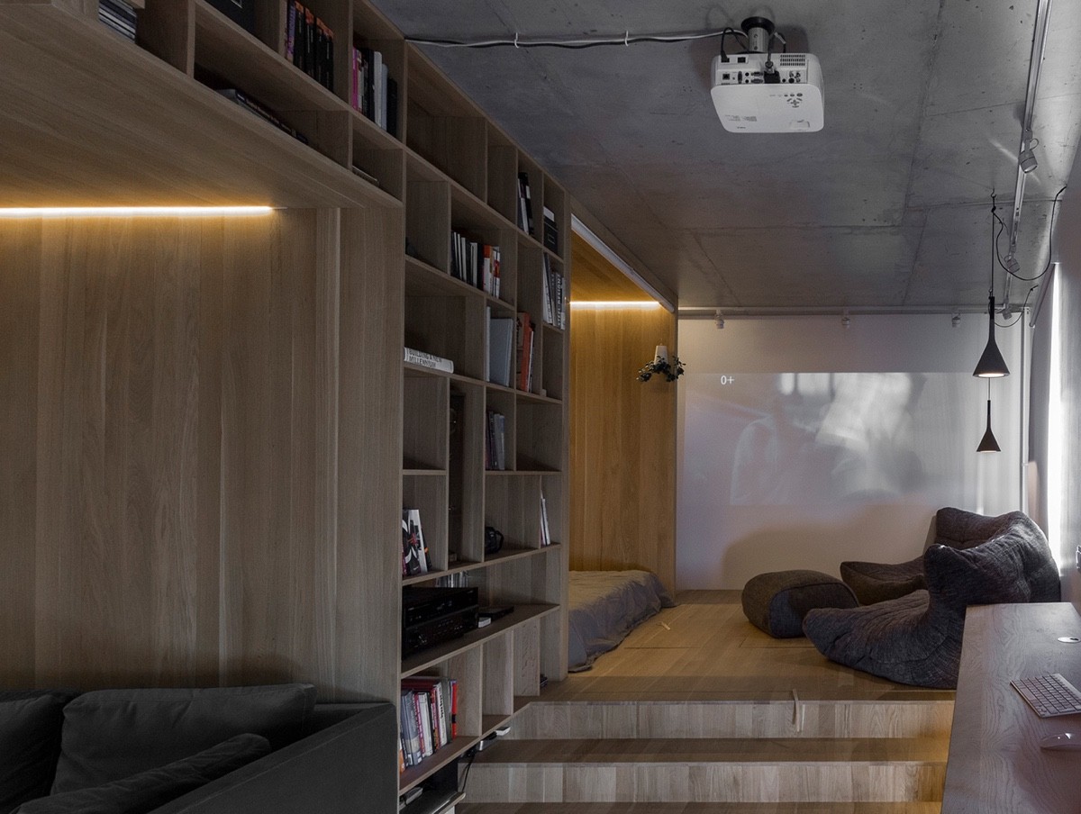
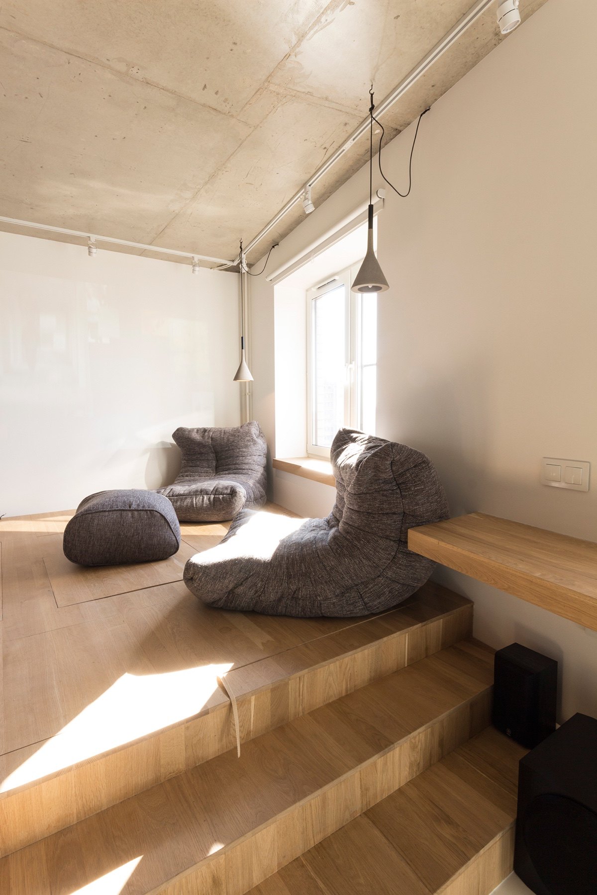
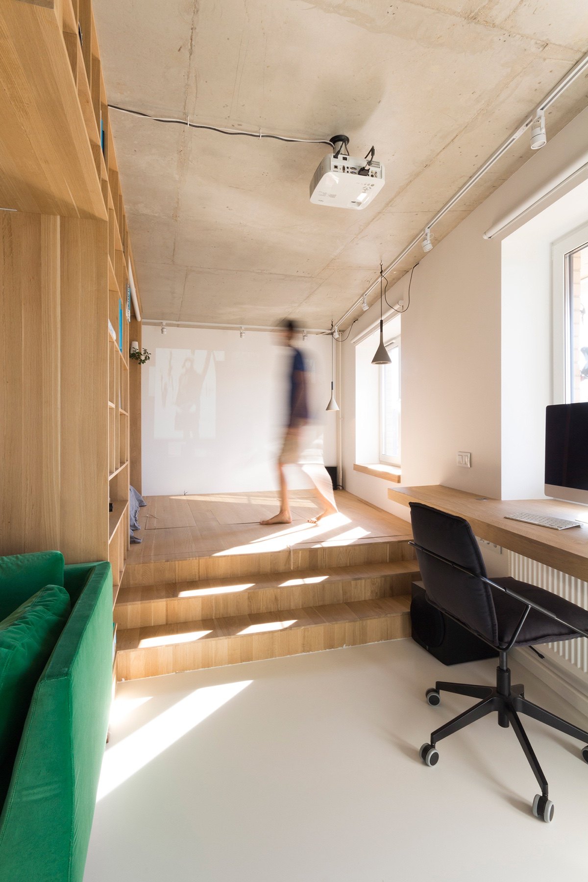
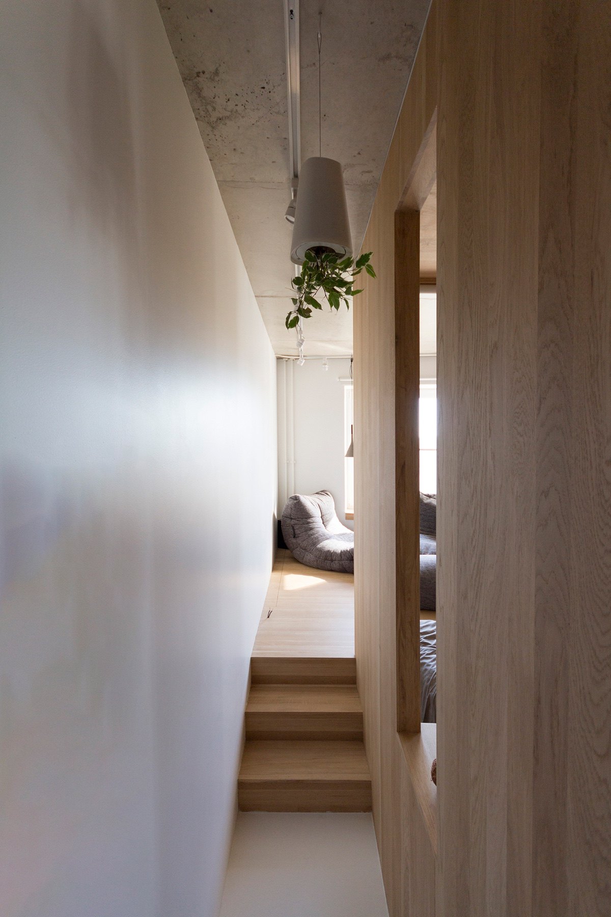
Wooden stairs lead to a wooden platform, where visitors can relax. Grey cotton beanbag couches invite on the floor, Japanese in style. Two grey lights hang on a grey concrete ceiling. White walls either side augment the light from a simple window, while LED strips line the walls at night.
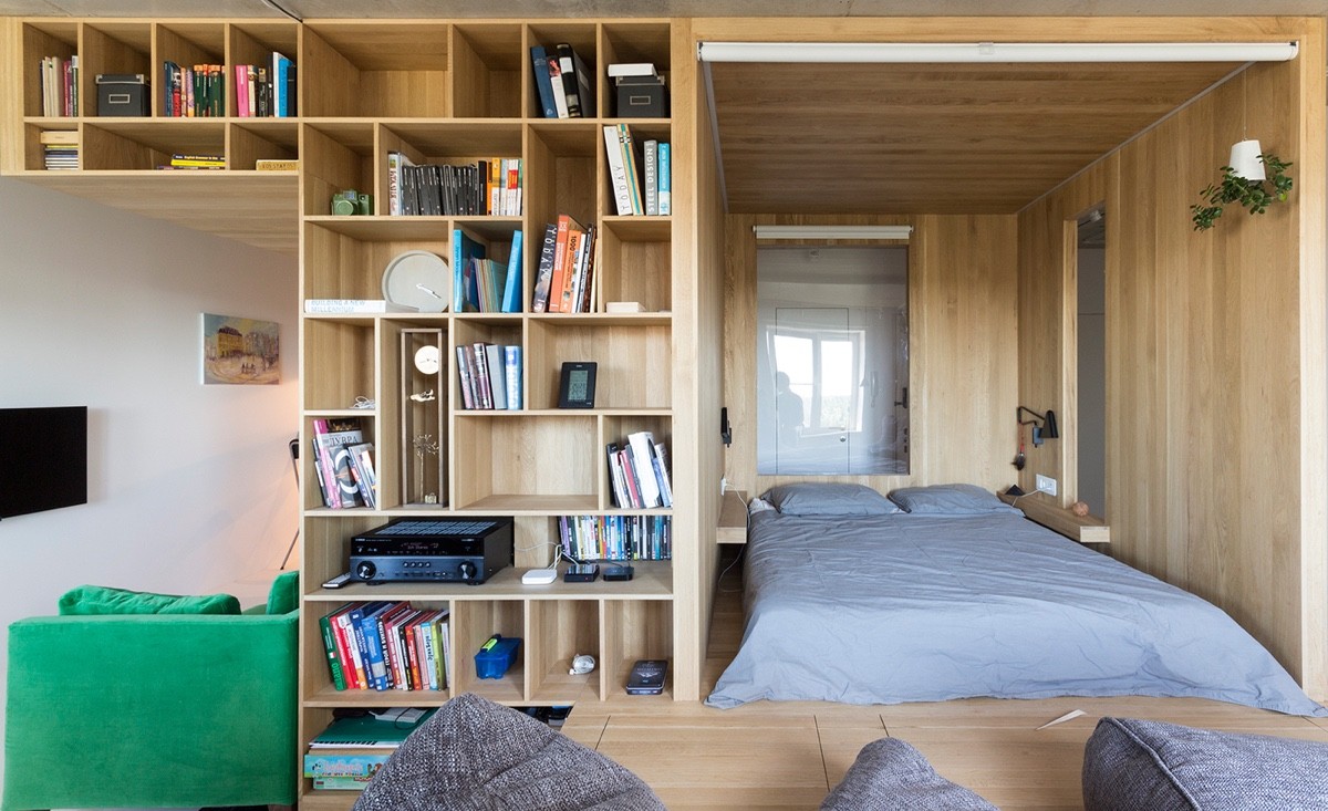
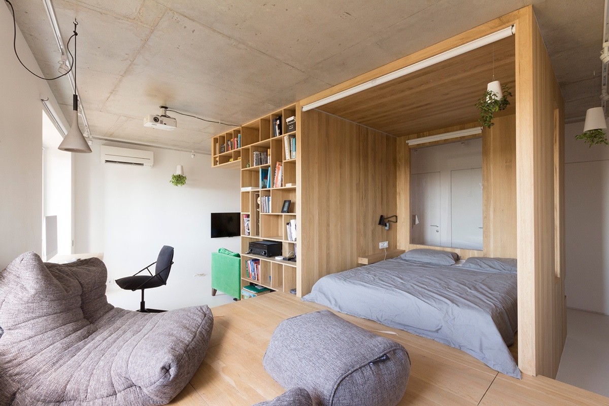
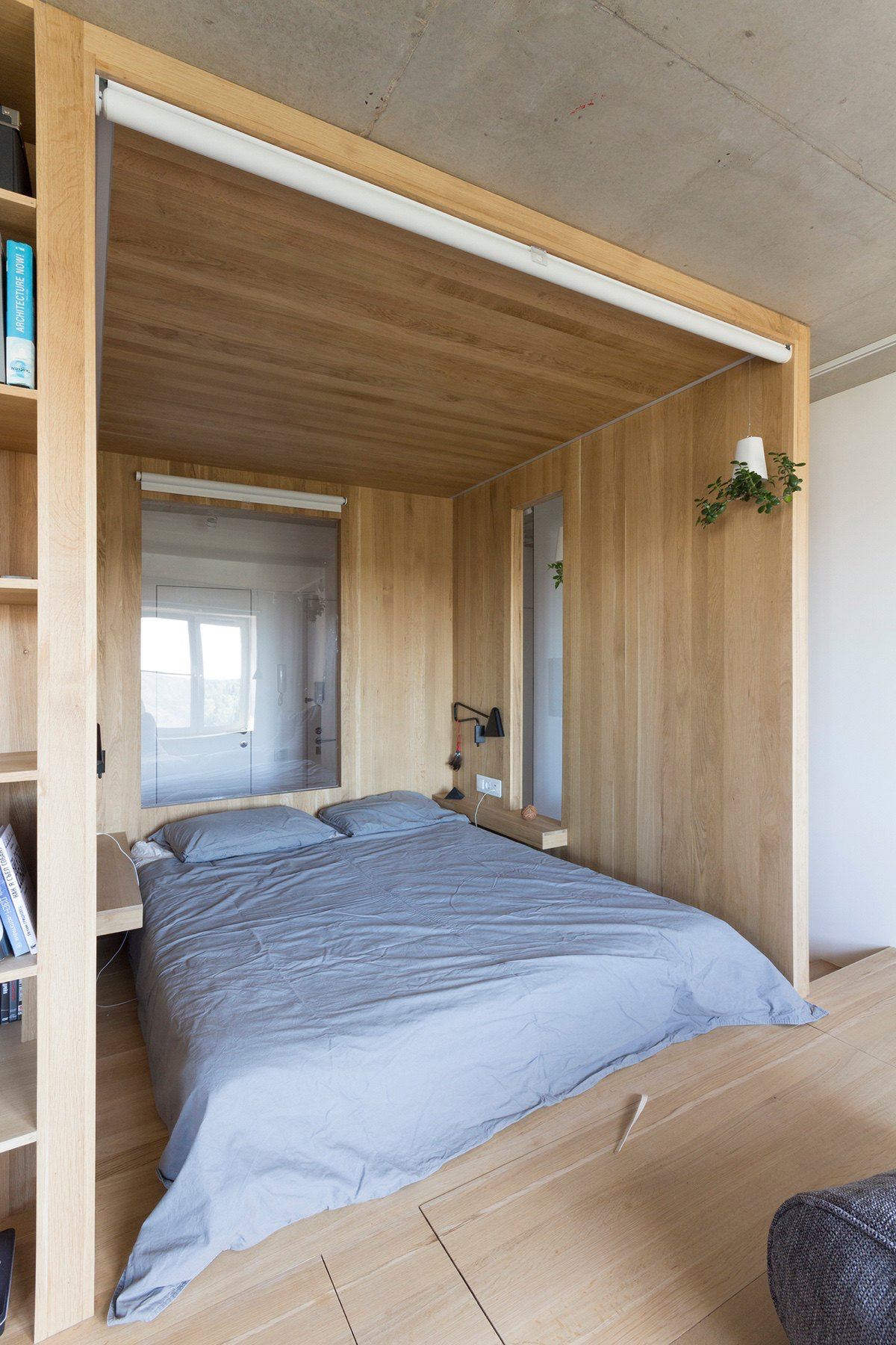
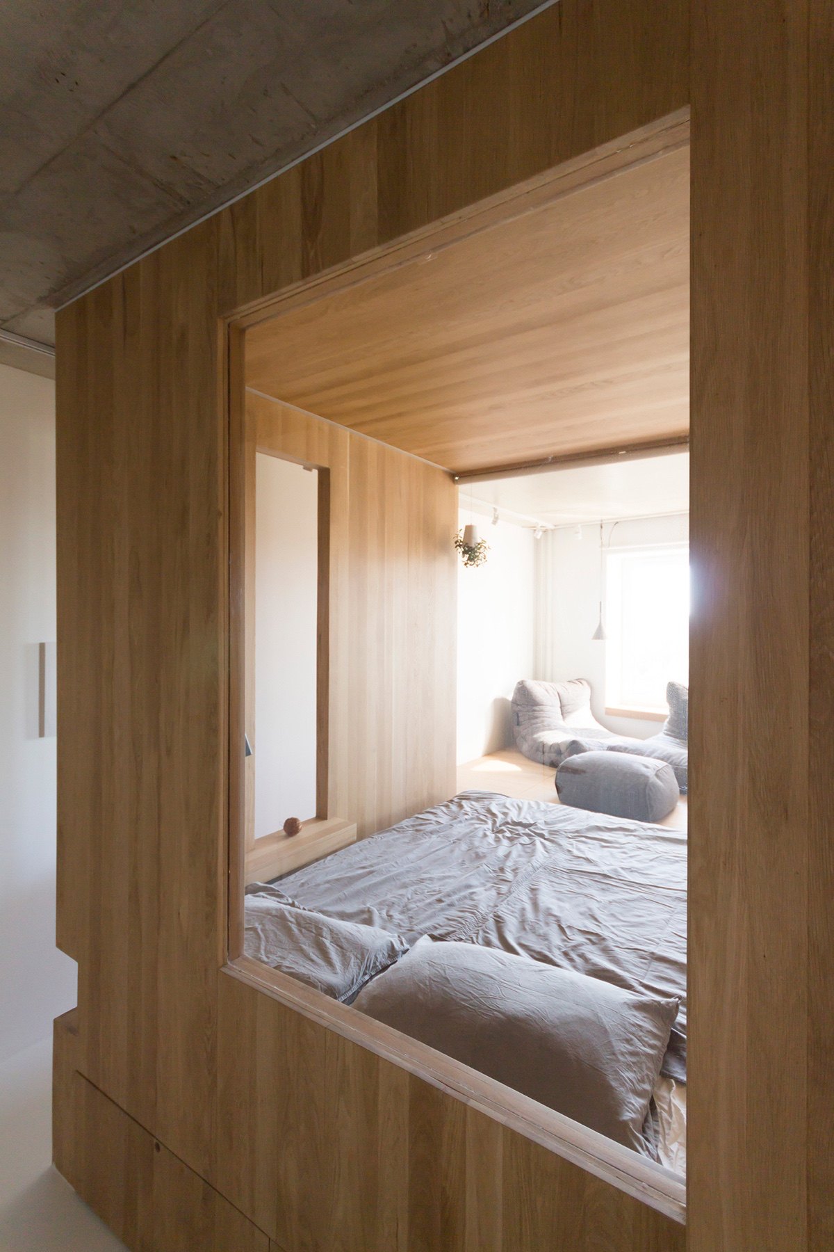
To the left, a bedroom is revealed. Swathed in a lighter shade of grey, character pops out in a small white light shrouded in greenery. A window to a white wall gives the illusion of more light.
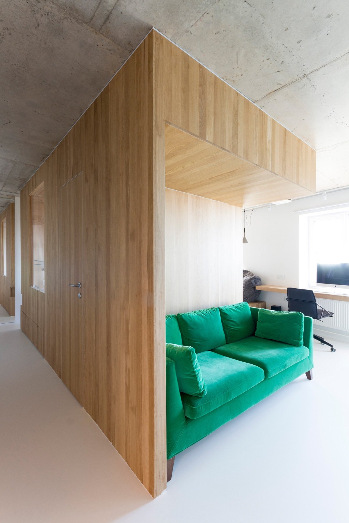
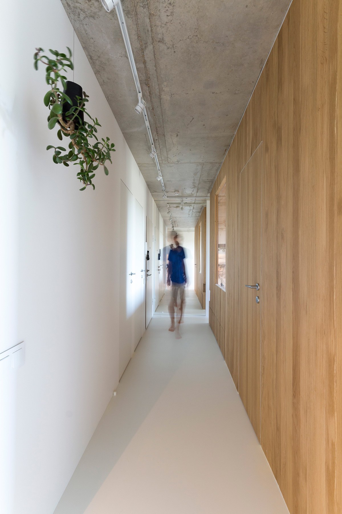
The wooden compartment winds around spaces in one continuous corridor. Lined with white-painted heating rails, light-wood fixtures in benches and window ledges unite its form. Chrome door handles polish it off.
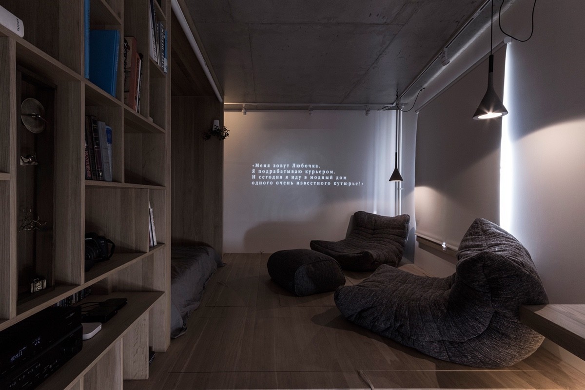
Light is let in at different focal points, specifically tailored to the space. At night, hanging lights let a projector TV add animation. During the day, two simple windows across the hallway pass sunlight down the corridors. The bedroom’s central window reflects the effect.
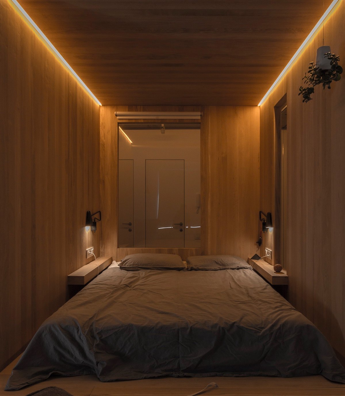
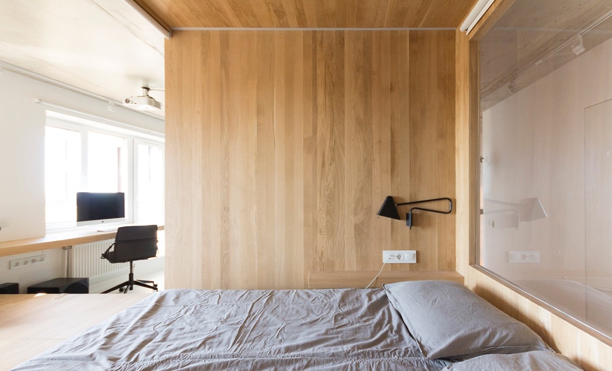
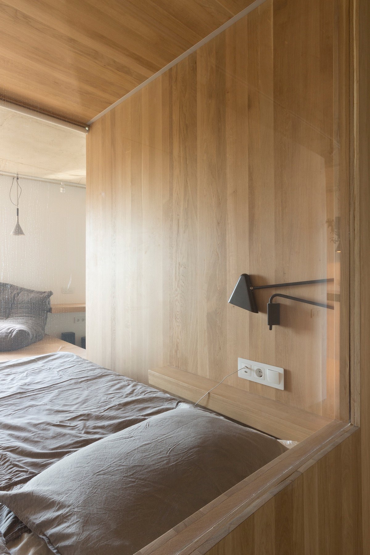
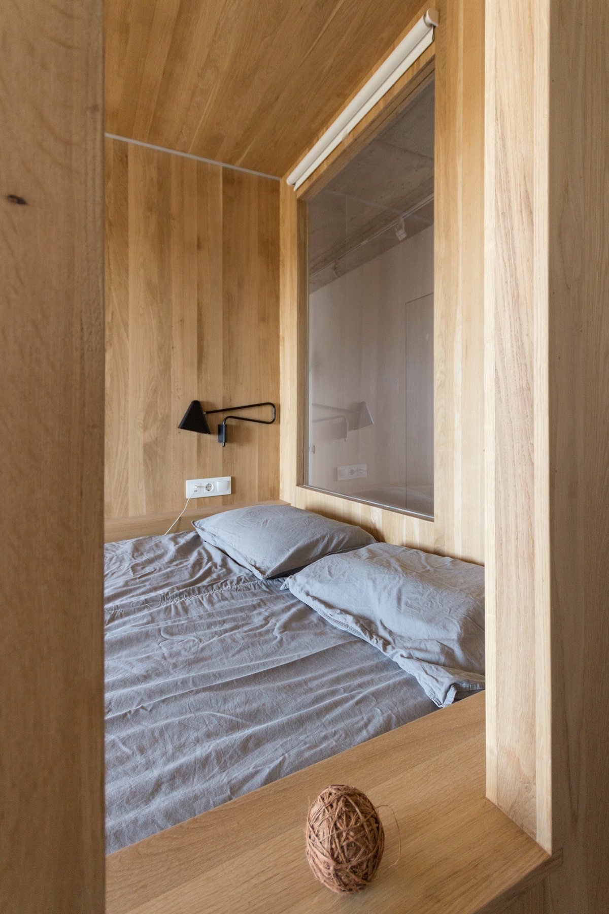
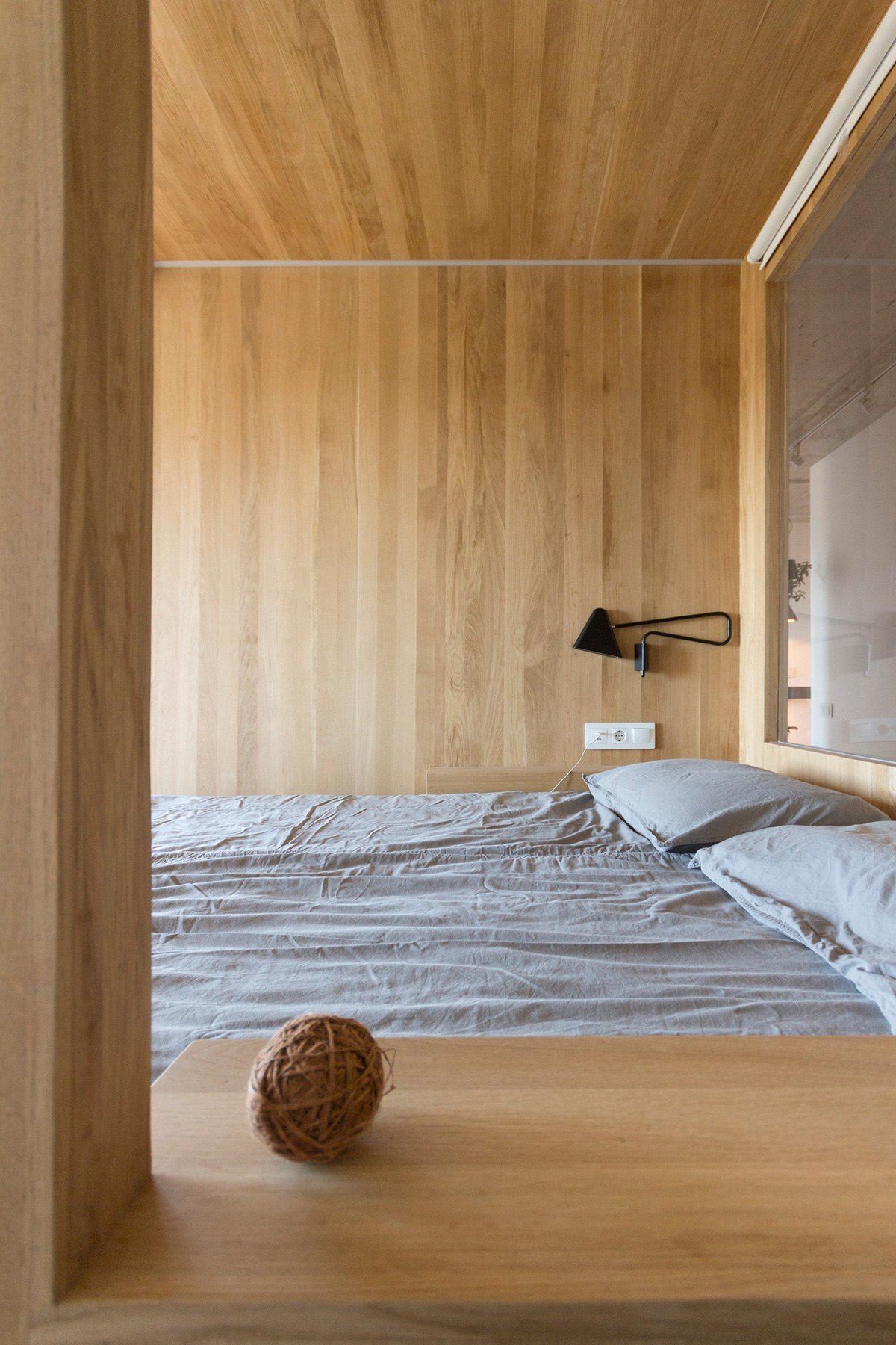
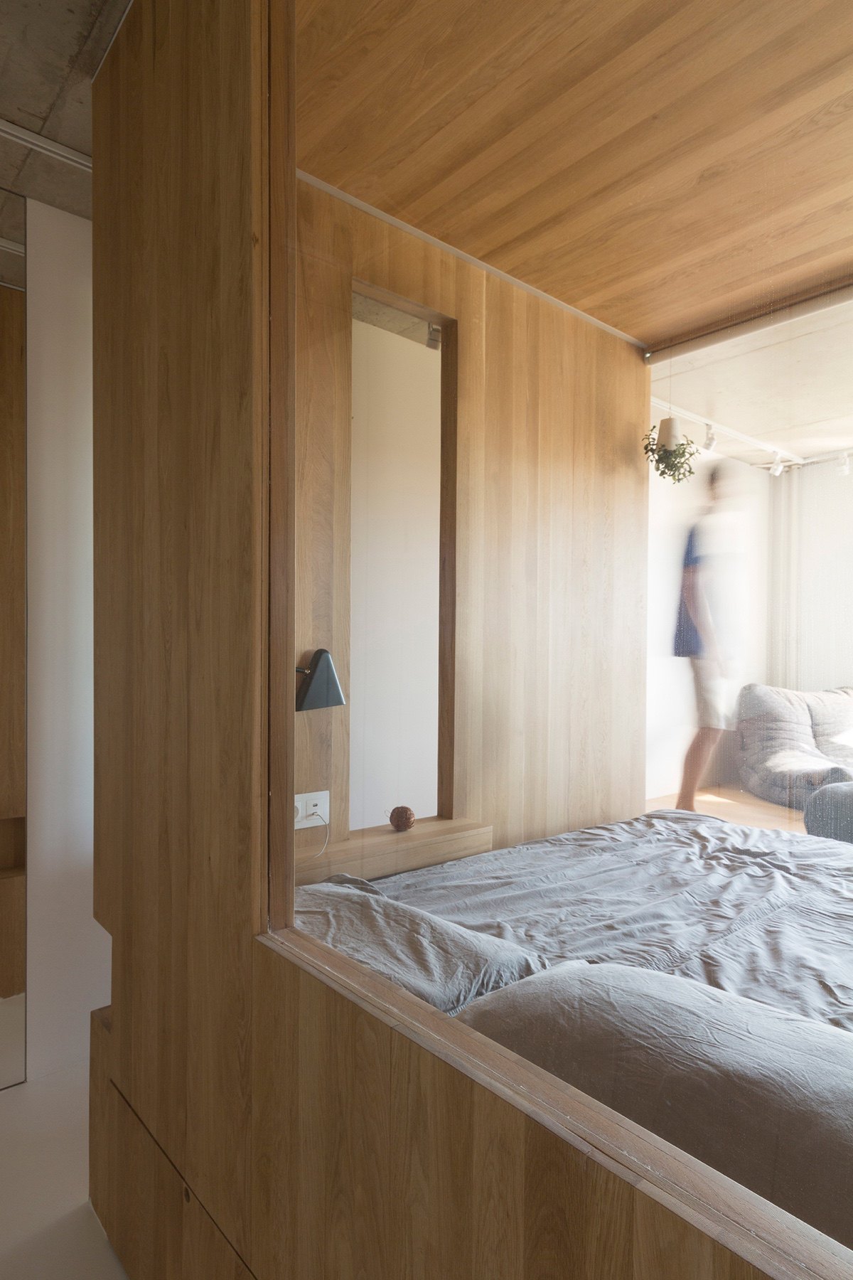
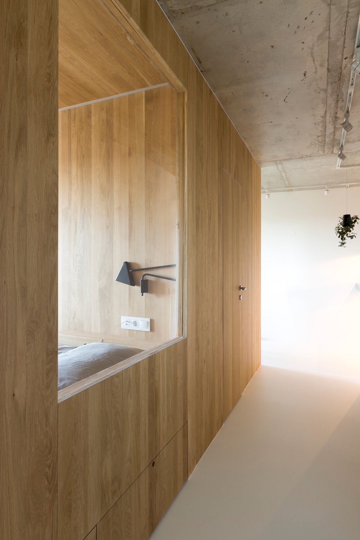
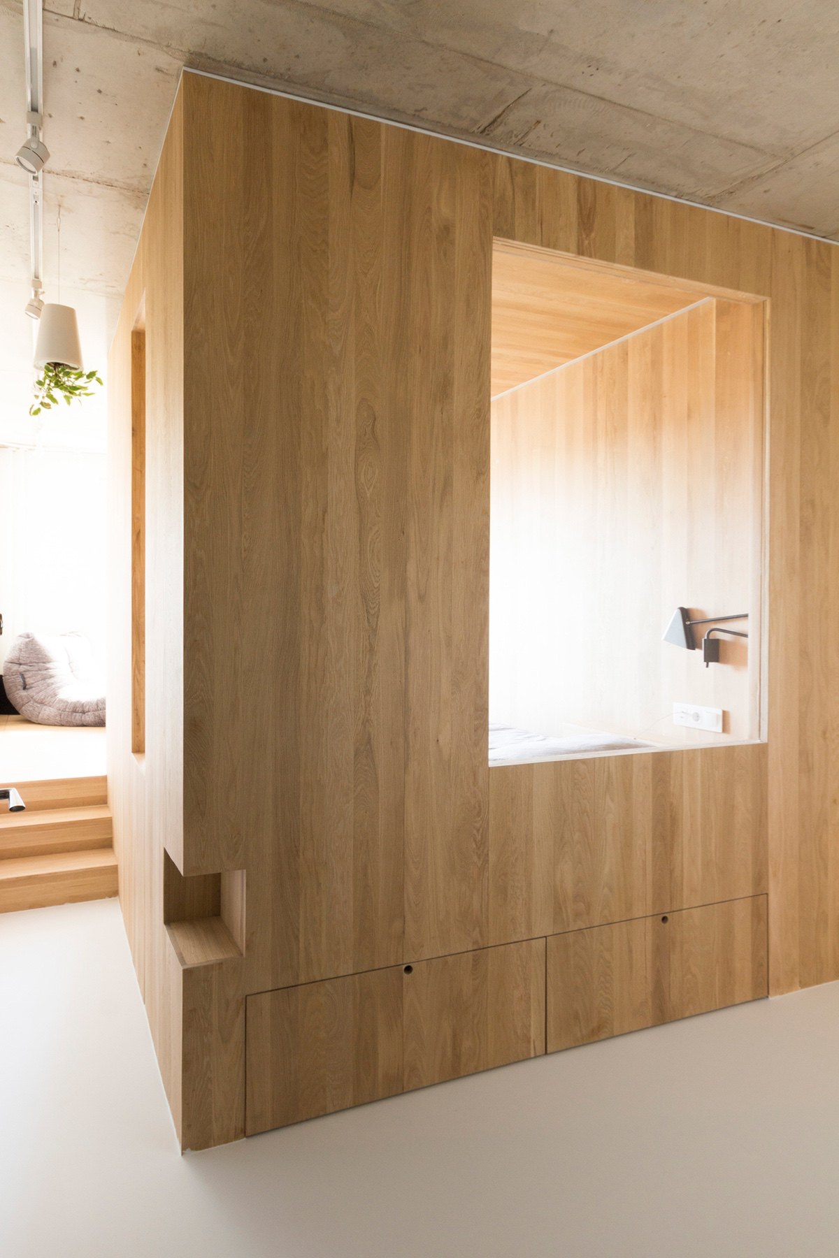
A closer look at the bedroom shows many elements of innovation. Box-shaped in form, LED lights fire up in the evening, moved closer by twin bedside lamps. Jutting ledges in the same wood act as bedside tables, seen from open frames to the side. A ball of raw yarn adds an element of play.
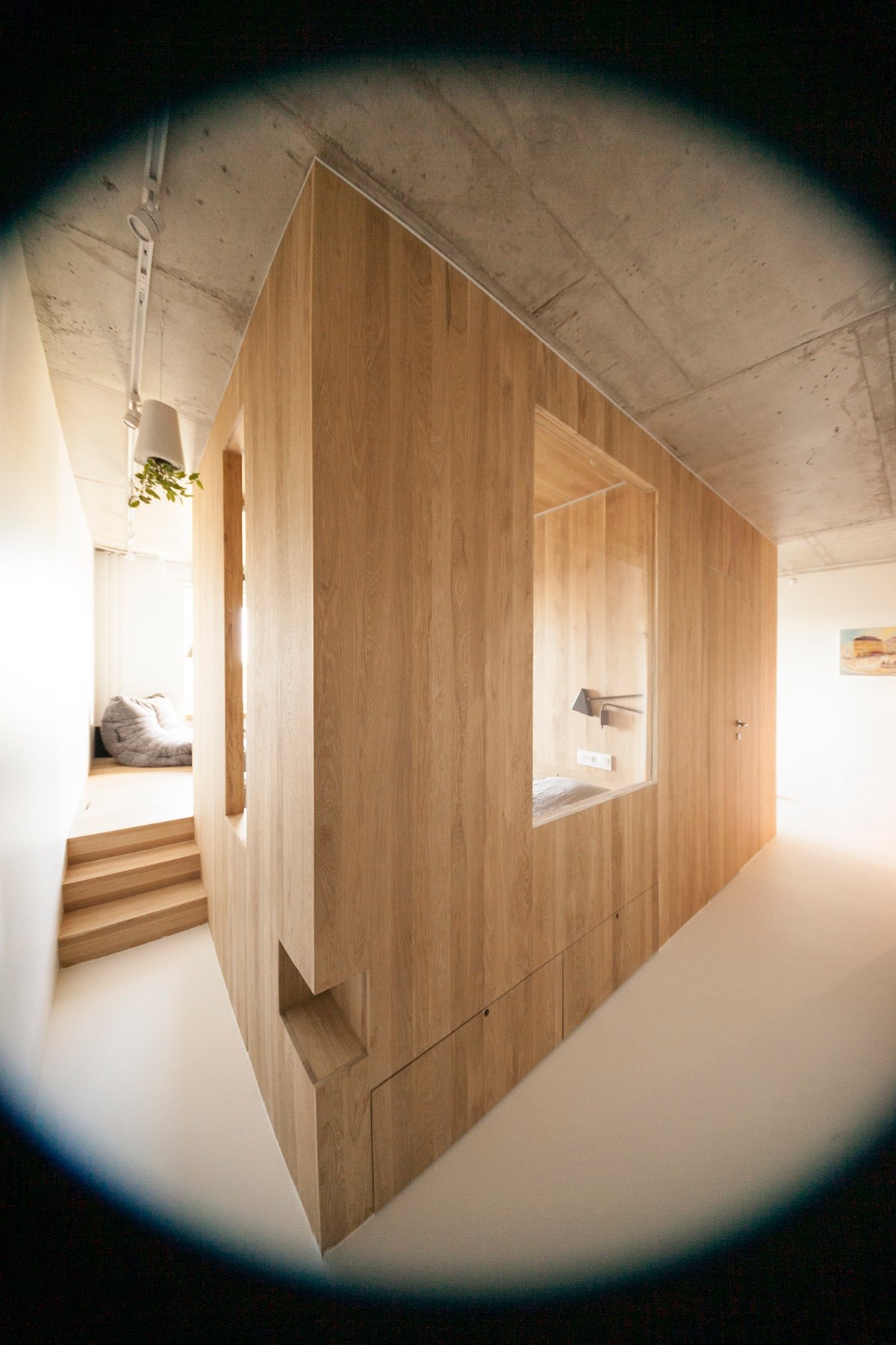
A view from a corridor reveals the secret to lightness and brightness. Although at first glance a square frame, the bedroom is only half wall, with the entrance and two windows removed of barriers. Views through the openings introduce the study and relaxation room, alluding to greater indoor-outdoor flow. Muted colouring avoids furniture blocking.
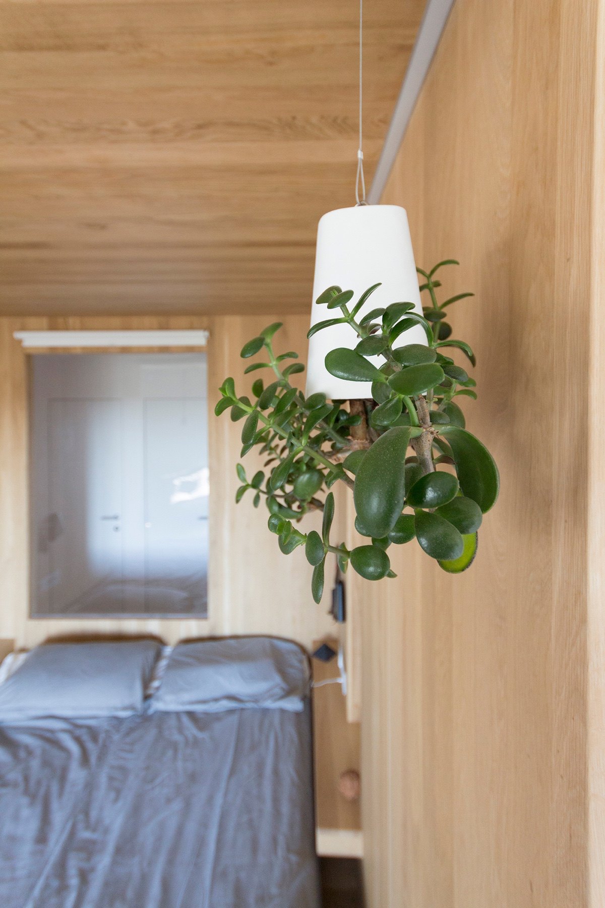
The bedroom’s living lights pop up throughout. The hallway to the left shows a hanging version, a minimalist feature in an otherwise white space. The third sits in a corner, easy to access from the lounge and central corridor. A jut in the bedroom’s wood provides an additional ledge.
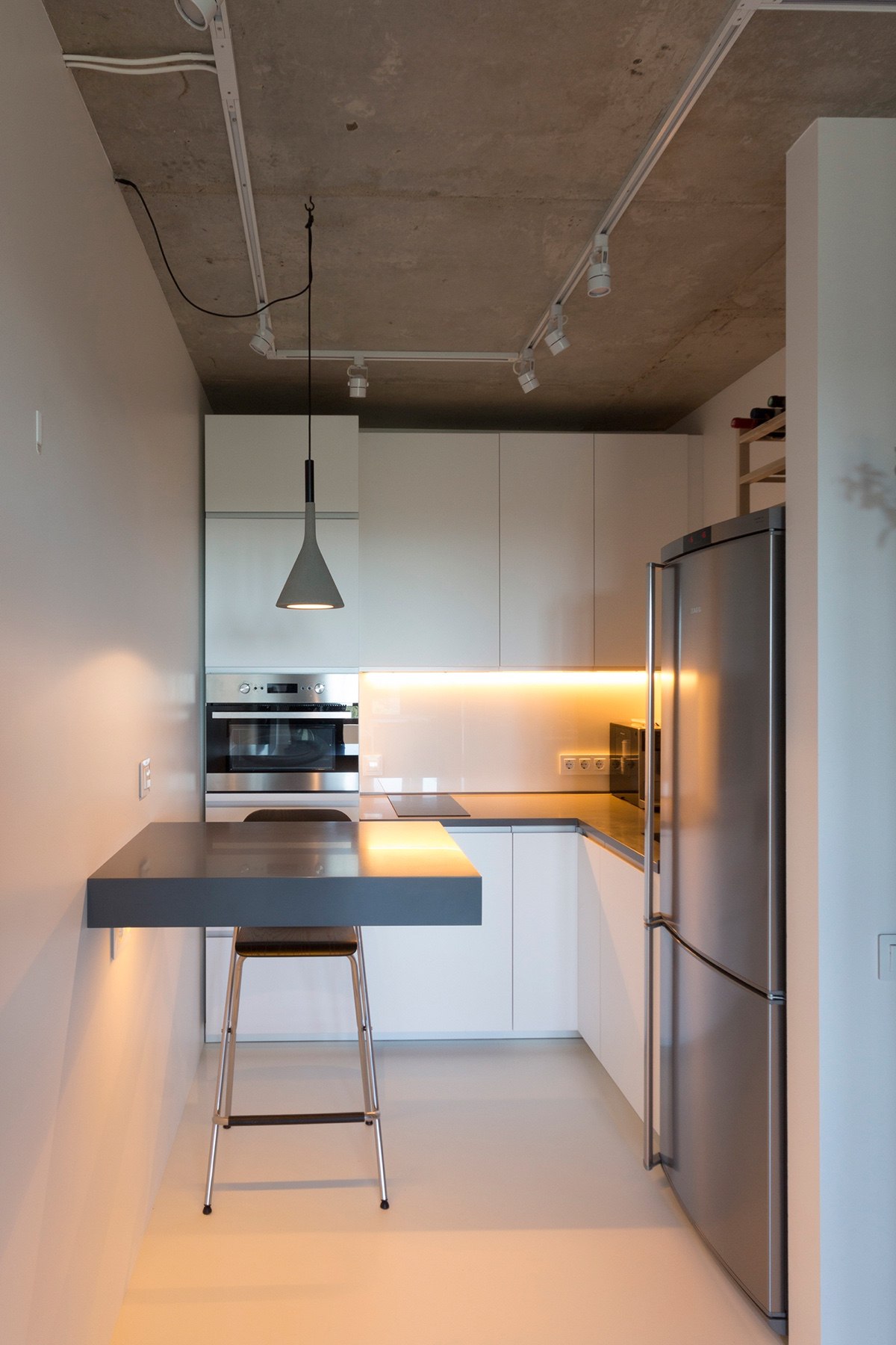
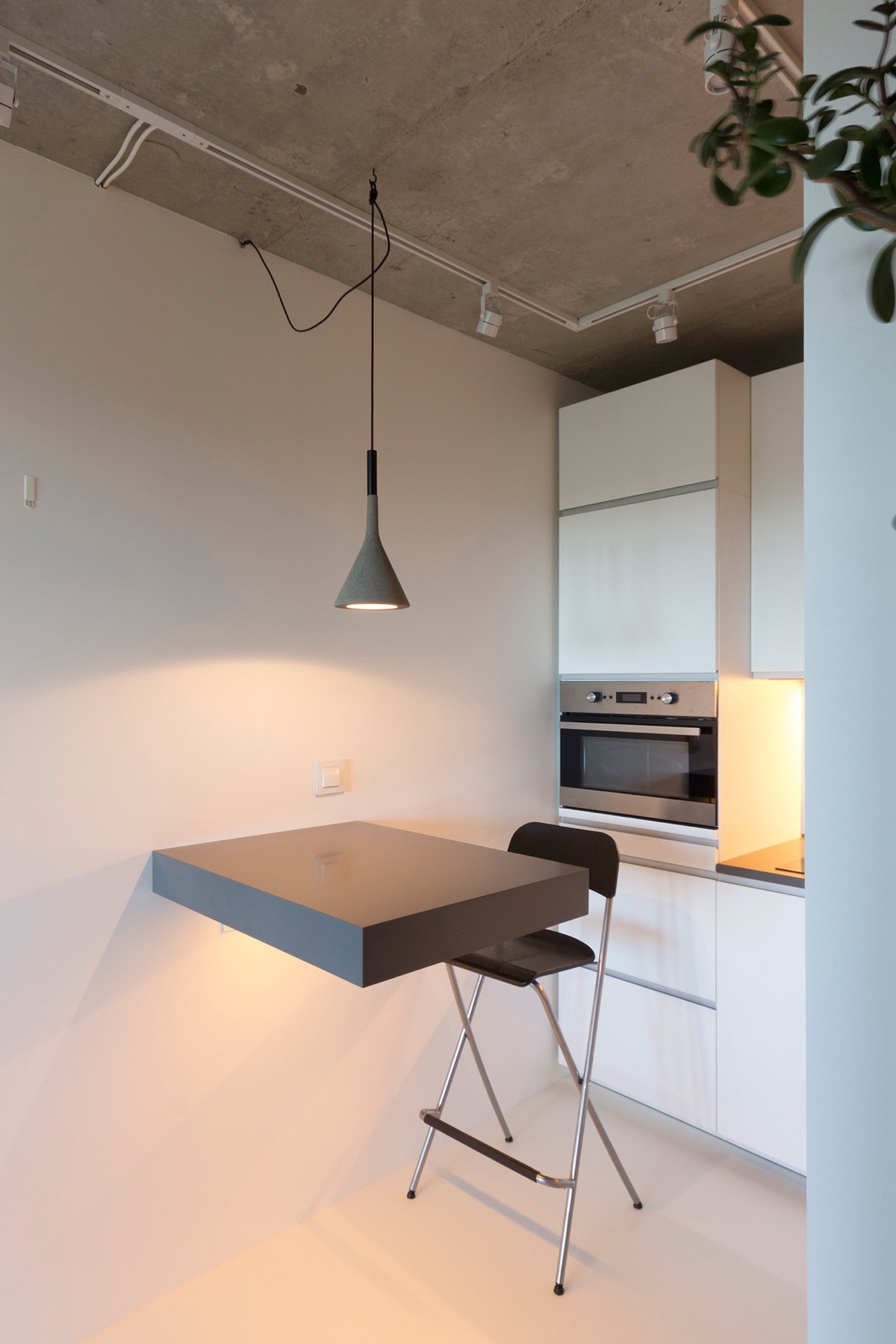
Through the central corridor, a kitchen makes space. The same grey hanging light glows upon a shiny grey breakfast ledge. Simple white cabinetry and a chrome fridge add contrasting elements, white and grey, without breaking up the space. LED lights lining underneath cabinetry provide light and a feeling of warmth.

