Each measuring just under 80 square metres, these modern one bed apartment interiors are fresh and welcoming, with a crisp sense of style. The three interiors each have their own personality and colour scheme going on, but what they do have in common is a great attention to how decor can be utilised to create a cohesive environment, and increase the perception of scale. The designs are also great examples of how space is best sectioned - keep scrolling to the end of each apartment tour to see floor plans, including an inspiring before and after layout for home interior number three.
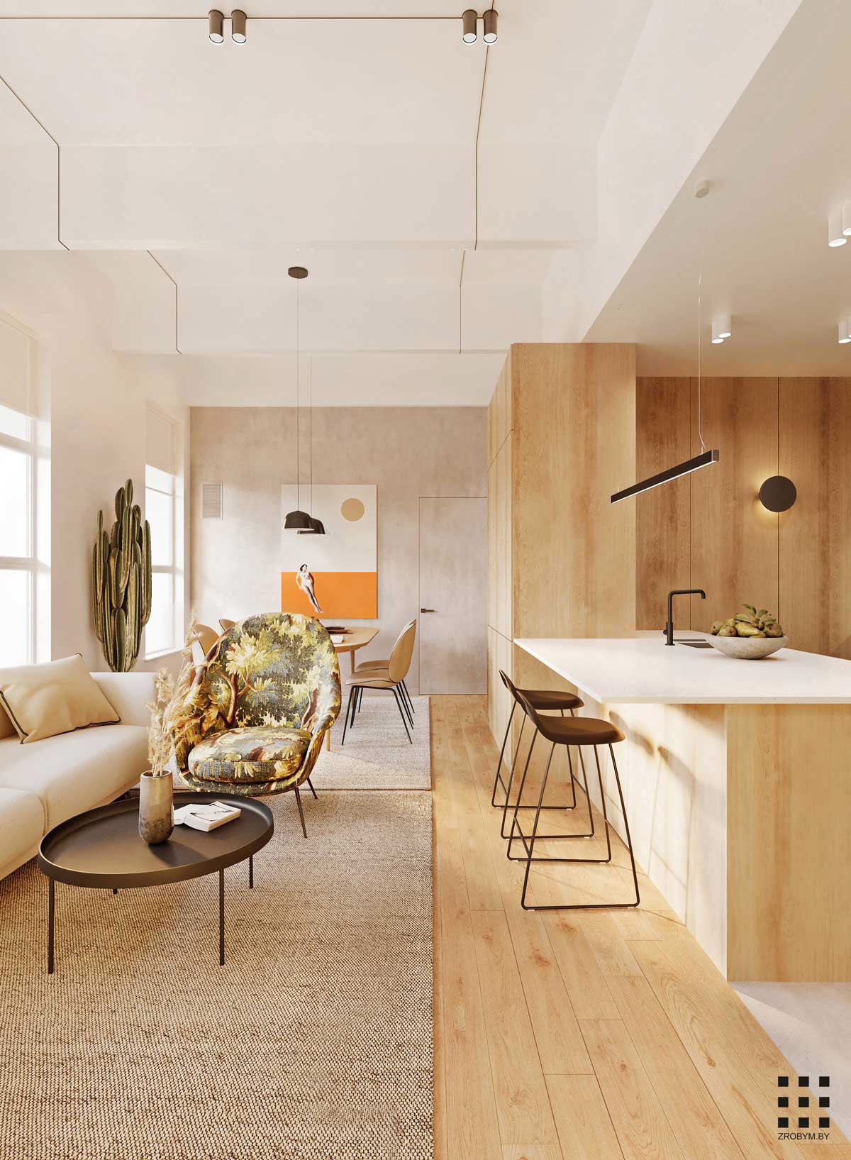
Apartment number one is a Brooklyn apartment, measuring in at 70.5 square metres. An abundance of natural wood tone and jute fill the interior with colour warmth and serene vibes. Small black accents keep everything looking crisp, like the bar stools at the kitchen breakfast bar, a round coffee table in the lounge area, and the lighting throughout.
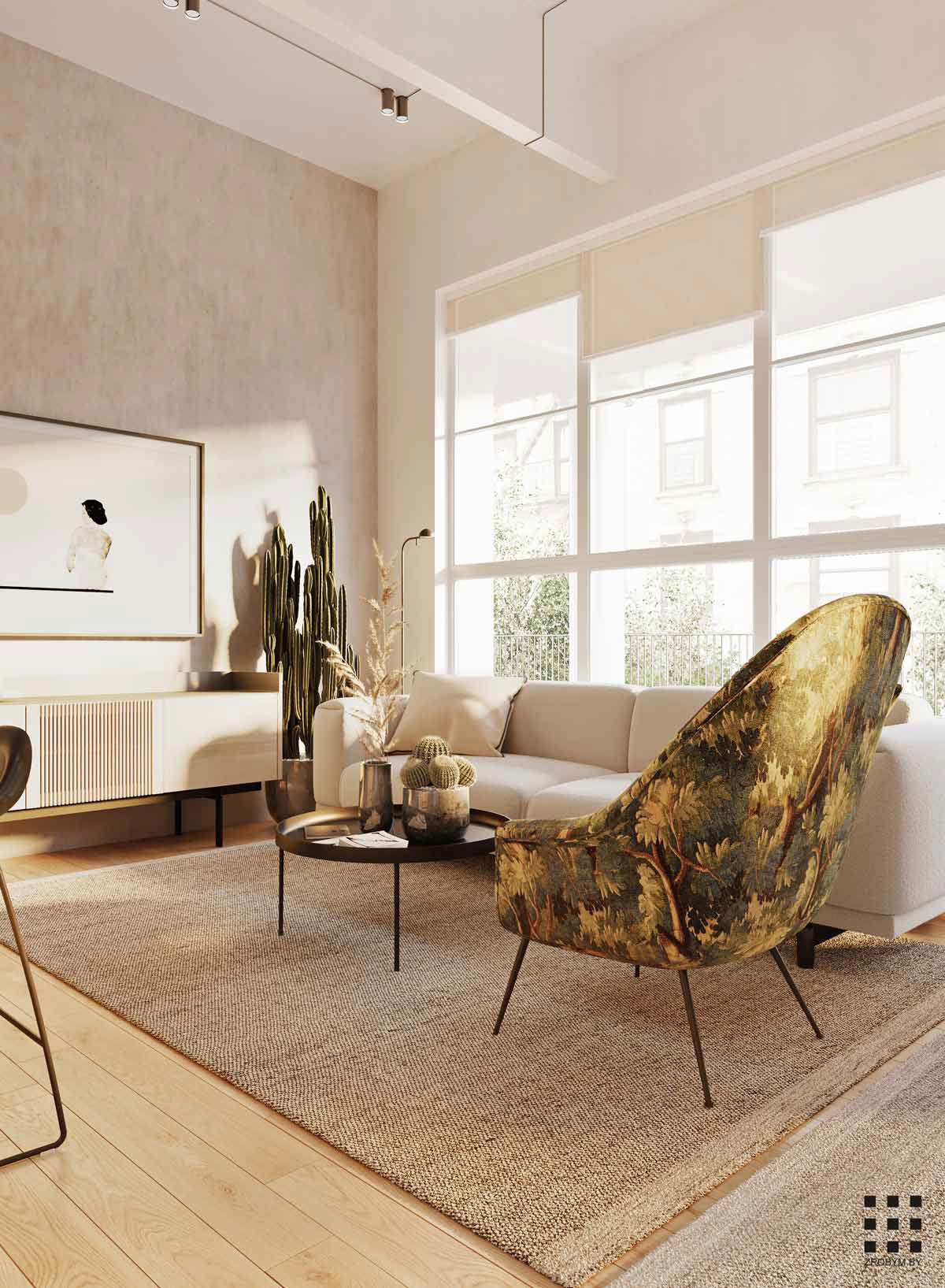
Planters of cacti grow around the open plan room, springing up greenery at regular intervals amongst light serene decor.
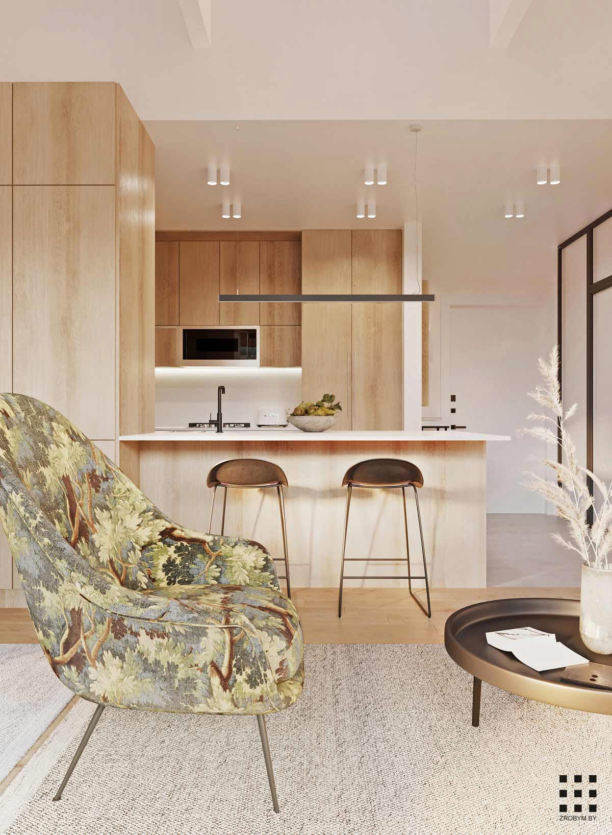
A botanical accent chair adds a little more nature and greenery to the mix.
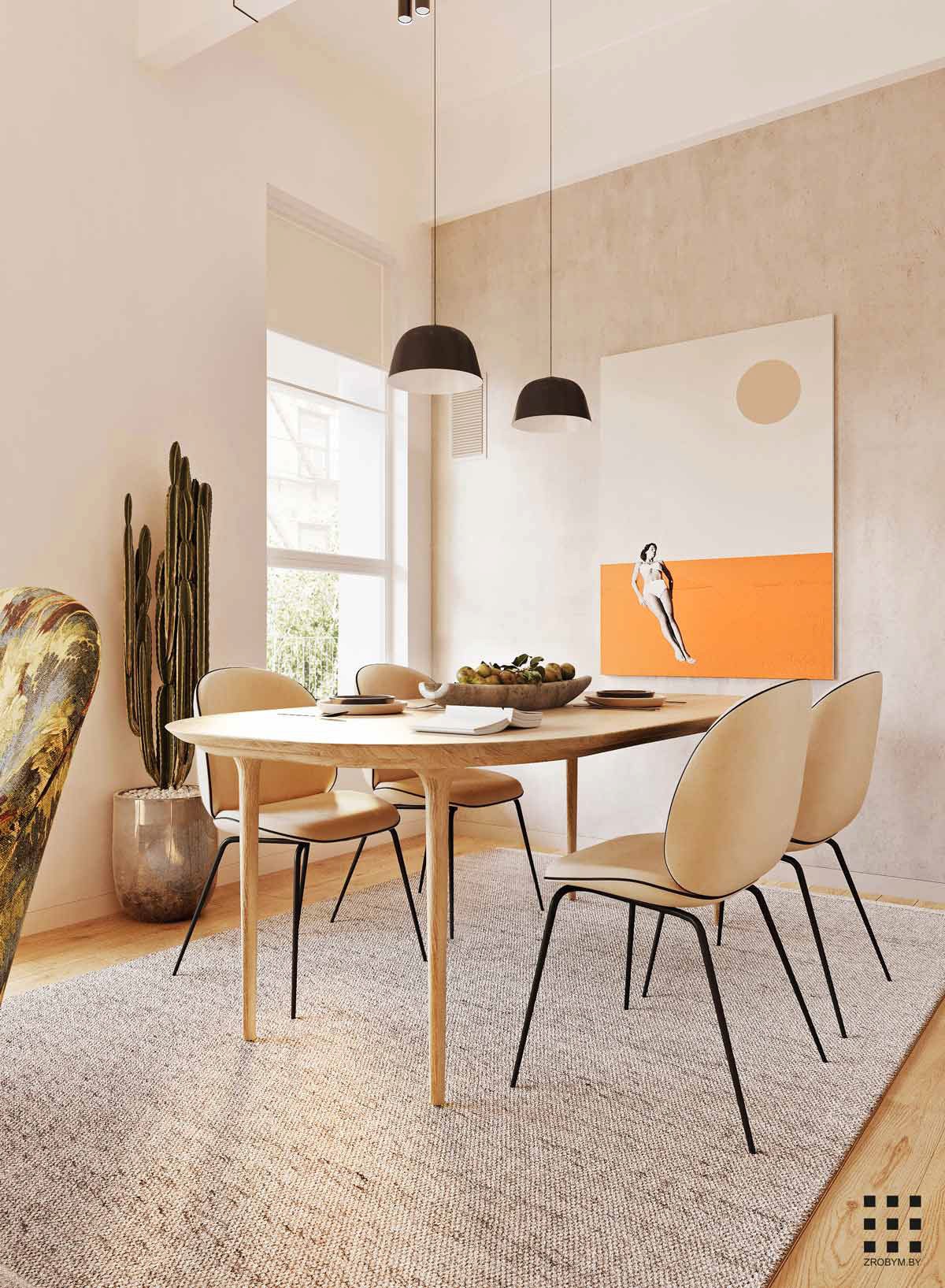
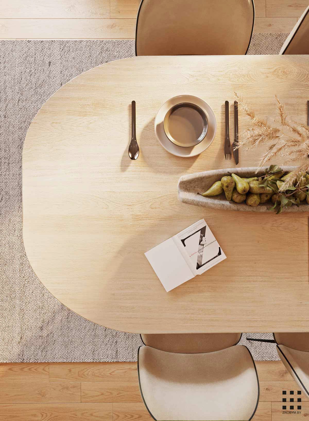
Black dining room pendant lights provide the base note in the eating area. An oval dining table complements the outlines of Gubi Beetle chairs. A rustic fruit bowl makes a table centrepiece. See more unique fruit bowls.
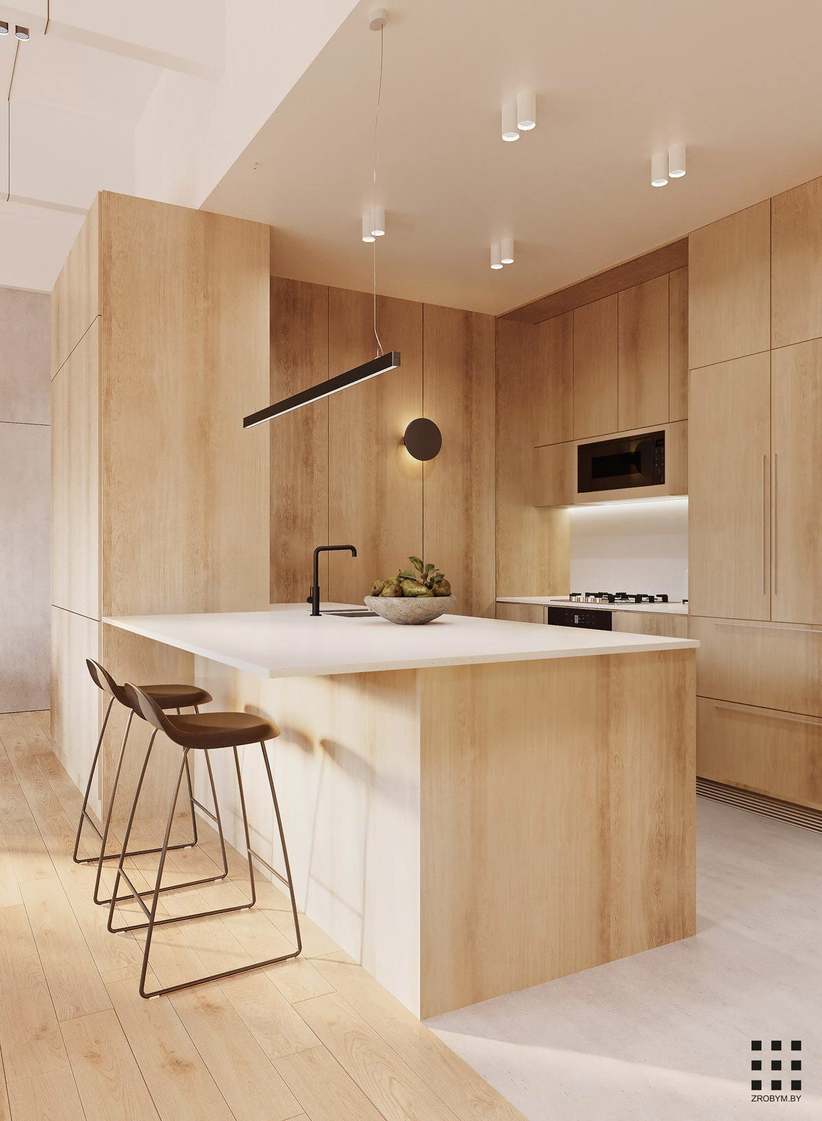
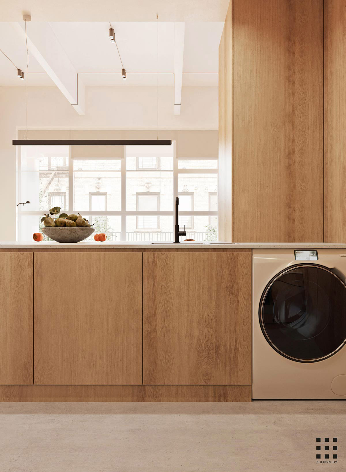
Two kitchen bar stools pull up at the kitchen peninsula as a casual dining spot. A black faucet ties in with the black linear suspension light over the bar.
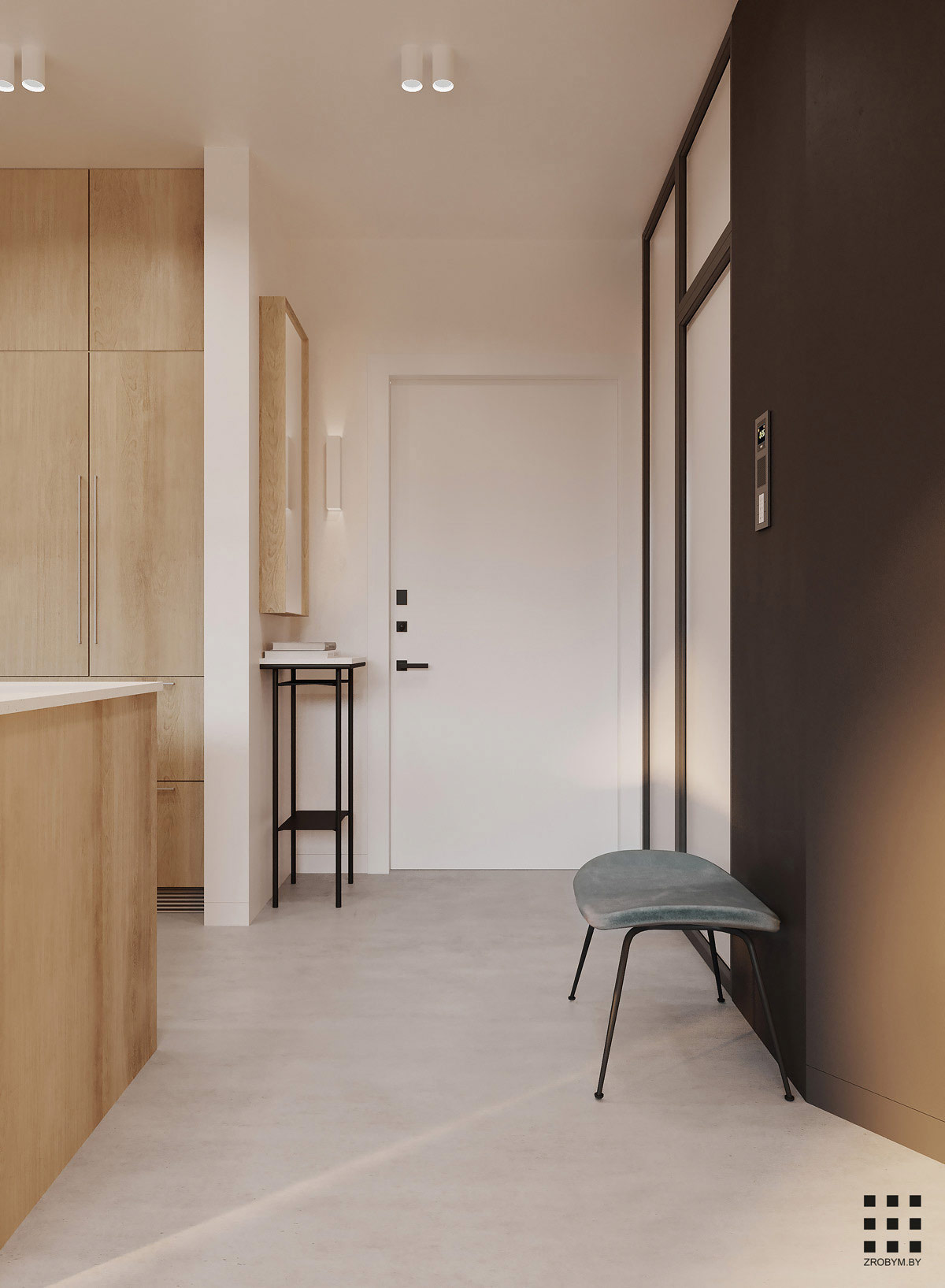
Black legs stand tall beneath an entryway table, opposite black framed closets. The contrast between the dark closets and the light wood finish of the adjacent kitchen helps build depth and dimension in the long room.
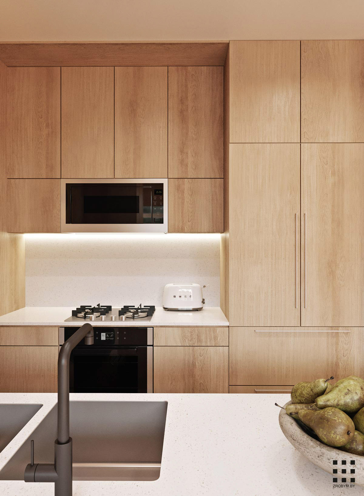
Bench space is limited in the small kitchen, but the peninsula provides extra prep space.
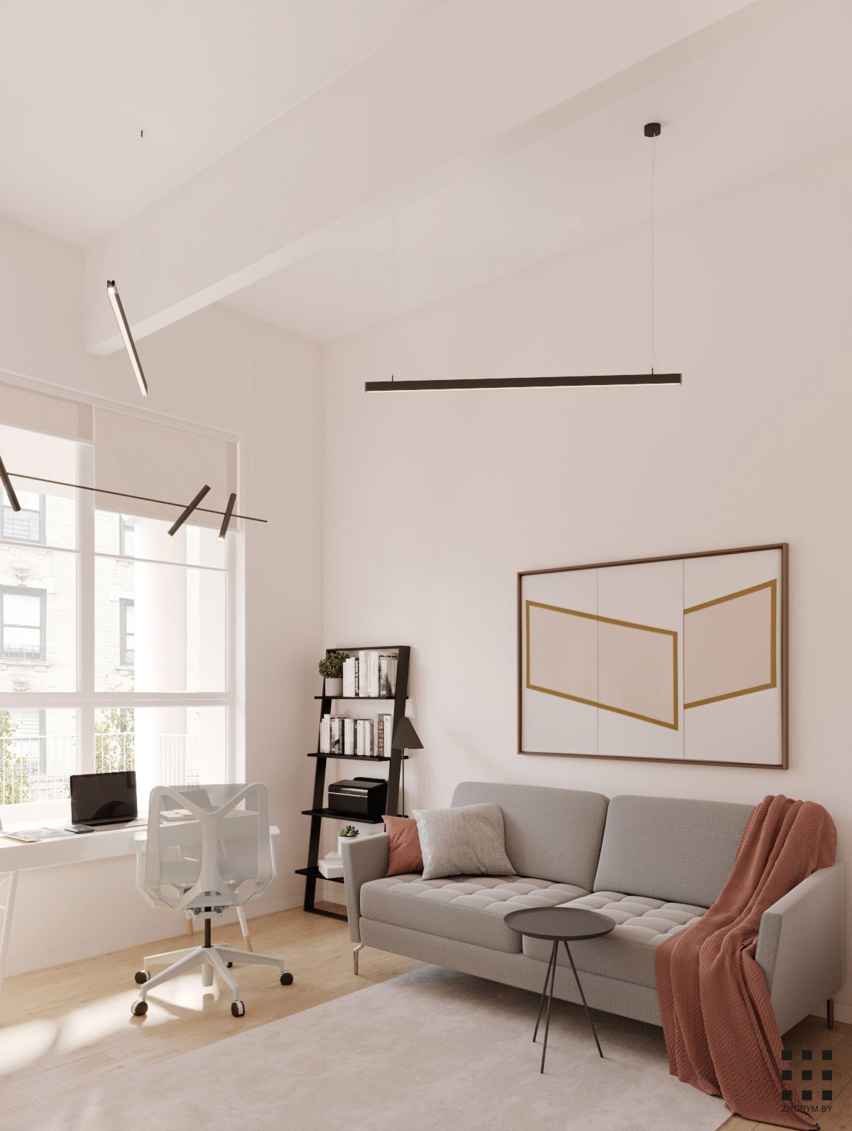
Although the apartment is a one bed home, there is also a dedicated home office that could potentially be fashioned into a guest room. For now, the desk by the window is joined by a neat sofa and small side table.
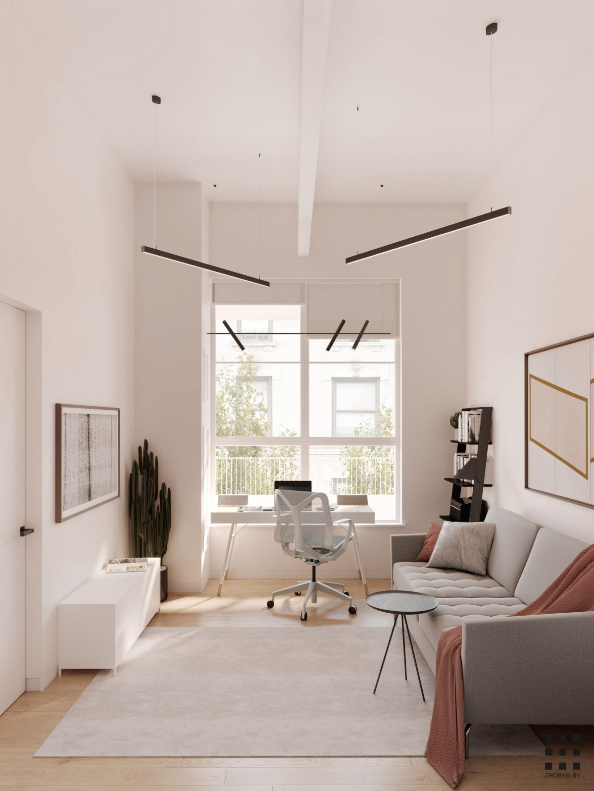
A ladder bookcase and a low level storage unit completes the minimalist home office furniture. A linear lighting arrangement strikes black lines across the white ceiling.
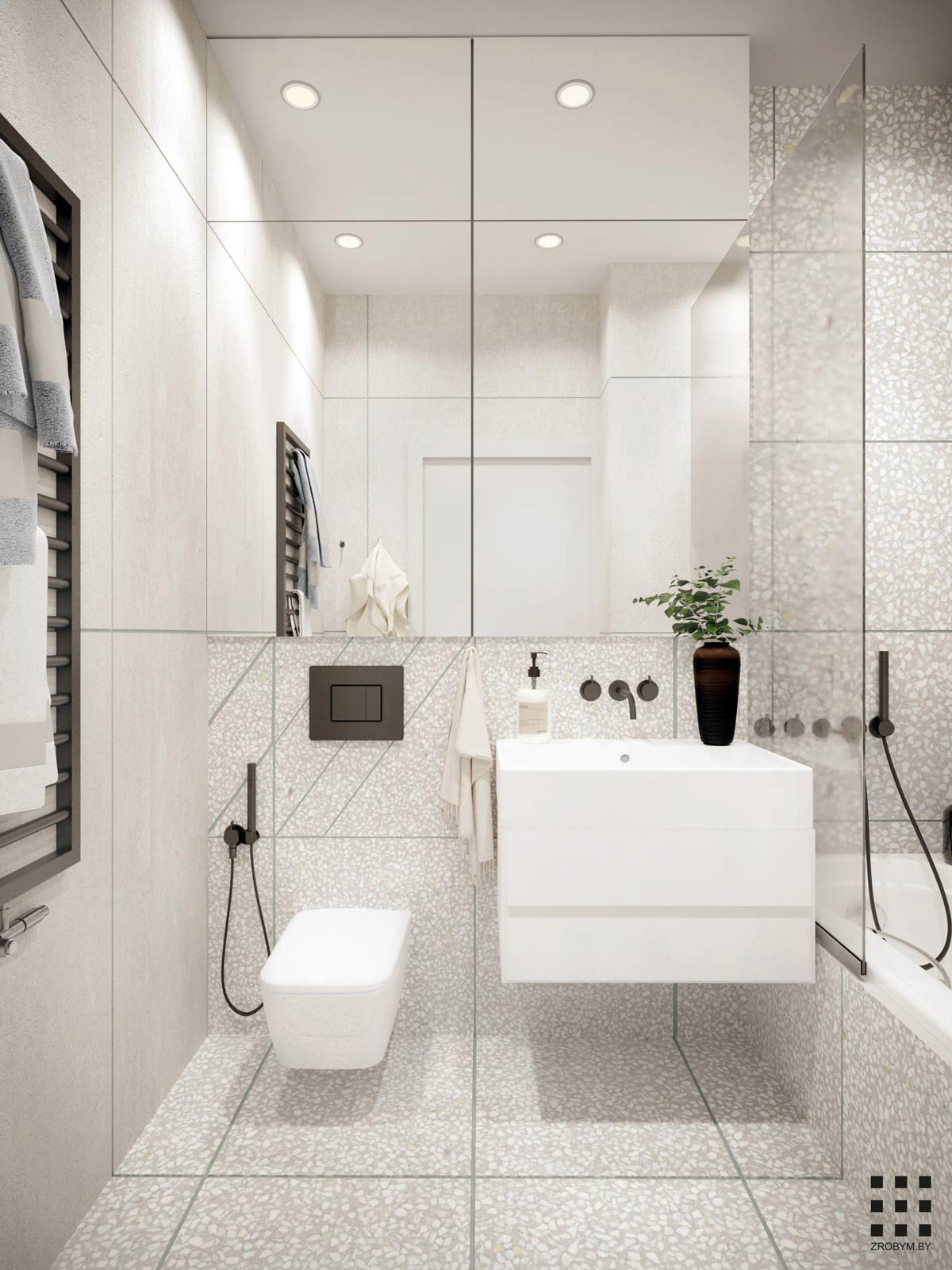
The small grey and white bathroom is fitted with sleek wall mounted pieces to increase the sense of space. Just one style of tile cohesively covers the floor, walls and bath panel.
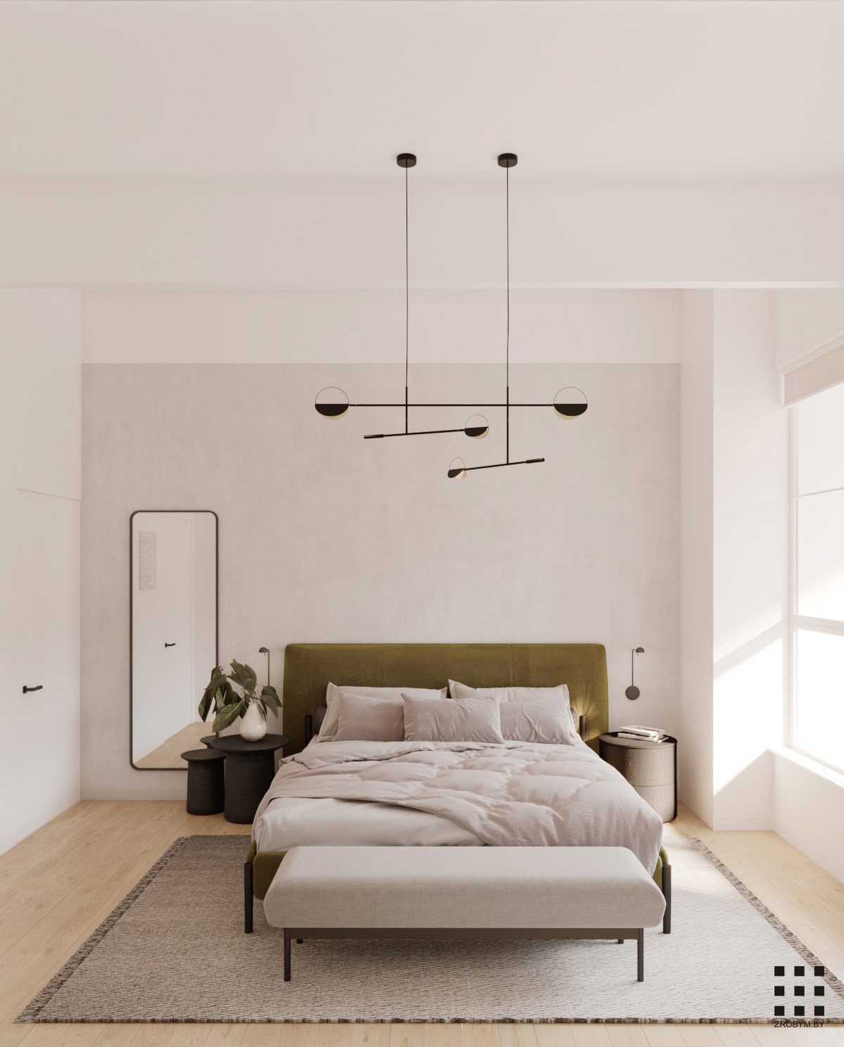
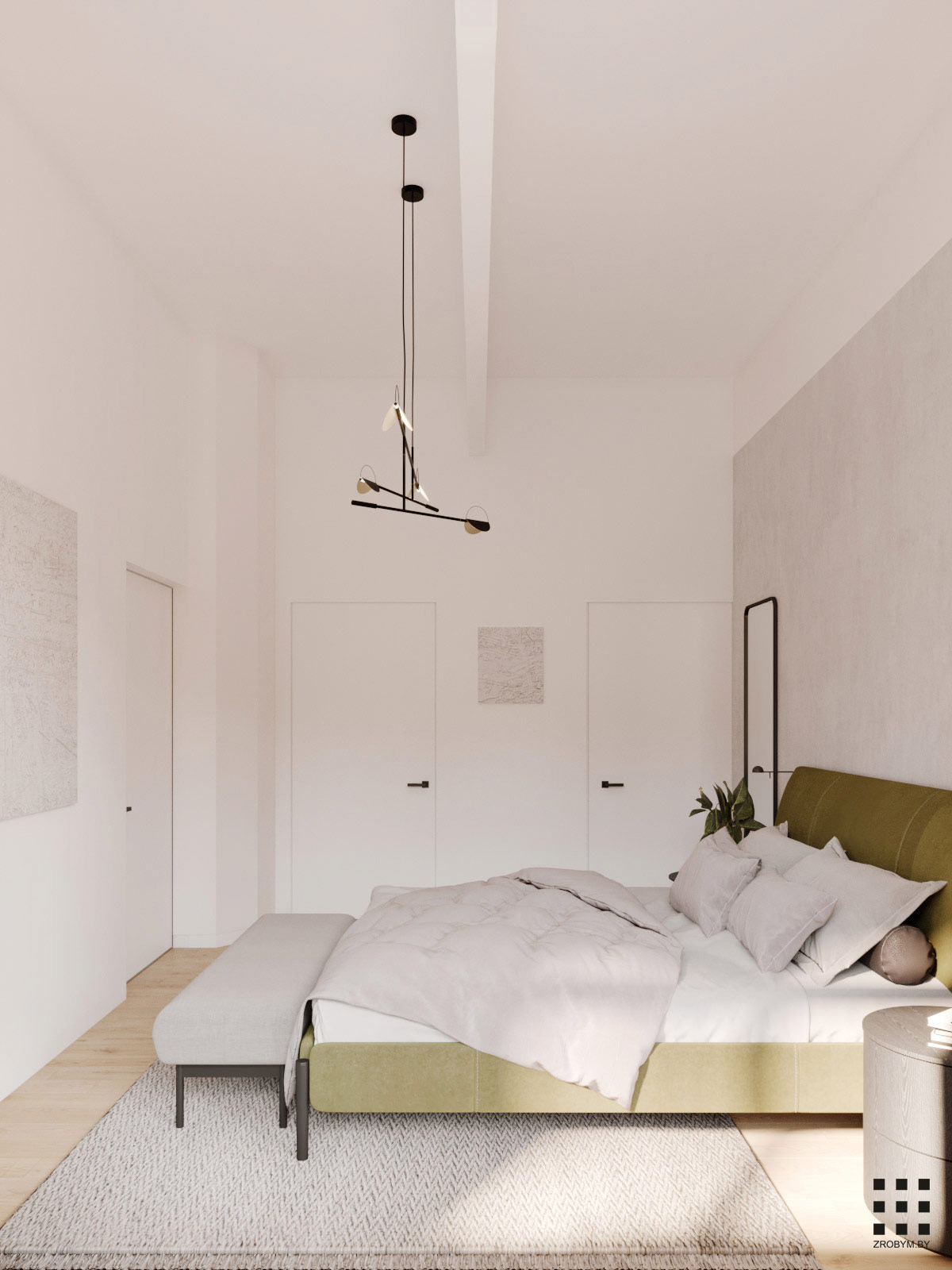
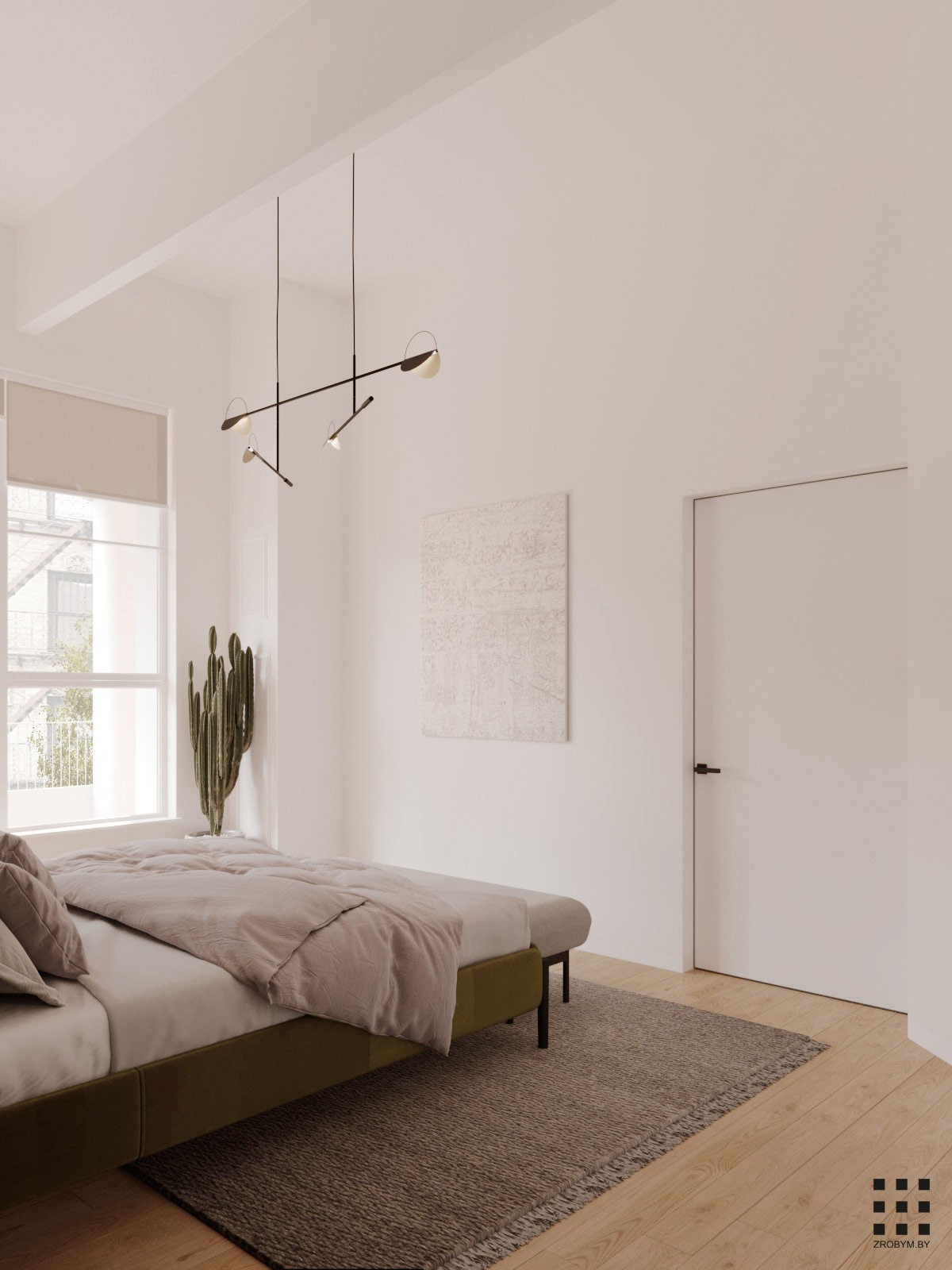
A linear chandelier tops a relaxing bedroom design, where the only pop of colour comes from an olive green bedstead.
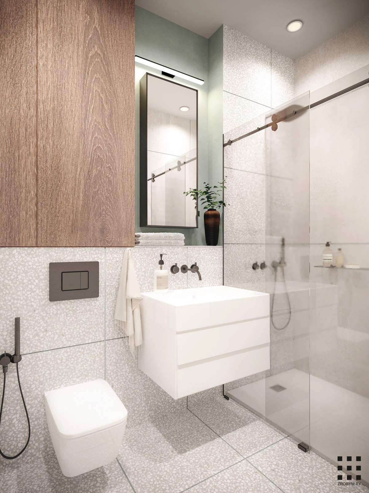
A different pop of green colours the ensuite. This time, a pale sage green colours the bathroom sink area.
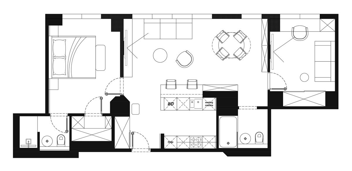
The floor plan illustrates how the size of the study, and its proximity to a shower room, would make it a practical guest bedroom.
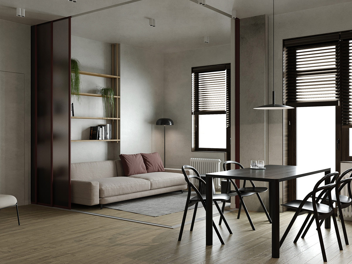
Our second home design is in Odessa, Ukraine, measuring a slightly larger 75 square metres. Glass doors open up around the lounge to make one large and airy living room.
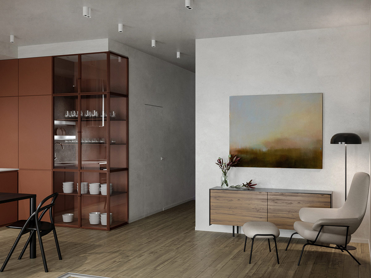
Glass cabinets for dishes help the room appear more spacious. The glass also helps reflect natural light from the windows.
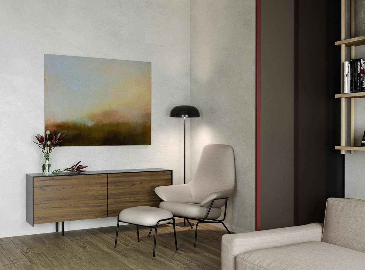
A comfortable reading chair and floor reading lamp resides in one corner of the room, by a peaceful wall painting.
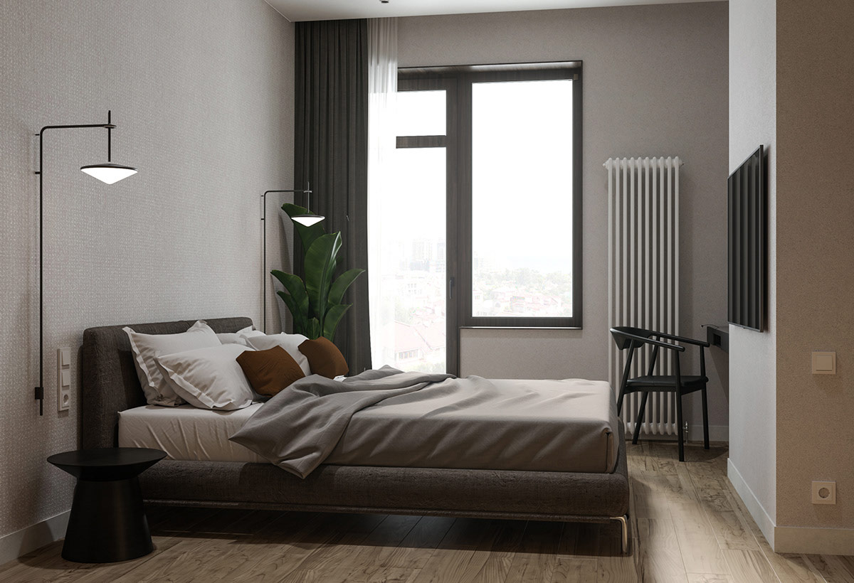
Eye-catching wall sconces are placed each side of the platform bed.
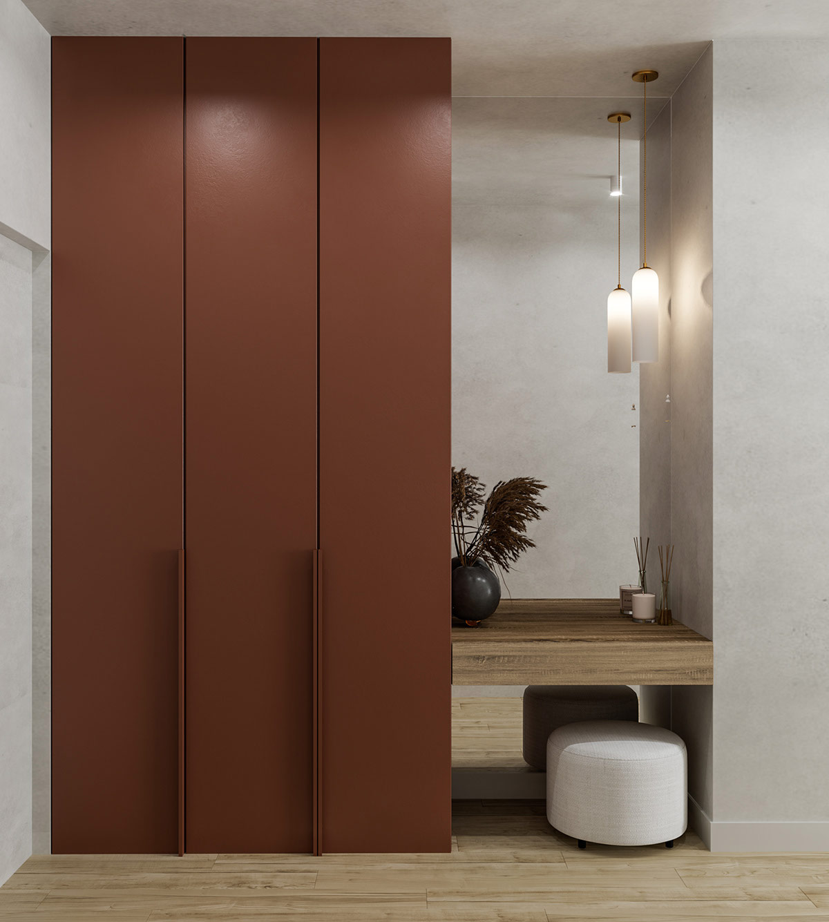
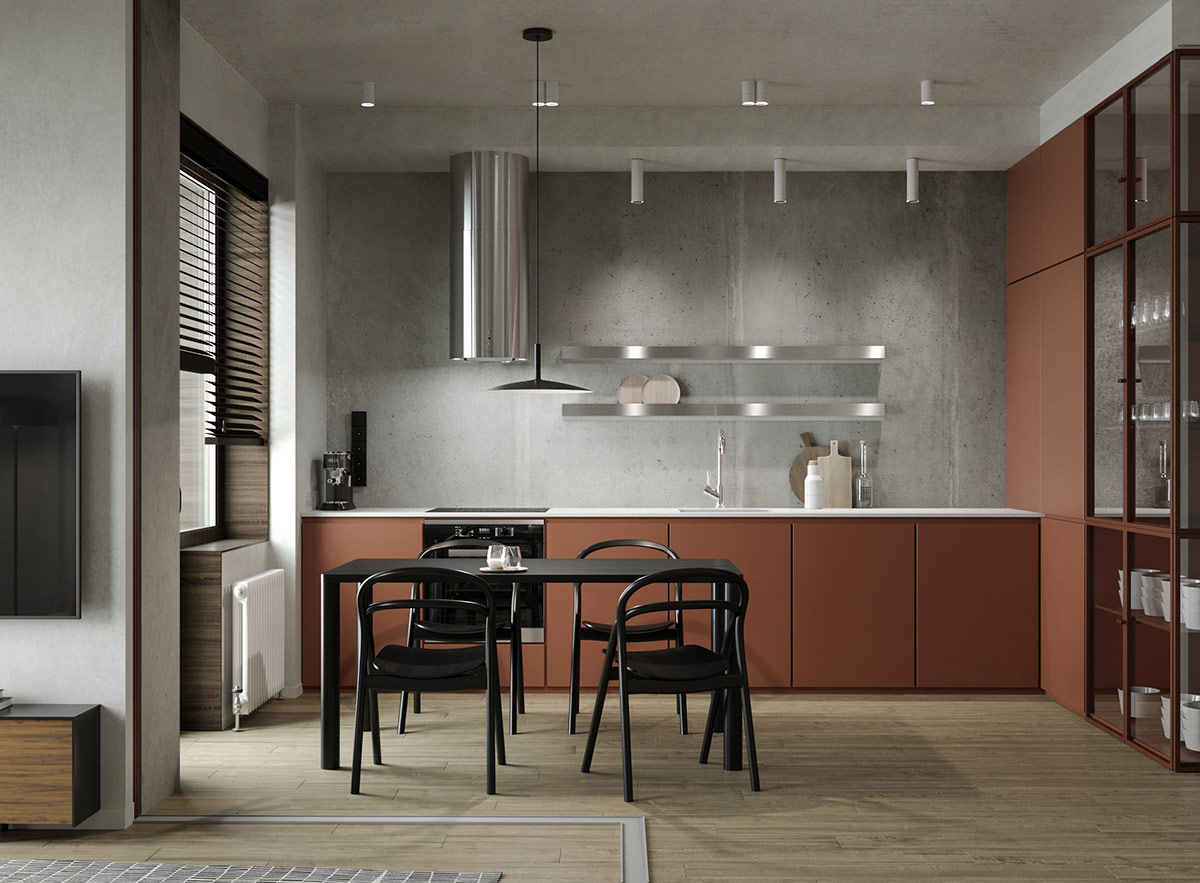
In the home entryway, wardrobes have been built using the same red material as the kitchen units to create a flowing colour story right from the front door.
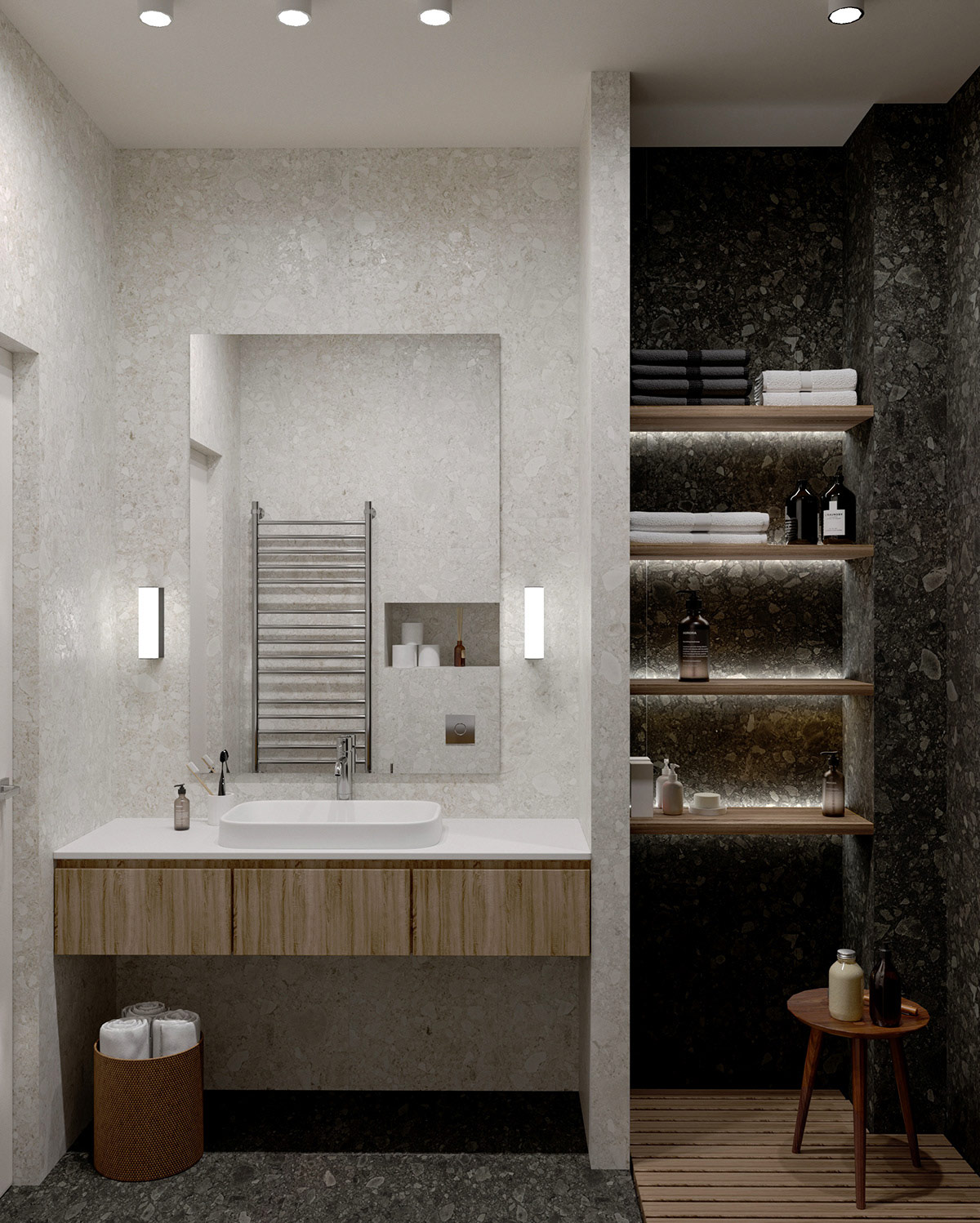
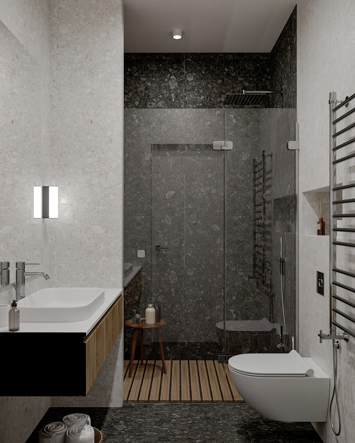
Simple modern wall sconces have been installed as bathroom vanity lights. Shelf lights brighten a shadowy recess.
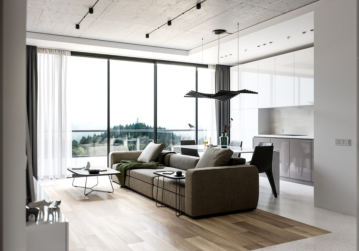
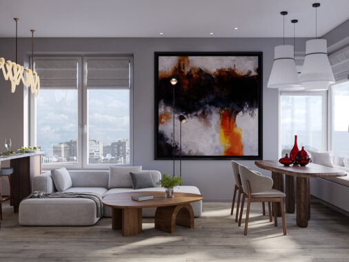
Our third and last apartment interior has a total area of 74.1 square metres, located in Ivano-Frankivsk, Ukraine. A modern sofa has been placed through the centre of the open plan to divide the floor between a lounge area and kitchen.
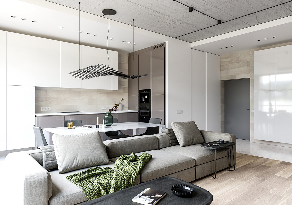
The grey sectional sofa is a low backed design to ensure that the room still flows as one, and makes conversation easy between the kitchen-diner and lounge.
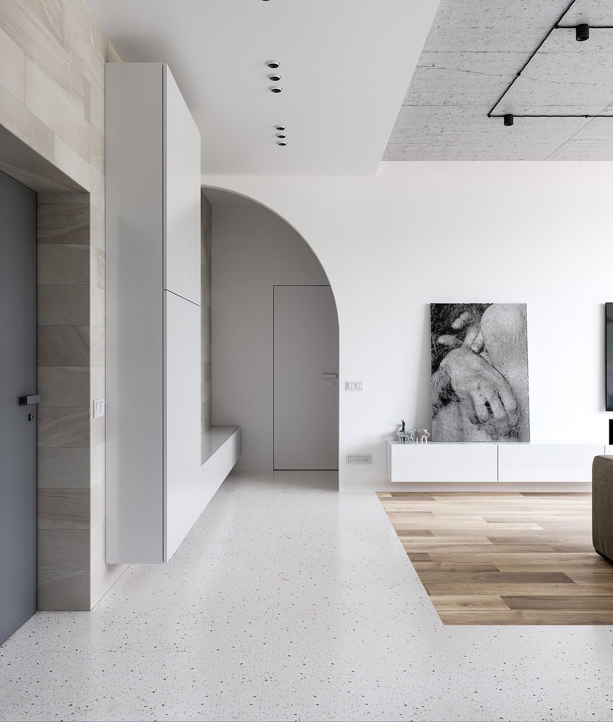
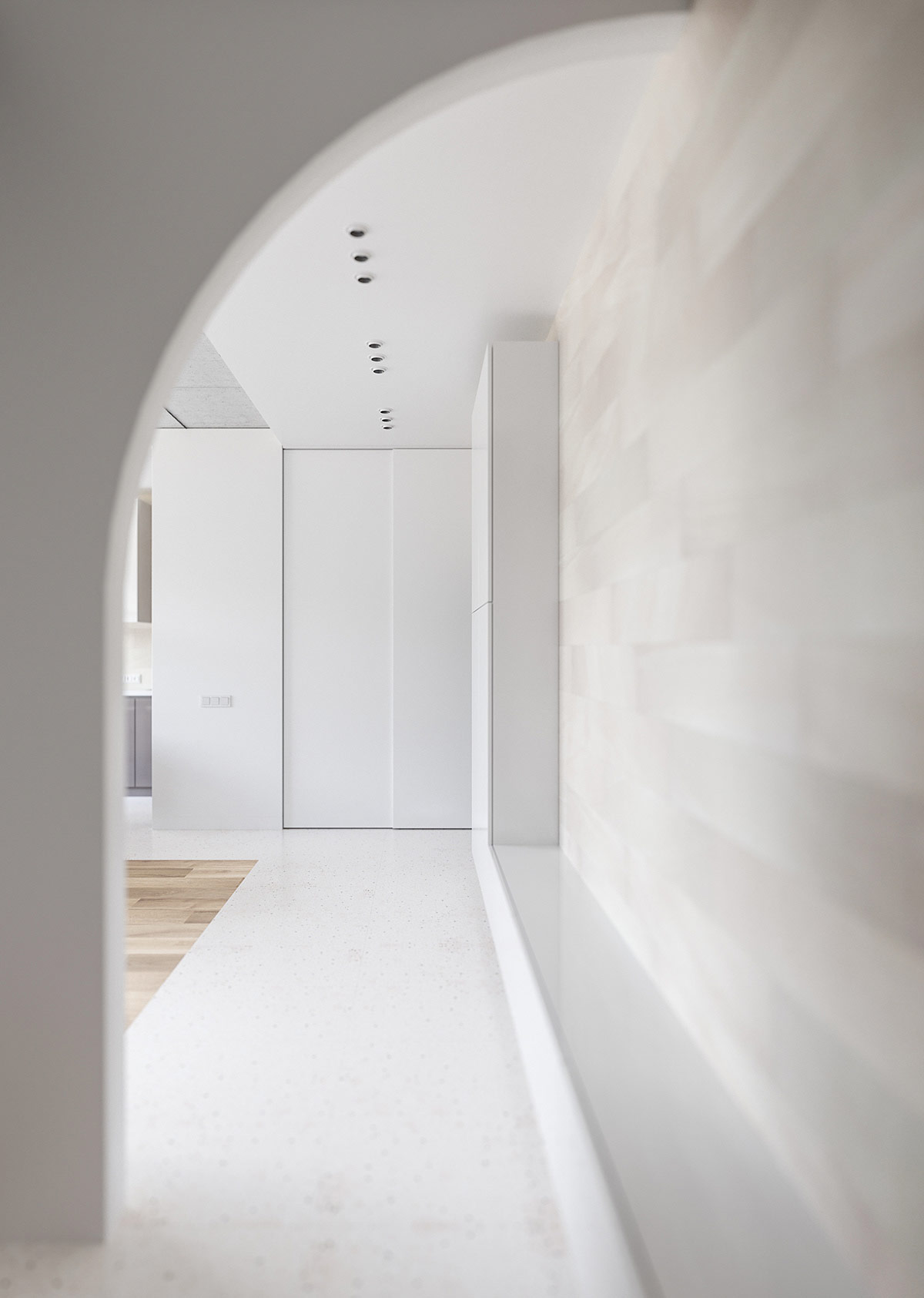
An arched doorway presents an interesting feature in the architecture of the building, bringing eye-catching design where there is no decor, colour or elaborate trim.
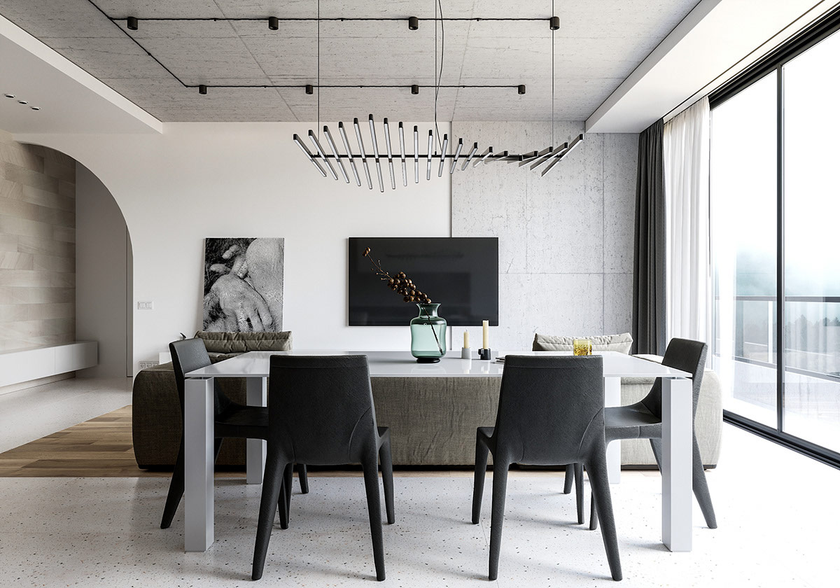
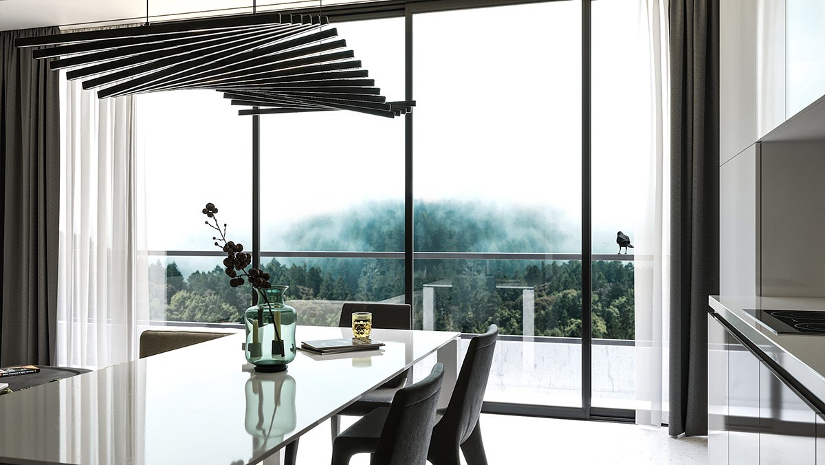
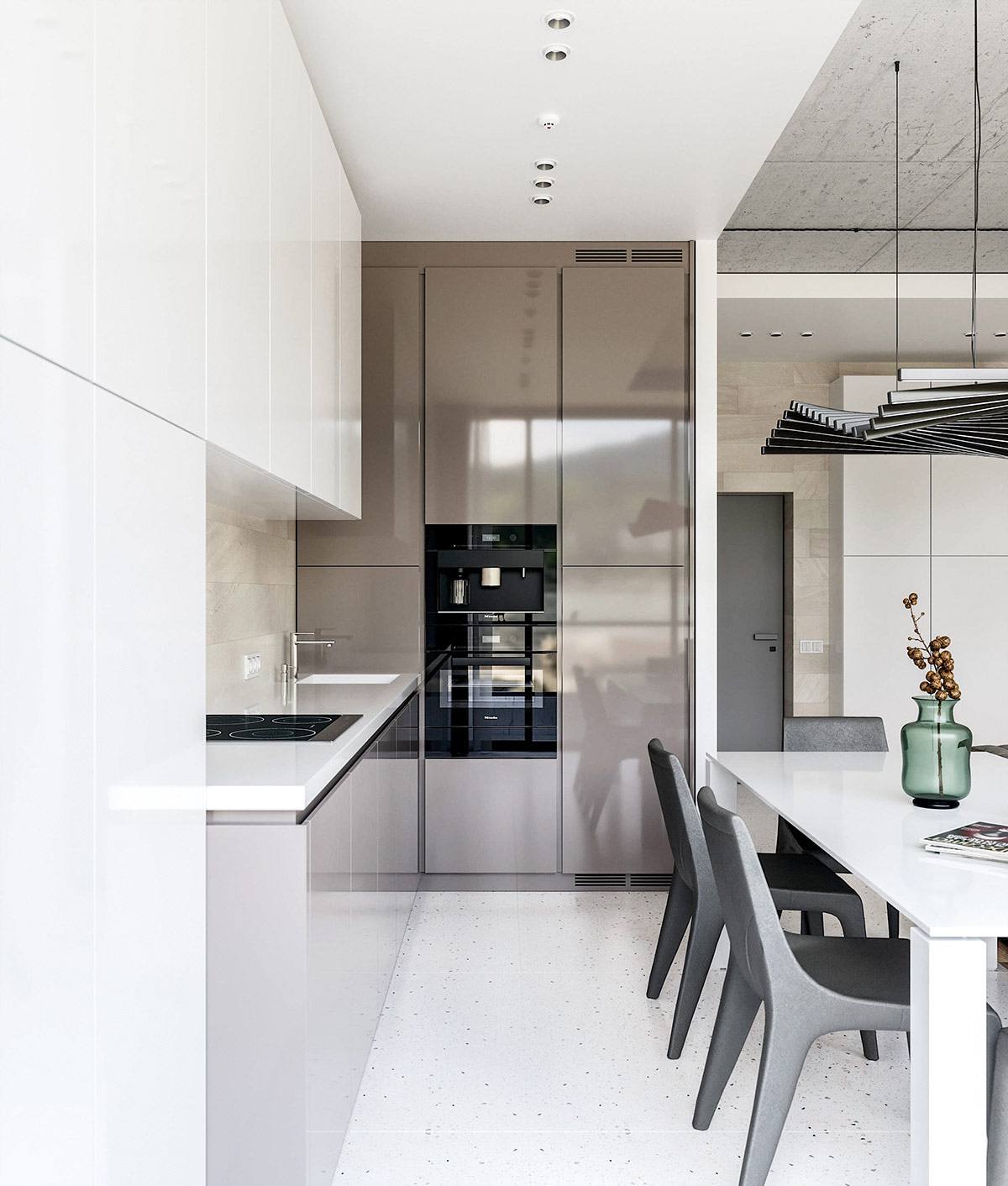
A rectangular dining table and modern dining chairs stretch out behind the length of the sofa, in contrasting white and black finishes.
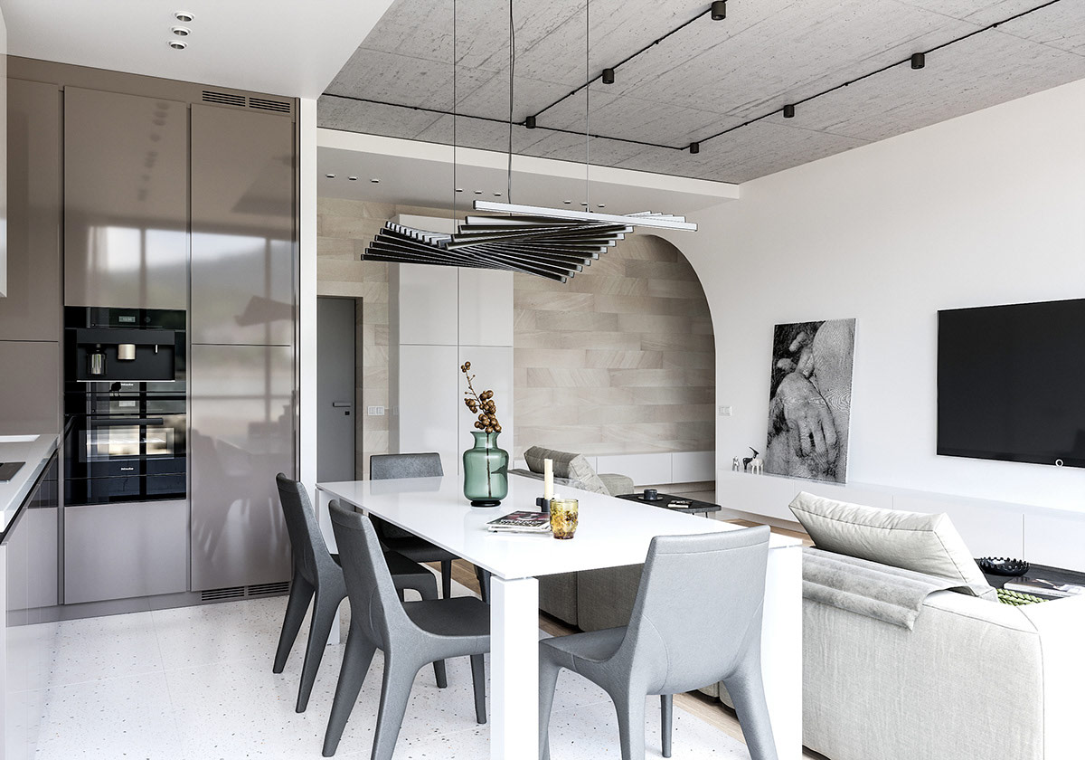
A unique modern chandelier waves across the ceiling.
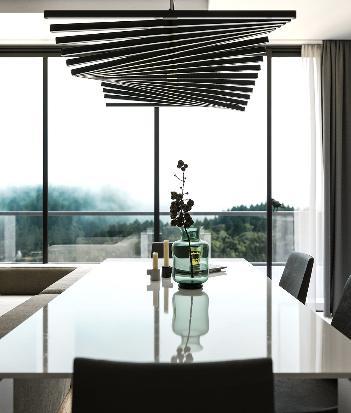
The curves of an elegant glass vase shine in the daylight.
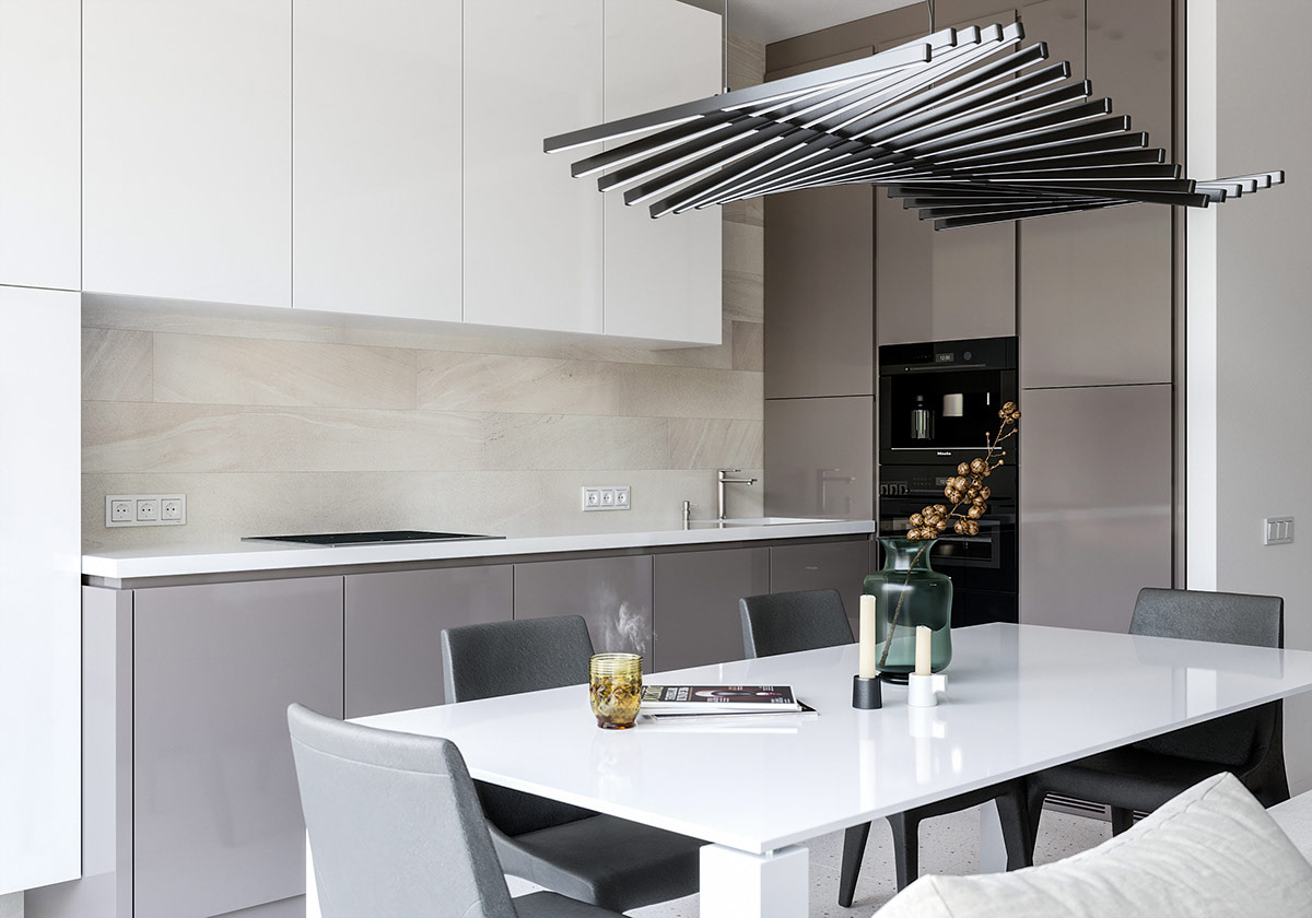
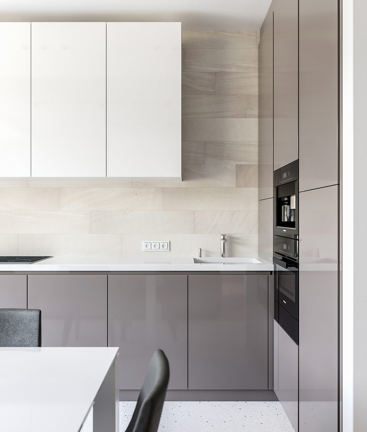
Grey gloss cabinets weight the base of the kitchen design, whilst white cabinets lightly cross the top.
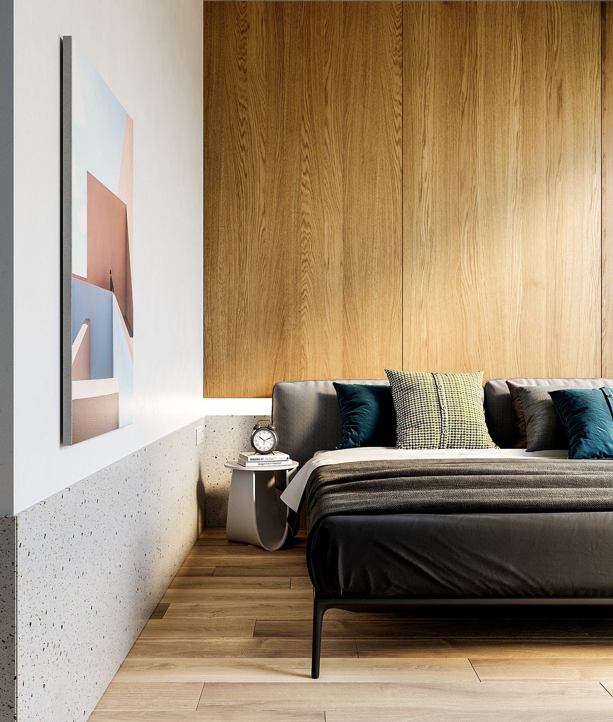
In the bedroom, white decor is visually warmed through with the introduction of wooden wall panels. The natural timber panels bring texture to the upper part of a headboard feature wall, whilst a terrazzo border speckles the lower quarter of the room.
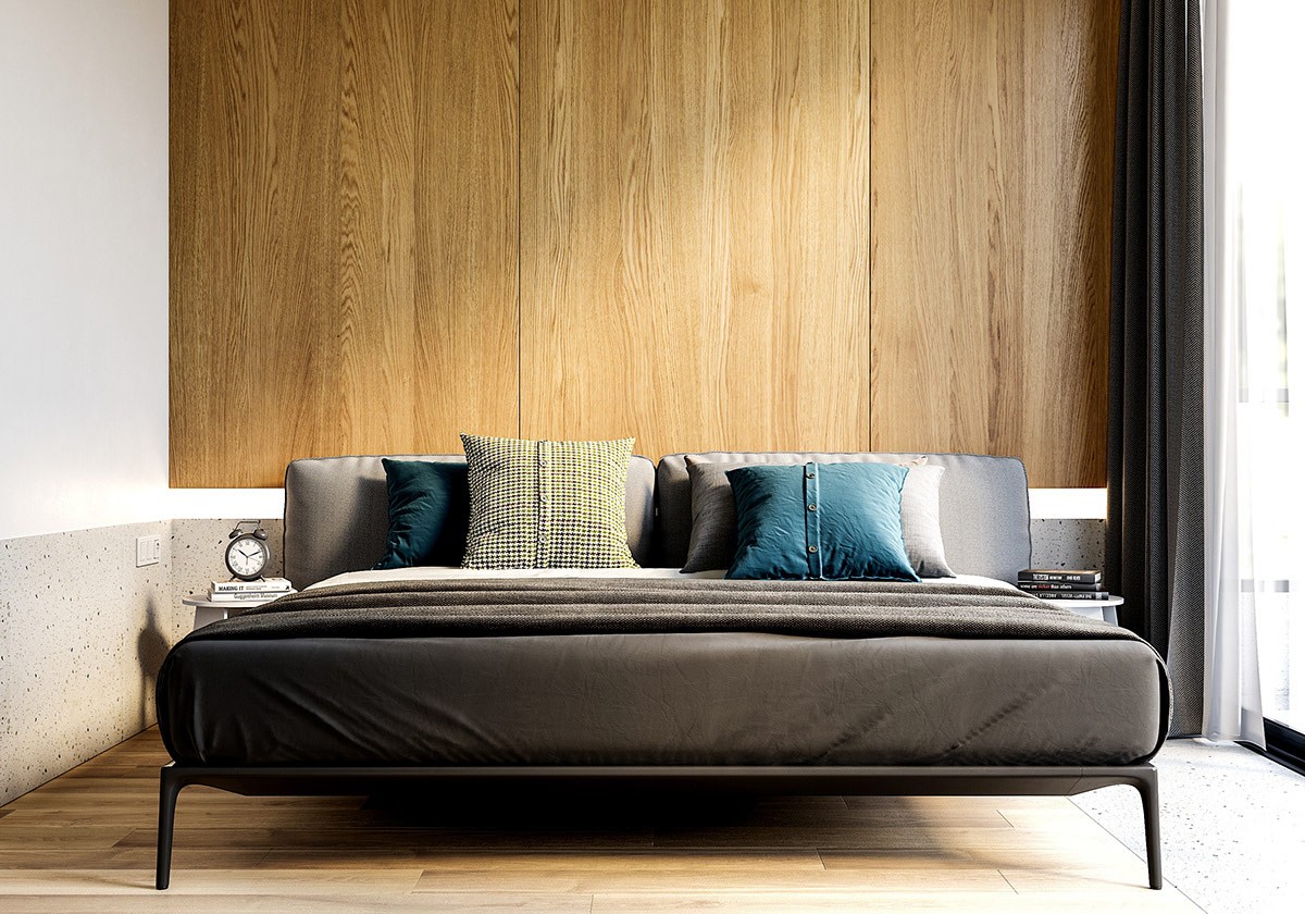
Blue and pink tones come in via a piece of modern wall art, and teal scatter cushions lean against a cosy upholstered grey headboard. A modern small side table displays a traditionally styled desk clock and books.
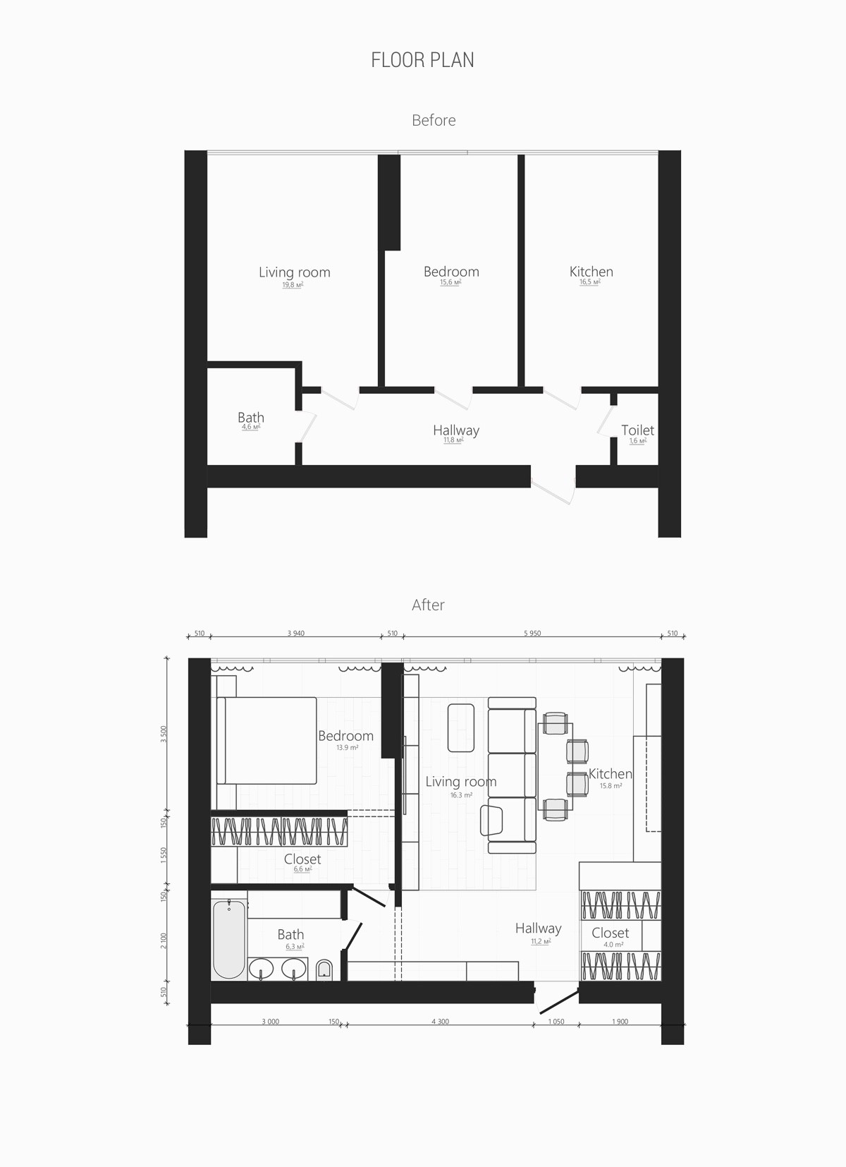
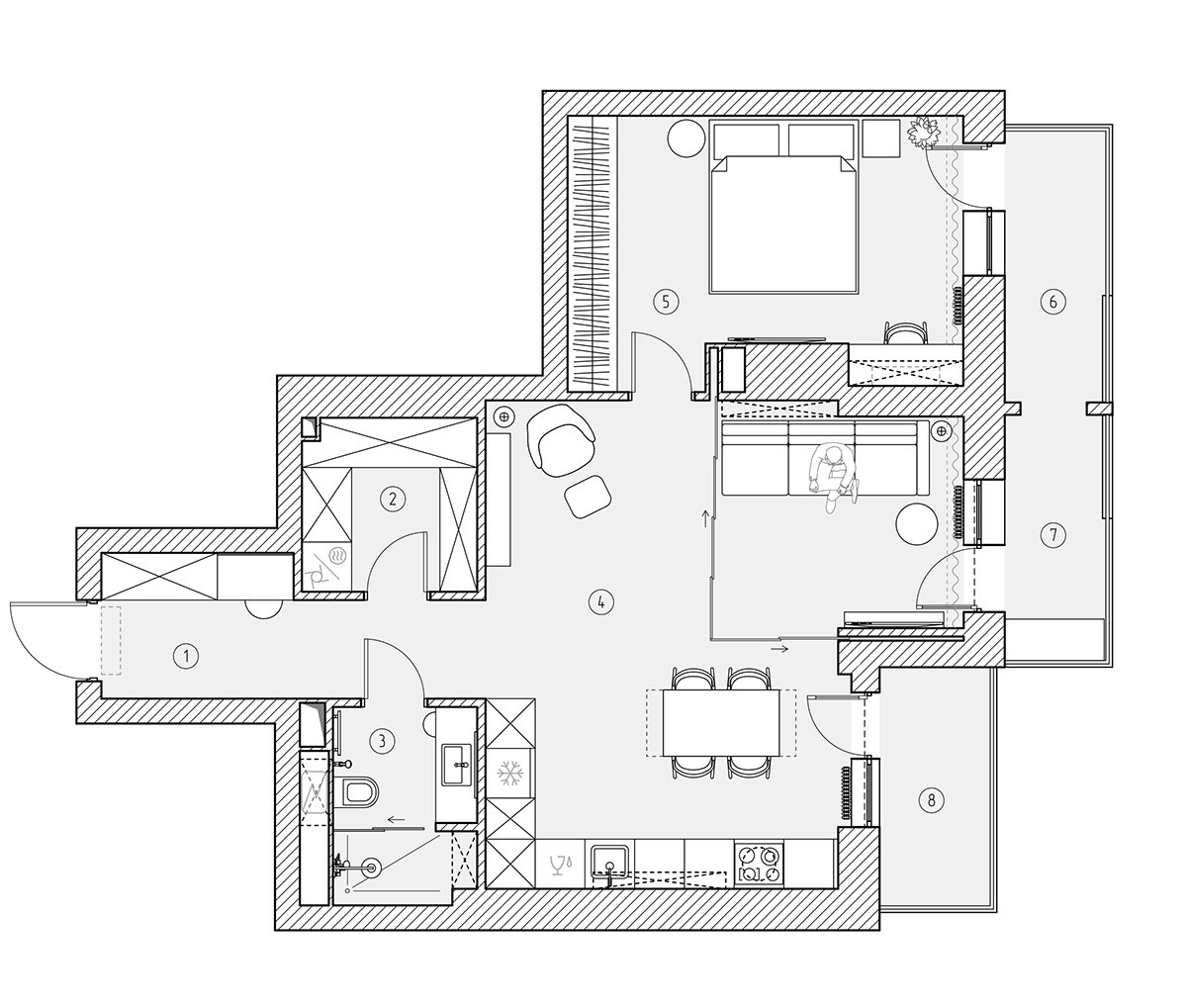
Floor plans from before and after the apartments renovation, illustrating how the space was opened up from its previous arrangement of separated living spaces and a centrally placed bedroom. The new layout has made way for an airy entertaining space, a walk-in closet for the new bedroom, a new entryway closet, and a larger bathroom.

