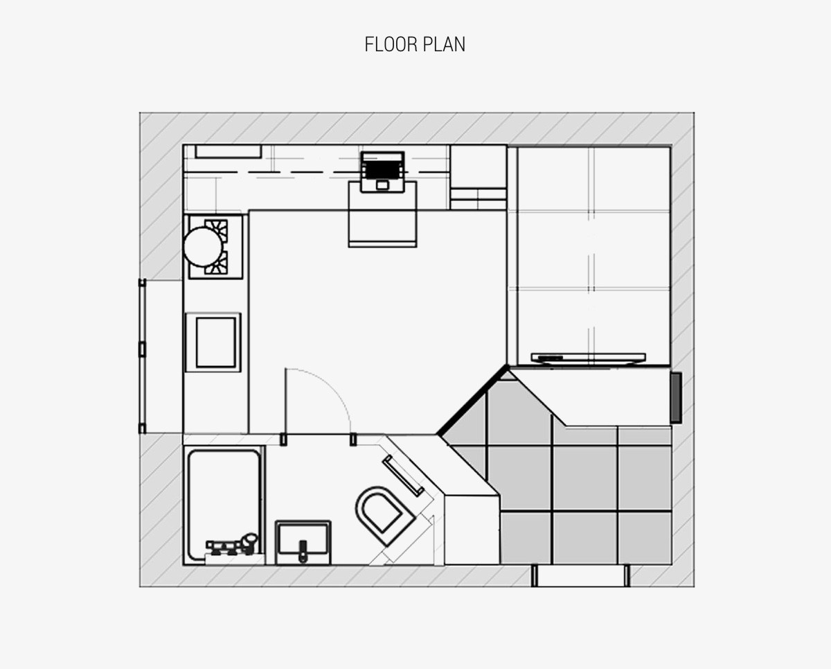
Looks can be deceiving. If you were to look at a tiny area of 17.3 square meters, you could be forgiven for thinking there isn’t room to designate clear areas for dedicated study, sleeping and dressing, plus a full kitchen and bathroom. However, this Ukrainian studio apartment located in an old building at the centre of Odessa, proves that clever layout can achieve the seemingly impossible. The talent at Fateeva Design was approached when the current owners inherited the limited space. The restrictive dimensions had the owners stumped for ideas but the designers were confident it could be sleekly transformed into an ideal student rental.
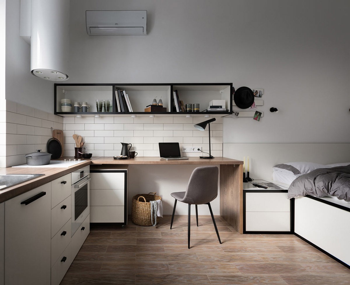
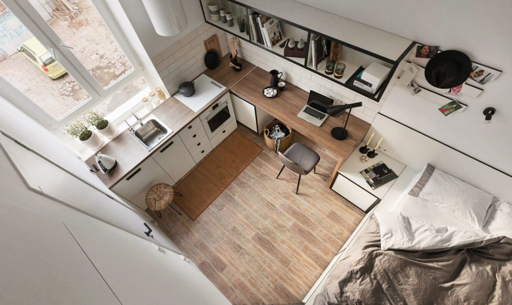
Clever spatial solutions became key for this compact interior design challenge, which resulted in some very original thinking. Just for starters, the kitchen bench runs around in an L-shape layout, with the return able to be utilised as a study desk. The thing that makes this position so ingenious is that the generous desk area can easily be switched back into food prep space if and when the need arises. A practical wipe-clean white metro tile backsplash spans the entire length. A large set of wall shelves hold both culinary paraphernalia and work related items.
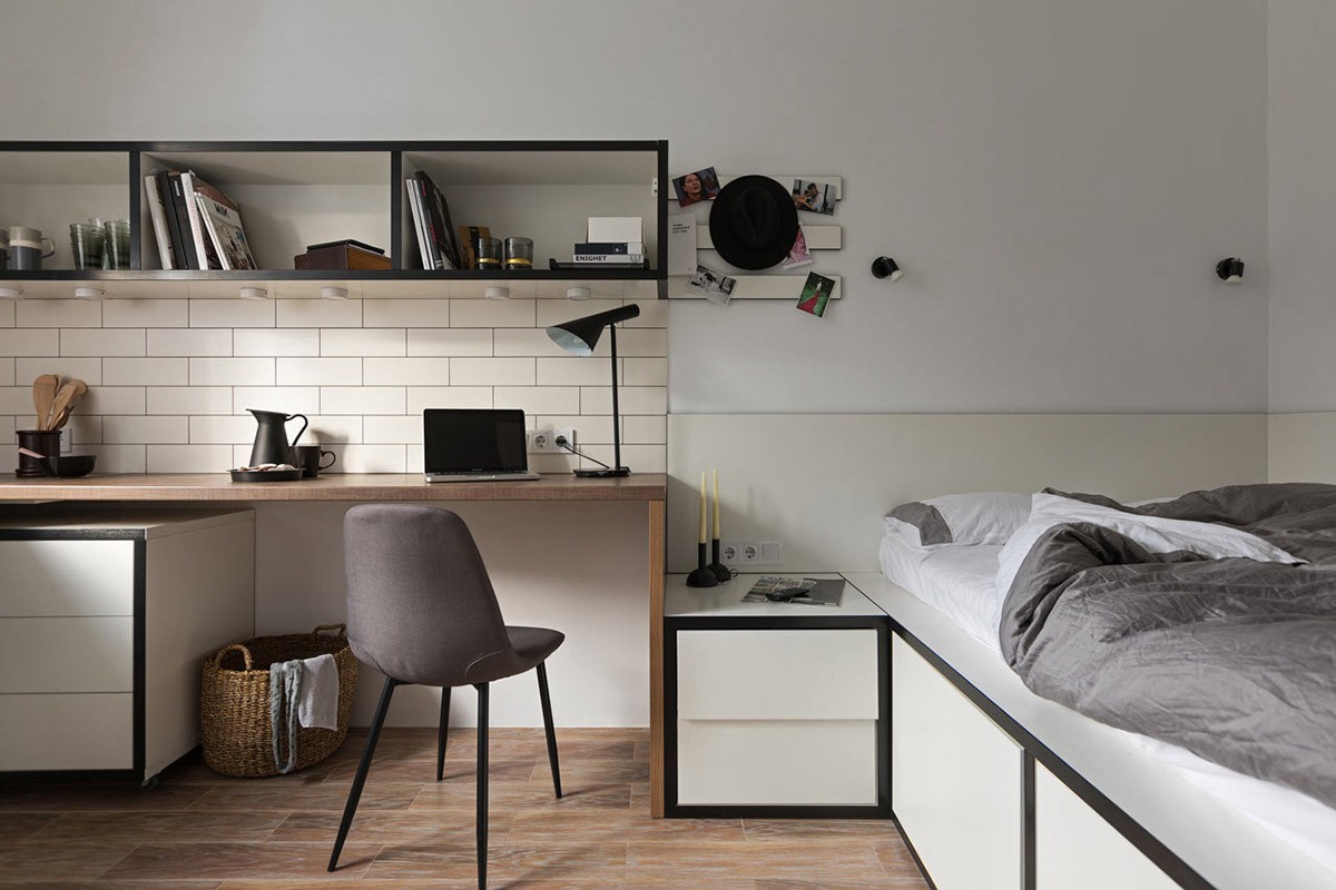
The run of kitchen base units comes to a stop beneath the study part of the countertop, in favour of a desk storage unit tucked at one side. A designer table lamp sits at the opposite end, which is the AJ Lamp. More task lighting is fixed along the underside of the ample wall shelves.
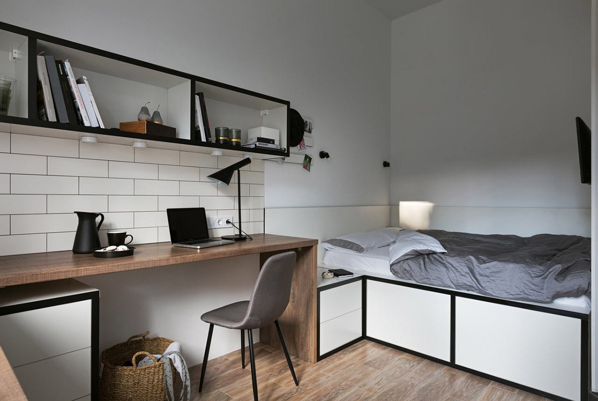
Marking a smooth transition between food and work zones is a smart black pitcher with matching coffee mug, to fuel long study hours. The smart drinks set complements the monochrome colourway of the furniture in the room. The long desk can also be used as a dining table, with even enough space to facilitate a companion too.
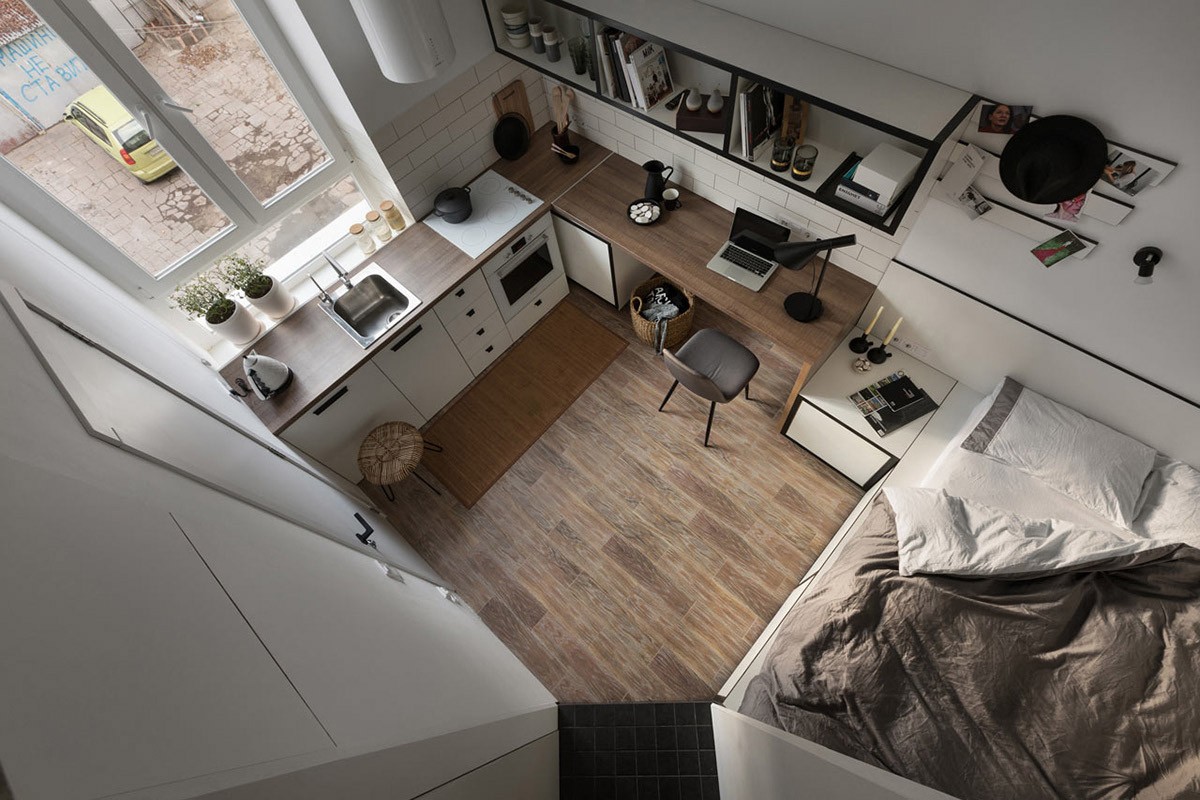
A unique notice board pushes out from the edge of the kitchen/study wall shelving unit, crossing over into the bedroom.
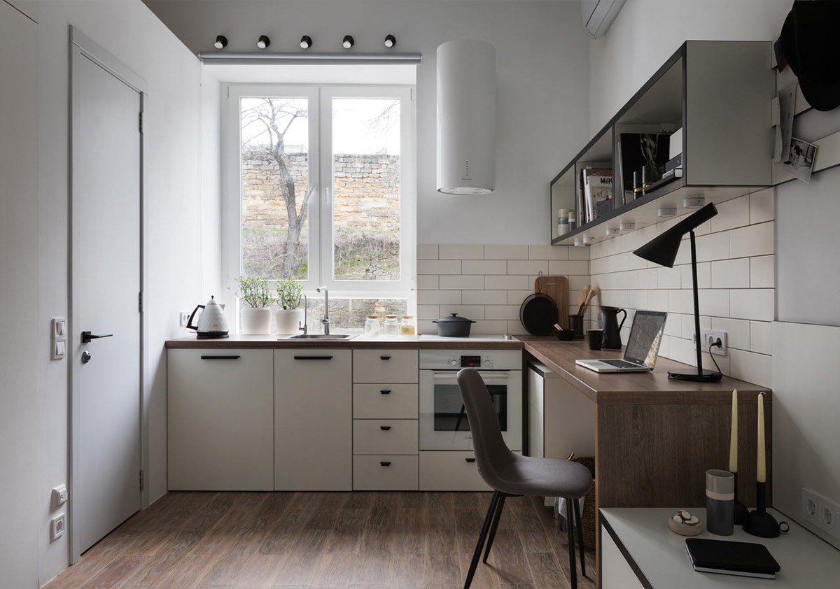
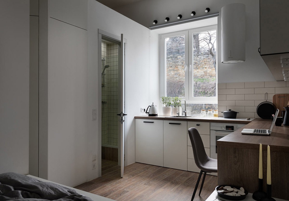
A slimline white kitchen extractor unit takes up very little wall space but is stylish in its simplicity; its lights illuminate the corner position of the cooking hob. A row of small black wall sconces line the top of the kitchen window, available to cast light over the kitchen sink when nighttime falls.
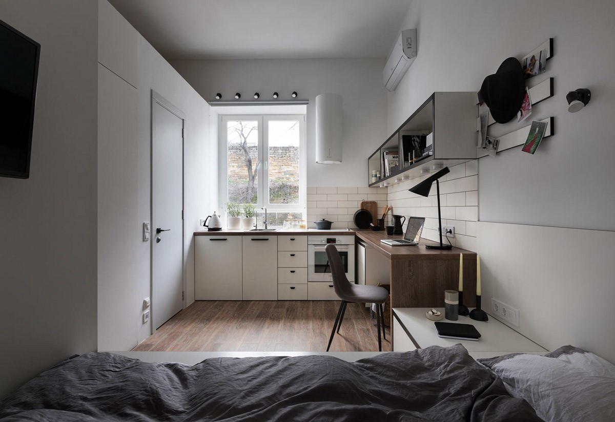
All the bespoke furniture hugs the perimeter of the room, in a neutral color scheme that keeps the space looking open and airy.
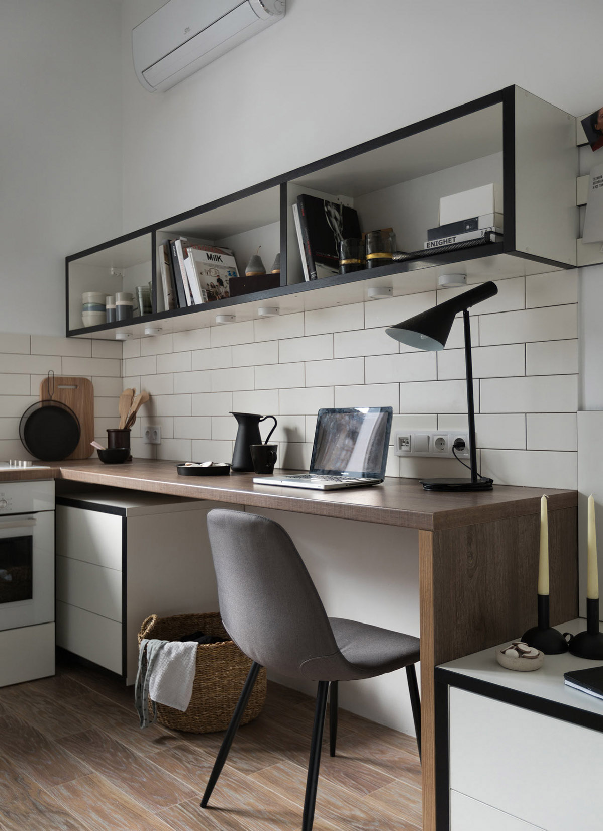
The desk chair is a slender design that can be tucked neatly beneath the worktop when not in use, leaving the central floor area clear. A short rattan laundry basket inhabits the remainder of the nook.
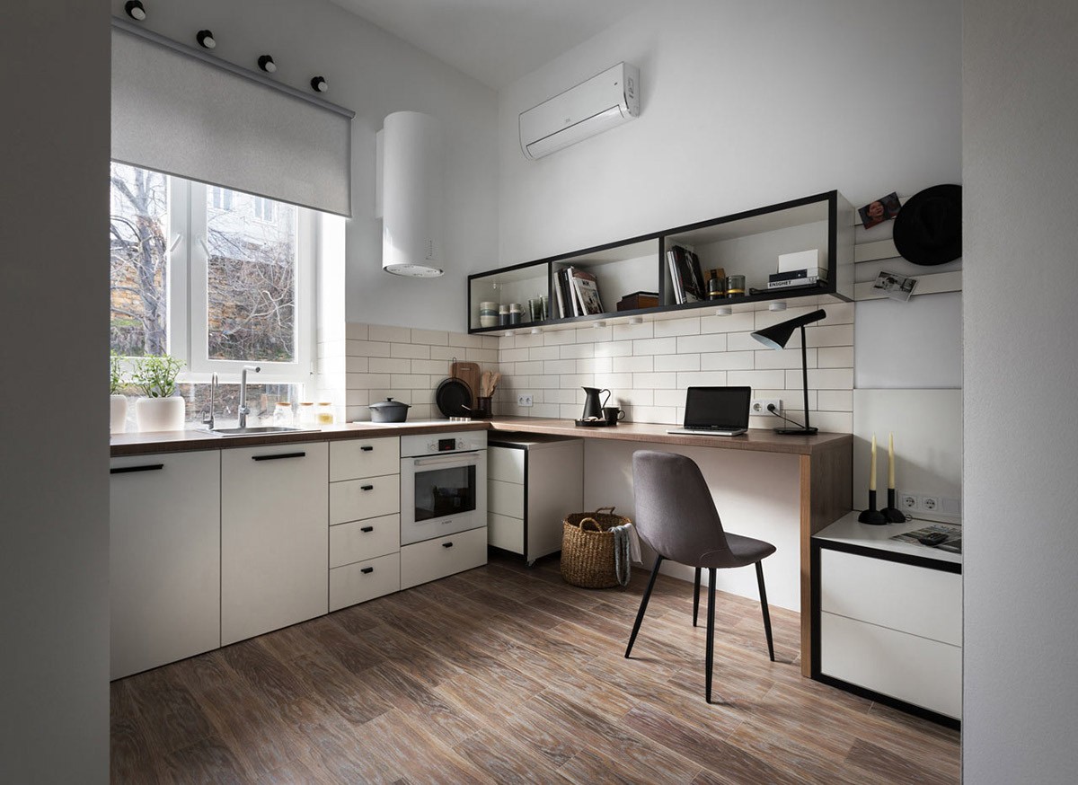
The desk drawer unit can be tucked deep in the corner to allow more leg space, and pulled out on its castors when access to its contents is needed. It’s mobile nature means that it could also be used as an extra surface in either the study or the kitchen.
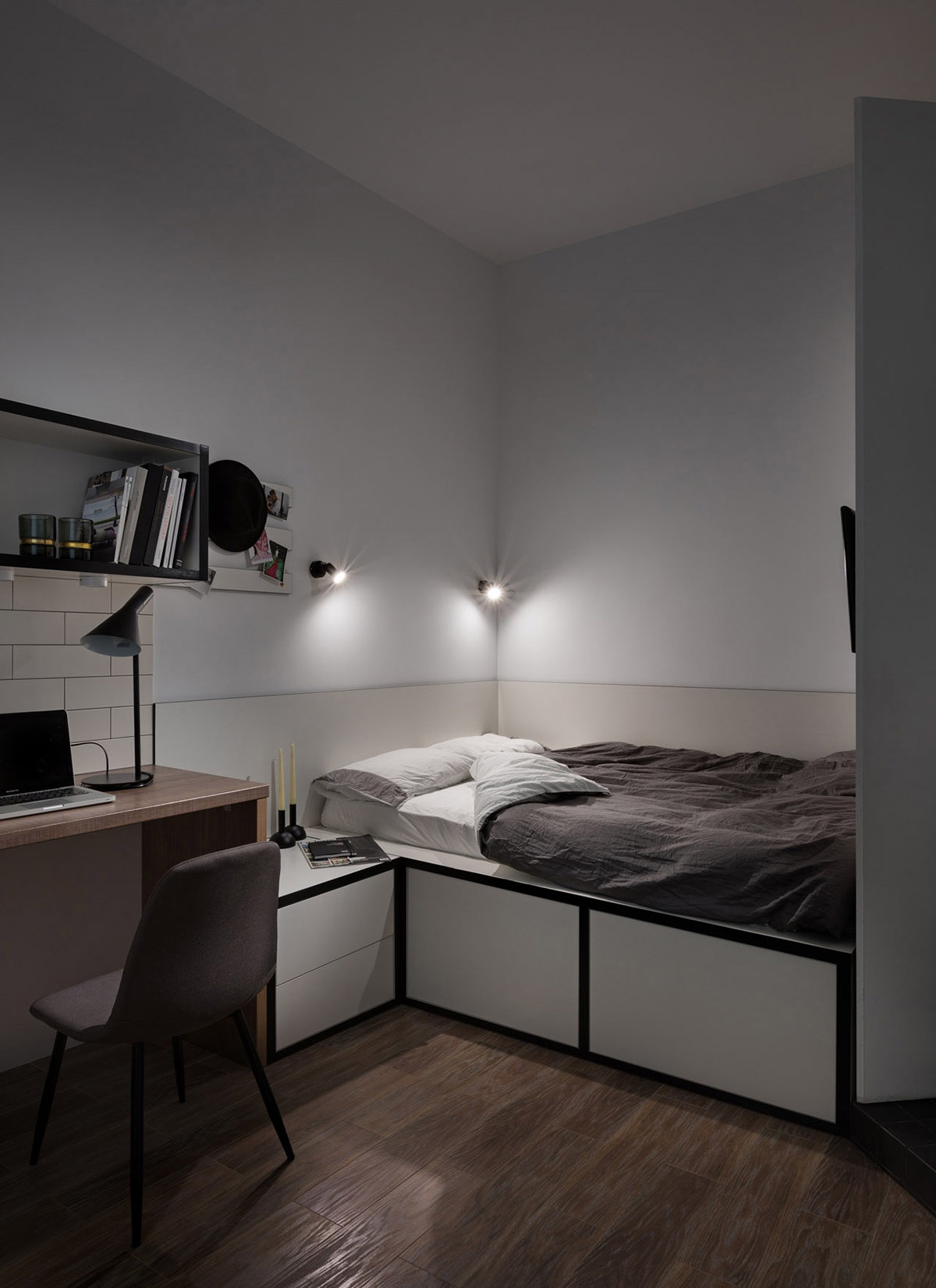
The bedside drawer unit joins flush with the platform nature of the double bed. Deep storage volumes fill the bed base. Two modern wall sconces throw light from above the headboard, which runs around two sides of the bed. The white finish of the bedroom furniture is edged with black strips that mimic the design of the wall shelves over the study and kitchen, tying the areas nicely together in one united look.
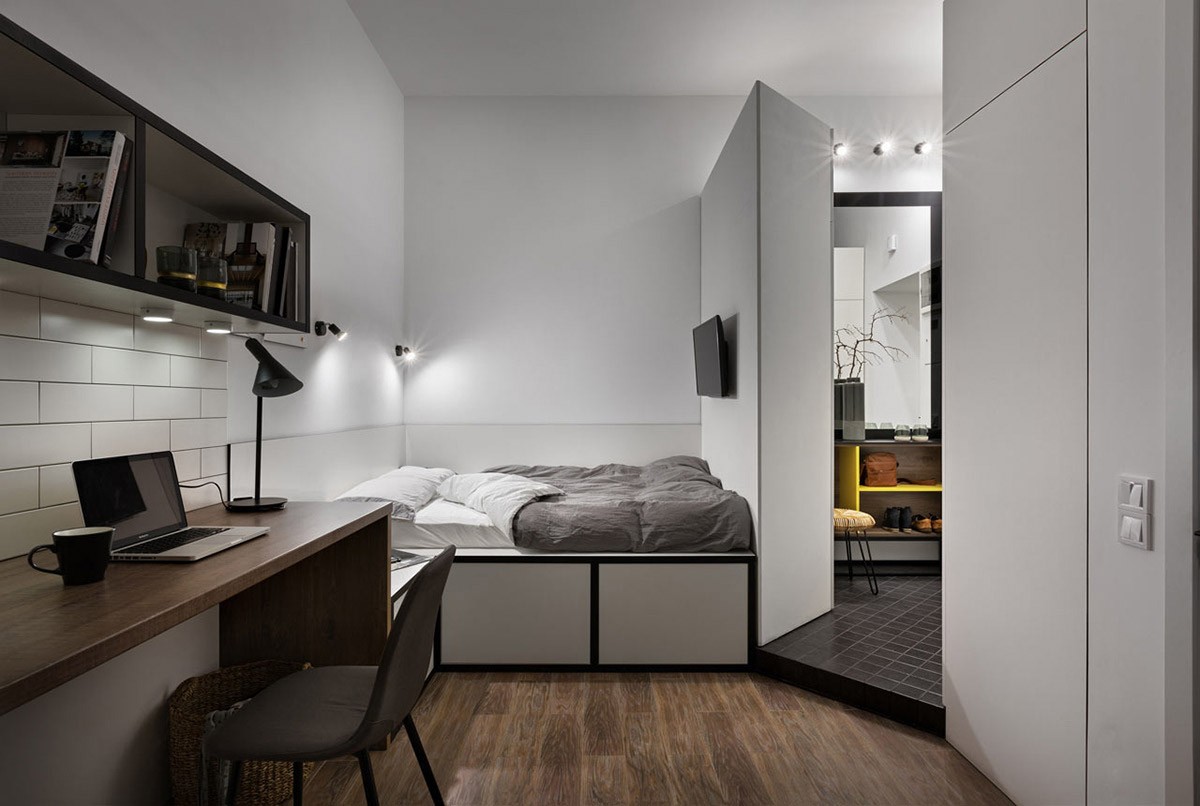
A flat screen TV is wall mounted at the end of the bespoke double bed. The TV wall is actually the back of a closet, which divides the sleepspace from a hallway area.
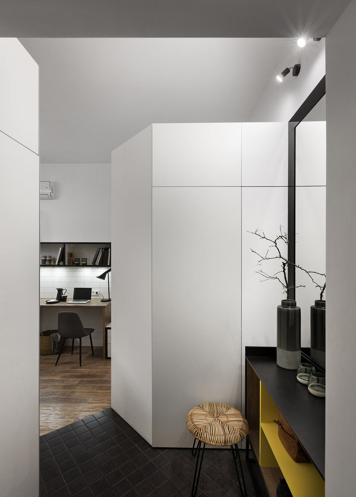
The hallway area doubles as a dressing room, as this is where all of the home’s closets are housed. Large wardrobes line each side of the entryway, with cupboards installed across the top. The units to the left all back onto the shower room, with the second row of closets shieling the bedroom from view of the front door. A woven seated vanity stool sits at a bright yellow and black hallway console unit, in front of a large black framed mirror. A decorative vase and a couple of tealight holders make a welcoming display.
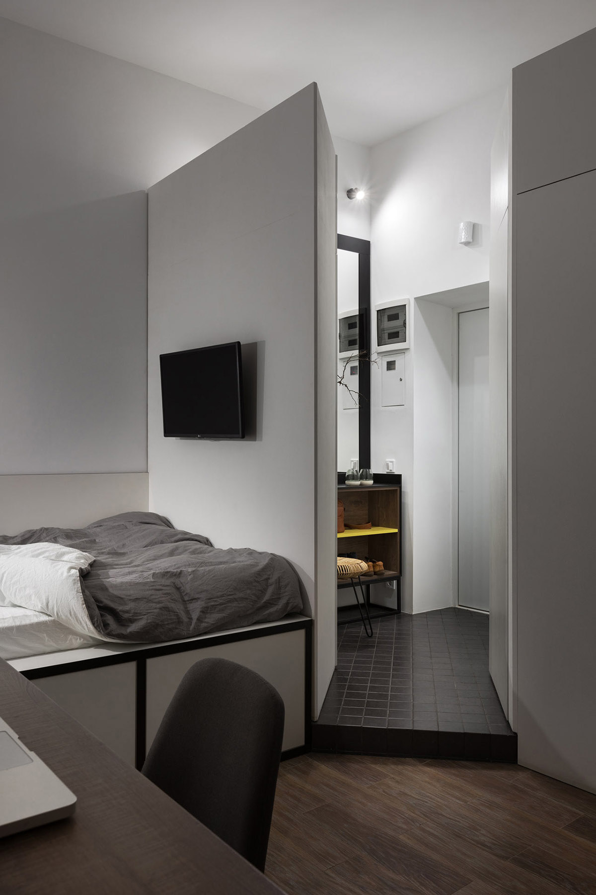
Small black floor tiles mark out the separated home entryway/dressing area. Laminate dark wood flooring covers the expanse of the main living room.
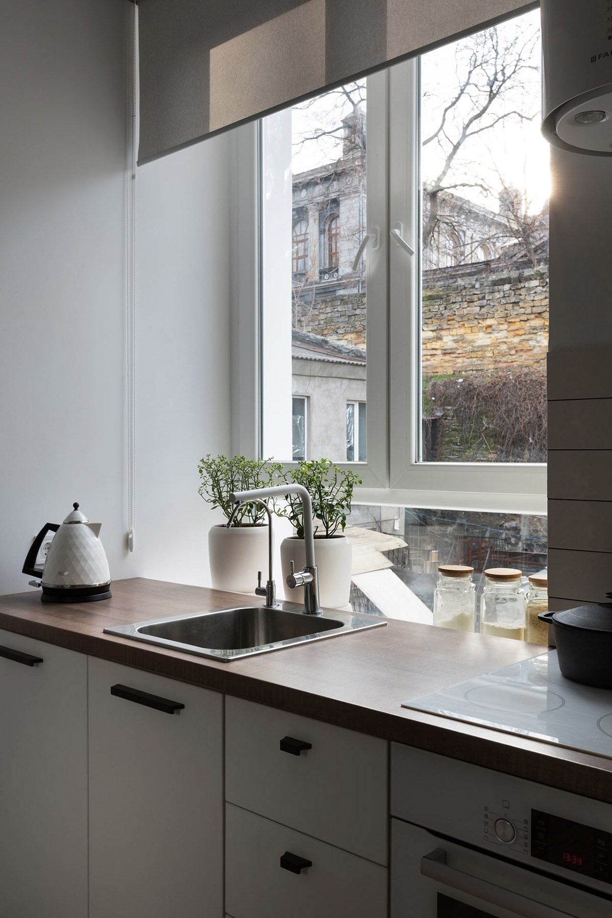
The window sill that dips behind the wood-look kitchen countertop is used as a spot to nestle some dry larder supplies in attractive glass jars, plus a couple of indoor herb planters. A white kettle and cooking hob matches with the white kitchen cabinets.
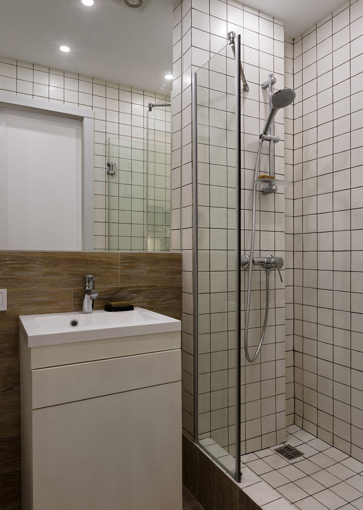
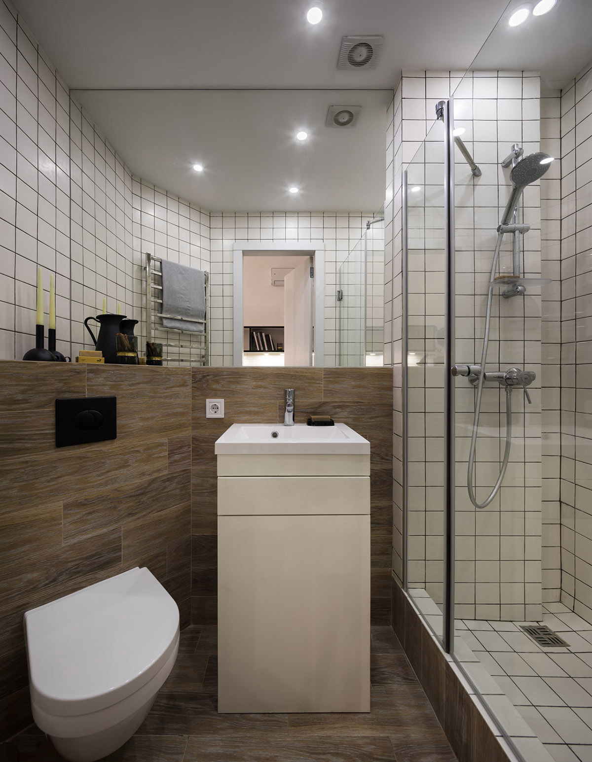
The shower room is covered head to toe in small white tiles, finished with black grout. The result is quite busy for the small space, but a wooden backsplash behind the vanity unit and toilet smooths out the look. SImple chrome fixtures and fitting dress the facilities.
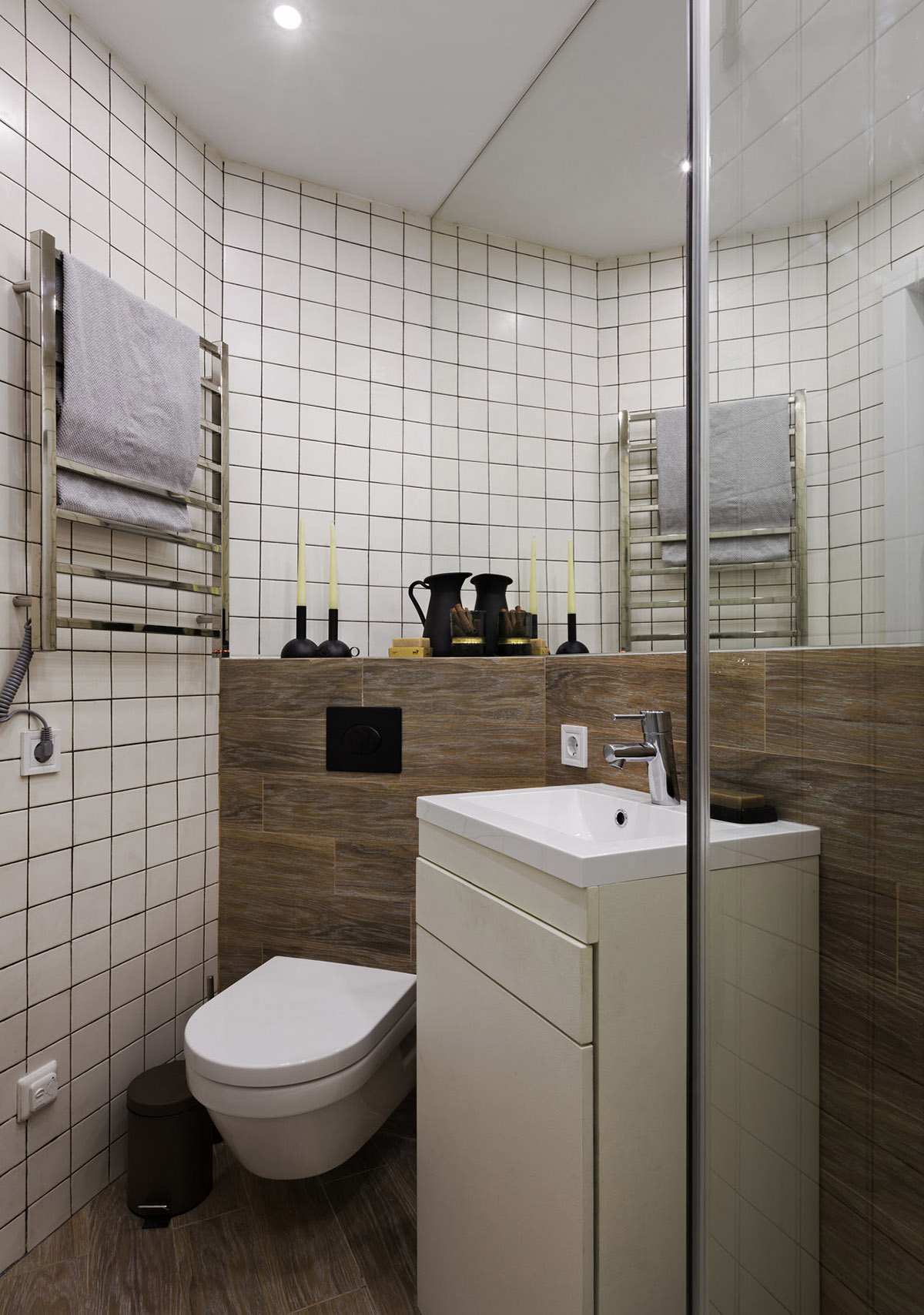
The shower room is very small but pretty perfectly formed. It houses a shiny chrome heated towel rail, a modern wall hung toilet and a compact vanity unit with storage space for all of the everyday essentials.
