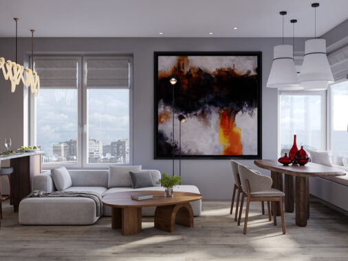
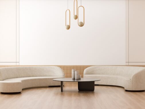
City apartments are abundant, central – and often tiny. For the modern urbanite building a beautiful interior, the apartment’s compact nature can be challenging. This studio by Insight Studio in Minsk, Belarus, is a compromise between a convenient location and a contemporary design. Combining the main living areas in one innovative space makes dark corridors bright and awkward spaces forgotten. Dark wooden panels contrast against monochrome prints, seeking refuge in linen couches and woollen rugs. Beige undertones, strikes of green and marble floors add warmth to the interior, without taking away clean lines. Take our tour to see how fresh thinking can transform a small space.
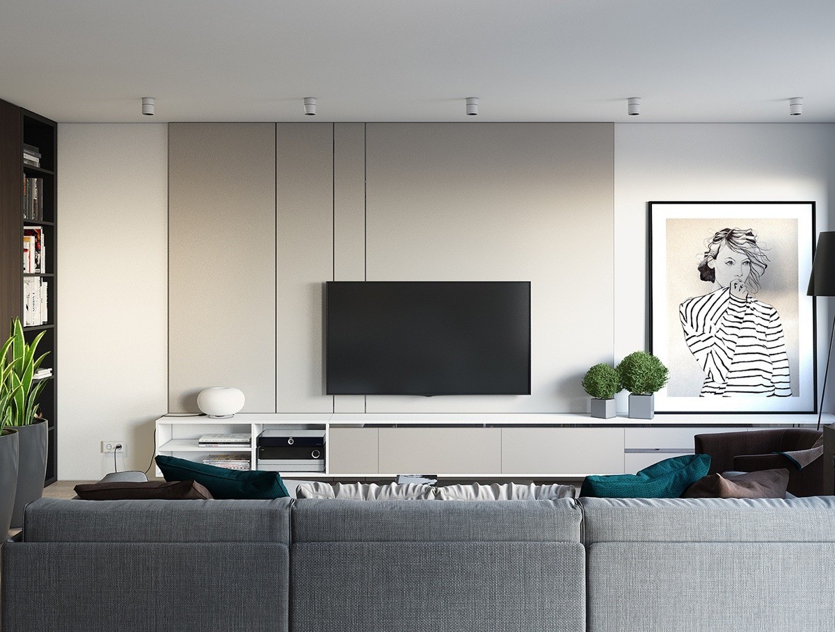
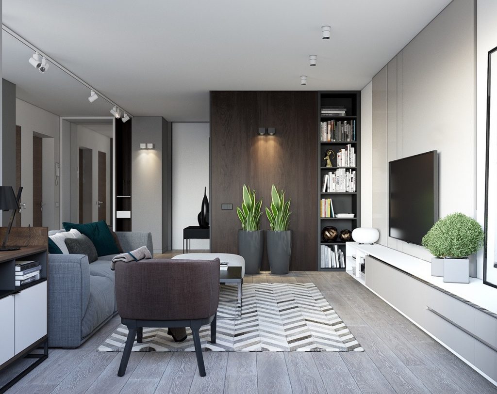
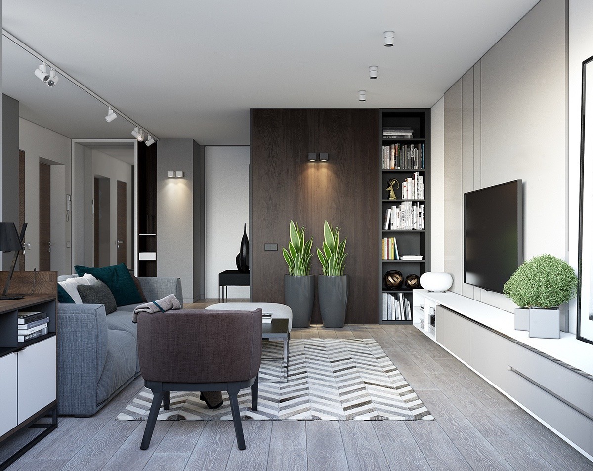
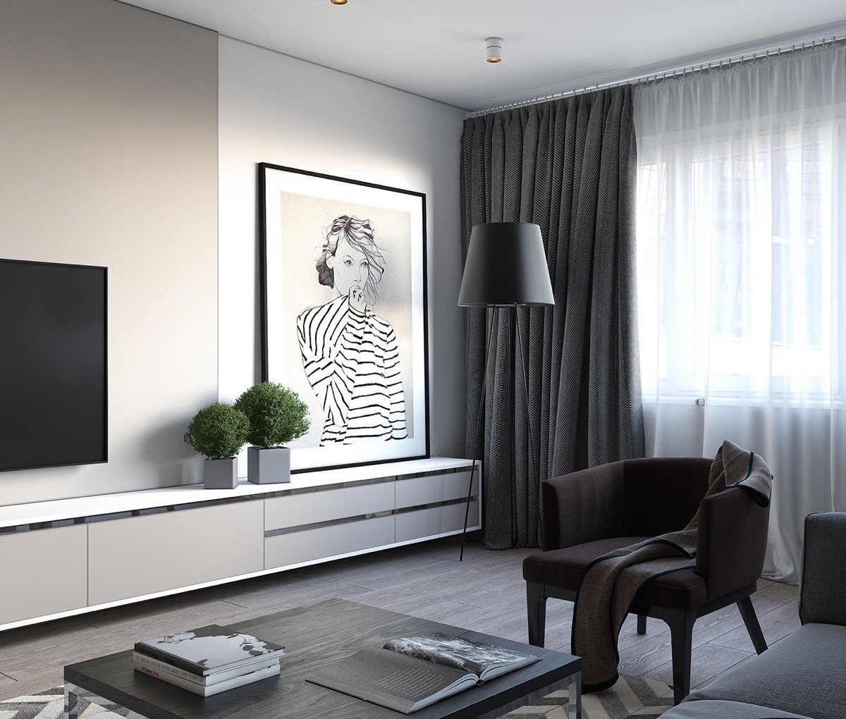
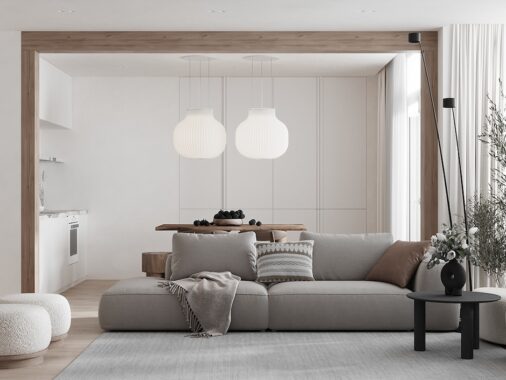
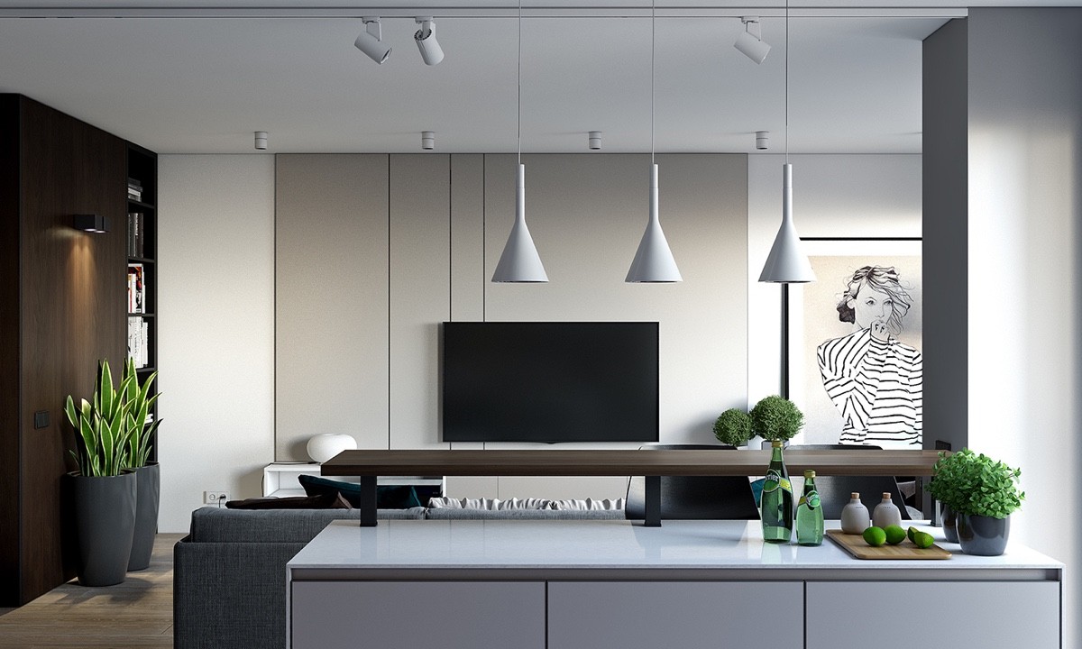
Our one-bedroom apartment begins in the central room, a fusion of living, dining and kitchen areas. Designed for a young woman, the TV space opens to a portrait of her likeness in black and white. Large panes of colour in a charcoal couch, wooden panel and beige wall provide clear space for thought. Subtle features in two types of foliage, white-bound books and a geometric-patterned rug add politically-correct personality. A semi-low, flat ceiling is disguised in white, minimal light fixtures.
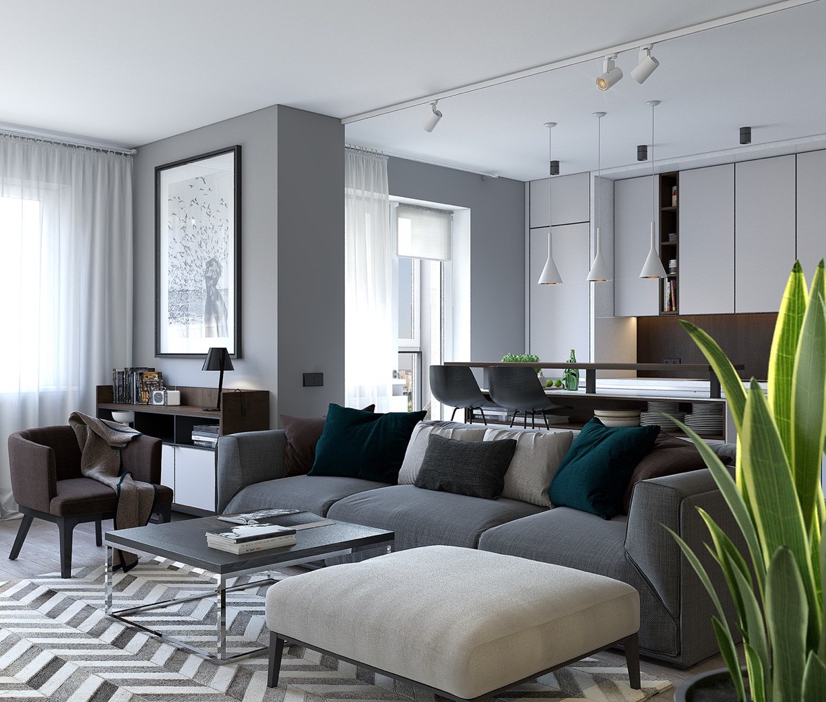
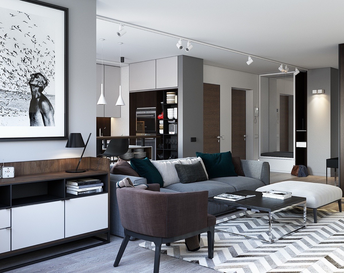
From the TV room, kitchen and dining areas extend a hand. Tall white cabinetry, mimicking the length of two large windows, pops out from behind the partition wall. Three dangling white lights mark the dining table.
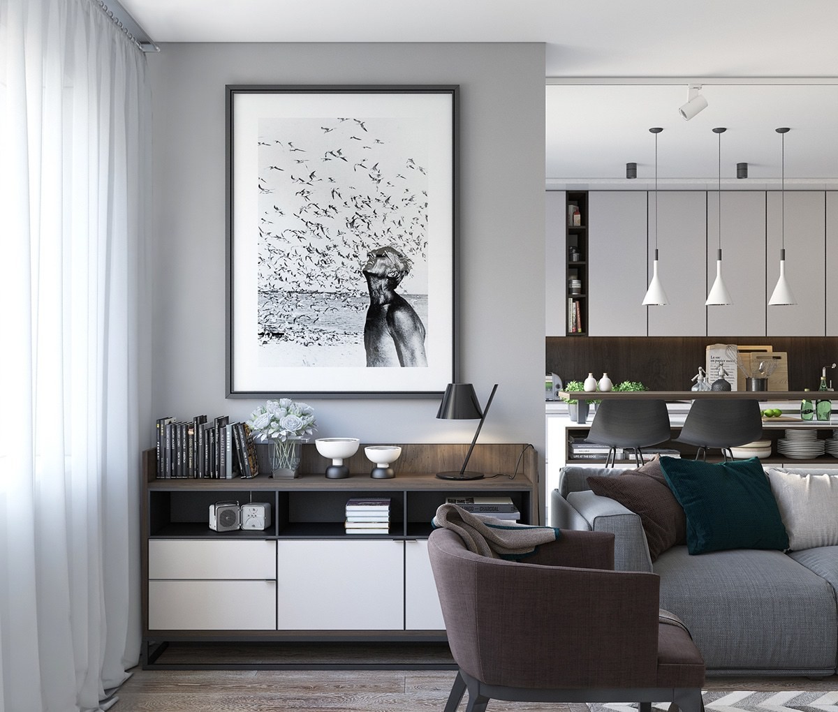
A monochrome print lords over a drinks cabinet. Oscillating in white and wood, its long lines mimic the TV cabinet, giving space to the print. A view further to the side shows a range of room partitions, each artfully placed to segment while uniting as one.
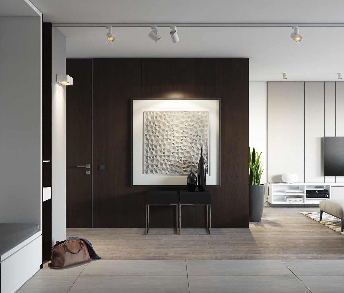
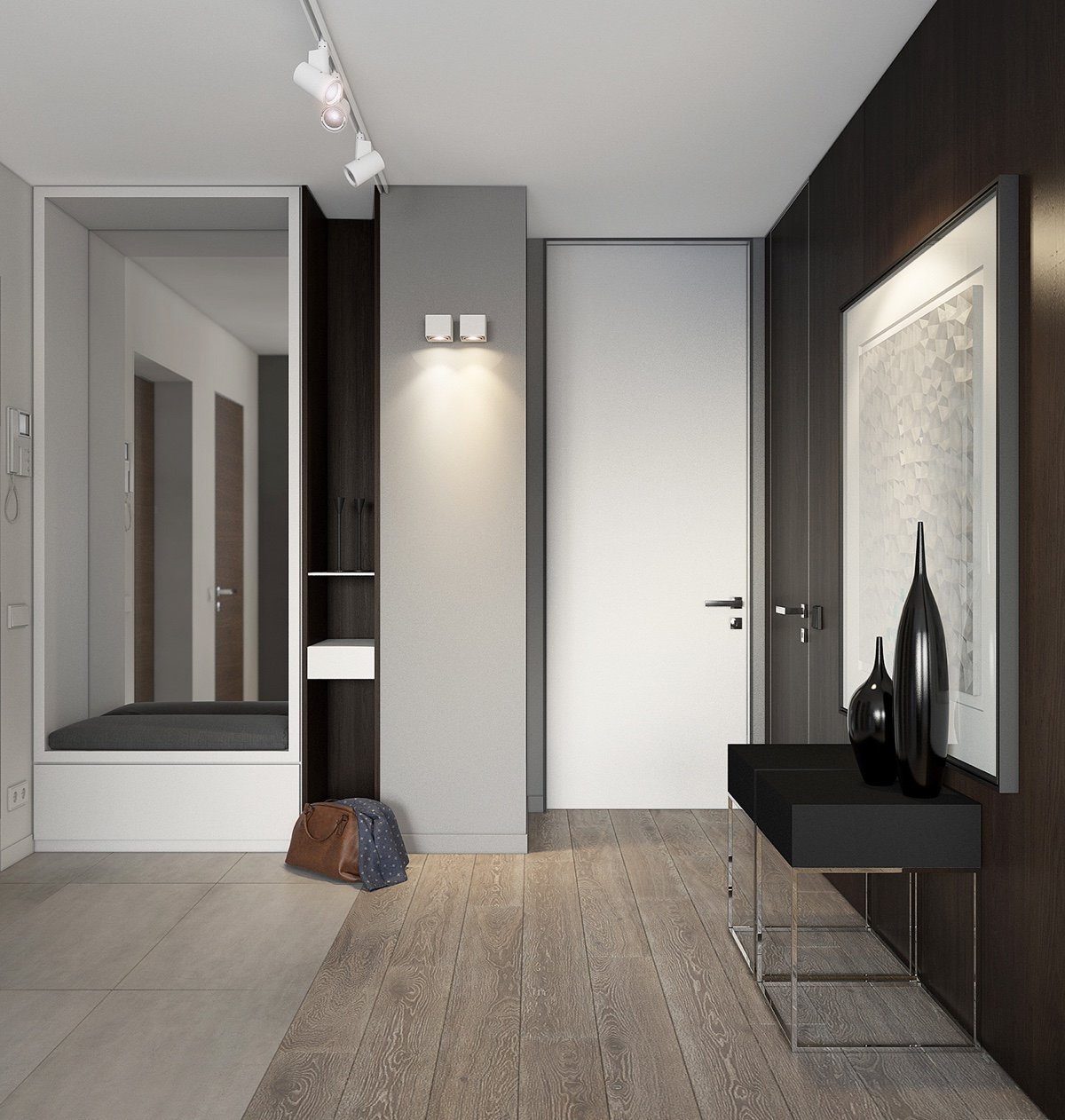
From the kitchen, the view is clean, minimalistic. A range of potted plants pave the way to another wooden feature wall, made all the more dramatic by a white textured painting hanging on its frame. Clean slate tiles and light-wooden flooring greet a hallway mirror, extending the space. A simple white door gives prominence to the artwork and table, avoiding overcrowding.
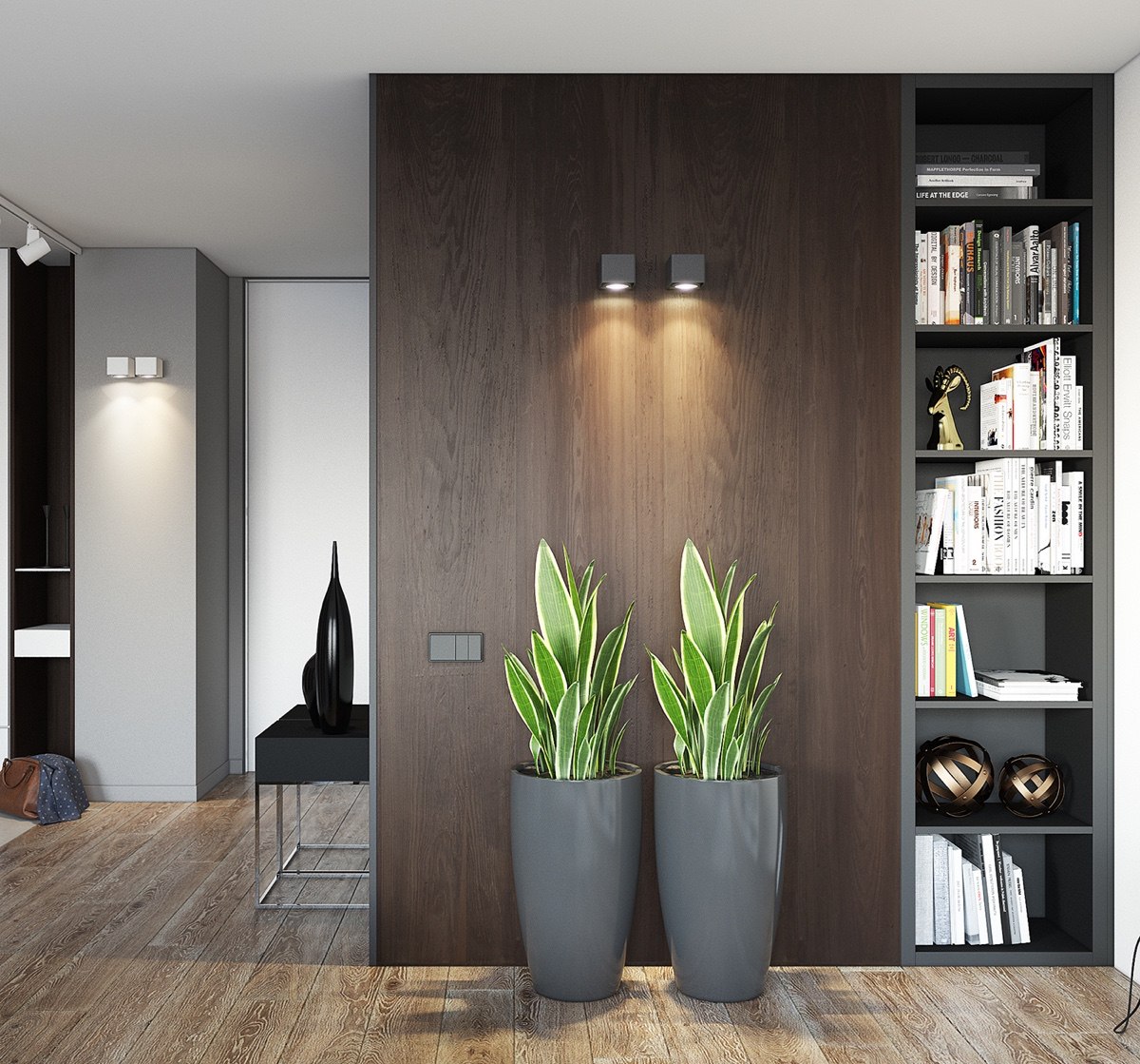
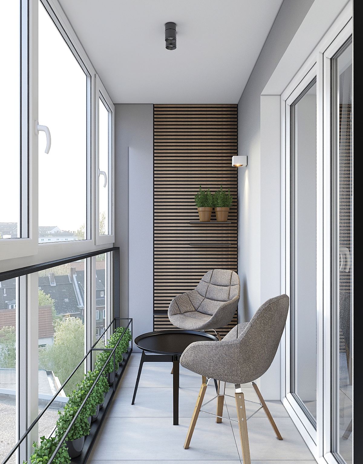
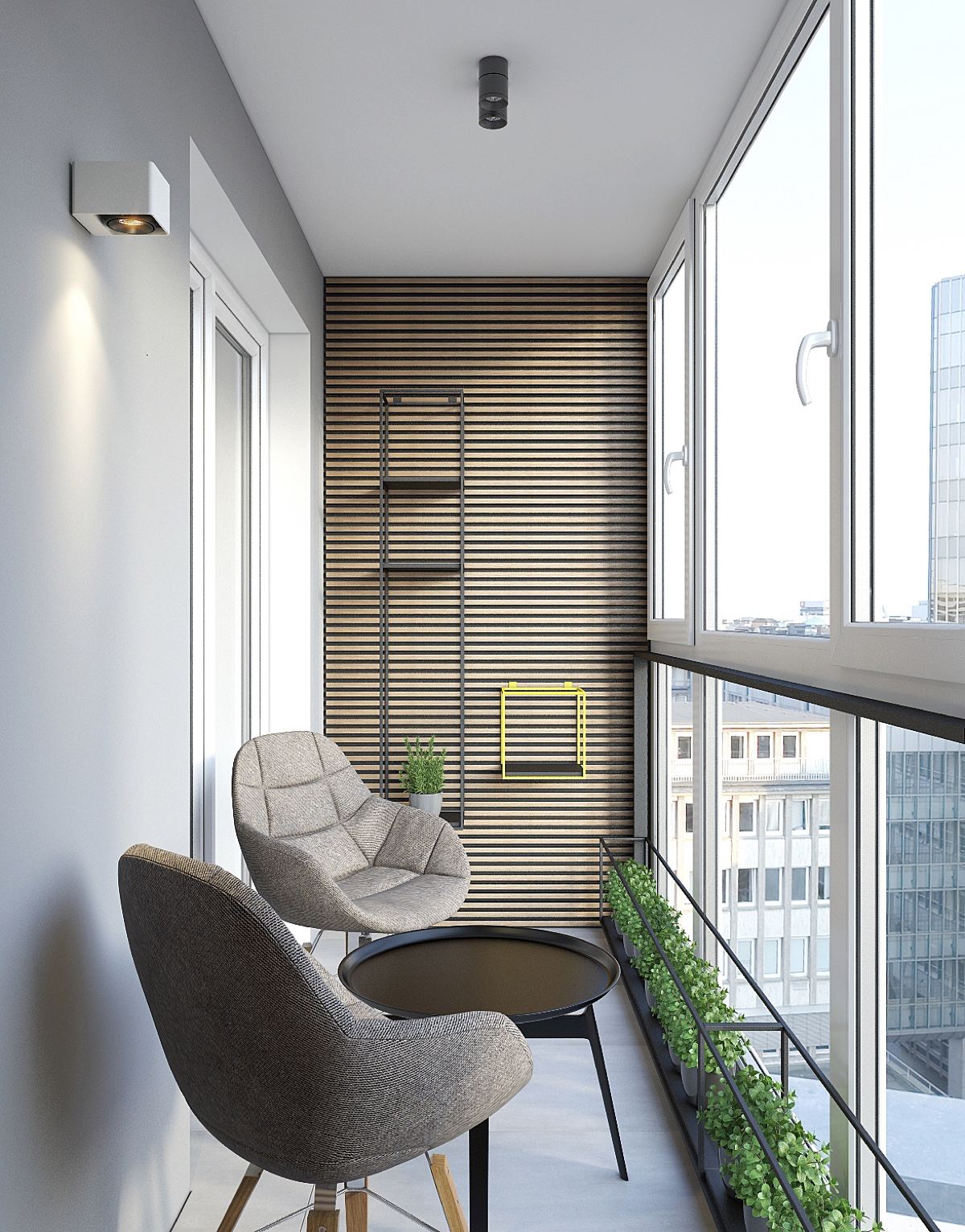
As the feature wall welcomes two lit ferns, a well-designed balcony leads us back out. Facing wide window panes in white joinery, the space is framed using very little space. A row of potted green fits almost into the joinery. A design feature wall in slatted wood replaces the original fixture. Wall shelving is stencilled and minimalist, while grey linen chairs gather peacefully.
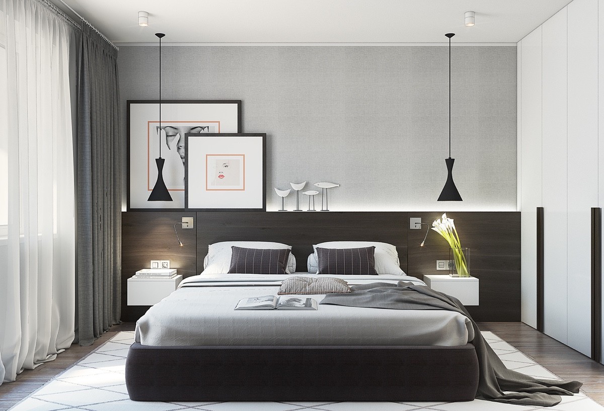
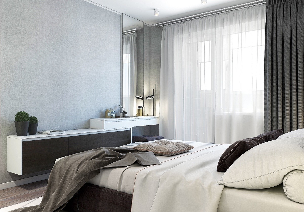
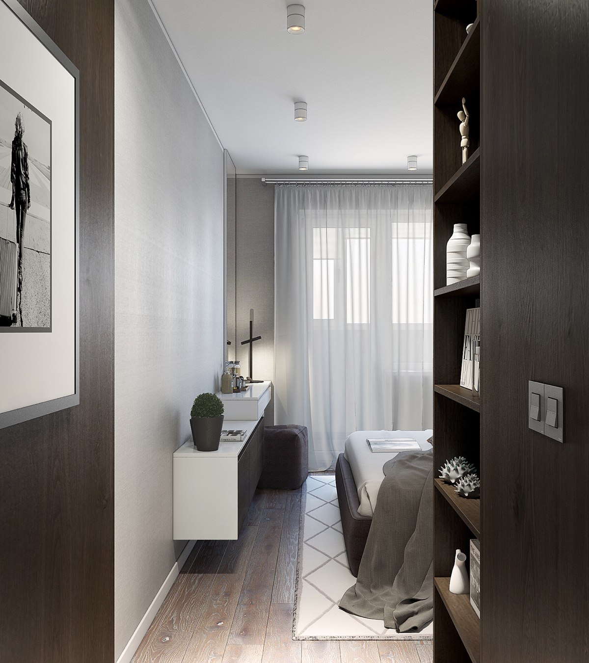
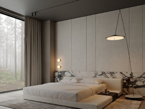
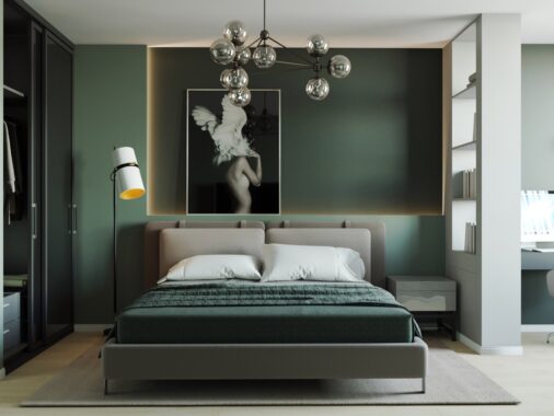
The bedroom brings in the themes of the central space. Emanating relaxation, a dark wooden headboard mirrors the TV room, light-grey walls the kitchen floor. Black hanging lights match white counterparts in the kitchen, and monochrome prints the feature wall. Creating difference, an LED-lit panel beams atop the headboard, while subtle stripes line the rug, cushions and duvet. Minimal shelving and a mirror extend the space and let light in.
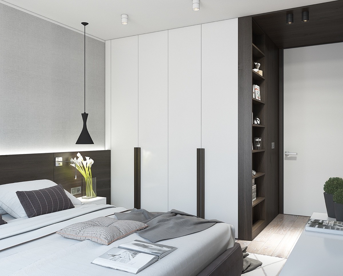
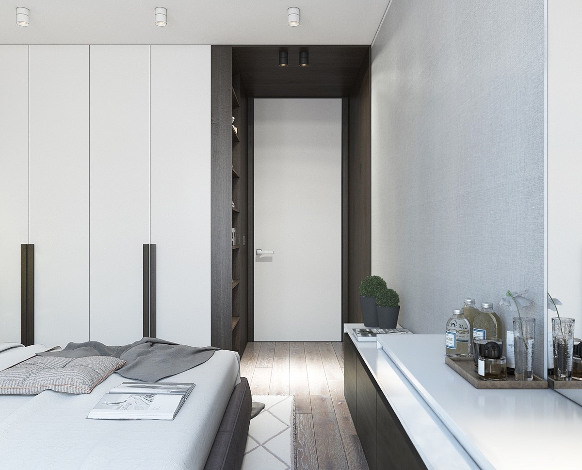
The wardrobe is both clever and contemporary. A cacophony of long, lean panelling, its central inlet appears to extend rather than take from the space. Dark-panelled, their cubby holes hide necessities while leading to another white, bright exit.
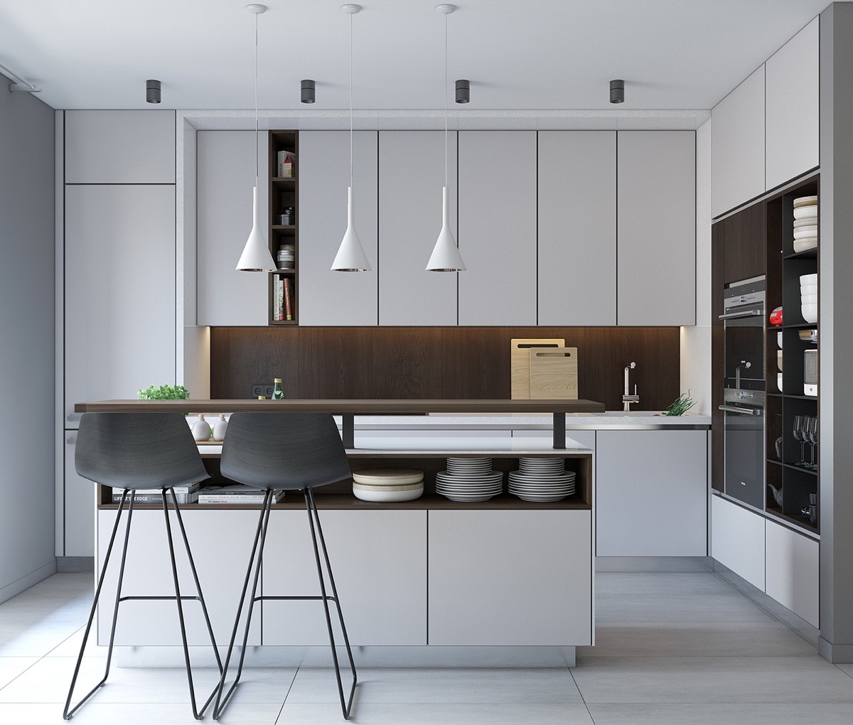
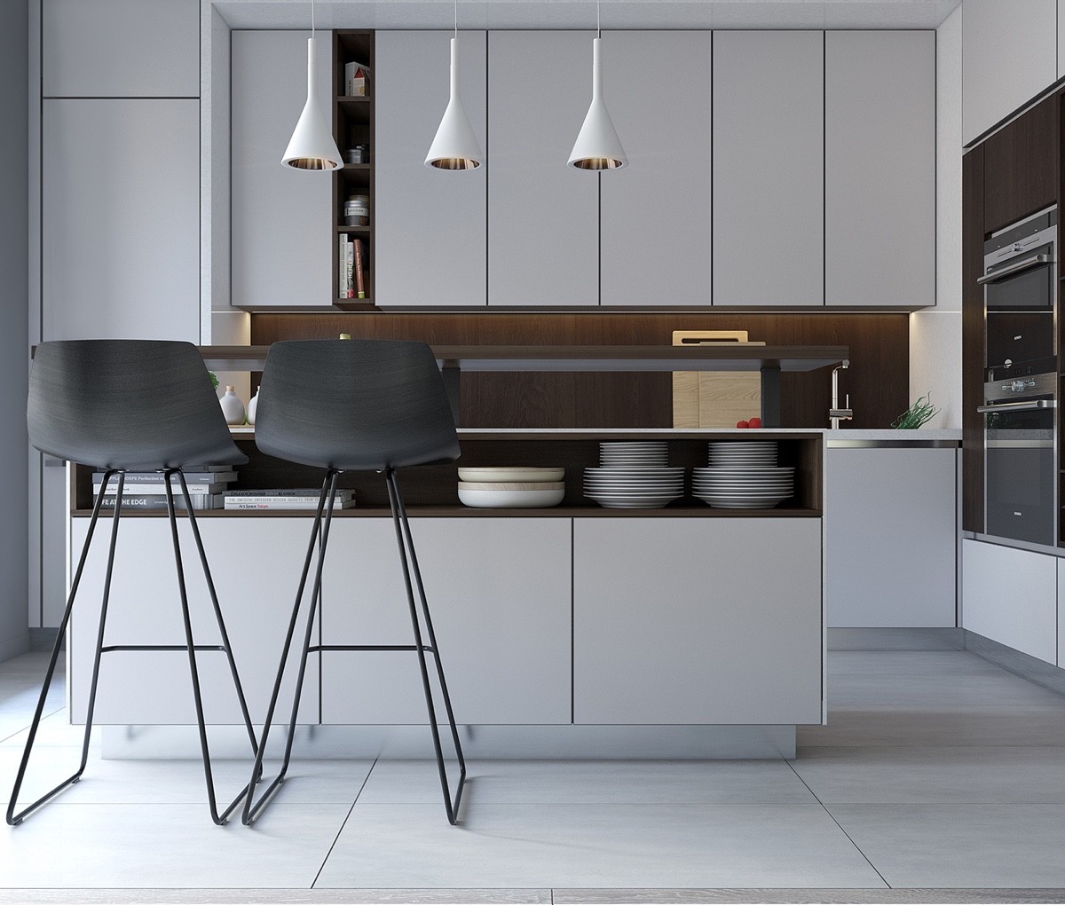
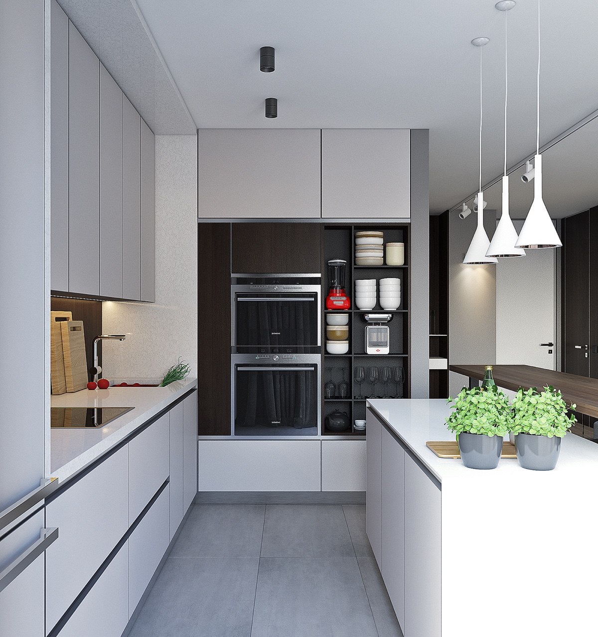
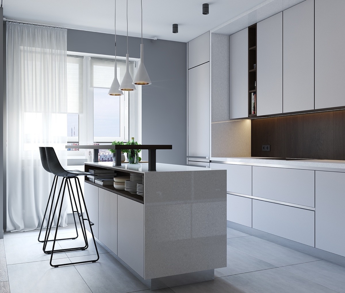
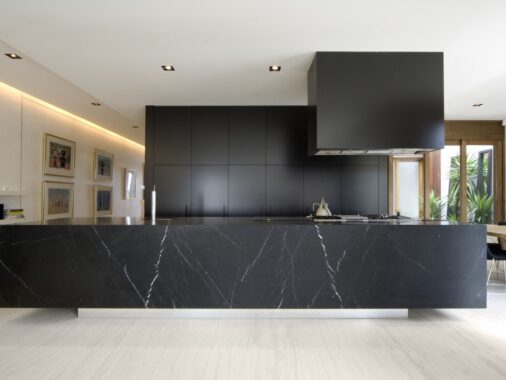
A closer look at the kitchen reveals similar themes. Long, white panelling makes it classic and elegant. Lit dark wood panelling creates an inlet of interest. Necessities hide in under-table shelving, while a stove and fridge take a seat to the side. An island bench affords room for unique drop lights to allude to more space.
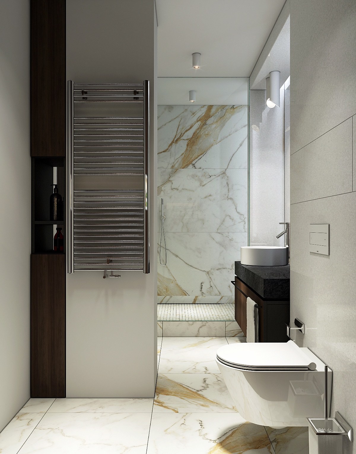
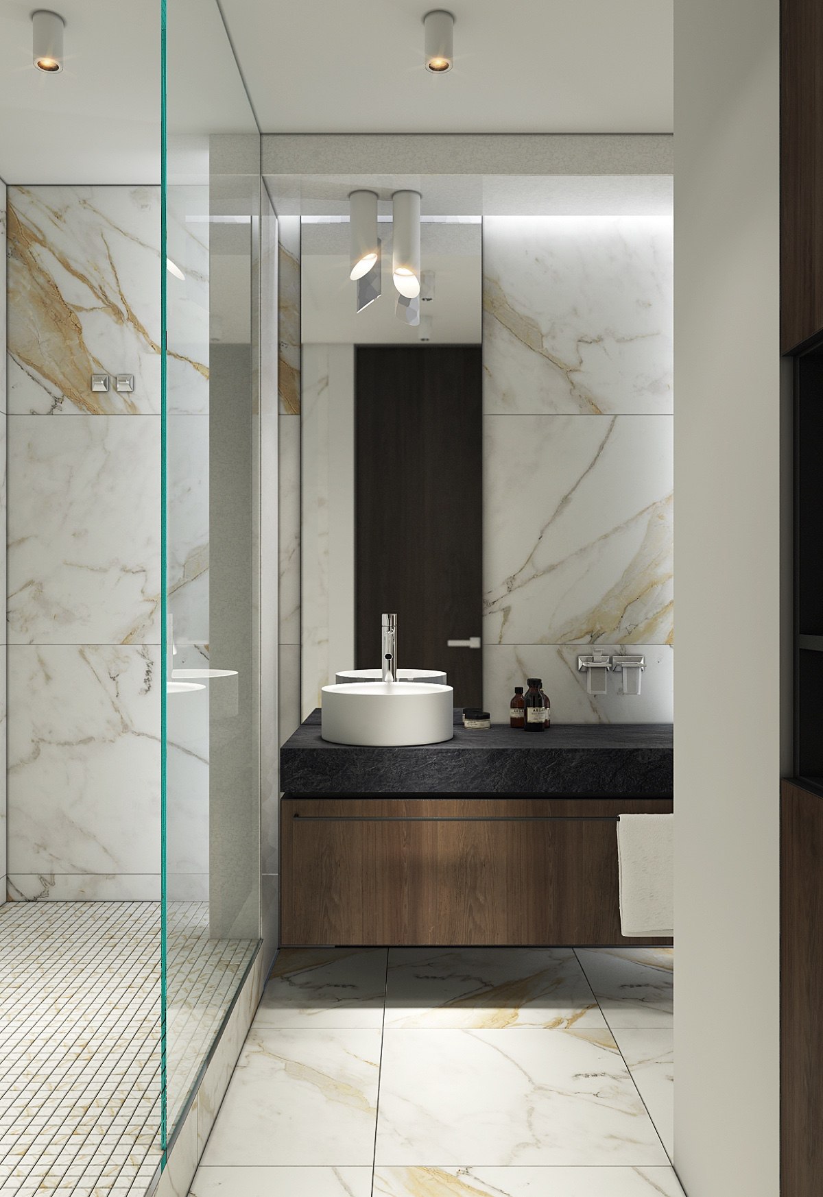
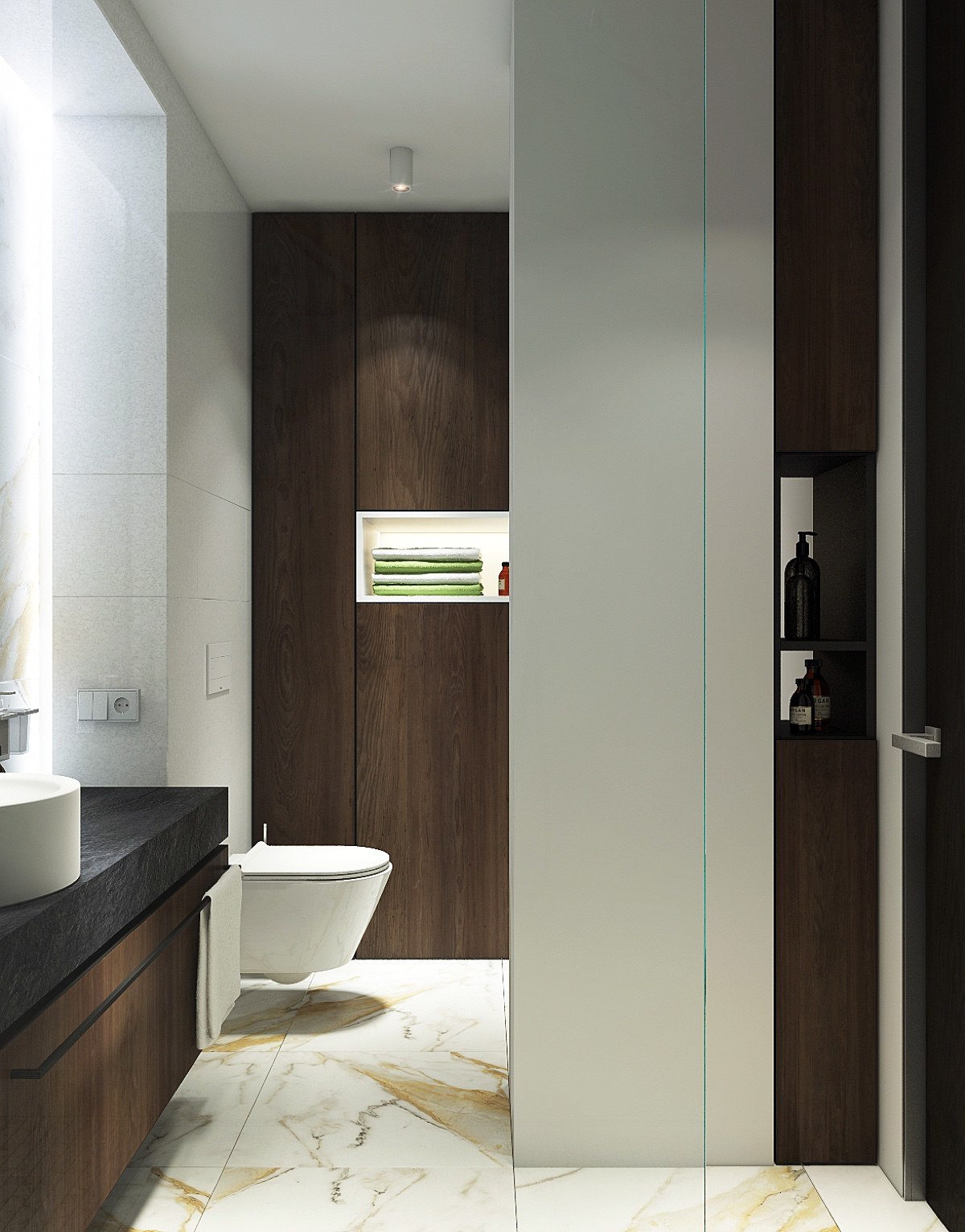
Carrying on their accents, more wooden panels are bathroom-bound. Making friends with marbled tiling, they find expression beside towel rails, under sinks and beside the toilet. Stone blocks in white porcelain and a slate benchtop ground the space, while an illuminated mirror and glass panel give the illusion of ever more room.
