The Scandinavian interior design style is one that is favoured by millions, not only because of the popularity of IKEA, but for its contemporary form and simple functionality. The Scandi aesthetic has a mid-century modern appeal and fits cleanly with the minimalist movement. It is flexible enough to splice with other themes too, and suits an array of colour schemes–not only the white, grey and wood palette (although this is a classic we still love!) Let us take a look at five different themes within the Scandinavian style, including muted rustic Scandinavian elegance, cheerful pastel play, one deliciously dark home, a botanical burst, and one for the trendy traditionalist.
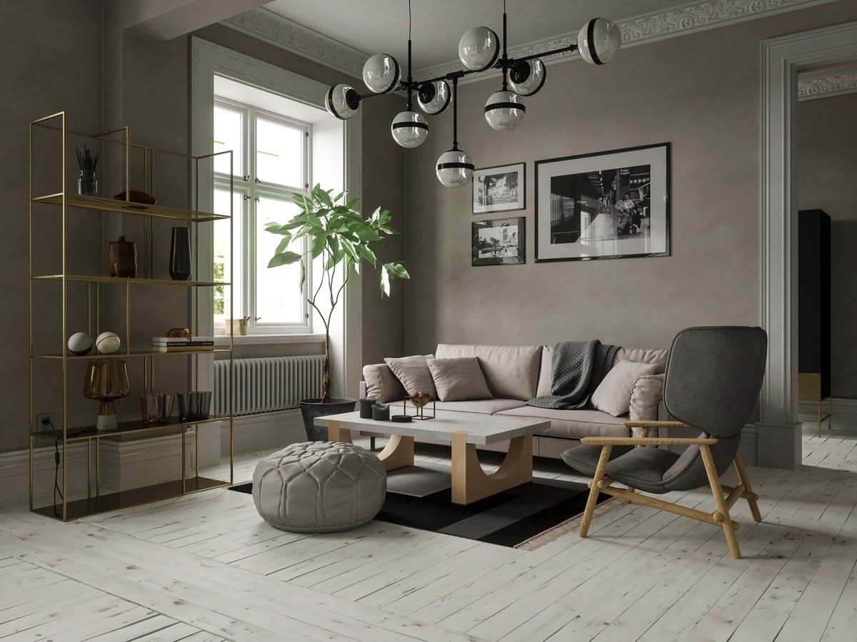
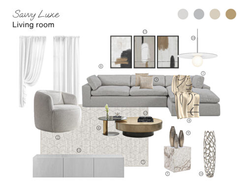
This entrancing grey rustic living room is layered with golden accents, natural timber elements and smooth silhouettes. Varying shades of grey upholstery cover a modern sofa, cool accent chair and comfy pouf to build depth. A huge sputnik chandelier crowns the look, in a black and white design that matches with monochromatic wall prints.
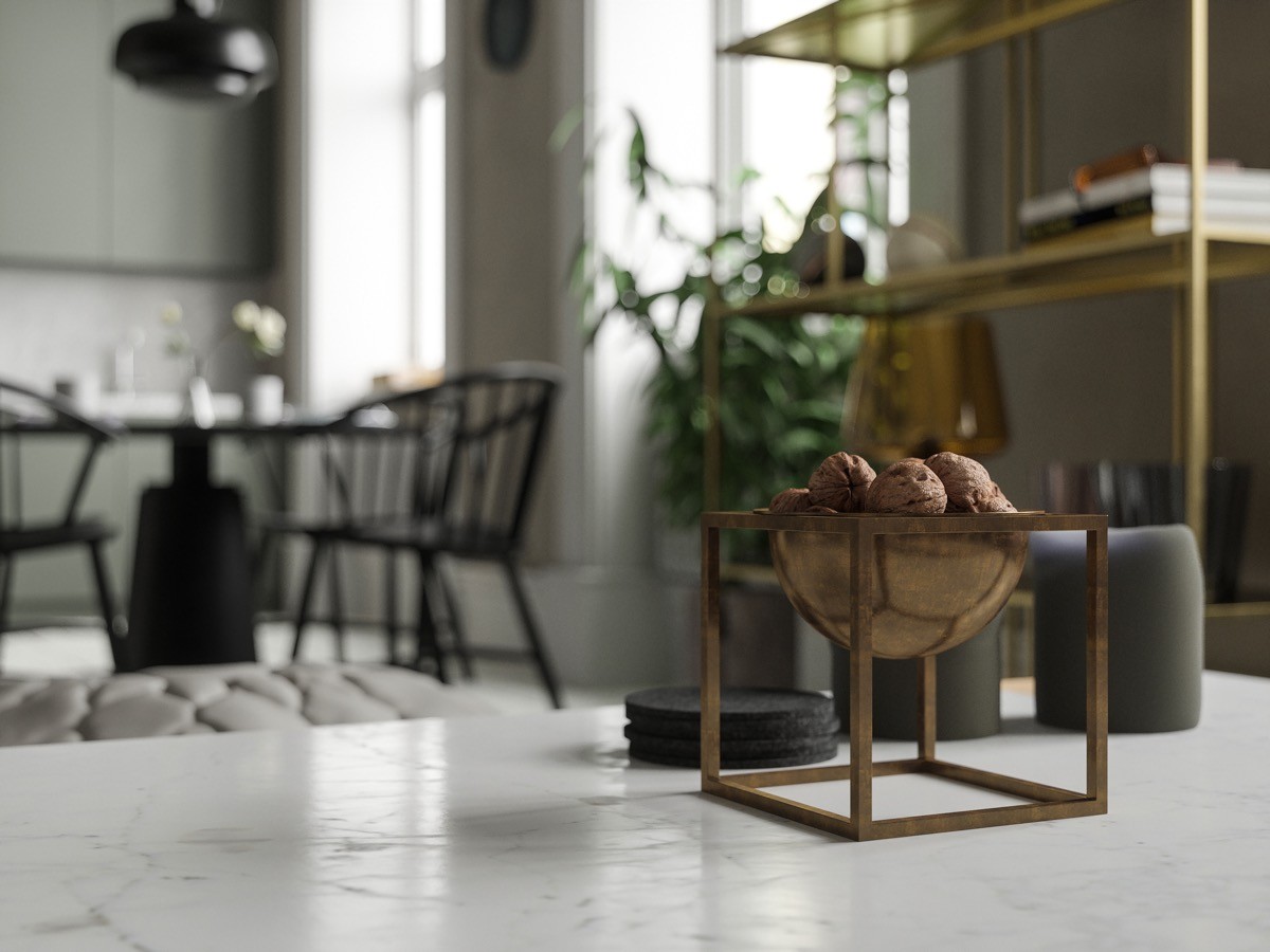
A few candles and decorative items are scattered throughout in small numbers–just enough to make a house feel like a home without cluttering.
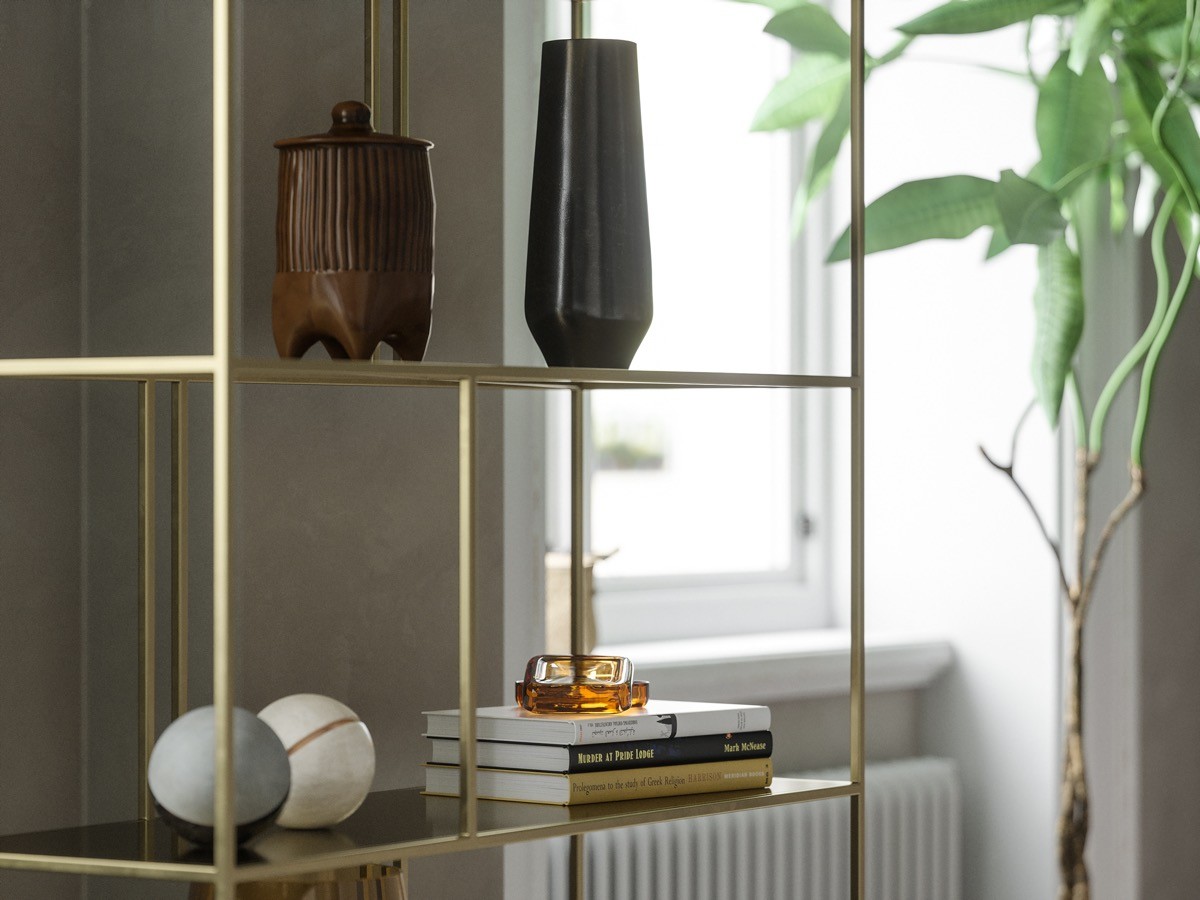
Decorative vases dot a gold shelving unit at one side of the lounge area. Books stack horizontally on a lower shelf.
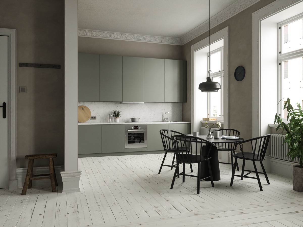
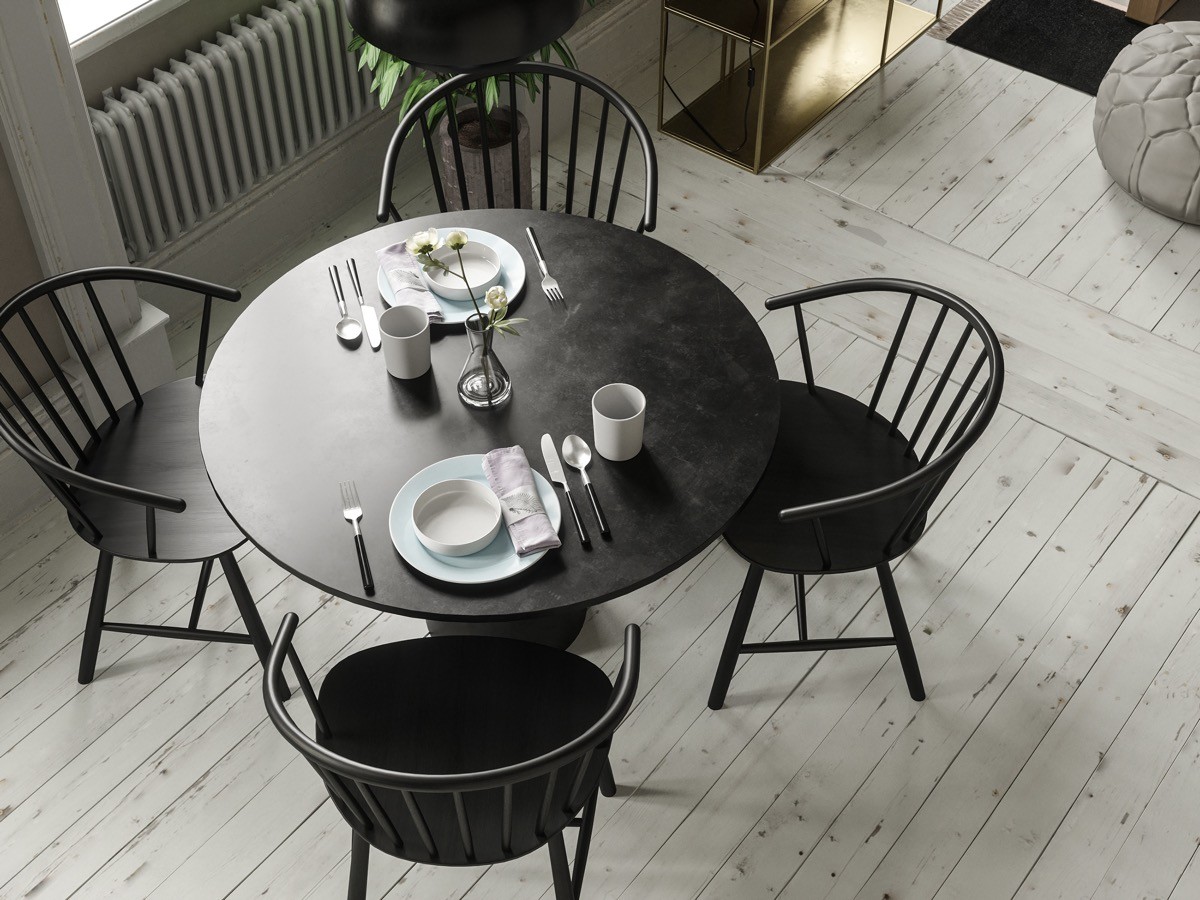
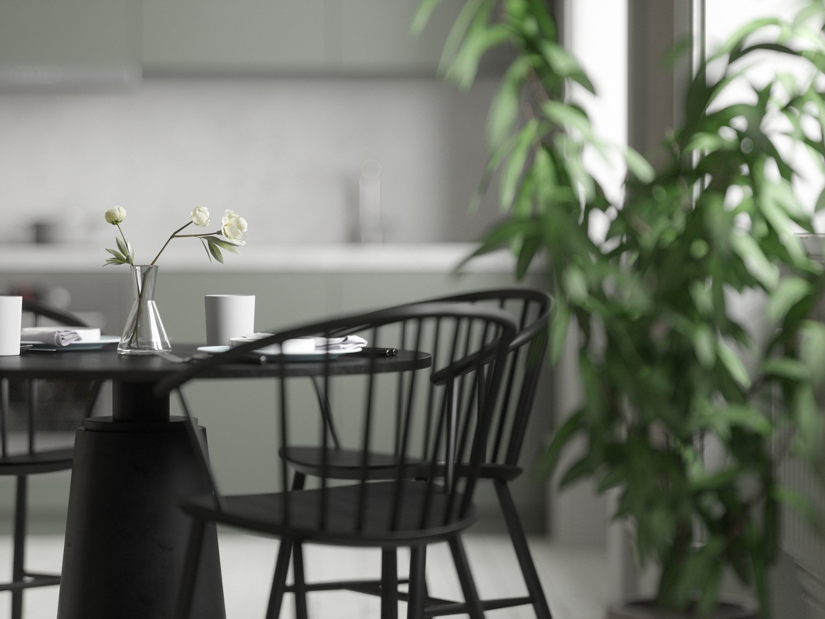
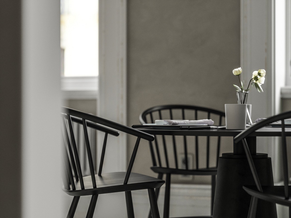
At the opposite end of the open plan room, a pale sage kitchen fills one wall. A black dining set weighs solidly at the centre of the room, visually anchored by a black dining table and a pendant light.
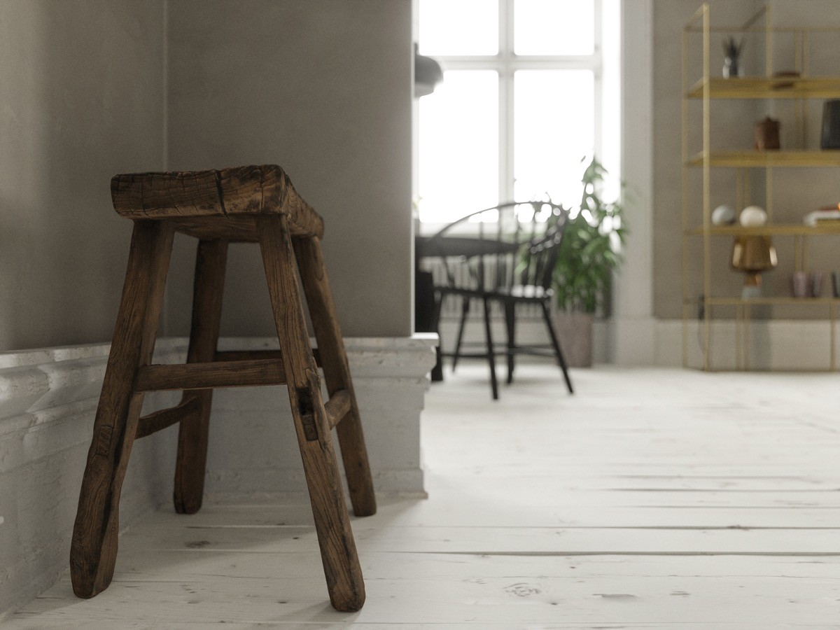
A useful rustic stool nestles around the corner from the kitchen diner, poised by the front door–it could even double as an extra dining chair in a pinch.
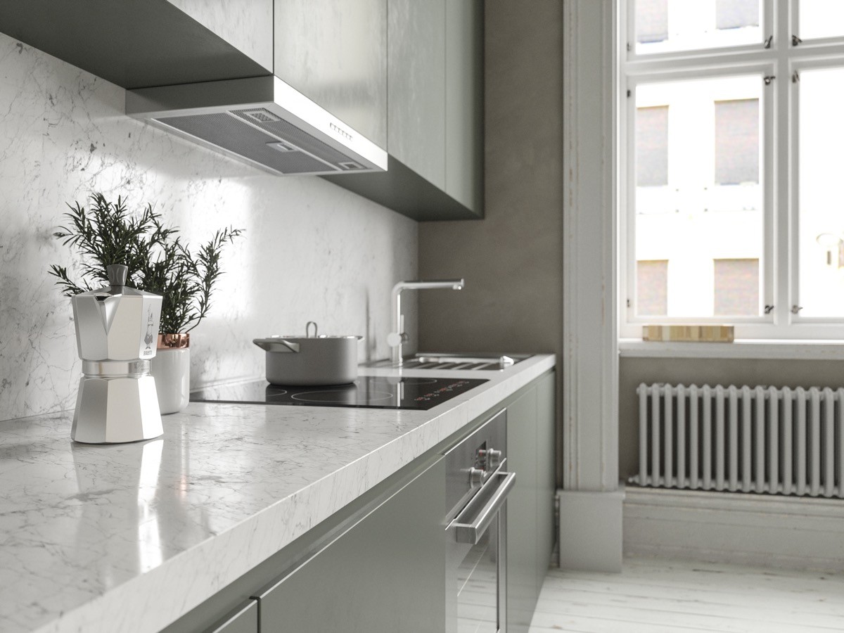
Exquisite white marble crosses the kitchen countertop and backsplash, which accentuates the delicate colour of the cabinets.
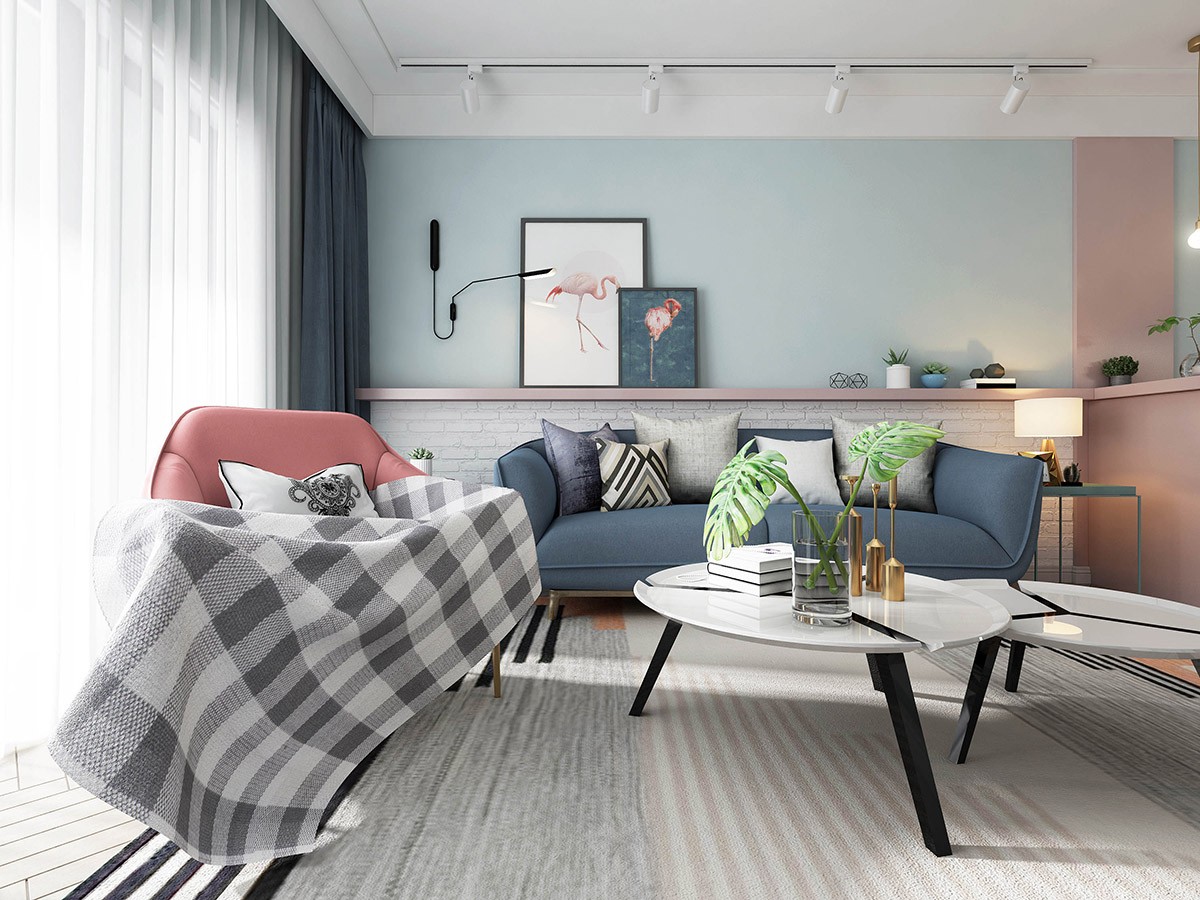
just can’t help but look bright and perky, as this blue and pink interior cheerfully demonstrates.
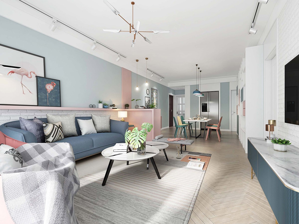
Pastel pink stripes through a dominating expanse of powder blue to make a sweet duo. A slightly darker blue sofa and media cabinet help add a little visual weight to the airy scheme, whilst plentiful white elements keep the mix looking fresh.
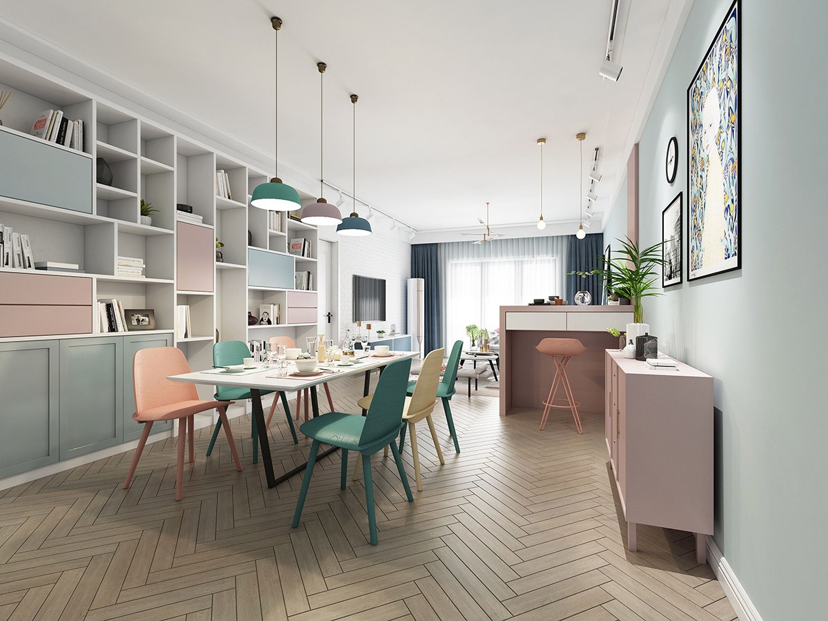
Turquoise and pale yellow are introduced as we take a walk into the adjoined dining area. A huge shelving unit covers an entire wall, with random sections faced with pastel coloured doors and drawer fronts. From this side of the room we can see that the vertical pink wall stripe is part of a small bar, with a matching pink bar stool.
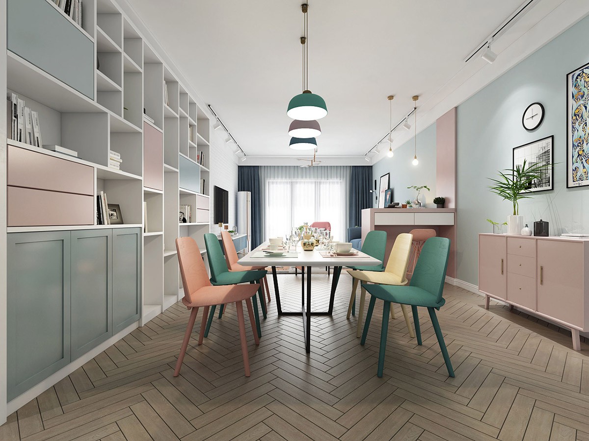
A pink sideboard is topped by a neat gallery wall, to balance out the colour and height of the large shelving unit on the other side of the space.
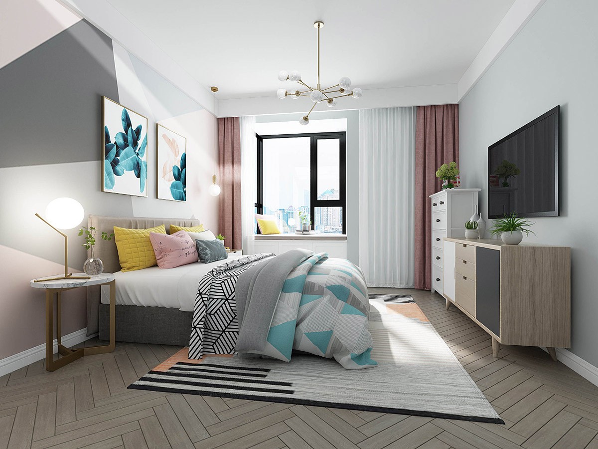
A petite gold sputnik chandelier gleams in a colourful bedroom ensemble, dashed with geometric lines.
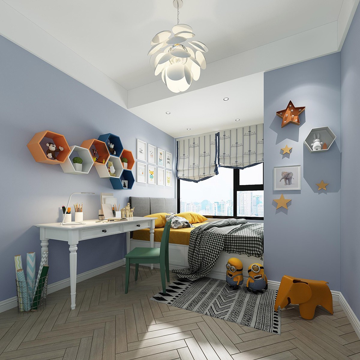
In the kid’s room, a little orange elephant stool lives in an energised blue, orange and yellow starry scheme.
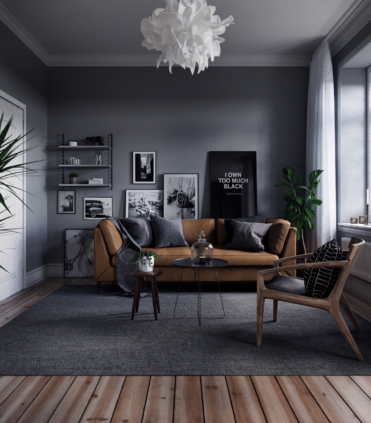
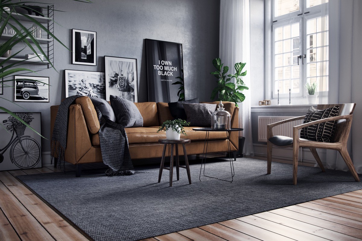
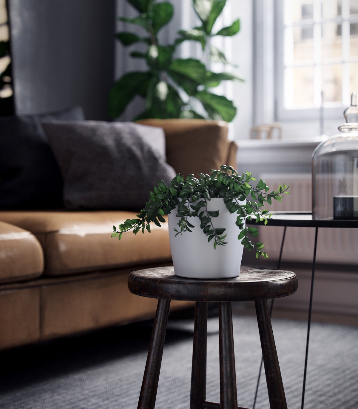
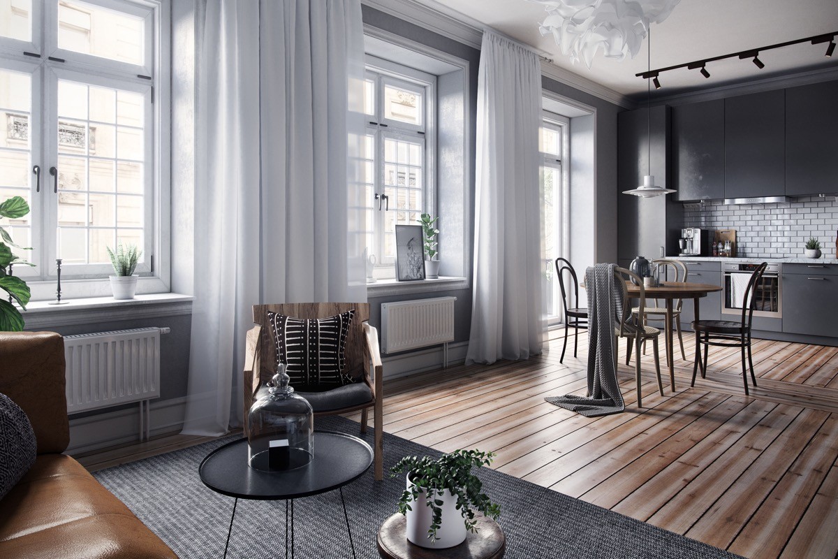
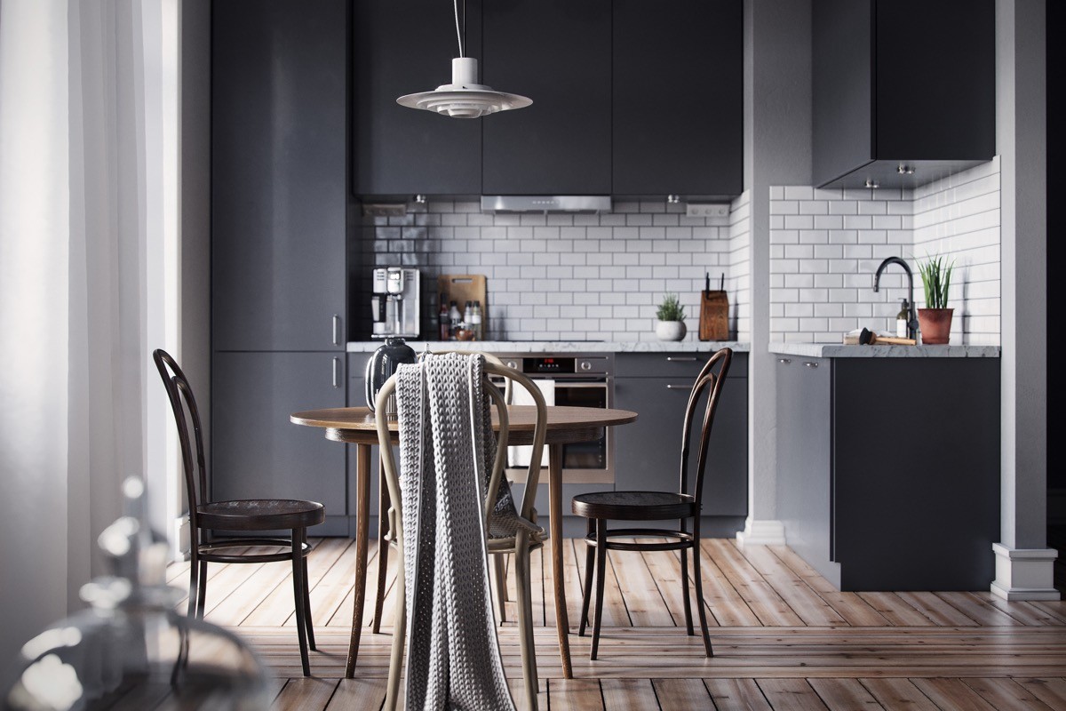
Black, grey and tan come together as a sophisticated trio in home tour number three.
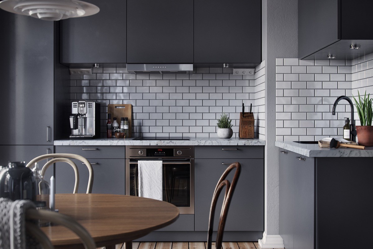
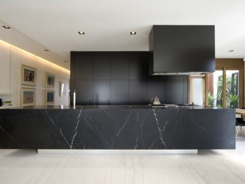
Glossy wall tiles line the L-shaped kitchen, softly reflecting the light. If you enjoy dark themed Scandinavian design, don't forget to check out our post: Dark Scandinavian Interior Design.

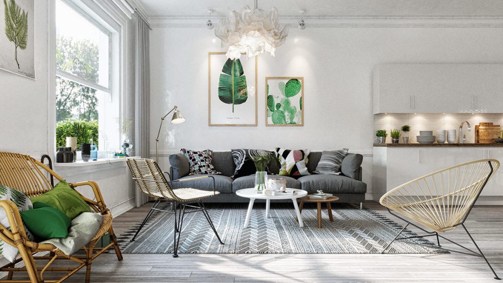
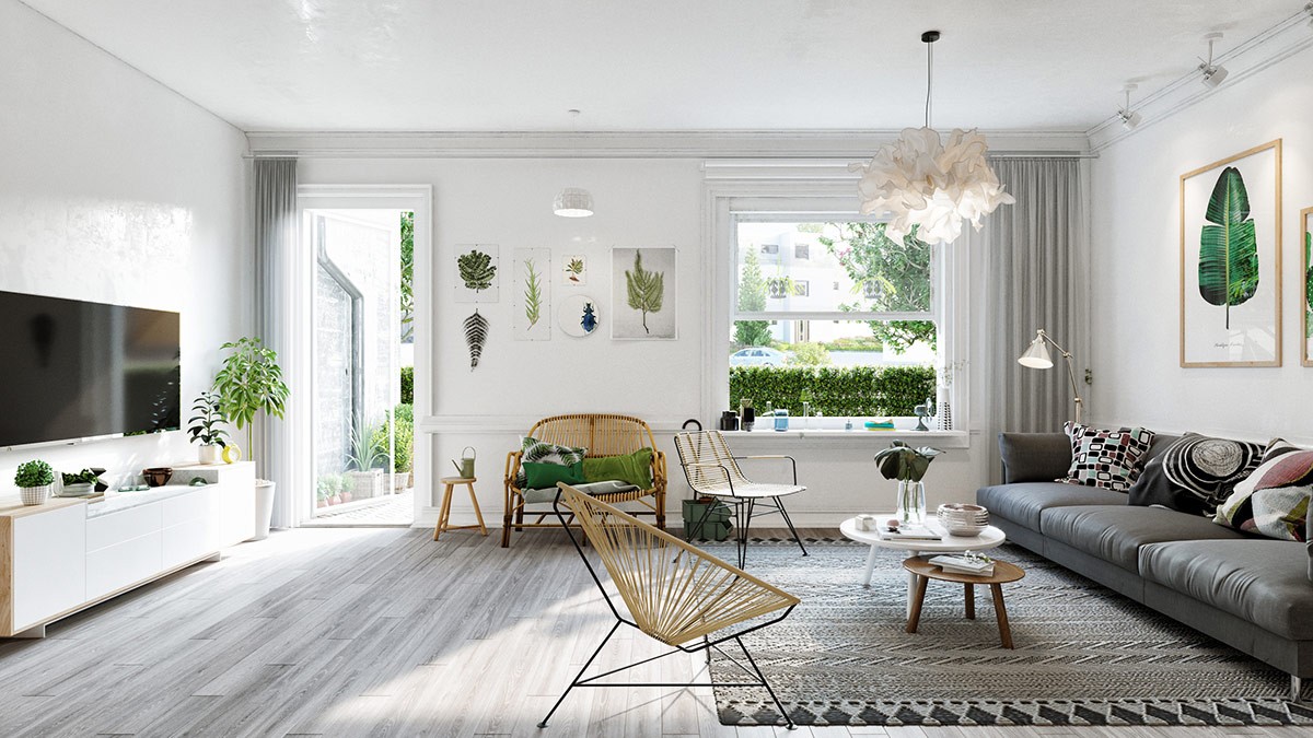
Green accents hold all the attention in this white and grey minimalist home, in living leaves, artists impressions, and bright scatter cushions.
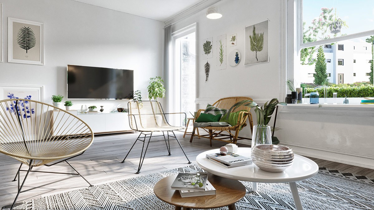
White and wood nesting coffee tables are settled on a monochrome tribal rug; Acapulco chairs vibe with the geometric print.
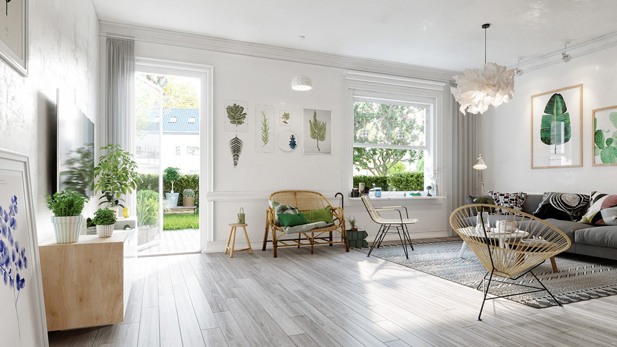
Light fixtures are kept white to blend with their calm surroundings, and to let the green works of art sing out as the hero pieces of the design.
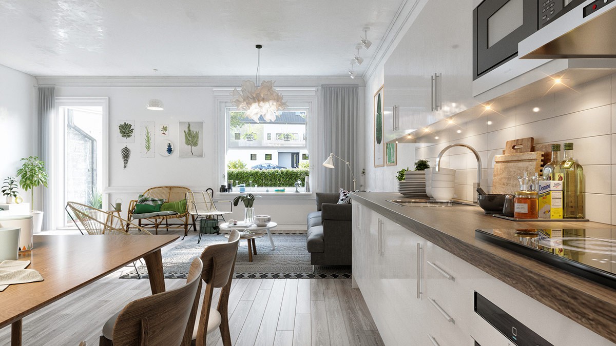
The kitchen too is a white affair, with chunky wood grain worktops to suit the natural theme of the room.
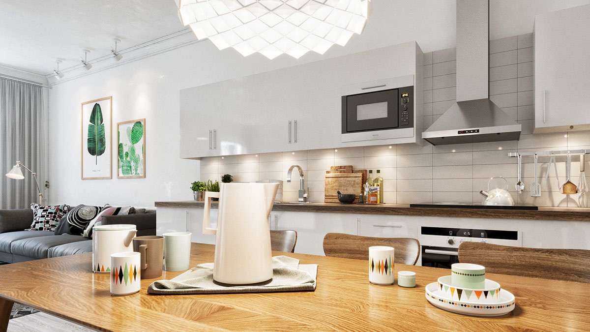
A rectangular wooden dining table runs in line with the one wall kitchen, echoing its wooden worktop.
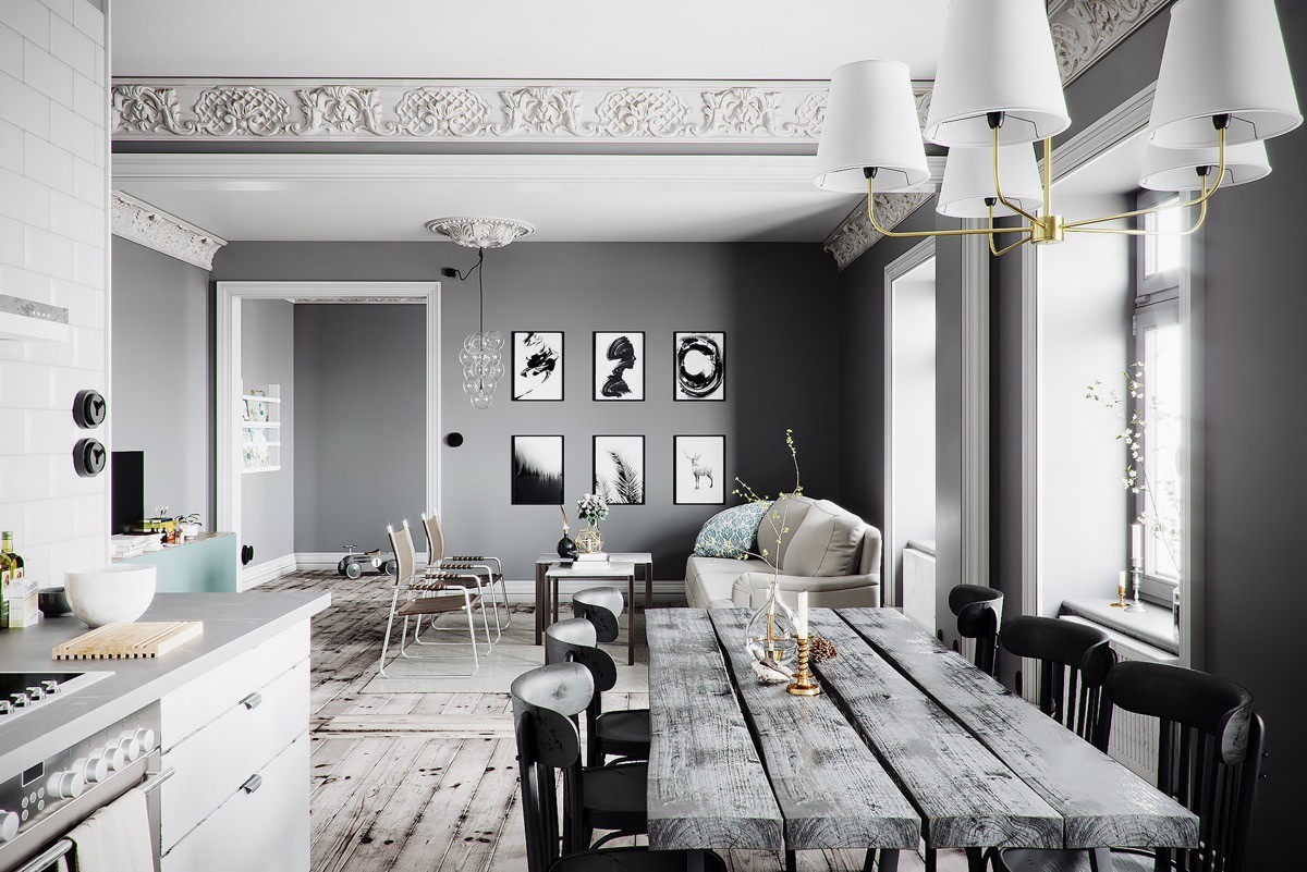
If you’re a sucker for traditional twists, but love modern lifestyle, then there’s no reason why you shouldn’t combine the two–and some Scandi flavour to boot.
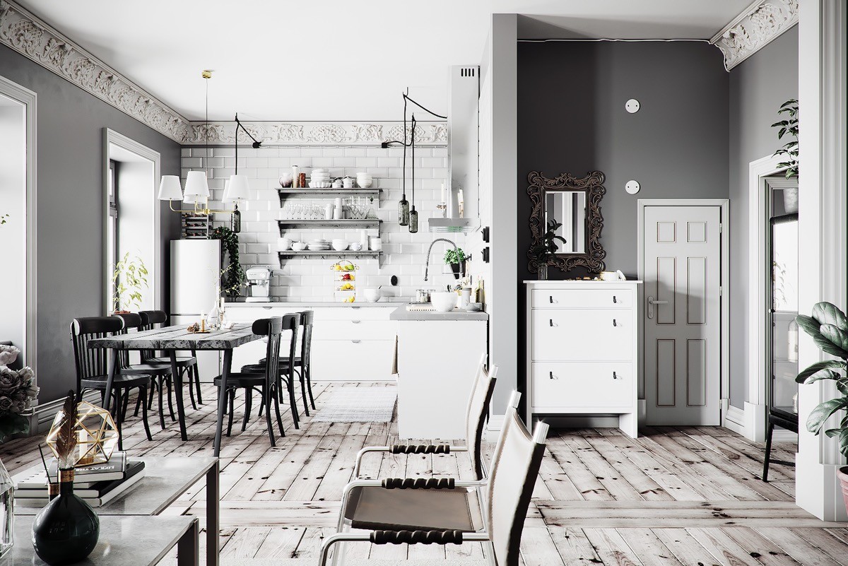
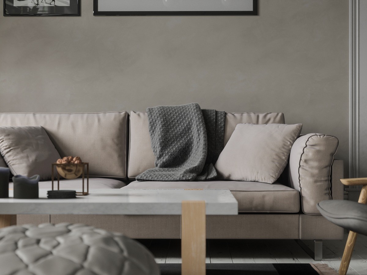
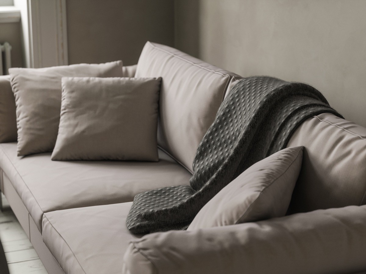
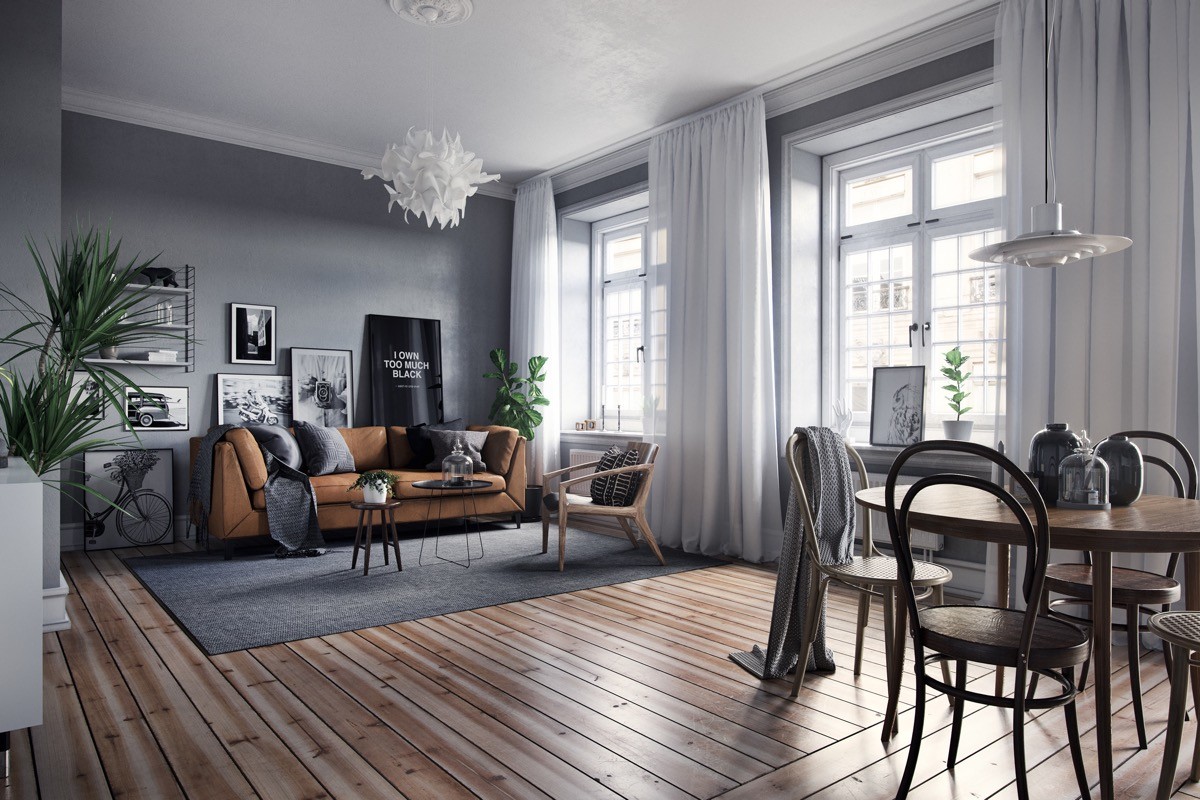
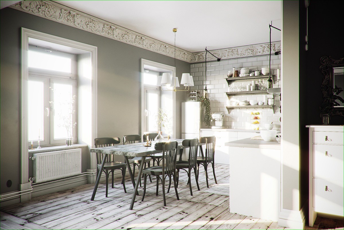
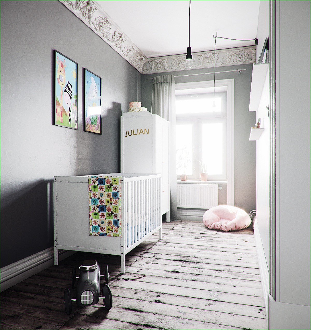
The mid-grey shade painted on the walls of this home has the perfect amount of depth to accentuate traditionally ornate white cornice. The clean lines of the Scandinavian furniture pieces do not detract from the decorative moulding.
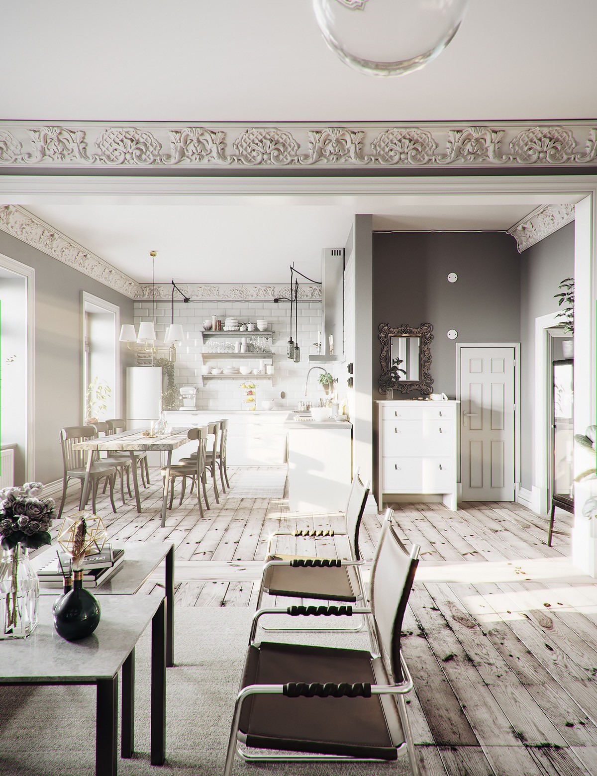
The bleached flooring straddles the line between modern and traditional, and is able to work with both styles in this arena.
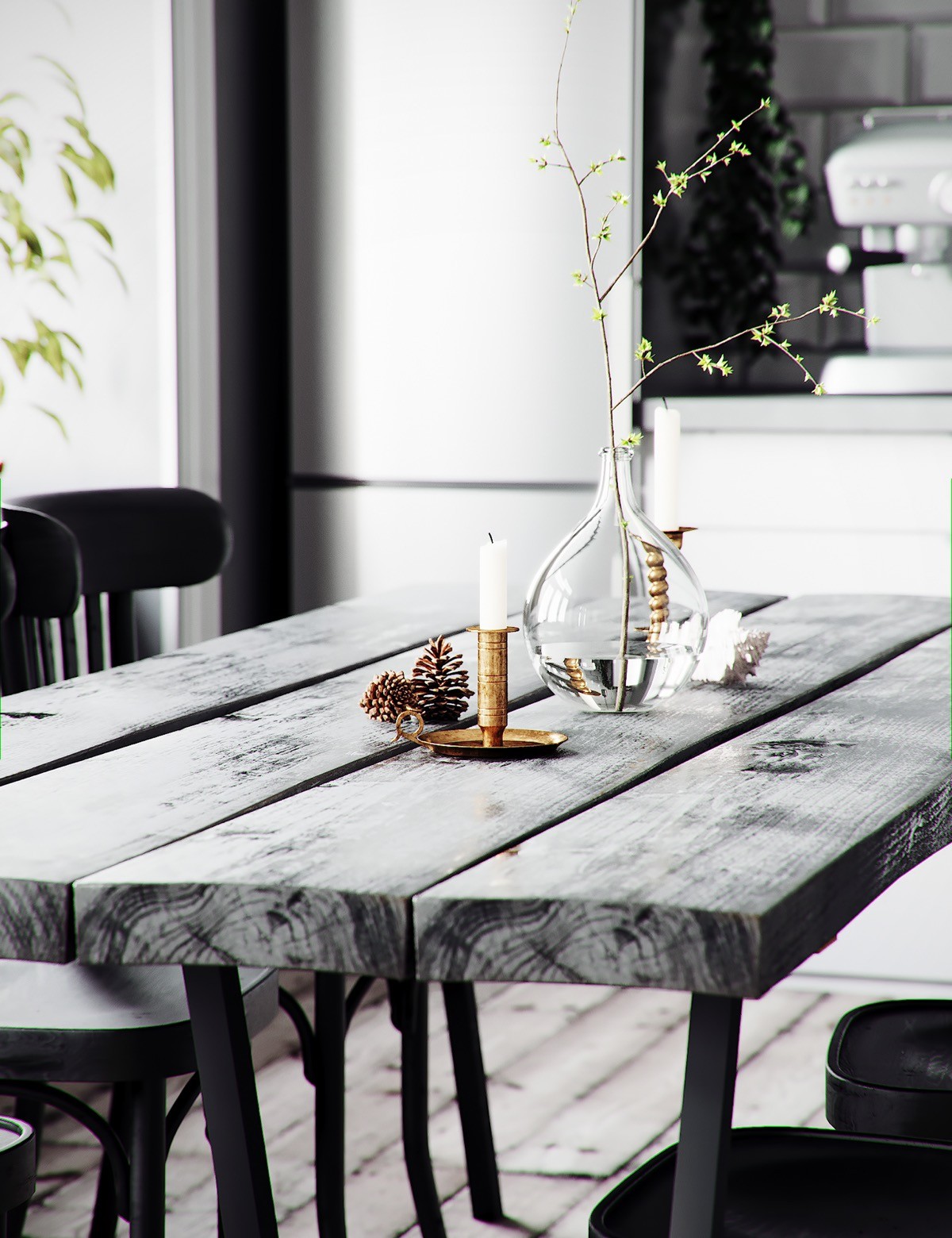
A curvaceous glass vase sits atop a timeless wood dining table.
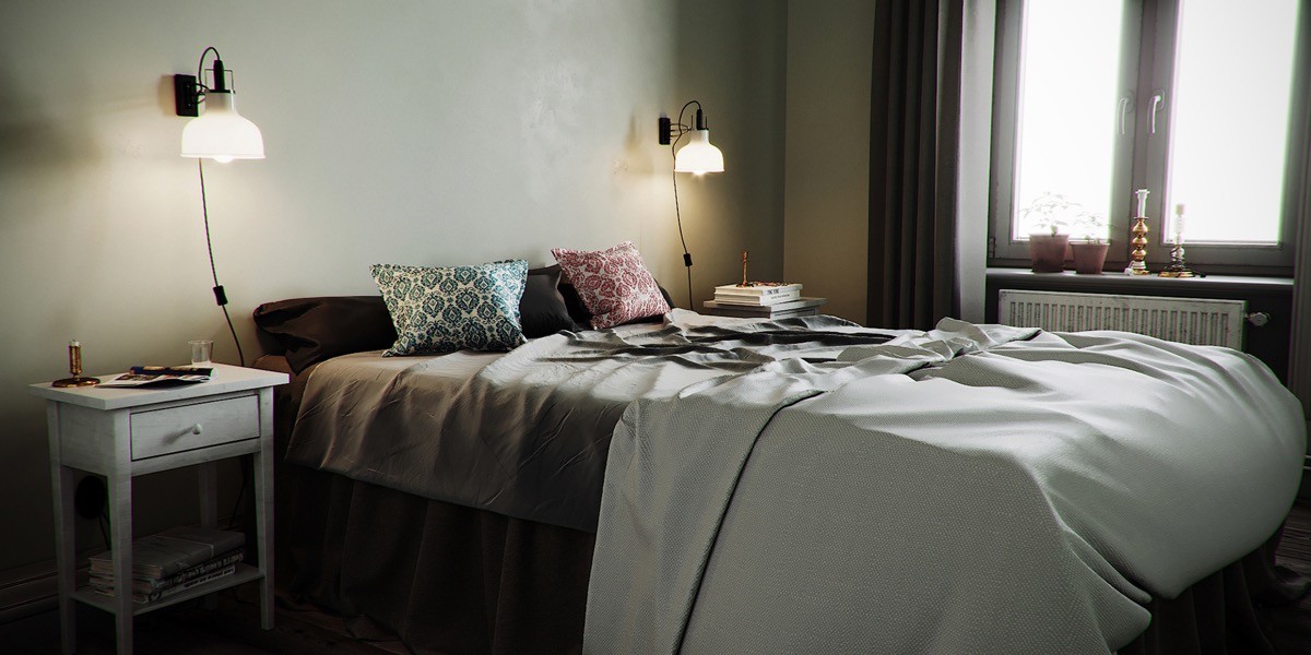
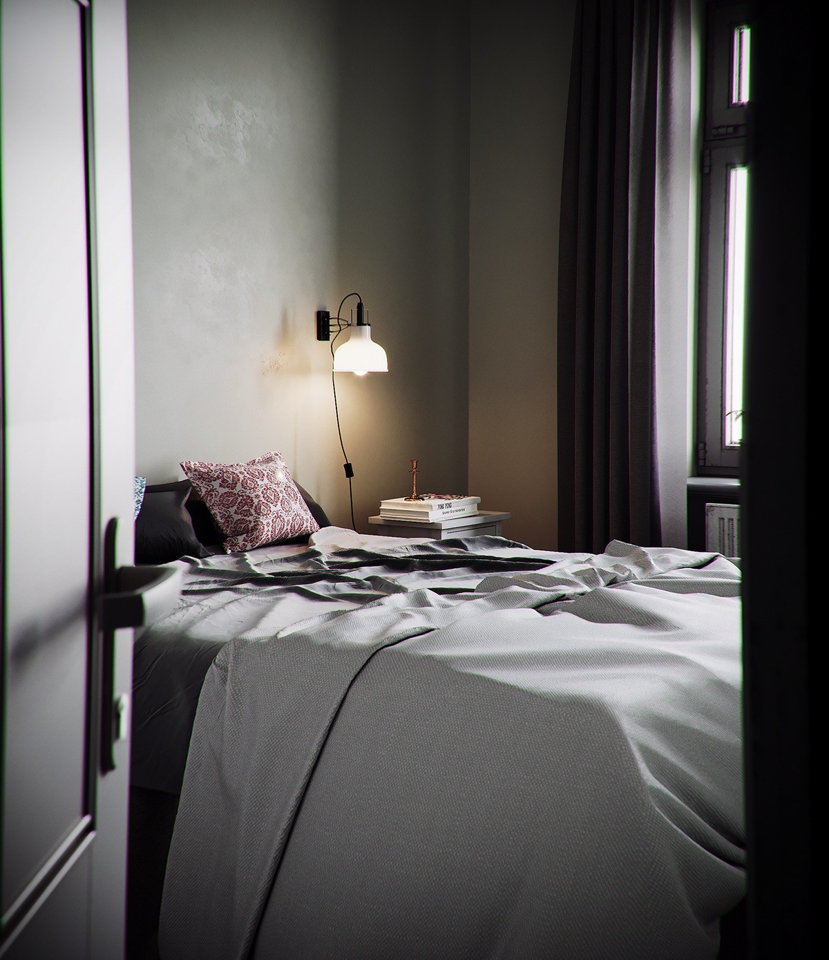
Warm wall lights glow against raw concrete walls. Patterned pillows decorate plain grey bedclothes.
