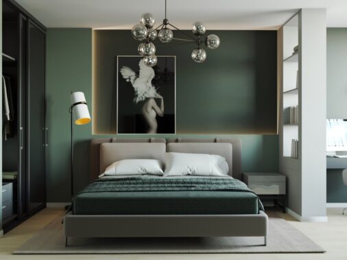
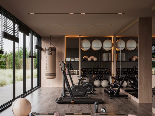
Balancing efficiency with comfort is a constant challenge for designers – but these three single bedroom apartments serve as inspiring examples of success. Each one focuses on organization and openness as a first priority without sacrificing that all important sense of “home” thanks to their warm and welcoming natural neutral color schemes. You'll also find ideas for storage and organization, streamlined furniture designs, minimalist decor motifs, and each apartment tour even includes a floor plan to help you visualize how the entire home comes together.
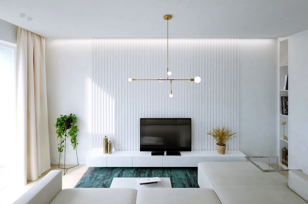
Let's begin with a modern apartment renovation designed for a bachelor who desired a more relaxing and uplifting place to decompress at the end of the day. The project began by banishing restrictive interior walls, updating the dark interior with a fresh springtime color theme to take advantage of the light that pours in through its large windows.
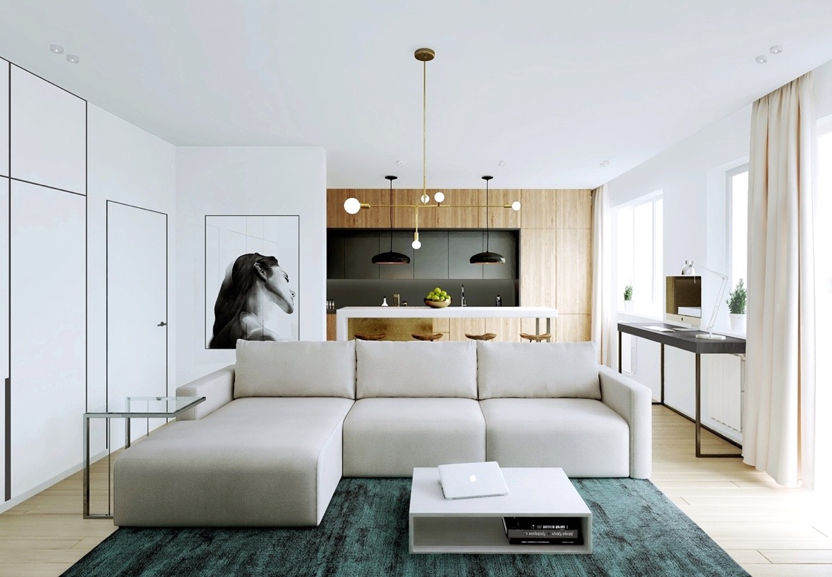
The tour opens to an airy open-layout living space, decorated in dramatic forest greens and golden hued woodwork. Brass accents immediately catch the eye thanks to the central placement of the smartly cantilevered Cliff Suspension light from Lambert et Fils.
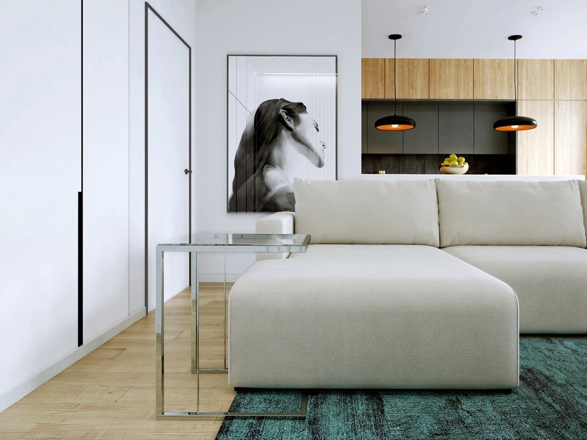
Furniture sticks to clean lines and straightforward materials for an uncomplicated aesthetic. Similarly, artwork remains minimal and echoes the subdued black-and-white theme of the walls.
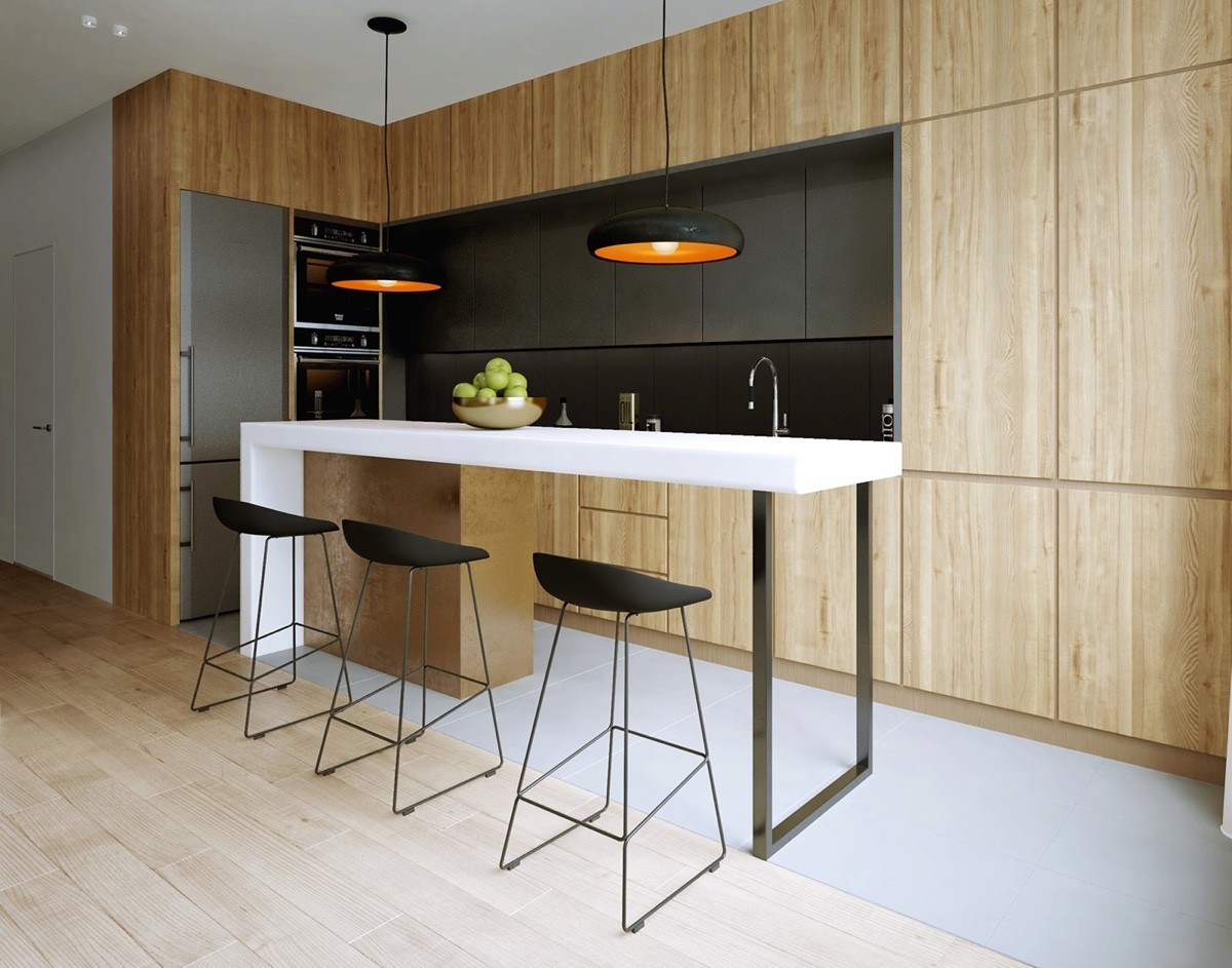
A compact breakfast table with kitchen bar stools separates the kitchen from the rest of the living space and conveniently doubles as a functional kitchen island for food preparation and other everyday tasks. Overhead, low kitchen pendant lighting provides focused illumination.
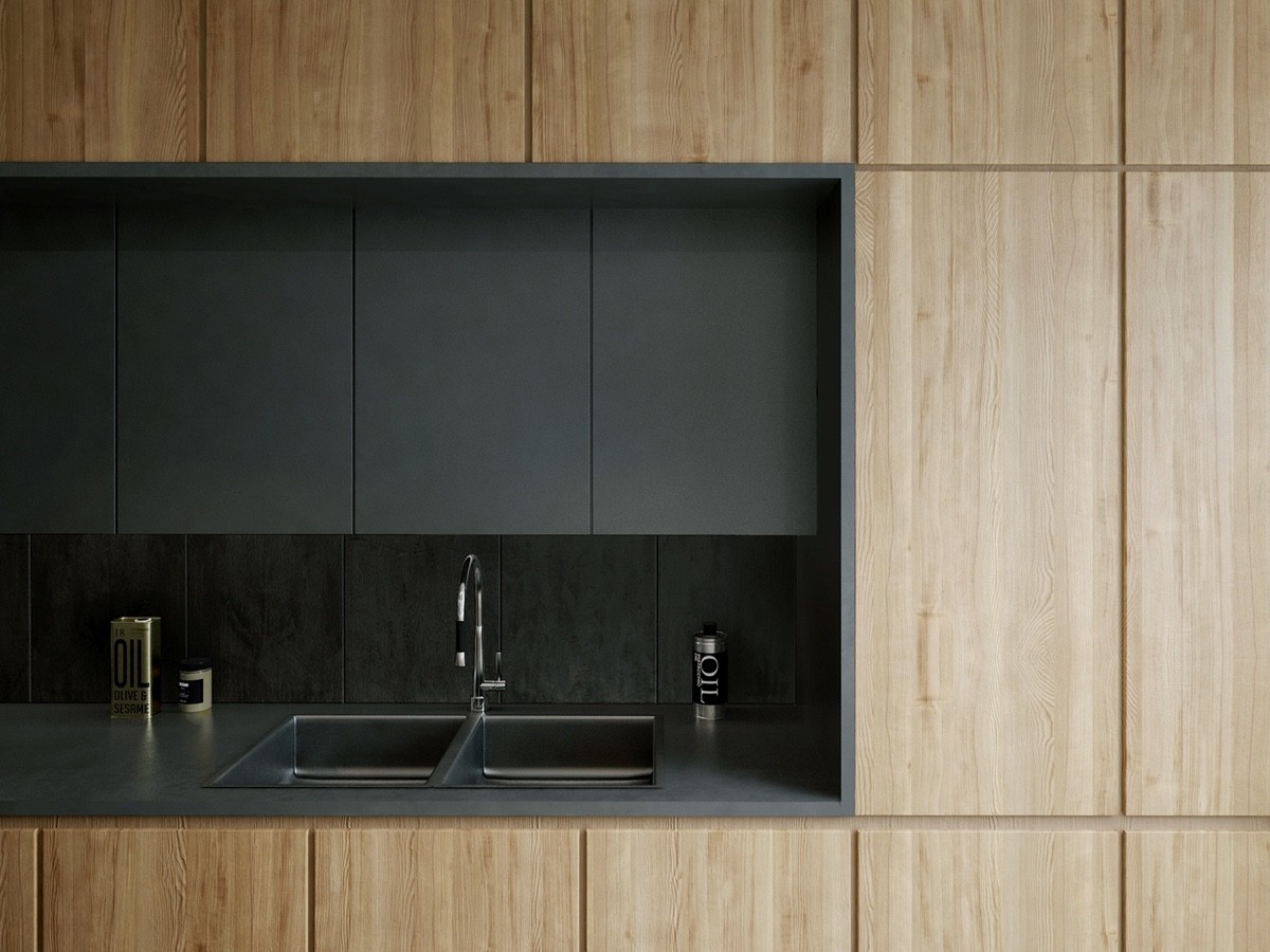
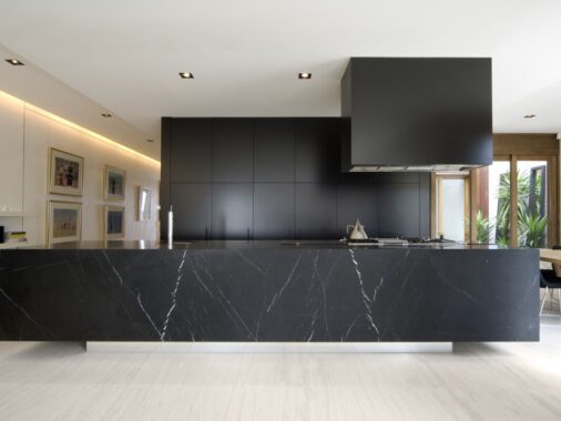
Black on black finishes help to expand the perception of depth granted to the work area, while the variation in matte texture prevents the surfaces from looking too minimal or undefined.
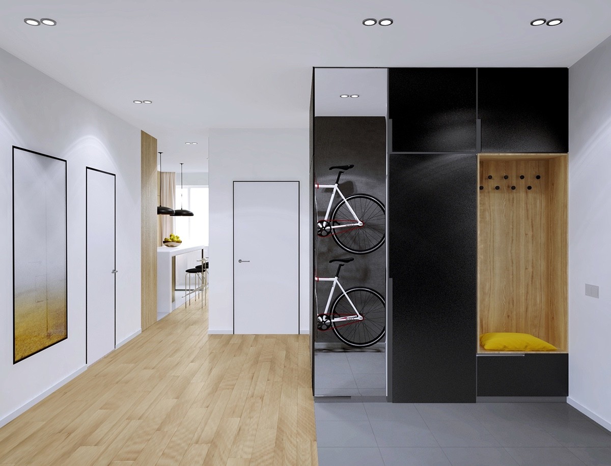
The client specifically requested ample space for bicycle storage, which the designers accommodated not only with a convenience but with attractive display options as well.
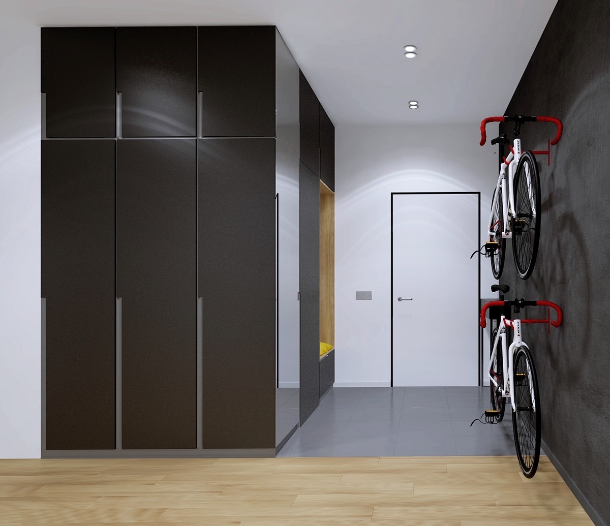
Now, not only can the resident easily grab a bicycle before heading out for the morning commute, guests are also greeted by a distinctive reflection of the client's personality and values - functional decor at its finest.
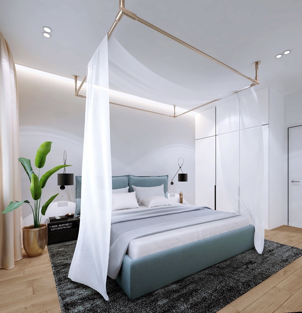
Brass accents and soothing colors appear once more in the bedroom, this time playing a more central role in the composition.
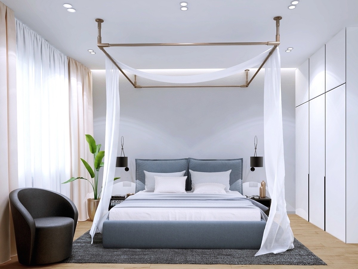
While the rest of the home makes extensive use of dark and light juxtapositions across a horizontal plane, this bright bedroom instead keeps the darker elements low as a grounding element to the design.
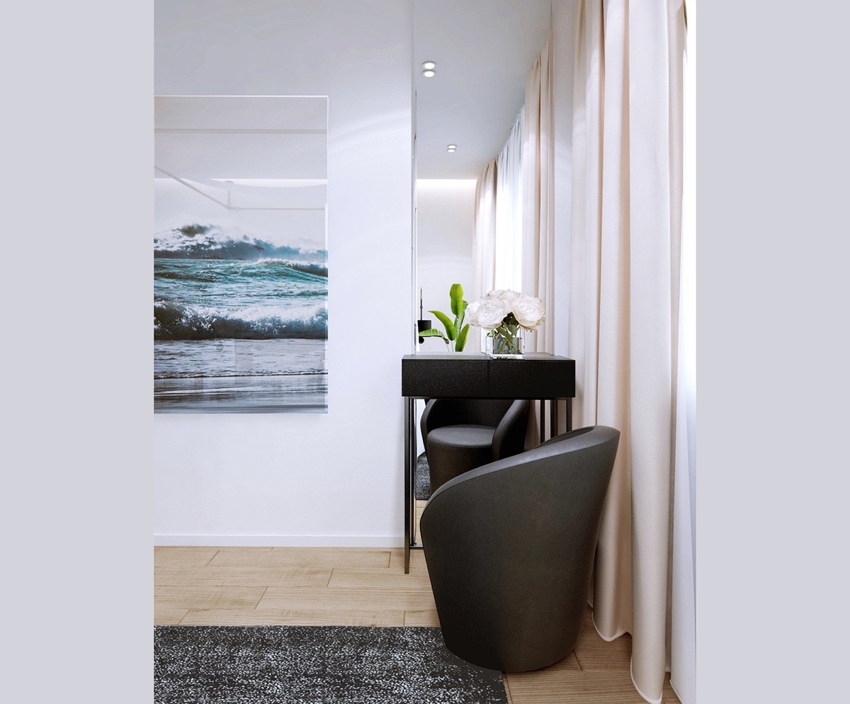
On the other side of the room, a smooth vanity chair offers flexible seating at a compact dressing table which could also act as a small work table if need be.
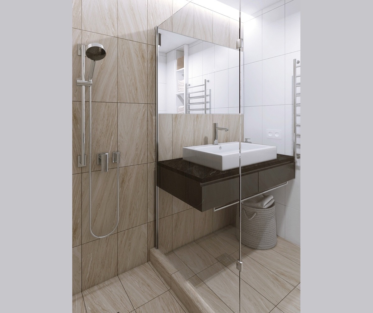
In the bathroom, richly veined tile lends an almost wood-like texture and tone to create a warm and comfortable place to clean up and unwind with a hot shower.
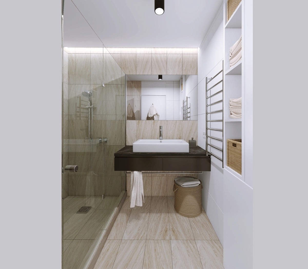
Ample built-in storage helps keep the narrow room uncluttered. A single linen basket tucks away easily beneath the sink vanity.
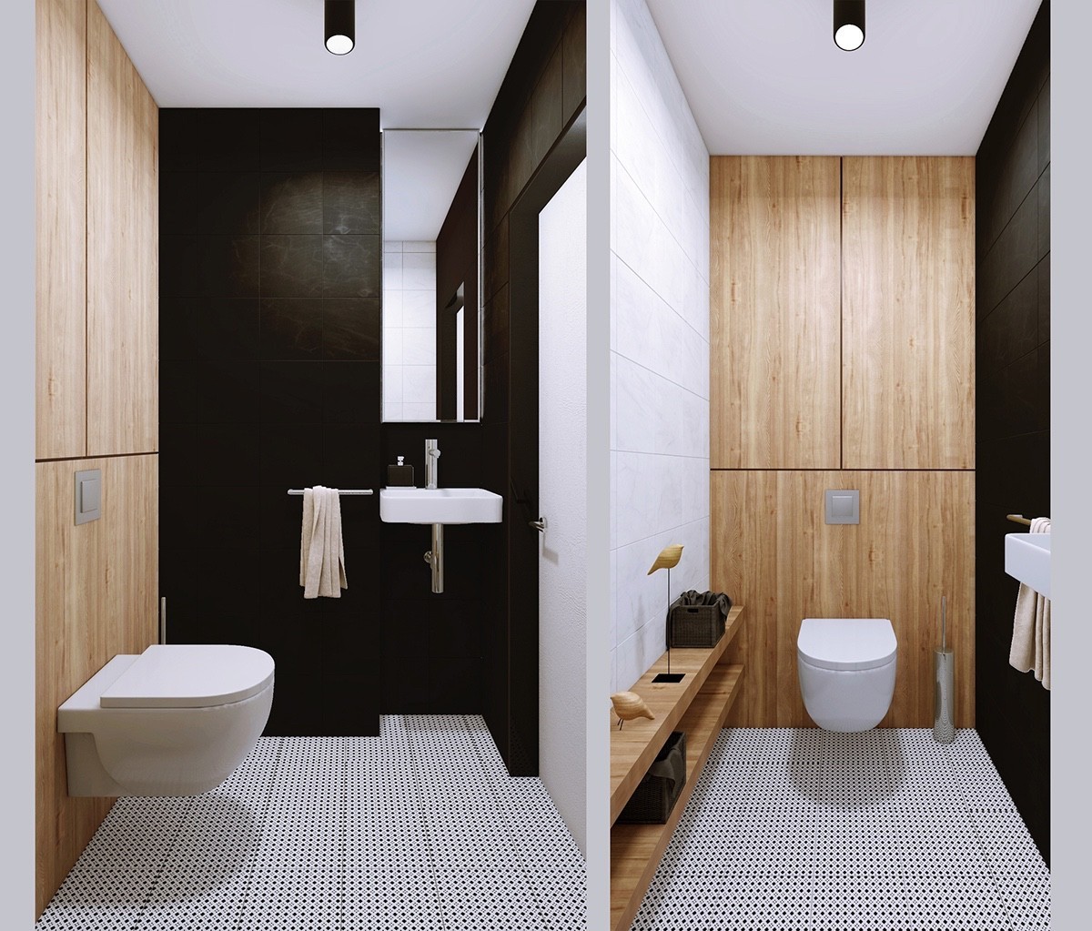
A second bathroom takes a bolder approach with a high contrast color scheme and patterned flooring. Adorable wooden birds serve as simple coordinating decor.
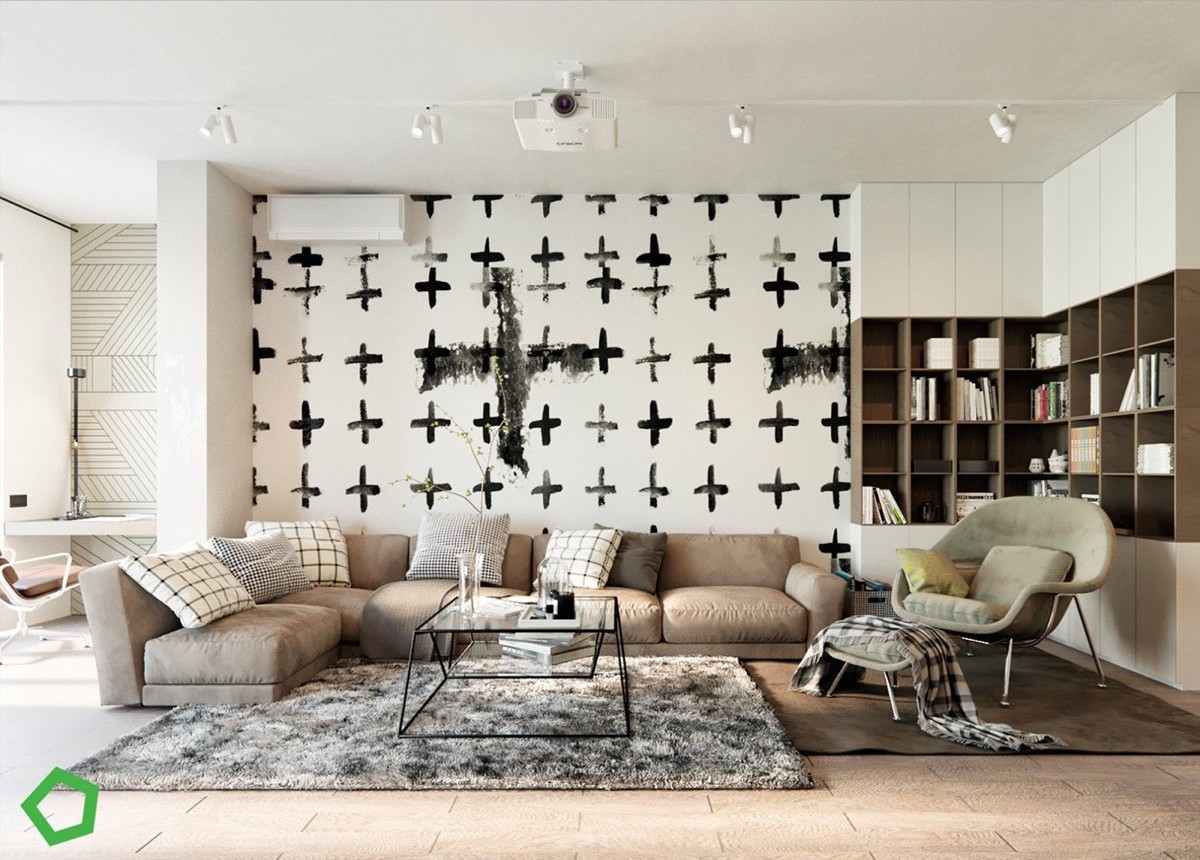
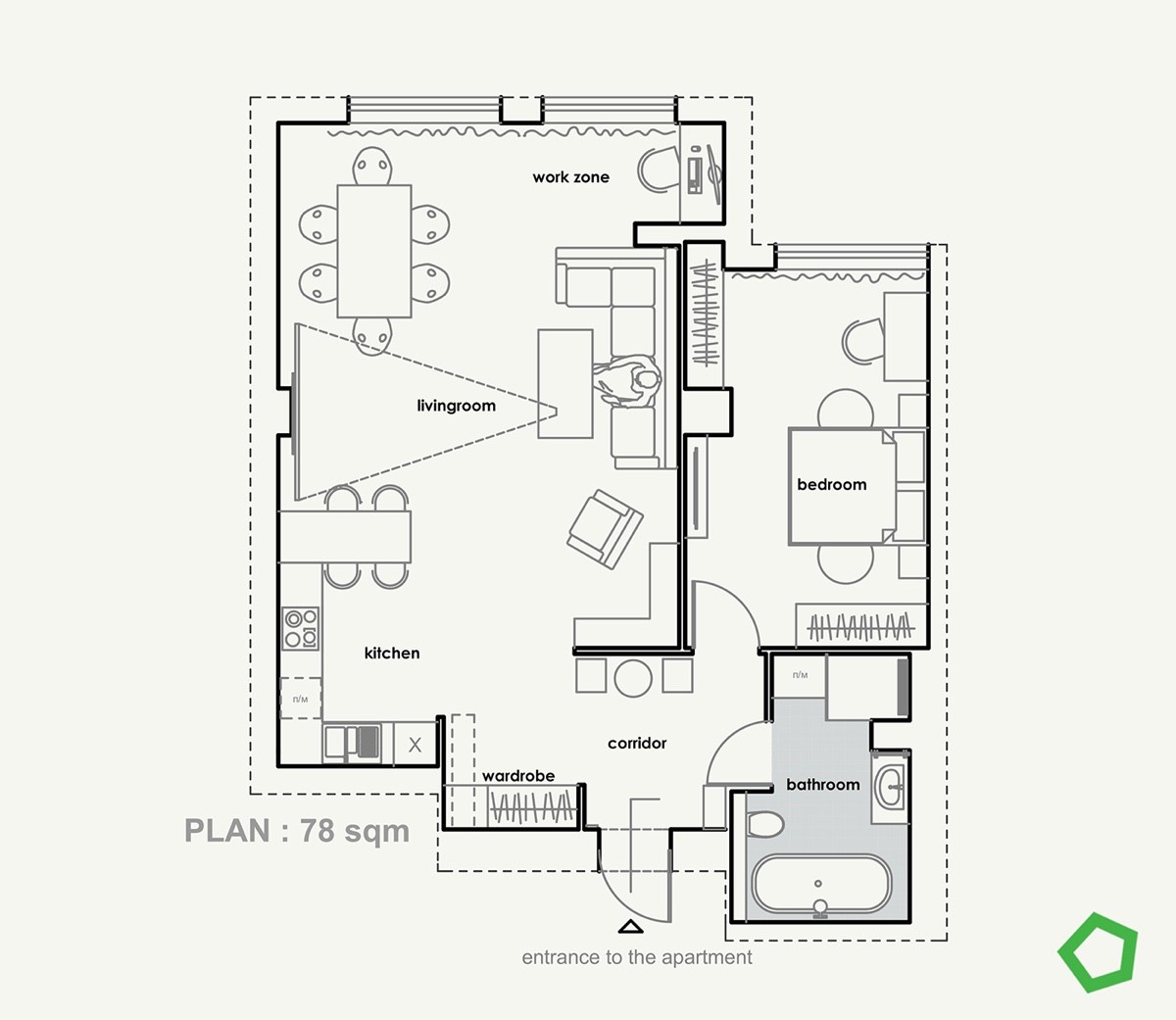
This 78 square meter apartment combines strong modern prints with warm earthy tones, two themes rarely found together but beautifully executed here. Low contemporary furniture helps preserve line of sight across the multipurpose living space while its composition easily marks the boundary of each functional area without making any particular area feel too closed-off.
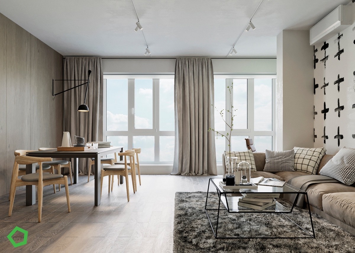
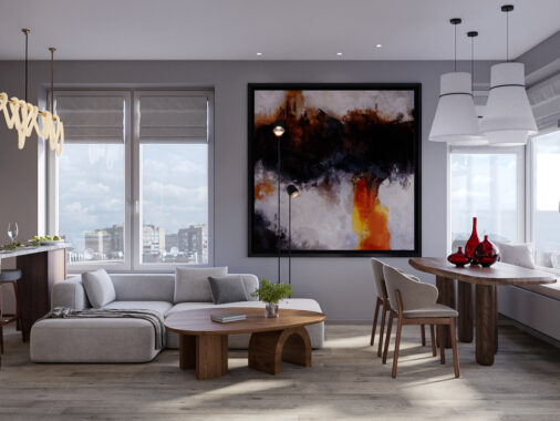
Living and dining areas stand side-by-side to share a generous view out the windows. While the seating arrangement is rich with prints and textures, the dining space takes a more trim approach that uses focused color blocking to balance the visual weight between both areas.
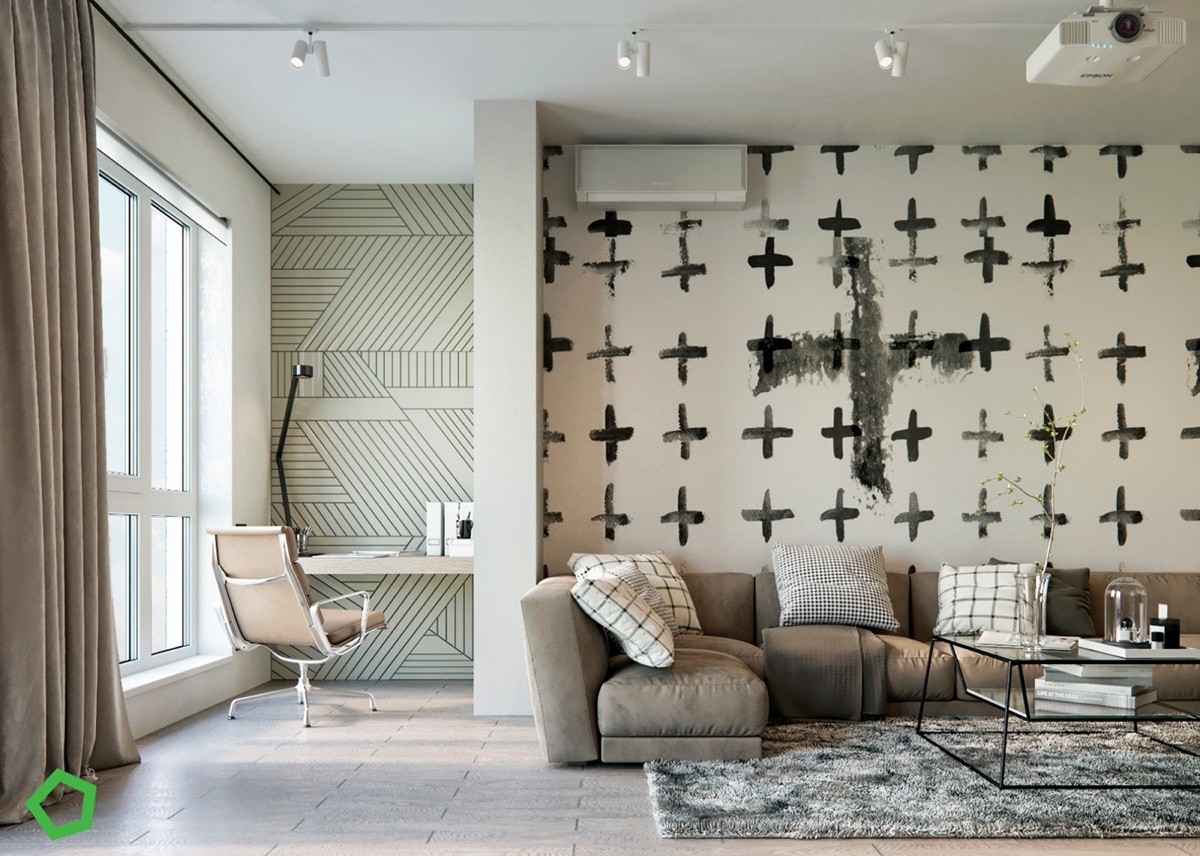
Nearby, a small desk takes advantage of its bright spot to lend energy to the resident while working. Thanks to its protective niche, it's able to enjoy its own unique accent wall without distracting from the cross pattern behind the sofa.
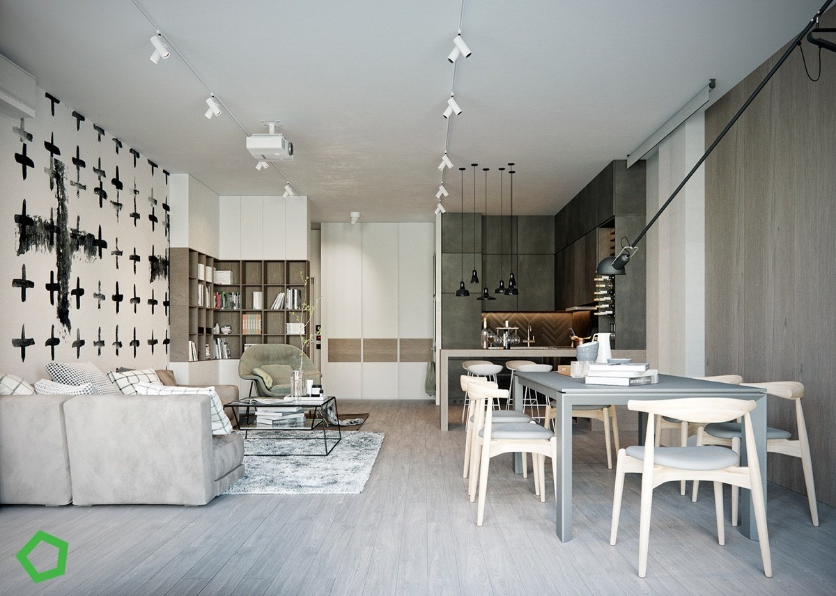
The other side of the room is defined by a storage system on one end and a dark and moody kitchen niche on the other.
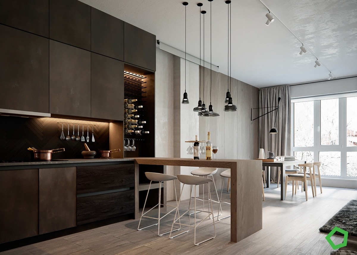
A breakfast table doubles as extended workspace for meal preparation, illuminated from above by lights from the Shadows collection by Dan Yeffet and Lucie Koldova.
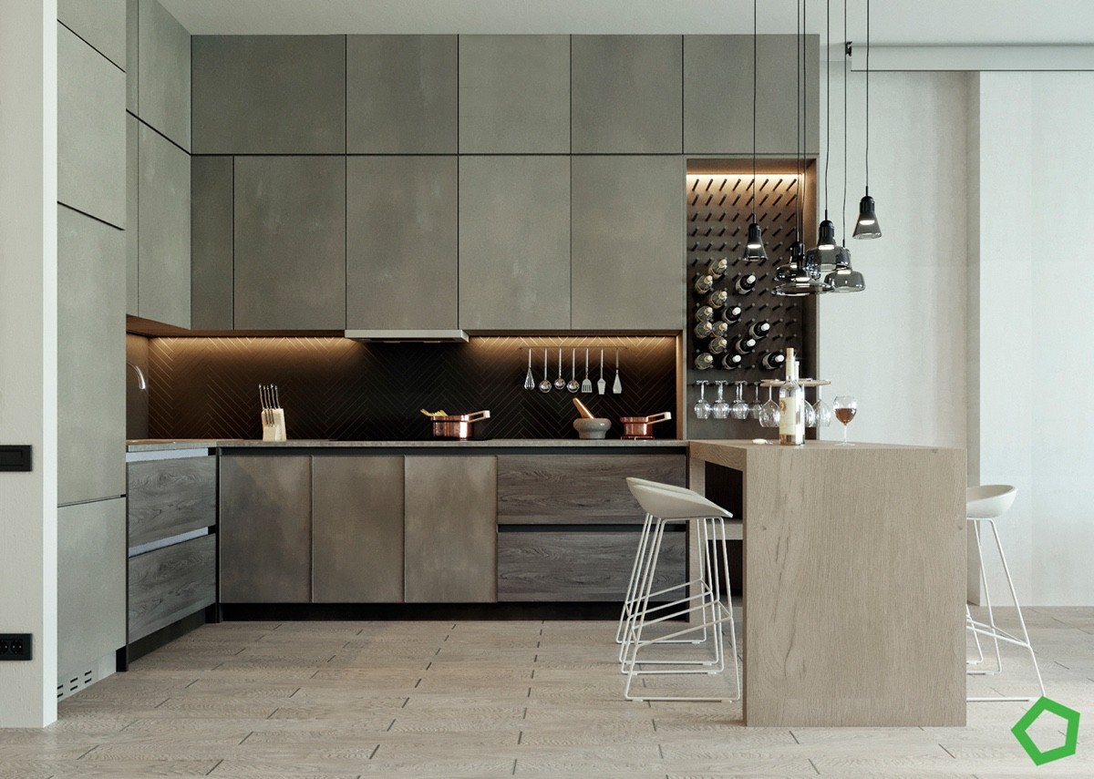
Textural variation defines the material palette. Wooden drawers, distressed cabinetry, herringbone backsplash tiles, neat rows of wine pegs - these uncommon combinations create tremendous character.

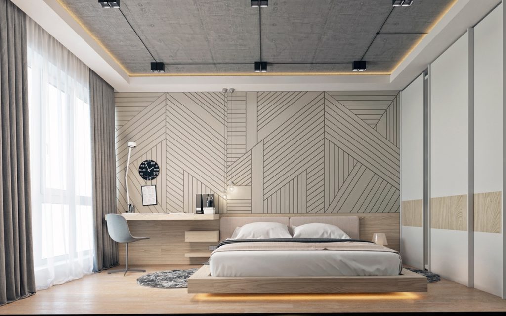
In the bedroom, patterned wall tiles make an immediate impression of energetic contemporary style despite the room's subdued neutral color palette.
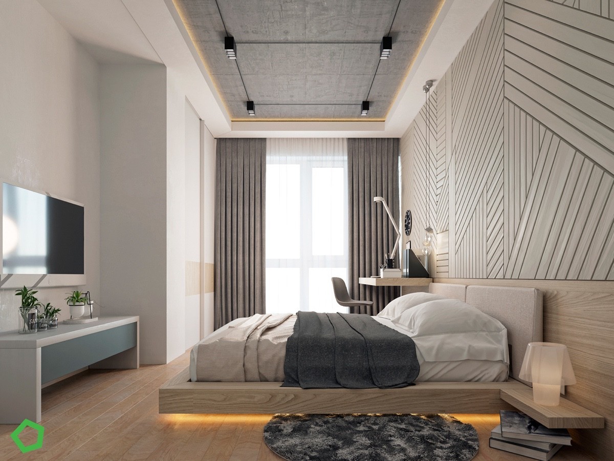
Furniture remains simple, putting ambiance first. Both the cantilever desk and platform bed rely on the most streamlined forms, forgoing elements like legs and drawers altogether.
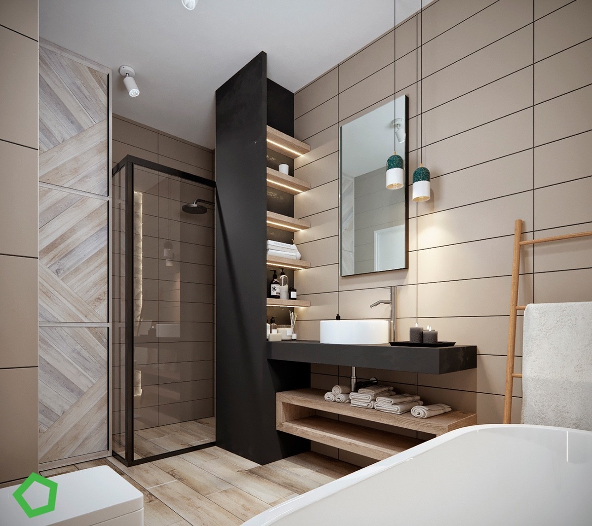
The bathroom layout is quite interesting. While many homes boast exceptionally spacious showers, this one keeps things narrow to make room for a luxurious bathtub and highly functional vanity arrangement.
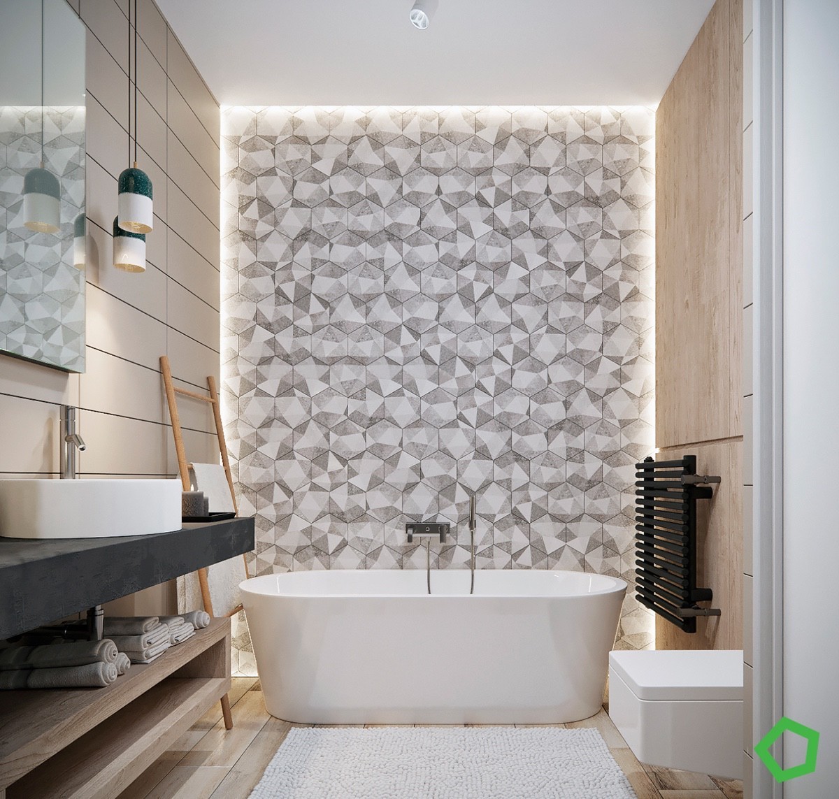
Sticking with the same geometric theme as the rest of the home, the bathtub certainly draws the eye with an elaborate tile wall as its backdrop.
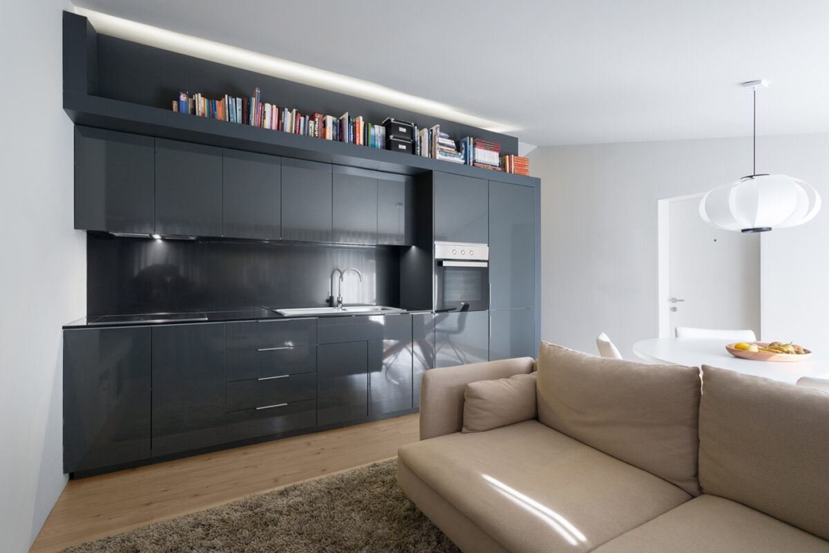
Formerly the attic of a 70s-era home, this updated apartment occupies a floorspace of only 46 square meters but gains a greater sense of spaciousness thanks to its smart layout and uncomplicated aesthetic. Color blocking helps divide functional spaces without the use of restrictive interior walls. Smooth textures banish any hint of shadows for a bright and welcoming environment at any time of day.
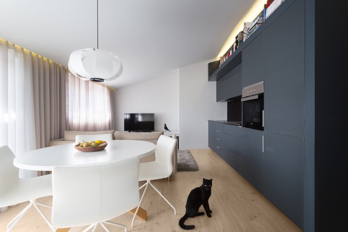
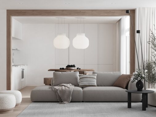
Interestingly enough, the furniture isn't even especially compact but creates a small form illusion thanks to low-profile design like thin chair legs and simple smooth edges.
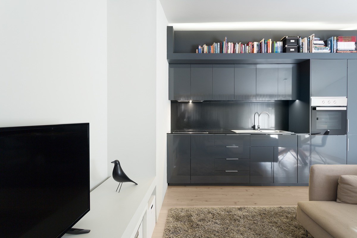
Monochromatic finishes help the kitchen maintain a sense of unification - it coexists with the rest of the room effortlessly, reducing the risk of contributing visual clutter.
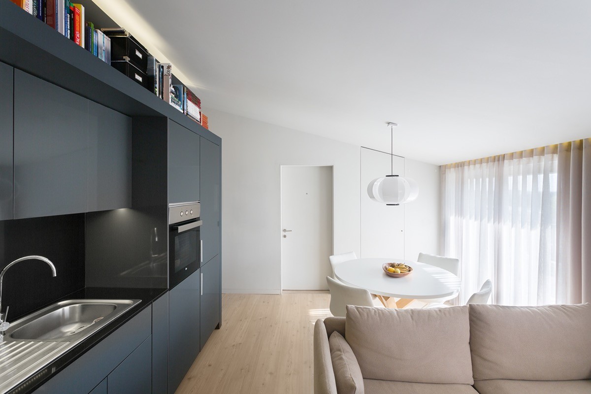
Colorful books line the top of the cabinetry, adding a cheerful splash of color to the interior while offering an out-of-the-way storage space.
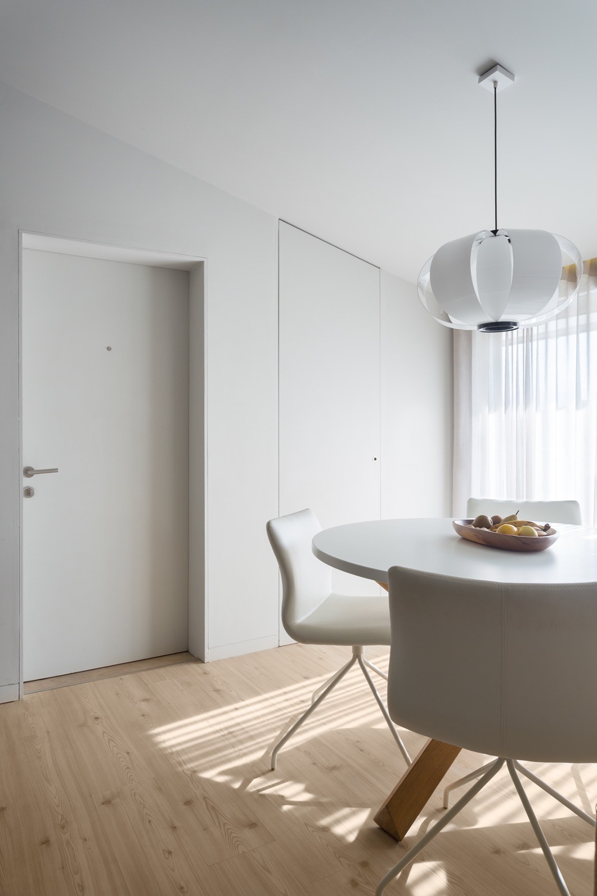
Even the doorways remain spare with details, disregarding obvious frames and using only the most streamlined handles.
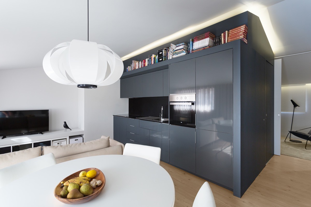
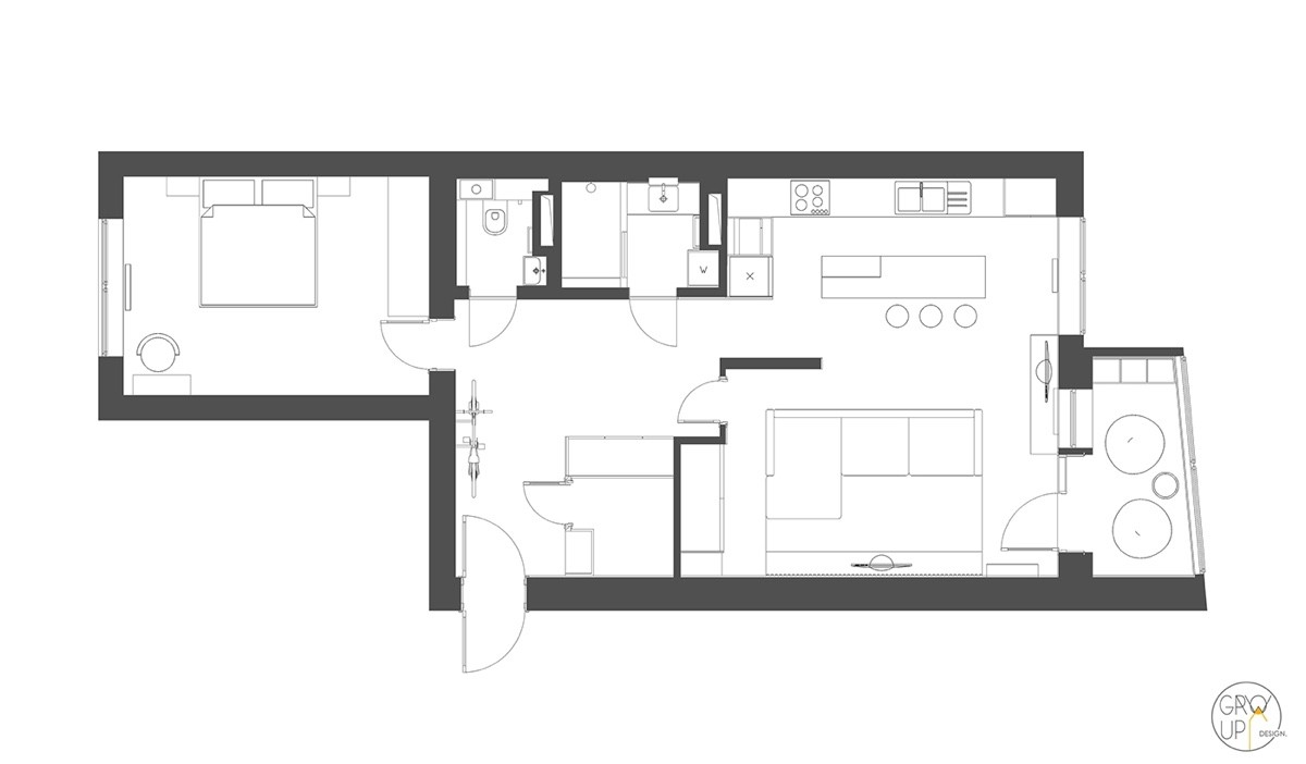
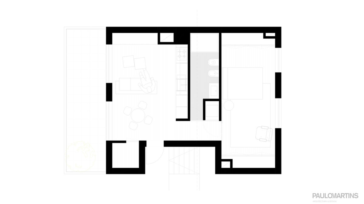
In terms of foot traffic, the layout is straightforward and very reasonable. Guests enter at the dining room, the bathroom hides in the volume behind the kitchen, and the bedroom resides just a few steps beyond that.
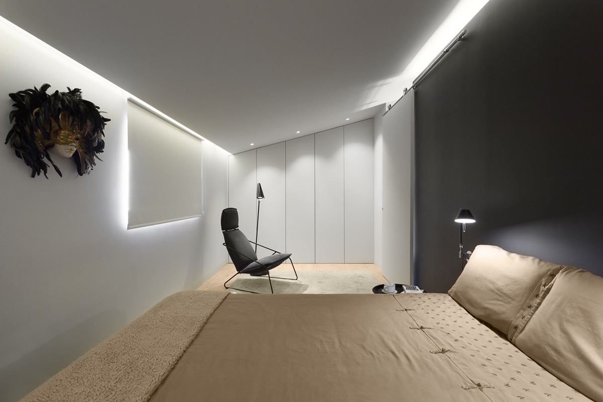
The bedroom is too narrow to contain much furniture, but it makes great use of the necessities like adjustable task lighting and integrated storage.
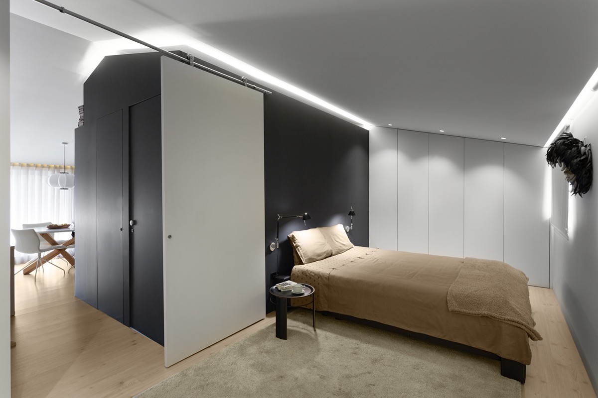
Much like the way the kitchen volume does not quite reach the ceiling, the door also slides to conceal the room without fully closing it off from the rest of the home.
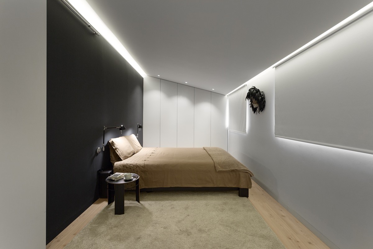
Its interesting color palette offers inspiration as well. While the rest of the bedroom remains stark with white and charcoal, the bed seems to beckon sleep with its warm tan hue.
