We rarely get to see two different interior designs for the same space, but this pair of visualisations let us do exactly that. Visualised by Alex Yagodin, both options have a swish modern feel with curvaceous furniture and commanding monochrome backdrops. However, by adjusting the colour palette, the ambience of the space is completely transformed. ‘Option 1’ is a fresh feeling space that utilises upbeat accent colours, which are then tamed by charcoal grey blocking. ‘Option 2’ is a cohesive colour story of midnight blue feature walls and textiles, sumptuous and sultry. Whether you like to change it up or match it through, this set of non identical twins shows both sides of the coin.
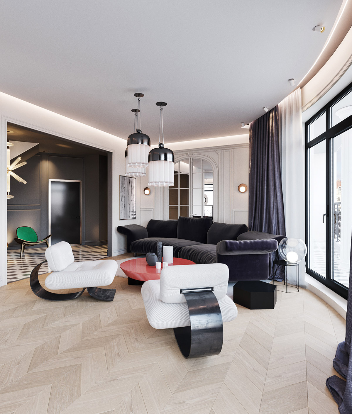
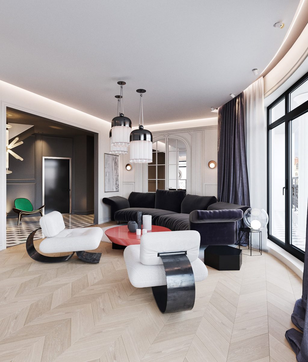
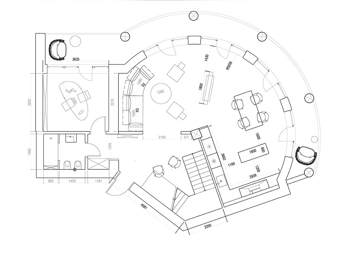
The main part of the home is almost circular in its floor plan, which makes for an interesting layout. Curvaceous furniture has been selected to tie in with the bowed line of the external wall, and the same lounge furniture pieces are used in both of the design options for this space. What does differ in ‘Option 1’ is the jarring pop of primary red at the centre of the lounge, where a vibrant coffee table switches up the vibe of the charcoal grey and white room.
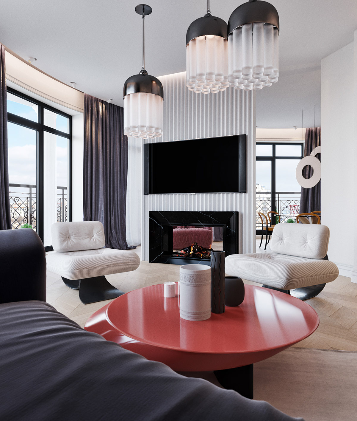
A cluster of three large modern pendant lights dangle above the red coffee table, and perimeter lighting adds more glow to the bright room. A corrugated panel adds a modern edge to the tv wall decor.
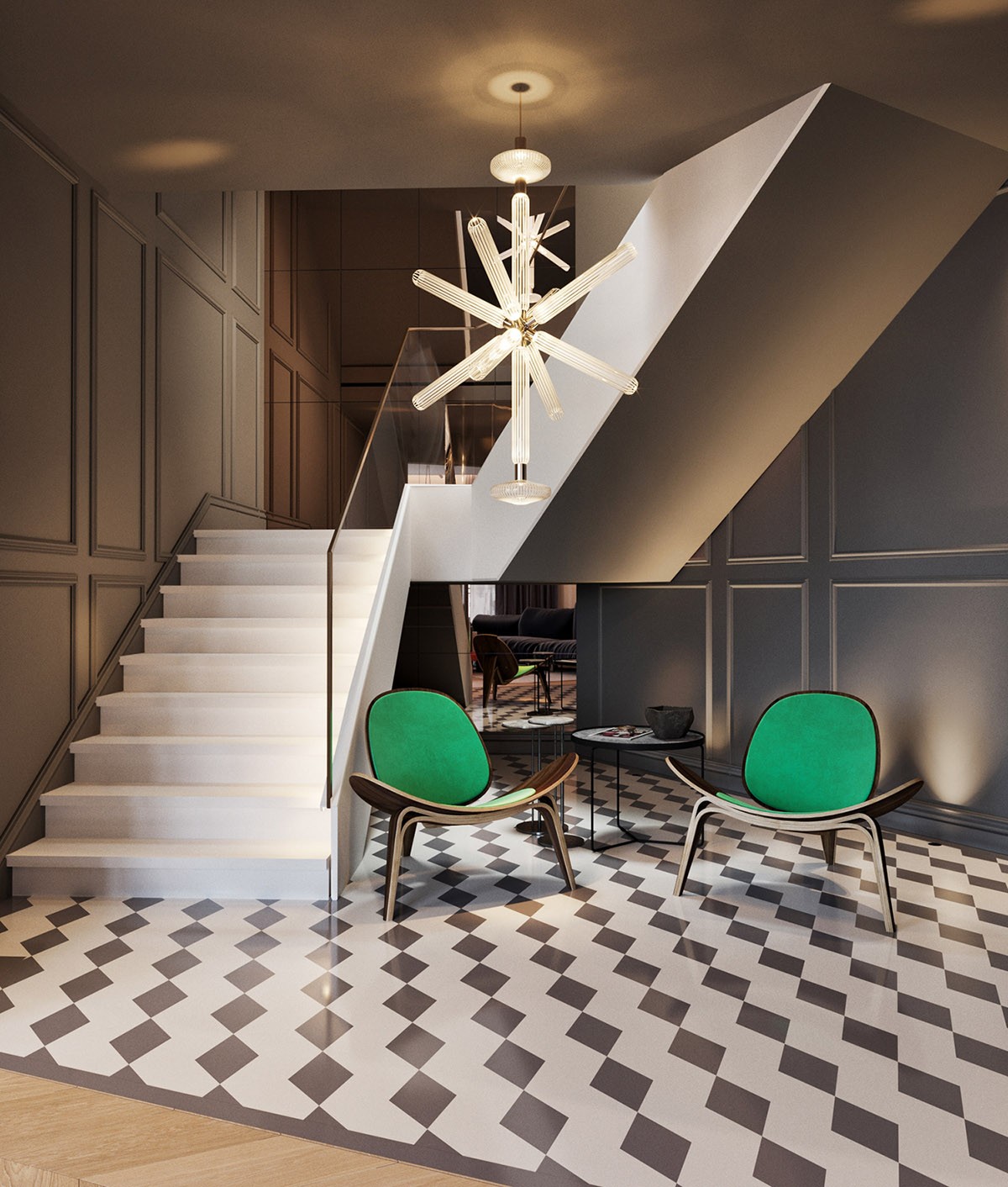
Bold green chairs are set by the staircase in a spacious foyer, alongside a set of black side tables. A modern chandelier makes a starburst of light over the arrangement, the design a high-luxury take on the classic sputnik chandelier format. Grey wainscot decorates the walls around the contemporary staircase design. Clean cut monochrome pattern fills the floor.
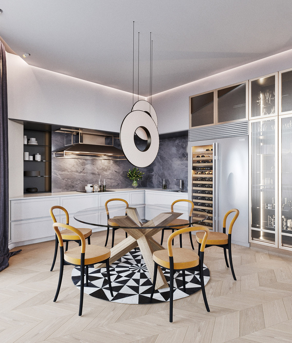
Disc-like dining pendant lights hover over a glass table and cheerful yellow chair combo. A monochrome circle rug adds another dimension.
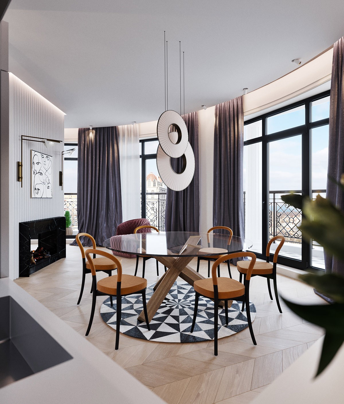
From here we can see that the living room fireplace is in fact dual sided - making it useful on the dining room side too.
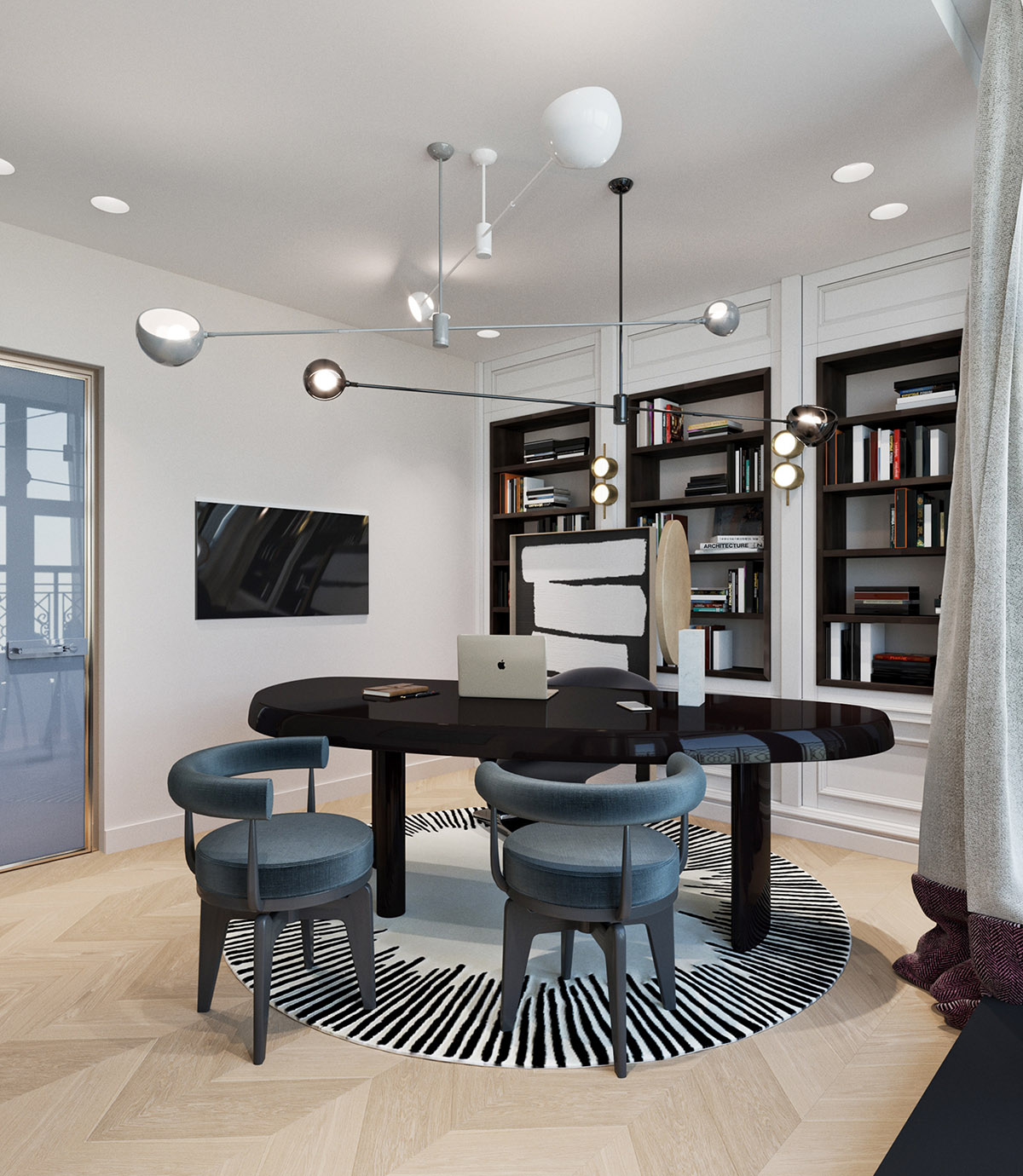
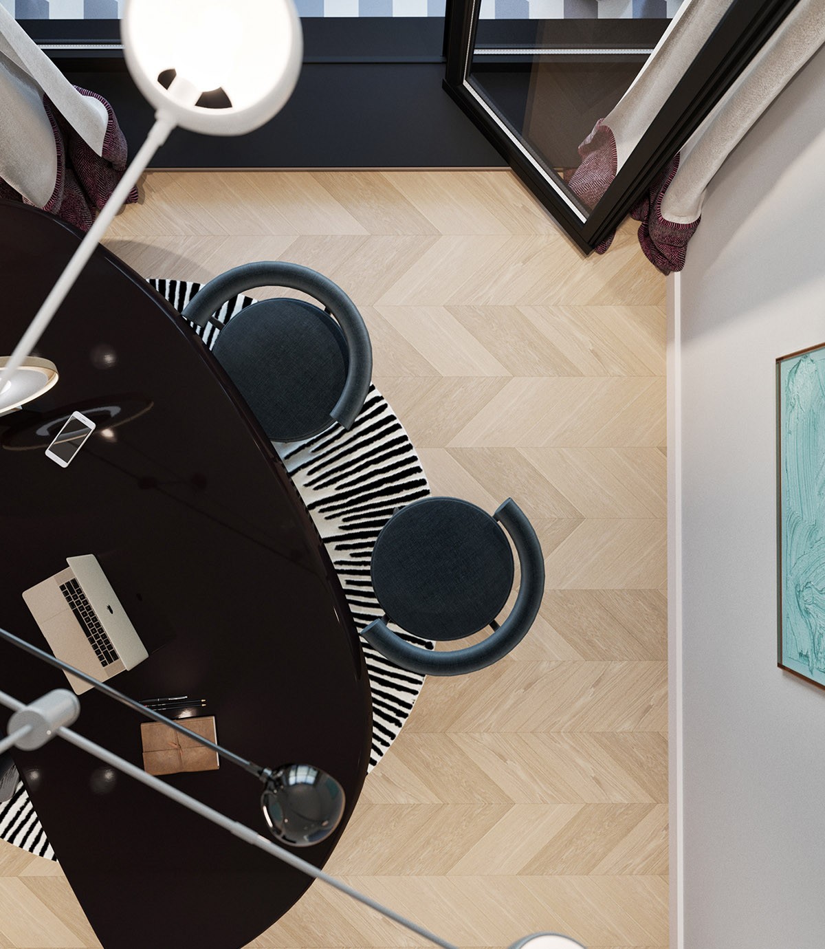
A chandelier trio span the ceiling of a modern home office space.
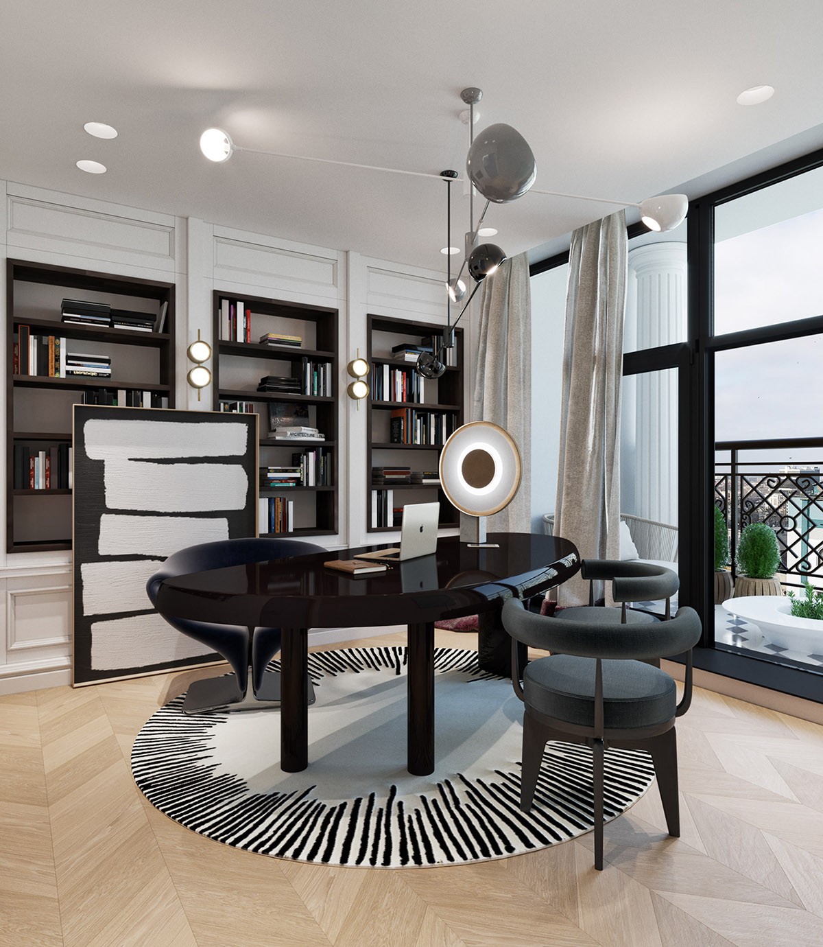
The high gloss black desk stands upon a black and white circle rug. A piece of monochrome art is casually propped against a set of bespoke bookshelves.
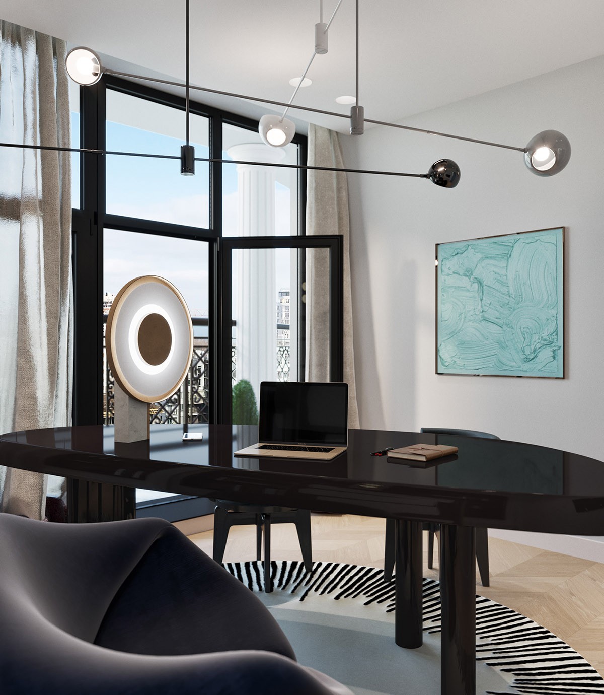
A designer table lamp brings another circular design to the room.
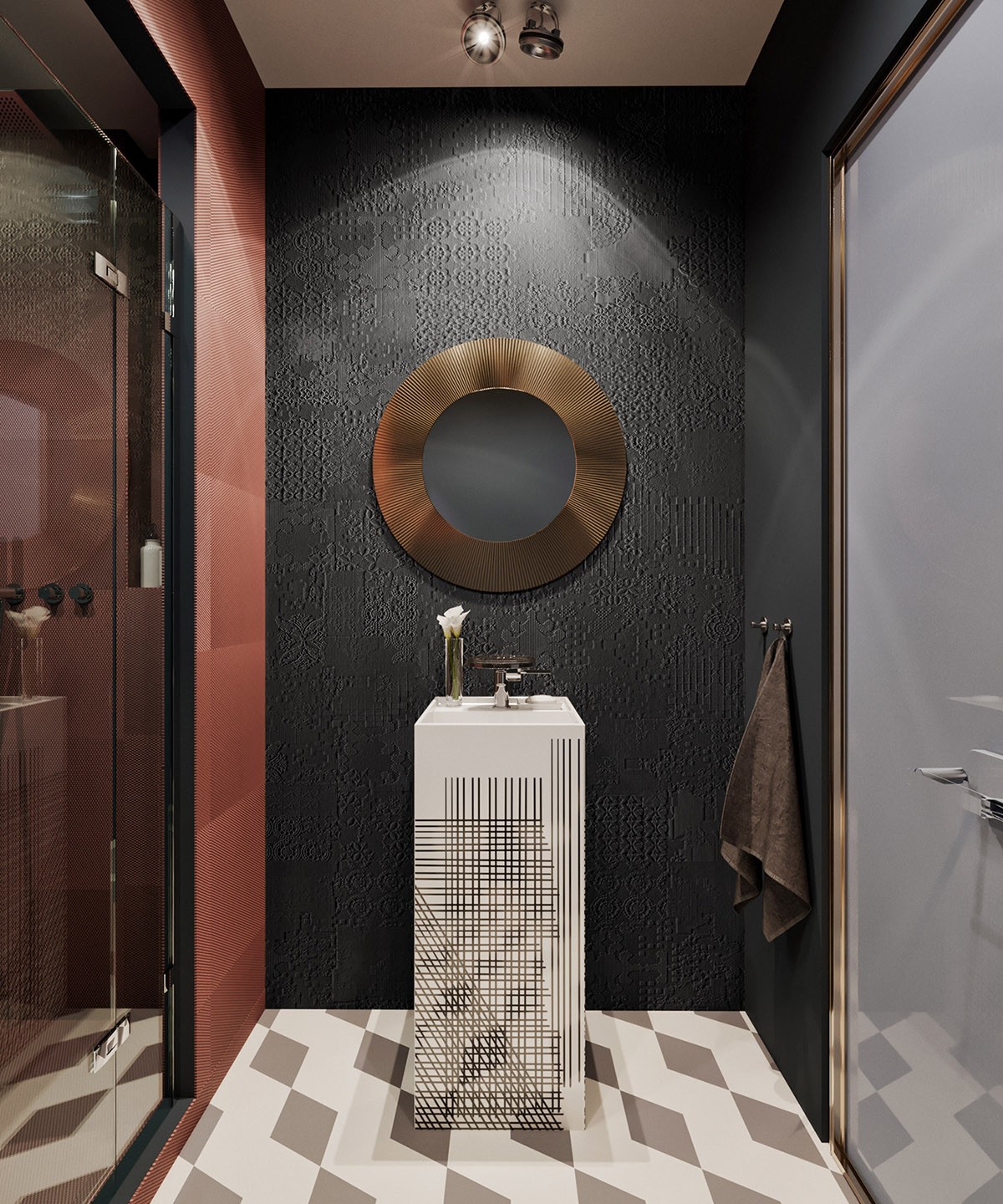
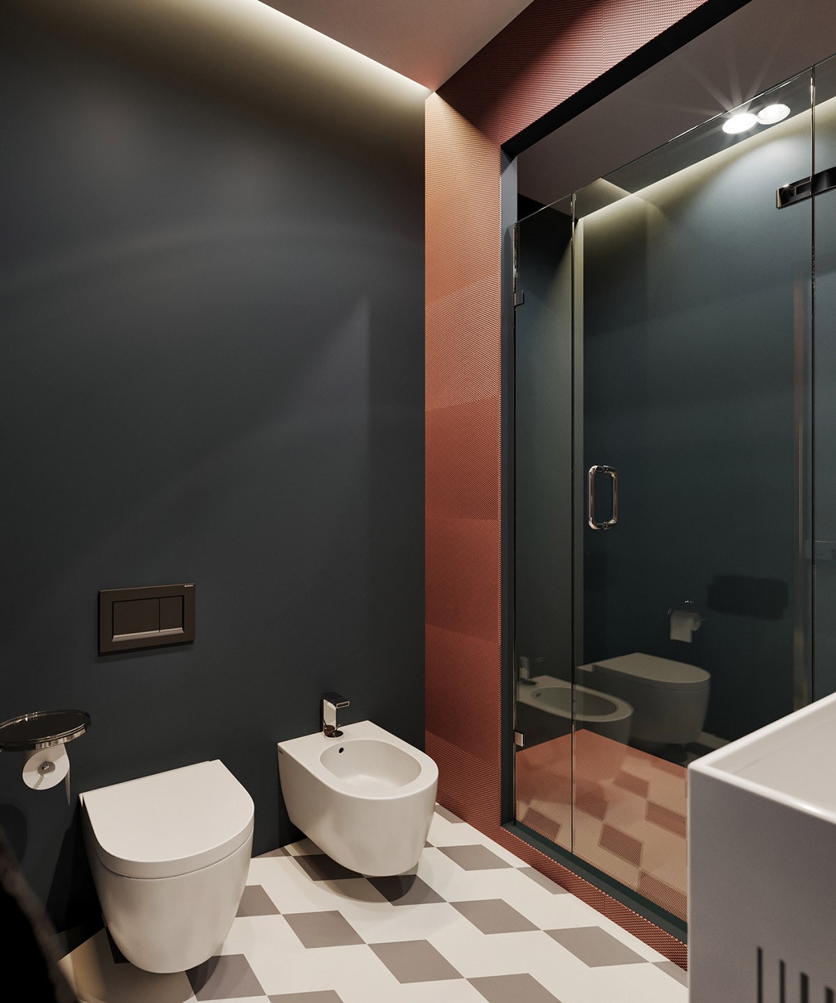
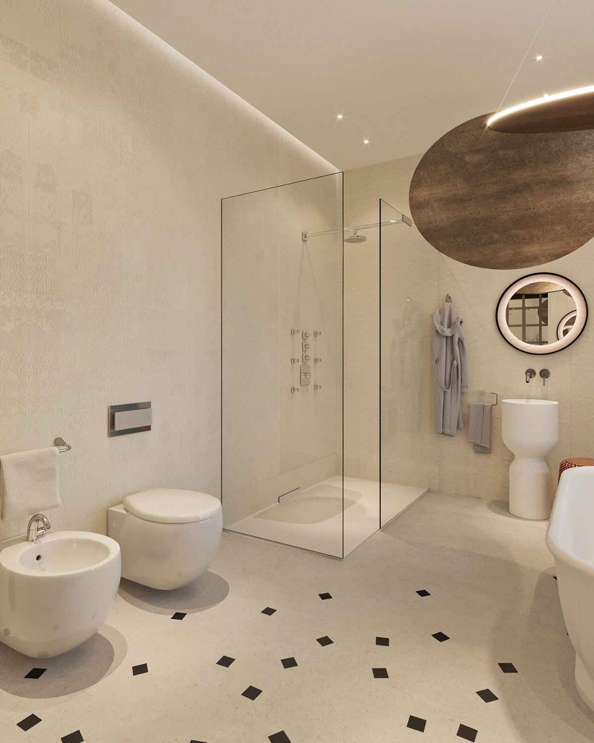
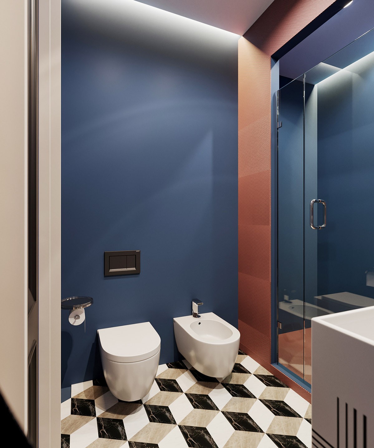
Russet walls contrast with charcoal inside a modest shower room. A copper decorative vanity mirror adds some sheen.
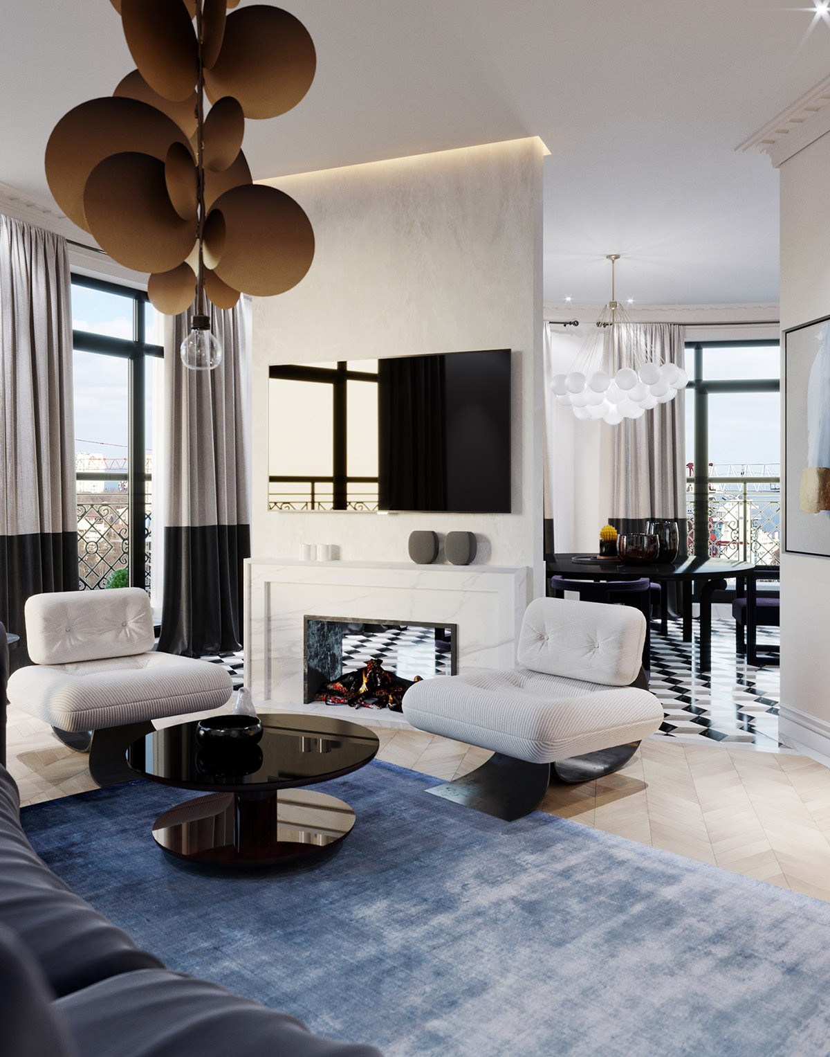
In ‘Option 2’, we’re met with an inviting blue rug in the lounge. The tv wall decor has been smoothed out for a sleeker, softer look, and a larger white fireplace replaces the black mid-sized alternative. Plain charcoal window drapes now become a two-toned fall of black and pale grey.
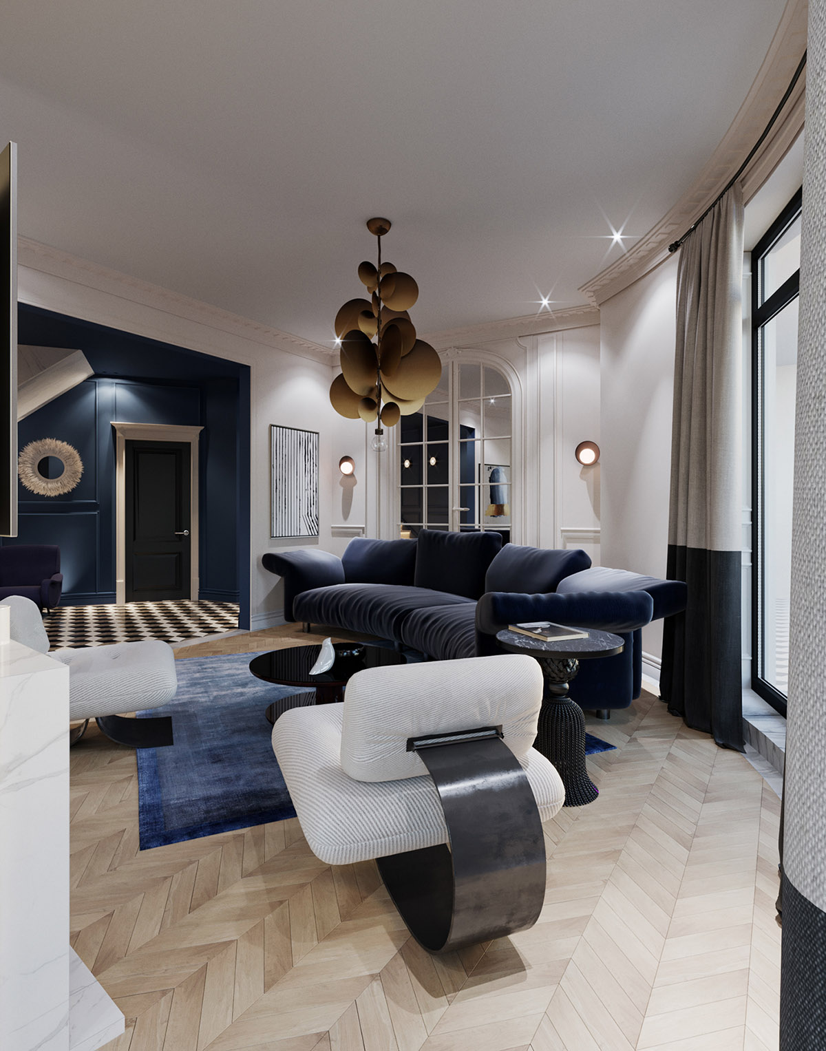
A gloss black coffee table replaces the uber-modern red one. A solo pendant light occupies the centre spot of the ceiling.
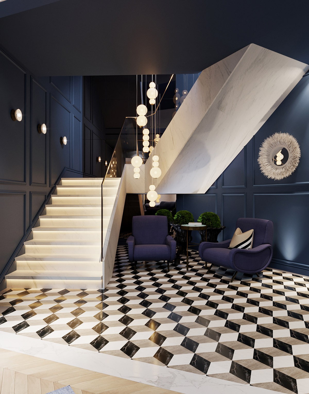
In this alternative visual for the foyer, the monochrome flooring has a much busier design - one which can be seen through much more of the house than in the original. Blue accent chairs pull together with midnight blue wainscot to evoke drama, and make high contrast with the white staircase. A twinkling long drop chandelier descends from the rafters down to the chairs, and meets with the glow of under-tread stair lights.
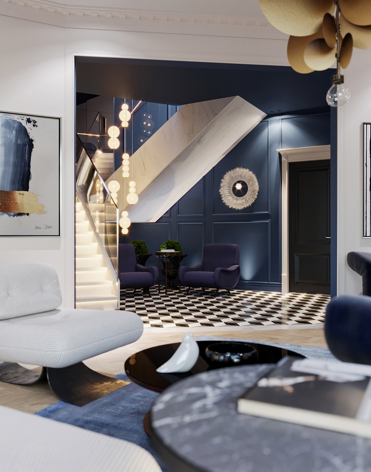
A white decorative wall mirror looks crisp against the dark blue wall.
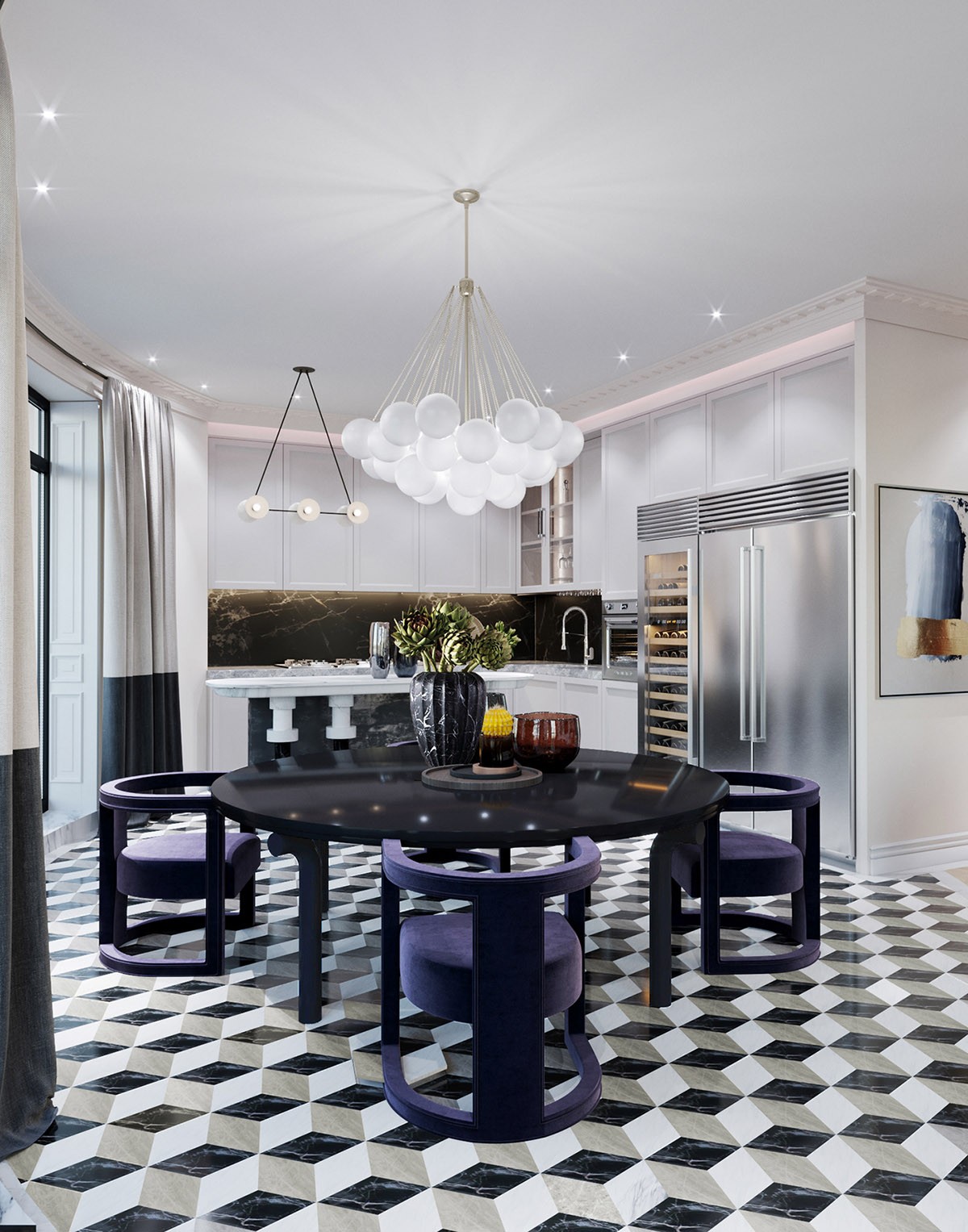
In the kitchen diner, a cluster of orb lights replace the duo of discs over the table. The dining table itself becomes a gloss black option instead of glass and wood. Petite yellow dining chairs have been switched out for blue upholstered comfort.
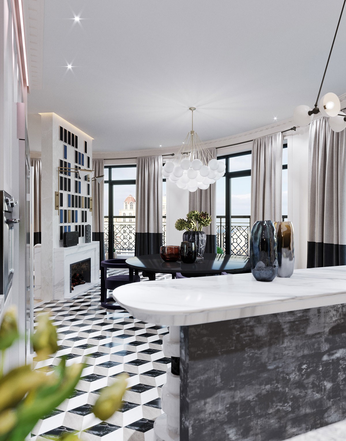
Wood herringbone is no longer in the kitchen diner, instead the floor is engulfed with optical illusion laminate.
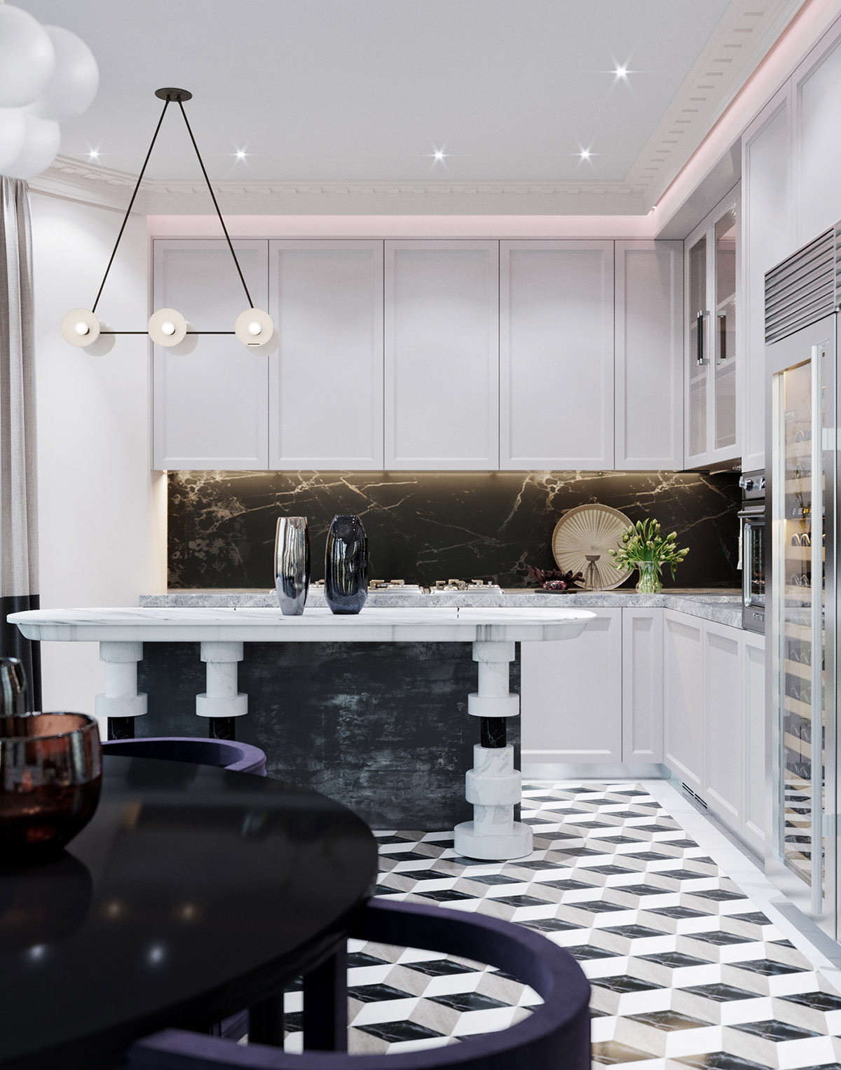
An island has appeared between the dining suite and the black and white kitchen, which could serve as culinary prep area or as a small side table serving the dining area.
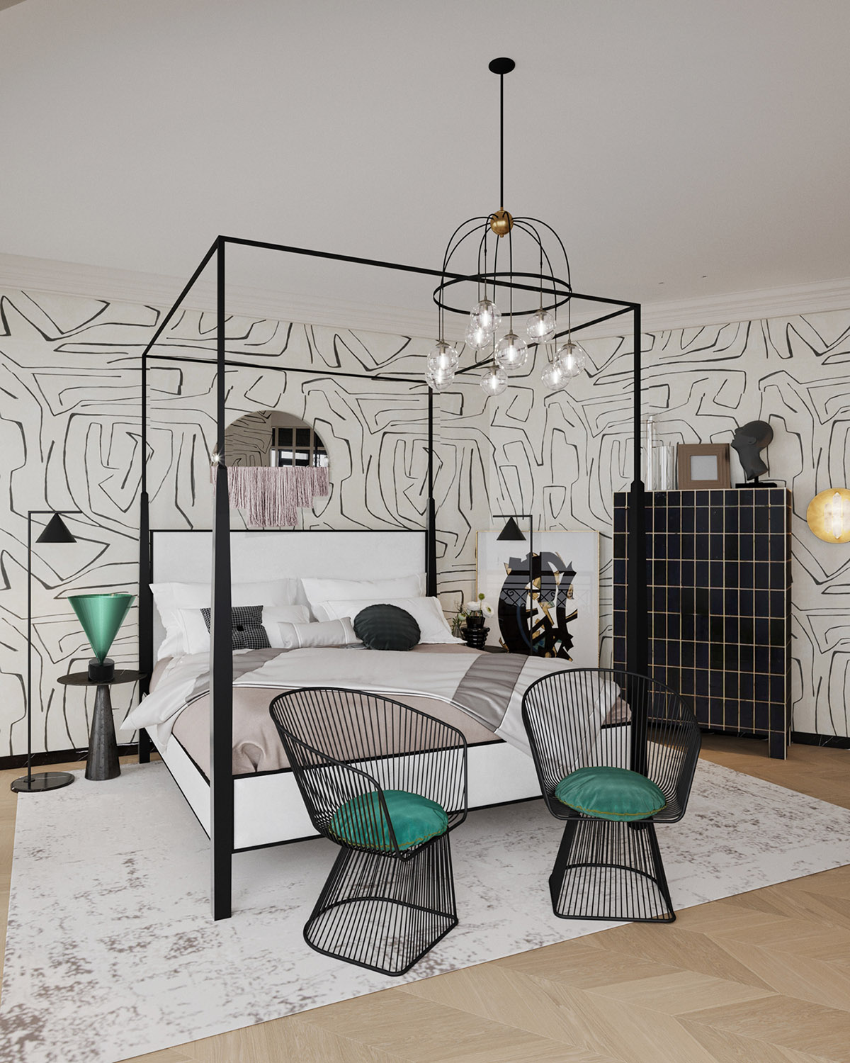
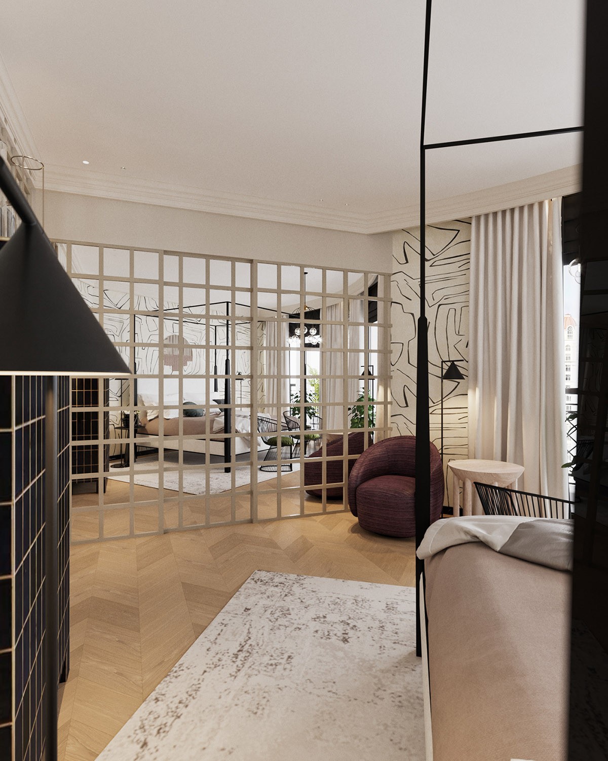
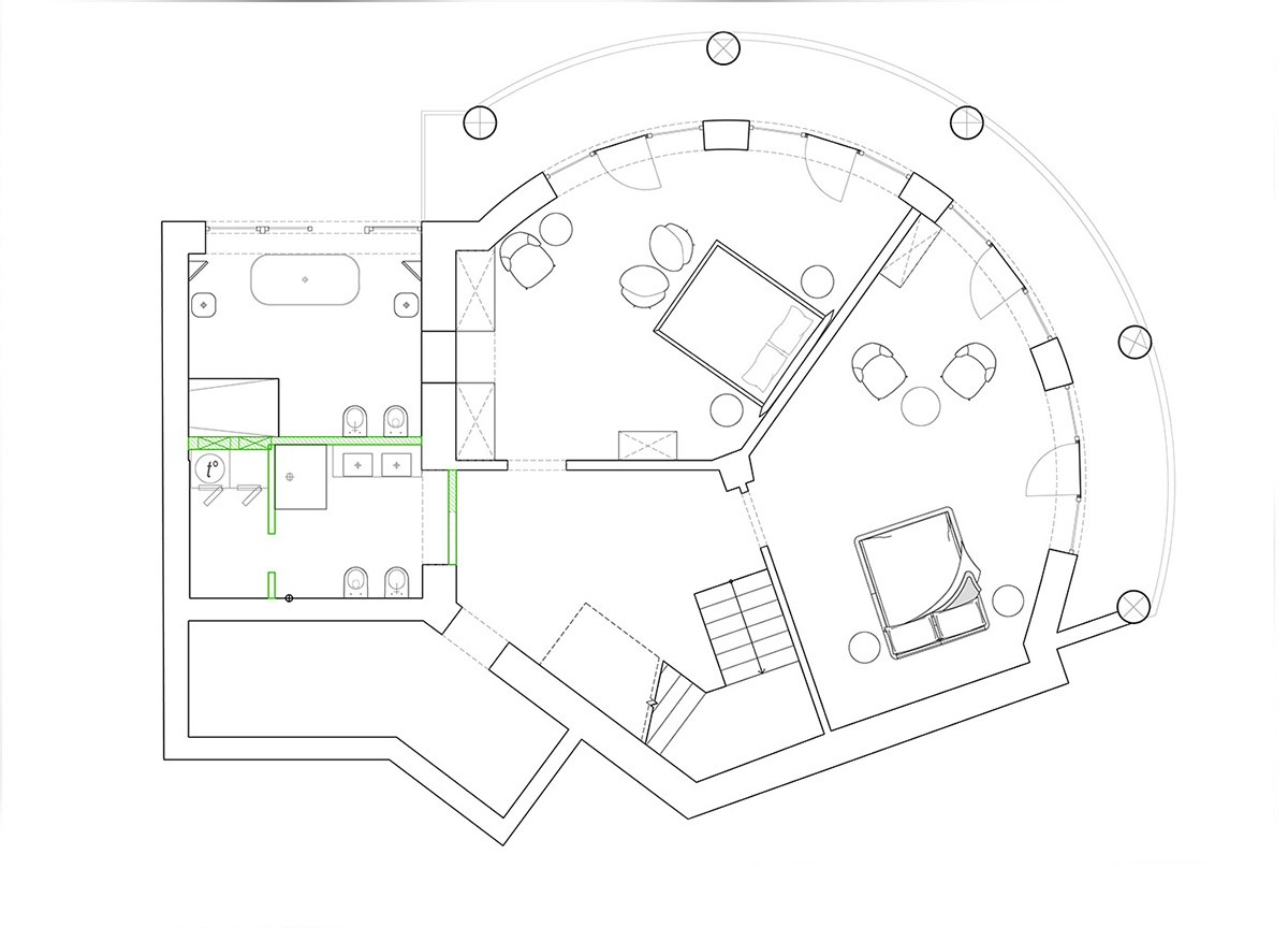
This time around we journey into the two bedrooms. The first decor scheme is an energetic monochrome affair with a modern 4 poster bed. You can find more options for 4 poster beds here.
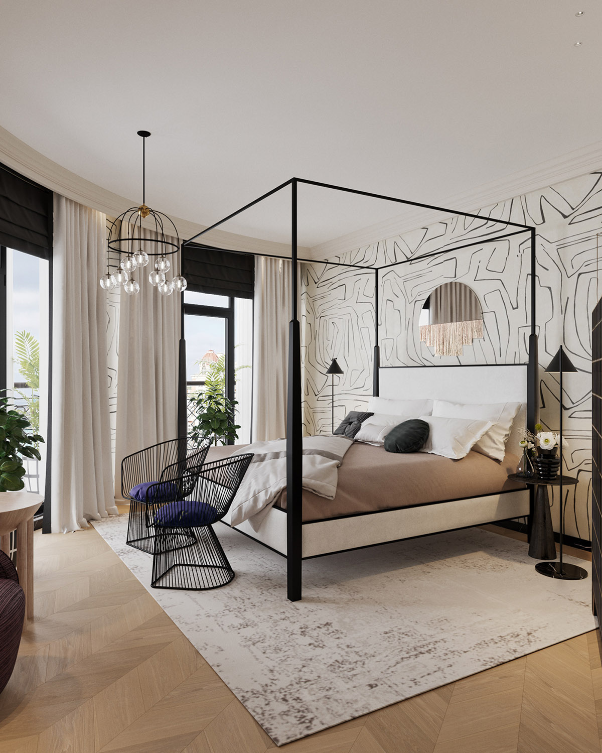
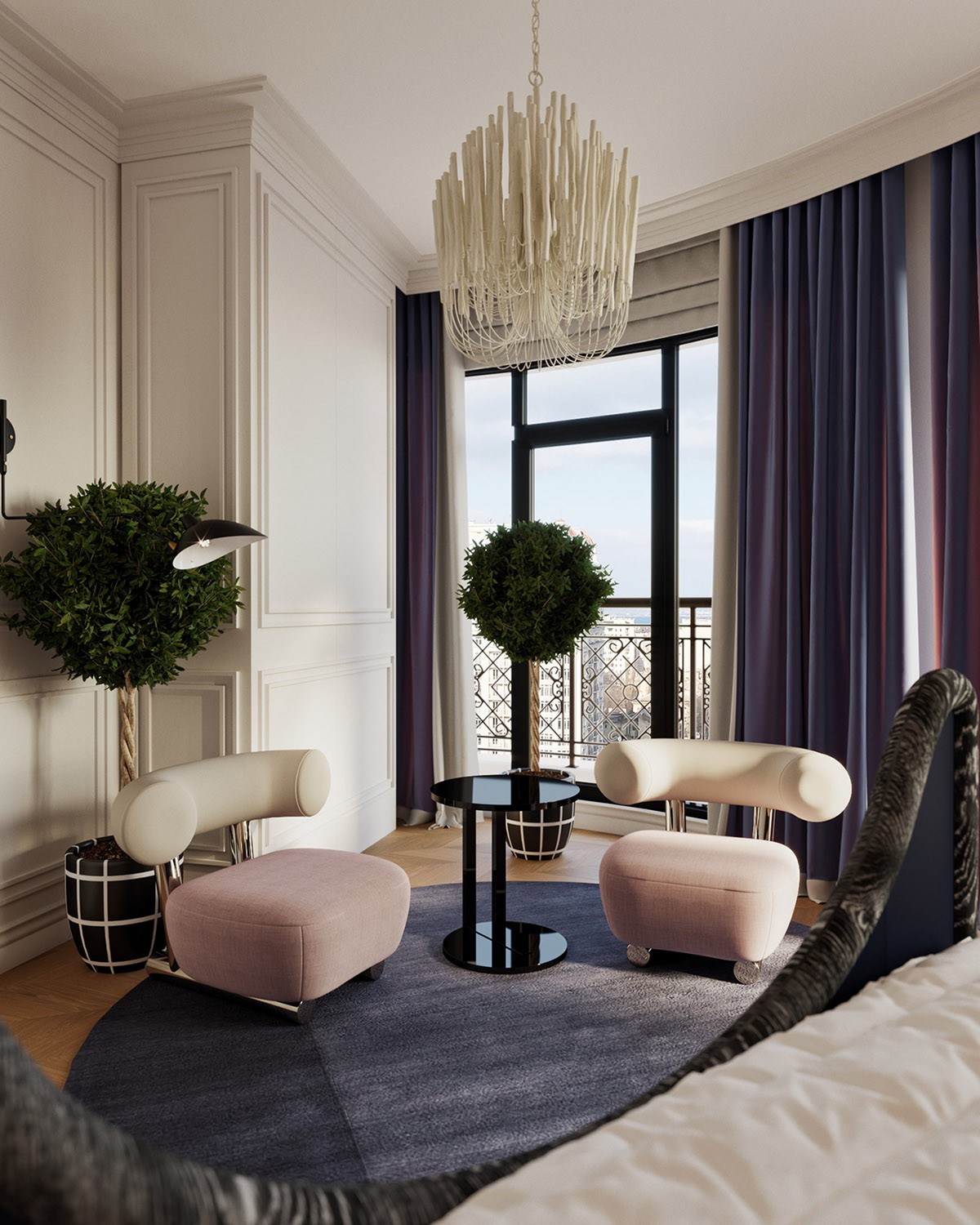
A pair of matching bedroom chairs squeeze onto the edge of the rug.
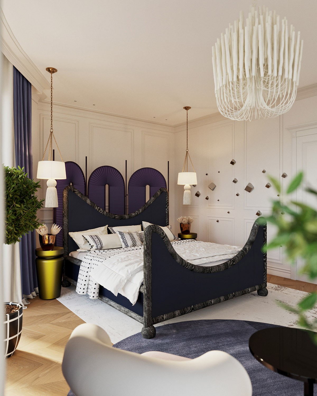
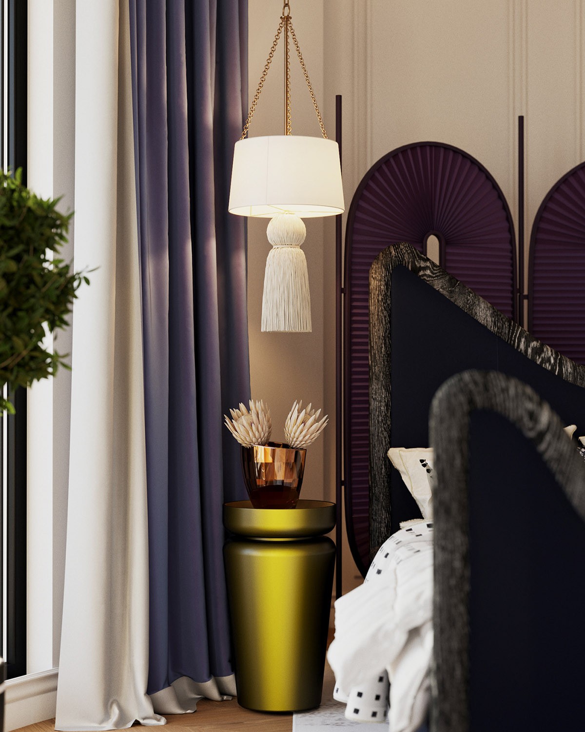
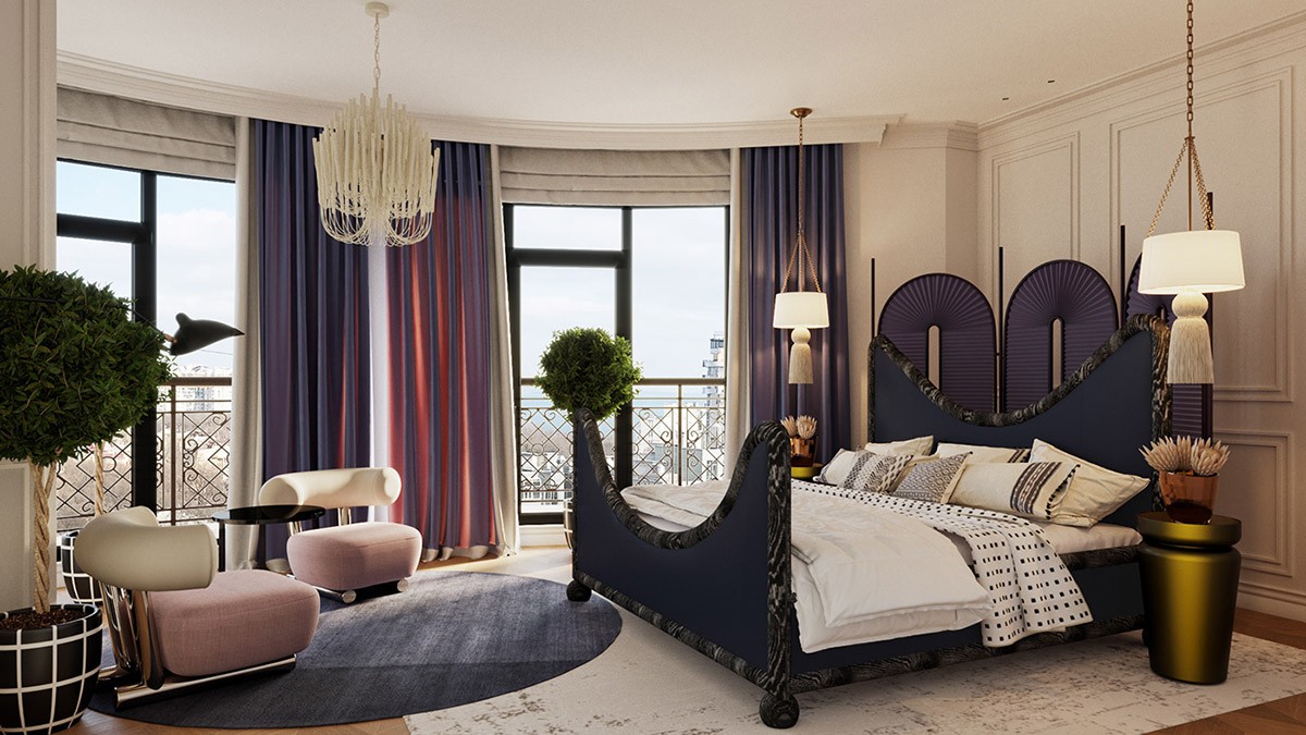
The second double bedroom in the home has an unusual fabric covered bed frame that is made even more eye-catching with the addition of decorative screening at the headboard. White bedroom pendant lights with tassels add to the layered effect.
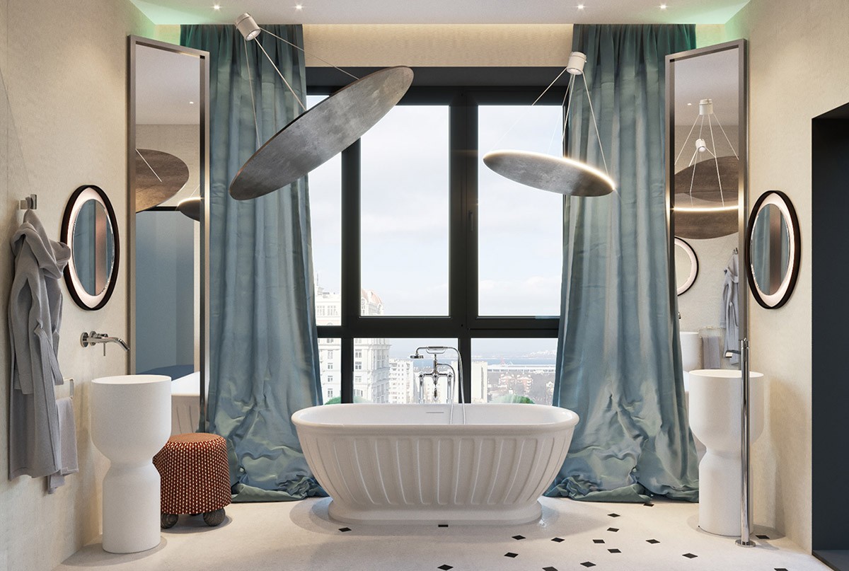
The luxury bathroom encompasses a paler shade of blue.
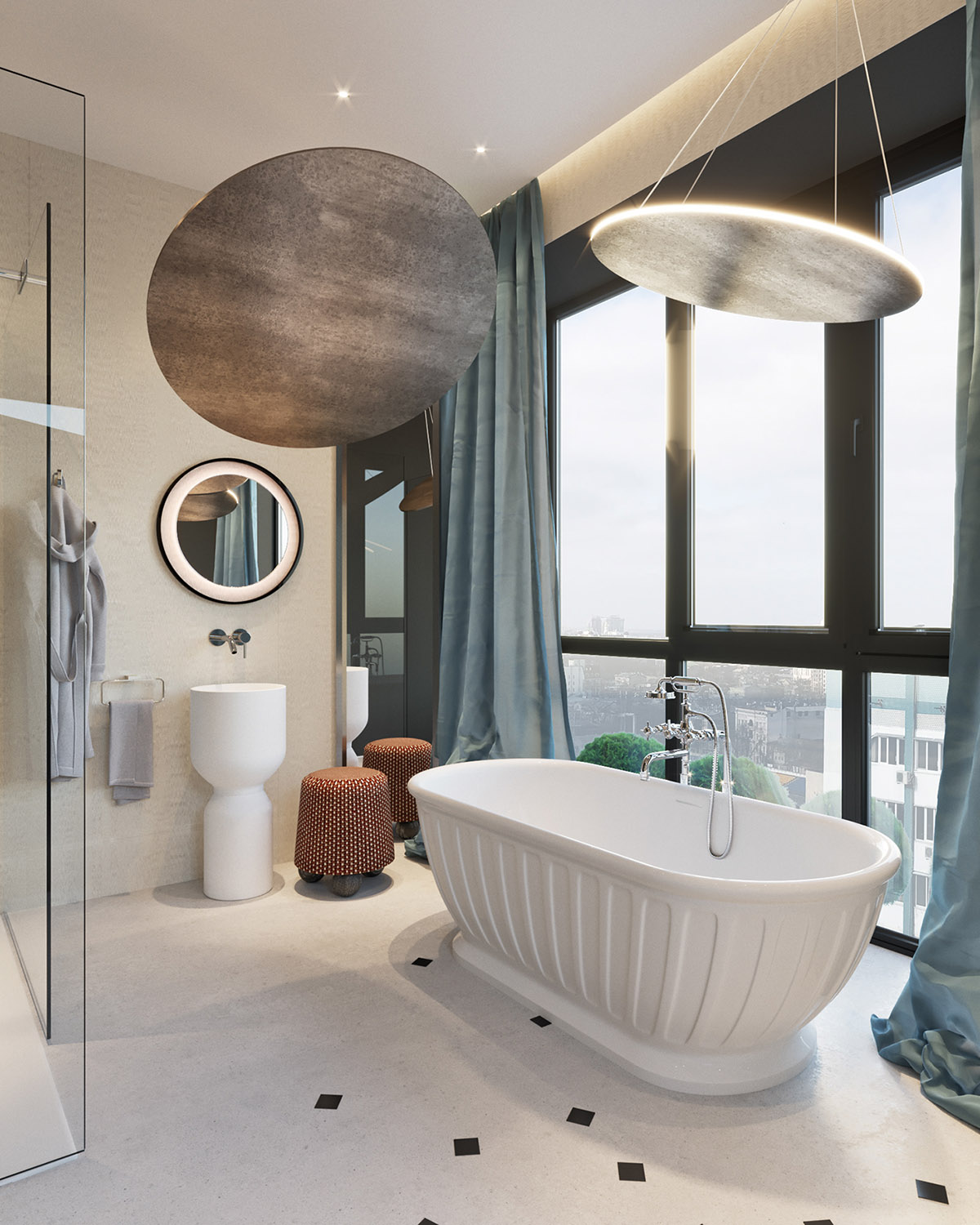
Enormous modern light fixtures are angled at a freestanding tub, making it the star of the show. You can see more beautiful bathrooms with bathtubs here.
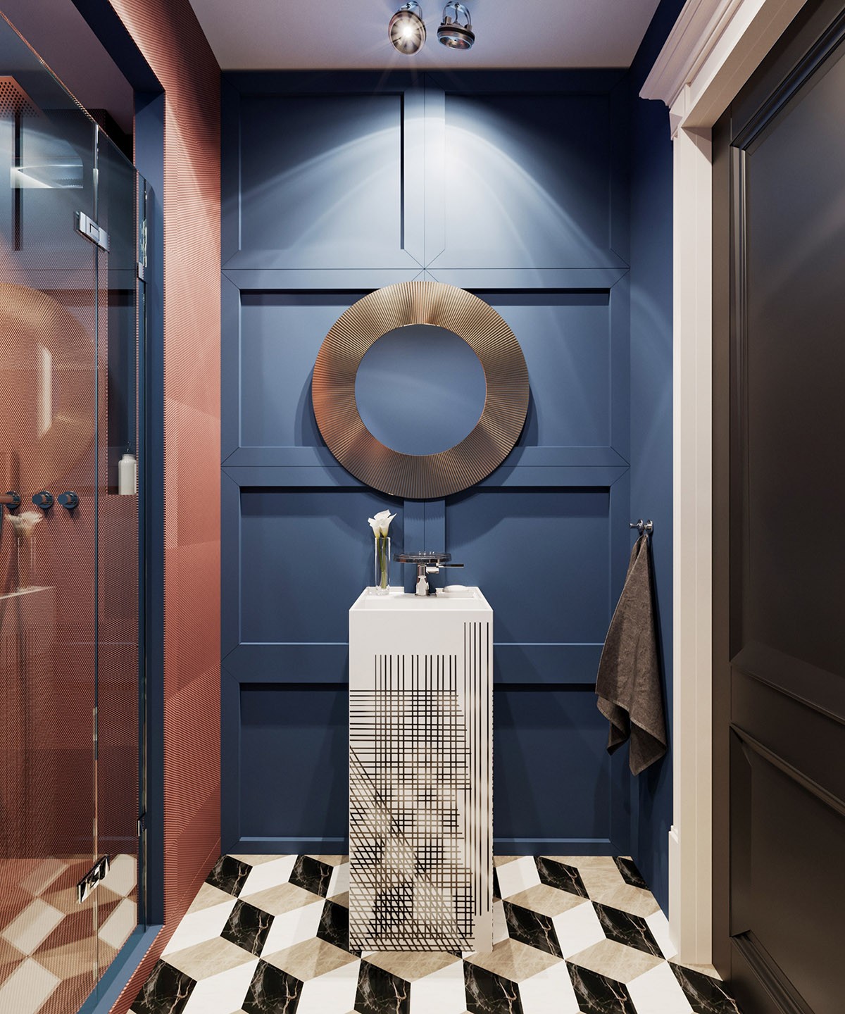
The shower room (which also featured in ‘Option 1’) has the same russet shower walls and monochrome pedestal basin, but this time the ensemble is teamed with blue feature walls.
