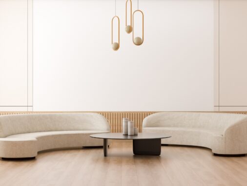
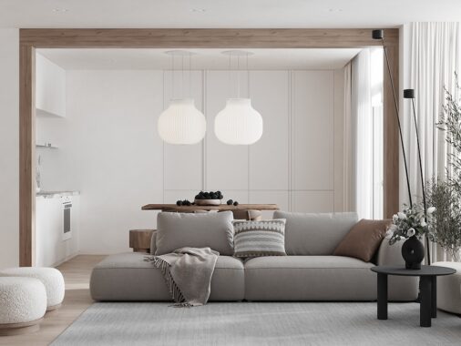
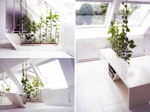
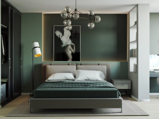
You don’t need to have bags of space to live comfortably in style. This collection of four apartment tours has interiors that are all of modest proportions but that each have their own fabulous attributes. A large dose of their design boosts come from a scattering of small feature walls that either stand alone or butt up against each other for contrasting effect. Some are bespoke partial dividing walls that separate and conquer. By picking out small sections and dividing up wall space, a limited area is broken in a way that makes it appear larger, and rooms that were once devoid of architectural features become packed with interest.

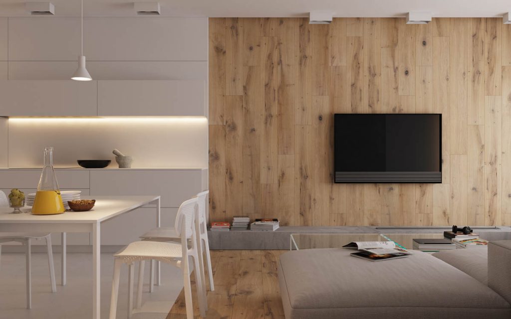
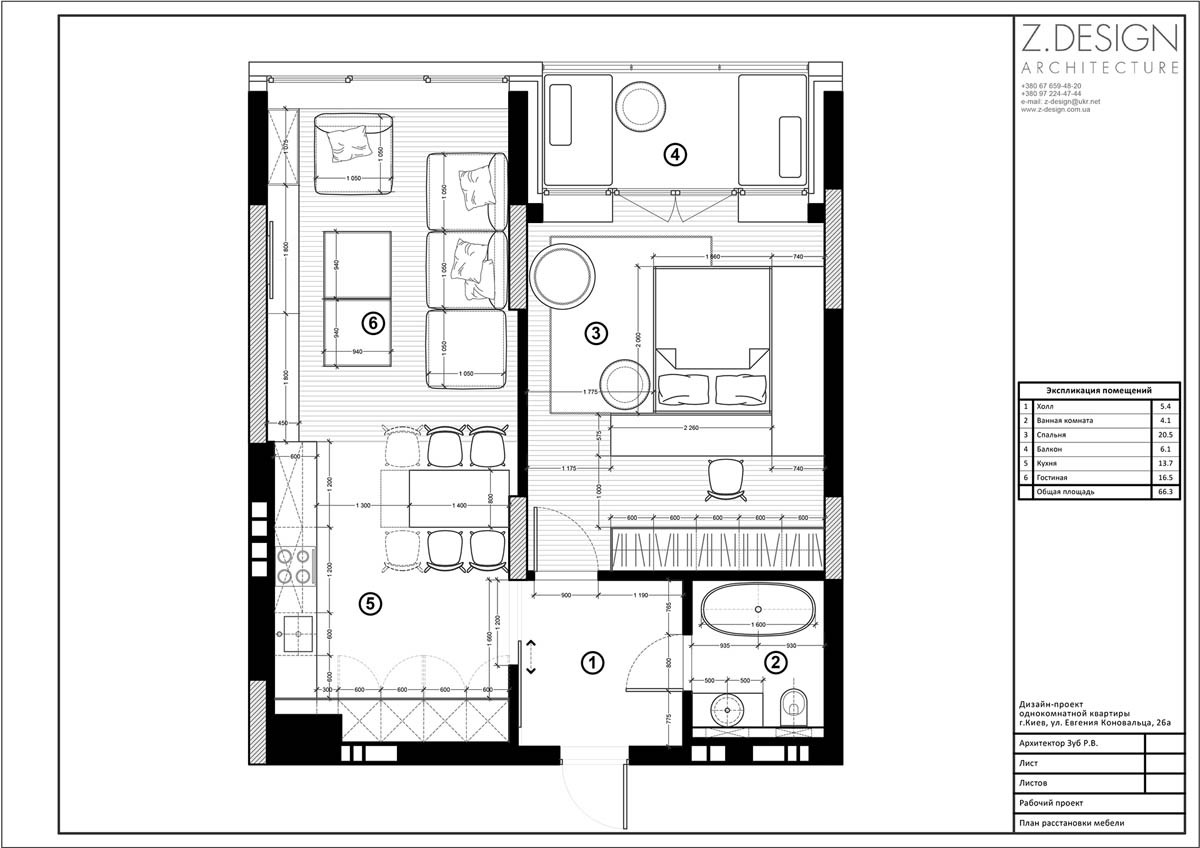
Our first home design, with an area of 66.3 square metres, is the most minimal of the four. Despite its minimalist aesthetic, the home still shows character through an installation of wood that extends from across the floor to cover an entire wall behind the television in the lounge. This feature wall brings a lot of warmth to the scheme, which is otherwise made up of large areas of white and scattered grey accents.
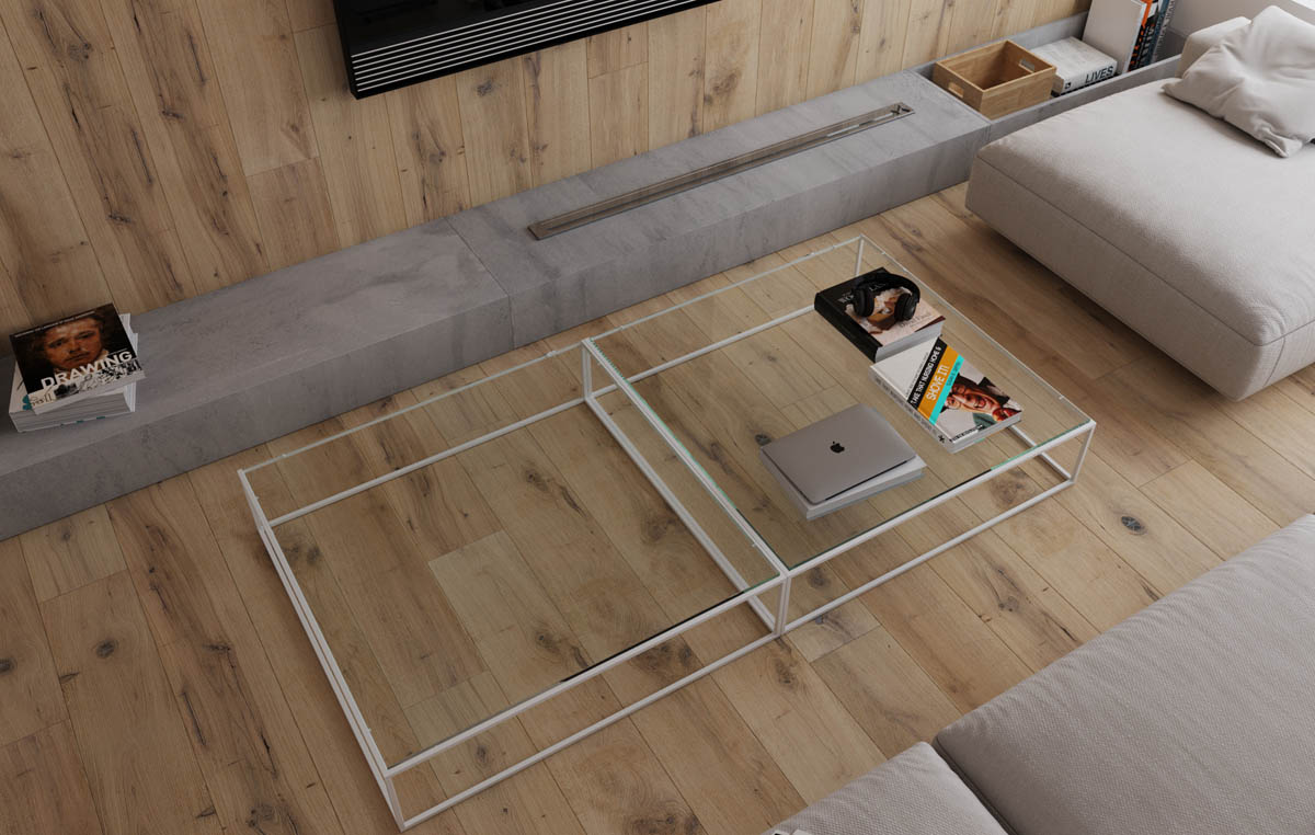
This transparent modern coffee table design keeps the area looking spacious, and shows off the wood tone beneath. Below the TV a concrete hearth brings a hint of industrial style to the scheme.
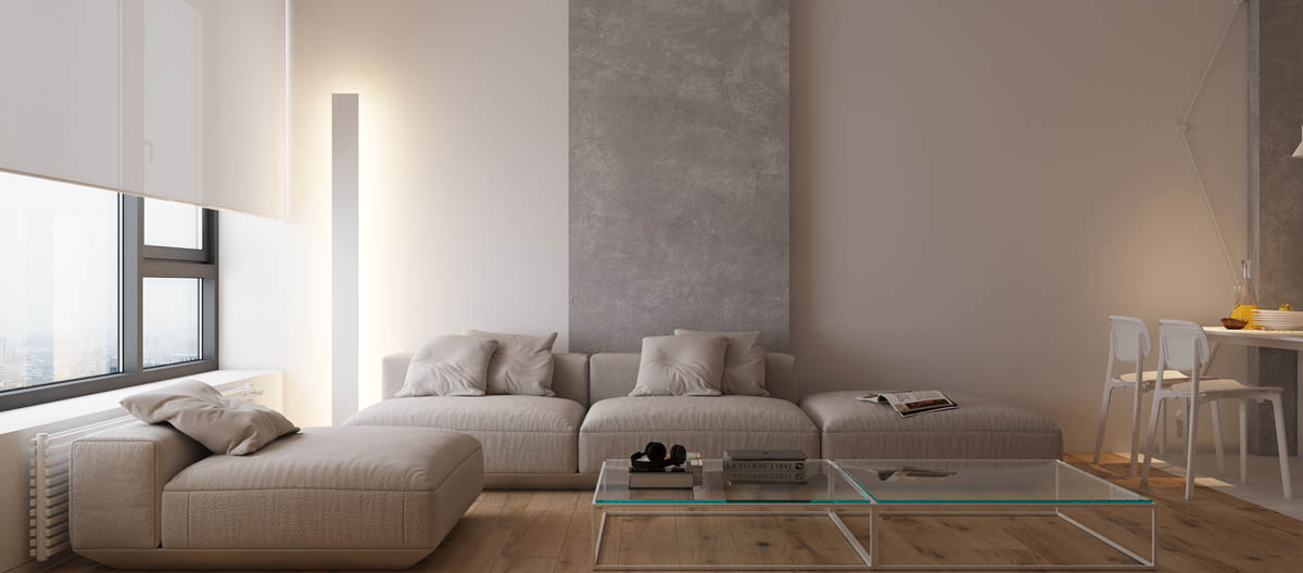
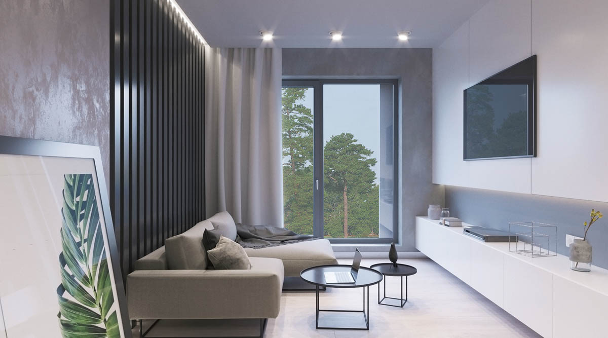
The sofa is of a modular design that allows for fluctuations in layout. It has deep seats but a low back and no armrests attached, which prevents the large piece of furniture from appearing too bulky for the small space. Behind it a section of concrete ties in with the hearth opposite.
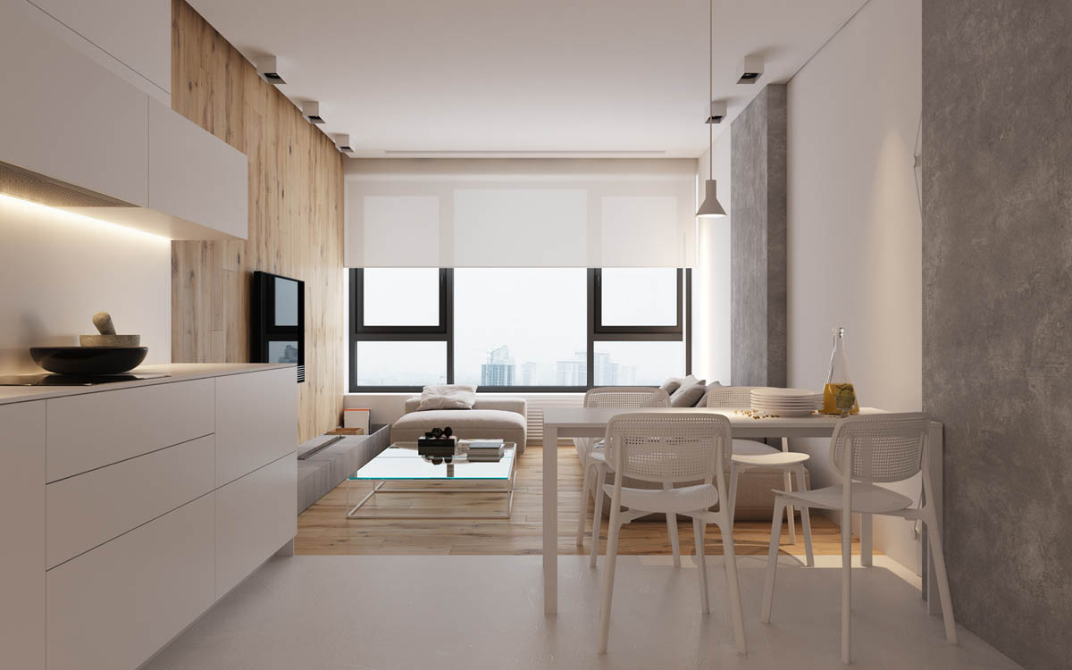
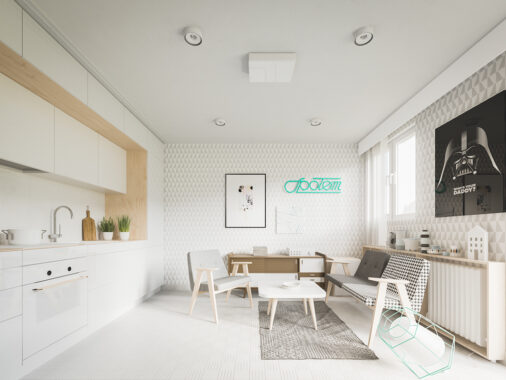
In contrast to the wood covered lounge, the kitchen and dining area are decorated completely white. White floor and walls, white kitchen units, and a white dining table set.
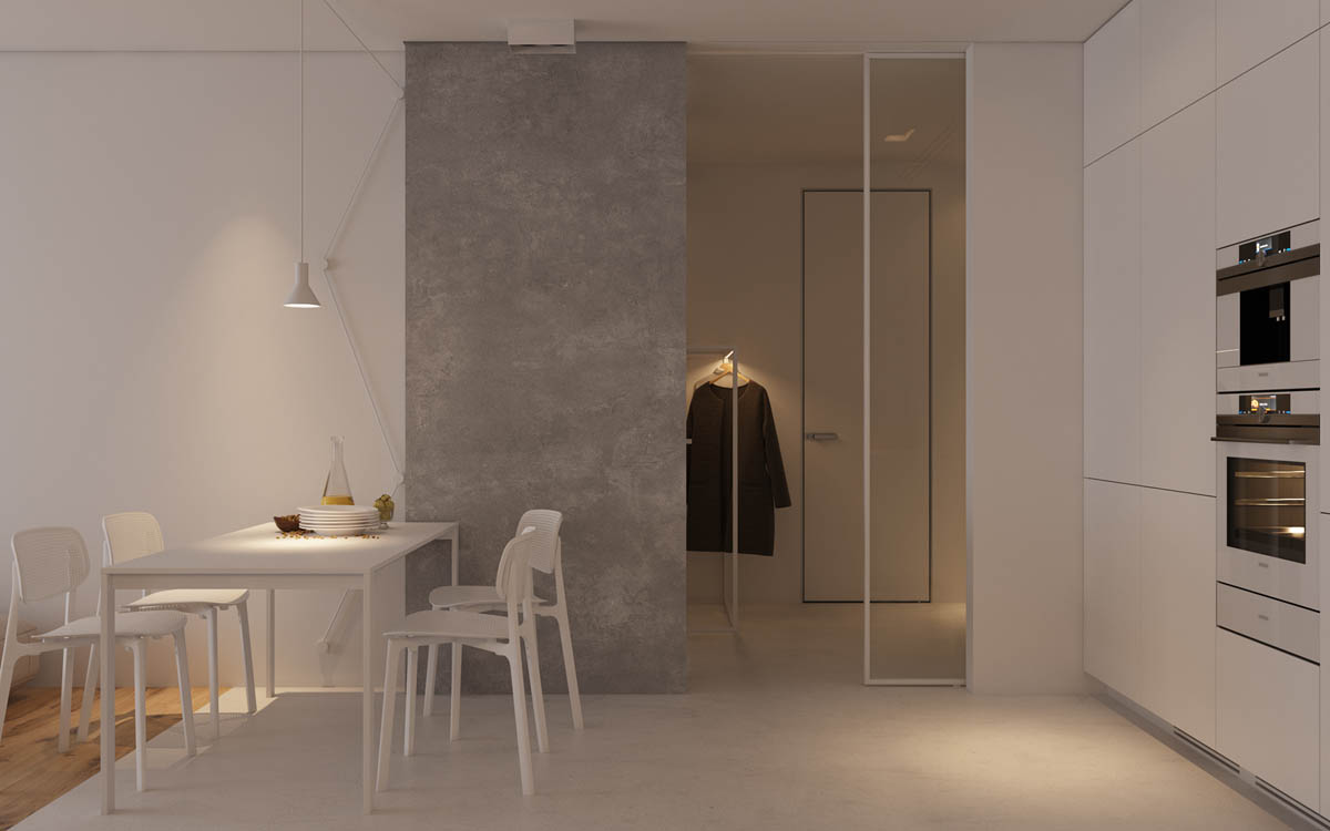
Behind the white table and modern dining chairs, a pillar of concrete breaks the stark white canvas.
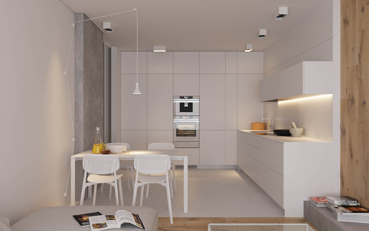
A small dining table light creates an interesting feature as it ascends the wall beside the eating area.
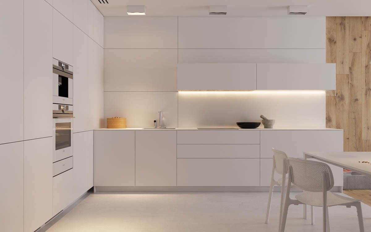
work well in an open plan layout as they always look clean and uncluttered. This plain white handle-free design benefits from some soft lighting located underneath the wall cabinets.
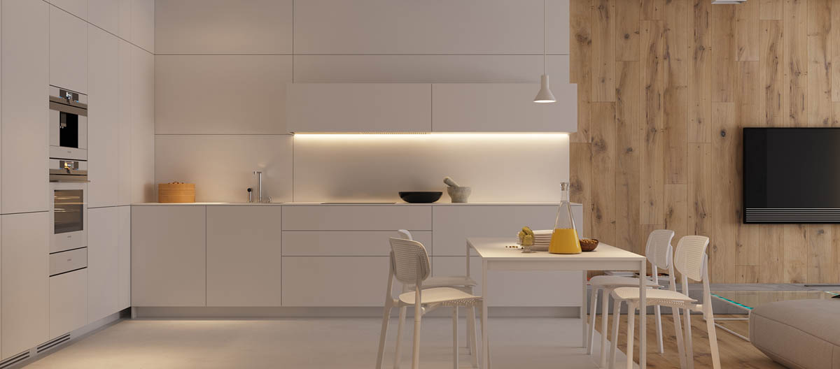
White panels make up the backsplash in the kitchen and extend all the way up to the ceiling. The effect of this treatment is that the matching white cabinets appear as though the are extruding from the wall.
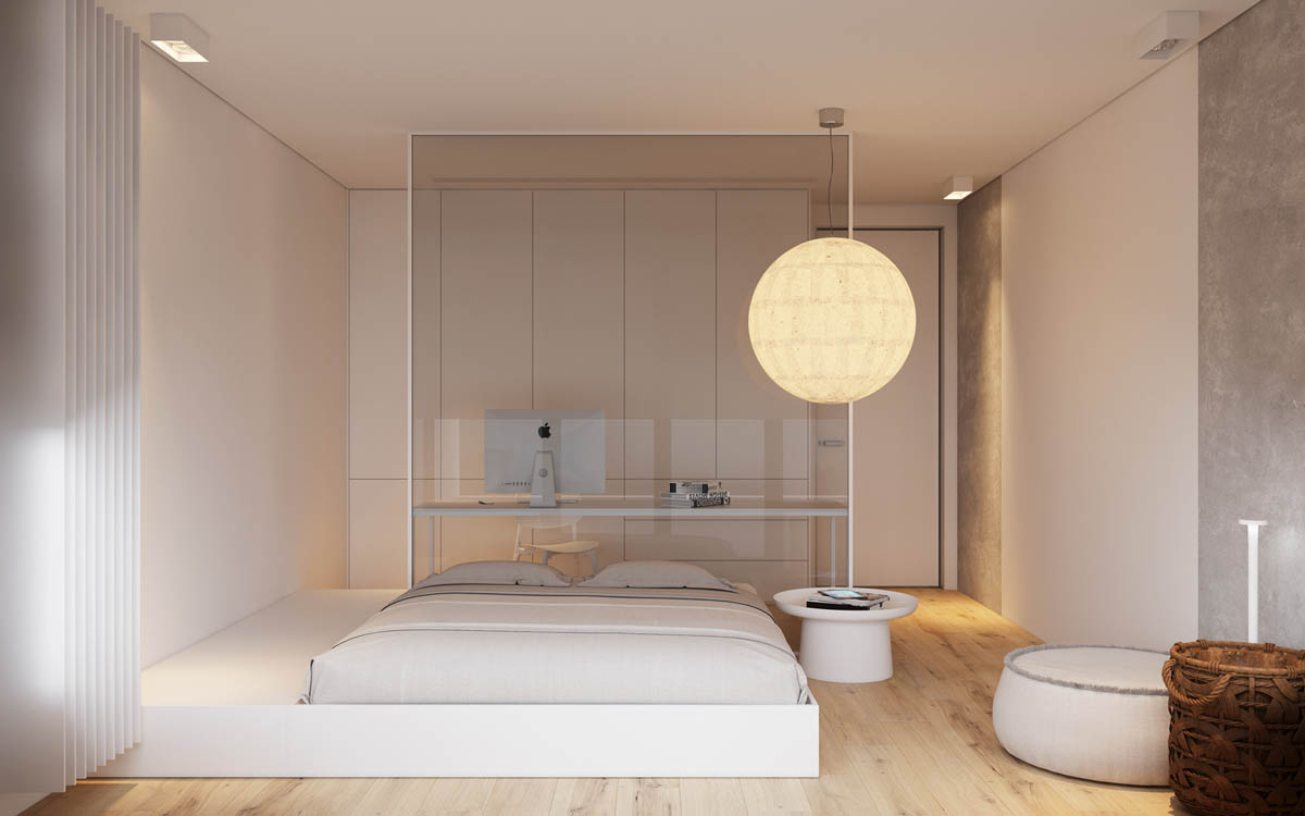
The bedroom is of an incredibly unique and bespoke design, where a platform bed manifests almost like a drawer that has been pulled directly out of the wall. A huge spherical bedroom pendant light glows like a full moon above it.
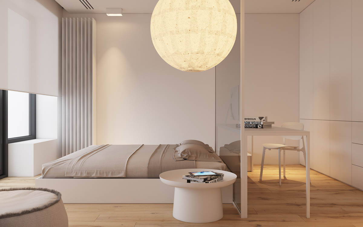
At the head of the bed a glazed panel is installed as a transparent dividing wall. On the opposite side of this clear divide a study area has been created, where a computer desk and chair is pushed up to the glass. A generous built-in closet covers the back wall from floor to ceiling.
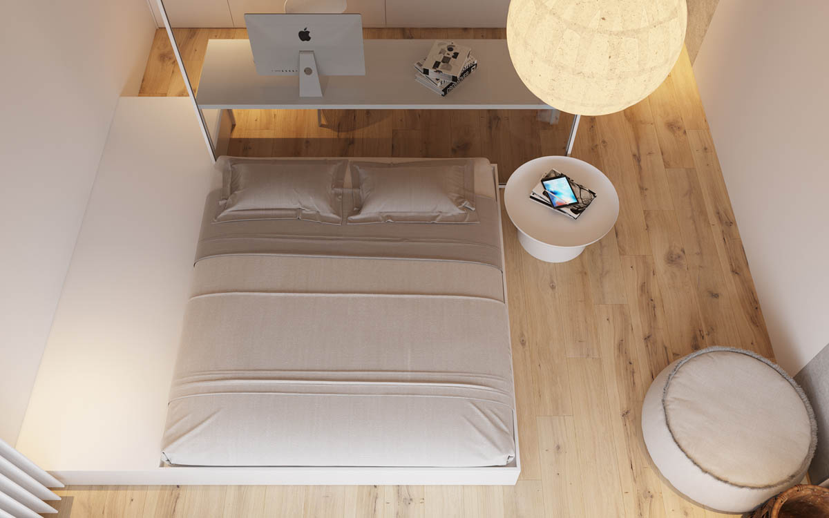
From above we can see how the extended side of the platform bed and the white linear desktop complement one another. The bedside table is of a contrasting circular design, which matches a nearby pouffe and the overhead orb pendant shade.
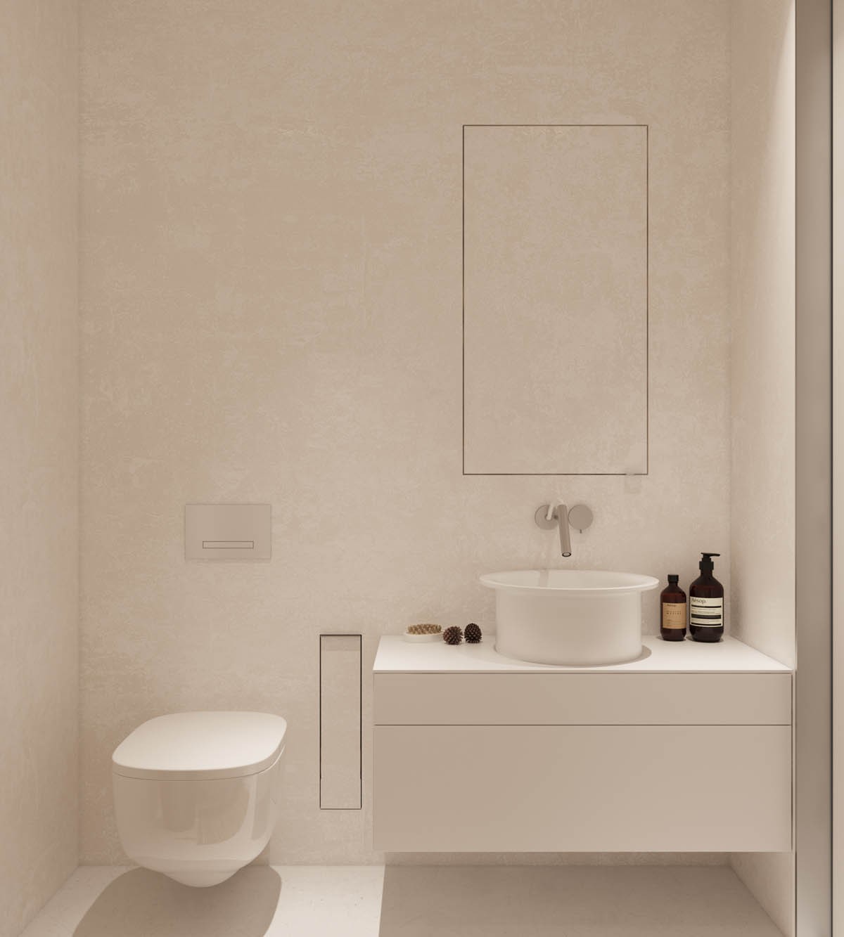
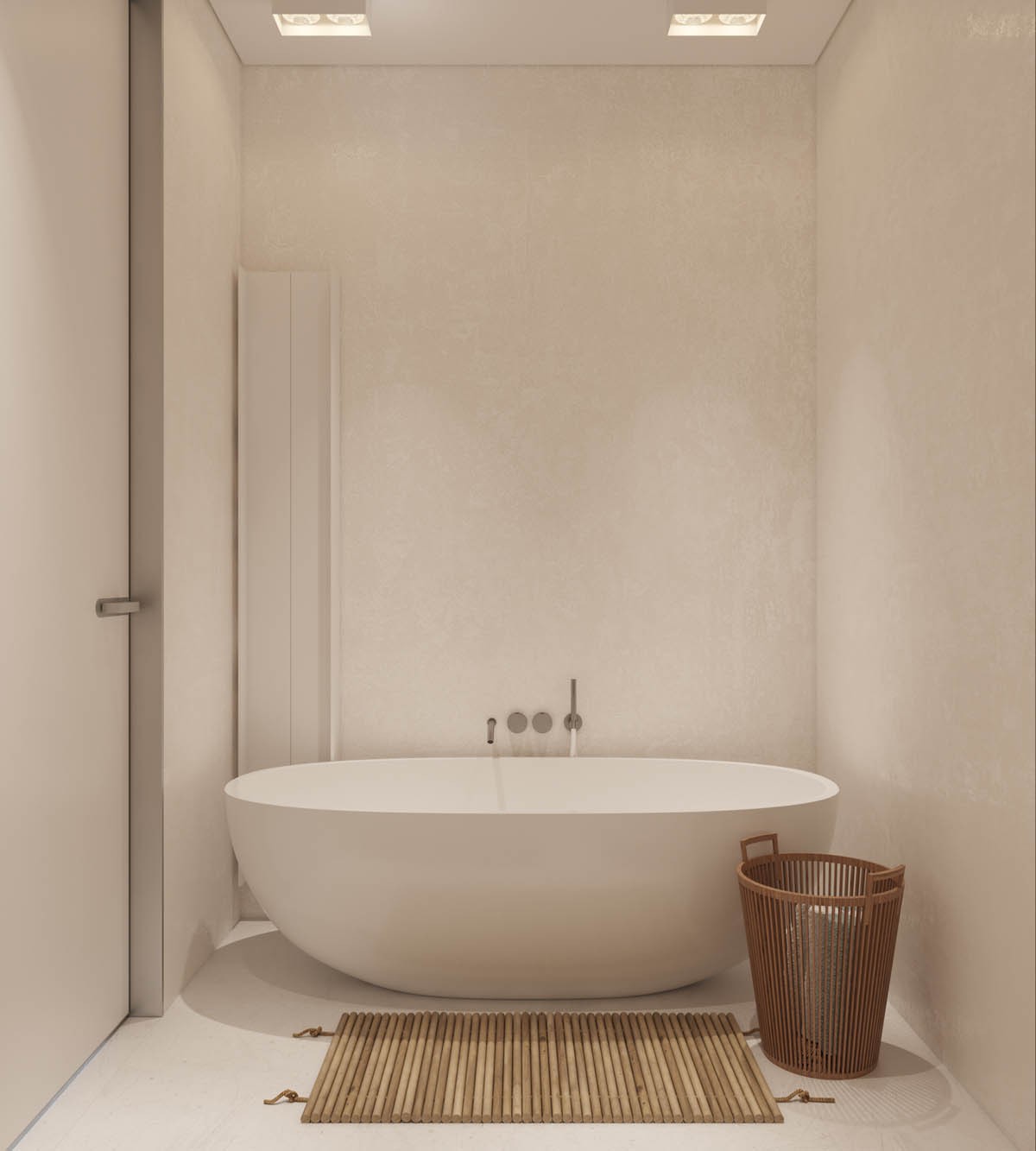
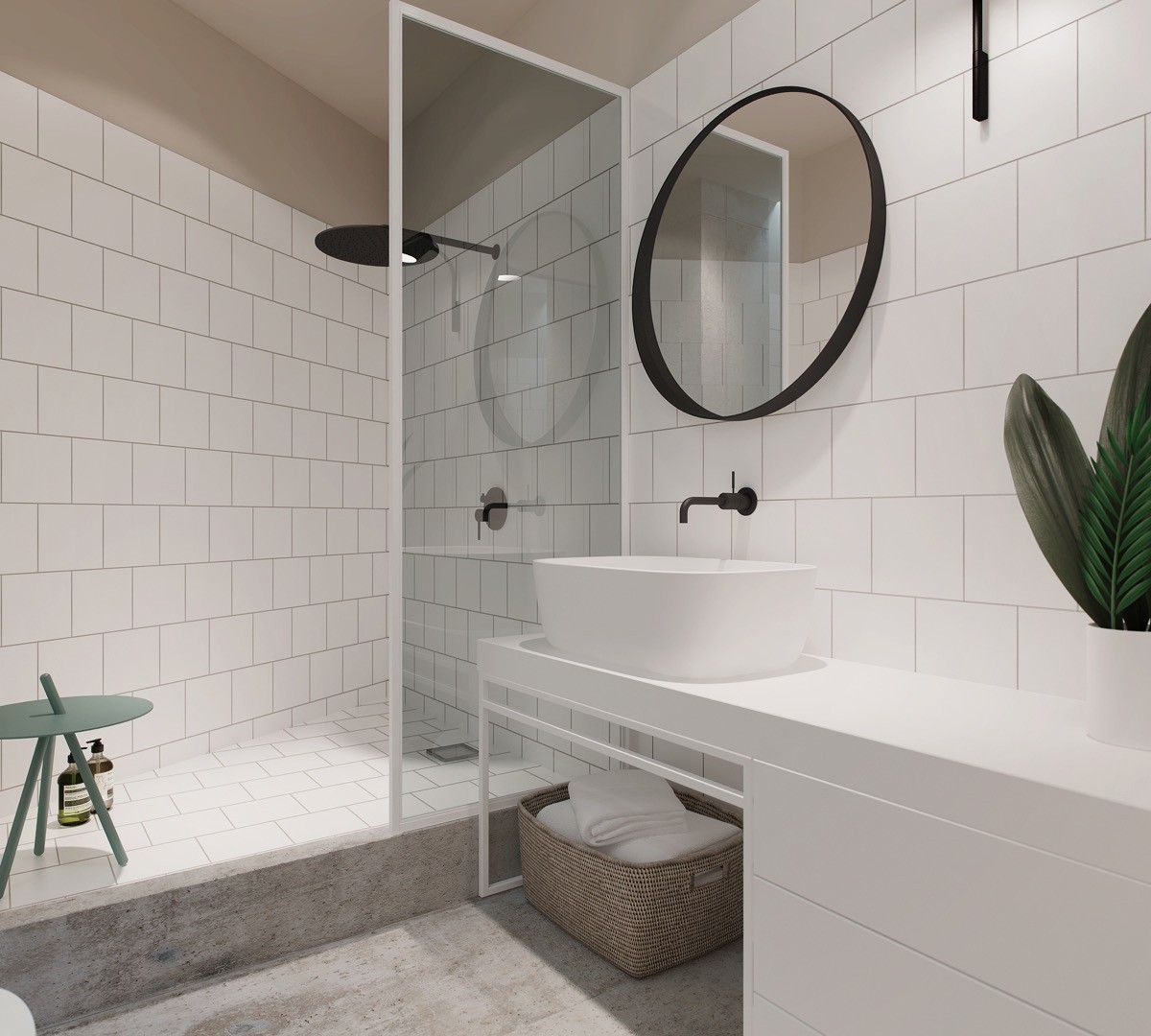
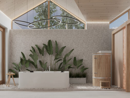
The minimalist bathroom has a pure white scheme.
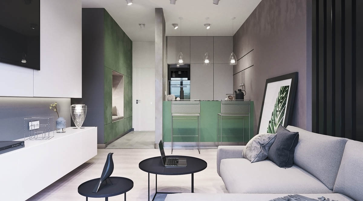
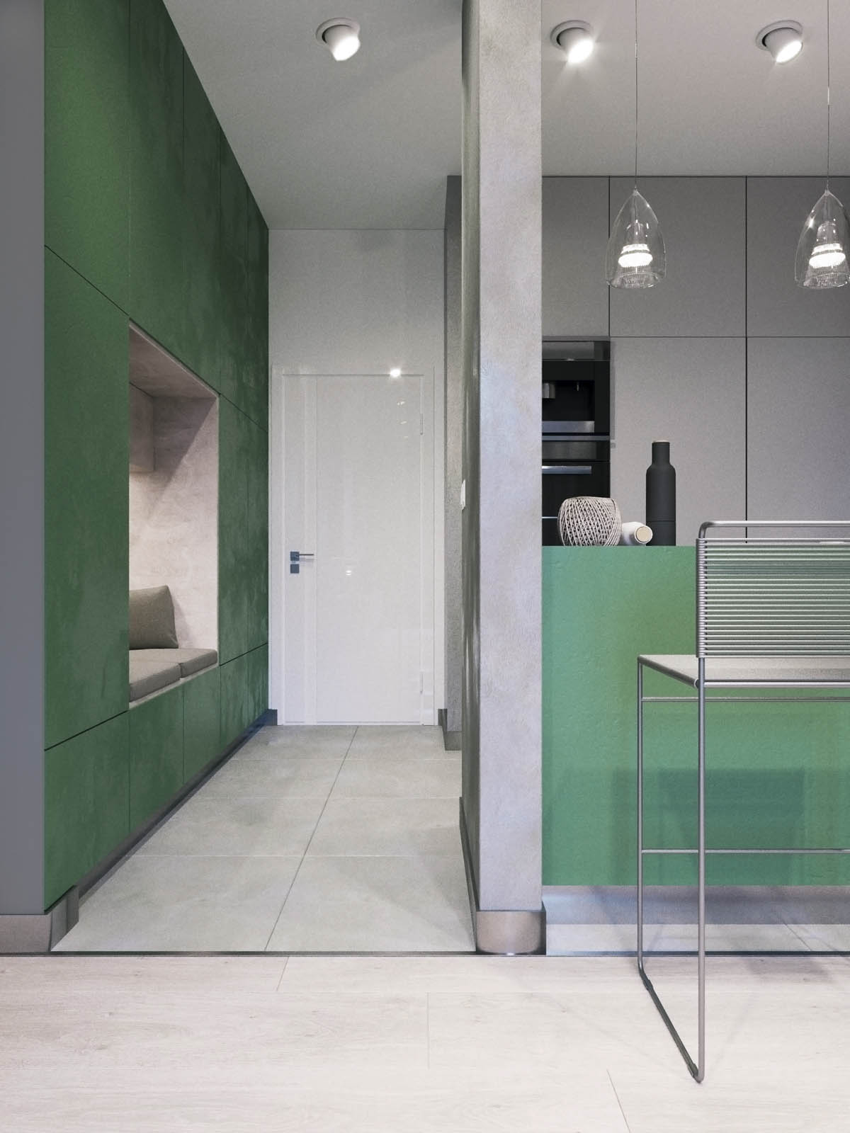
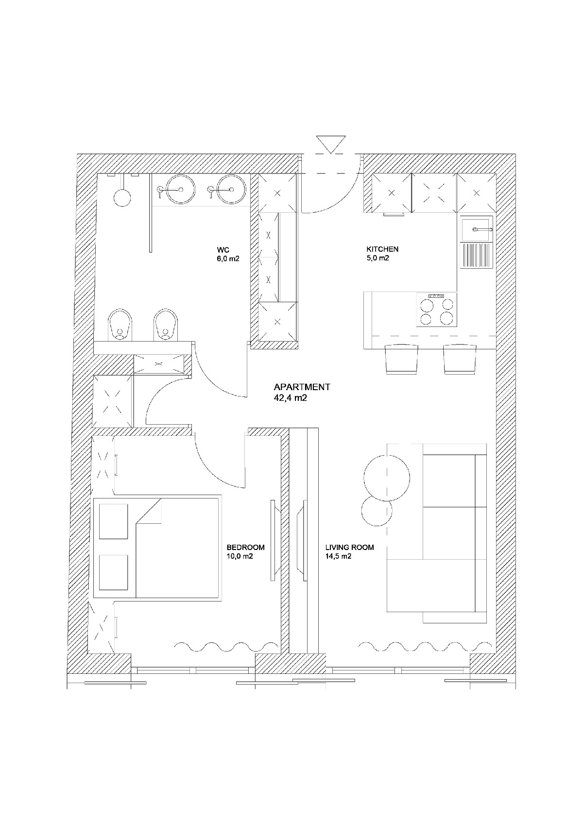
Modest size apartment design number 2, covering 42.4 square metres in Krakow, Poland, introduces a strong accent colour that is used liberally around the space.
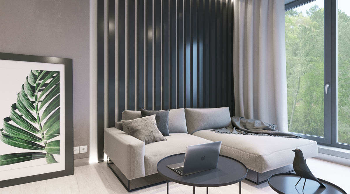
Green inspiration has been taken from beyond the windowpane, and the black window frames inspire dark notes throughout the scheme too.
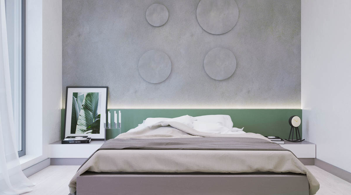
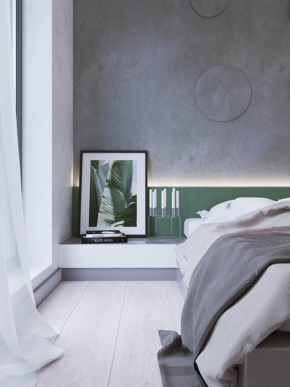
In the master bedroom suite a green headboard has been softly lit along its edge beneath a circular wall design.
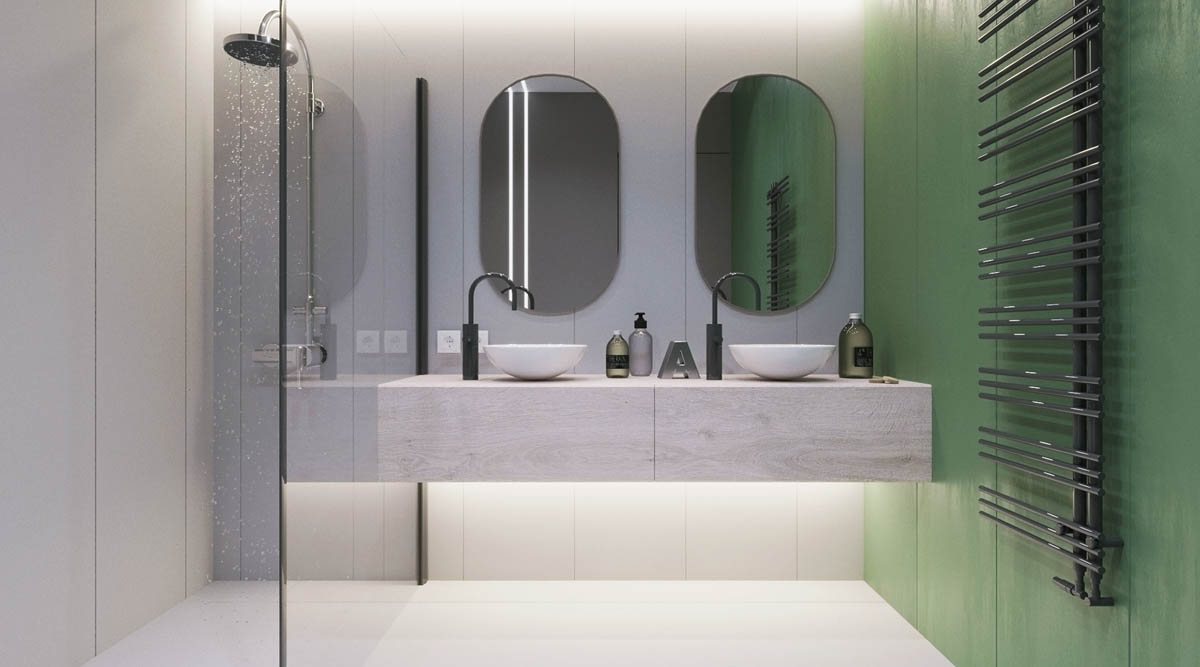
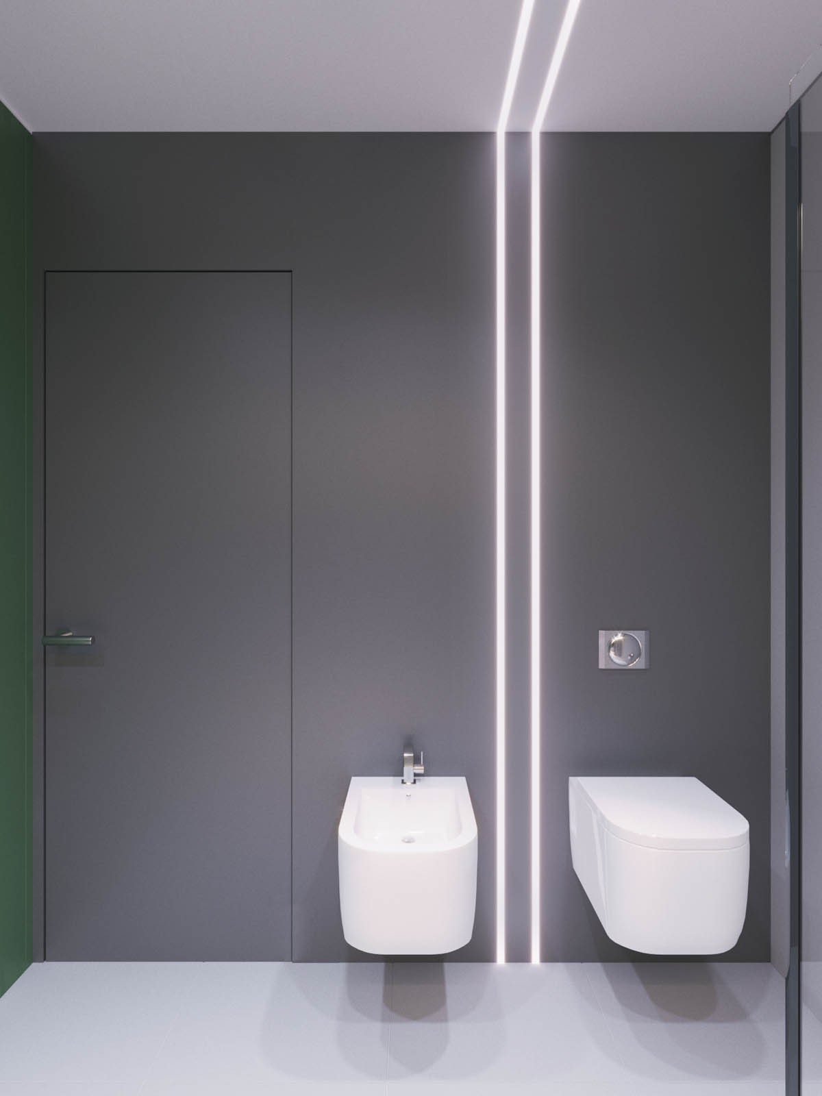
Although not huge, the bathroom fits double bathroom vanity sinks and a walk-in shower.
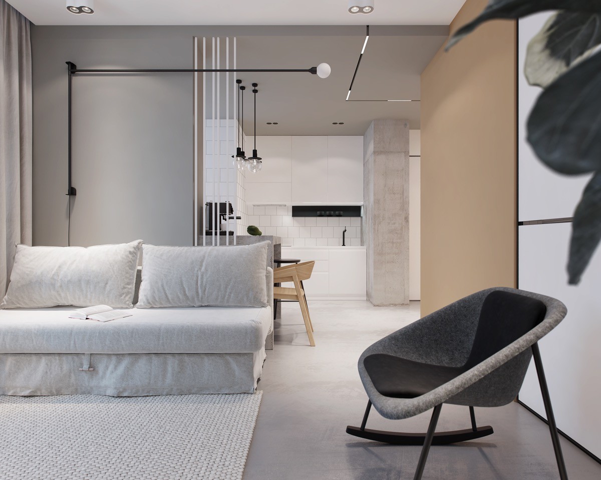
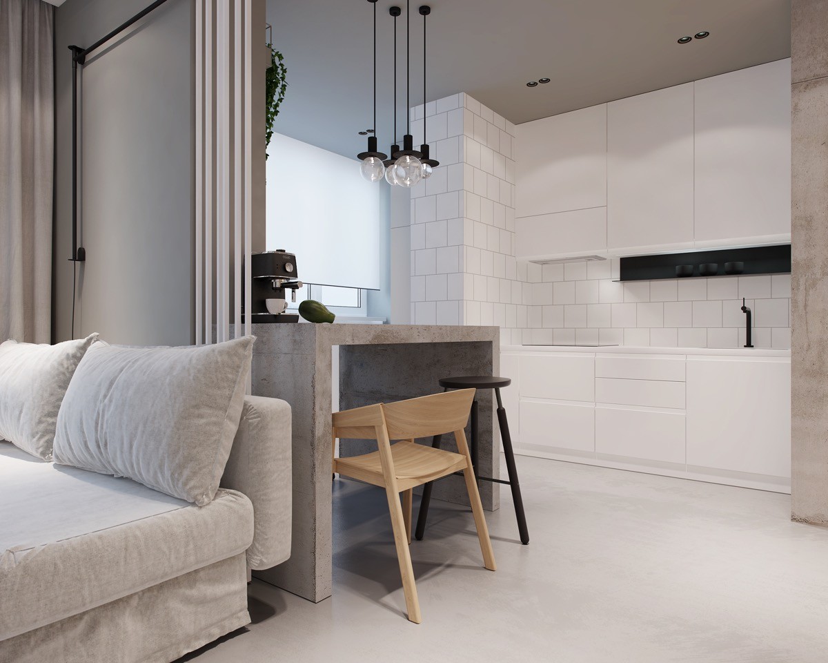
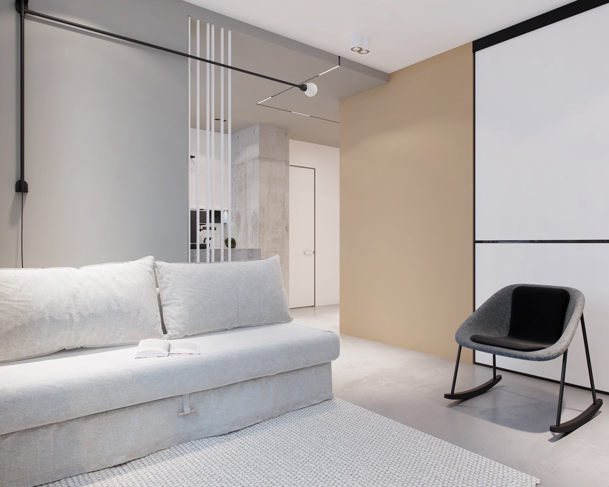
Our third tour is a modern concoction of grey, white and beige.
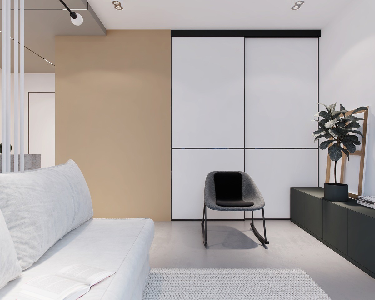
Sliding doors are a good idea for small spaces, so that they do not encroach on limited floor space upon opening.
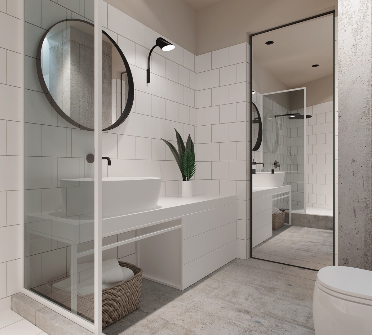
A white vanity unit extends to include a set of drawers at one side for storing cosmetics, toiletries and spare towels. A wide full-length mirror on the door visually doubles the space.
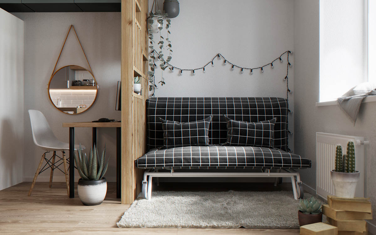
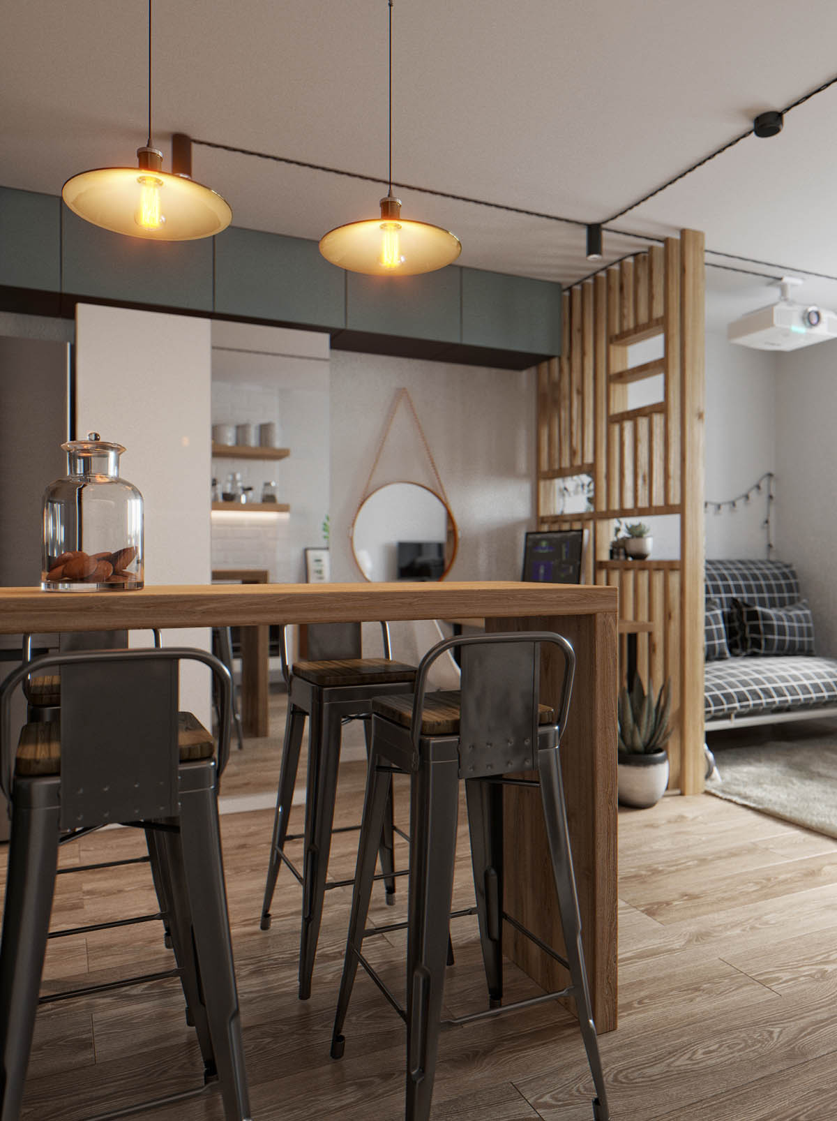
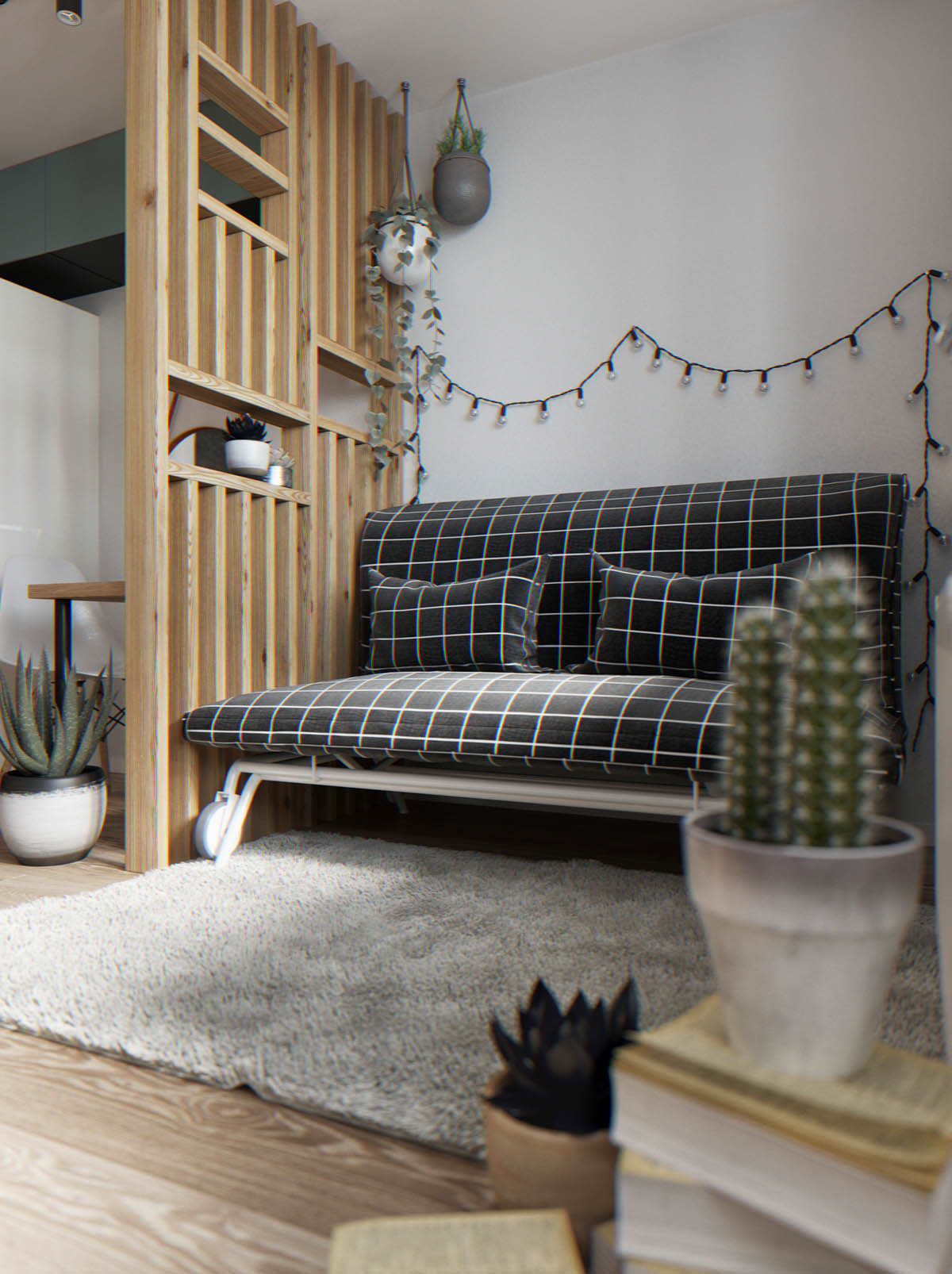
Our last home is a tiny studio apartment that has a strong monochrome theme running through, lifted by a good dose of rustic wood tone.
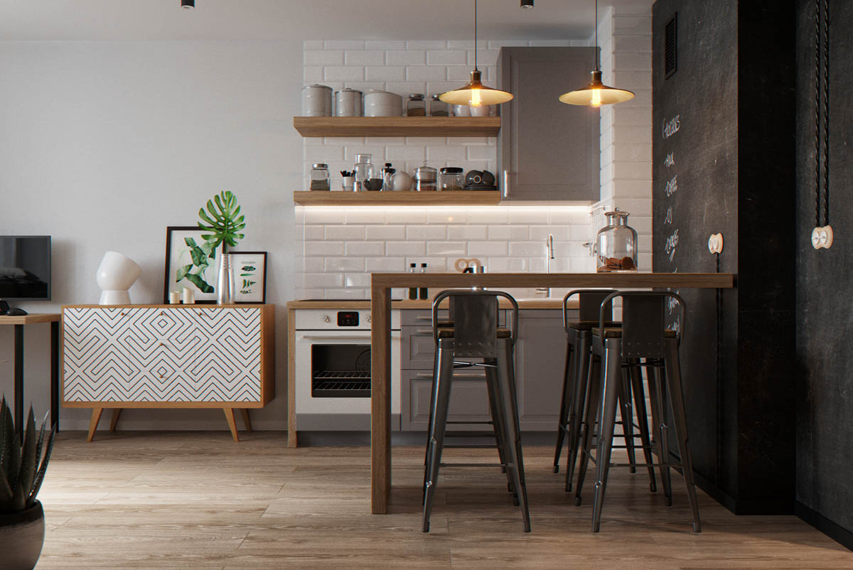
Beneath two industrial dining pendants, a wooden bar table runs directly into a wall decorated with chalkboard paint. The treated wall makes a handy place for scribbling grocery lists and meal plans.
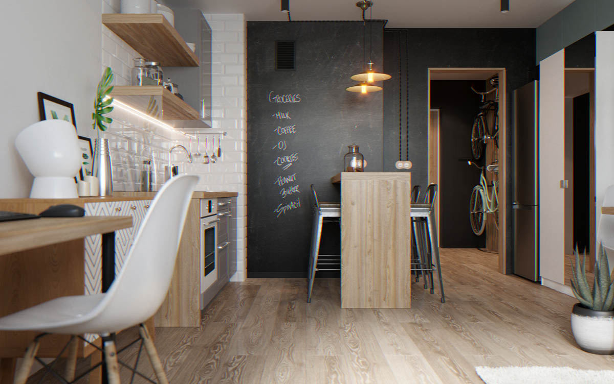
The kitchen is just three grey units and two wood shelves that are matched by a wooden countertop. A console with a geometric patterned front provides extra interest and divides the cooking space from a desk area.
