What makes a mid century modern kitchen? Cabinet styles are typically simple with little detail, such as flat-fronted or slim shaker designs. These minimalist forms are brought to life under rich wood tone, strong hues, and sometimes even graphic patterns. Aesthetics range from understated to wild organic and geometric motifs. Contrasting materials and textures build a wealth of visual interest too. Accent furniture is finished with shining chrome and signature tapered legs. Sleek lines form striking silhouettes, bound in leatherette. In this collection of 40 kitchens, we’ll look at how to combine the mid century modern spirit with contemporary surroundings, and some favourite features to note.
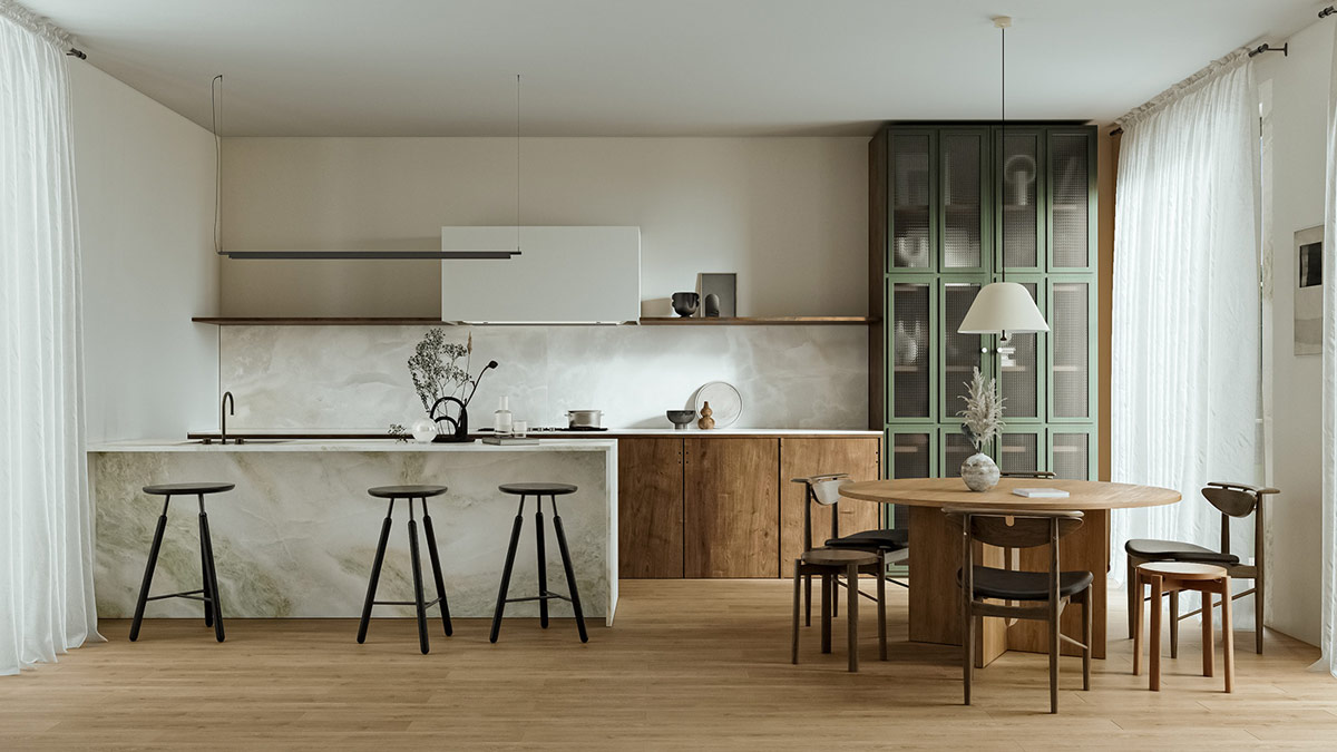
Deep emerald and olive greens spark a mid century modern-inspired colour palette. Combine these shades with signature mid-century brown tones and natural materials. The black bar stools bring in contrast to the composition.
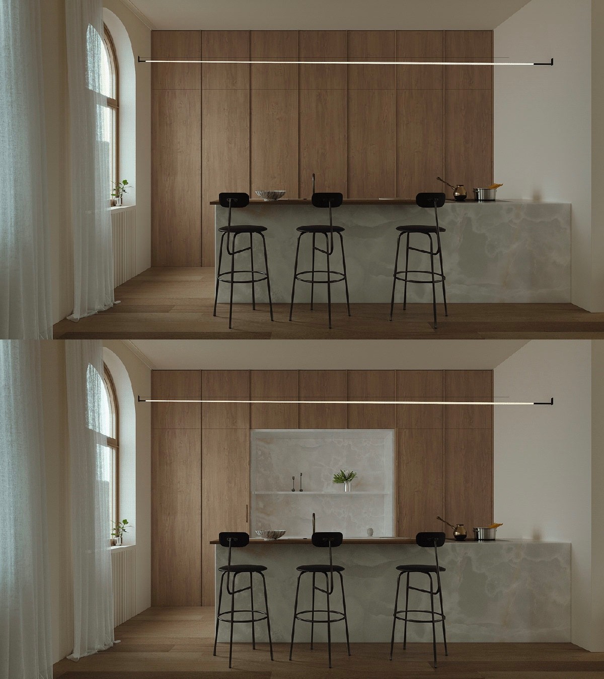
Flat-fronted units hark to mid century modern kitchen design. This understated look fits well in minimalist schemes and interiors that are spiced with Asian influence, like this one. More images here.
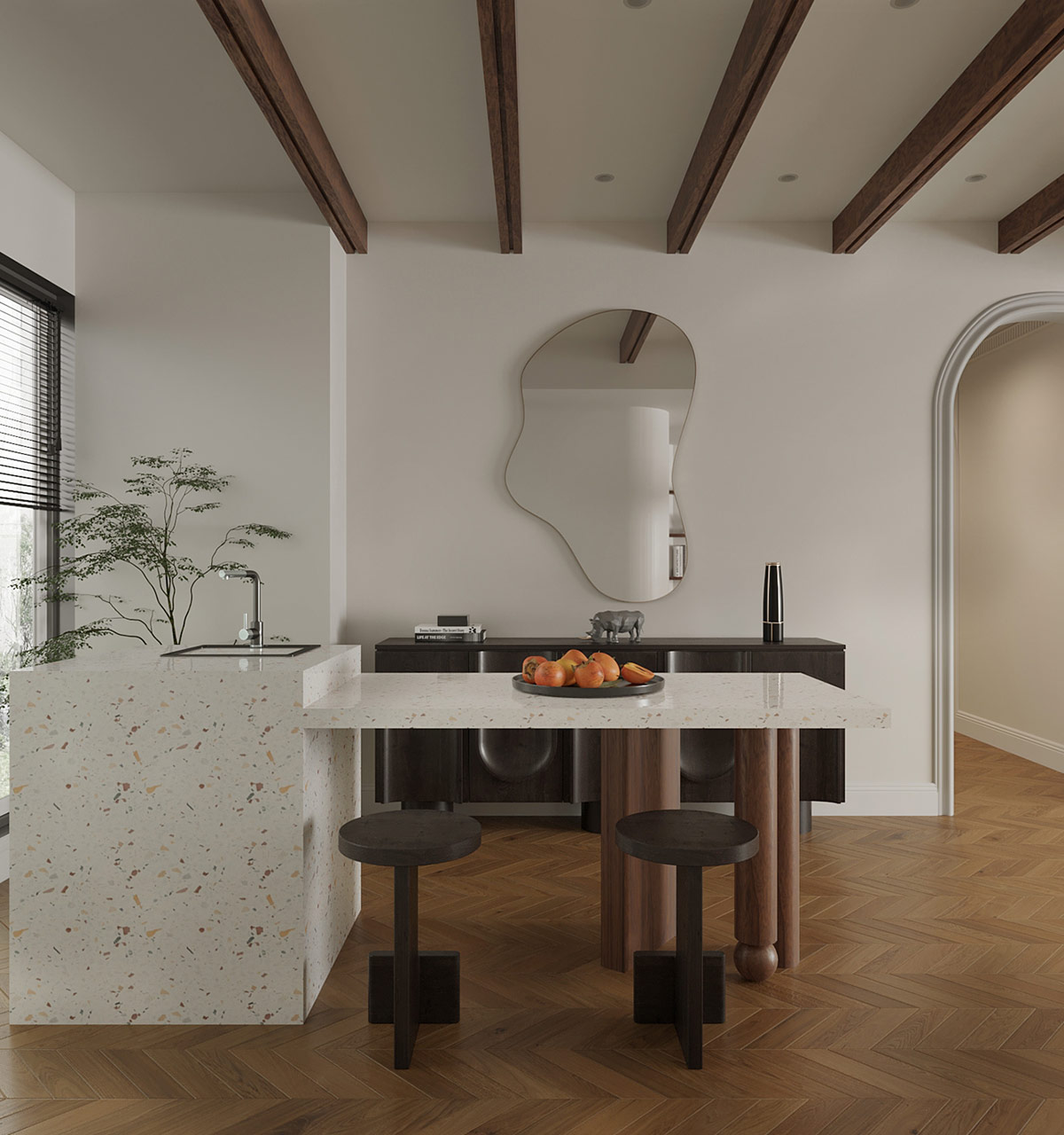
Terrazzo reached peak popularity in the mid-century modern period, and is currently having a revival. This material was favoured by architects and designers for its monolithic, minimalist look. Organic shapes showcased too, making this decorative wall mirror a complementary piece for a terrazzo kitchen island.
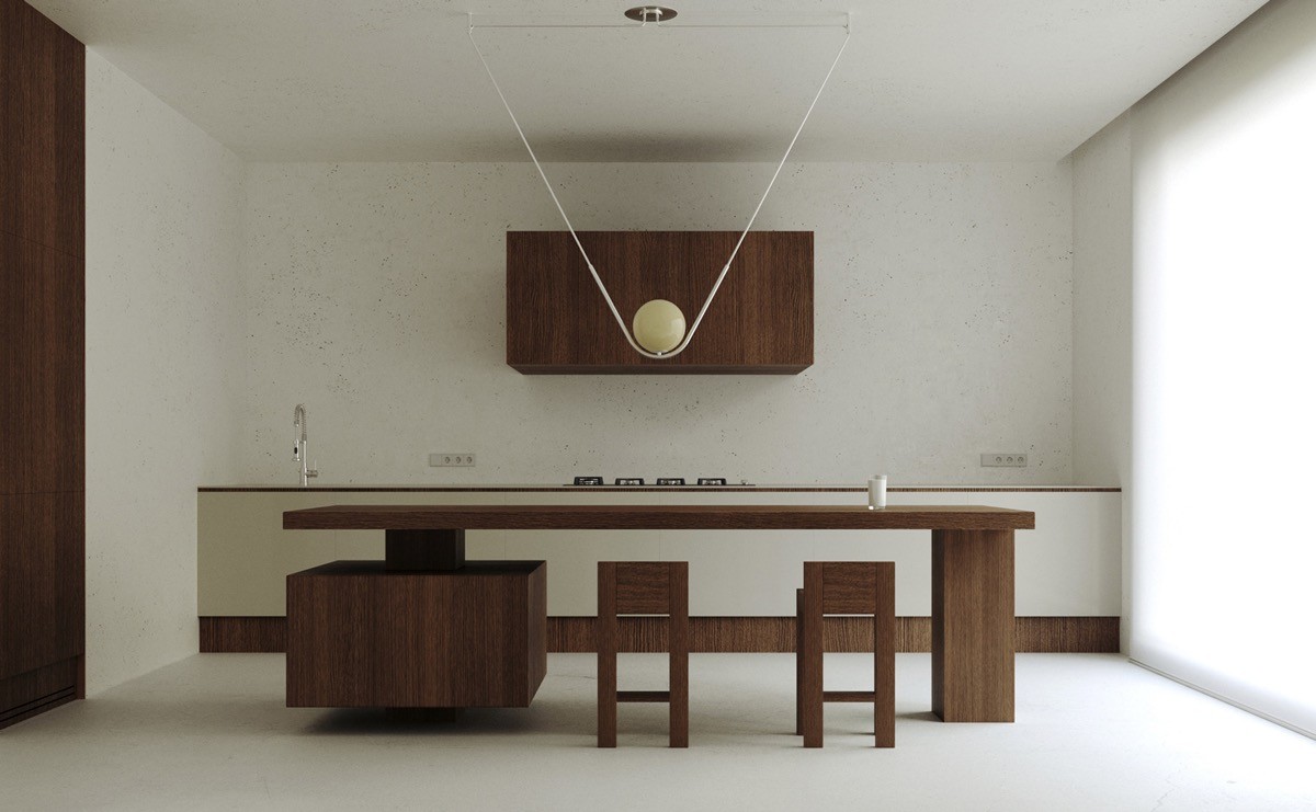
In true understated mid century modern style, this minimalist kitchen features a rich brown and cream colourway.
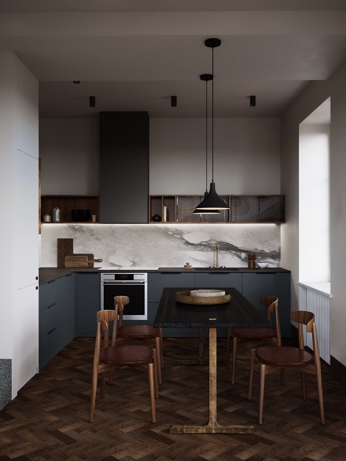
Fluted glass first became popular during the Art Nouveau period, but it shines through mid century modern design too. Use this textured glass to add interest to kitchen wall units and partition doors.

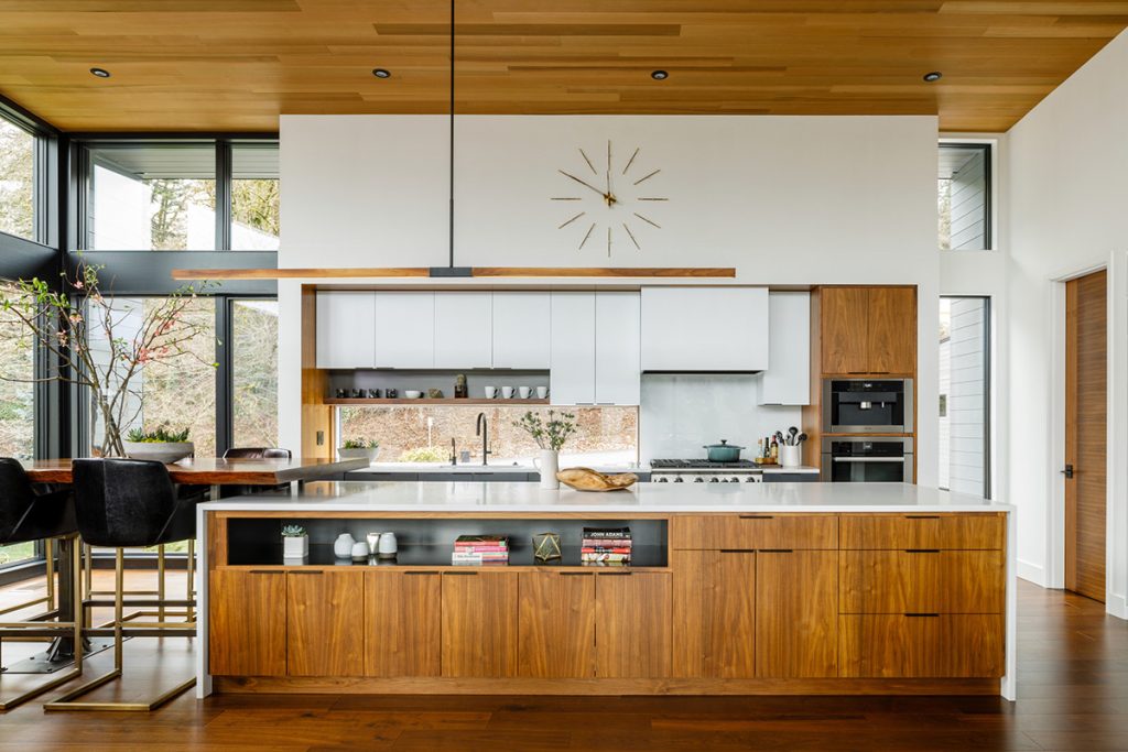
Crown a flat-fronted wooden kitchen design with a statement mid century modern kitchen clock design. This singular piece of wall decor will cement the theme whilst providing functionality.
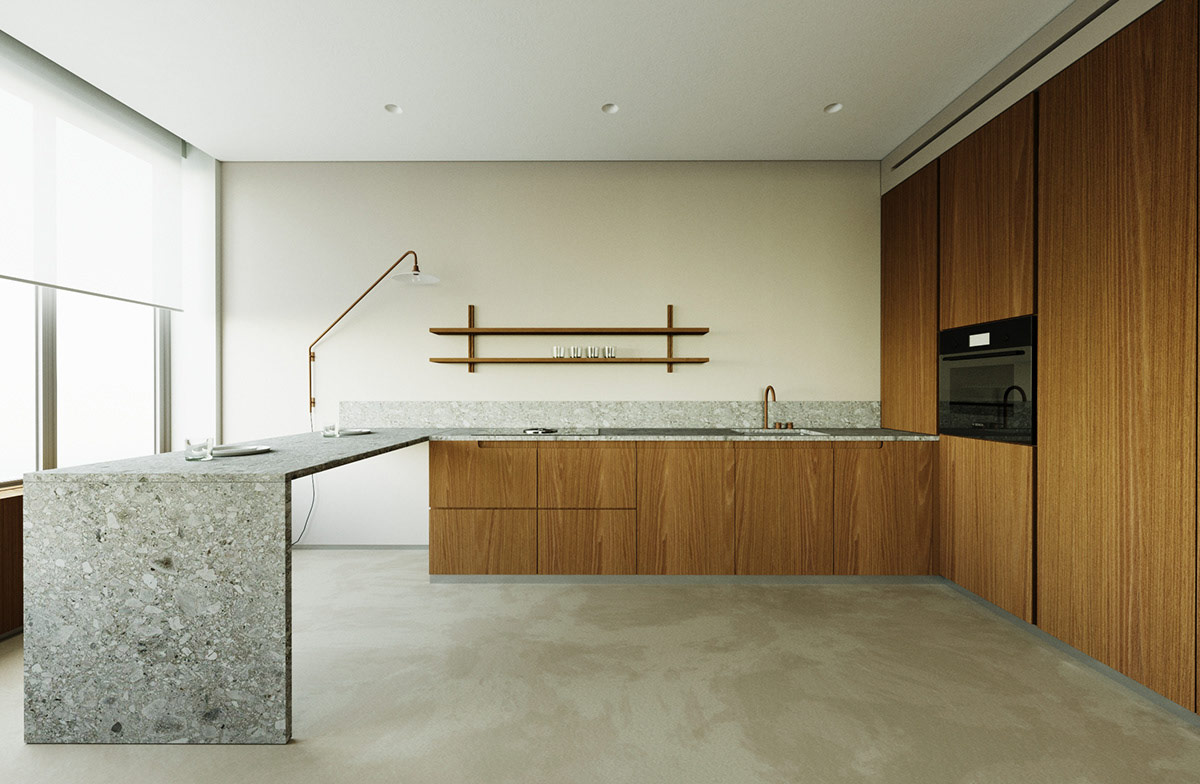
Create cool contrast against warm wooden kitchen units by installing a sleek grey stone countertop. These counteracting hues and textures will build balance in the space.
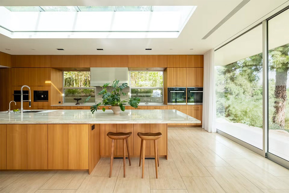
Cast a warm light upon honey-coloured cabinetry with a skylight or kitchen roof lantern. Plants were as loved in mid century modern homes as they are today, so select a green friend to come drink up the sunshine.
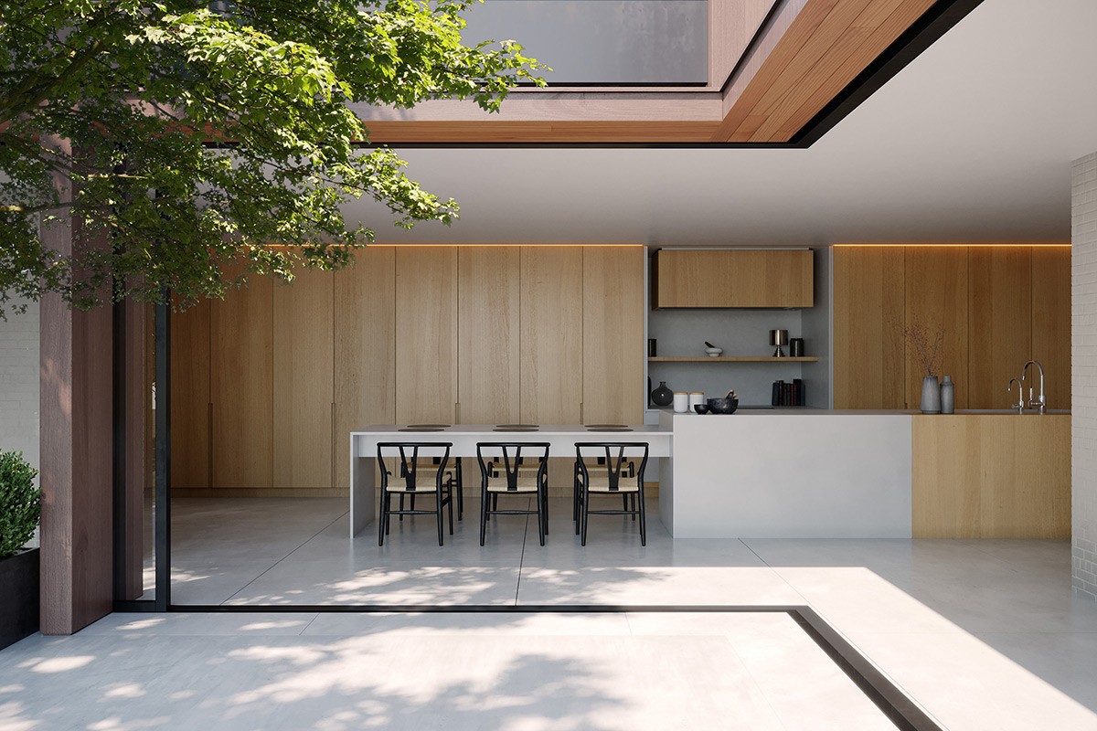
This smooth-fronted kitchen design is complemented by two walls of sleek retractable doors, which connect to the terrace.
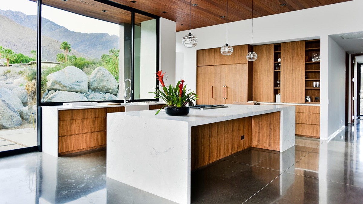
While wood was a popular choice in mid century modern homes, an abundance of woodtone can appear overwhelming. Cut around heavily wood grained cabinets with a swathe of fresh white wall stucco and a white waterfall countertop.
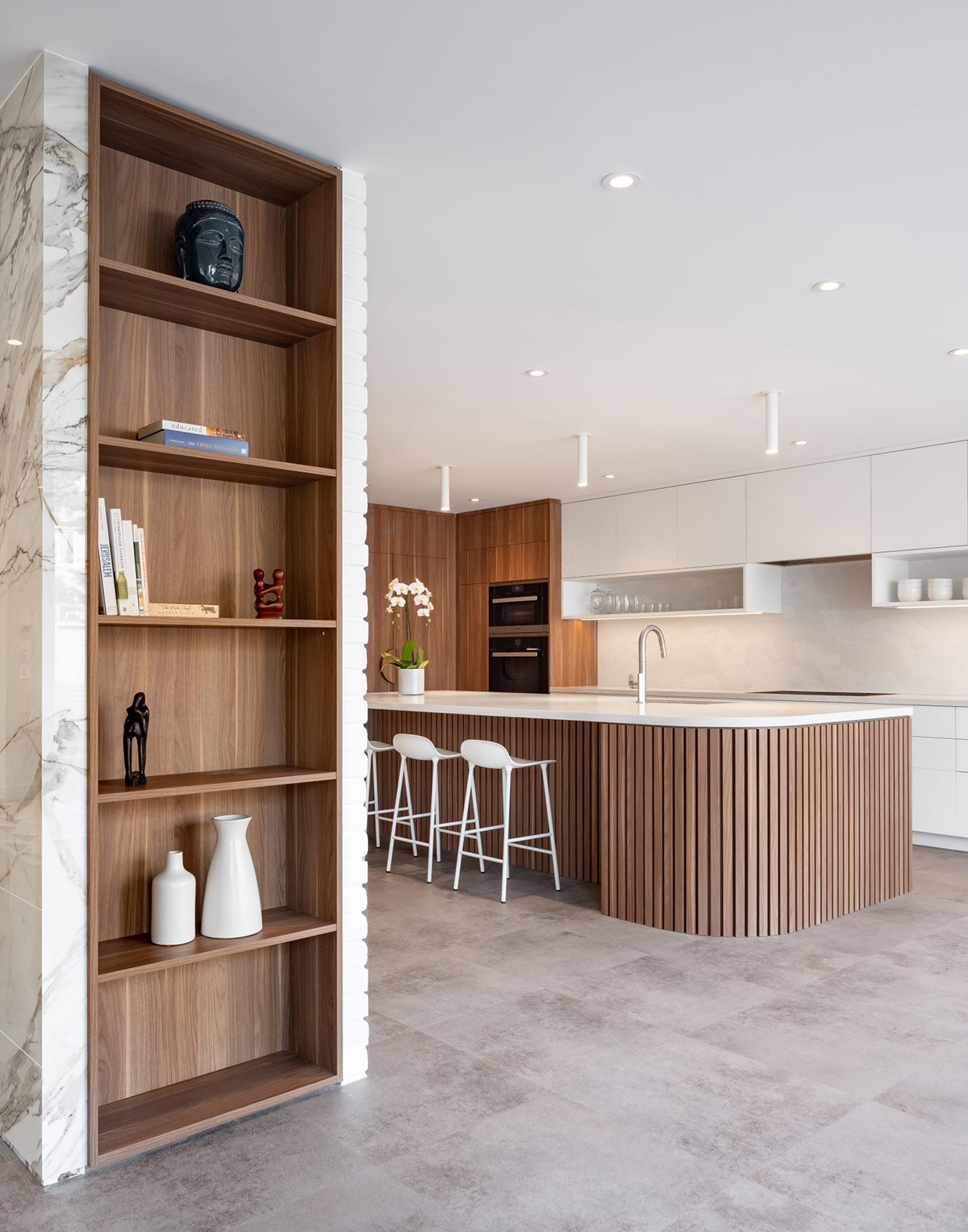
We’re enjoying an abundance of wood-slatted decor elements in contemporary design, but this is not a new concept. With focus firmly on natural materials, wood-slatted textures appeared in many mid-century spaces. The slatted treatment looks particularly impressive on a large kitchen island.
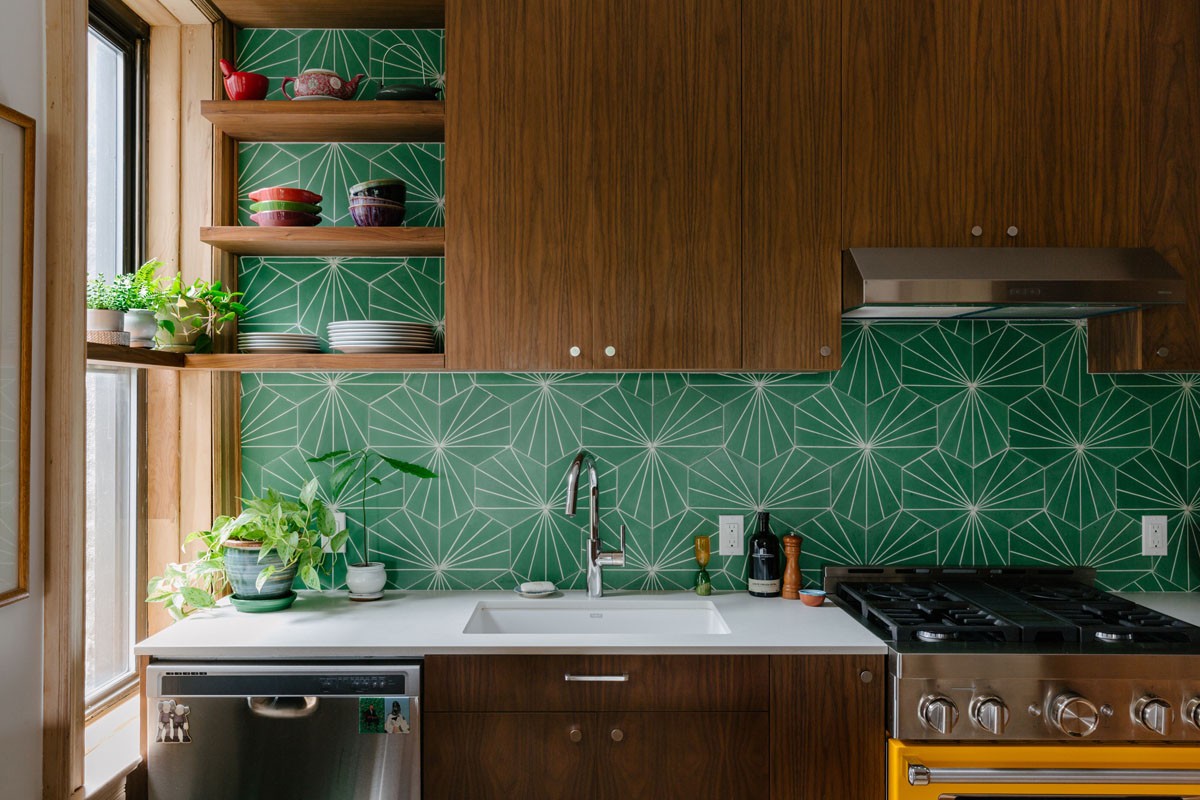
This emerald green and rich wood tone scheme calls in the geometric element to create a stunning green kitchen backsplash.
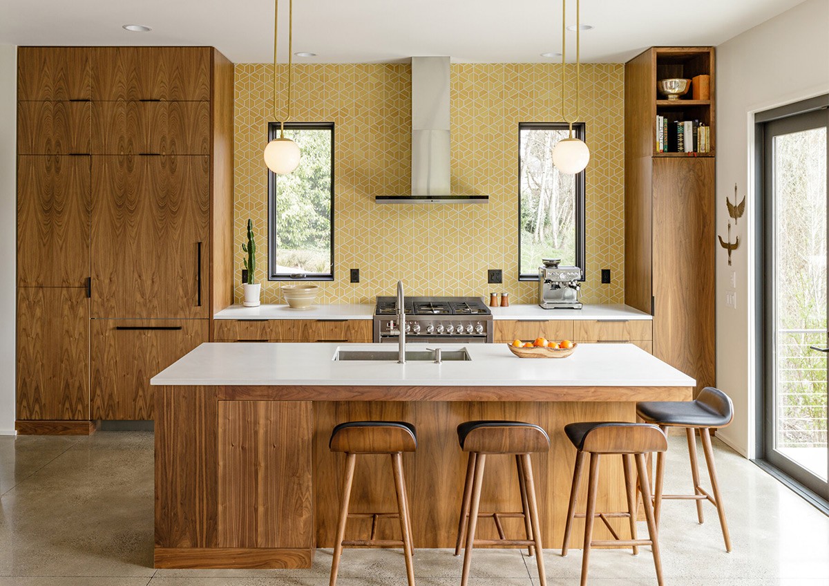
Mellow yellow kitchen colour schemes make a perfect pairing with the warmth of mid century modern kitchen cabinets. This feature wall incorporates a geometric print too. See more yellow kitchens.
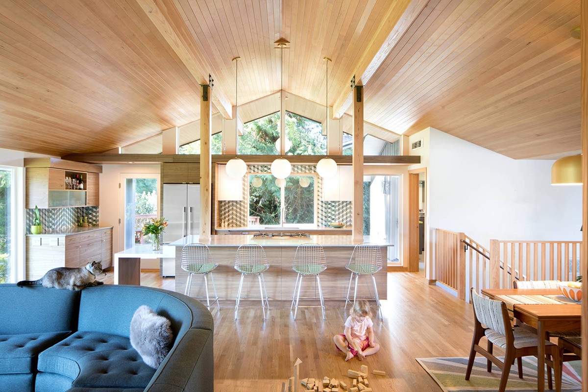
Don’t forget the ceiling when spreading the love for natural wood. This trio of low hanging globe pendant lights draws the eye up to a glorious wood-clad canopy.
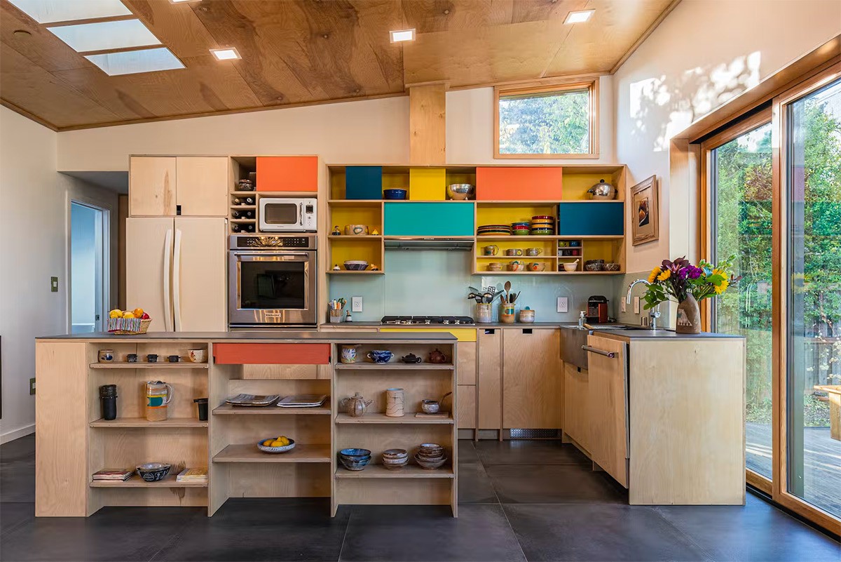
Create a crash of colour for a youthful aesthetic.
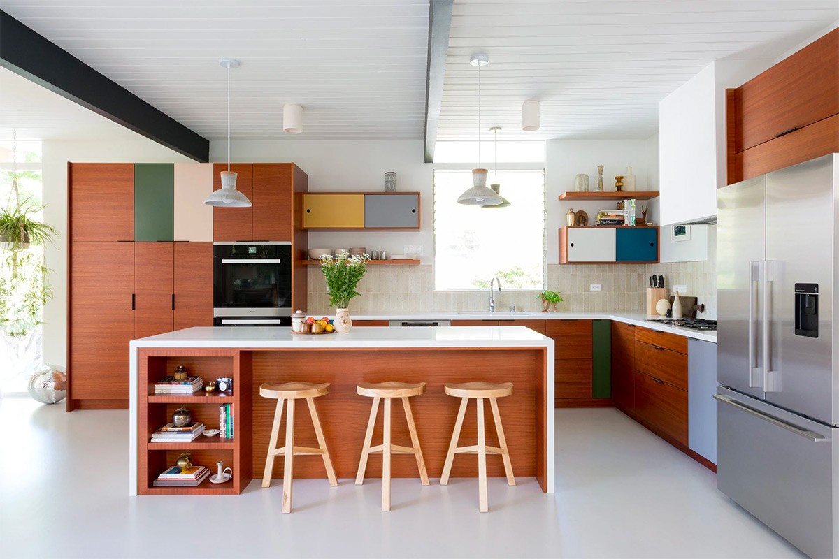
This muted take on a multi-colour theme is toned down further by neutralising dark brown elements. A trio of wooden bar stools add a lighter tone.
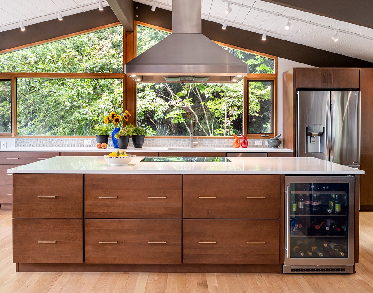
Metal hardware evokes shiny memories of the era, so use it to brighten up a dark brown wood kitchen installation.
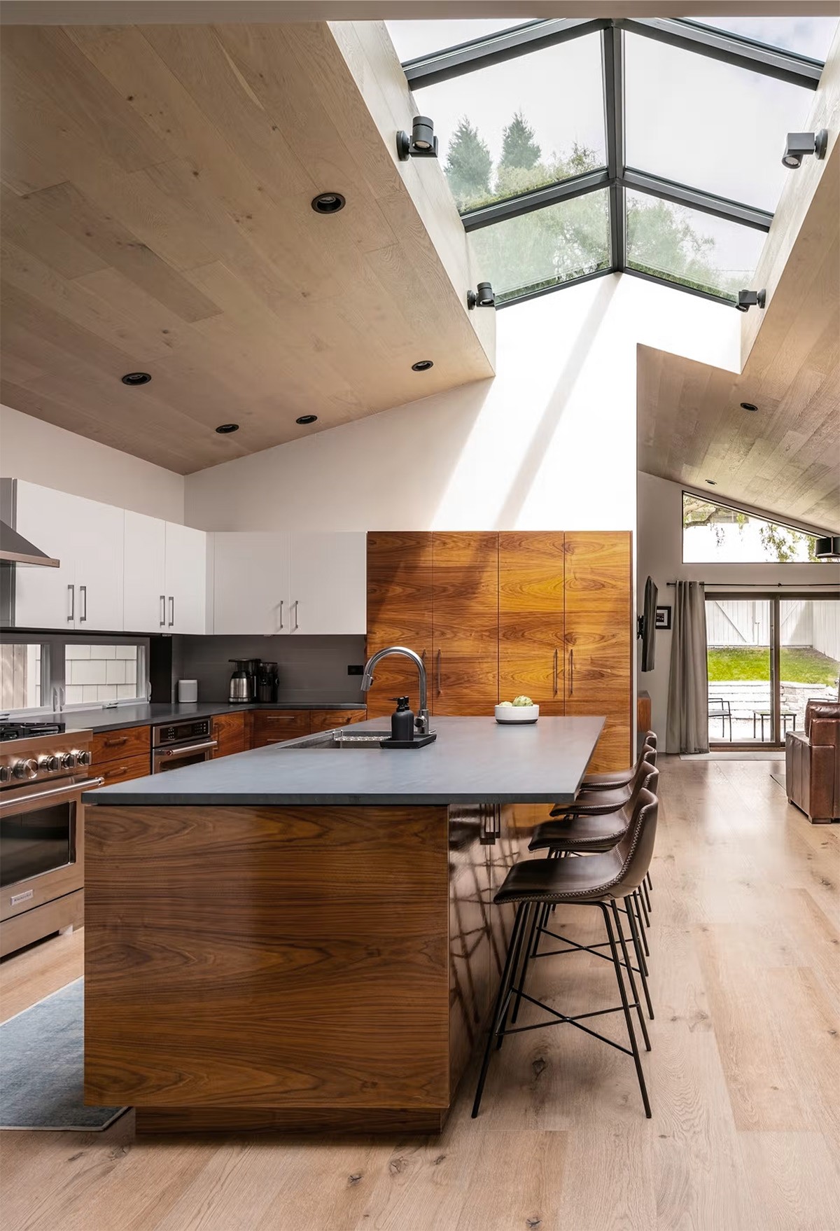
Break up a densely wood-clad ceiling treatment with a spectacular skylight.
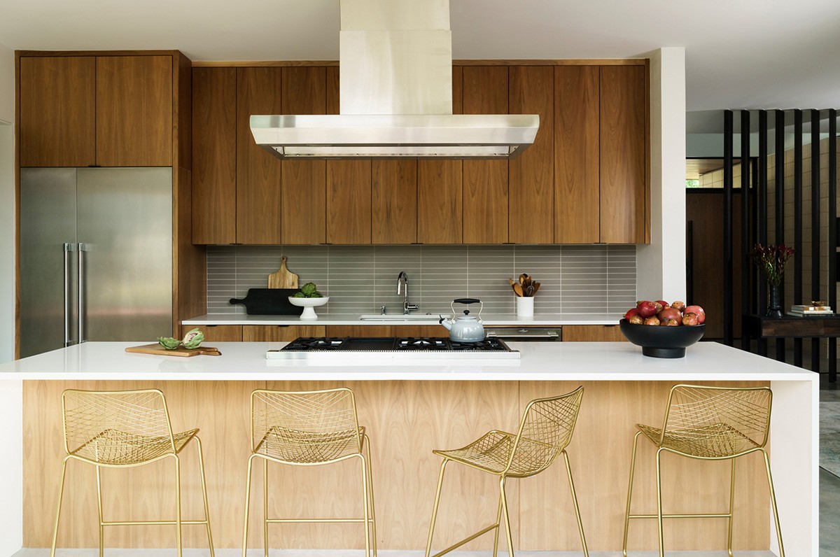
This brown and steel kitchen combo receives a dose of contemporary appeal with golden kitchen bar stools.
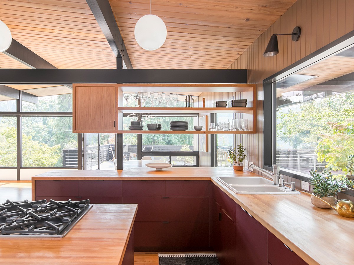
A claret red kitchen treatment makes a delicious meld with natural wood elements. To construct something more zany, combine red mid century cabinetry with contrasting aqua blue accents.
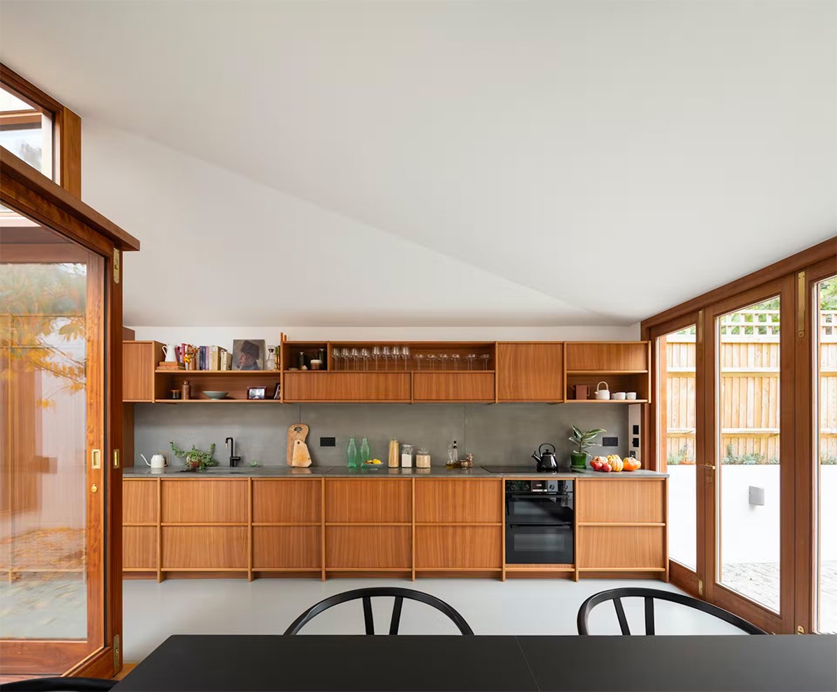
Slimline shaker units offer a little more detail than their plain slab-fronted counterparts. Use this style to add structure to your surroundings.
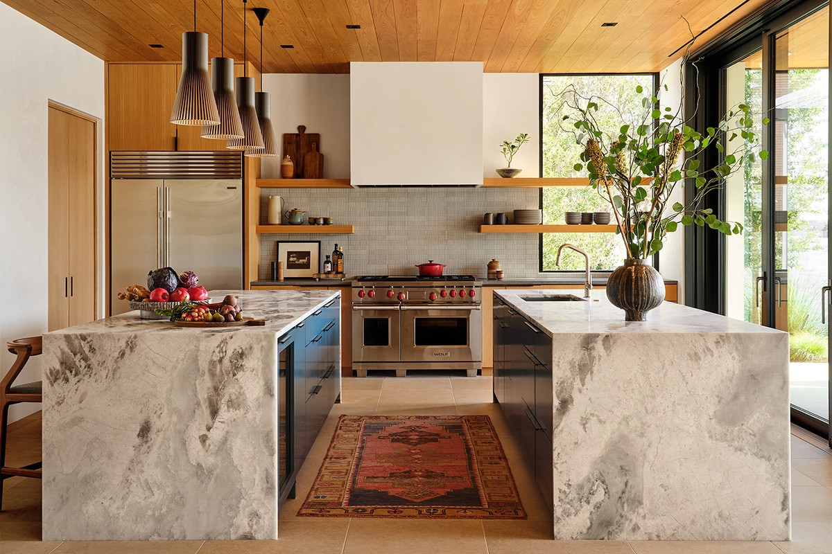
Break up the space with open kitchen shelving. Display colourful ceramics and glassware.
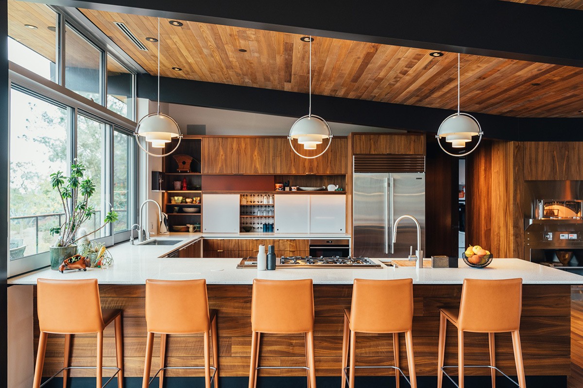
Accentuate a mid century inspired wooden ceiling with deep black framing.
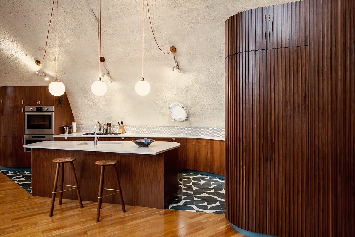
Combine a mid century wood-clad wall aesthetic with contemporary curves.
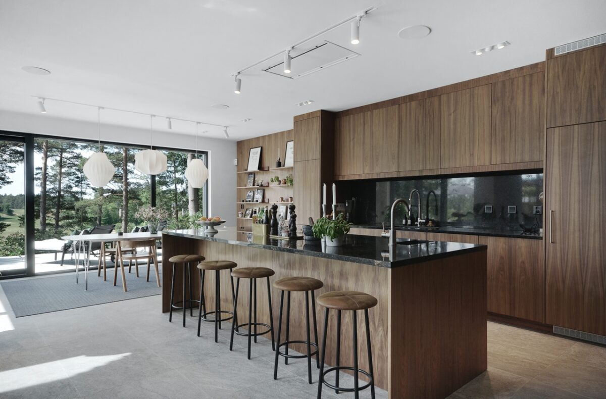
Bar areas should be set up for entertaining with a relaxed, social aesthetic. The upholstered bar stools add to the comfort.
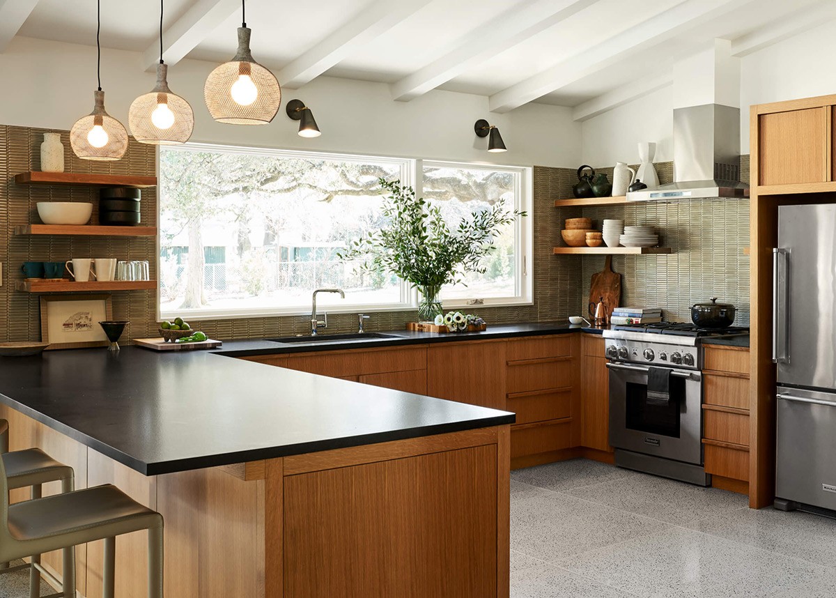
Olive green backsplashes provide a subtle colour accompaniment for a wooden kitchen run.
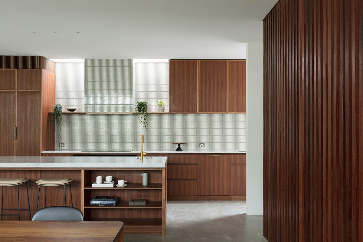
Cunningly extend tall units that fall just short of the ceiling line with a wood-slatted extension.
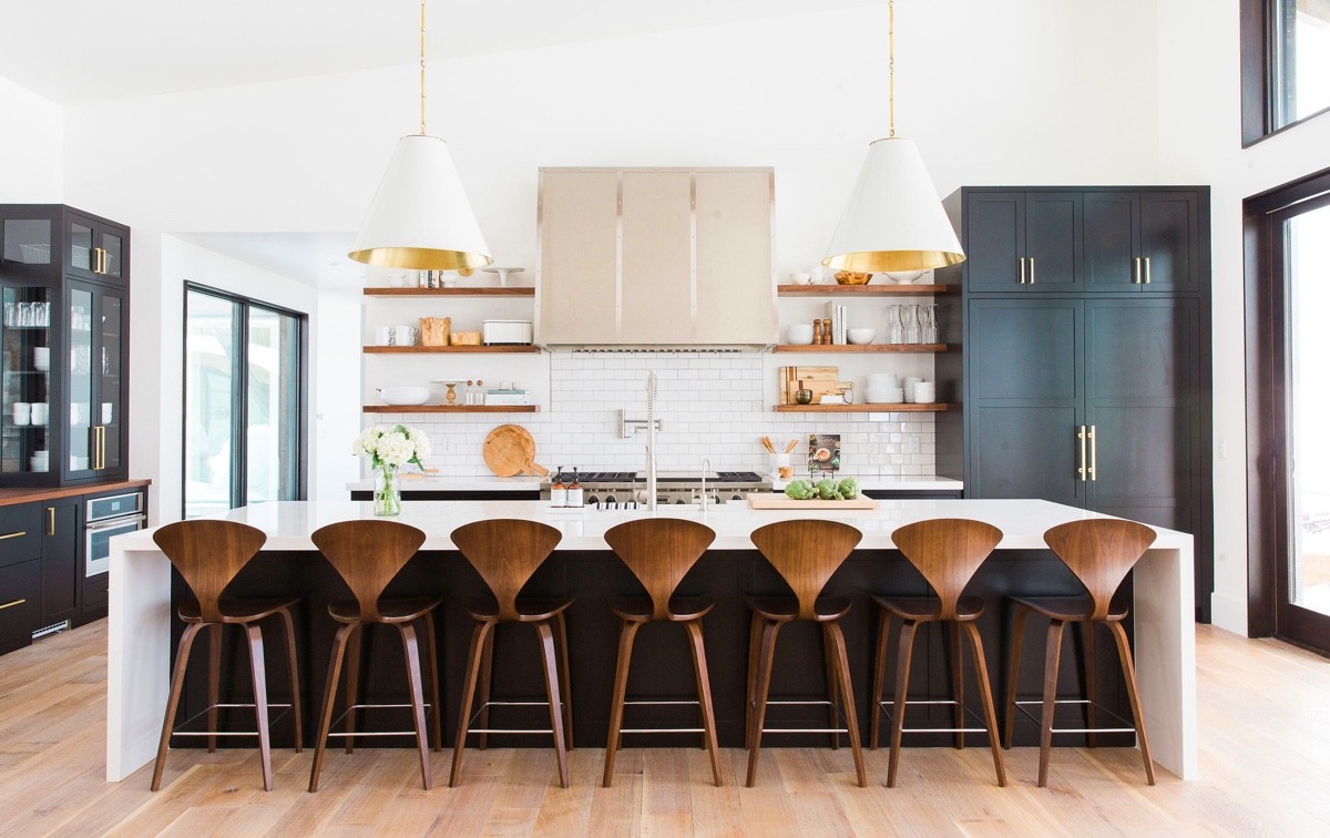
On the whole, this kitchen doesn’t quite hit the mid century mark, but Cherner stools fetch in the vibe.
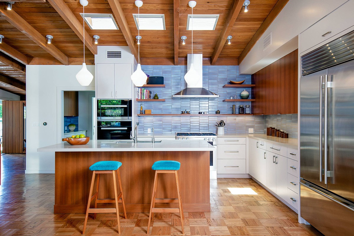
Bright blue accents jolt wooden kitchens out of their heavy, solid state.
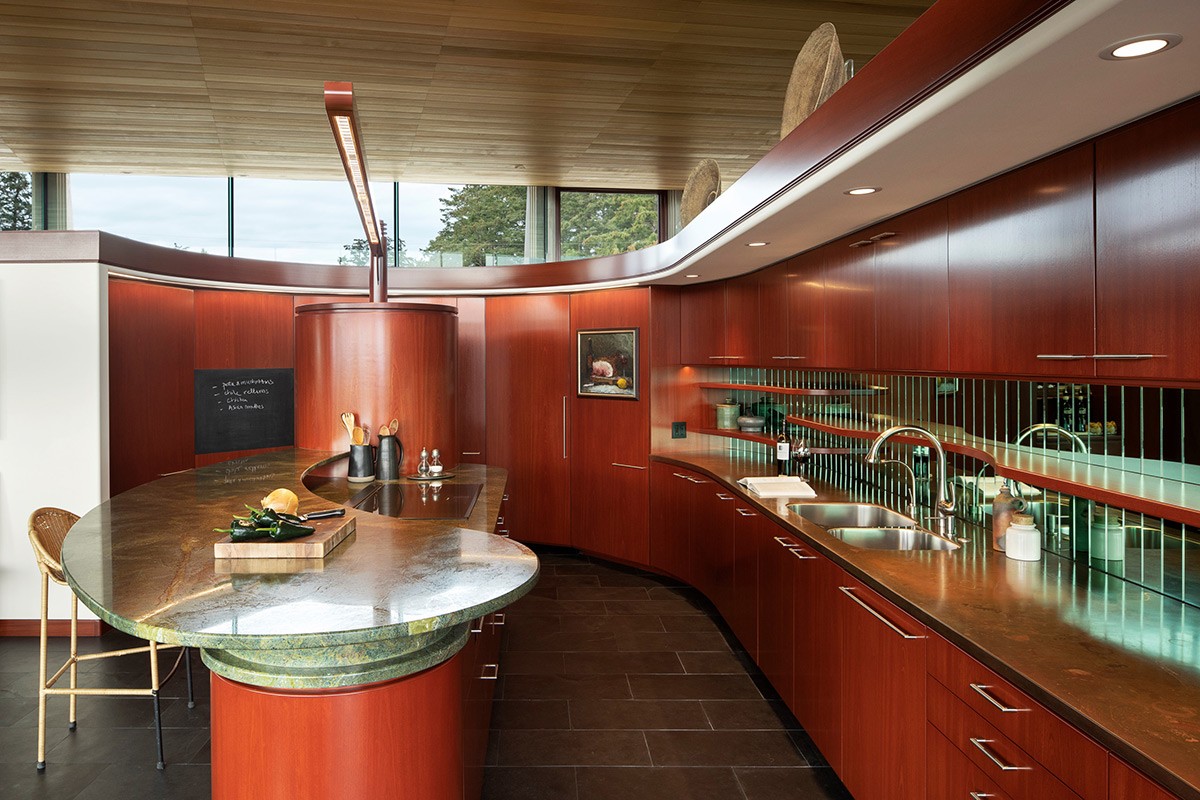
Polish up the woodwork to create mid century luxe.
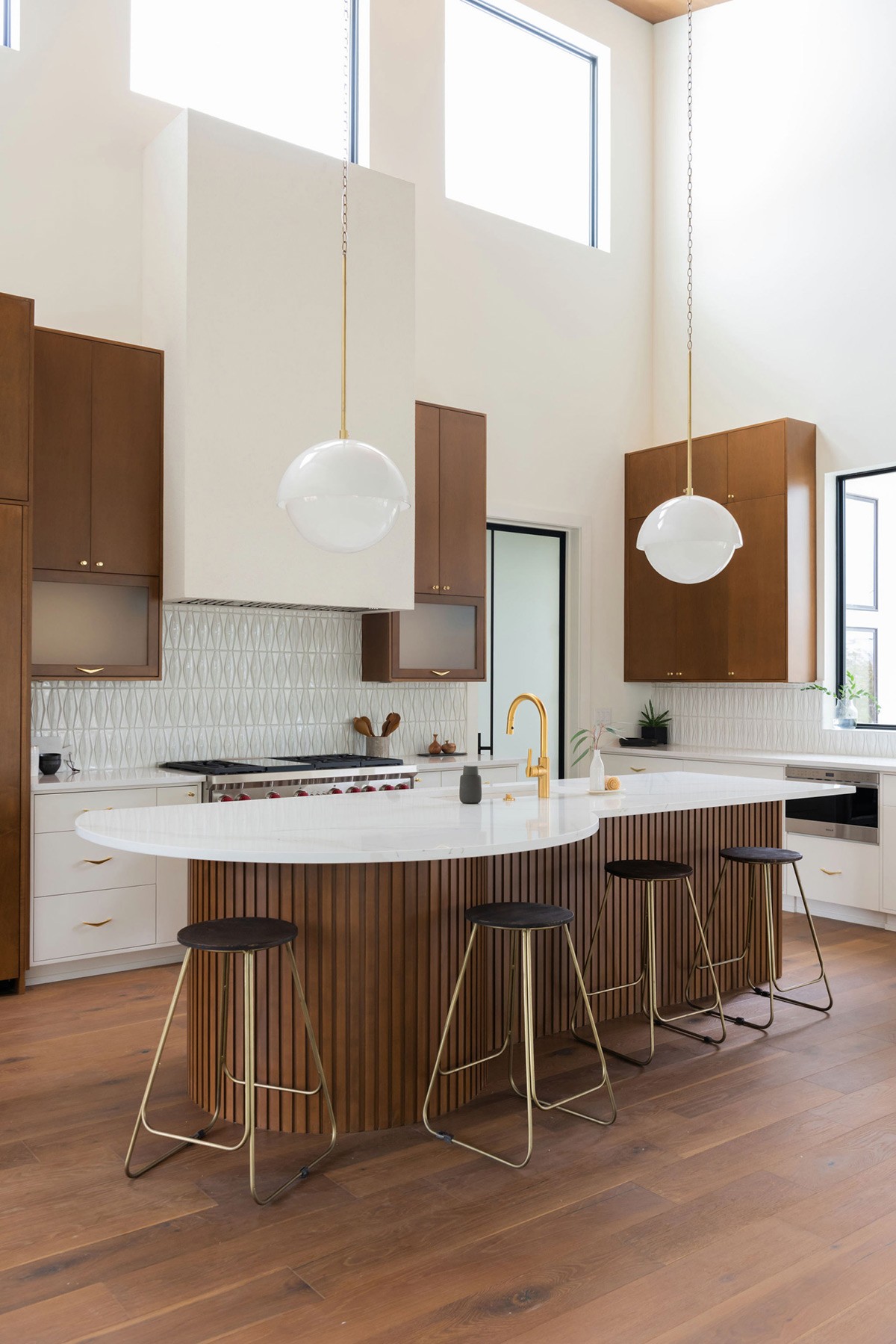
When picking out mid century modern style kitchen lighting, globes and domes provide a gentle aesthetic.
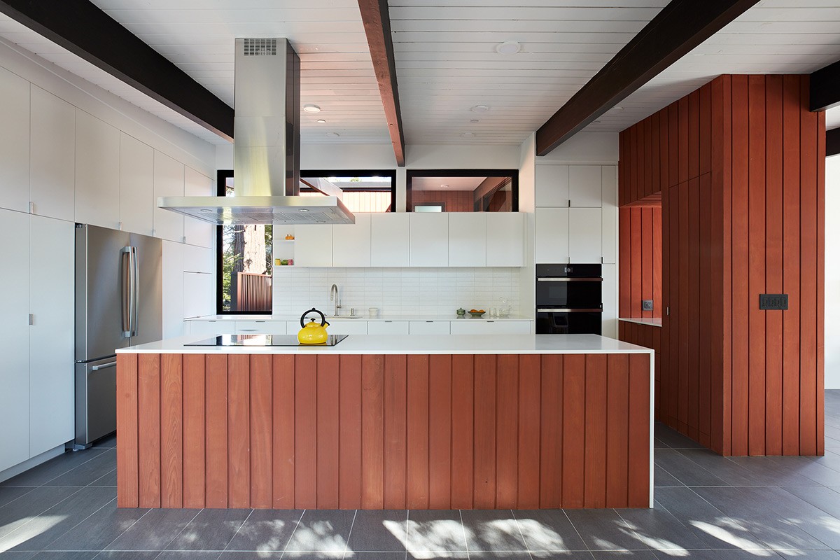
Use wood cladding to unite a kitchen island with a nearby feature wall.
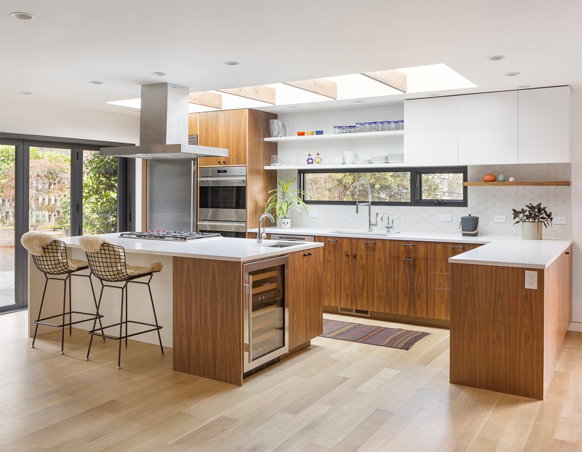
Employ colourful kitchen accessories to add a burst of life to the room, displayed on a simple white shelf.
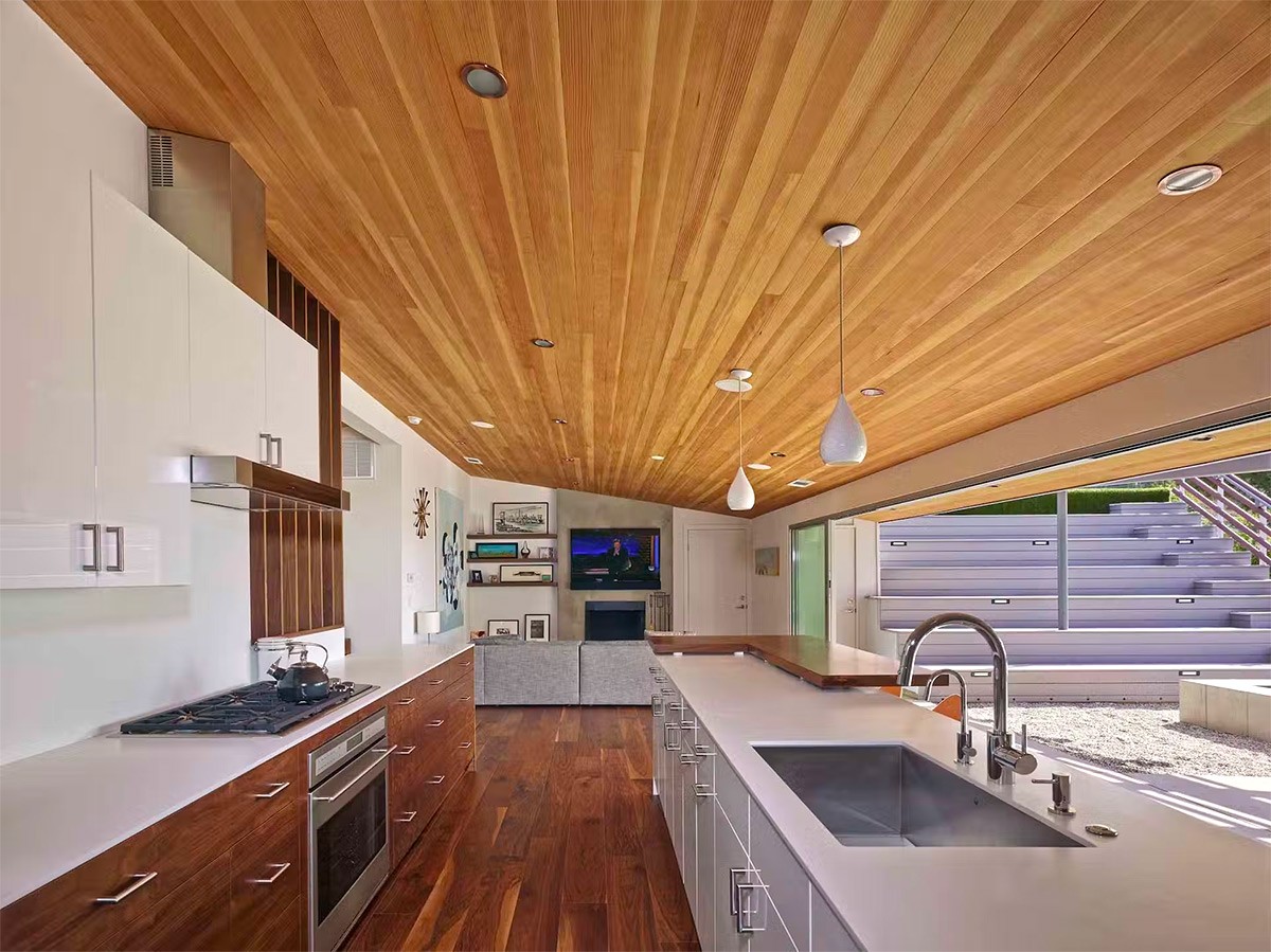
Don’t shy away from wood-clad treatment on a low ceiling. Create a cosy cocoon.
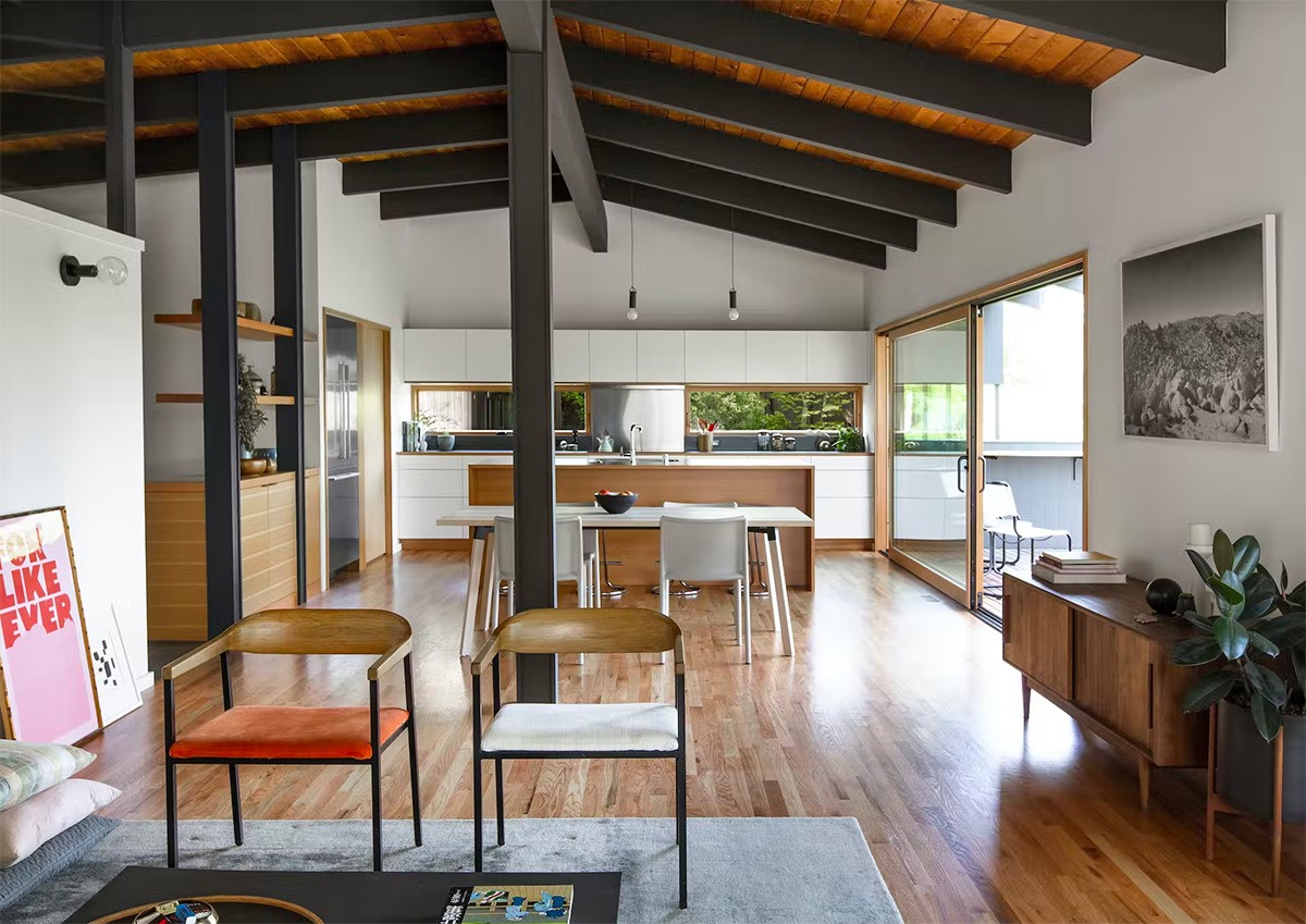
You can even squeeze wood cladding between ceiling beams.
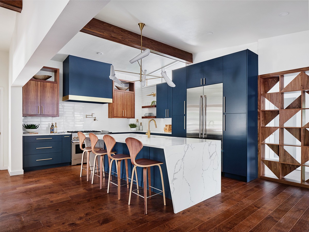
In this concept, Cherner stools complement a bold geometric unit design.
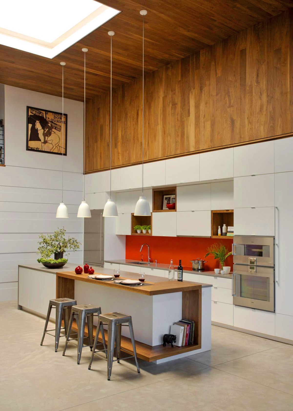
Create a waterfall effect by continuing wood ceiling cladding onto the upper part of a feature wall.
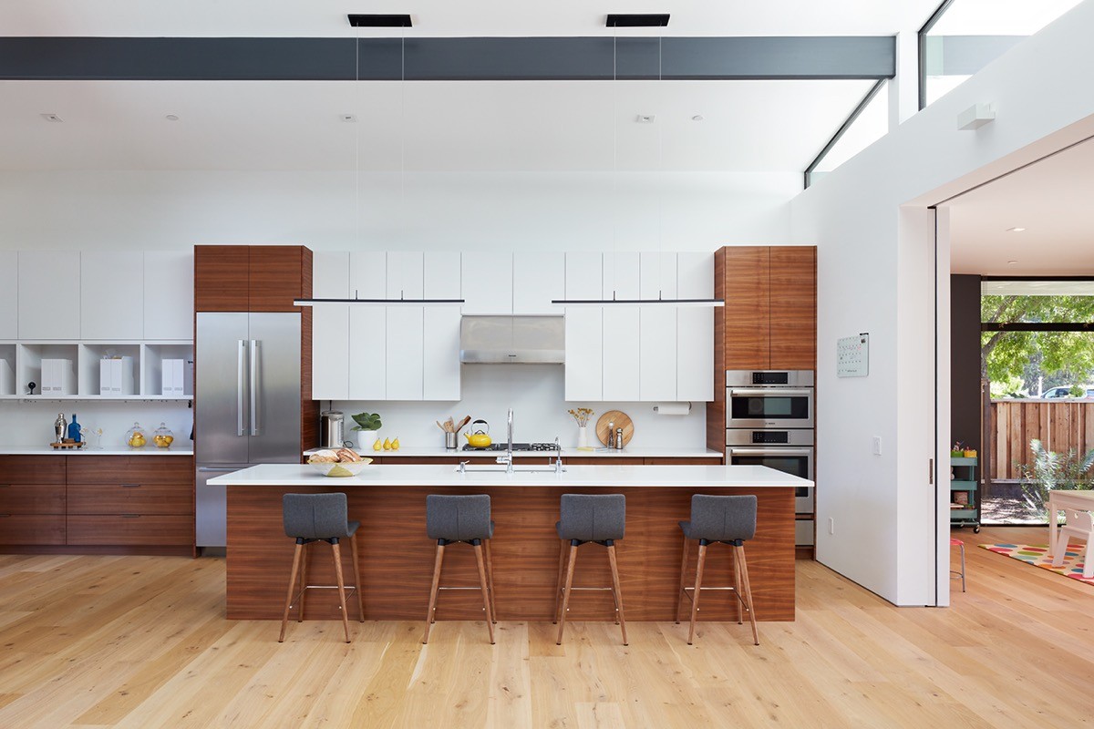
Turn wood grain on the horizontal plain to create a wider looking kitchen aesthetic.
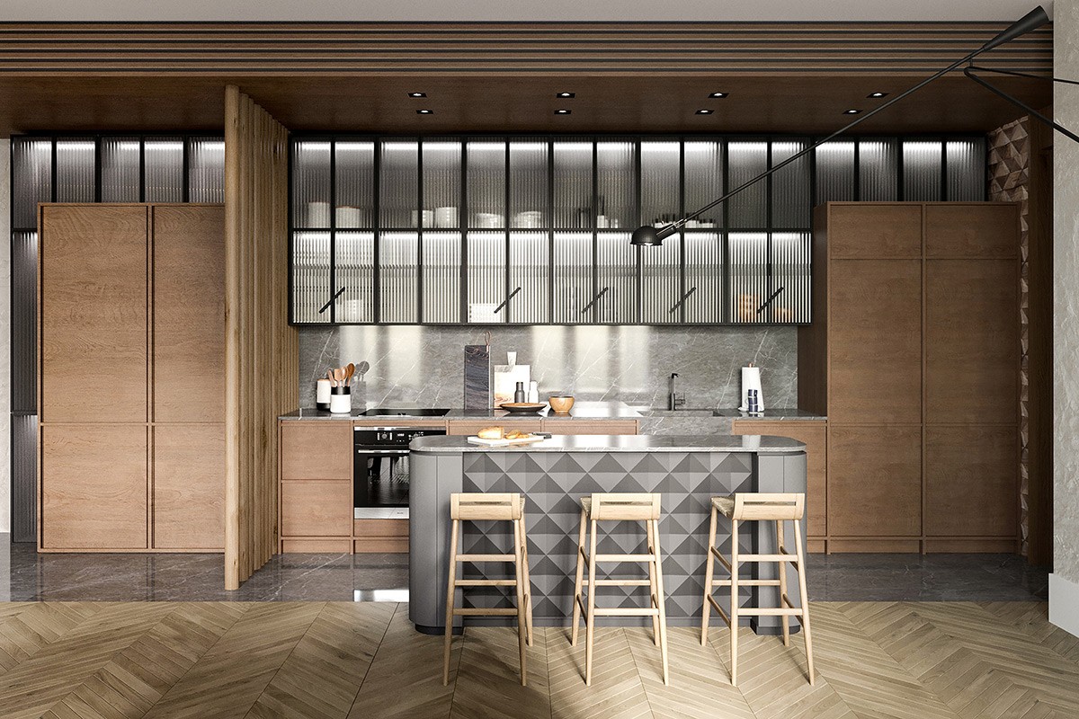
Fashion a geometric island facia.
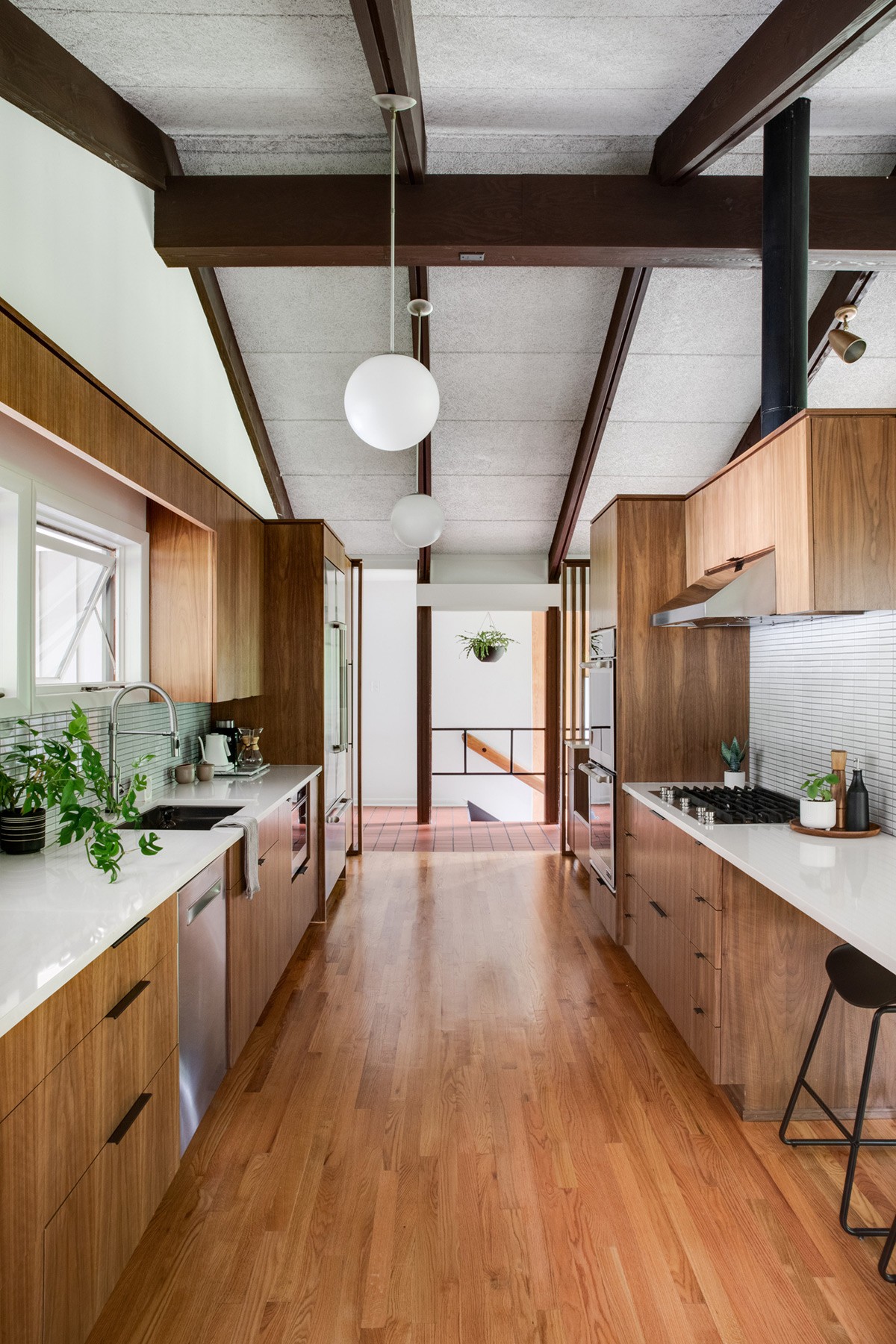
When worktops are already full with plants, use hanging baskets to drop in more.
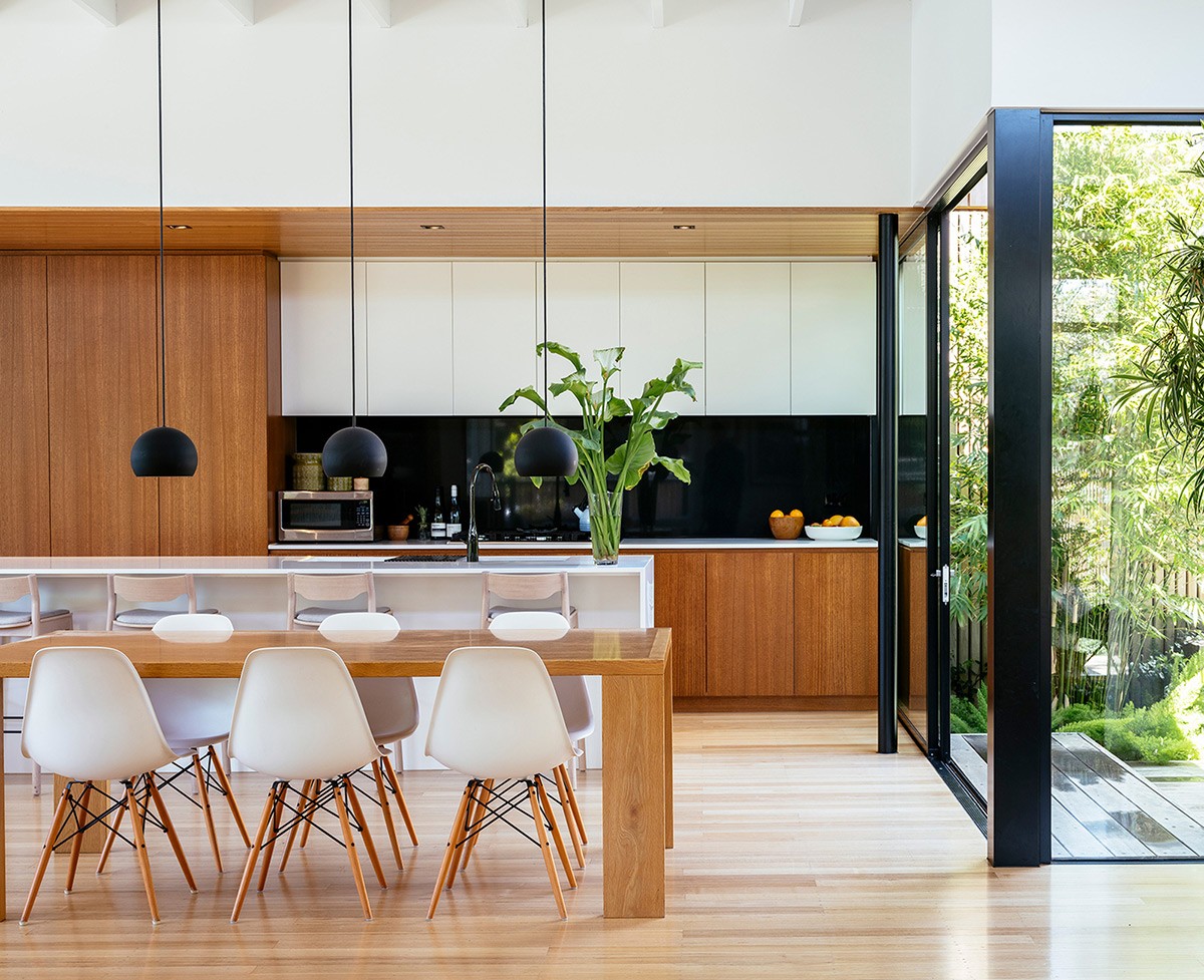
Combine a mid century modern inspired kitchen design with contemporary black window and door frames to build stark contrast.
