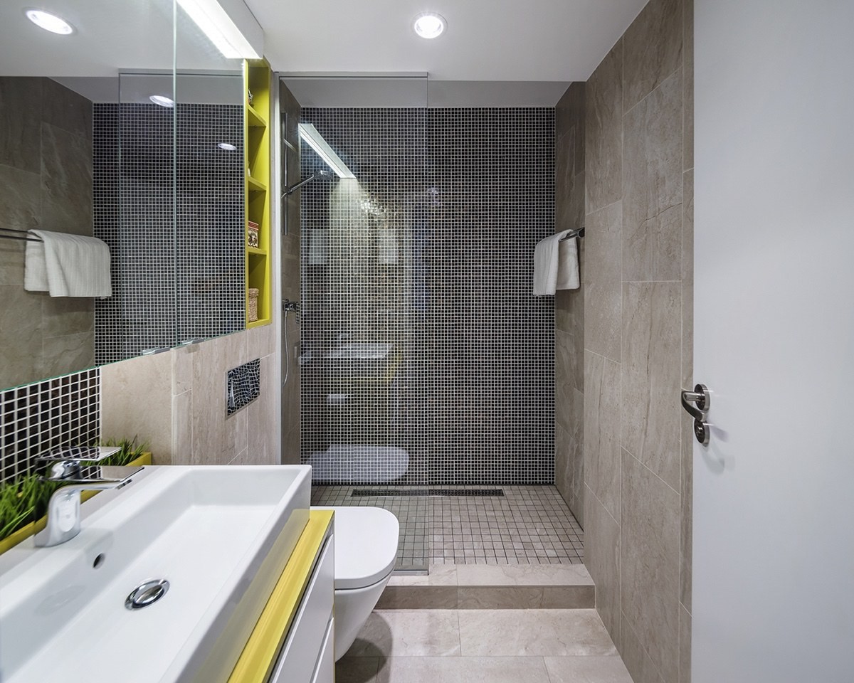
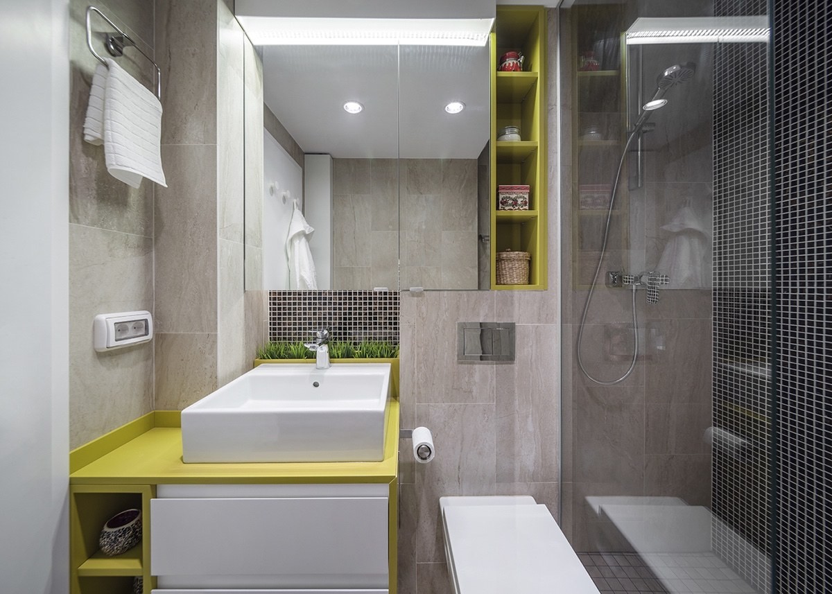
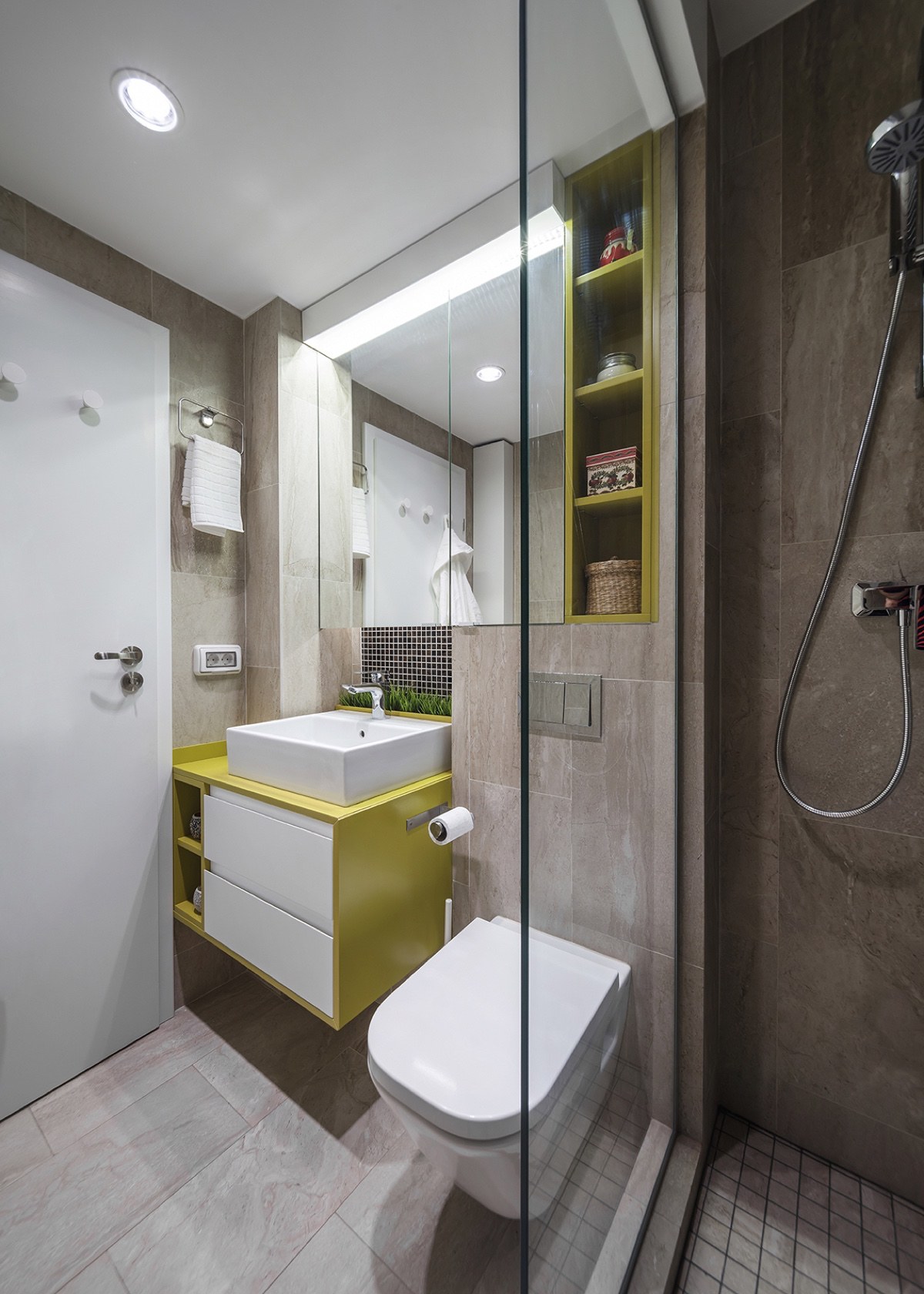
Located in Bucharest, this compact 1-bedroom apartment makes the most of its 55 square meter floor plan with smart organization and unique layout choices – all without forgetting to infuse the design with color, fun, and whimsy. This inspiring space is the work of the talented creatives at CRAFTR AAIM, a Bucharest-based design office whose philosophy emphasizes efficiency and timeless appeal, two goals that play a huge role in what makes this apartment noteworthy. From kitchen chalkboards to combination office/guest bedroom combos, there are plenty of interesting features to admire.
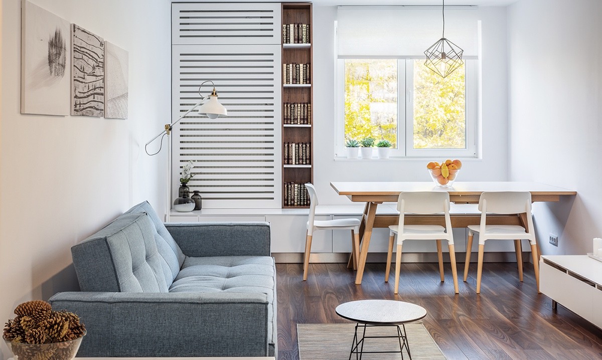
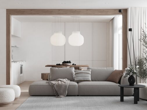
The tour opens with a look at the attractive yet compact open living space. While many layout options could have worked, this one adopts a rather unconventional choice by putting the dining table near the window rather than near the kitchen.
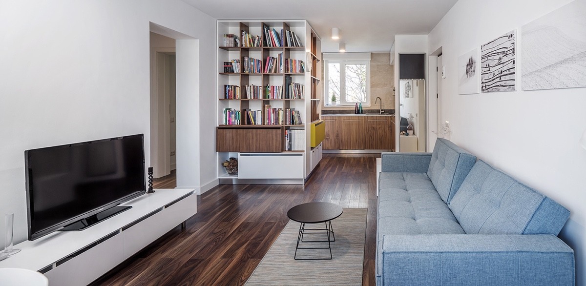
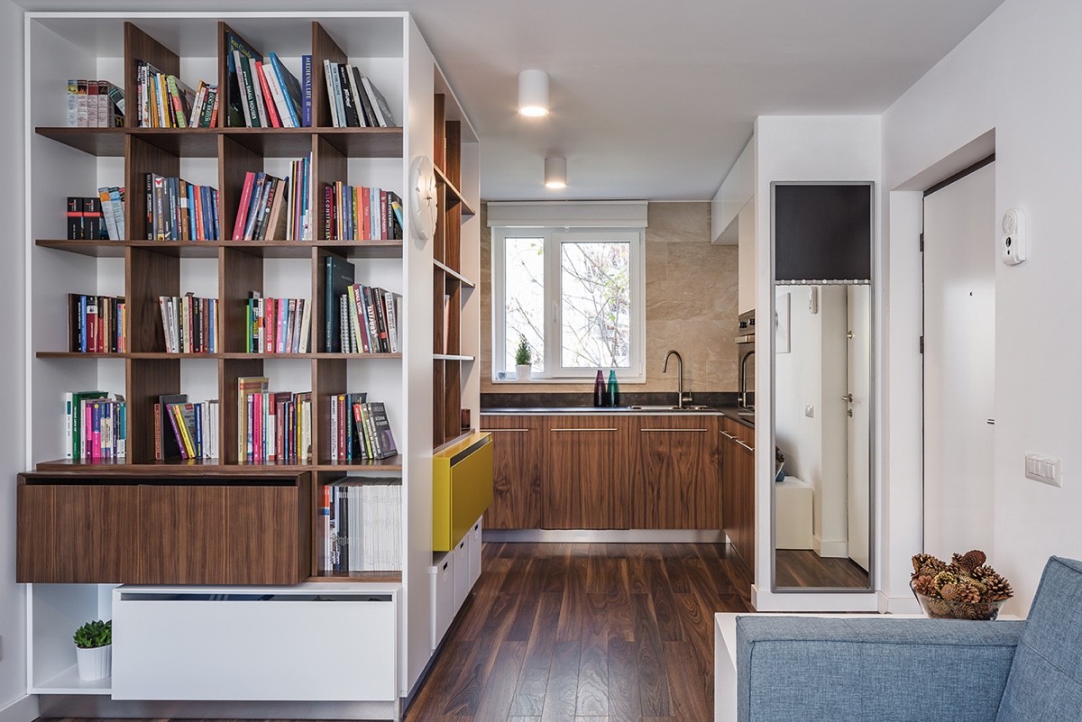
Low-profile furniture keeps the space feeling open and light, with a minimalist TV stand matched to the height of the sofa. On the other side of the living room, the kitchen feels like its own distinct space thanks to the expansive storage unit that stands in between.
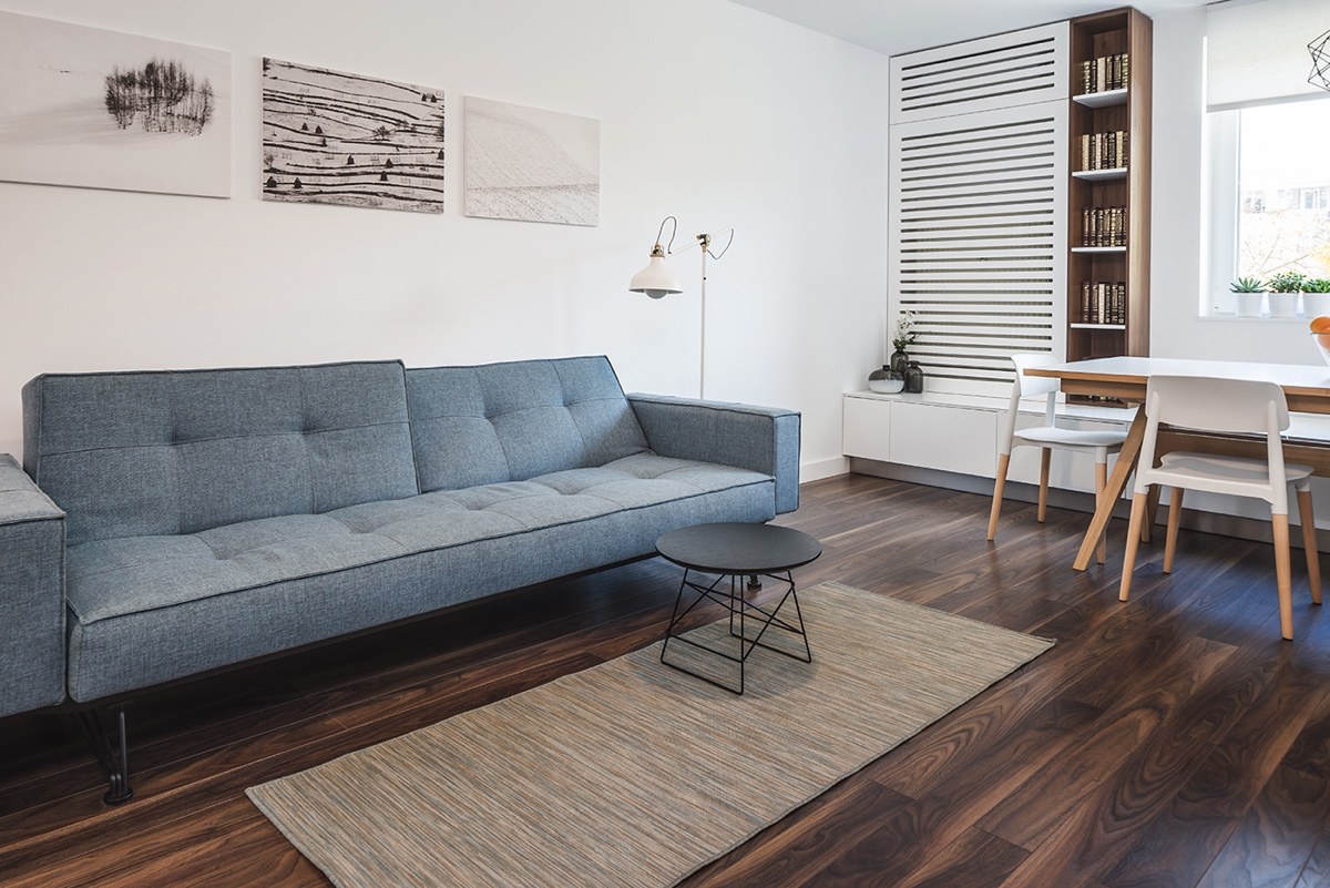
In terms of decor, this home combines modern and mid-century elements. The sofa's low-profile form is a wonderful complement to the low cabinets near the window.
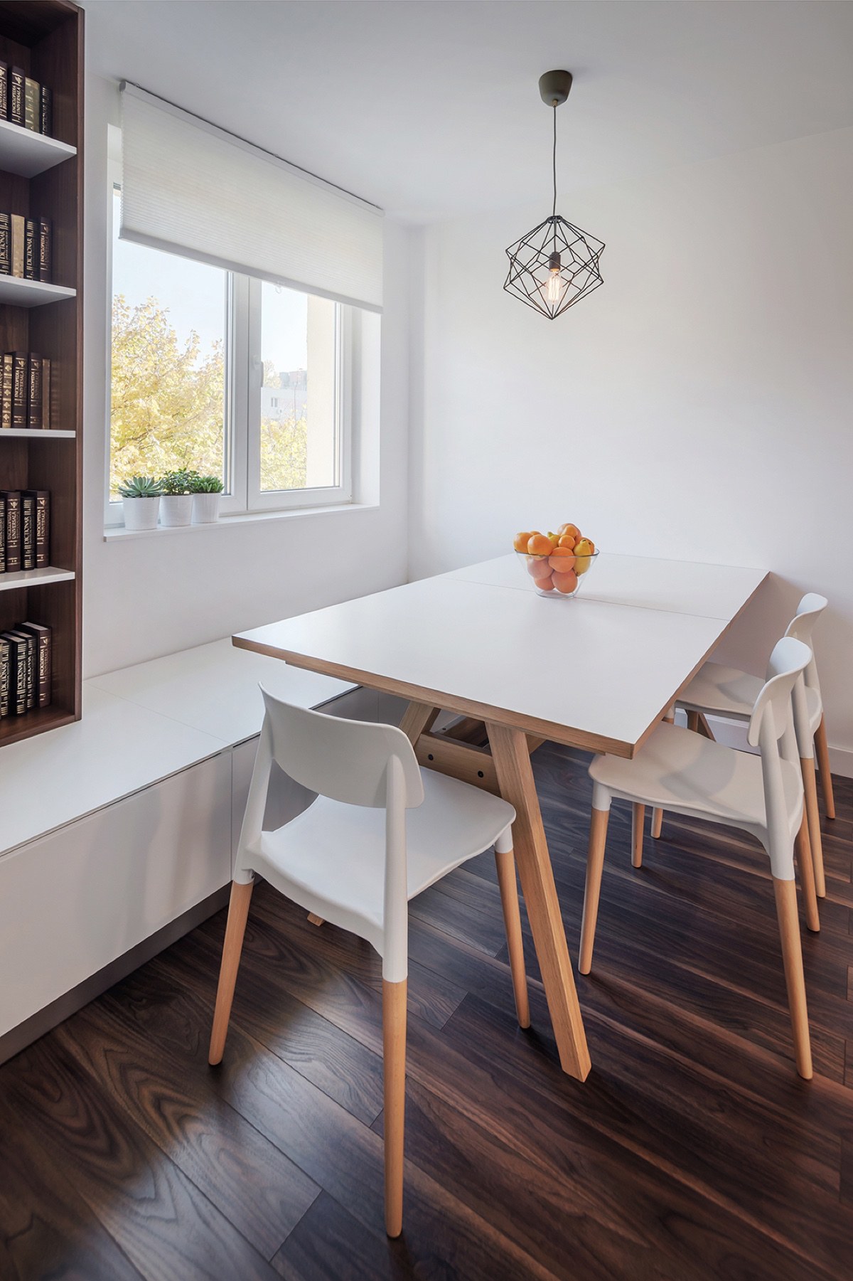
Because it's a relatively small open layout living room, this table solution proves very versatile – the window area doubles as extra seating but the residents could pull the table out for formal dinners when needed.
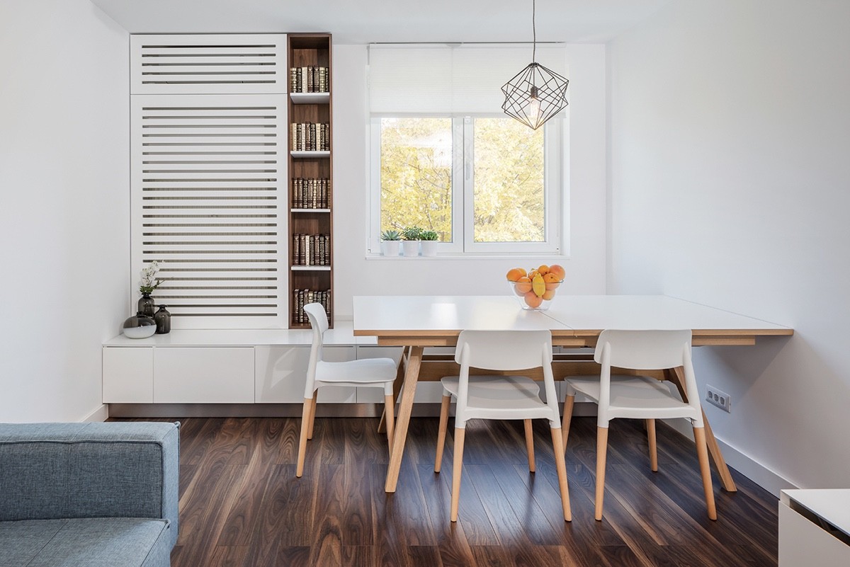
While the designer could have easily chosen a more minimalistic table (a common choice in compact areas) this one enjoys the best of both worlds by combining simple materials for decorative effect.
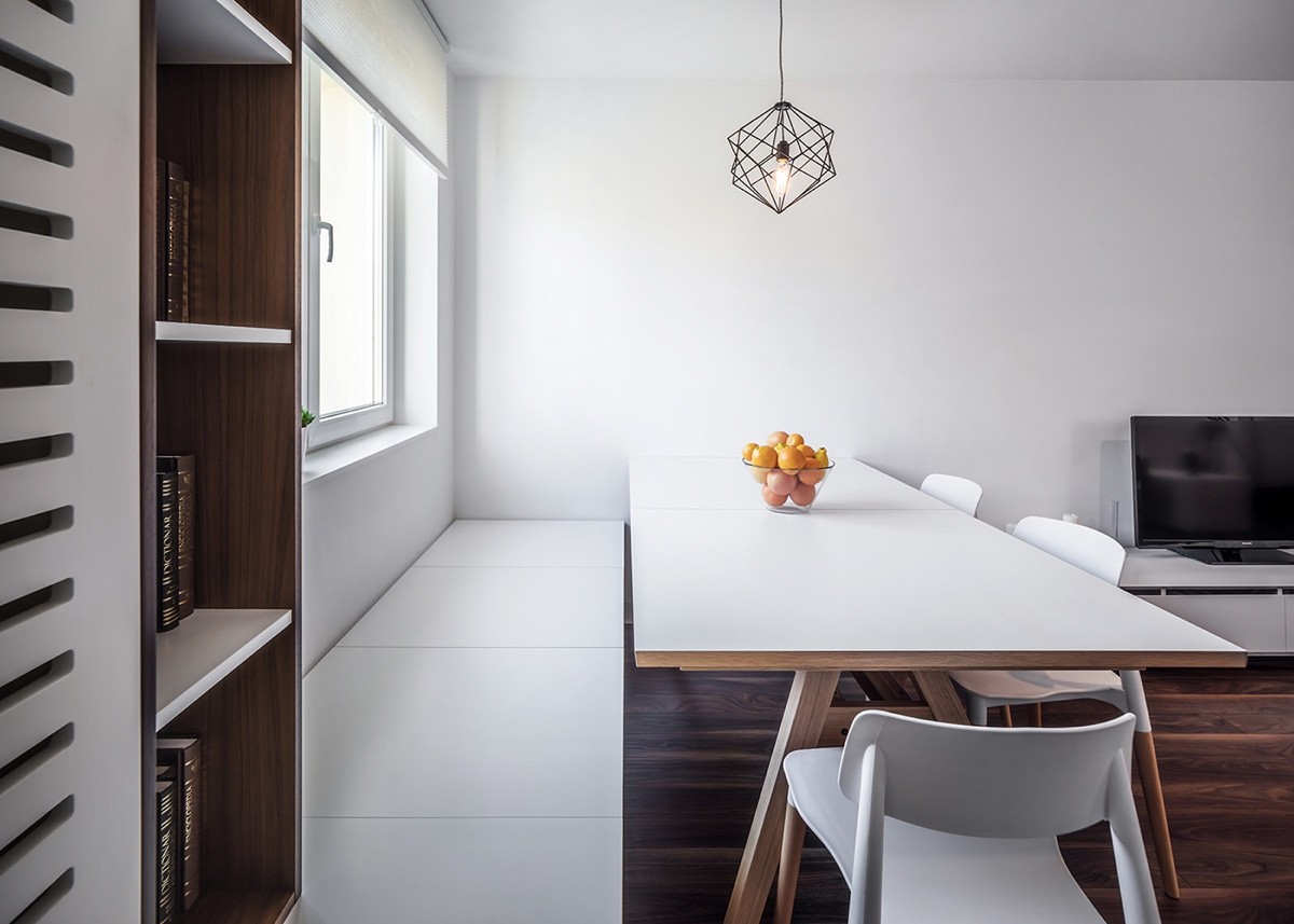
One small window might not seem like enough light for a space this large, especially considering the dark floors but the abundance of white surfaces helps preserve as much light as possible.
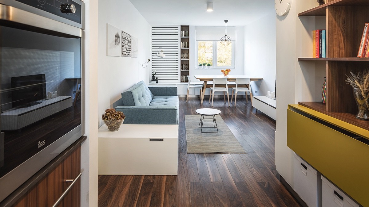
The extra storage can hold cookbooks, decorations, and even includes drawers and storage boxes for spare dishes or large cookware. This type of addition frees up so much space in the rest of the home.
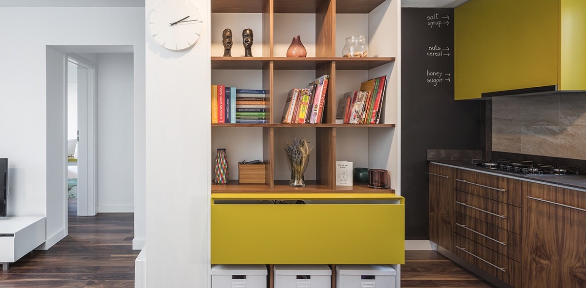
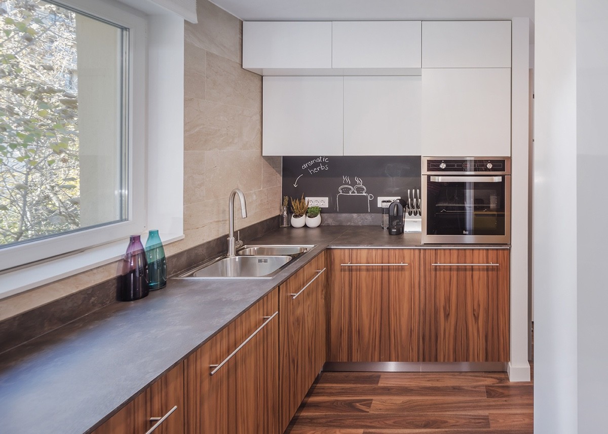
Bright yellow accents bring retro charm to the kitchen. The other cabinets use the same richly grained wood as the floorboards for a nice cohesive look. While the living room emphasizes minimalism, the kitchen embraces a bold attitude.
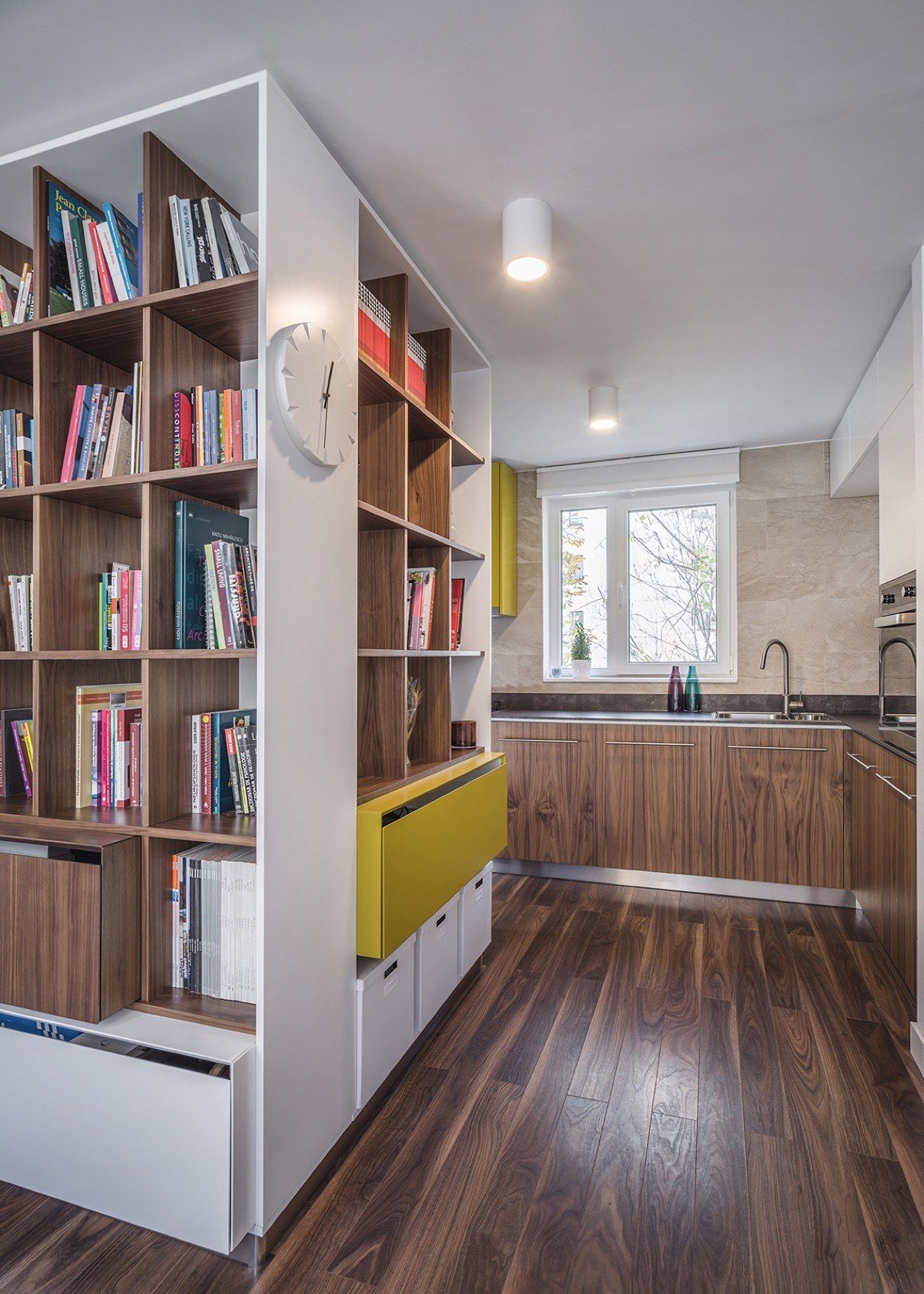
The unique looking wall clock is a neat addition that does the job without standing out too much. It offers the appeal of a mid century modern clock, designed in a sleek minimalist style to fit within modern homes.
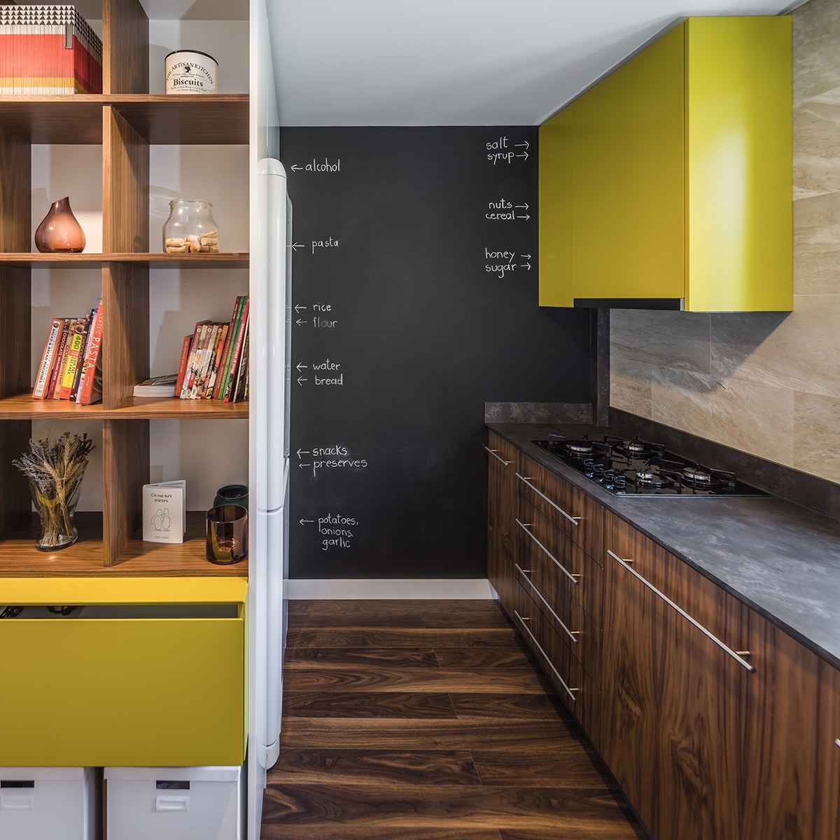
Everybody loves chalkboard walls. This one takes an approach that differs from the ordinary recipes or shopping lists by pointing out the location of ingredients much like an oversized label.
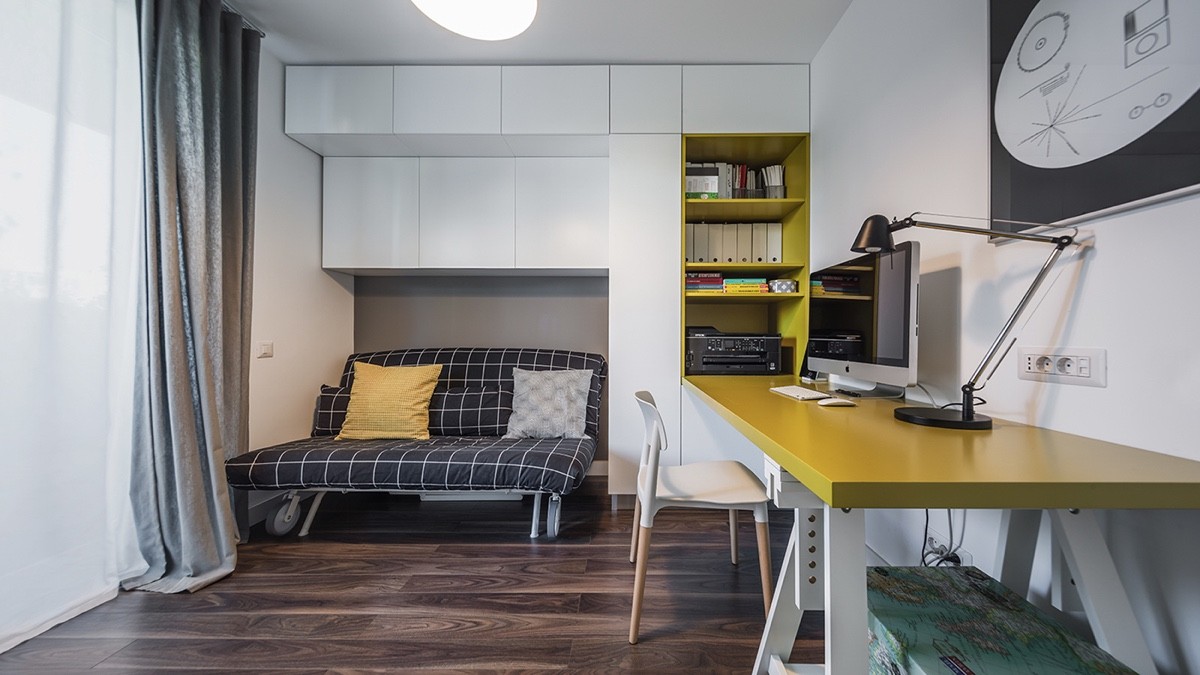
Elsewhere, the office is small but retains enough floor space to double as a guest bedroom thanks to its abundant storage and space-saving techniques. It uses the same dandelion yellow as the kitchen.
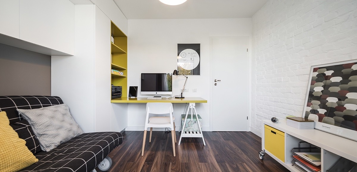
Most of the furniture – including the bed and the sideboard – have wheels for easy reconfiguration. If the resident wanted to use this room for a large project, it wouldn't be too difficult to get things out of the way.
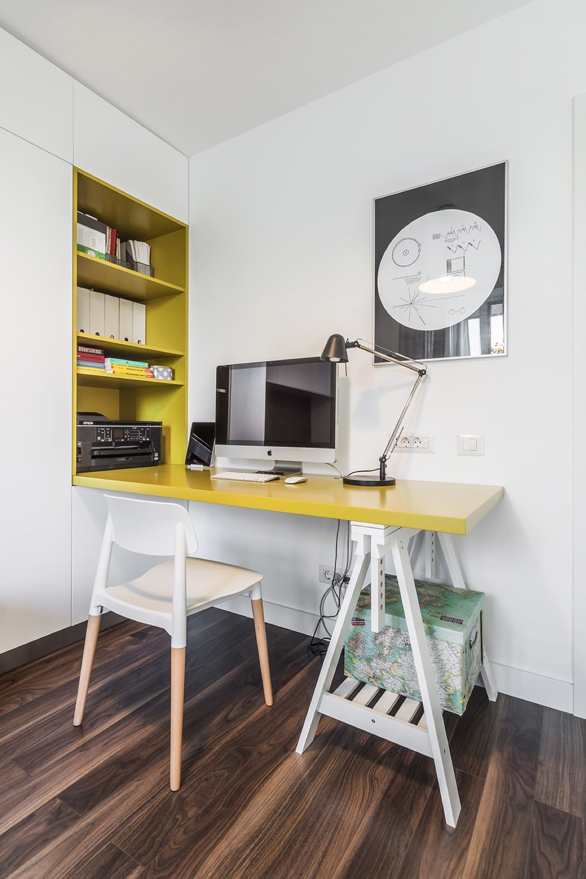
The desk is just too cute! Its anchored to the wall on one side and uses a small sawhorse-shaped structure to support the other. The map-printed box offers a great alternative to the cabinets an ordinary desk would use.
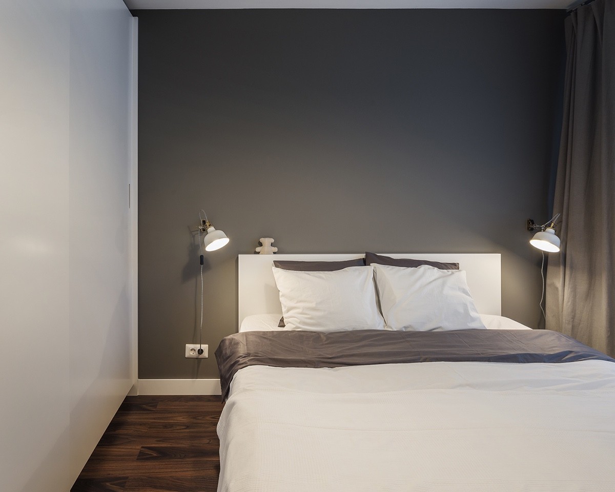
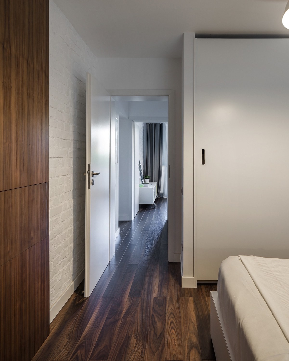
In the master bedroom, subdued colors and simple fixtures create an environment very conducive to relaxation. The difference between this space and the energetic office is night and day.
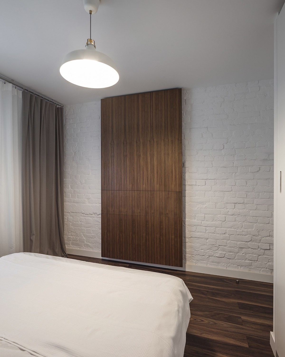
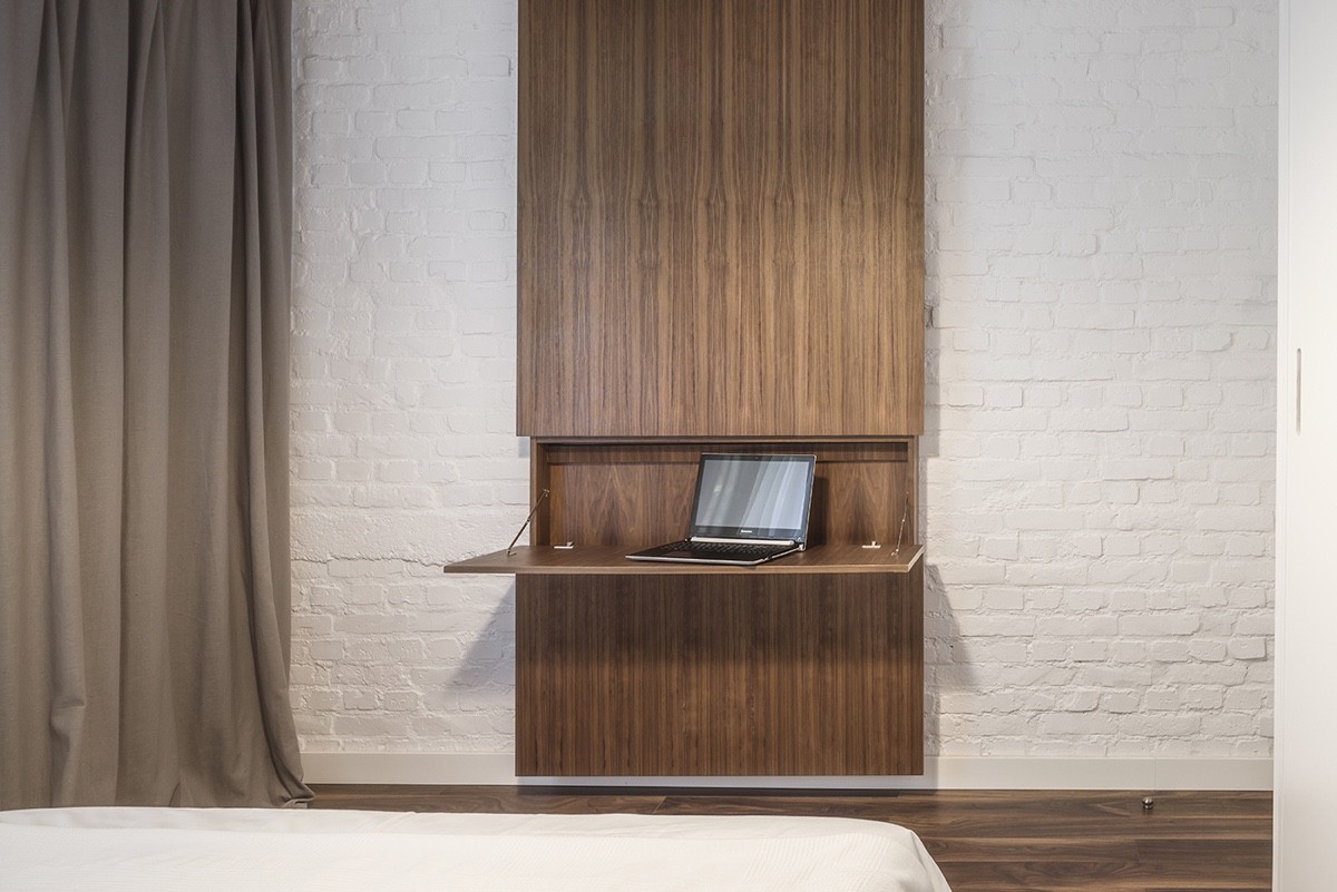
Exposed brick and rich dark wood both feel like very homey and comfortable choices for a space like this.
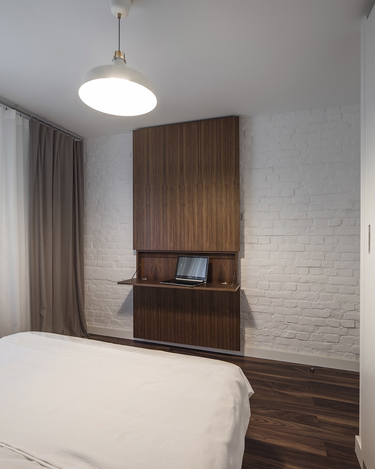
Check out this handy feature! What looks like a decorative panel unfolds to reveal a convenient little desk for light work or writing.

