When designing a functional kitchen, the ‘working triangle’ should be kept in mind - that is, the distance between your sink, stove and fridge. An L-shaped kitchen lends itself perfectly to this triangular tip, being two sides of a triangle to begin with. An L-shaped layout works best in small and medium sized spaces, which fly closer to the work triangle efficiency guideline of spreading workstations at no more than 1200mm apart. A great kitchen is not all about rules though, it’s equally about how that space feels and inspires you to create fabulous food. This collection brings ideas for cabinet placement, shelving designs, statement backsplashes, eating areas and more.
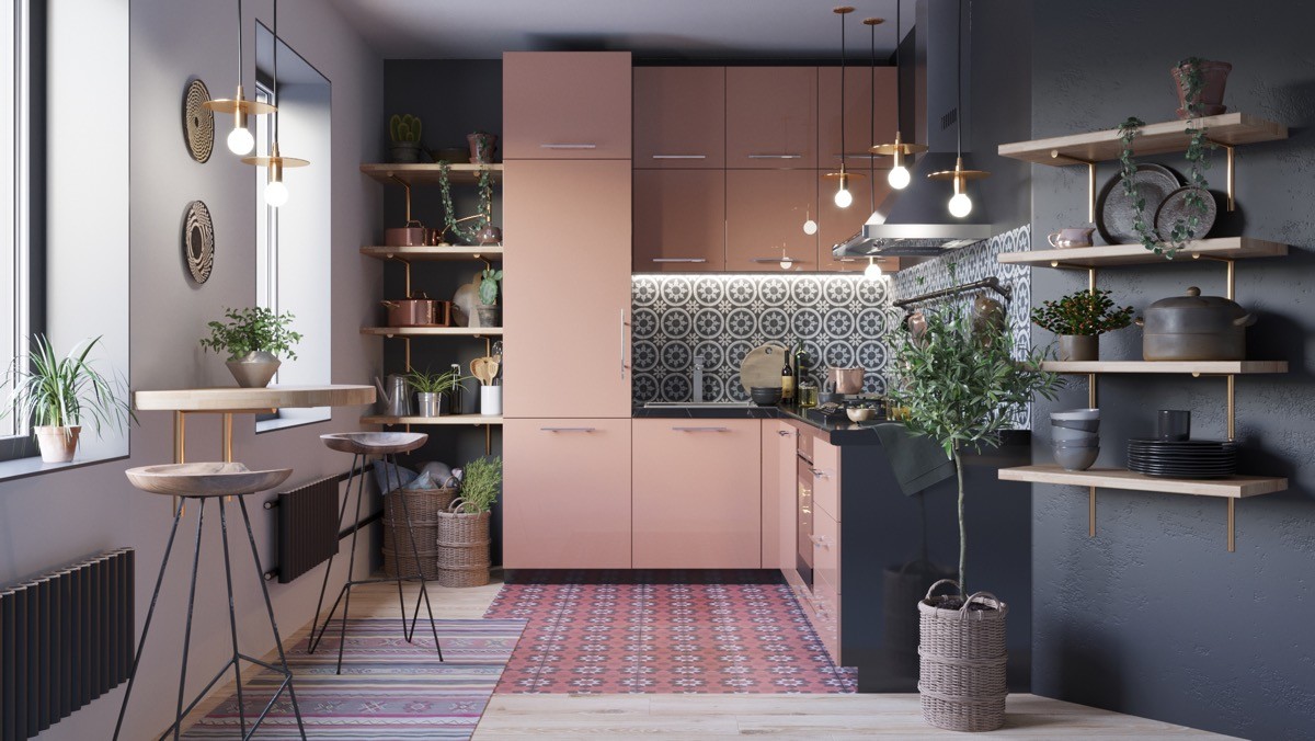
Busy, busy, busy. A heavily patterned backsplash and zoned flooring are the stars of the show in this colourful kitchen. A small semi-circular breakfast bar has been implemented at one side of the room to allow guests to socialise with the busy chef, and as a spot for a quick snack or early morning coffee.
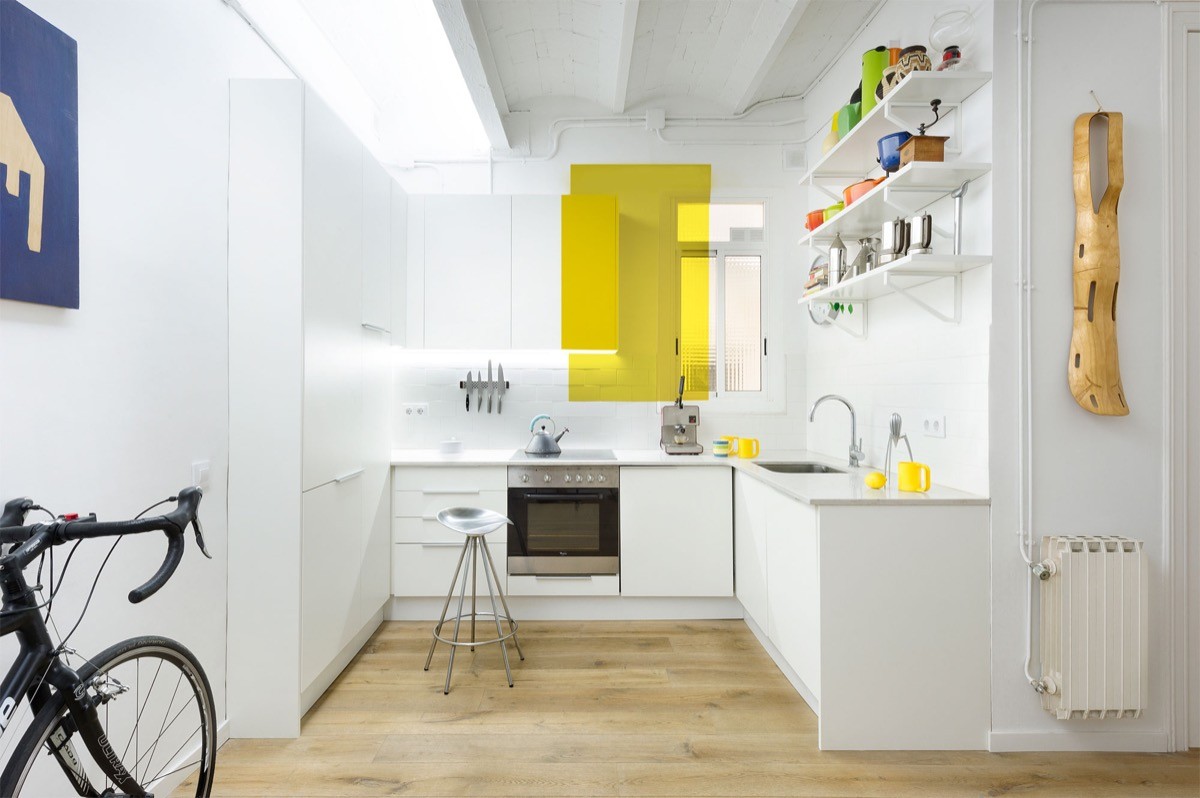
Block it out. This L-shaped kitchen layout with corner window is dominated by a colour block of solid yellow. The rectangle overlaps one half of a wall cabinet, and ends up across the window glass as coloured film. Yellow kitchen accessories complement the strong accent.
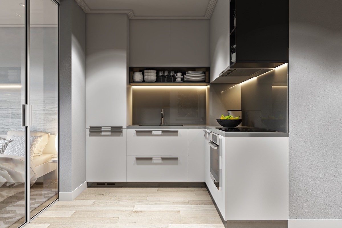
Implement striking design features to unite each arm of the kitchen. A black box shelf underlines wall cabinets on one wall of this kitchen, and another forms an end point to the line of pale cabinets on the other side.
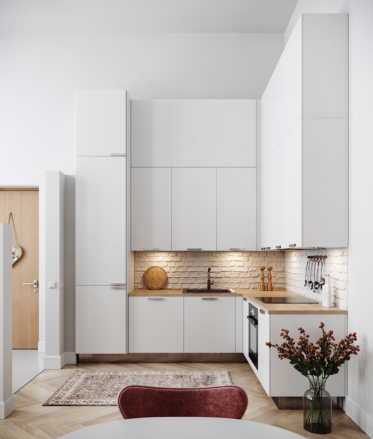
Make the space feel more rectangular by adding an area rug. Set a tall decorative vase of flowers down on the floor at the units’ end, to soften the look of the hard edge.
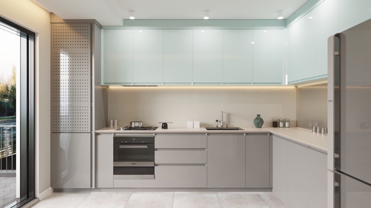
Whip out the sledgehammer - after seeking the advice of a professional! If budget allows, open up your disused kitchen wall to the great outdoors with some retractable doors. The increased natural light and perceived space will truly transform your kitchen.
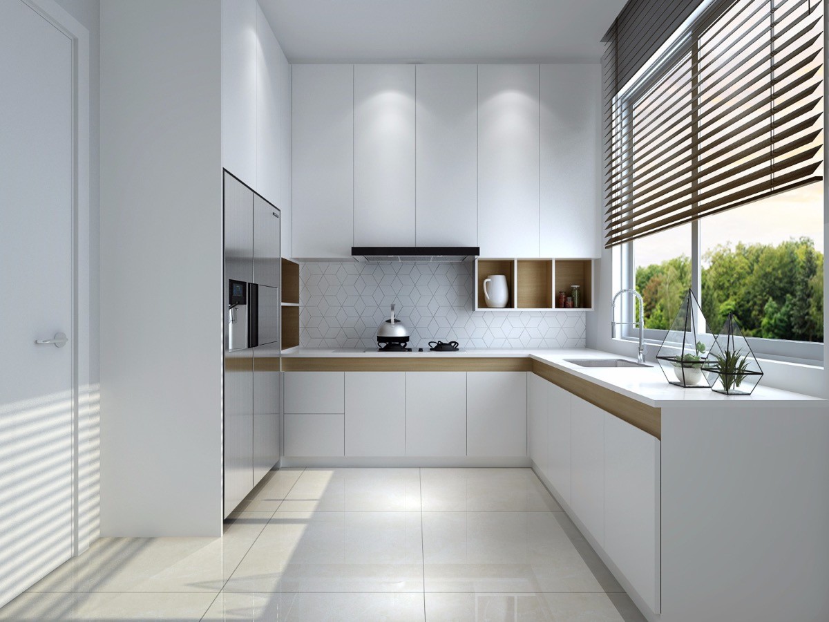
A large picture window looking out to the garden can be hugely satisfying too. Note how the venetian window blinds at this one are wooden to match the horizontal strip around the kitchen base cabinets. A couple of geometric succulent planters match the geo backsplash, and provide a perfect modern flourish.
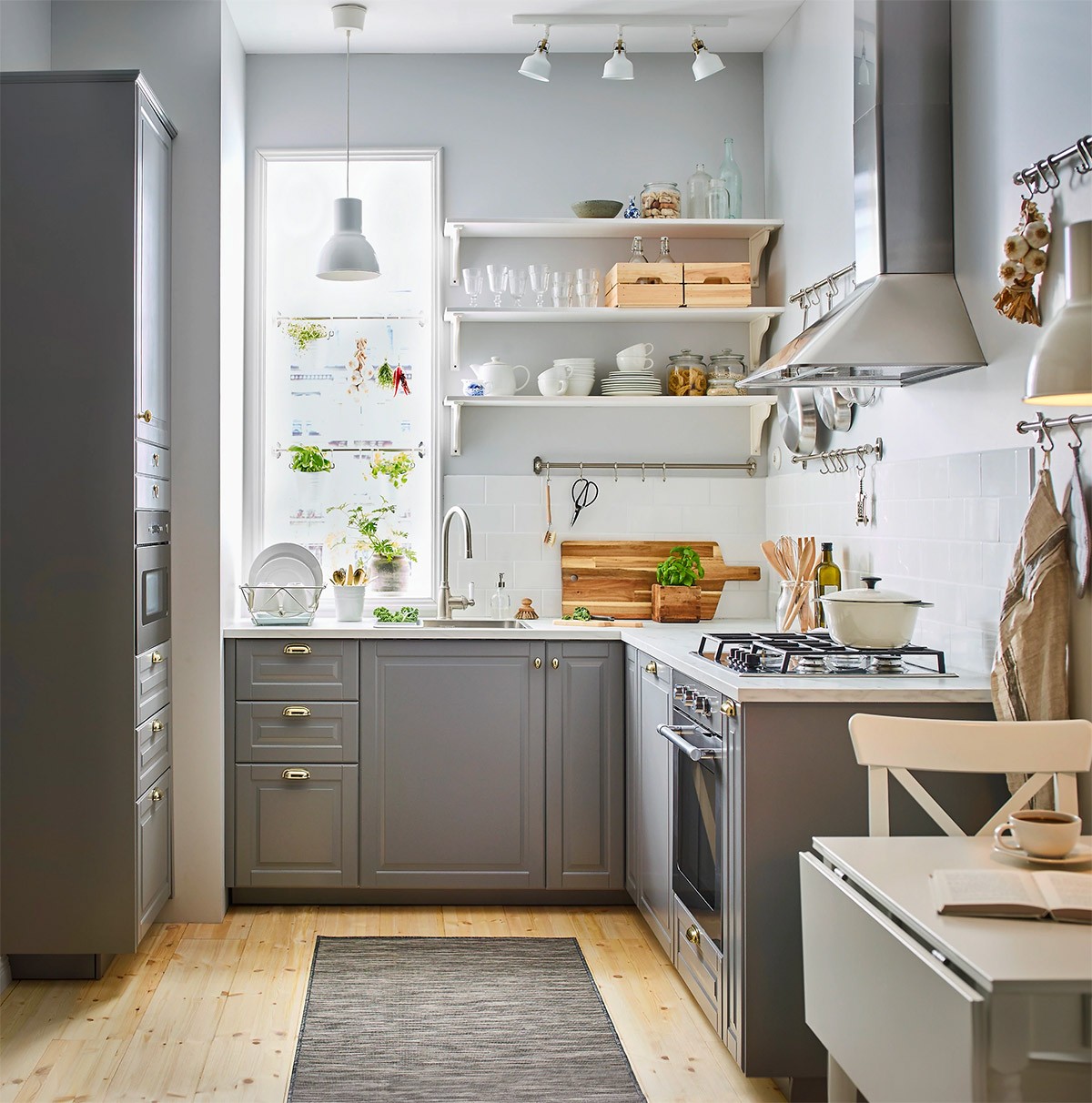
This sweet little grey kitchen is warmed up with gold cabinet handles and natural wood accessories. A table with a drop leaf makes a great addition to a small kitchen, allowing the eating space to be maximised or minimised in an instant.
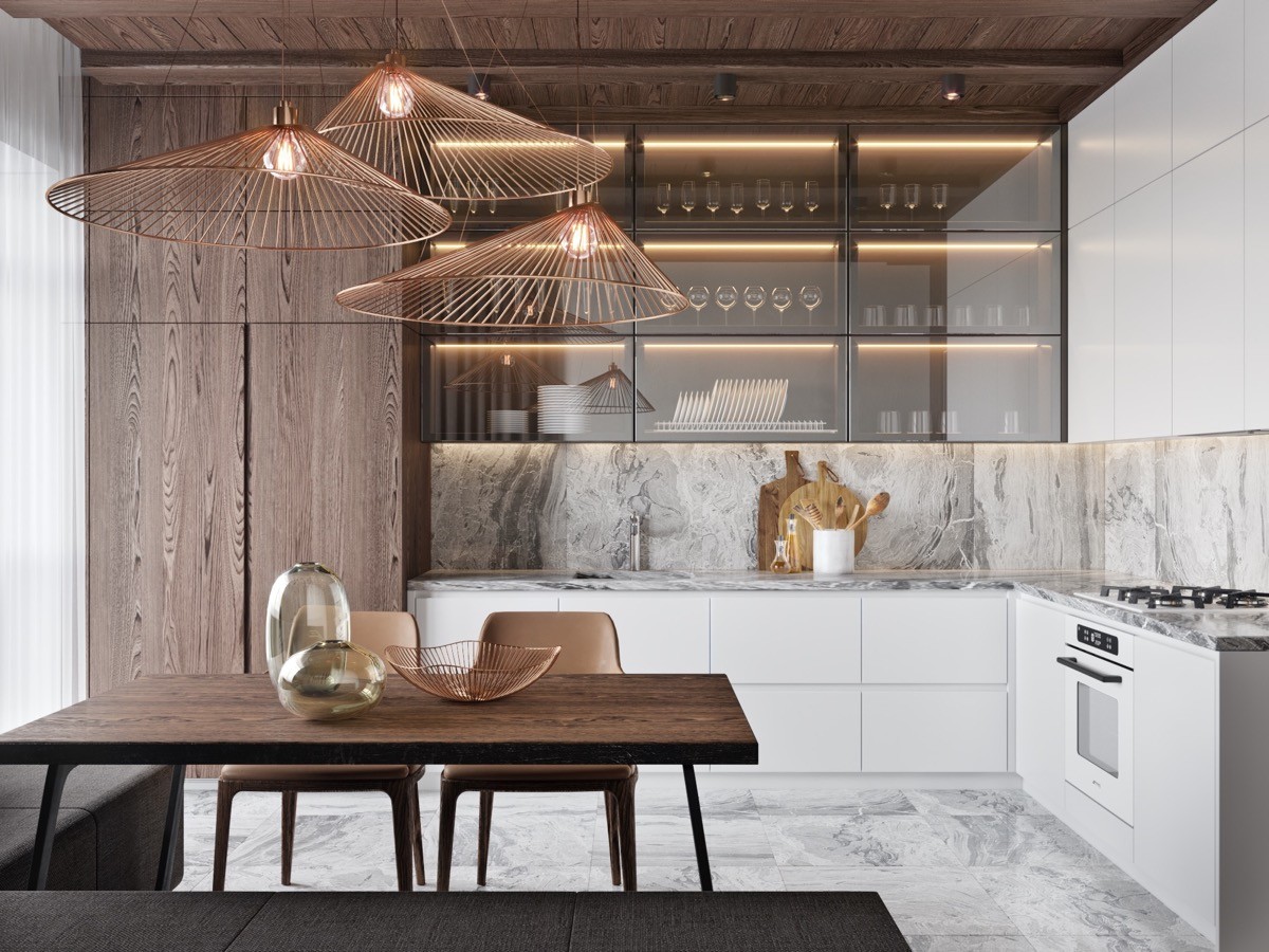
Focus on what makes you happy. wine glasses are the focal point in this home, highlighted by the glow of strip lights inside glass cases.
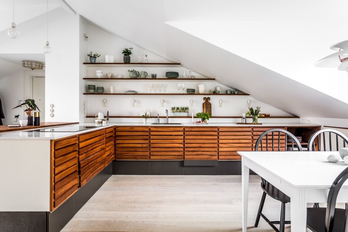
Cater to the space, and your budget. If monetary constraints don’t allow for the building of bespoke kitchen cabinets into eaves, then use up that awkward space by installing a wall of open kitchen shelving at waning lengths.
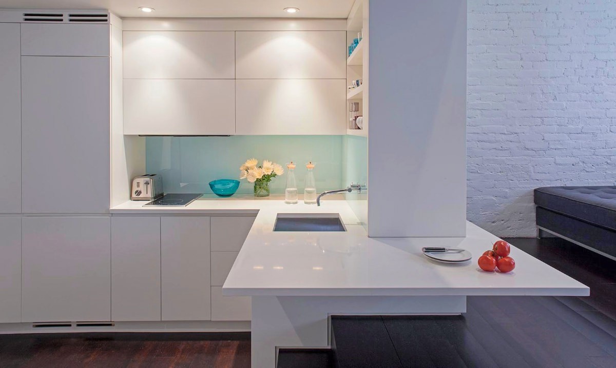
Fashion a peninsula around a challenging architecture.
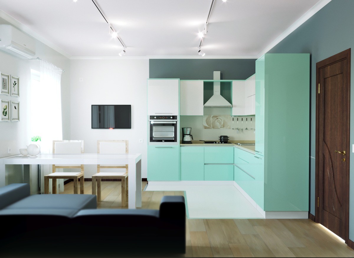
It’s not just the cabinets that follow an L-shape here, the flooring follows suit too.
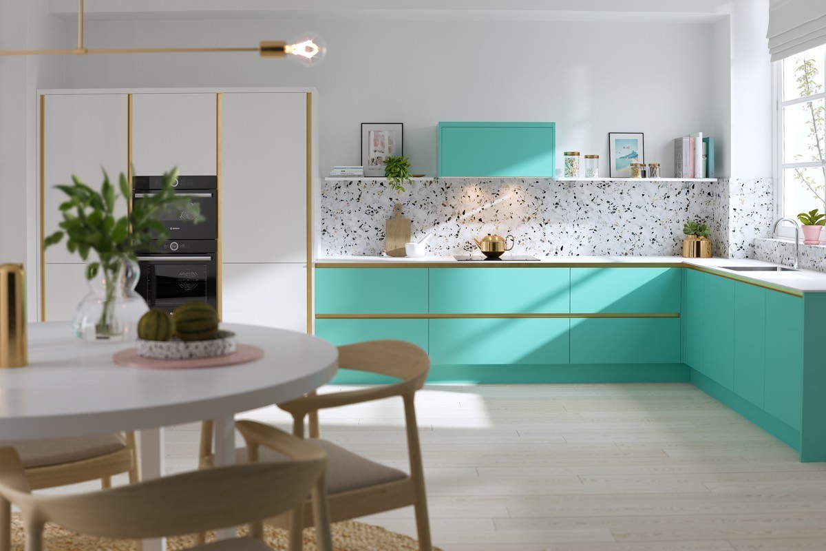
Choose larder units in one colour, with standard base and wall cabinets in another to break the look of a long wall.
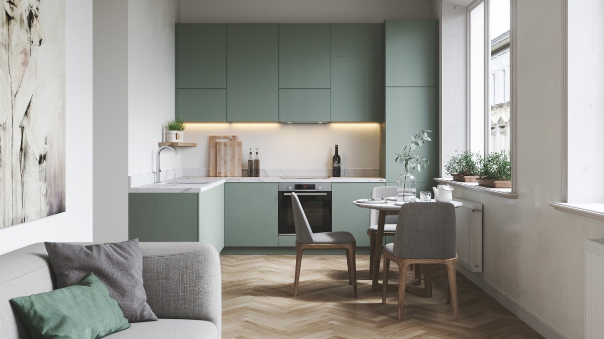
As L-shaped kitchens only use two walls, they naturally open up space. This is ideal for kitchens that flow into a living room or dining area.
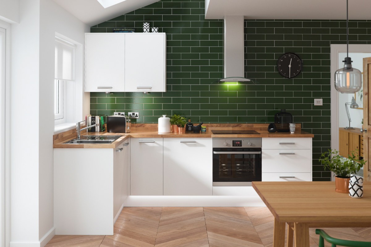
Find inspiration in tradition. Traditionally the kitchen sink was situated in front of a window, if one was available, like in this green kitchen. Although, in a modern age of dishwashers it doesn’t seem so important to always have the best view from here. A kitchen clock is another classic that’s been bumped. Digital oven displays and microwave clocks negate the need for analogue designs, however, they still make nice wall decoration.
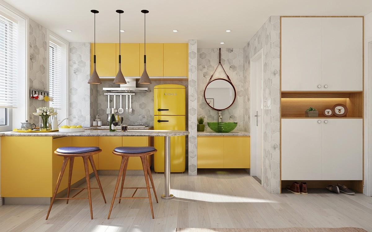
Colour coordinate. This yellow L-shaped kitchen with breakfast bar has a matching canary yellow fridge-freezer. The upholstered bar stools provide comfortable seating. If you like this then be sure to check out these other yellow kitchens.
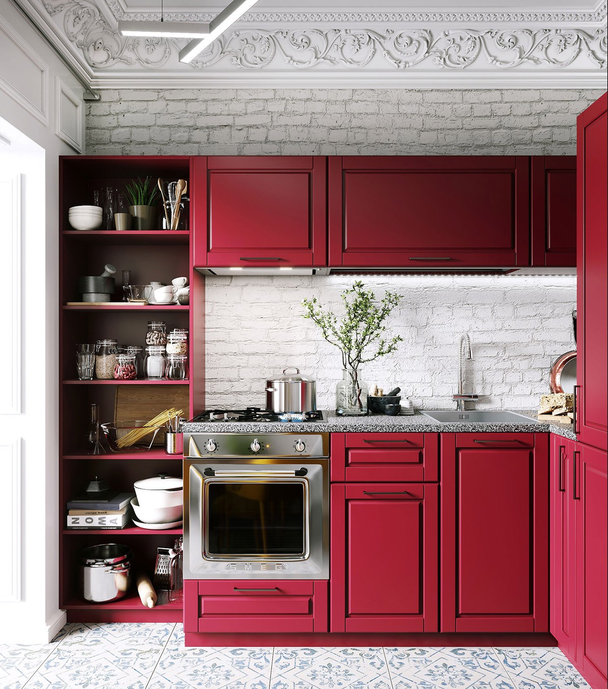
Include a corner pantry. This red kitchen has an open shelving unit filled with pantry supplies that are both useful and decorative.
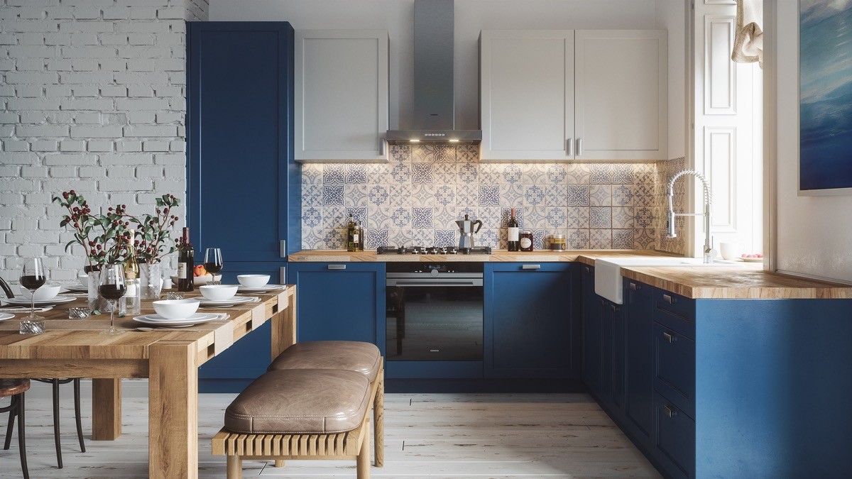
Dial away wall cabinets in a paler colour. Base units in rich colours work well when teamed with white or light upper cabinets, so as not to oversaturate a space.
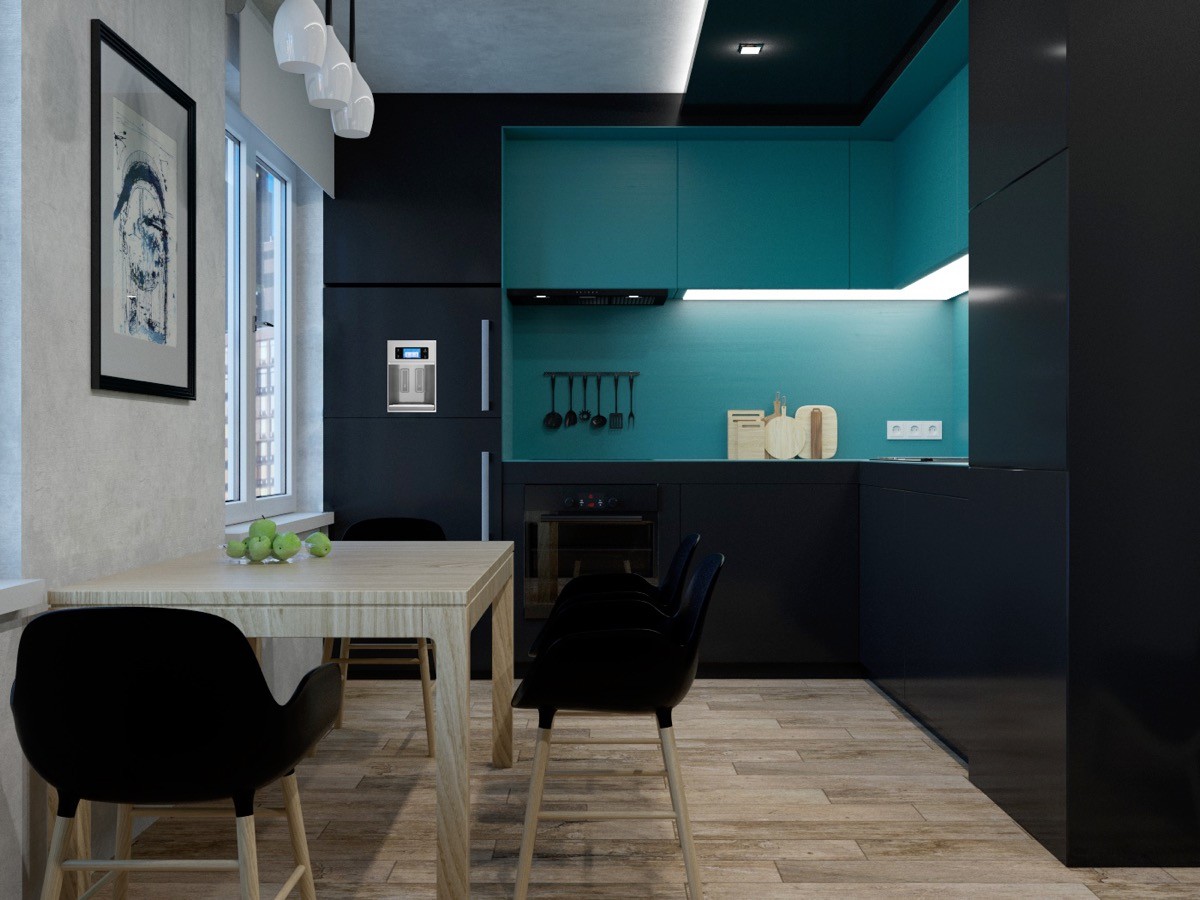
Use ceiling panels to deepen the layout. This dramatically dark kitchen has an equally dark ceiling extension, fitted with spotlights. The matching material across the ceiling gives the layout extra depth, whilst two-tone cabinets play with form.
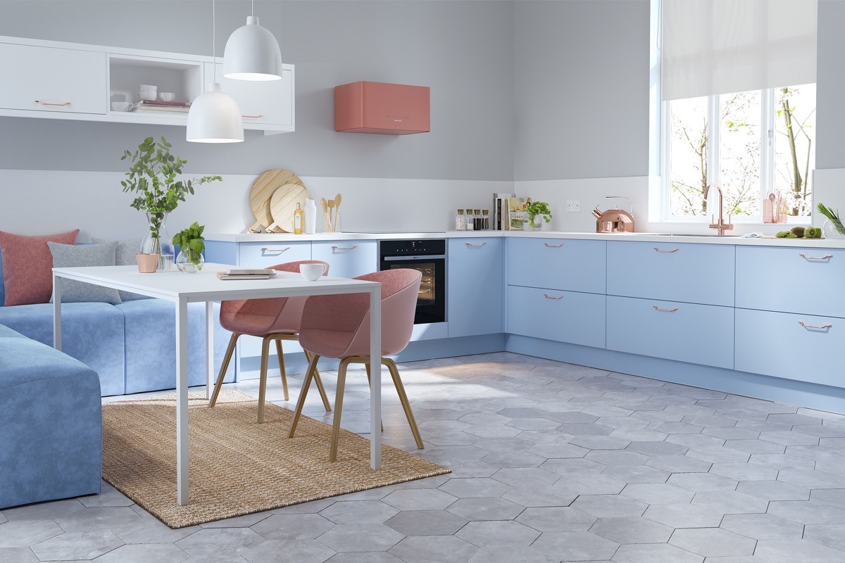
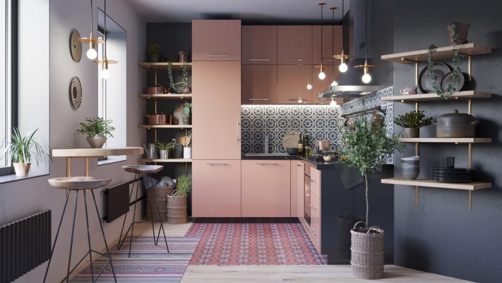
Powdery perfection. A flurry of blush pink accents and copper accessories speckle a perfect measure of contrast and warmth through powder blue decor.
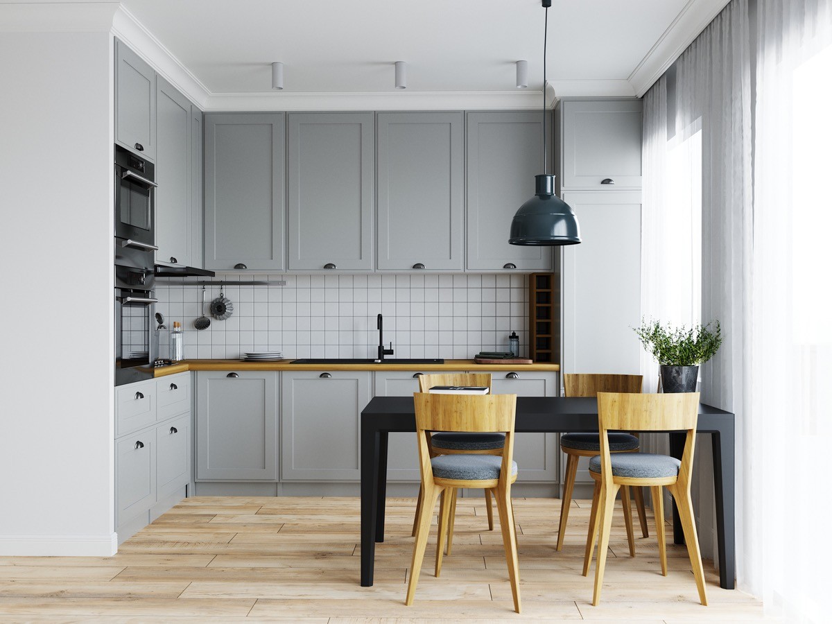
Golden honey toned wood additions and heavy black accents bring an entirely different feel to a light grey and white kitchen.
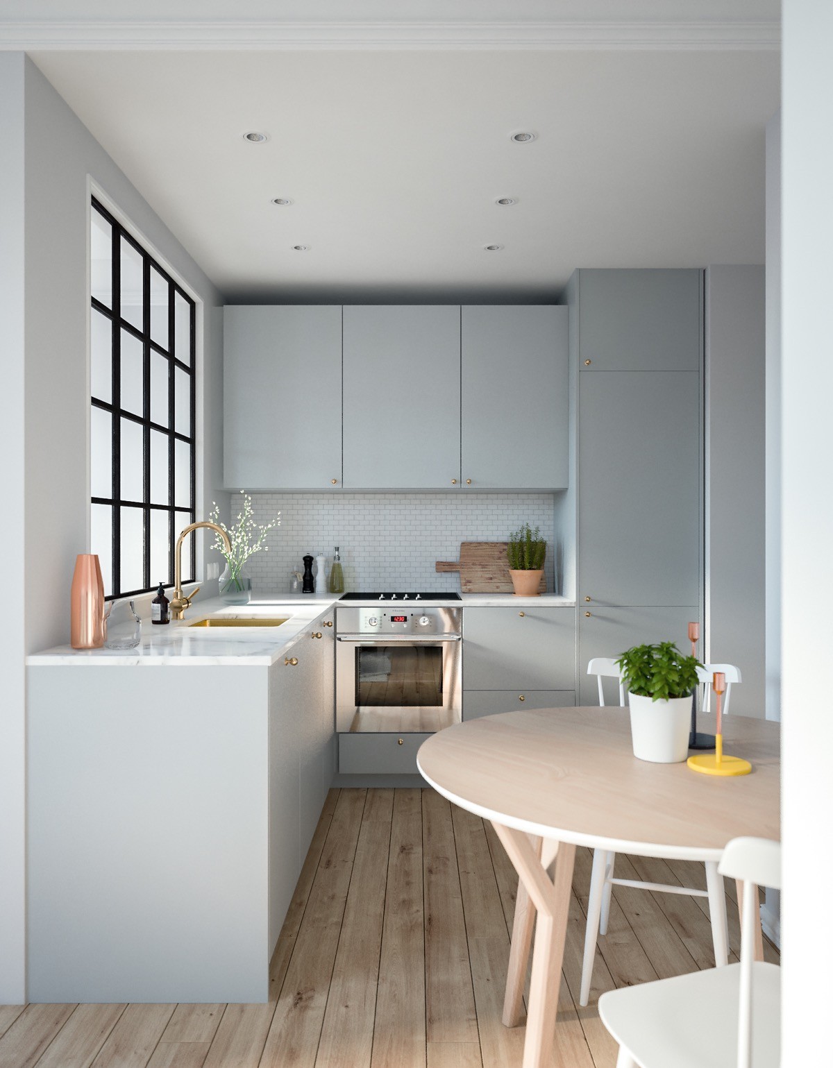
Make a metallic mixup. A gold faucet, a silver oven, a copper vase and candlesticks. Anything goes.
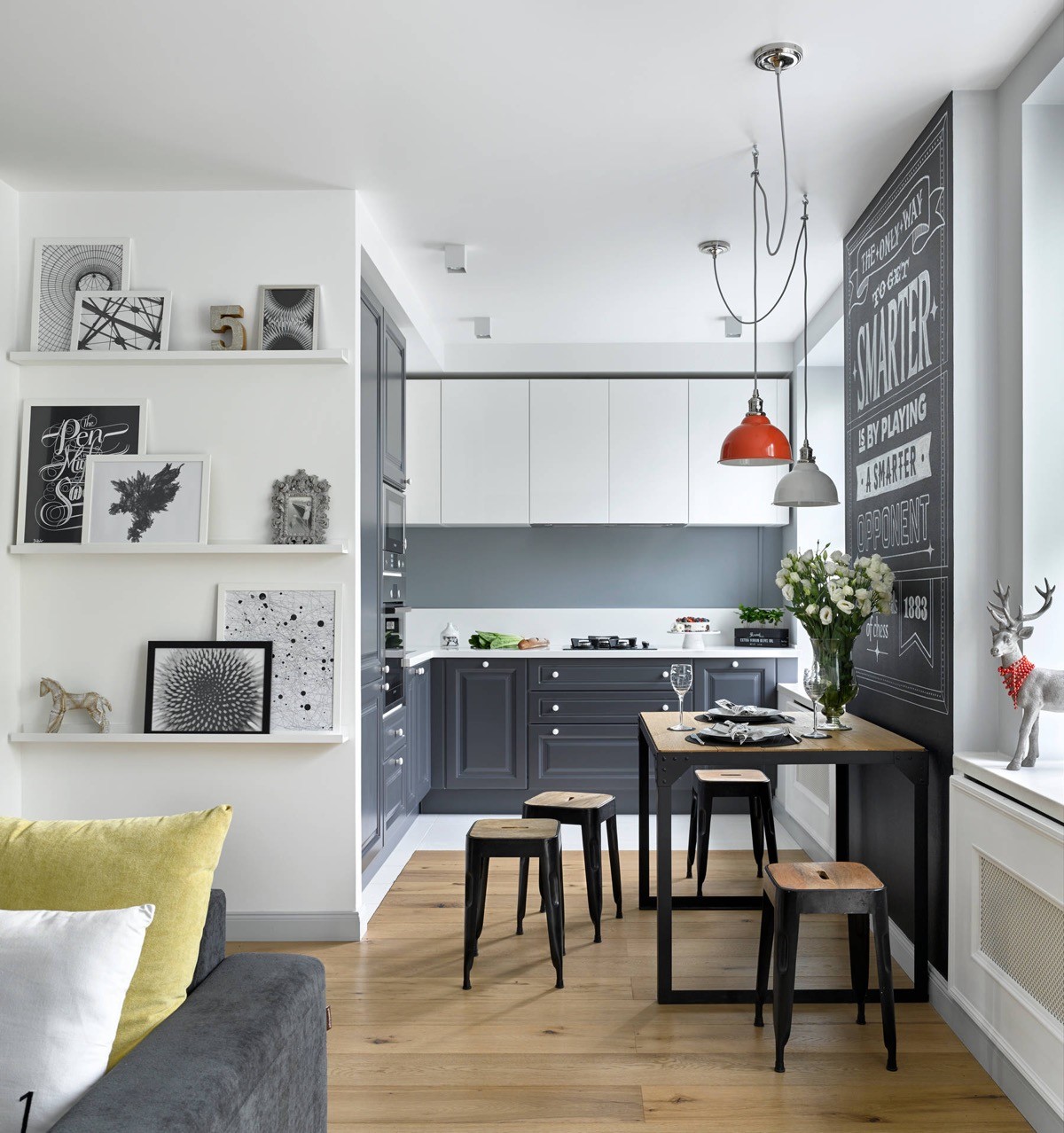
Jazz up the unused kitchen wall with some typographical art. It’s also a great way to mark up a side-slung dining spot.
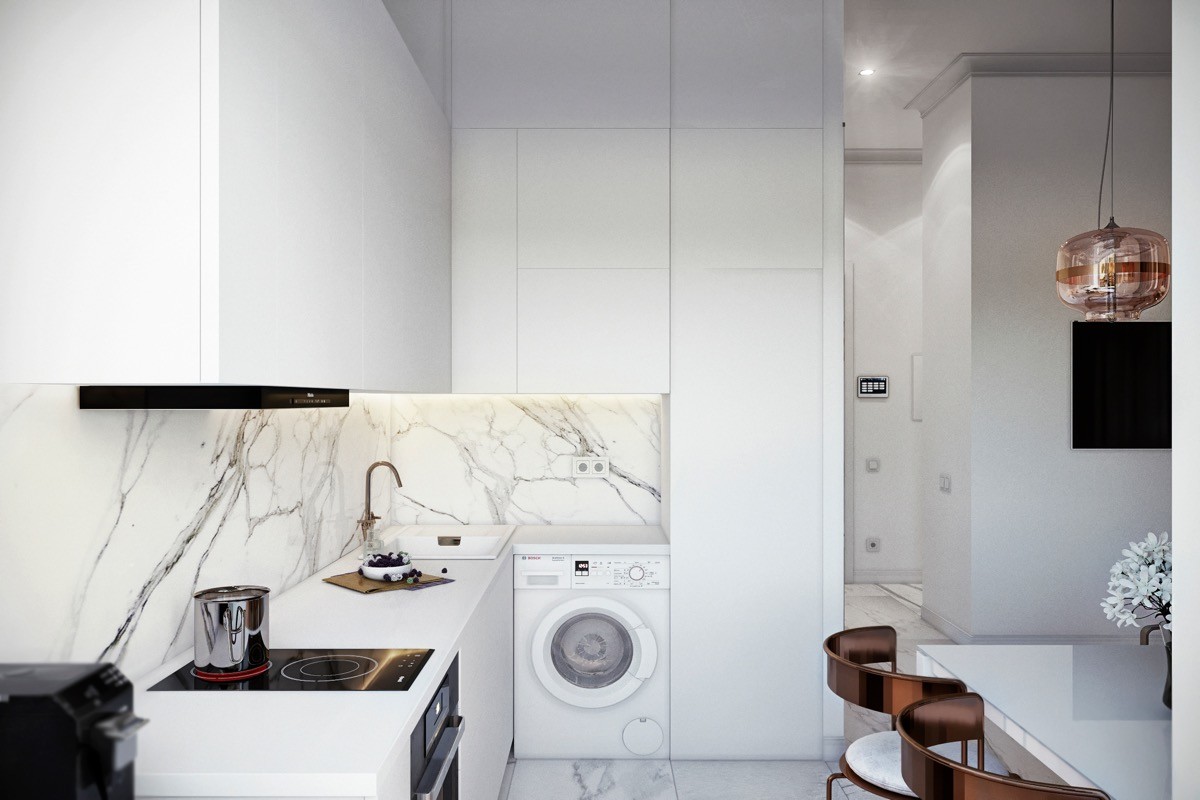
Make two seperate rooms in one. With two walls to work with you could separate kitchen facilities from utilities by splitting the arrangement, like this kitchen with washing machine. Keep cooking, prep and food supplies on one arm of your L-shape, and place washing machines and utility cupboards for ironing boards, laundry supplies and baskets along the other.
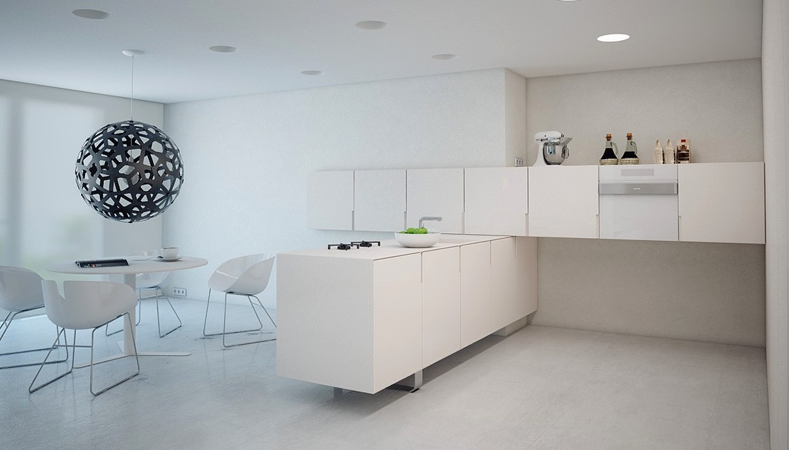
Criss cross low mounted wall cabinets over base cupboards for a unique arrangement.
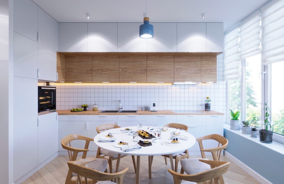
Use two depths of wall cabinets, in different tones, to break up a double banked arrangement.
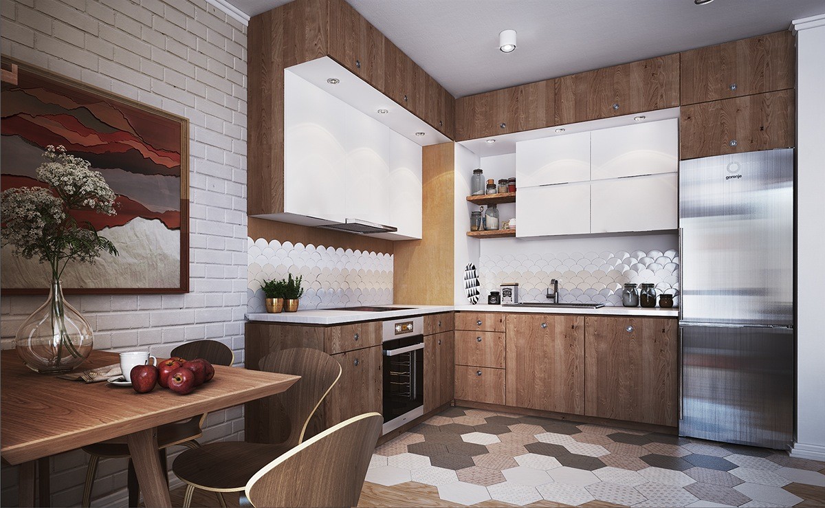
Craft stand-out perimeters. Extend a soffit of recessed lighting around an L-shaped perimeter to add to lofty proportions. Create a unique kitchen backsplash with unusual shaped tiling in a series of different hues.
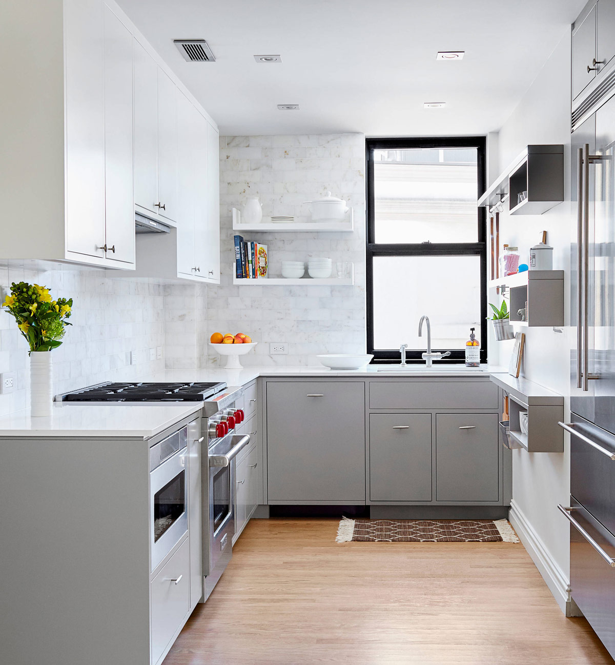
A collection of wall shelves decorate the leftover wall here, along with a series of kitchen utensil hanging rails.
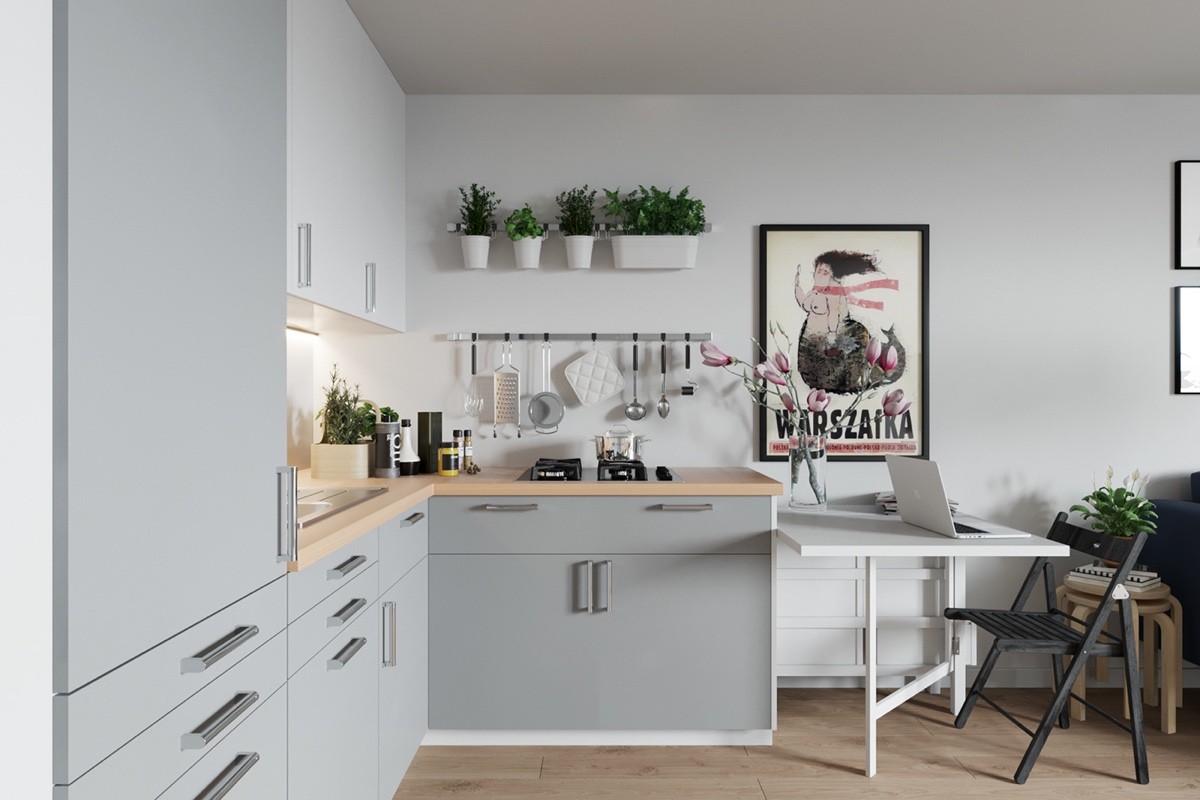
can hang along a rail too. This design allows pots to inhabit a space not deep enough for a shelf, where an open wall cupboard door from the other side might chip against its edge.
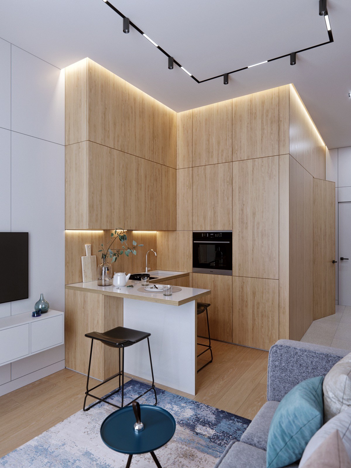
Go with the flow. This completely wooden kitchen module extends its style to the hallway beyond. A matching wooden facia flows over the adjacent wall and one interior door.
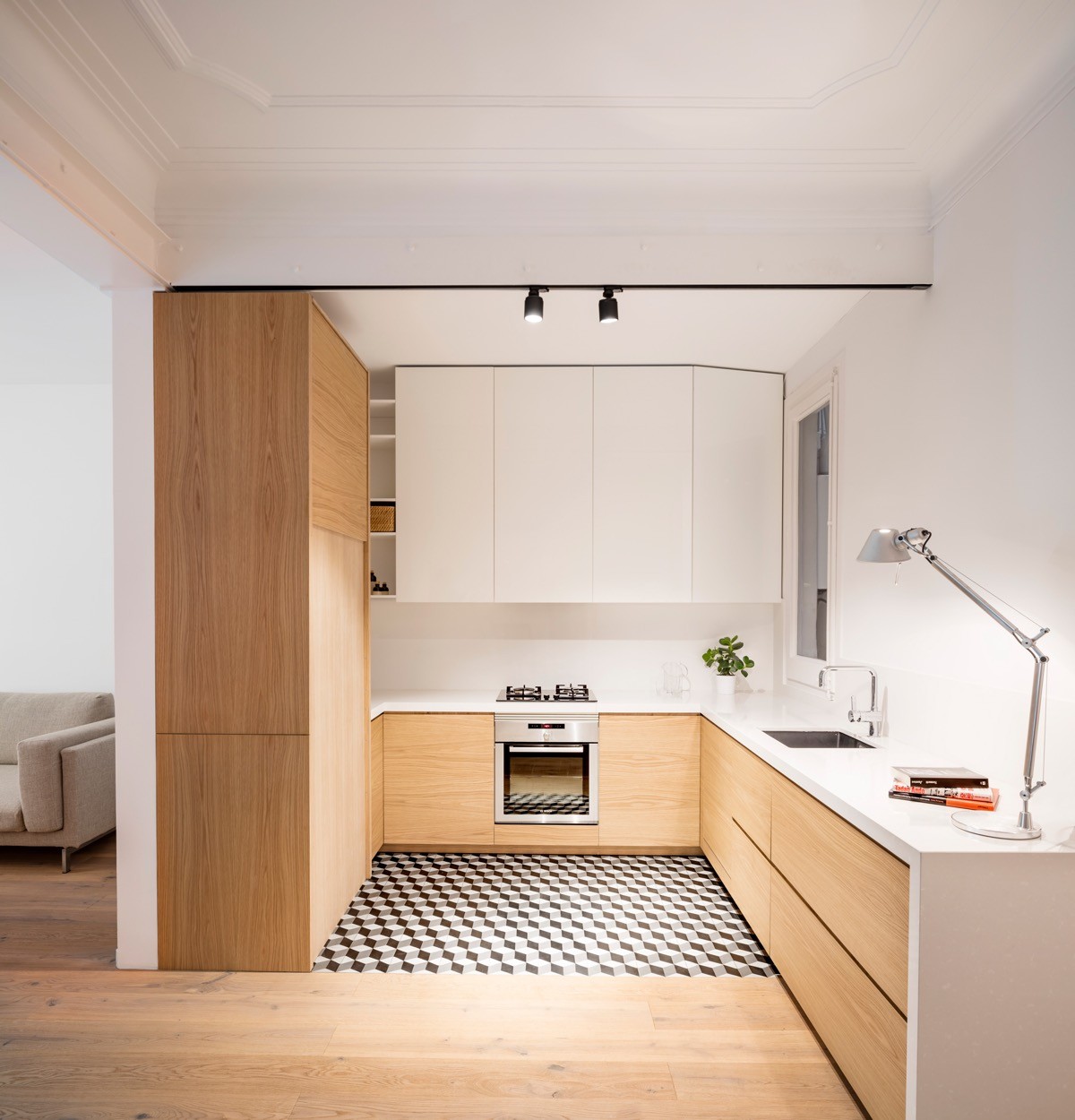
Even though the counter extends beyond the 'L' here, we’ve added this to the collection because it holds cunning inspiration for an L-shaped kitchen with a corner window. Notice how the end wall cabinet has been chamfered so as not to block out any of the natural light.
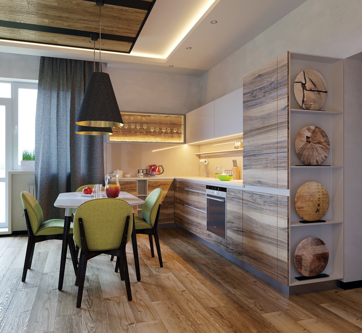
Curate a gallery at the end of the run. A display of decorative plates makes a beautiful and fitting end point.
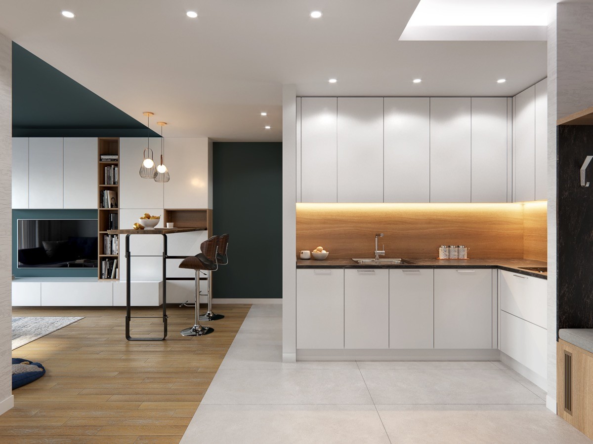
Simple and chic. A glowing wooden cut through between crisp white cabinets looks clean and inviting.
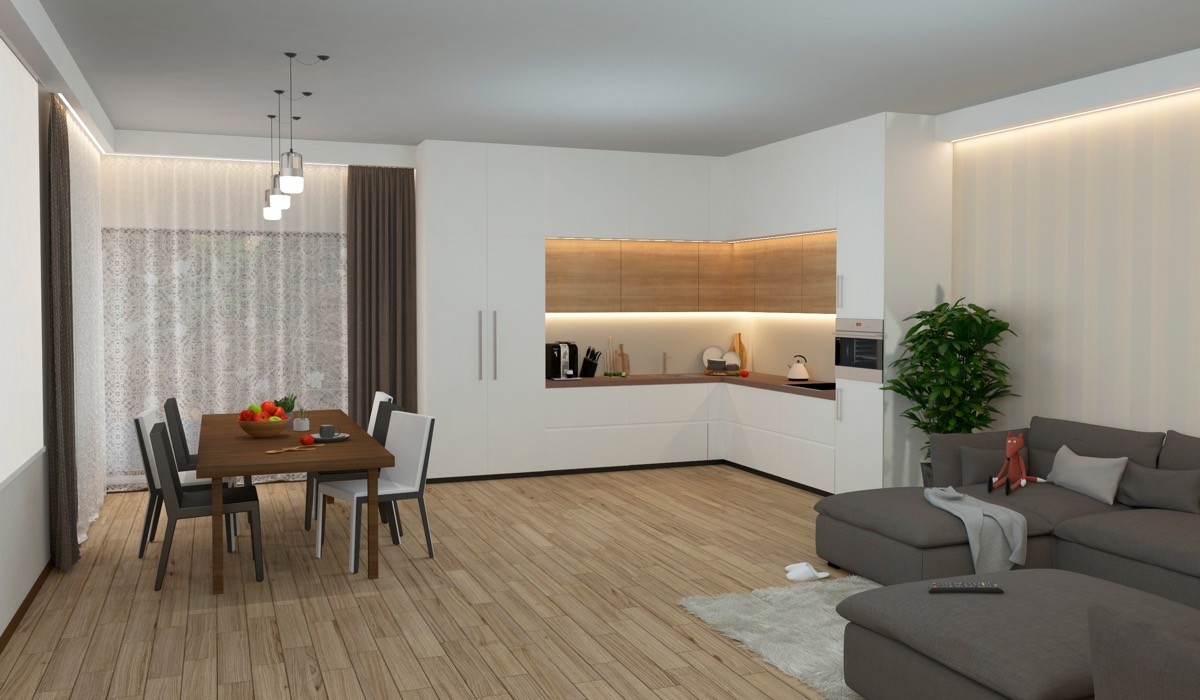
Create a chunky frame out of cabinets, like this white framed kitchen design with wooden inset.
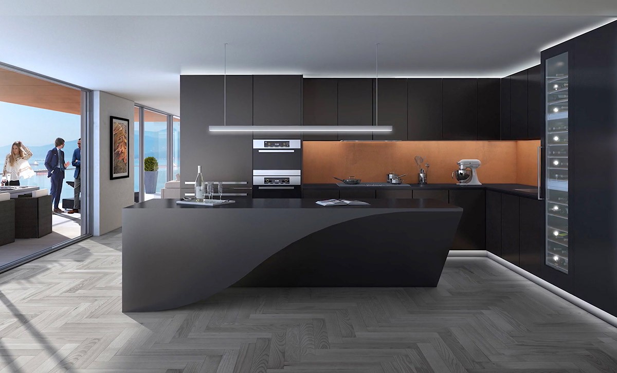
Create a party piece. The wine cooler that towers the full height of this black kitchen is certain to keep guests entertained!
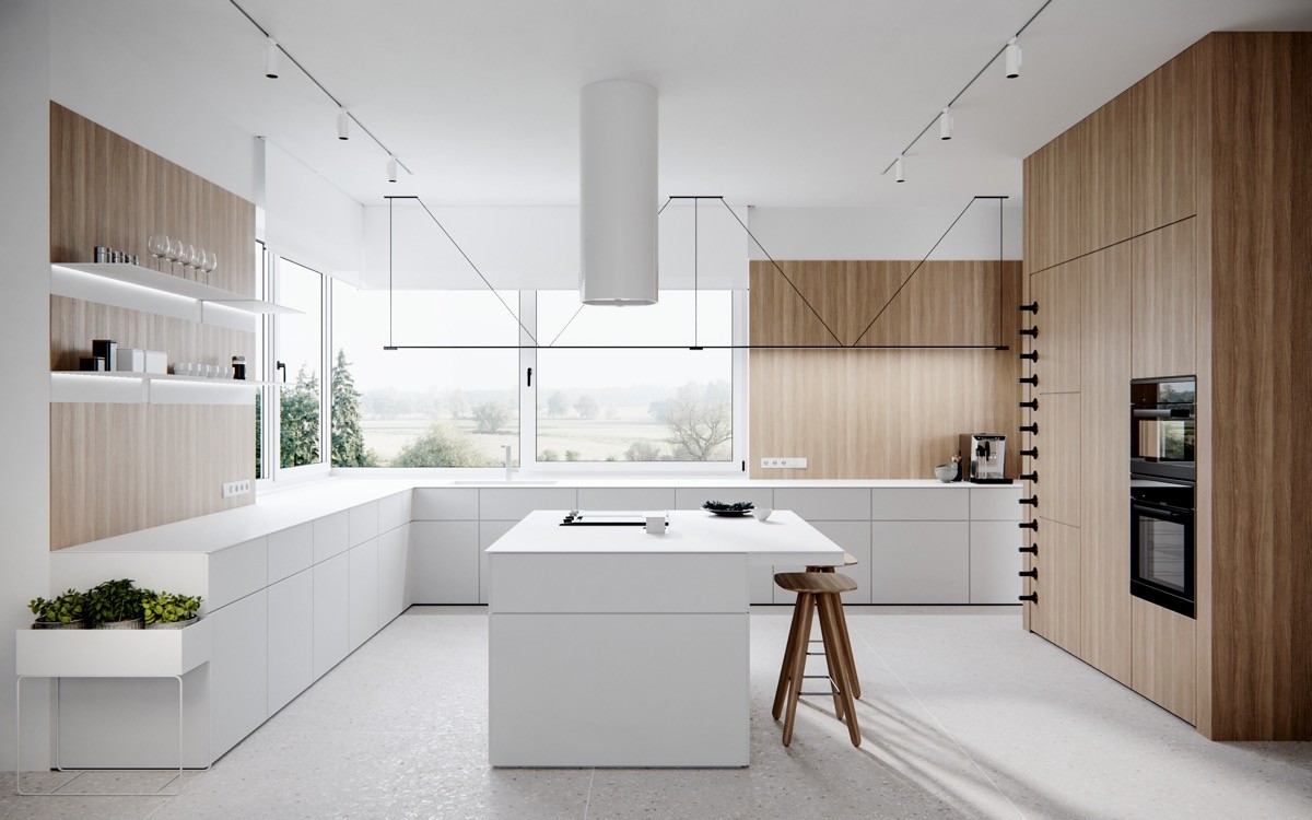
A boxy plant holder fringes this L-shaped kitchen with island. LED illuminated shelves brighten a wooden feature wall. Wooden bar stools match the veneer on the cabinets.
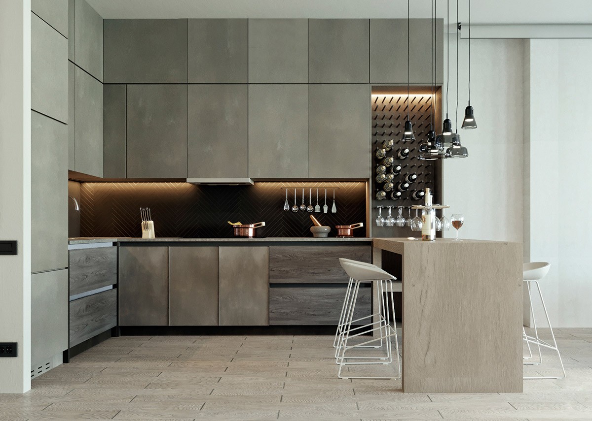
Another wine rack in an L-shaped kitchen with peninsula. This time the vino is brought right to the bench. It might prove a challenge to stop at just one bottle.
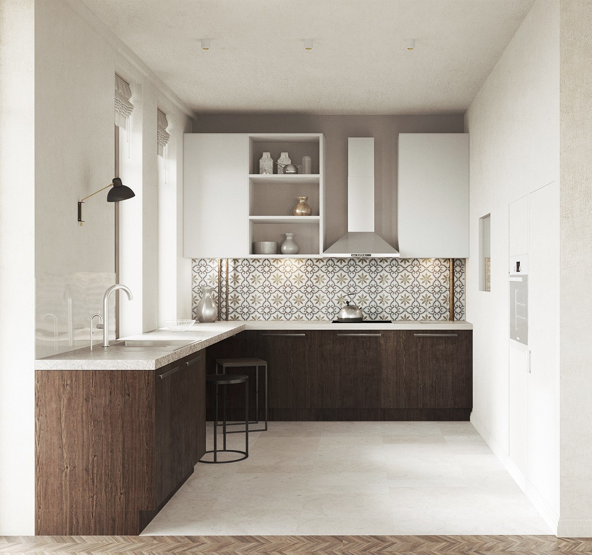
Dual windows look grand along a length of countertop. Intricately patterned backsplash tiles on the other branch balance the look.
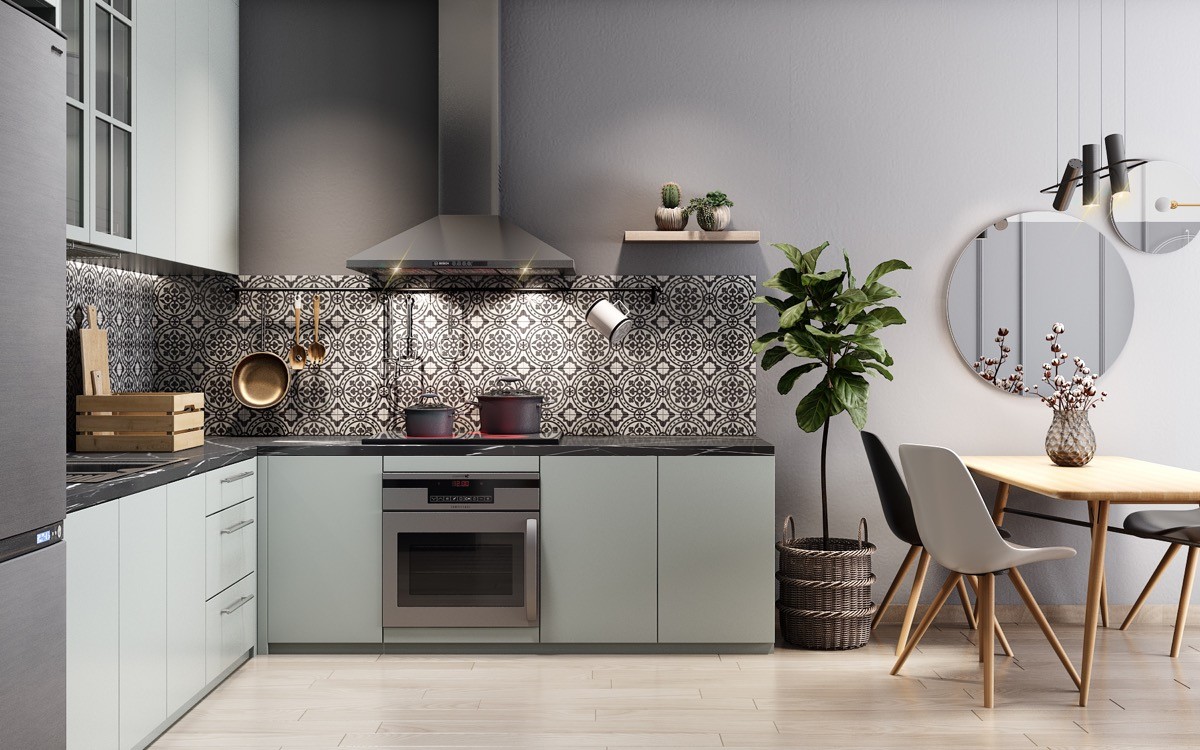
A large potted plant makes a natural divide between the kitchen and dining spot.
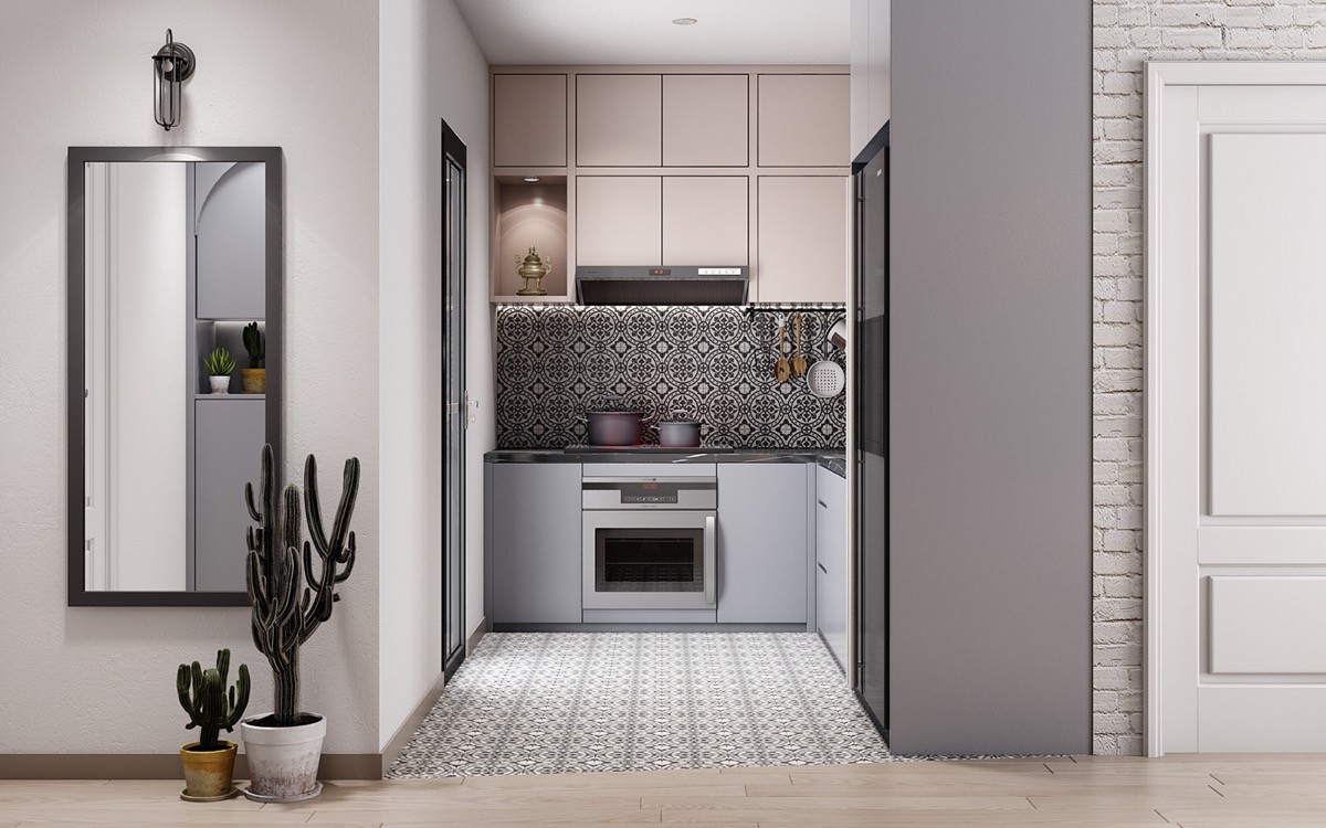
Use pattern to make the most of small spaces.
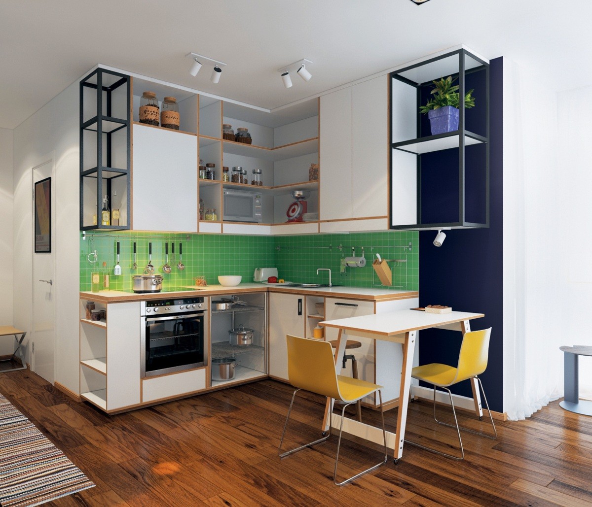
Open shelving units and colour blocks make an interesting scheme. Projecting out of the backsplash at an angle, the knife holder adds an interesting touch as well.
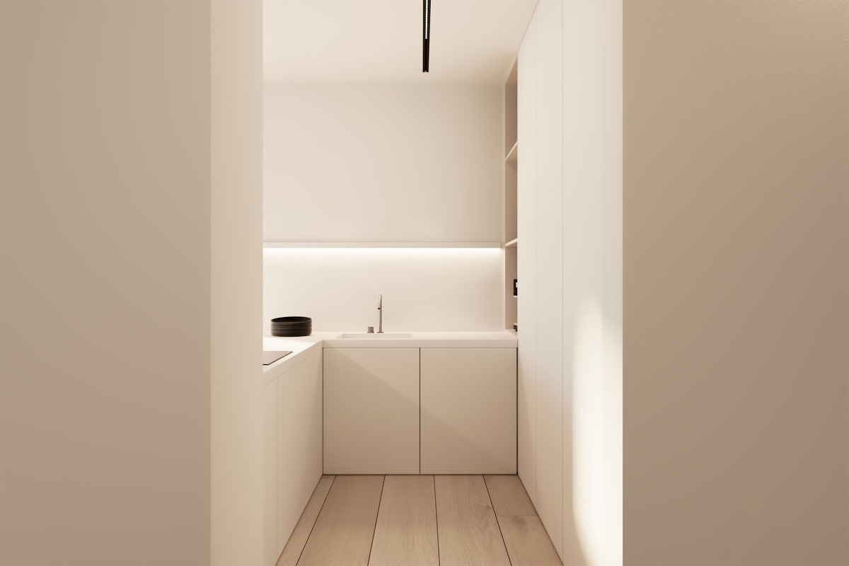
can sink away into the walls with handle-free slab fronted units.
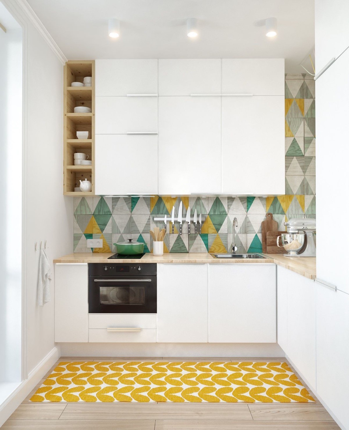
Adding light wood tone and cheerful prints to a white kitchen creates a wonderfully Scandinavian style kitchen.
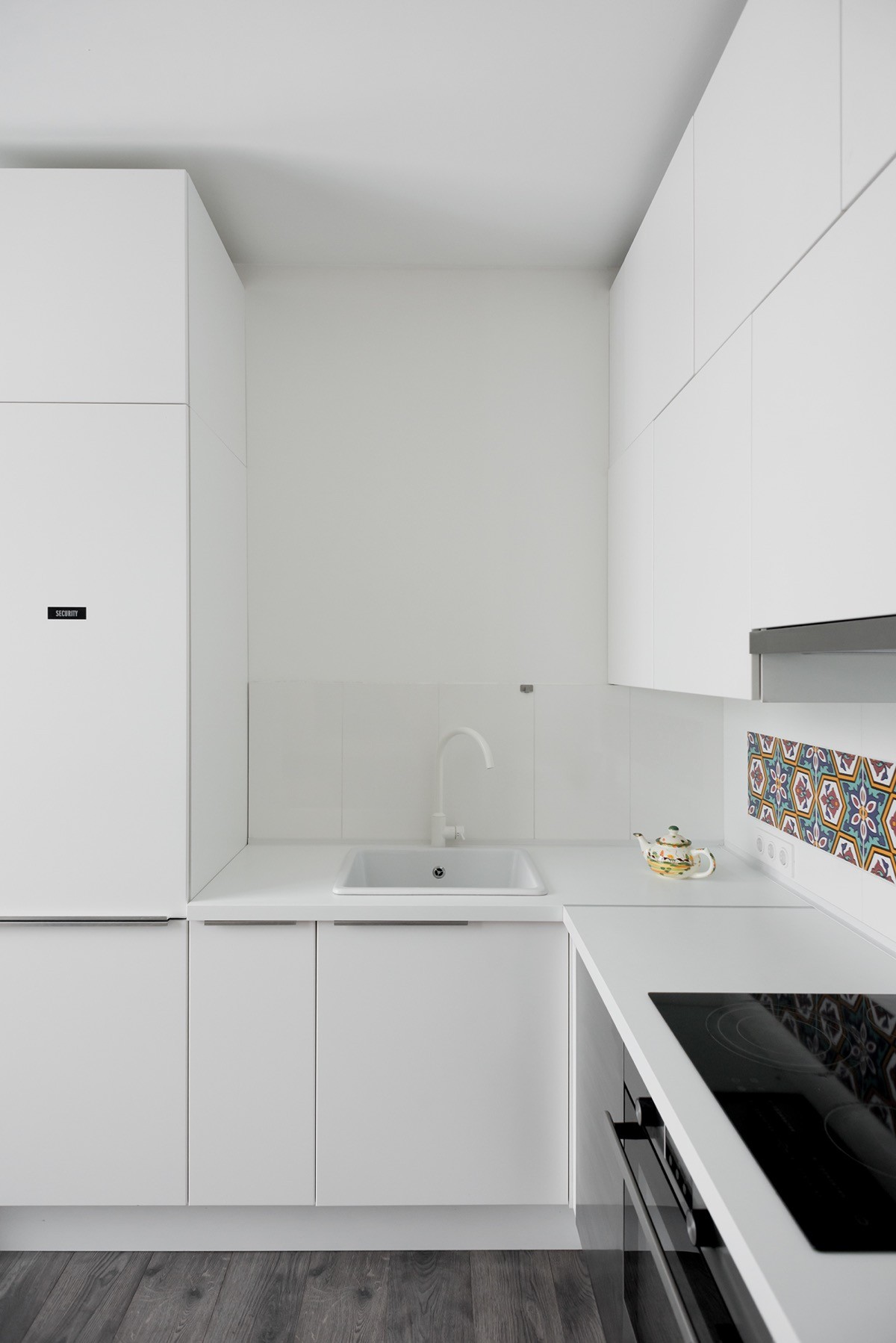
Even just a few special tiles can bring a new energy a plain white kitchen.
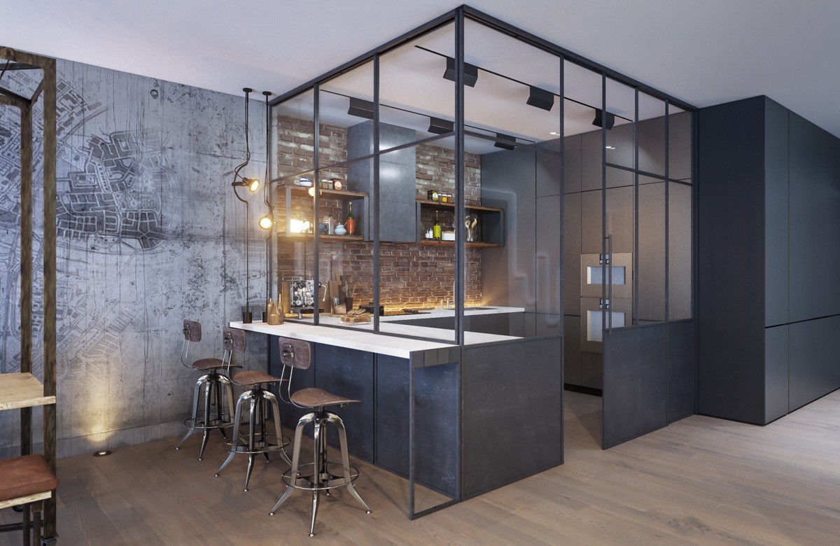
If you like this look, take a glance at these other industrial style kitchen designs.
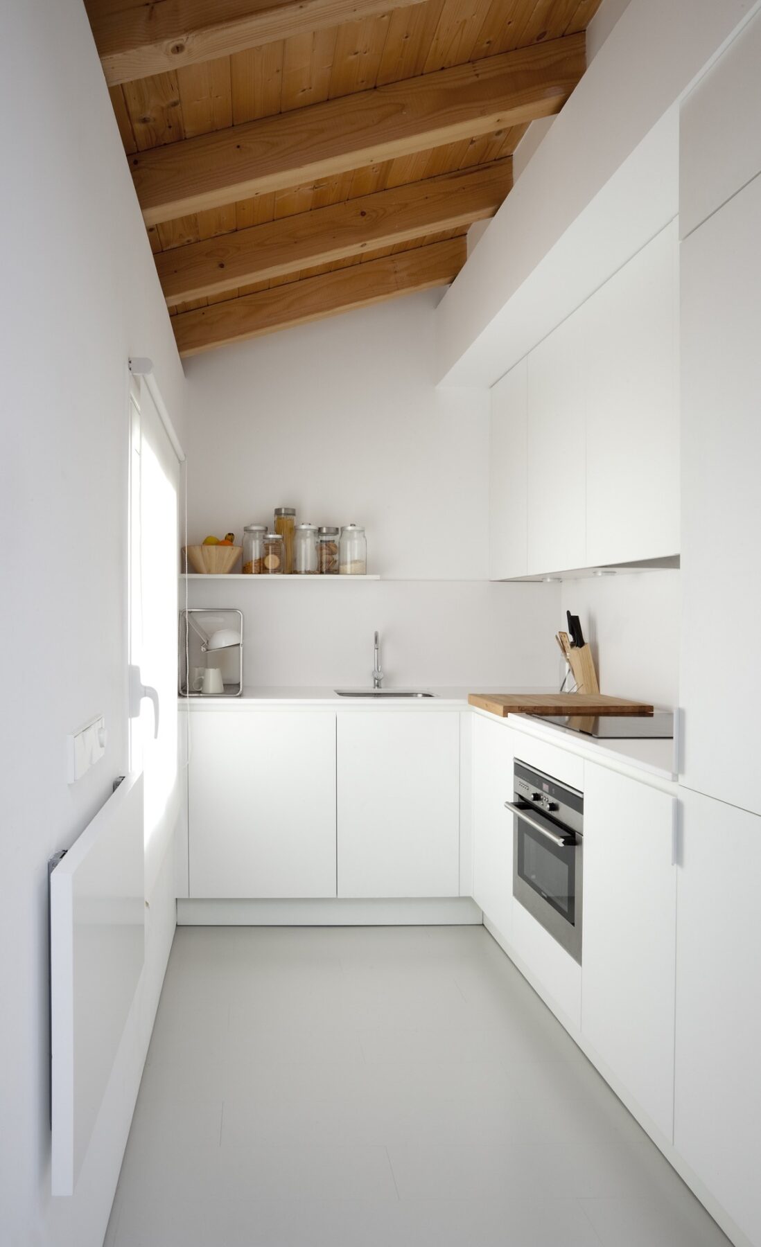
An open shelf occupies one wall, whilst closed cabinetry completes the other. The change keeps the small space looking airy and open, rather than overwhelmed with too many units.
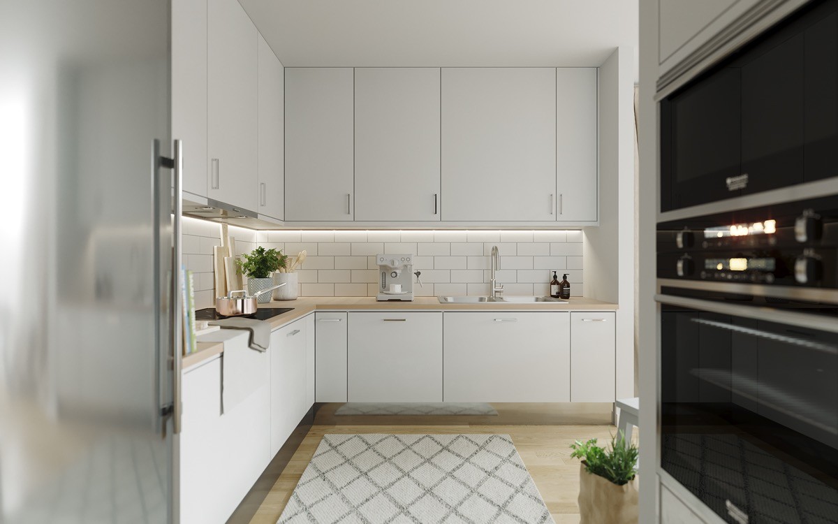
Metro tiles help a small space to appear wider.
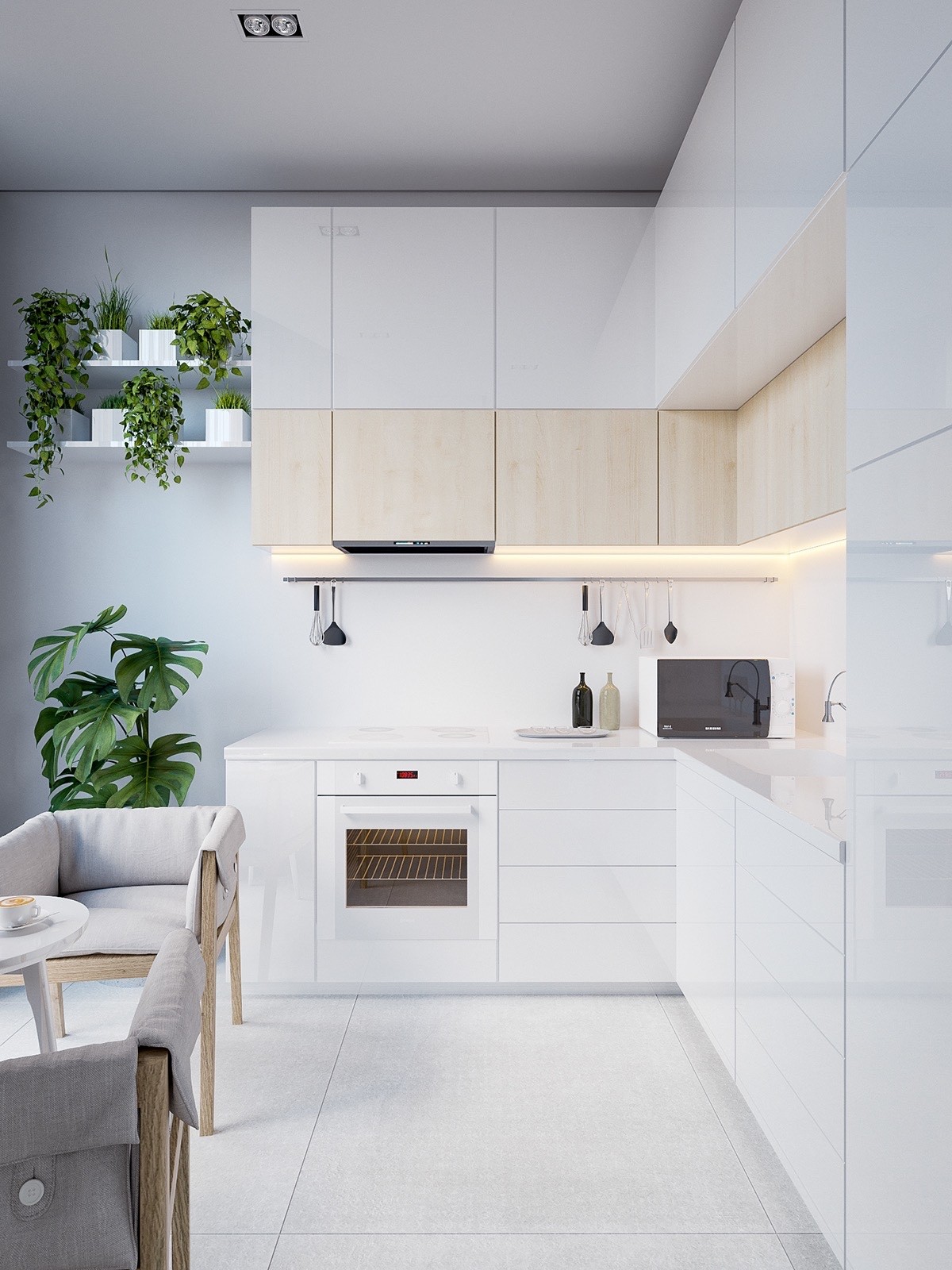
A horizontal stripe is another method to visually widen the space.
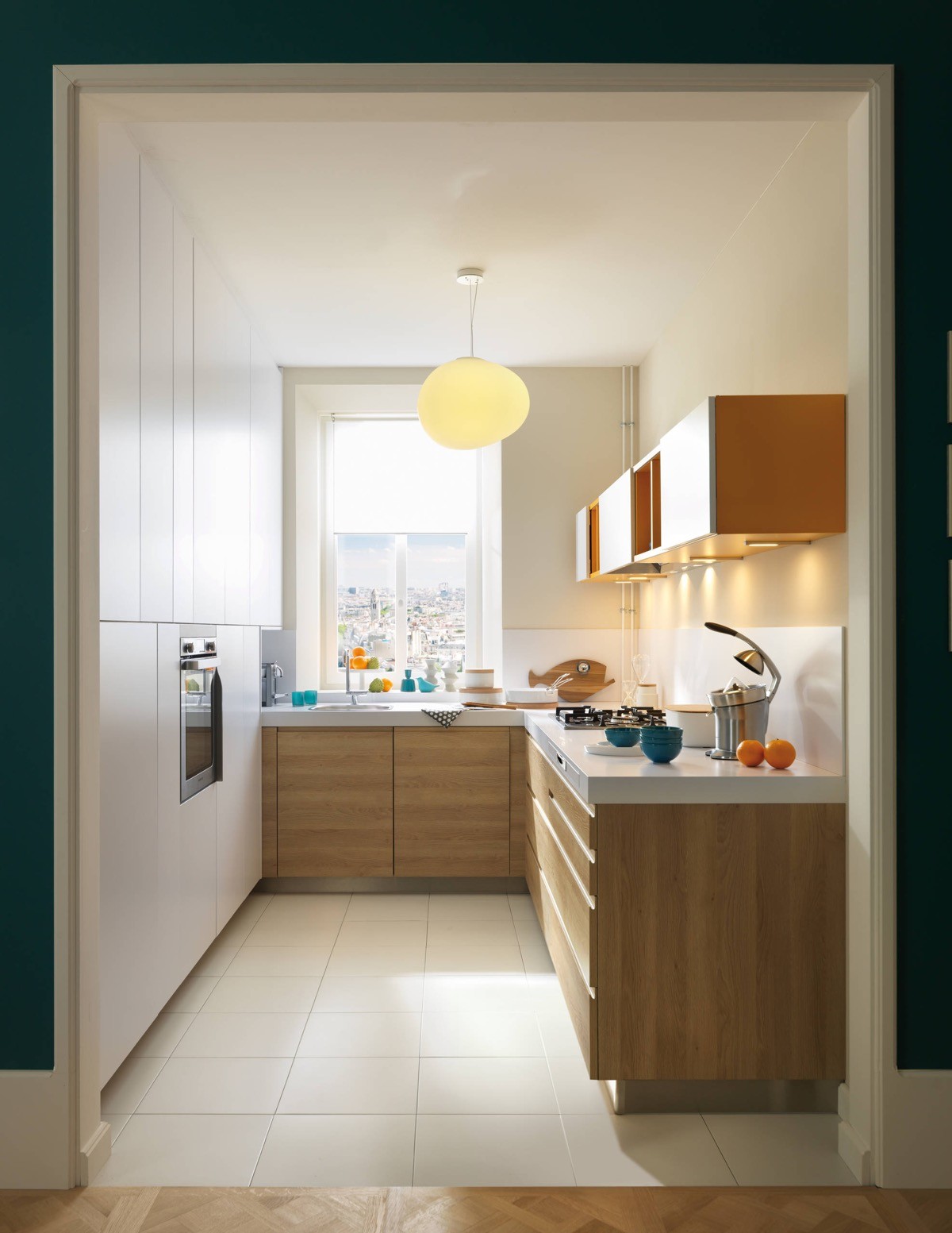
Nope, this isn’t strictly an L-shaped kitchen but we’re taking a look at the L-shaped arrangement of wooden units that are complemented by a cheerful orange unit. The unusual piece has a series of open fronted and closed volumes for displaying and concealing choice items from view.
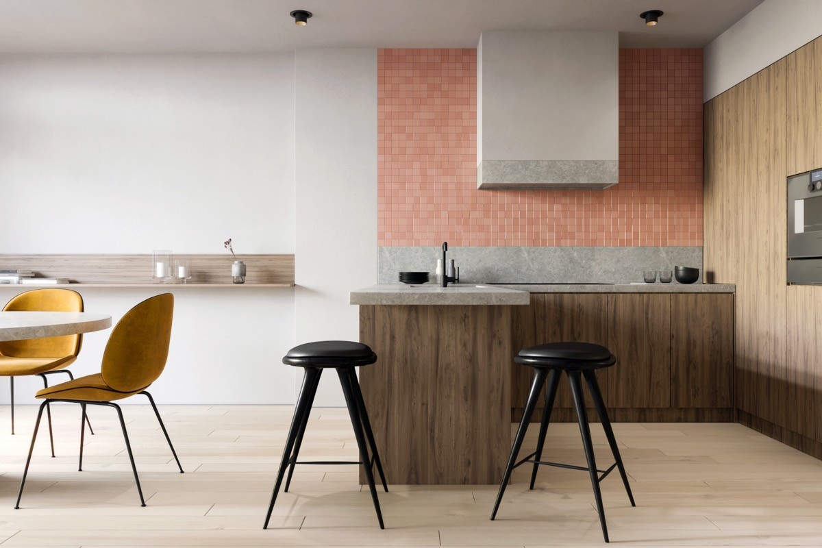
Two bar stools make the end of a cabinet run into a breakfast bar.
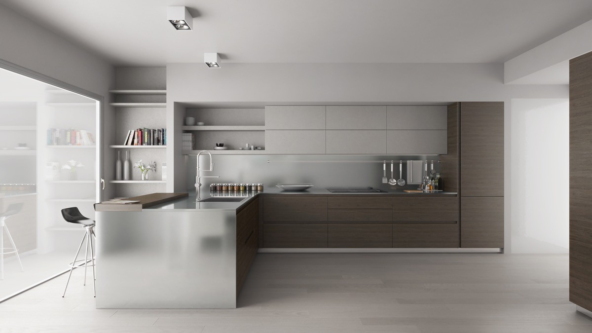
Wrap a countertop down the side of the end cabinet for a sleek luxurious finish.
