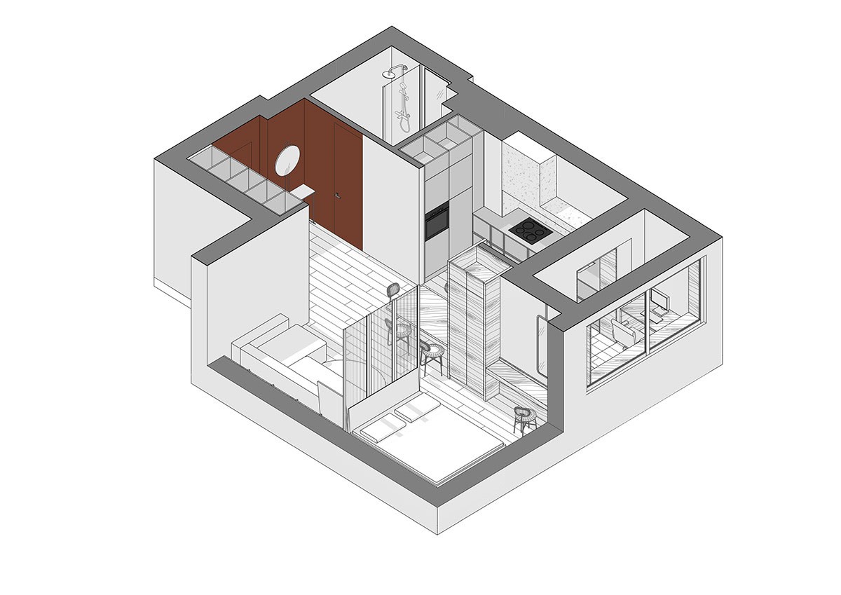
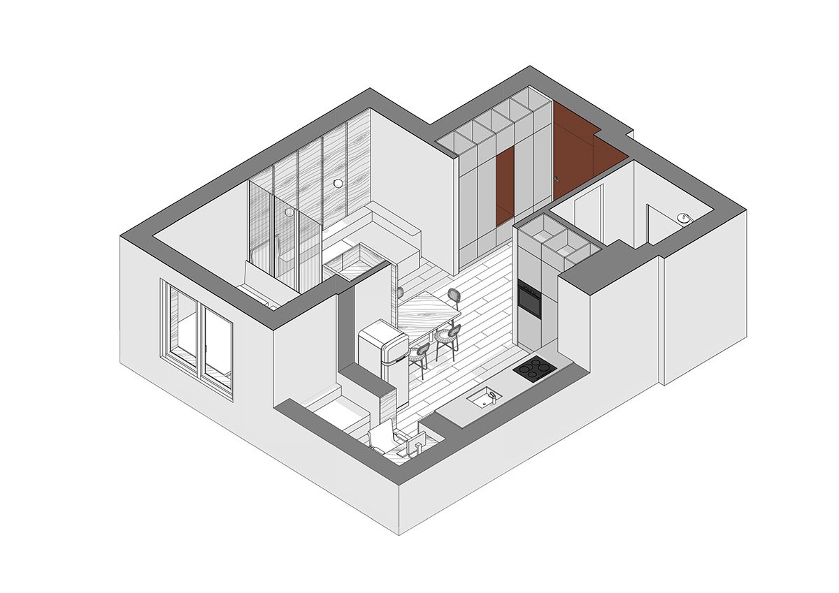
Modern spaces can be flat and fruitless when it comes to picking out interesting architectural features. They can also lack warmth when geared toward the minimalist aesthetic, which can prove a challenge to counteract. When you’ve fallen in love with a streamlined home, how exactly do you go about building a welcoming atmosphere that’s a pleasure to come home to? These two home design visualisations by Rolig Design are great examples of how to load flat spaces with depth, without calling for textured wall panels or floating fixtures. These examples will largely leave your new silky smooth walls alone, and put the bulk of your expenditure toward pieces that could even move home with you.
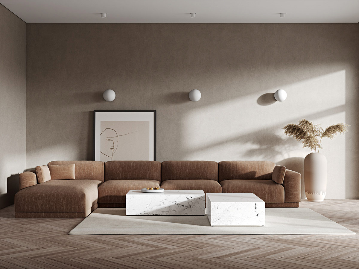
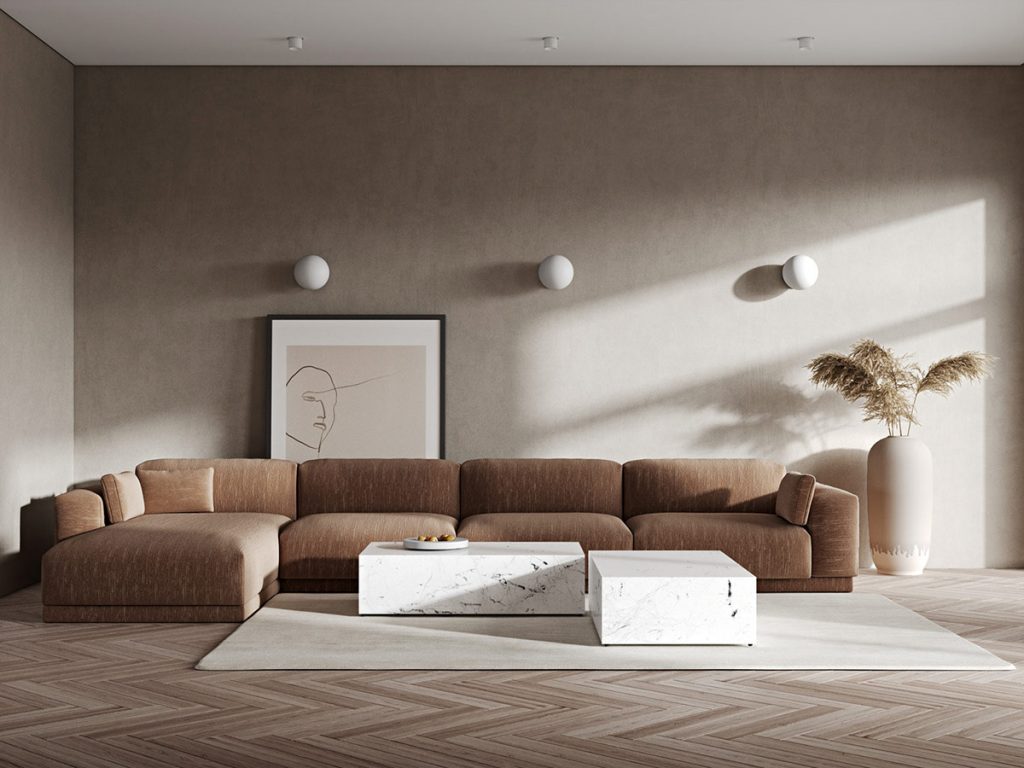
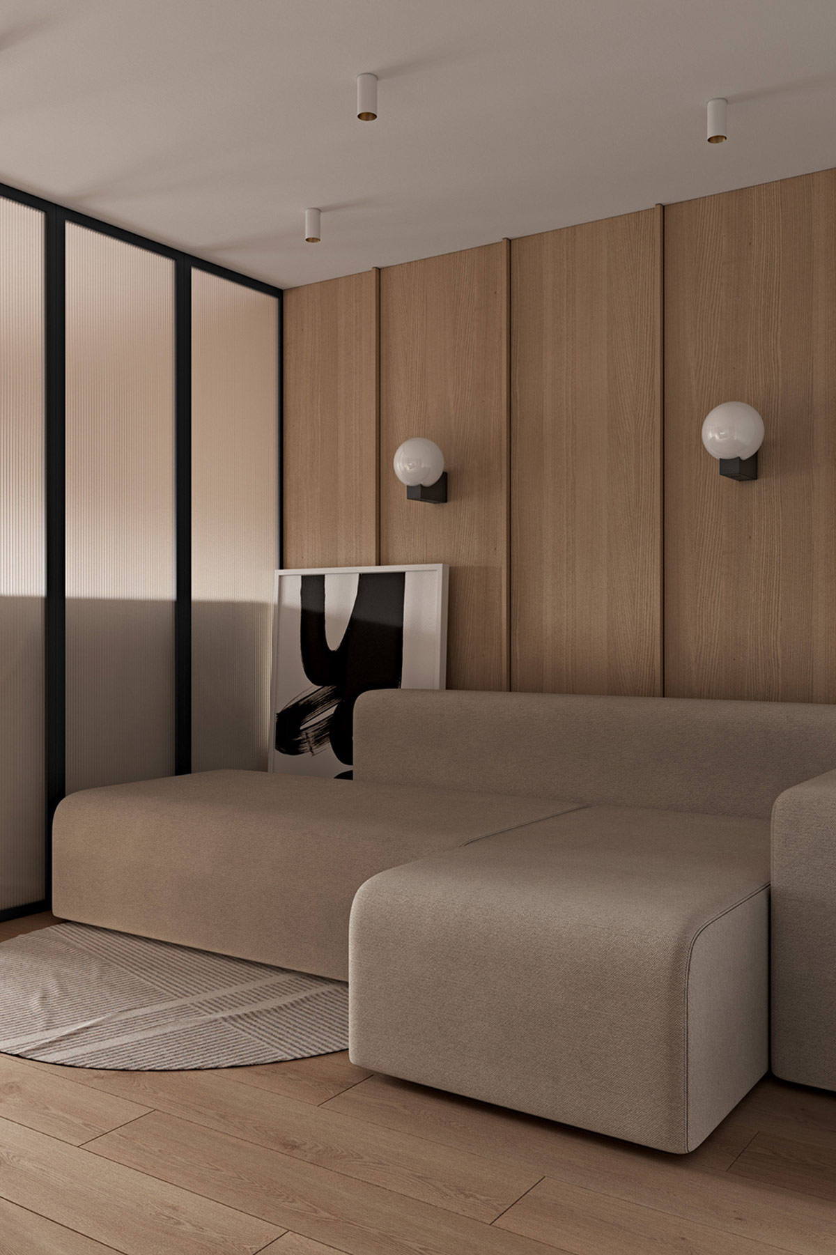
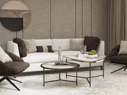
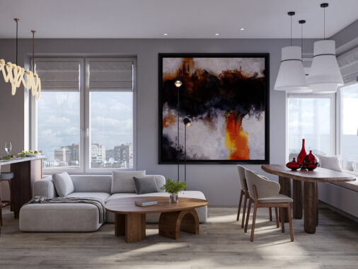
This snug brown modern sofa instantly conjures up imagery of cosy afternoons lounging under a blanket with a great book, or stretched out with popcorn on movie nights. Three modern wall sconces become architectural-like features where there are none.
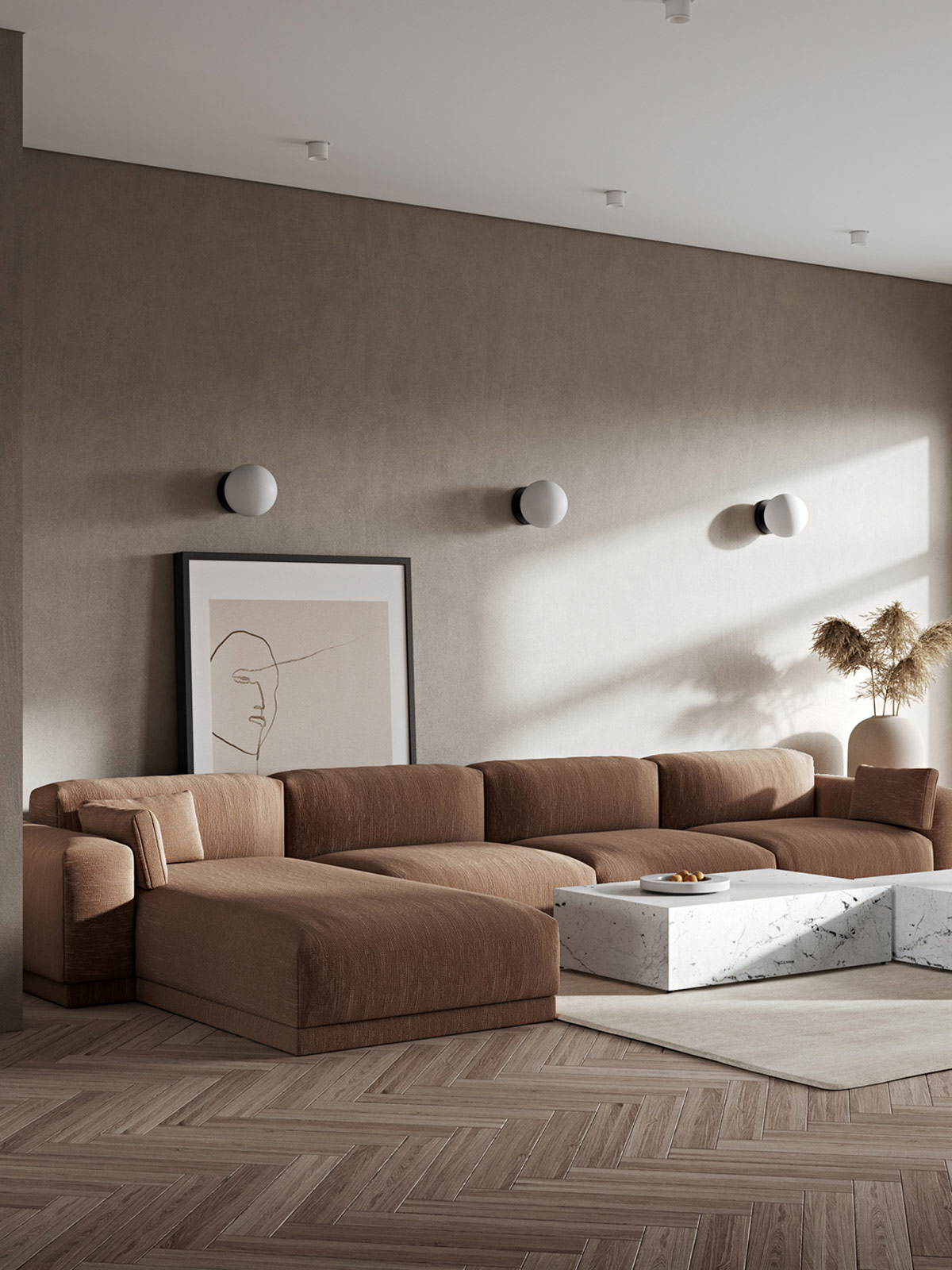
Large pieces of artwork propped casually behind a sofa or chair build a layered look that evokes a homey lived-in feel.
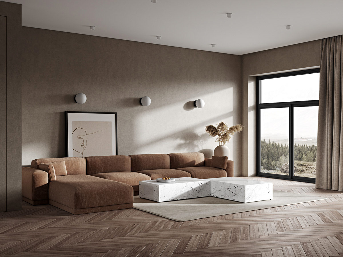
Two marble coffee tables situated in an interlocking arrangement expand a lounge layout into the larger room space, rather than leaving it apologetically hugging tight to the wall.
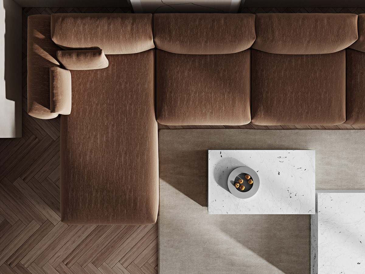
A soft area rug is effective in dampening the echo in a spacious living room, which makes the place feel a whole lot less like a big old museum or gallery.
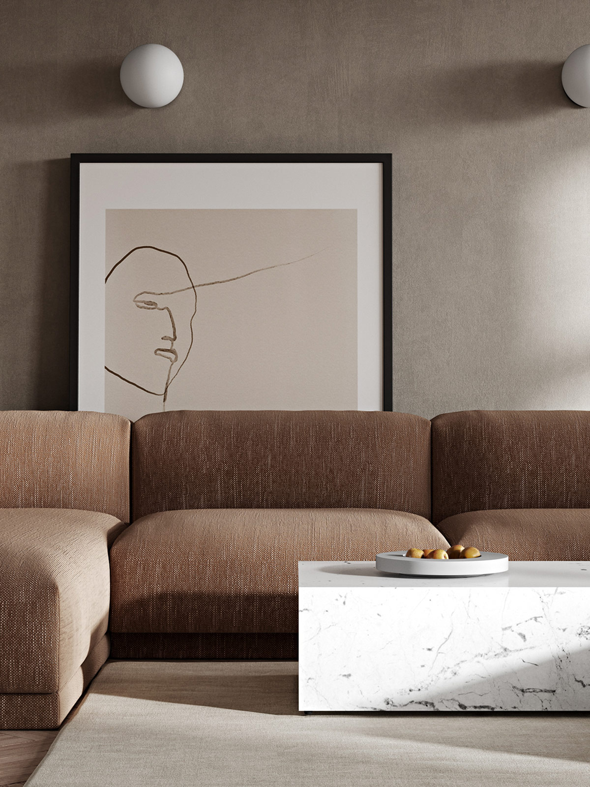
Placing a modern fruit bowl on the coffee table brings in the offering of food, which is always a welcoming touch.
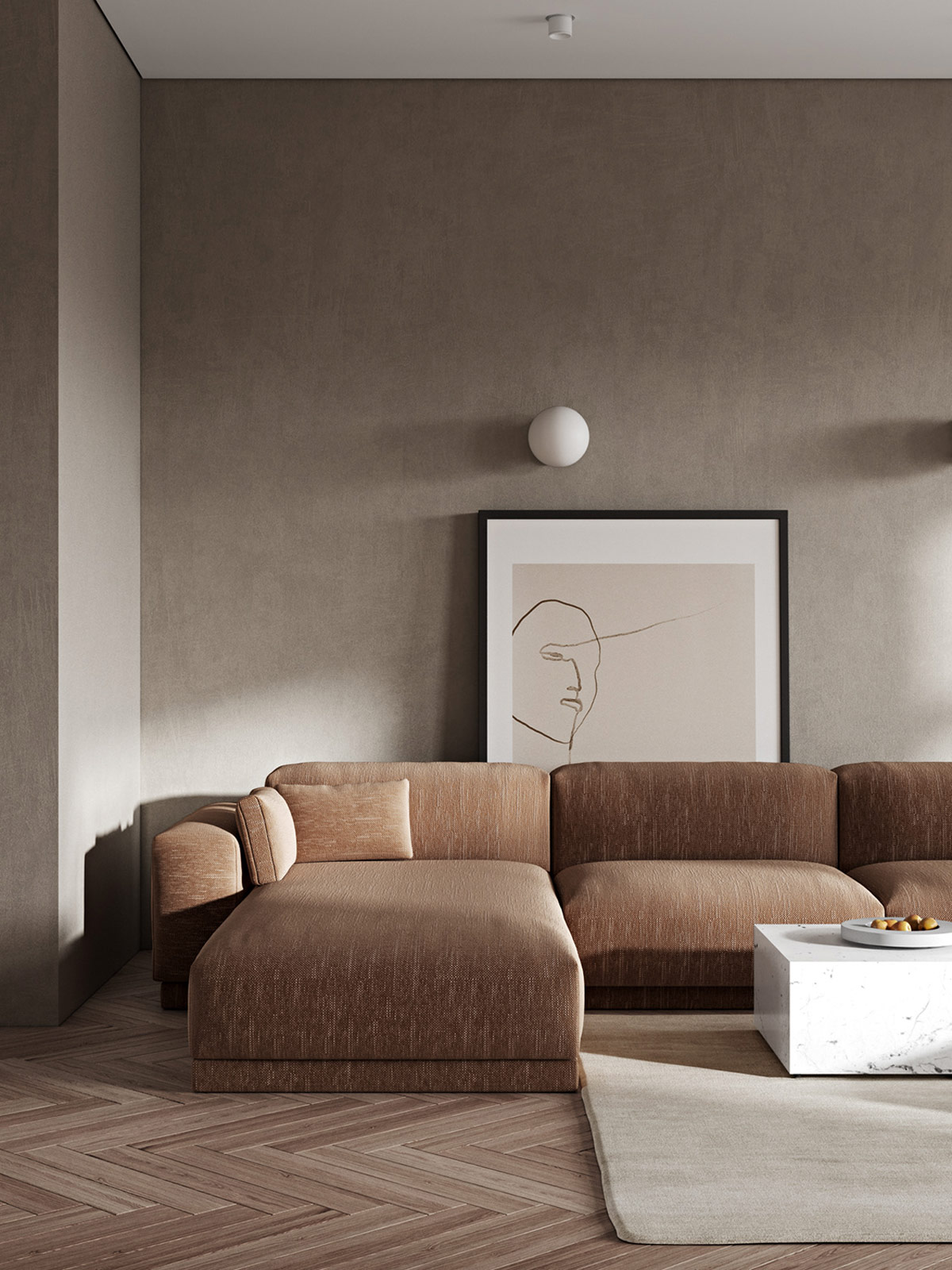
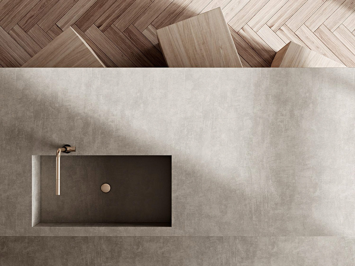
Flooring is the largest area of decor after the walls, so it’s an ideal place to introduce warmth when you’ve already opted for cool paintwork. Herringbone wood flooring ups the visual temperature of a space whilst adding exquisite texture too.
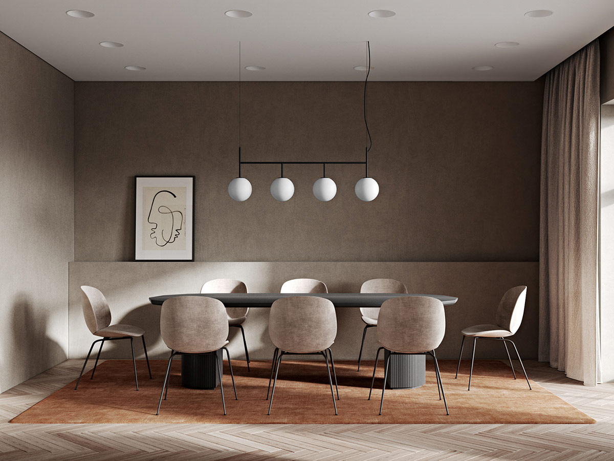
This linear chandelier matches with the wall sconces in the lounge area, and artwork from the same collection features here too. The commonality between zone decor builds a comforting continuity in the home, an identity.
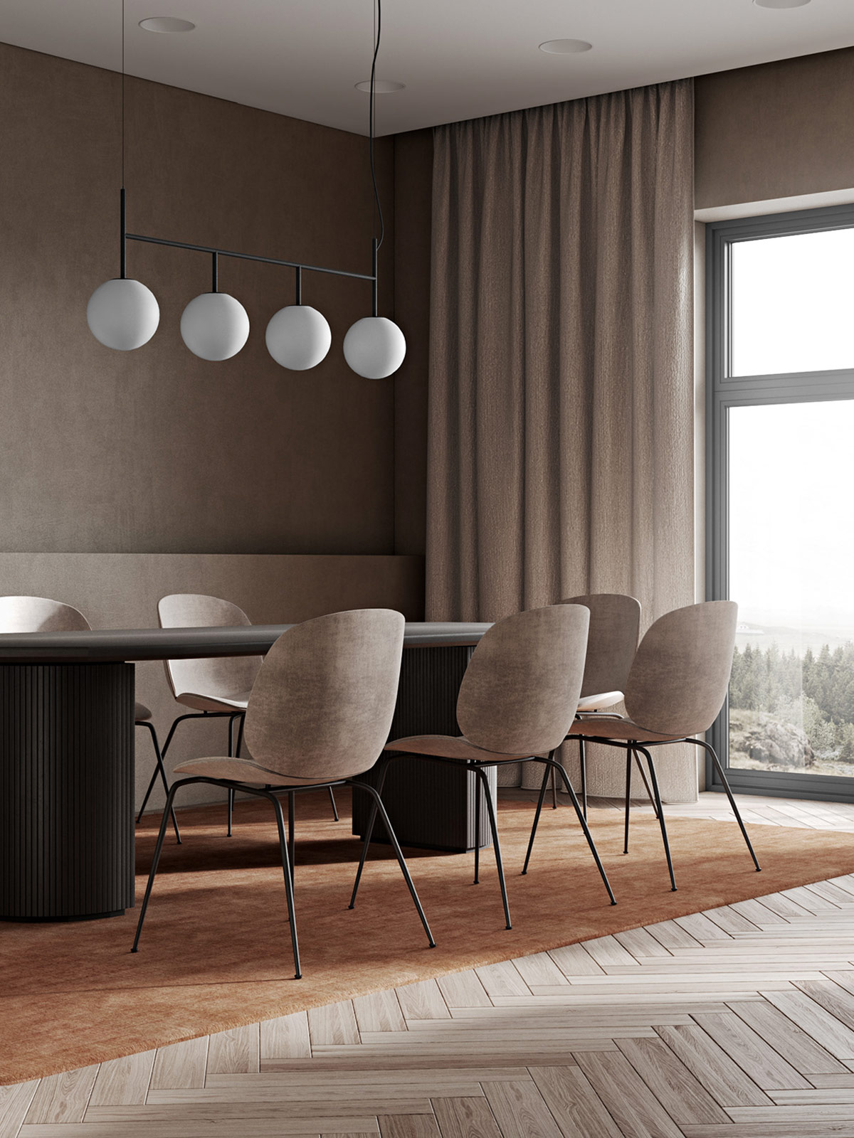
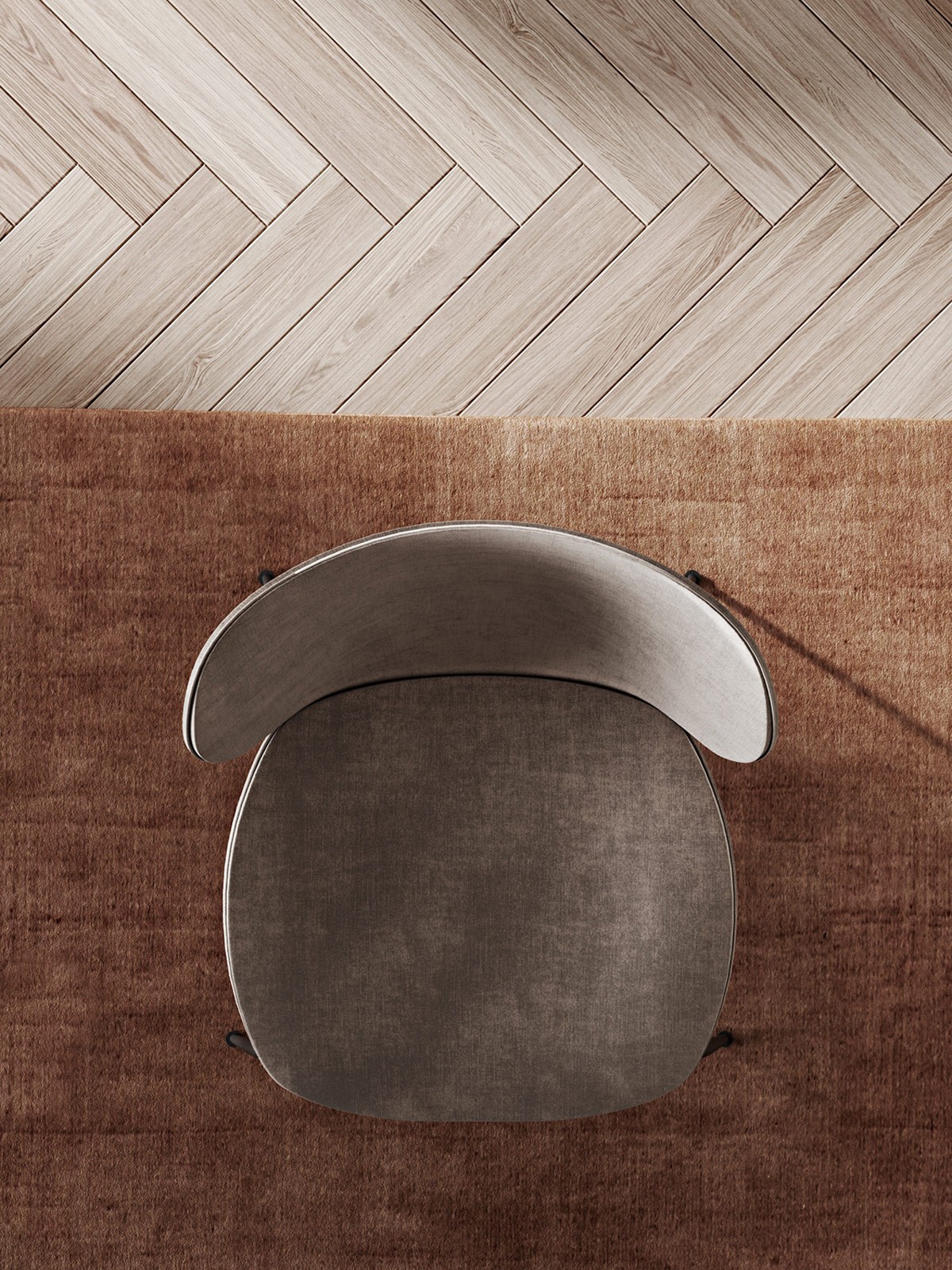
Curvaceous lines give the dining table an approachable, practical aesthetic. The Gubi Beetle chair echoes the same vibe–modern yet soft. Hanging curtains from way up in the ceiling line, all the way down to the floor will infinitely improve the cosiness factor in any room. It doesn’t matter what size the windows or the patio door, go full height for full plush factor.
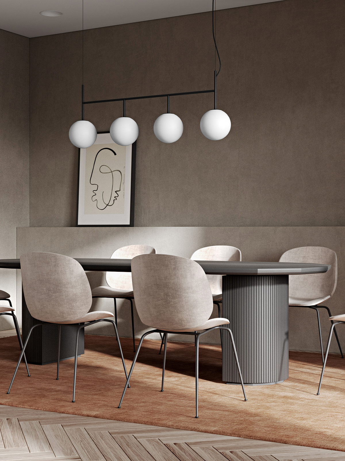
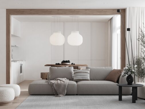
An umber rug burns a heat that will fire up a creamy neutral decor palette, without demolishing its calm neutral foundations.
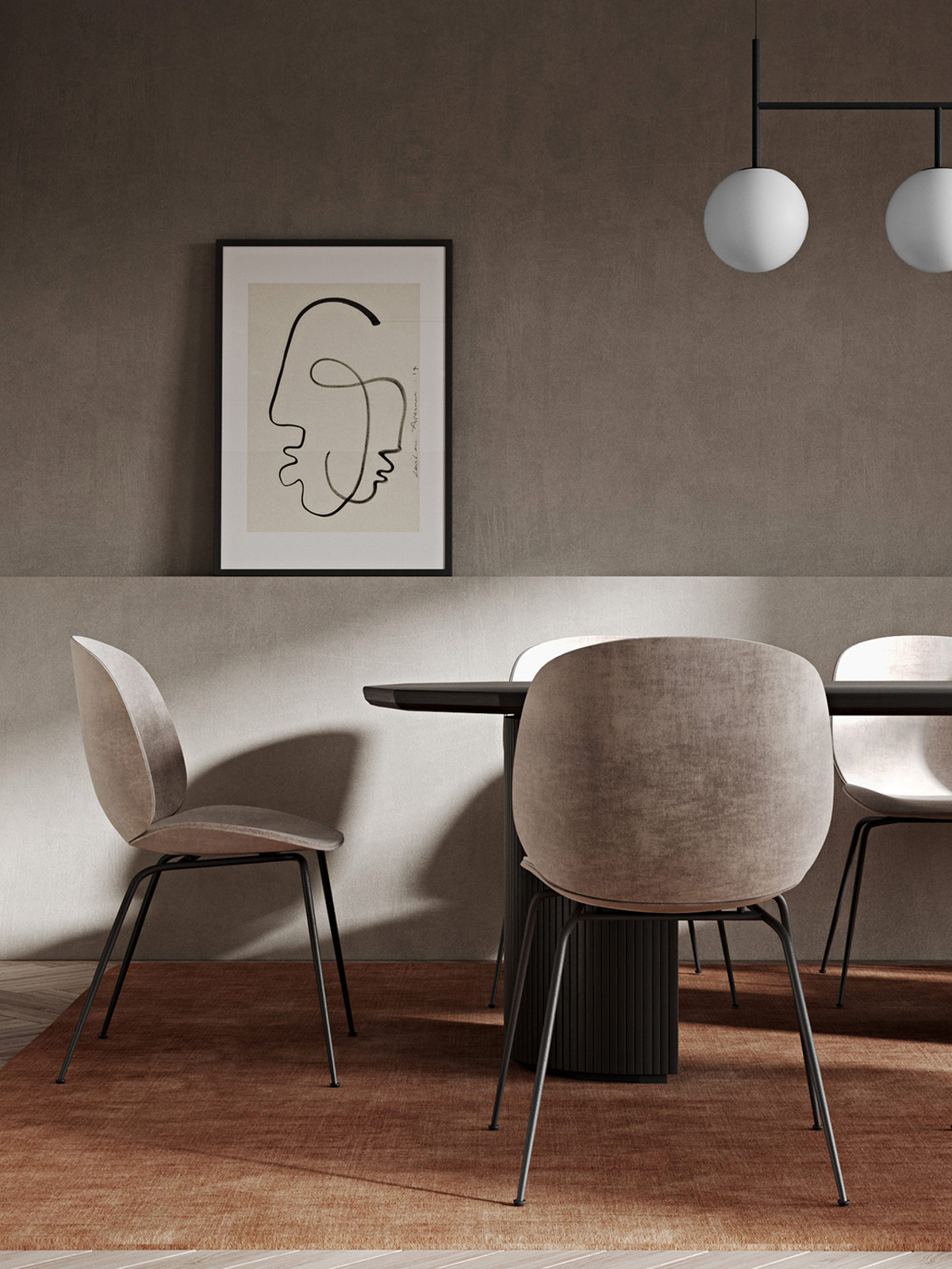
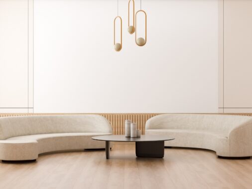
When wainscotting is considered too decorative, a plain half height wall can provide just a hint of the wall panelling aesthetic without the fanfare.
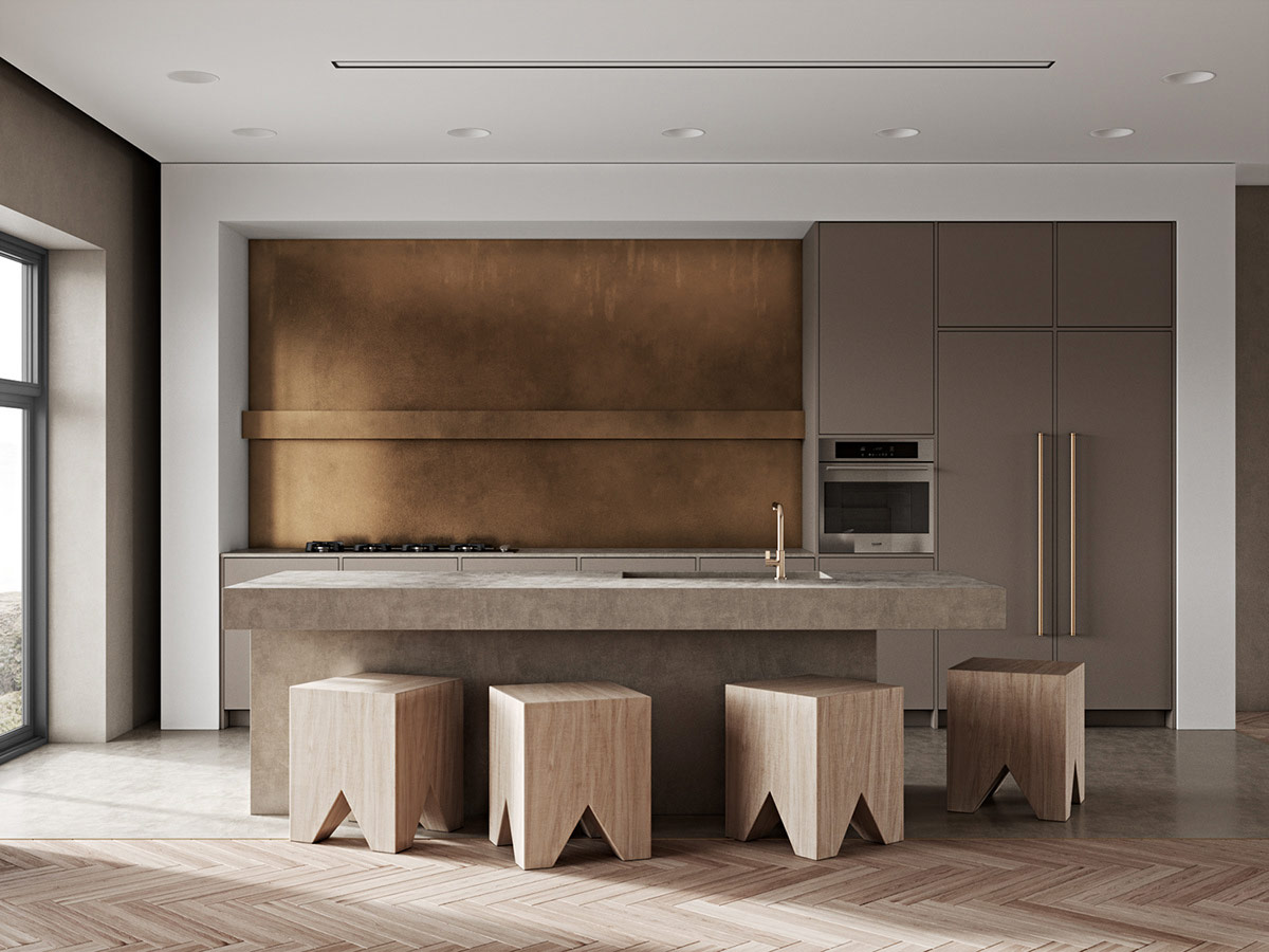
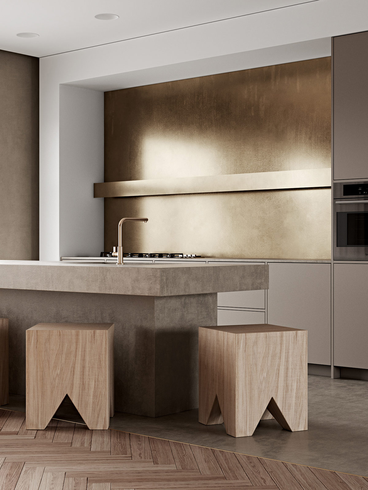
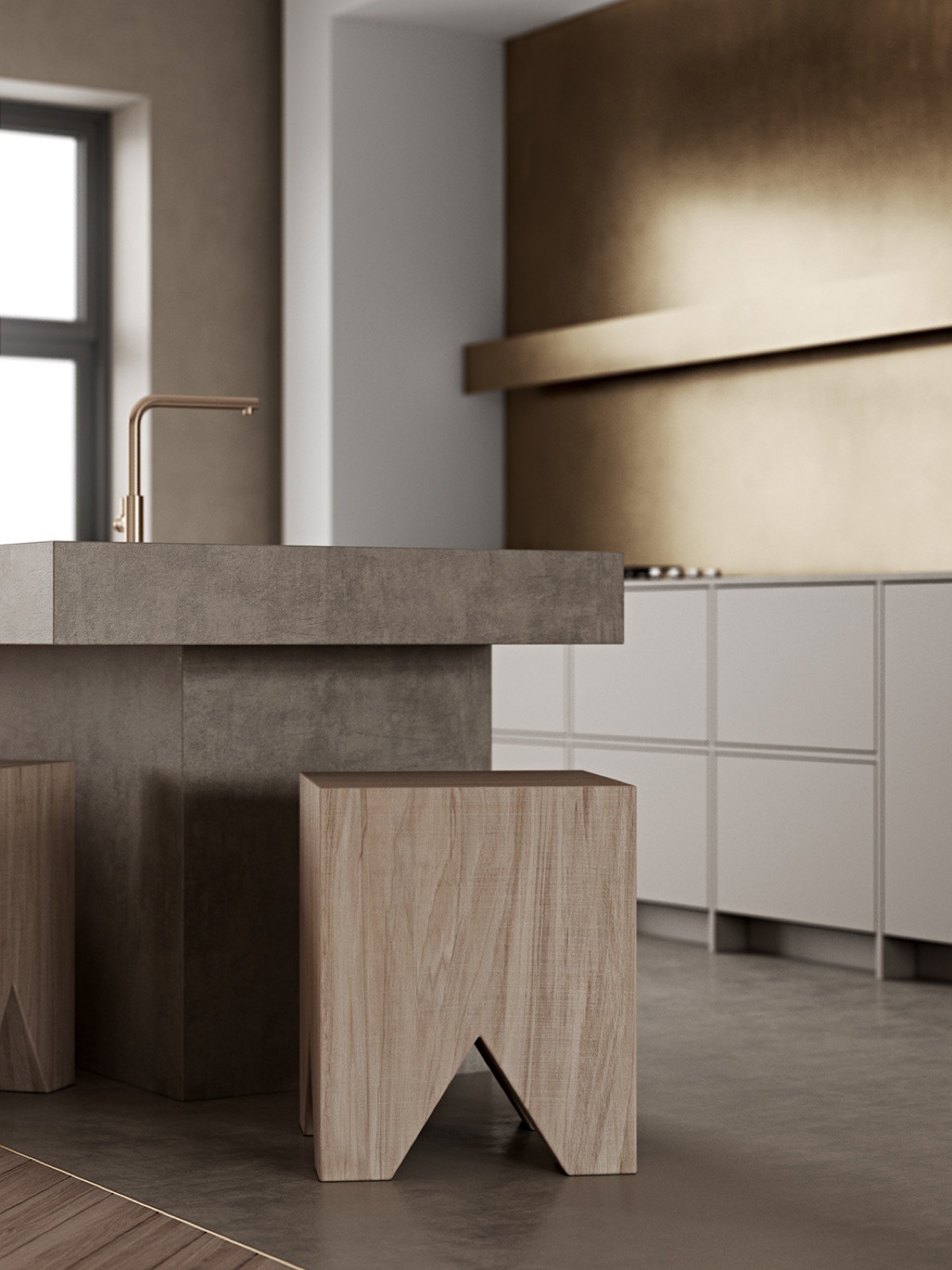
Chunky kitchen bar stools evoke the family feel more so than spindally designs. These robust little numbers look like they could happily take some knocks and not be too worse for wear, which makes everybody feel way more relaxed.
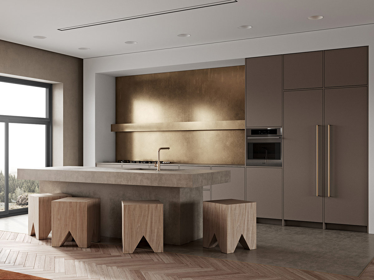
Refinement can come into the kitchen in other ways, like a metallic kitchen backsplash, a gold faucet, and golden cabinet hardware.
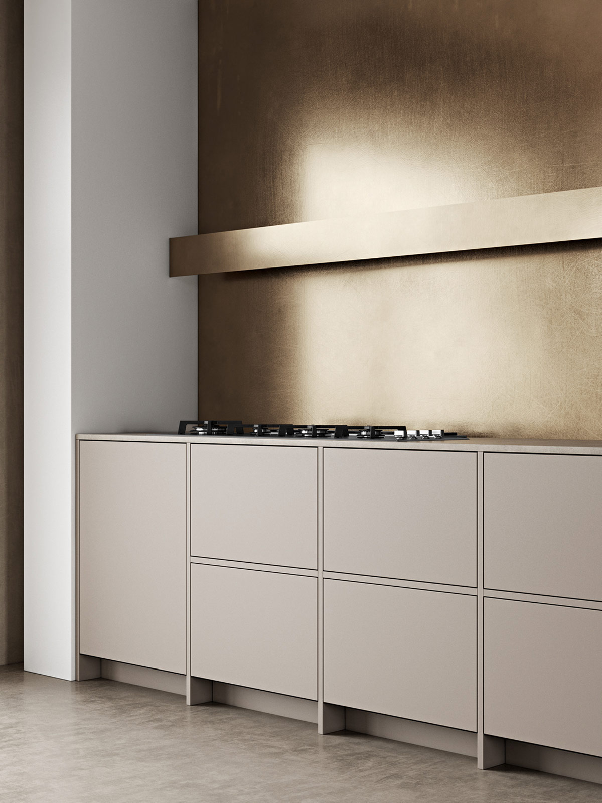
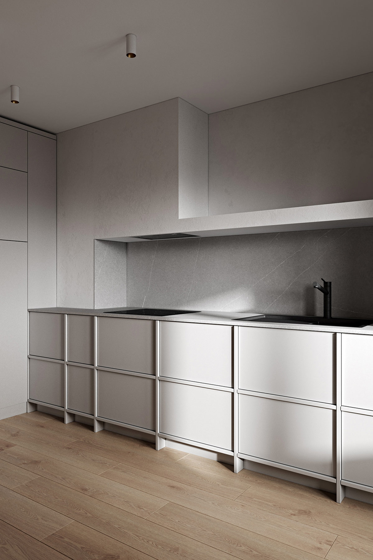
Greige kitchen cabinets provide just enough tint to differentiate them from crisp white painted walls, without causing the kitchen to stand out too jarringly in an open plan living room. Flat fronted drawer units maintain the streamlined finish of a minimalist home.
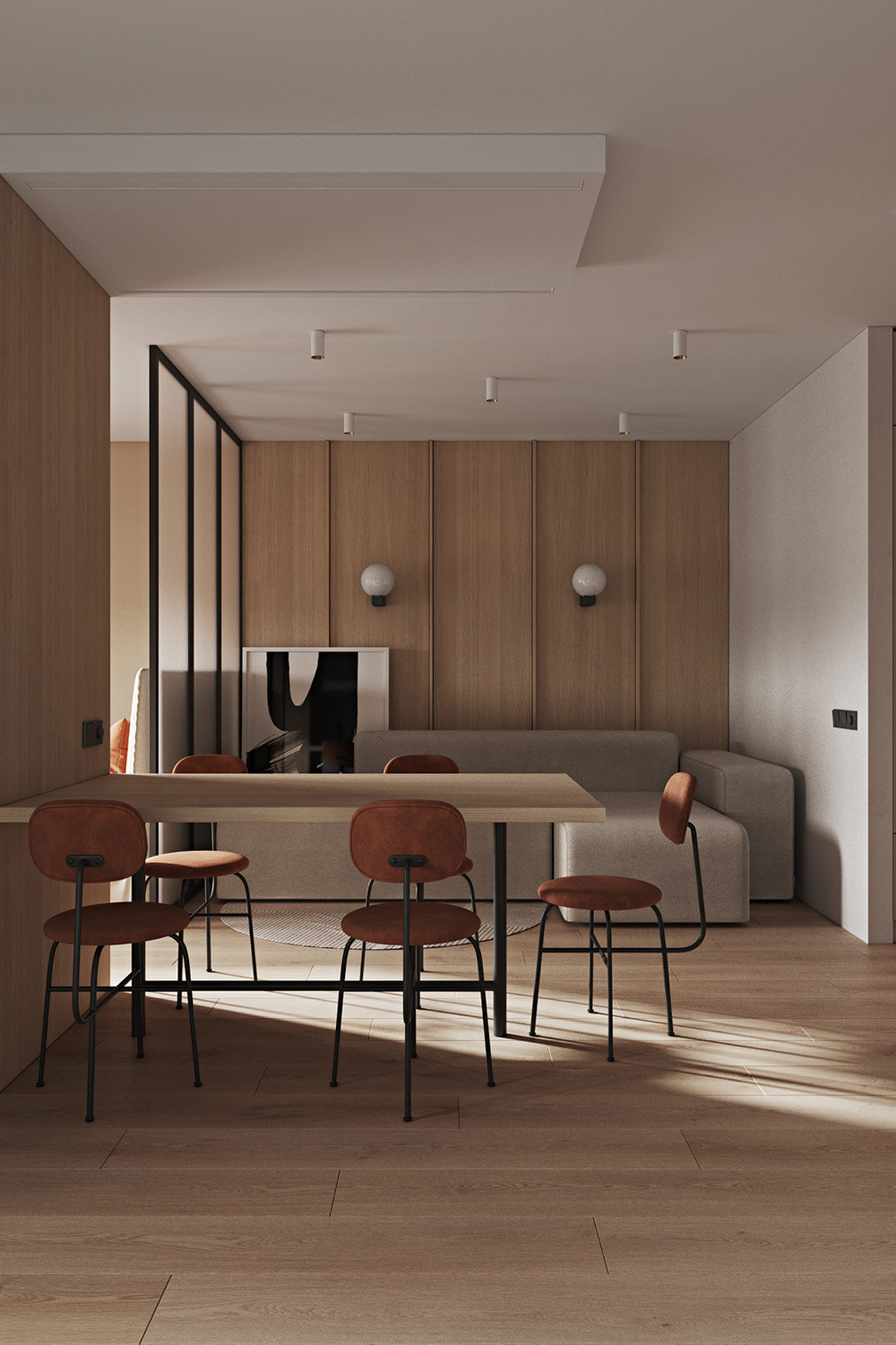
Moving on to example number two. Wall panelling doesn’t have to be overly decorative, smooth slabs can still bring in texture via wood grain effect. A backdrop like this instantly warms without having to consider a colour scheme as such.
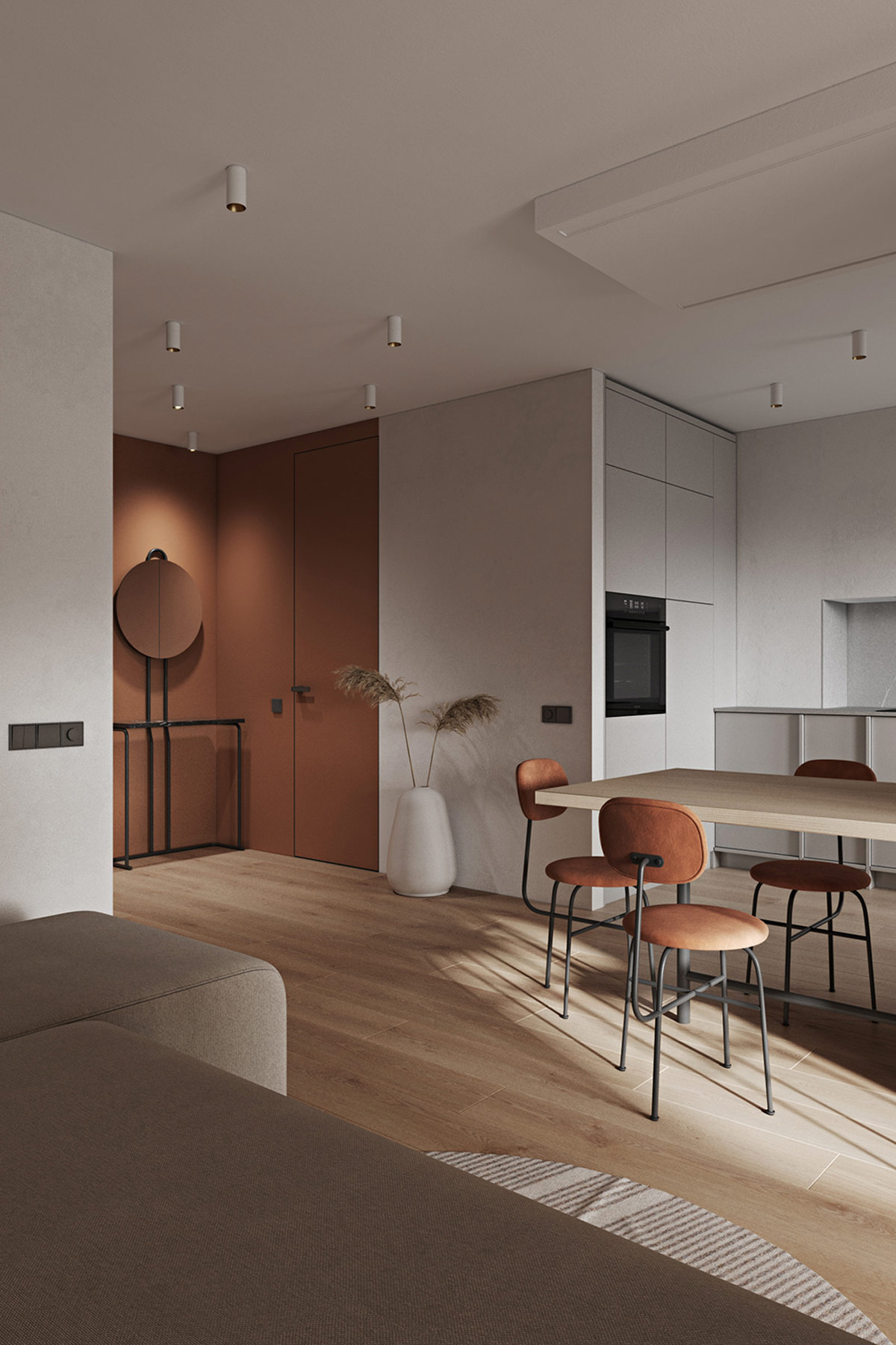
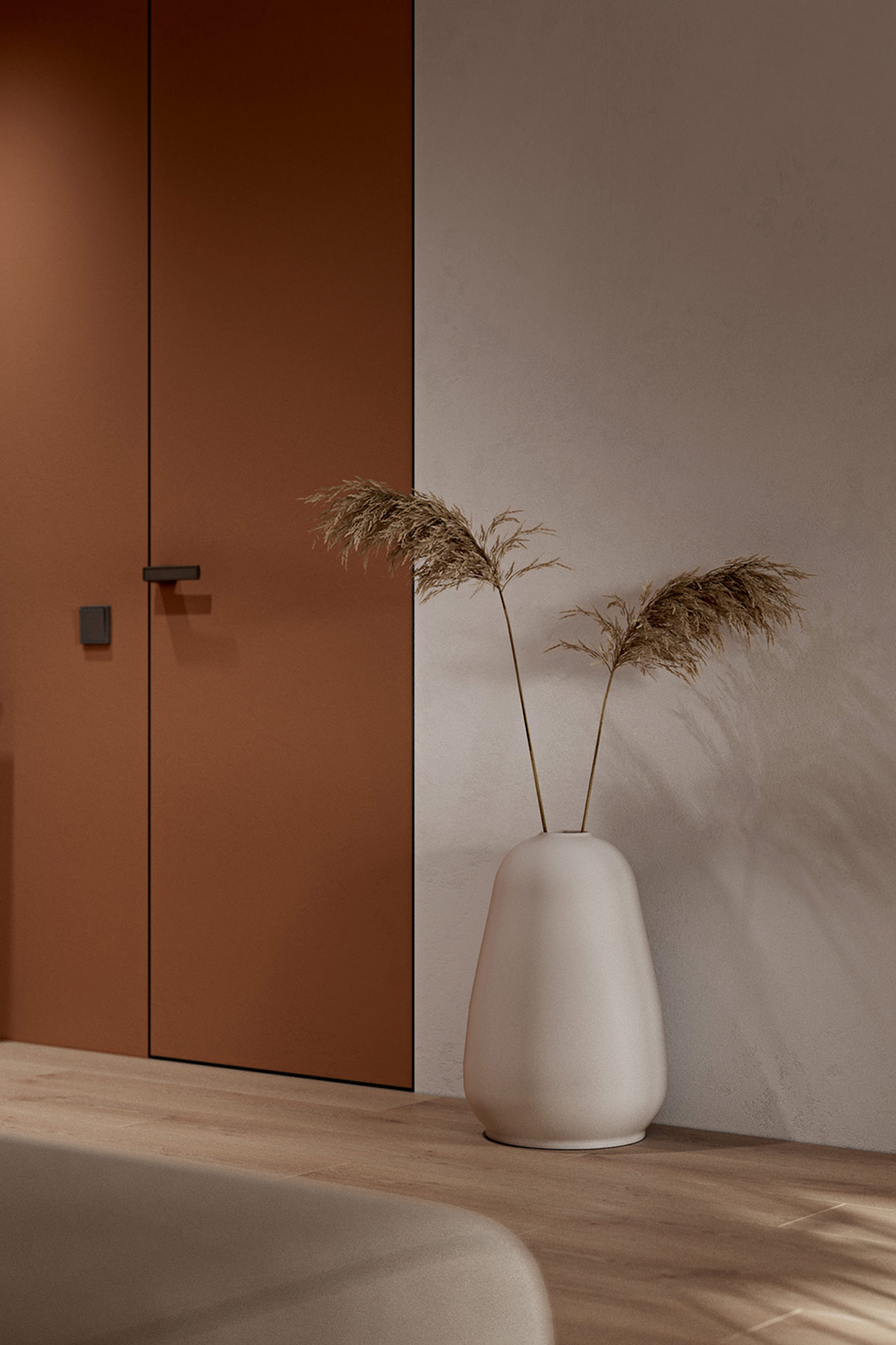
The umber colourway brings great depth as accent wall decor, and makes furniture items look comfortable and inviting.
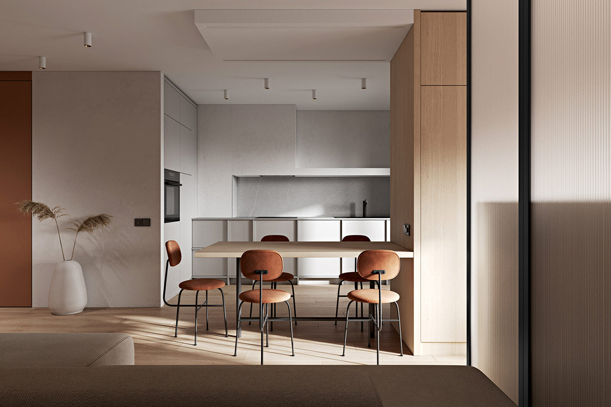
Melding a dining table with a wall clad in the same material creates a focal point that is bespoke to the home.
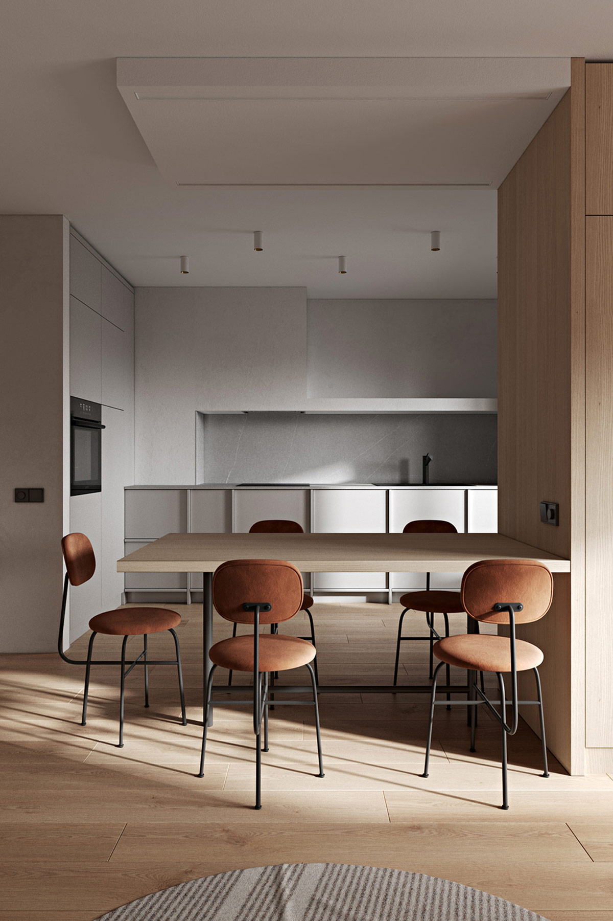
The table no longer looks as though it is crammed close to a wall, but rather that it is part of the wall.
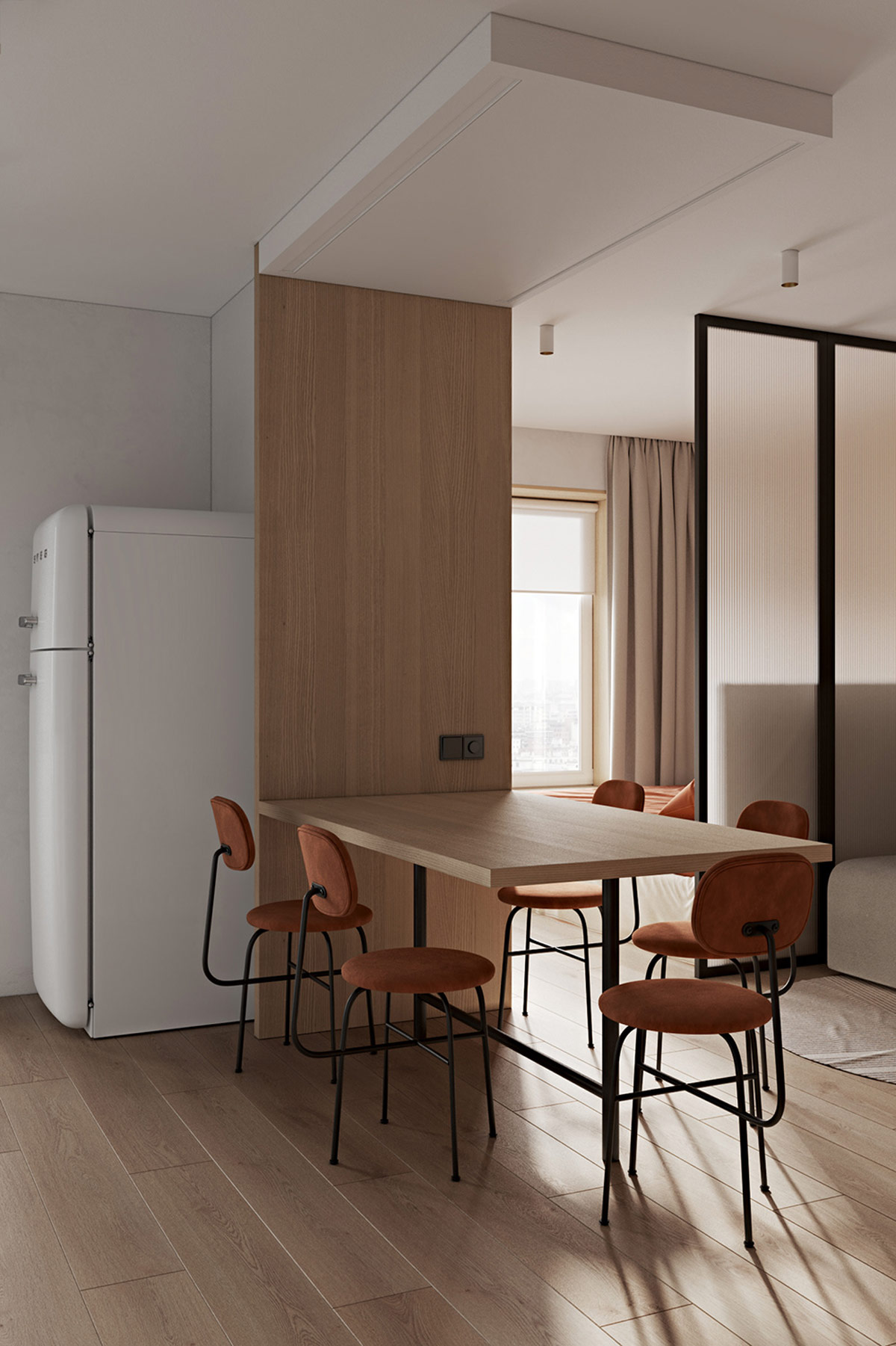
Creating a colour theme for framing and metalwork in the room will unite a minimalist scheme. Choosing black base notes will anchor light decor.
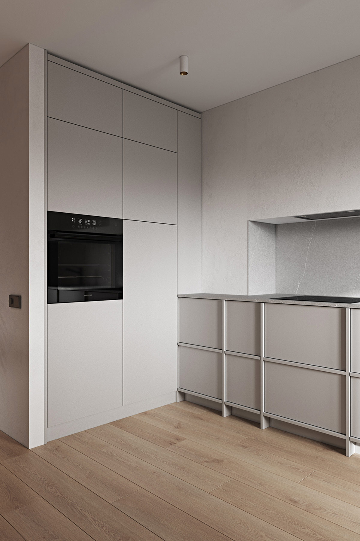
Two-toned cabinets bring added interest to a flat minimalist kitchen.
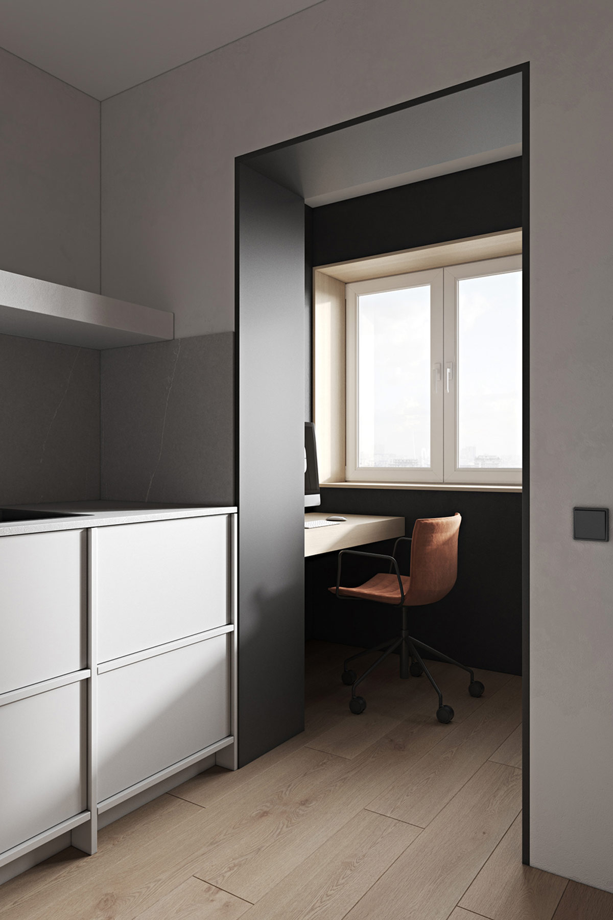
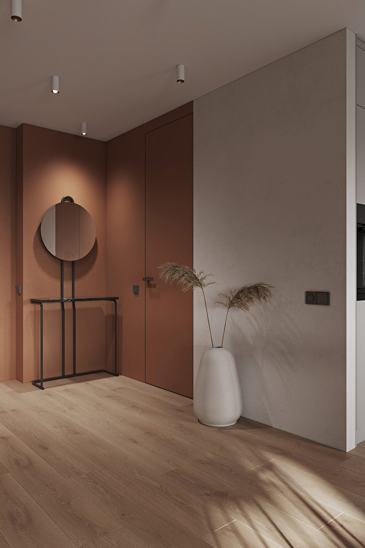
Tucked away tiny spaces can become the gems of a home design. Go darker with wall shades in these nooks and corners to define and embolden them.
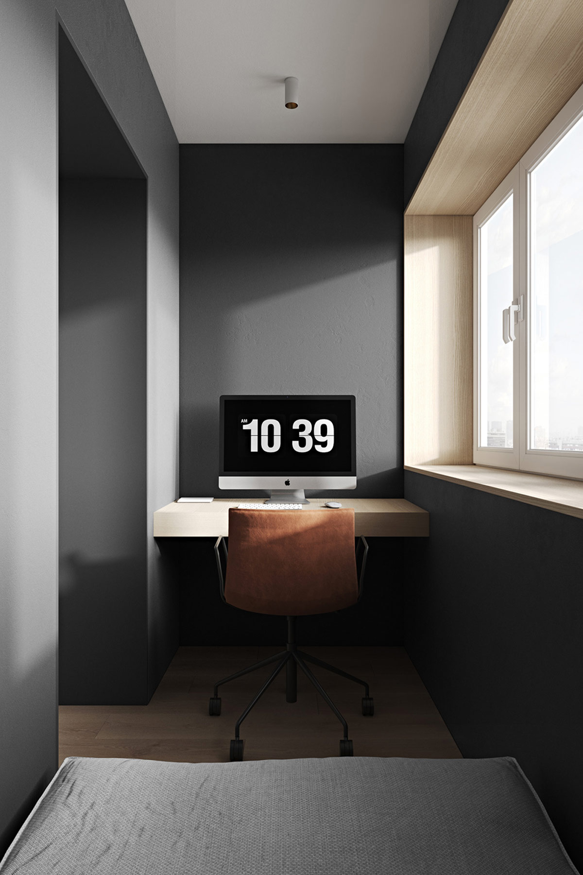
A minimalist workspace can be worked into covered balcony areas, disused closets, alcoves, or the space under the stairs.
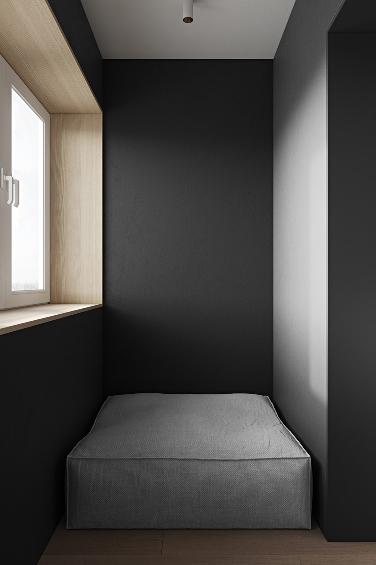
Turn awkward dead spaces into cosy hangouts and reading nooks with the easy introduction of a plush pouf or cushioned storage bench.
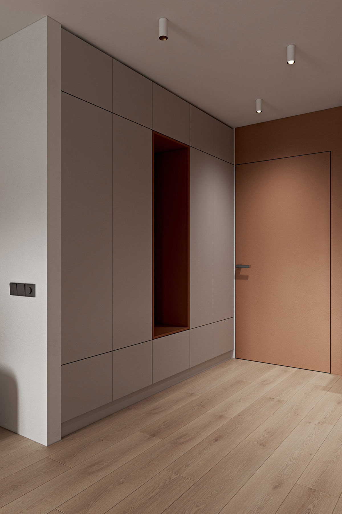
Bespoke hallway furniture is truly transformational. Not only can it solve a home’s storage problems of clothing or equipment overspill, but it can become the home of beautiful bench seats and decorative hanging nooks.
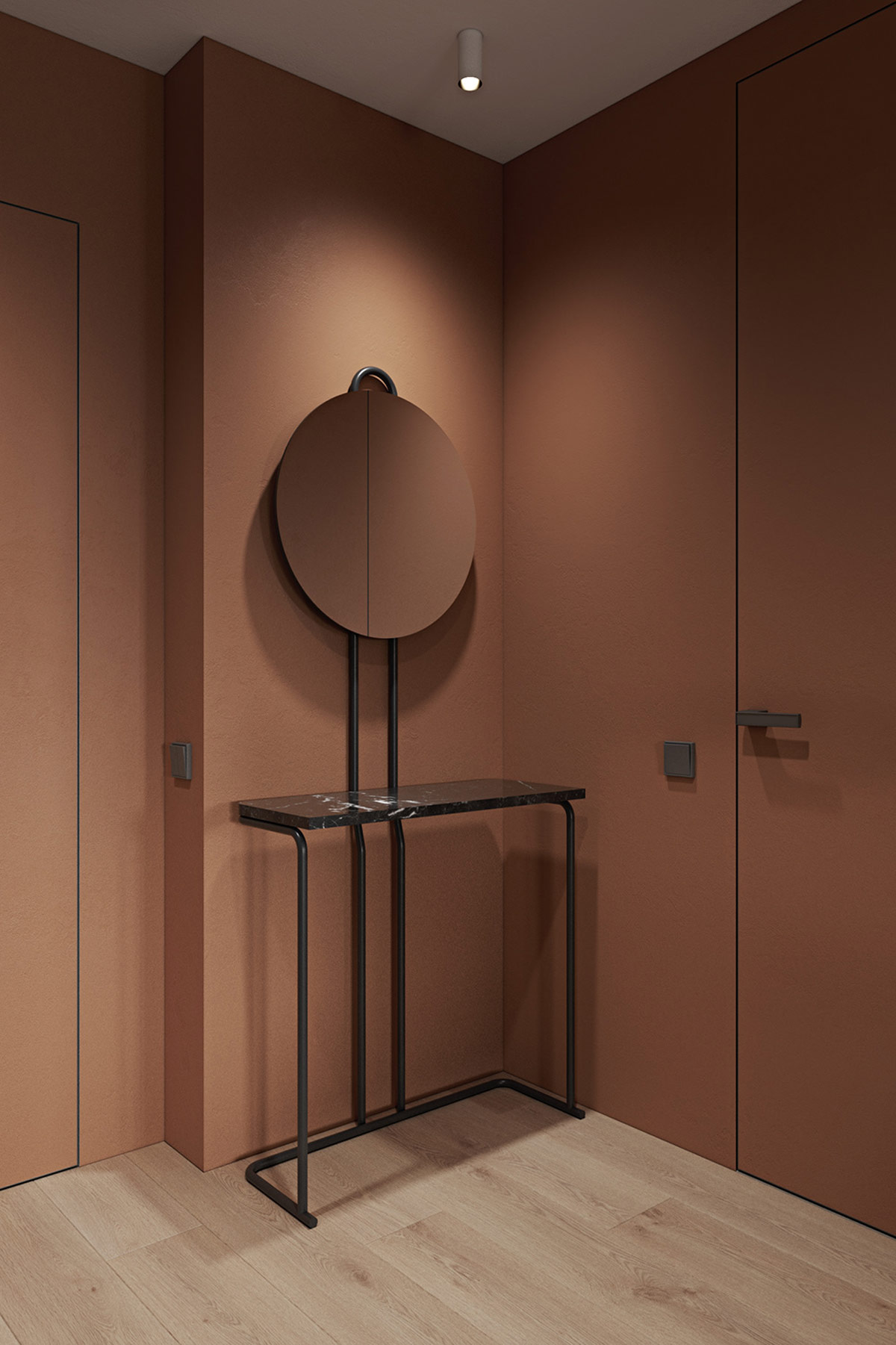
Black marble furniture looks stunning against umber decor. Couple the two together to make an instant impression in a home entryway.
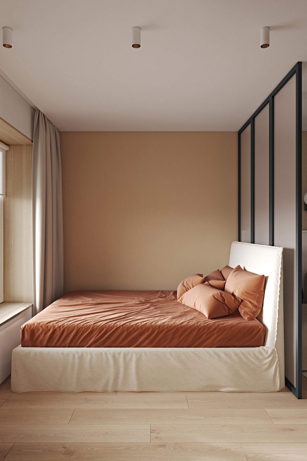
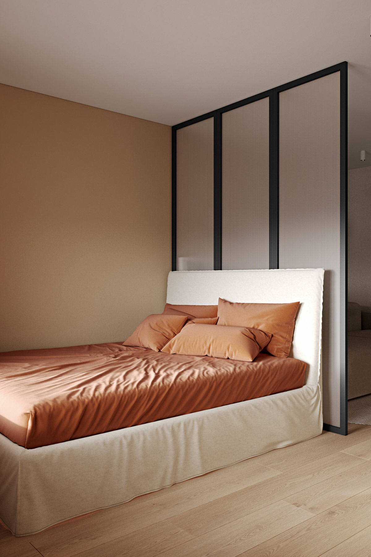
Umber shades fashion a cozy bedroom.
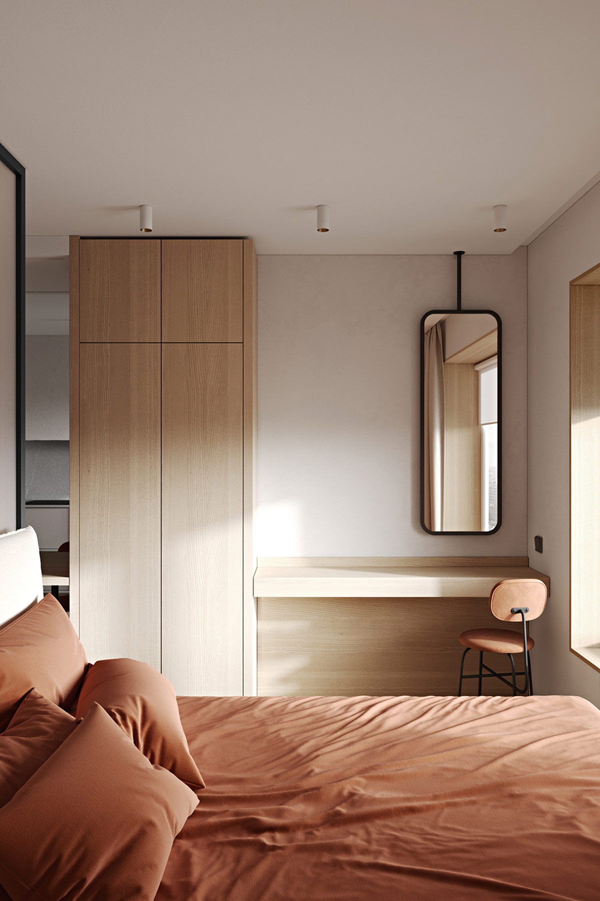
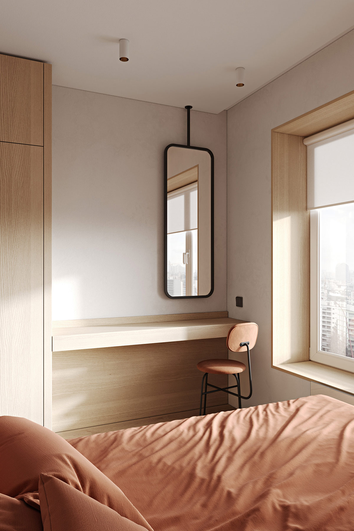
Think outside the box on everyday items. A vanity mirror doesn’t have to be wall mounted, or stand on the dressing table, it can descend unexpectedly from the ceiling.
