Open concept apartments offer a sense of openness and visual freedom but certainly present stylistic challenges for designers and residents alike. Much like studio apartments, these spaces require a certain level of aesthetic cohesiveness while marking each functional space with its own sense of individuality – it's all about balance. This tour presents three open concept apartments that get it right, each one beautifully visualized by Ukraine-based architect and interior designer Artyom Bezfamilniy. From casual to retro to minimalist, each one demonstrates how even restrictive layouts retain lots of opportunity for expression.
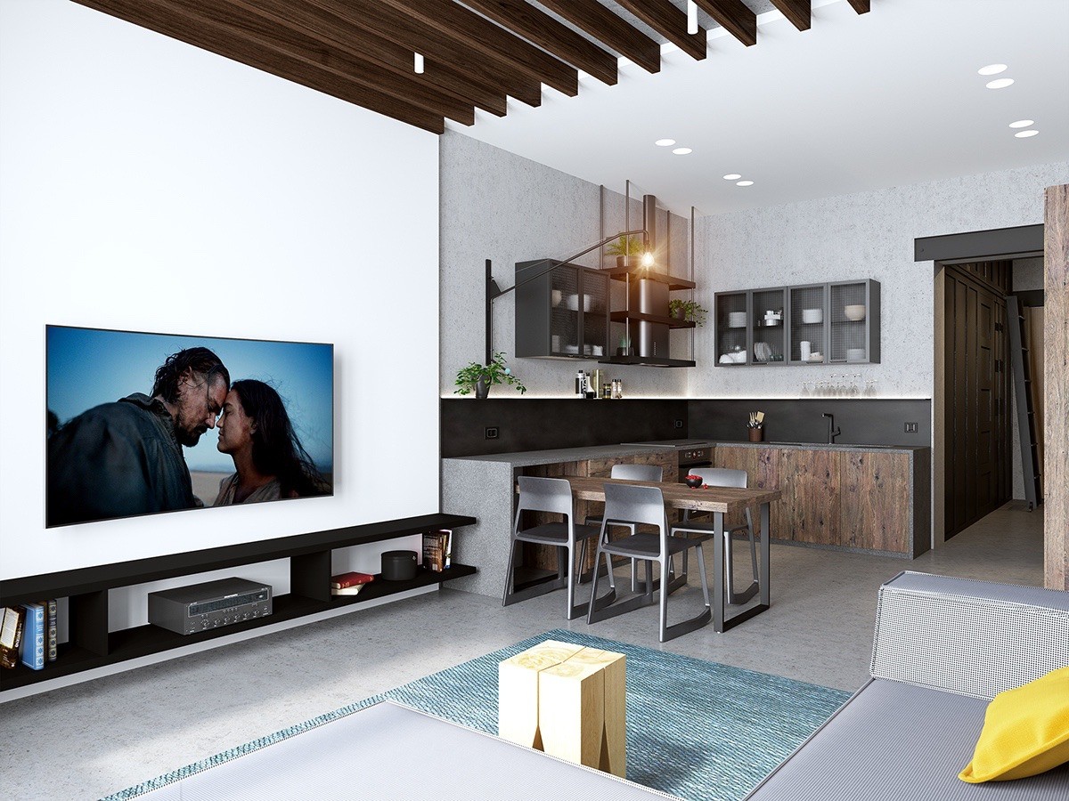
With a carefully planned layout and a refreshing interior theme, this apartment manages to feel bright and spacious despite its limited size. And that's an impressive feat considering the dark accents used throughout! A living space occupies the larger portion of the room with a low-profile kitchenette tucked away near the entrance, each functional area managing to coexist peacefully with the next.
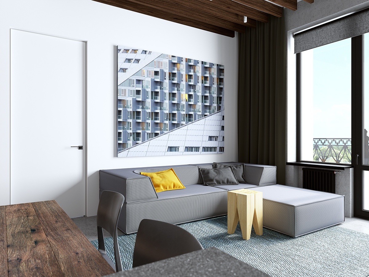
Architectural photography is a great accent for a home like this one, where exposed ceiling beams and contemporary materials demonstrate a love for the craft.
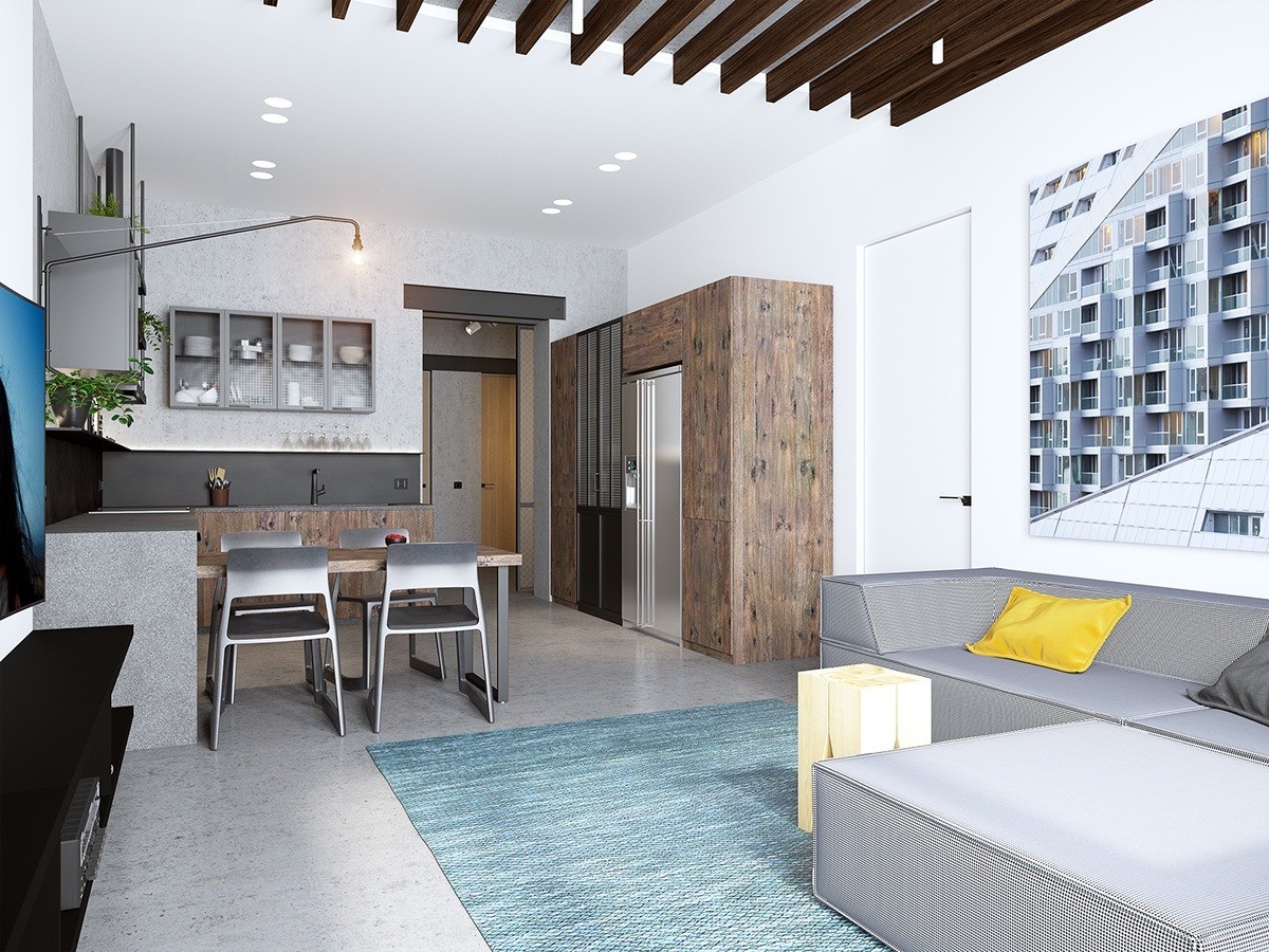
Contrasting materials help solidify the visual divide between each area. The kitchen embraces a high contrast theme of wood cabinetry with matte black accents, yet the living room adopts a more casual style with comfortable mid-range tones.
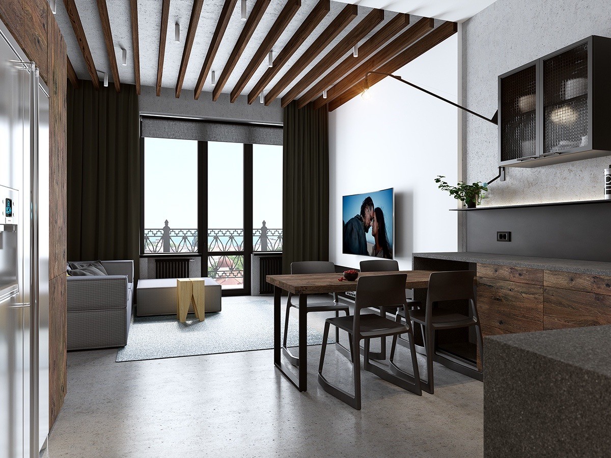
While some open concept layouts employ a kitchen island as a physical barrier, this home instead uses a dining table. Pulling away the chairs from the interior side instantly expands usable work space.
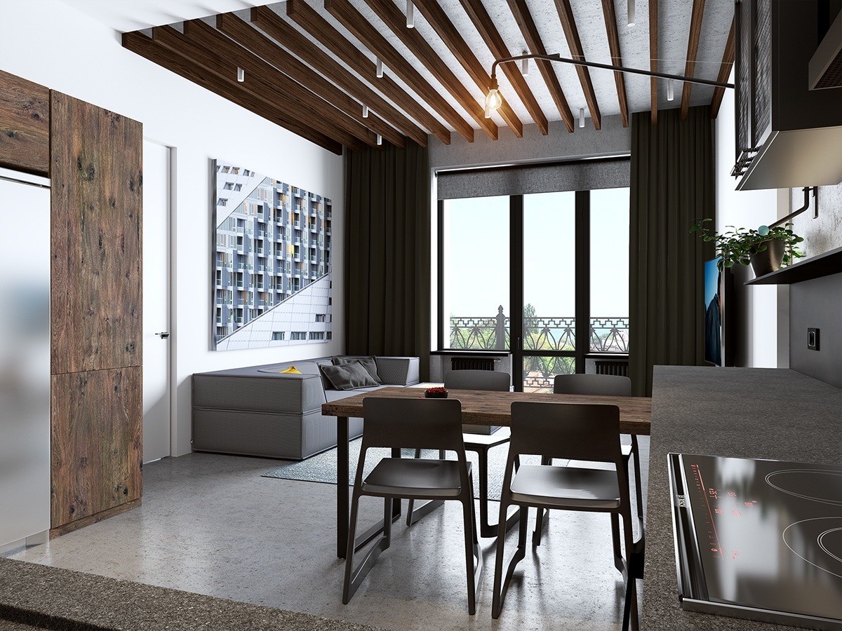
The living room is emphasized even further by the abrupt transition between ceiling and wall materials, with actual dimensional variation rather than a simple texture or color change.
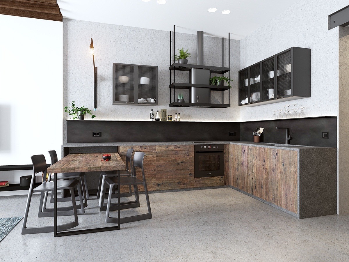
Meanwhile, the kitchen is defined by more of an industrial aesthetic. Yet it doesn't feel cold, thanks to the knotty wood cabinetry there to offer up warmer color accents.
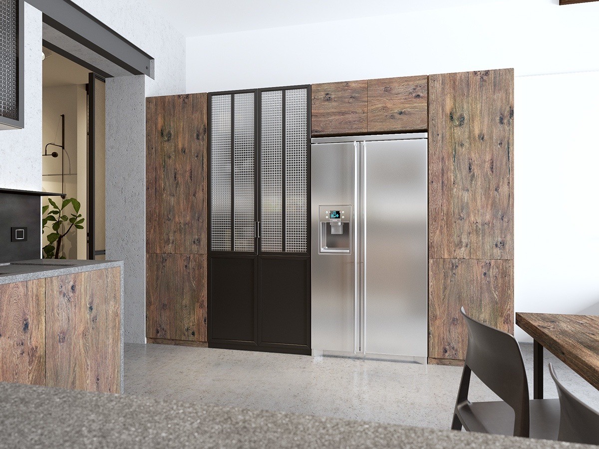
The wooden cabinetry further serves to transform the utilitarian necessity of storage into an artful addition to the room.
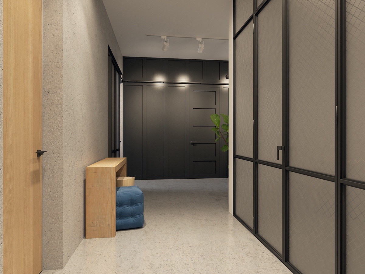
And finally, a quick peek at the hallway that wraps around the bedroom and leads to the entry. One of the doors, of course, opens to the bathroom.
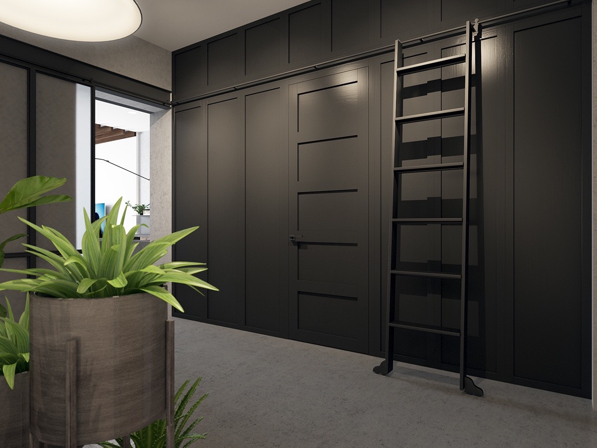
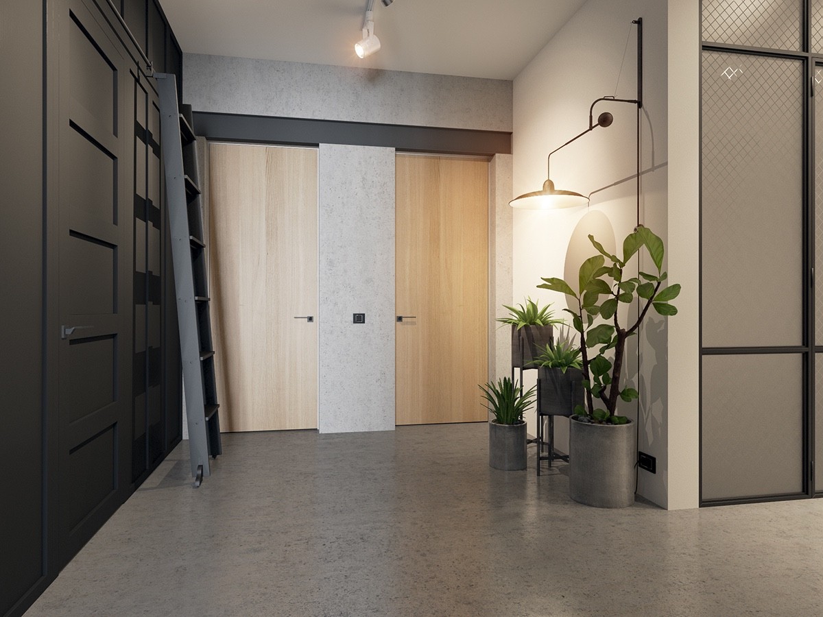
To maintain the minimalistic appeal of the apartment, the hallway offers abundant storage both high and low. A convenient sliding ladder allows access the higher shelves.
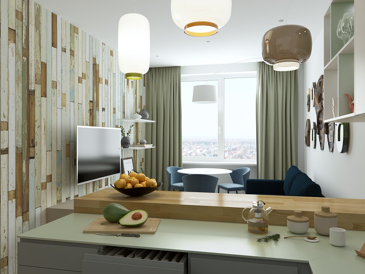
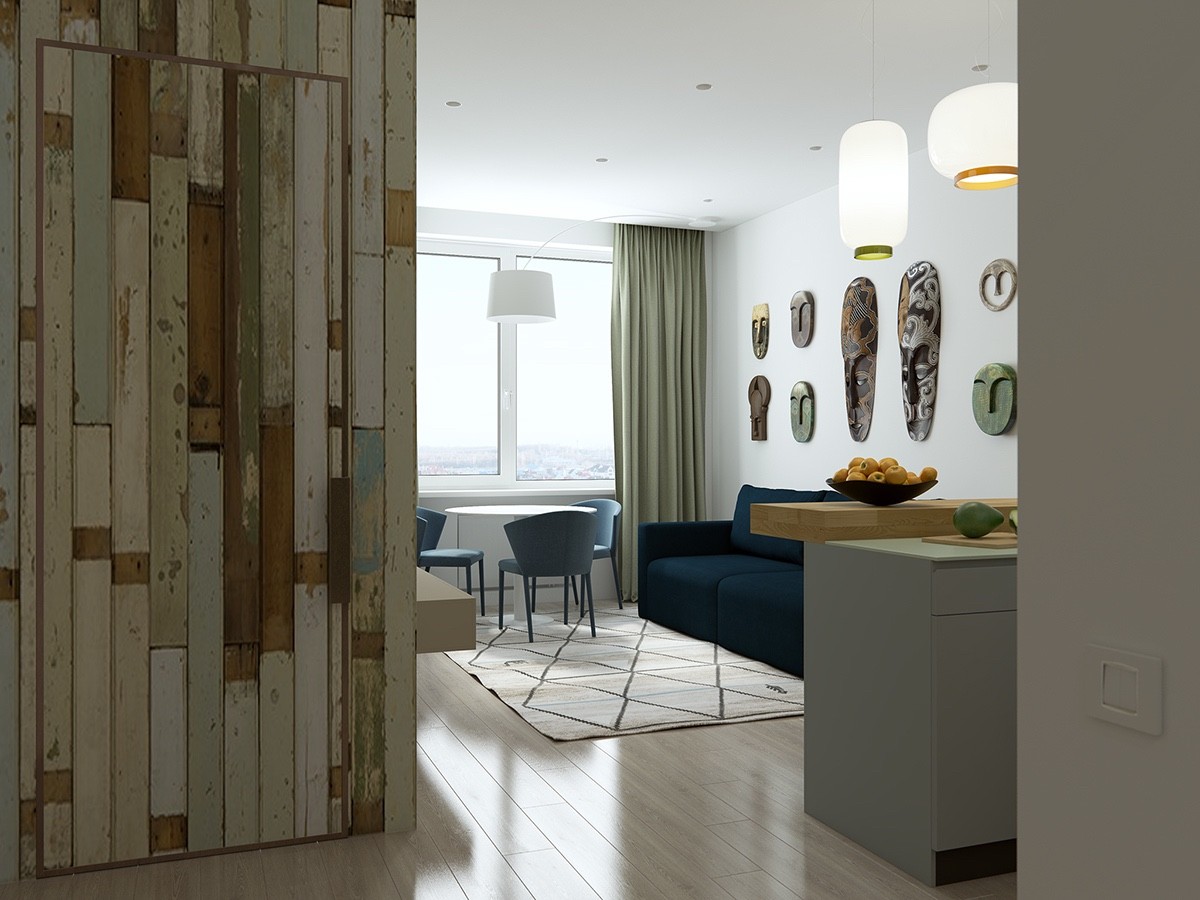
This next home is a little smaller and significantly more colorful. The color theme of wood, powder blue, and olive green give this space a cheerful retro atmosphere – rounded lighting and furniture act as subtle throwbacks as well.
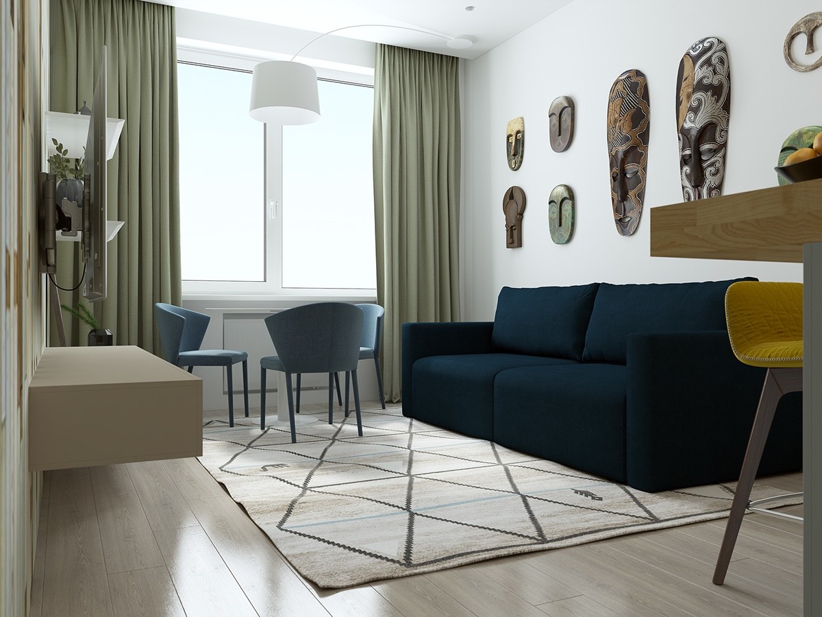
Because the wood paneled accent wall grabs so much attention, it makes sense to keep things a little more simple on the other side of the room. These masks make a huge impression without feeling like visual clutter.
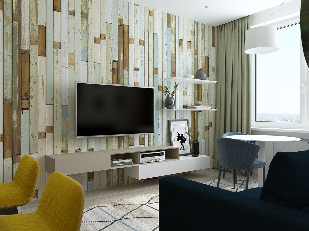
The cool thing about the accent wall is that anybody can achieve this look at a reasonable price, either by arranging authentically weathered reclaimed wood or by distressing new lumber by hand.
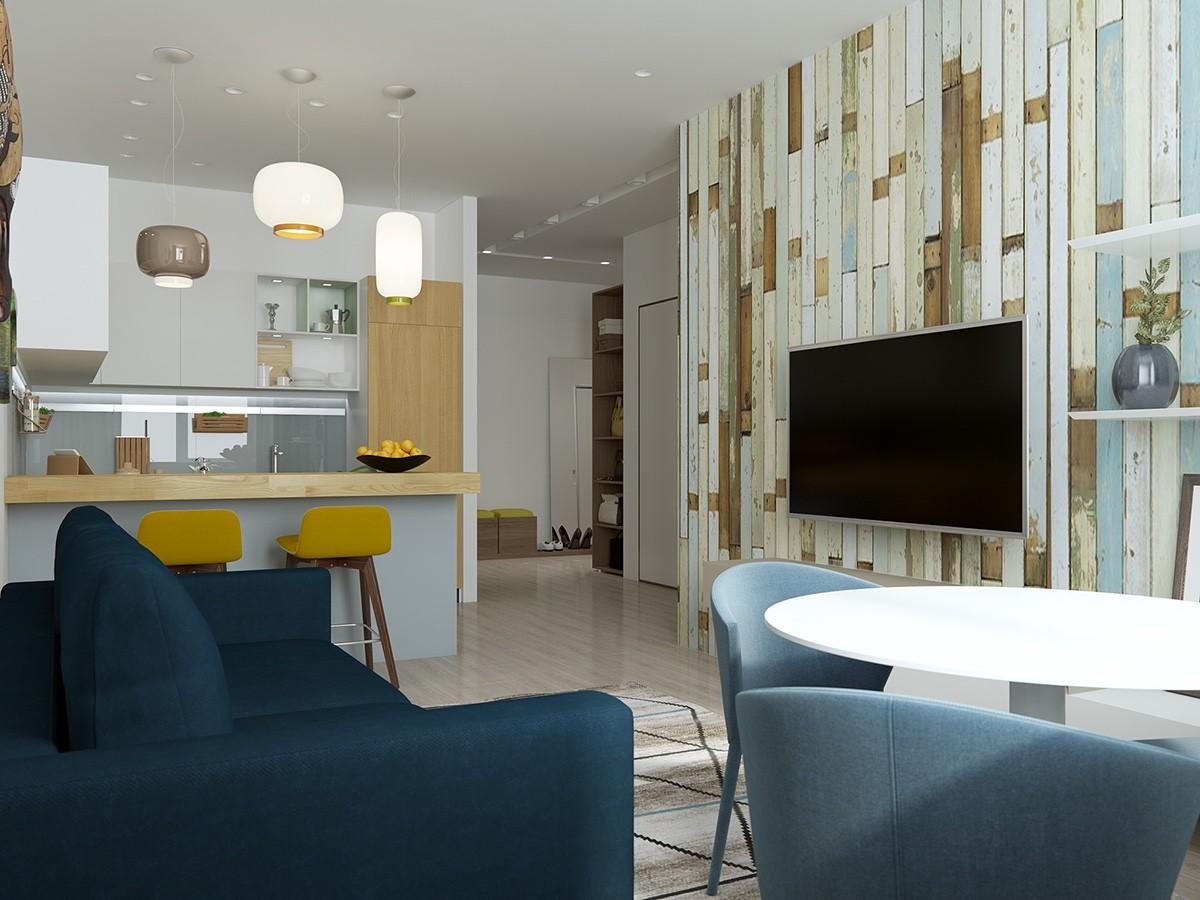
The little kitchen takes the same color palette but takes turns heightening and subduing the colors within. The bright breakfast stools draw immediate attention, for example, but the inner cabinets take a subtle approach.
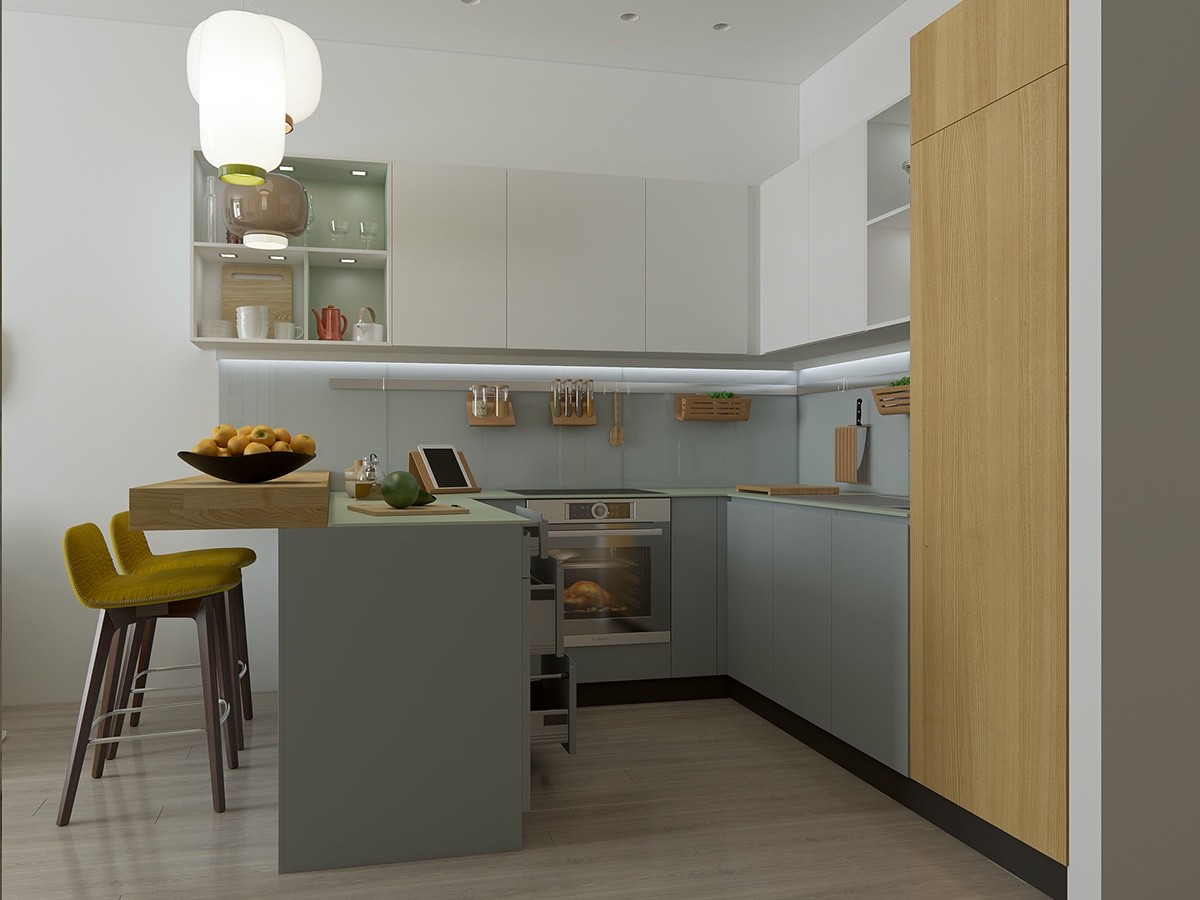
Wood utensil holders hang from a rail that runs the length of the backsplash, a creative and space-saving solution suited for a kitchen as compact as this one. A homeowner could even recreate the functionality with magnets!
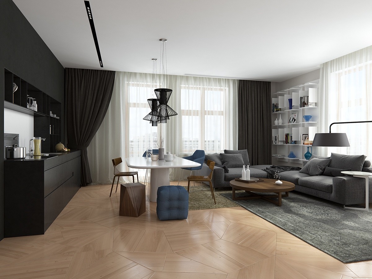
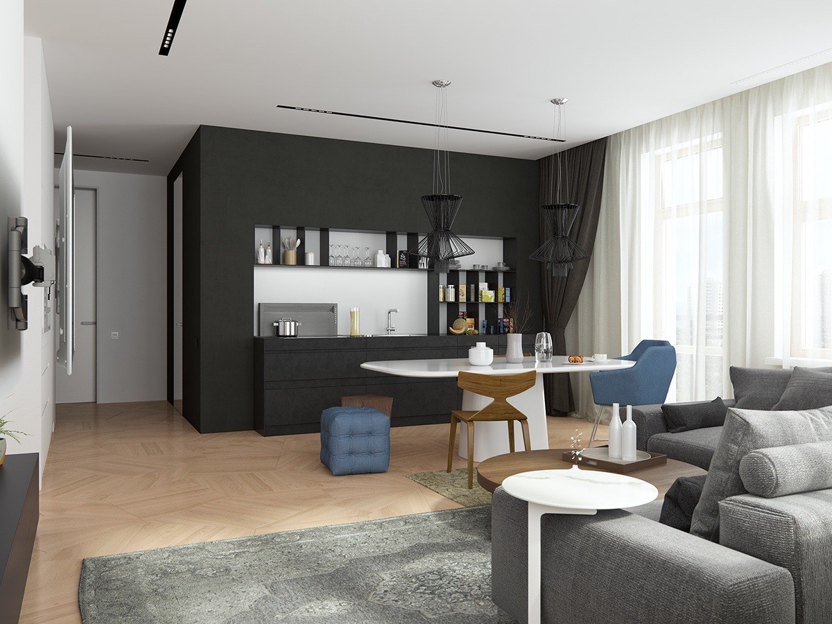
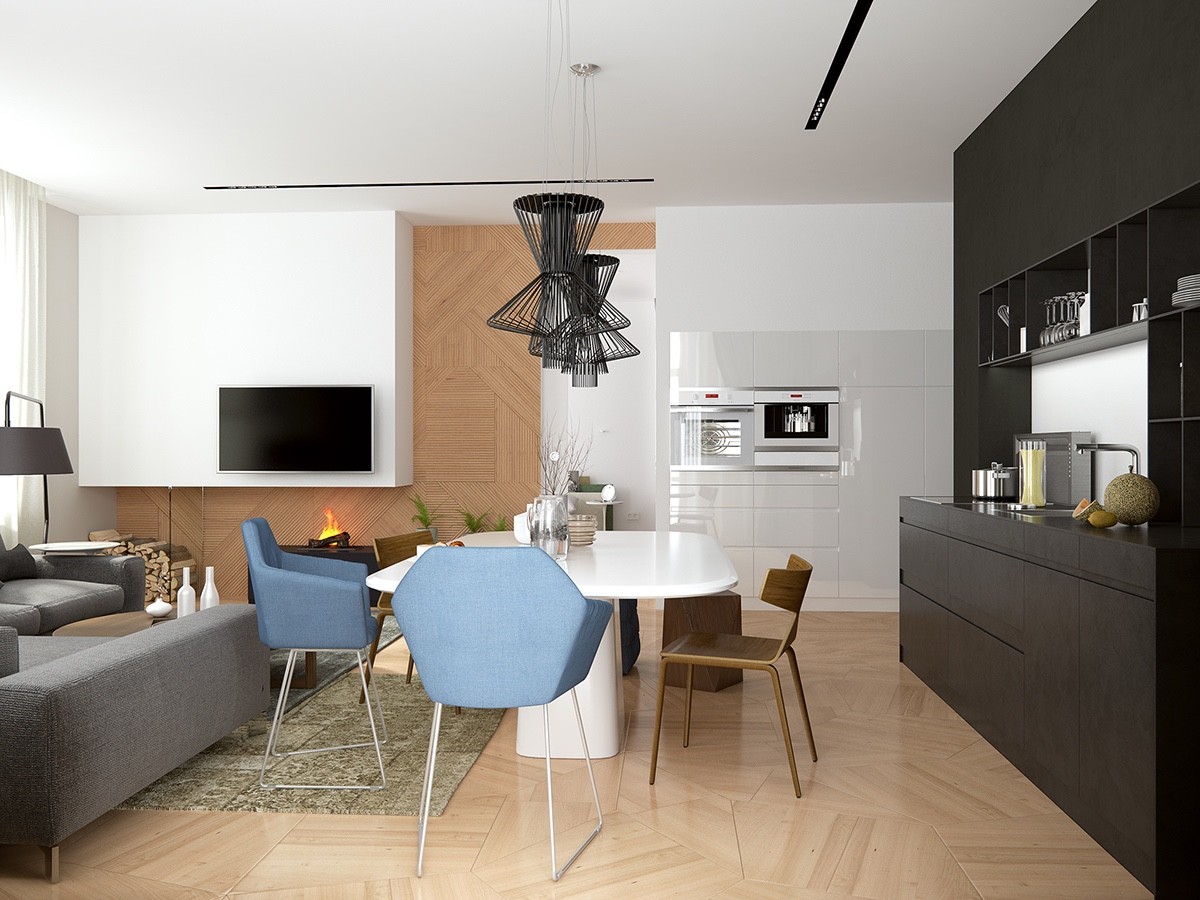
And here's a quick peek at a sleek classic style. This home foregoes the increasingly common approach of using a kitchen island as a divider, instead including the kitchen in an organic and inclusive way, almost like any ordinary appliance or piece of furniture.
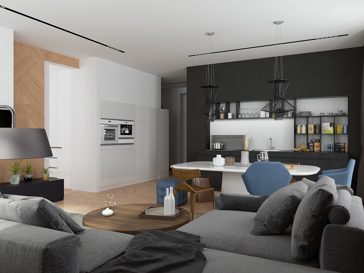
The more utilitarian kitchen features line the wall near the entryway, clean and minimalistic. It offers plenty of storage but doesn't look bulky thanks to the elimination of external handles in favor of modern hardware.
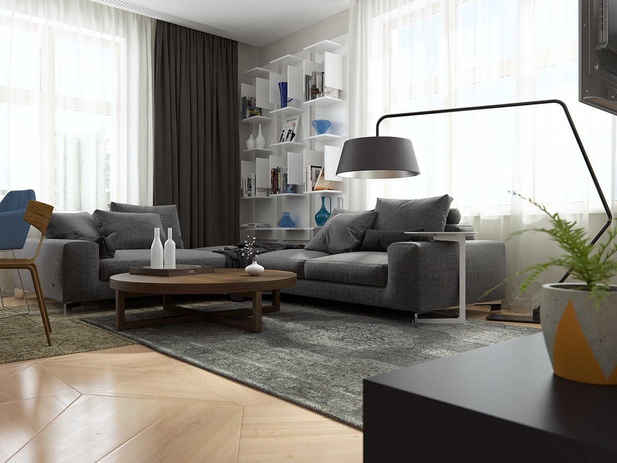
Subtle geometric themes inform every aspect of the design, from the gorgeous floorboards to the unique bookshelves and even the elegant angles of the floor lamp.

