Dark grey just looks so sophisticated with a white and wood home decor scheme doesn’t it? The depth of hue works sharply against an icy white edge, and is effectively warmed by smooth natural tone. The quantity of dark accent colour used can affect the mood of a place. Large swathes make a room feel dramatic, a smaller expanse appears smart and crisp. This collection of three home design tours use dark grey, white and wood tone in all different ways. Our first house feels homey and warm, the second is slightly more suited and booted in a city slicker style, and the last sits somewhere comfortably in the middle.

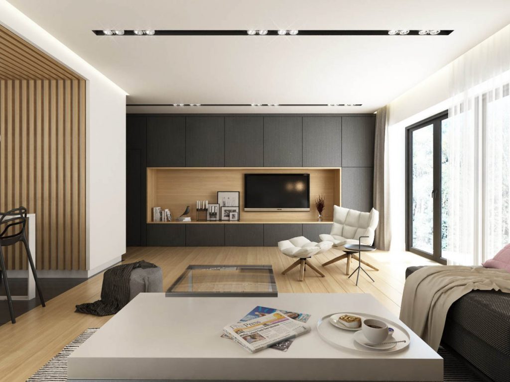
Flying in the face of any critic who ever unfairly deemed grey as always being a dull or cold neutral, this home design is an incredibly cosy and cheerfully bright affair. A wide spanning arrangement of wall cabinets frame a warm wooden centrepiece that lays home to the flat screen television, a small gallery of prints and a mini book collection. The vista is lifted further by a modern accent chair upholstered in ivory coloured fabric. The chair used here is the Husk by Patricia Urquiola.
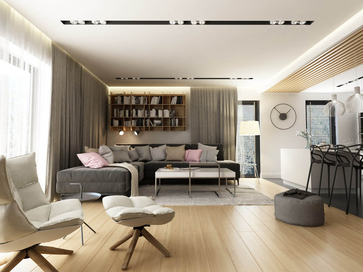
The large linear sofa is also a charcoal grey hue, which has been covered in a scattering of cushions in lighter shades of grey, pinstripe and pale pink. A large wall clock adds interest to a plain wall between the lounge and kitchen areas.
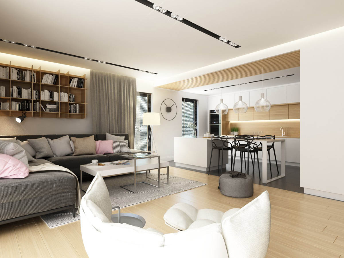
The kitchen is a delicious amalgamation of white and wood cabinet fronts, and a white central island with a dining end.
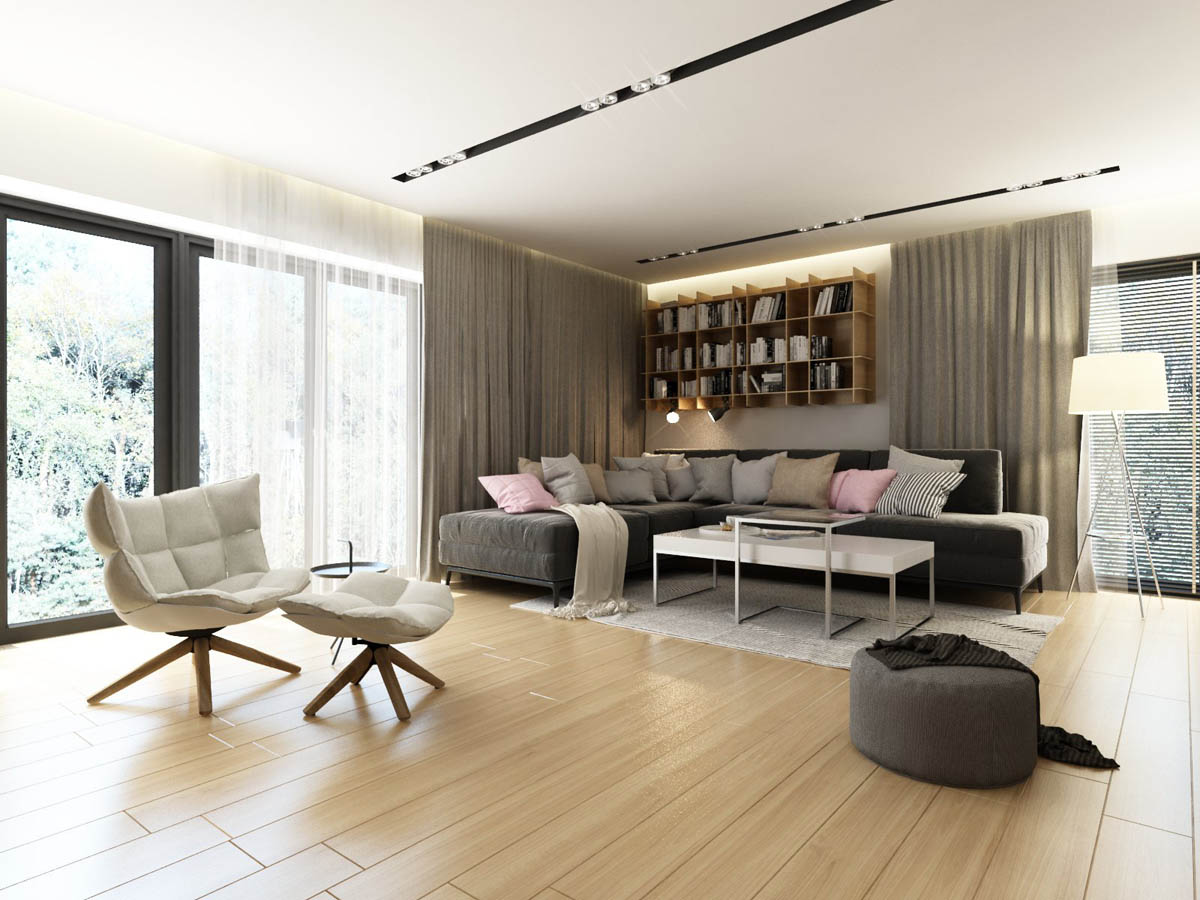
Above the long grey sofa, a large wall mounted wooden bookcase brings some of that warm natural tone over into the seating area. A floor lamp with a white shade provides task lighting for reading in the evenings.
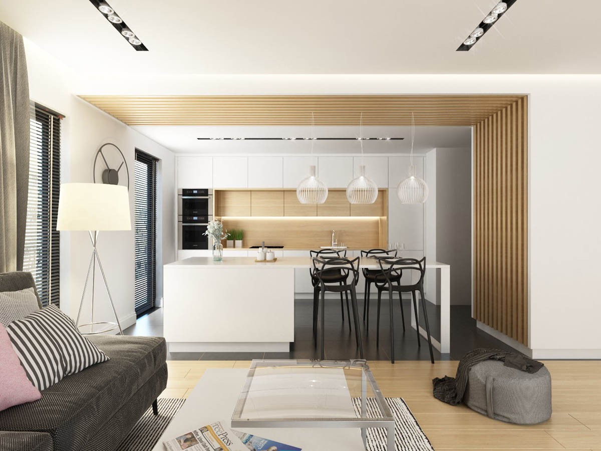
The four black kitchen bar stools in this kitchen diner setup are the Kartell Masters.
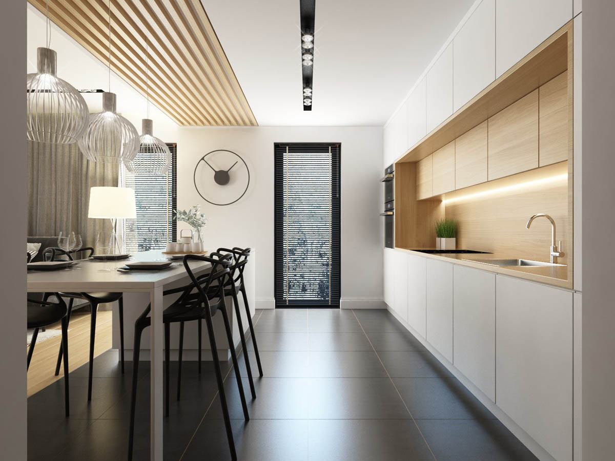
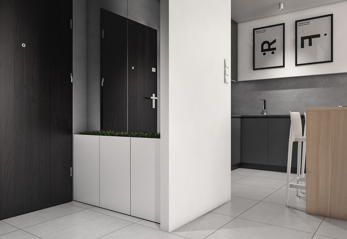
The minimalist kitchen has no handles on the units, no visible extractor and only herb planters for decoration.
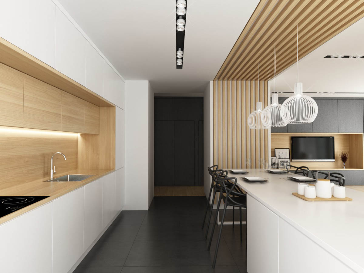
Above the kitchen island that doubles as a dining table, three kitchen pendant lights hang from a decorative wooden stripe that reaches up and over the entire central countertop. These appear to be the Octo 4240.
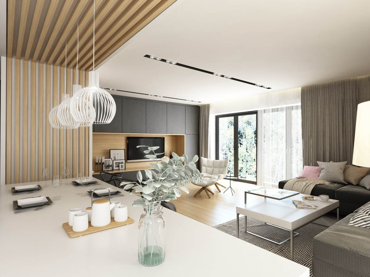
The wooden slatted design helps to visually define the cooking and dining area from the rest of the living room, as well as adding interest and warmth of colour.
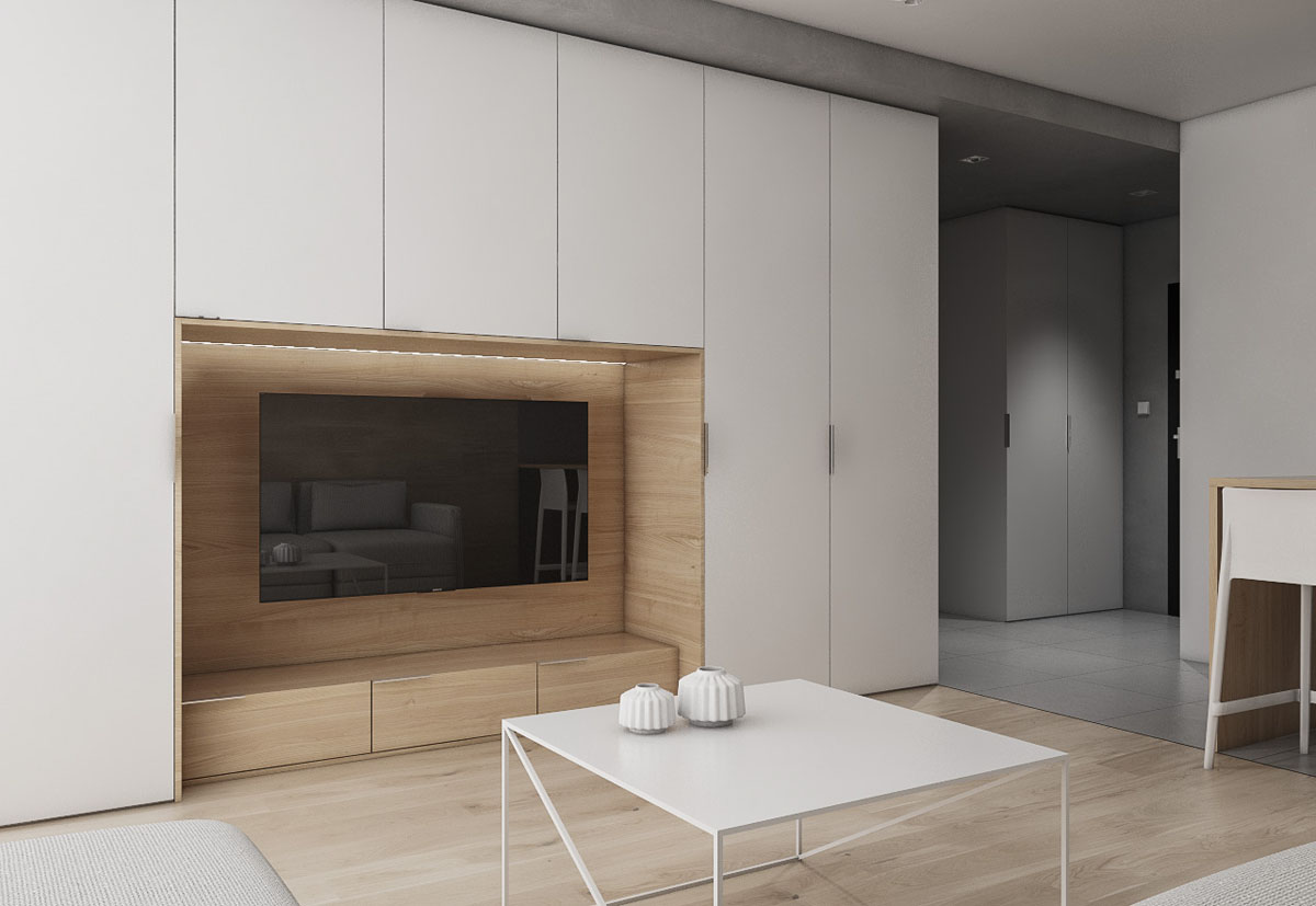
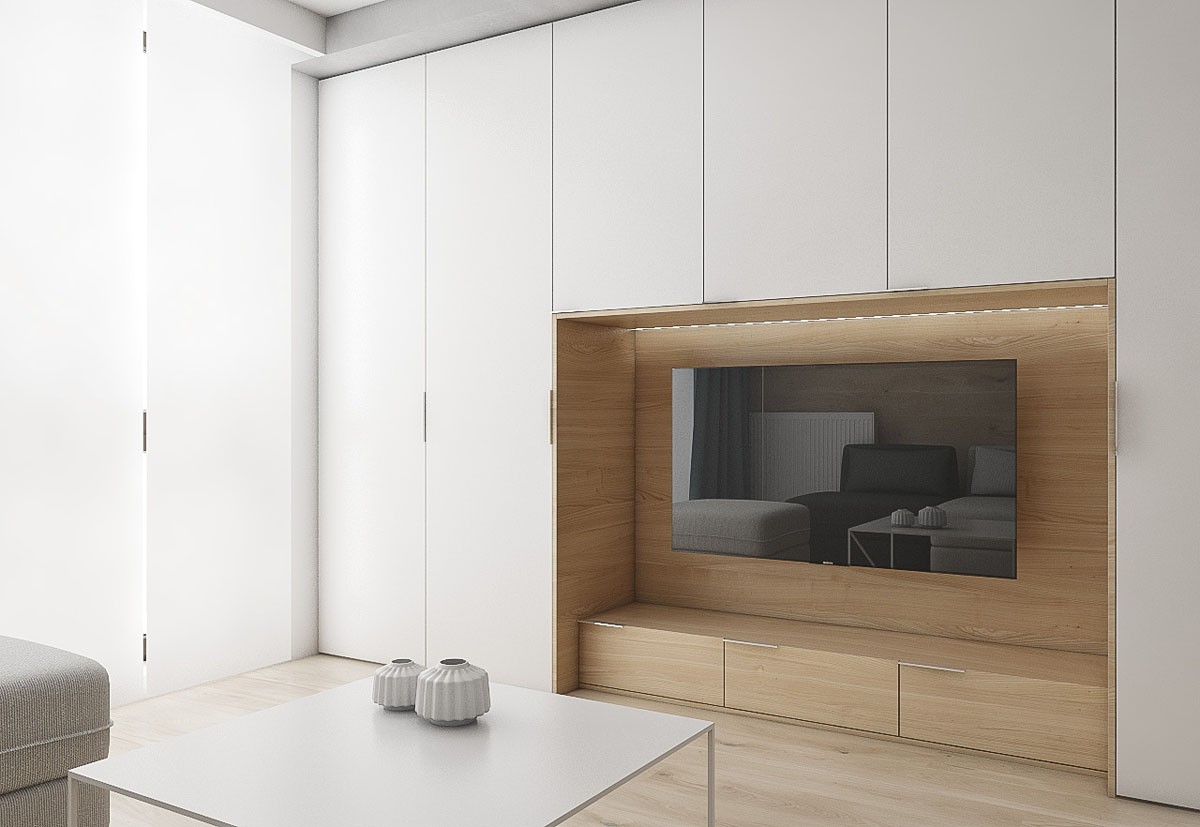
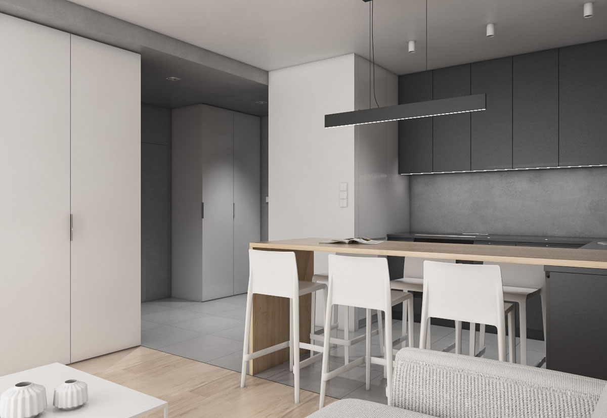
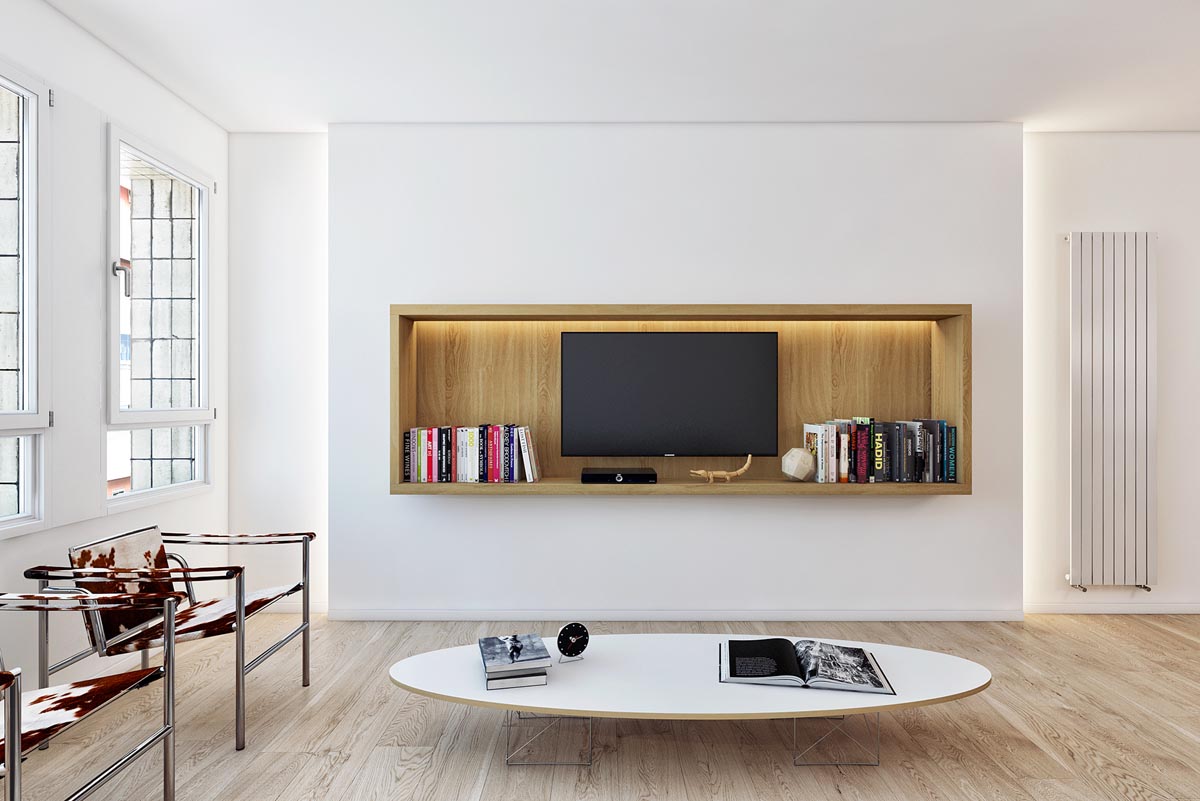
Similarly to our first home design, this interior also has a wooden backdrop supporting the TV. This time the expanse of wood has an airy white surround. A matching white coffee table sits between the entertainment unit and the sofa, kept plain except for two small decorative vases.
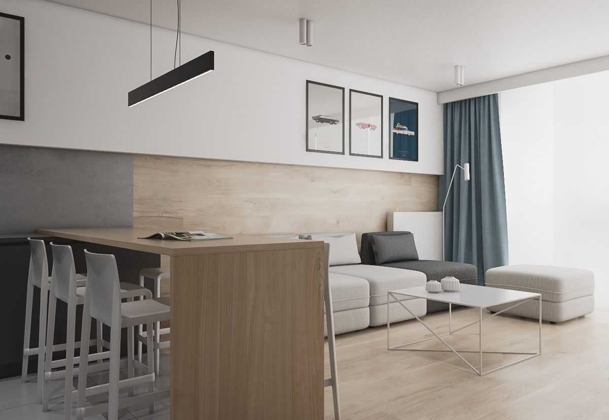
The modular sofa is a quirky combination of shades, with one dark grey segment nestled beside all white ones and a white footstool. A neat floor reading lamp makes this a functional reading corner after dark. A splash of blue makes its way into this grey, white and wood scheme, in the form of an art print and matching curtains.
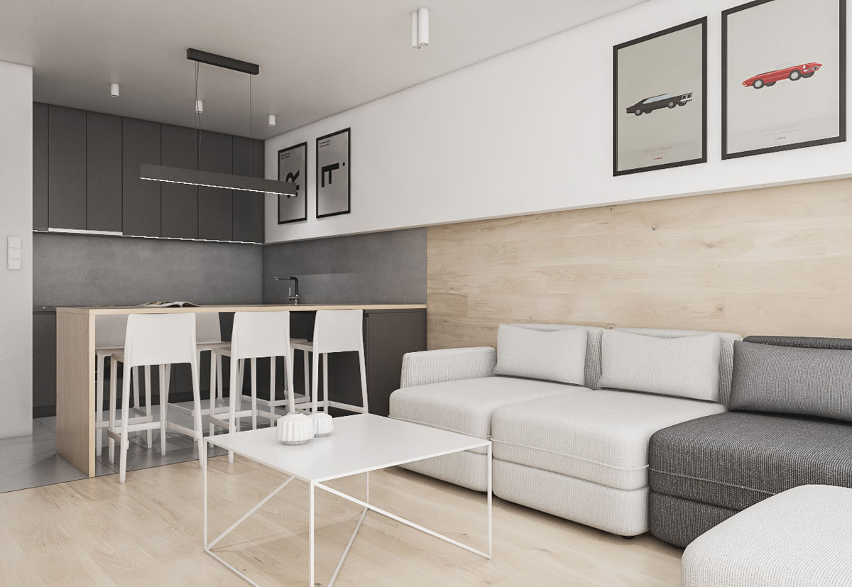
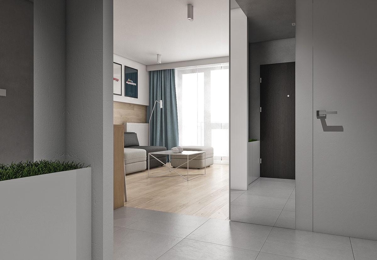
Squared-off expanses of wood and grey over the walls and floor give this apartment an unusual cubist look.
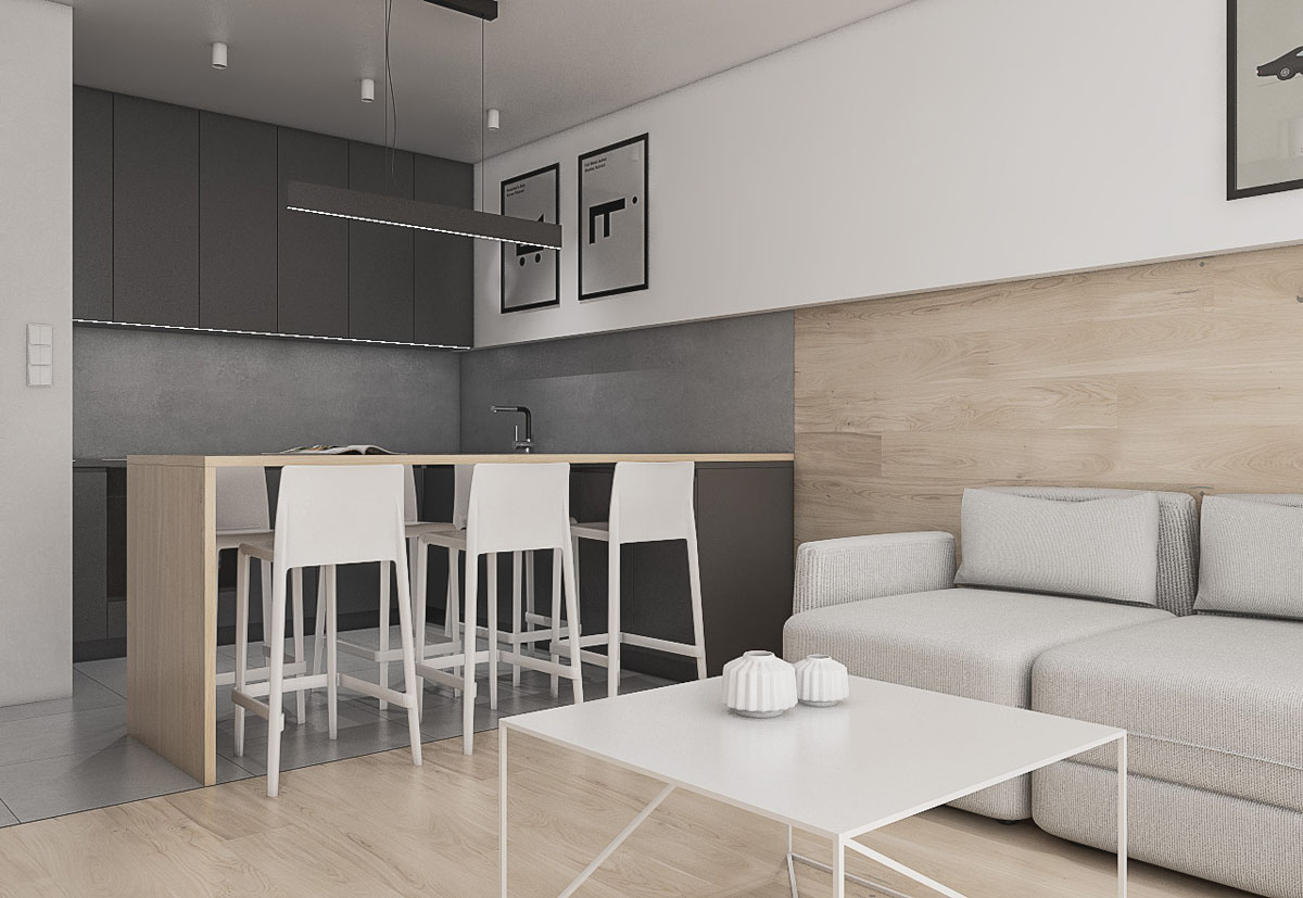
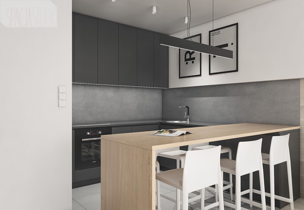
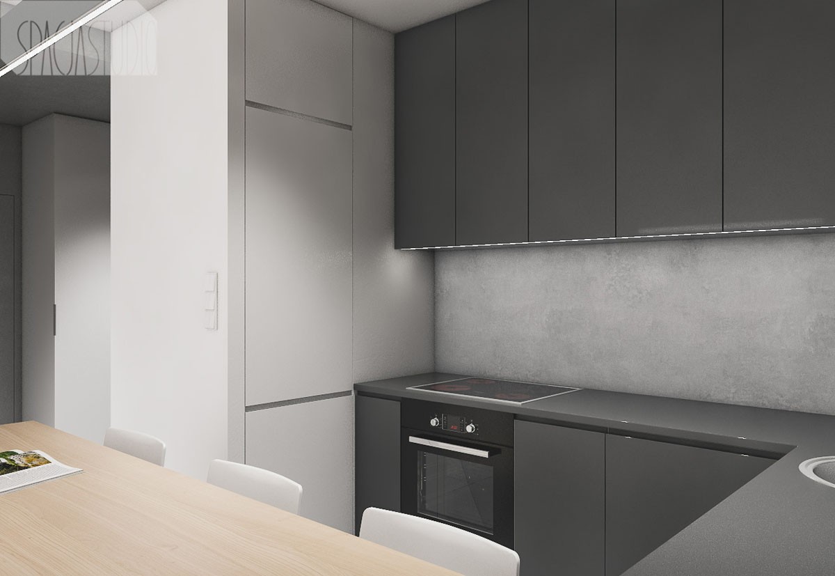
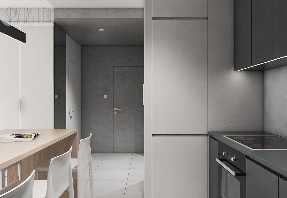
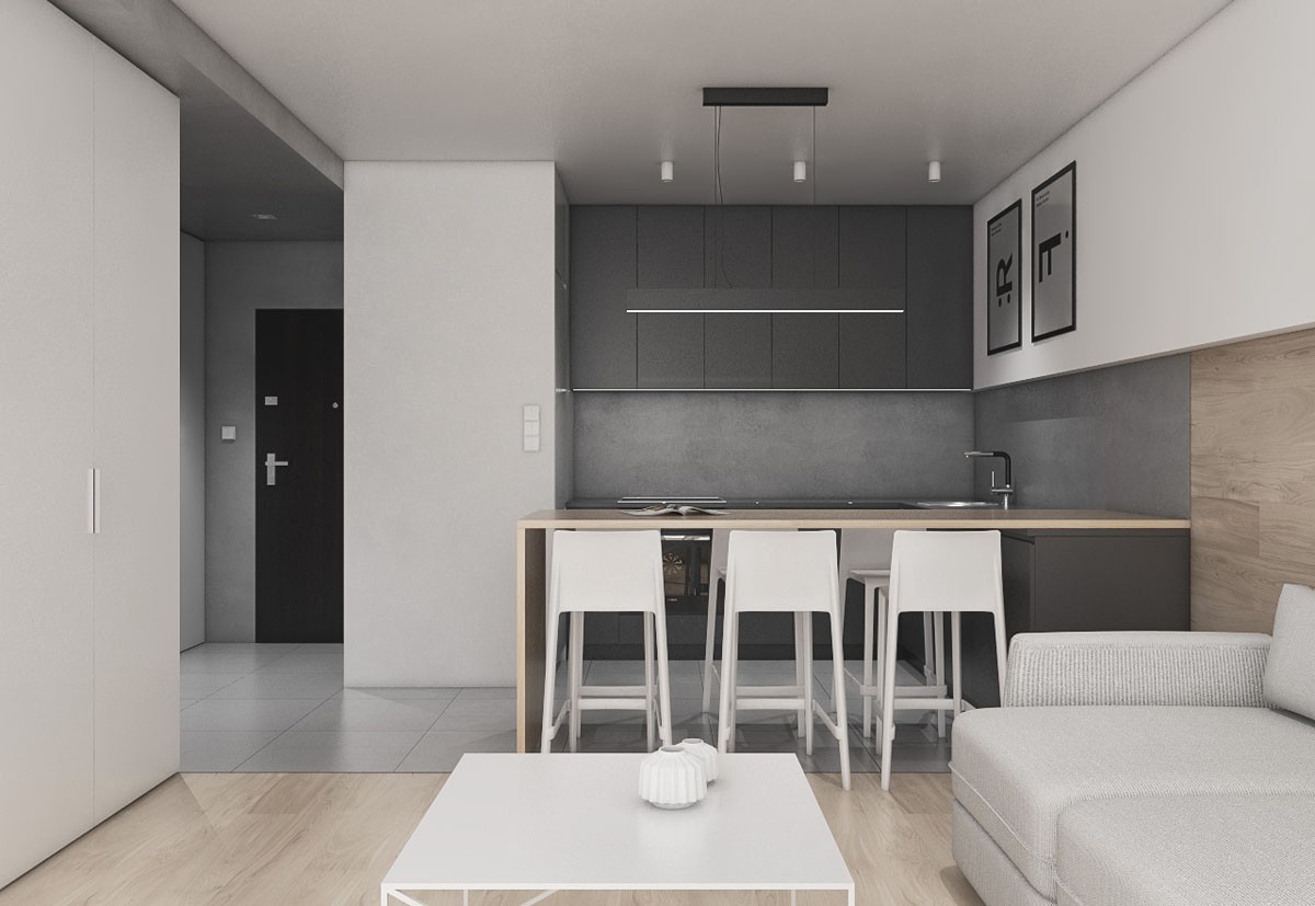
The kitchen is a dark and dramatic charcoal colour brightened only by strips of LED lighting and the light wooden countertop and side support of the breakfast bar.
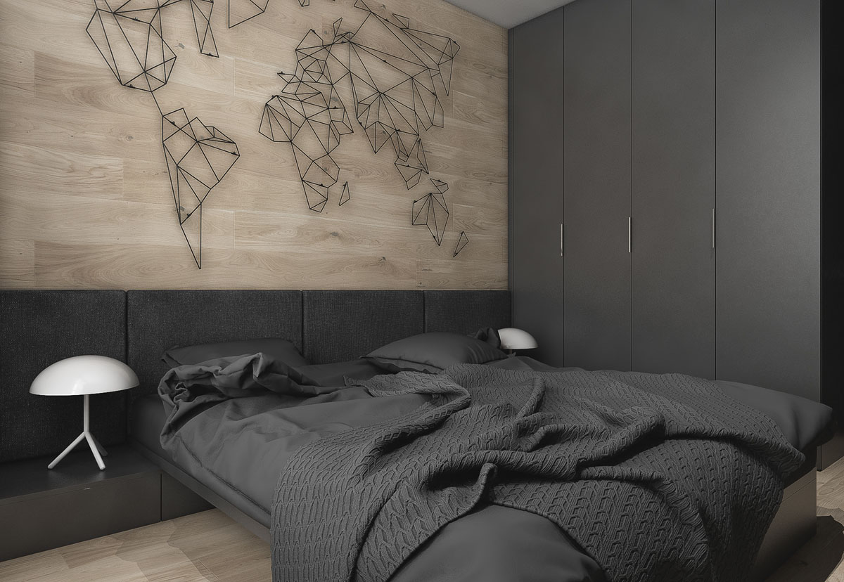
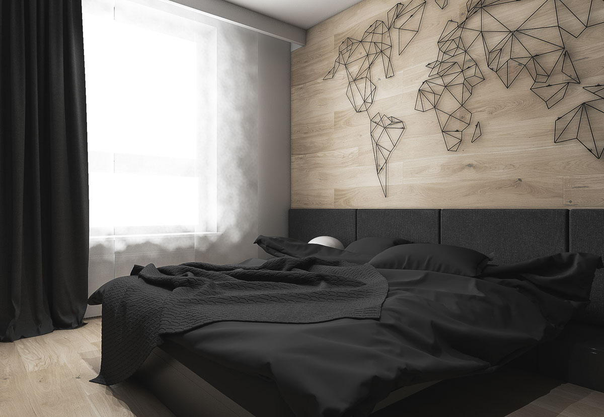
The bedroom in this city-slicker apartment is another dramatic affair. A charcoal grey bed frame, bed clothes, headboard and storage are a bold choice. A white modern bedside table lamp at either side add a little spot of light by day and night.
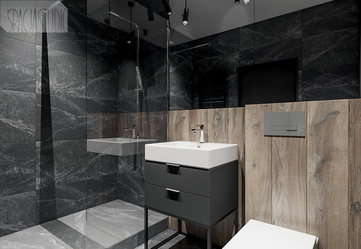
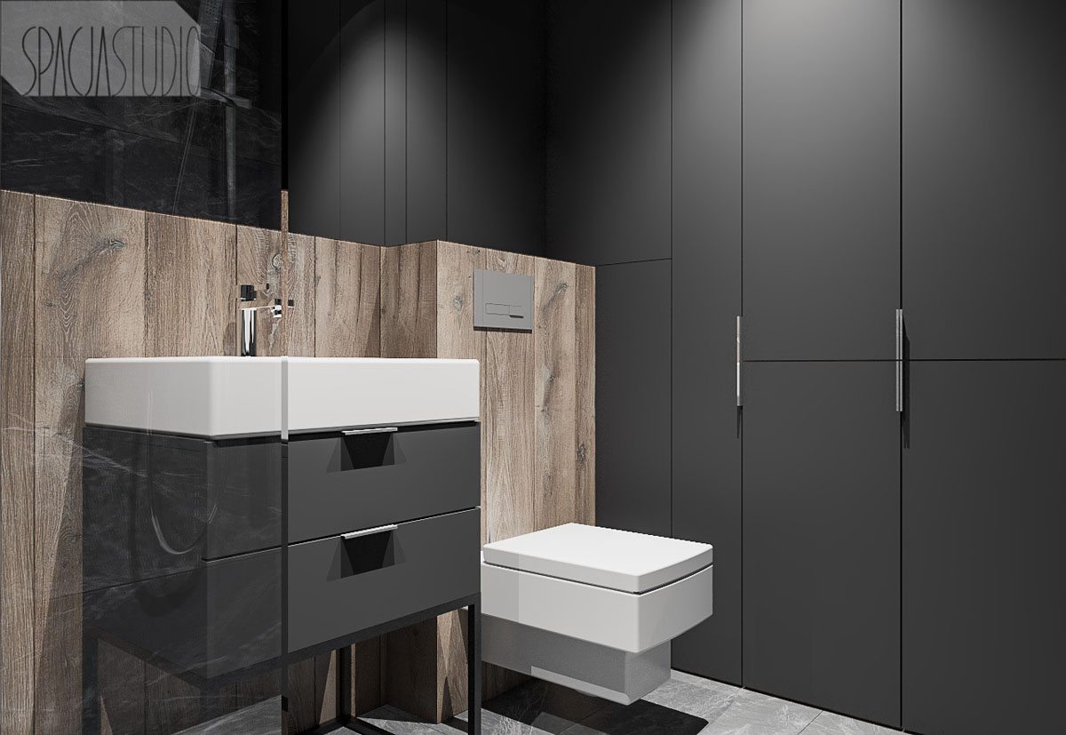
The walls are entirely covered in dark marble tile except for one small run of wooden tongue and groove panelling.
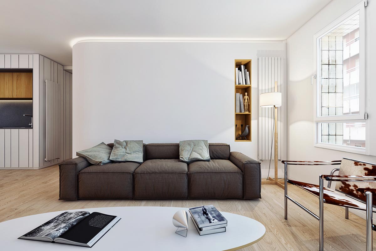
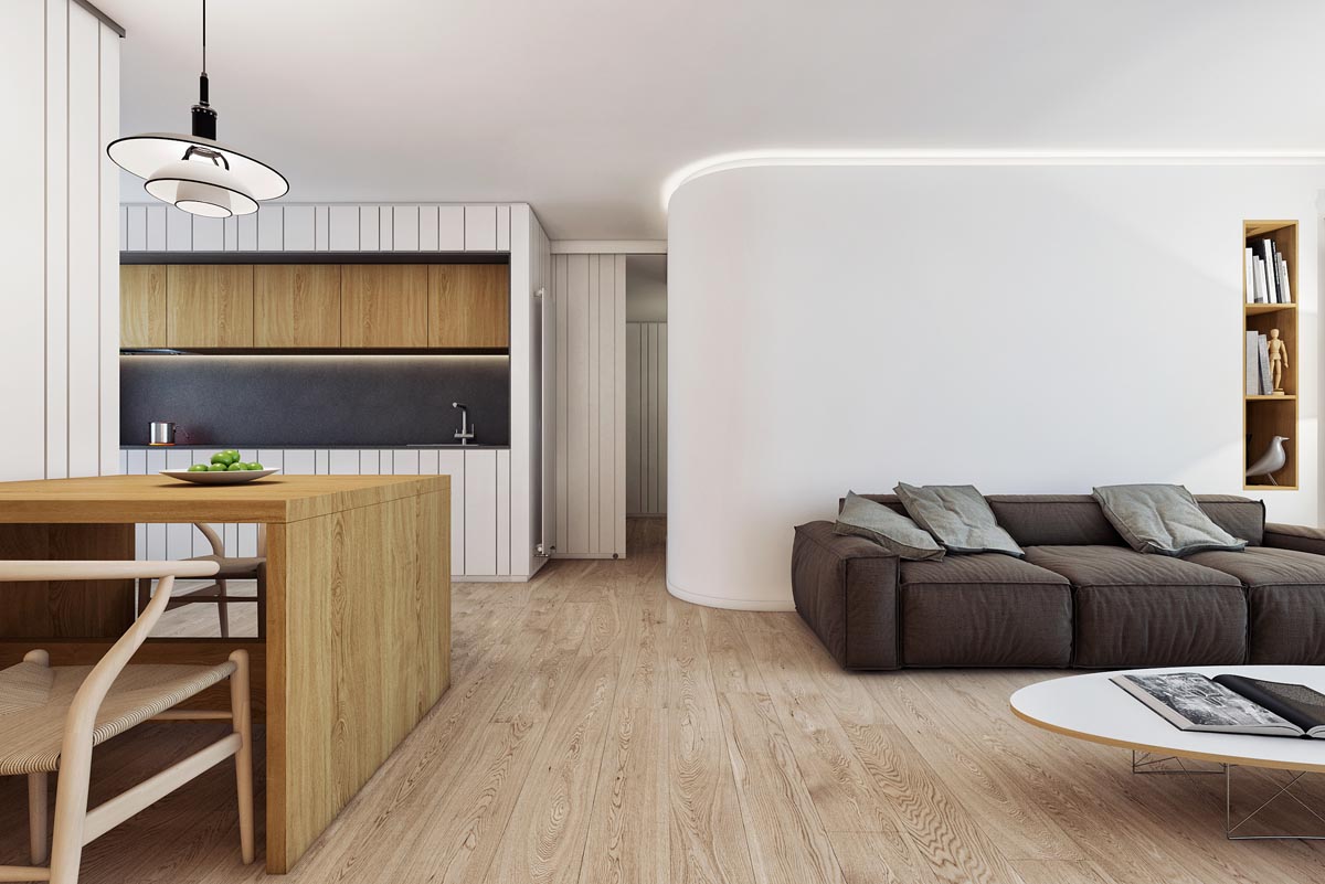
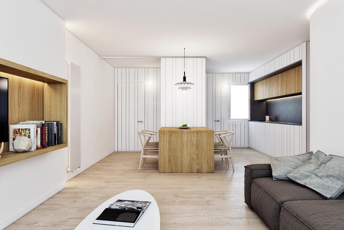
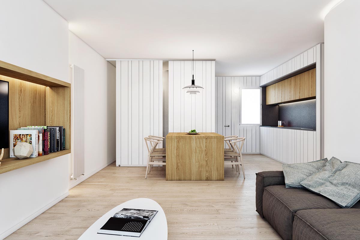
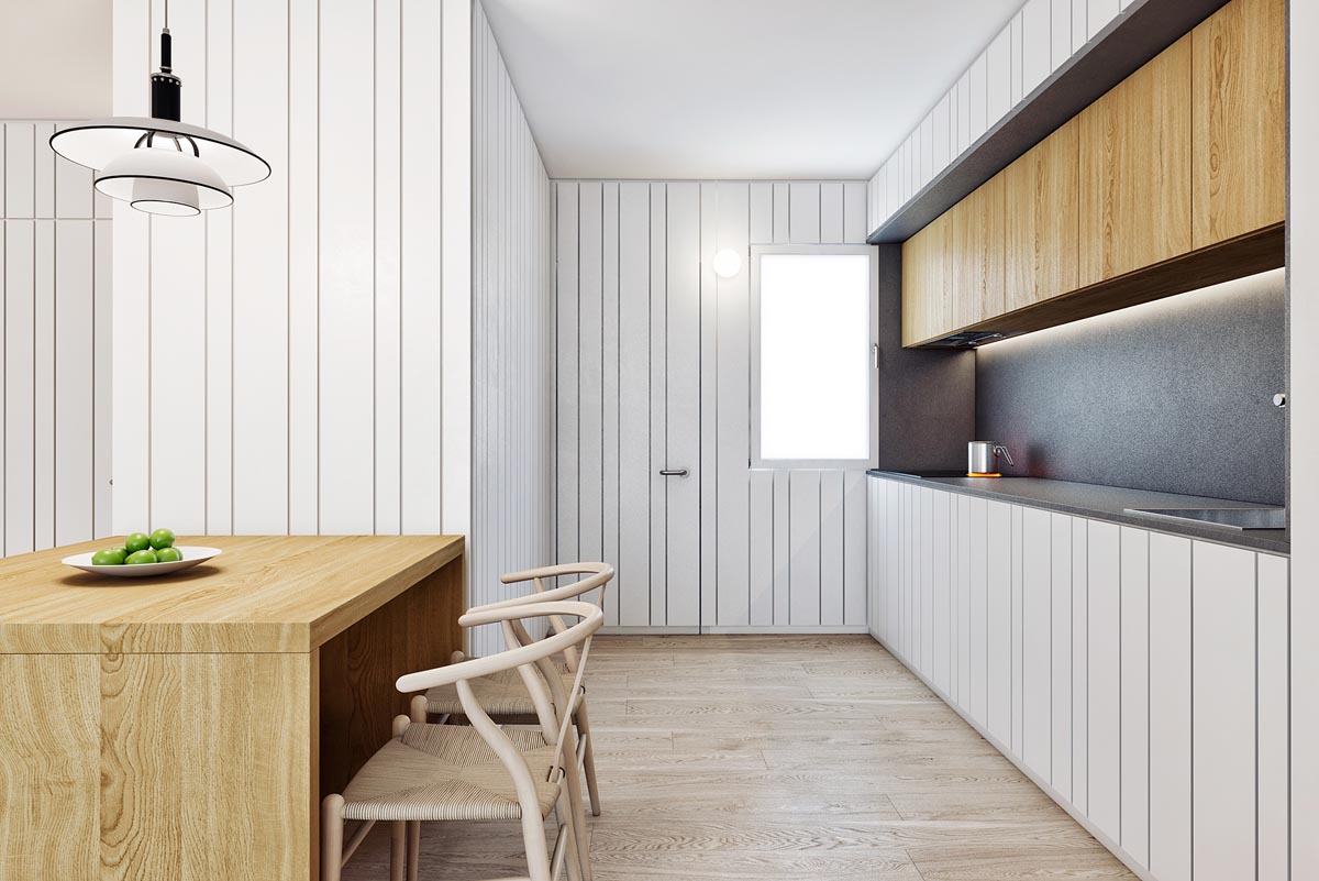
Last but not least is this unusual apartment design in Baiona, Pontevedra.
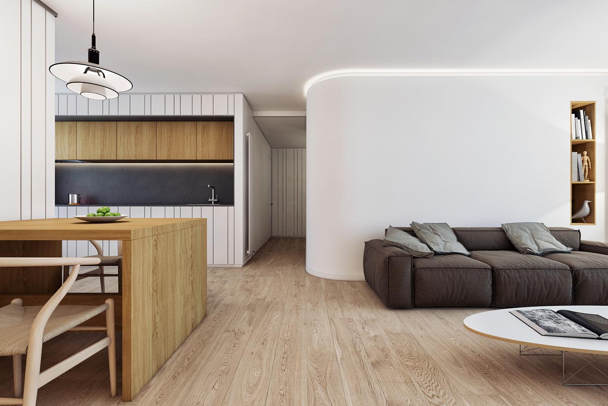
A strip of LED lighting around the ceiling lights the bright white walls even further, creating obvious contrast with a deep grey sofa and dark kitchen backsplash.
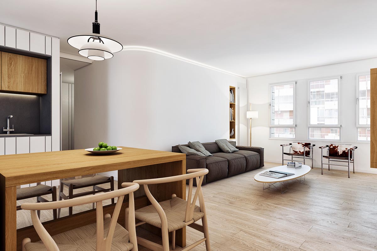
can set the tone of a room and this one has a design that suits the pleasantly modern yet unflashy scheme. Beneath the light, a simple white fruit bowl acts as a centrepiece.
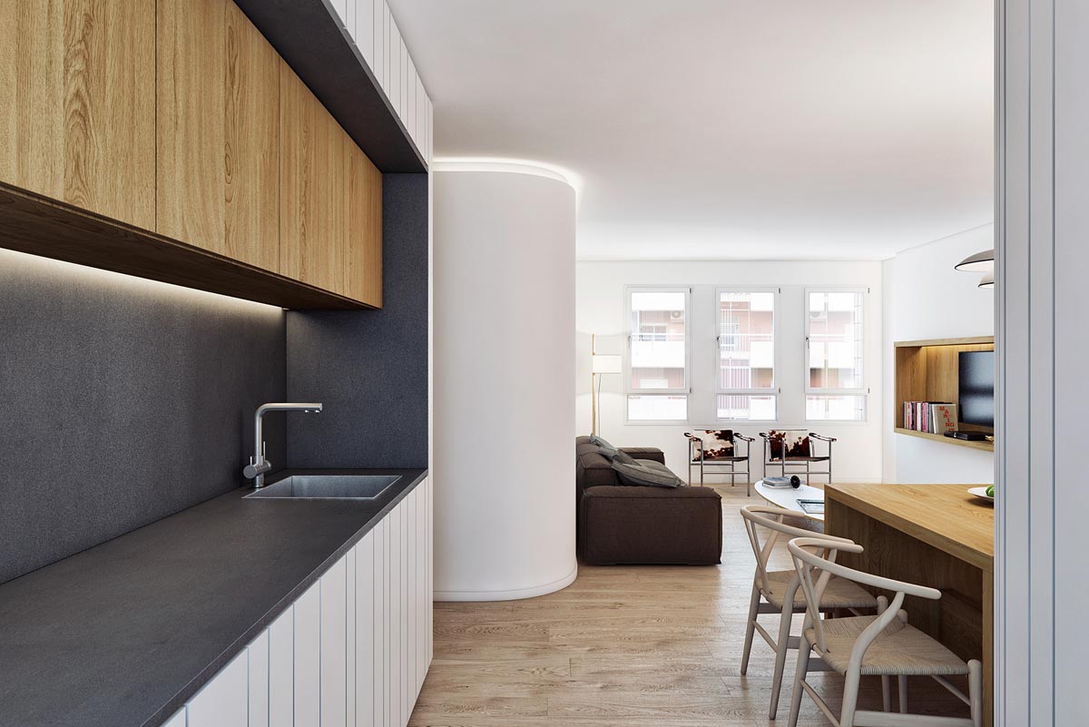
The black, white and wood themed kitchen has an eye-catching workspace that is the most dominant feature of the open plan room. The run of wooden wall cabinets are lit beneath with an LED lighting strip that matches the glow of that around the ceiling of the lounge.
