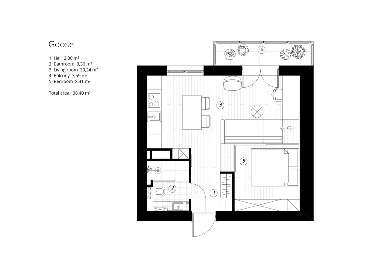
Creating unique living spaces in a studio apartment for one can be a challenge. Between having enough storage space and feeling like there's enough room, there's much to consider. Designed by Cartelle Design, this studio apartment for one located in Saint Petersburg offers 38.4 square meters of living space without sacrificing style. As with any apartment with a small footprint, the first challenge comes in the form of creating comfortable living space that allows the occupant to move freely and have designated areas for dining, sleeping, and entertaining. This apartment accomplishes all three through smart use of dividers, building materials, and storage.
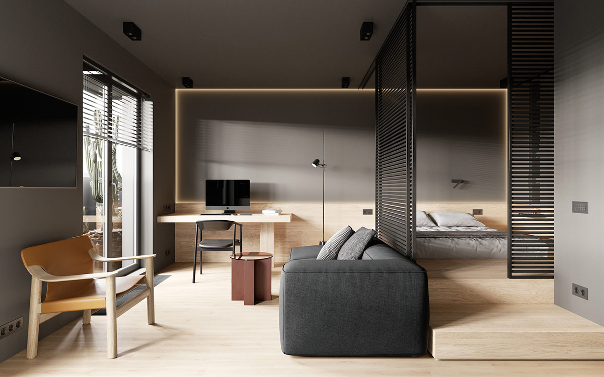
The space consists of several distinct areas: a bright and airy kitchen, a bedroom, a functional workspace, and a relaxation area, complete with accent chair and modern sofa.
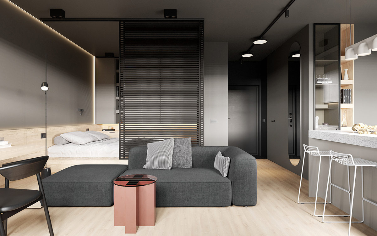
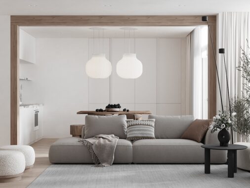
With the placement of the sofa parallel to the bedroom and clever room dividers, the studio feels as if it has rooms in spite of its compact shape. Even so, it flows together well as the designer uses a variety of grays and light woods in the main living spaces.
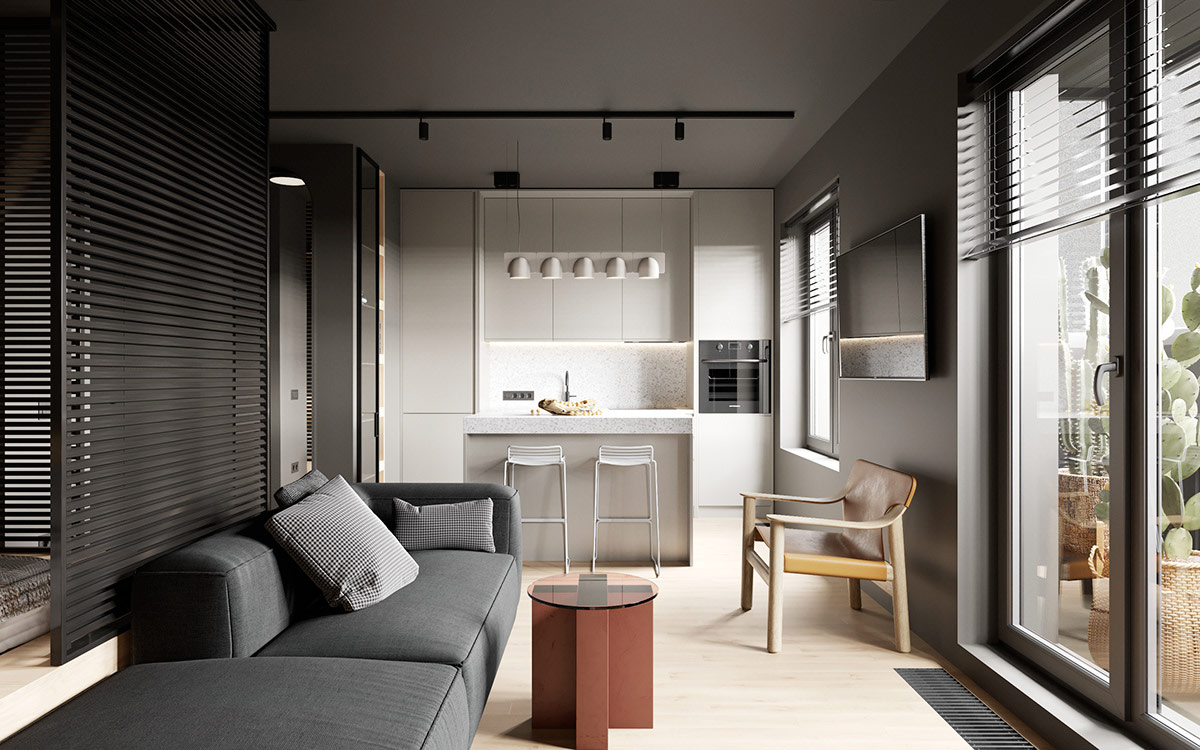
From the living area, a small terrace is accessible. Natural light spills through the glass doors and kitchen window. This small footprint is light and open.
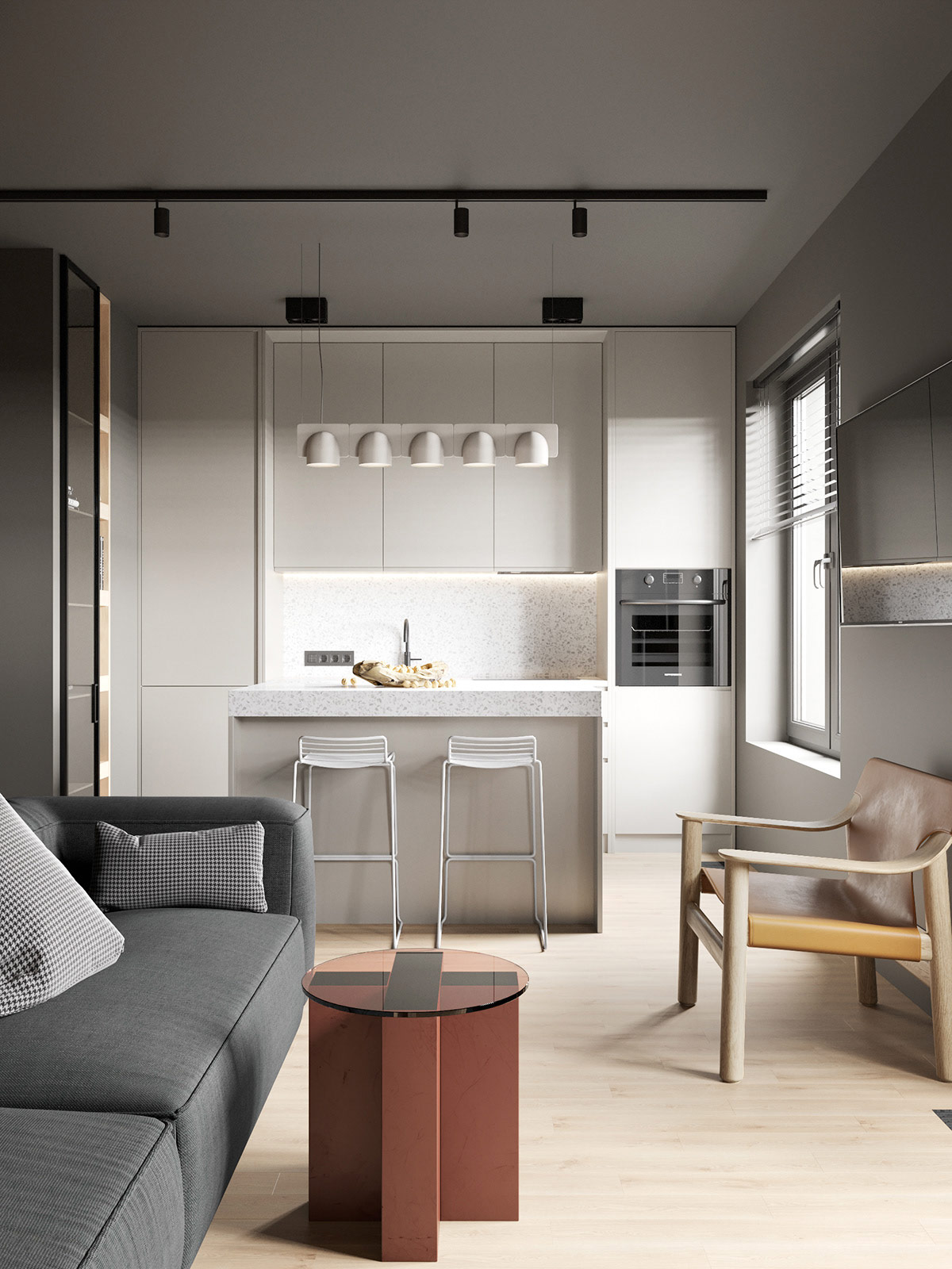
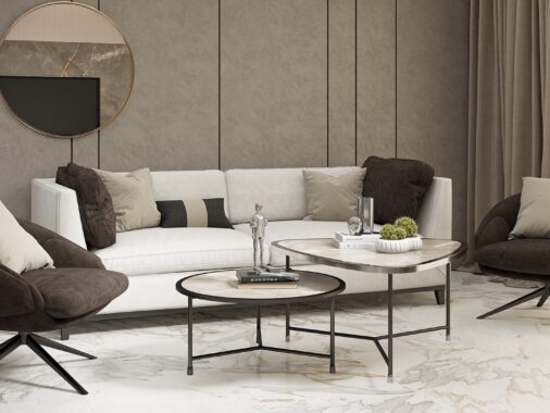
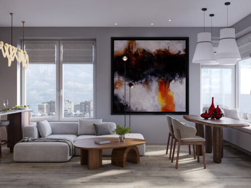
To keep the feel of the space from feeling too heavy, the designers chose sleek and minimal furniture for the living and kitchen areas. In the kitchen, tall slim white bar stools sit at the island. In the living area, a contemporary couch, accent chair, and round coffee table make the space feel inviting without being cluttered.
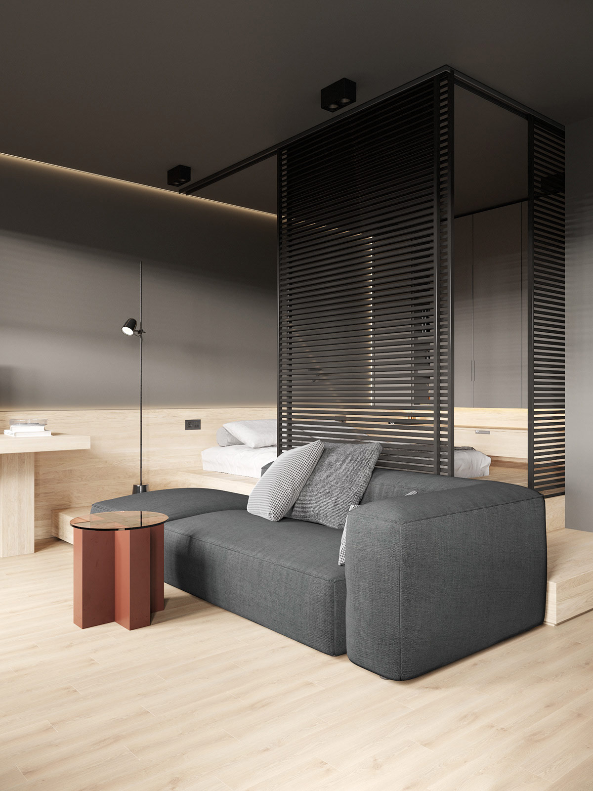
Decor is kept at a minimum within the space. Instead, the designer focused on geometry and a combination of materials to create a soothing, contemporary aesthetic. Shades of gray and natural wood runs throughout the apartment with black partitions, blinds, and a dark sofa to add contrast to the room.
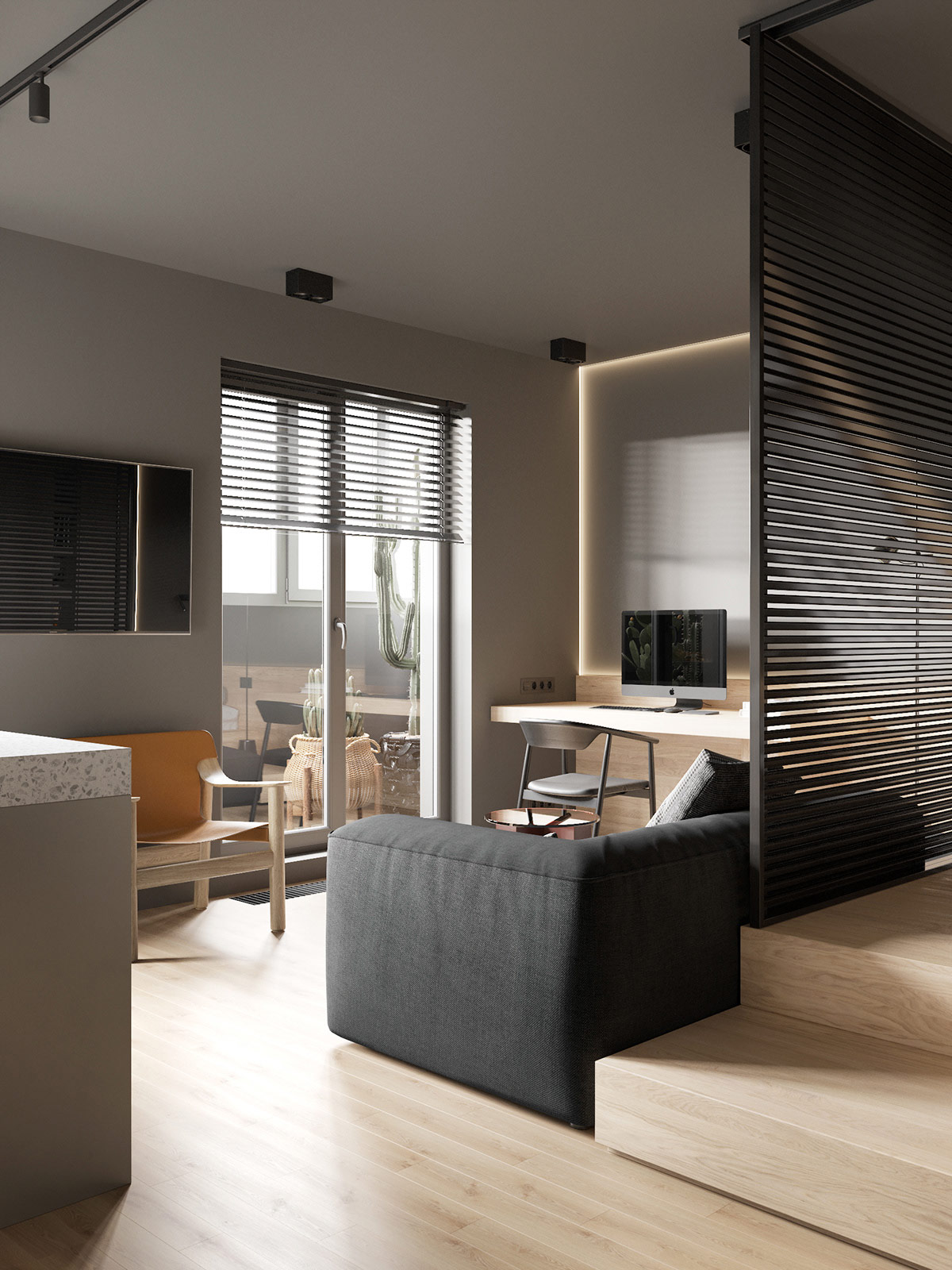
From most of the apartment, one can see out to the balcony where views of a sunrise or sunset are made easily accessible.
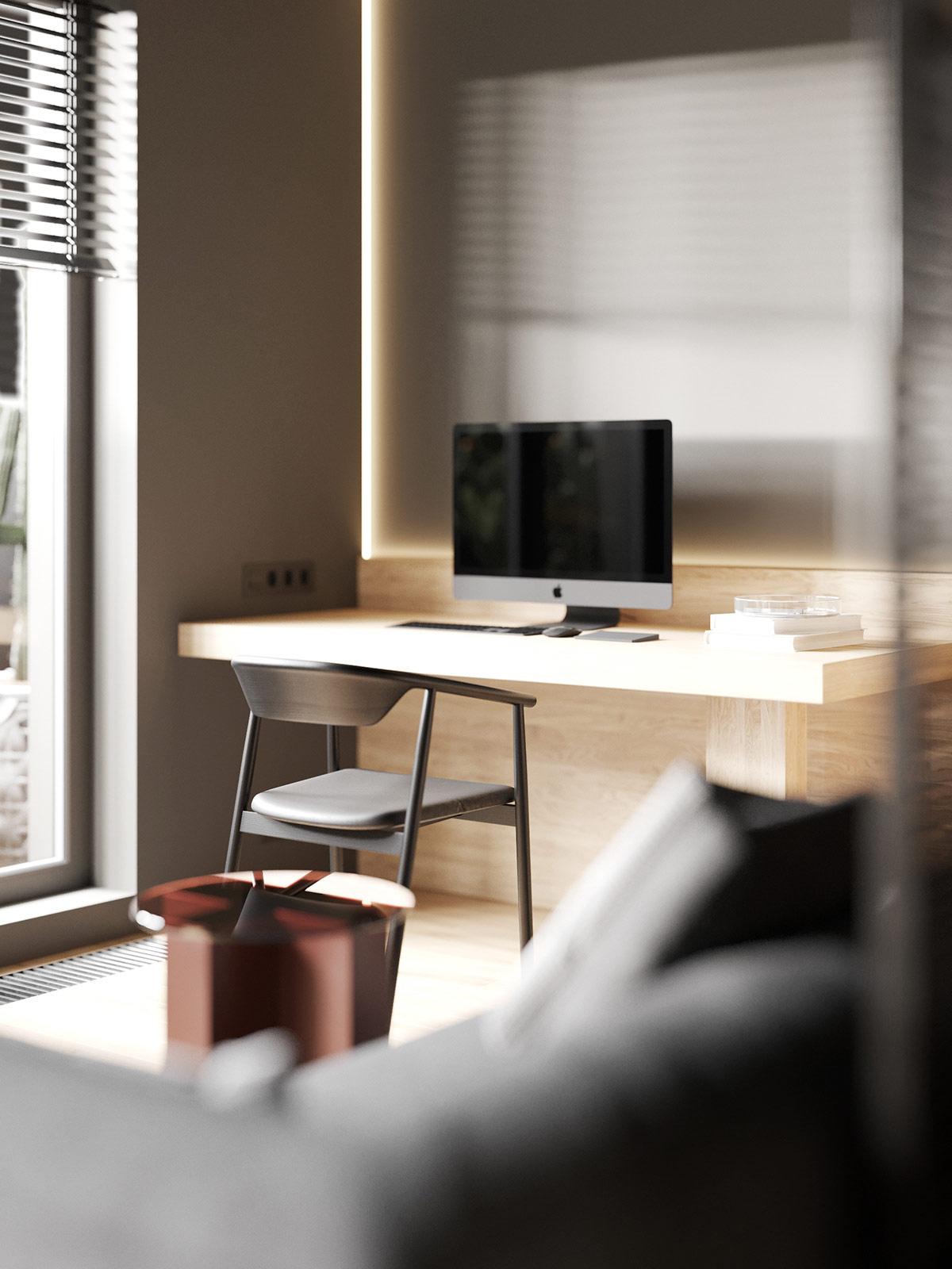
The home workspace is kept ultra-minimalist with a built-out shelf desk that offers storage underneath - if needed.
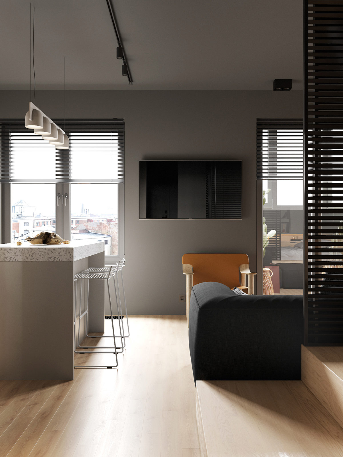
Between the kitchen and living area, a flat screen television is mounted in such a way that it can be viewed while preparing meals, eating breakfast, or relaxing on the sofa.
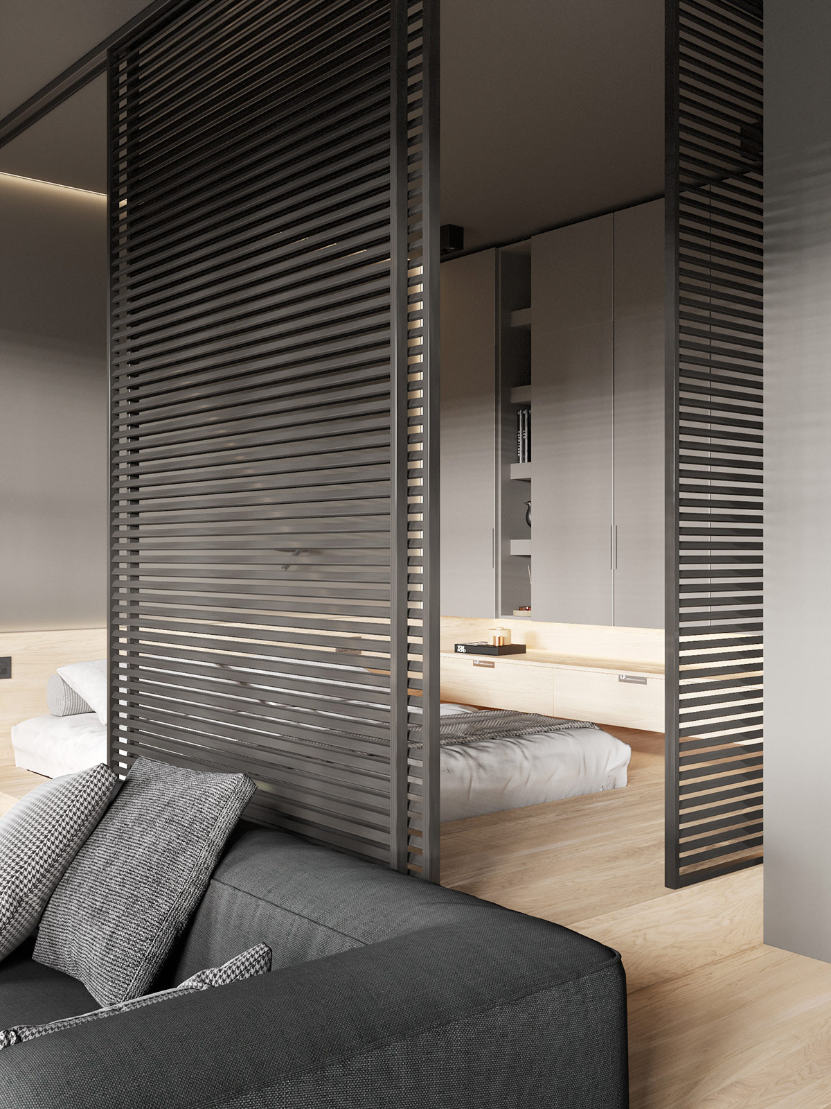
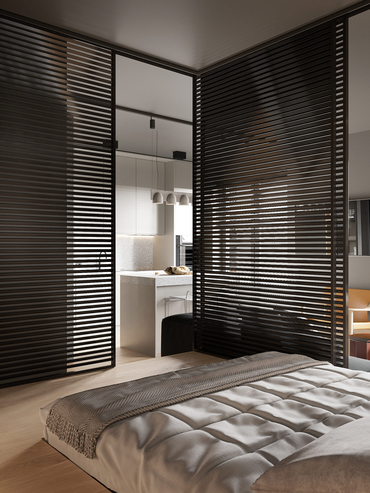
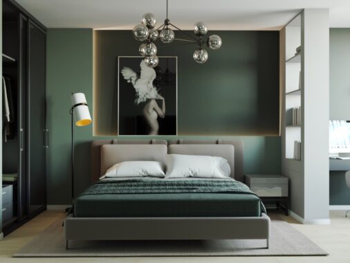
One of the most unique features is that of the bedroom's wall partitions. These sliding metal partitions make the sleeping area feel private, but at the same time part of the overall space.
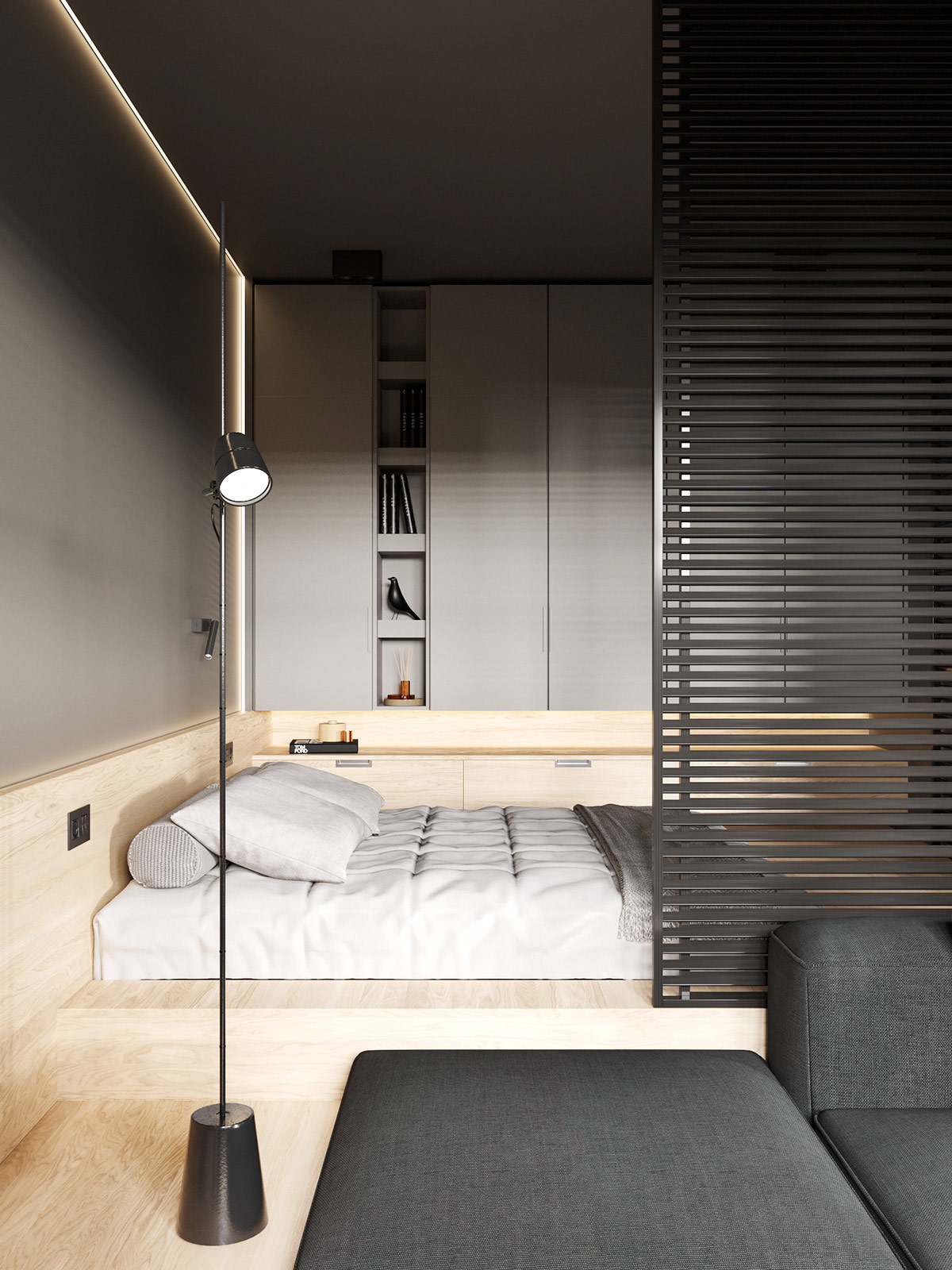
Lighting is a key design feature throughout the apartment. In the living room, a floor reading lamp next to the sofa gives just enough light yet can be easily moved or adjusted for use in the bedroom. Along the accent wall the runs between the workspace, living room, and bed room, lighting along the wall's borders creates interest and keeps the feeling seamless as you move through the space.
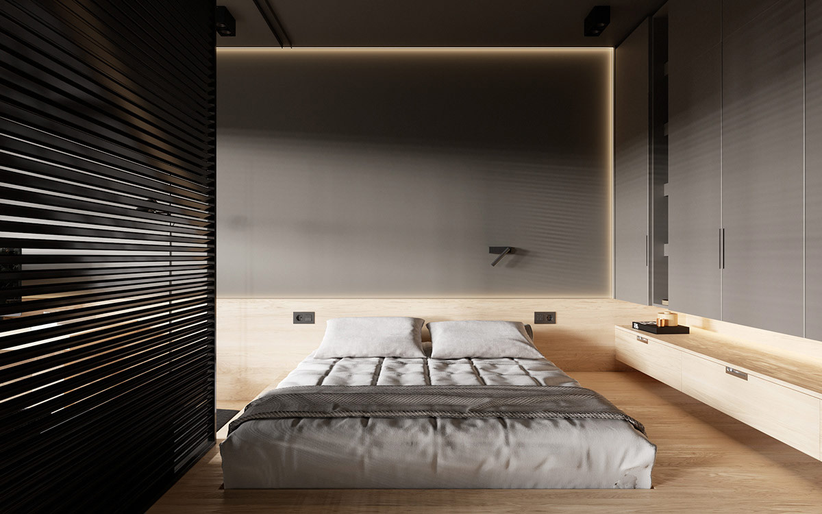
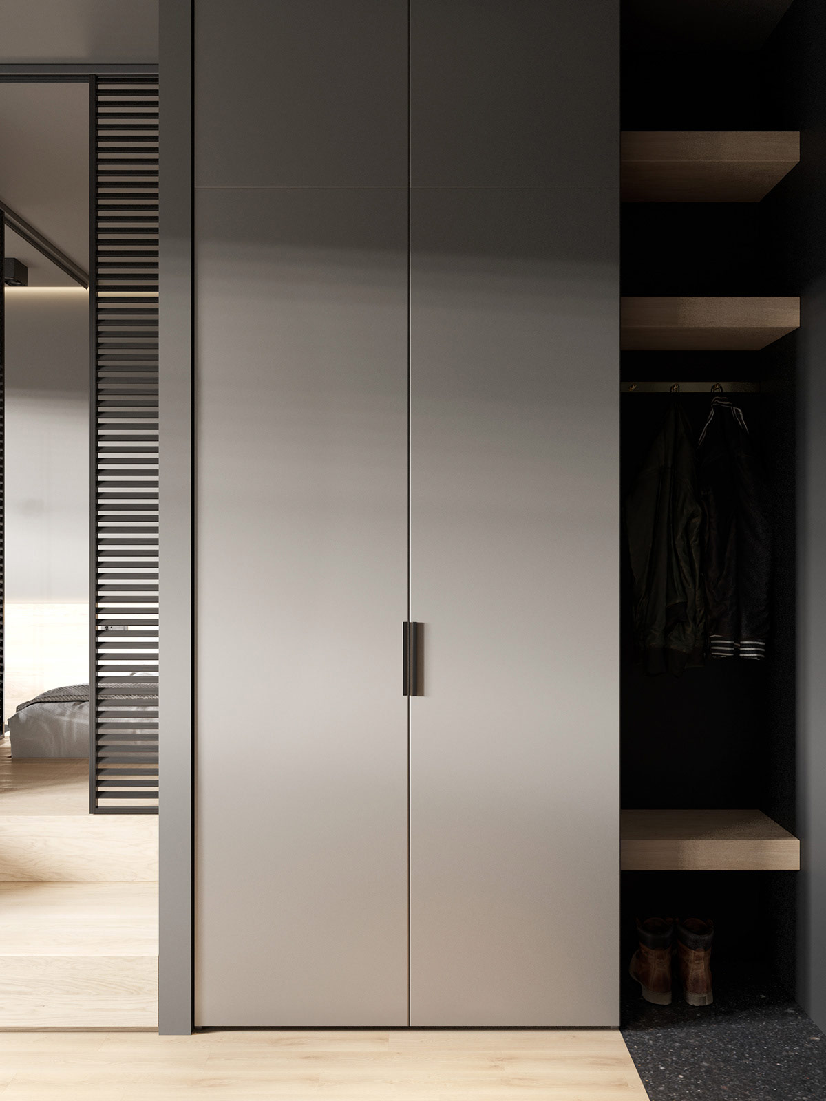
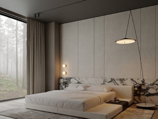
The bedroom is set on its own platform, made from the same natural wood that flows throughout the flooring. Along one wall, built-in shelving and tall cabinets offer plenty of wardrobe storage.
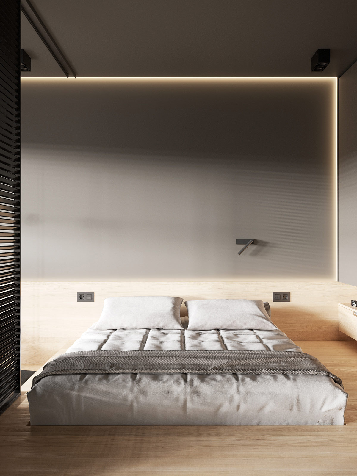
The bed sits comfortably within the custom-built structure. A single adjustable reading light above the head of the bed add illumination when needed.
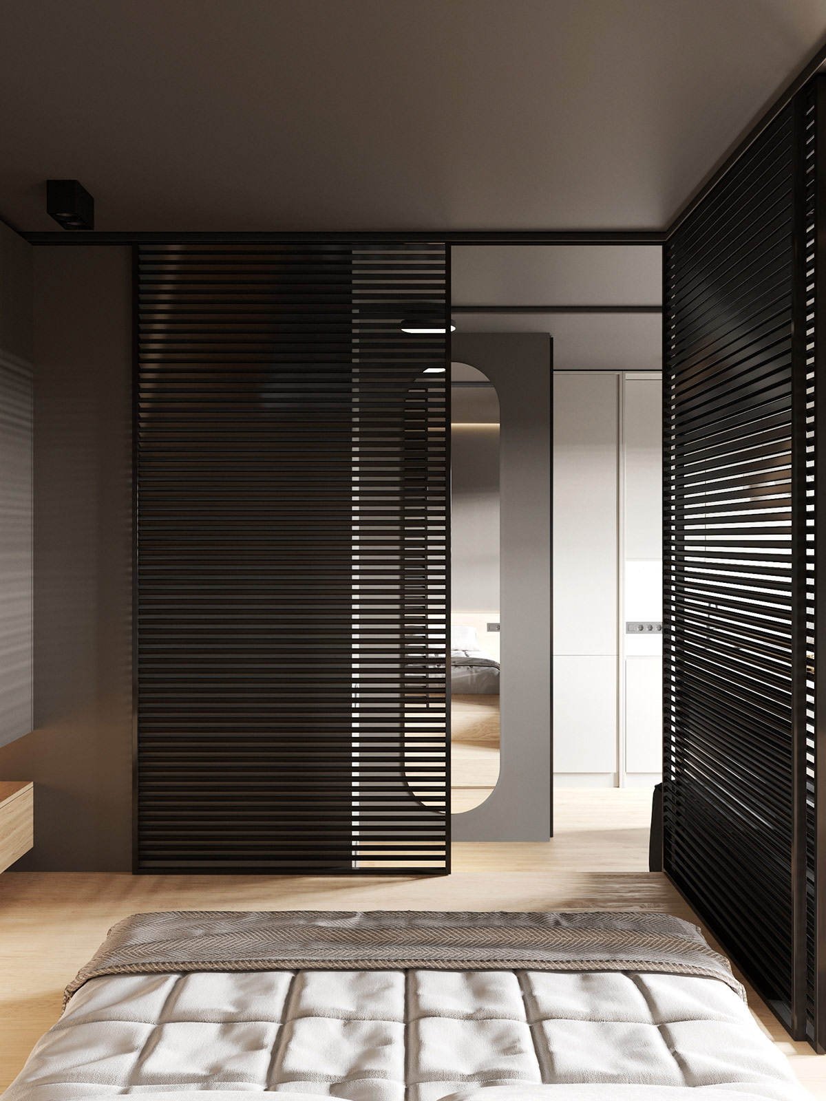
From the bedroom, one can see to the hallway's full-length mirror, which makes the already open space feel bigger.
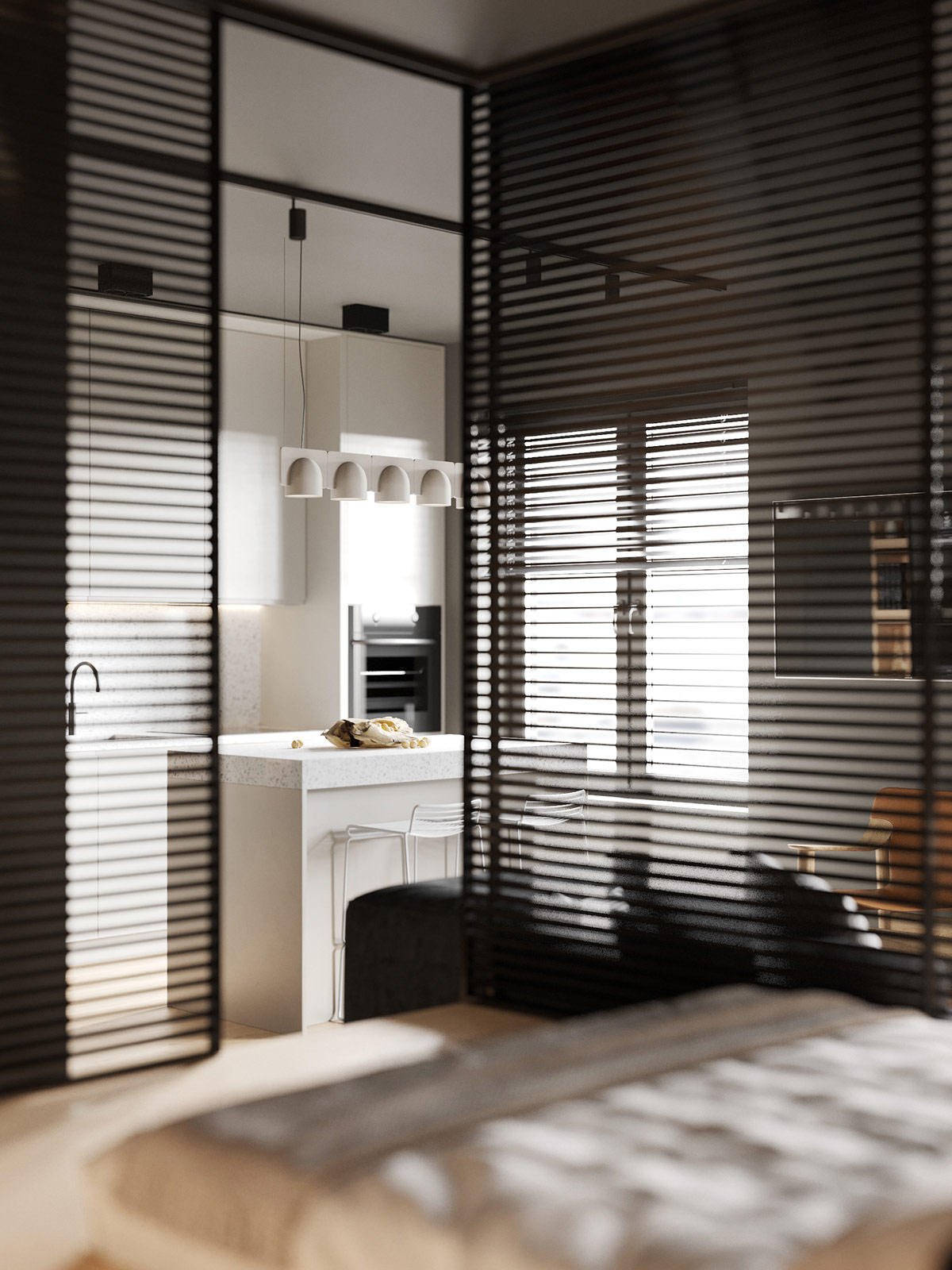
The bedroom's sliding partition walls also allow for the occupant to see out into the kitchen and into the living area.
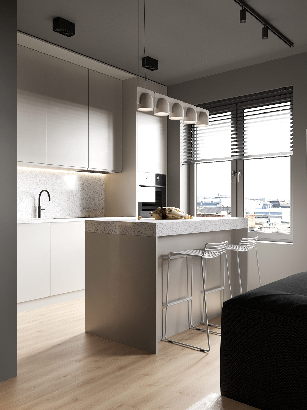
From the living area, a kitchen is accessible and features a kitchen island with seating for two. The kitchen bar stools were a smart choice for creating a distinct dining area within the studio.
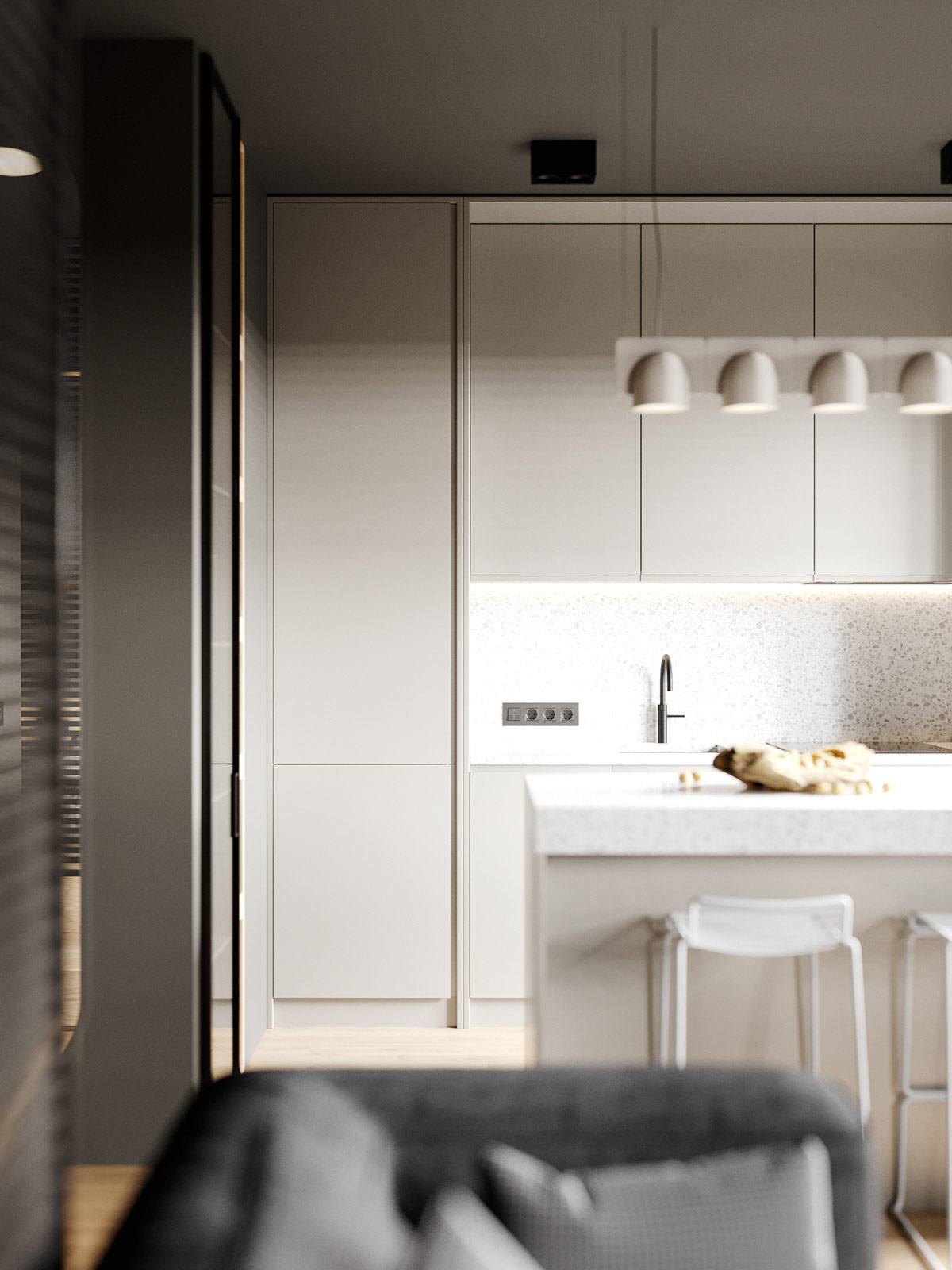
The main palette for the kitchen area is white, which works well with the soft gray on the walls. Cabinets are kept smooth and uniform for a modern look.
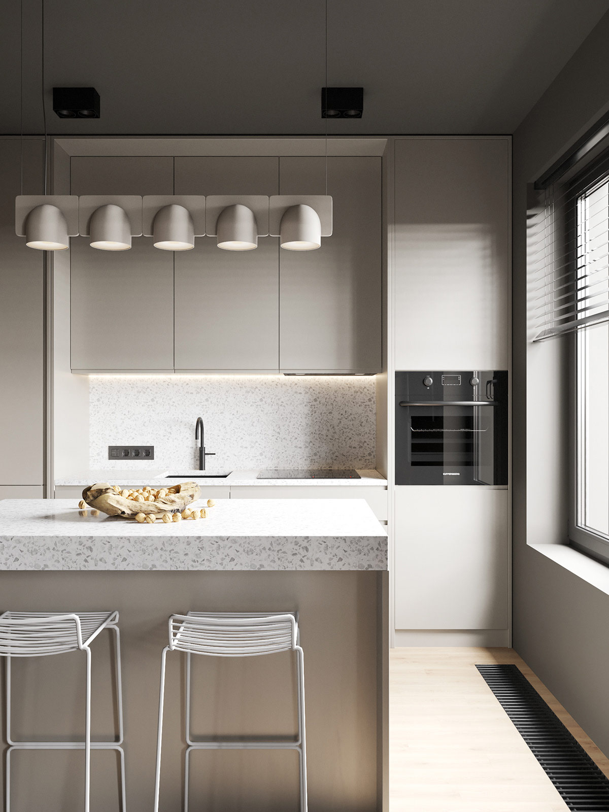
When daylight isn't pouring in through the nearby window, a linear chandelier illuminates the space.
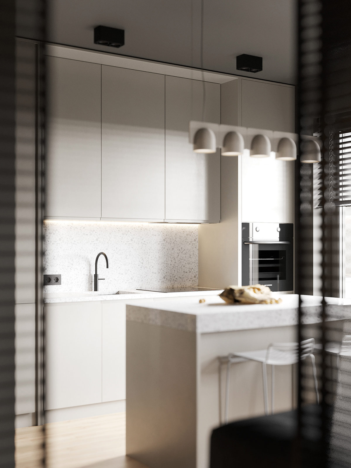
As a minimalist kitchen in an already tight space, the layout is simple yet effective. The tall cabinets above and below the sink area give the kitchen area additional storage capacity.
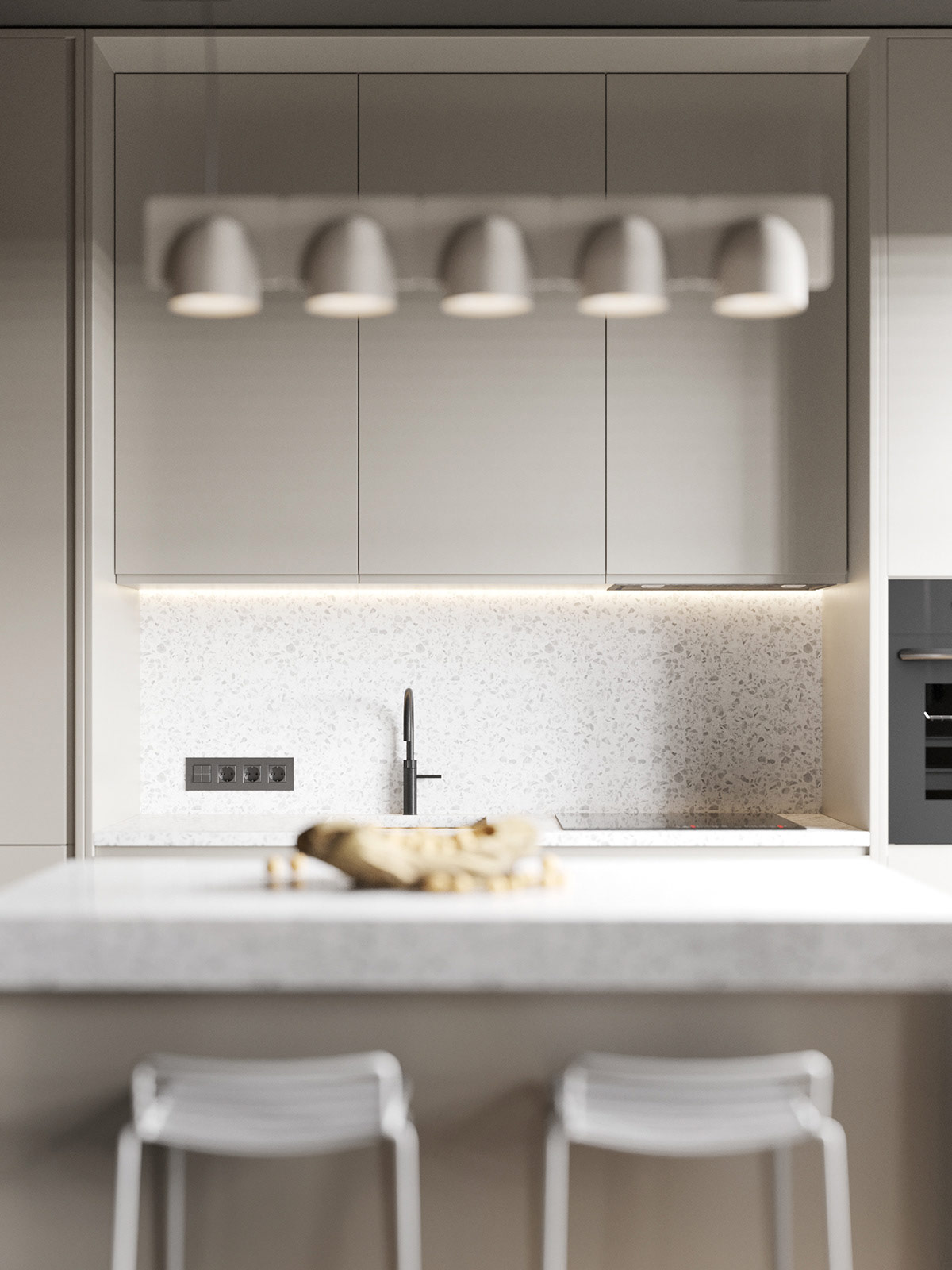
The kitchen countertops are a light terrazzo, which can also be found in the bathroom area. This keeps the kitchen from feeling dark and avoids creating too much contrast.
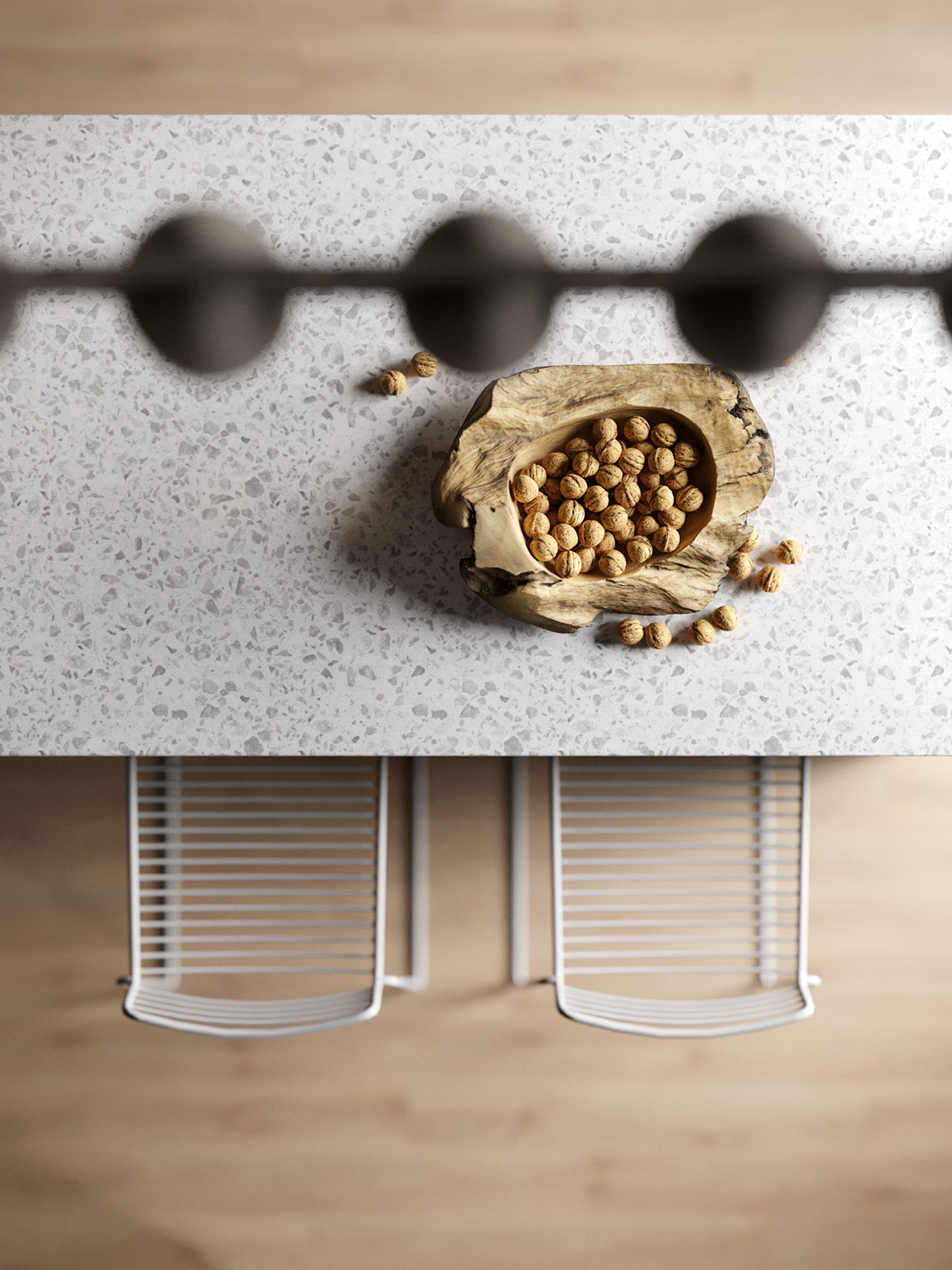
Tying in the aesthetic of the light natural wood, a wooden fruit bowl is one of the few decorative touches throughout the space.
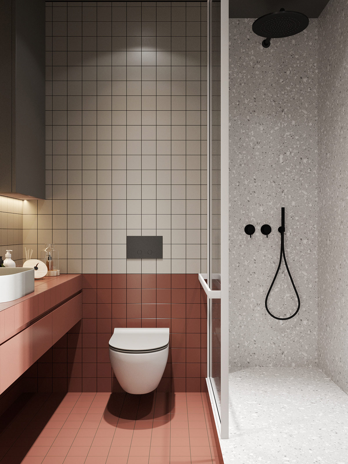
In keeping with the palette, light gray tile and terrazzo dominate the color scheme while red bathroom tiles and black fixtures add contrast.
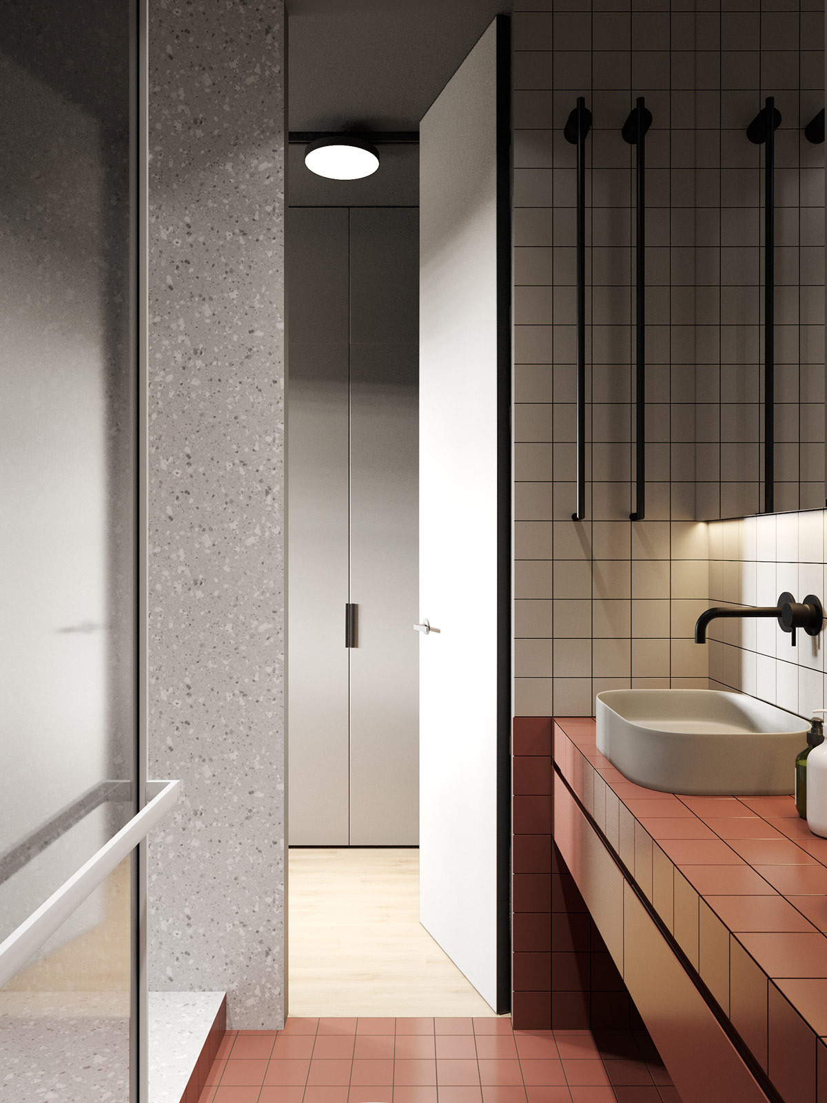
The bathroom's shower cabinet is lined with ceramic tiles at the top and side, creating the feeling of a single structure.
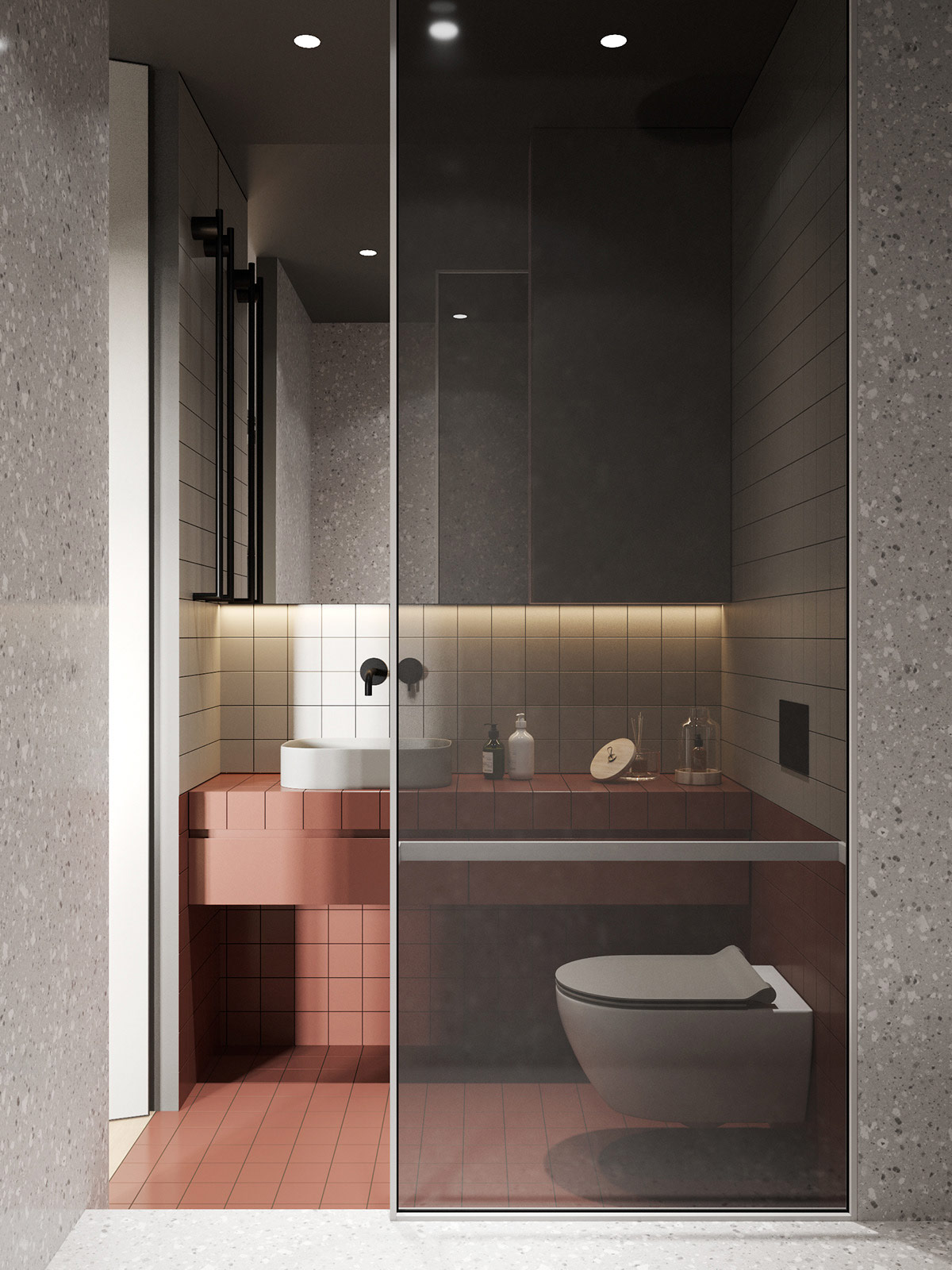
While compact, the bathroom offers additional storage space under the vanity and minimal decorative flourishes to keep it feeling neat and tidy.

