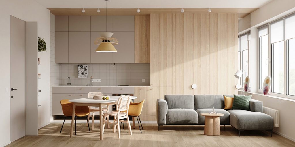
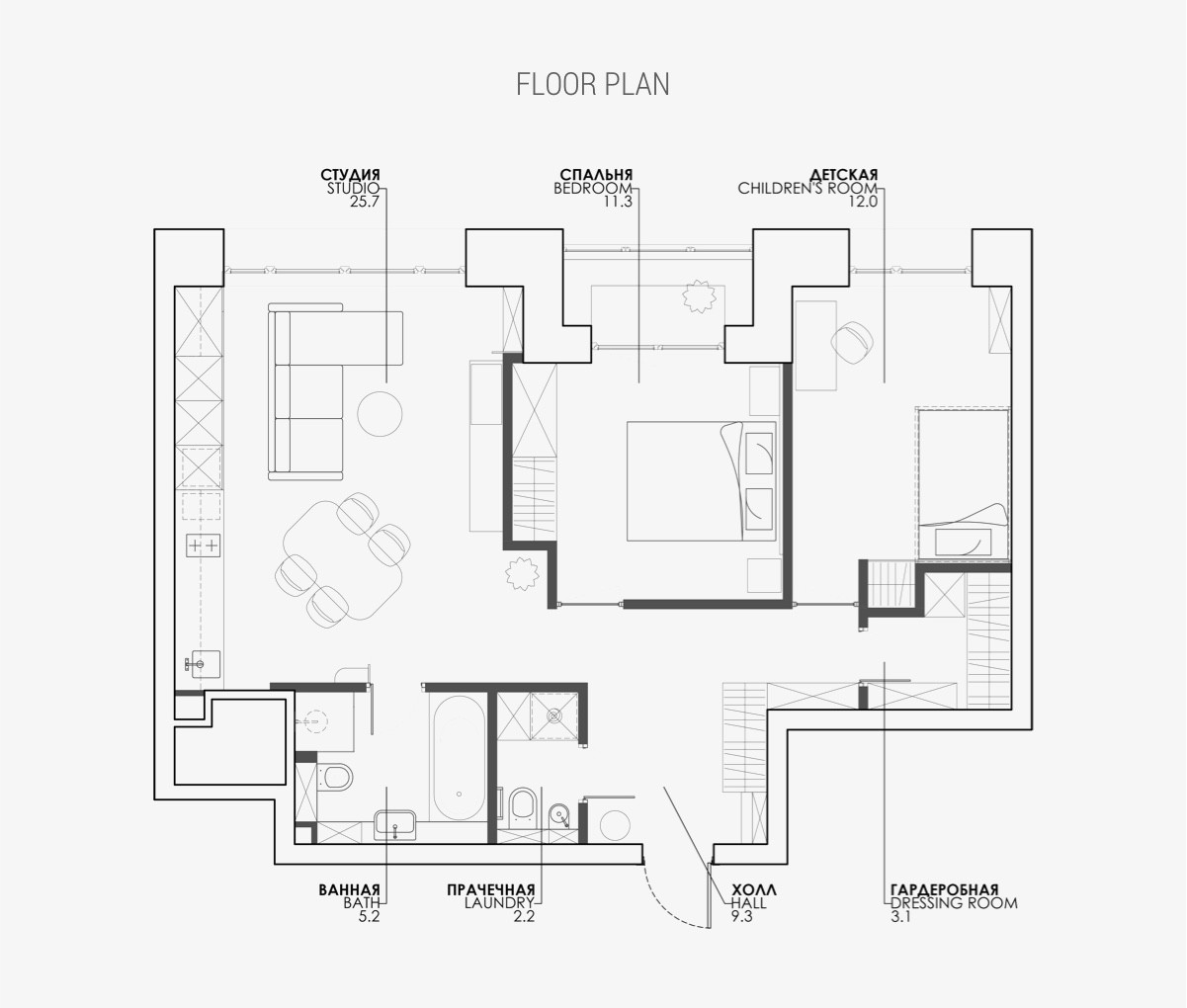
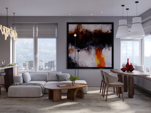
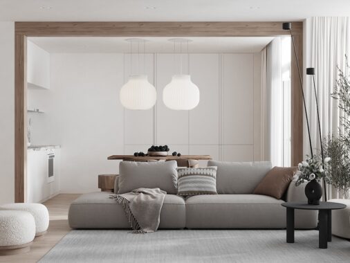
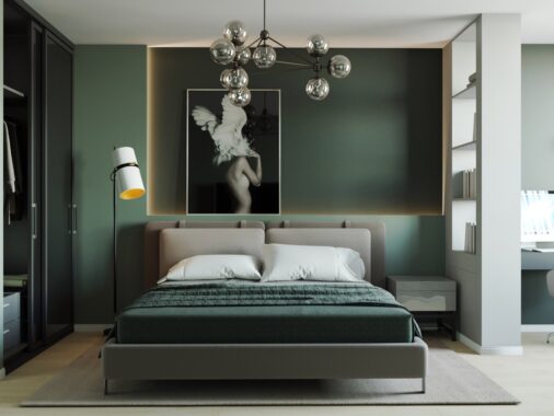
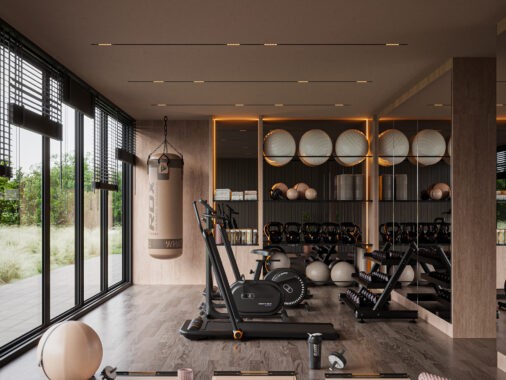
Gentle accent colours uplift this comfortable 71.2 square metre family home interior, located in Moscow, Russia. Designed by Natalia Rybakova, this modern space is warmed through with mellow green, yellow and blue infusions, alongside dominant light wood tone elements. Whilst compact in dimensions, this floor plan encompasses all of the practical necessities for a happy family life. The open concept living space brings family members together with a combined dining, cooking and lounging arrangement. Peripheral furniture is pared back to ensure the environment doesn’t feel overcrowded or complicated. Bedrooms are peaceful, and the fitted bathroom cleanly precise. Apartment floor plan included at the end of the tour.
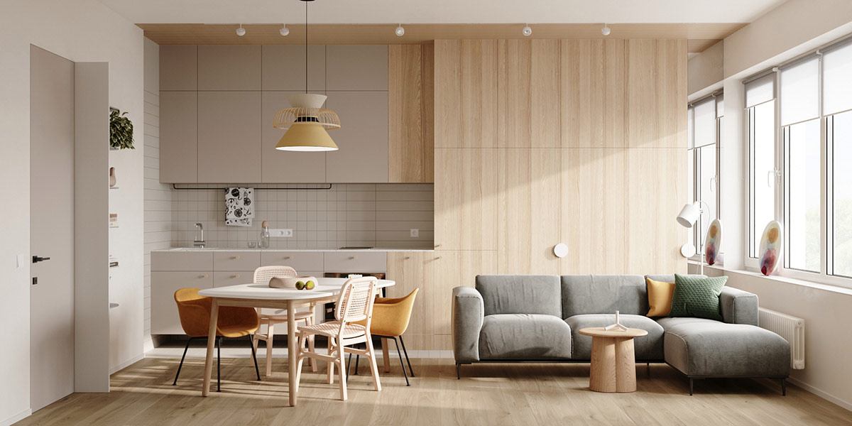
With the dining room and kitchen located so close to the lounge area, accent colours and textures take on increased importance in the visual division of space. Perhaps most useful in this quest is the split grey and wood tone finish across the one wall kitchen. Grey kitchen cabinets make a cool backdrop behind the dining area, whilst light oak effect cabinet fronts create a cosy background behind the lounge.
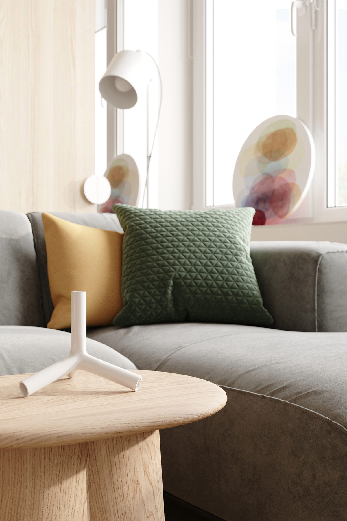
An assortment of buttery yellow and foliage green throw pillows draw the eye to the end of the sofa that’s furthest away from the dining spot, which is another effective widening and dividing technique for a compact living space. A small coffee table nestles into the crook of the L-shaped sofa here, further signalling the area’s separate role. A Tetra candle holder by Naoto Fukasawa for B&B Italia makes an curious display piece.
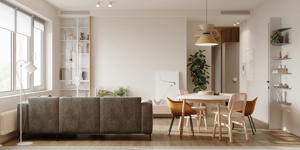
Lack of a TV builds a sense of peace in living room dining room combo, although a blank wall leaves opportunity for projection. With that said, focus is on reading here, with an elegant glass bookcase in one corner and a simple white floor lamp to provide reading light over the couch.
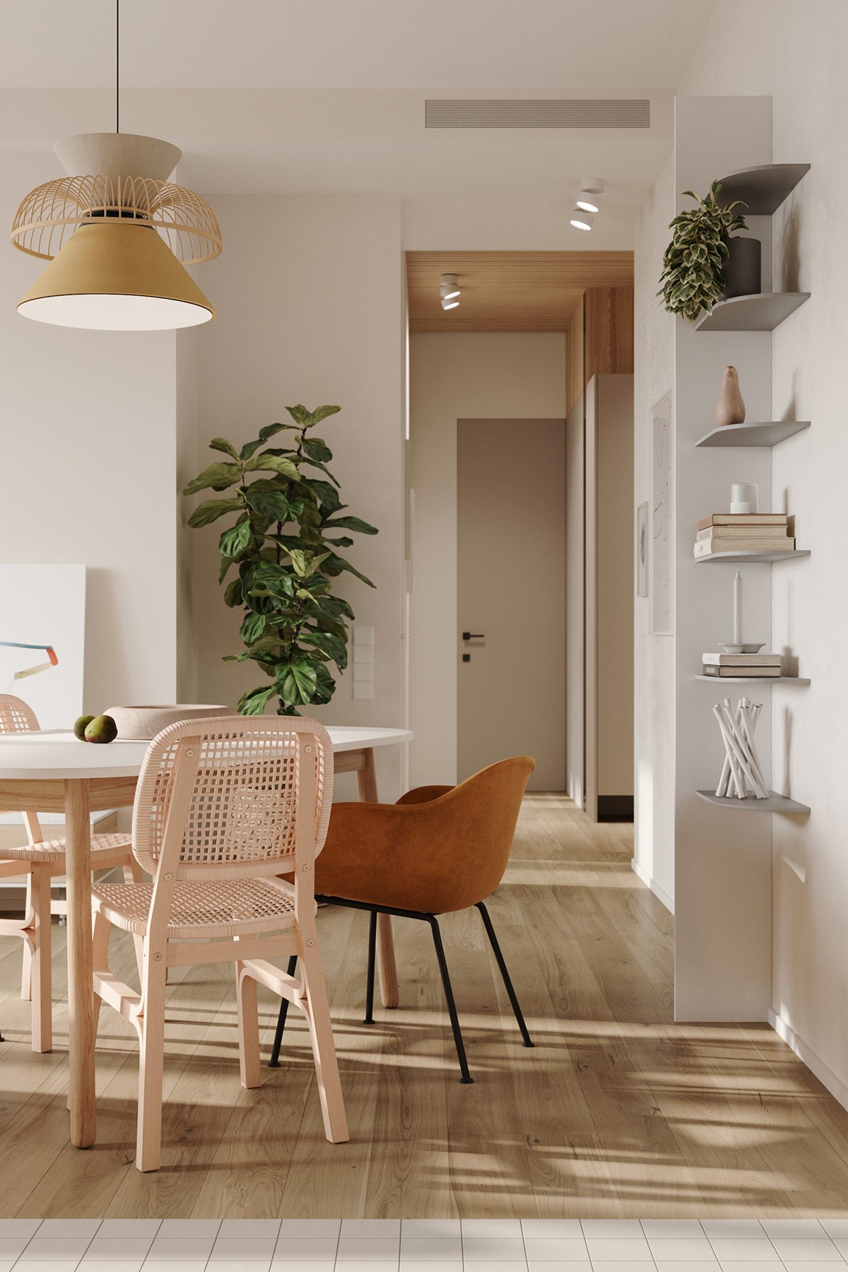
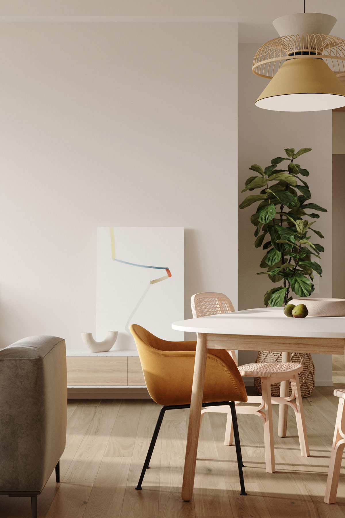
The Mekko pendant light by Market Set provides a strong visual anchor for the dining area.
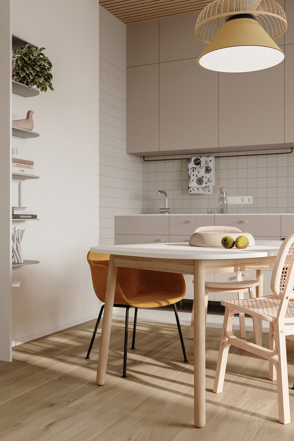
Open shelving and two different styles of Scandinavian furniture shape a laid-back, eclectic dining room scheme.
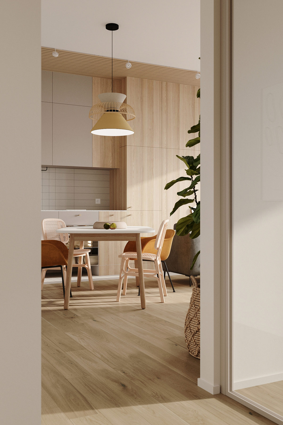
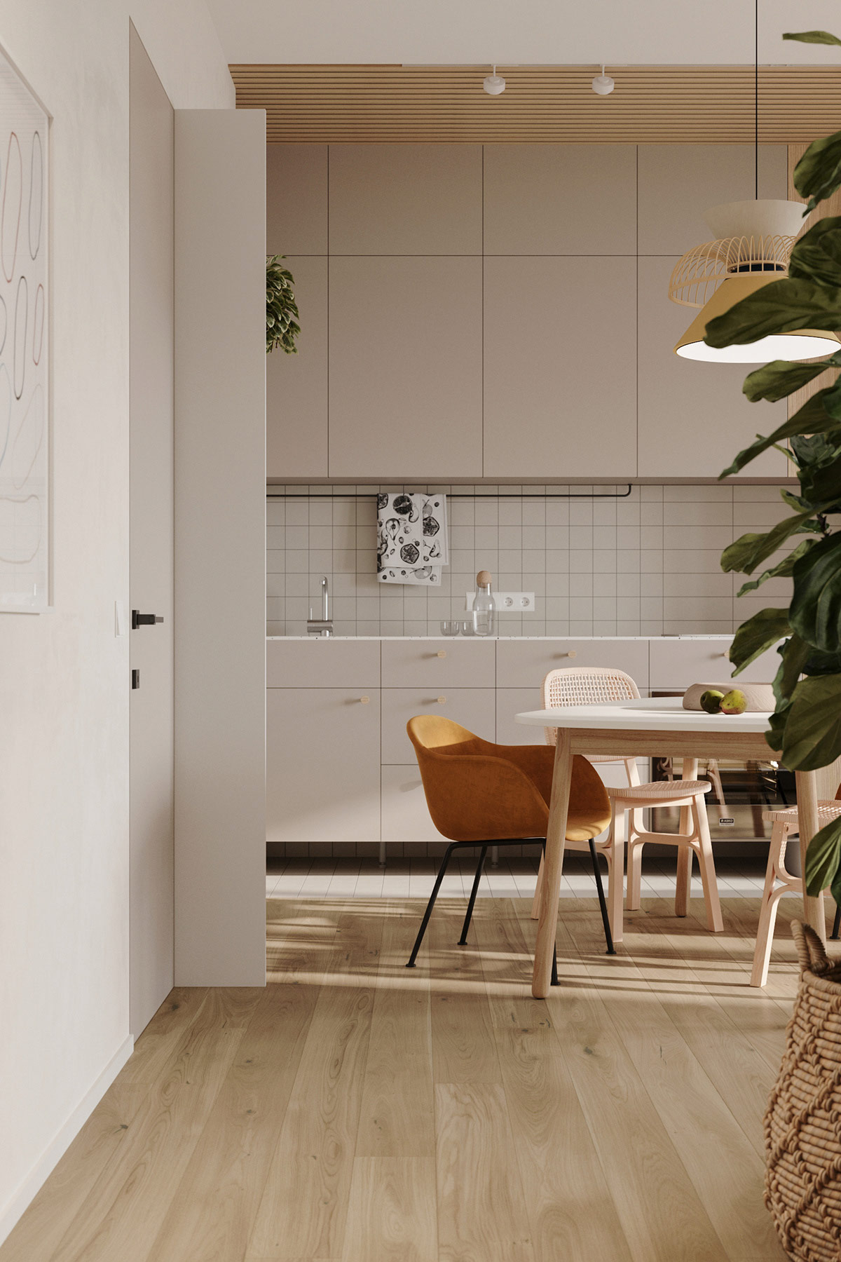
Tiles lay down a hard wearing walkway across the kitchen, and create cohesivity with the matching tiled backsplash.
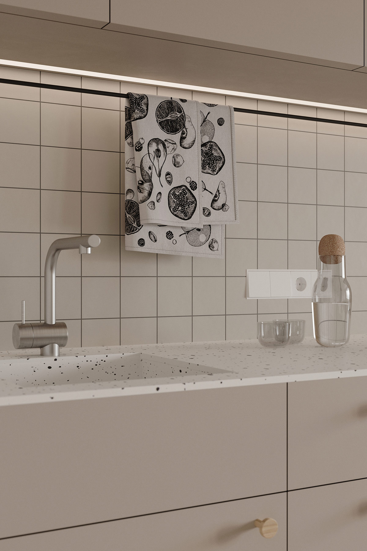
, a carafe and a modern chrome kitchen tap gleam beneath a under cabinet LED strip light. See more unique faucets here.
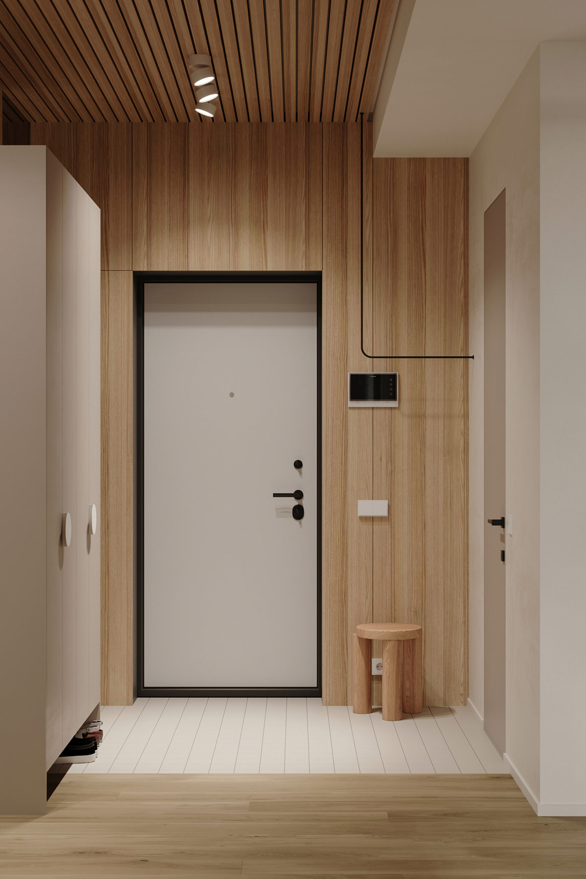
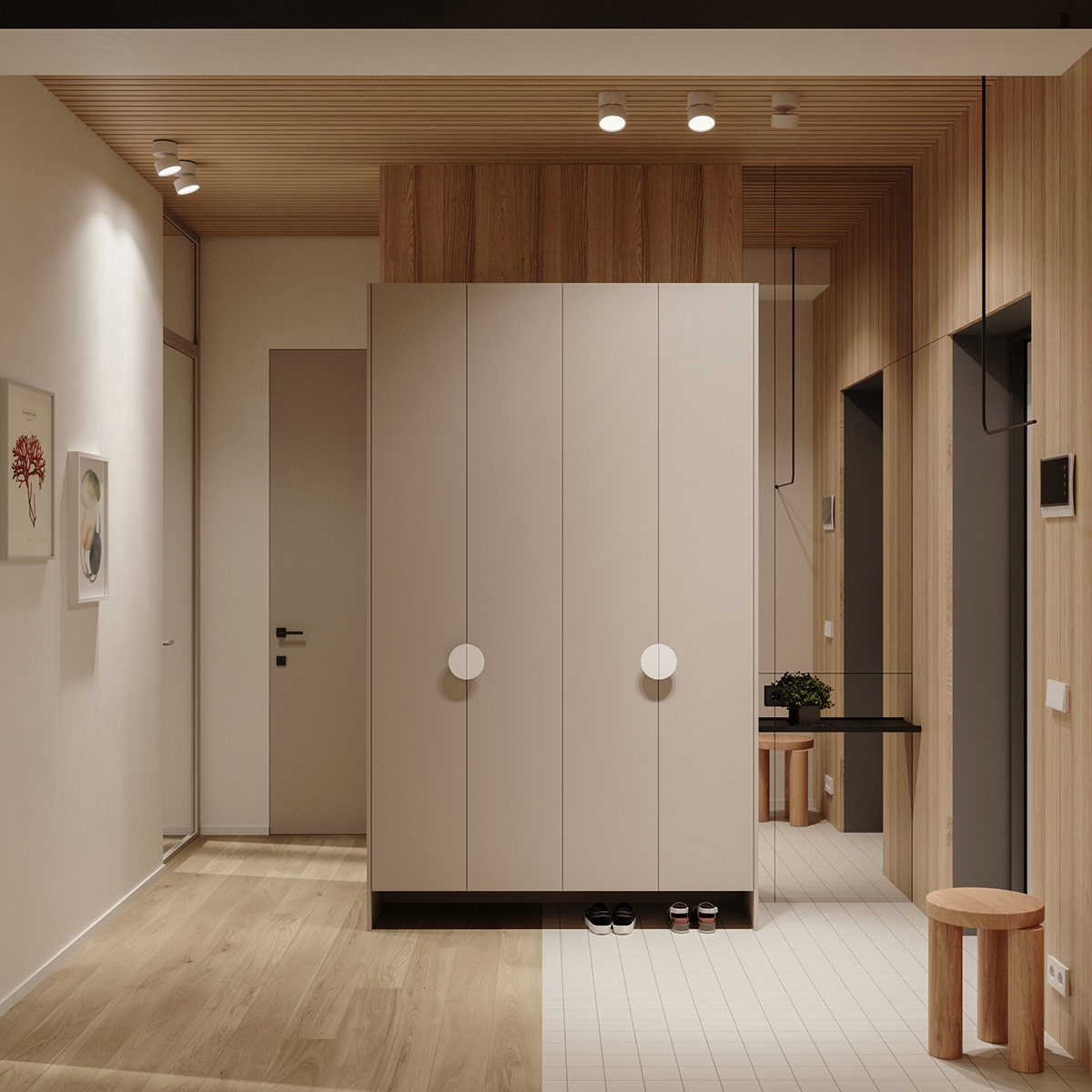
The sleek wood slatted ceiling treatment reoccurs in the home entryway. Wood cladding warmly encases the walls. A small entryway seat slides the wood accent onto a crisp white tiled floor treatment.
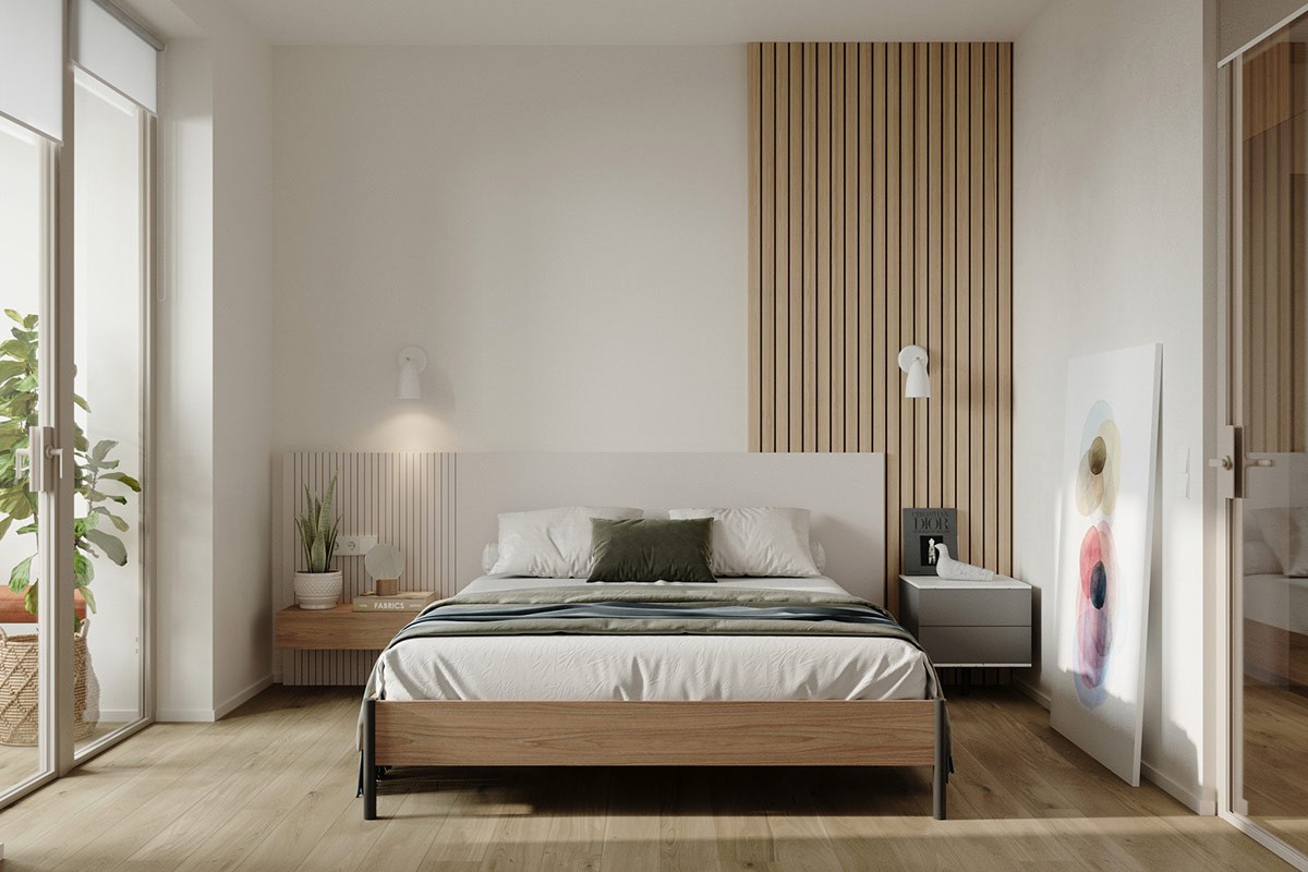
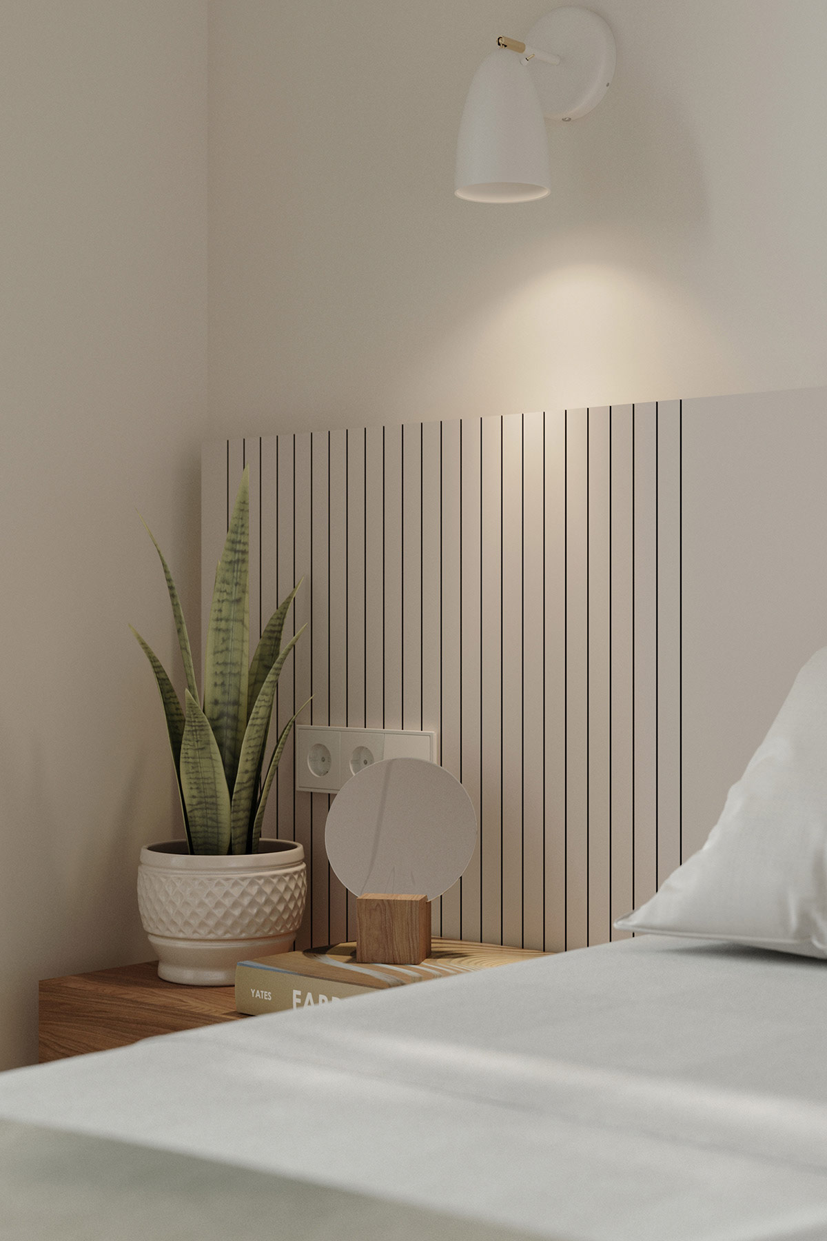
In the master bedroom, wood slatted panelling is no longer utilised as a ceiling treatment but instead comes down to form a stylish headboard feature wall.
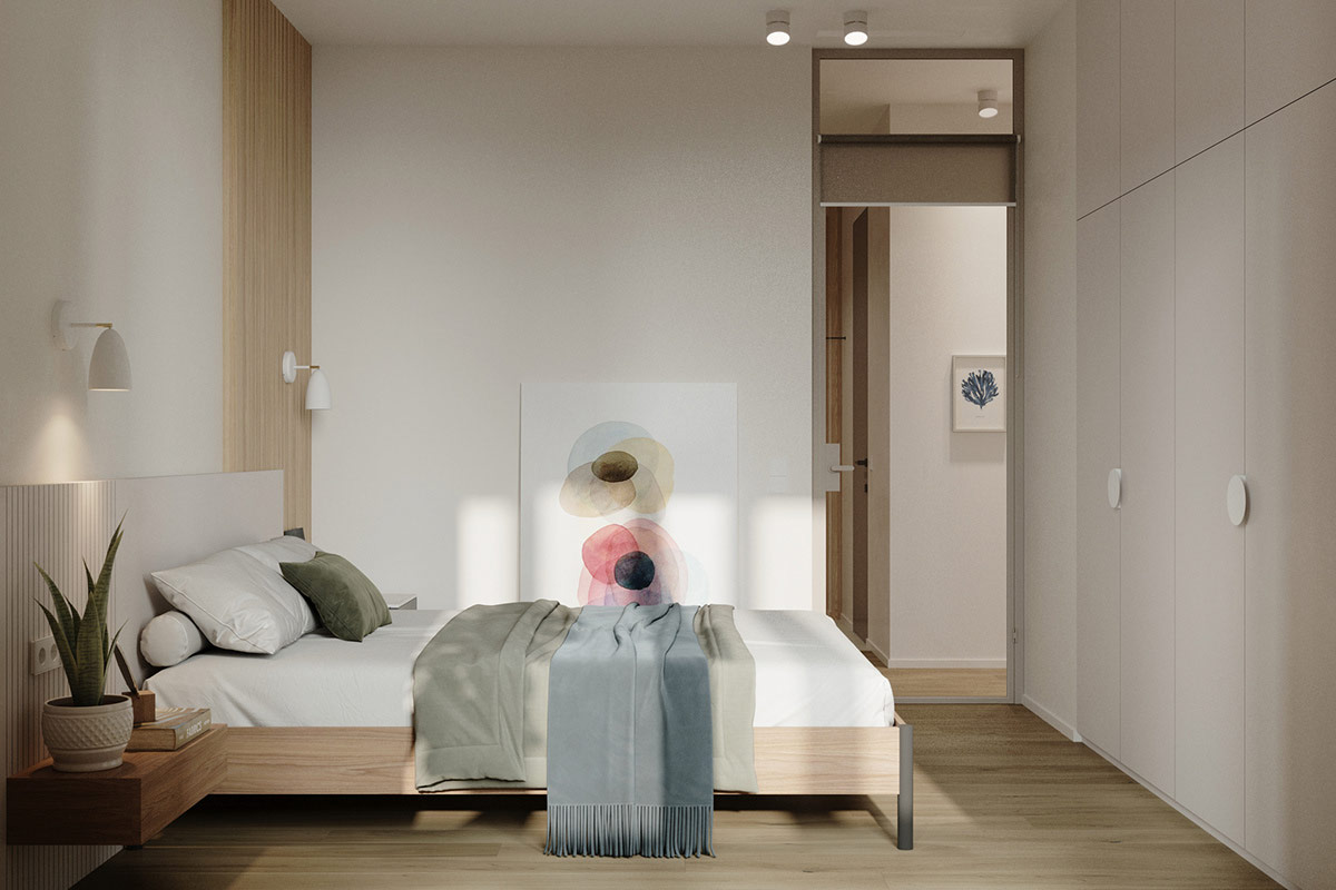
White modern wall sconces are mounted over each bedside table, and can be reangled for reading light.
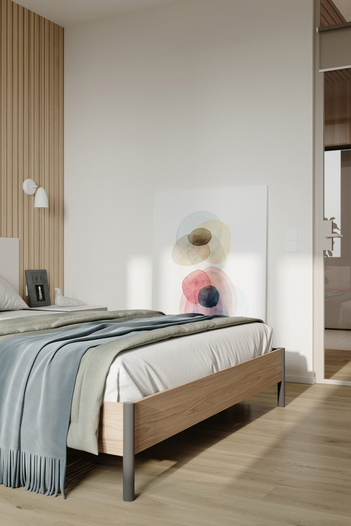
A muted green comforter and soft blue throw create layers of calming colour on the platform bed.
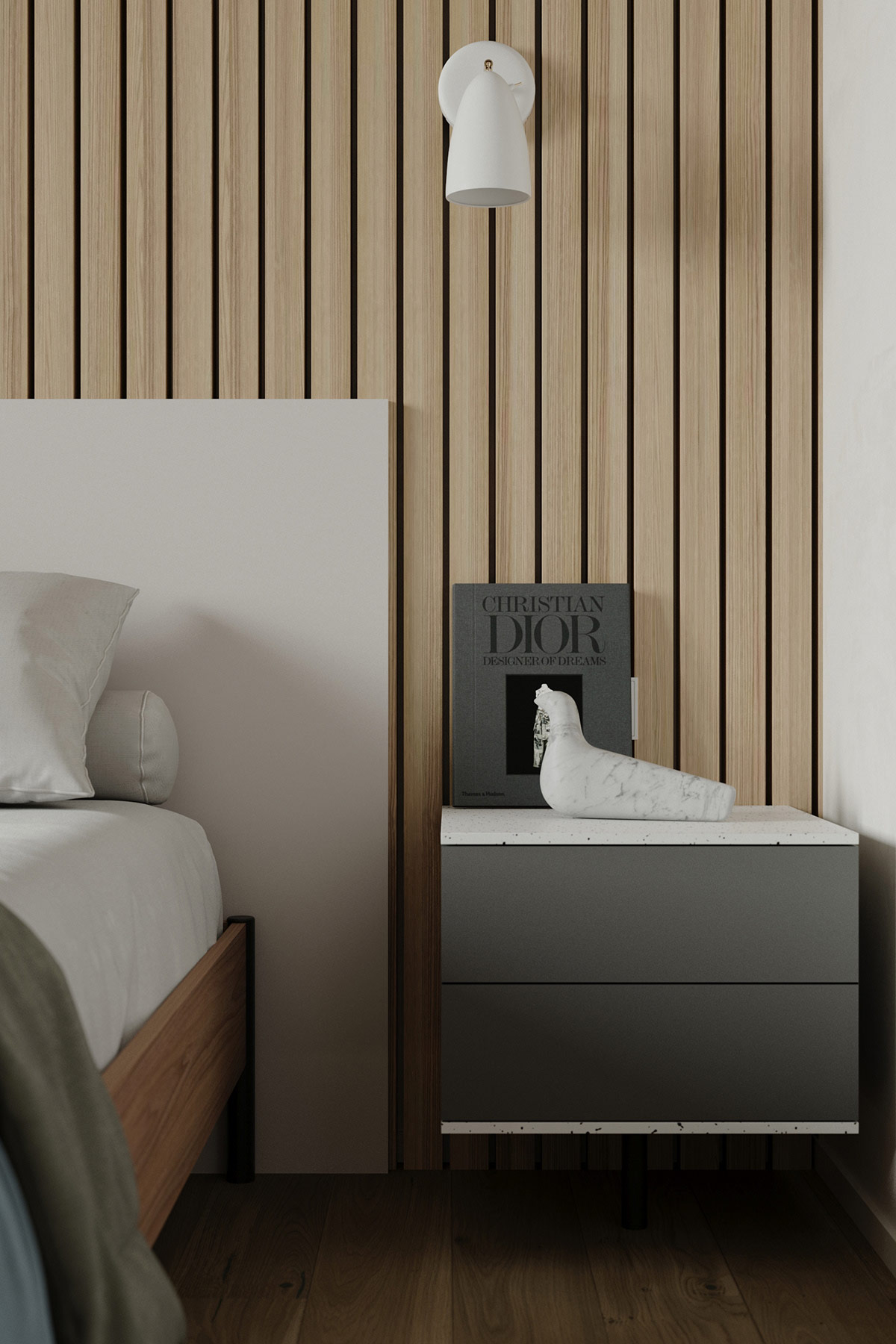
A grey bedside drawer unit is adorned with a L'Oiseau bird figurine designed by Ronan & Erwan Bouroulle for Vitra in 2011.
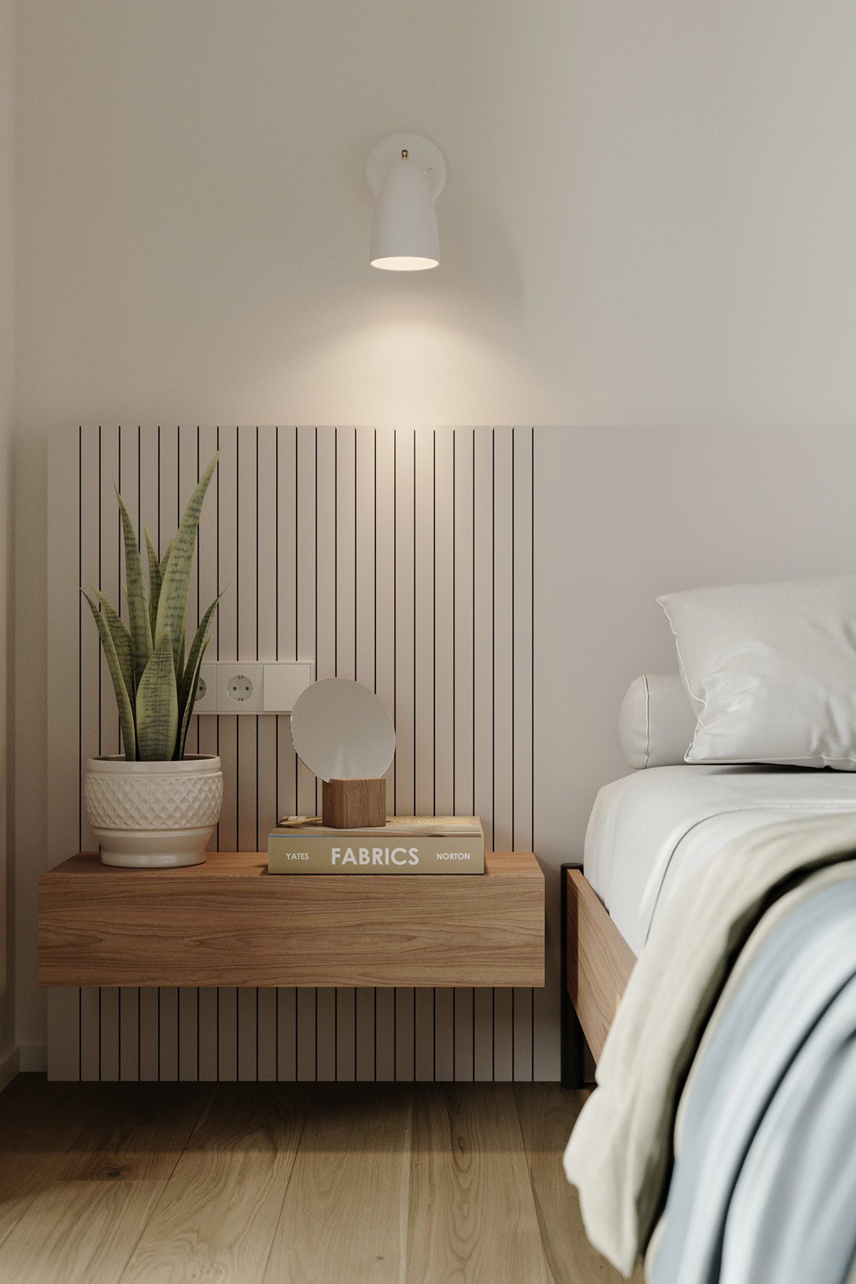
The opposite bedside table offers a completely different and contrasting look, with a linear, warm wood tone finish. A modern planter houses a green beside flourish.
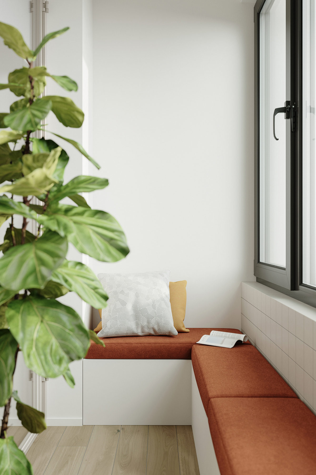
The enclosed balcony has been transformed into a comfortable reading nook with a built-in bench and upholstered seat cushions.
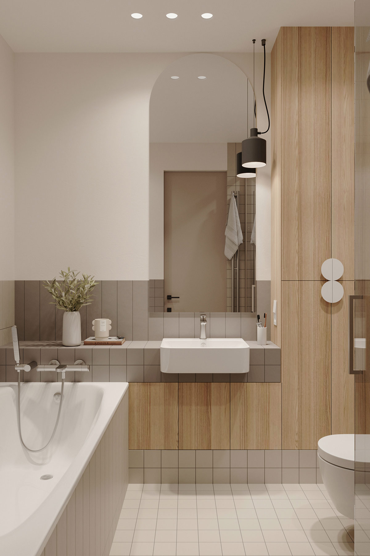
Inside the bathroom, fully-fitted furniture makes the absolute most of the compact room dimensions. A small farmhouse sink springs forth from a countertop with an attractive tile overlap, which also forms the tap mount for the bathtub.
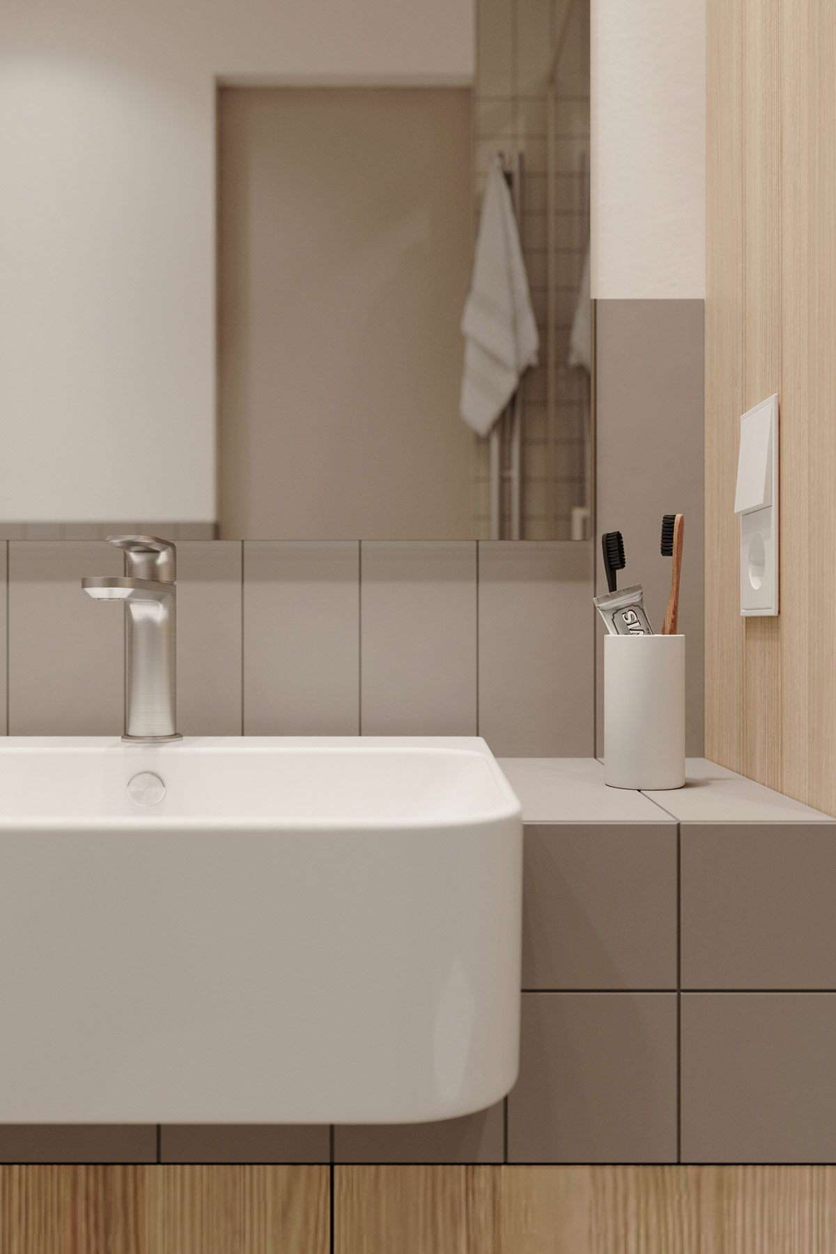
A matching grey linear tile is situated across the vanity backsplash area in a vertical orientation.
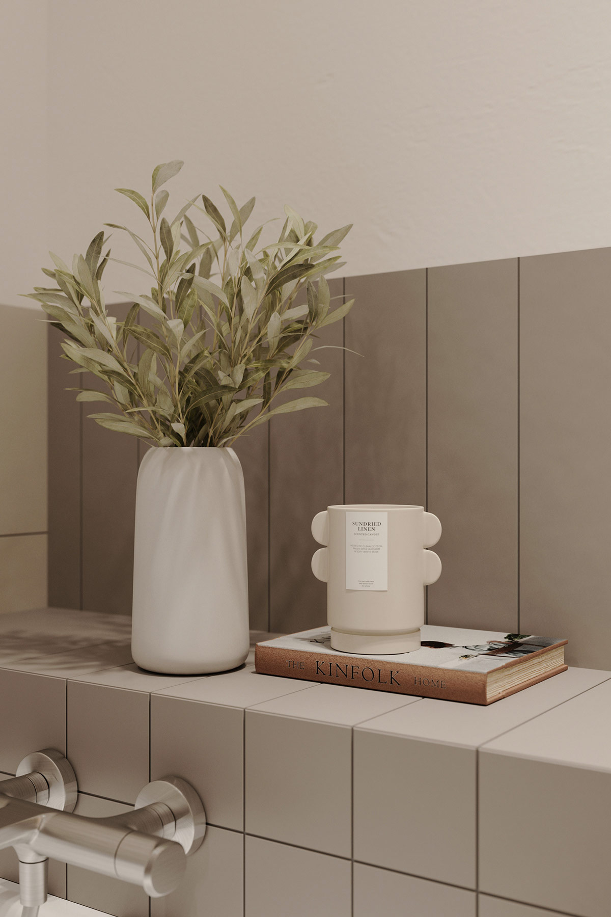
Scented candles and filled decorative vases evoke an air of pampered tranquility
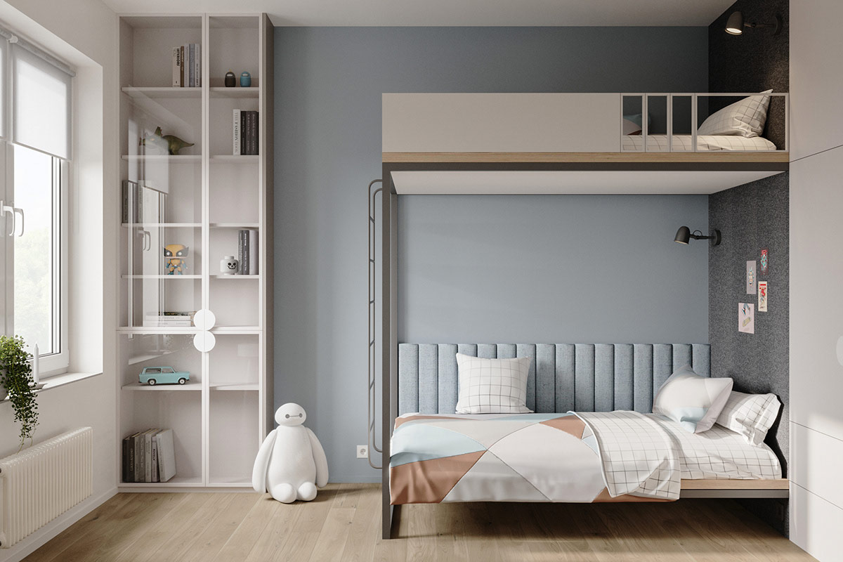
Gentle blue paintwork and a matching upholstered backboard sets a tranquil backdrop for the kids' bed. A geometric duvet cover combines all of the room colours together in a blue, brown, grey and white print.
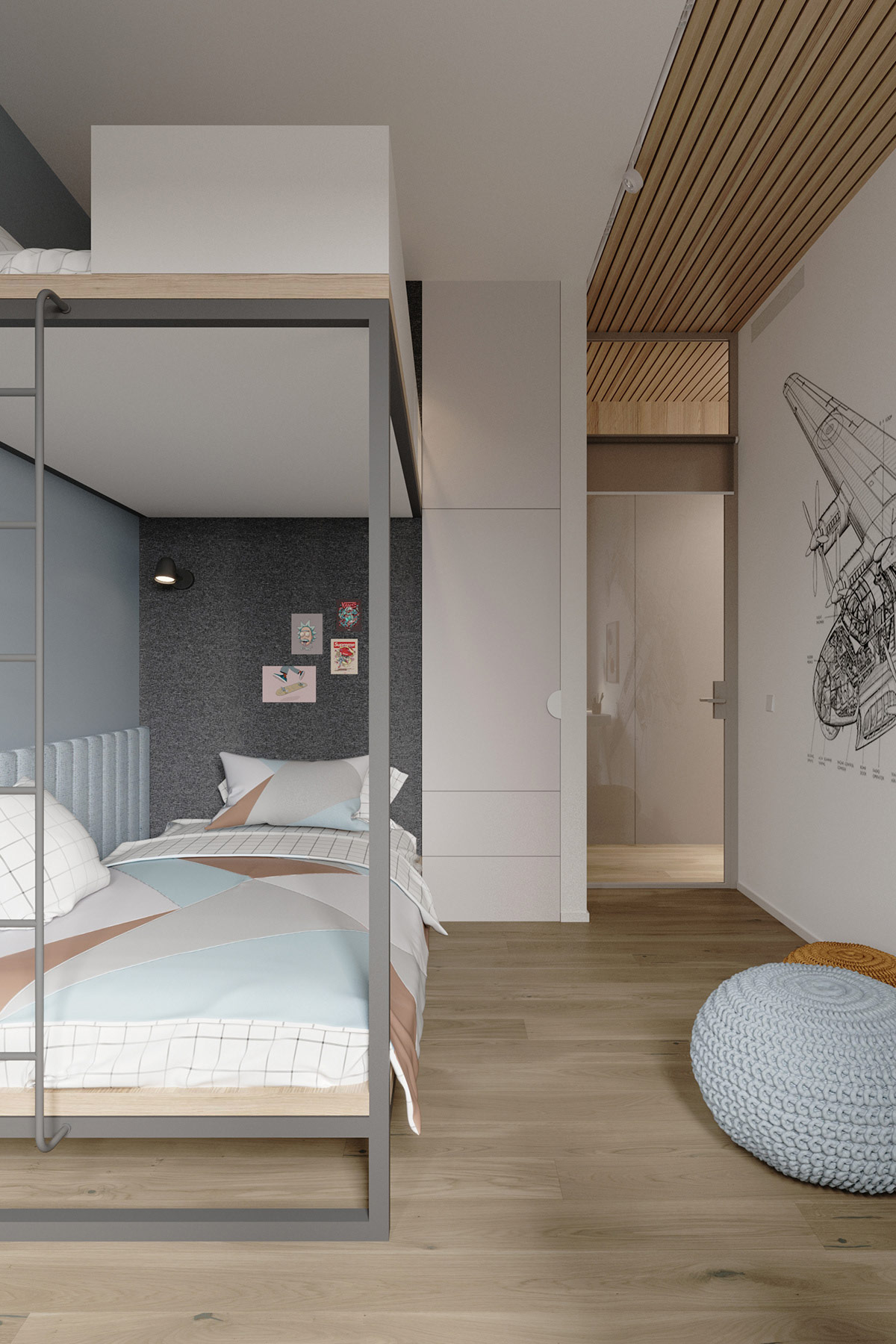
Knitted poufs scatter the blue and brown accents across the oak floor, creating cosy hang out spots. A fabric pinboard offers the opportunity for the youngest member of the household to display artwork and treasures right up by their pillow.
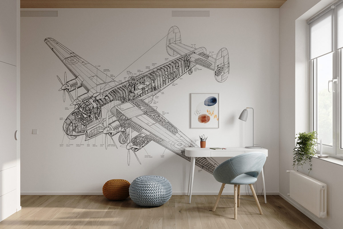
A kid's study area is laid out opposite the bed, with a unique kids’ desk, practical table lamps" title="50 Unique Table Lamps That Help You Lighten Up Your Interior">table lamp and a contemporary blue desk chair. An Avro Shackleton drawing makes a spectacular and educational focal wall behind the desk.
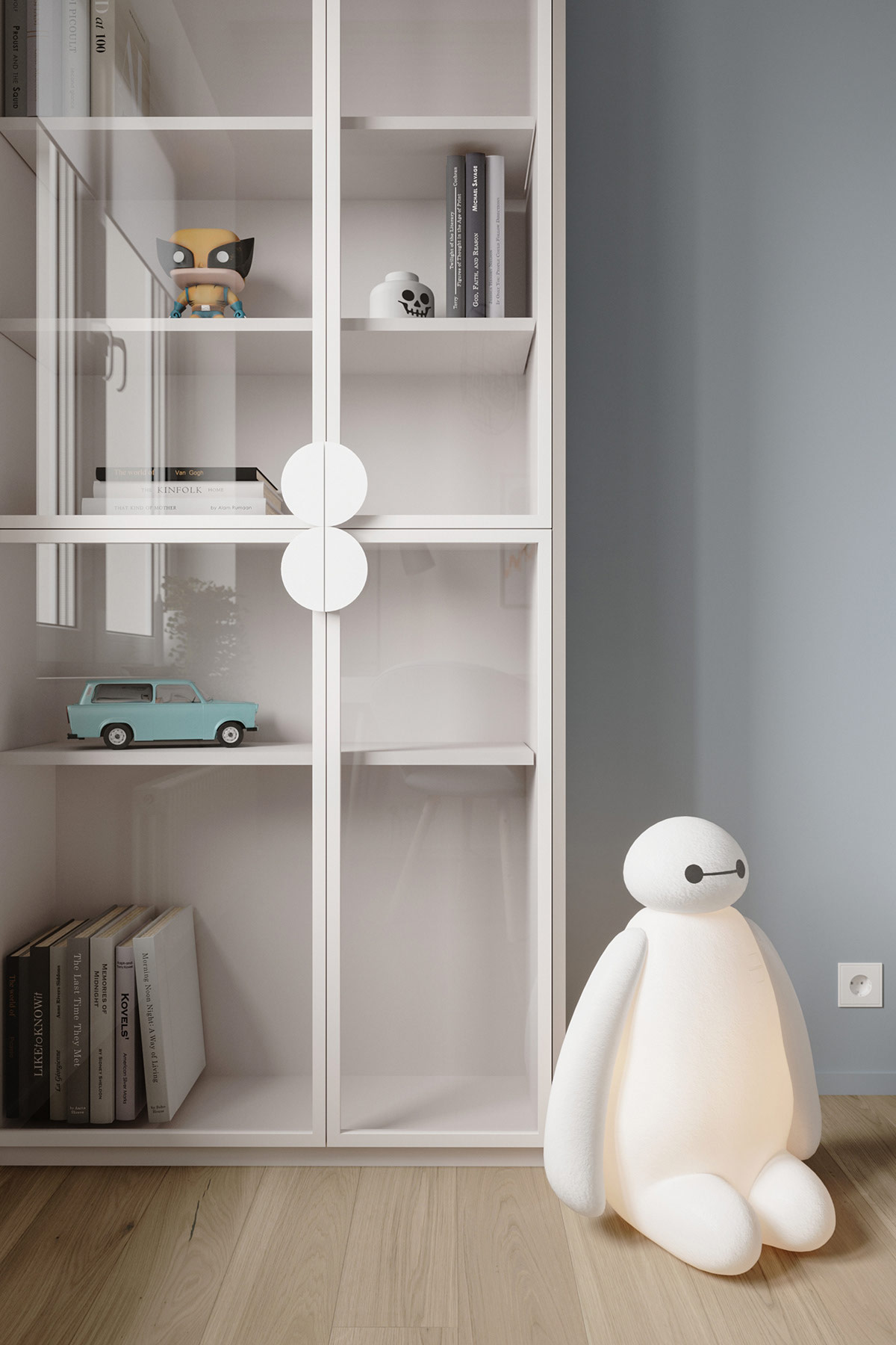
A glass bookcase keeps the dust off the kids’ library and special collectibles. A Baymax lamp gives off a friendly glow.
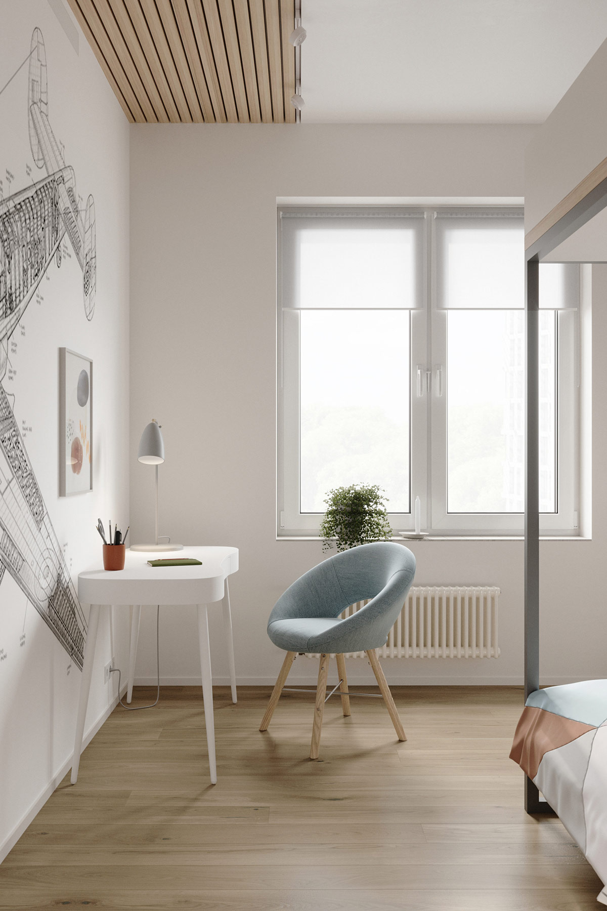
Another wood slatted ceiling panel establishes the study area as its own separate zone in the bedroom.
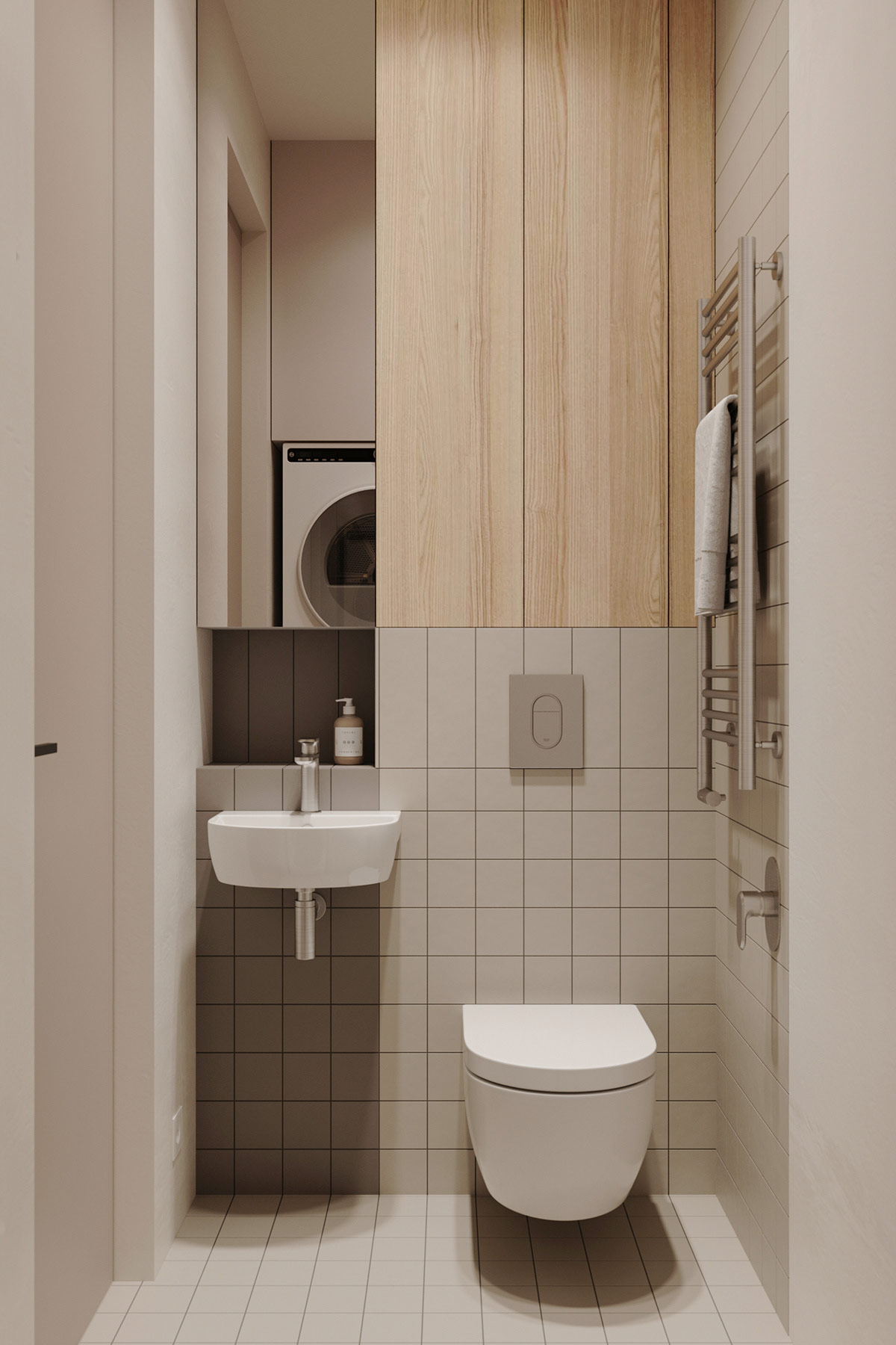
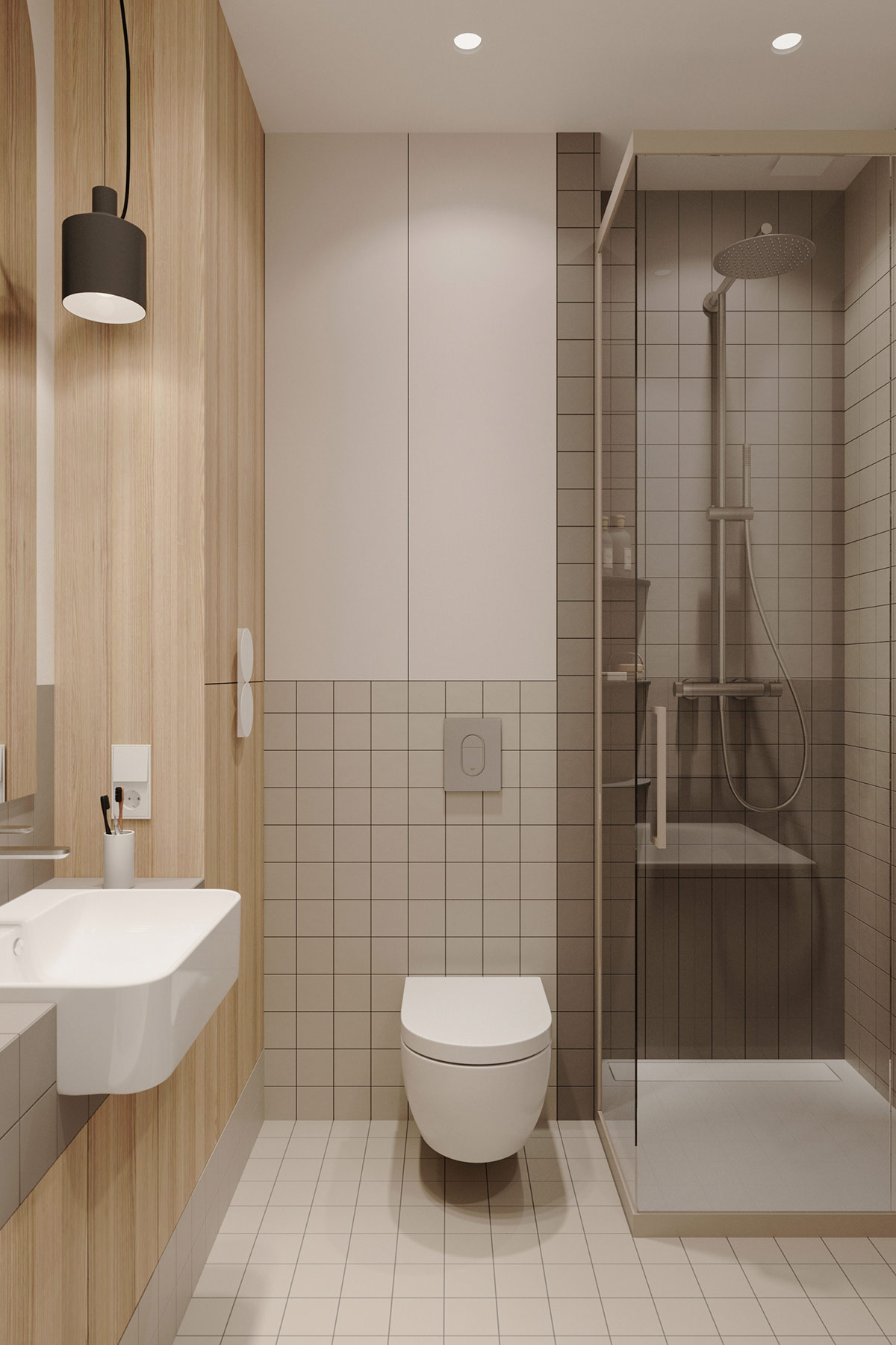
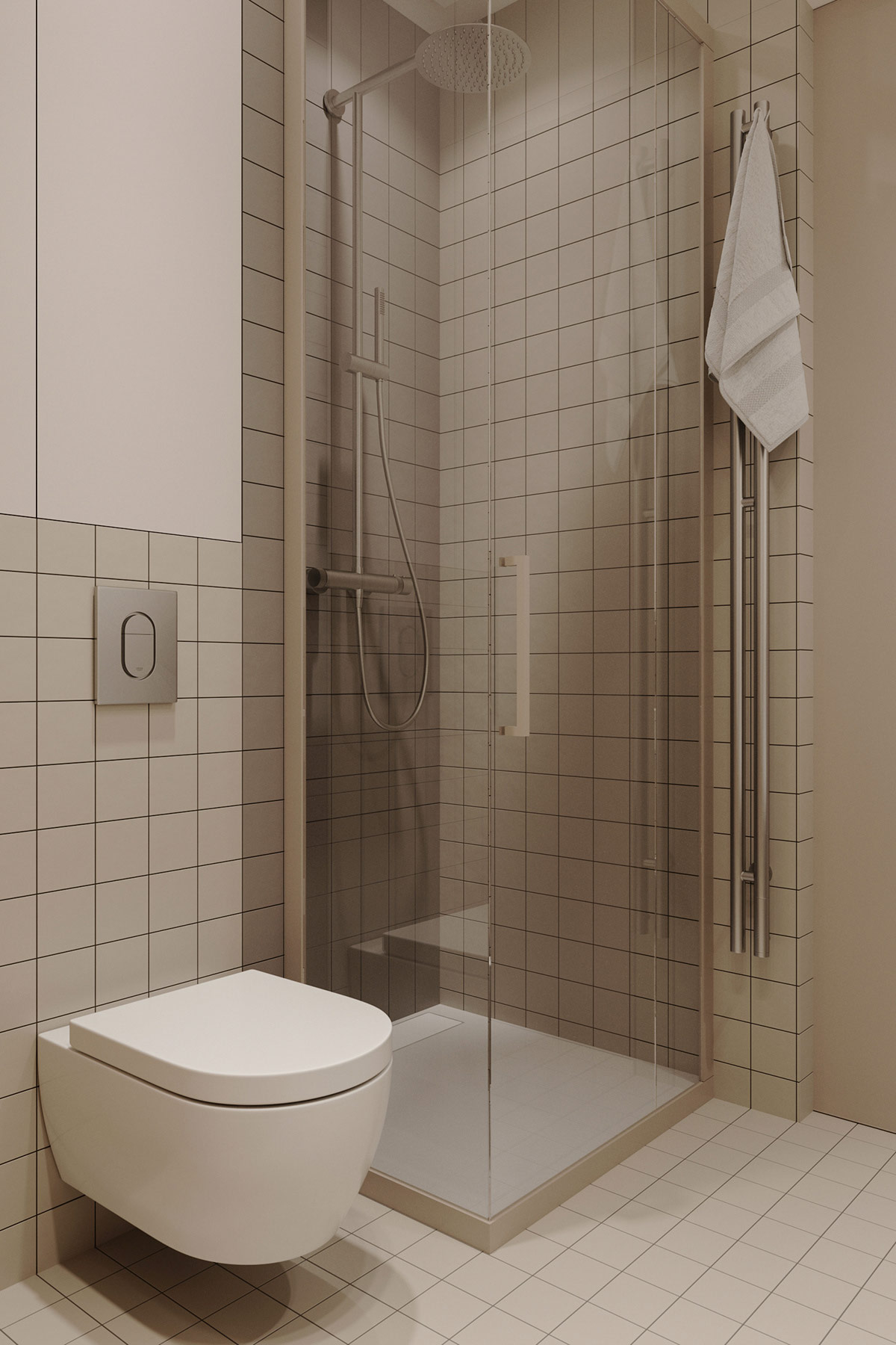
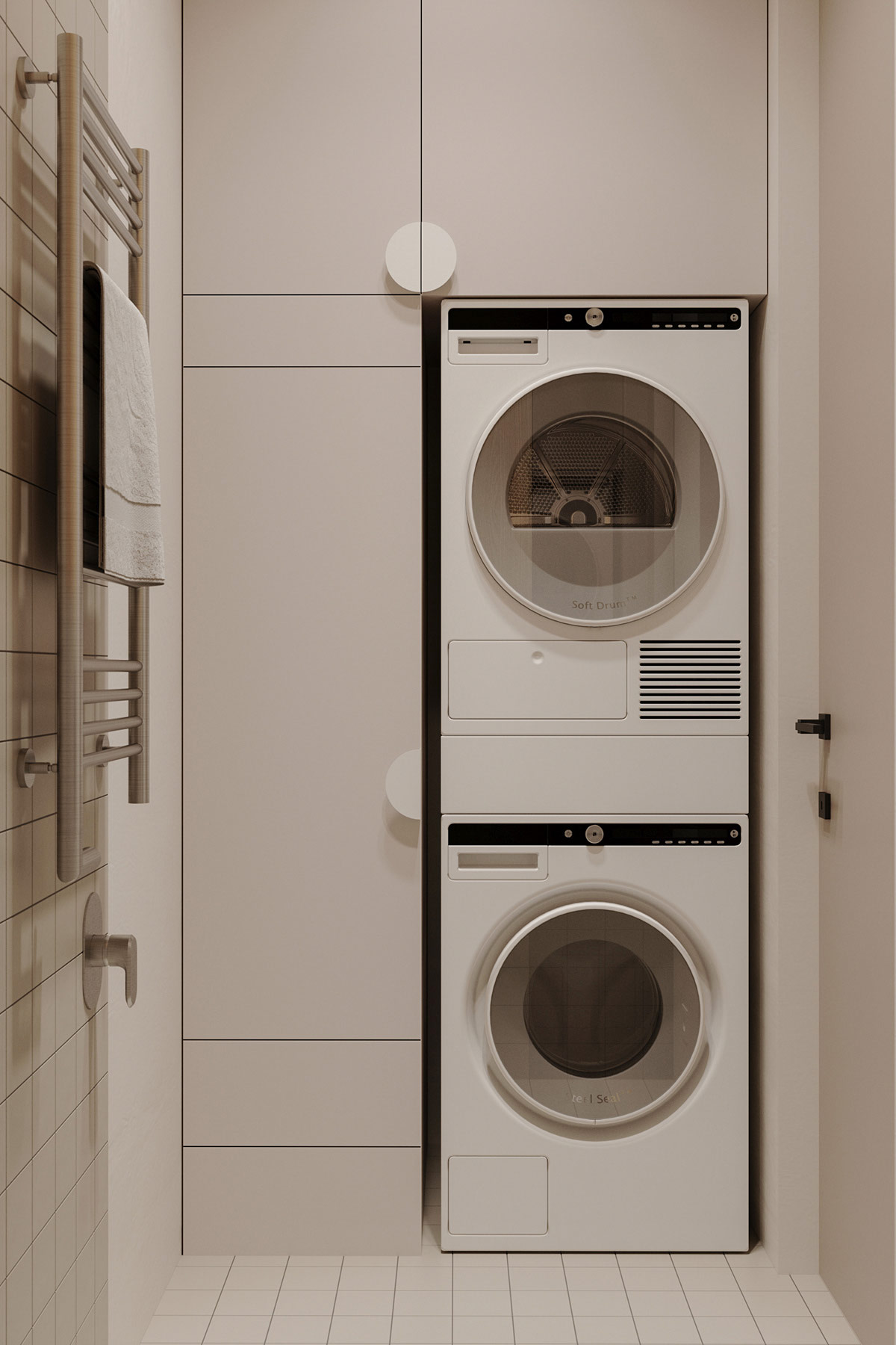
The small bathroom design situated off the home entryway follows the same aesthetic as the family bathroom, with light grey tile and custom-built oak cabinetry. A chrome towel heater dries off the hand towel.
