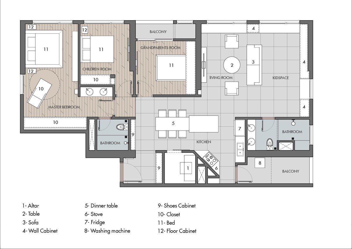
If we imagine of a child-friendly space in our minds, we might not typically first envisage it with industrial style decor. The Industrial vibe is a strong, adult look. The aesthetic calls for a hard utilitarian backdrop with exposed electrical wiring and ducting that don't seem exactly baby-proof. However, it is possible to have your parental piece of cake and eat it! If you love industrial interior style but aren’t sure how it would lend itself to a family home, then take a look at this child centric industrial chic apartment designed by Kây Architecture JSC. It even comes complete with a grandparents room (couldn’t leave out Gran and Grandpa!)
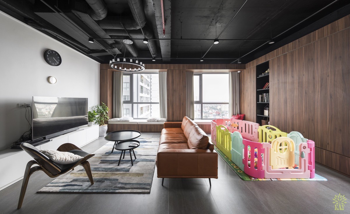
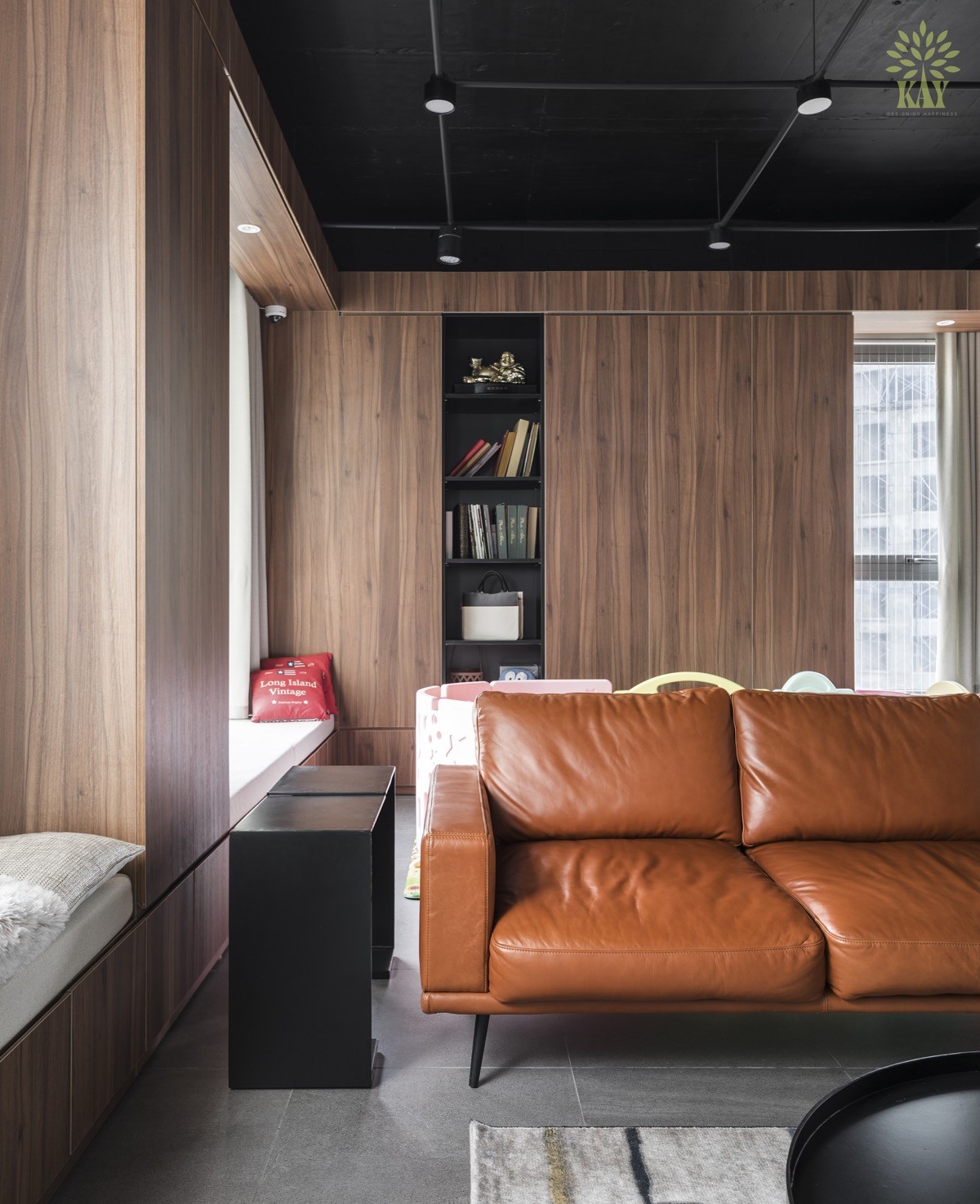
Right off the bat we can see that this living room has been designed with child play space in mind. Not only is there a playpen present, but it is an enormous playpen that has been given space to breathe. The living room layout has been designed in such a way that almost half of the floor area is dedicated to the youngest member/s of the family. So what happens when little legs leave the confines of the pen? Well, you will find that all of the industrial styling in this home has been cleverly confined to the ceiling area, keeping exposed electrical wires and ducting clear of curious little fingers.
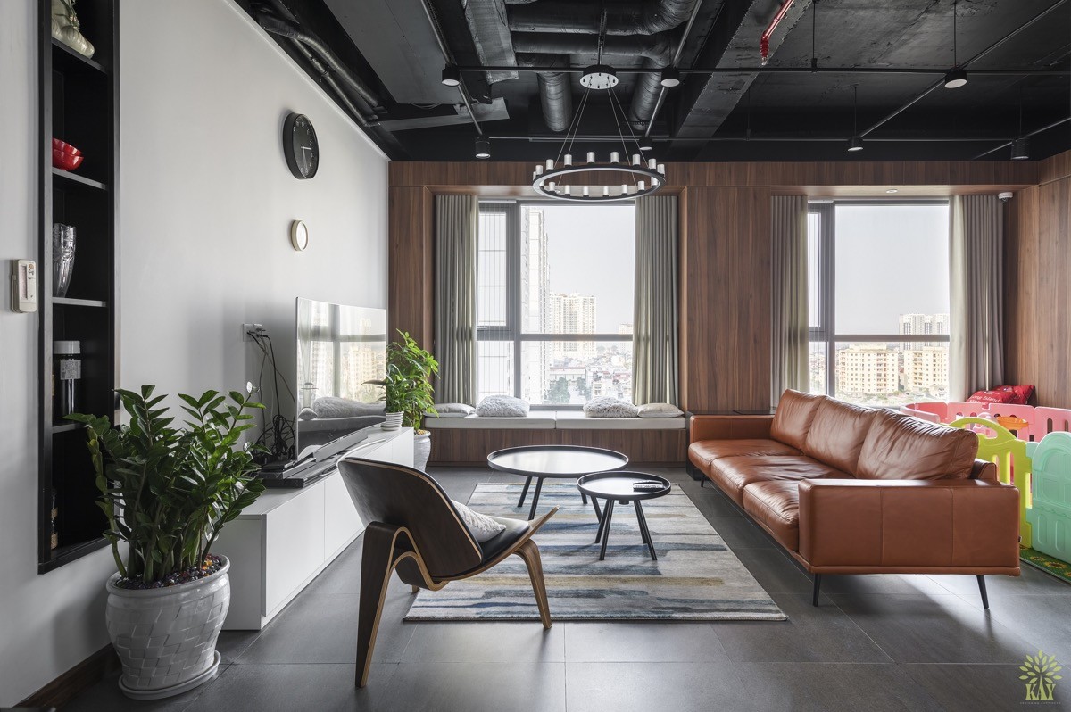
By utilising the ceiling space to its maximum to showcase many industrial elements, the home gains all of the industrial style without parents and grandparents having to worry about baby fidgeting or tumbling around against these things. Everything down at ground level is as you would find it in any modern home interior.
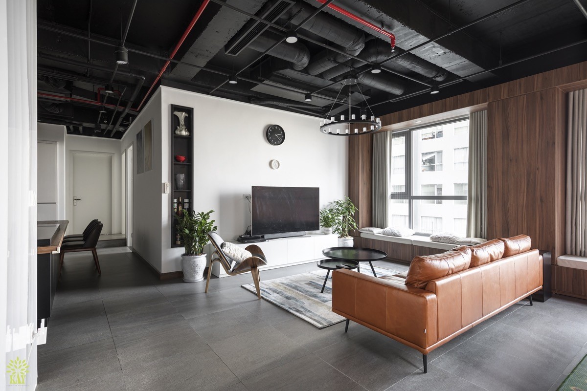
The furnishings have been chosen to compliment industrial chic styling. Forever popular in industrial schemes is a brown leather couch. This one has been teamed with an unusual three legged accent chair and a lovely built-in window seat on the opposite side.
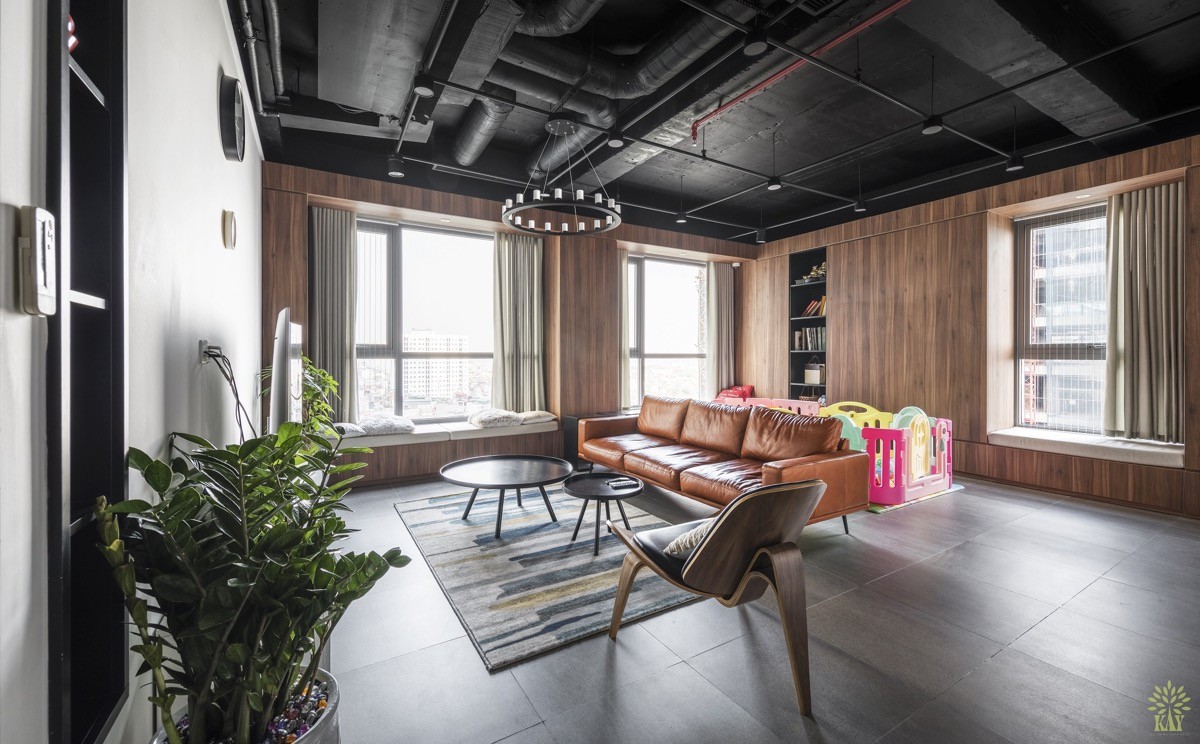
A set of black coffee tables mirror the black industrial ceiling, as do a number of narrow recessed bookshelves around the room.
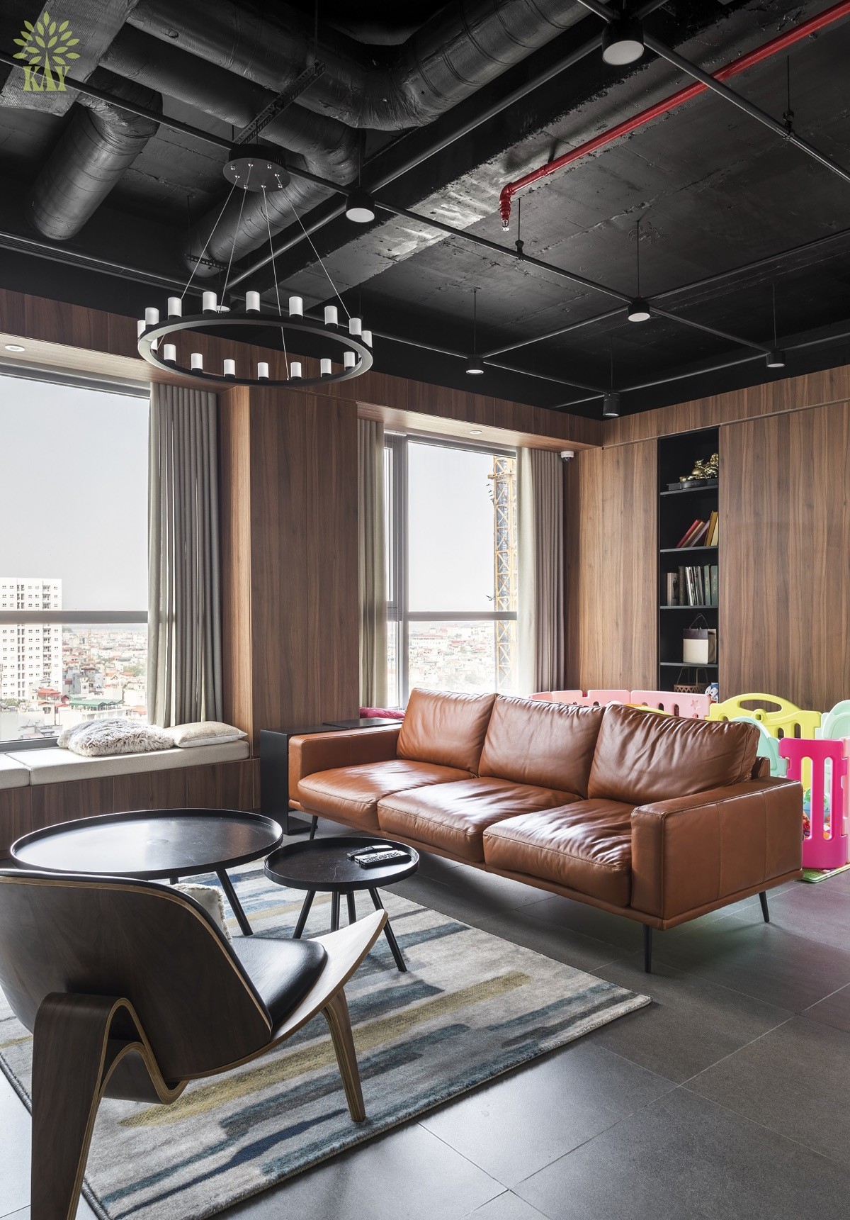
A chandelier hangs from a ceiling track, encouraging the eye to move up and take in the rest of the feature ceiling. Also present is some bespoke industrial lighting on a red track; this continues out from the open plan living room area and over into a kitchen-diner.
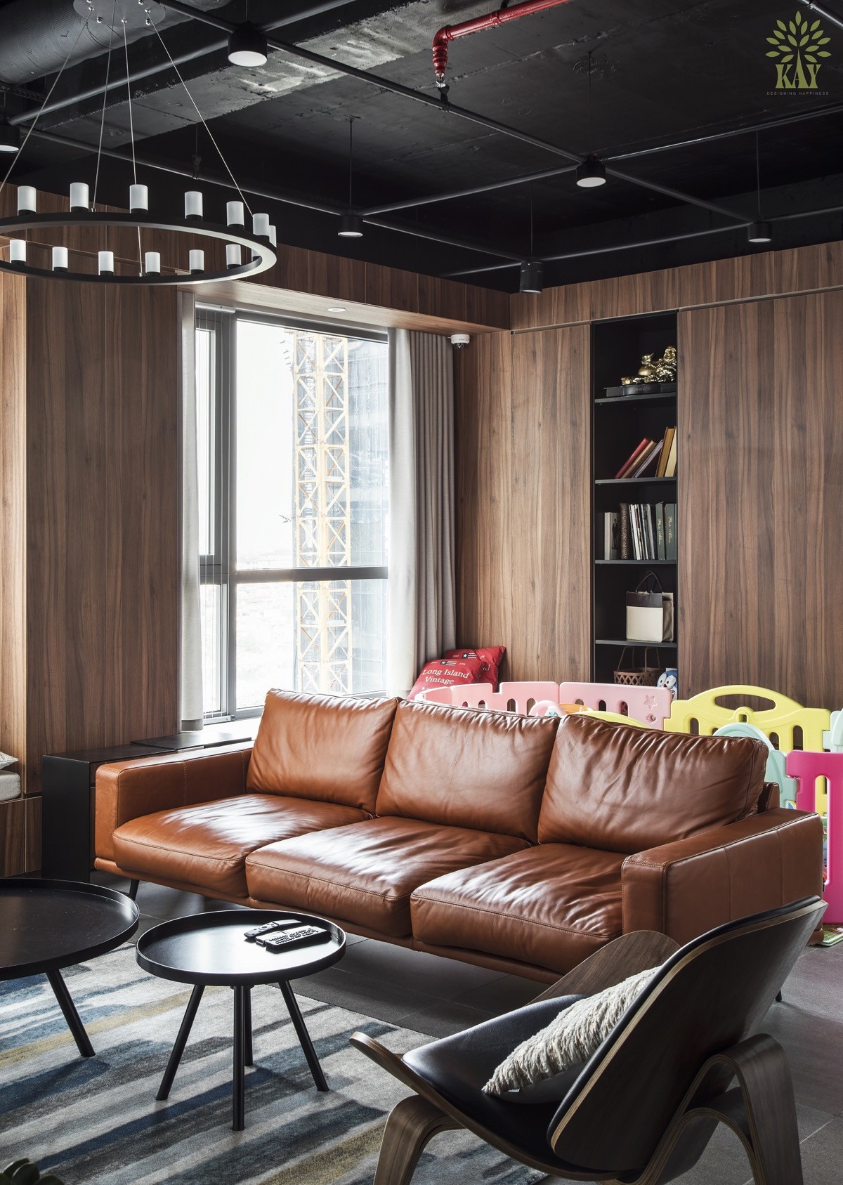
Two of the large living room walls have been covered in wood panelling. Wood tone acts as a visual warmer in an industrial style space. The tone of the wood is complemented by the colour of leather on the couch.
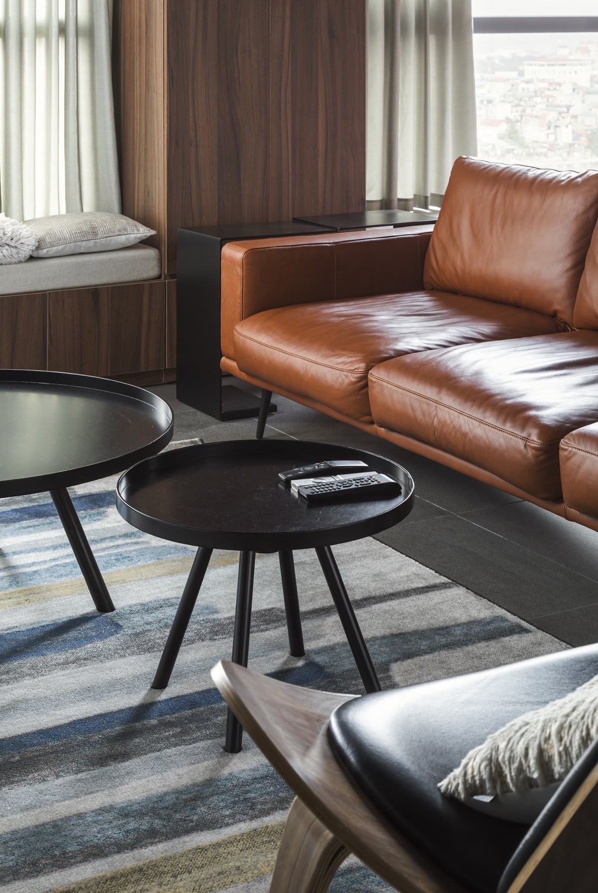
The set of two round black coffee tables sit on top of an area rug that brings a little colour into the adult sitting area.
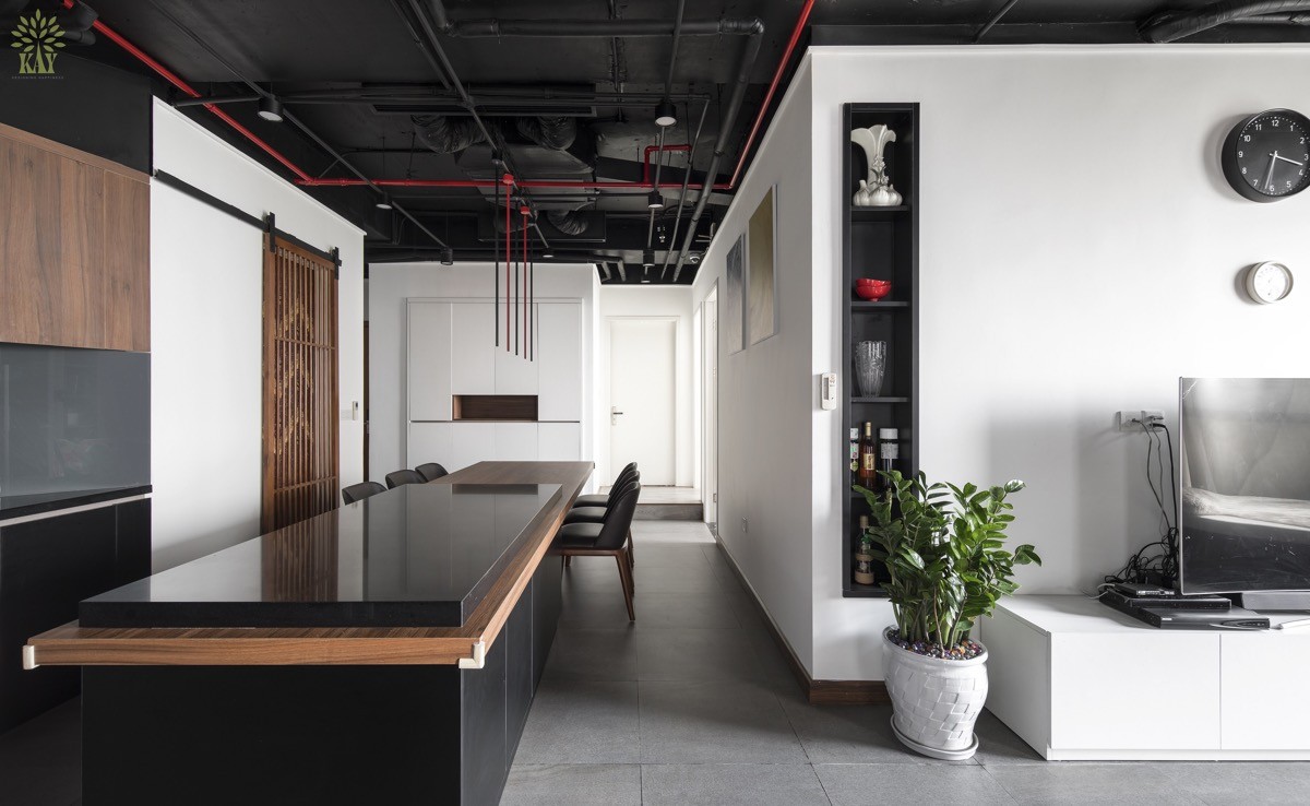
Moving out from the lounge, a kitchen-diner stands nearby. The proximity to the lounge and play area allows parents and grandparents to keep an eye on little ones whilst cooking dinner or laying the table. Children can watch happily and communicate with the cook without getting underfoot.
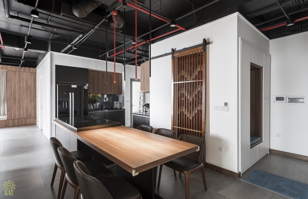
A six setting dining table provides plenty of space for family dinners, which can be easily served from the directly adjacent kitchen worktop.
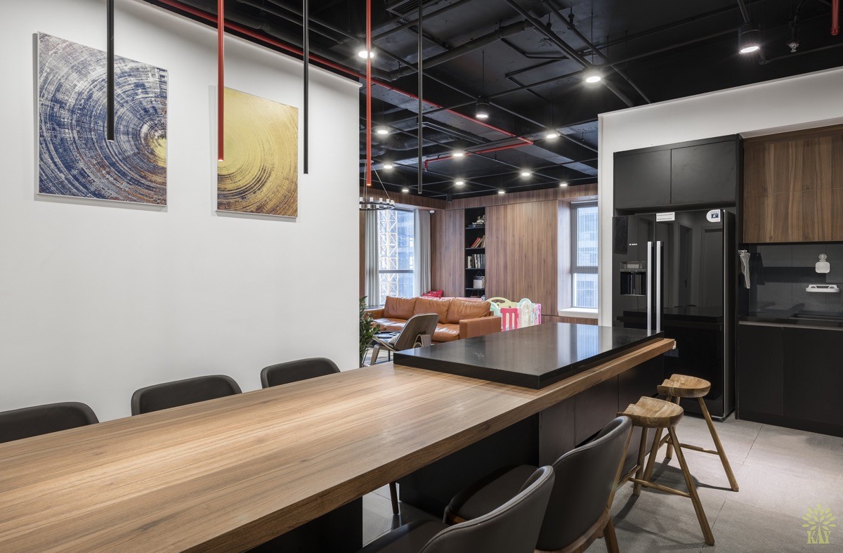
A glossy black American fridge-freezer and black kitchen units create the base notes here, tying in with the drama of the industrial ceiling design.
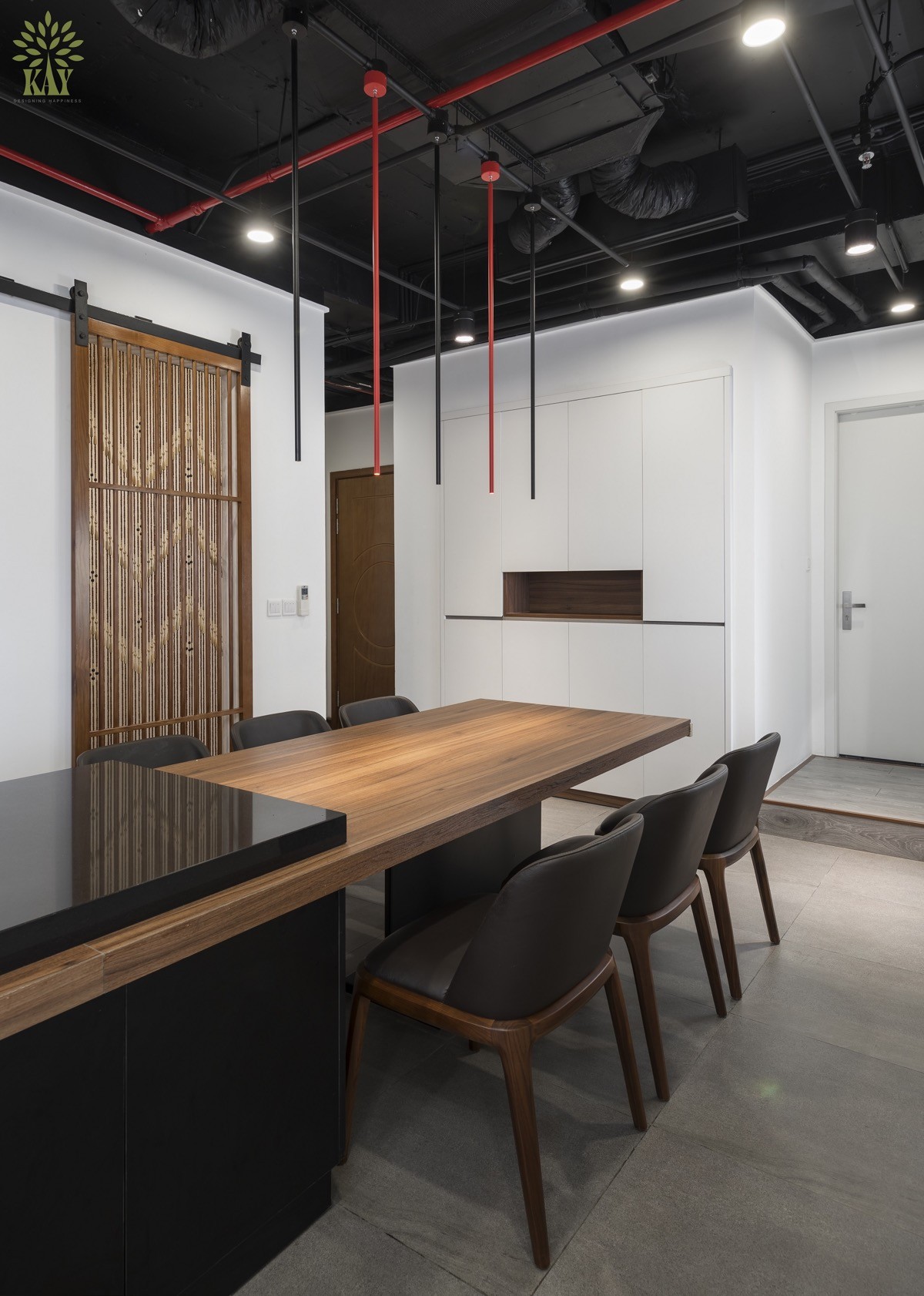
We can see how the red lighting feature streaks into this space, creating colourful routes around the home, like a subway map. The lighting installation descends over the dining table in black and red alternating bars.
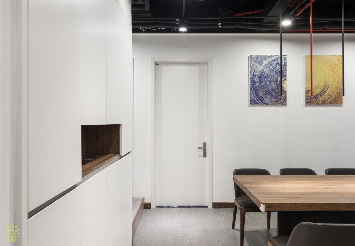
Built-in storage cabinets at one end of the dining area have white doors, keeping things clean and blended with white walls.
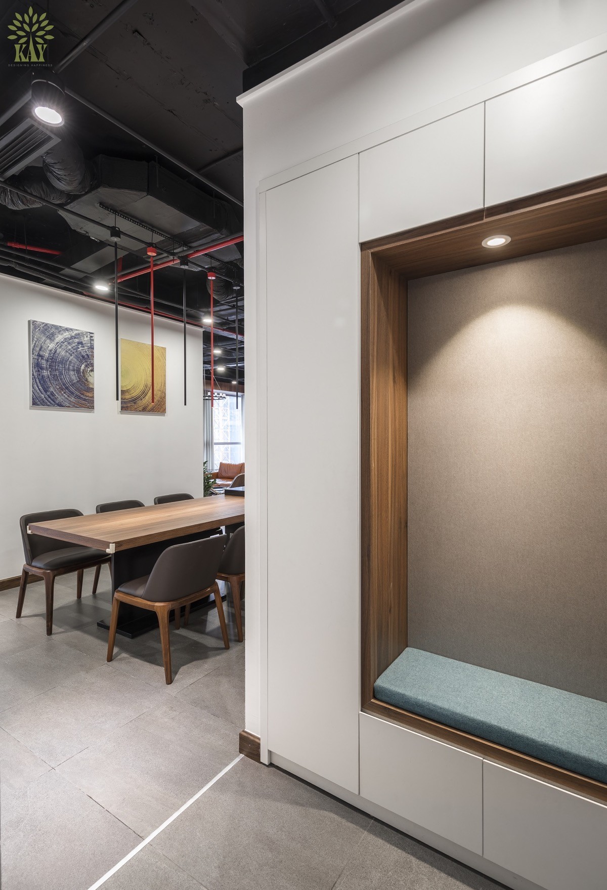
On the opposite side of the white storage volume is a built-in bench by the entryway. Storage on this side could be utilised for coats, shoes and bags.
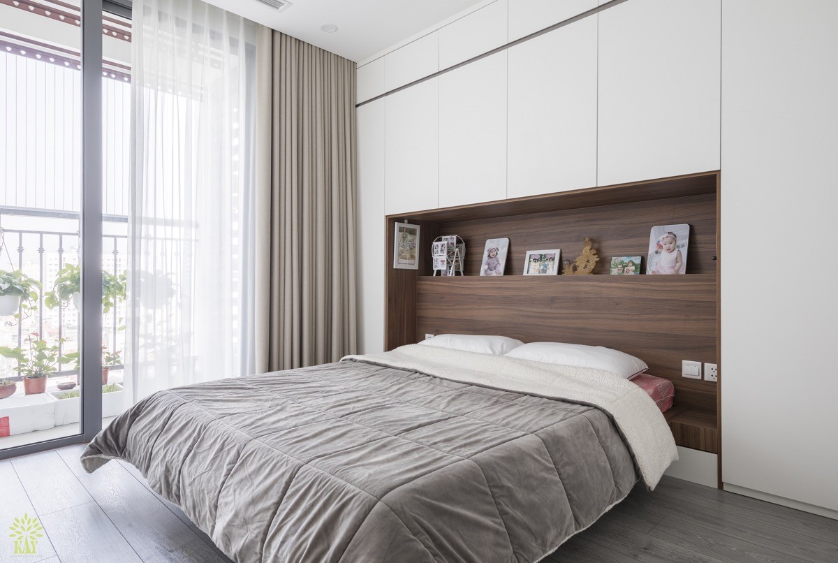
The grandparents’ bedroom has its own private balcony, allowing them to snatch a calm and quiet moment or two whilst the little one rampages with their parents. Gran and grandpa retire to a soothing neutral scheme with a bank of storage installed around and over their bed, plus a wooden shelved headboard feature for displaying photographs of their grandkid/s in pride of place.
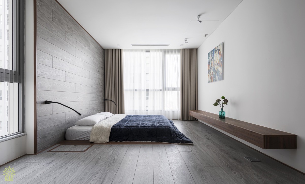
The parents’ bedroom takes an entirely different tack. A floor level bed gives the space a young and contemporary feel. Wall sconces have been mounted low to match, as has a long wall-mounted console opposite.
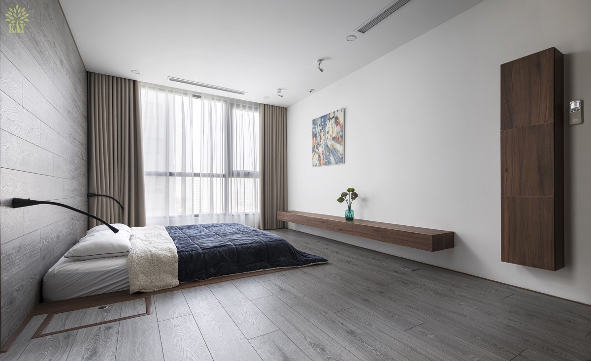
The room has a distinctly minimalist feel. The flooring is a washed grey wooden plank that continues up and over a headboard feature wall.
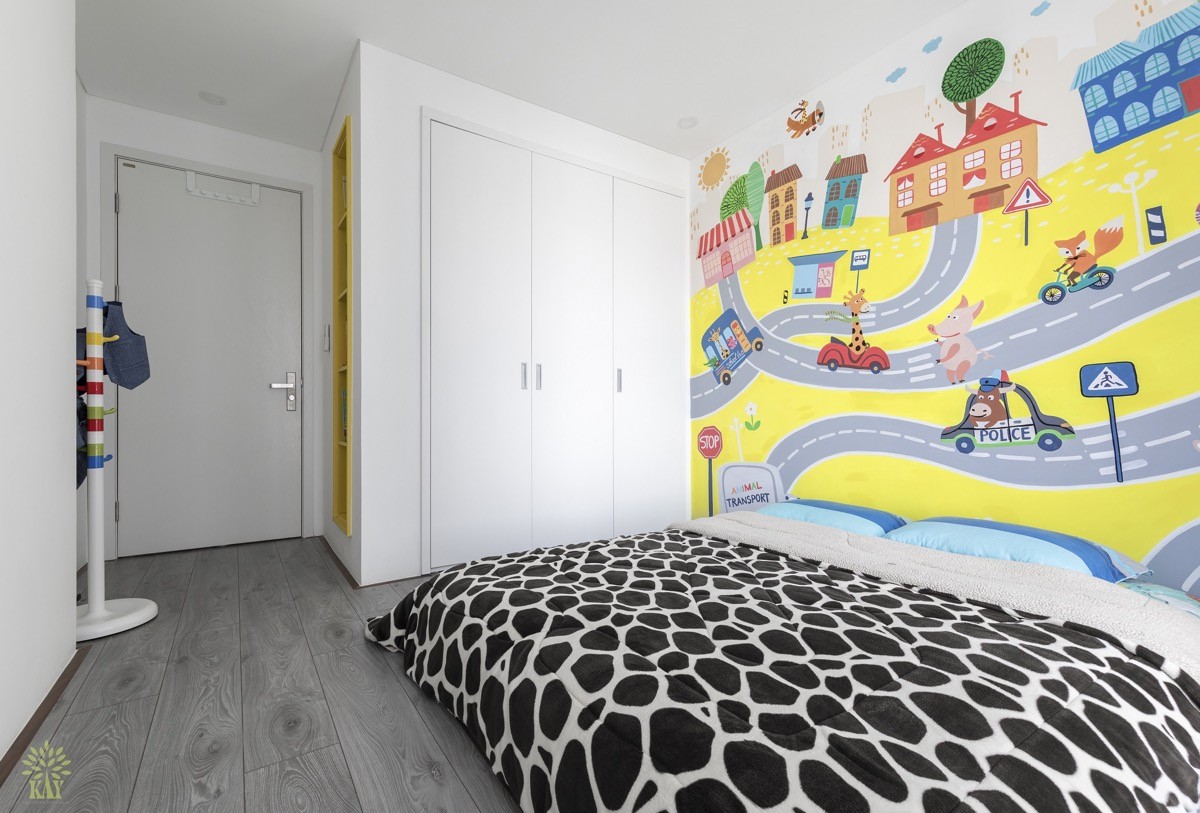
In the child’s room there is an explosion of colour on a mural wall. The bed has been dressed with a bold monochrome print duvet cover and mismatched blue pillowcases. A colourful kids coat stand looks onto bright yellow recessed shelves.
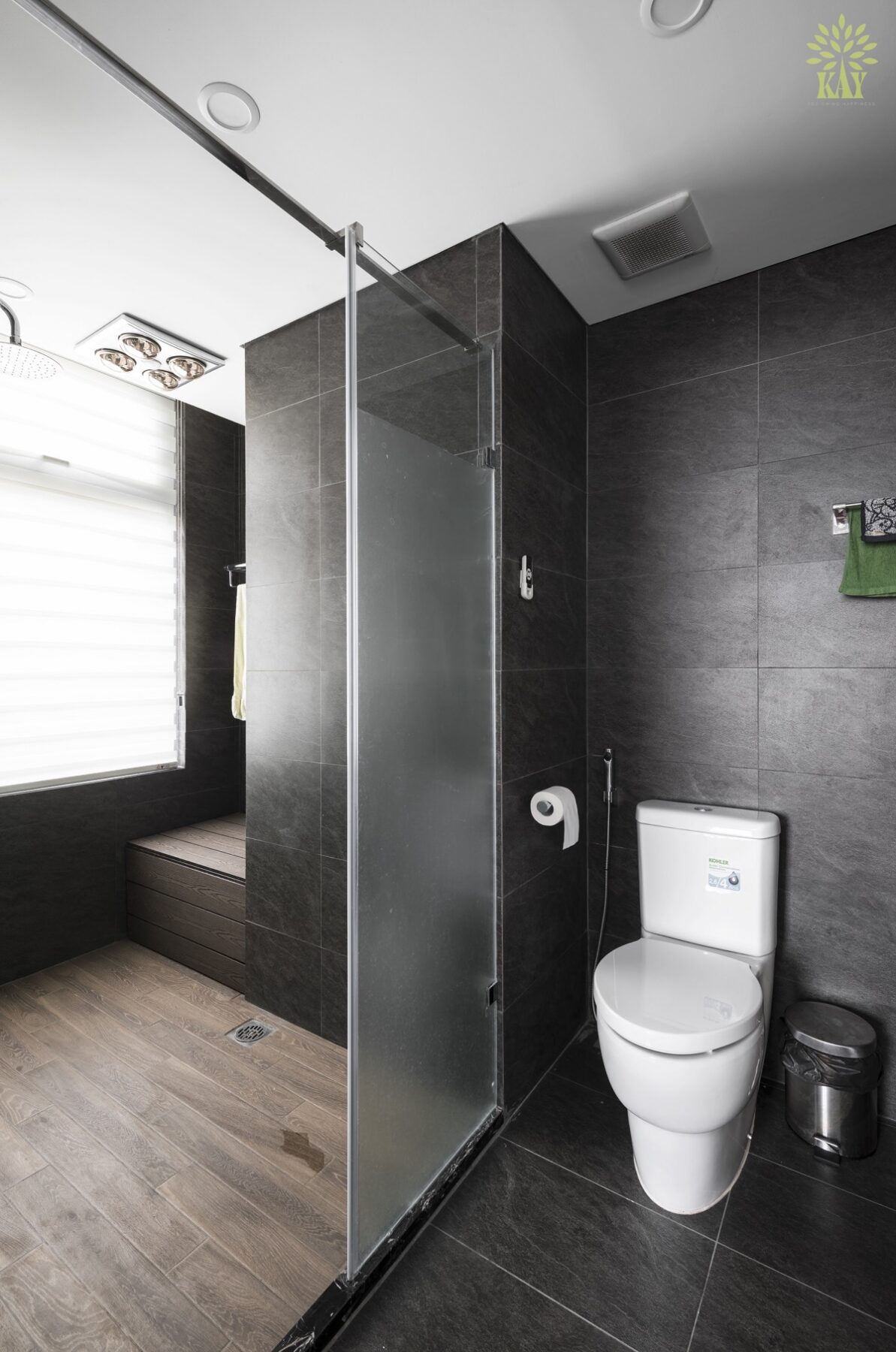
The first bathroom is located just off the open plan living room, putting it in quick proximity to the play area.
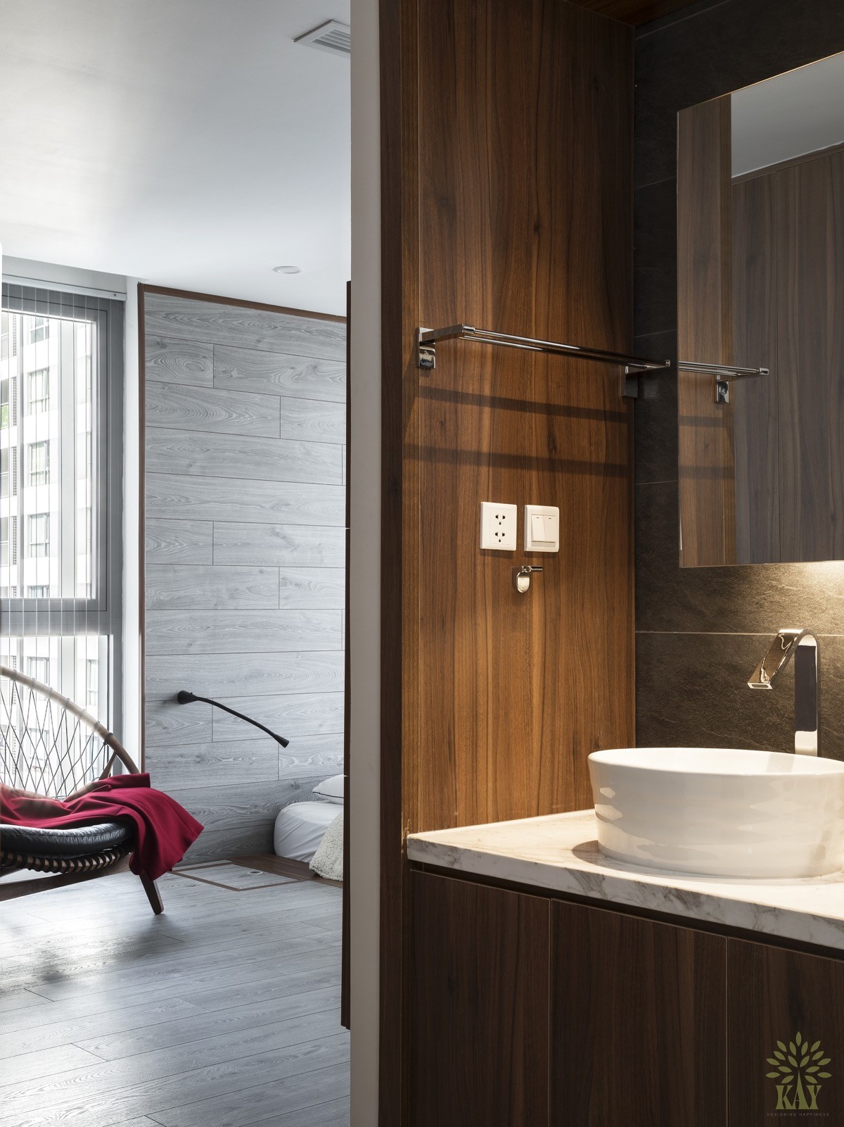
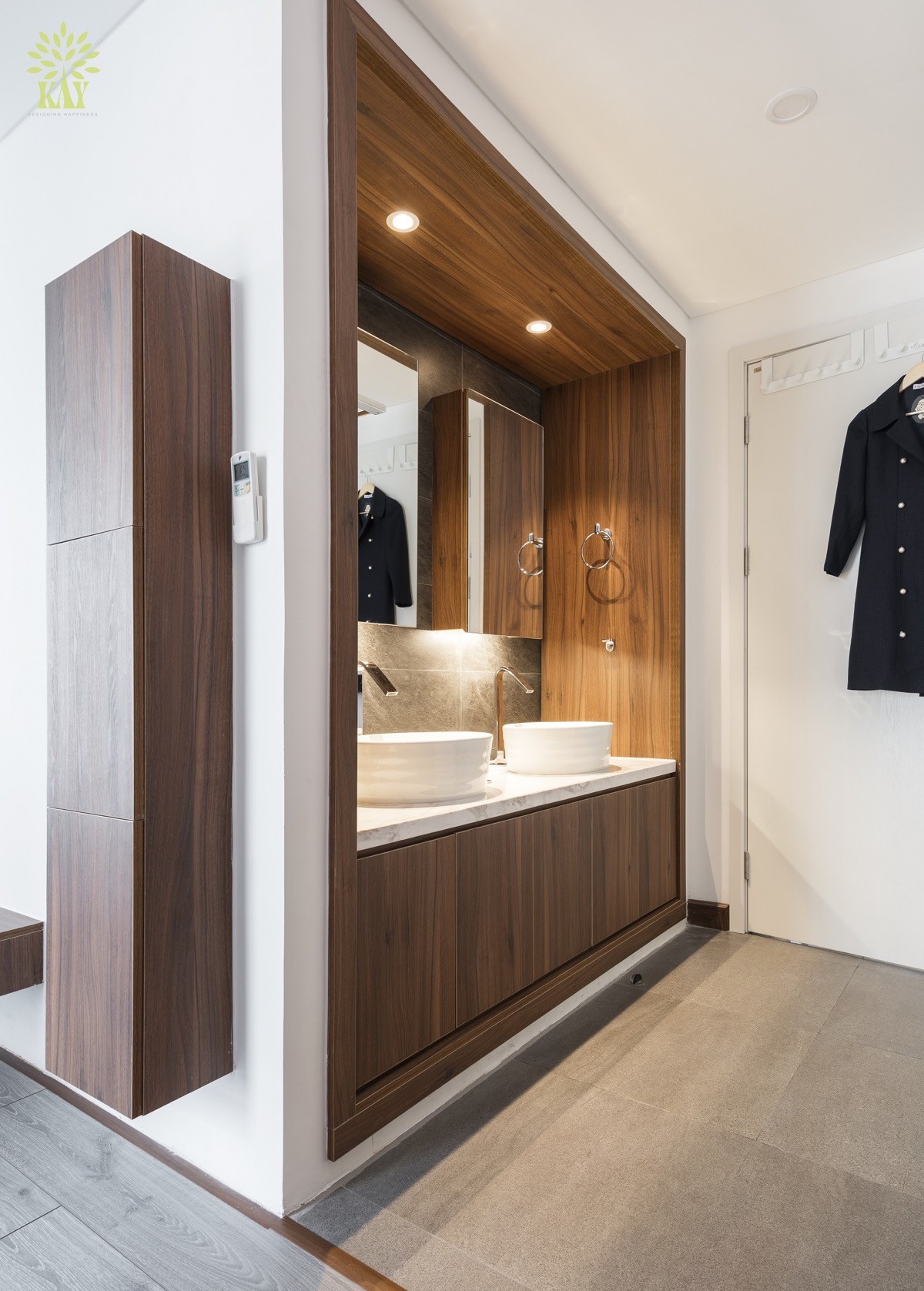
The second bathroom is situated within the parental master suite, but within the direct vicinity of the kid’s room for emergency twilight bathroom trips when toilet training arrives.

