How do you tie rooms in a living space together, without appearing kitsch or too-perfectly-matching? This apartment by Lugerin Igor of Lugerin Architects shows how a few well-thought-out design themes can lend balance and harmony to your room transitions. Interestingly-placed pieces, unusual materials in muted hues and stand-out details in each room lend your apartment the vogue of one in a magazine, without revealing the work behind the scenes. Undertone patterns and common background colours add a finishing touch, letting bolder colours take centre stage and contrasts take effect.

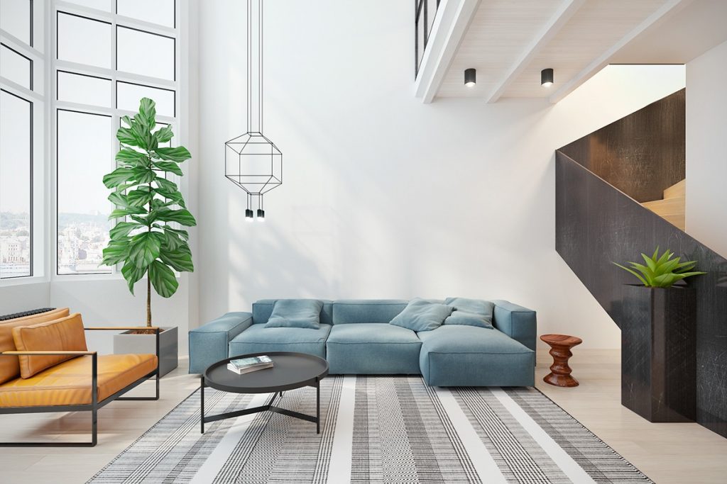
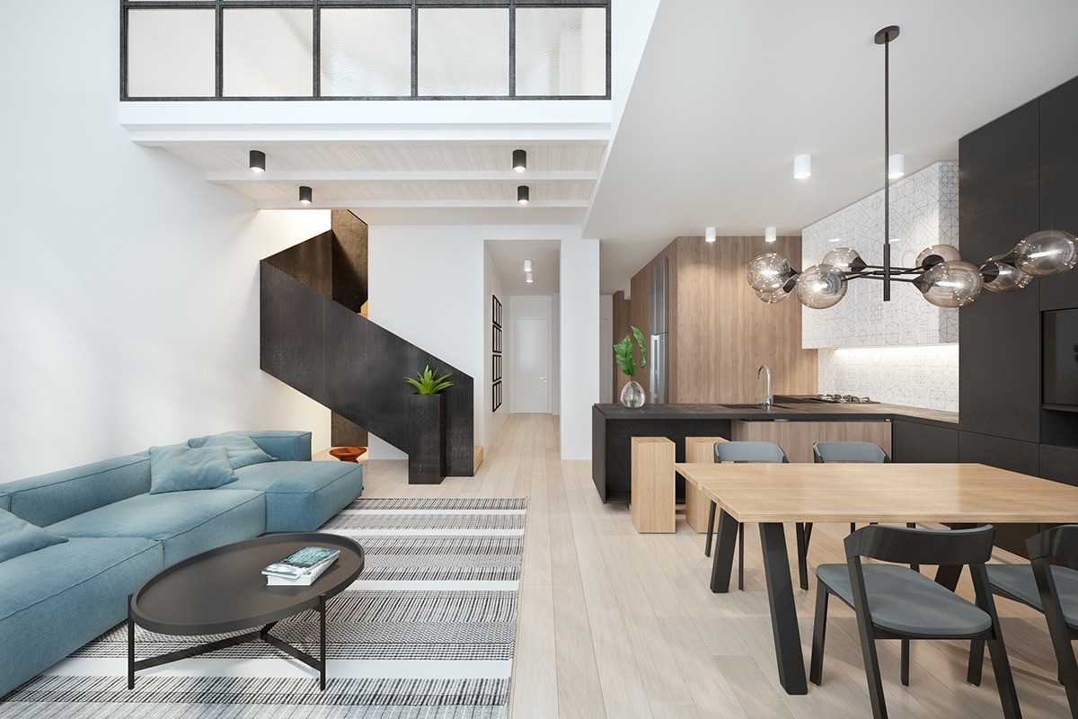
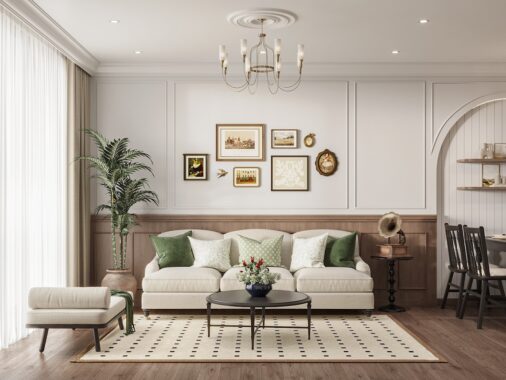
The first sight of the interior-designed living room is a unified example of how to bring several themes together in one space. Complementary orange and sky-blue tones are back-dropped by tones of living green, while a dark wood staircase adds grounding to the room. A lightly-patterned rug adds conversation between the elements. Round bauble lighting mimics the lines of the table.
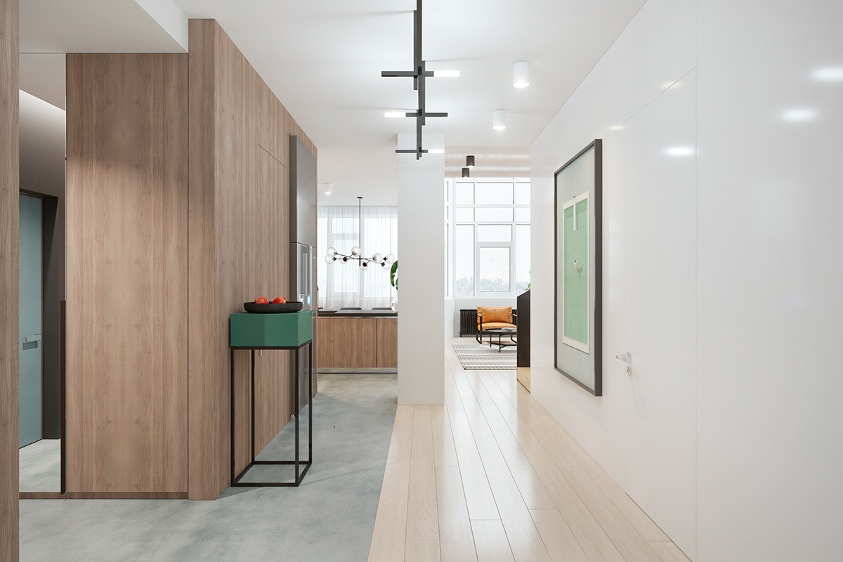
To offer a breath between each space, the hallway is shown in muted tones, with a green vertical table referencing the dramatic colours of the preceding room.
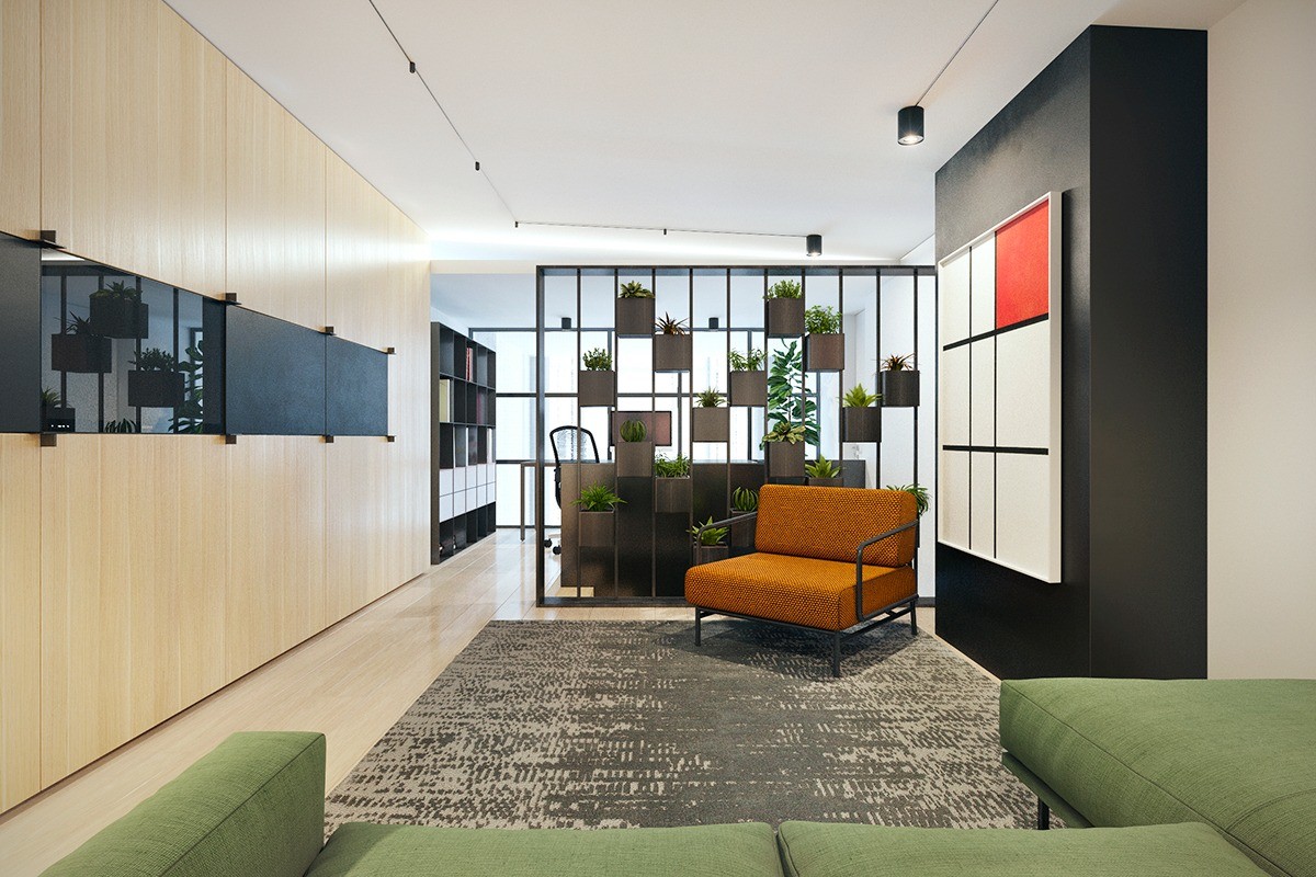
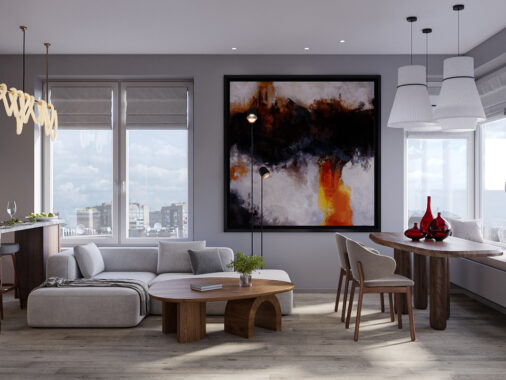
The television room is modelled off the living room – bold couches, lightly patterned rug, and stencil features – but adds its own twist with oblong and square motifs. The artwork on the right exemplifies this approach – a similar frame can hold a bright orange theme, but only if enough white breathing space exists around it.
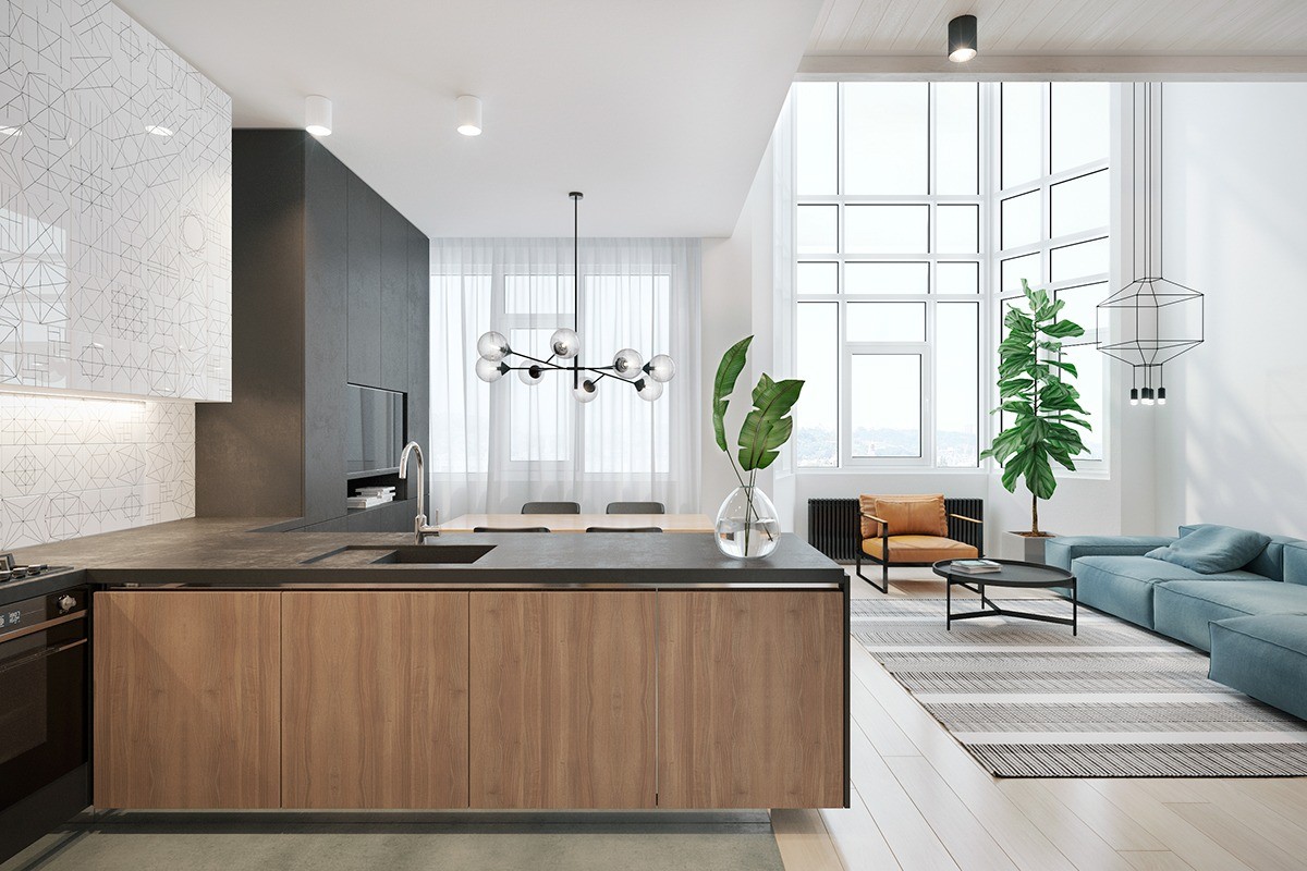
Further from the living room, muted whites with stencil artwork help the cupboards lend space to the bright orange and sky-blue couches. The light wood benchtop mimics the hallway.
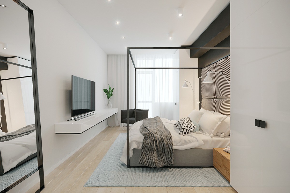
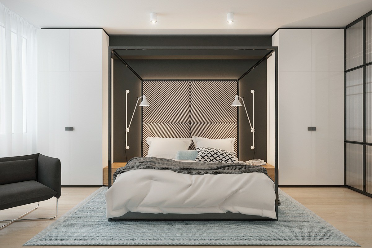
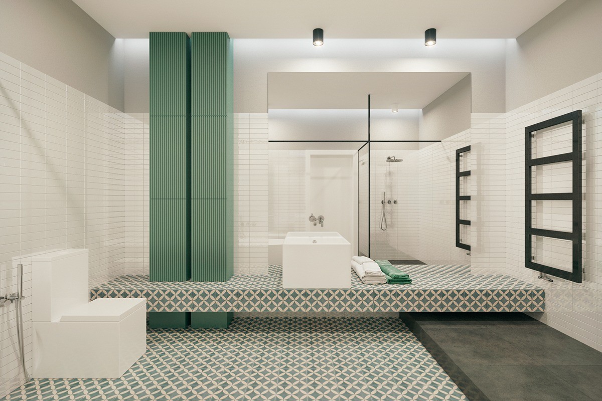
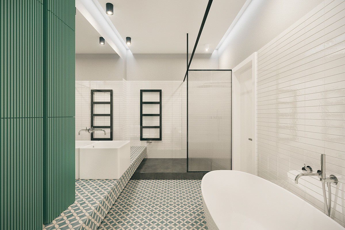
The versatile theme of stencils continues across the master bedroom and bathroom, where it takes on a different nature. In the bedroom, softer hues and headboard patterns dominate, while the sky-blue rug adds a cloud underneath the place for dreamtime. The bathroom offers a soft green as a counterpart to the master bedroom’s blue, creating a segue between the two with a midway tile design.
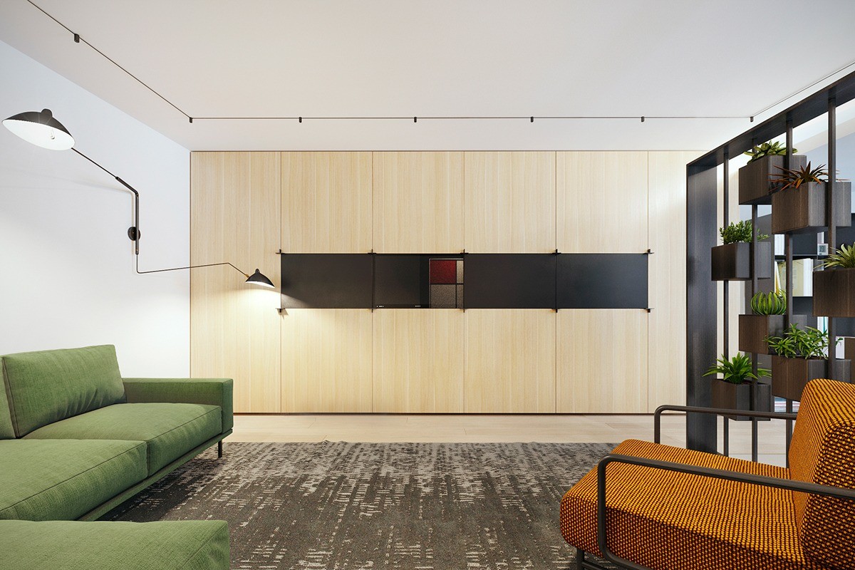
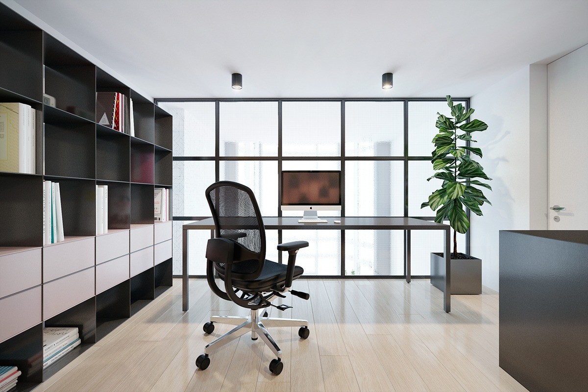
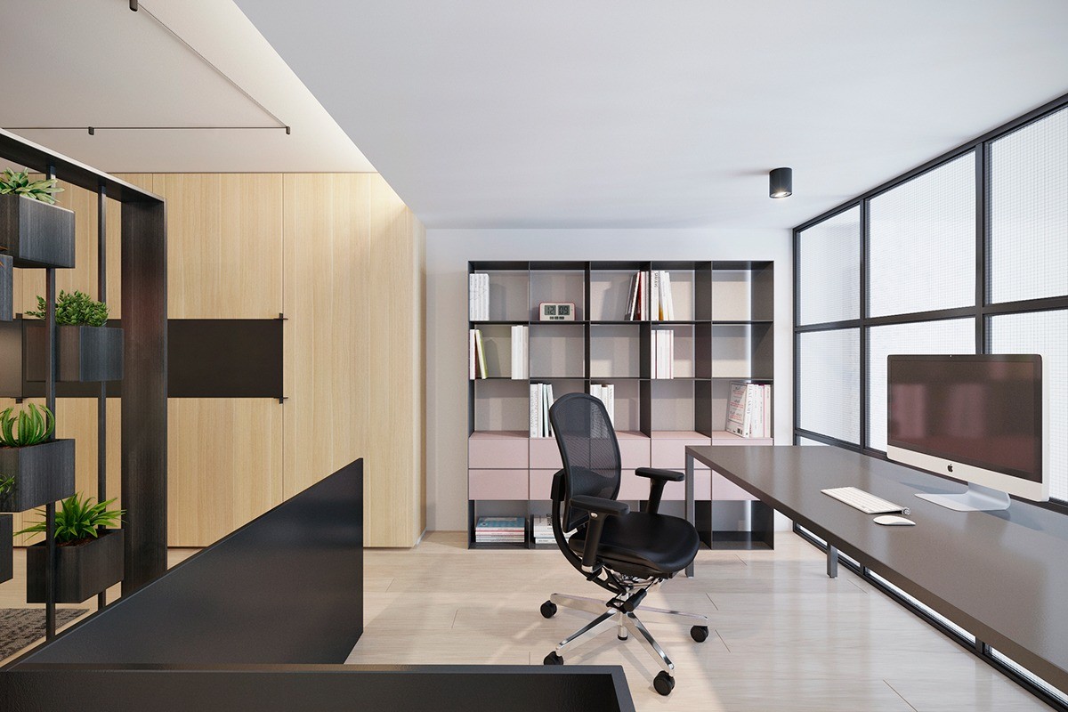
Finishing touches throughout the apartment show how a level of detail can add the quality of afterthought to a home’s design. In another angle of the television room, a stencil light comes to greet visitors, while the box effect in the same room acts as a handy partition for the office. The office and lounge, two polar sides of the apartment, are linked by the same type of plant in their corners.
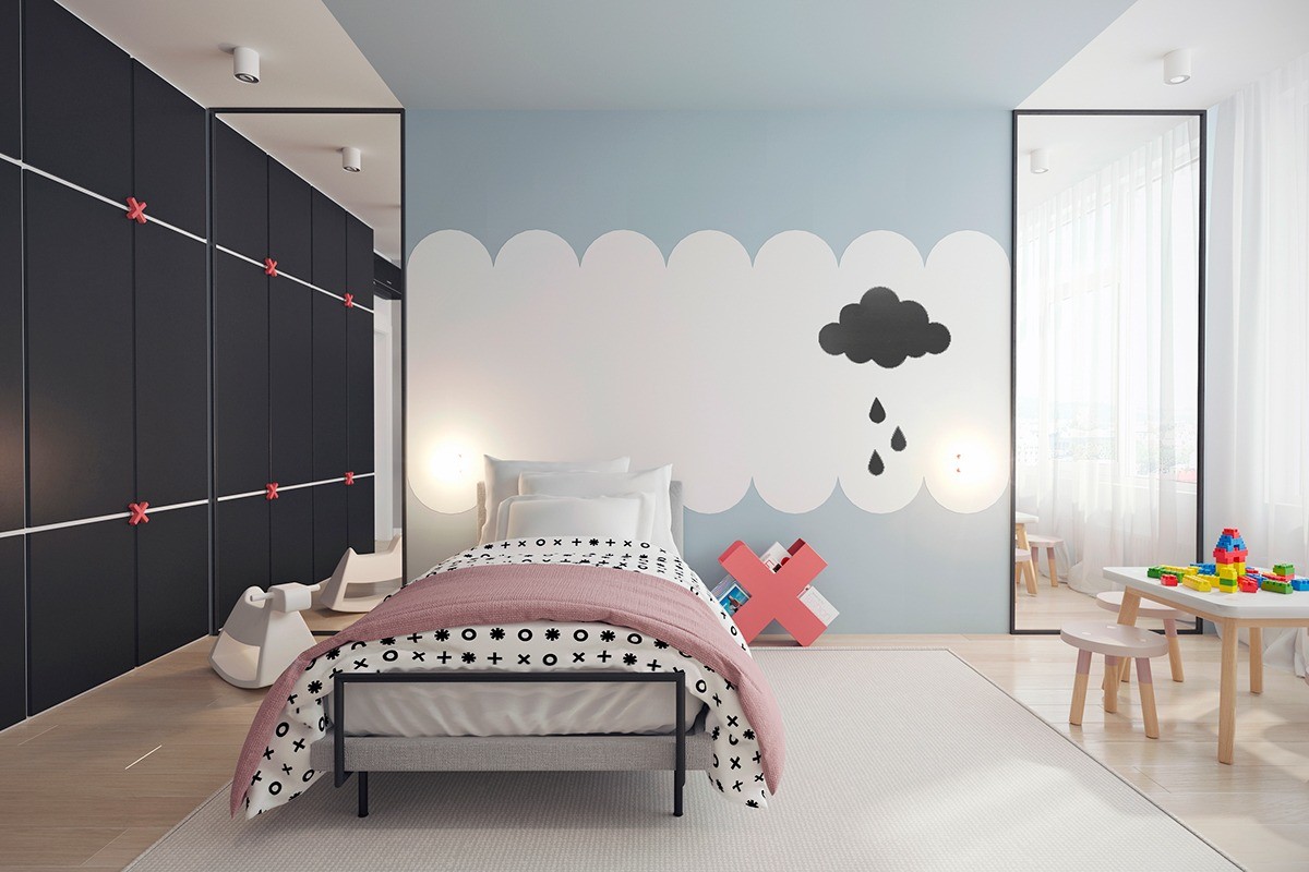
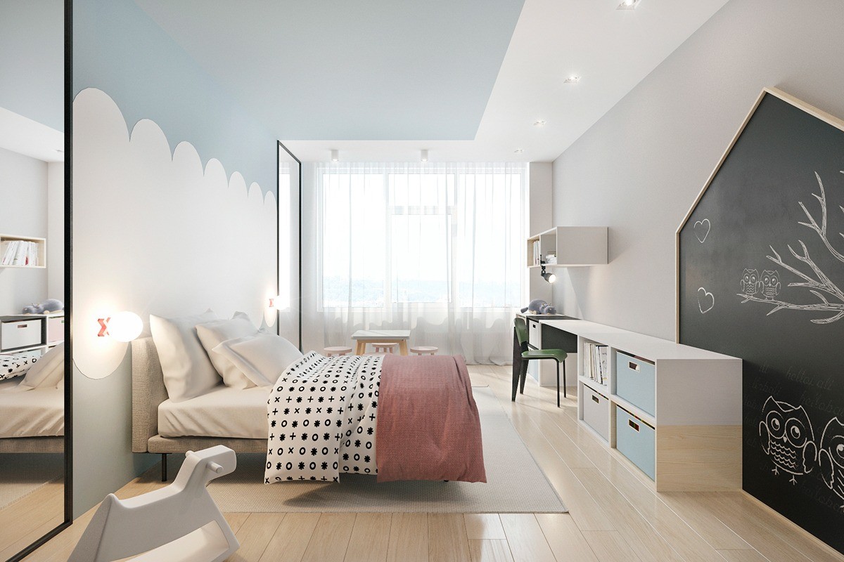
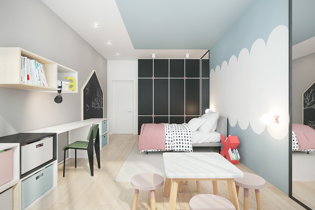
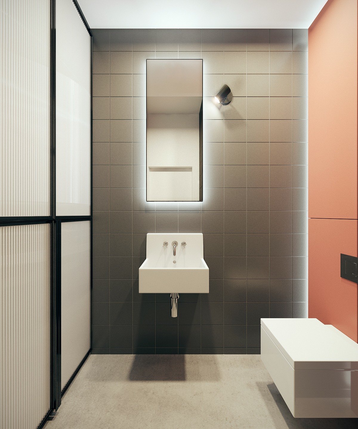
The cloud theme is also carried across the bedrooms. While the master bedroom only hints at the cloud metaphor, the child’s bedroom is more overt, with painted clouds handing above sleeping heads. ‘X’ motifs are the feature star in this room, and are replicated across detailing along the wide wall, bedside table and duvet, still linked to the remainder of the home through light stencilling detail appropriate for a child’s bedroom. Pinky, terracotta themes add character and softness to this room, and are easily replicated in the ensuite, which adds a touch of the same hue to a side wall, resembling the painting in the television room.
