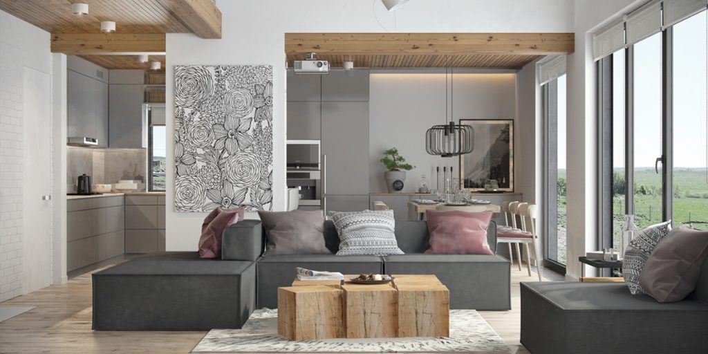
This beautiful home is located near Lviv, Ukraine. Designed by Marta Gord, there is a keen use of cozy gray hues used all throughout the home. Even though moody shades are embraced, the home feels light and airy. Lots of natural light fills the rooms and the tall ceilings make the space feel larger than it is. The use of line art on the walls in the different rooms also brings character to the home. Along with the gray, a light pink is used as an accent color. This breathtaking industrial loft with a view is the perfect place for a young family to grow.

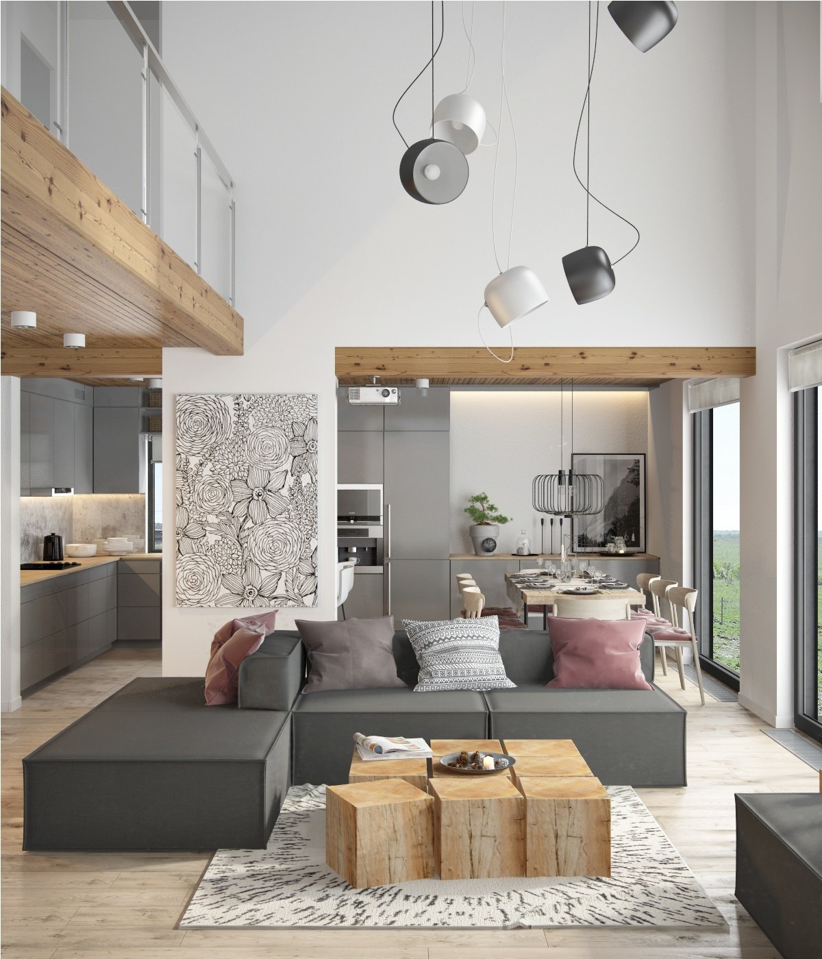
Your eye immediately is drawn to the fun line art hanging on the wall in this loft-like living room.
You can see in this image that there is a hallway that overlooks the living room. By using a glass railing, the space seems more open and airy.
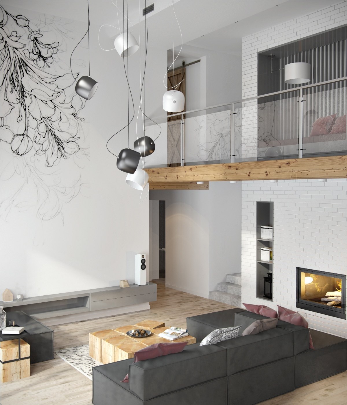
To add to the airy-ness of the space, a large sketch of flowers is placed on the left wall. This is then accented by white and silver pendents that are organically bended every which way.
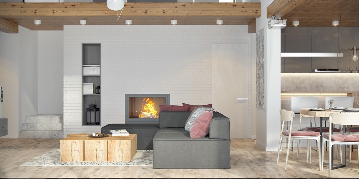
When looking up, you can see that the wood of the ceiling and loft space is kept natural. This gives a raw feel to the space but also warms up the gray. A light pink is used to bring both the dining table and couch together. There are pink throw pillows on the couch and coordinating cushion pillows on the dining table chairs.
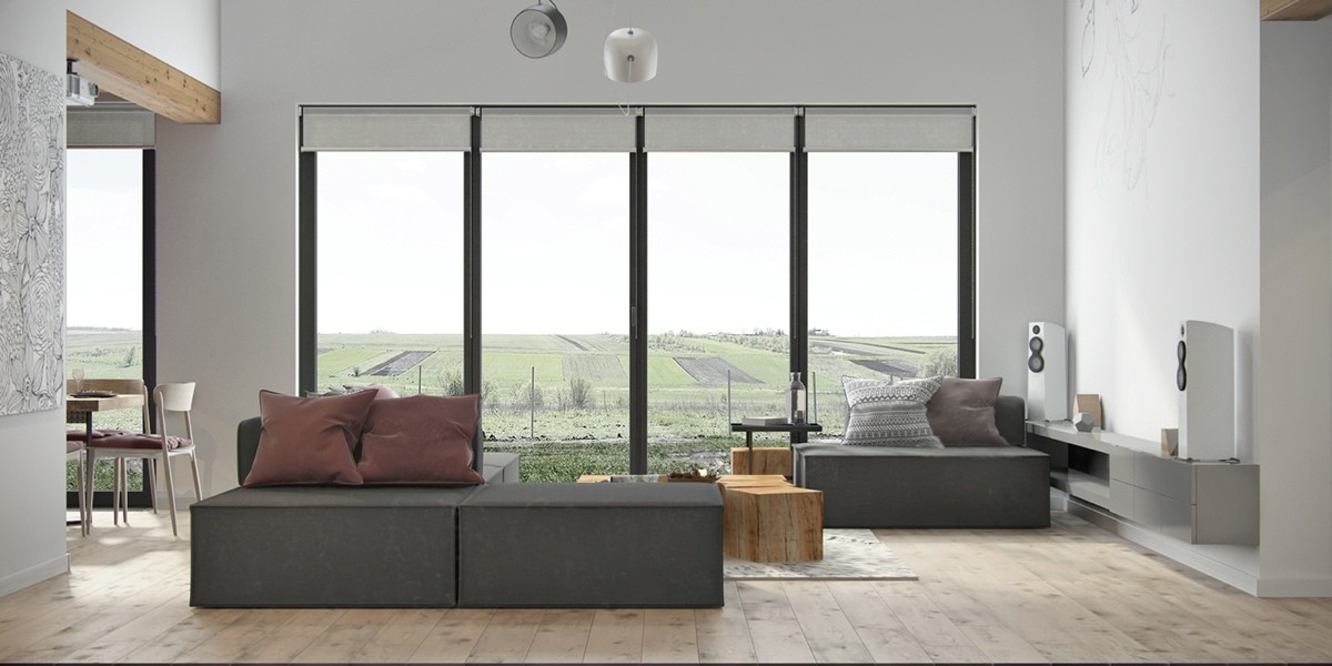
A view such as this brings green into the space and helps define the room. Large windows cover the walls and there's a view of the outdoors along the entire side of the home.
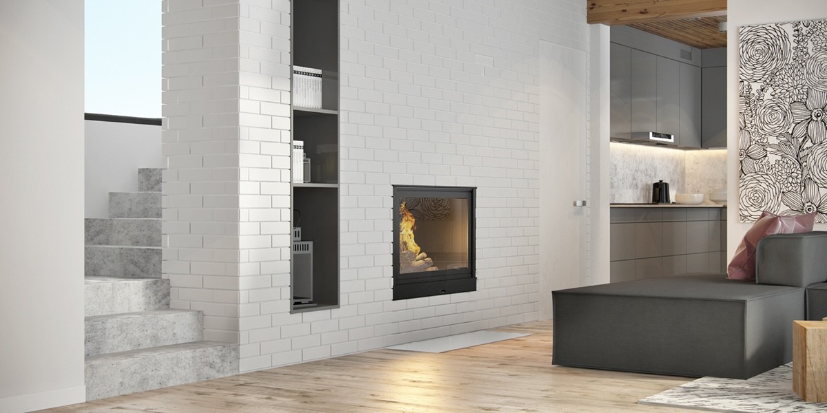
The contrast of the orange fire and white brick is artistic and creative in this space. When you mix in the marble steps, all of the elements come together and create a one-of-a-kind aesthetic.
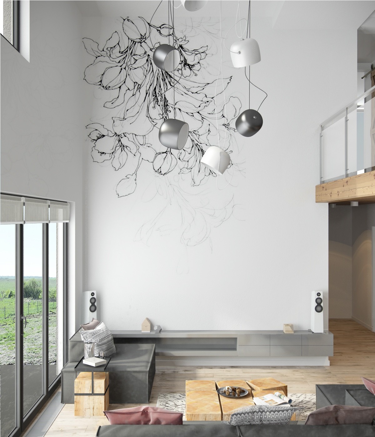
Anything other than a light, wispy sketch of flowers wouldn't have worked in this loft living room. Without taking away from the outdoors, the black and white drawing is fun and unfinished. This speaks to the space since there are a lot of natural elements used, like the natural wood grain accents.
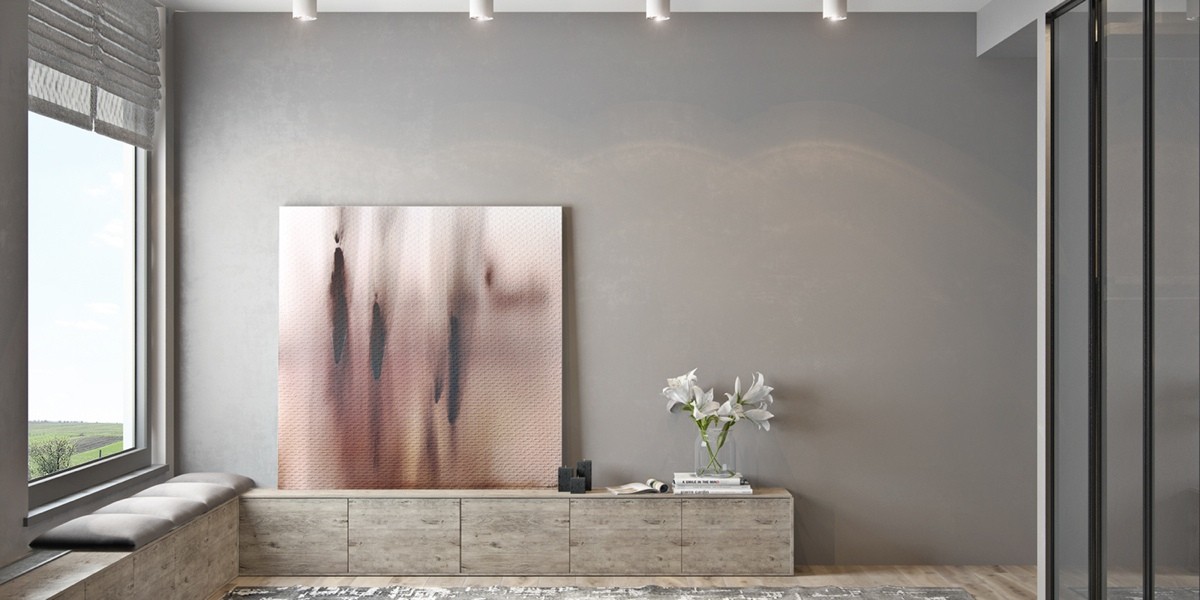
One of the other colors used in this home is light pink. This abstract art piece is perfect leaned up against a low-to-the-ground shelf. It adds height to the room and a contrast in color. The texture is also complimentary to the wood grain on the shelves.
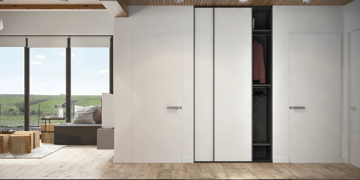
A white entryway to this home hides coats and other accessories. The sleek steel handles work well with the rest of the room. As you look into the living room, you notice there's a wooden coffee table that looks like it brings the outdoor view in.
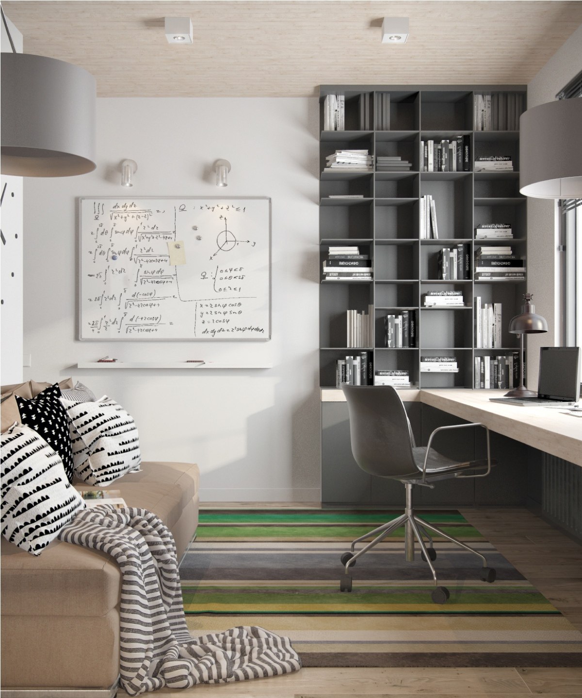
Large custom gray shelves make organizing easy in this home office. Along with the built-in desk, there is a loveseat where the home owner can mix up their seating. A few throw pillows and a throw helps the space feel informal.
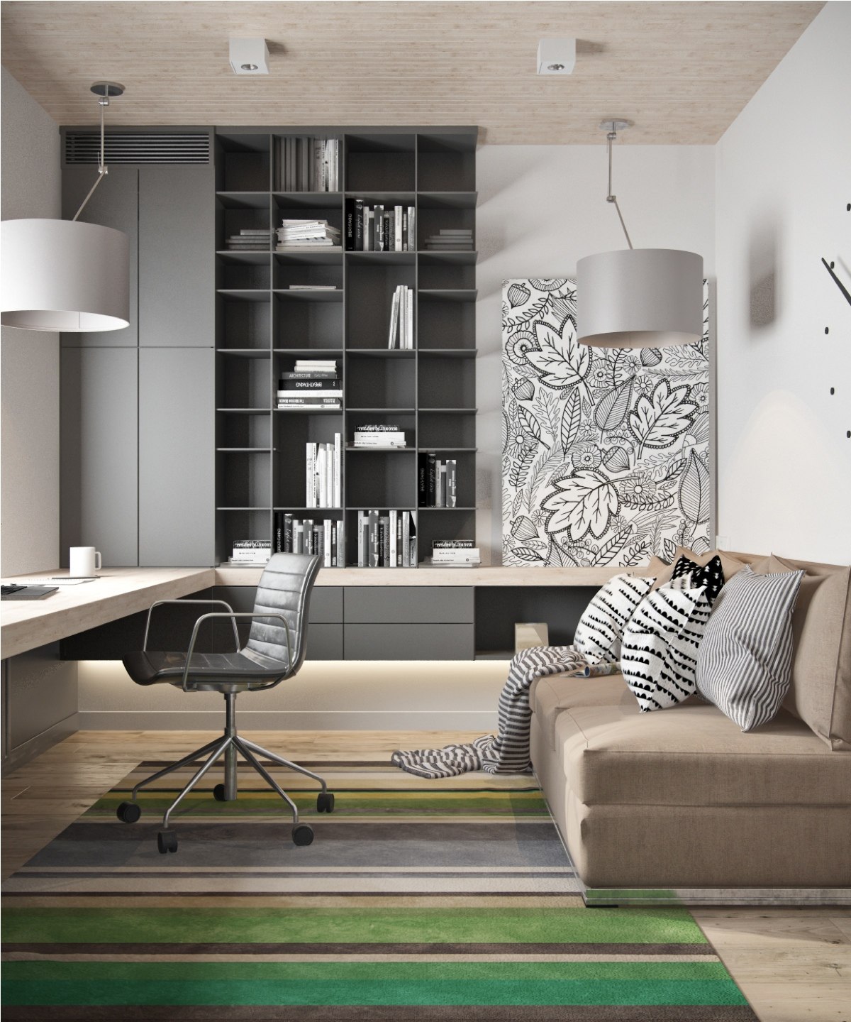
On the other side of the room you can see another black and white floral sketch art piece hanging on the wall. This piece is related to the other art used in the living room. The art tells a story. Even though we know that flowers are bright and colorful, this piece is black and white. This tricks out mind into thinking of more colors, even though the space is gray. The green rug on the floor helps bring more life to the study.
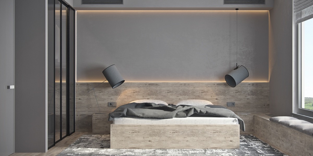
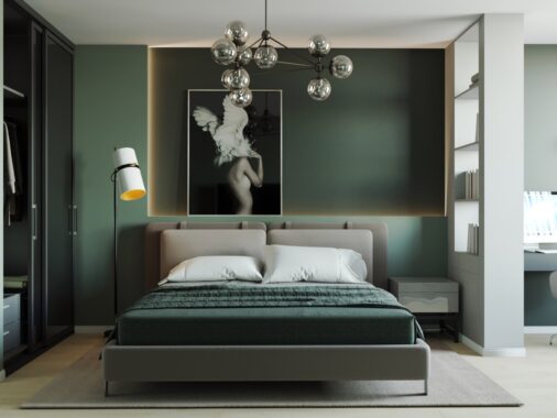
This master bedroom is masculine and sculptural. Two large pendent lights illuminate the bed and make it feel like it's more of a stage production. Lighting behind the wall adds even more drama to the room. Do check out our post on minimalist bedrooms if you like this style.
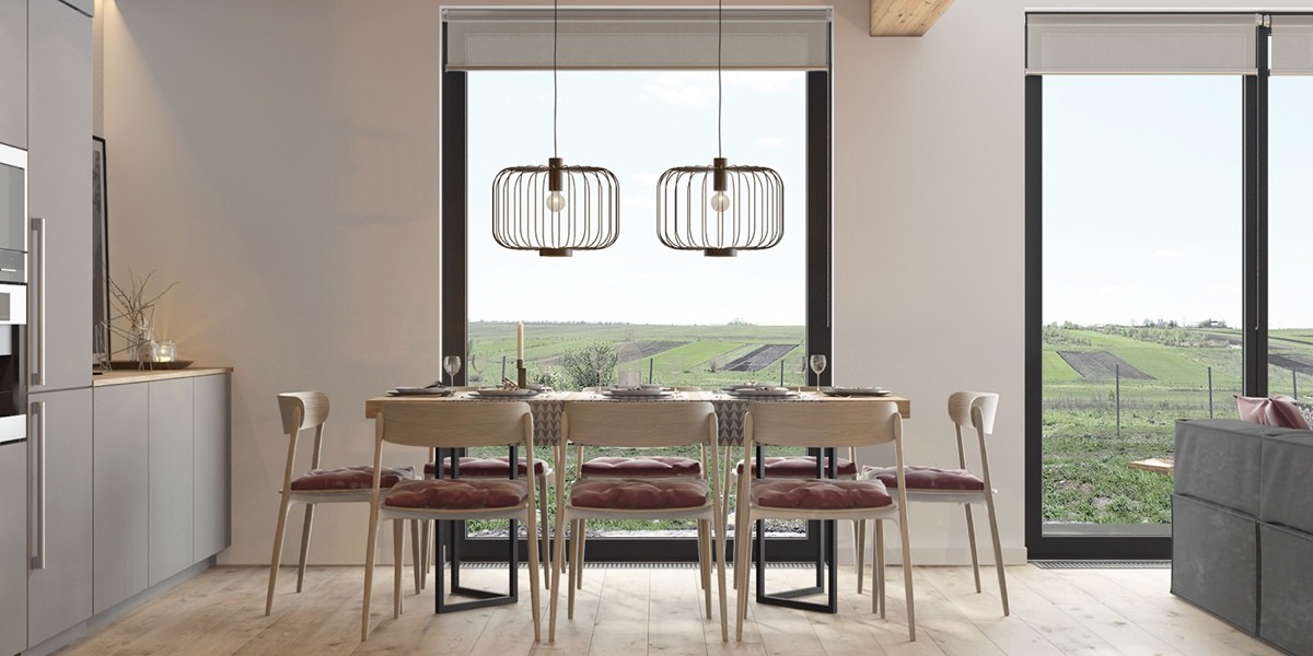
You can't miss the expansive view while enjoying a meal or paying bills at this dining table. Fun pendents in organic shapes draw the eye upward and outward onto the rolling hills. Pink cushions connect this room in the industrial loft to the others.
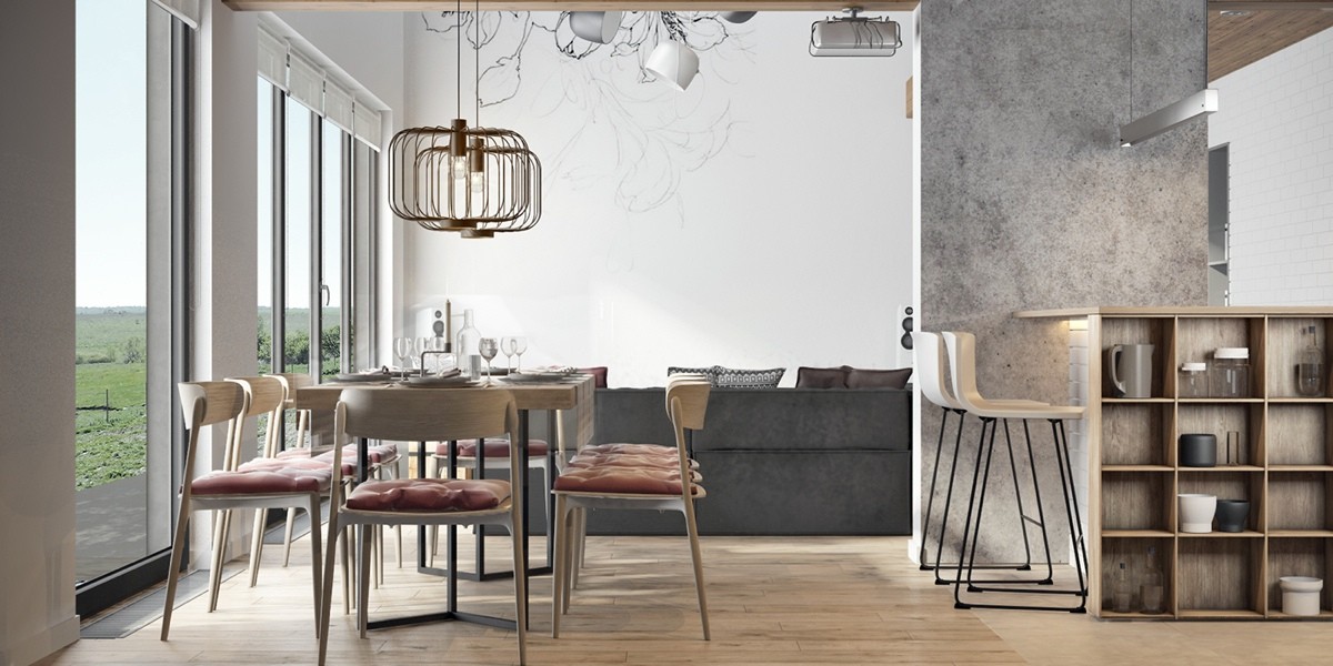
A view of the open floor plan helps the reader know where things are located in the home. The living room, dining space, and kitchen are all within a few feet of one another. Each is connected to the cement-like beam which is in the middle of this image.
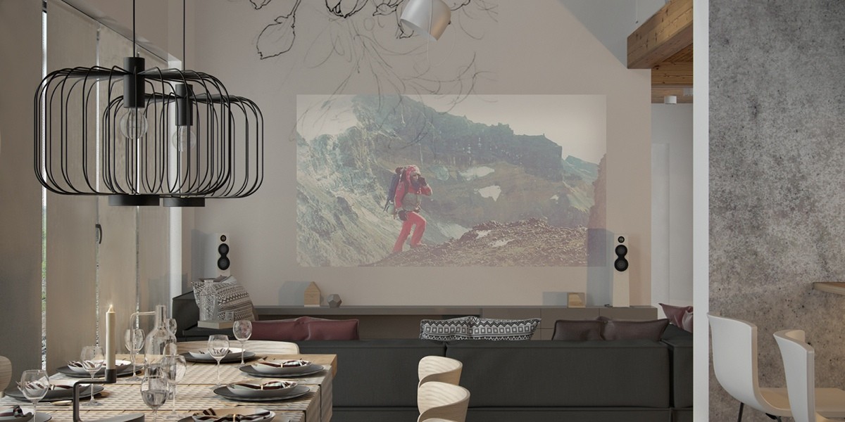
When designing a home, it's always a good idea to think of things practically. Even though a T.V. doesn't really fit into the theme of the house, the designer made the most of the large wall by adding a projector. The home owners can enjoy films on their large white wall from different zones on the first floor.
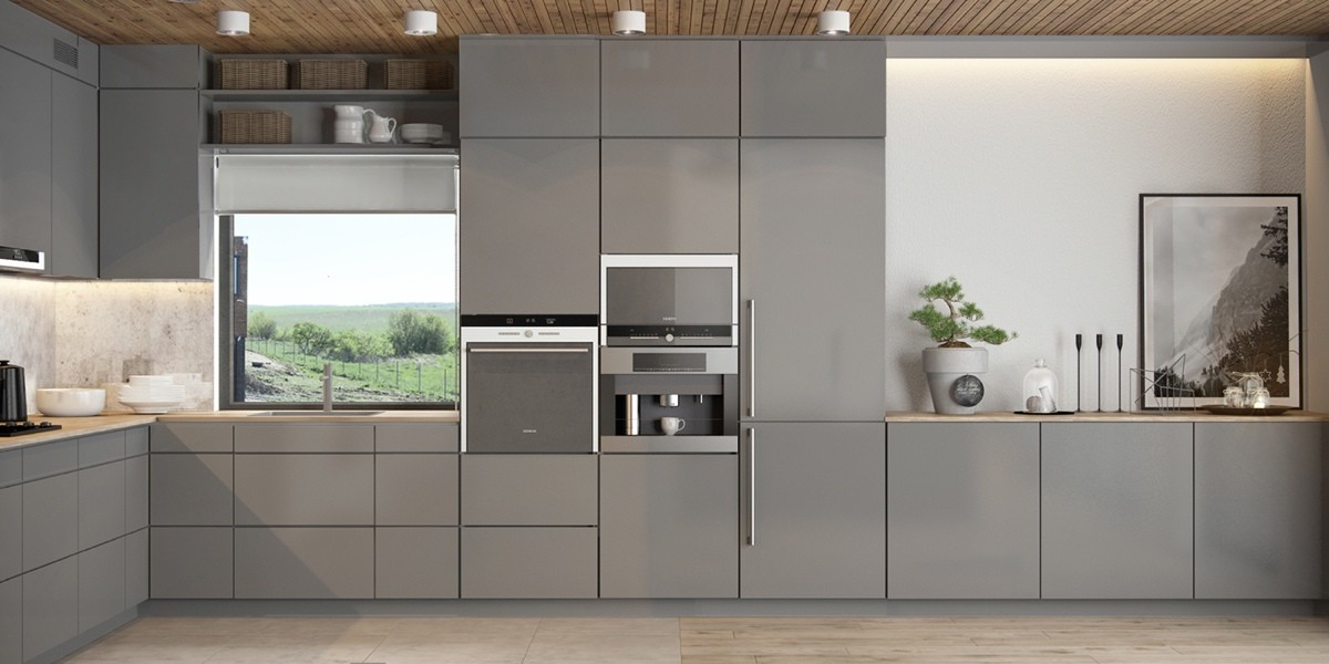
Not much hardware is used in this kitchen. Instead, each cabinet is opened without handles. This style choice adds to the sleekness of the home and affirms that there is a minimalistic style here.
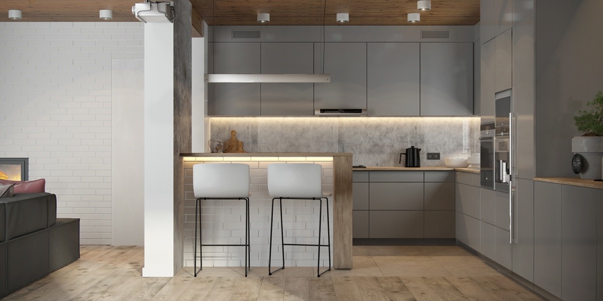
This type of kitchen, using grays and marble, can easily become too cold and sterile. Instead of being boring and void of life, the designer added under-the-counter lighting. This warm glow under the bar makes all the difference.
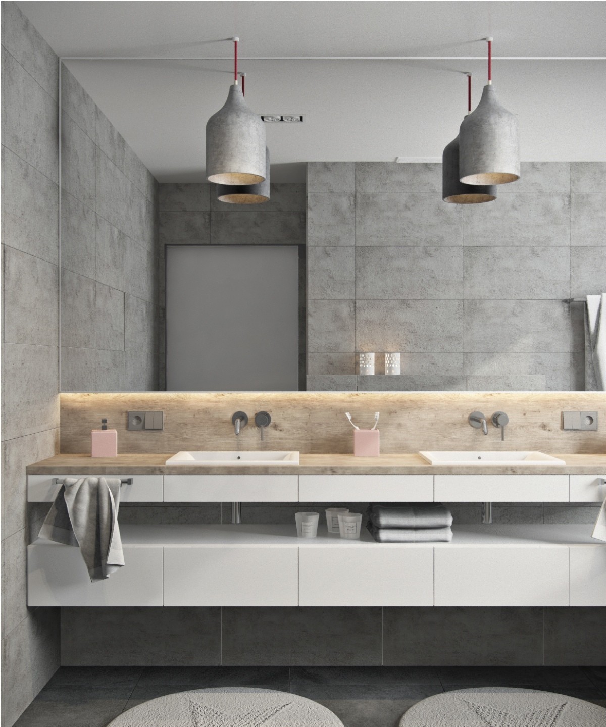
Even the bathroom has some light pink accents! If you look closely, you'll notice the toothbrush holder and kleenex holder are both pink. This small color addition connects the rest of the home and adds a fun twist on the gray.
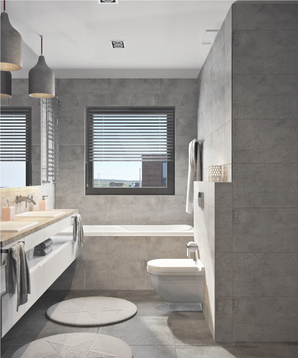
A loft isn't a loft unless it has a spacious bathroom with a soaking tub. This tub is deep and perfect for relaxing in. Details have been thought out, like the towel warmer hung on the wall above the tub and the ledge holding candles behind the toilet.
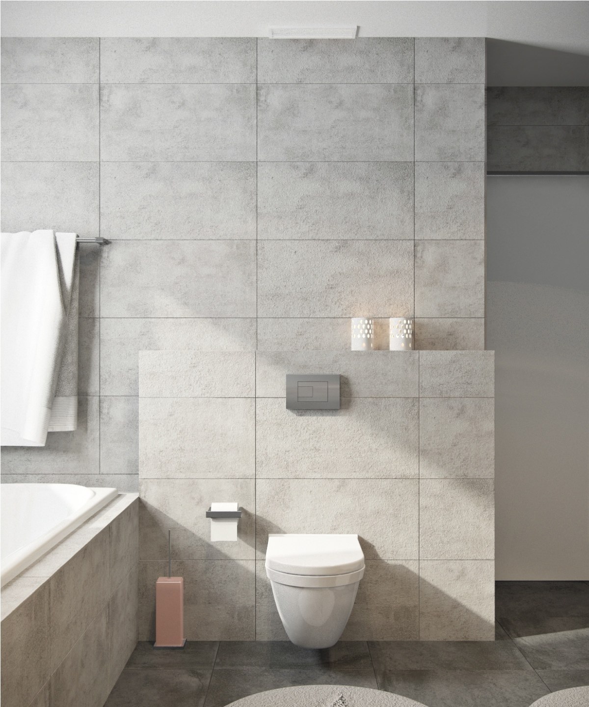
White, spa-like towels make this bathroom feel like a retreat. Two simple decorative candles are lit on the ledge behind the toilet. You'll also notice the cover for the toilet brush is - you guessed it - light pink. By using a color like this throughout the home, it seems calculated and interconnected.
