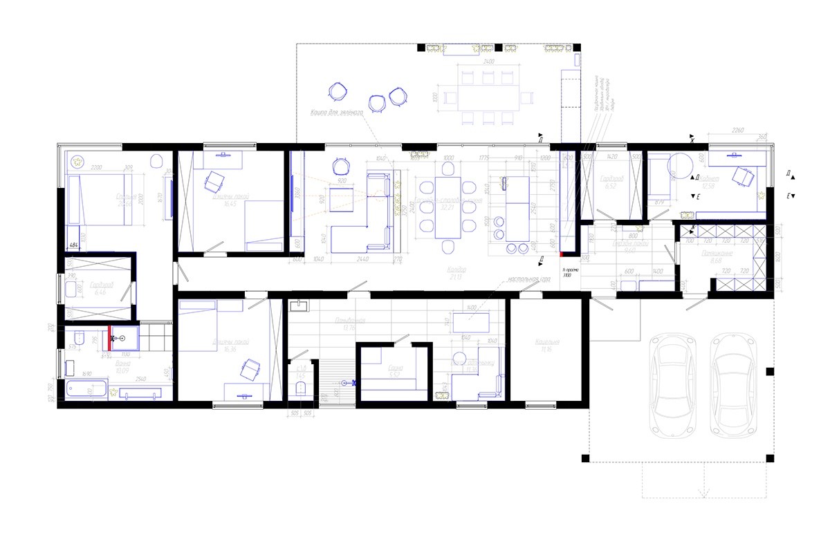
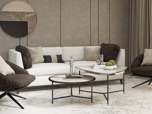
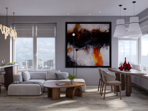
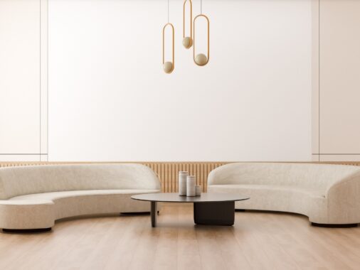
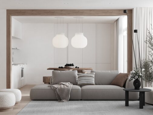
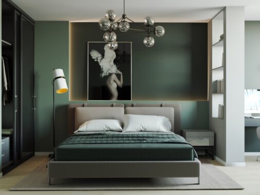
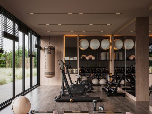
This gorgeous 203 square meter home in Belarus uses its bright white interior as an effective canvas for a dramatic meeting between organic shapes and clean lines, plus its beautiful contrast of natural wood panels and textural industrial-style concrete cladding. The result is a space that feels undeniably fresh and modern but retains a hint of cutting urban edginess – a welcoming atmosphere with a touch of adventure. Dmitry Sheleg created the flawless visualizations below for ZROBYM Architects, leaving plenty of open space for the reader to imagine their own decorative take on this flexible interior aesthetic.
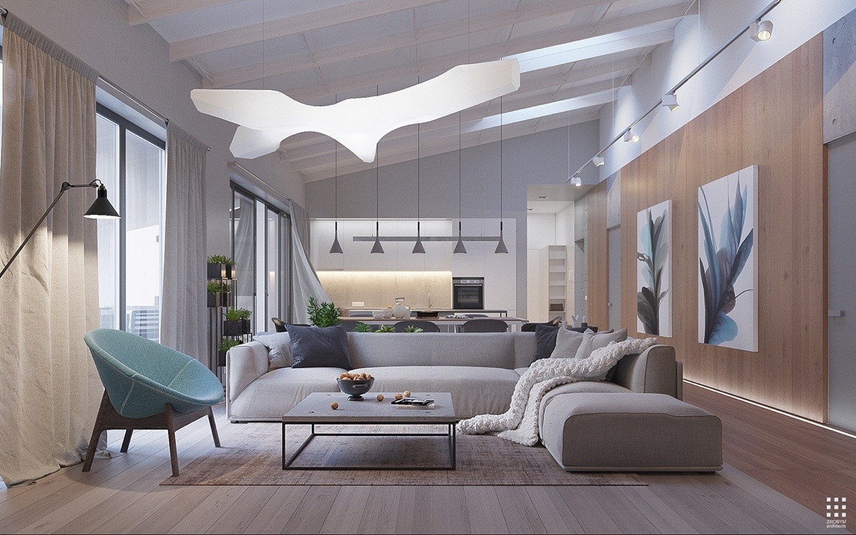
Opening with the living room, it's easy to appreciate the combination of flowing curves and crisp edges. Linear shapes define the primary seating area but the suspension lamp influences the entire room with its fluidity.
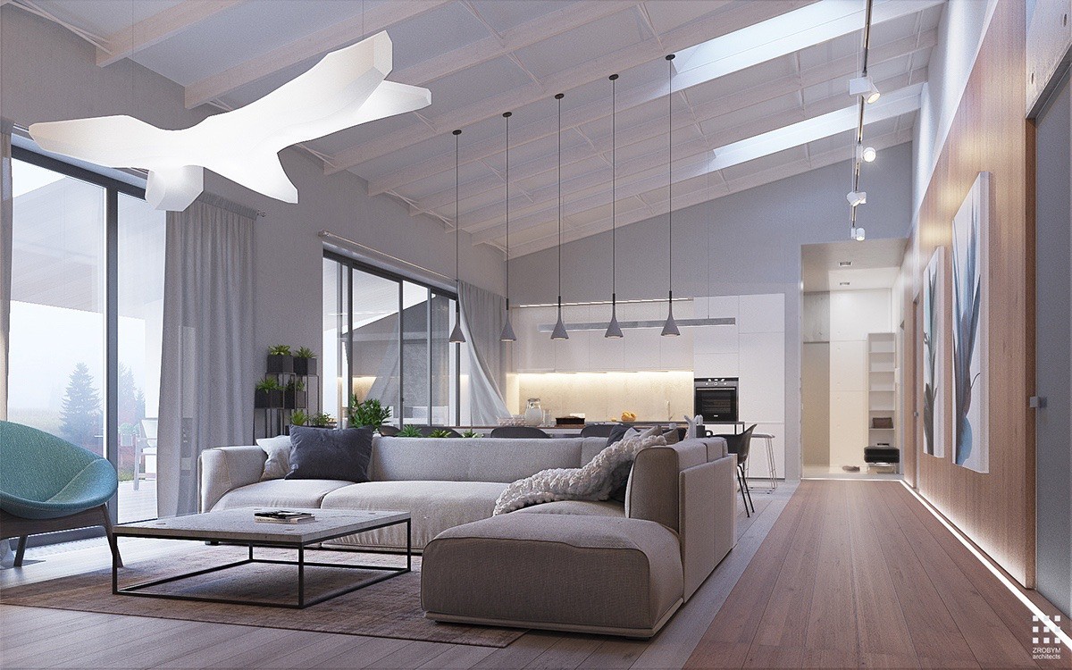
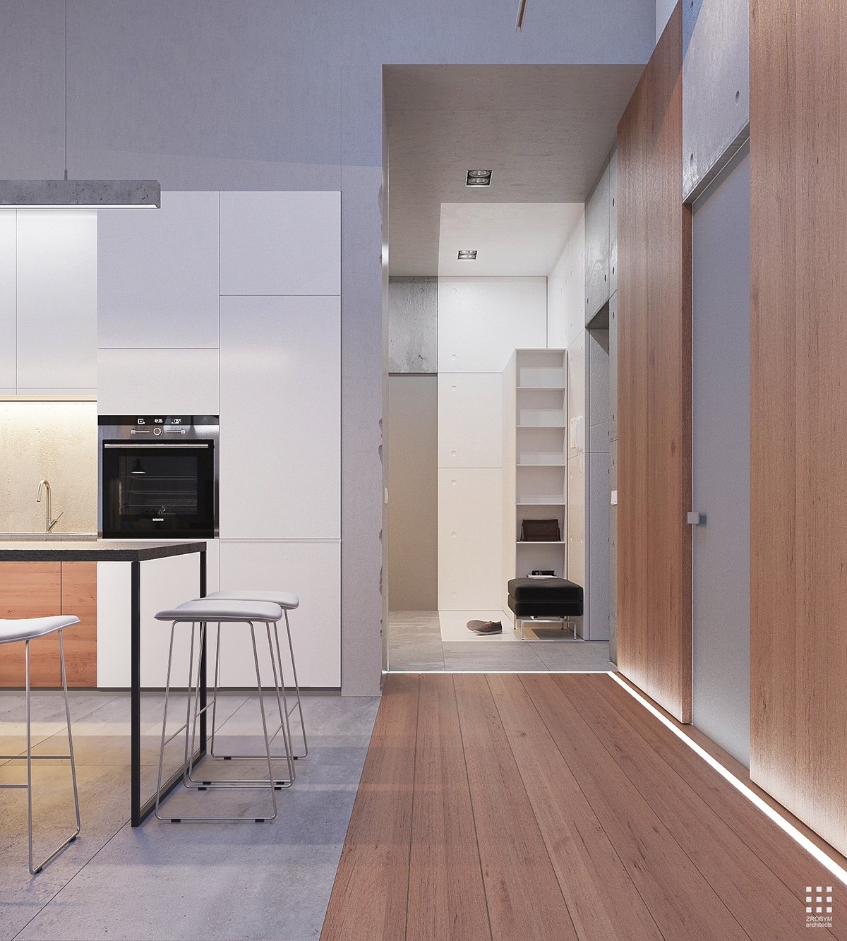
Hard lines split the open plan living space to define functional areas. Darker floorboards denote a "hallway" of sorts, directing the flow of traffic from the entryway and crossing the thresholds of the interior doors.
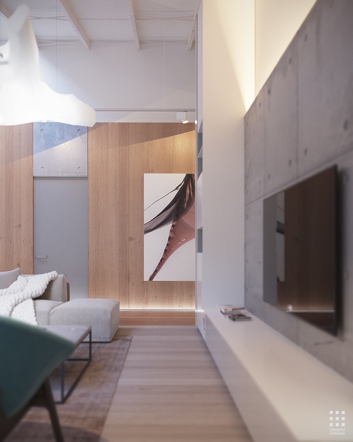
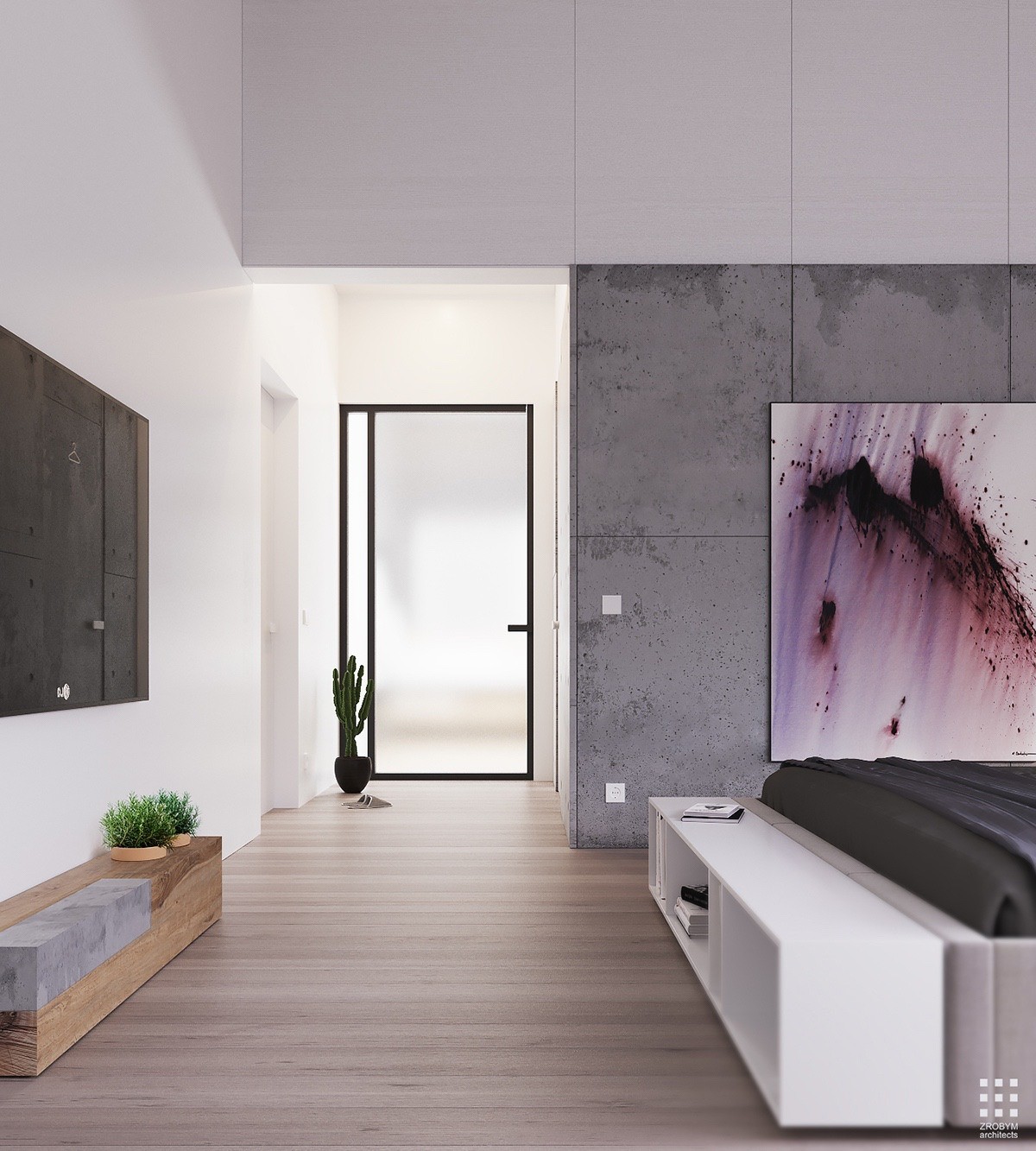
Concrete accents draw attention to crucial spaces, drawing the grey doors up to the ceiling and providing a nice neutral backdrop for the media wall.
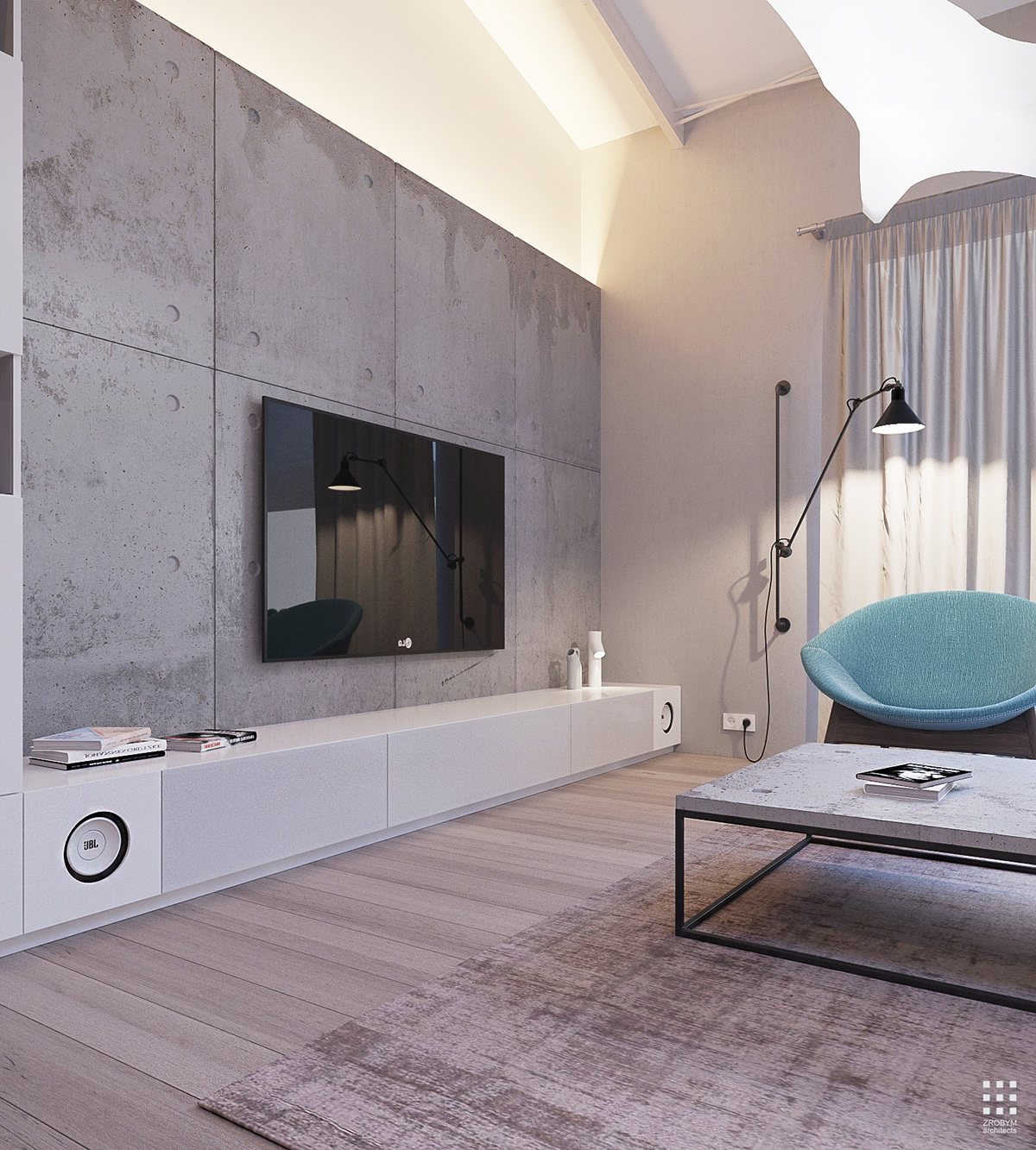
Inset lighting banishes all shadows between the concrete and ceiling – always a smart tactic to enhance the perceived spaciousness of a room. Here, it ensures the concrete really "pops".
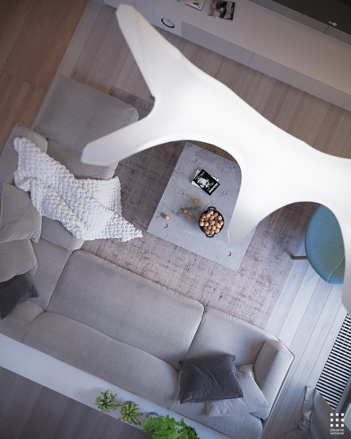
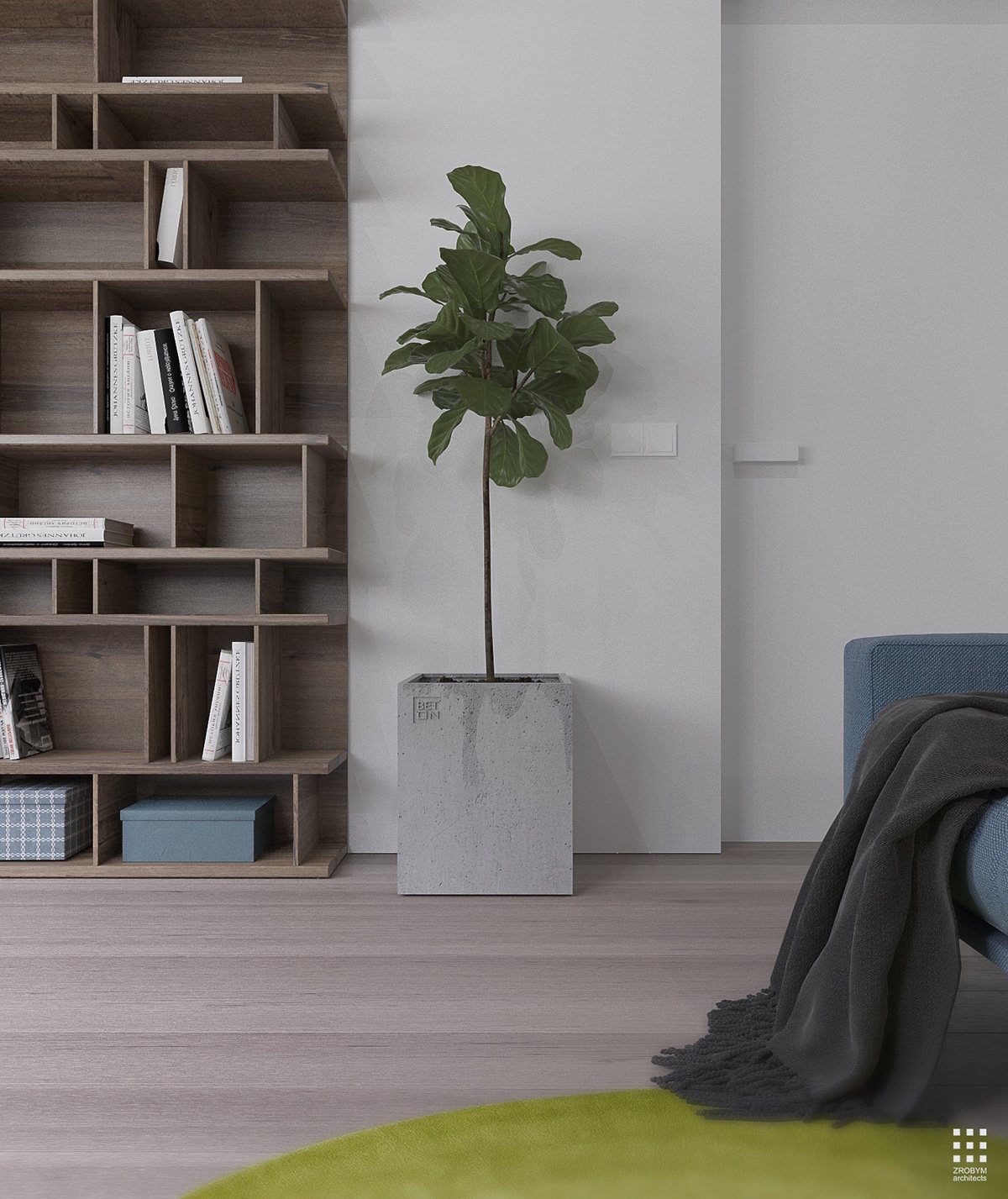
The strong texture palette adds character in the absence of bold colors or patterns. Rough concrete, woven fabrics, fluffy blankets, and even houseplants all play a distinct role in the overall composition.
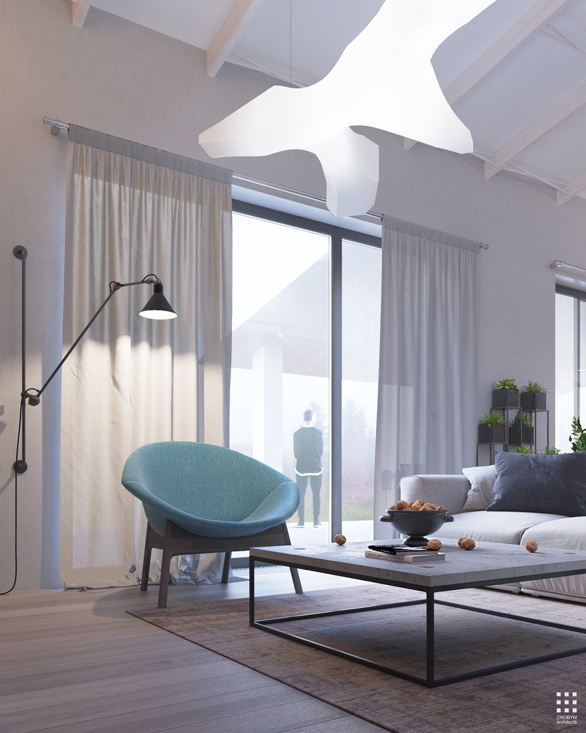
One tangible source of contrast is the armchair, smooth and organic with light blue upholstery. The wall lamp by Bernard-Albin Gras is highly adjustable to provide ambient or task lighting in turn.
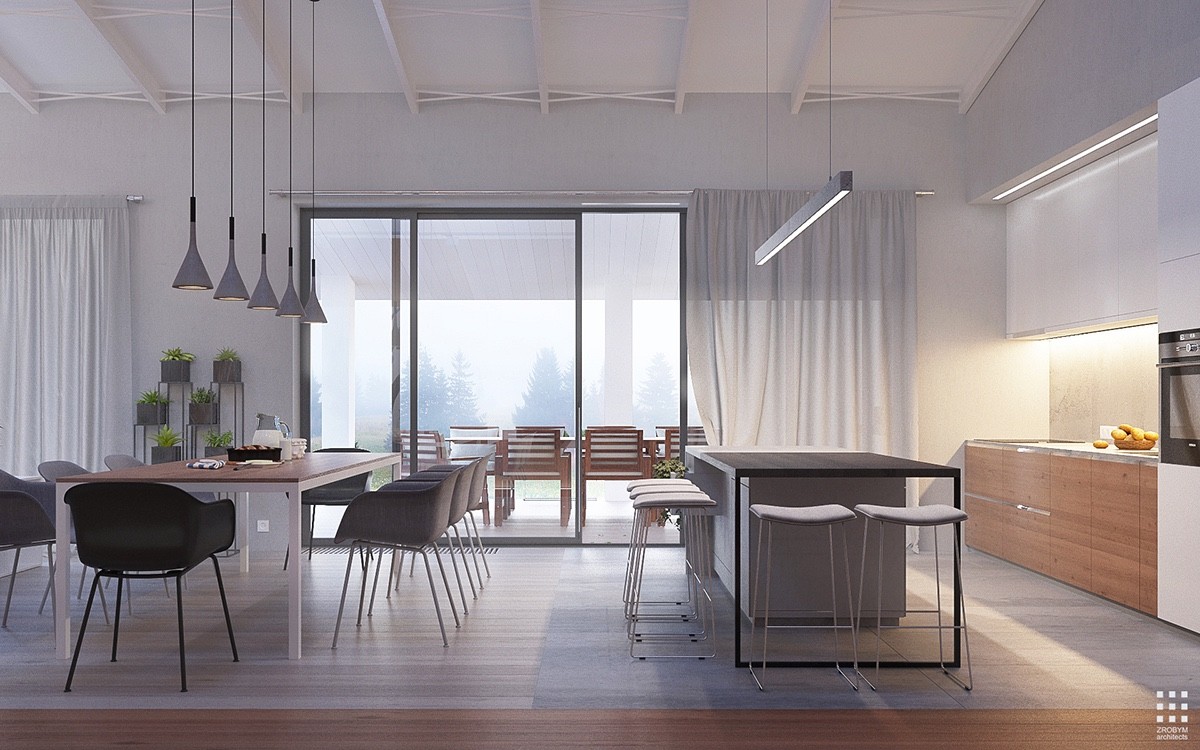
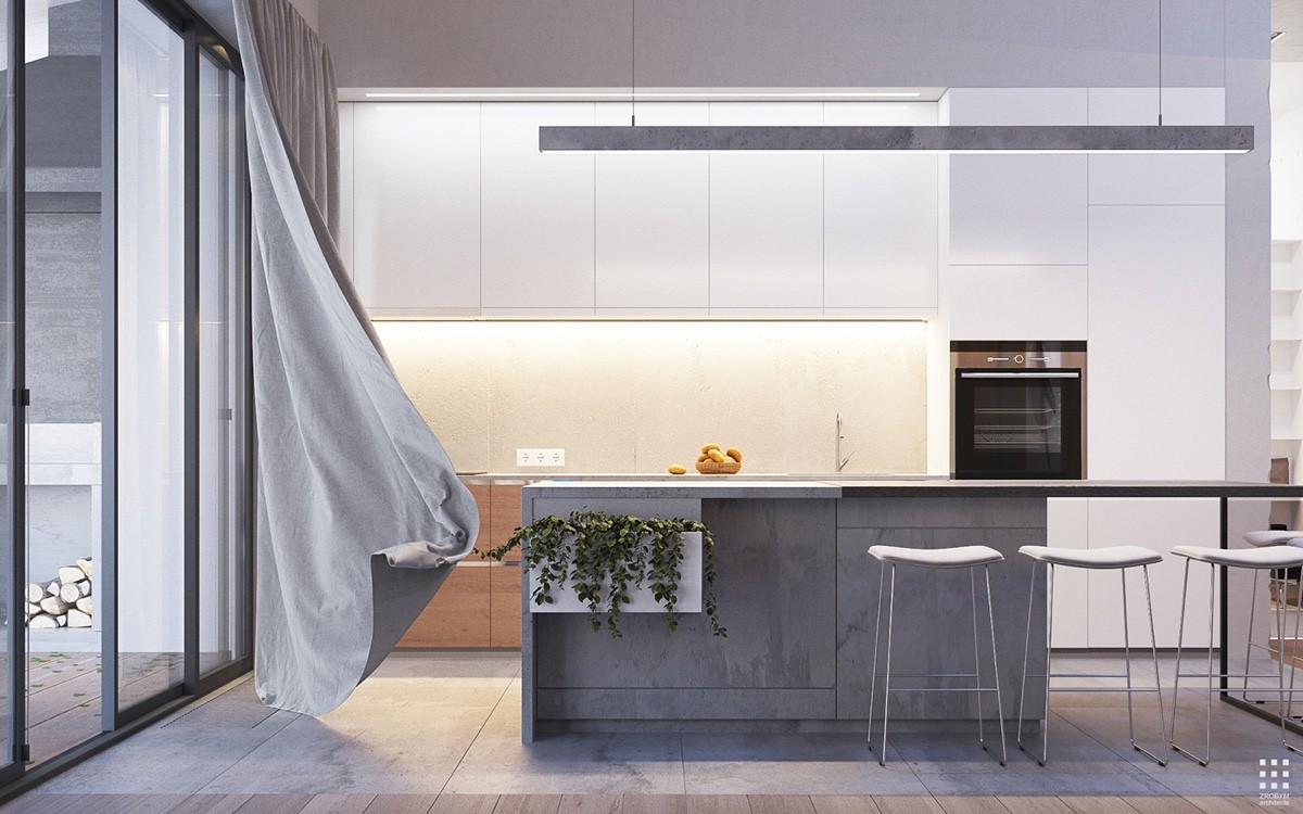
Sunlight easily filters through the slim forms in the dining room and kitchen, a deliberate and effective choice to counteract the overhang that protects the gorgeous outdoor dining table outside. The unique dining pendant lights used here are Aplomb Suspension by Foscarini.
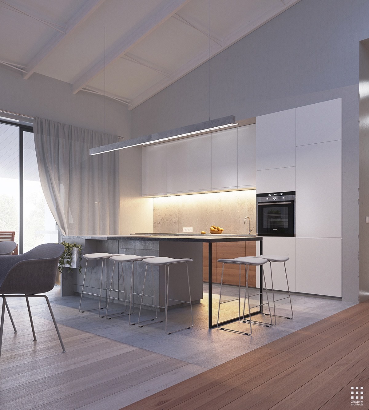
Like the transition from living room to "hallway", large concrete tiles distinguish the kitchen space from its adjoining dining area.
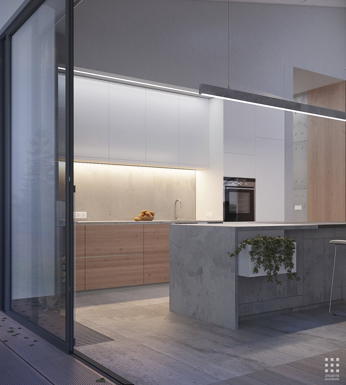
Planters are a creative way to make any kitchen look homey and comfortable, and they're extra useful if you use them to grow fresh herbs for your favorite recipes. This built-in planter ties the space to the outdoors.
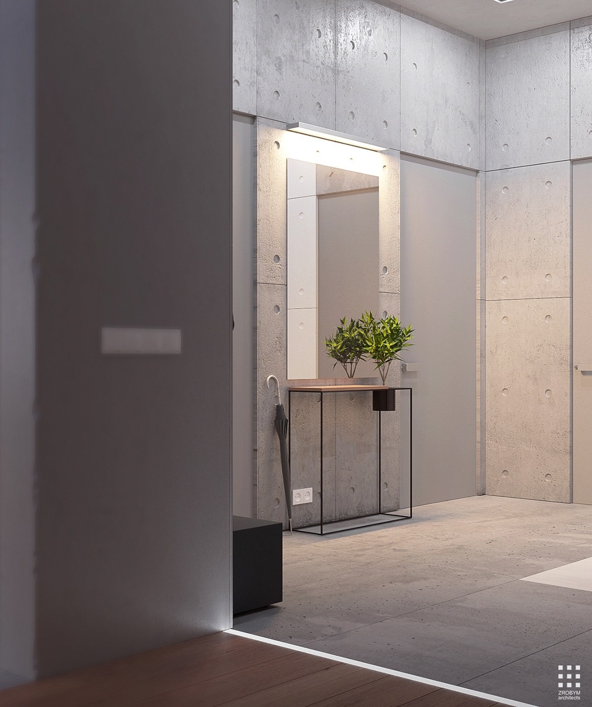
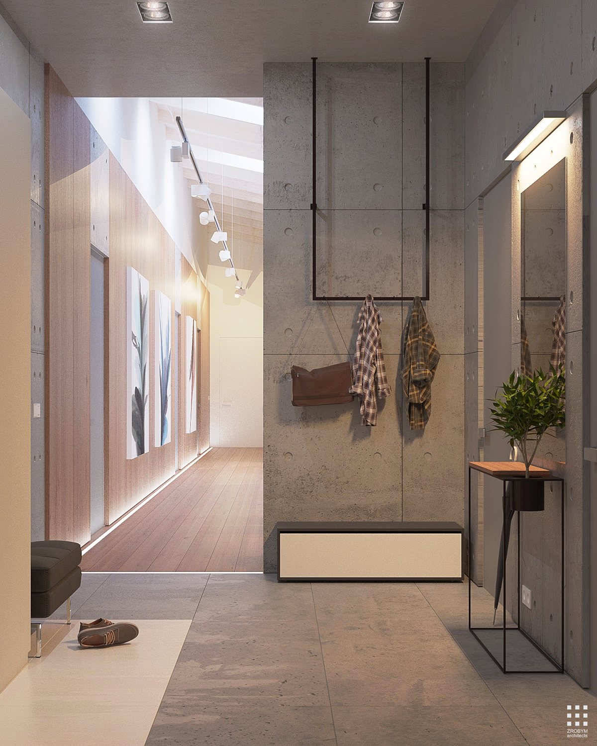
Small entryway tables and mirrors are a must-have. Set down your keys, smooth down that stray hair, and be on your way. The planter enlivens the otherwise concrete heavy space.
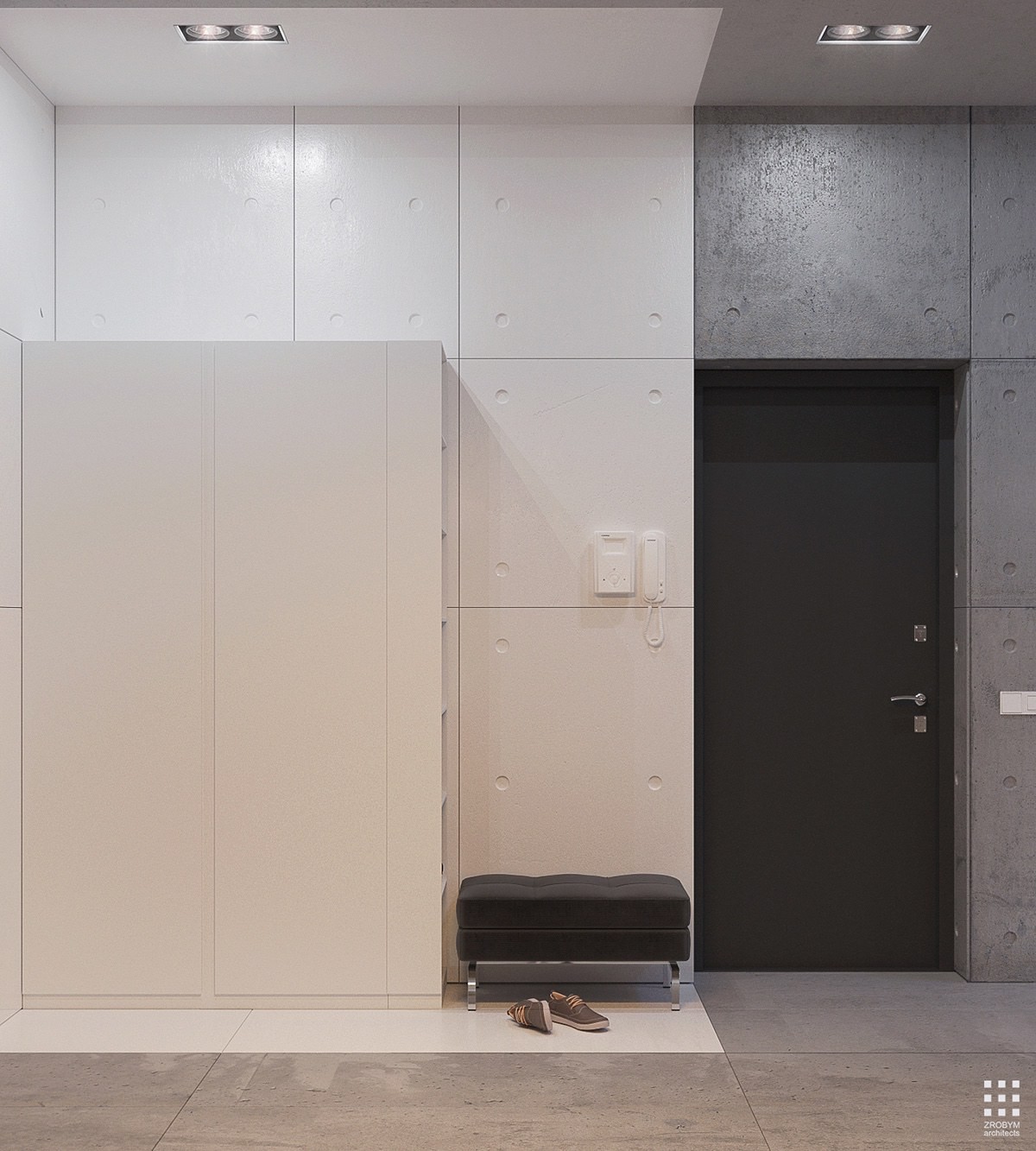
It's simple, clean, and effective. Notice the material tie-in, with the same round dimples in both the white painted concrete and the unfinished concrete.
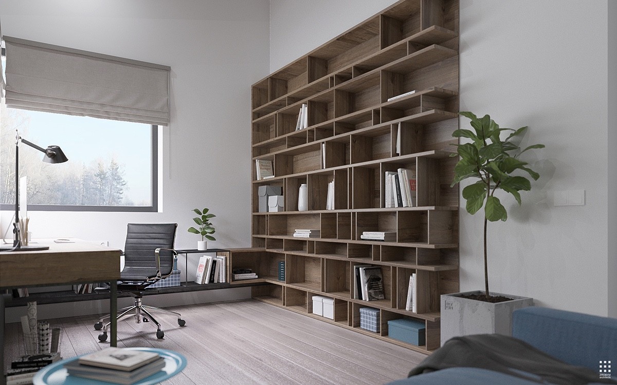
The office uses casual materials and sleek organization tactics to gain the best of both comfort and professionalism. There's plenty of space for reference material and even decorations.
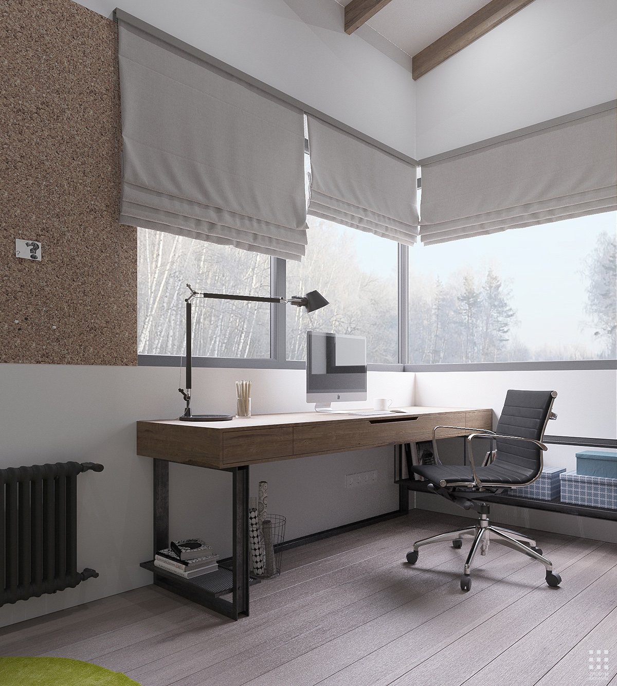
Corkboard is an endlessly useful tool for those that love to keep organized, but they're also great for those who need a little visual prompting to stay on track.
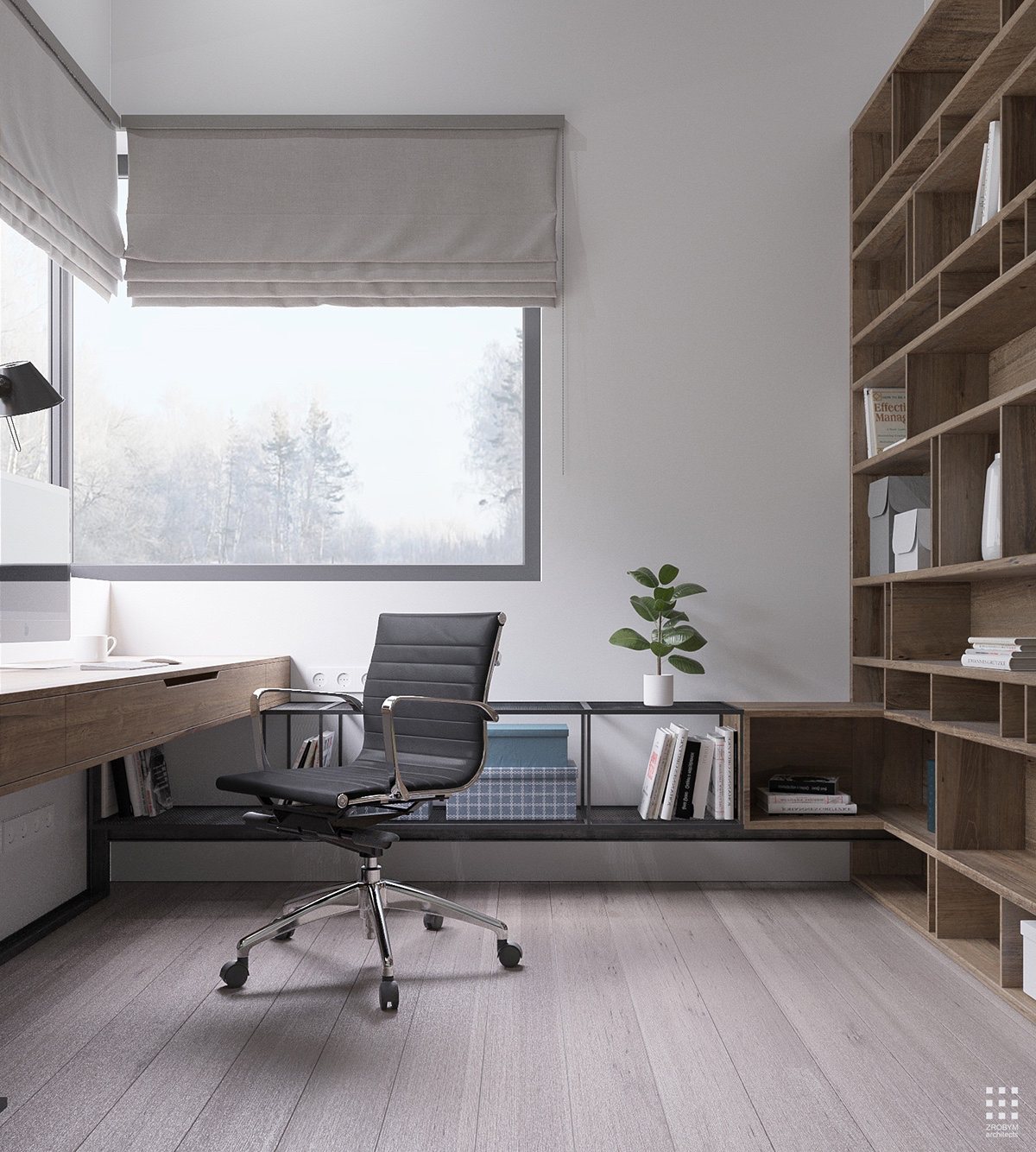
Corner windows flood the room with light, endlessly energizing for productive days and inspiring starry nights.
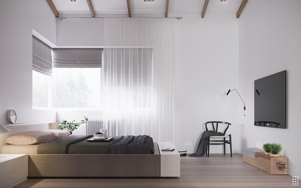
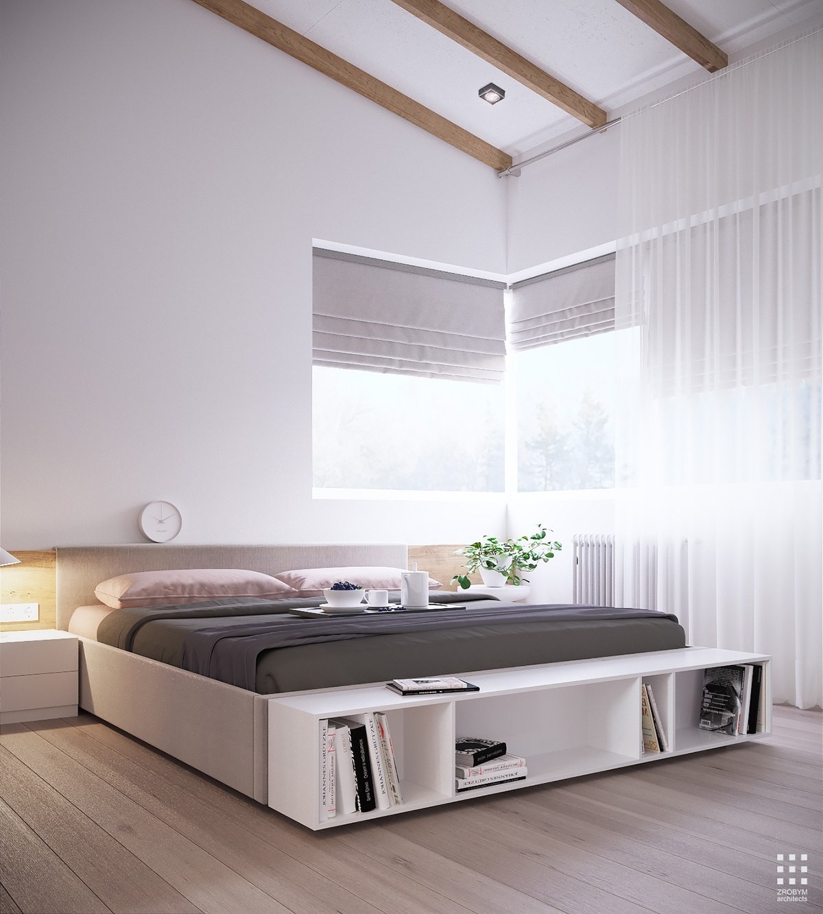
Simple, clean, and open – the aesthetic transition from the public areas of the home to the bedroom is an easy and comfortable affair.
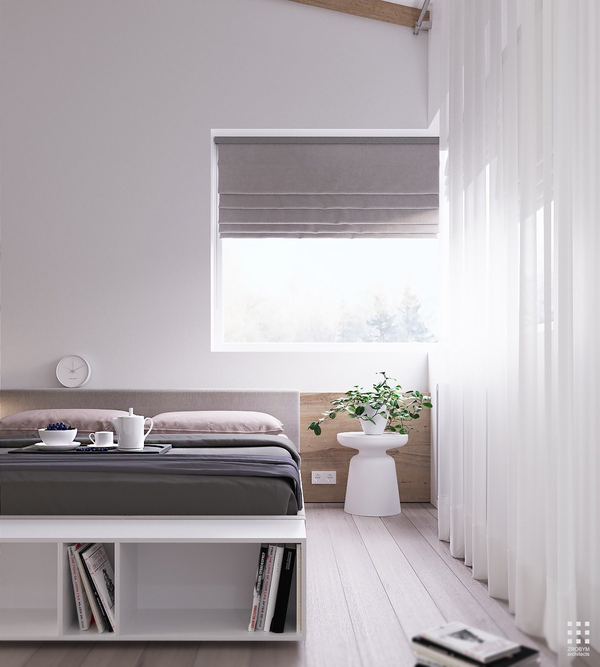
Wood panels match the height of the headboard to balance and lengthen the room. Its height is impressive, but this stylistic choice keeps the eye anchored to the functional areas below.
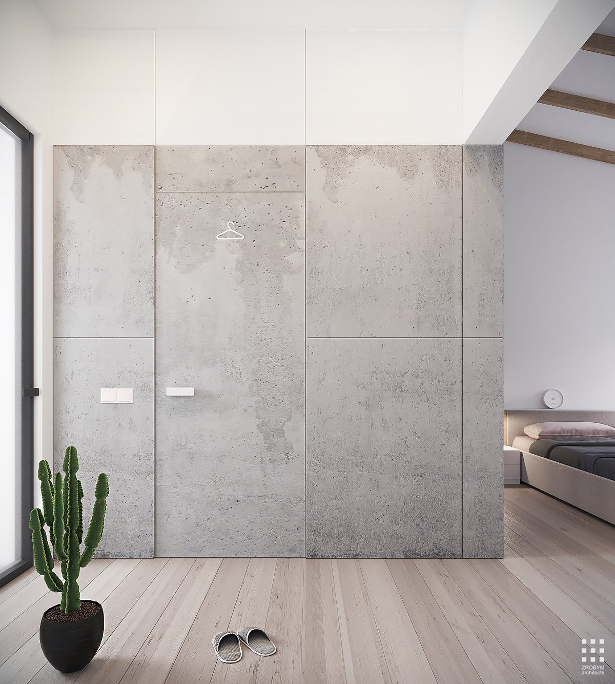
What an adorable way to label a closet! The tiny hanger applique is outright charming against its rather serious-looking background of textured concrete.
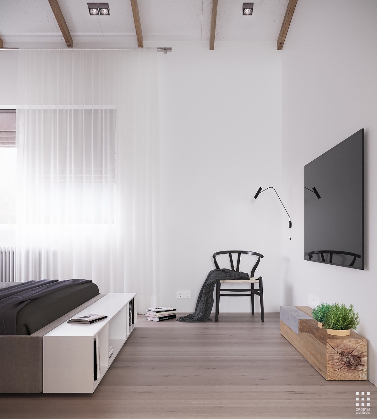
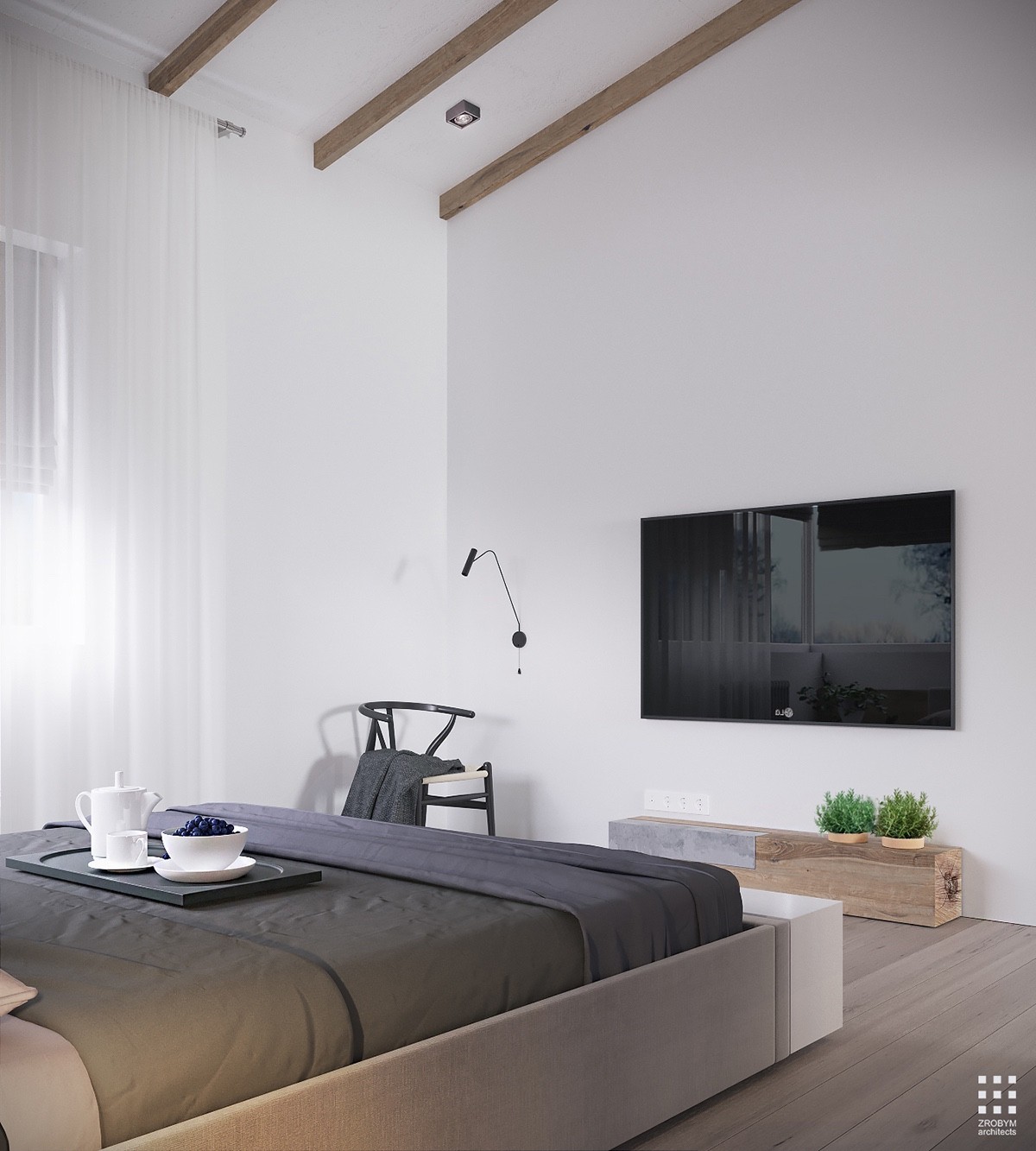
The chair is an iconic design by Hans J. Wegner, positioned beneath an adjustable wall lamp for light reading in the evening. And check out that concrete detail on the low table!
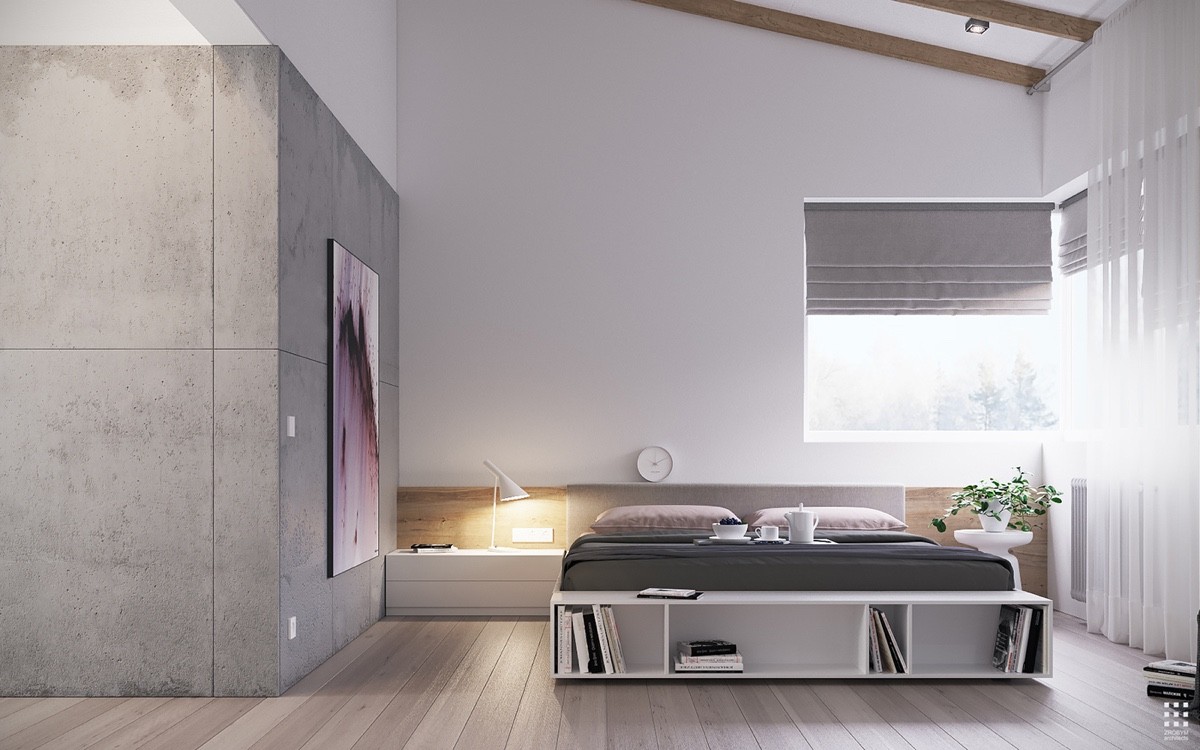
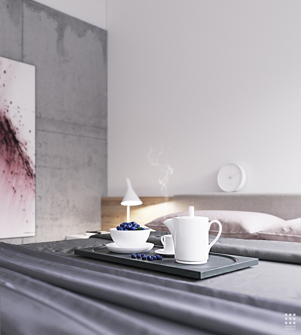
A designer table lamp by Arne Jacobsen sits to the left of the bed. High-end pieces like this one demonstrate a focus on quality over quantity. Each addition deserves the attention it generates.
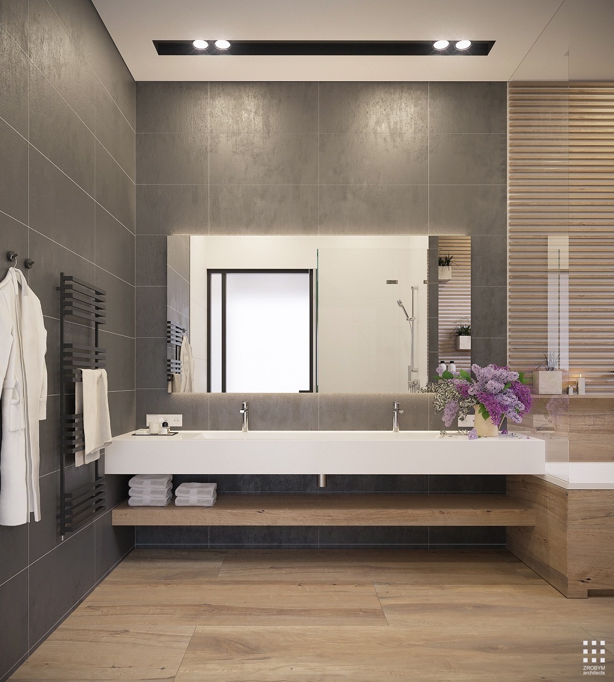
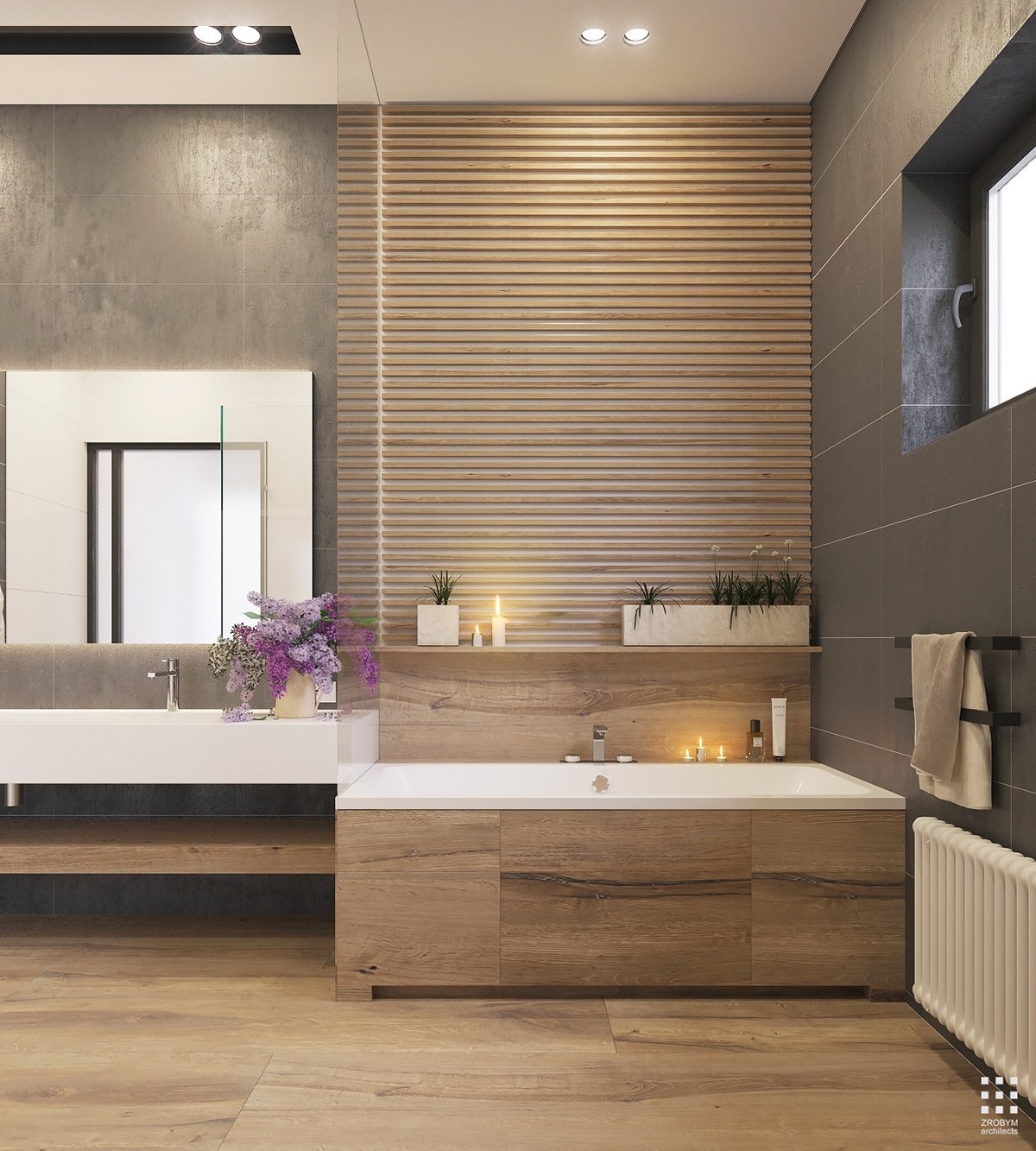
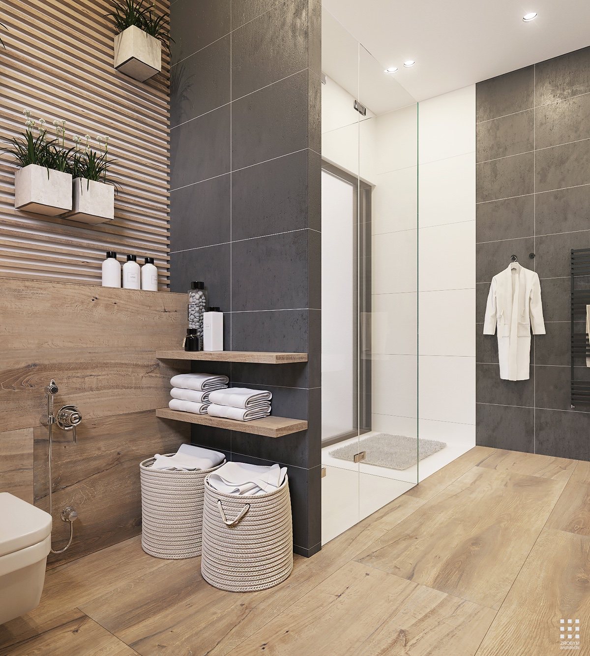
And finally, a quick look at the bathroom – always an interesting part of any home tour. This space demonstrates a greater reliance on wood elements for a more natural and welcoming atmosphere.
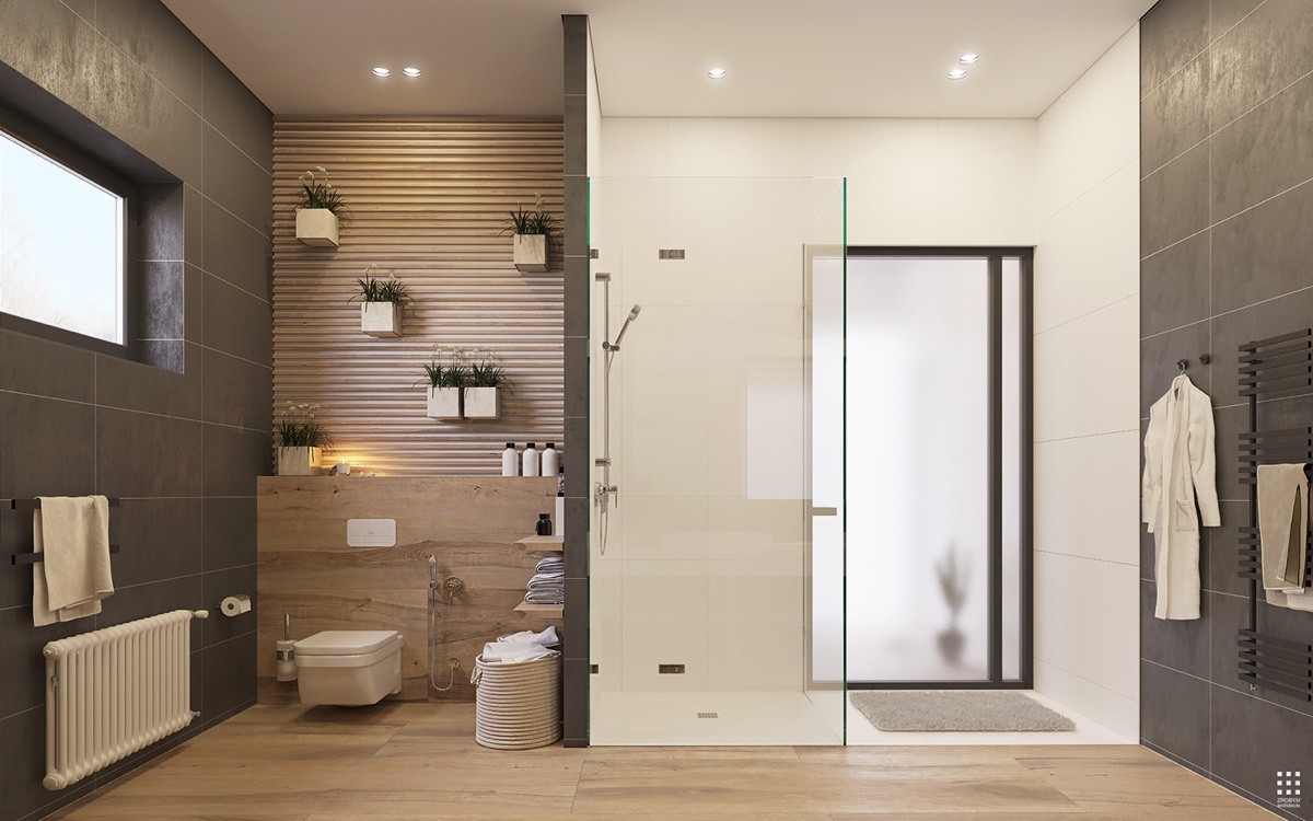
One of the more distinctive architectural features of this space is the entrance to the master bedroom, accessible through the shower.
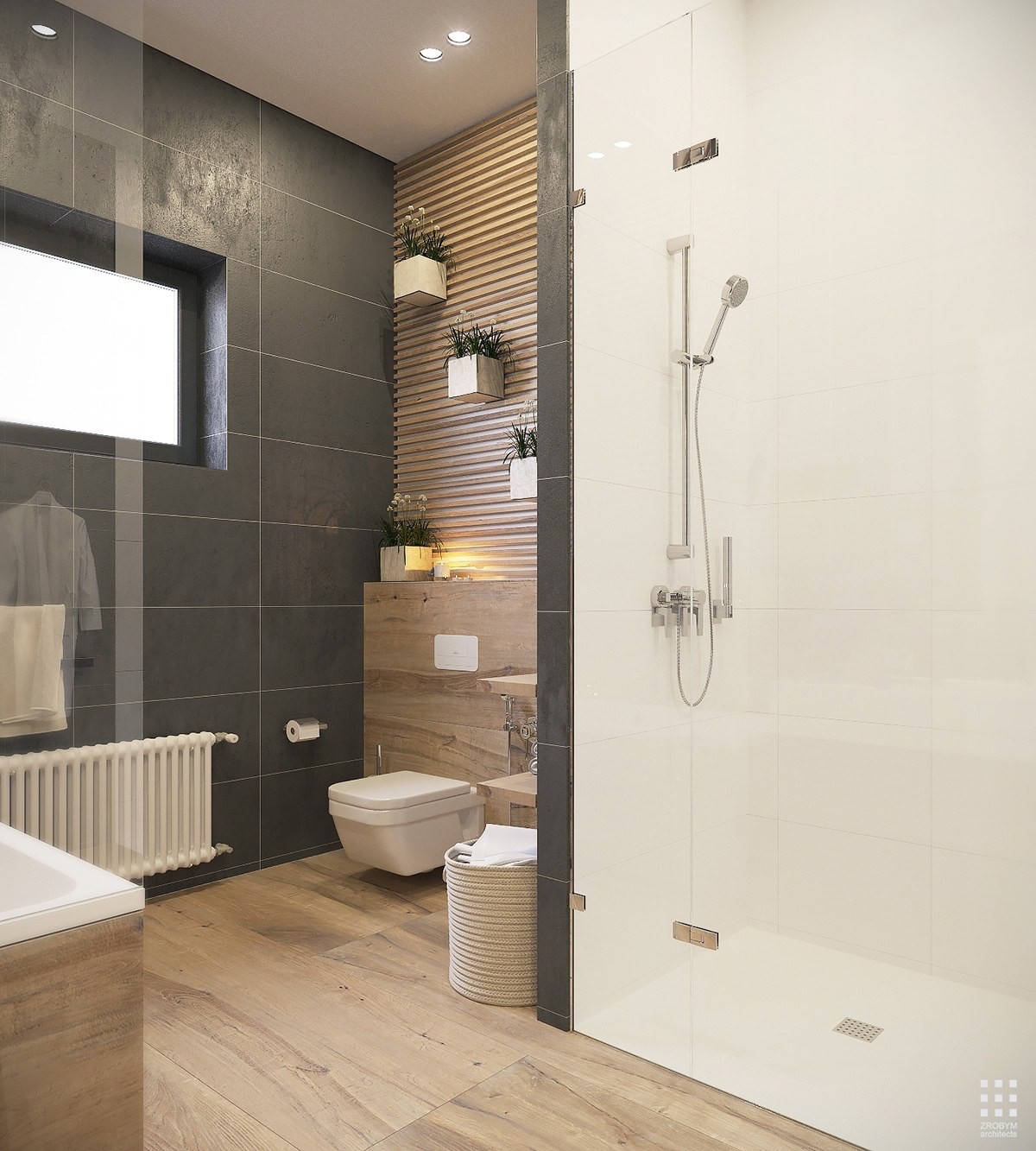
Modular planters create a beautiful vertical garden within reach of the window's sunlight. These plants likely thrive in the humid environment.

