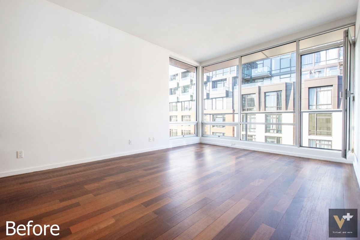
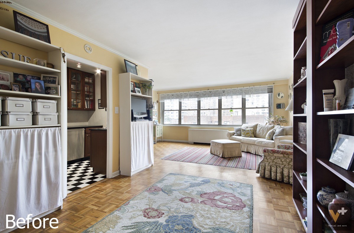
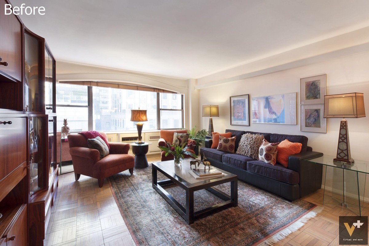
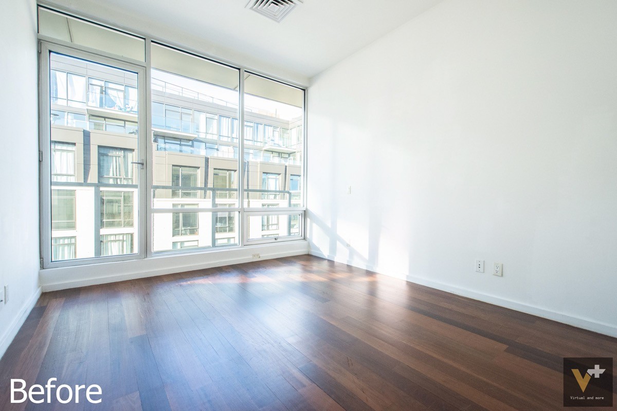
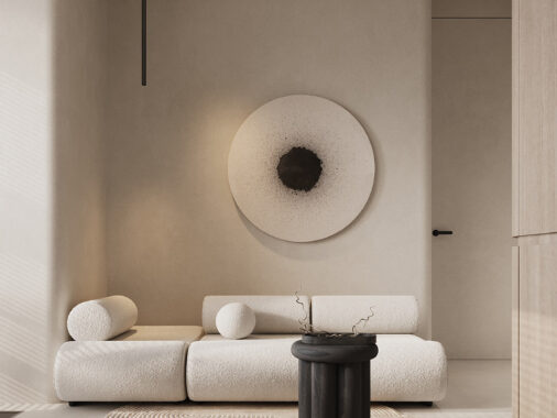
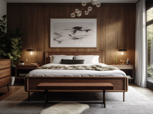
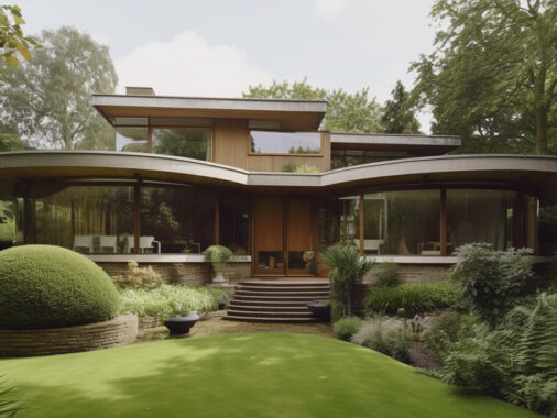
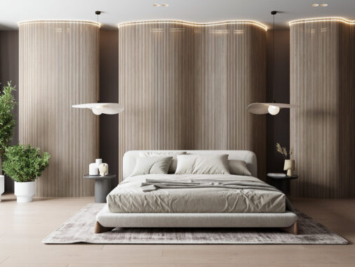
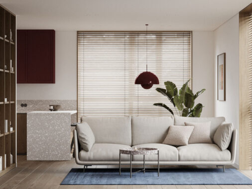
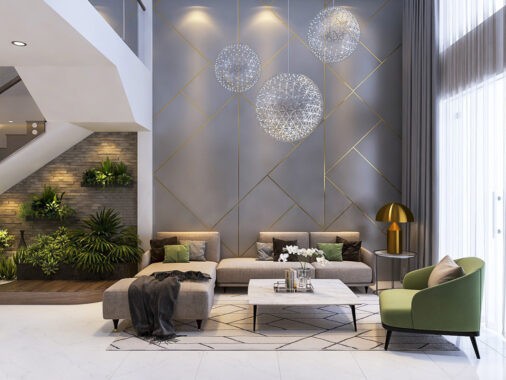
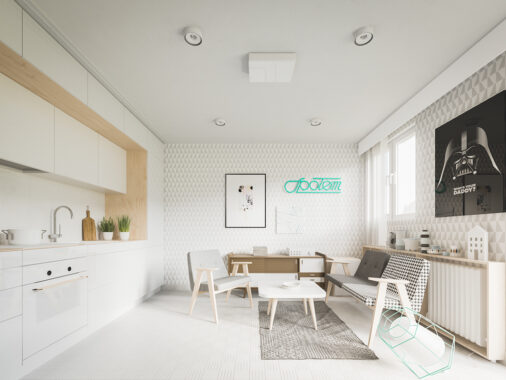
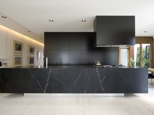
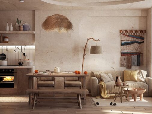
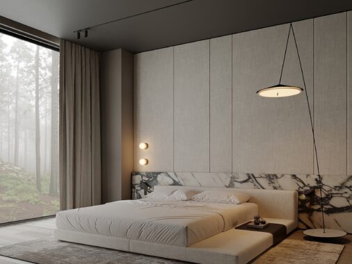
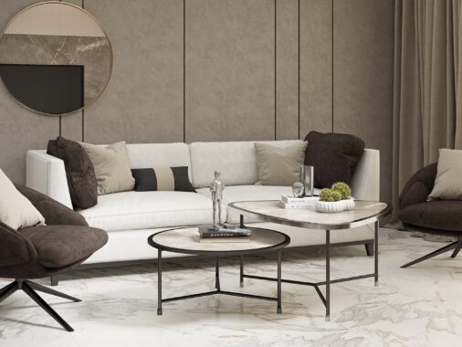
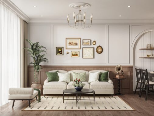
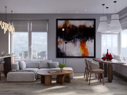
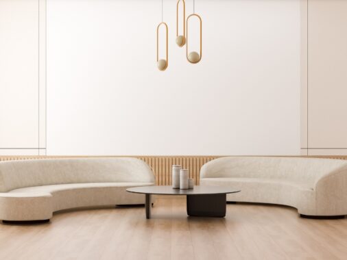
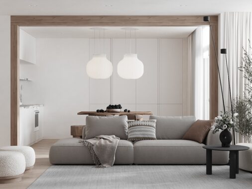
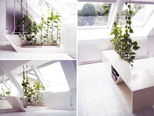
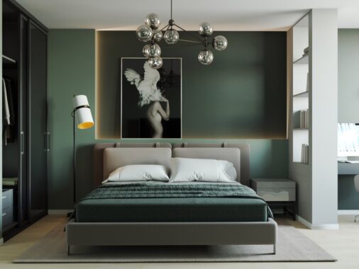
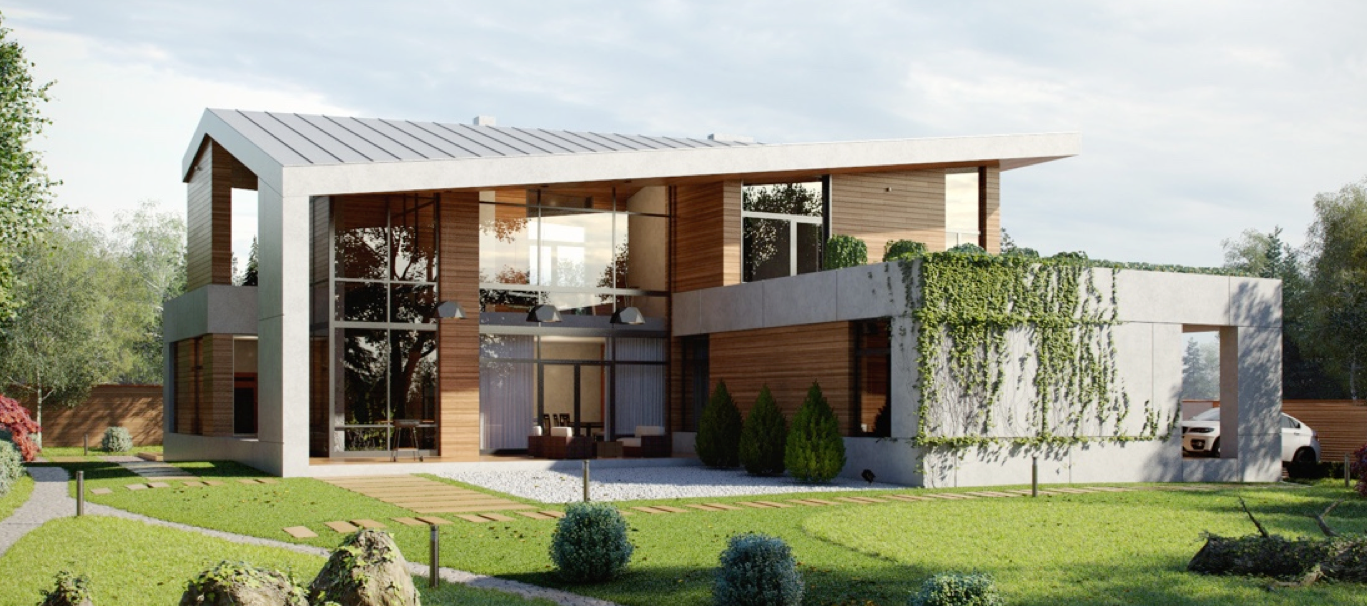
In the world of interior design, few things are more satisfying than a fantastic before-and-after shot. Seeing a blank canvas come to life is inspiring in so many ways – a compelling reason to reconsider the hidden potential waiting to be uncovered within your own four walls. This post explores several great transformations by V+ Studio, an architectural visualization firm that reimagines homes with new furniture, modern decor, carefully curated artwork, and more. In some cases, even the flooring and wall treatments get an update. What would your dream home visualization look like?
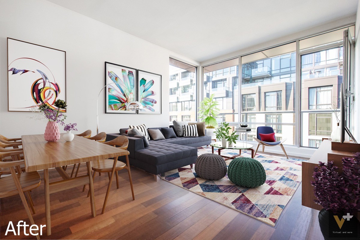
And the "after" visualization? Stunning! Colorful details like knitted poufs, a blue Wegner style lounge chair, and a geometric area rug all pull from hues found within the unifying modern artwork. A glass glass coffee table in front of the tufted sofa, both pieces simple and streamlined for modern appeal.
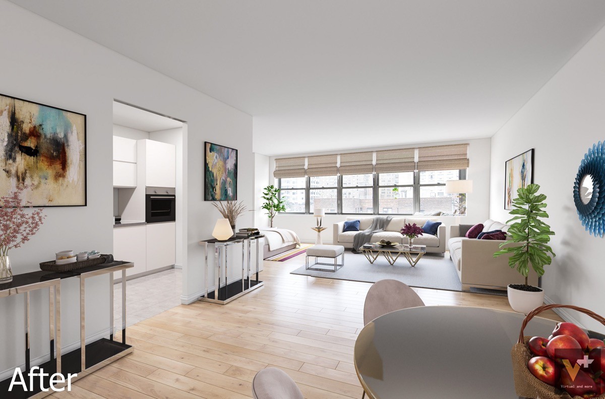
With the yellow walls and heavy upholstery choices gone, this white living room immediately feels larger. Metallic accents add a gleam of subtle luxury and indoor plants provide a soft natural touch. You may also notice the floors get a bit of an update – the old parquet and checkered tile swapped with more current options.
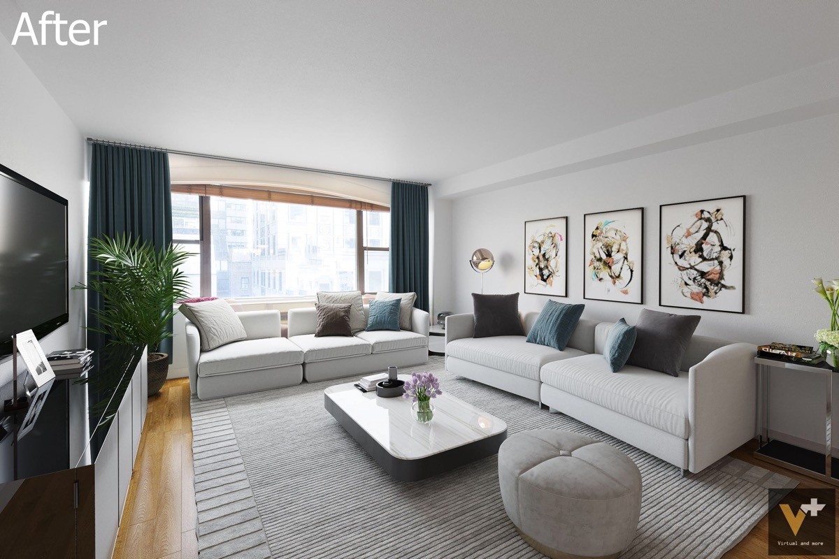
Parquet floors have been replaced with wood floors, oriented to make the room look longer. The classic wood entertainment console has been removed as well and replaced with a low modern sideboard. Simple white sofas and a coffee table with storage brighten up the atmosphere. Decorative table lamps are replaced by an adjustable floor lamp.
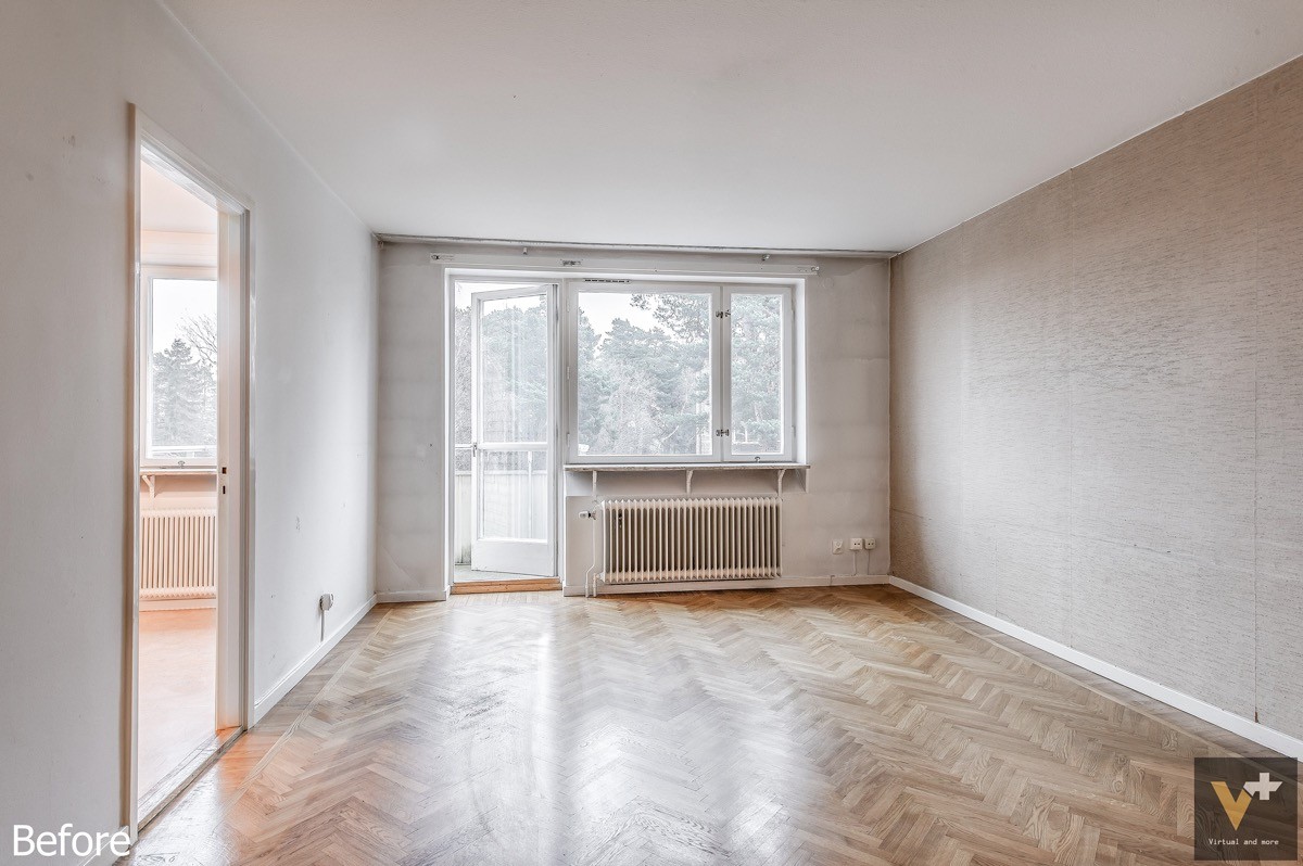
Classic features make this room stand out. Instead of replacing them, the "after" design puts them to good use.
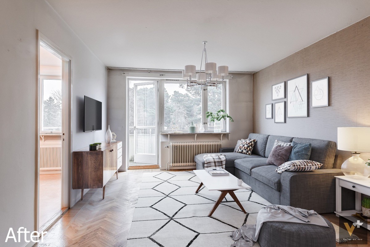
You can see that the wallpaper, chevron floors, and radiator all stand unchanged and uncovered. This room makes the most of them by going a little bit vintage with its decor. Both the coffee table and the TV stand take cues from mid-century modern design for a charming retro look.
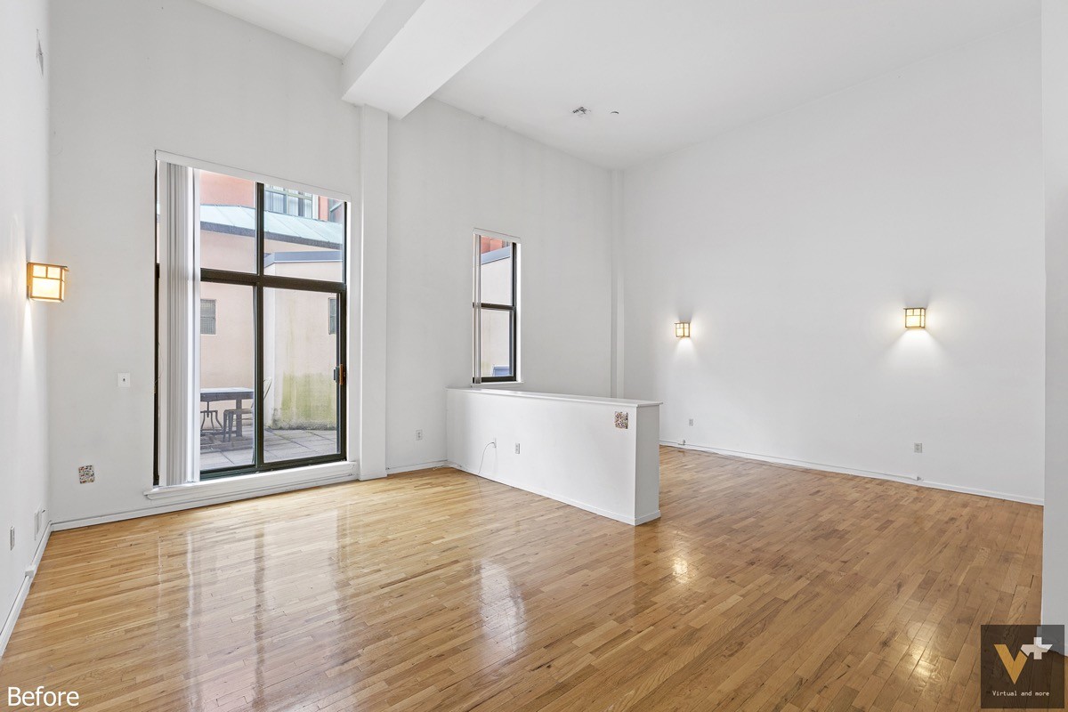
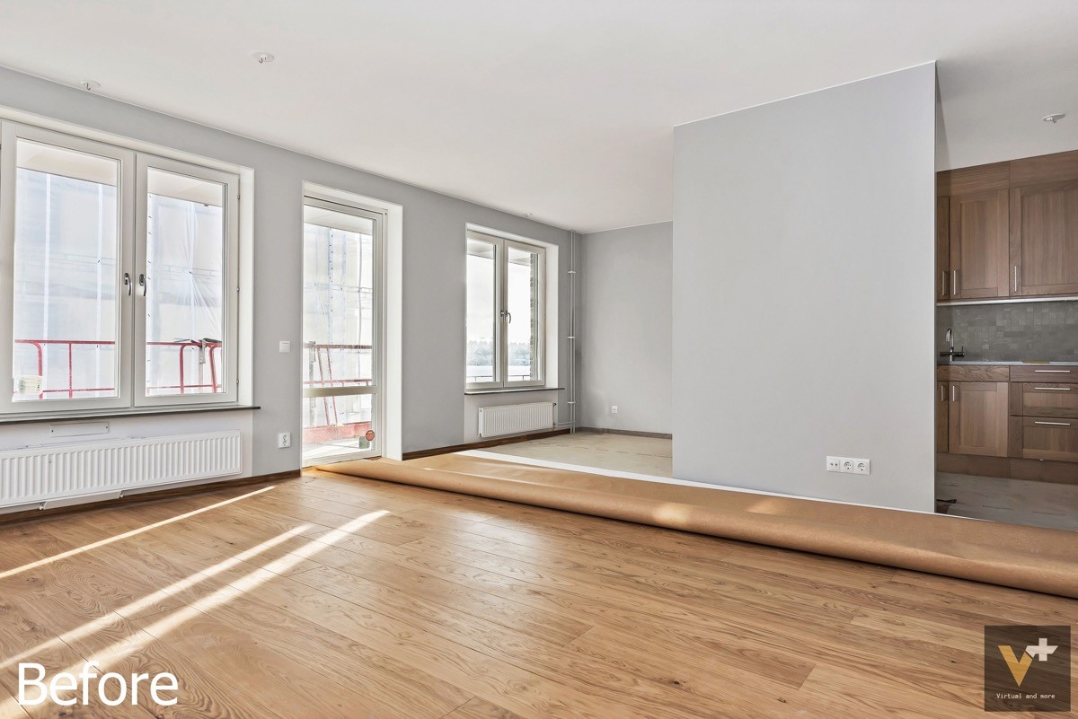
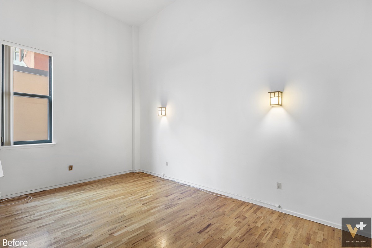
This interior has an interesting layout. The tall ceilings and small divider wall present interesting design challenges.
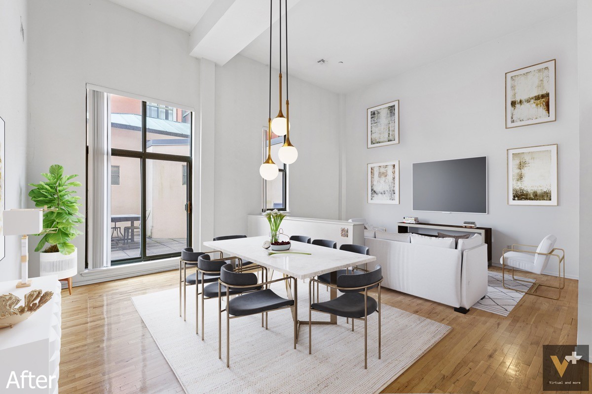
Both issues are addressed beautifully. The space on the other side of the divider wall is arranged as a small living room, the sconce lights removed to make the wall friendlier for television viewing. Artwork is hung high to take advantage of the extended ceiling height. A trio of beautiful dining room pendant lights hang above the table to make the arrangement feel more intimate, finished in brass to match the dining chairs below.
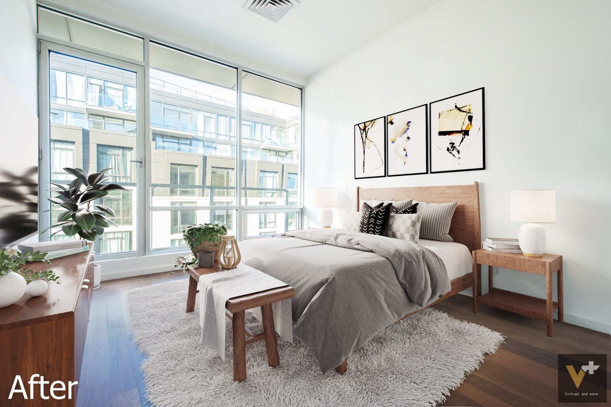
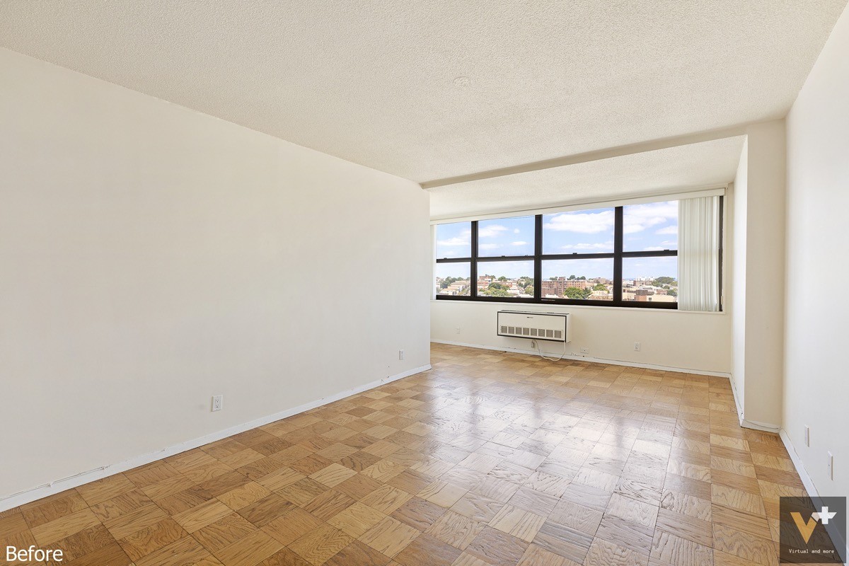
To balance out the urban window view, this space goes with a warm natural theme for its "after" visualization. Wood furniture, indoor plants, and lots of layered cozy textiles make this bedroom feel especially welcoming.
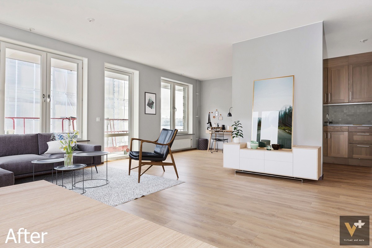
While that far corner seems like it would be difficult to furnish, this visualization reveals it would be the perfect spot for a little home office. The central wall is another hard-to-decorate feature but finds wonderful purpose with the addition of a sideboard cabinet and large photo print.
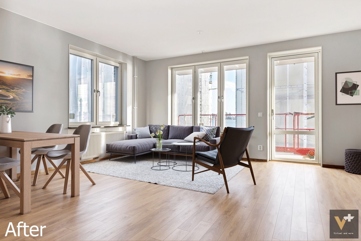
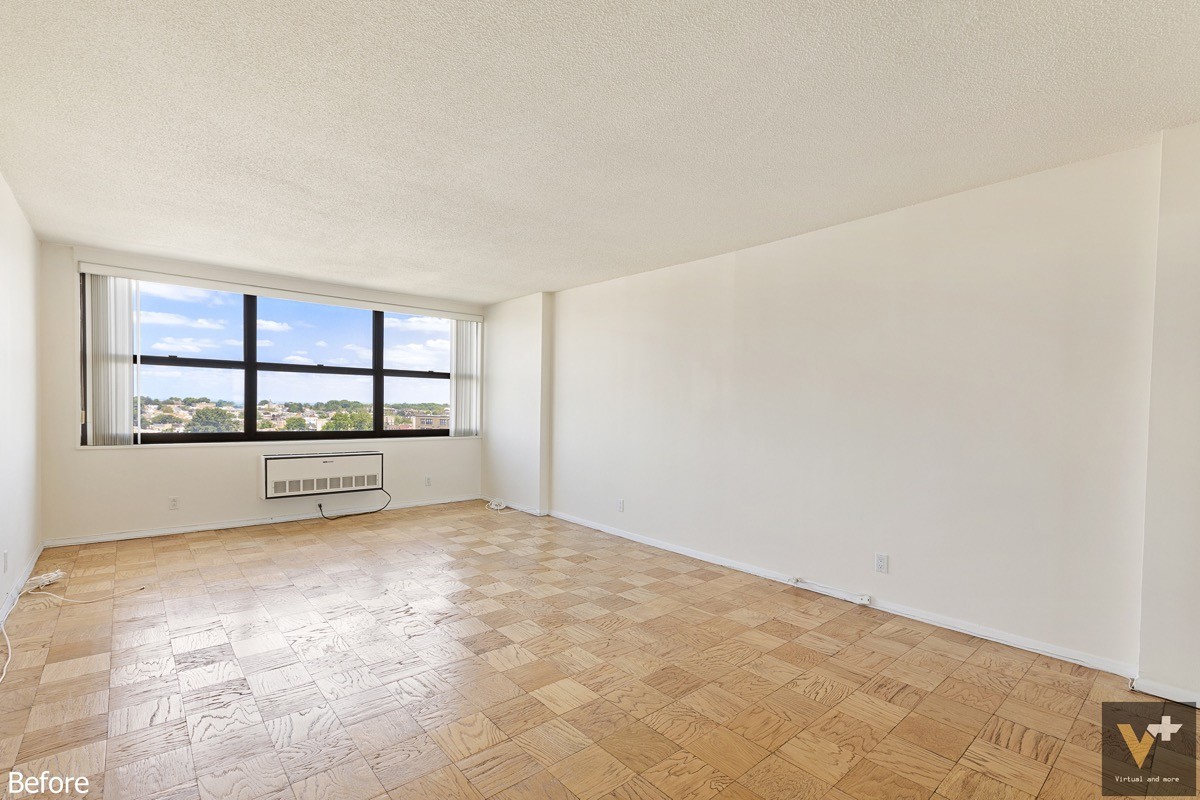
Simple furniture retains a somewhat low profile, making the most of a prime corner window spot. A grouping of three nesting round coffee tables allows for flexibility in the arrangement.
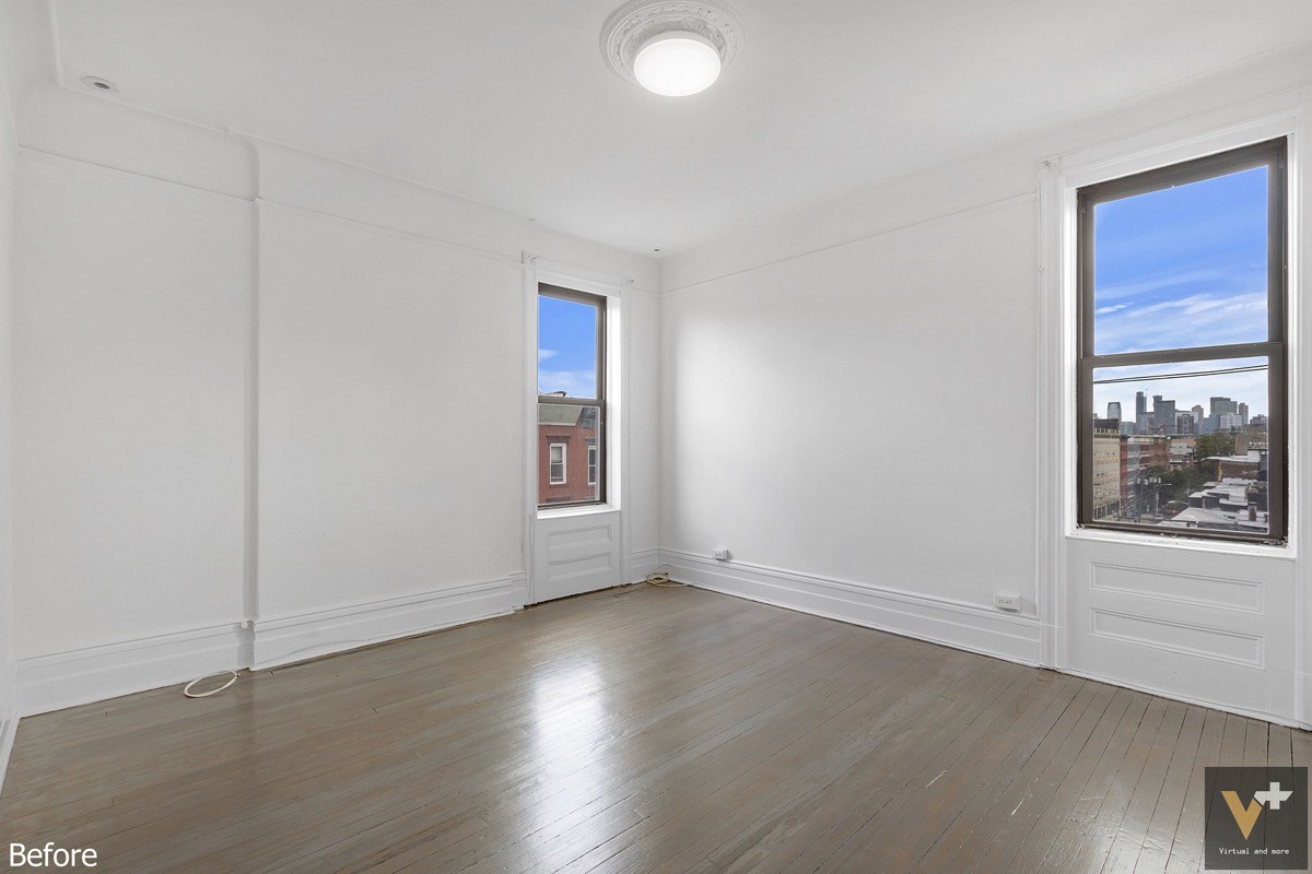
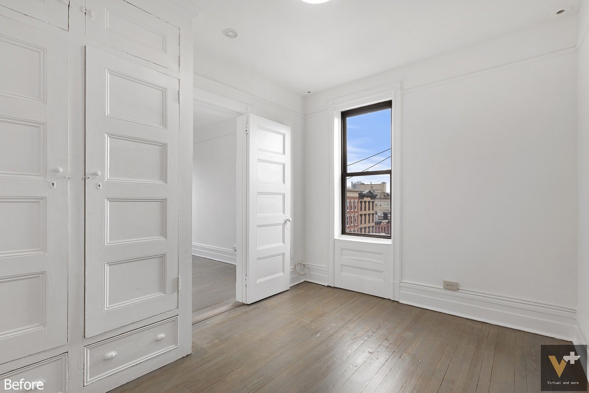
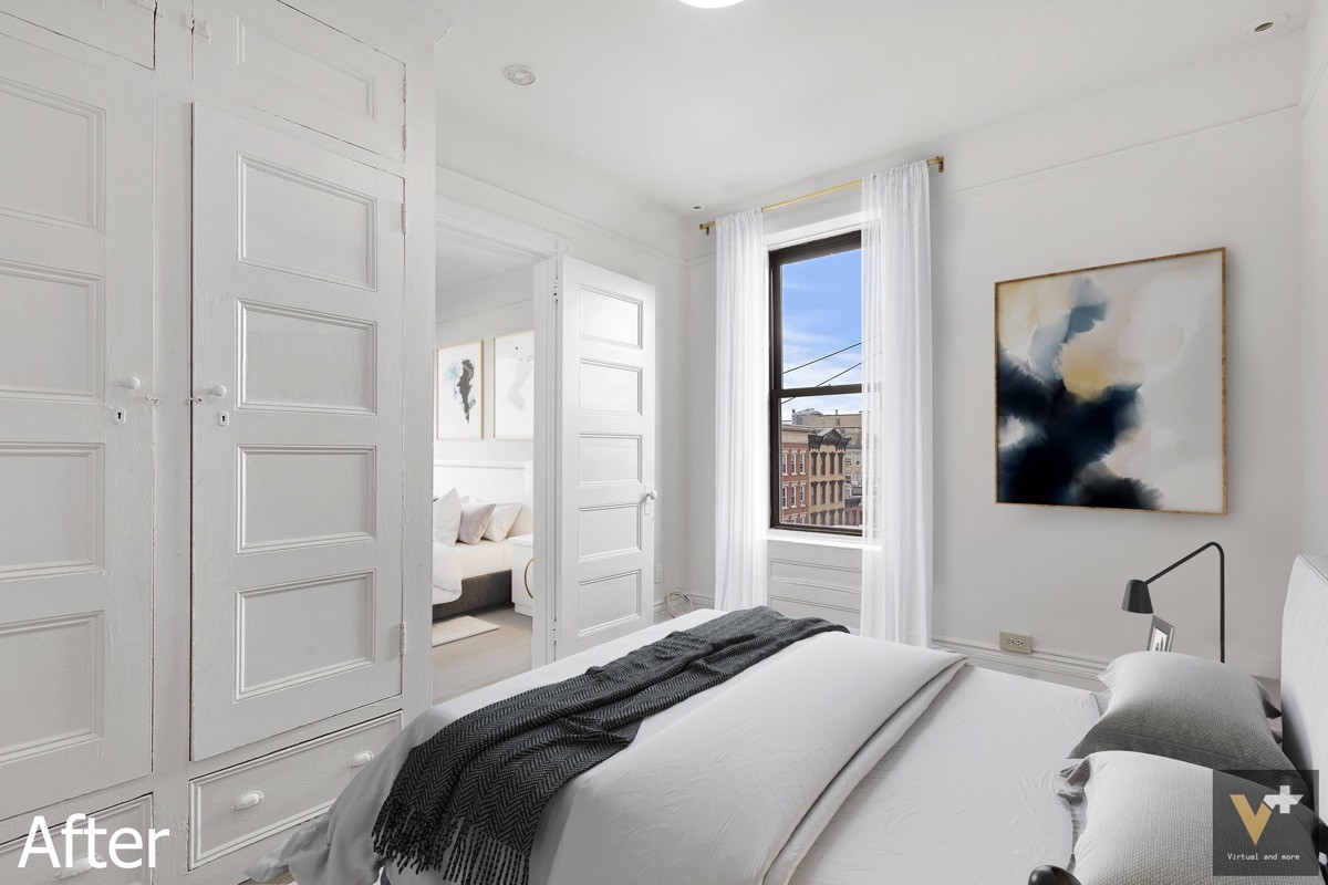
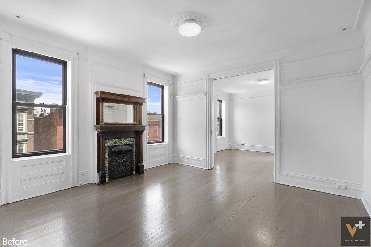
This bedroom features some very interesting classical details around the baseboards, under the windows, and around the ceiling light.
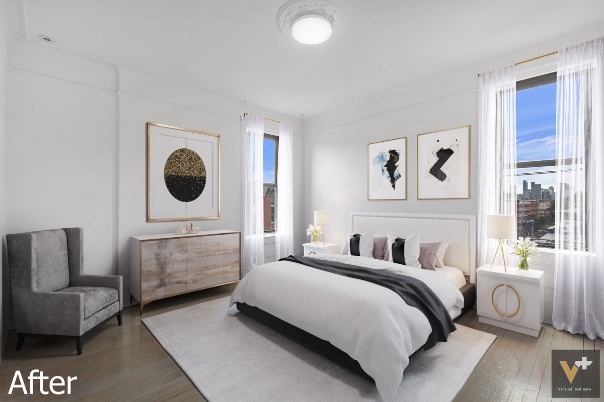
Those classical features are embraced by the new decor theme. This space uses a fabulous transitional theme – the use of glamorous metallics is kept minimal but impactful, the colors remain soothing and soft, and each furniture selection features a truly timeless profile.
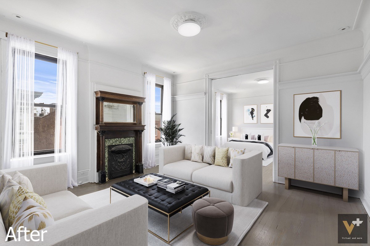
And again, a transitional decor theme does a great job serving as a bridge between the classic and modern elements.
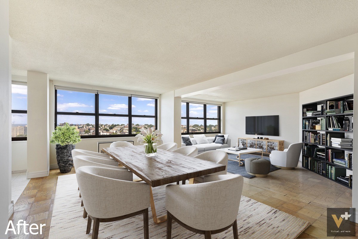
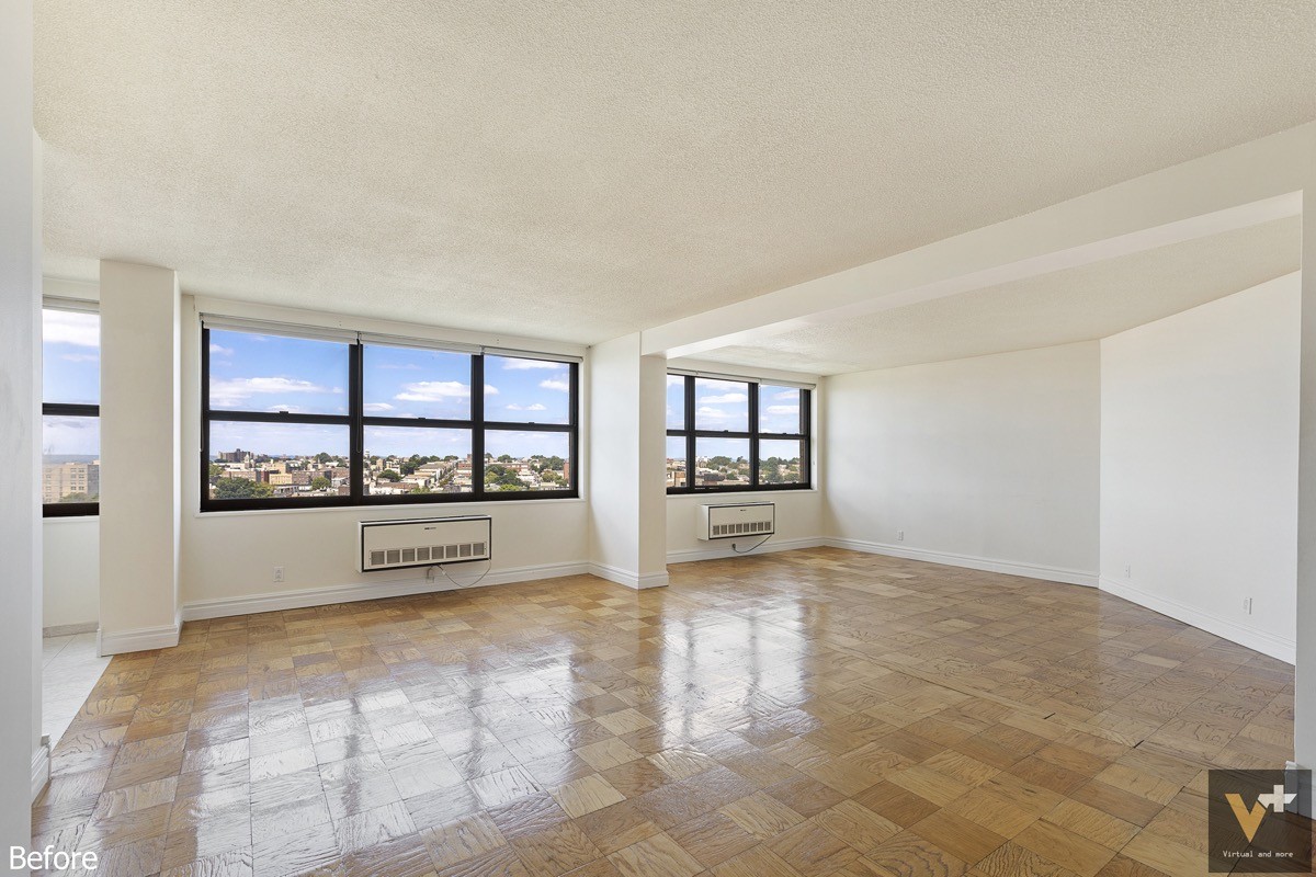
Instead of letting the angled wall serve as a limitation, this concept transforms it into a built-in bookshelf. A cozy living area occupies the space that remains, with a television mounted to the only bare wall.
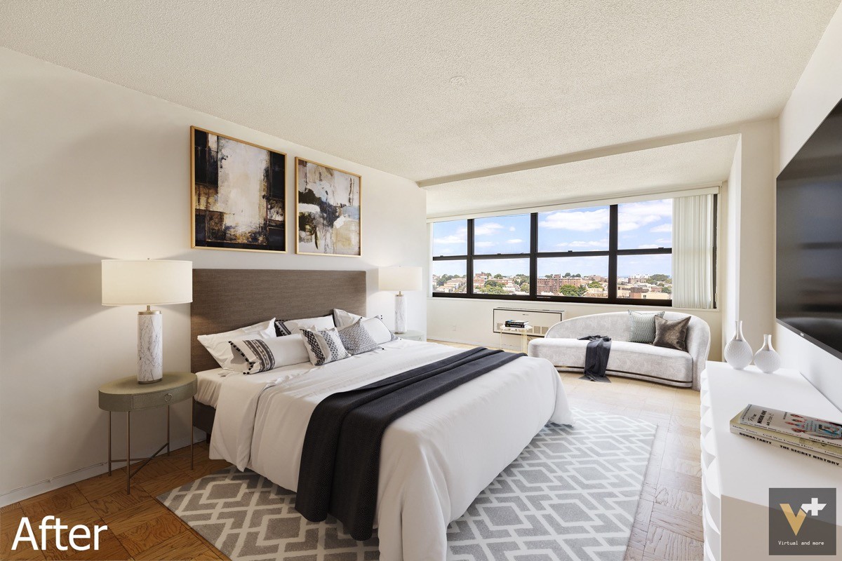
Bold artwork centers the space, and bedside table lamps provide gentle illumination from either side.
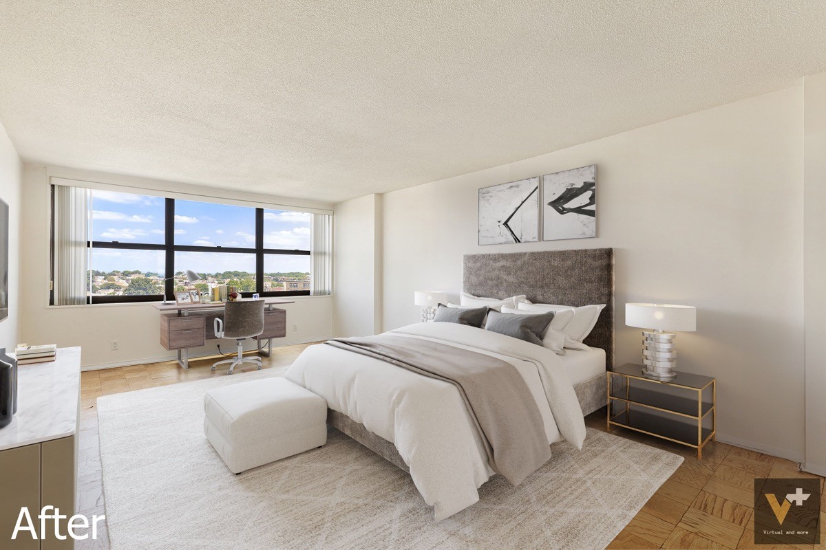
A lovely desk arrangement takes advantage of the spectacular window view. A spacious rug defines the boundaries between work and rest areas. Storage furniture is scarce but effective – tiered bedside tables and a storage ottoman provide space for essentials.
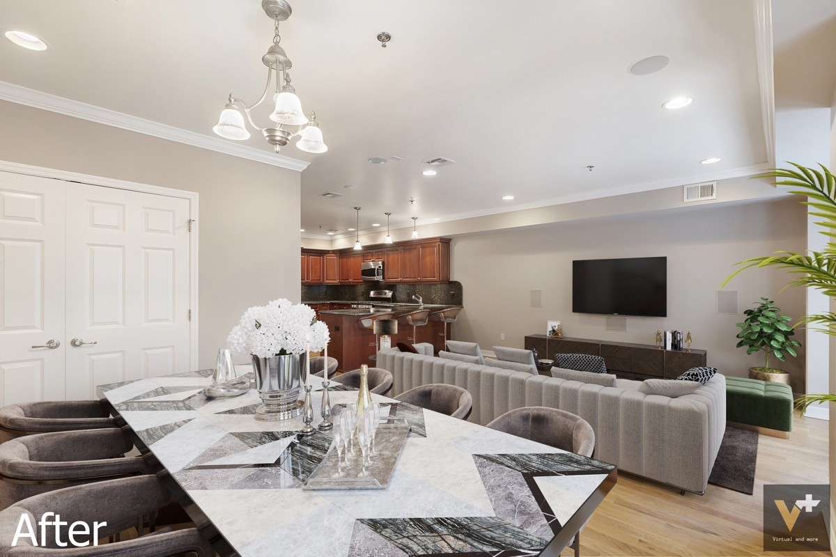
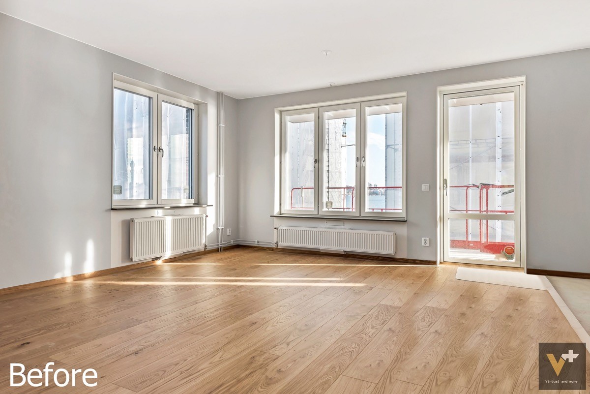
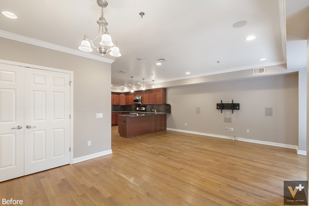
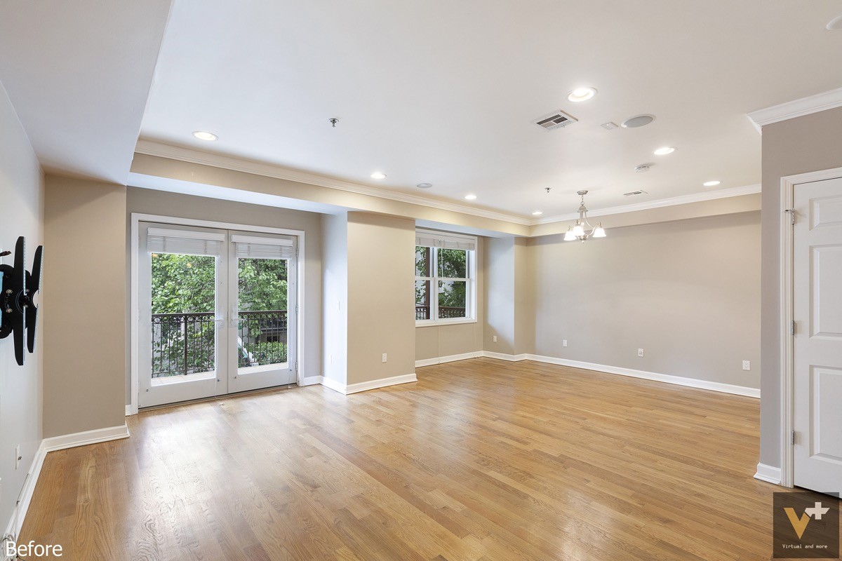
Luxurious materials meet modern profiles to create a high-end transitional theme that dances between eras with grace. A hint of emerald green in the living room works well to complement the cherry cabinetry in the kitchen.
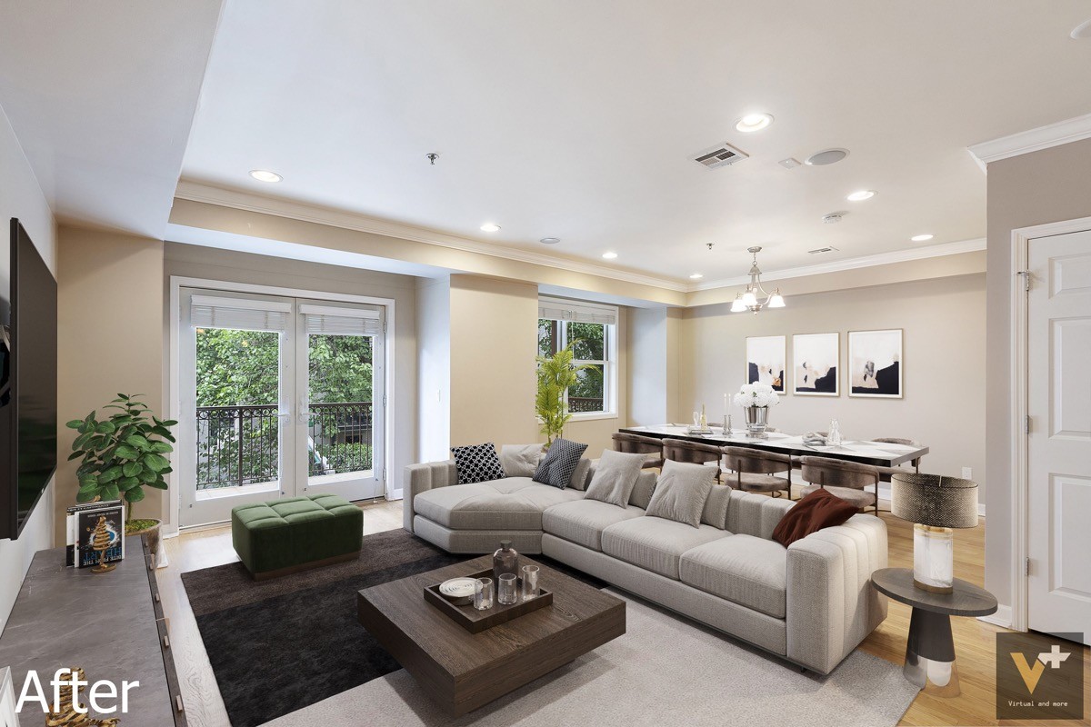
You can see all the elements come together. Because the cabinets in the kitchen are cherry and the floors are a light honey color, the square coffee table plays an important role mediating between the two finishes for a more intentional look.
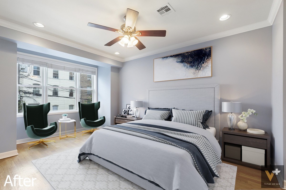
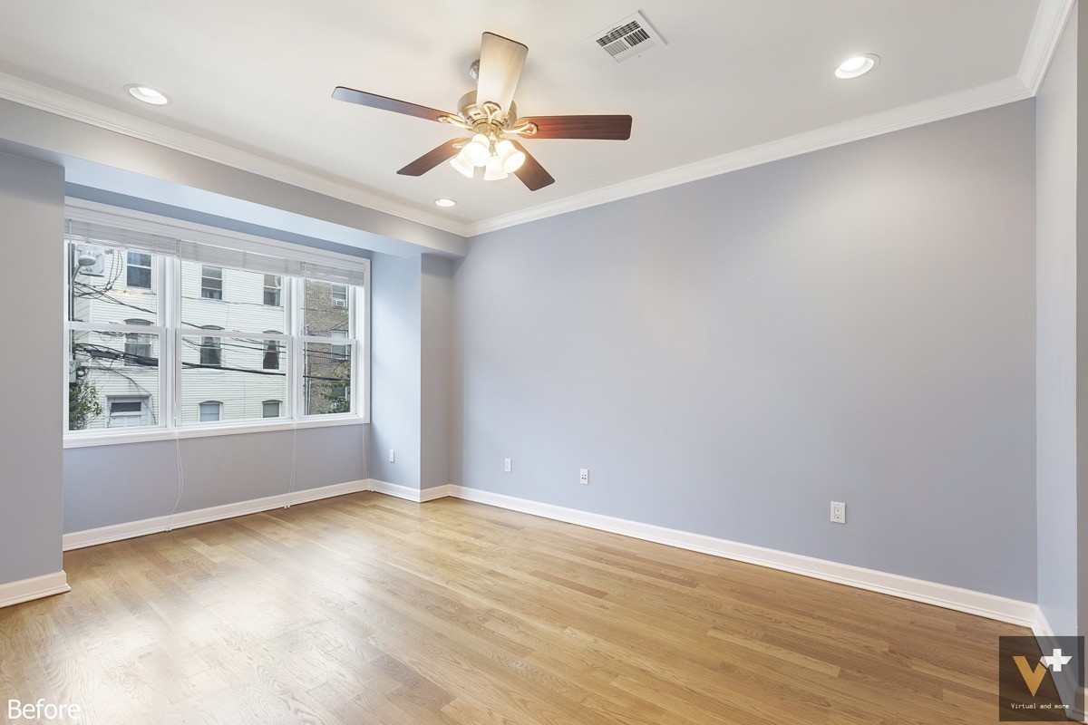
Emerald bedroom chairs and sapphire textiles set the stage for elegance. This bedroom also demonstrates another example of different woods being used well together – the dark bedside tables balancing the weight between light floors and the darker cherry ceiling fan.
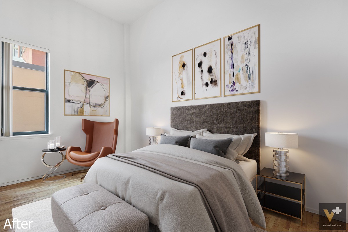
Removing the wall sconces offers more flexibility for the bed arrangement. Here, they've been replaced with bedside lamps.
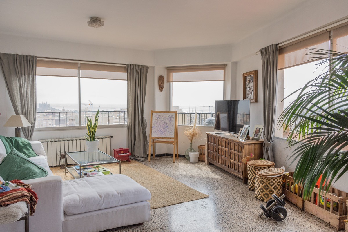
The final transformation is especially interesting. While the "before" and "after" images feature very different furniture and decor choices, the result maintains the same overall theme.
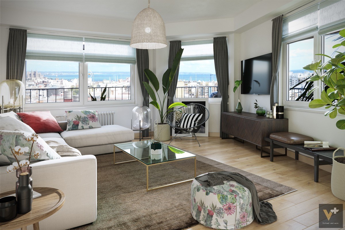
It remains a very vibrant and eclectic space. Outdated table lamps are replaced with the fabulously fashionable Oda style lamp (originals are available here), the small ceiling fixture replaced with a dramatic Rattan light, and a handsome Acapulco chair is added to underscore the tropical atmosphere.

