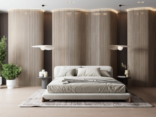
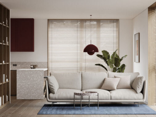
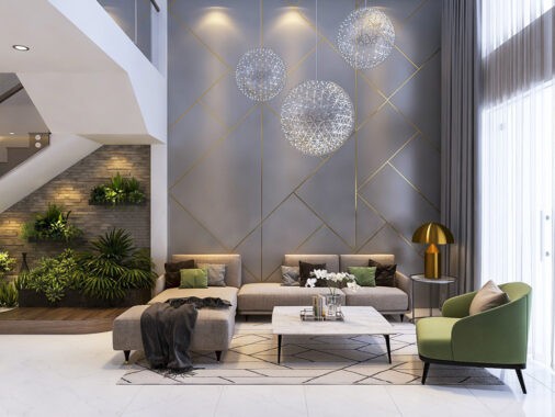
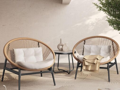
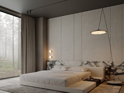
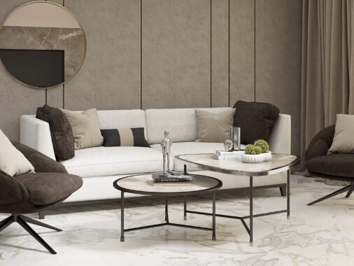
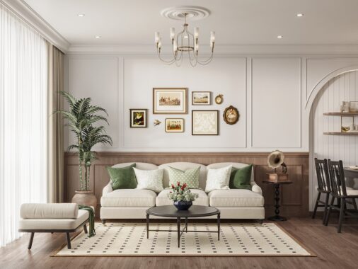
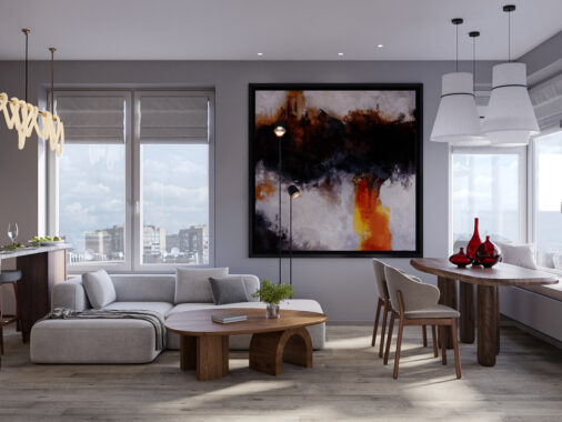
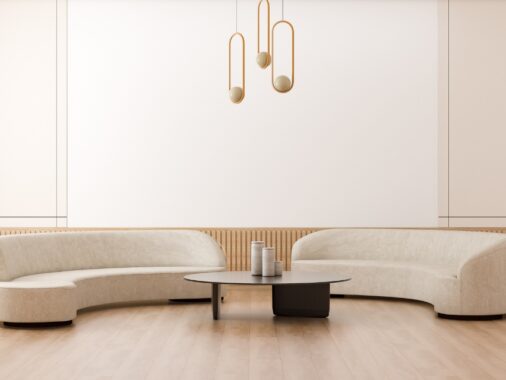
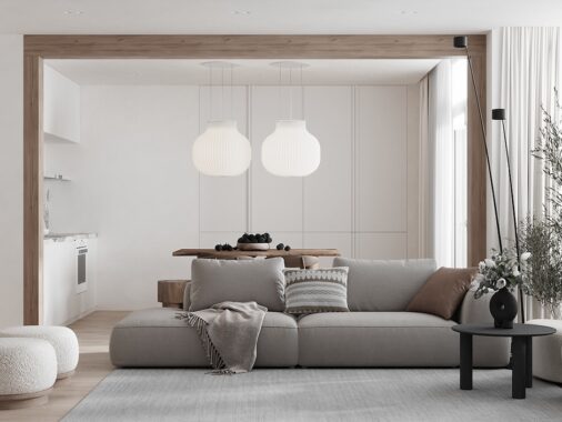
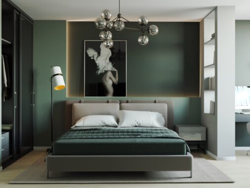
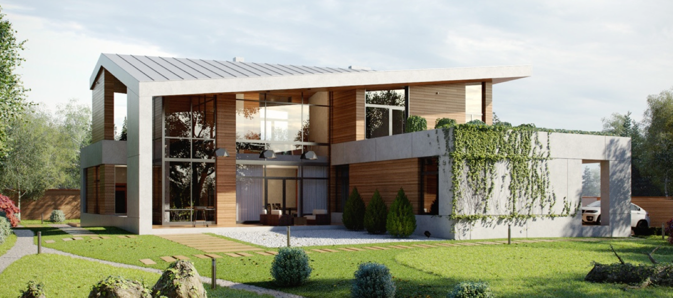
What would you do with an extra room in your apartment? Frequent entertainers might find a spare guest room useful, while artists may set up a studio or storage space. The designers of these two single-bedroom apartments each took a different approach according to the needs of the residents – the first apartment features a traditional home office and library setup, while the second apartment uses the spare bedroom as a sort of media area for television and perhaps even video games. Both are smartly decorated, one minimalistic and the other with bold primary colors.
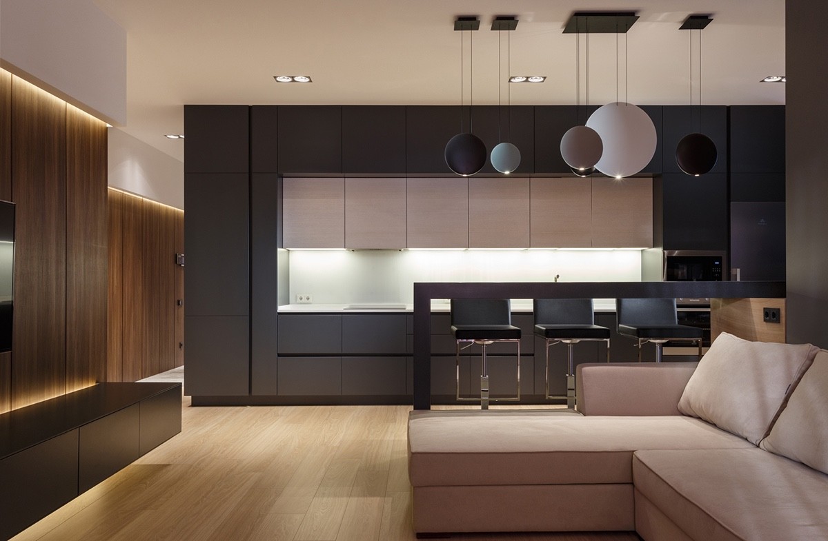
In the dining room, a series of kitchen pendant lights illuminate the dining table. They're from the Vibia Cosmos Cluter Pendant Light collection by Alberto Lievore. Inset lighting above the counter tops and along the walls set the mood in the evening.
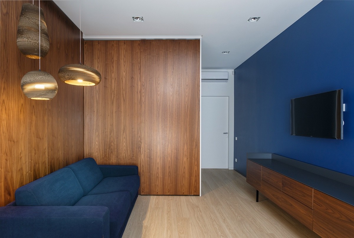
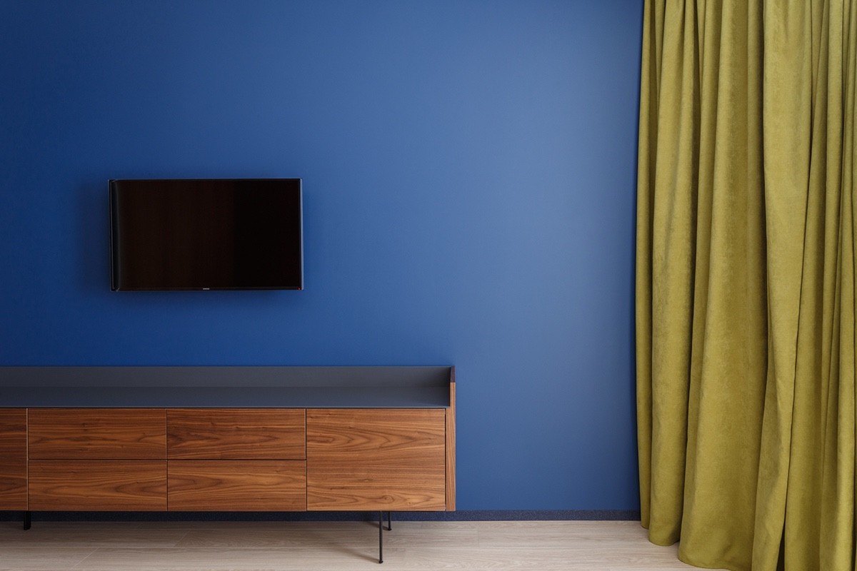
Like the bedroom, the media room takes a dramatic departure from the rest of the interior – dark blue makes for an unobtrusive backdrop while watching movies in low light conditions.
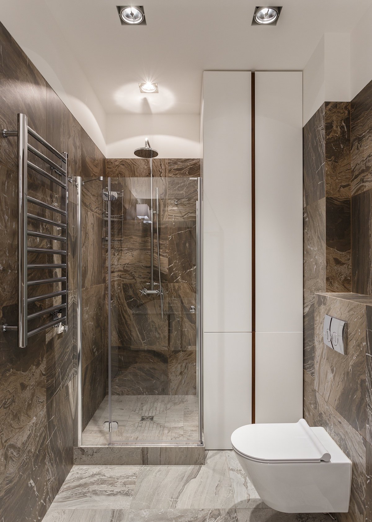
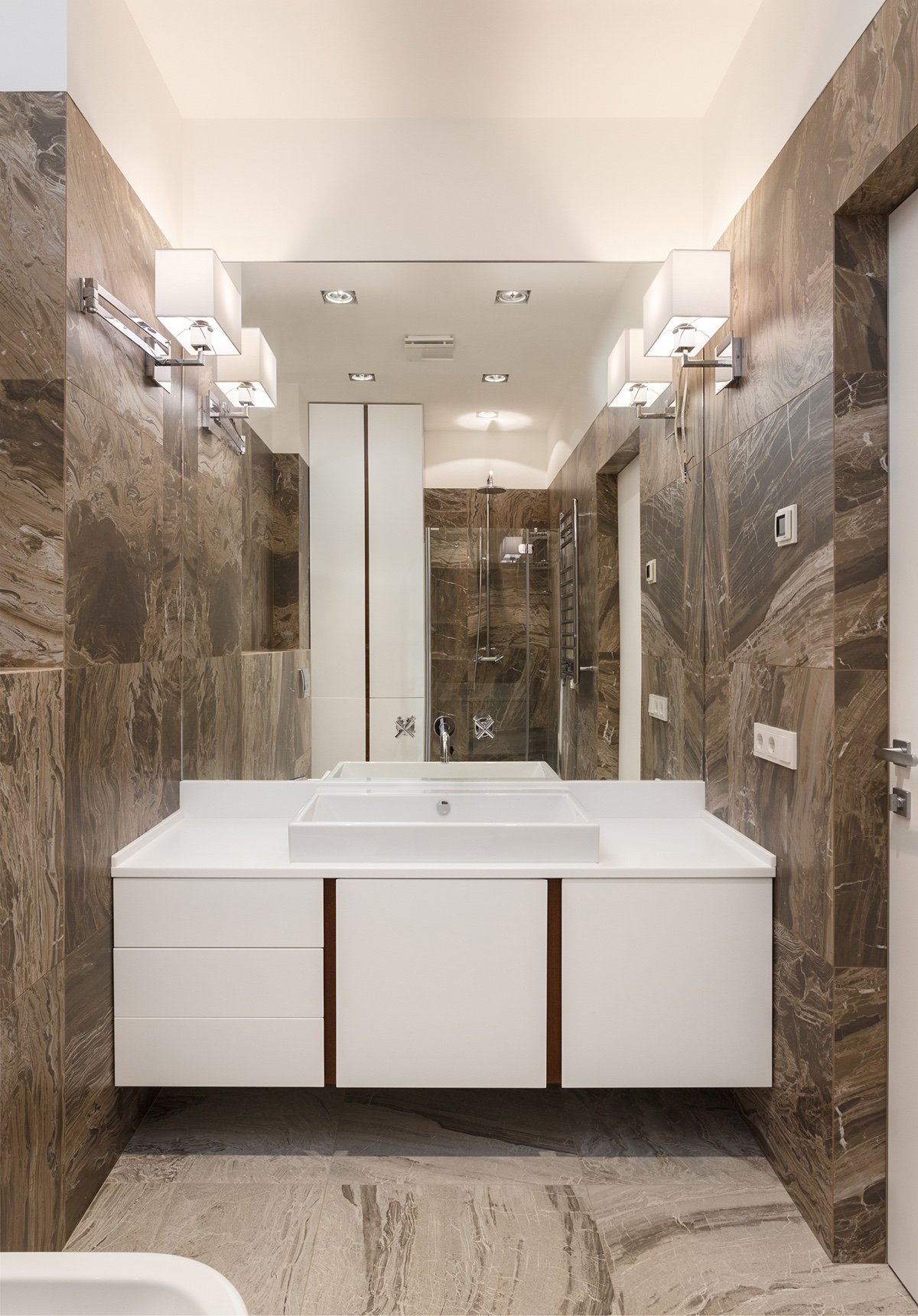
Practical and simplified, the guest bathroom lacks the drama of the master bathroom but makes up for it with sophisticated chocolate-toned tile.
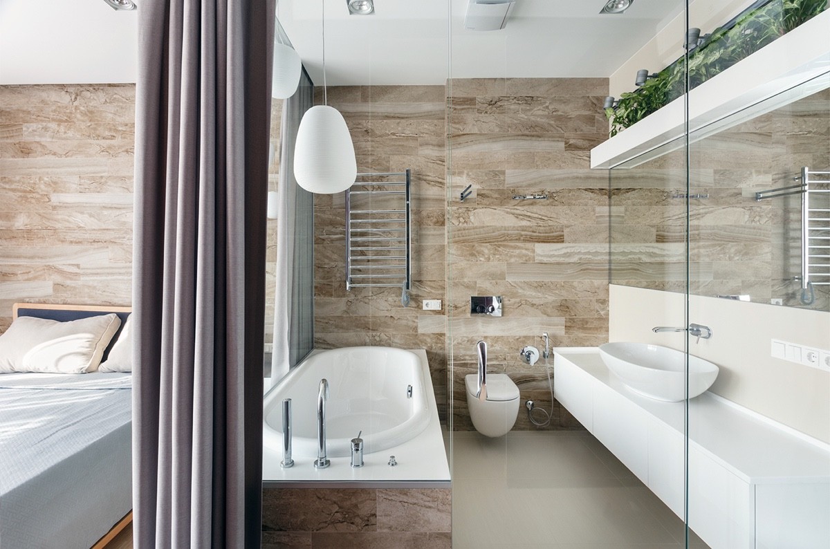
More pendant lights hang in the bathroom area above the tub – these are from the Rituals collection by architects Ludovica and Roberto Palomba.
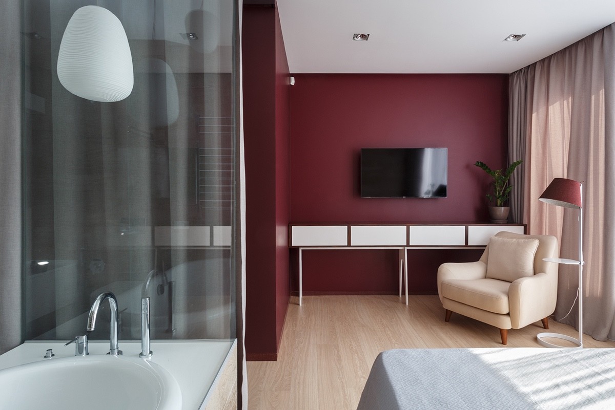
Toward the end of the room, a comfy chair offers obligatory space to read. The accompanying lamp and table combination is a useful addition.
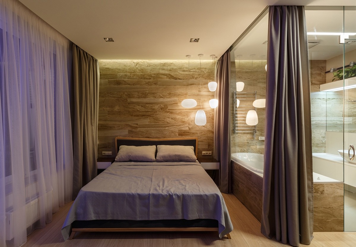
A series of unique bedroom pendant lights offer soft illumination for before-bed relaxation, while inset lights in the ceiling would provide brighter light for task-oriented activities like getting ready for a night on the town.
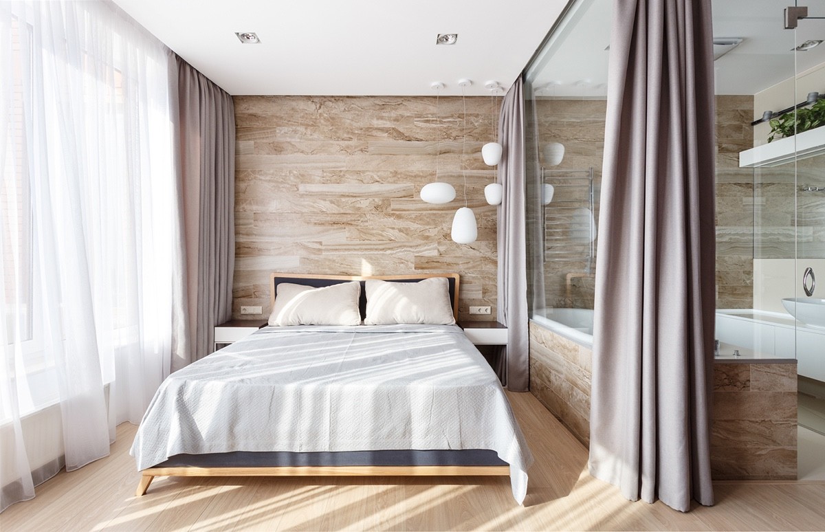
Of course, the bathtub area includes curtains to give the option for privacy, or to darken the space so the resident can enjoy the ambiance of candles or mood lighting during the daytime.
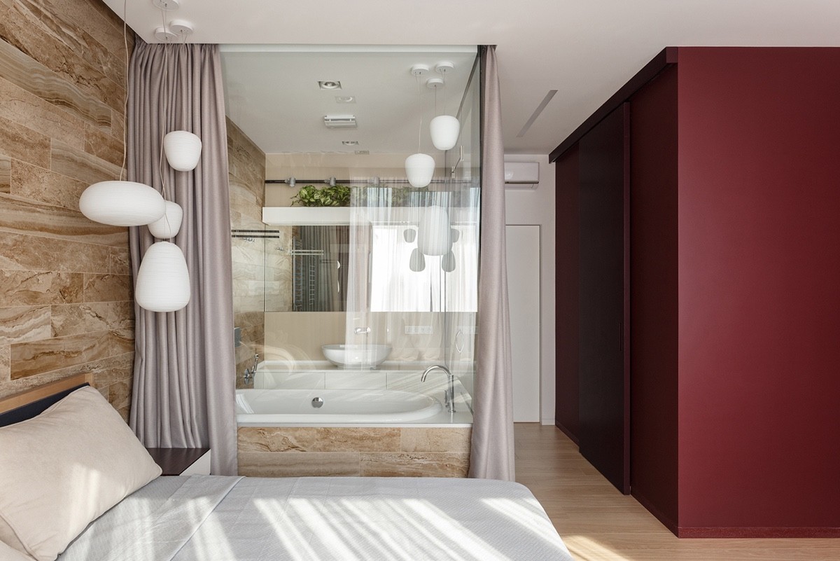
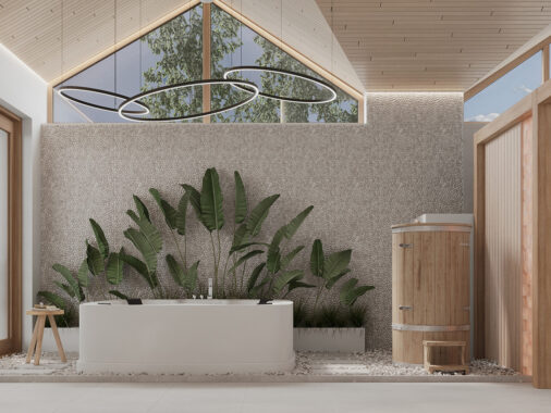
How bold! The bedroom takes a completely different approach with a dramatic dark red accent wall. It's a multipurpose space that includes a freestanding bathtub and vanity, a lovely retreat.
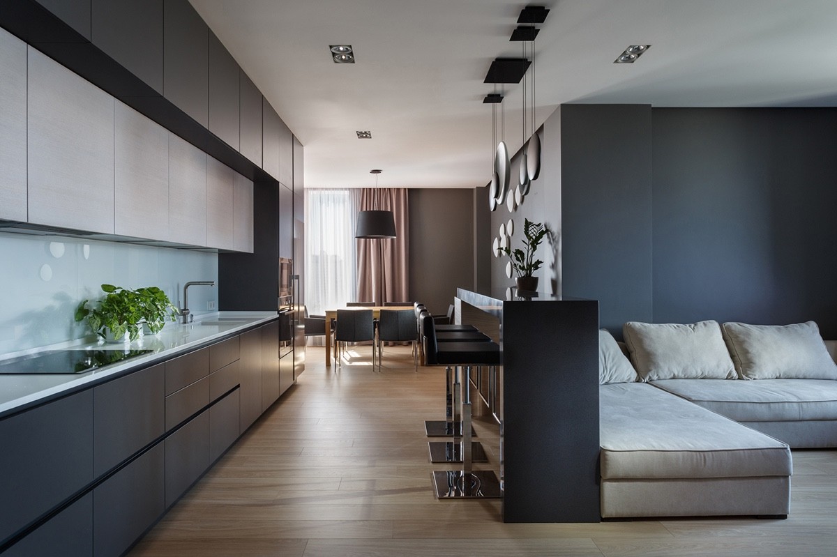
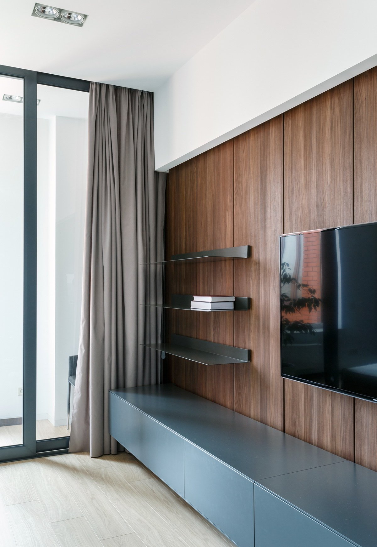
Mauve curtains and a chocolate accent wall extend the tones of the Cosmos pendant lights across the room.
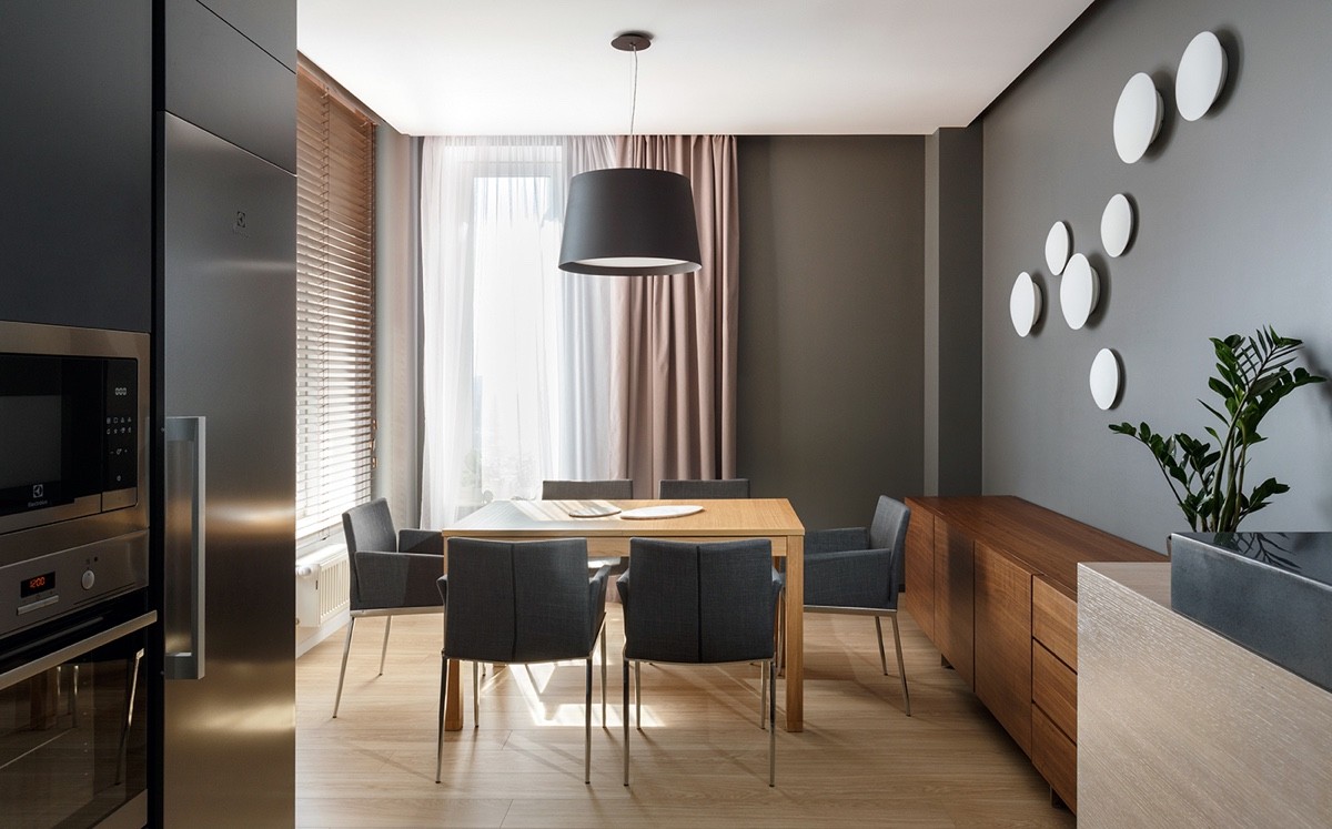
A formal dining room continues the circular decorative theme with modern wall sconces. An oversized pendant hangs above the contemporary table arrangement.
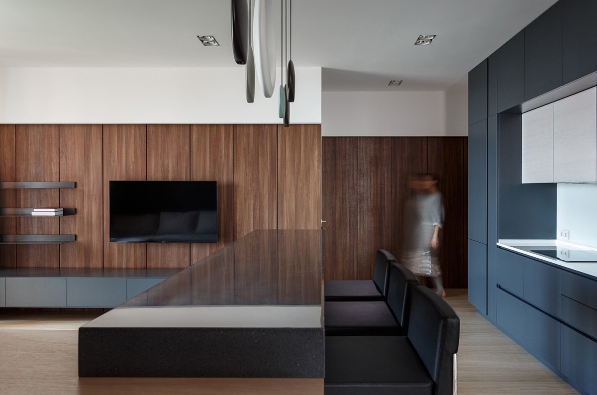
Here you'll notice that the pendant lights are actually flat circles rather than globes, a smart way to reduce their visual footprint when viewed from the side.
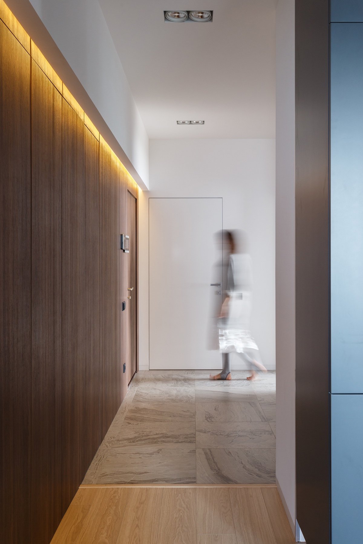
Natural flooring options blend beauty and functionality. Stone tiles protect the entryway from muddy boots during snowy and wet seasons, while the wood boards feel more comfortable and welcoming.
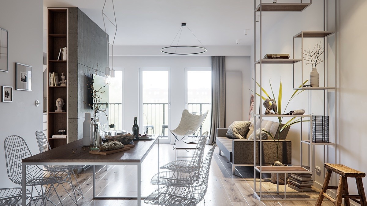
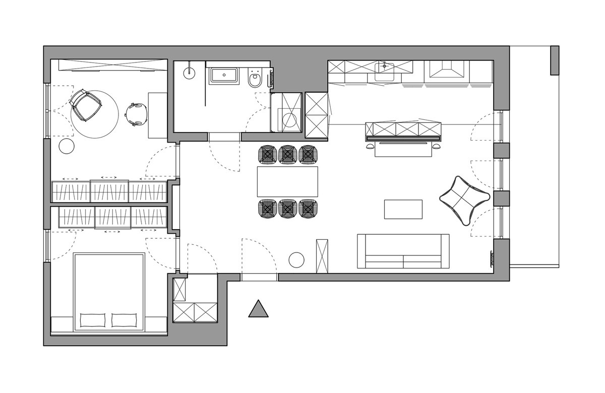
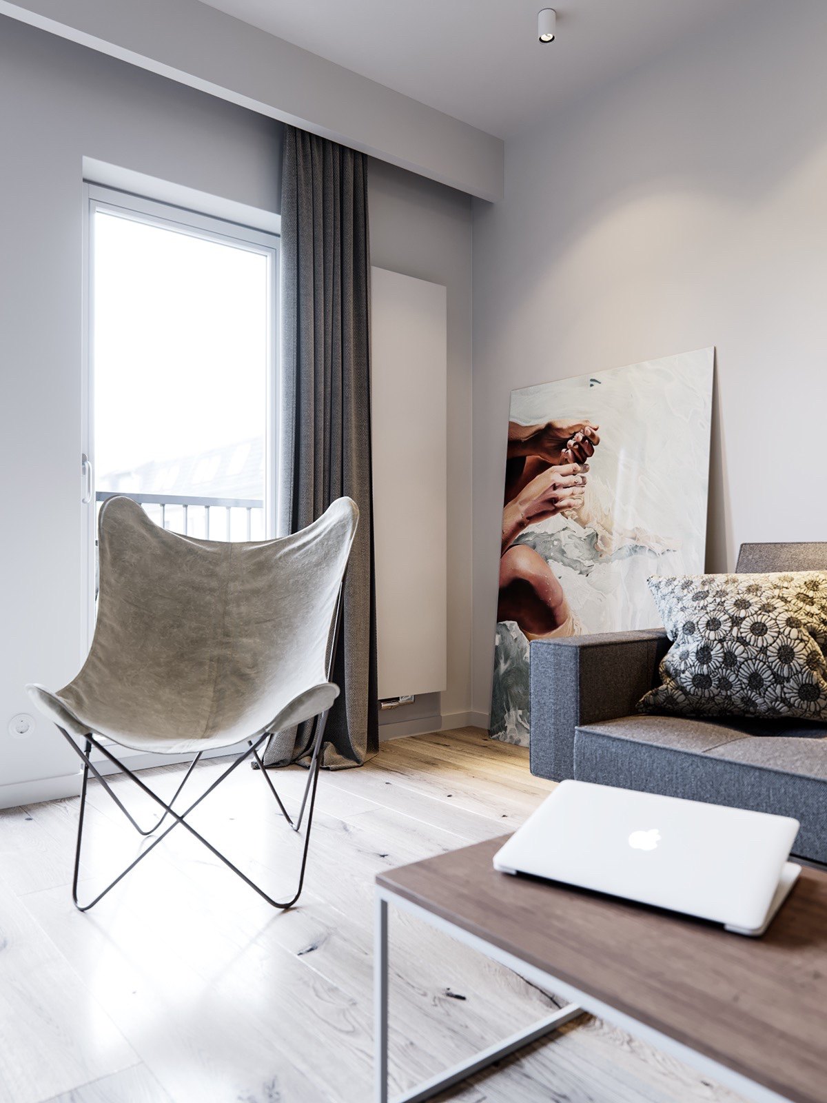
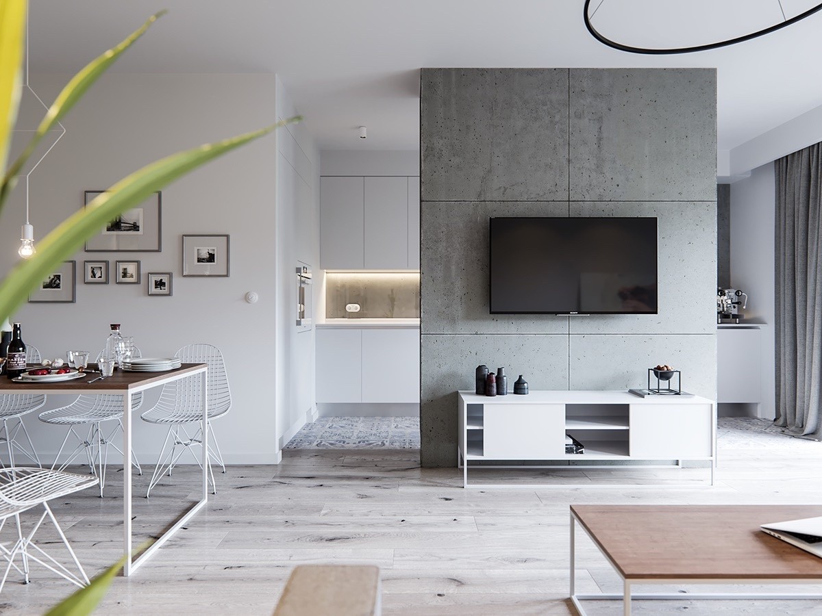
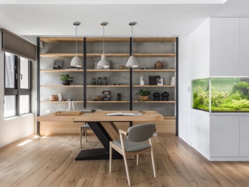
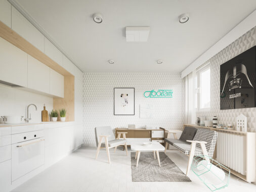
This smartly compact apartment features a bright semi-open plan layout with a single bedroom and an efficient library/office in their own private areas. The decor theme falls somewhere between industrial minimalism and contemporary chic, a mixture of natural and urban-inspired materials reaching a comfortable middle ground at the center of the two aesthetic influences.
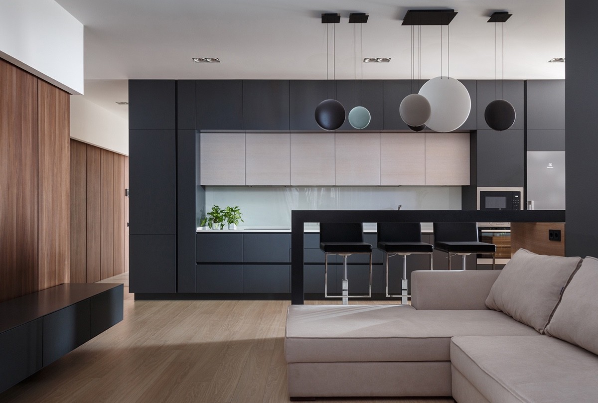
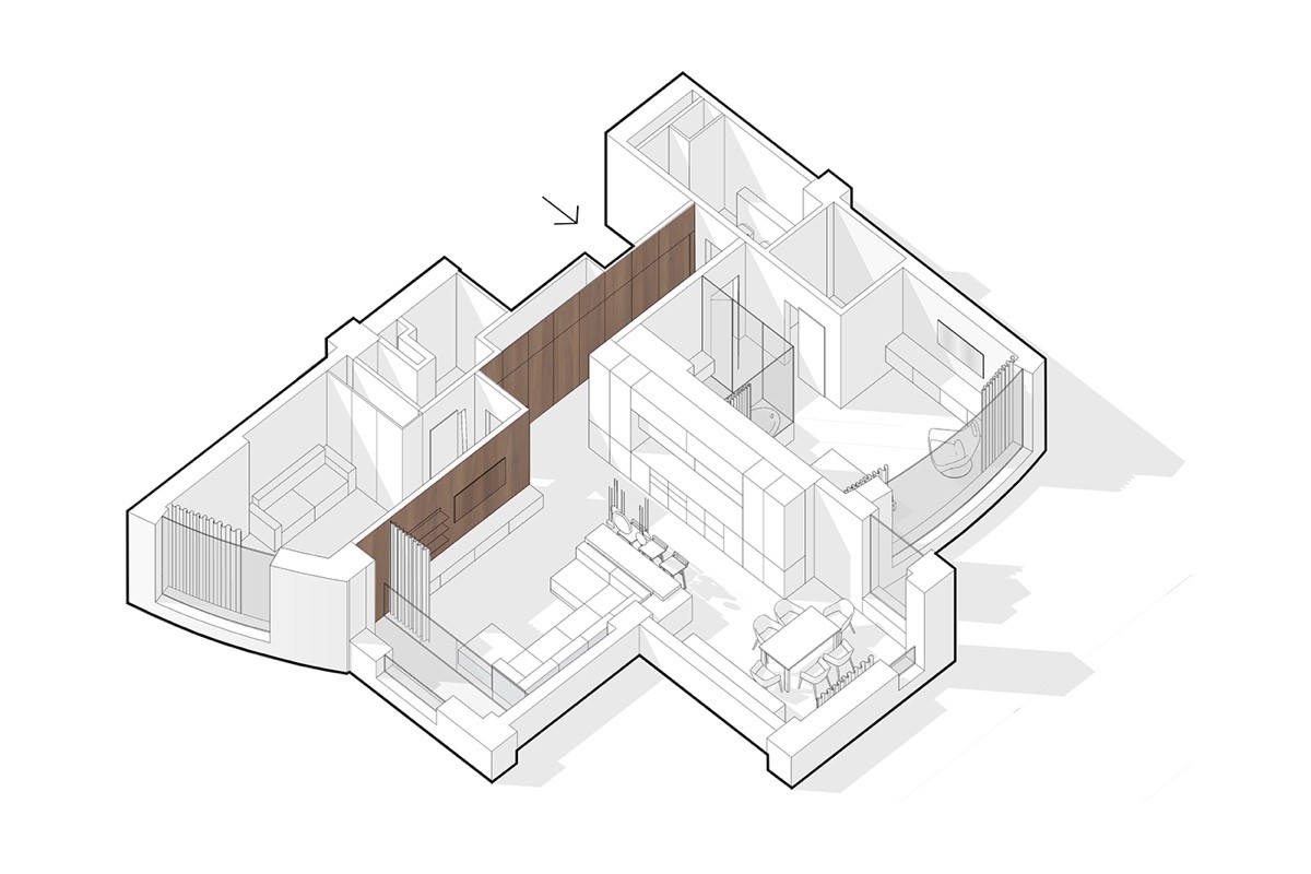
The second home is a 135 square meter space located in Odessa, Ukraine, appropriately titled The Moonway Apartment. The living space is based on an open-plan layout, its spacious floor plan allowing residents to stay engaged with guests while entertaining. Its palette makes creative use of rich colors including darker tones like charcoal and deep gray, a theme meant to invoke a sense of relaxation and comfort even in the midst of busy city life.
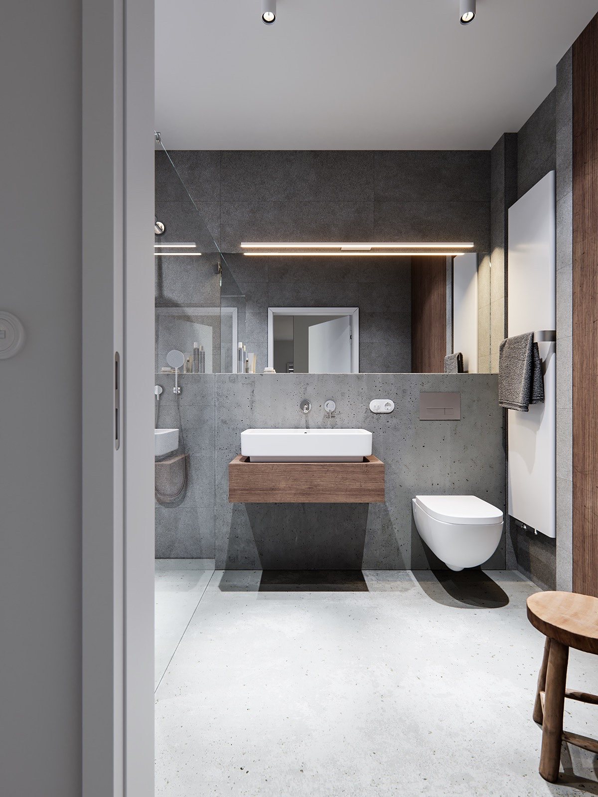
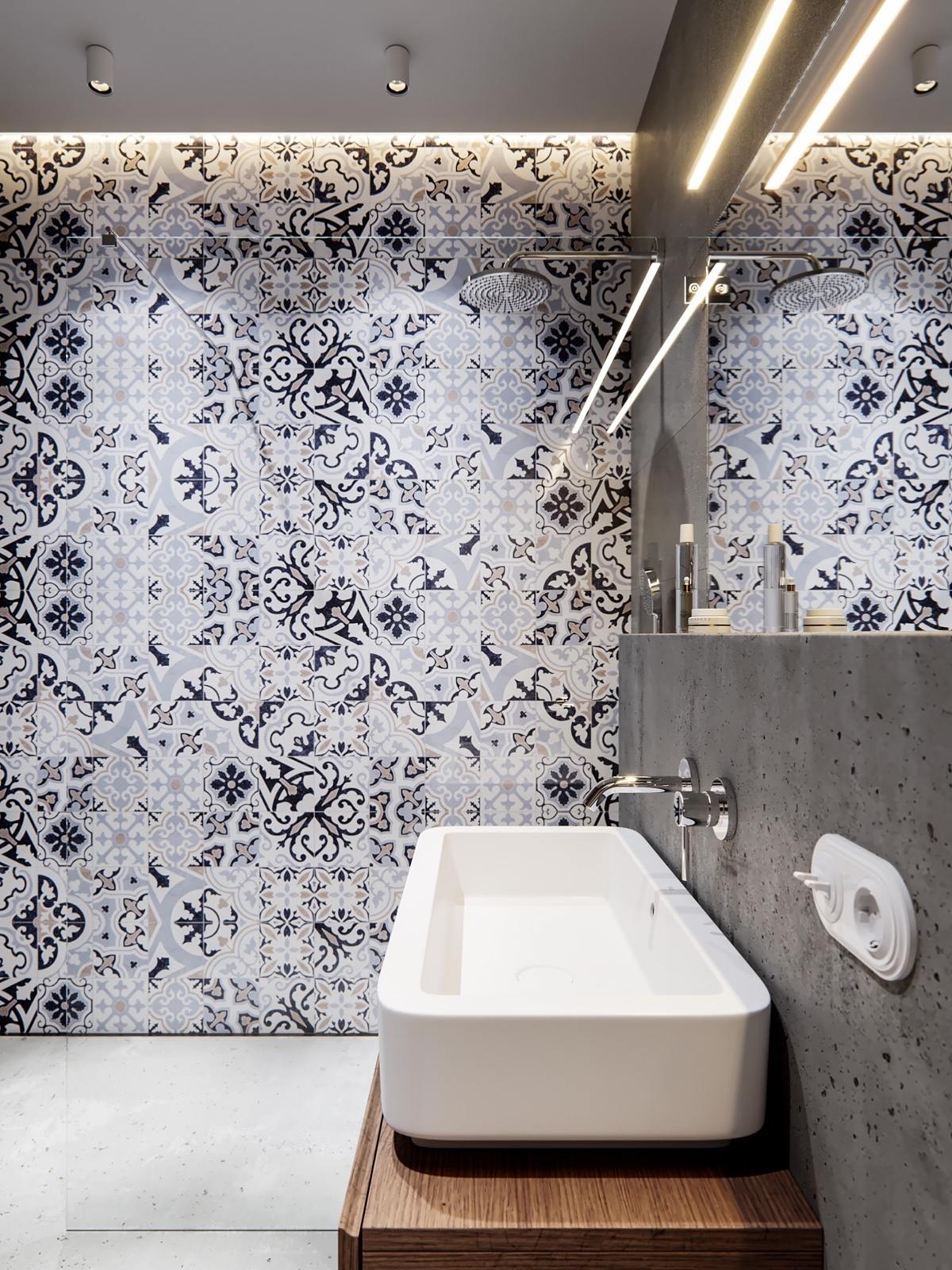
Besides the shower wall, the rest of the bathroom lacks obvious decoration, allowing the beauty of the materials to claim more influence on the theme.
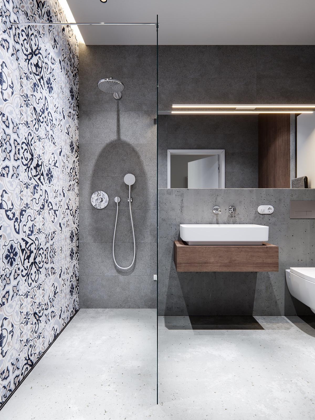
These tiles have the same classic feel as the ones in the kitchen, but these feature a daring mismatched pattern that helps bring them up to-to-date.
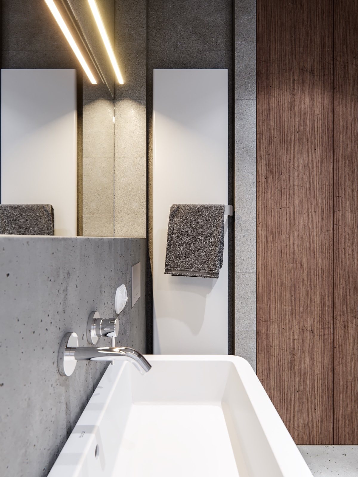
Now let's take a peek at the bathroom! It follows the same natural-meets-industrial material theme as the rest of the home.
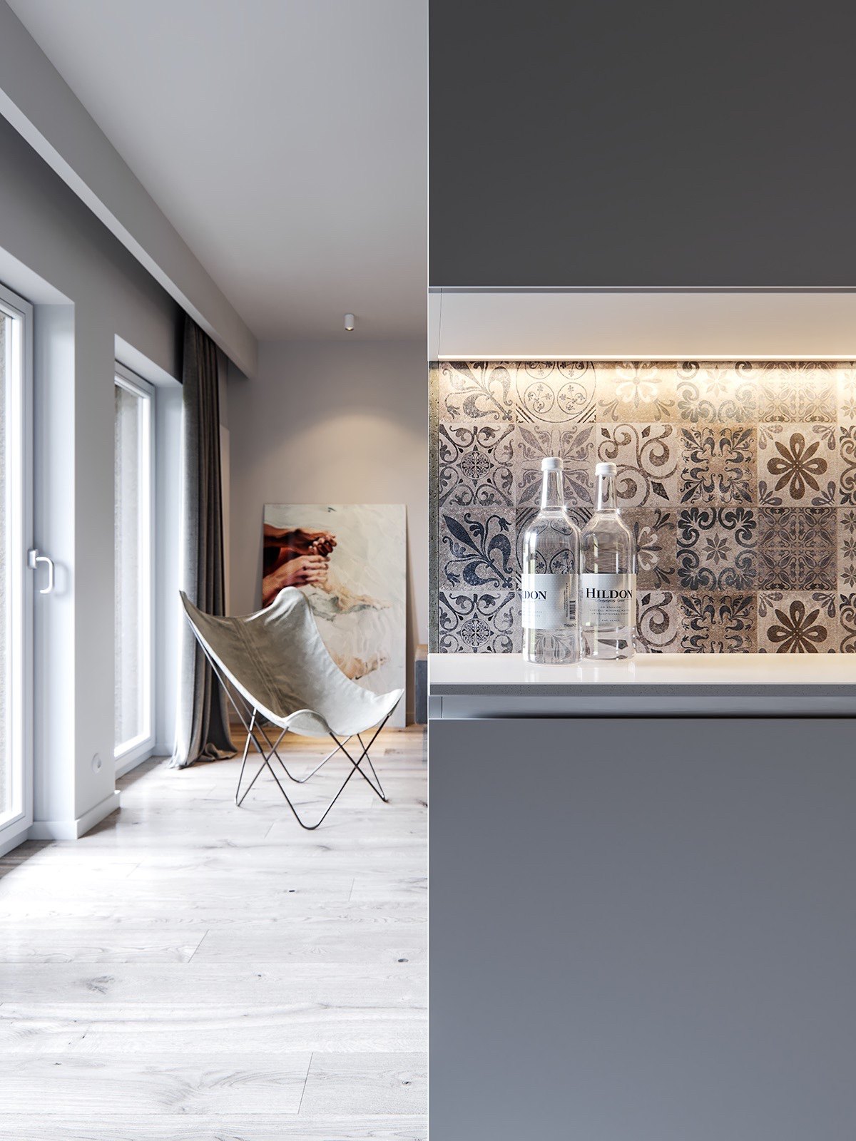
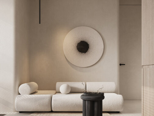
The differences between the living room and the kitchen are clear. While one focuses on subtle artwork and a clean texture palette, the kitchen makes a bold impression with rustic patterned tiles.
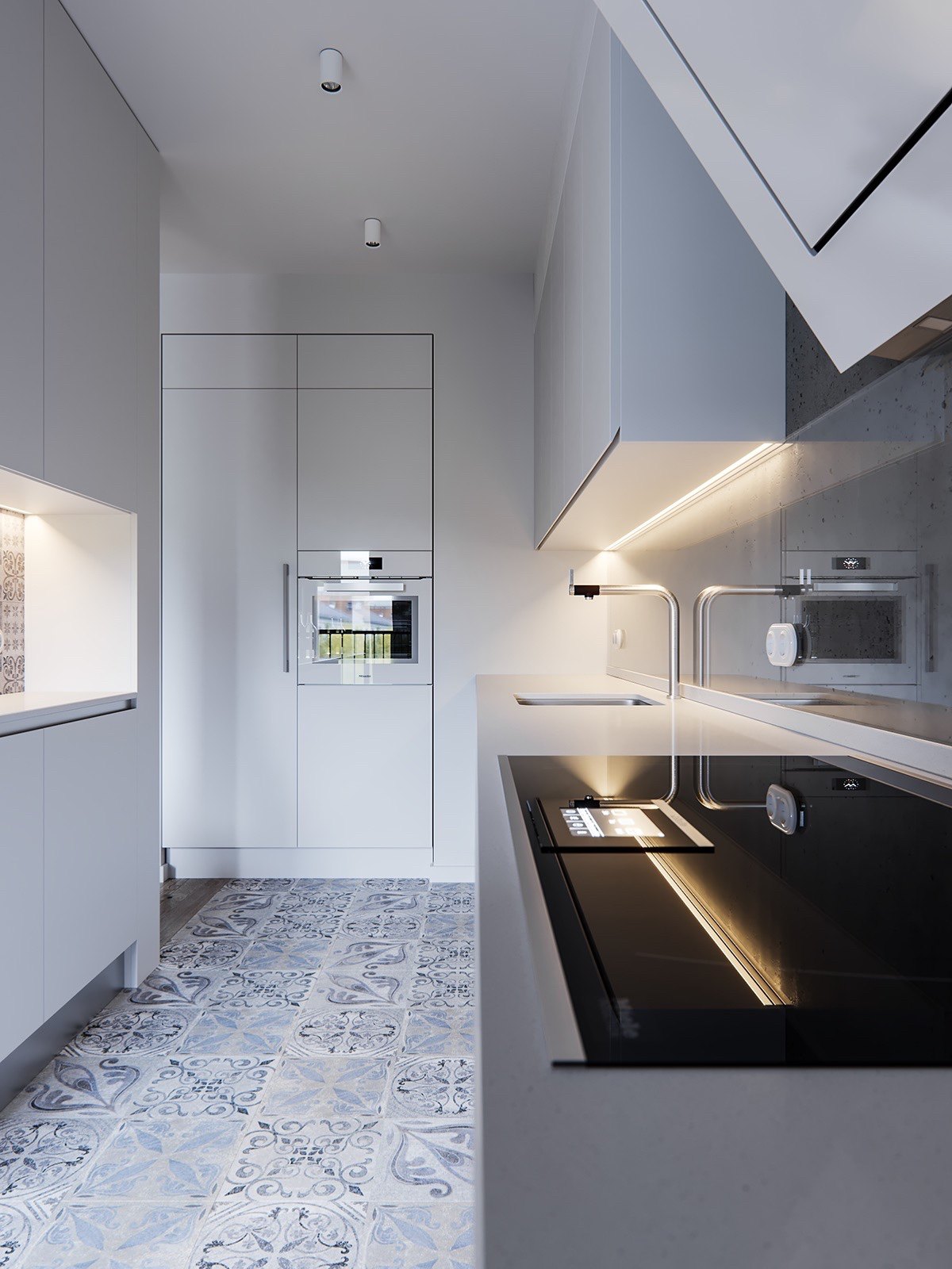
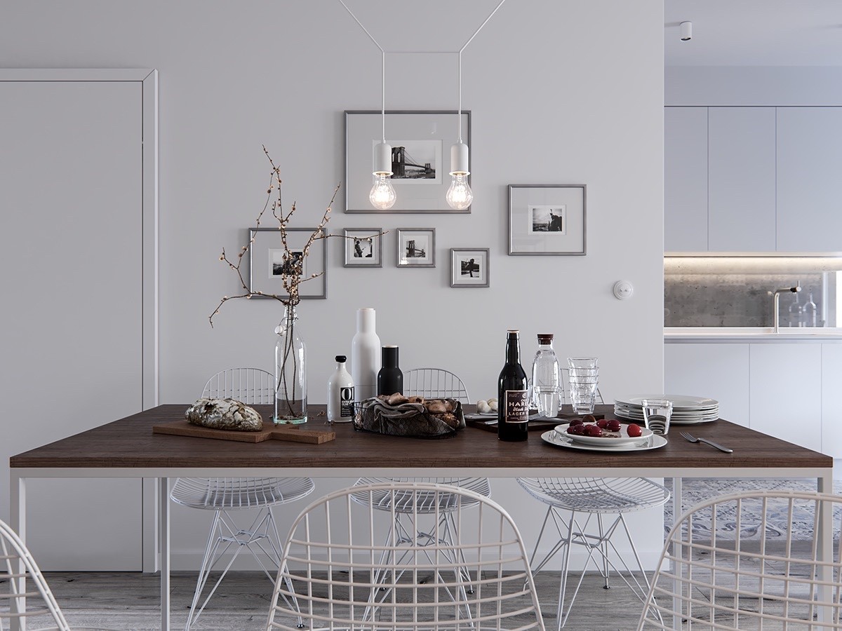
In the kitchen, clean minimalism and distinctive patterns collide. The intermediary wall prevents the patterns from overwhelming the living room's distinctive aesthetic.
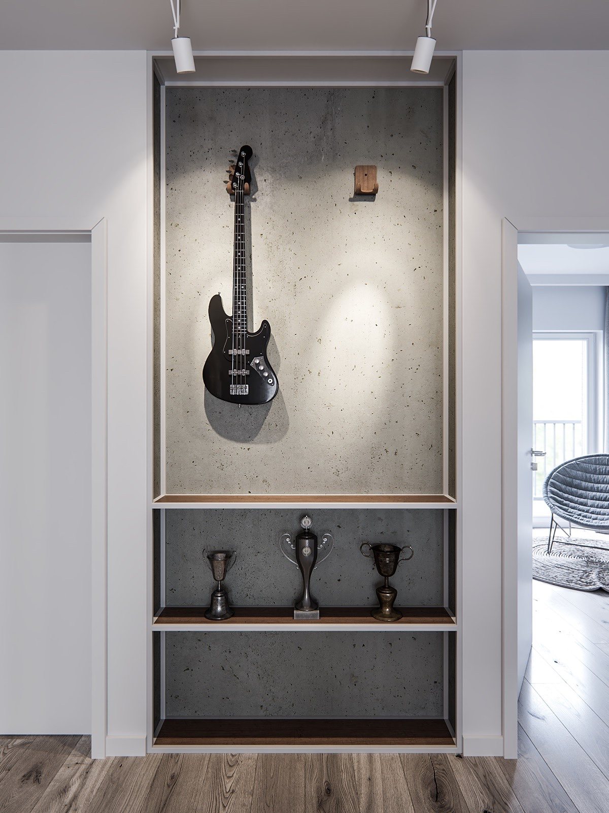
Rather than hiding away the musical instruments in some closet, this home utilizes a striking display technique with an understated concrete backdrop.
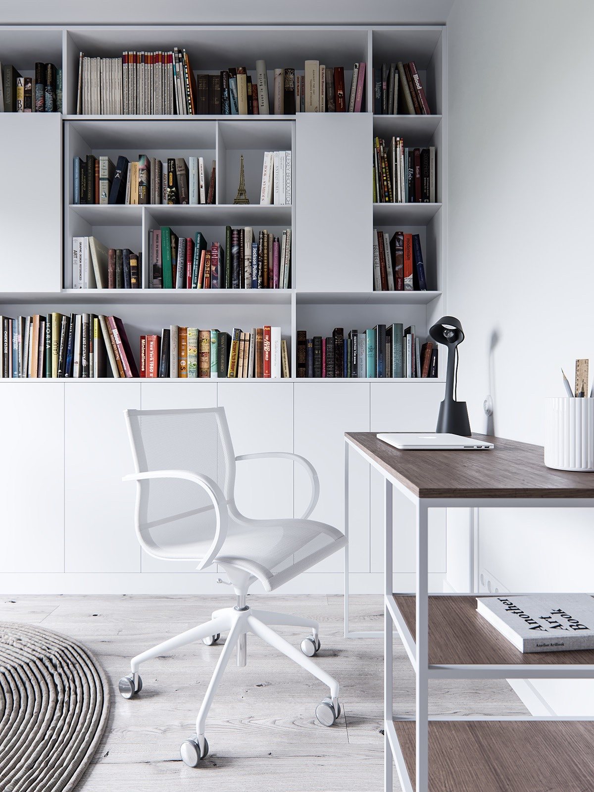
White minimal decor fosters an environment where the resident can avoid distraction and maximize creativity – it's like a blank canvas, dotted with books for inspiration.
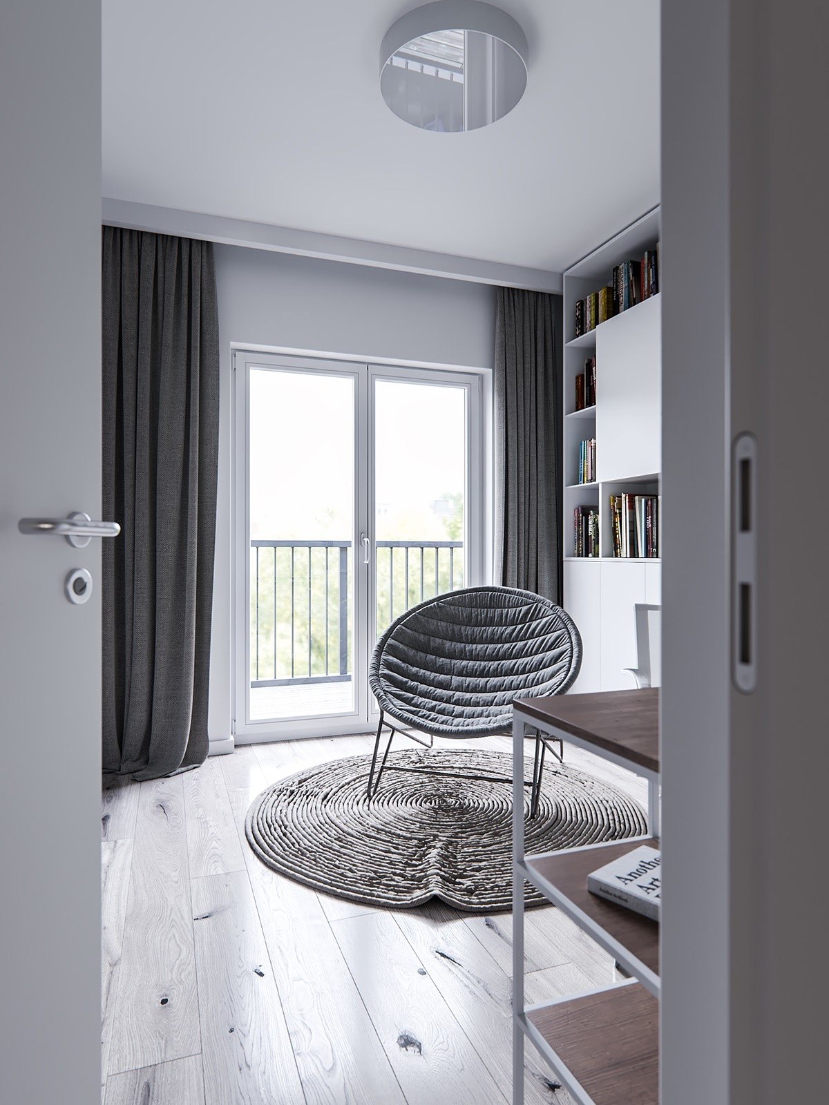
Upstairs, a lovely study houses the main library along with a comfortable spot to sit and read by sunlight. On nice days, the swinging doors to the balcony help circulate fresh air.
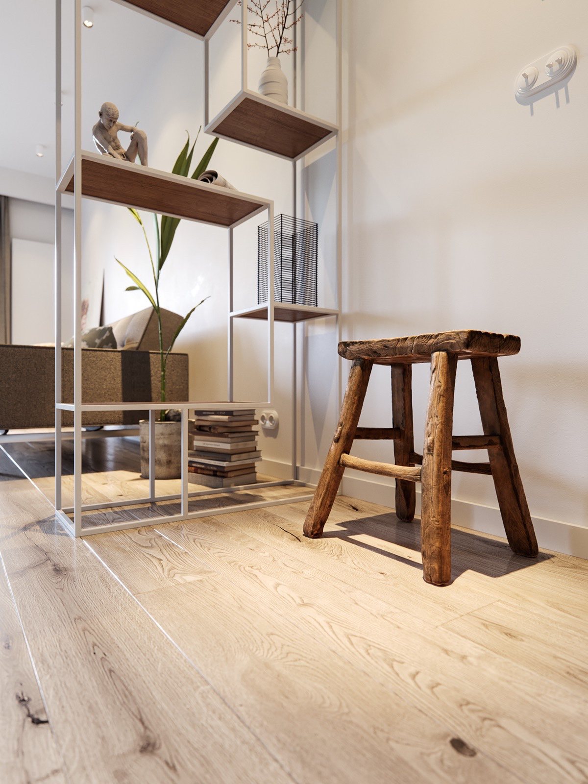
Spacious shelves help separate the living room from the entrance area, where a lovely rustic stool stands waiting to accommodate the residents as they take off their shoes.

