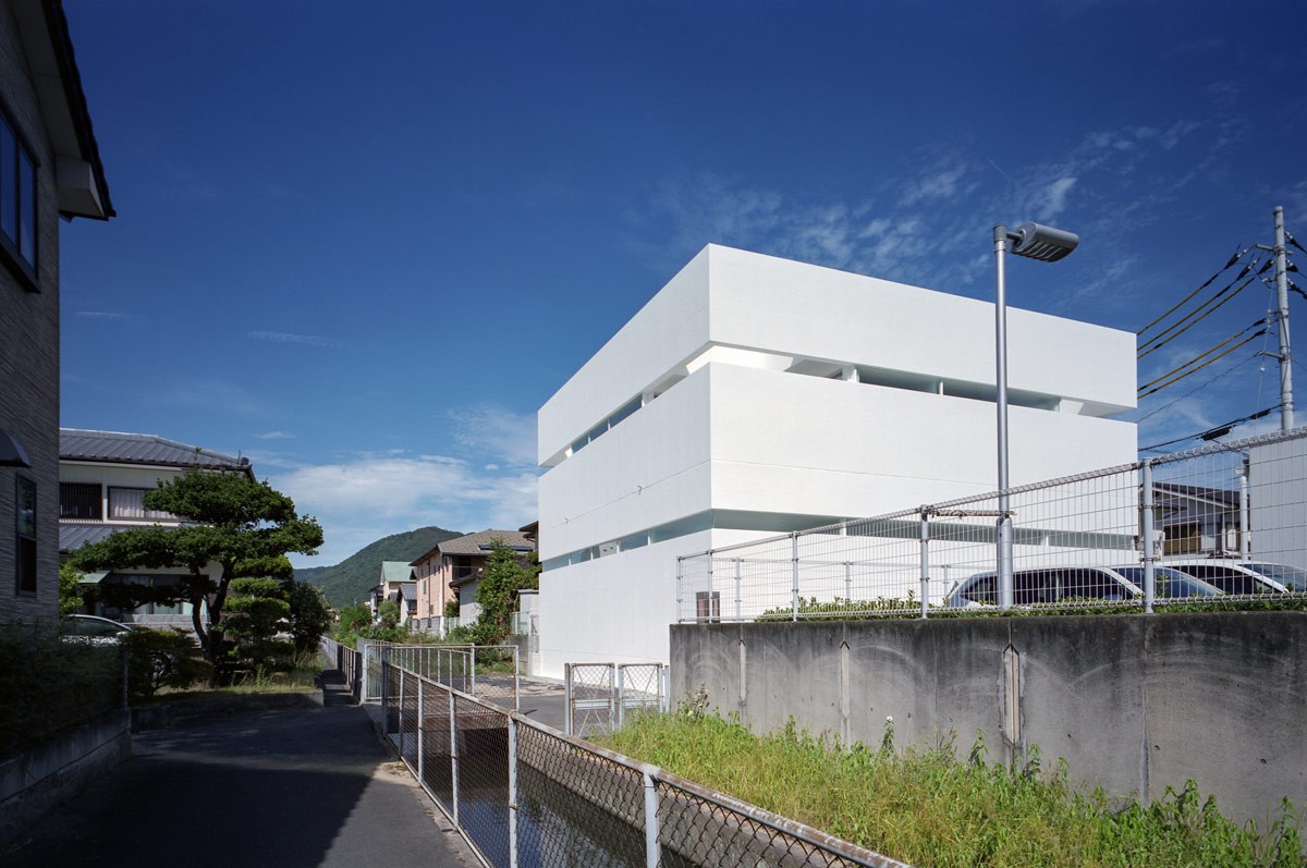
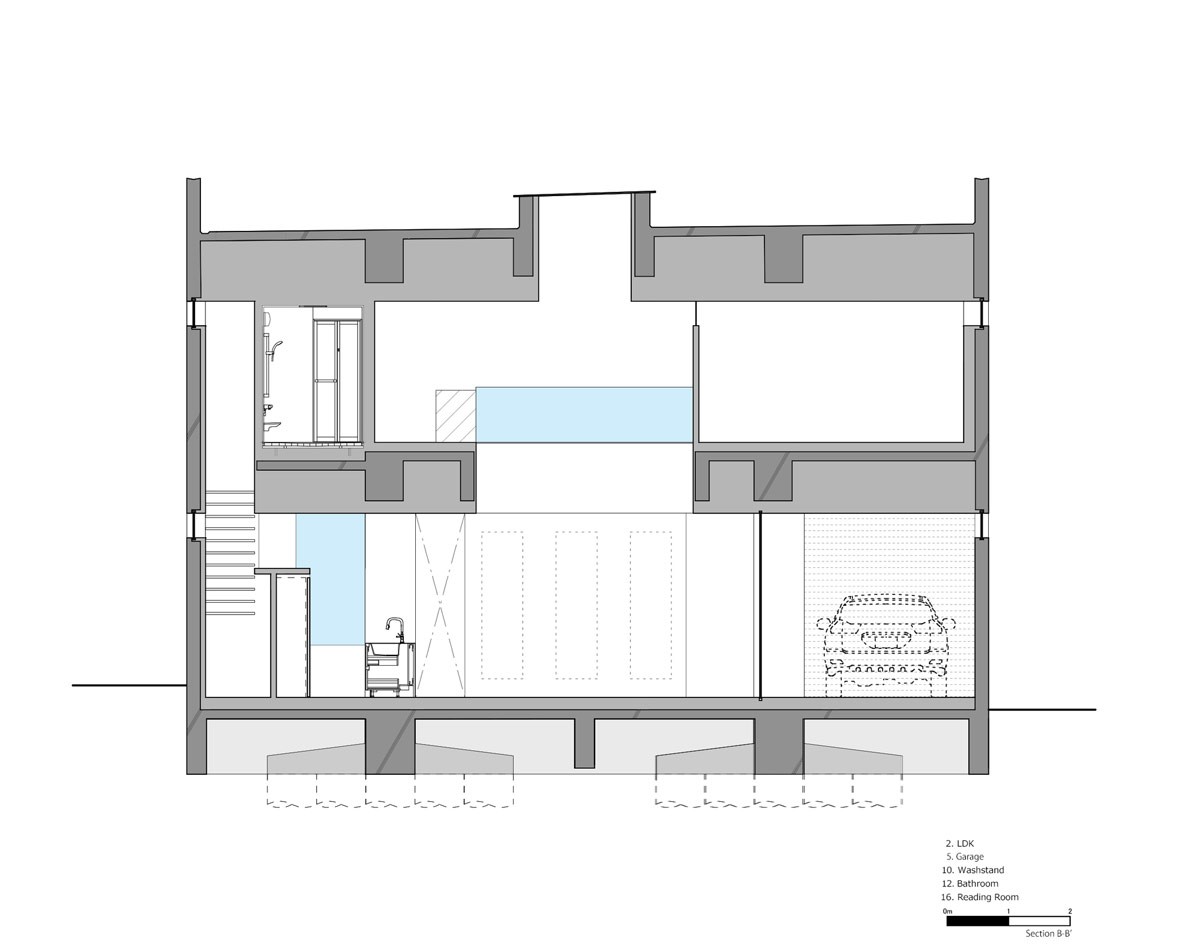
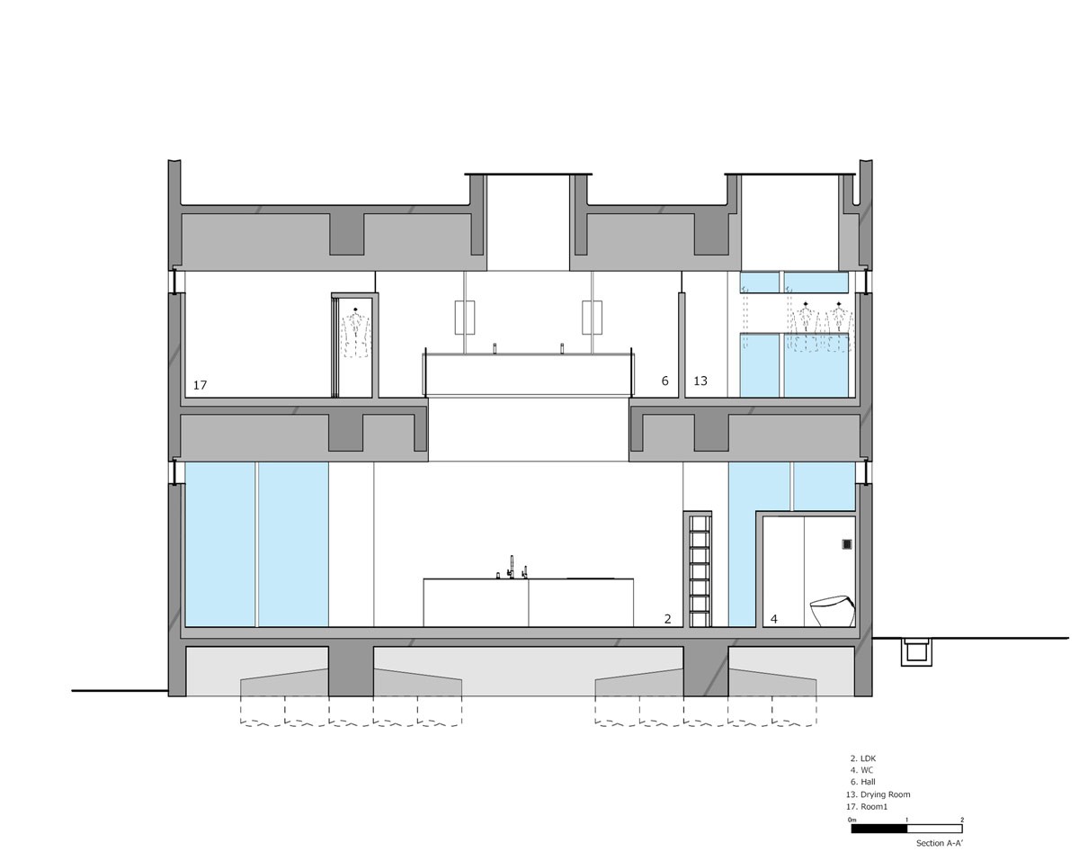
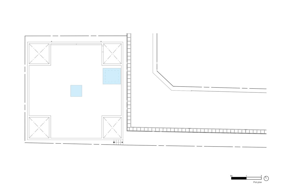
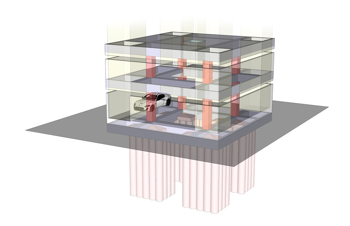
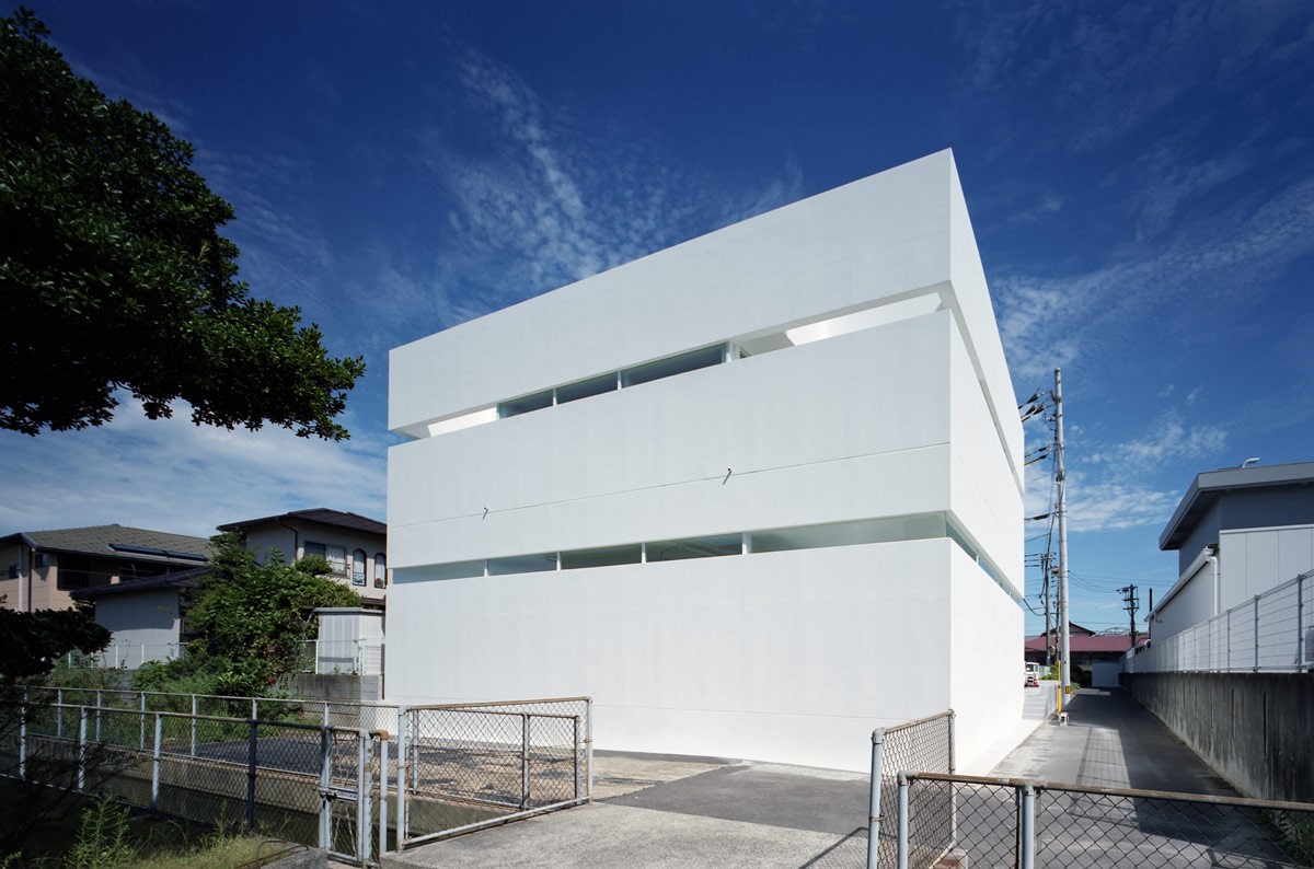
We have seen houses that showcase Ferraris and Lamborghinis. In fact, we have seen some luxury apartments do so as well. This particular 131.68 square metre car lover's house has been created by Fujiwaramuro Architects in central Takamatsu, Japan, as a reinforced concrete haven to a stunning Maserati. The brief was that the house should occupy as much of the lot as possible, have an integrated garage to display their prized car, and ensure privacy for the homeowner couple and their child. The architecture features cantilevers that extend horizontally from just four structural pillars, an arrangement that allows the interior of the home to remain open and simple.
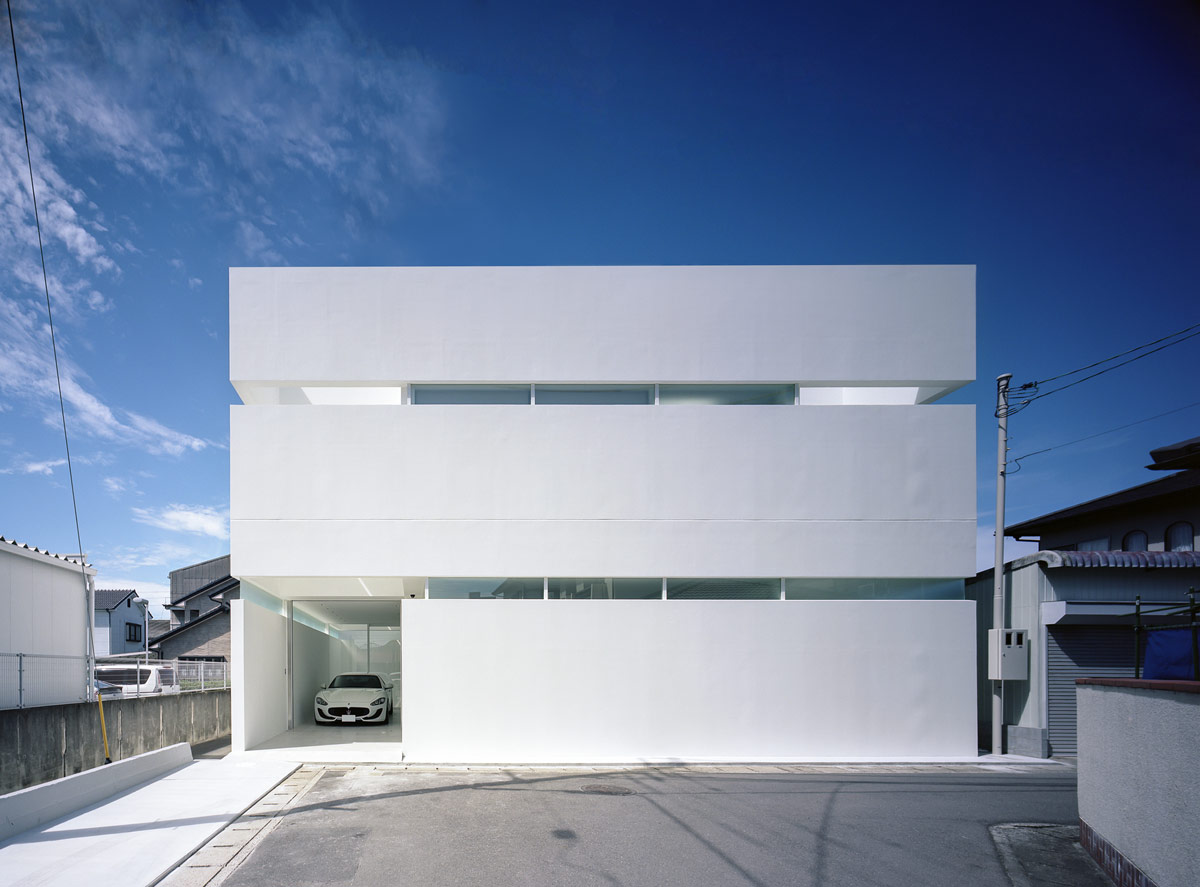
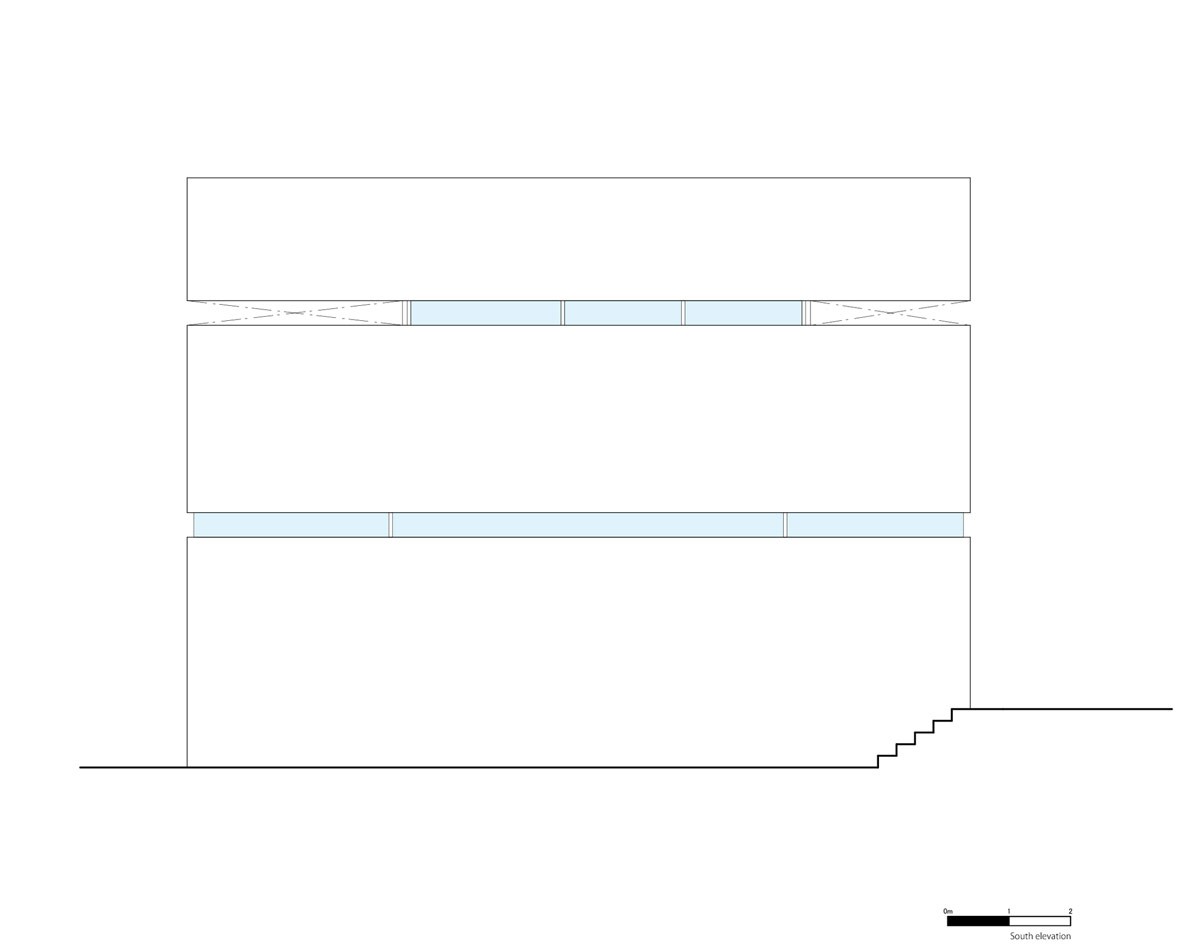
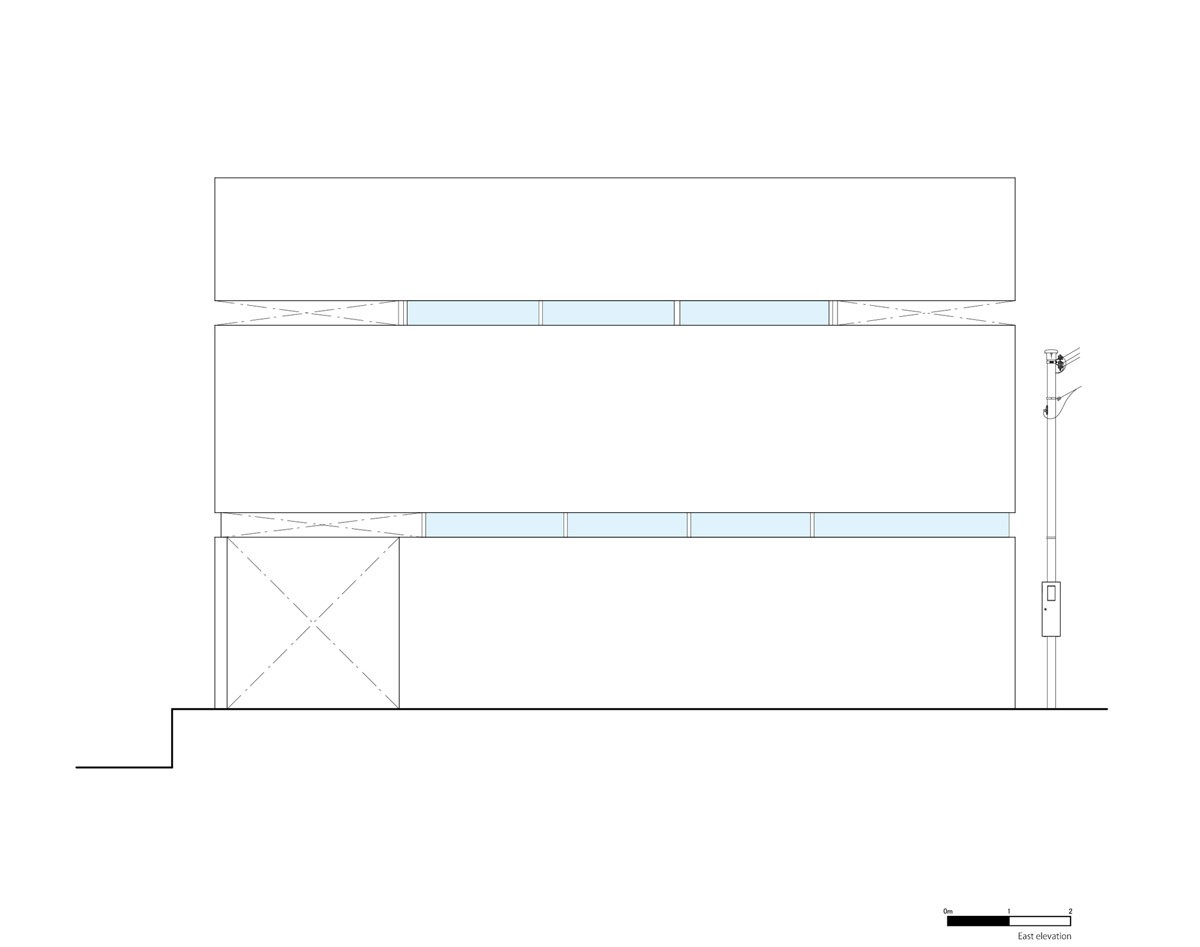
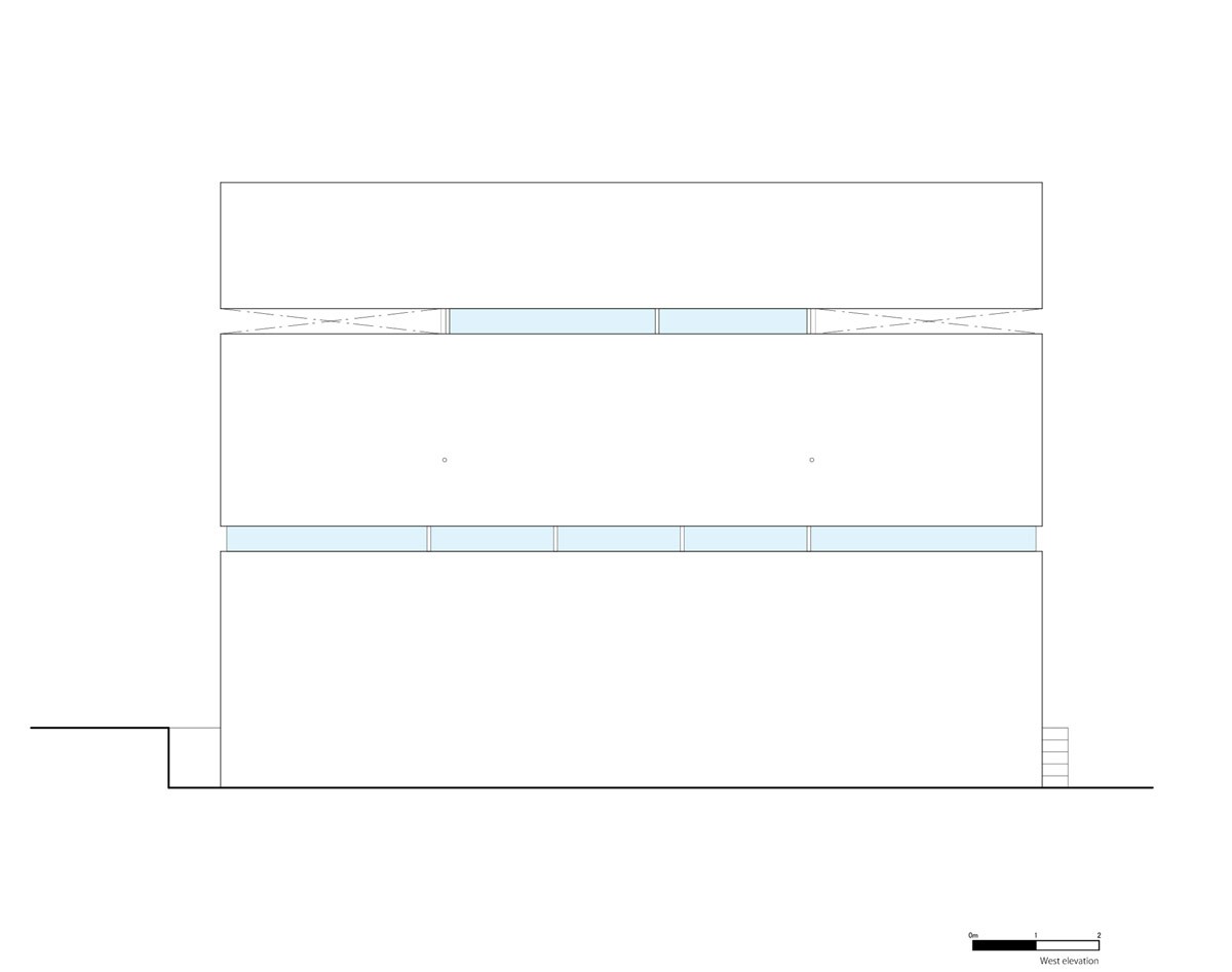
The white modern facade of the home is split into layers, with slit windows crossing the full width of each floor. The continuous lengths of glass is made possible by the building’s four column structure, and the cantilevers that extend horizontally from them to support the first and second story floors, walls, and the roof.
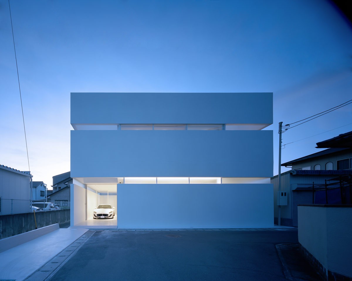
The clerestory windows admit light around 360 degrees of the home, without losing privacy. At night, from the street, the thin windows are seen to glow intriguingly between the solid floors.
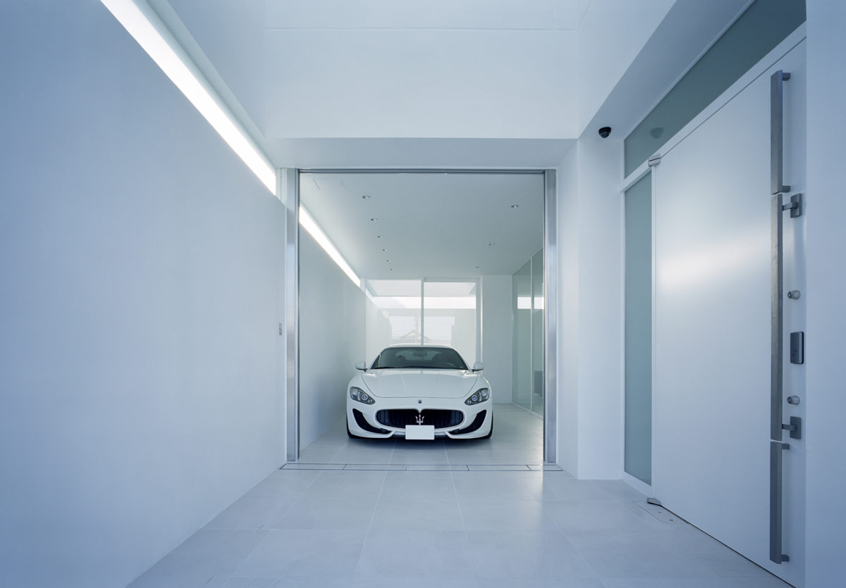
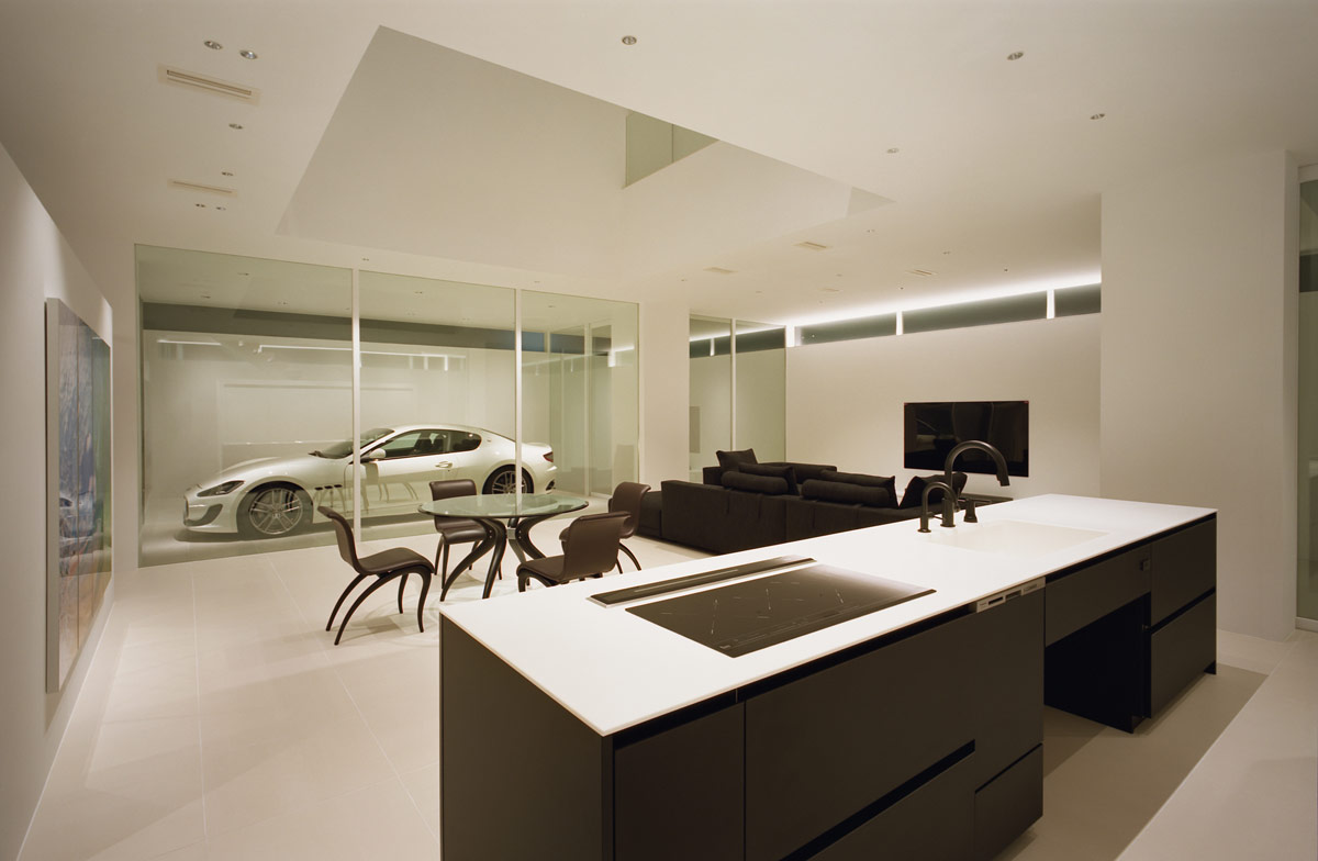
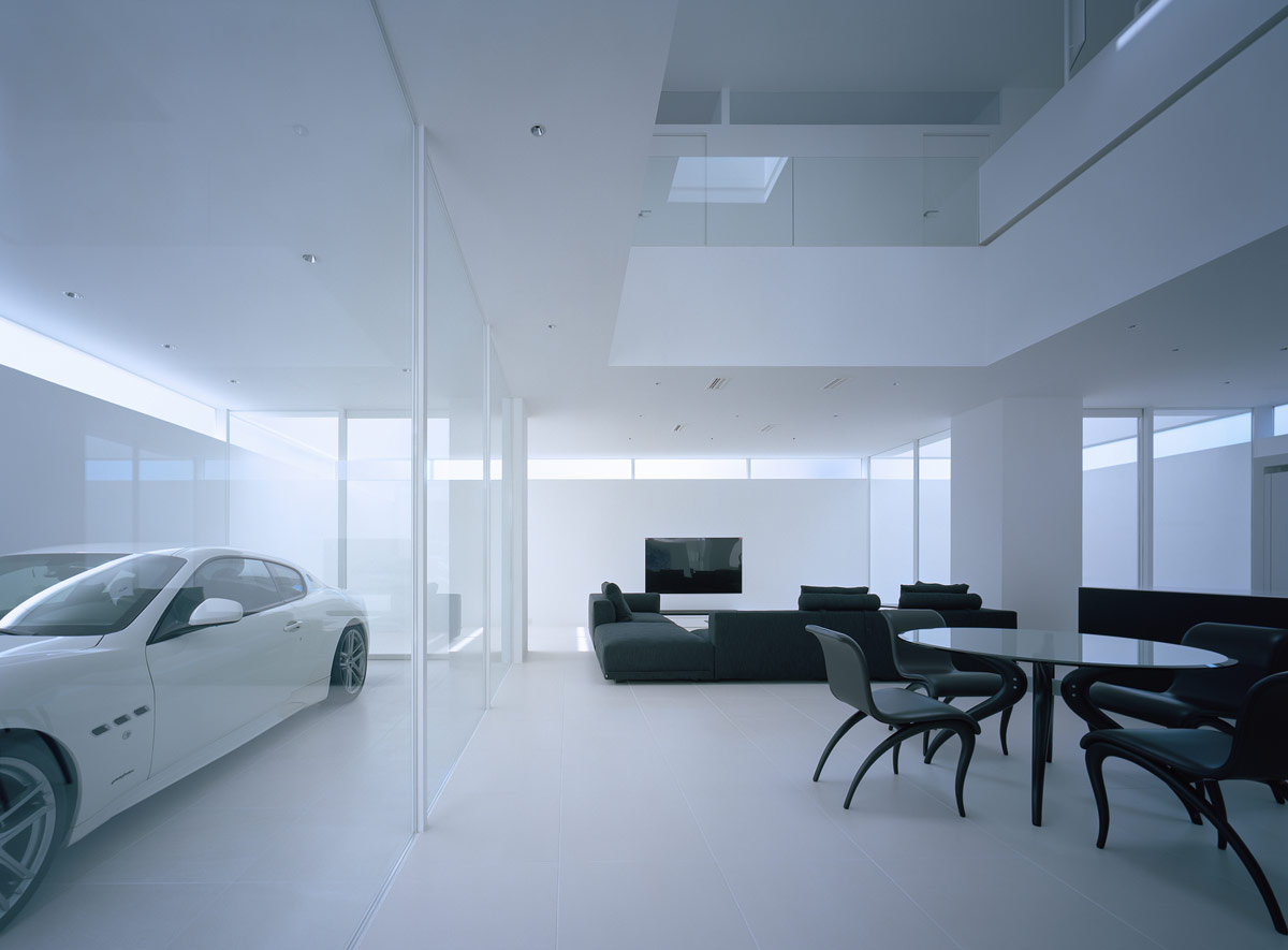
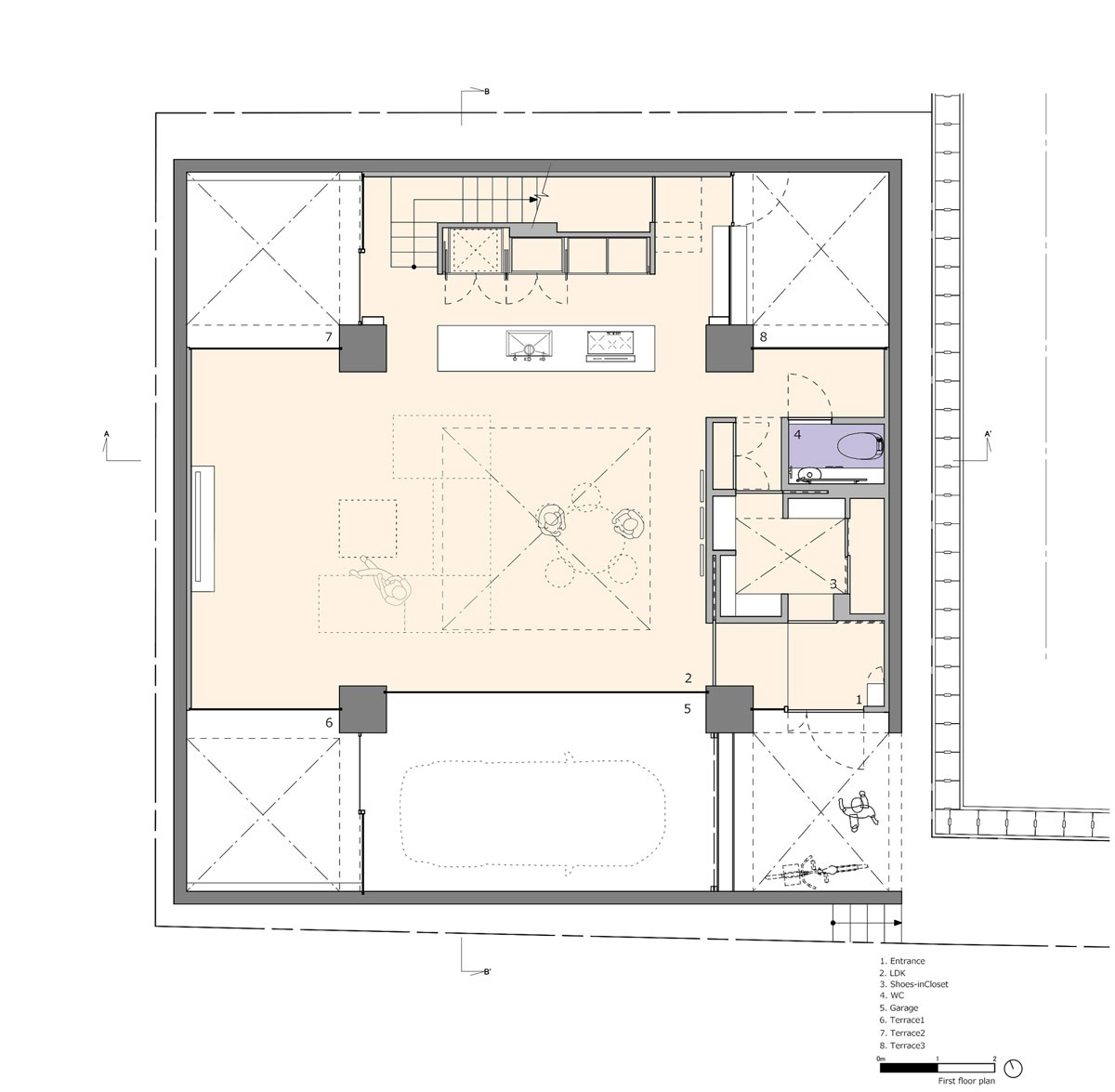
The integrated garage is decorated in the same crisp white decor as the rest of the rest of the home interior, to allow it to merge smoothly with the living room via a glass wall. A large solid door gives entry into the home.
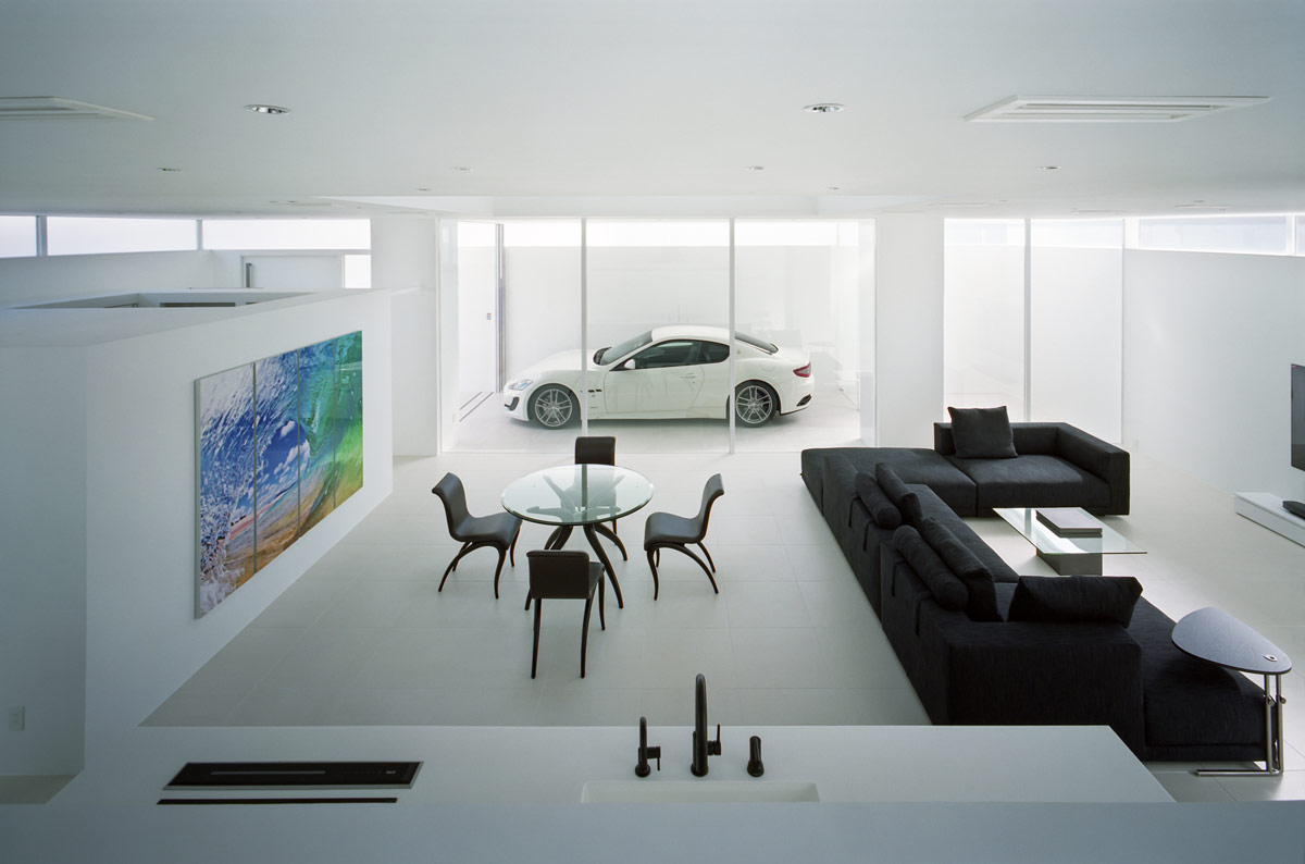
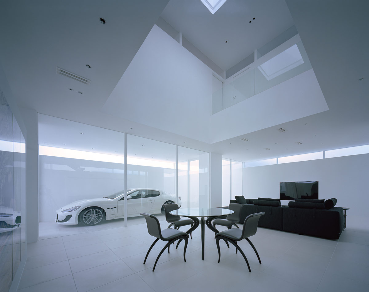
The glass car garage acts as a display case for the owners beloved Maserati, putting it in pride of place for all to see who enters this home. In place of a traditional interior, textured with wooden elements, floor rugs and multiple materials, the interior here is minimalist and monochrome like a car showroom. The only colour inside the simple living room dining room combo comes from a large piece of modern wall art, which swirls refreshing blue and green hues across a crisp gallery white wall. It adds a much needed element of nature to the stark monochromatic expanse.
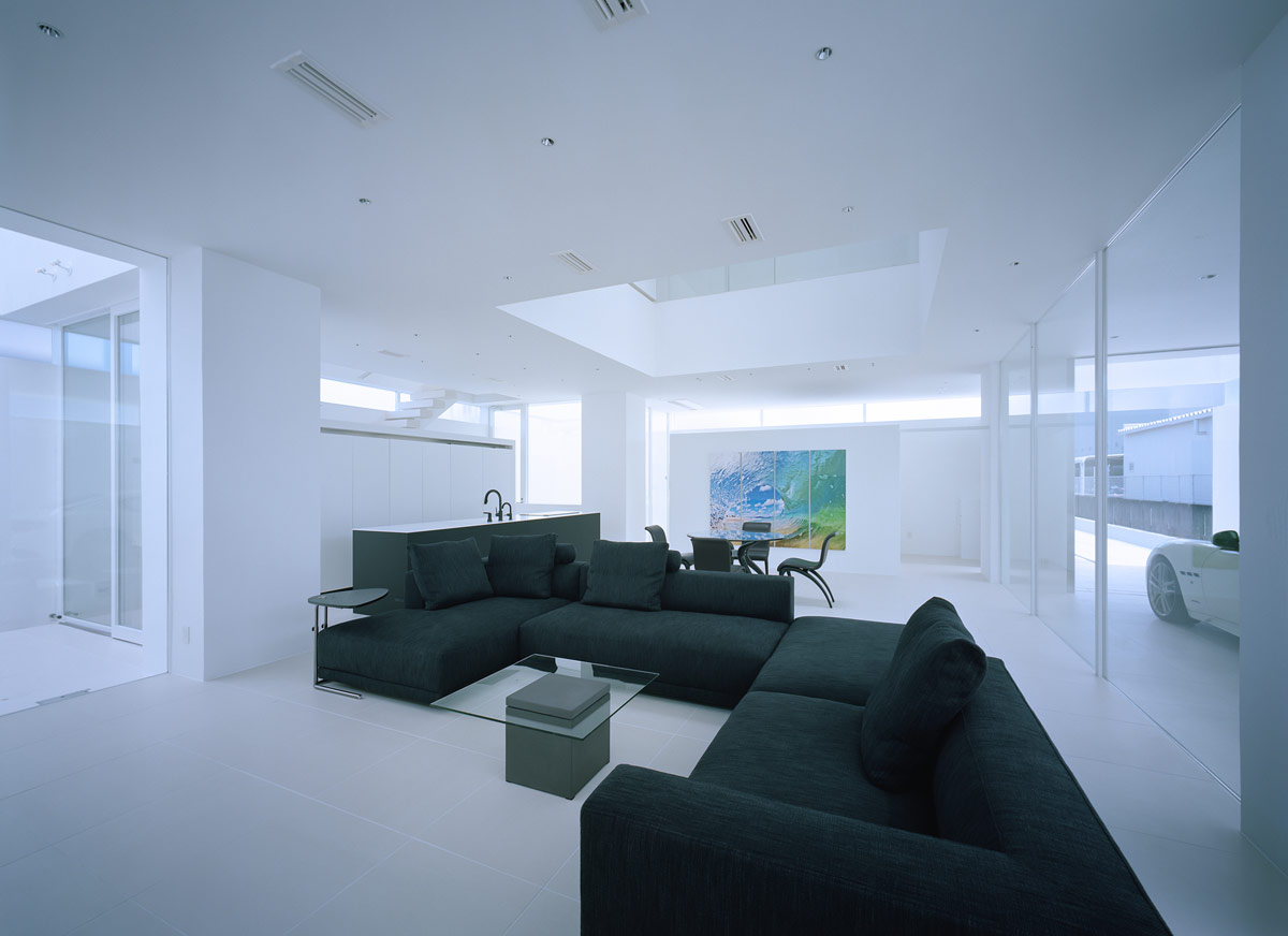
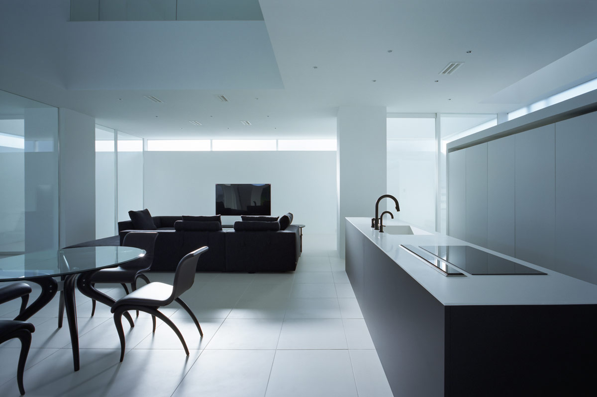
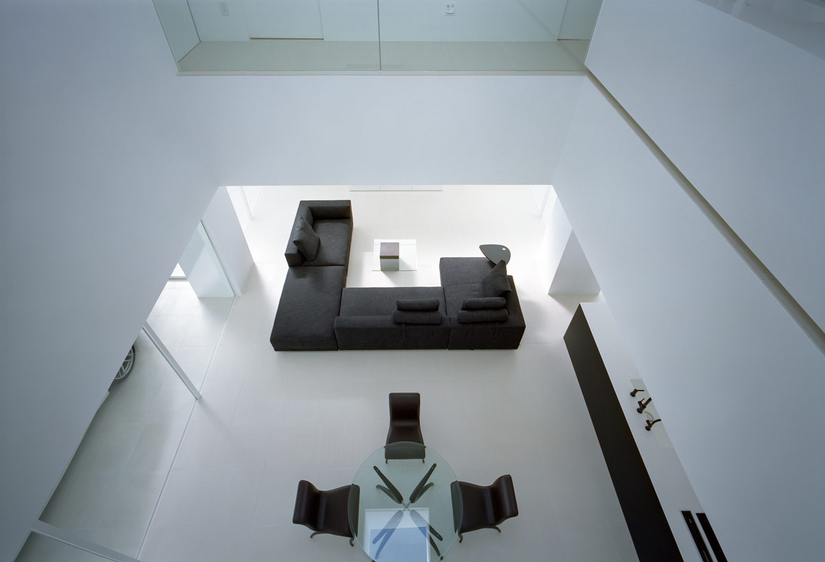
The architects on this project proposed that the living area be situated right in the center of the lot, so that the other spaces could unfold around it. A black modern sofa fills most of the minimalist living room, spread in a sociable three sided arrangement. The low sofa backs keep the space feeling open and integrated with the other zones in the open plan room.
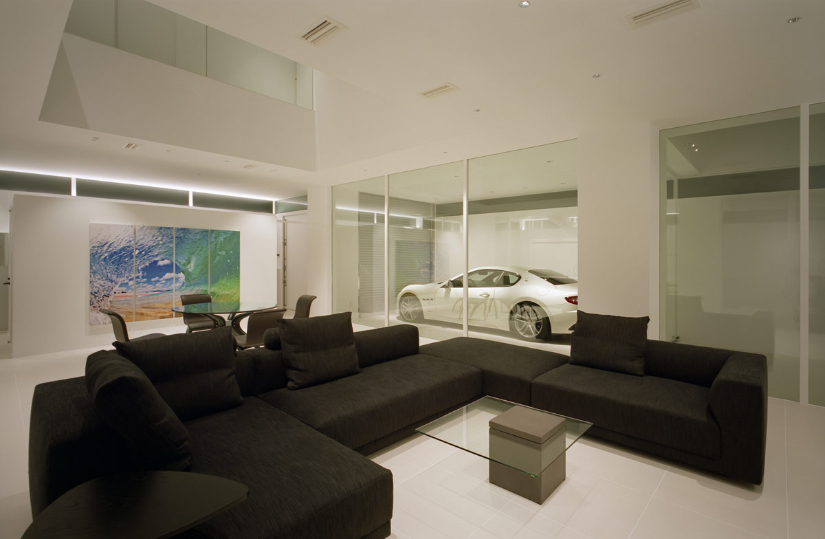
A glass coffee table completes the lounge set-up, it's simple rectangle top echoing the large windows of the car display. There are no decorative items on the coffee table, or anywhere else in the room. In this home, the very expensive family car is all the eye candy that the family requires!
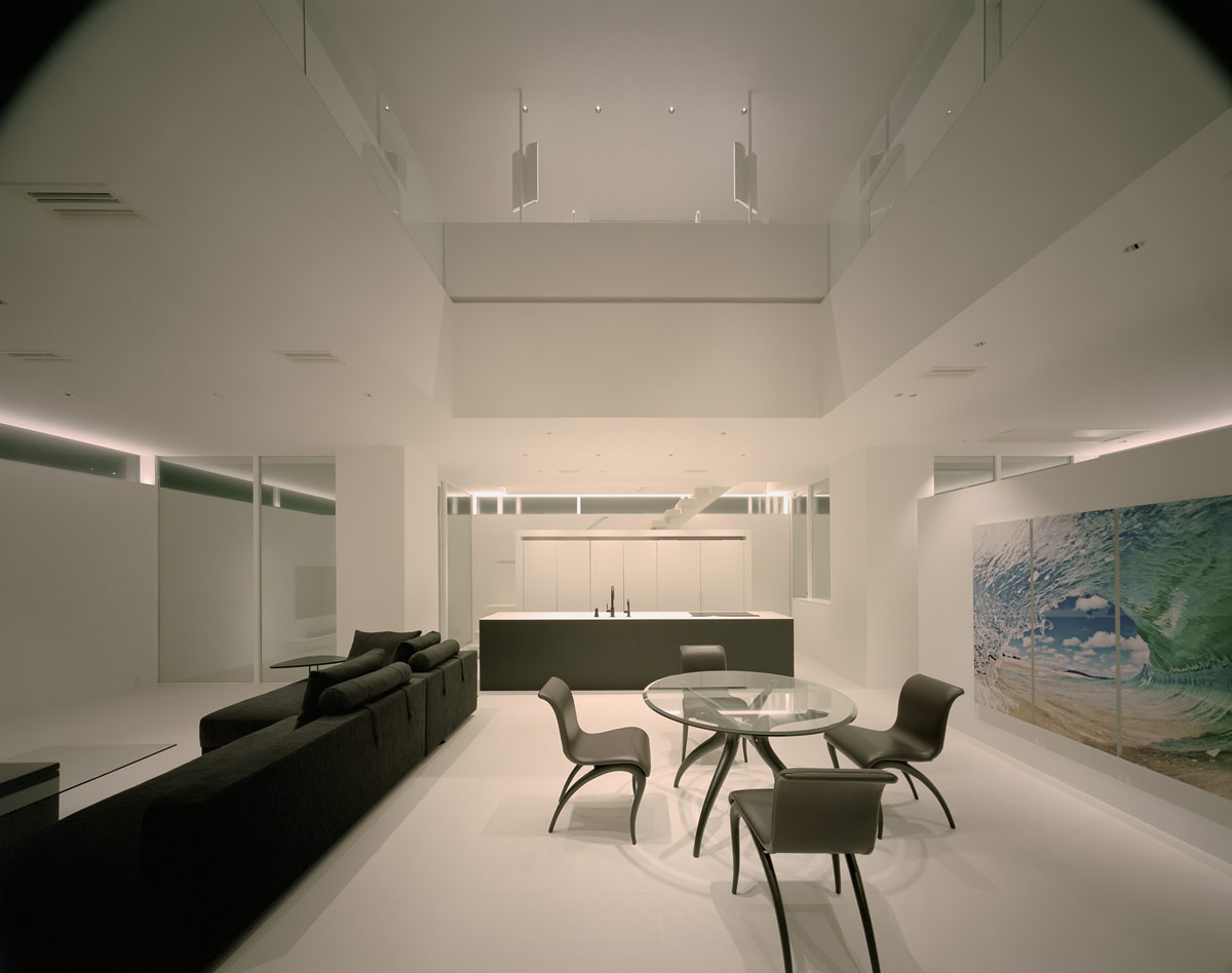
A four place modern dining set sits in a large expanse of floor space behind the sofa, just enough to comfortably seat mum, dad, junior, and a guest at dinner.
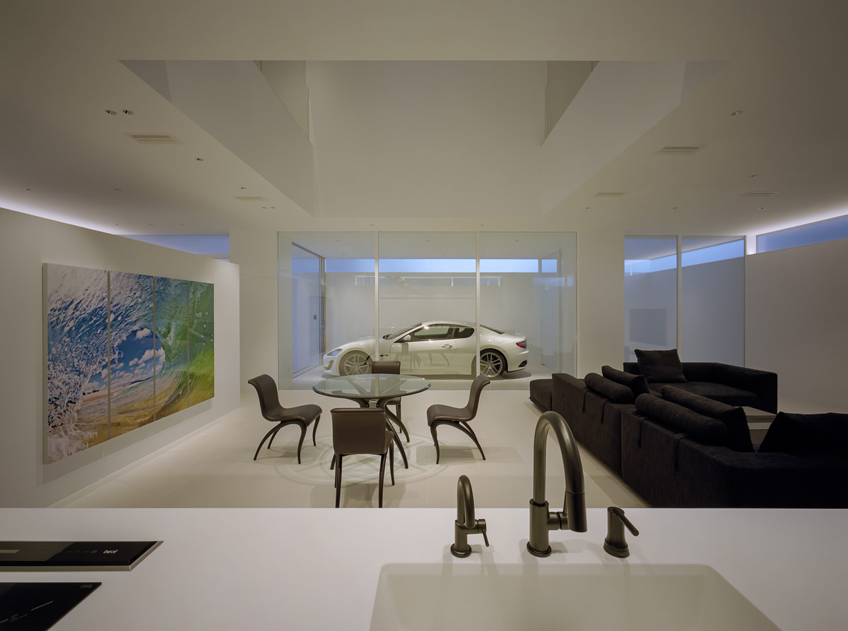
The round dining table continues the clear glass theme of the room. The reflective glassy elements help to bounce the light around the large room. Curvaceous table and chair legs seem to ripple from the aerodynamic car design standing behind them.
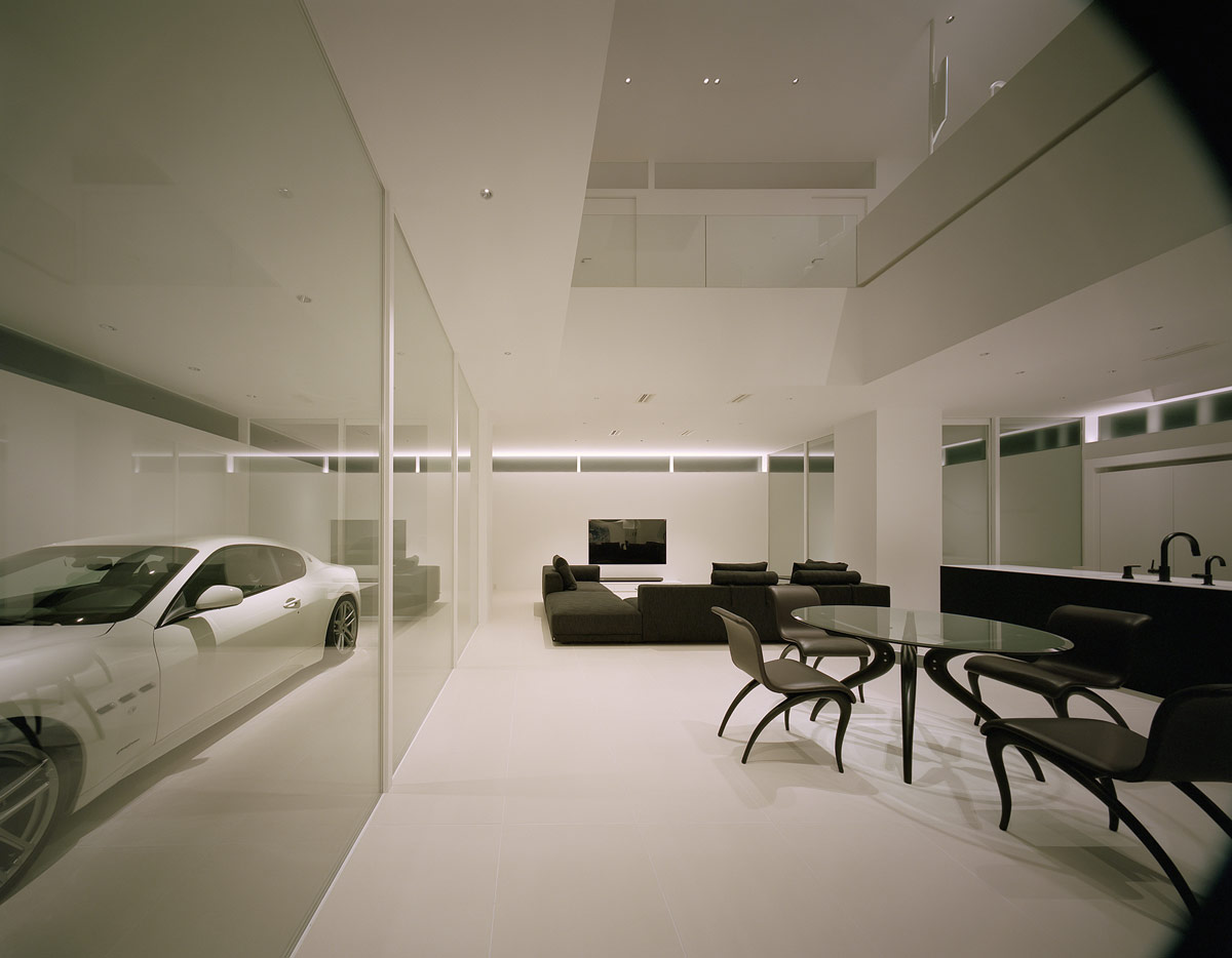
Four exterior walls fully enclose the property. There are voids located at each of the four corners of the interior, as well as one more in the very centre of the building. The central void can be seen here in the high ceiling of the main living room.
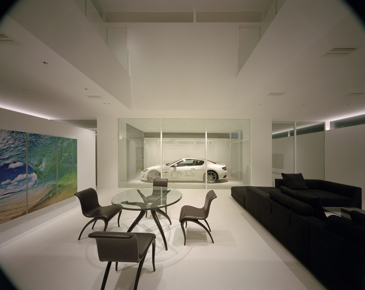
The five voids are designed to achieve uniform light in each part of the interior, as well as create an added sense of spaciousness.
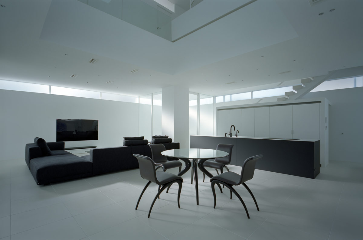
The kitchen and lounge wing the black and white dining room, so that family members can see each other from all areas.
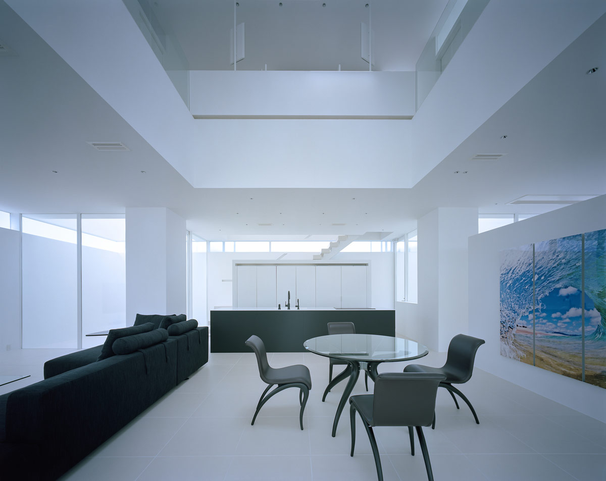
From this angle we can see how the corner voids create a feeling of connection to the outside world beside the kitchen, even though there is complete privacy.
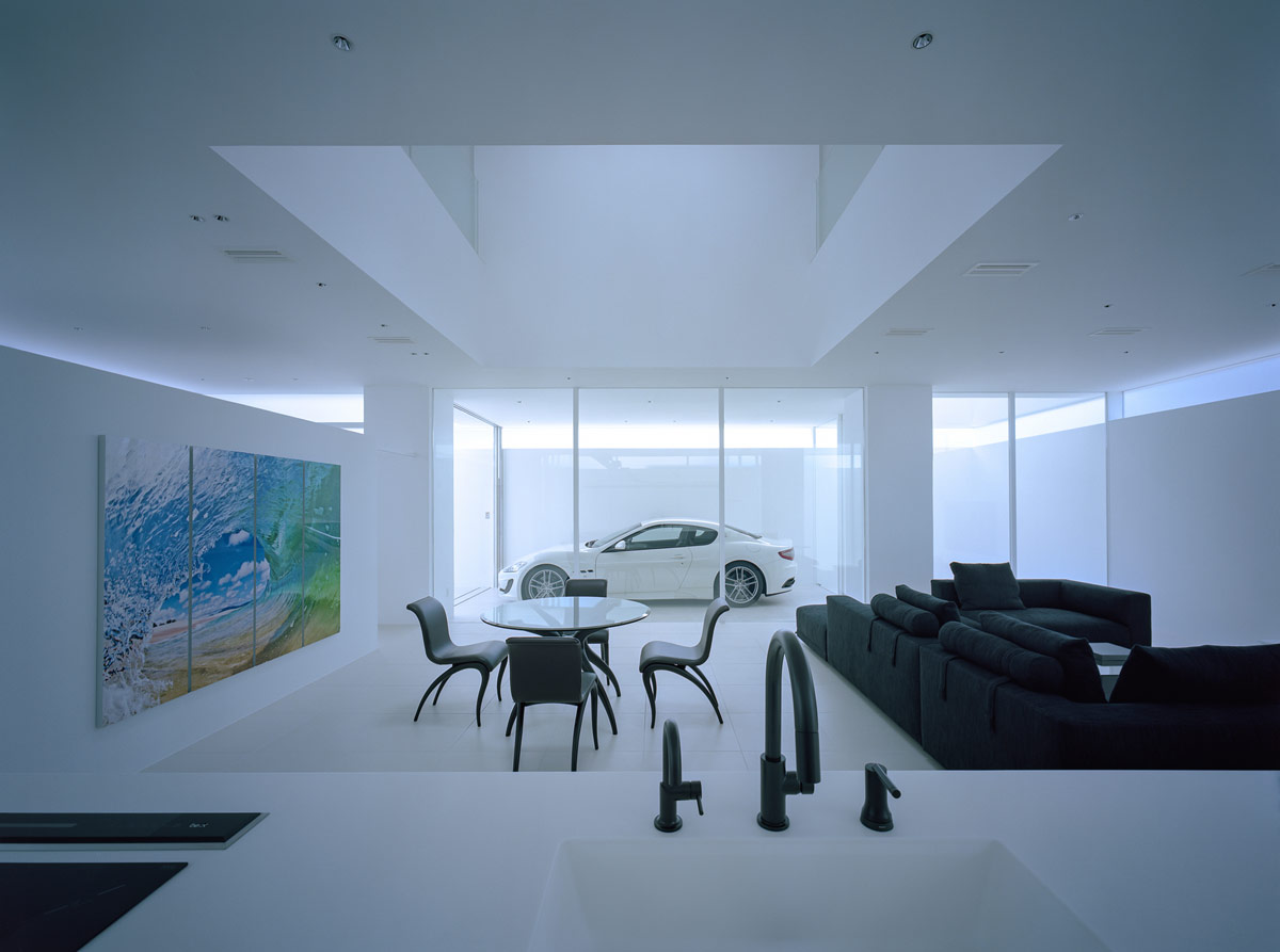
The four structural pillars barely encroach on the interior layout at all, they simply blend with the white decor.
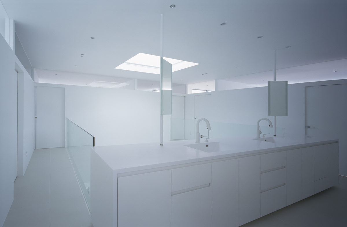
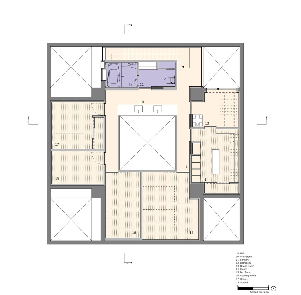
On the upper floor of the home, there is a huge white vanity area right on the central landing. Vanity units, bathroom sinks, faucets and vanity mirrors are bleached out in solid white finishes.
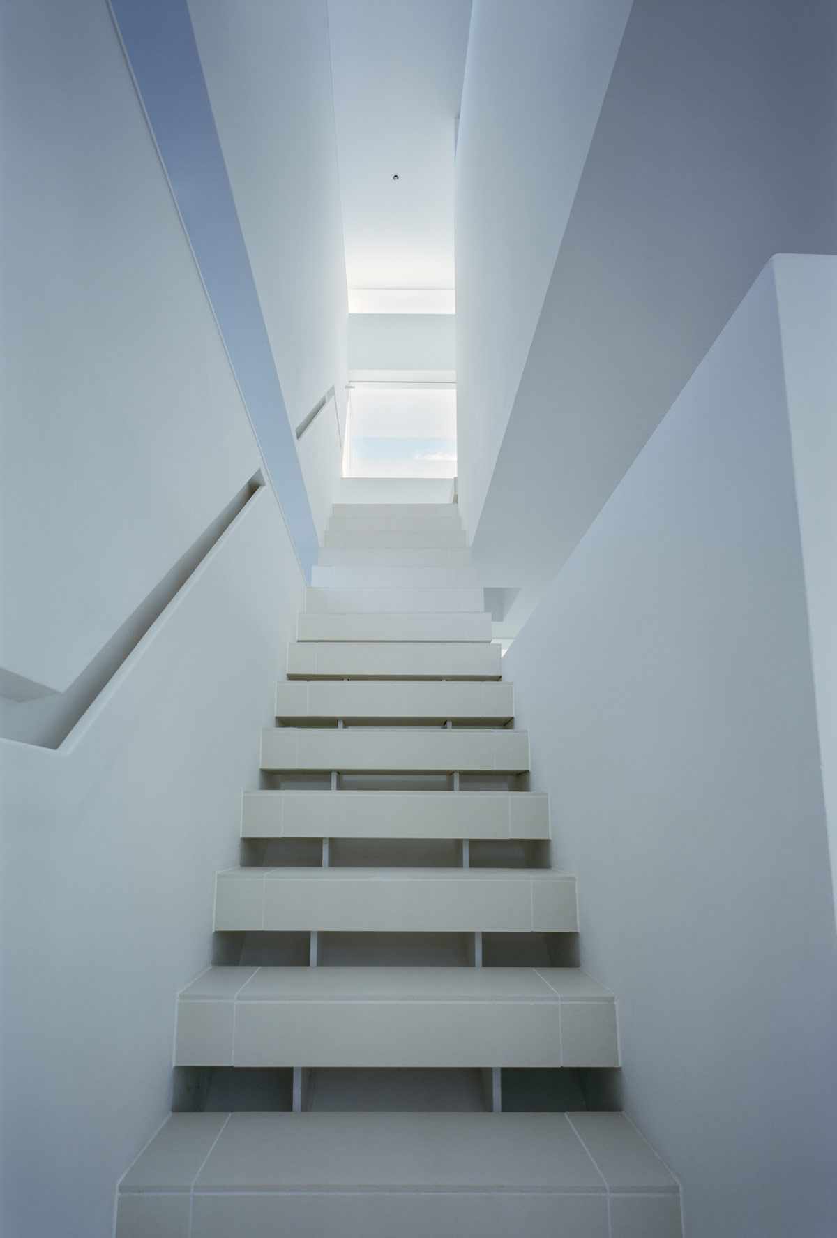
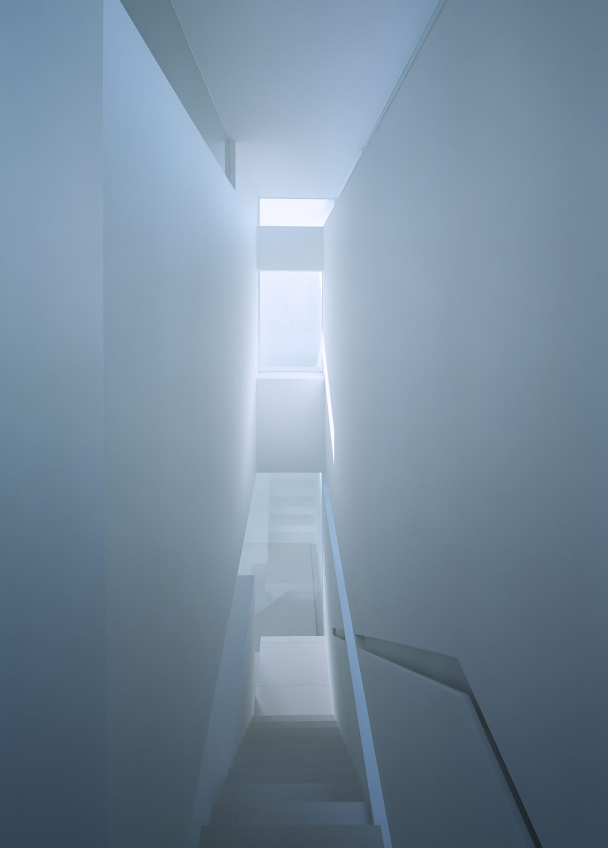
Tiled steps complete the fresh modern staircase design.
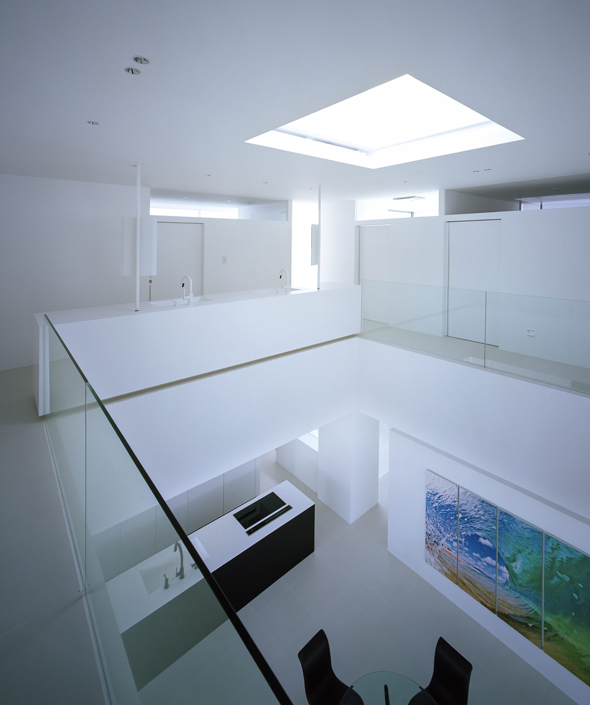
A skylight sends natural daylight right down through the core of the home.
The landing vanity area is situated directly above the kitchen island downstairs. Looking down through the glass balustrades it is possible for family members to interact through the vertical open plan too.
The four column architectural design made huge savings in the home’s construction process. Since the ground was fairly soft, an ordinary mat foundation would have demanded extensive soil stabilisation.

