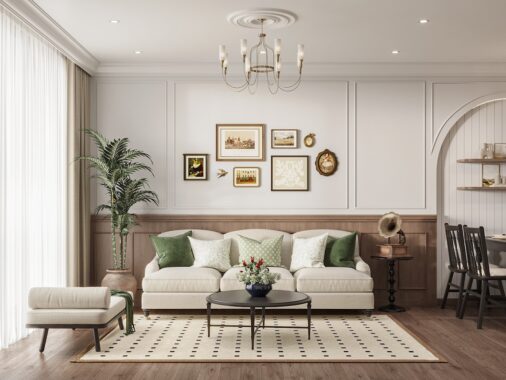
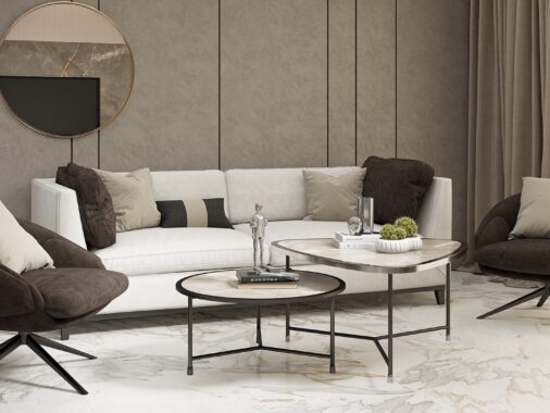
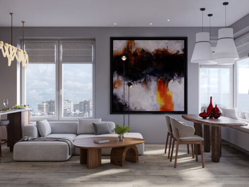
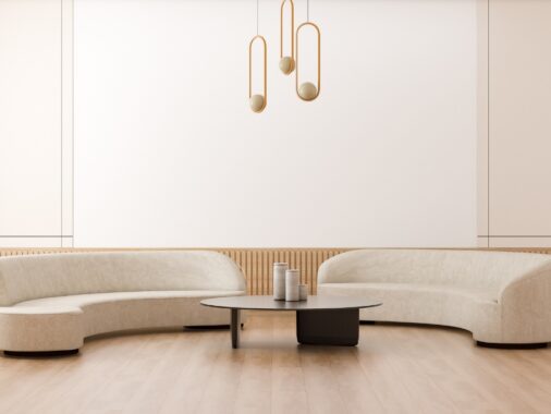
What do you see when someone says ‘family home’? Usually a quaint and cluttered home: that feels homely and lived in, with delicious smells wafting from the kitchen. At least, that's what most of us picture when we hear that term. That's not what PLASTERLINA pictures. This Polish design company pictures something quite different, and they've made their vision a reality. This home is stylish, sophisticated and chic while retaining all the elements needed to comfortably house a family of four. Look out for the masterful use of colour and designer furniture. Bookmark your favourite features (there will be many) and sigh in envy. We don't blame you!
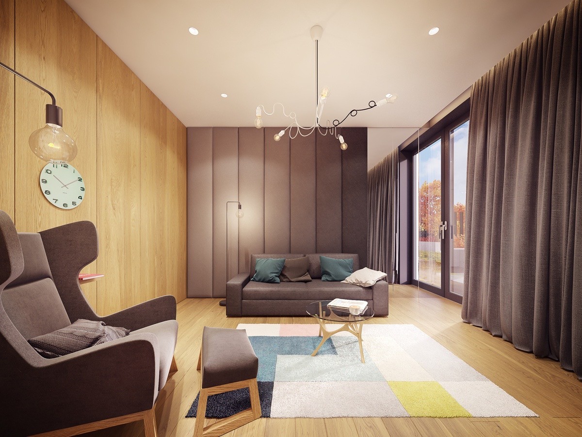
We start our tour in the main living room. The space is warm and inviting, with a colourful rug and warm wooden flooring/panelling enlivening the monochromatic colour scheme. The throw pillows add a homely feel to an otherwise sophisticated room. The grey colours look classy and incredibly fashionable, especially the panelled accent wall.
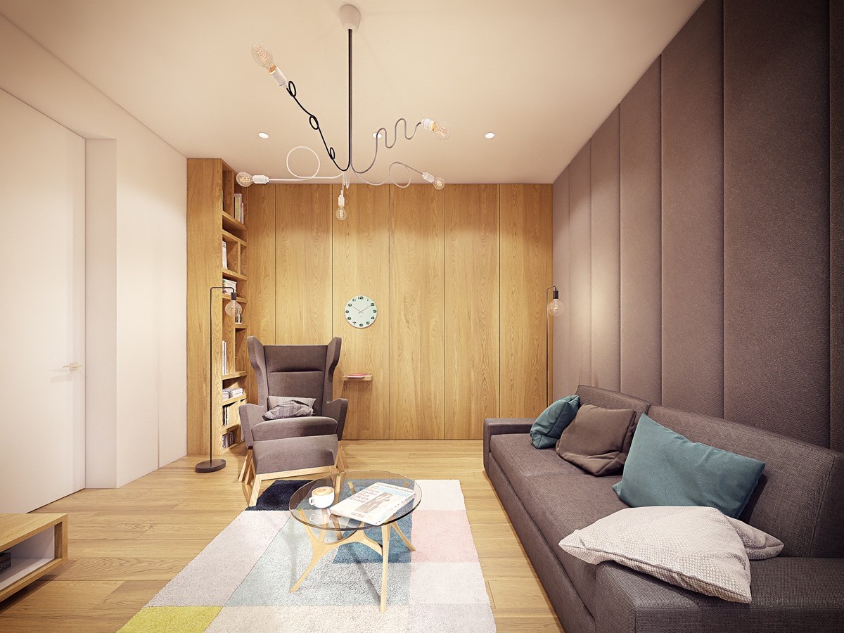
The room is vibrant and comfortable, with a nice reading corner and space for dad to kick his feet up after a tiring day. There are many wooden elements, with the floor leading up to wall panelling that makes the room feel cohesive. The coffee table ties in nicely with the wooden panelling, while a bare white wall opens up the room, preventing it from feeling claustrophobic.
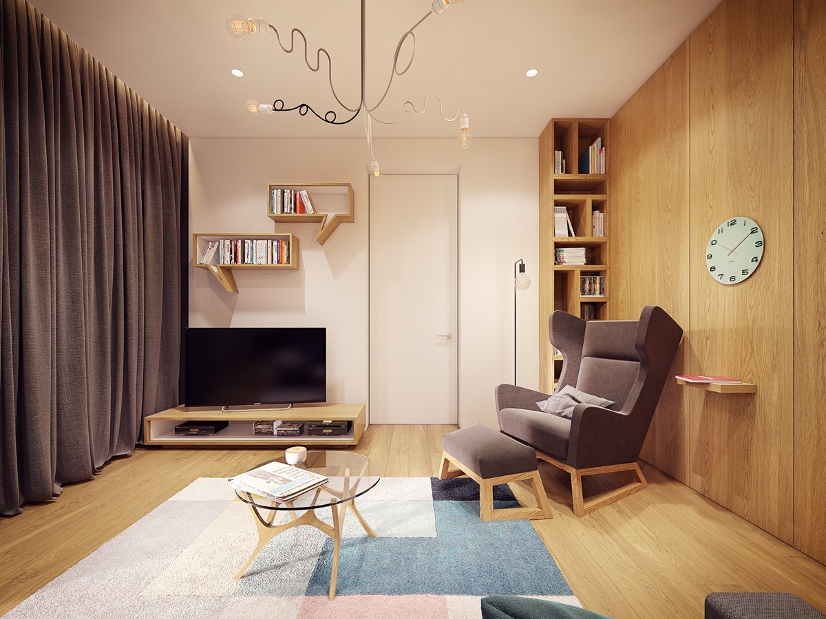
The statement bookshelves and geometric light fixture add a touch of fun, hinting at a childlike joy- without becoming childish and immature. This keeps the room from taking itself too seriously.

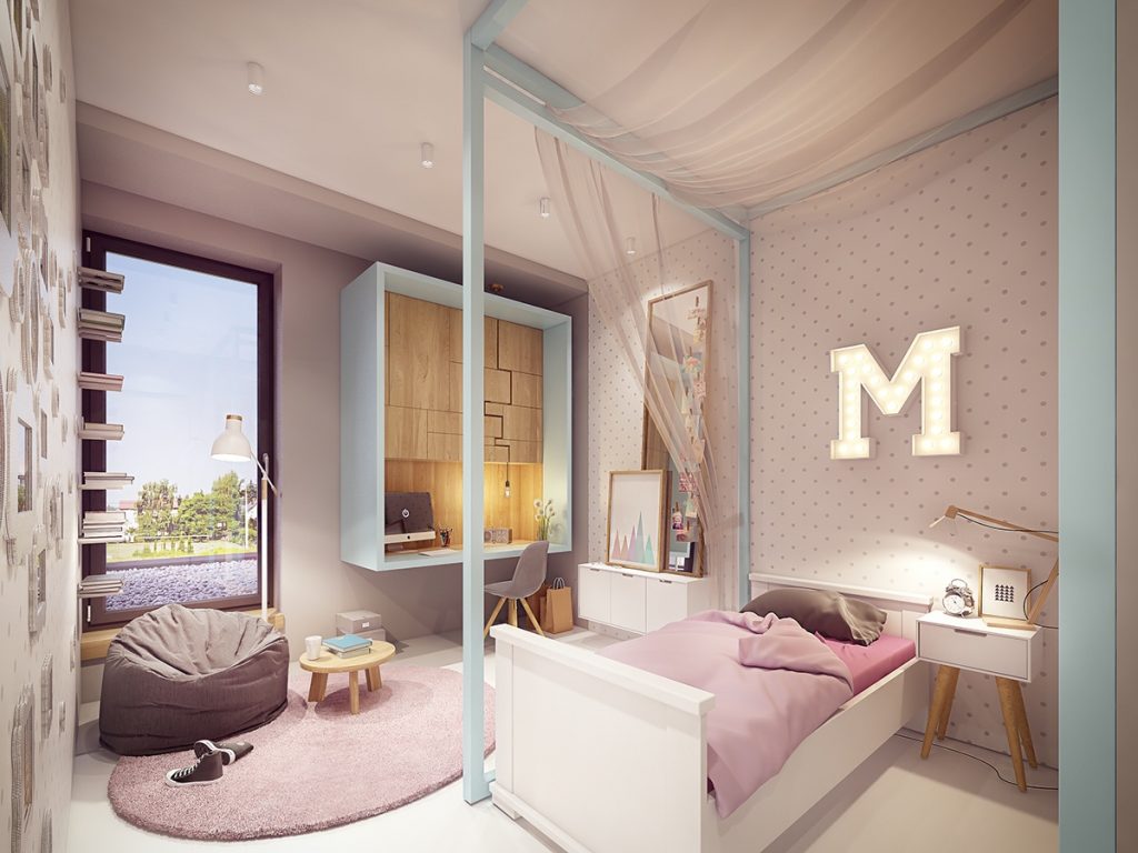
Here, we have a lovely girl’s room. It has a lot of personality and provides a refreshing look out over the manicured gardens.
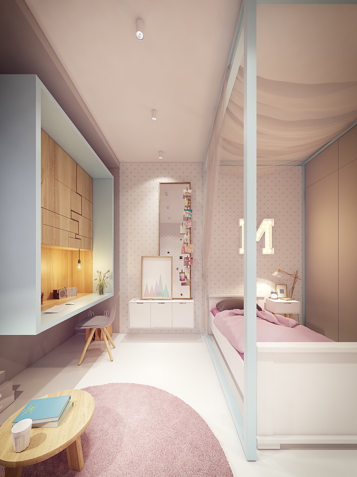
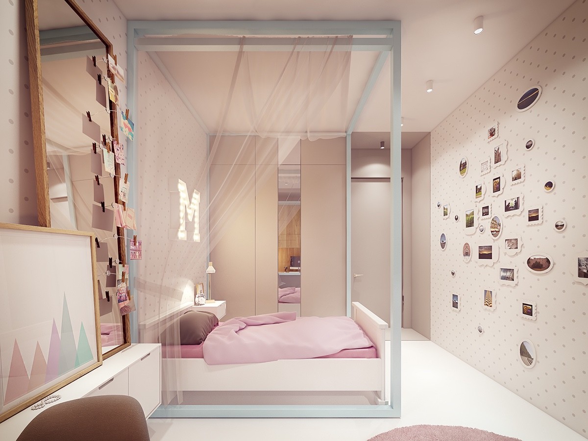
The room is well organized, with clean lines and pastel colours. There is a personalized arrangement of photographs by the mirrors: that hint at a signature teenage messiness. The light floor makes the room look pristine and provides the perception of space.
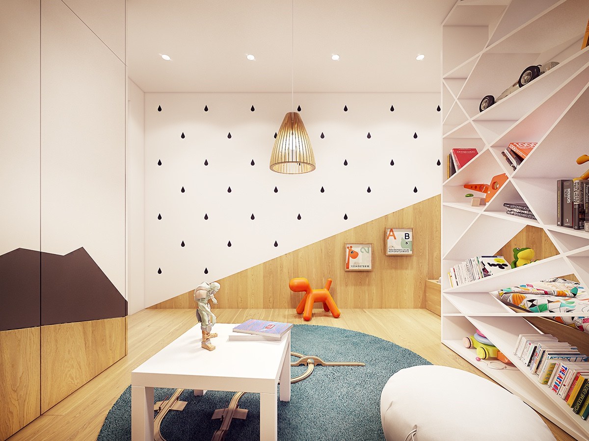
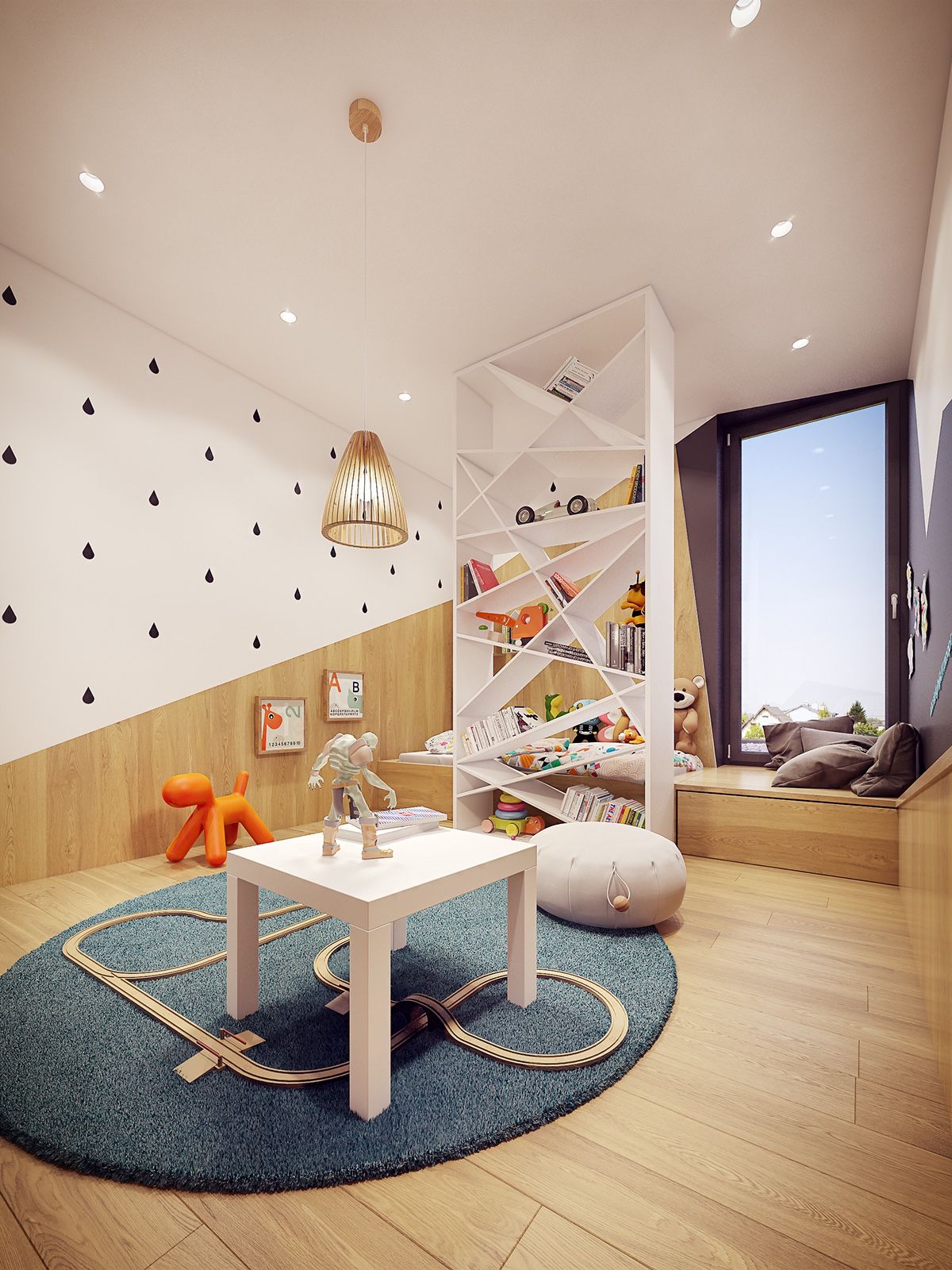
This room has been styled to appeal to a young boy, and it works. Geometric lines and contrasting colours create a visually appealing effect that intrigues the mind. Patterned wallpaper adds to this effect, and the traditional blue rug leaves no doubt about the gender of the occupant.
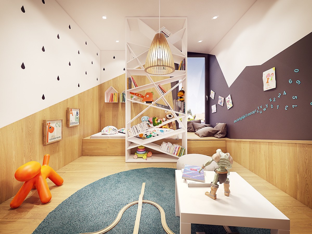
Toys and books stimulate the mind, creating a child’s wonderland. The bookshelf is a focal point that immediately draws the eye. Stick-on alphabet letters and numbers are a traditional staple for any child’s room, but in this room it has a bit of a twist. The letters follow an uneven line that disintegrates into a scattered pattern, projecting the idea of a child’s wandering mind.
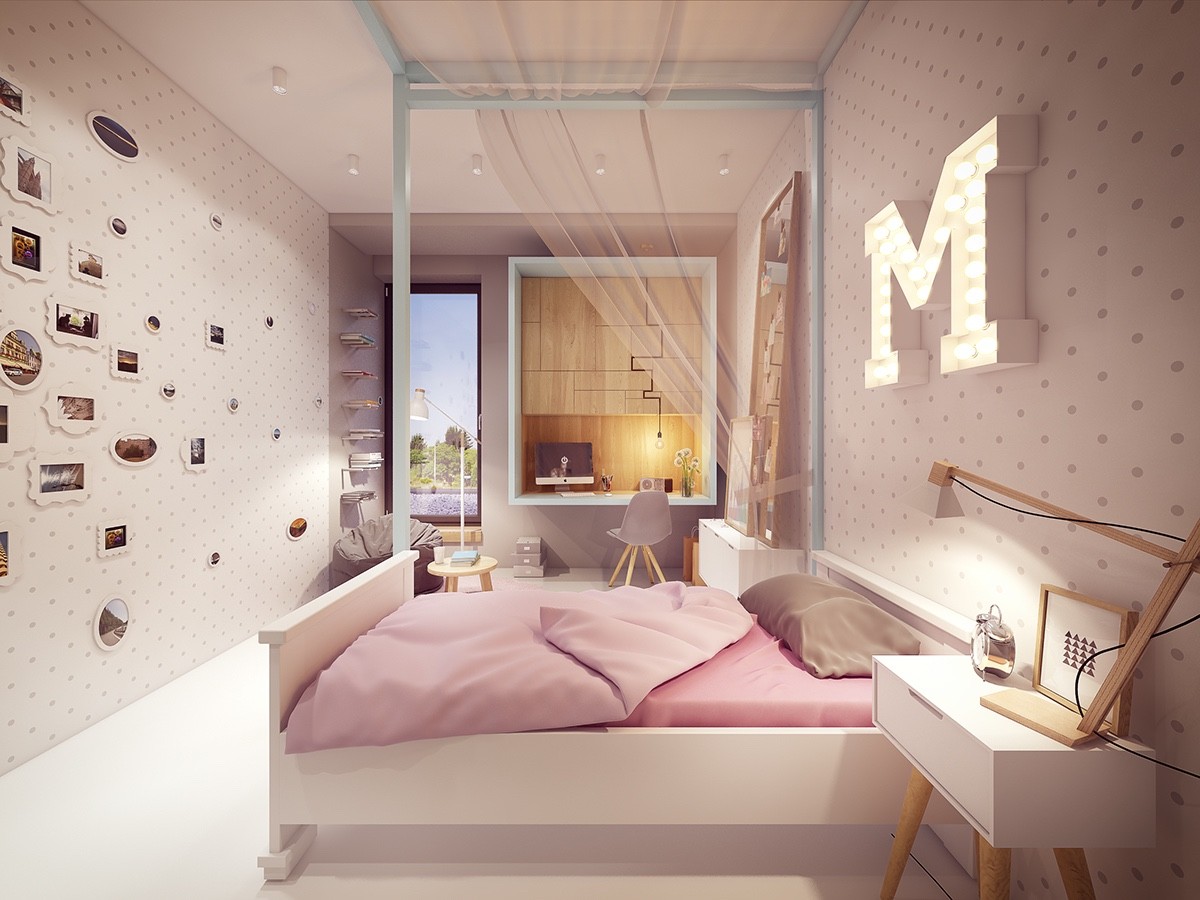
Framed pictures assert the individuality of the room’s occupant, the frames adding a touch of class. The canopy bed is a feature that every girl secretly desires (no matter what they might say!). The adjacent walls sport polka-dot wallpaper that is very feminine, while the wall facing the door is a light grey. This creates the illusion of separate spaces for different purposes, but the matching grey polka-dots and grey ensure that the separation isn’t too distinct.
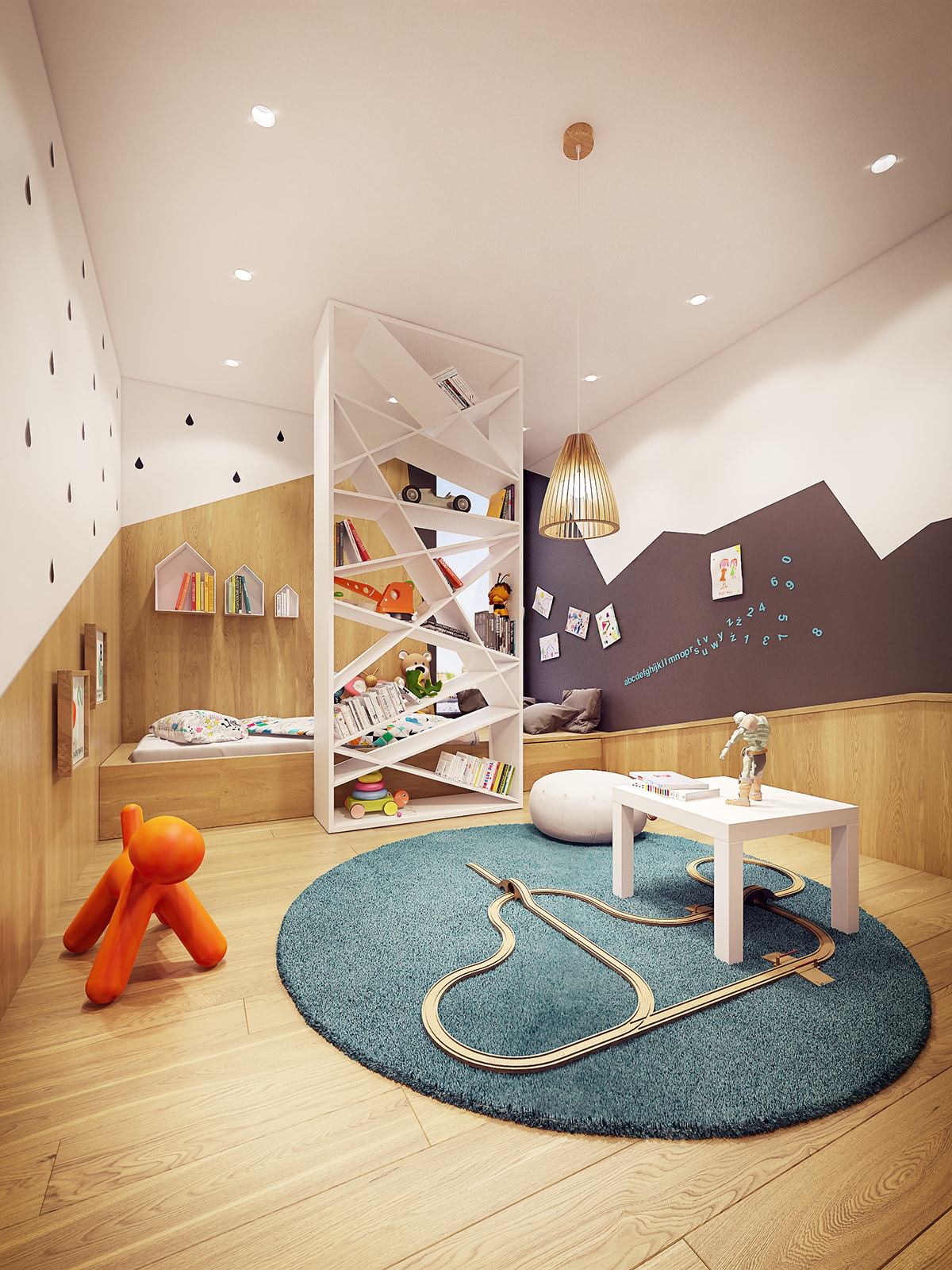
Model railway tracks are a whimsical statement piece as well as an engaging toy. The genius of making it part of the decor means that you don’t need to keep reassembling it when the child wants to play.
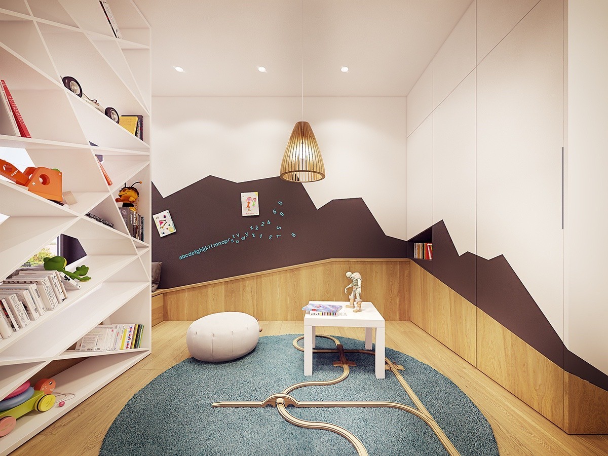
Black board paint stenciled onto the wall to resemble a mountain range, is the perfect place for a young mind to roam free. Give him a few pieces of chalk and the result will be hours of entertainment.
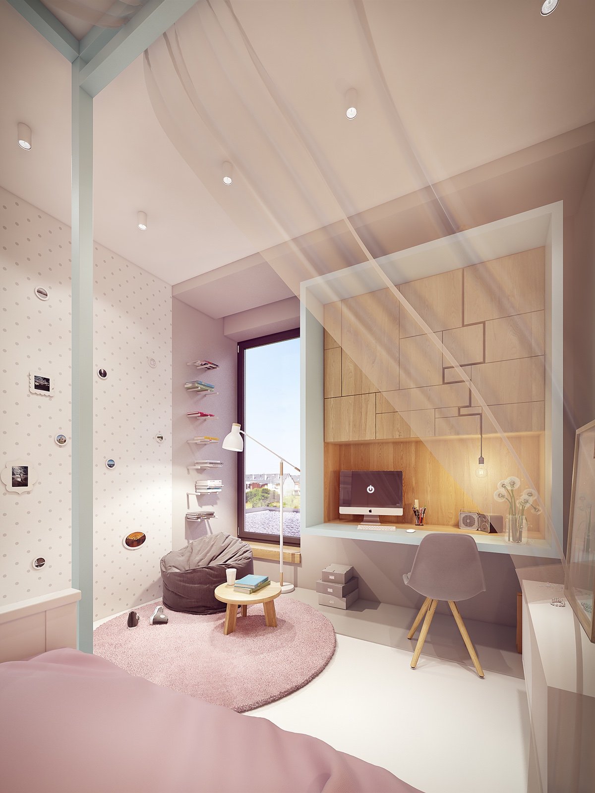
This designer study area will make a studious learner out of the laziest of us. The pastel blue frame and panelled compartments make for a sleek desk. The comfortable chairand bean bag reading area almost makes one wish for homework so that you can use the space.
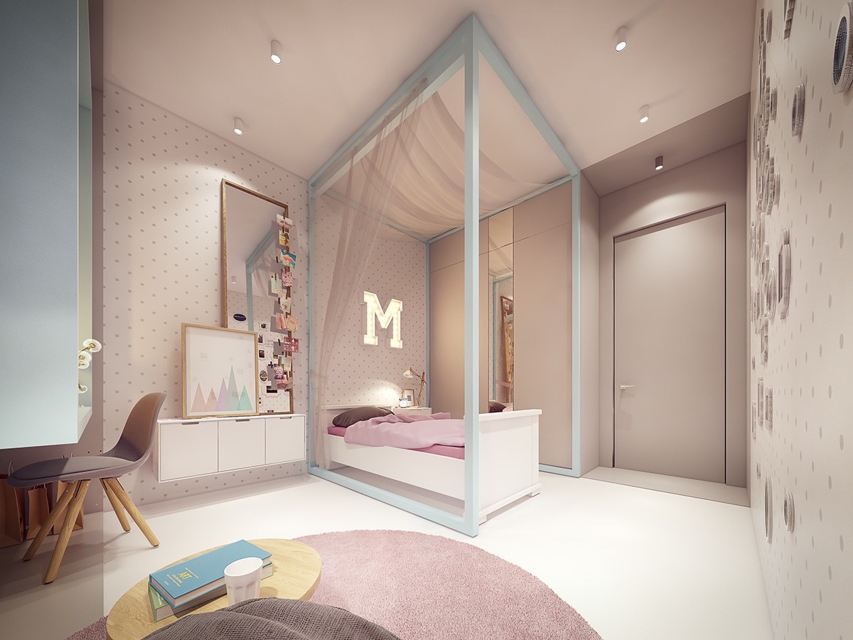
A pretty blue frame around the sleeping area makes for a simple and sweet embellishment. Subtle light features don't attract too much attention, this is a smart move in a room that already has many different elements.
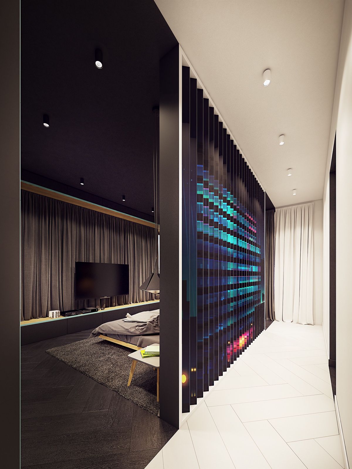
The main bedroom deviates from the cheerful tones of the children's bedrooms, this room is much more edgy and refined.
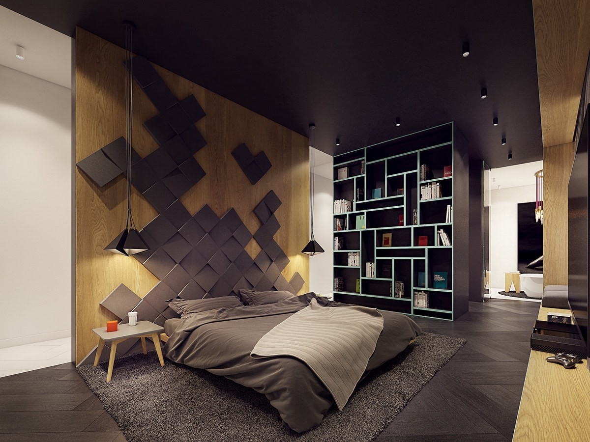
The home's theme is showcased in this space. The overall palette is monochromatic with homely wooden overtones that break up the mysterious nuances of the grey coloring.
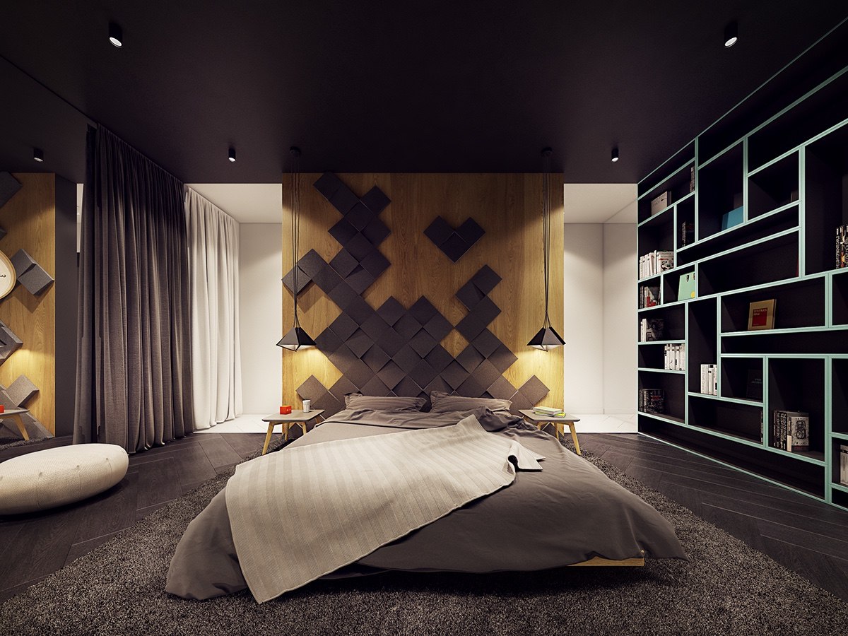
The wooden panelled bedroom wall with a dark grey 3-D pattern creates an intriguing facet to the room. The pockets of white brighten the room and is a nice burst of color in an otherwise dark bedroom.
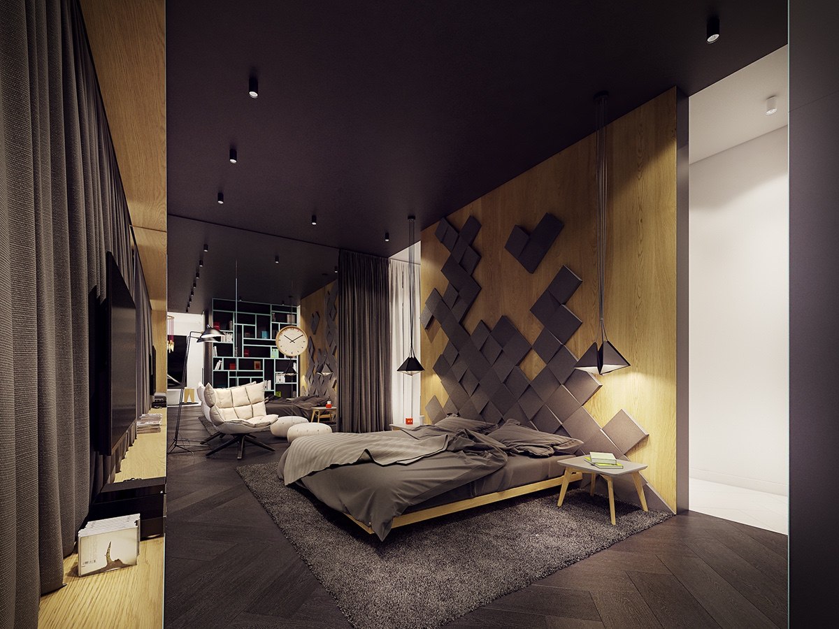
The master bedroom is a perfect retreat for when the kids become a bit loud, the lush carpet adding to the comfort of the room. The room contains an abundance of light thanks to the numerous light fixtures that sometimes make for fascinating accent points.

The dark bookshelf avoids being unassuming, by boasting a light color trim. The bookshelf itself contributes to the overall aura of sophistication.
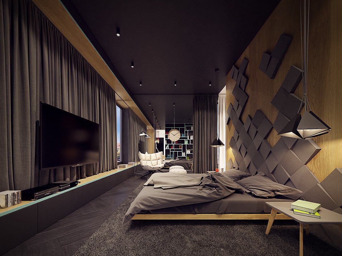
From this view, we can get a clear image of all the wooden elements that warm up the room. These elements are subtle, but make a discernable difference.
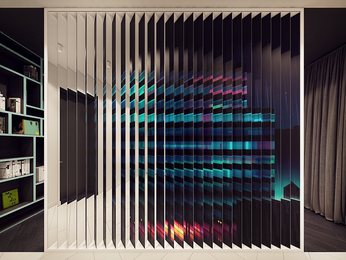
These panels are a unique aspect that takes the entire space to the next level. The rotating boards ensure that it will never be the same or boring.
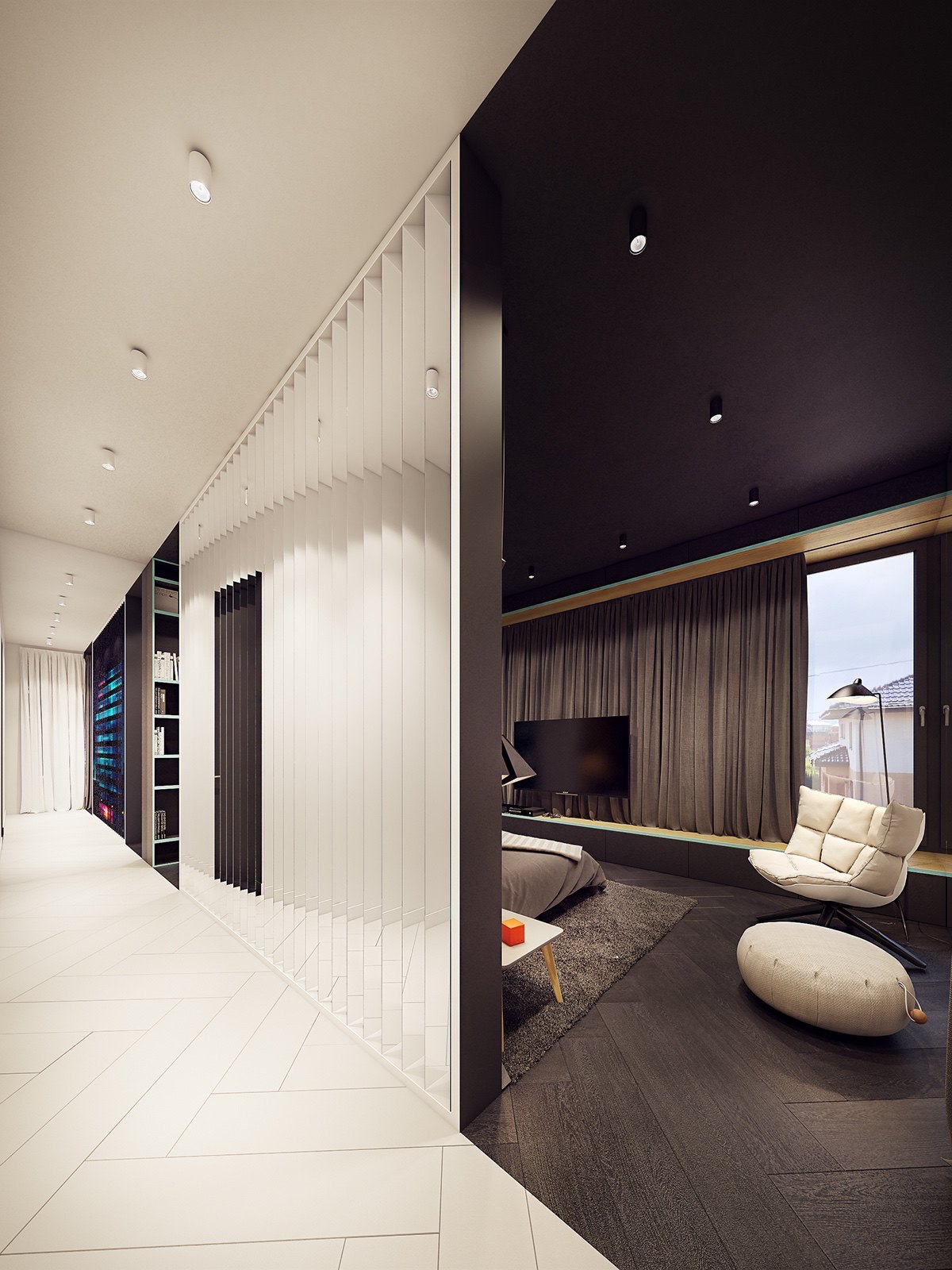
From this angle, we can see what was almost hidden by the bed's accent wall. A pristine white corridor leading to the ensuite bathroom is a refreshing jolt from the darker bedroom.
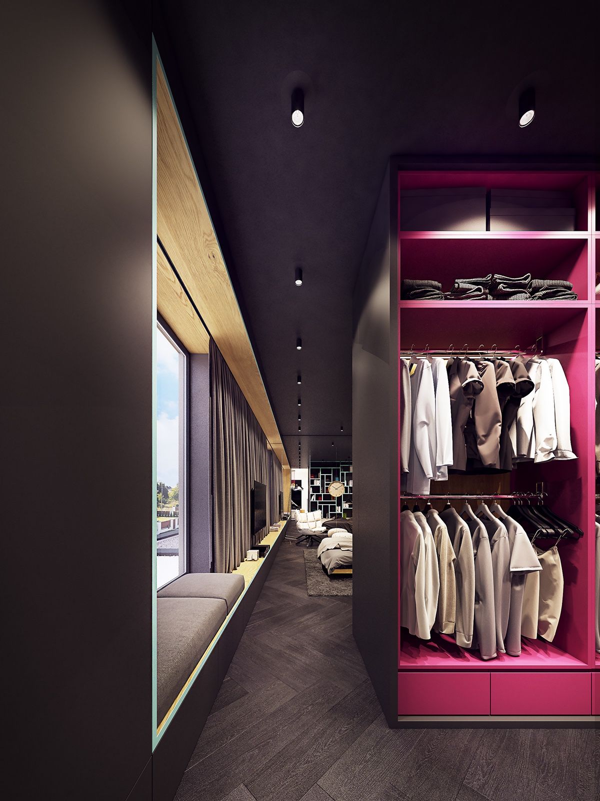
We've come to expect a lot from this stylish home, and this gorgeous walk-in closet does not disappoint.
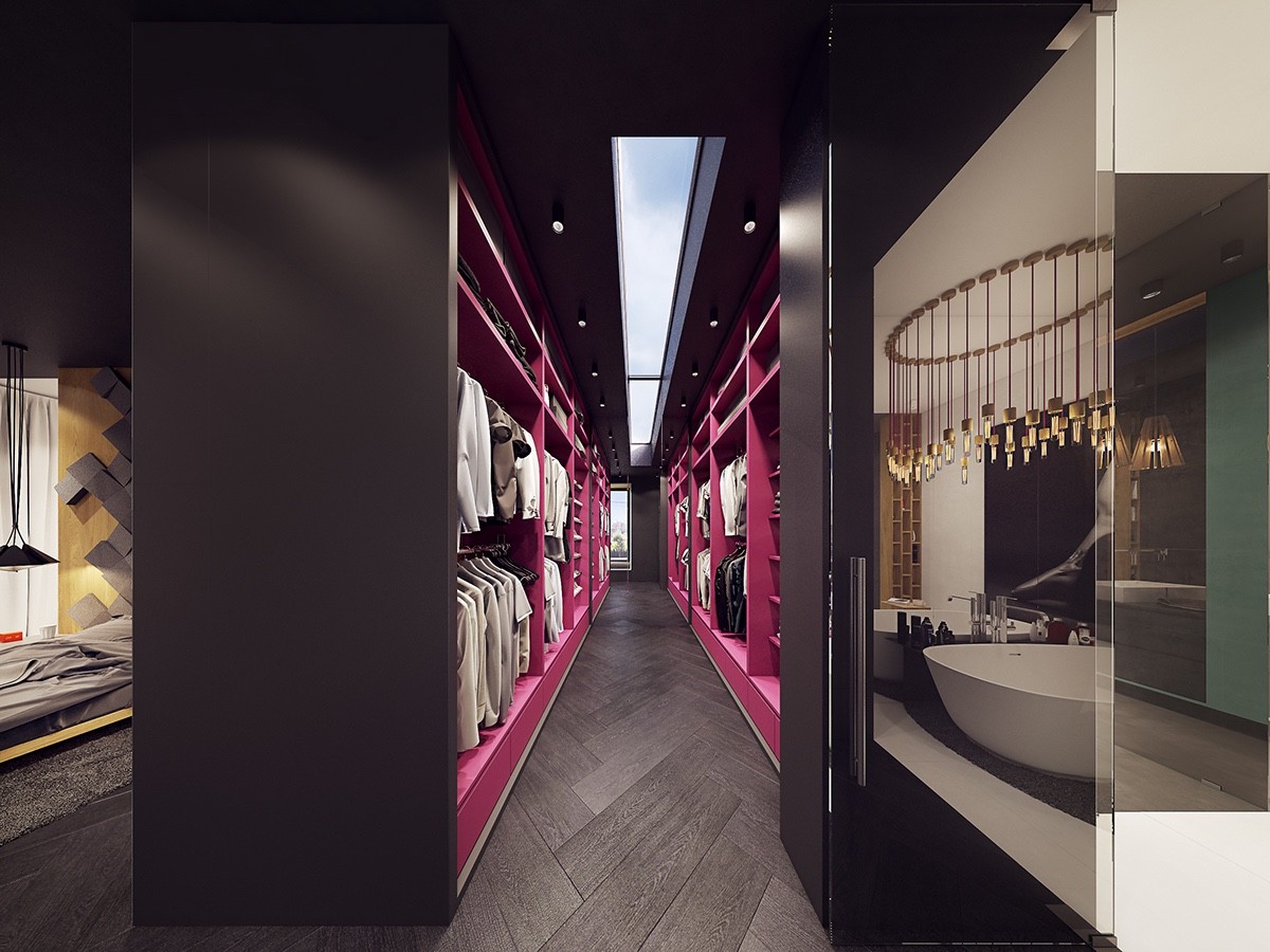
If these closets were completely dark, this wardrobe would look like a punk rock dream. Instead, the astute designers removed the cupboard doors and substituted the dark interior for a vibrant and cheery color, that didn't detract from the sophistication of the room. A narrow strip of skylight opens the room to the sky and provides some much needed air and space. No one has ever felt claustrophobic by looking up at the sky.
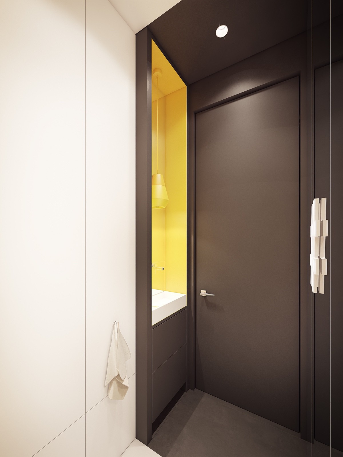
A grey door and slice of yellow is a pleasant preview of what the main bathroom is going to present, proving that this shade of grey matches any color.
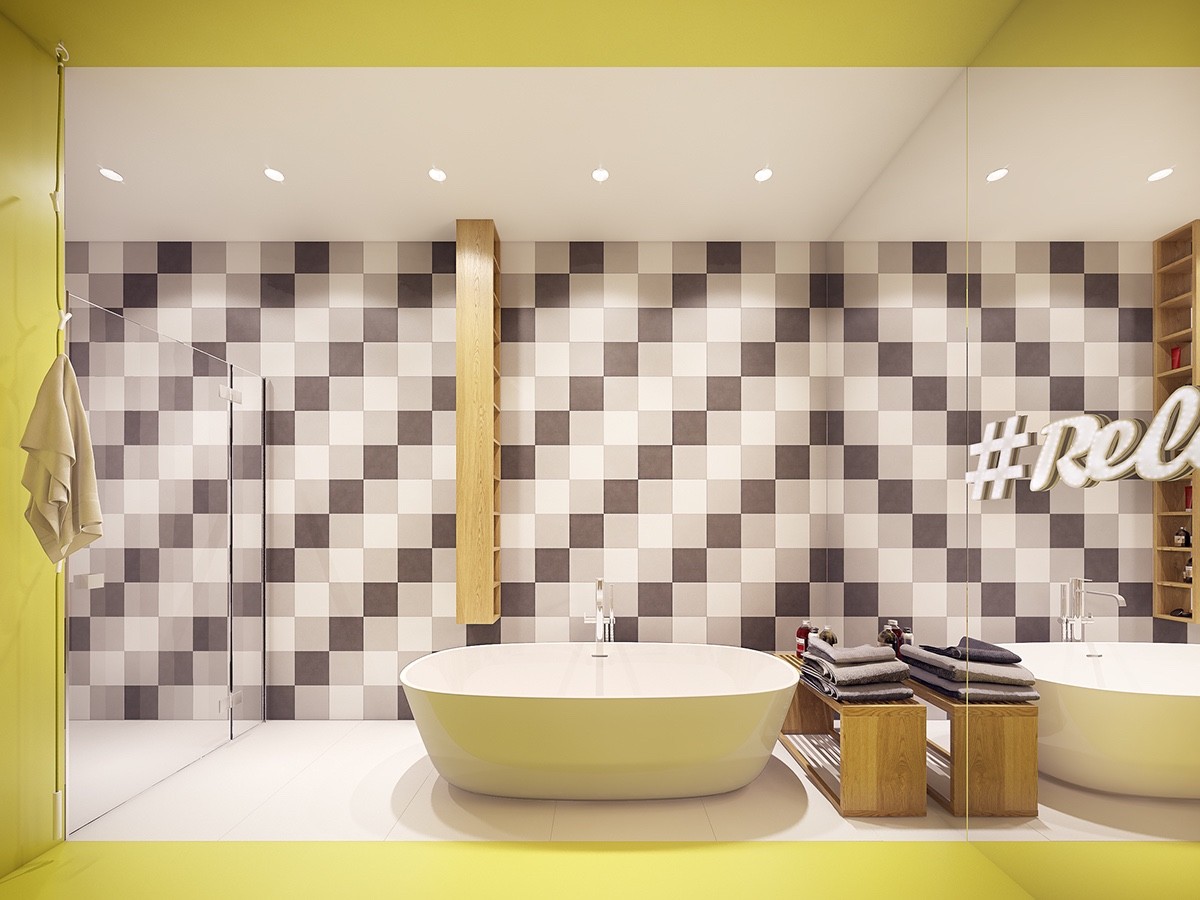
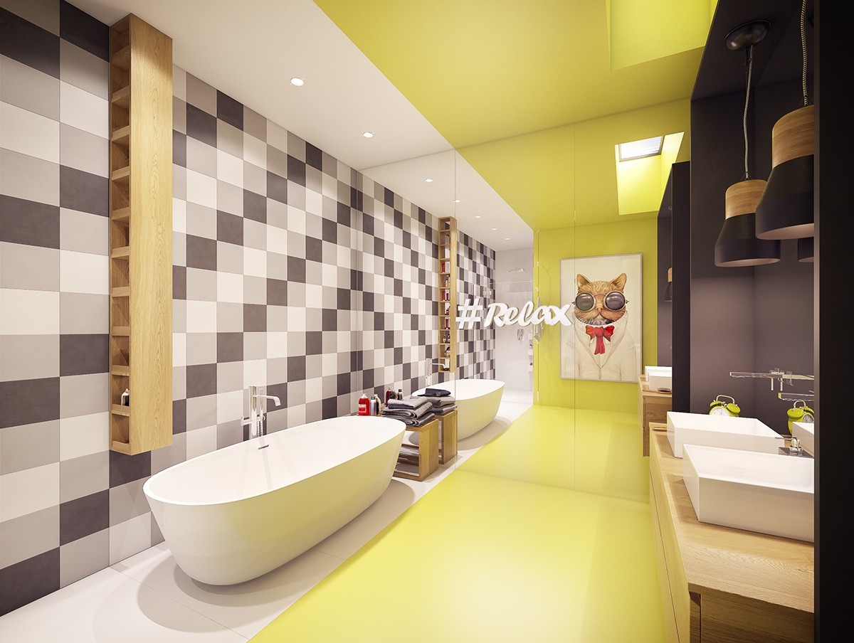
A checkered pattern on the wall is a unique touch that ties the room together perfectly. A freestanding bath looks like a bubble set against the patterned wall and sunny yellow hues.
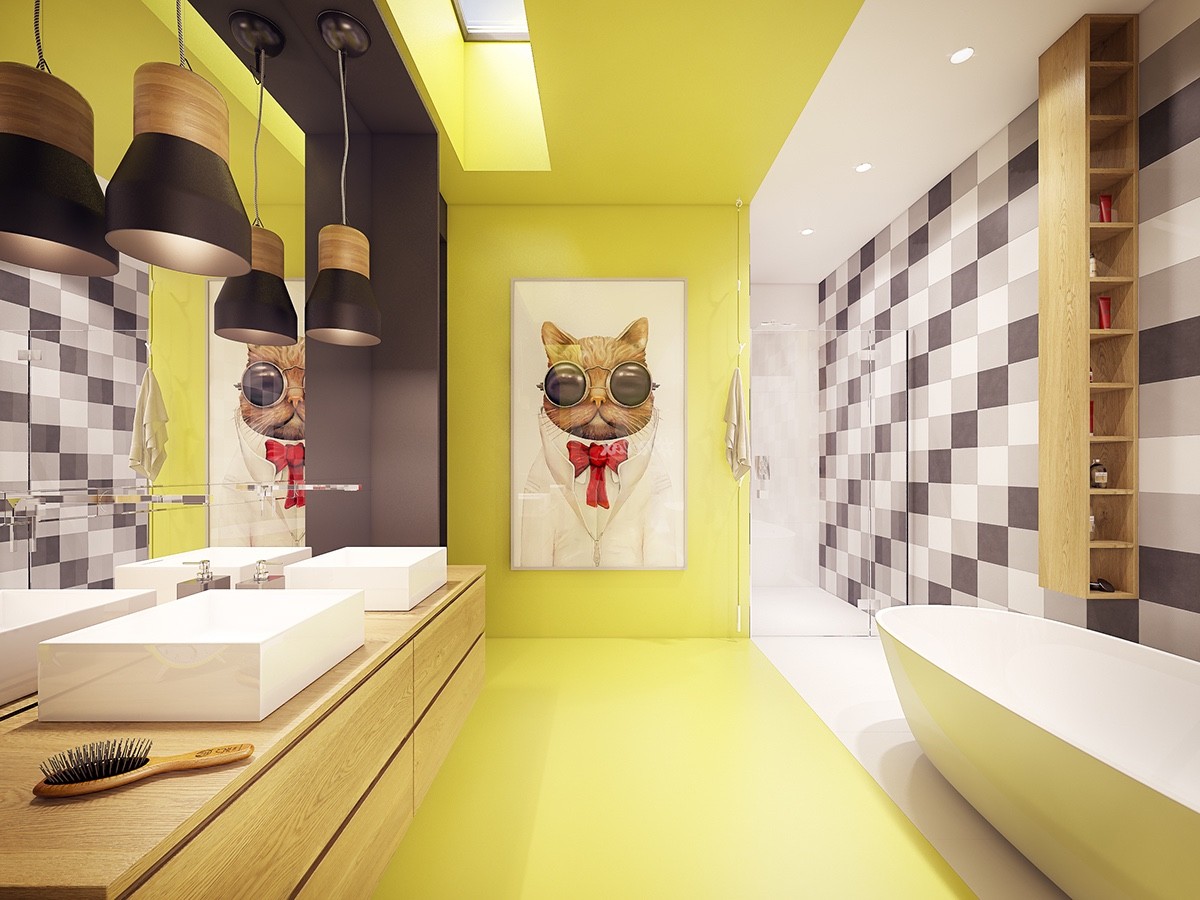
His-and-hers sinks ensure that there won't be any early morning bathroom fights between the siblings, saving mom from a major headache. A sarcastic cat surveys the entire scene, adding the necessary cool factor.
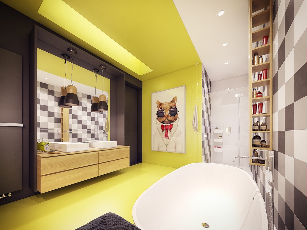
Industrial light fixtures are a perfect match for this modern room. Wooden elements such as the shelves and cabinets soften the brightness of the yellow aspects.
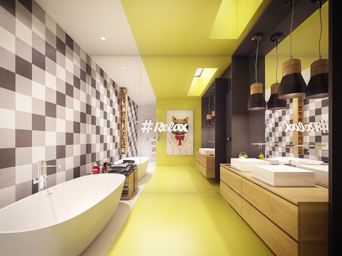
The room makes masterful use of mirrors by adding a mirrored wall. The wall lengthens the room and enhances the design features of the room.
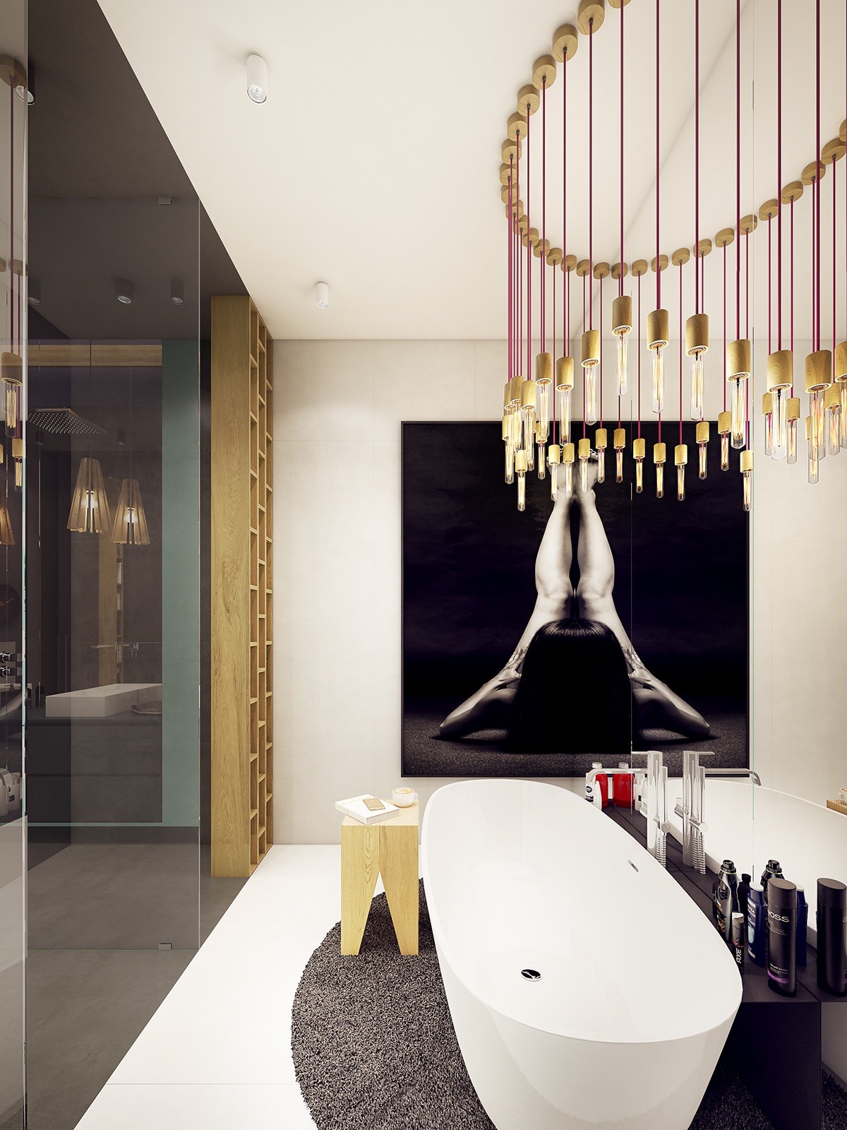
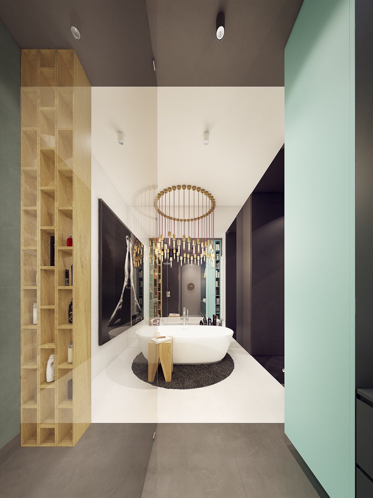
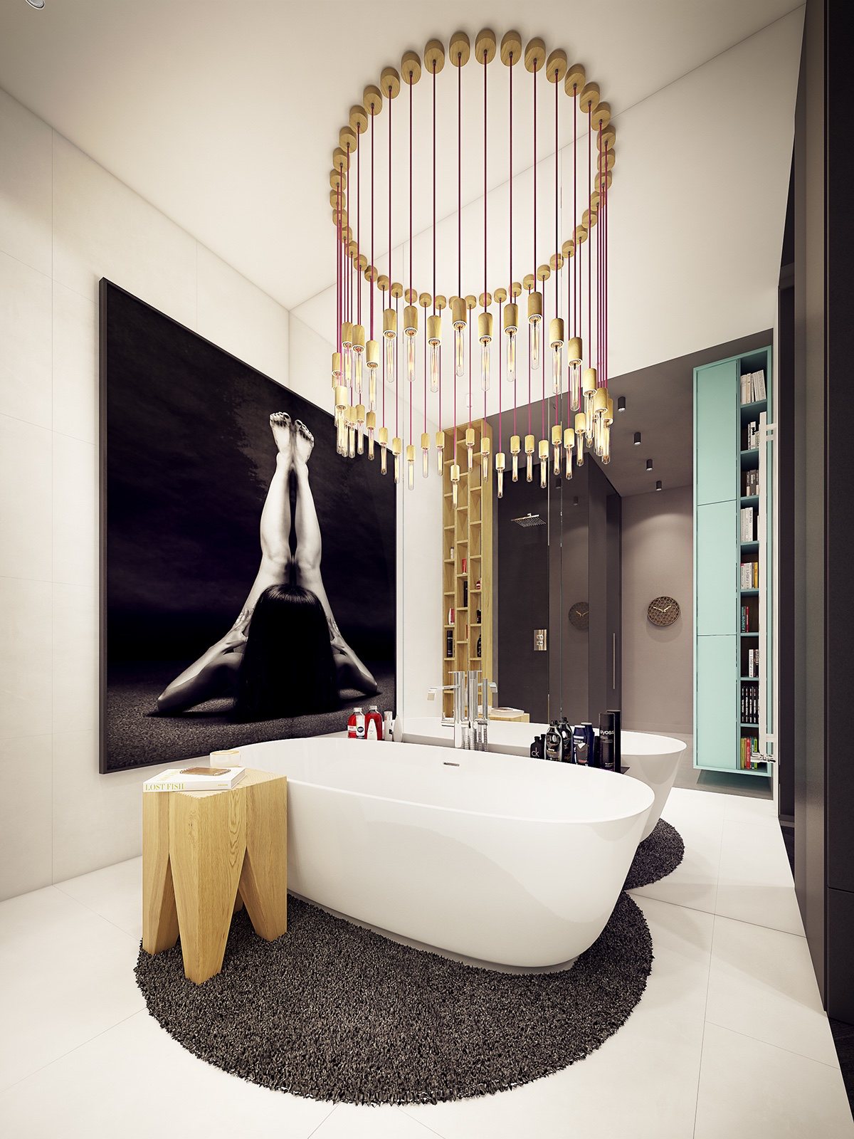
Once again, the parent's bathroom is worlds away from the lively atmosphere from the children's space. The ensuite bathroom is artistic and refined, focusing more on relaxation than the bright master bathroom.
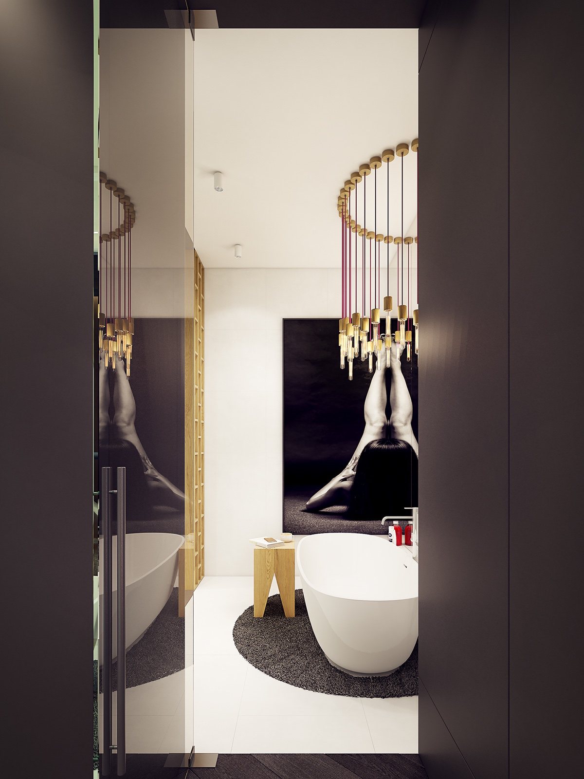
A soothing, visual art piece is the first element to capture the attention as you enter the bathroom.
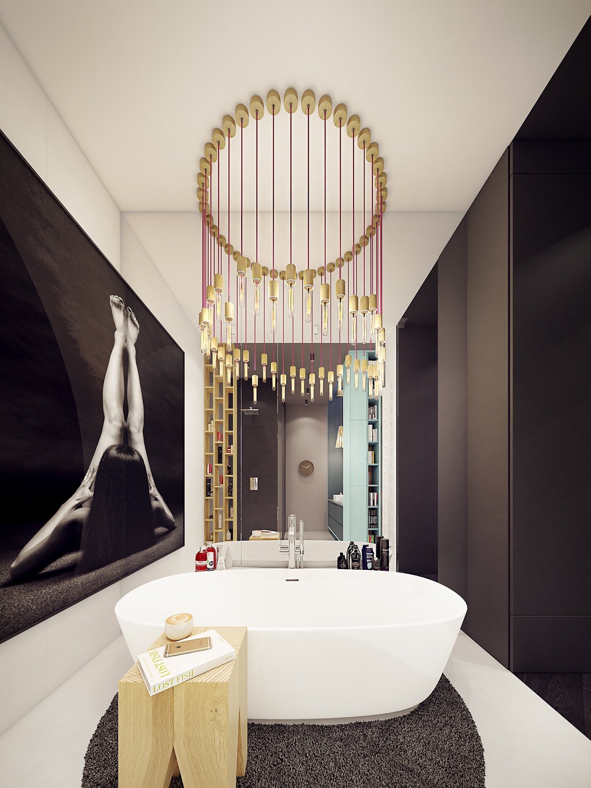
The round chandelier and wooden components are an organic aspect of the room meant to aid the senses in the relaxation process.
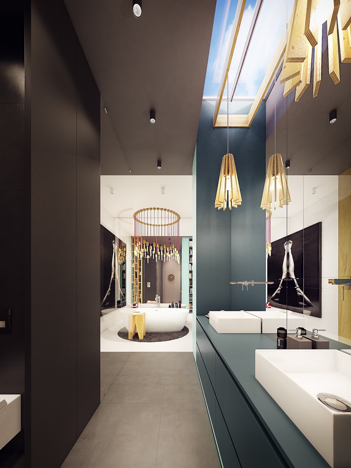
The sky is featured in the decor, just above the necessary his-and-hers amenities. The different shades of color create a multifaceted room that's interesting and engaging.
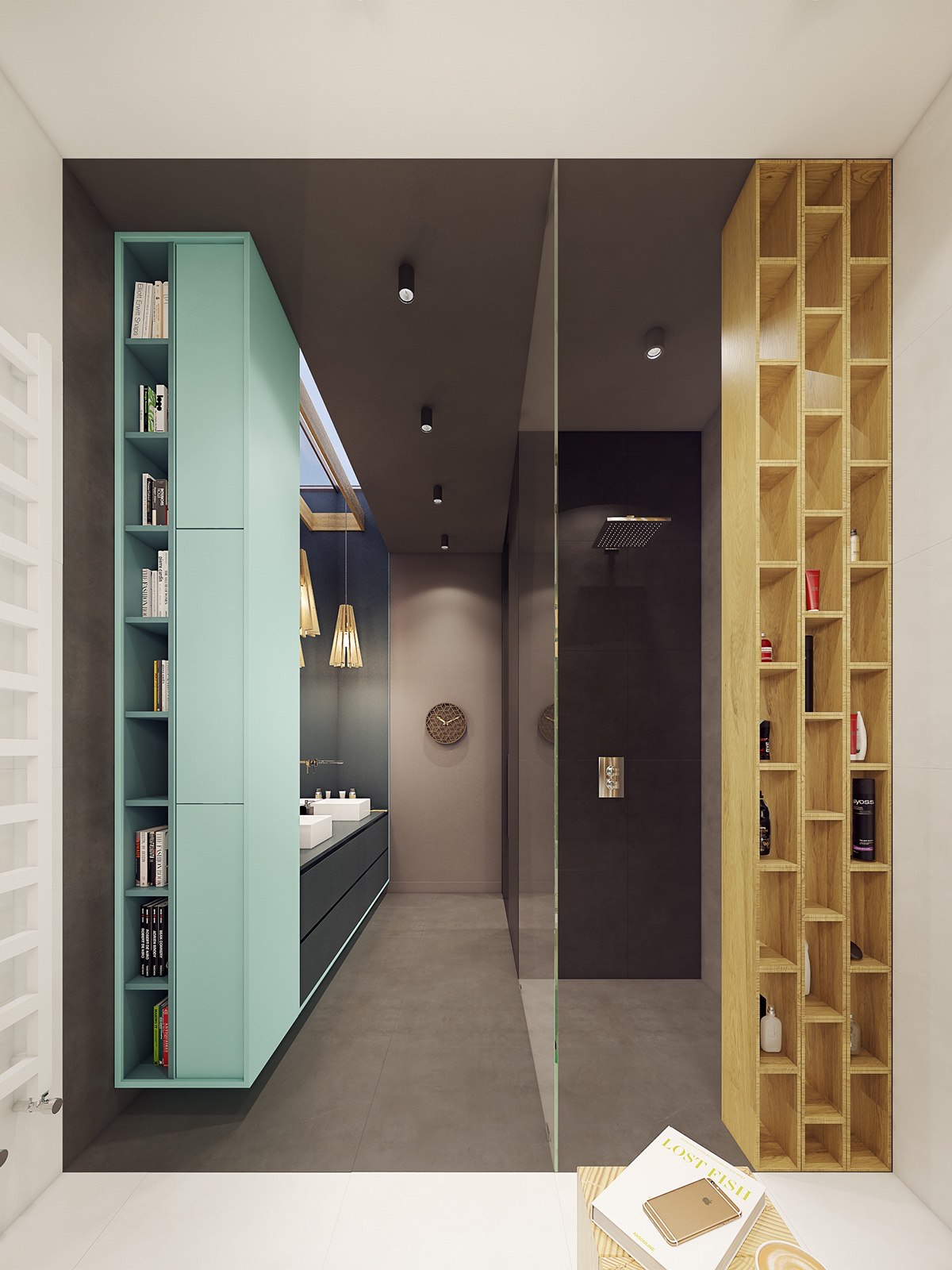
A light blue cabinet breaks away from the rest of the decor, and instead of being out of place, it is a fun accent of piece that works in the space.
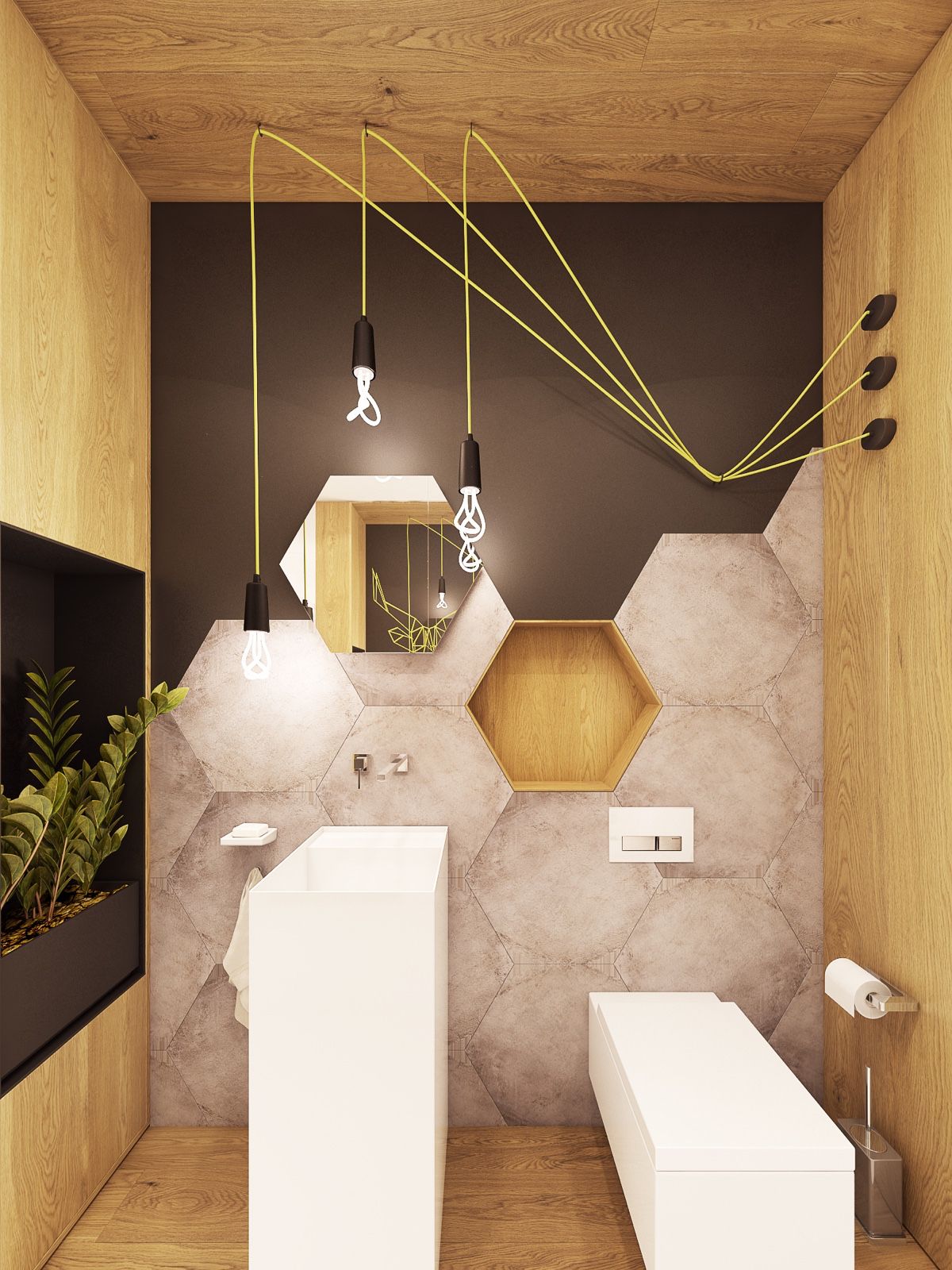
This bathroom is organic. Every element screams natural and it's a refreshing aspect to the design of the house.
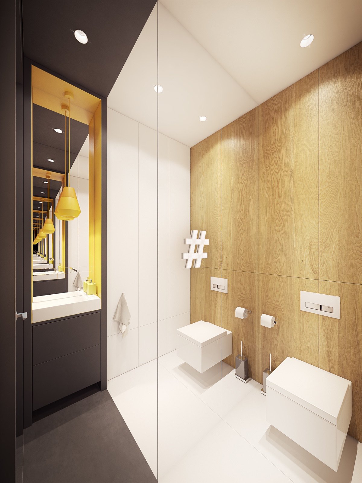
The door and sink area ties this bathroom to the master bathroom, but carrying over the same design details.
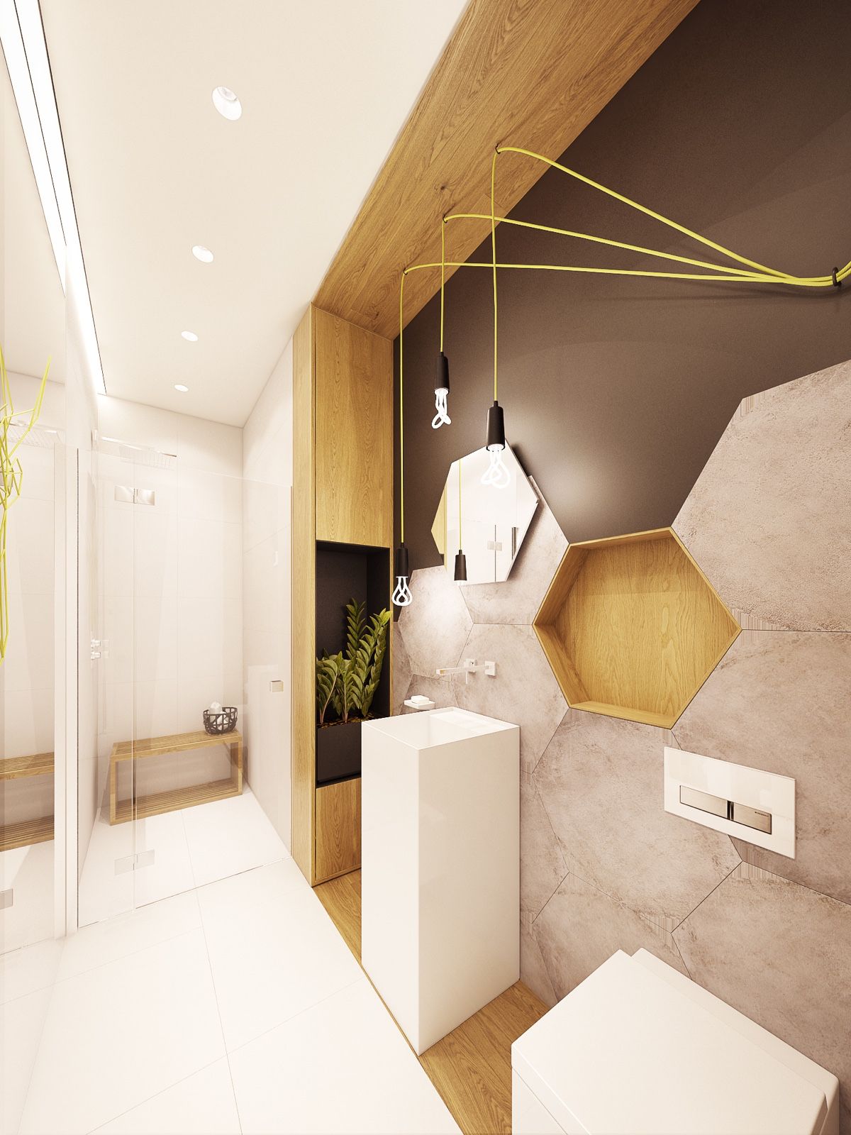
and wooden features create a natural aura. The hexagonal panels are reminiscent of a beehive, while the green cords of the light fixtures look like jungle vines. The dark brown wall ties all of these elements together.
