Located in the bustling Haidian District in Beijing, this small family home emanates big style with its sleek interior and modern finishings. Being only 116 sqm (1245 sqft) and fashioned with a sloping roof, designer Chen Hongwen and his team at HAO Design had their work cut out for them. Luckily, they fearlessly rose to the occasion and took this home in a refreshingly modern direction. Instead of fighting against the odd shaped build, they decided to embrace it and highlight its beauty through the use of bright white walls, large windows, and fresh oak accents. All captured by the award-winning photography team, Hey!Cheese.
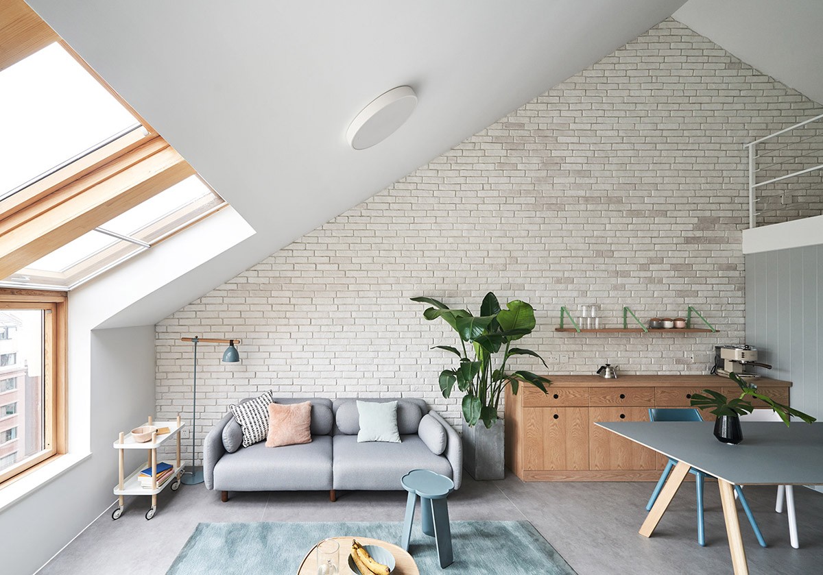
An open-concept layout that is overflowing with natural light bouncing around its bright and lively interior. The perfect dwelling for indoor plants if we've ever seen one and clearly the designer agrees! This space has been accented with Monstera plant clippings in a vase, as well as an eye-catching Bird of Paradise plant perched beside the couch.
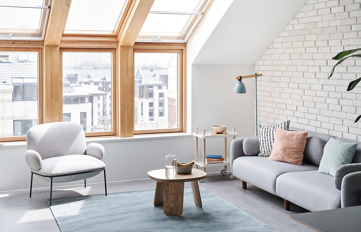
The white walls have been offset with oak window casings and light blue accents strewn throughout the living room. A two-tier repositional cart, a stylish floor lamp, and a couch adorned with plush pillows shape the perfect corner to curl up with a good book.
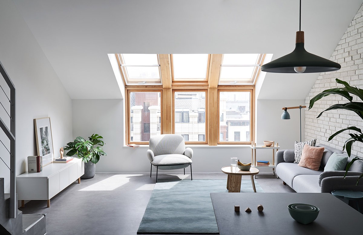
With the slope of the ceiling starting a mere meter off the ground, this home could of easily felt small and closed in. Instead the windows have been extended upwards to create a skylight that ensures that the main floor feels spacious.
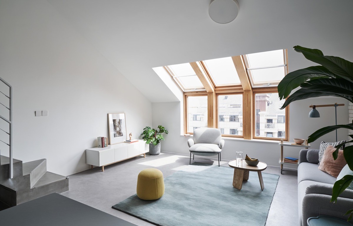
Low furniture has been used in the living room to create more head space. One of the challenges faced with a sloped ceiling is to make the areas closest to the wall functional and cozy, without feeling claustrophobic.
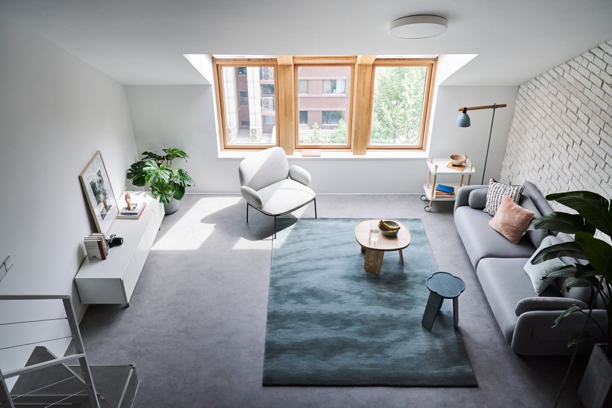
A birds-eye view gives us a glimpse of the smorgasbord of textures intermingling within this design. The white brick wall, the wood framed windows, the blue carpet, and imitation cement flooring are all major players that assist in creating the playful energy that encapsulates this living room.
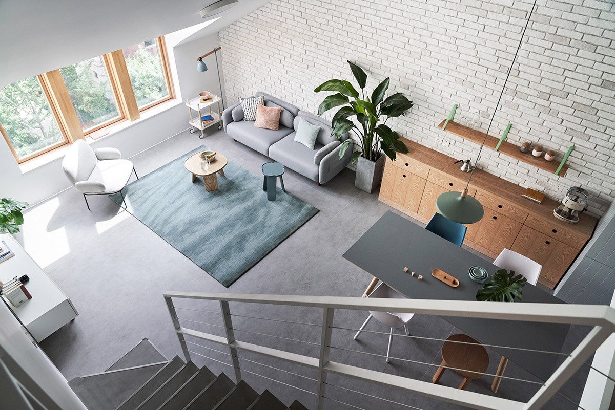
The dining room has been fitted with a strip of light wood cabinets and furnished with a simple grey dining table. Design choices like the fun, mismatched chairs are said to reflect the owners' individual style.
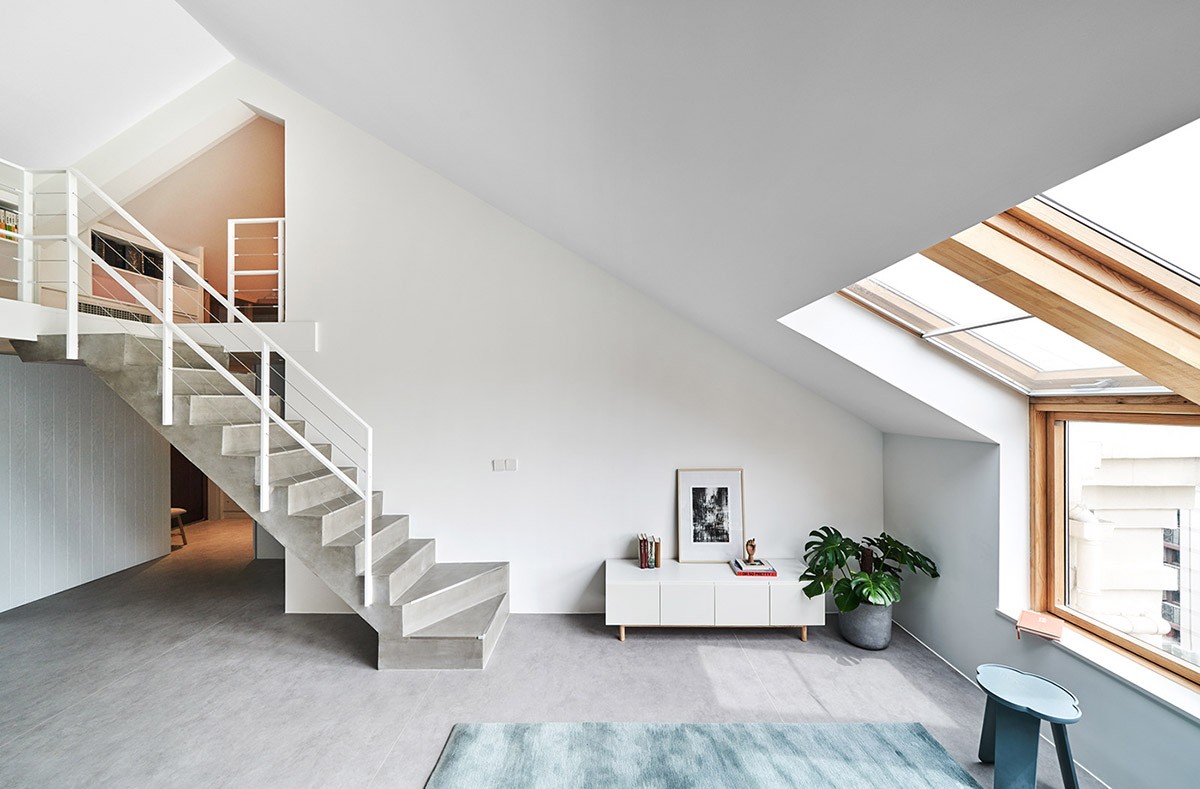
A grey and white staircase design seamlessly blends in with the rest of this modern residence. The simple lines of the white rail ensure that the stairs and second floor are still in clear view, which in turn creates flow and openness.
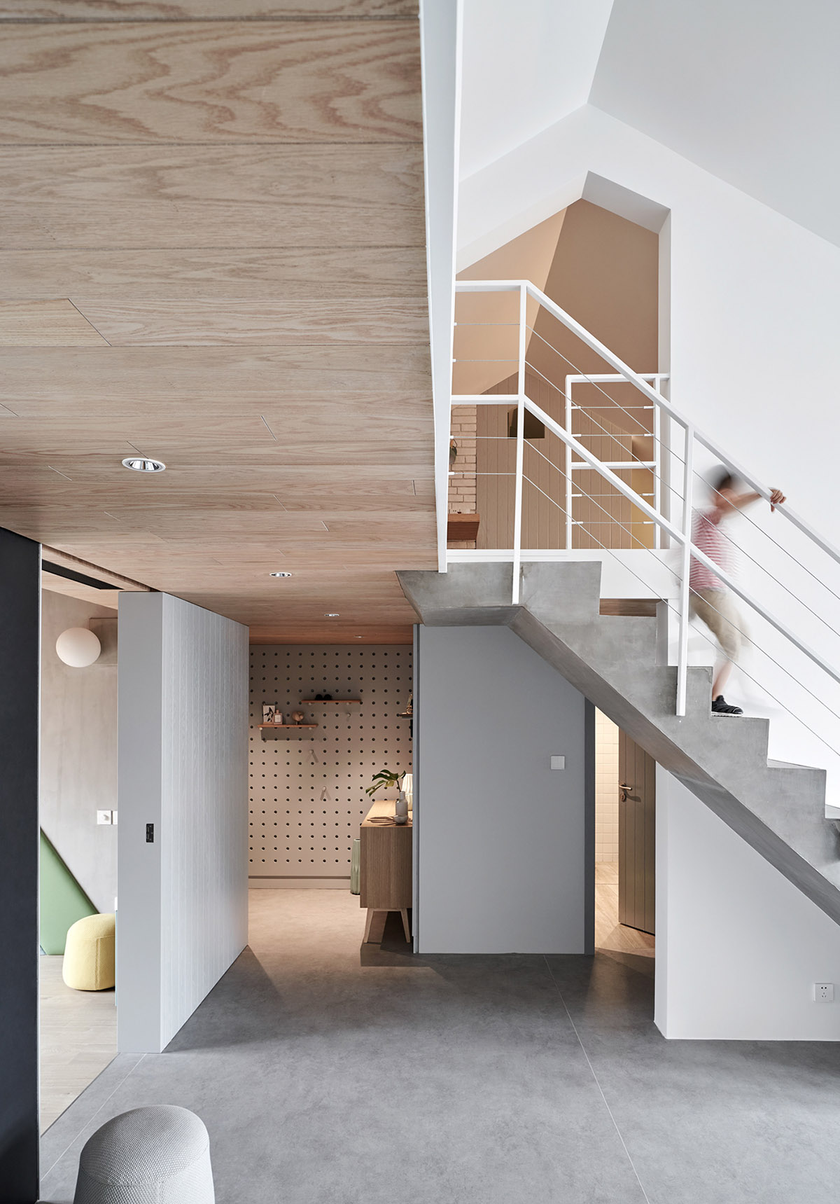
Light wood highlights the ceilings and radiates a feeling of warmth. It contrasts beautifully against the faux concrete floors, which have a bit more of an industrial feel. We also catch a glimpse of the entryway and its playful aesthetic.
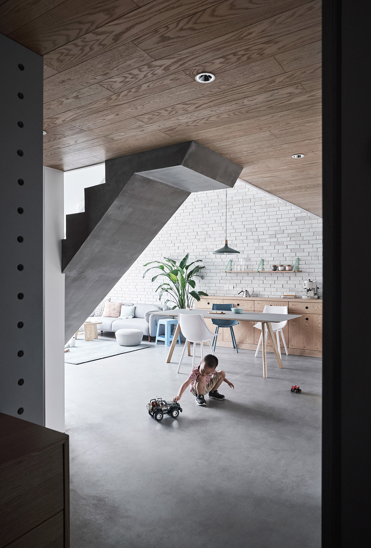
Open floor space transitions the entryway to the dining room. The perfect place to roll around a monster truck or two. VROOM! VROOM!
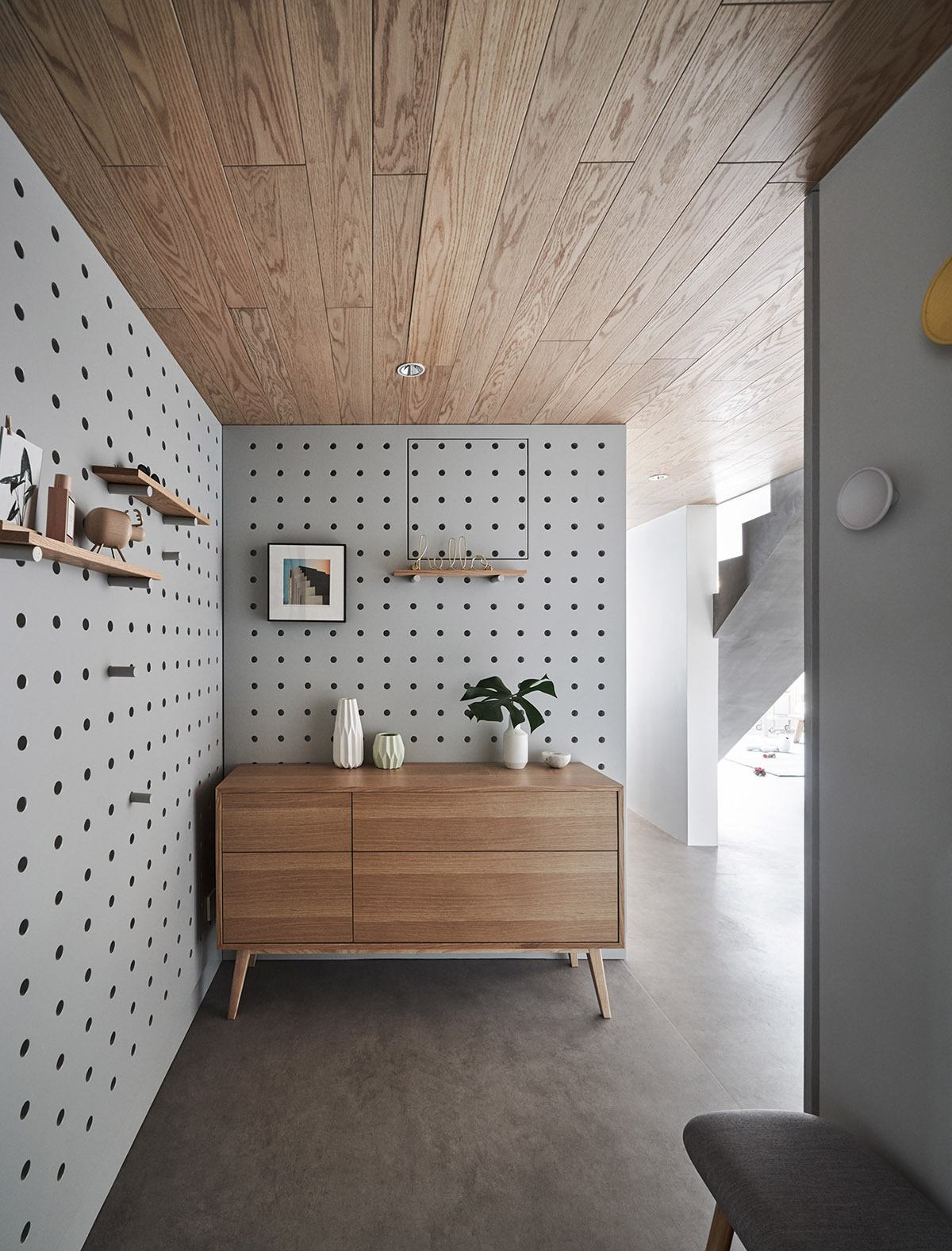
In the entryway we find the walls fitted with over-sized pegboard. An unexpected and youthful choice, which really draws attention to the Mid-Century Modern credenza that has been tastefully staged with decorative vases.
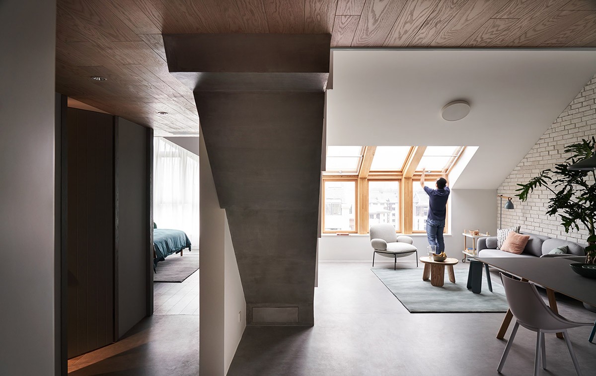
This concrete staircase has a pleasingly offbeat appeal, even from the bottom. To the left we get a sneak peek of what is yet to come in the master bedroom.
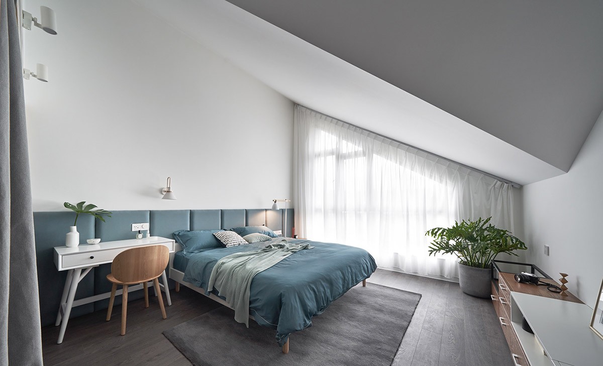
Enamored with tranquil blue accents, the master bedroom is brimming with a calming essence. With the large window, multiple wall sconces, and a matching floor lamp, this room will never run out of light!
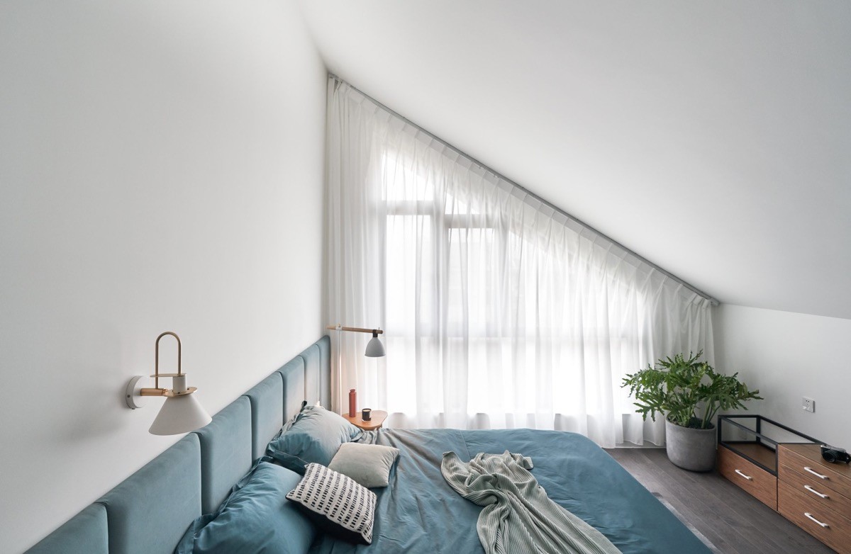
Sheer white curtains filter the abundance of natural light pouring in from the full-wall window. Perfect for the potted plant thriving in the corner. Its vibrant greenery harmonizes effortlessly with the rest of this tranquil design.
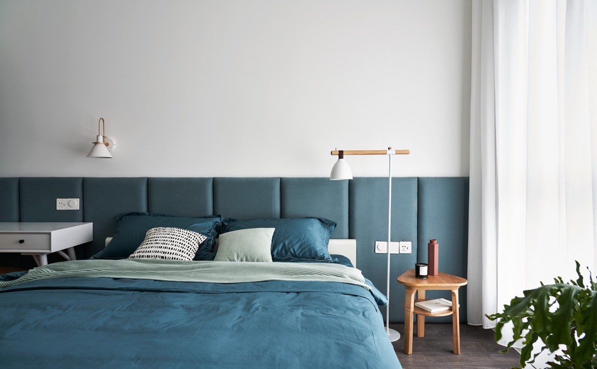
Blue carries through the sheets and weaves itself across the expansive, upholstered headboard. This master bedroom takes off with the blue bedroom theme and executes it flawlessly!
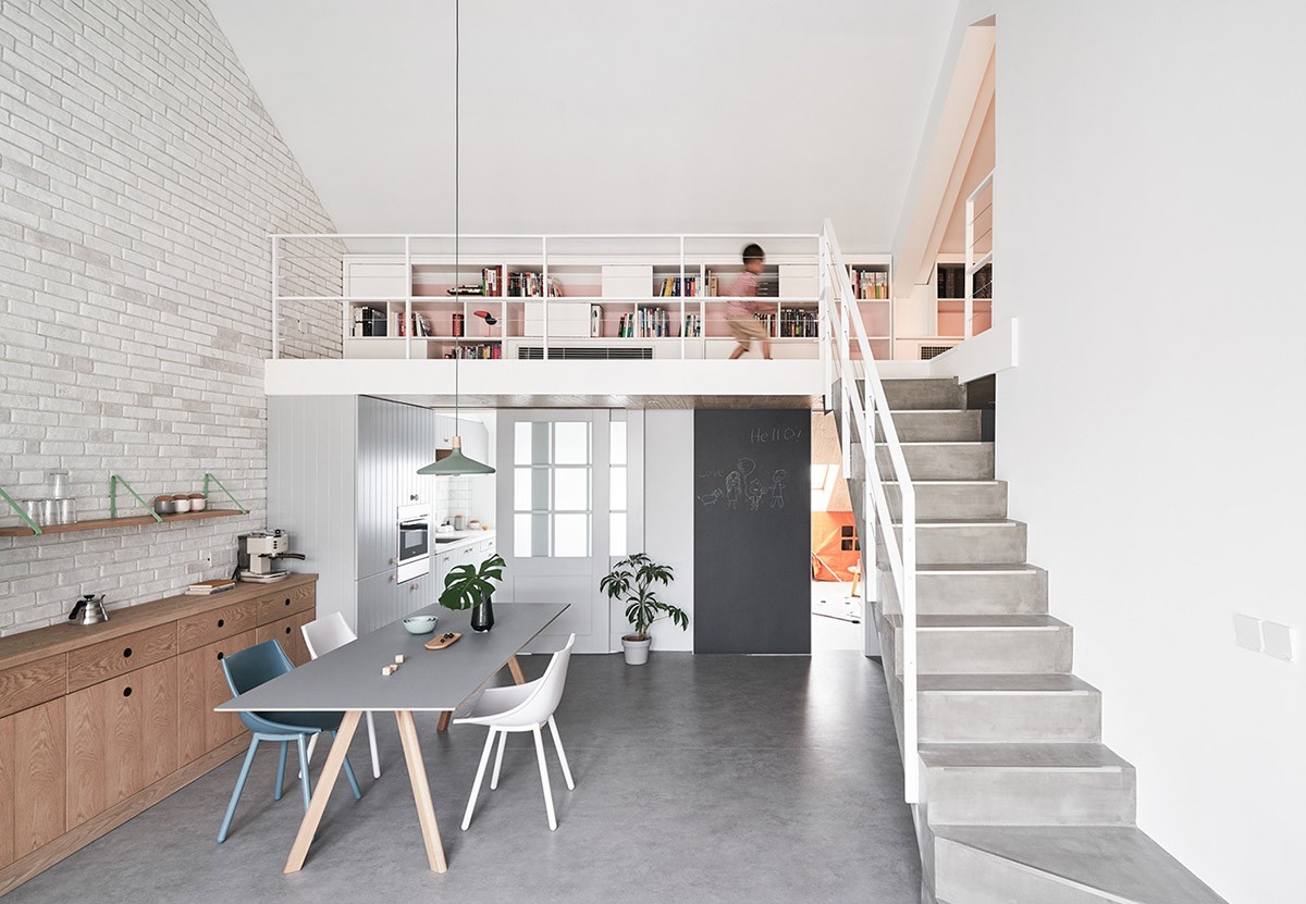
Quick as a flash, a blur of a toddler is caught running across the mini-library that is situated at the top of the stairs. The built-ins make great use of that narrow space and also help incorporate a bit of storage in to the home.
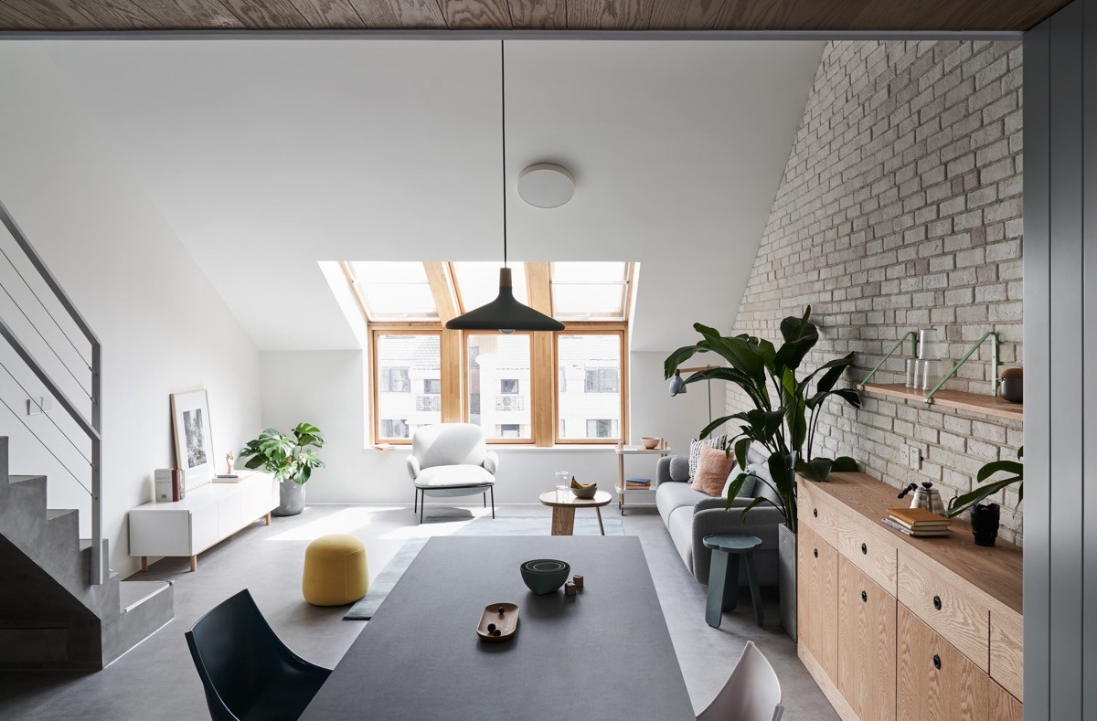
Being directly under the apex of the A-frame ceiling, a dining pendant light is a genius and stylish lighting choice for the dining room table.
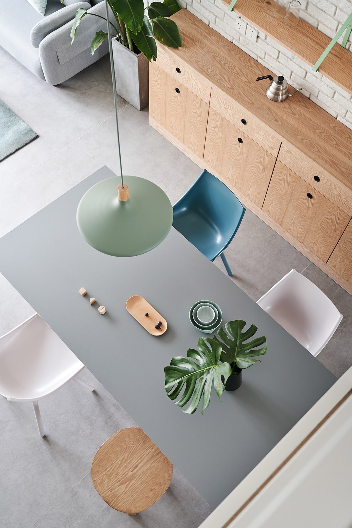
A view from above allows us to take in the array of soft blues and mix of modern dining chairs. We love that instead of flowers, Monstera leaf clippings are used as table decor.
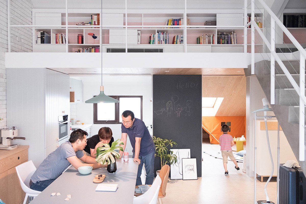
A dining table collaboration happens in front of a cozy white kitchen. We adore all the vibrant and youthful elements that have been incorporated in to this home, especially simple additions like the large chalkboard seen here.
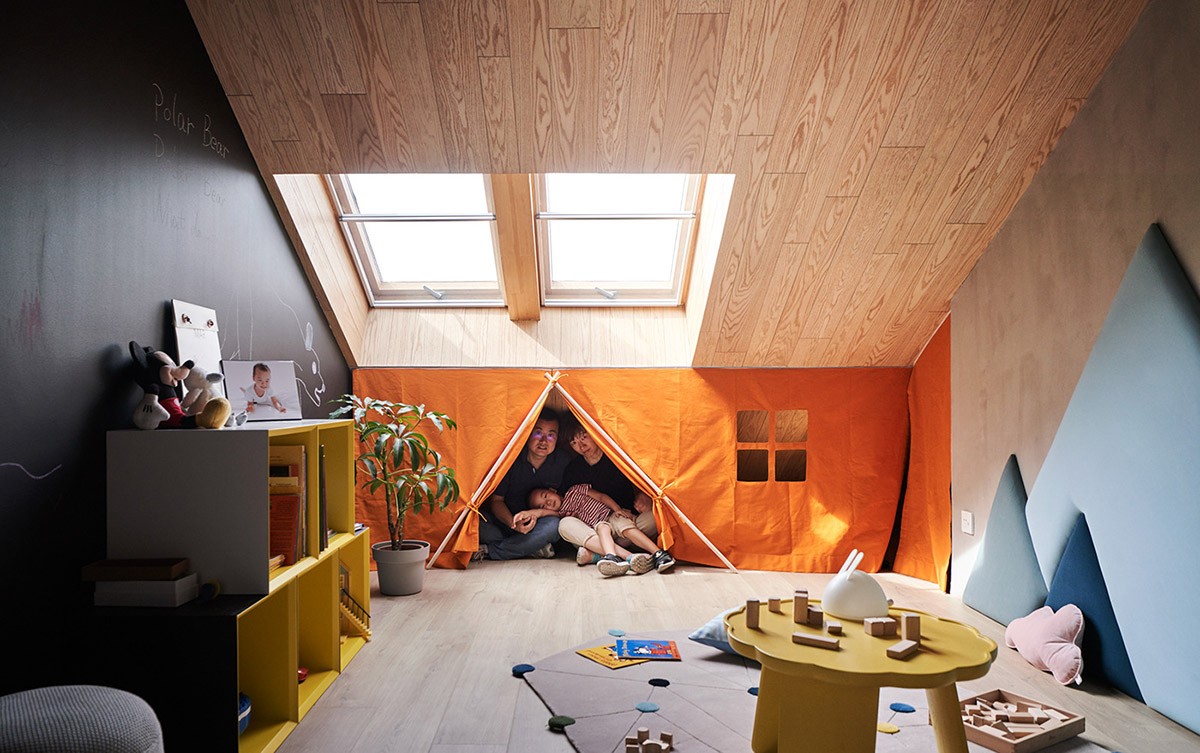
A splash of bright and bold color sets the kid's room apart from the rest of this house. Another skylight has been fitted to this room and illuminates unique features like the fun blue mountains, flower-shaped play table, and bright yellow storage cubes.
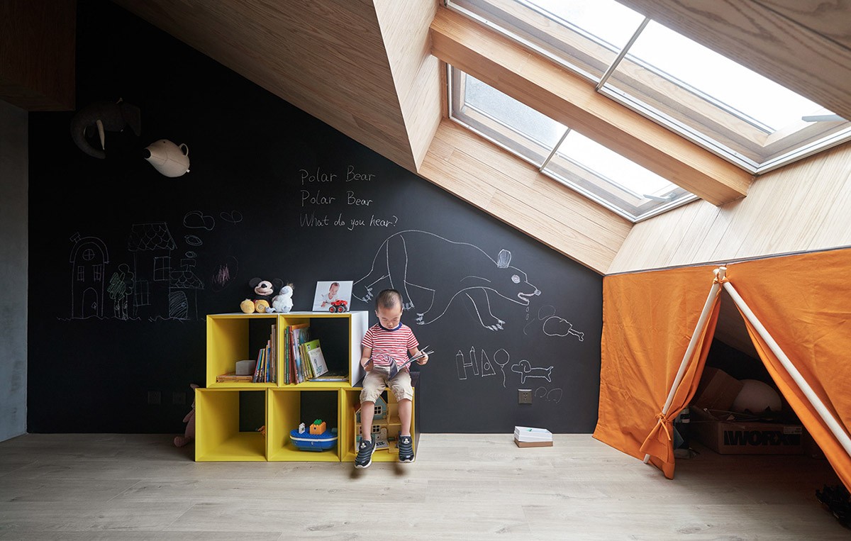
A whole wall covered in chalkboard paint gives lots of opportunity to learn and explore through erasable art! The combo of the black wall paired with the bright yellow and orange is strikingly energetic.
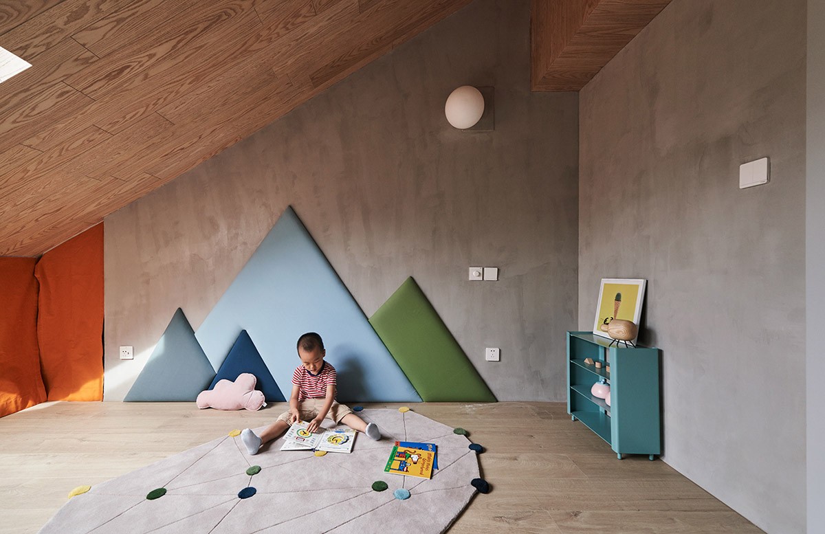
The upholstered mountains match the play mat and small blue shelf to create a bright and unified design. The idea behind the blue mountains with their playful charisma is that they can grow with the child. For example, later on they might be used as a unique headboard.
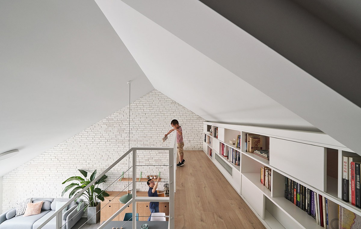
The mini-library located in the narrow loft area is clean and bright with an assortment of reads to choose from. We wonder what they chose this time.
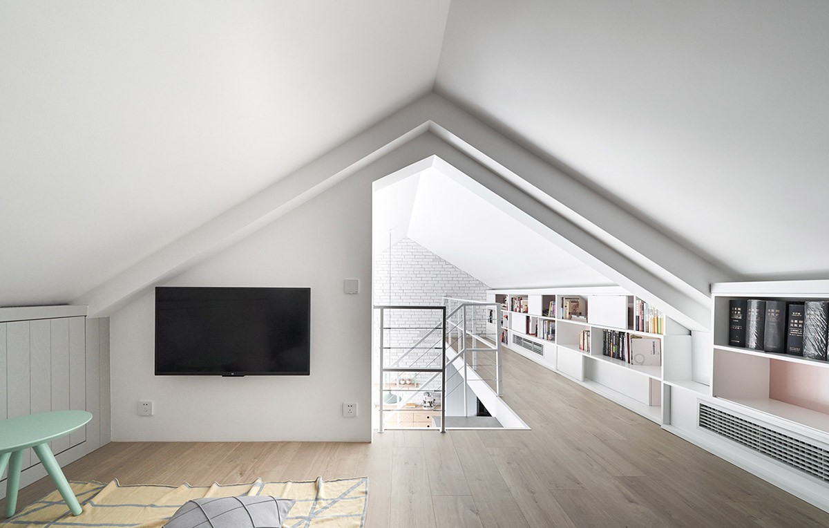
A quaint TV space off to the corner of the upstairs office. Wood flooring that flows throughout this level makes the second floor feel extra cozy. We also see that more shelving has been incorporated on the right side of this room, which makes excellent use of the low ceiling space.
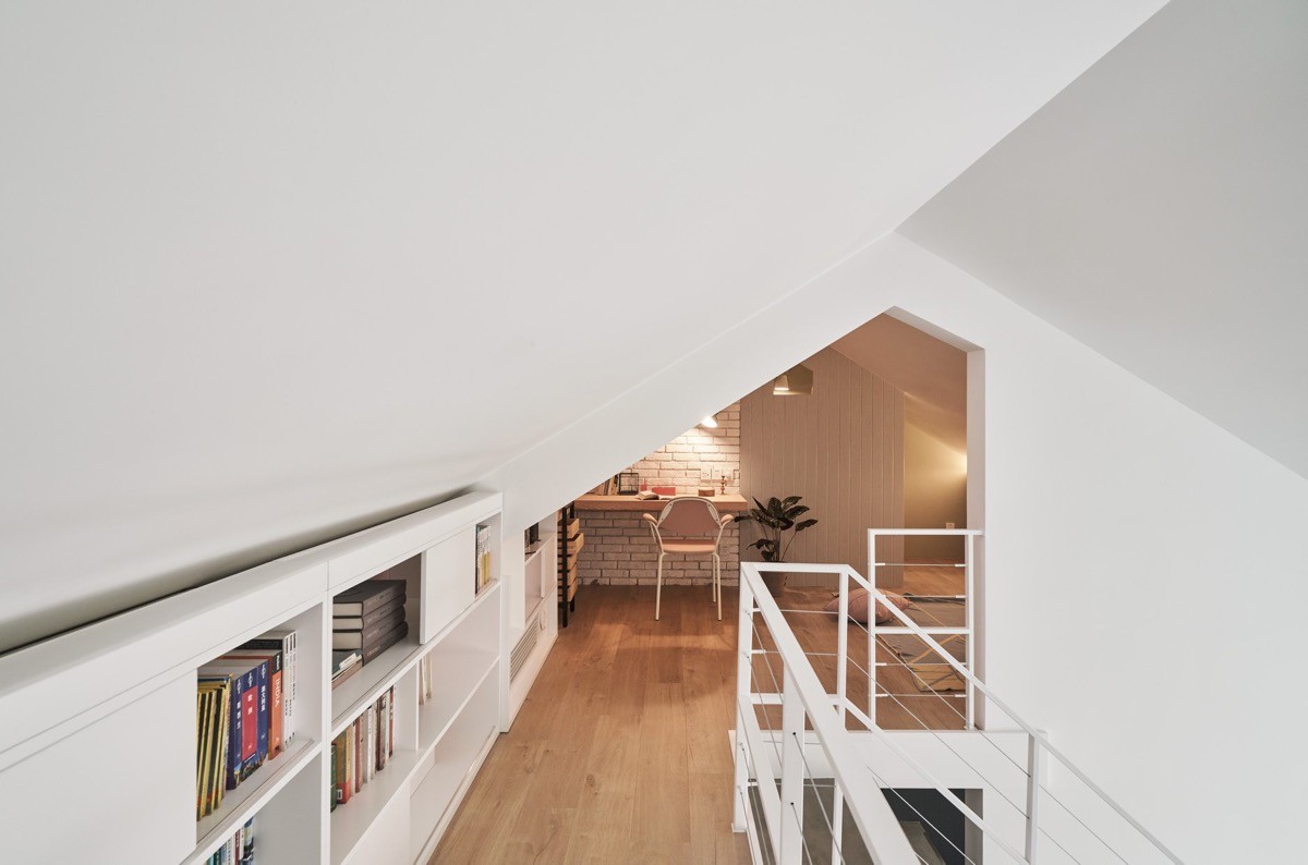
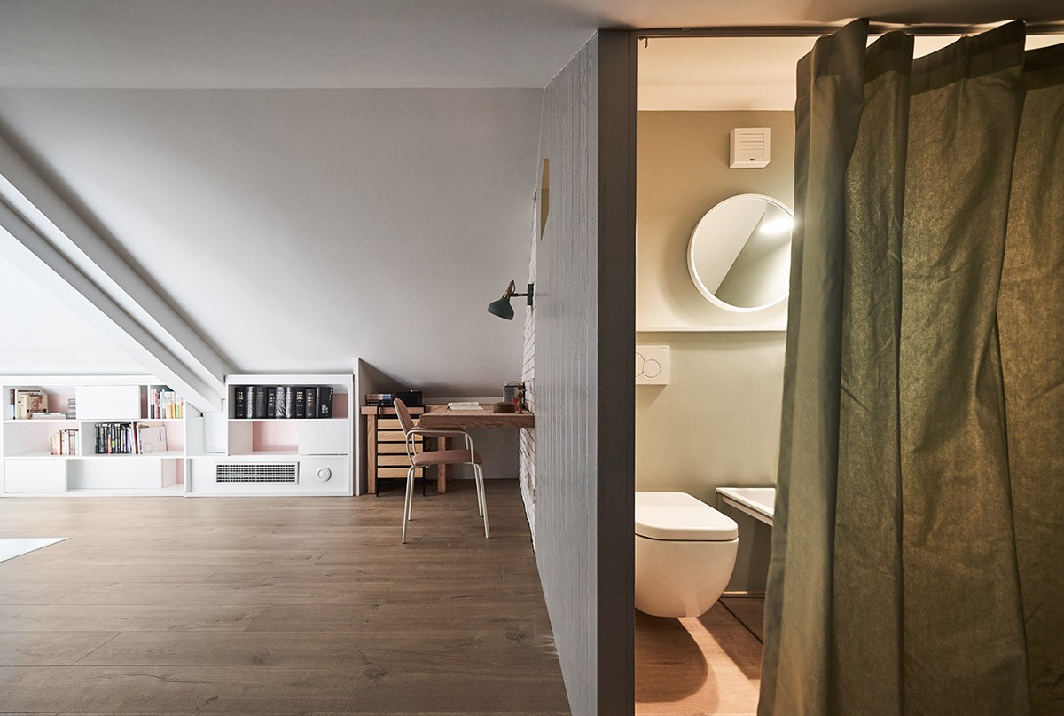
Filled with an ambient glow, this small home office was created for the hostess to work and read. It has been accented with the same white brick that we see in the living room and dining room.
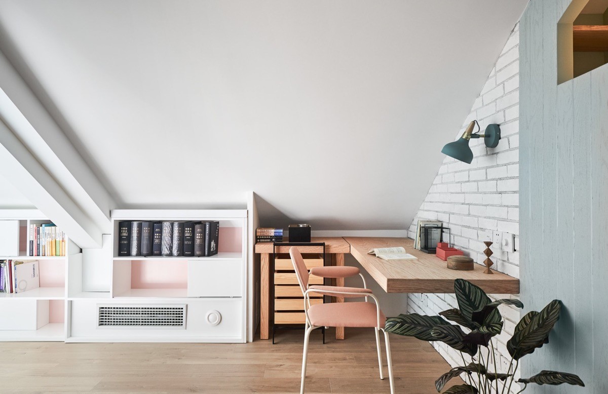
This modern home office has been fitted with a floating desk in a light wood finish that is no stranger to this home. The low slanted ceiling may be cumbersome if this was a standing space, but for a sitting office it is perfect.

