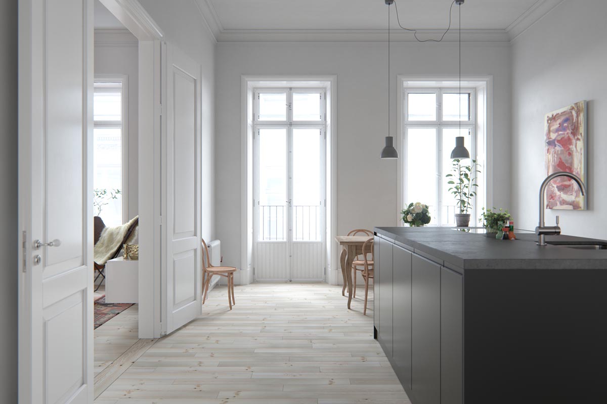
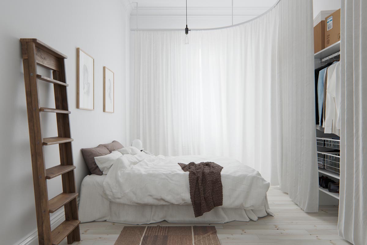
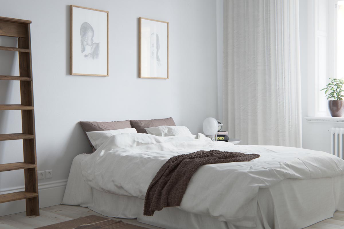
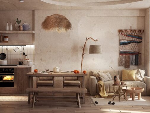
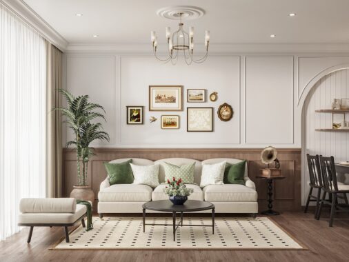
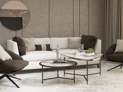
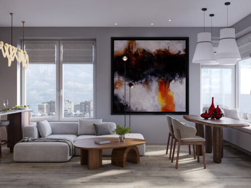
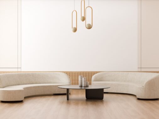
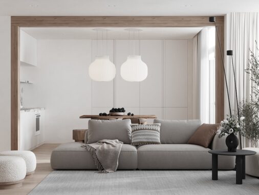
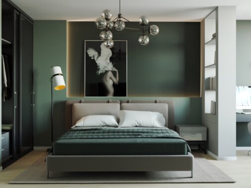
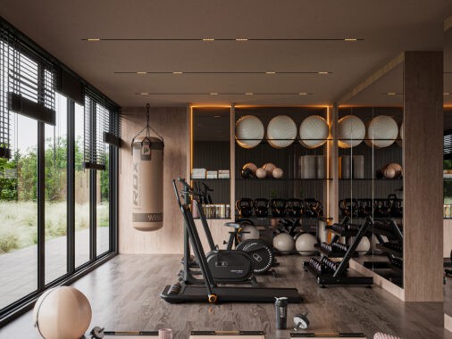
There is nothing quite as cozy and inviting as the clean lines and soft textures that are so common in the Scandinavian design style. By using soothing neutral tones alongside natural greenery and bare wood, the Scandinavian homes featured here are exude a calming warmth. Further, the furniture chosen in each is able to convey how important simplicity of style is to the designer. Embellishments and garish accessorizing is better left to other styles -- the Scandinavian interior (no matter where its geographic location) is content only with harmony in its color palettes, flow, and overall livability.
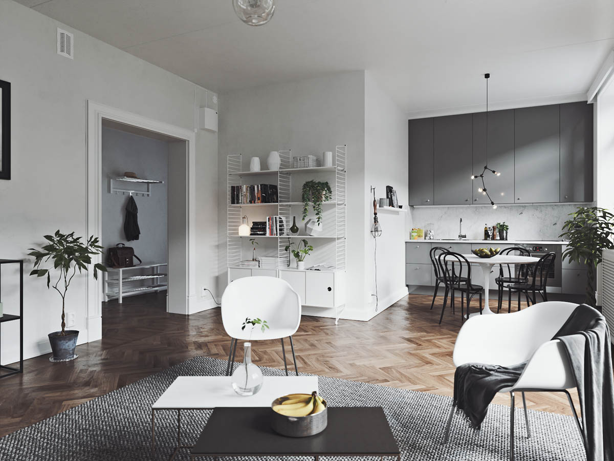
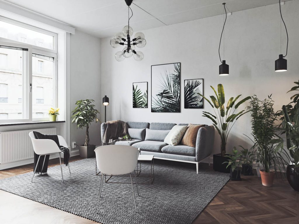
The first home featured takes an open floorplan and keeps much of the floor itself open for foot traffic.
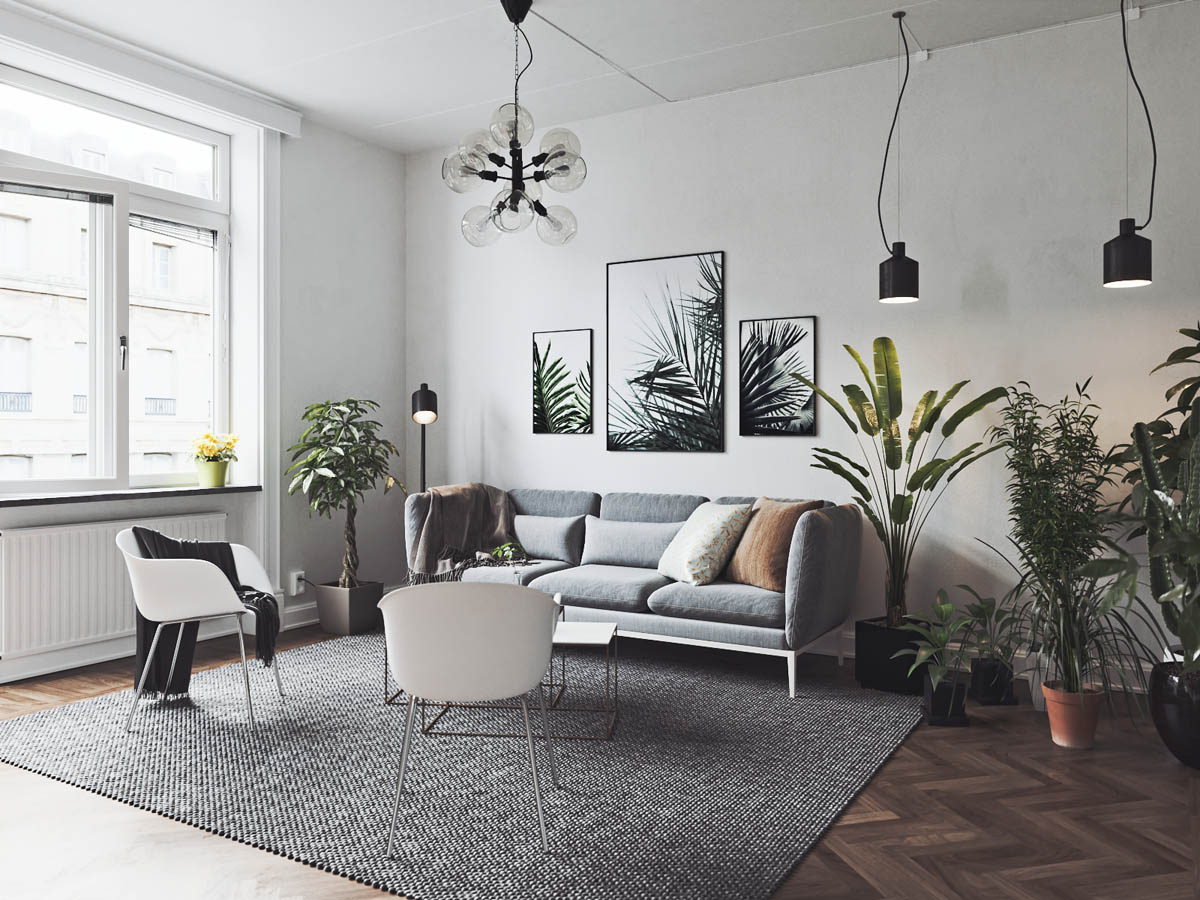
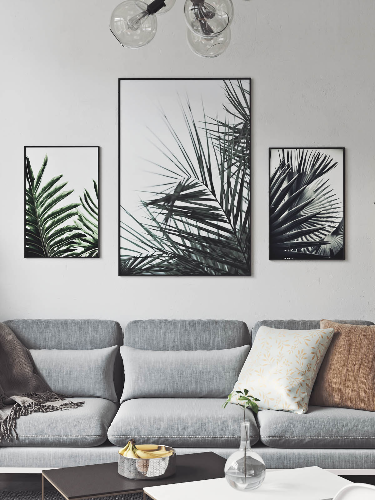
The use of indoor house plants in the main living area is anything but minimalist, but it works to create a welcoming gathering spot. Other features keep things purely greyscale - from the lovely white chairs to the black sputnik chandelier and mini pendants.
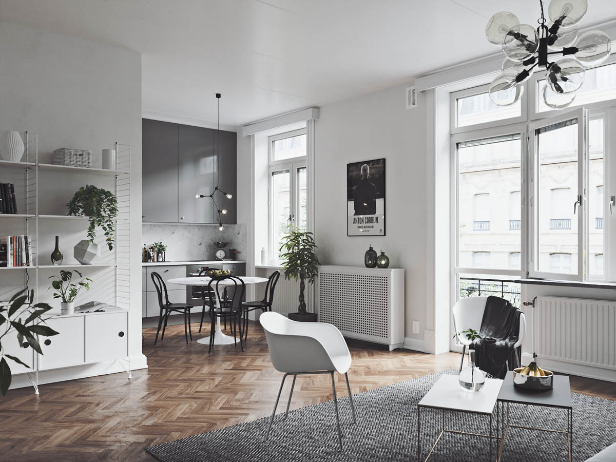
Area rugs, this one with a nice nubby texture, are a great way to separate spaces without closing off a room.
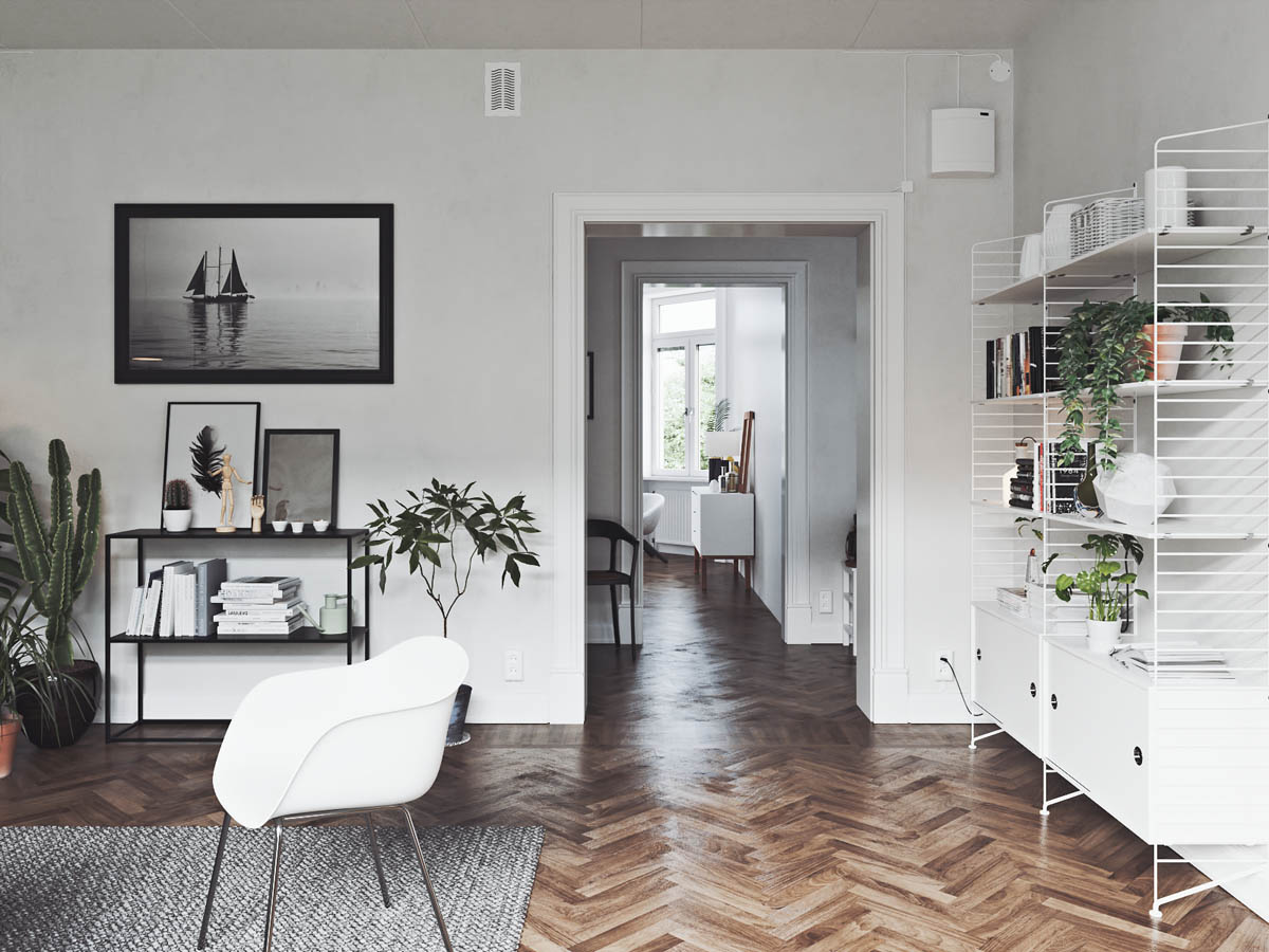
The chevron stripe is a popular feature in the Scandinavian style, and its use here in the wood flooring is a classic, playful choice.
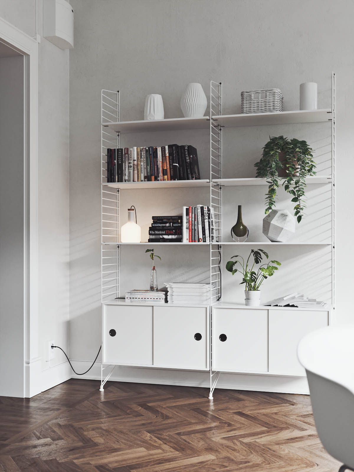
Open shelving necessitates keeping things orderly -- this gorgeous white option is from Swedish furniture maker String.
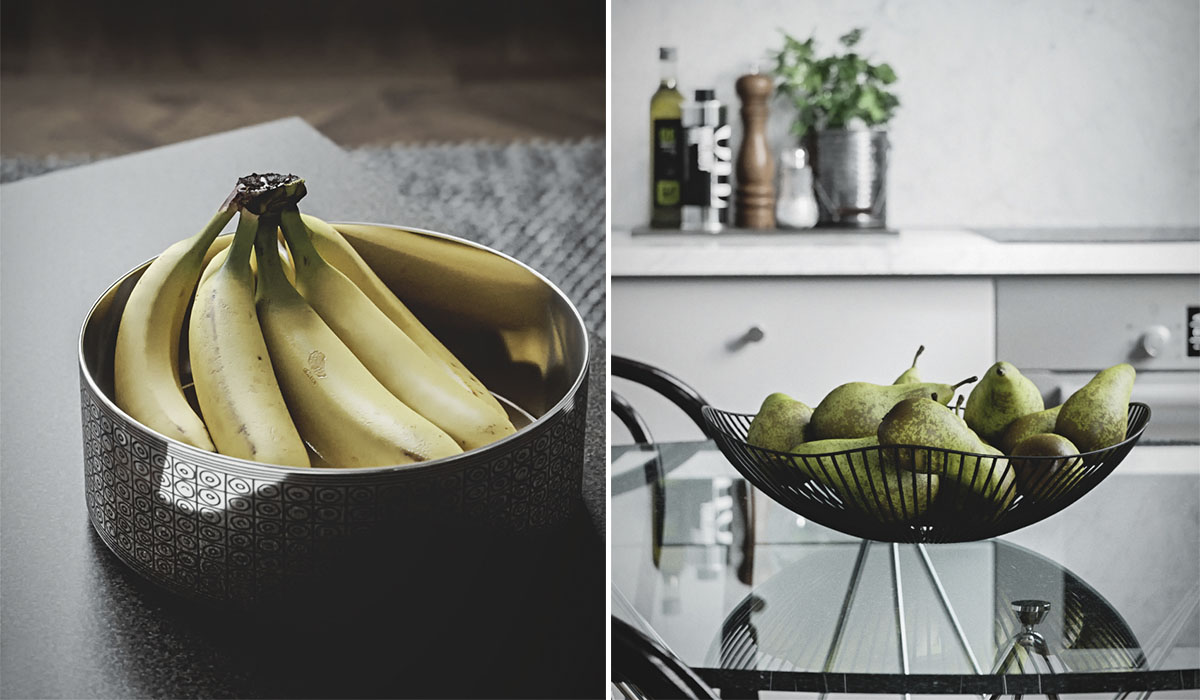
And modern fruit bowls are anotehr way to bring a bit of edible nature into a design.
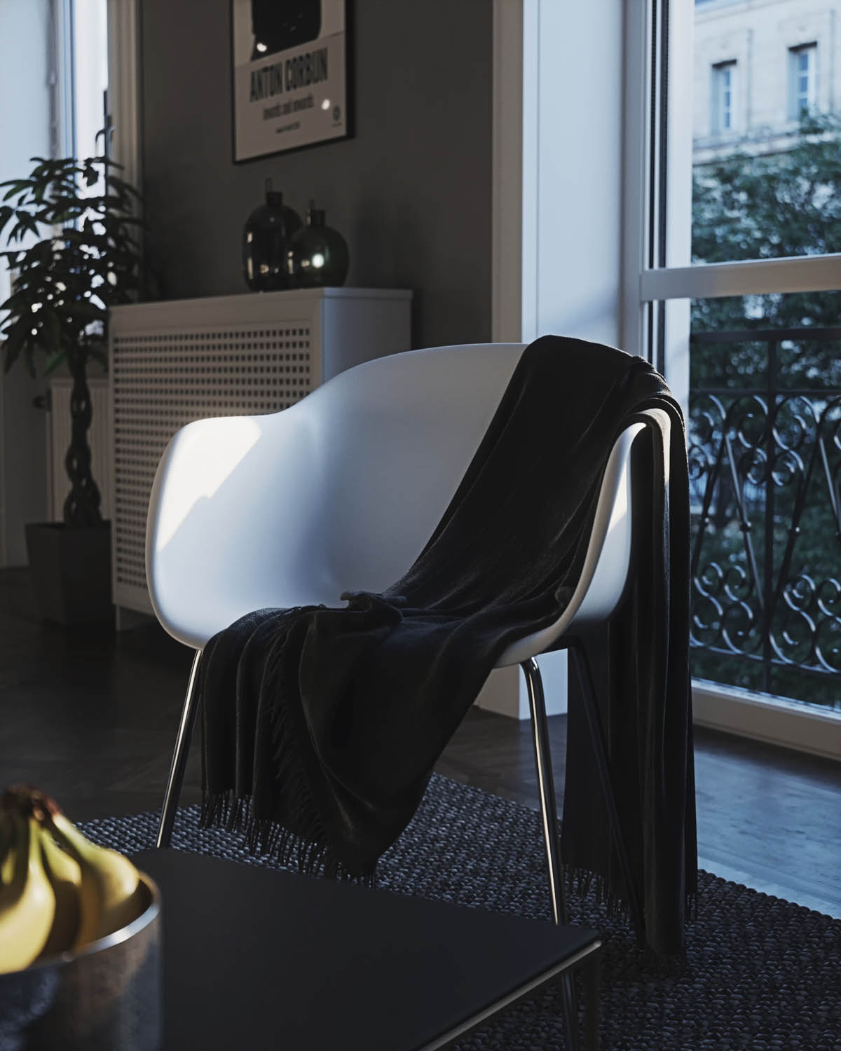
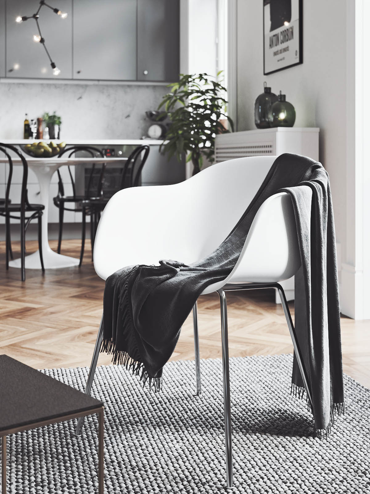
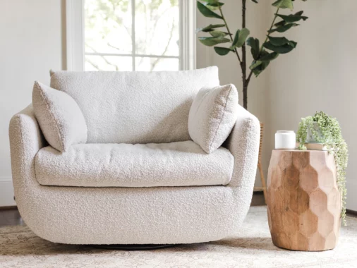
While the way this throw is slung over the Eames-stlye chair may look careless, it's actually an effective way of blending textures.
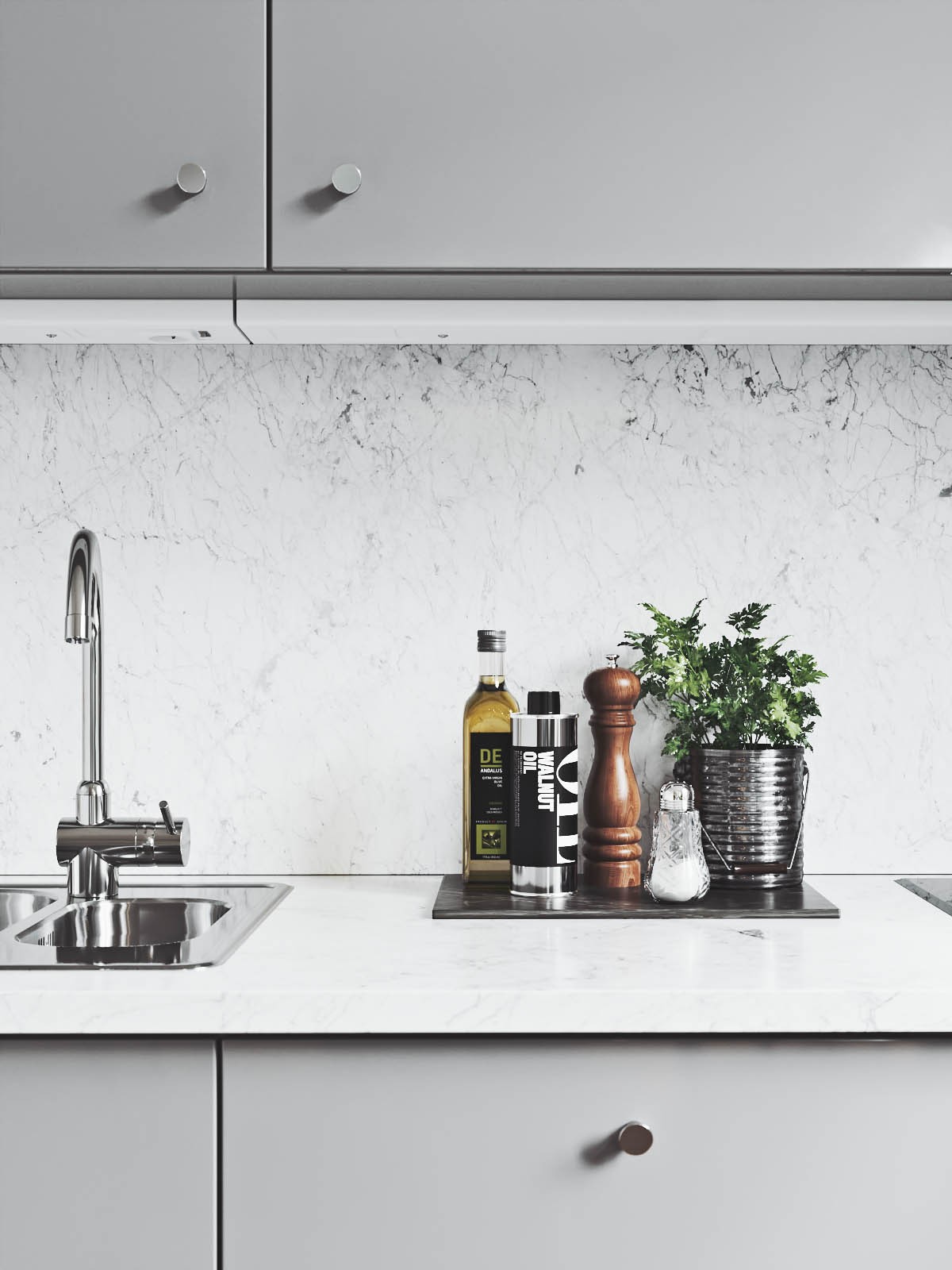
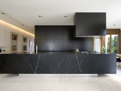
The design in scandinavian kitchens like this one is also typically quite simple.
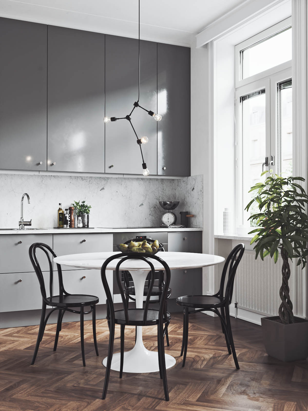
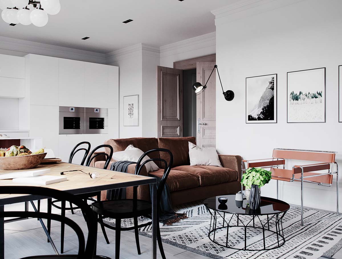
In the small dining area, Scandinavian style chairs complete a clean and functional look. These particular black chairs are the Thonet style chairs.
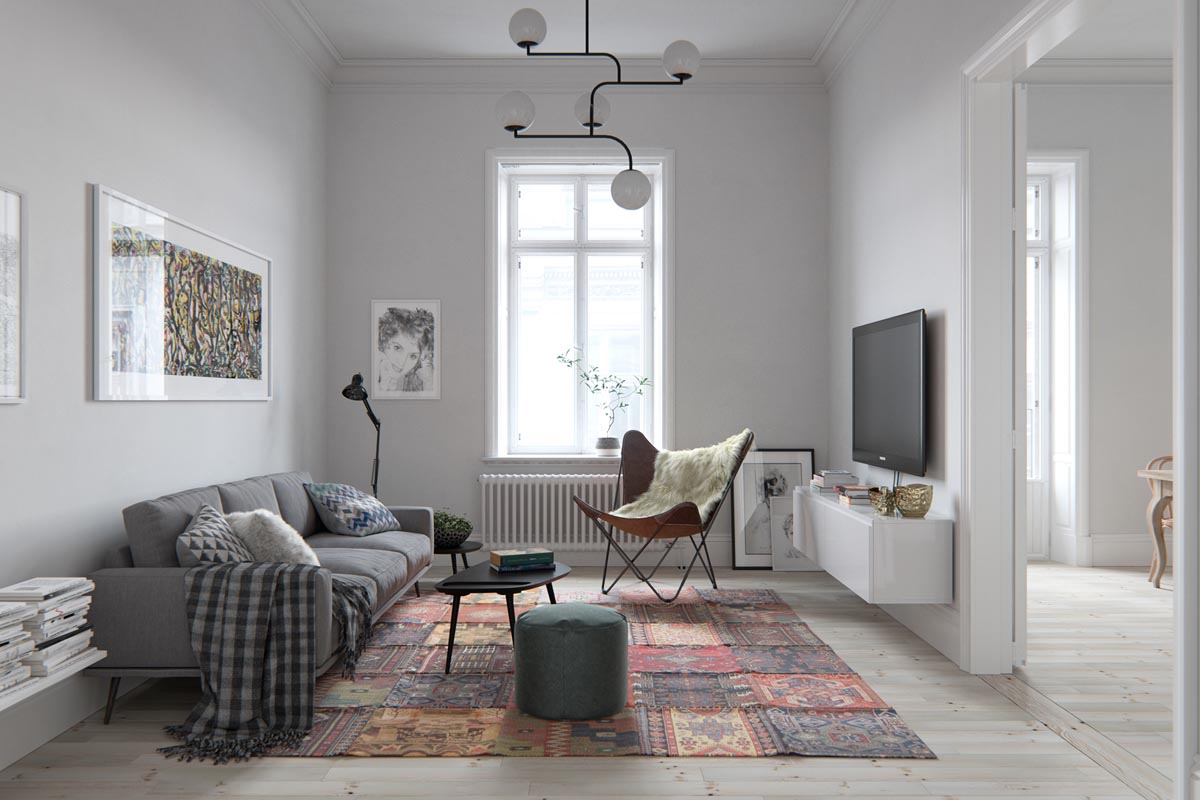
The colors in the second featured home are not as high-contrast as the first, but the overall effect is still similar.
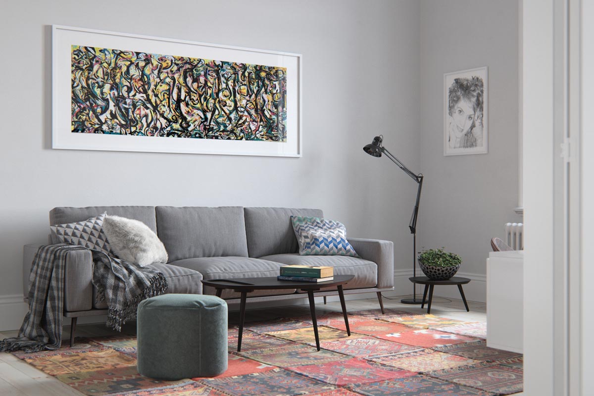
This design certainly uses a bit more color, as evidenced in the area rug as well as the print of a mural by Jackson Pollock over the sofa. A simple floor lamp makes the sofa a cozy place to read at night, too.
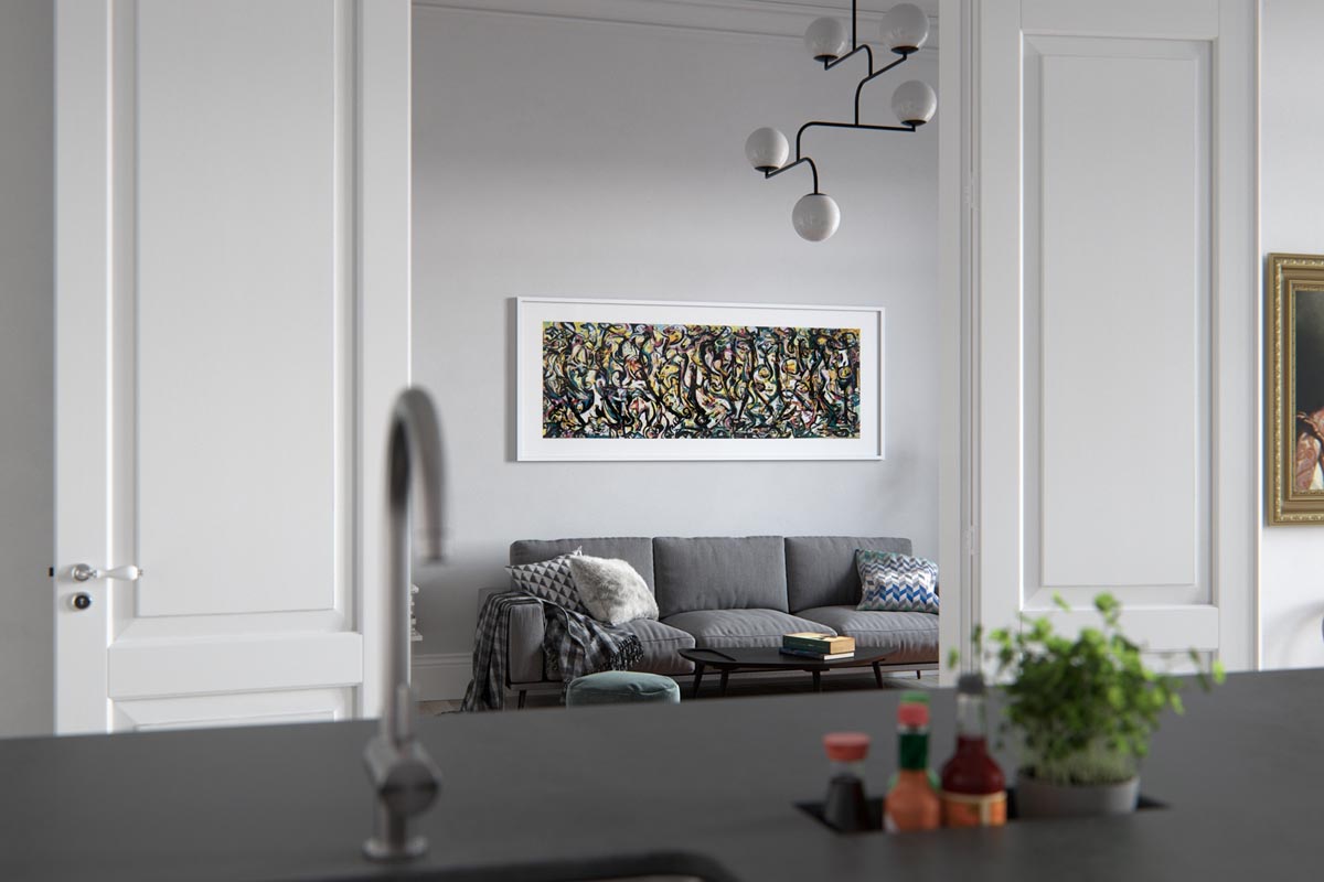
The kitchen looks out onto the main living area, so keeping the colors in the same family (grays are used here) is important.
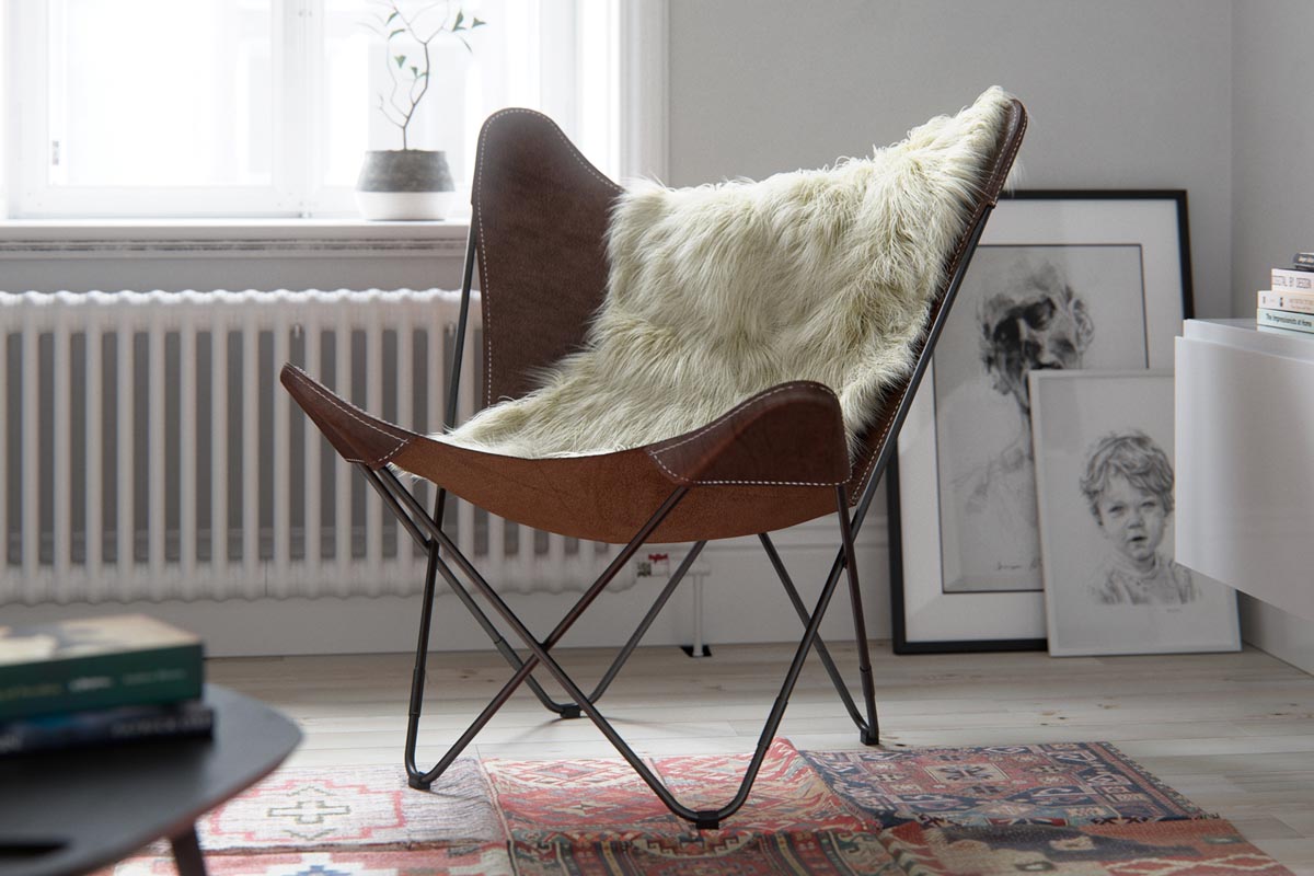
The Scandinavian style is no stranger to creative accent chairs like this leather butterfly chair.
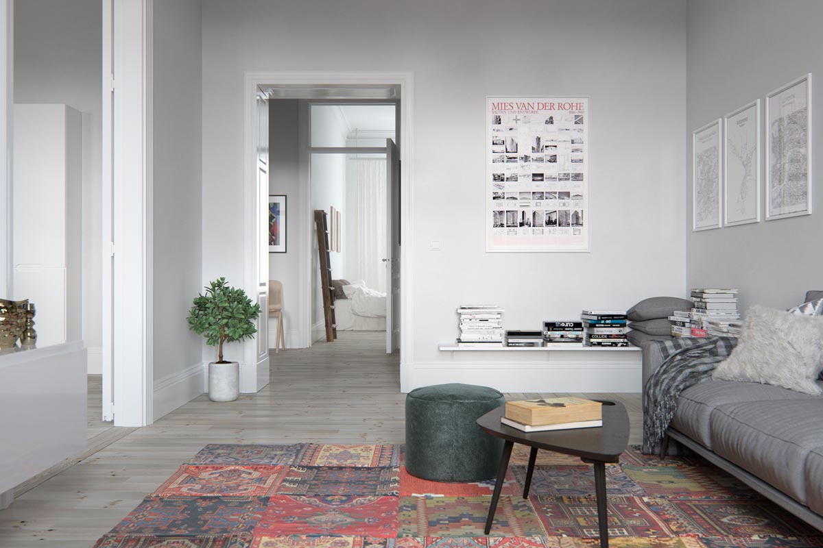
An architectural art print, this one celebrating Mies van Der Rohe is indicative of the designer's reverence for style.
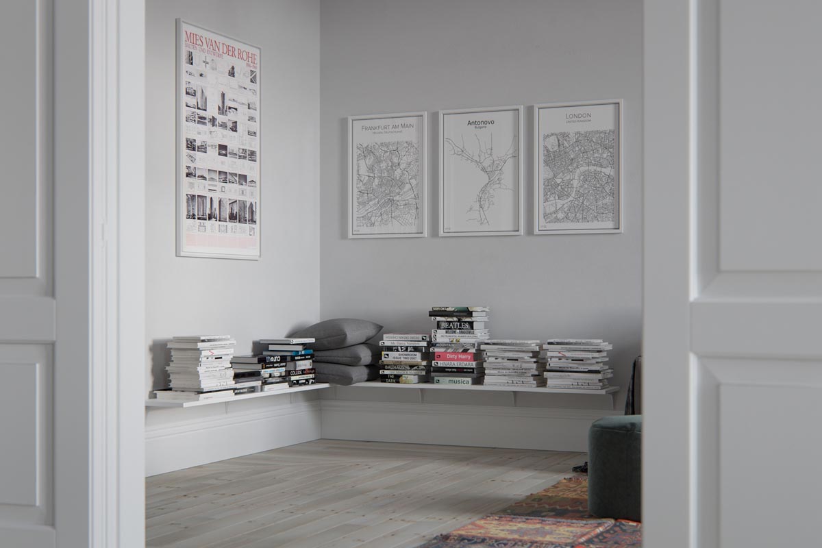
Custom city maps, available on Etsy are another stylish way to personalize the walls of any home, Scandinavian in style or otherwise.
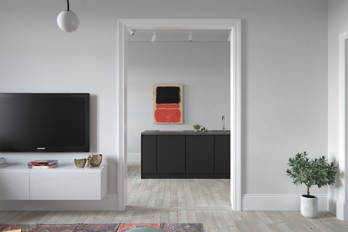
The artwork in use in this design ties the space together, with the reds in the wall print mirroring the reds in the living room area rug.
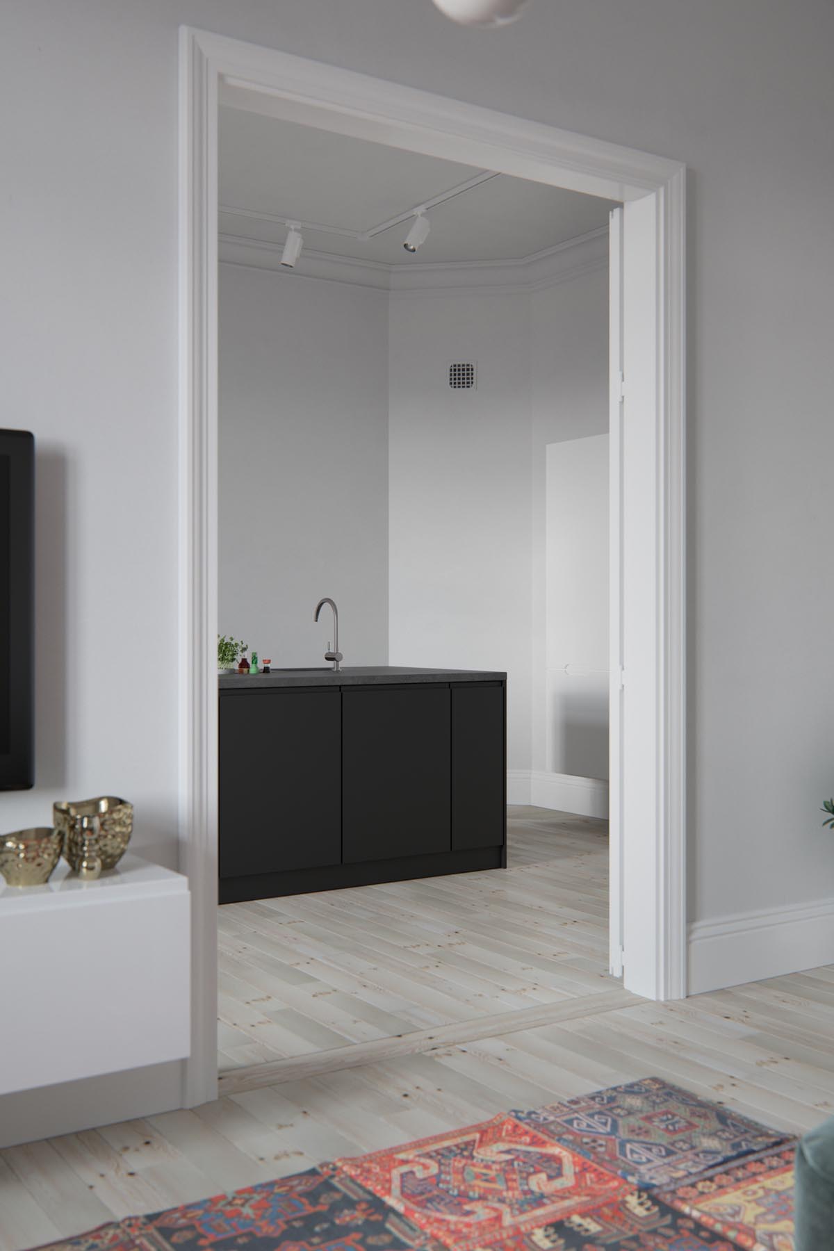
White walls may be drab for some, but in this design they indicate openness and focus the eye on other design elements.
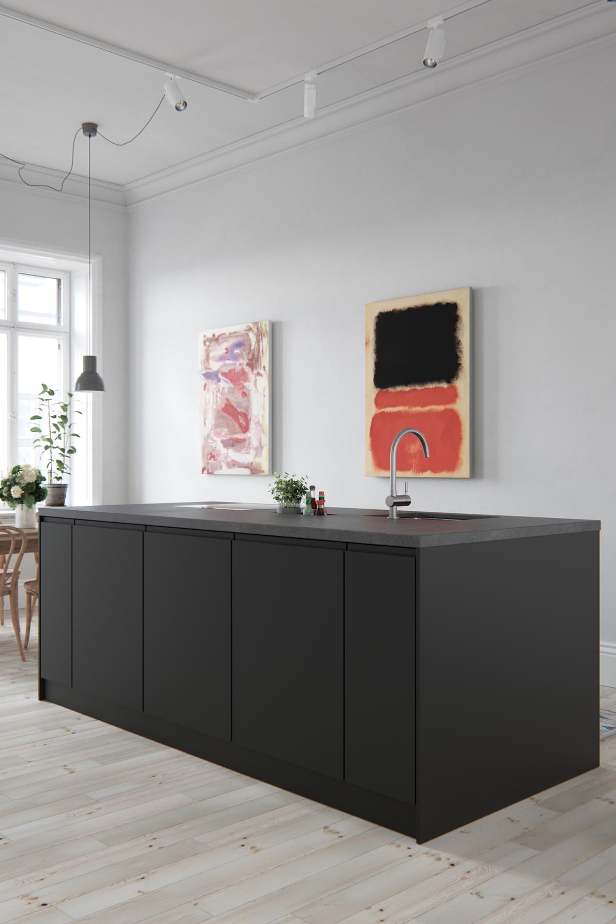
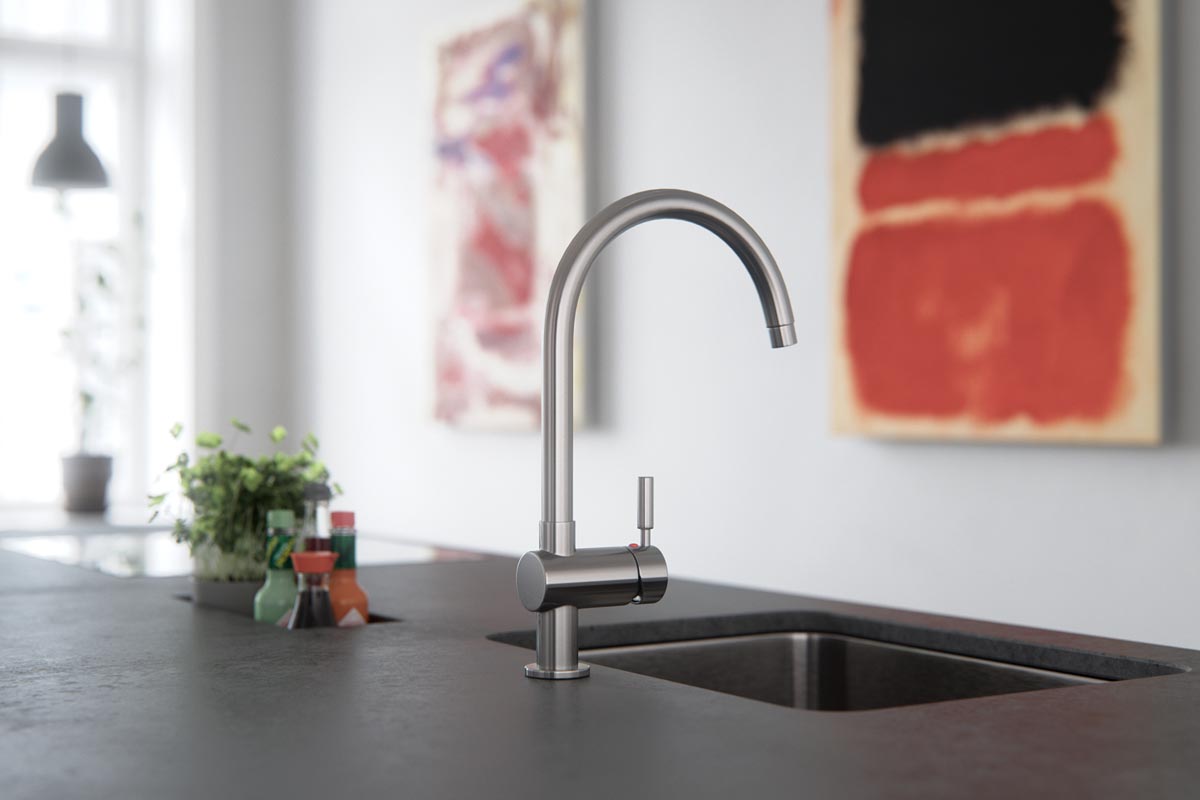
When we get inside the minimalist kitchen, we can see just how simple and sleek it is.
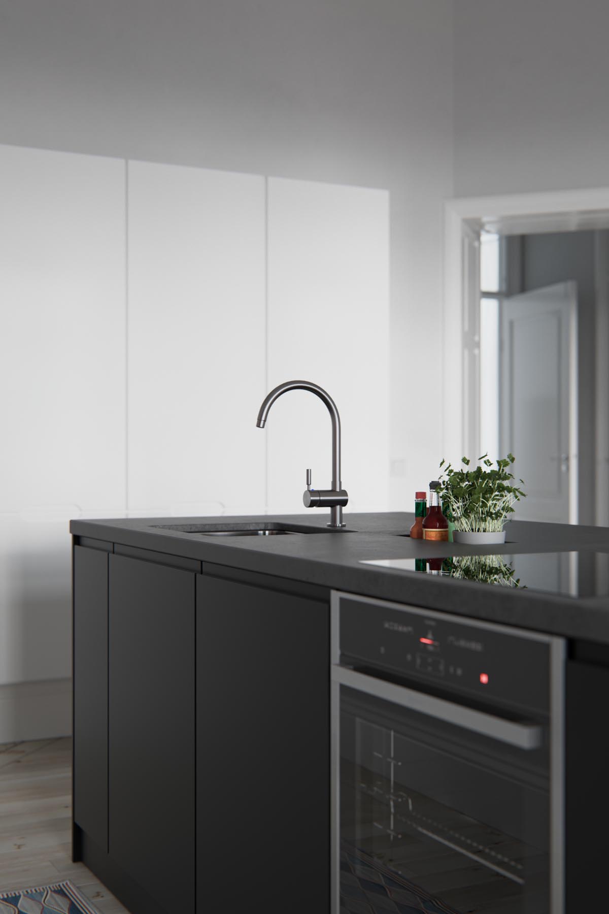
An indoor herb planter is the only spout of life on the clean and clear countertop.
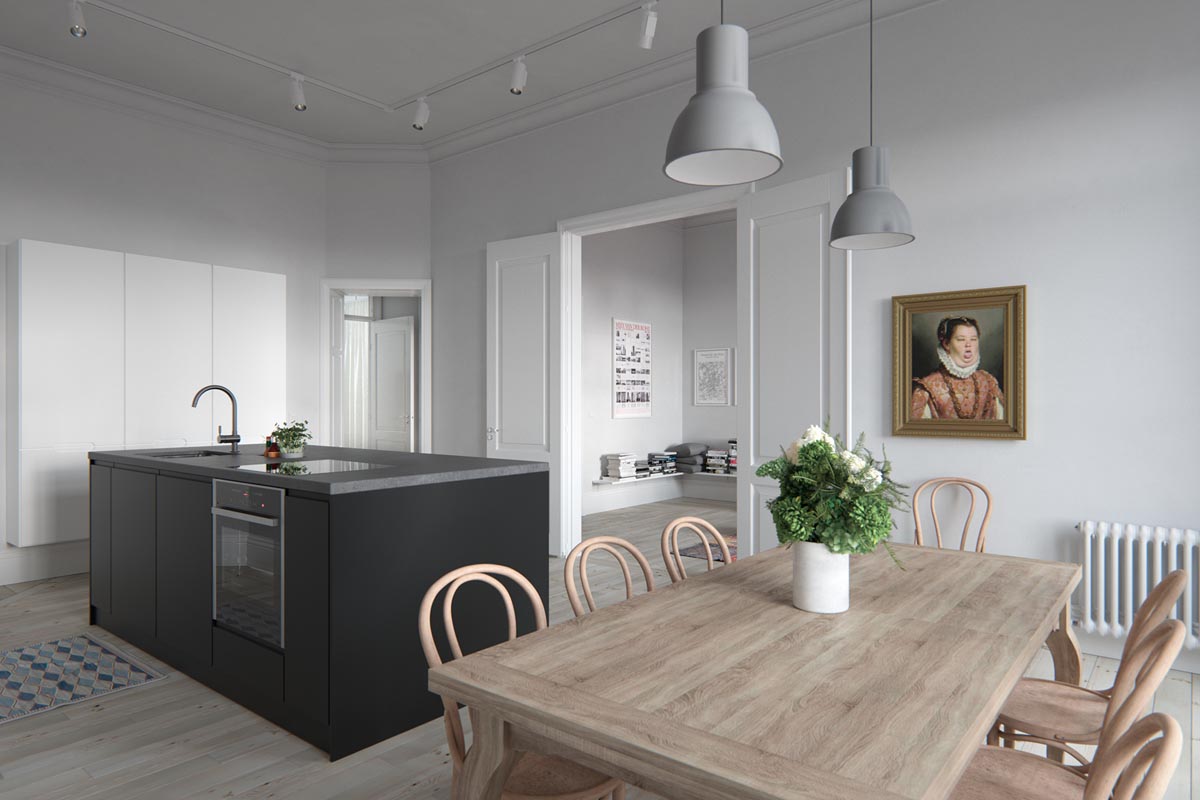
The dining table set is more Scandinavian than minimalist, with gray dining pendant lights and a decorative vase on its large wooden dining table.
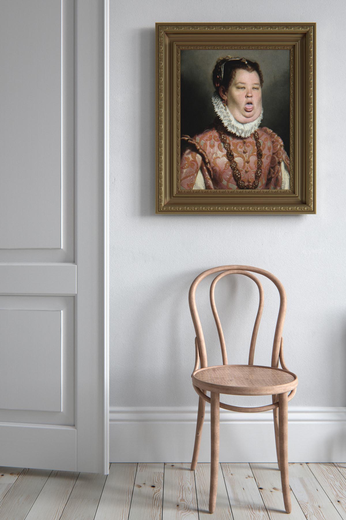
A bit of a departure from the design focus of the art around the house is this satire of Giovanni Battista Moroni's portrait.
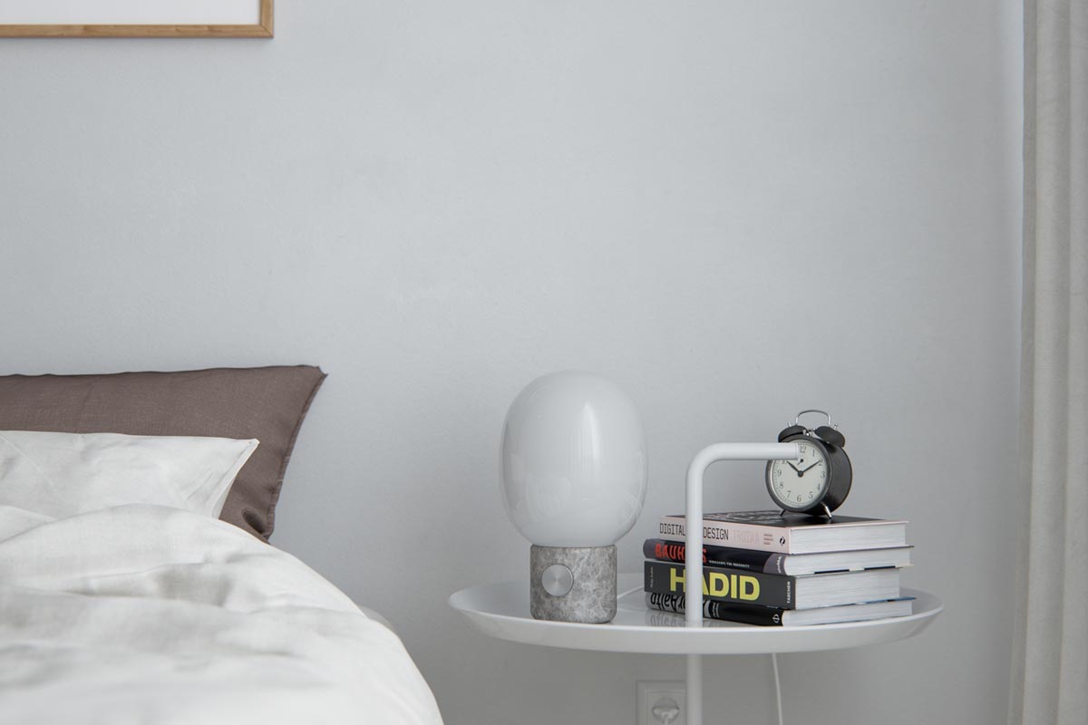
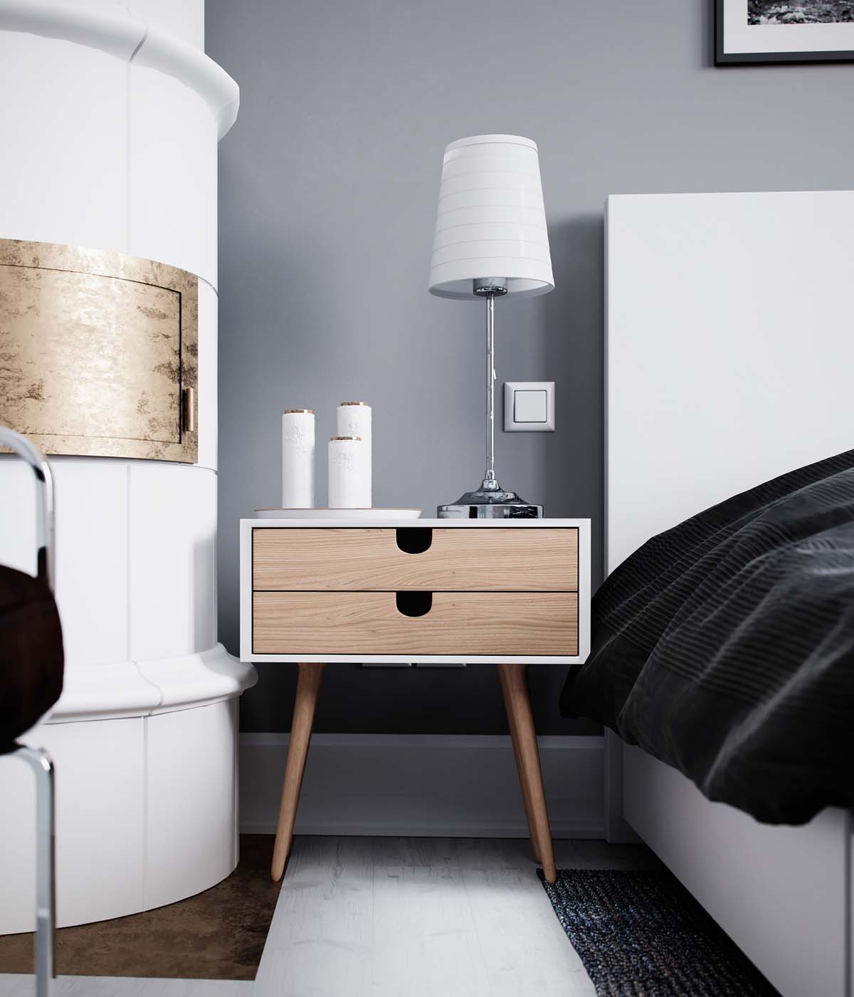
Finally, a neat bedside table lamp, in this case the JWDA Lamp makes it easy to drift off while reading what is surely a design book from the minimalist bedside table.
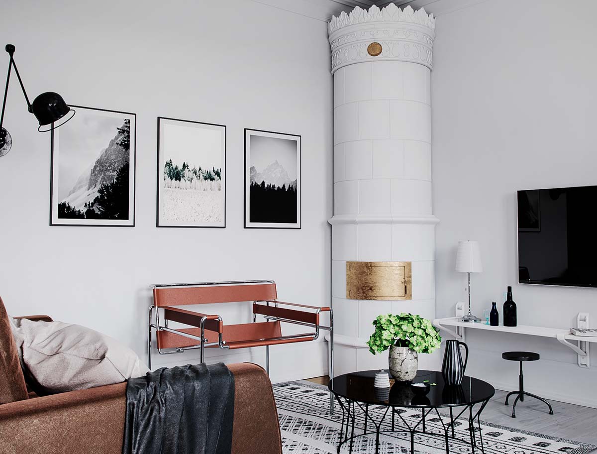
The final home featured has quite a bit going on in its main living space.
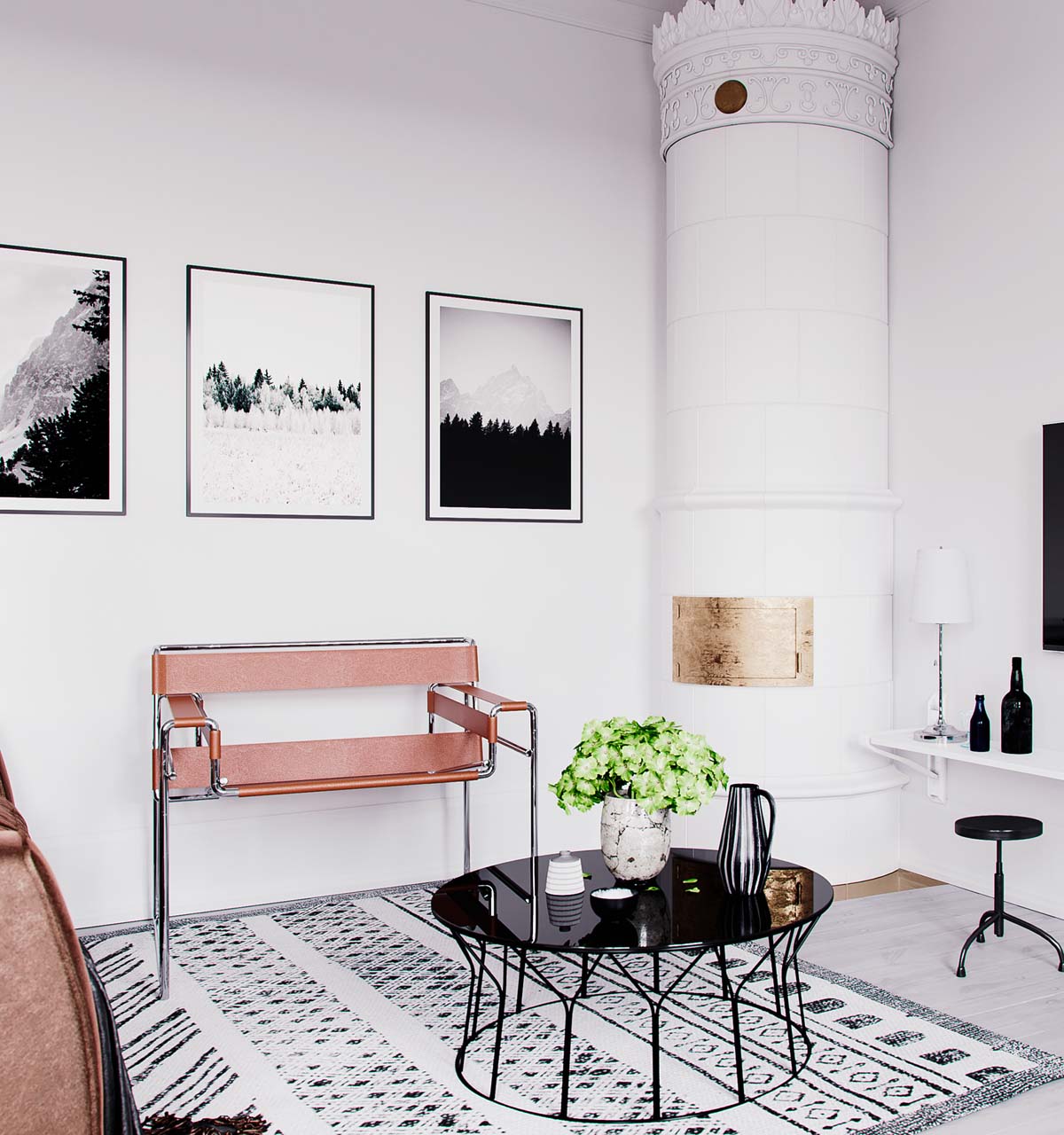
Not only is there a turret in the corner with intricate detailing, but there a few more bold colors and patterns than some Scandinavian designs tend to use.
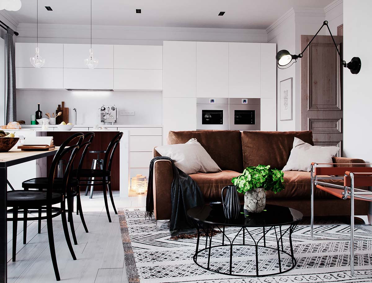
The rich dark brown works in harmony with the black furnishings like the coffee table and dining chairs to create a modern warmth.
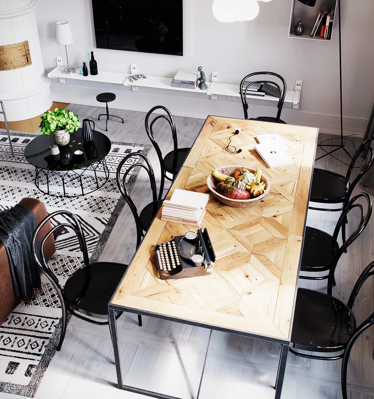
Again, we see the Thonet style chairs used to great effect in the dining space.
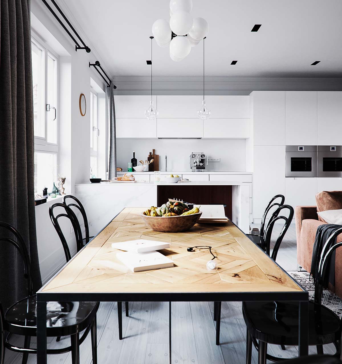
Wooden fruit bowls like this one are practical but also stylish.
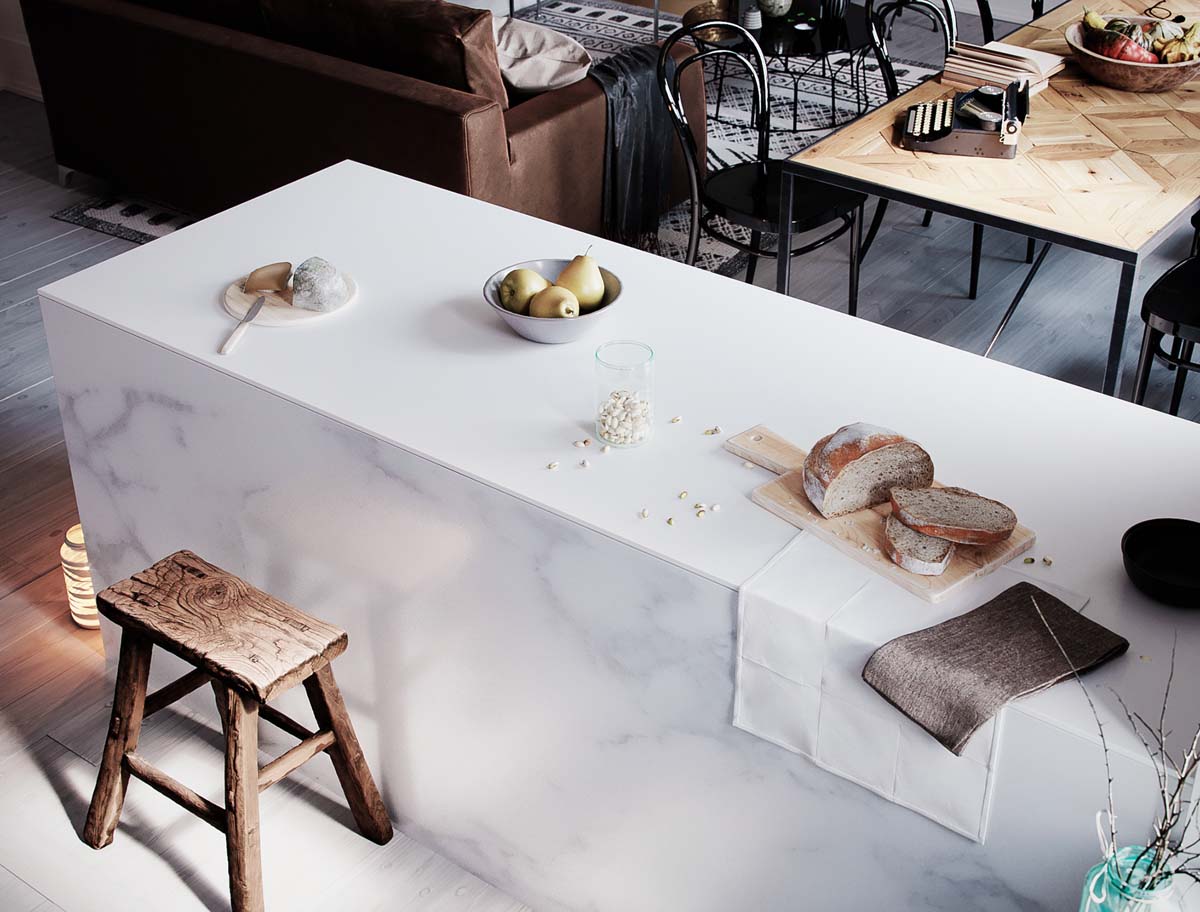
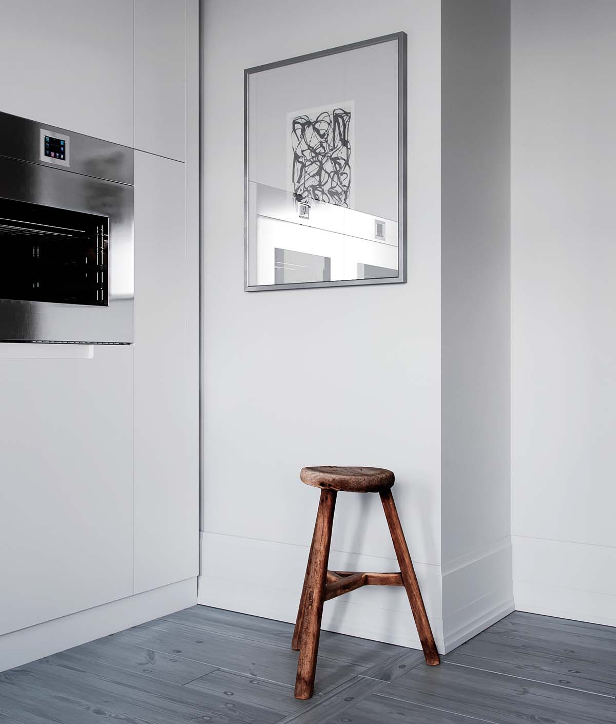
The lived-in kitchen uses a sleek cutting board as well as a small wooden stool that stand in contrast to its marble countertop.
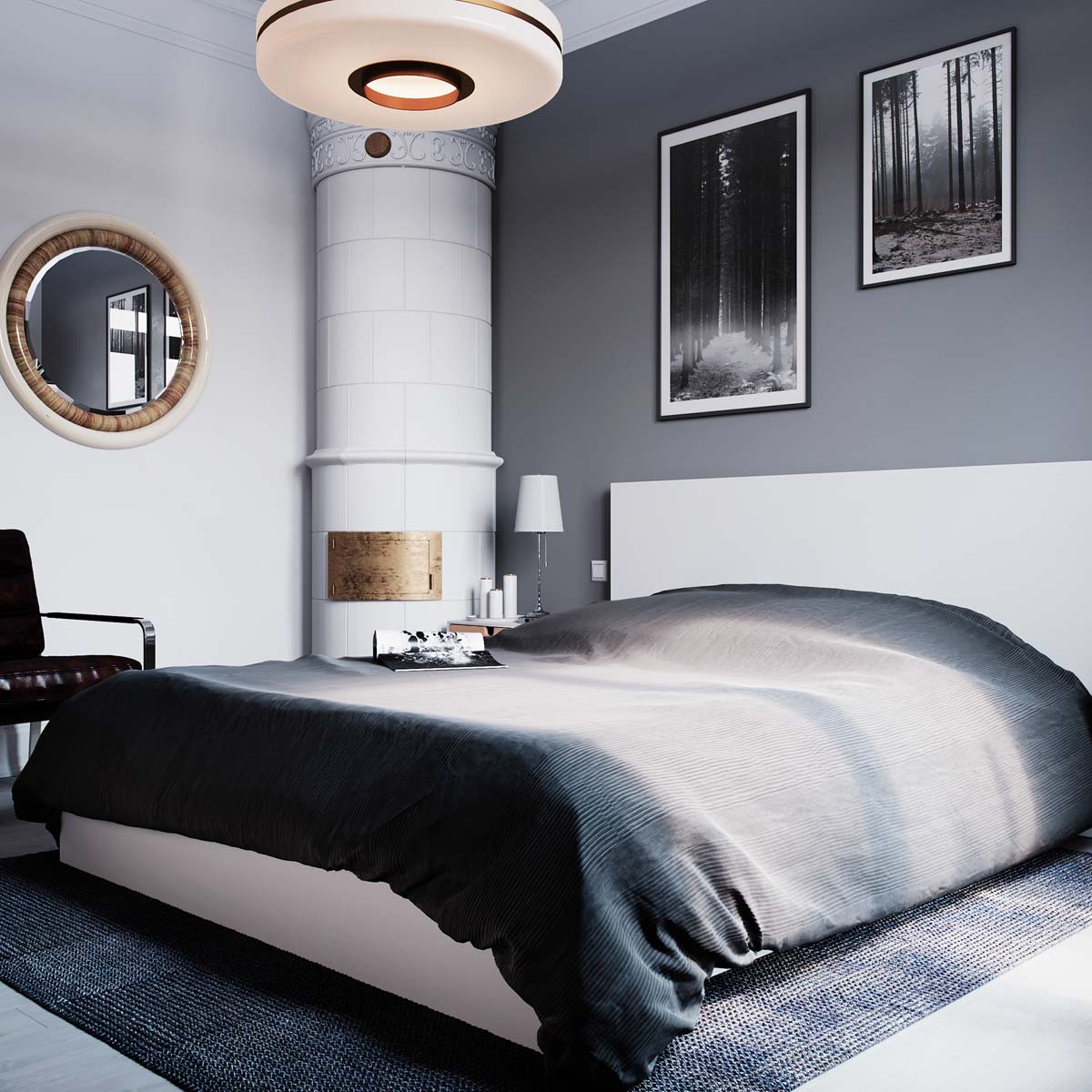
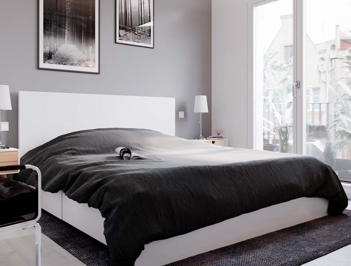
The dark gray bedroom also has the decorative turret (clearly a heating element) as well as cool gray linens and monochrome art.
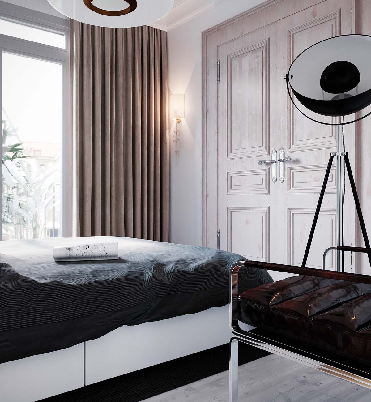
The modern wall sconce in the corner is a useful source of light at night.
