Ever wanted to know how to inject a bit of nostalgia into the interior of your home without compromising on contemporary aesthetics? This is a modernisation project that transformed an apartment set in a preserved 1940s building. The project, located on Hen Boulevard, Tel Aviv, was sent to us by interior designer Galya Ben Asher from Israel. First, we’re struck with a monochromatic decor treatment but the colour story does not end here. A blue and blush colour combo breaks through, fashionably nostalgic of the time that saw the building in its beginnings. A peppering of 1940’s furniture silhouettes add to the subtle throwback effect.

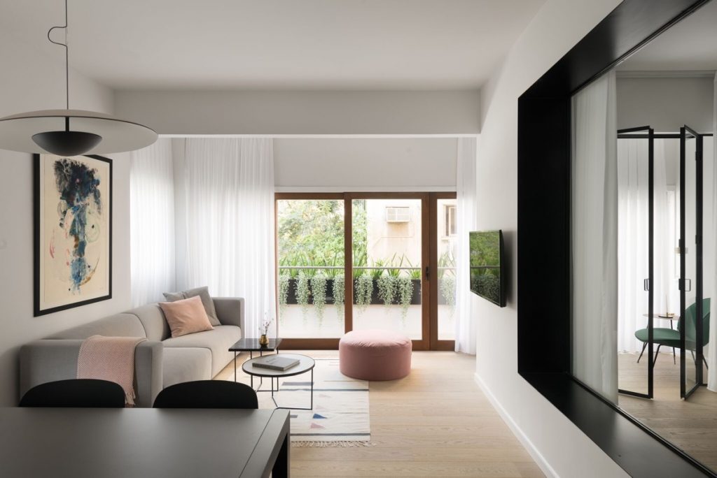
The compact apartment follows an open plan arrangement whereby the kitchen views directly over the dining spot and into the lounge. Beyond this lies a small garden balcony decorated with trailing plants. Besides the exterior greenery, we see our first colour emerging in this space; the placement of soft pink items form a visual triangle, whilst the wall art hints at our next stop on the colour wheel.
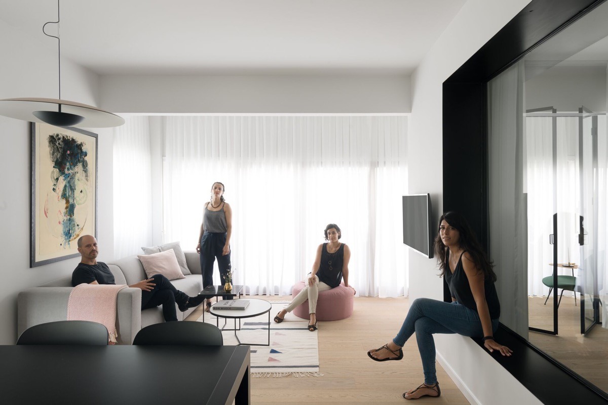
The layout provides an ideal social space with plenty of opportunities to sit, chat and eat communally. The consideration throughout this project was to cater for the homeowners ideal needs in terms of practical facilities, as well as to create the right energy. All of this had to come without compromising on the overall living space, or the crispness of the intended design.
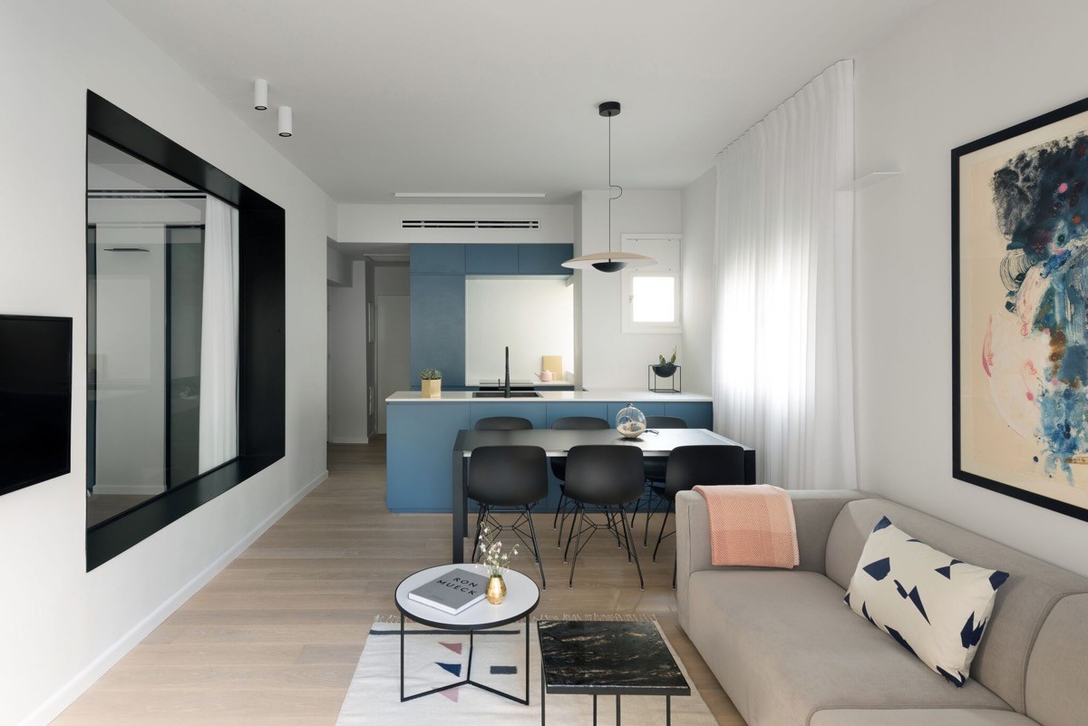
Each of the two coffee tables strike a chord with 1940s design style, as does the silhouette of the dining room pendant light. The small decorative vase found on the round coffee table is a pretty little copper piece. More sprinklings of the metal accent can be seen placed subtly in other areas of the home too.
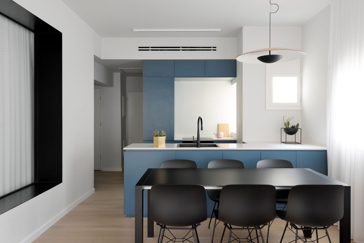
Over in the kitchen the second hue strikes unapologetically. A swathe of strong blue units cut across the width of the room, creating a backdrop and central sweep. The bright units are an unfussy handle-free and flat fronted design. The only decoration being a couple of small plants situated on the central countertop at each side of the sink.
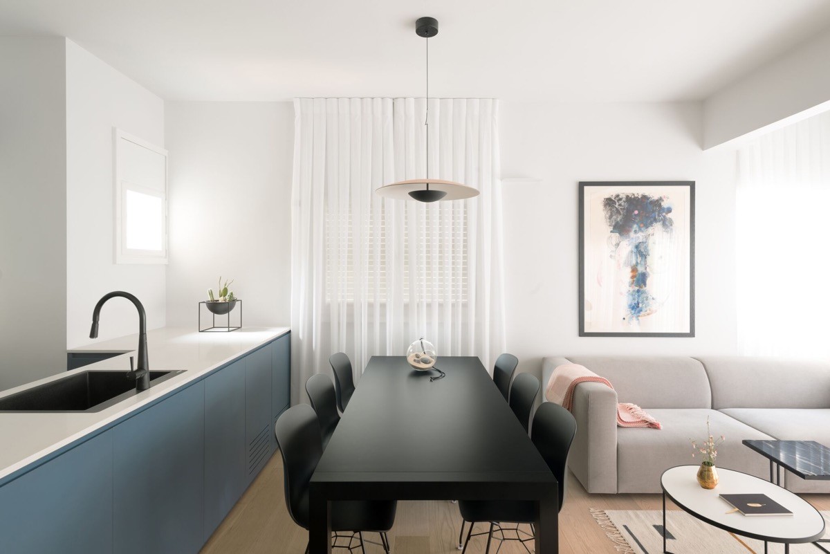
The dark kitchen sink and faucet match the black dining table and chairs, in addition to the lounge picture frame and coffee tables.
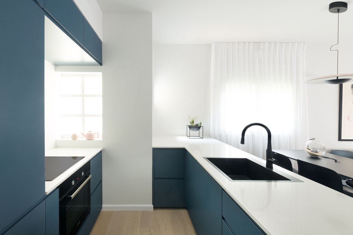
Ice white kitchen worktops reflect the pure white walls. A pink teapot decorates the window sill and pulls the accent hue through from the lounge.
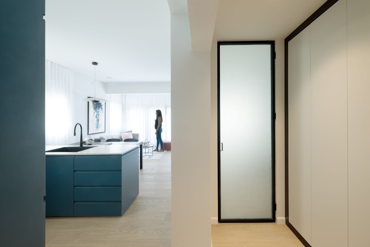
The design challenge for this home was to turn the apartment into a contemporary one whilst preserving its charm and special character. The color selection made works alongside elements of iron and glass, and with wooden floors.
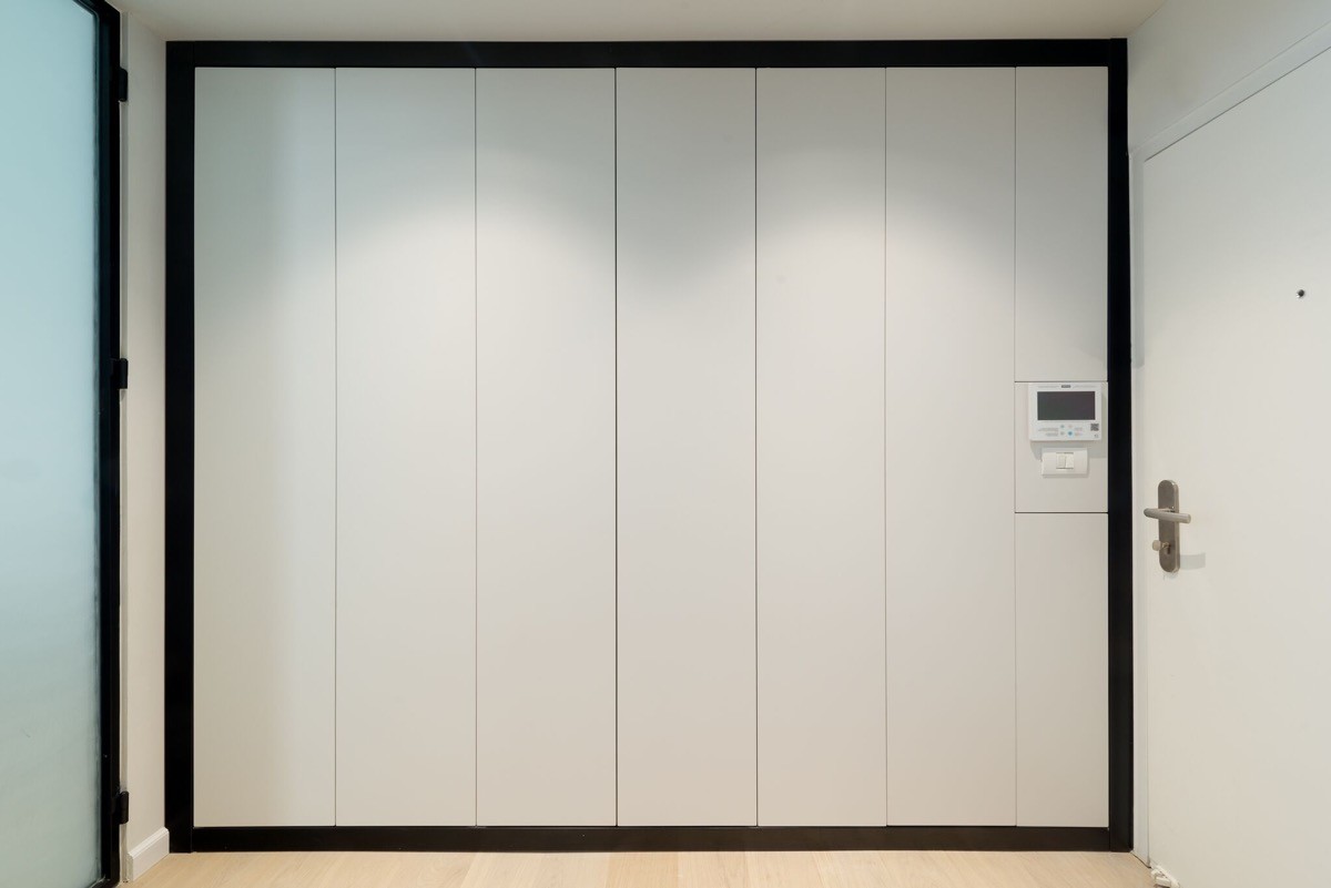
To maintain the simplicity and modernity of the new apartment scheme, a bulk of the homeowners storage needs are met by tall built-in units that run the length of the home entryway.
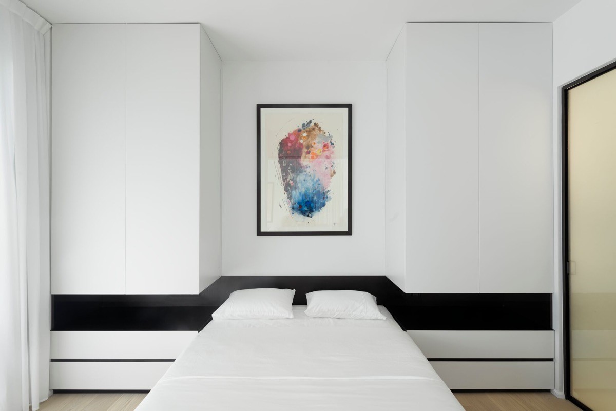
Another piece of colourful artwork can be found in the master bedroom. Here the framed work is the only relief from a monochrome palette. A symmetrical split unit design hugs the bed, where a black recess forms an unusual runaround design at headboard height.
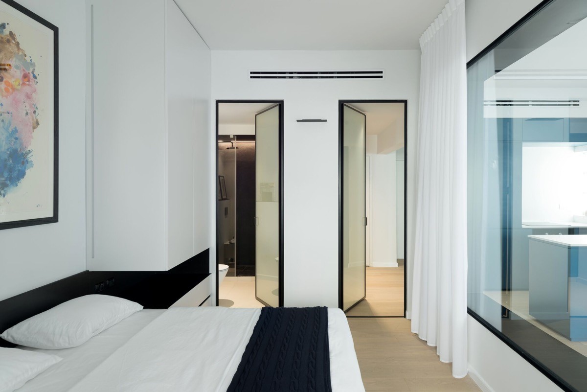
Bed linen is white and plain, as is drapery at the internal window that draws back to reveal the open plan living area on the other side of interior glass.
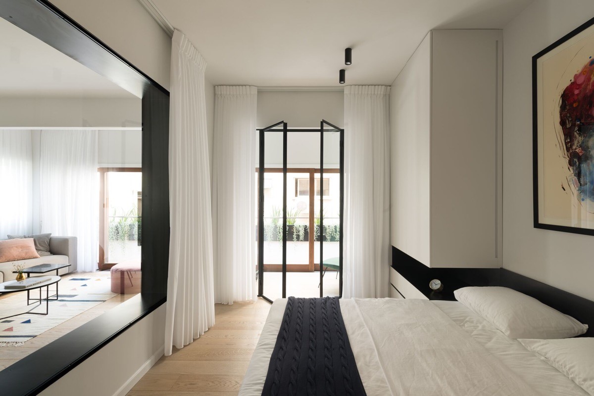
The exterior bedroom window is actually a set of french doors that allow an exit out onto the main balcony. The black bed runner forms the middle of three visual stripes that run the length of the room, the first being the black interior window ledge, and the third being the deep closet recess stripe.
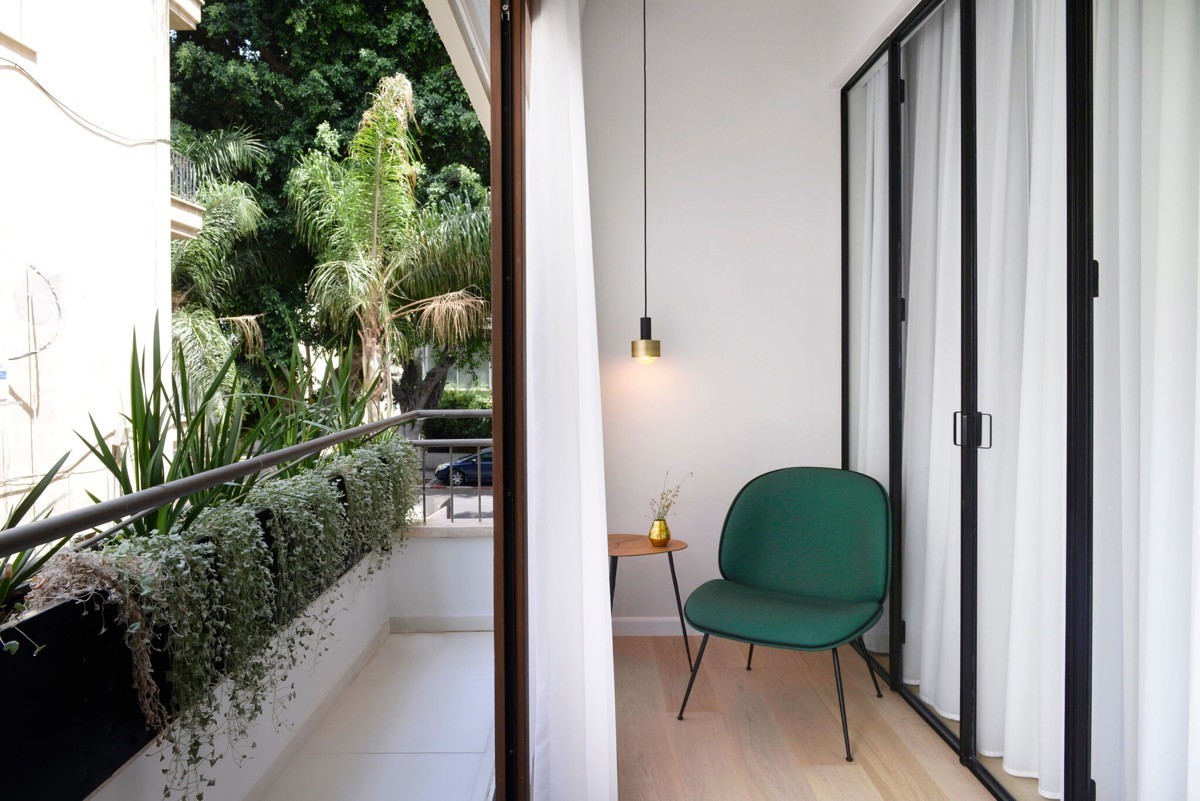
Just outside of the french doors from the bedroom there is a small indoor area where one might sit for a moment and read or enjoy a drink out of direct sunshine or rain. A small copper pendant light anchors a green chair and wooden side table in position. An identical copper vase to the one seen on the living room coffee table sweetly decorates the spot. The flooring runs continuous with that inside the living and sleeping areas.
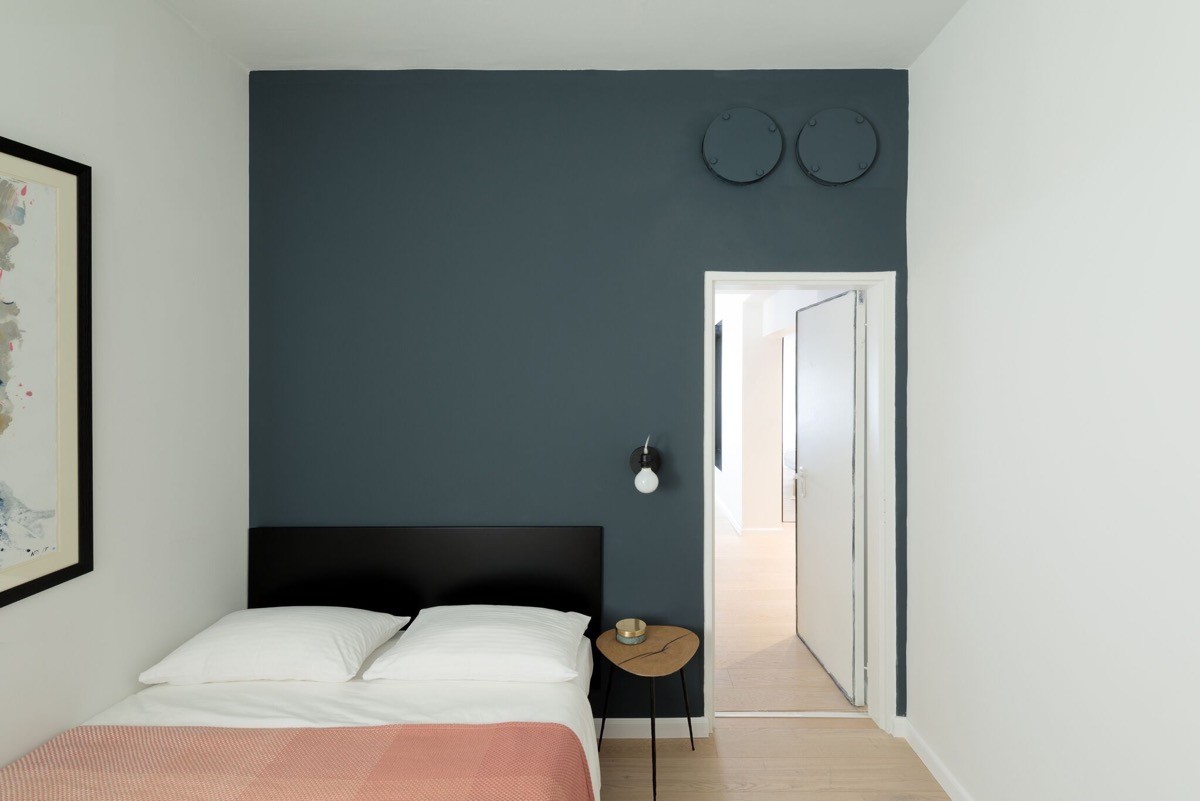
A second bedroom scheme returns to the colour combination of the living area, with a blue-grey wall and a blush bed throw. The bedside unit is a wooden triangular tabletop design synonymous with 1940s design, beneath a simple wall sconce. Another colourful moment of art decorates the white wall flanking the double bed.
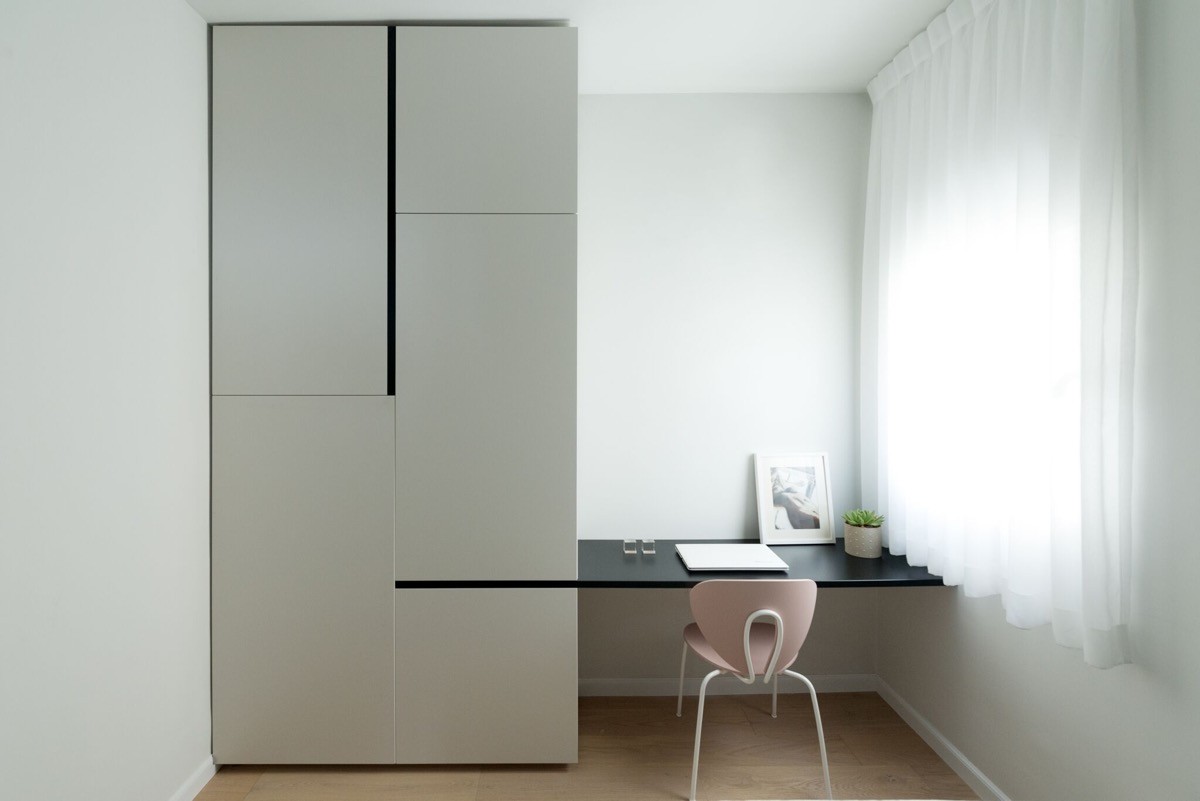
The home office area has a unit style in keeping with the closets found in the master bedroom. These are teamed with a pale pink desk chair that, although dainty, completely adjusts the strong black and white scheme, adding softness and femininity.
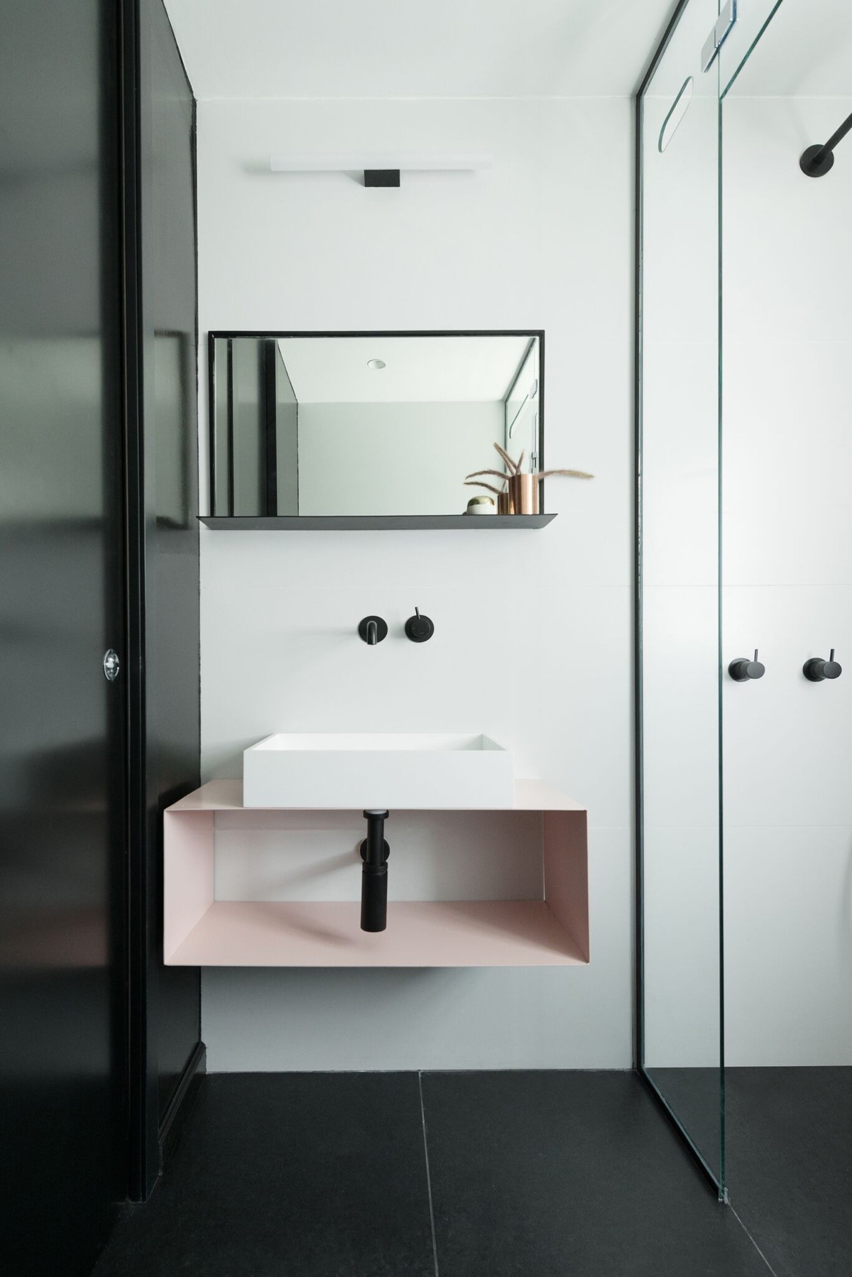
One singular piece of pink accent furniture lifts the bathroom scheme too. A simple wall mounted vanity unit is coated in blush beneath a rectangular basin.
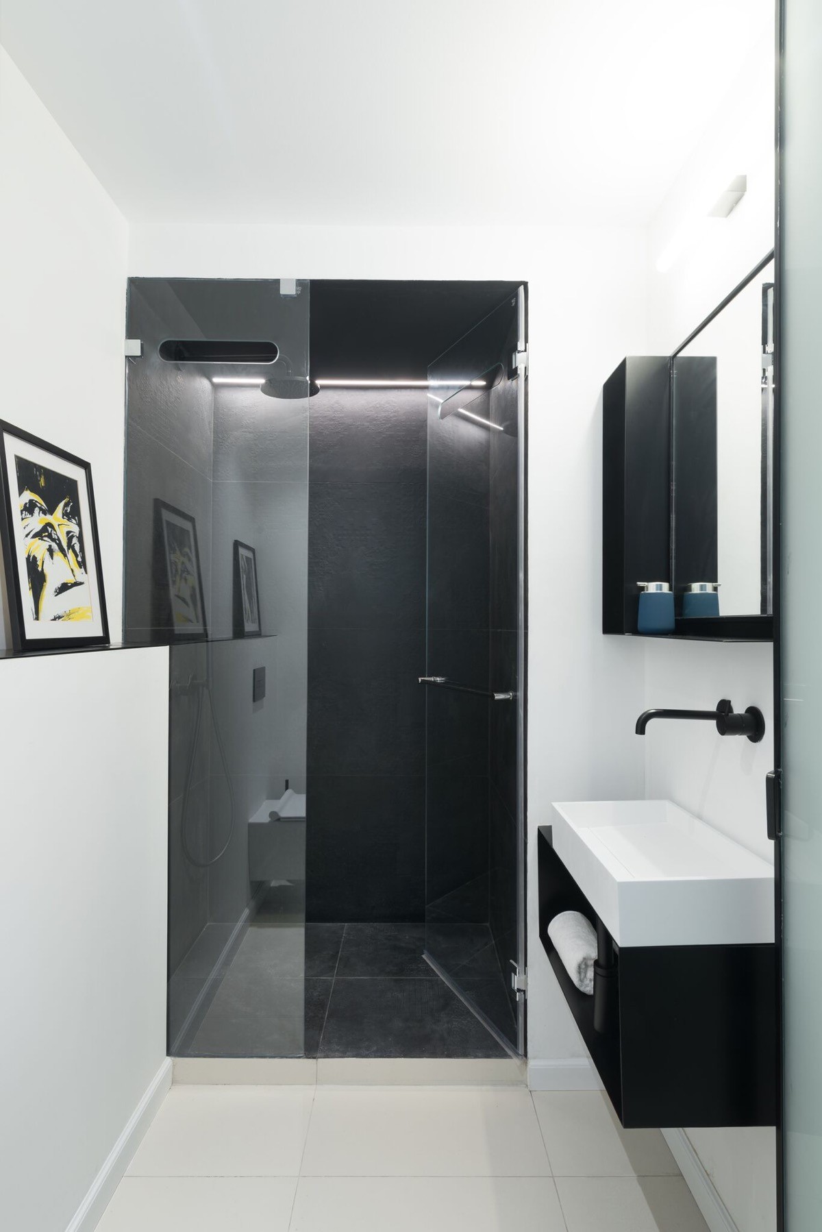
A second bathroom has a reversed scheme. Here we find white floor tiles instead of black, and a dark shower where the first was white. A strip of white LEDs provide mood lighting inside the shower cubicle. The boxing in of the pipes on the left hand side has been made tall, creating a picture ledge. Art frames, mirror and vanity unit in this room are all basic black to provide sharp contrast against white surroundings.
