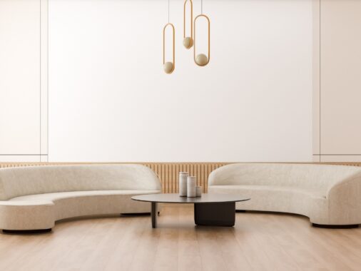
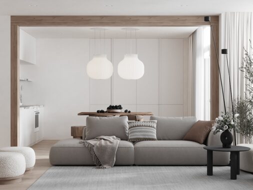
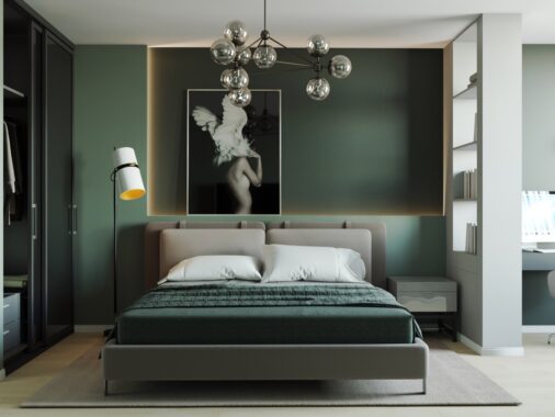
Studio apartments are such a good source of interior design inspiration – the ideas found in these space conscious designs often come in useful outside of the context of apartment design, translating easily to other contexts like single rooms or open plan areas. This post looks at three studio apartments, each one representing a different interior design style. The first one is a straightforward minimalist space, the second is a charming Scandinavian-inspired theme, and the third studio takes a different approach with a dark and moody design with luxurious elements. Which one is your favorite?
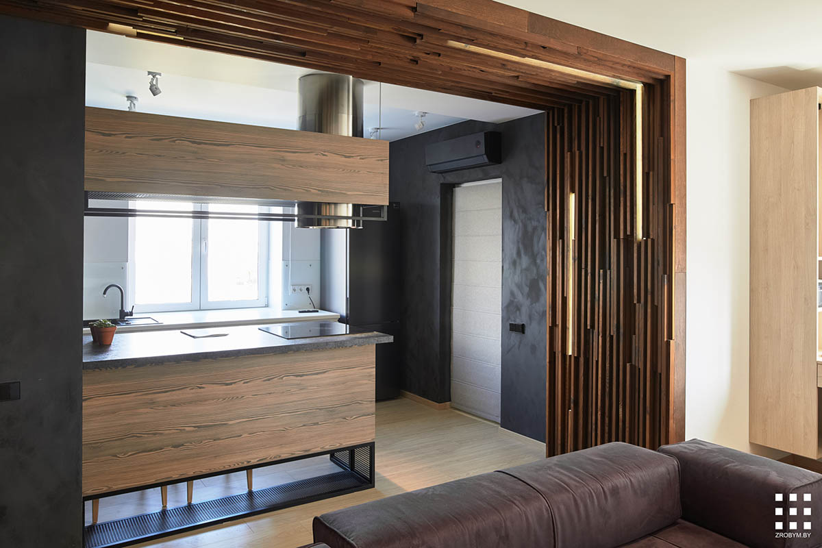
Just behind the living room, a spacious kitchen occupies nearly half of the floor space – a great choice for residents who enjoy cooking or entertaining guests.
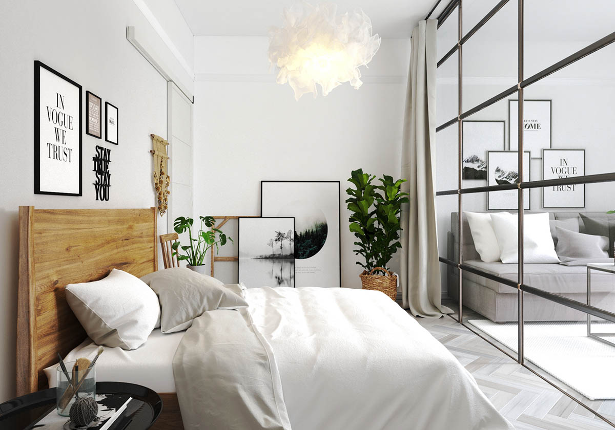
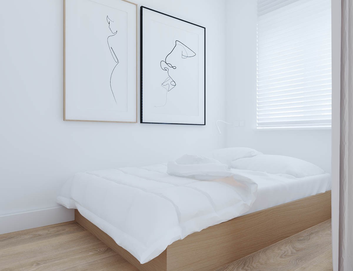
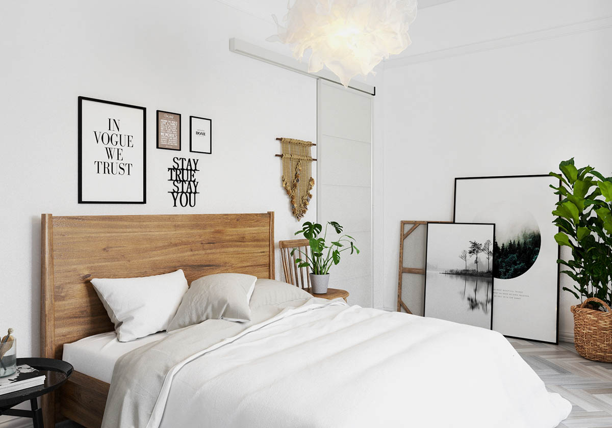
And just look at all these amazing prints! Smaller prints hang above the bed, and the larger prints simply lean against the wall.
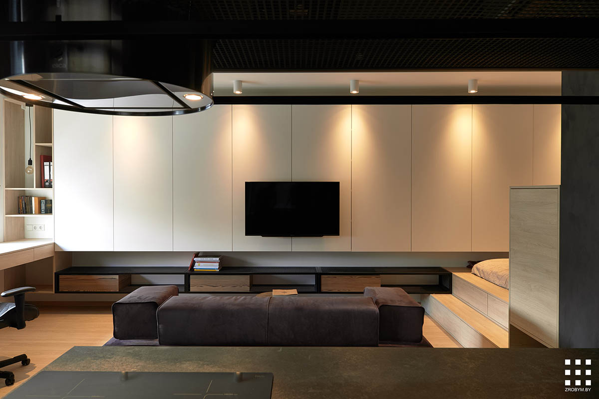
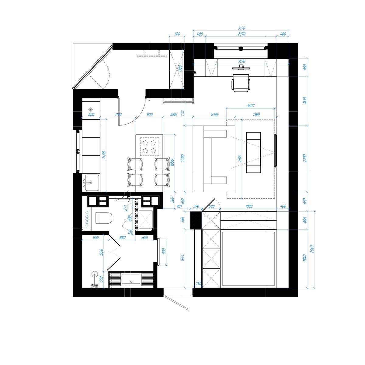
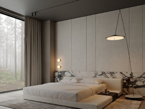
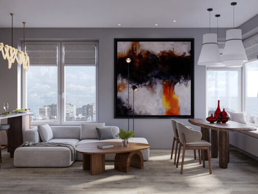
The last home in this studio tour is a little different from the previous two. Where the others were bright and sunny, this space takes a dramatic and almost moody approach. This project by Zrobym Architects occupies a 45 square meter apartment floor plan in Minsk, Belarus, but embraces its compact format with a cozy style that exudes a sense of relaxation.
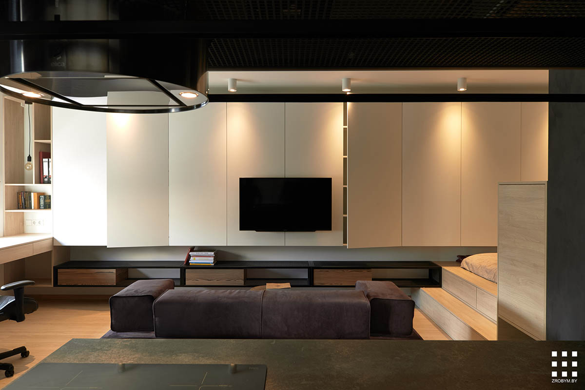
To keep things looking streamlined, the interior team included a full wall of storage cabinets behind the media center, ensuring that everything has a place to "live". Three functional areas share this storage space: the office to the left, the central living room, and the bedroom area to the right.
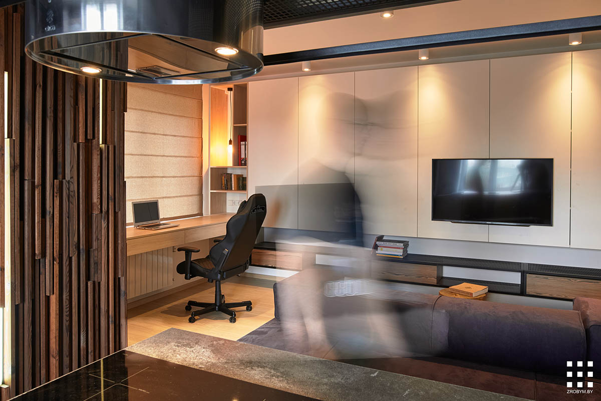
A few of the shelves near the desk are left open for easy access to work and study-related materials like books, binders, and office supplies.
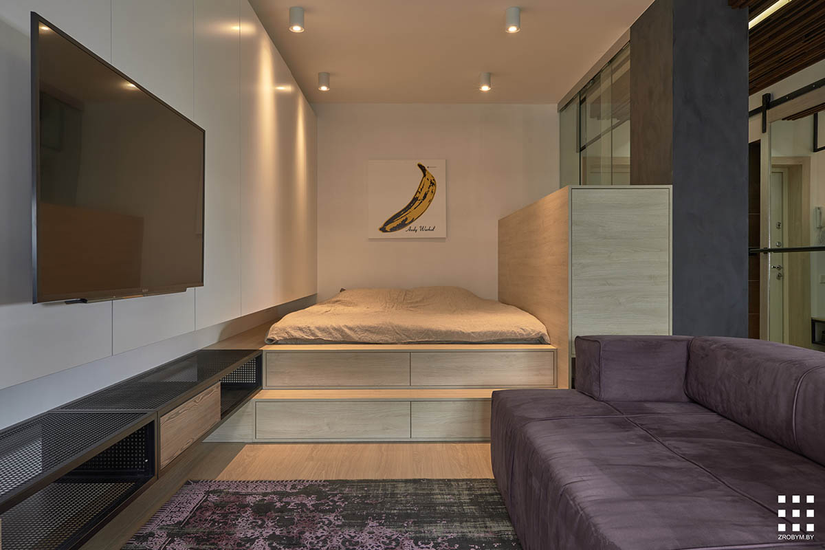
More storage hides in the stairs that lead to the bed, with a larger wardrobe-style cabinet to the right. This taller cabinet also blocks the view from the glass wall that separates the living spaces from the hallway.
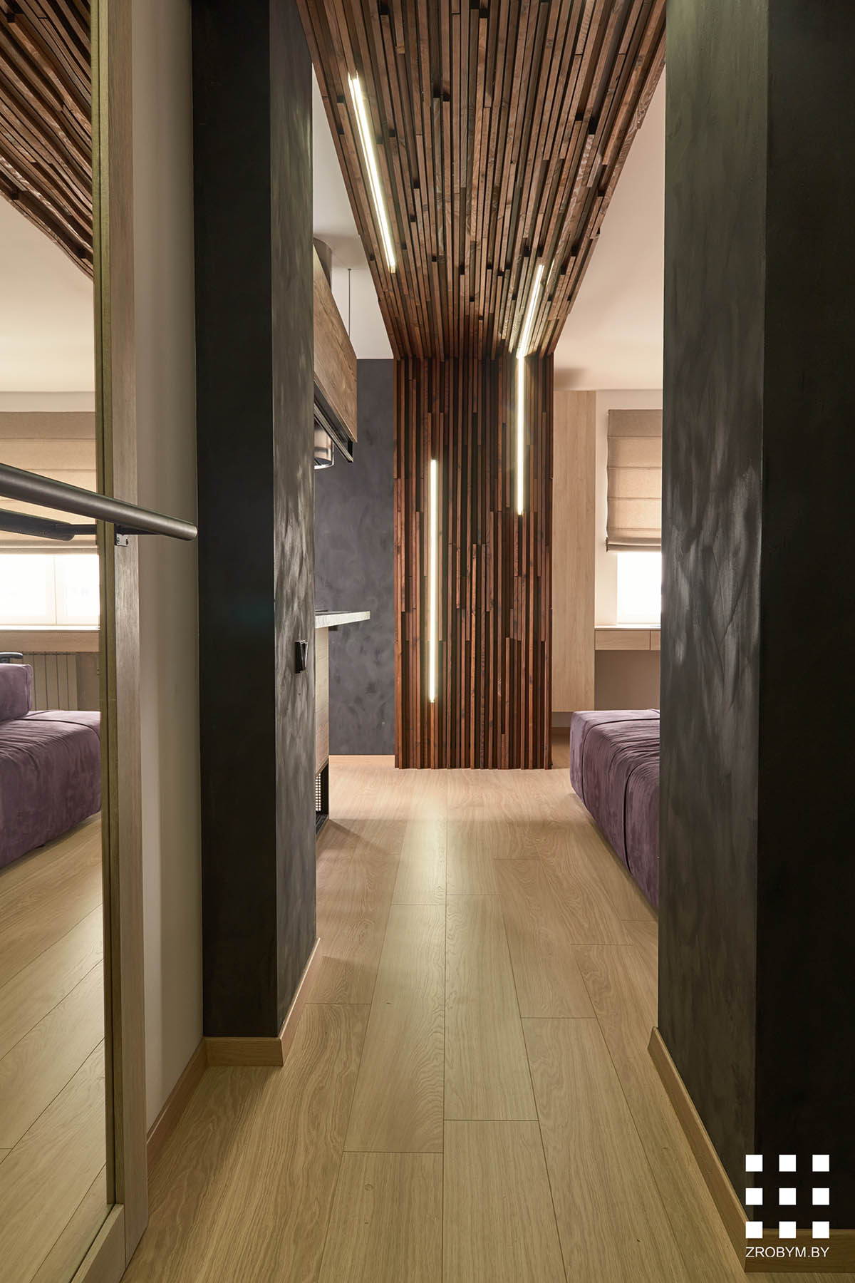
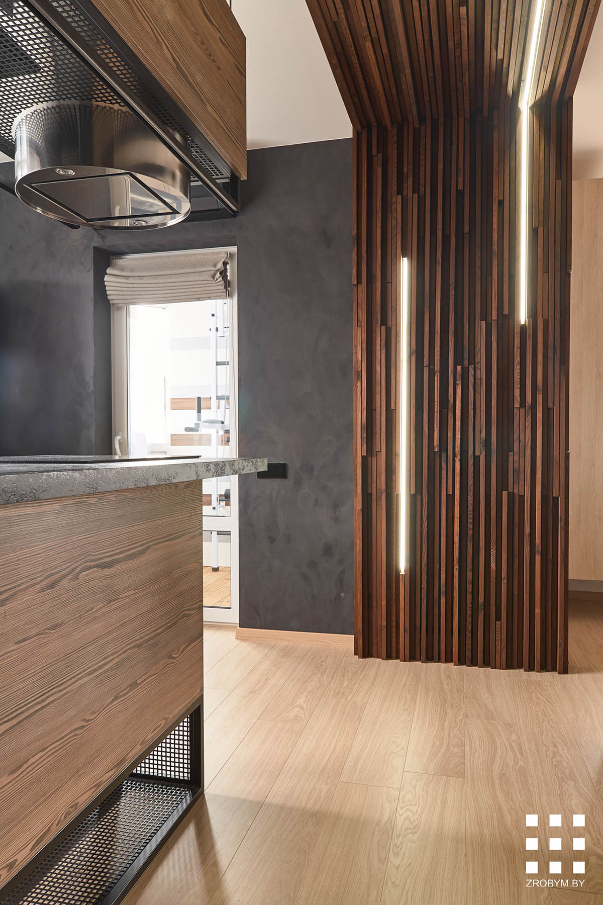
The hallway itself doesn't reveal much about the home but does make an immediate first impression thanks to the creative wooden panels and integrated lighting.
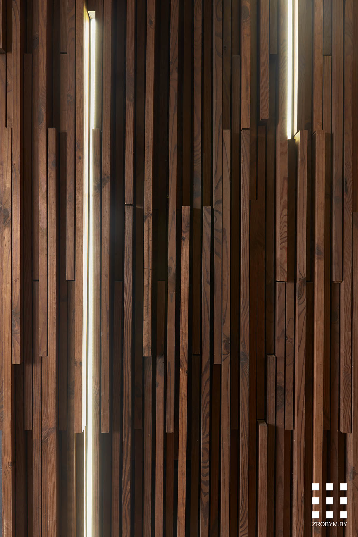
It's easy to imagine how these lights might come in handy when setting the mood for an intimate dinner or while simply unwinding after a long day.
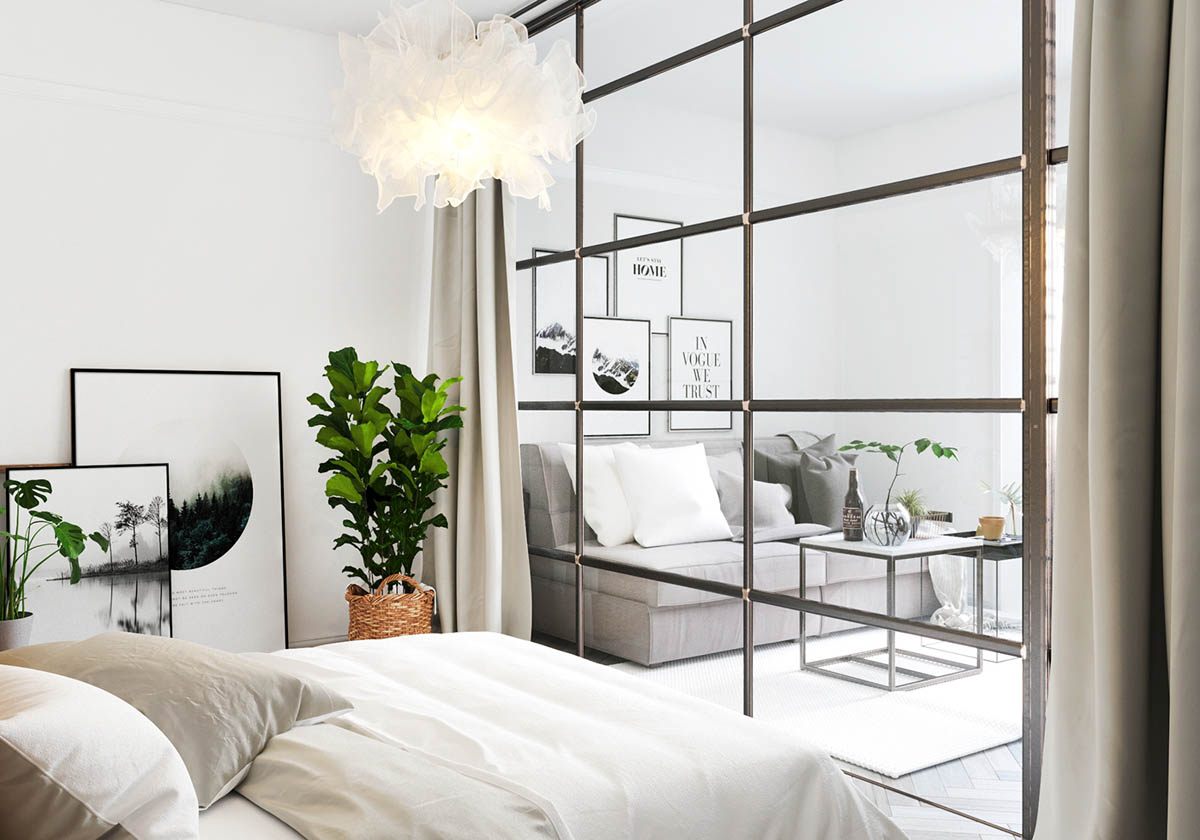
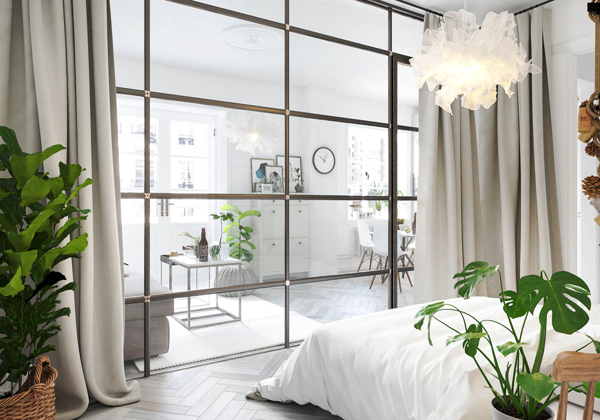
Like the dining room, the bedroom also enjoys a little creative lighting - unique bedroom pendants always create a striking focal point. This dreamy cloud-like model is available from IKEA or right here.
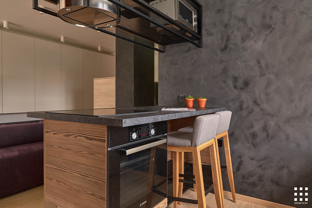
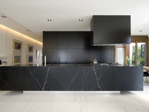
A central island contains all of the appliances necessary for cooking. The stove and range both huddle at the end of the island with a microwave discreetly tucked away above.
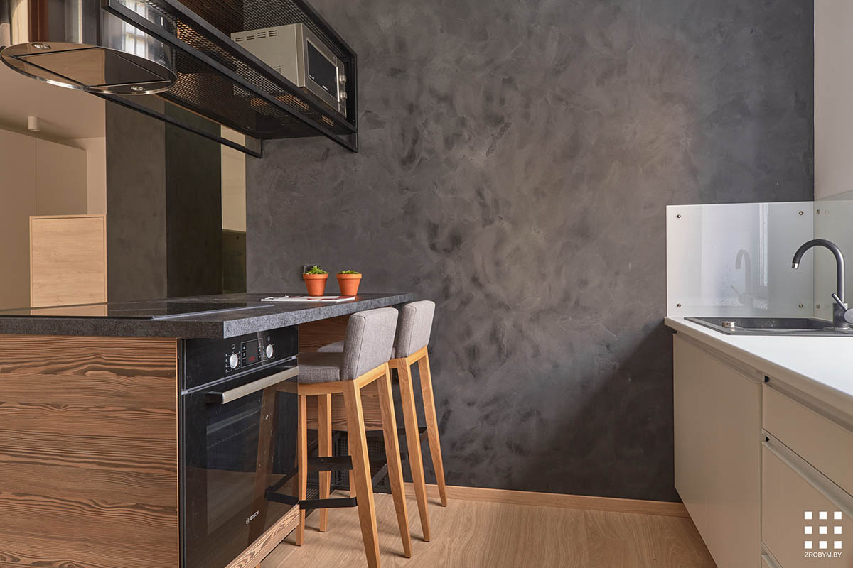
A breakfast bar and dining chairs shares its space with the kitchen worktop. Doubling up is always a good way to gain more functionality from a limited floor plan.
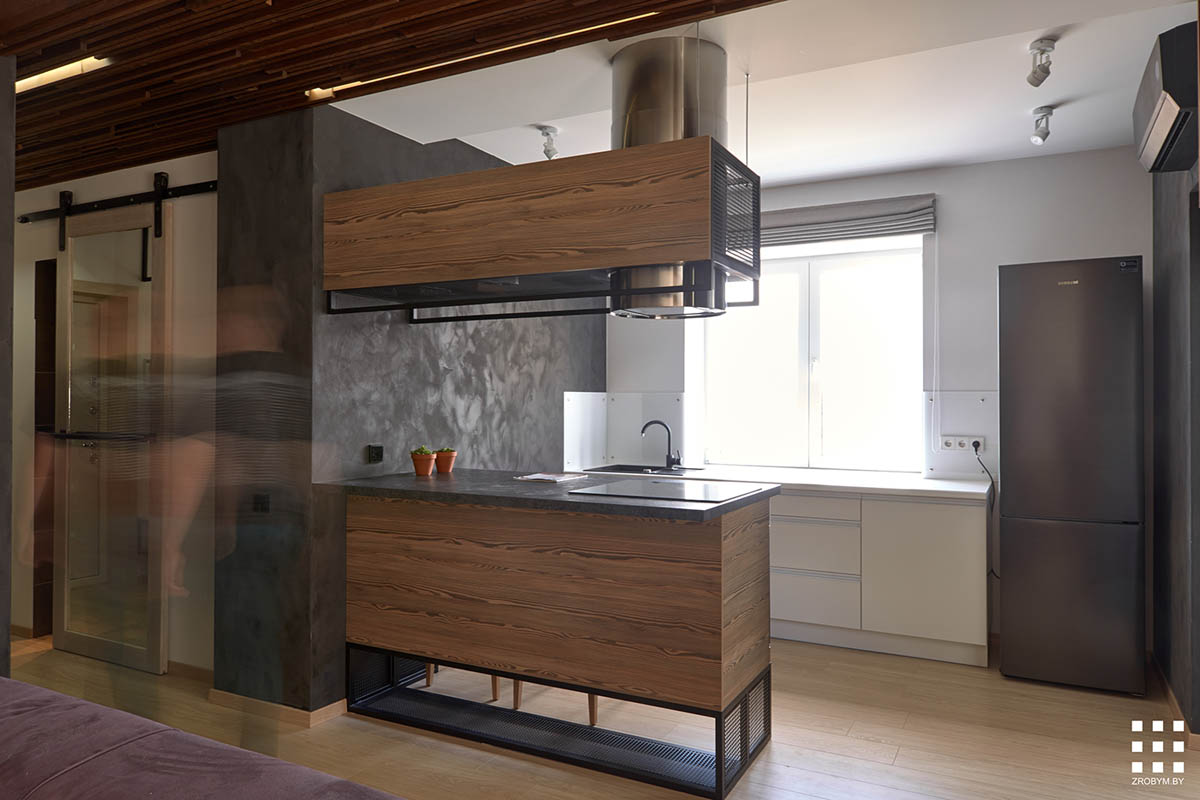
The rest of the kitchen remains relatively minimalist, clad in white for a bright and clean appearance.
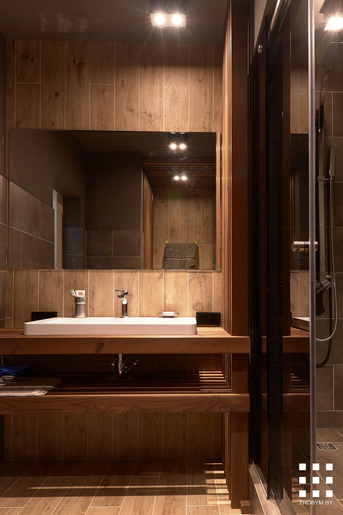
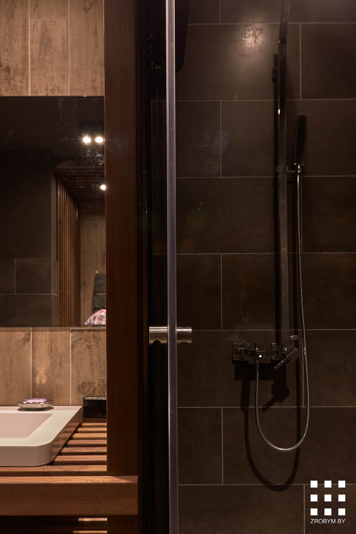
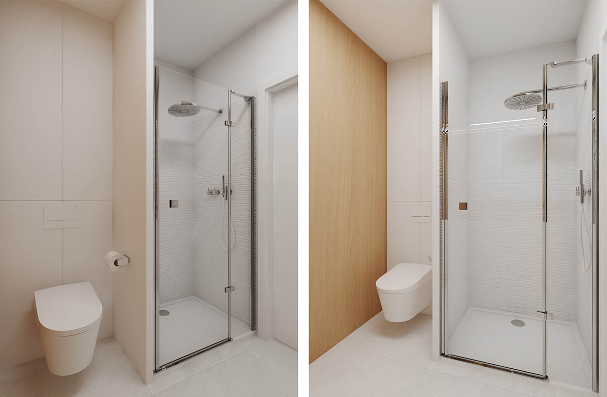
Now for a peek at the bathroom, which takes the dark and relaxing aesthetic from the living room and runs with it.
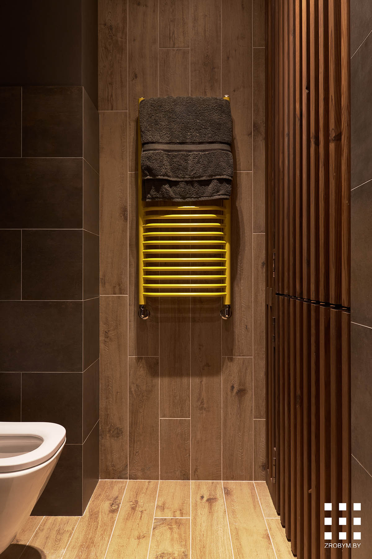
With a wood vanity and even wood-printed tiles, it almost feels more like a lodge or a steam room than an ordinary bathroom.
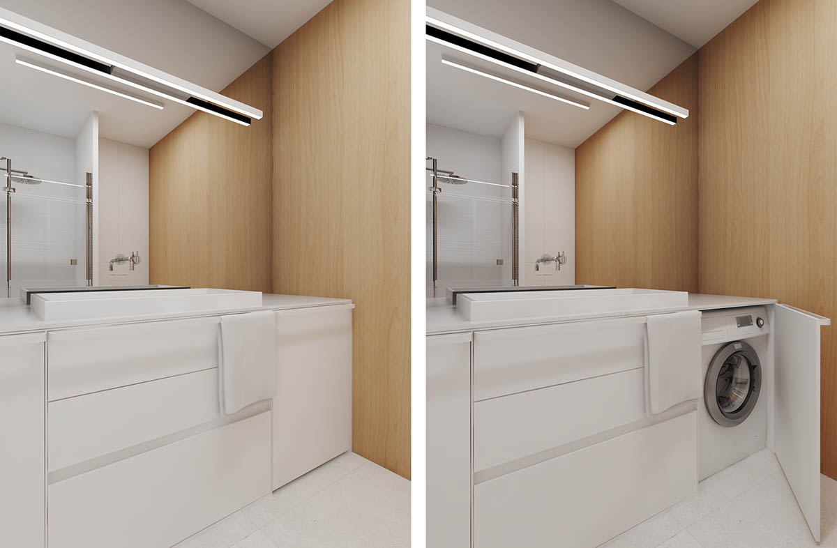
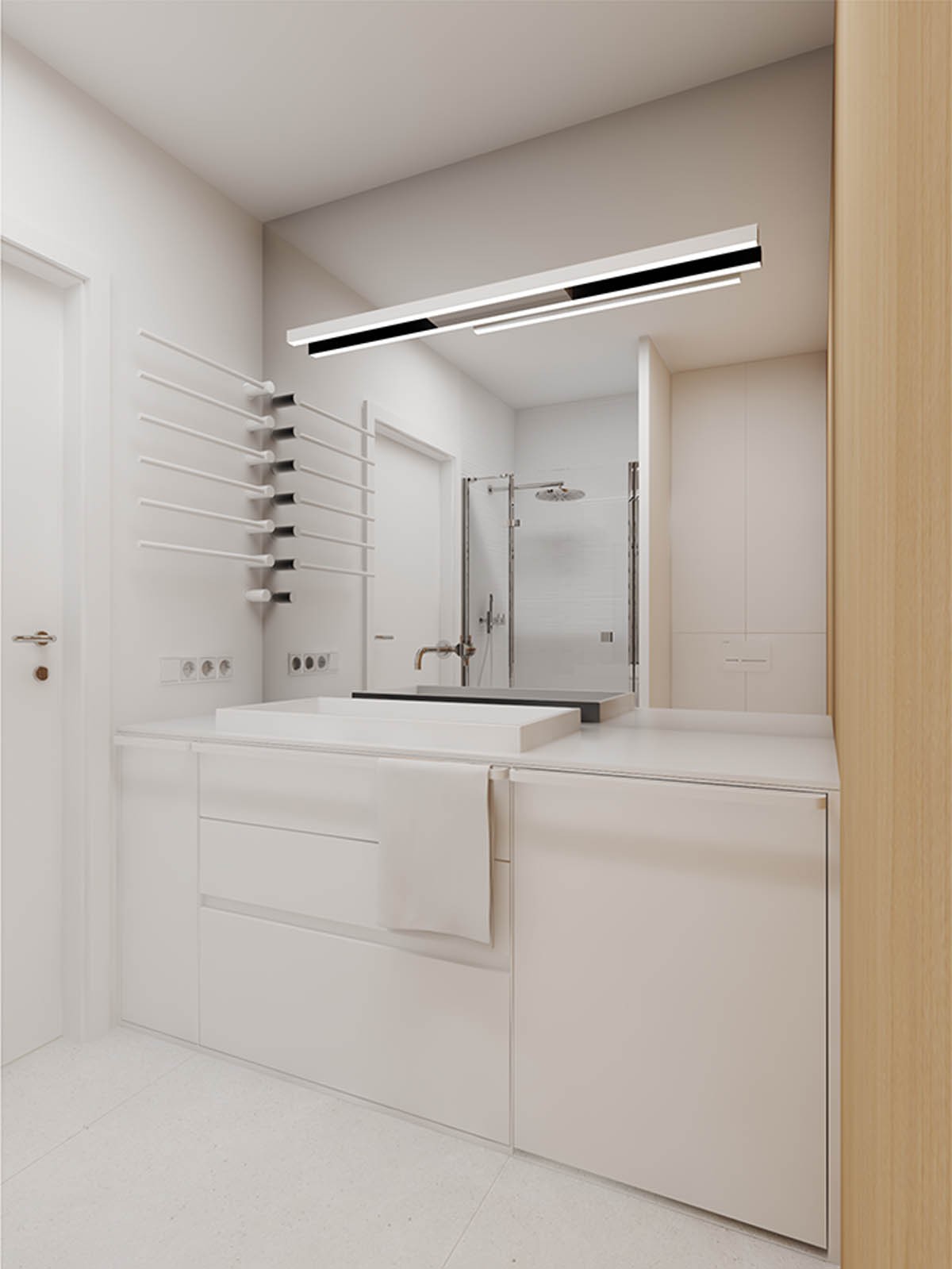
And finally, a look at the bathroom. The washer hides behind a small cabinet door to eliminate another potential source of visual clutter.
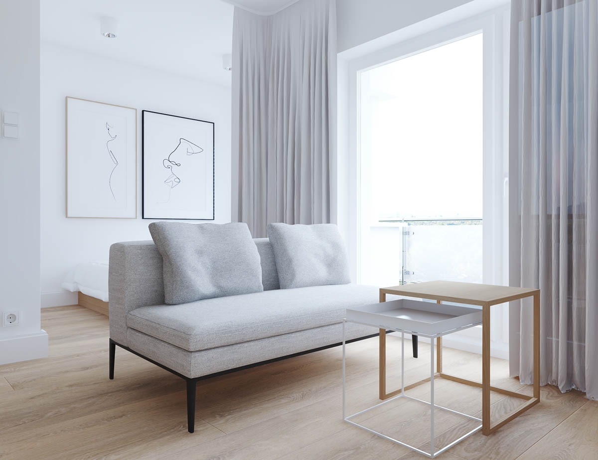
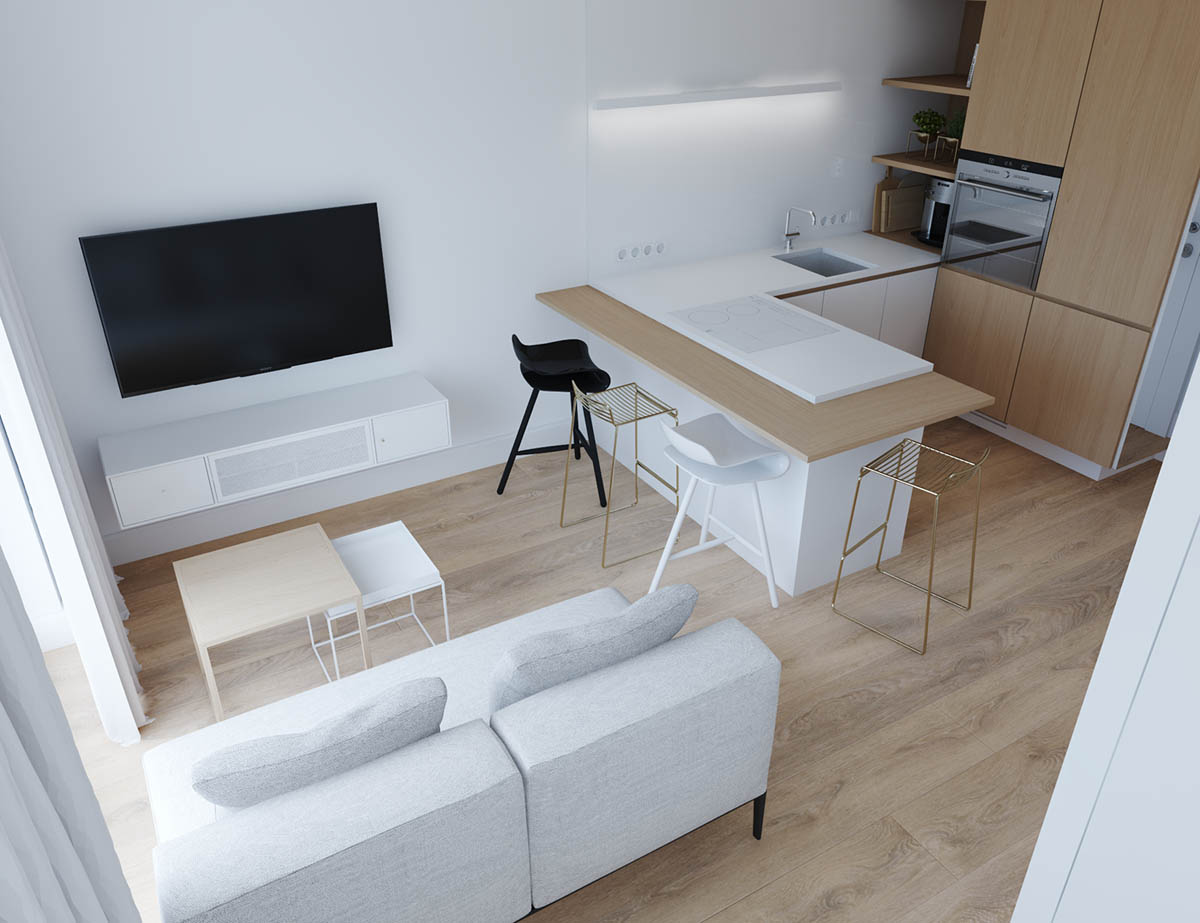
Saving space is crucial in such a compact apartment. Nesting tables like these are a great tool, able to slide together to reduce their footprint when the extra surface area isn't needed.
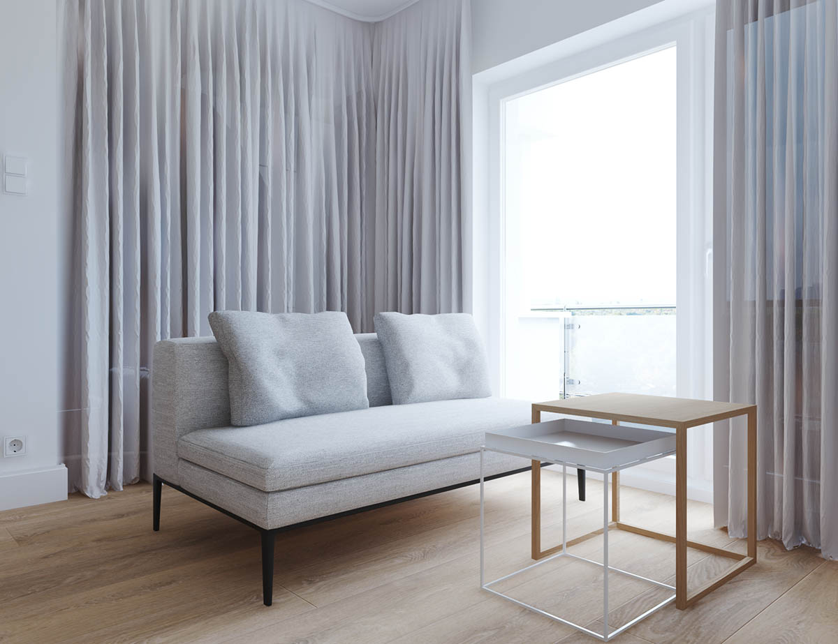
Residents can enjoy a more private bedroom by simply closing the billowy gray curtain. Those who need to dampen ambient noise could opt for a heavier curtain.
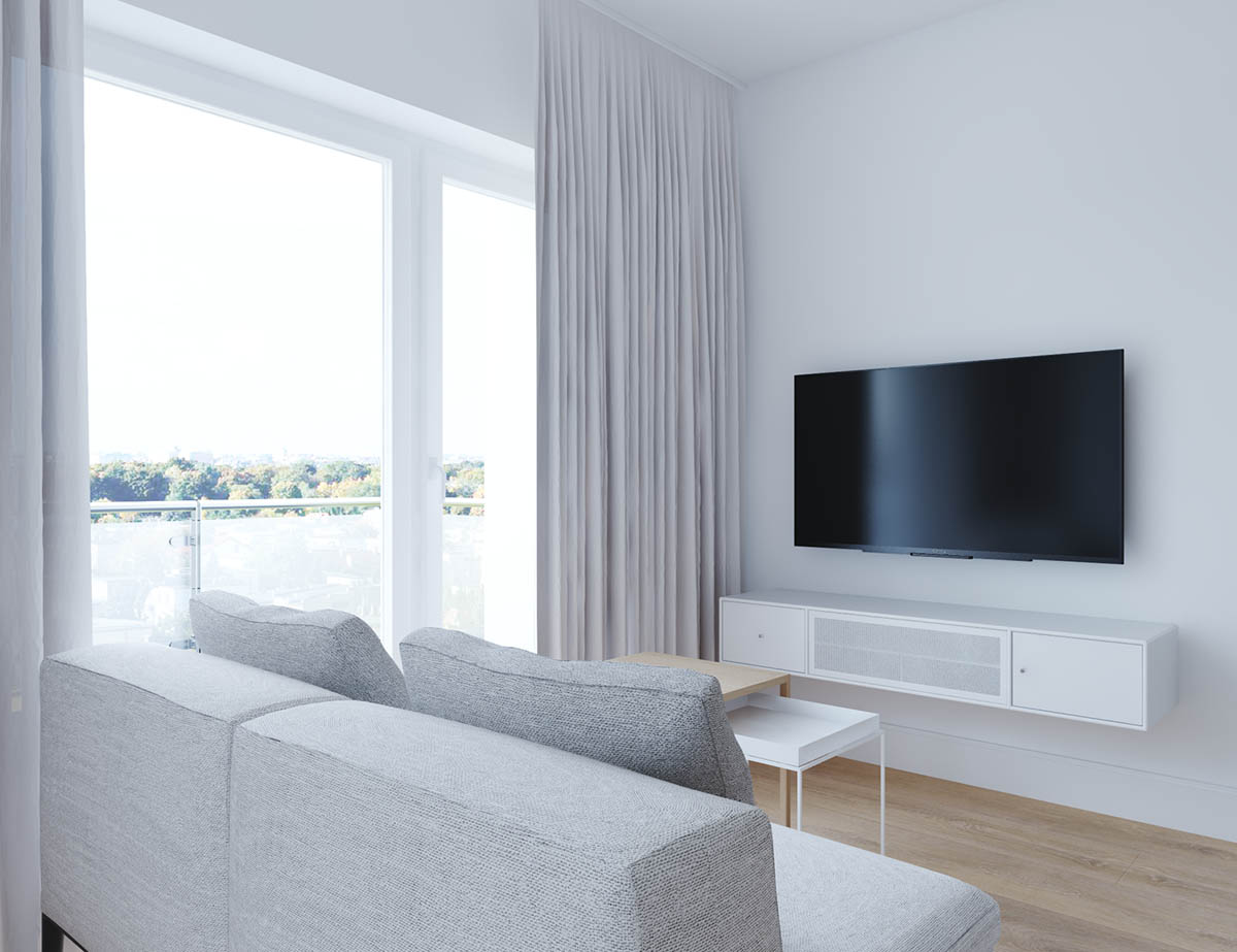
The media center is clean simple, with a nice wall-mounted cabinet to keep electronic components hidden from view.
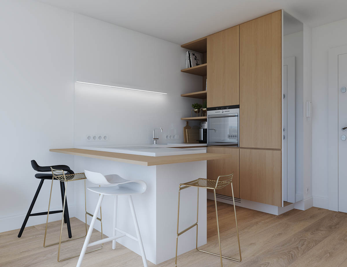
The wire bar stools are the work of Hee Welling, available from Danish design house Hay. The curvy stools are available here. In the absence of decoration, these unique kitchen counter stools offer an abundance of character.
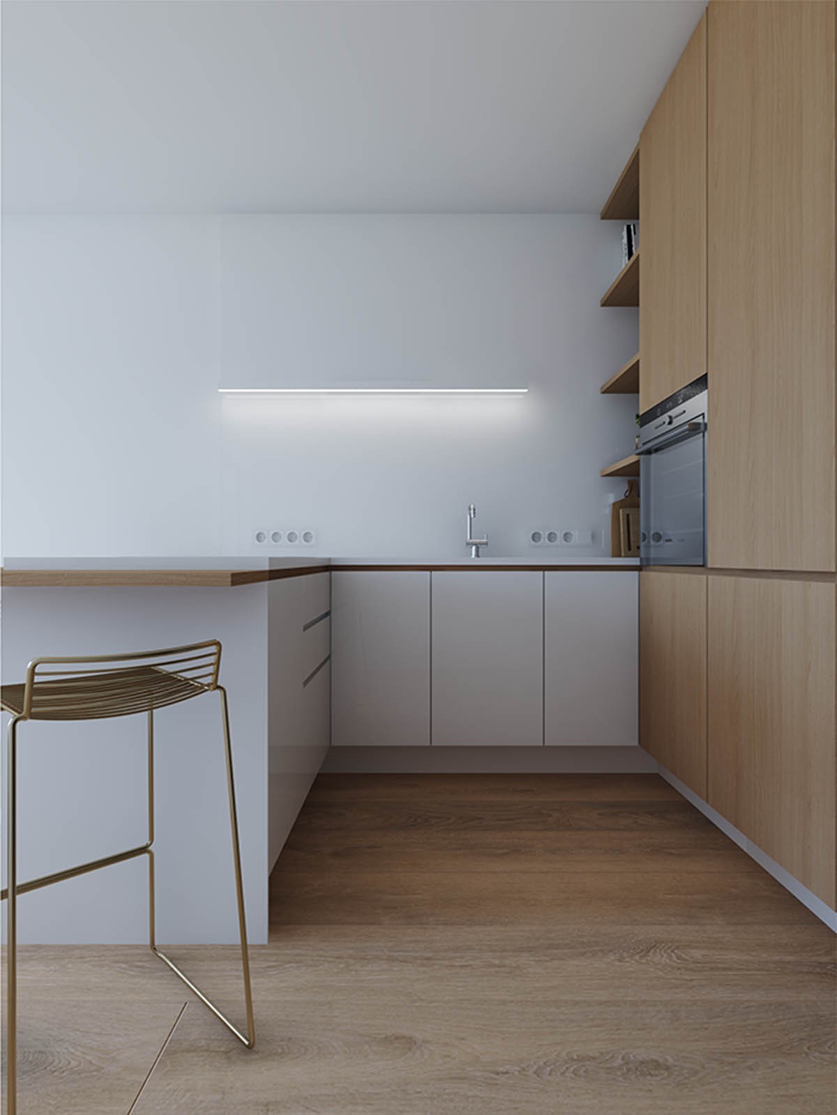
It's hard to find a space more simple than this utilitarian kitchen. White and wood cabinets stick with the overall apartment theme.
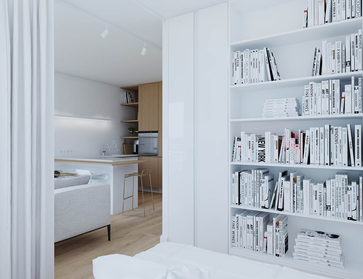
Here's the view from the bedroom. It also houses the home's library. This arrangement looks lovely with the coordinated book jackets, but would look just as nice with colorful spines.
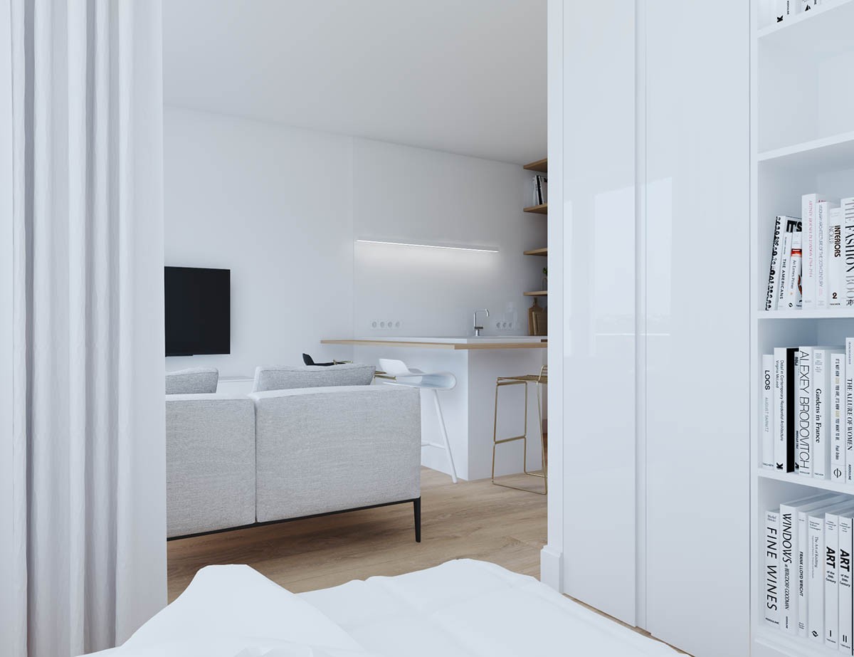
With the curtain fully retracted, it would even be possible to catch a little late night television right from the bed.
Let's start with something simple. It's difficult to foster a welcoming environment when it comes to strict minimalism, but this apartment pulls it off thanks to its bright white walls and warm wood elements – and of course the addition of quirky elements like the eclectic dining stools and the occasional modern art print.
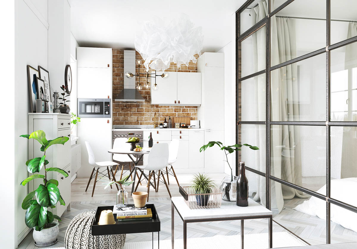
This next apartment features the same mostly-white theme as the last one, but this space strays far from minimalism. Its cheerful Scandinavian-inspired decor theme makes great use of subtle patterns, eclectic artwork, and various materials like exposed brick and whitewashed wood.
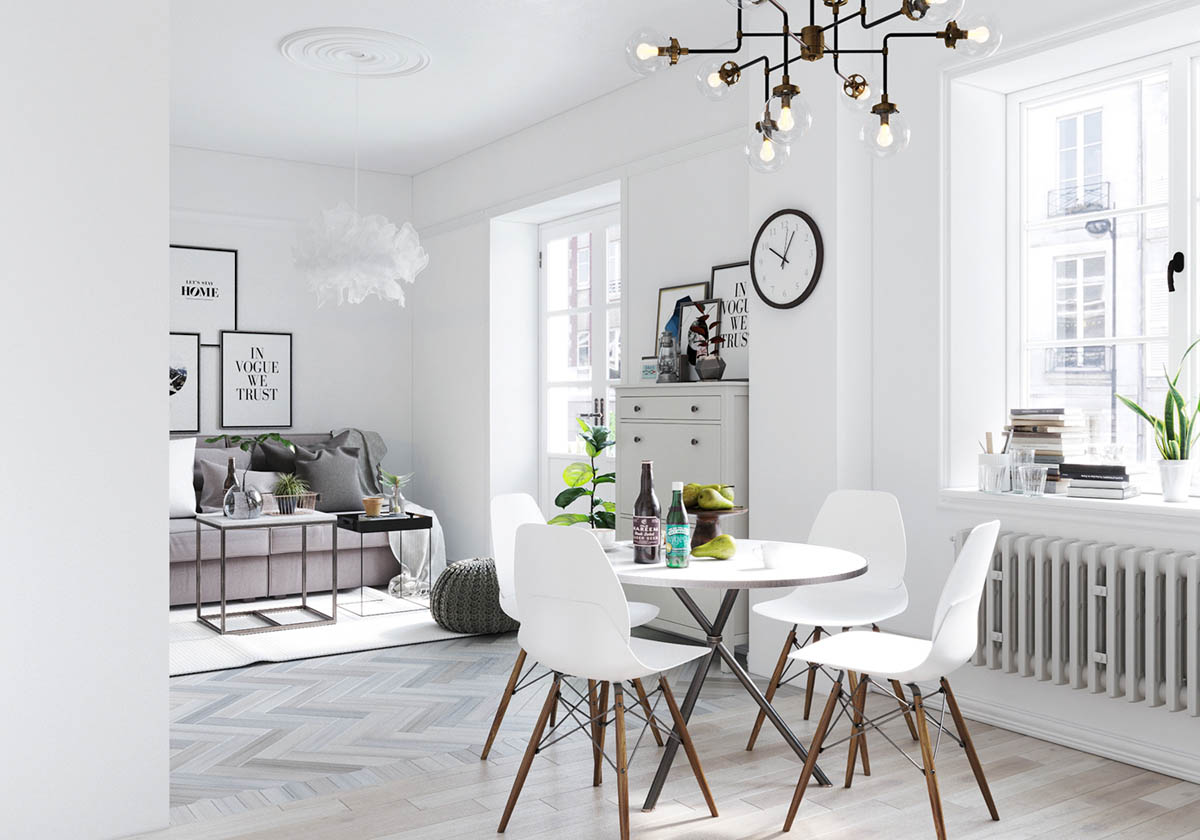
Refined and stylish, these Scandinavian style chairs don't complicate the dining arrangement but still add just enough decorative flair thanks to their rustic wood legs.
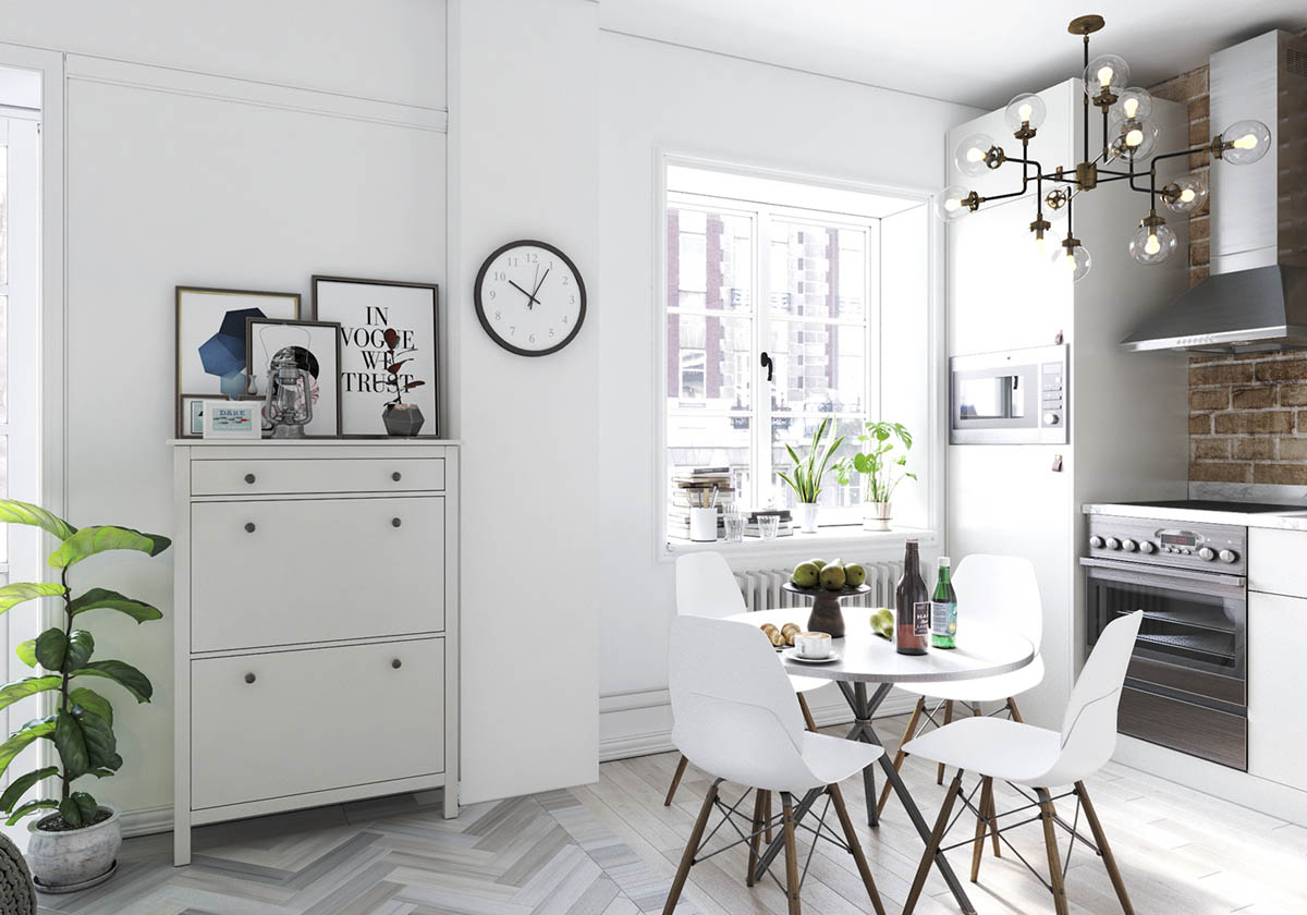
While wall clocks aren't the "must have" investment they used to be, they're always helpful in the kitchen area where hands tend to be too busy with food to check a phone.
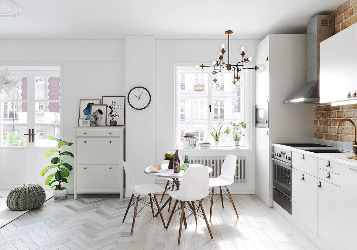
This dining room pendant, on the other hand, really makes the space. It's a unique piece that seems to take equal inspiration from vintage and modern motifs.
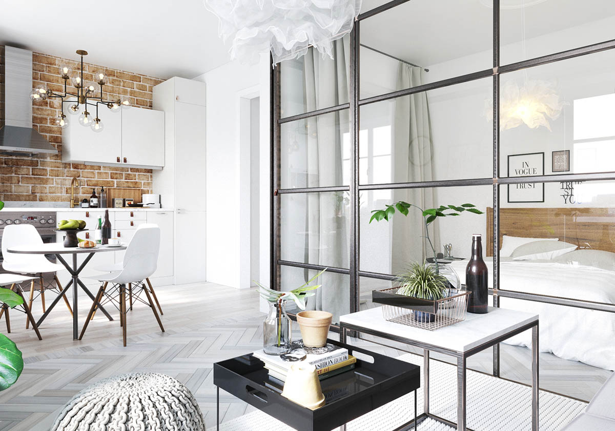
The surprisingly spacious bedroom occupies a space behind curtained glass walls. With the curtains open, the room is absolutely bathed in sunlight – an asset for cheerful mornings.
And thanks to the abundant sunlight, the indoor house plants are able to flourish. They add an outdoorsy element to the home that complements the natural wood nicely.

