The single life is one of the best ways to live. You're the only person you have to take care of, and your space is all your own. You don't need a huge home, and the way you decorate it is all your own. The problem with that is that sometimes the apartment is too small to contain your personality. So, to help you with your dilemma, we've collected three apartments that make the most of a small space and reflect the personality of the homeowner. Each of these homes come with detailed floor plans to show exactly how all of that was achieved. Let's take a look.
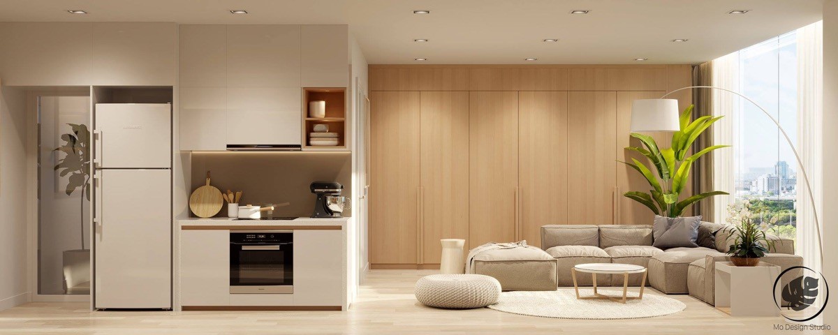
A single bedroom apartment does not need to cater to the needs of many people, it does however, need to cater to the needs of the homeowner. Most people enjoy having guests over, so any apartment needs to be presentable, and most importantly: it should make the homeowner enjoy being home. This first apartment does just that.
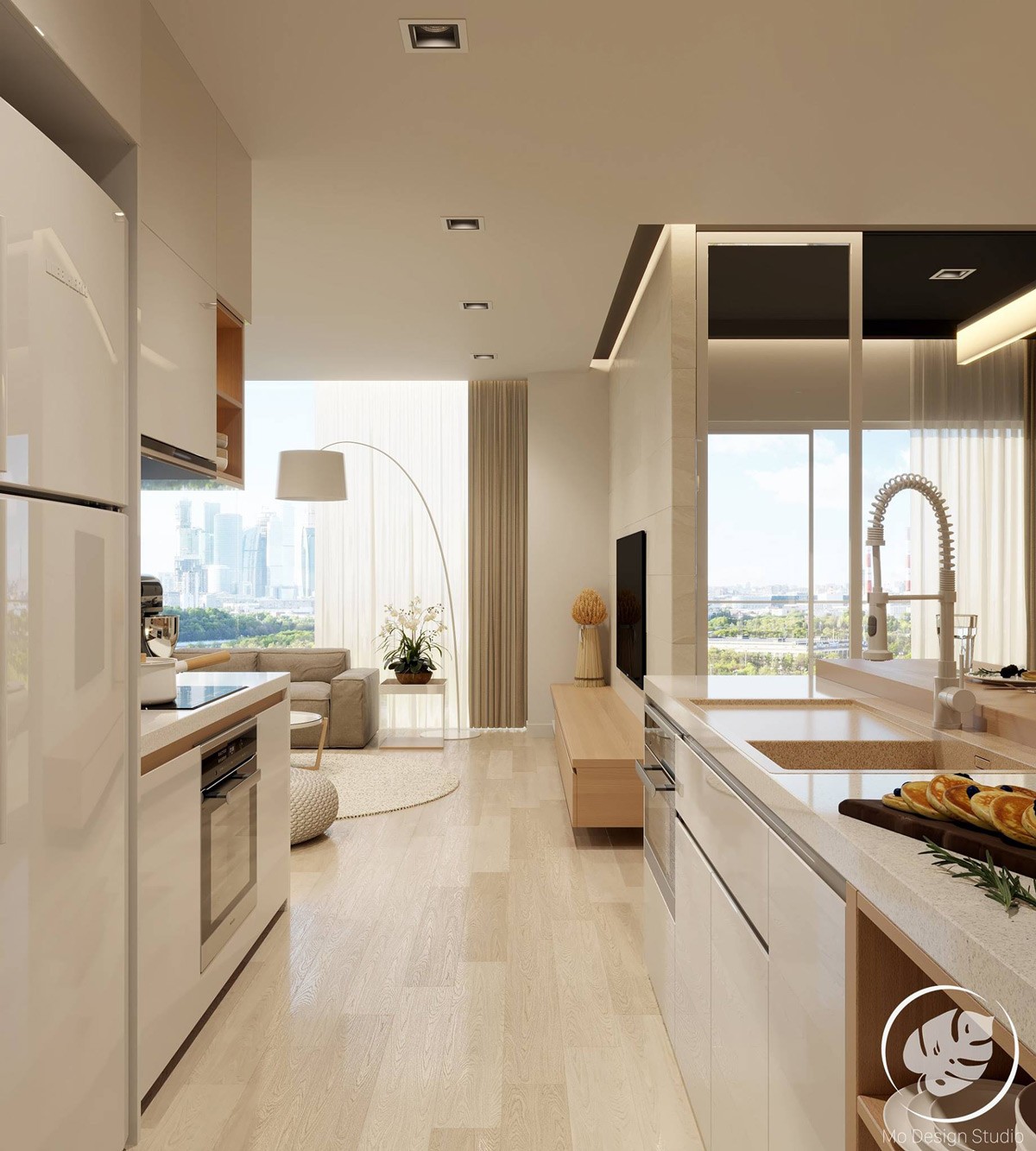
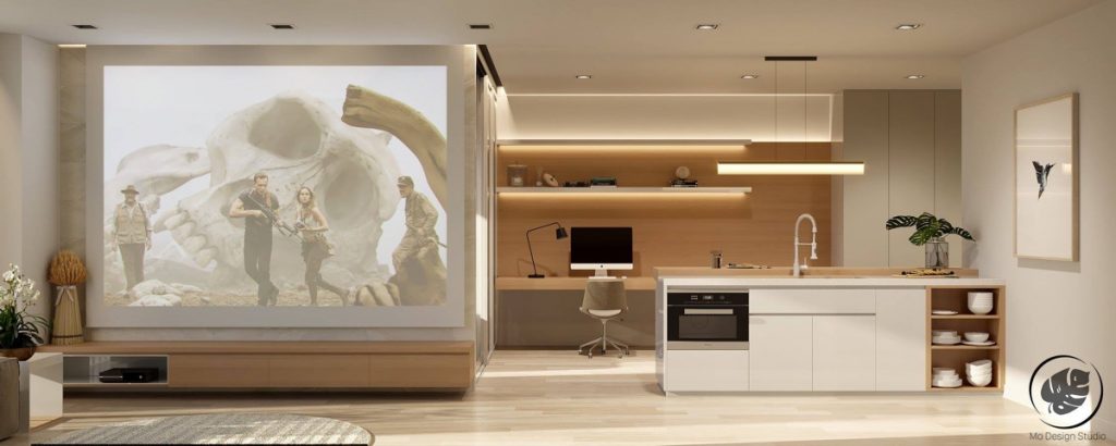
Sleek and practical, this apartment has everything that a modern individual would ever want or need. The apartment is warm and inviting, and utilizes the space so that it is not unnecessarily cluttered.
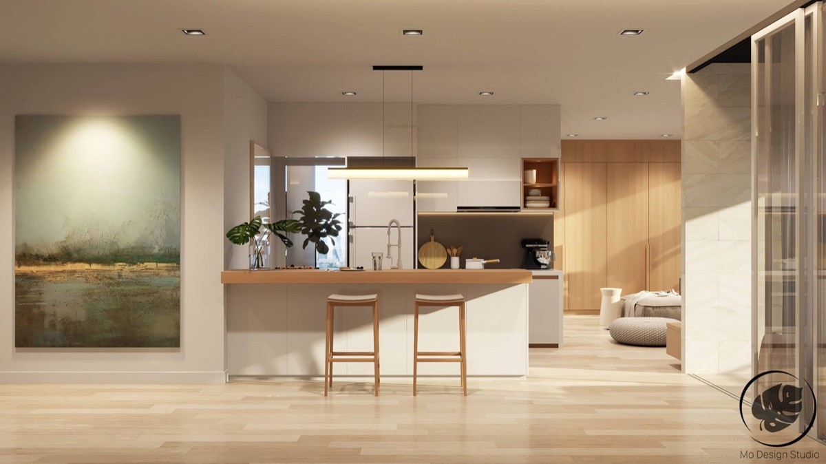
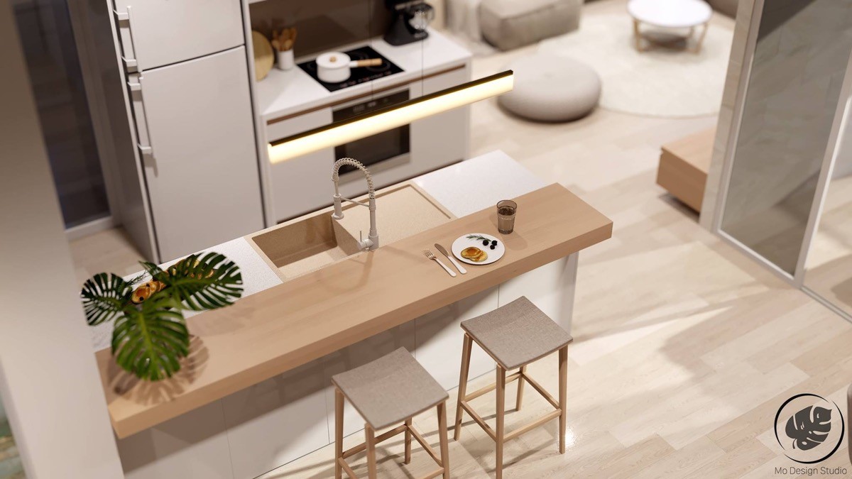
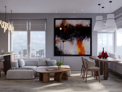
A kitchen island is a classic way of combining two spaces into one to save space. This apartment walks on the artistic side of life, and to prove that, a beautiful watercolor painting is showcased proudly.
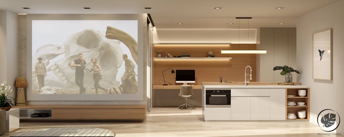
In a stroke of genius, the designer combined the kitchen and study area. The study is just far enough not to get cluttered with kitchen apparel, and just close enough so as to conserve space and provide the homeowner with a fully functional home study. A projector negates the need for a bulky T.V and T.V cabinet. Instead a large wall is kept purposefully bare for the projector- this makes watching a movie to a whole othe rlevel.
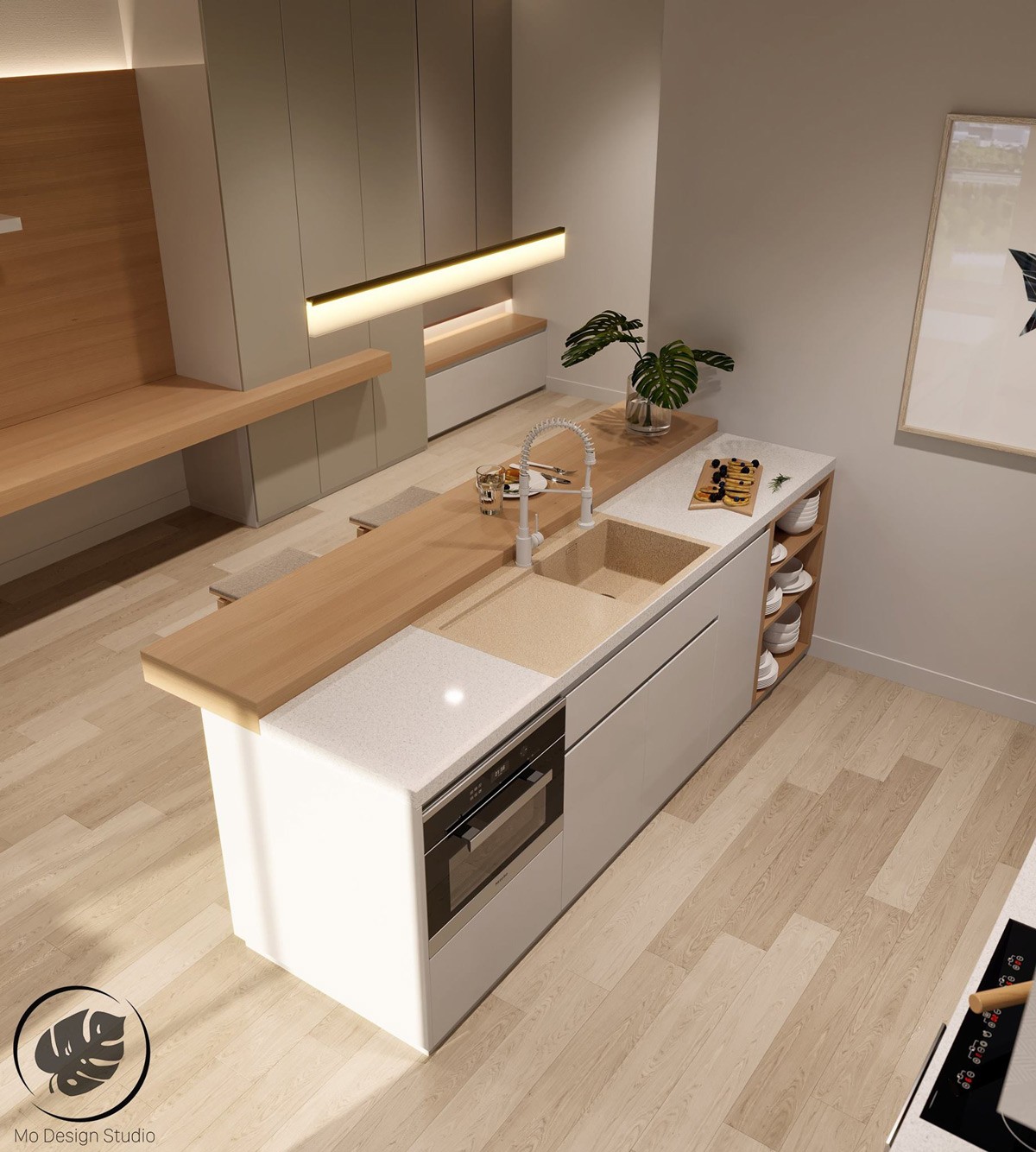
The kitchen is compact and sleek. Everything has its place and the result is a neat and ordered space.
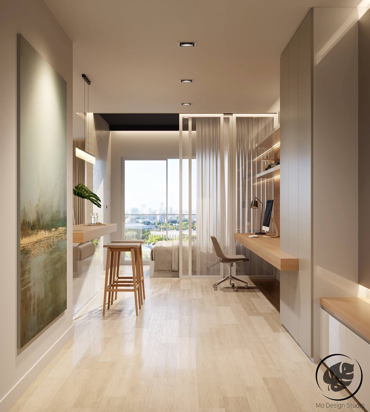
This picture shows just how structured the entire apartment is. The design isn't completely minimalistic, but does not employ unnecessary features in an attempt to make it look more stylish. Instead, the apartment is kept simple- and it works.
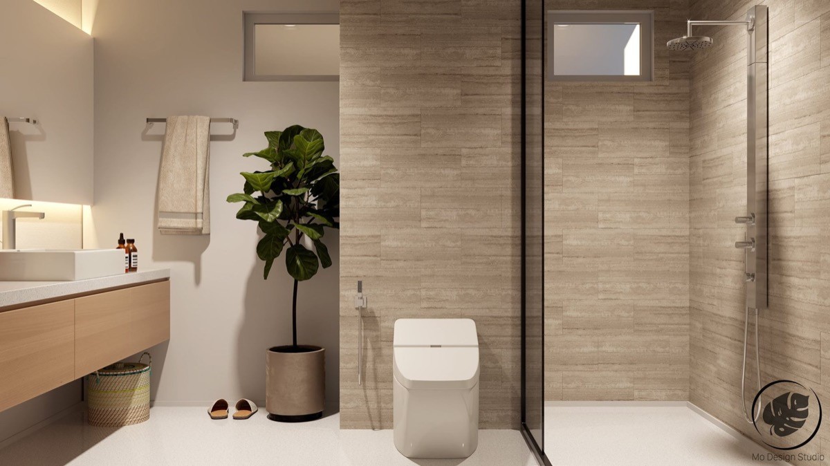
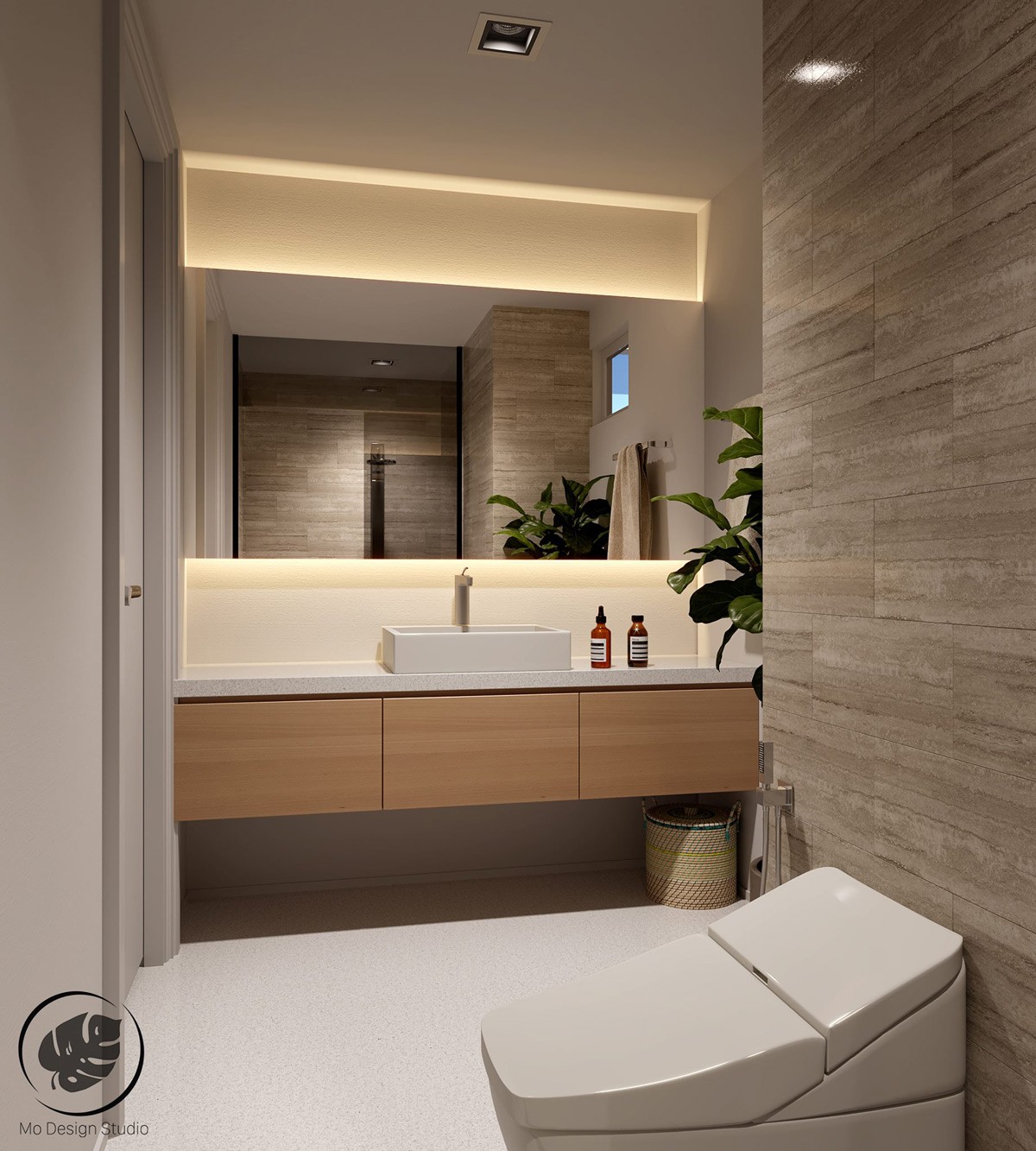
The bathroom is definitely earthy, with organic elements combined to make this bathroom look more like a spa than an ordinary bathroom. Don't you wish you had one?
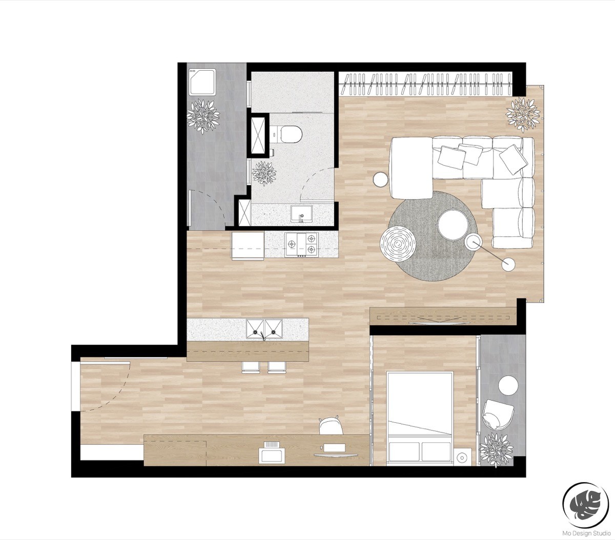
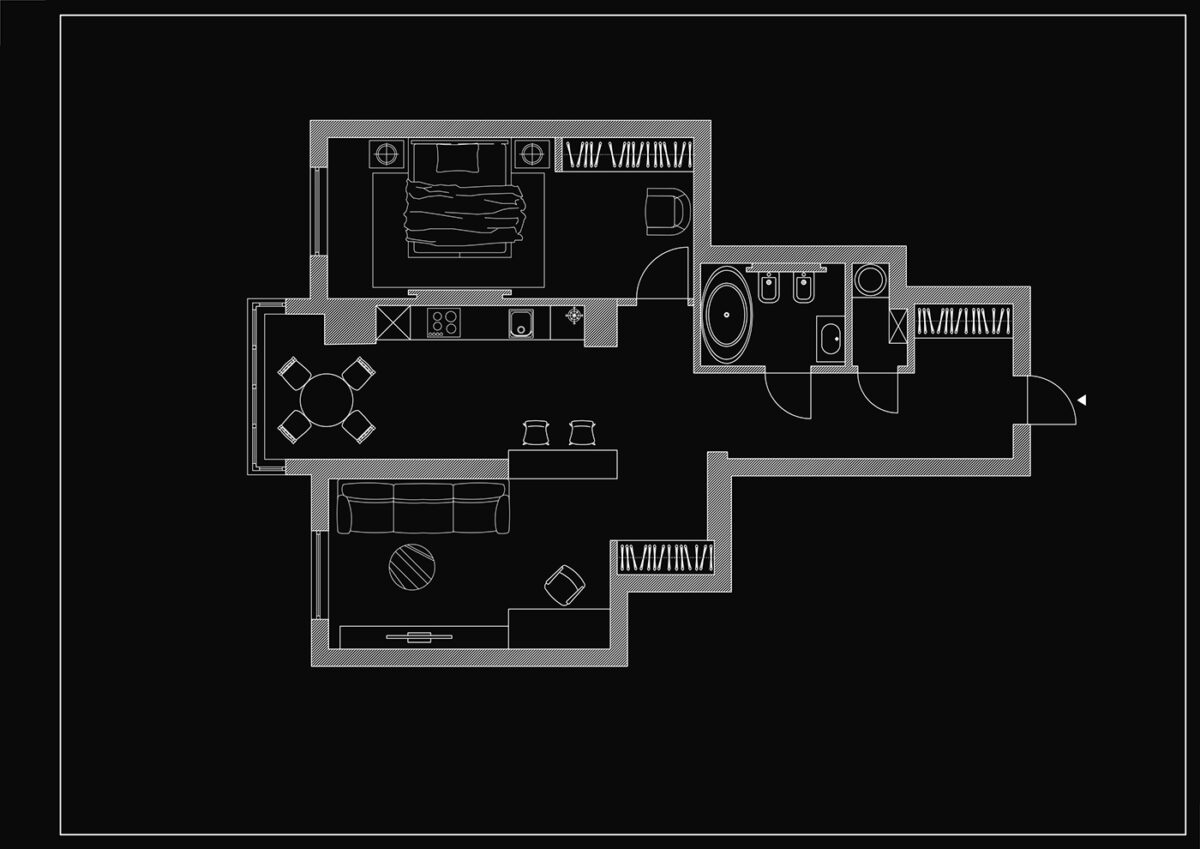
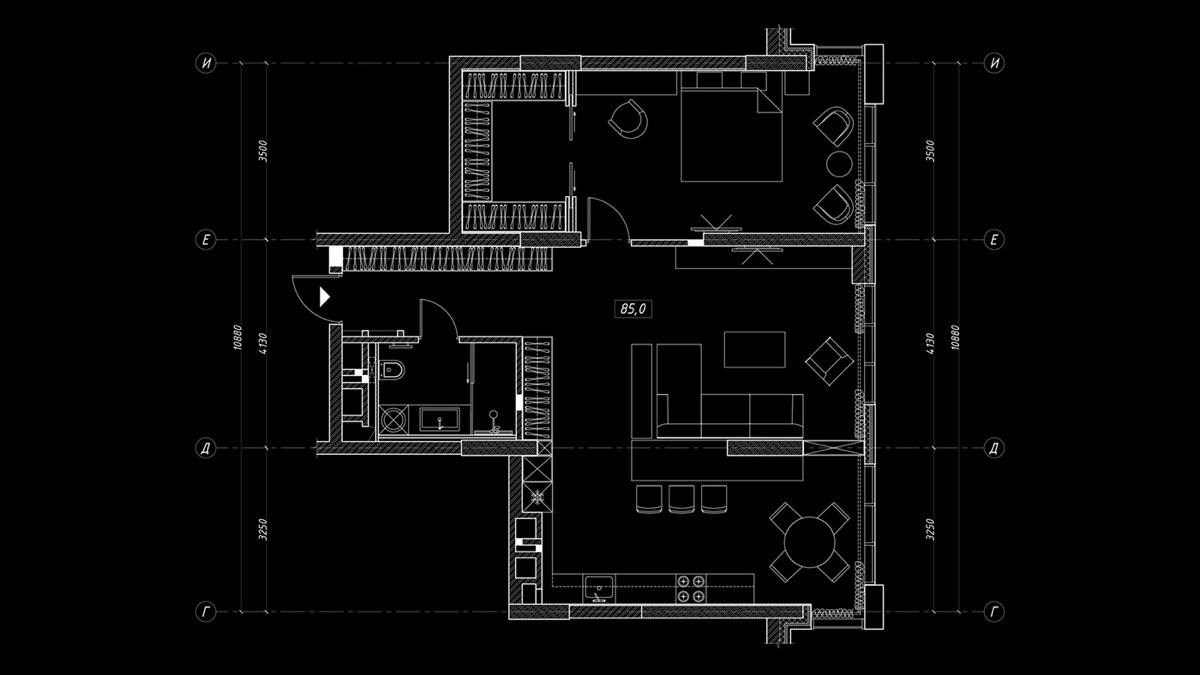
In this floorplan, we see that the designer planned everything to be functional. A lot of measures were taken to conserve space and keep things compact. Remember: save space where you can.
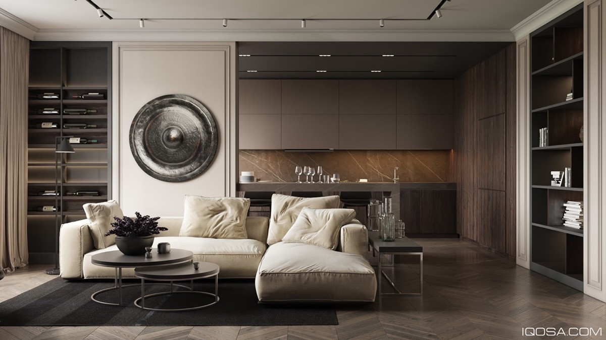
The next apartment is a little more opulent, but still keeps the lifestyle of the homeowner in mind.
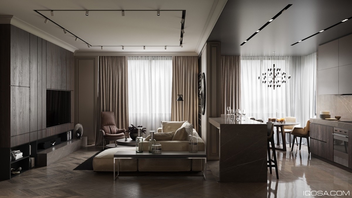
The lavish furniture and marble aspects turn this apartment into a mini-palace fit for royalty. This home proves that saving space doesn't mean that you can't have luxury.
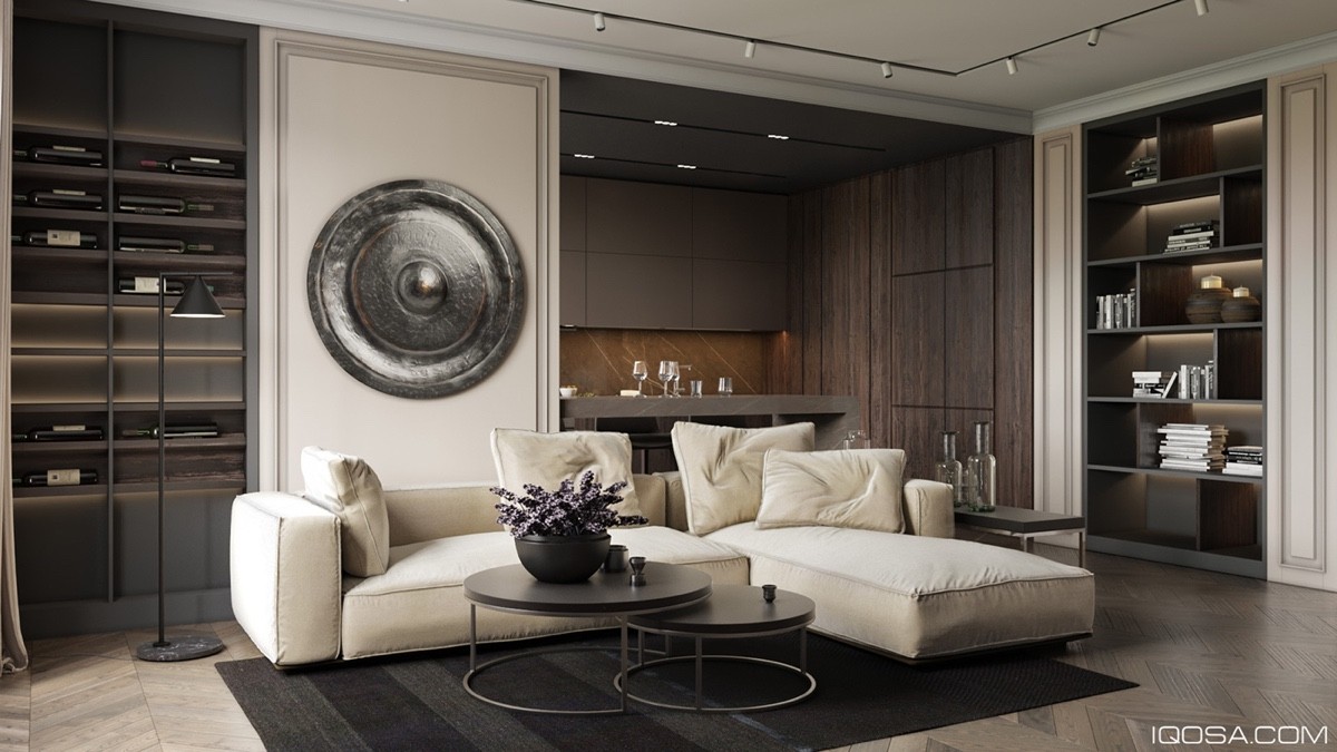
A round metallic wall ornament adds a certain level of dimension to the room, while also looking incredibly sophisticated.
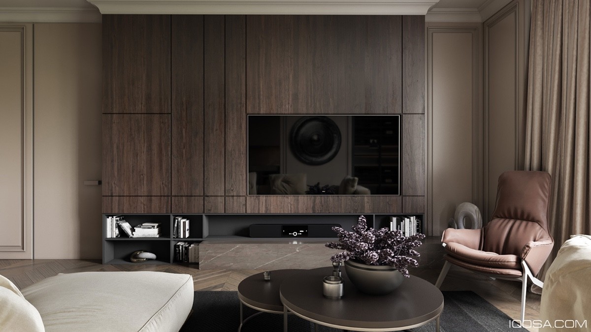
If you don't enjoy watching a movie from a projector, you could always build your T.V into the wall. The wall panels around the television also look classy, creating a pleasant accent wall.
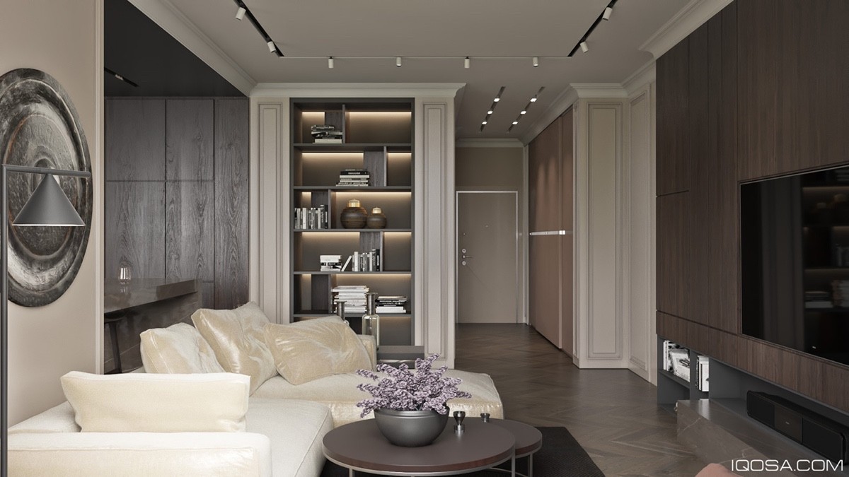
The bookshelf is highlighted by the strategically placed LED lighting. A bowl of purple flowers look beautiful, placed on top of the rounded designer coffee table.
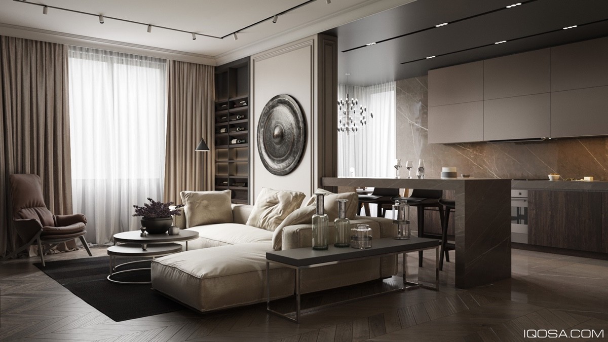
Every sophisticated home needs a drinks table, where guests can be served with a drink of their choice upon arrival. This side table proves that you can be conservative without cutting out the classics.
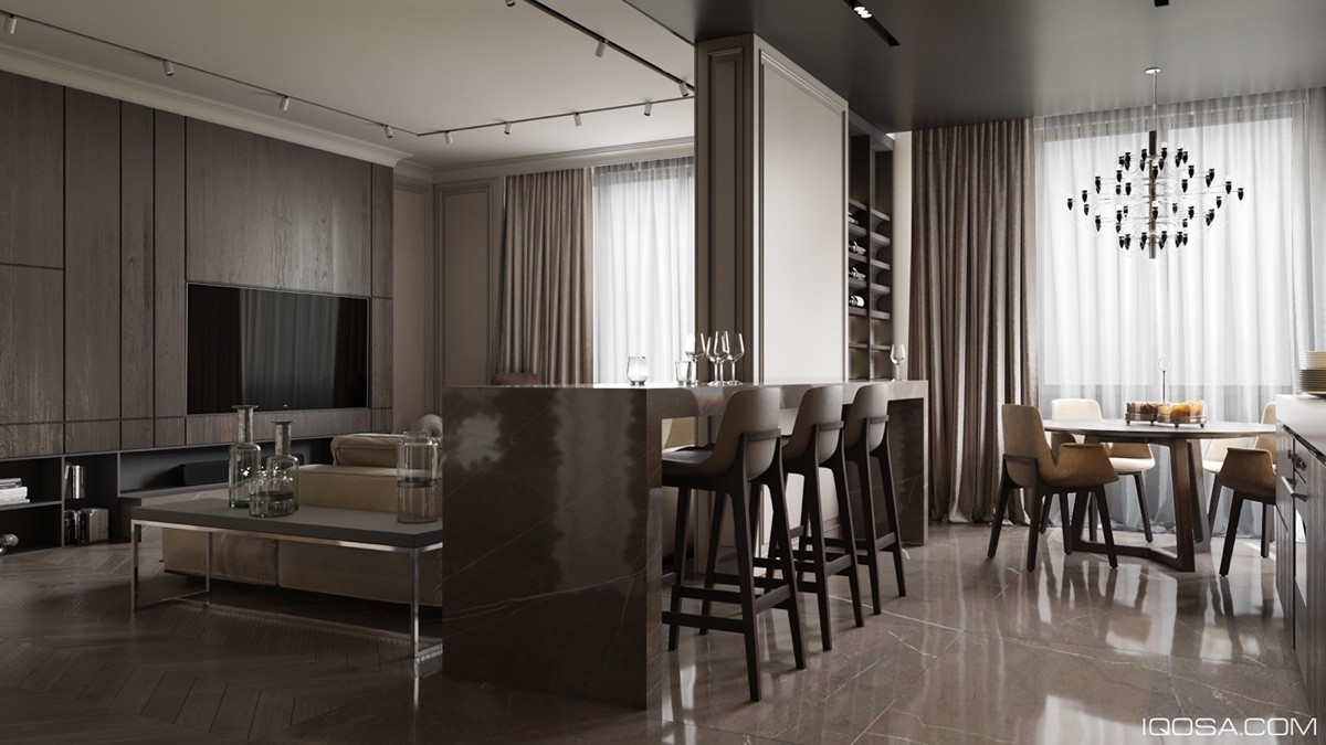
The dining table is a unique blend of tradition and modern creativity. Is it a dining room table or a kitchen bar? Or is it both?
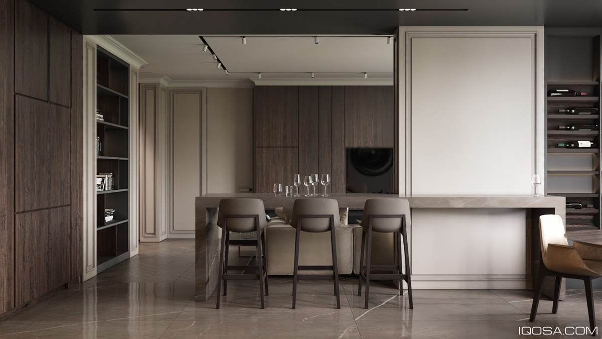
The wall panelling is timeless, melding together the old and the new, proving that elegance is timeless.
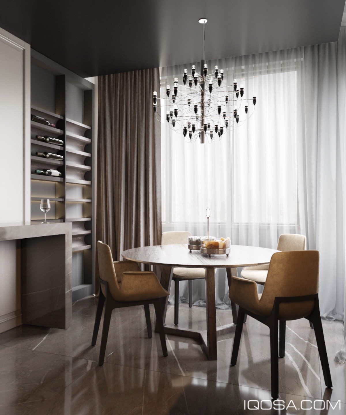
The home boasts a compact wine rack, with only the finest selection, proving that you don't need space to be sophisticated. A beautiful chandelier adds ambience to the entire space, making it the perfect environment to sip your favorite wine.
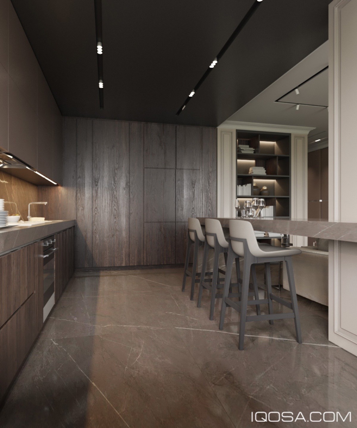
The marble and wooden features work together to contrast in texture, but work together in color. This is an innovative way of adding depth to a room.
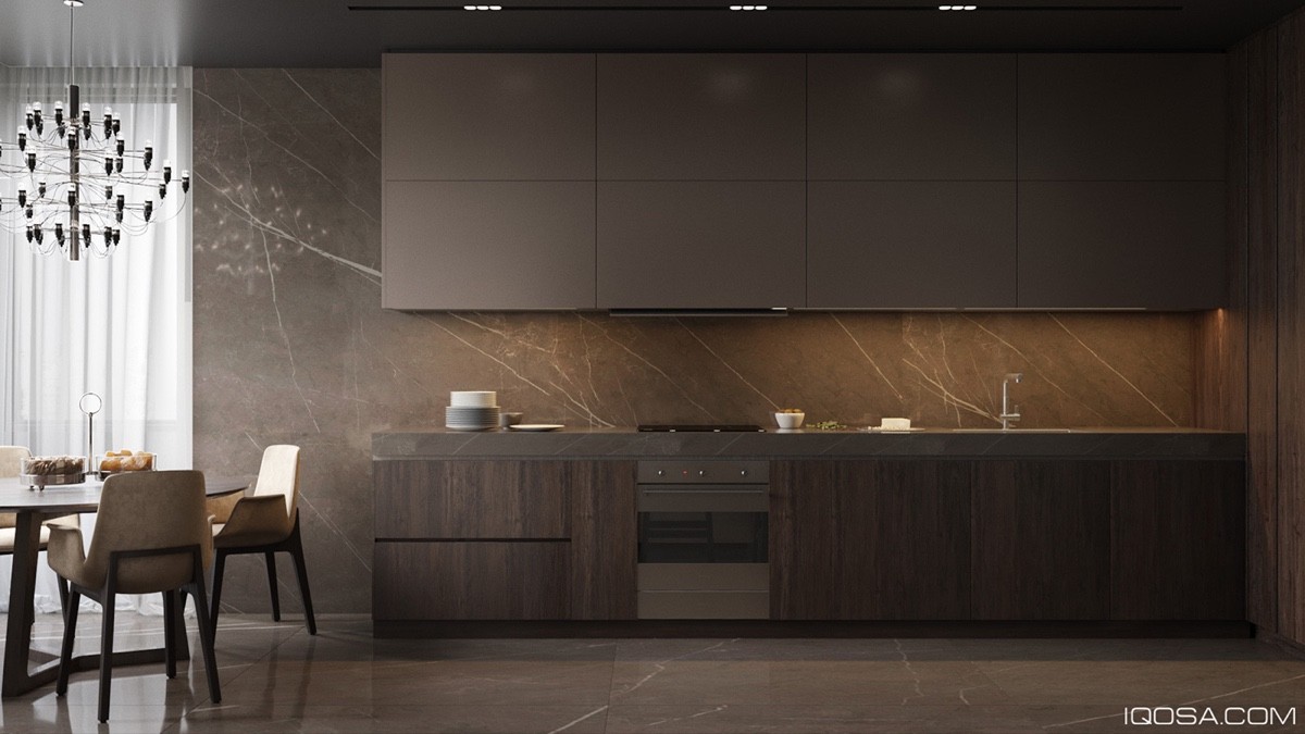
The kitchen is spacious, and is the one room in the house that needs to be. Don't skimp on the bathroom or the kitchen.
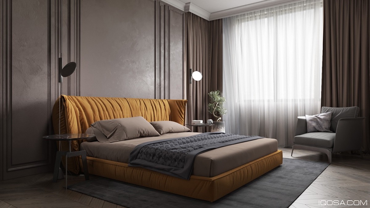
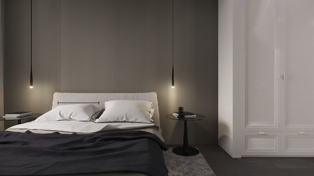
The bedroom is the epitome of comfort and luxury. In fact, the bed looks like one giant cushion to snuggle into after a tough day.
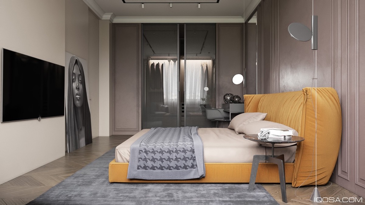
A spacious walk in closet is partially obscured by frosted glass wardrobe doors. This draws attention to the design feature, but obscures the clothes from view, lending privacy to the homeowner. A bold painting rests proudly against the wall, showcasing the homeowner's excellent taste.
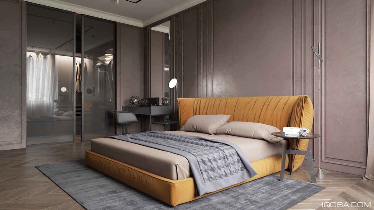
A carpet around the bed adds to the picture of comfort and warms up the entire room, working together with the colors of the ebd.
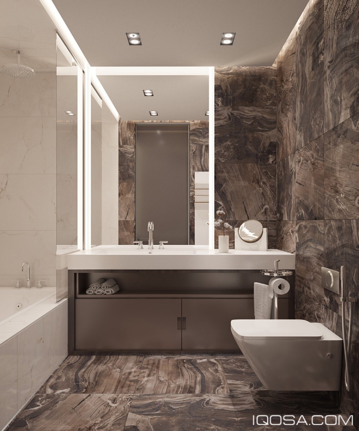
The bathroom is sleek, with mirrors and marble floors and walls. Don't skimp on the bathroom or kitchen, but be creative about saving space. For example, the space under the sink allows you to store your towels there, negating the need for a towel rack.
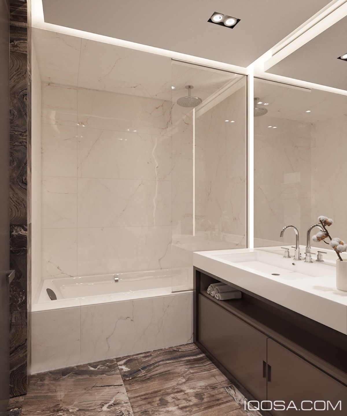
Another way of conserving space but not skimping on luxuries, is by combining a luxurious shower head and spacious bath. Two for the price of one!
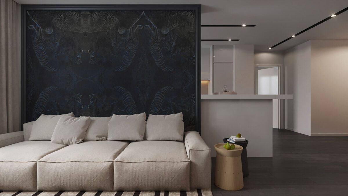
Our third and final apartment is a little more whimsical than the others. WIth more colors and interesting patterns, this homeowner likes to look on the fun side of life. Do you?
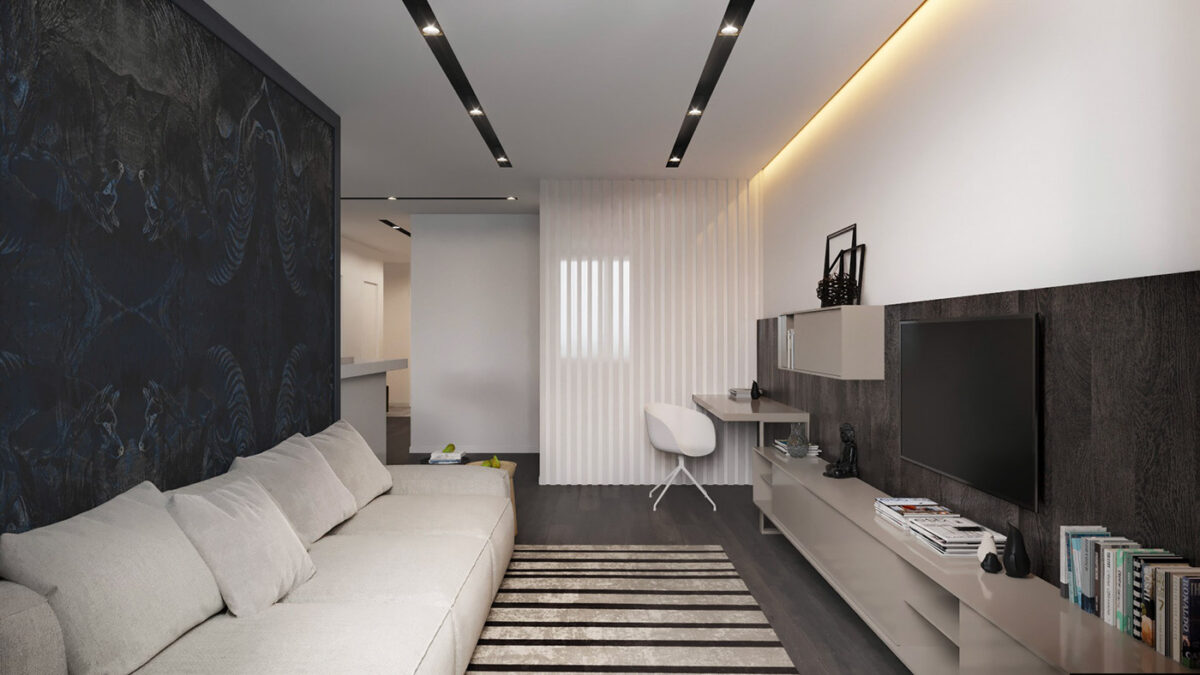
This living space is long, but every inch of space is used for a specific function. The space has a monochromatic color base to showcase all the other design features, giving them prominence.
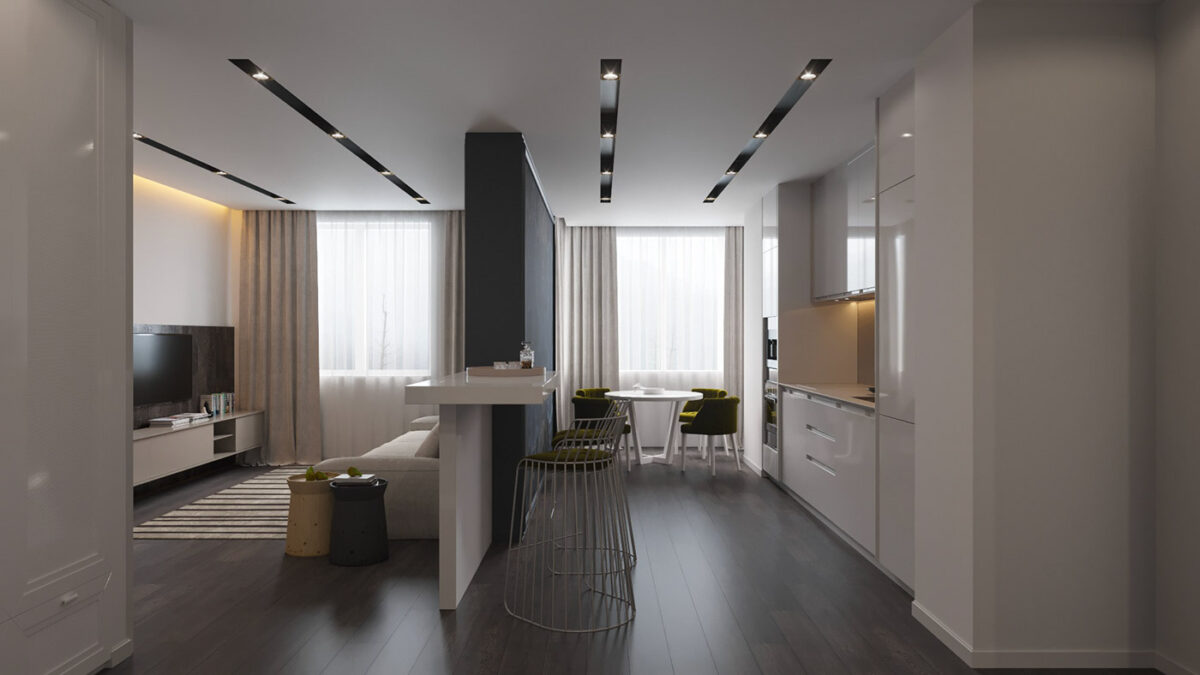
There are many different colors and patterns in the apartment, but they don't become overwhelming. It is always important to remember that less is more when it comes to patterns and textures.
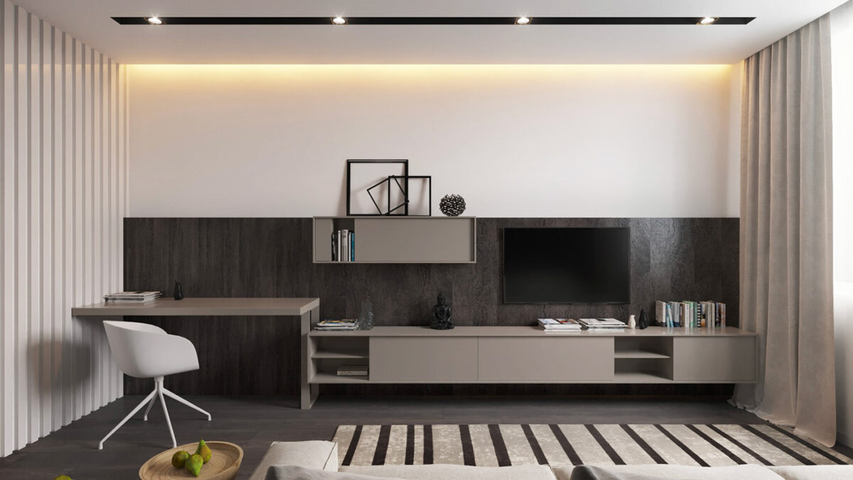
The entertainment/study area has mor eof a grey color scheme, but the varying shades and splashes of white prevent this from becoming boring. Empty frames, and a small houseplant create an intriguing design element that is to be appreciated. While multiple shelves provide a stylish storing space.
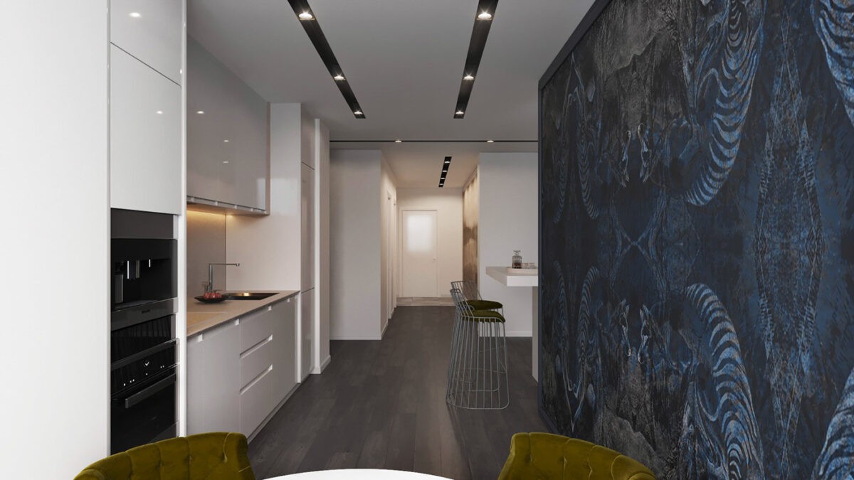
What truly takes this apartment to the next level is the multicolored holographic accent wall. The intricate patterns are fascinating to watch, it is a truly beautiful aspect to the home.
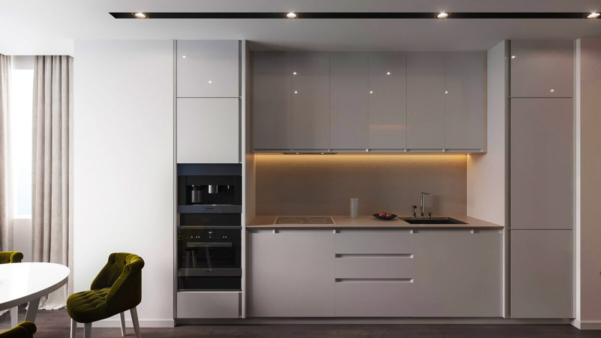
The kitchen doesn't take up much space, but still has everything that a modern chef could ever desire. And enough space to work!
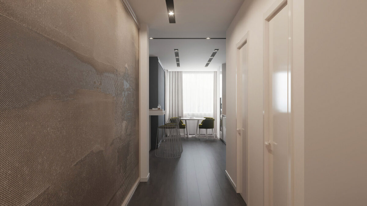
At first glance, the hallway looks ordinary, even boring. But when you look again, you see the understated accent wall, and all the design elements of the apartment working together to create something remarkable.
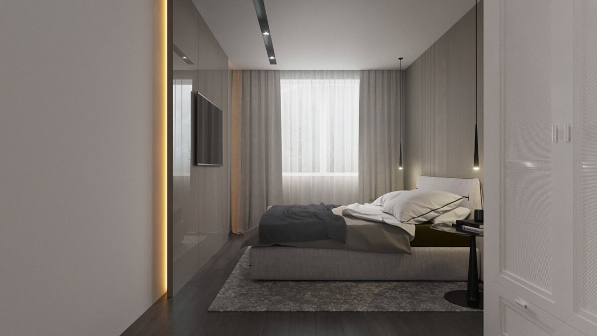
With a room like this, you'd never want to leave. A glossy accent wall with LED backlights, holds a flat screen T.V, directly opposite a cloud-like bed- all for the homeowner's comfort.
