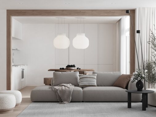
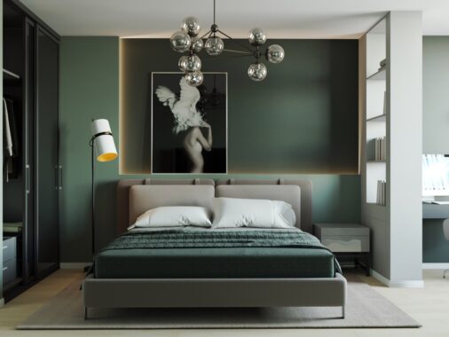
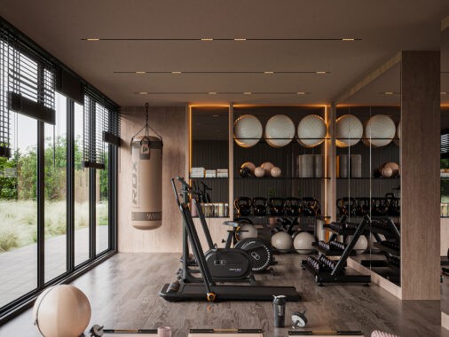
Beautifully-designed home interiors often have one thing in common: a lack of clutter. Streamlined to perfection with minimal accessories in sight, they offer a picturesque example of what we would like to achieve – but struggle to – on an everyday basis. These four homes make the beautiful achievable, using Scandinavian design as a basic structure. Peppered with ornaments, useful fixtures and looking more like your house might every day, their perfect blend of patterns and tones make detail look crafted, not cluttered. Representing very different design themes, they offer an option for those who are not super-minimalist, but still aspire to the delights of gorgeous interior design.
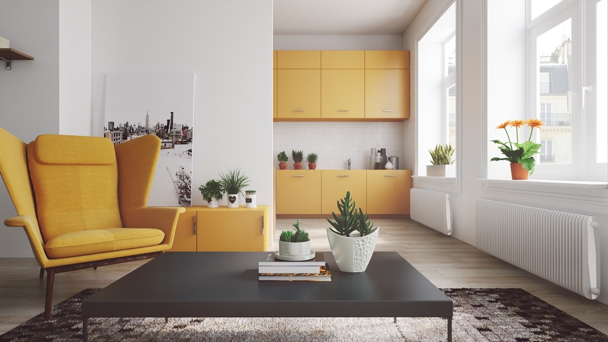
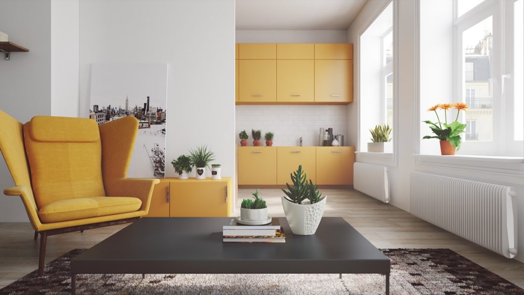
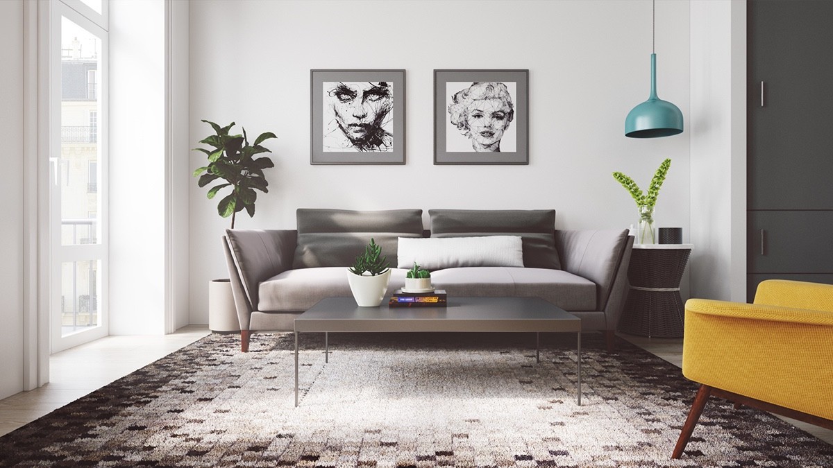
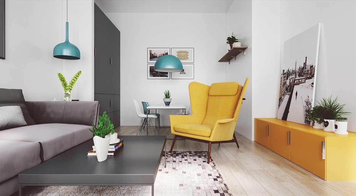
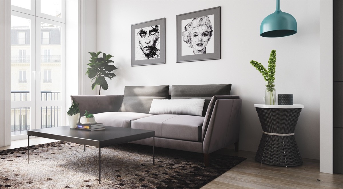
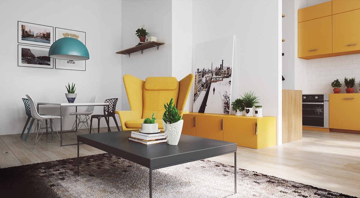
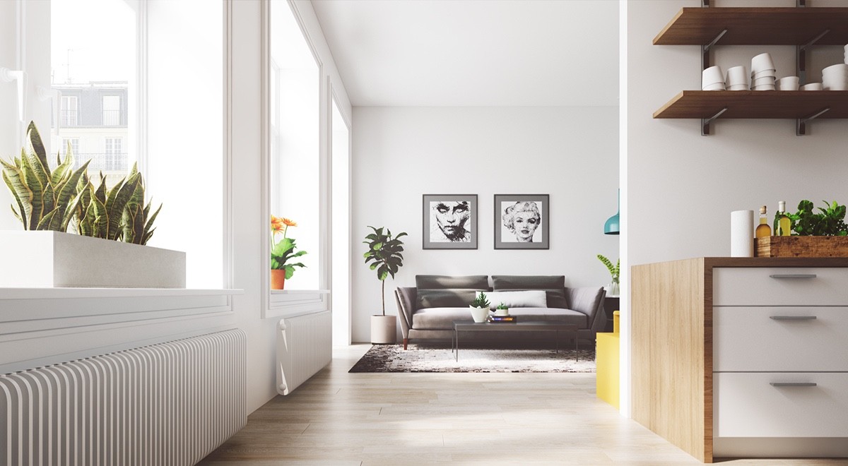
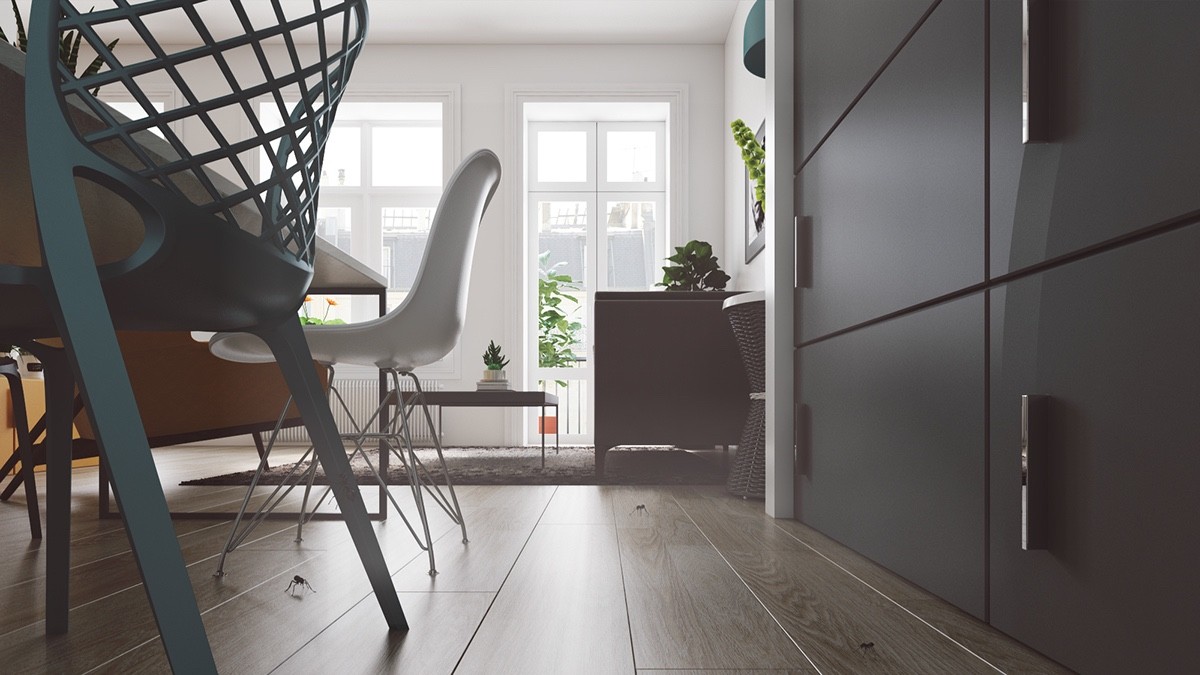
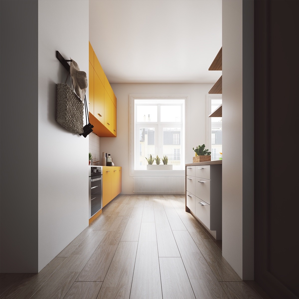
Our first home design uses a Scandinavian backdrop to showcase pops of colour and an array of potted plants. In the lounge, bold mustard tones cover kitchen and lounge cabinetry and a chair, backgrounded by walls in white. A black table and intermittent grey-and-black rug tie together, reflecting their tones in two sketch prints above the sofa. The grey sofa and cabinetry make way for teal hanging lights and more prints, swathed in grey-and-black lines. An array of white and terracotta-potted plants pepper the space with a lived-in feel.
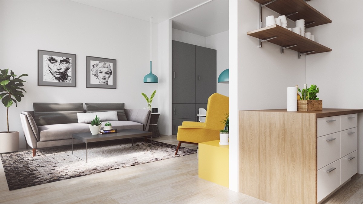
Hints of Scandinavian influence pop up throughout the space. Standing on light-wooden floors, a classic white-and-wood kitchen bench props up basic wooden shelving. The dining room holds a simple white table and chairs, interspersed with quirky mesh-back chairs in teal. White heaters gain clear space, and chrome vertical handles sophistication. Opening the space via white windows, a light, airy feel allows bold colour personalities to shine.
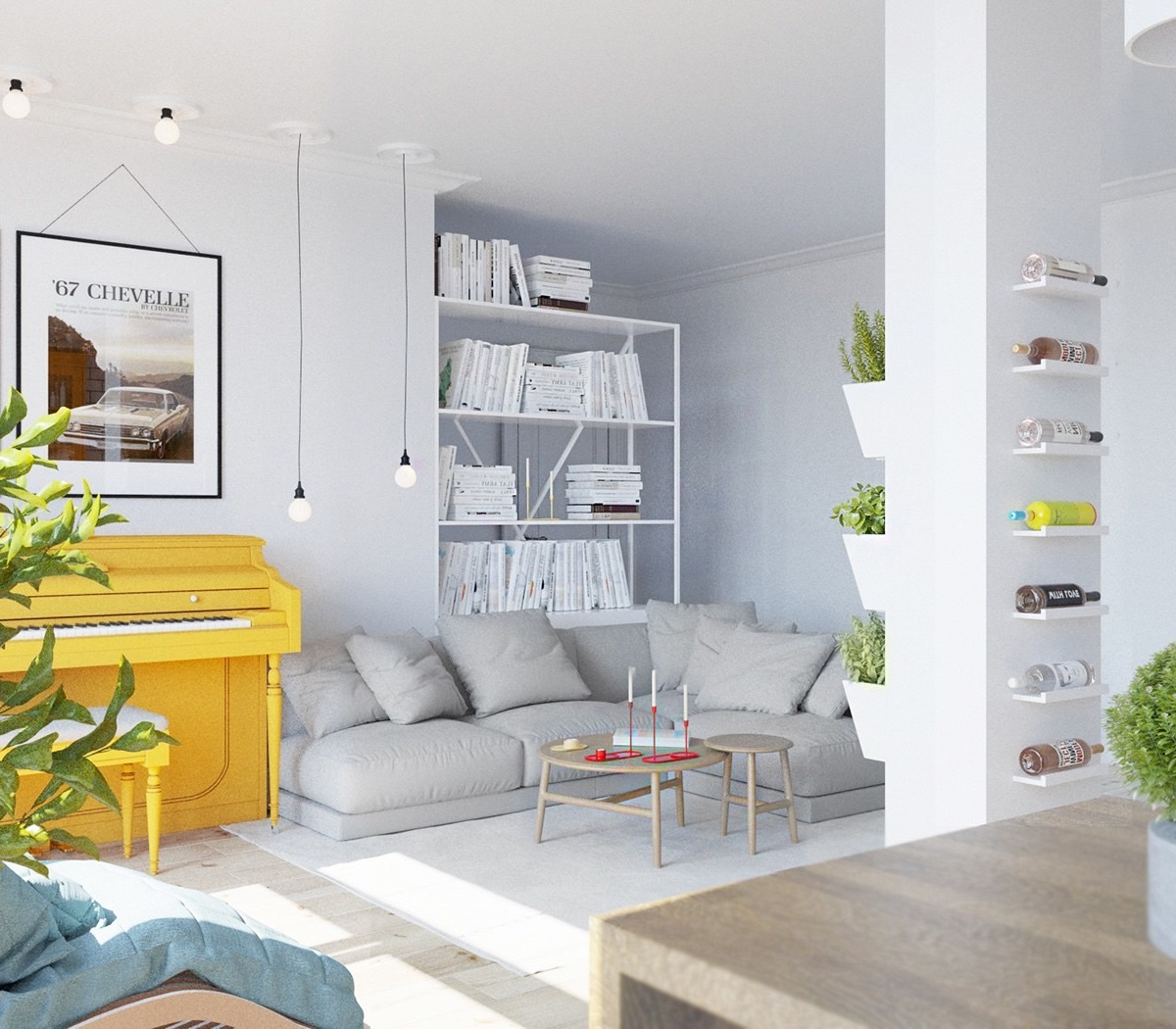
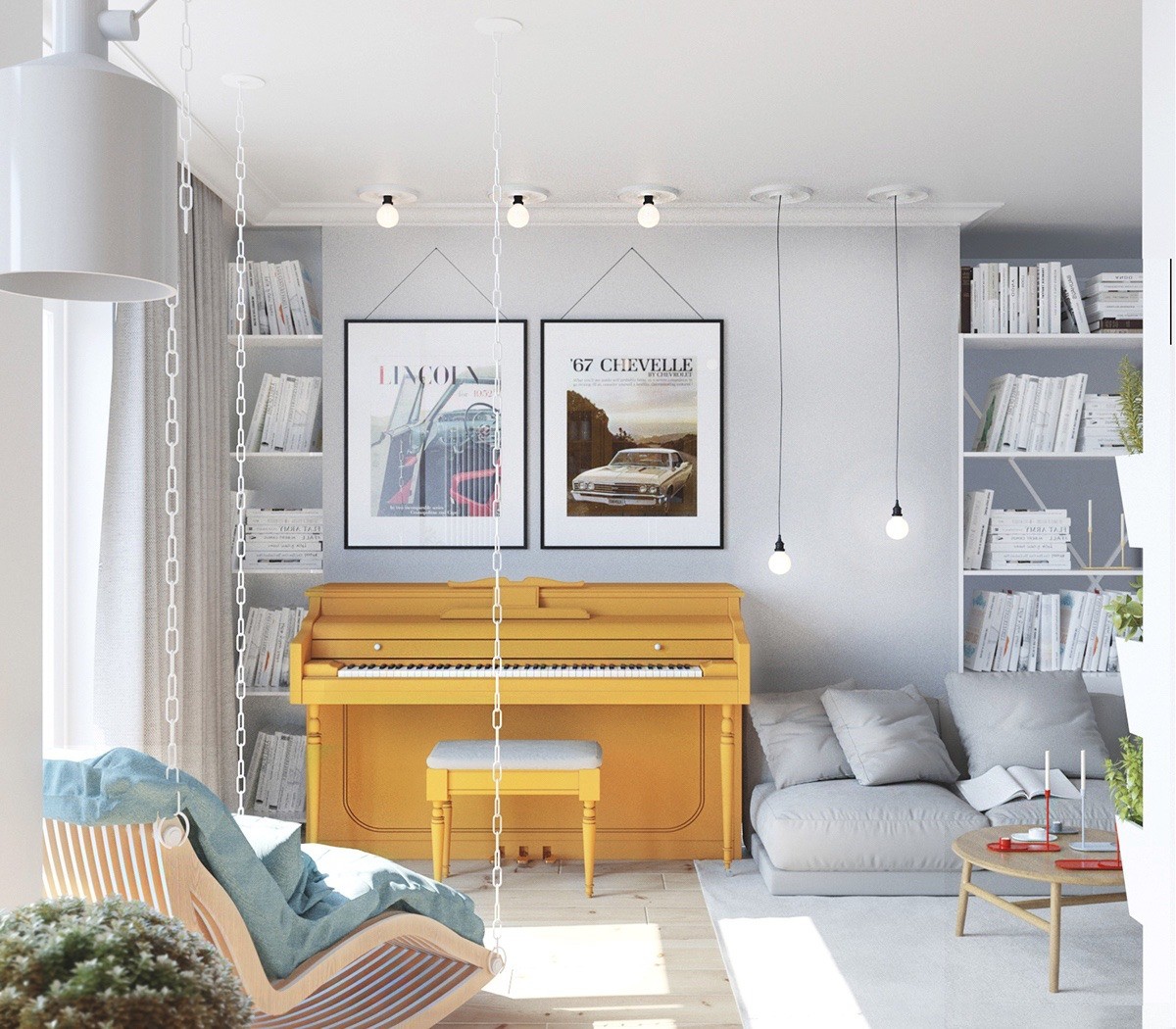
Our second space is also keen as mustard – but with pastel over-and undertones. Classic white shelving on pure white lightens and brightens, with a stencil white bookcase and books bound in the same hue. As white holds pot plants in three identical holders, grey couches and light-wood furniture takes out the dark. Going bright with a mustard piano, teal armchair, ’67 Chevy poster and feature liquor bottles, Scandinavian structure allows the space to remain clean and light.
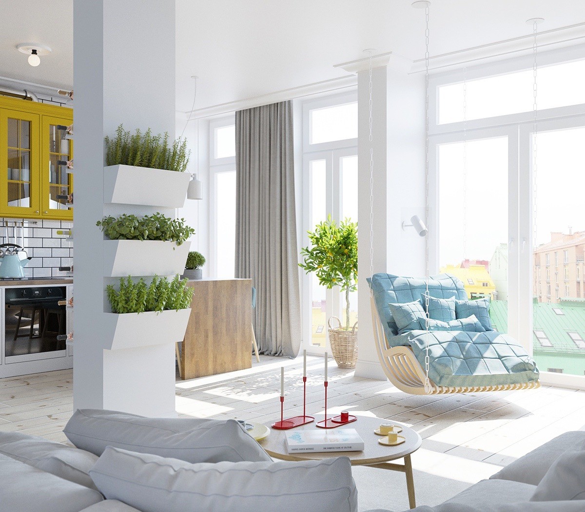
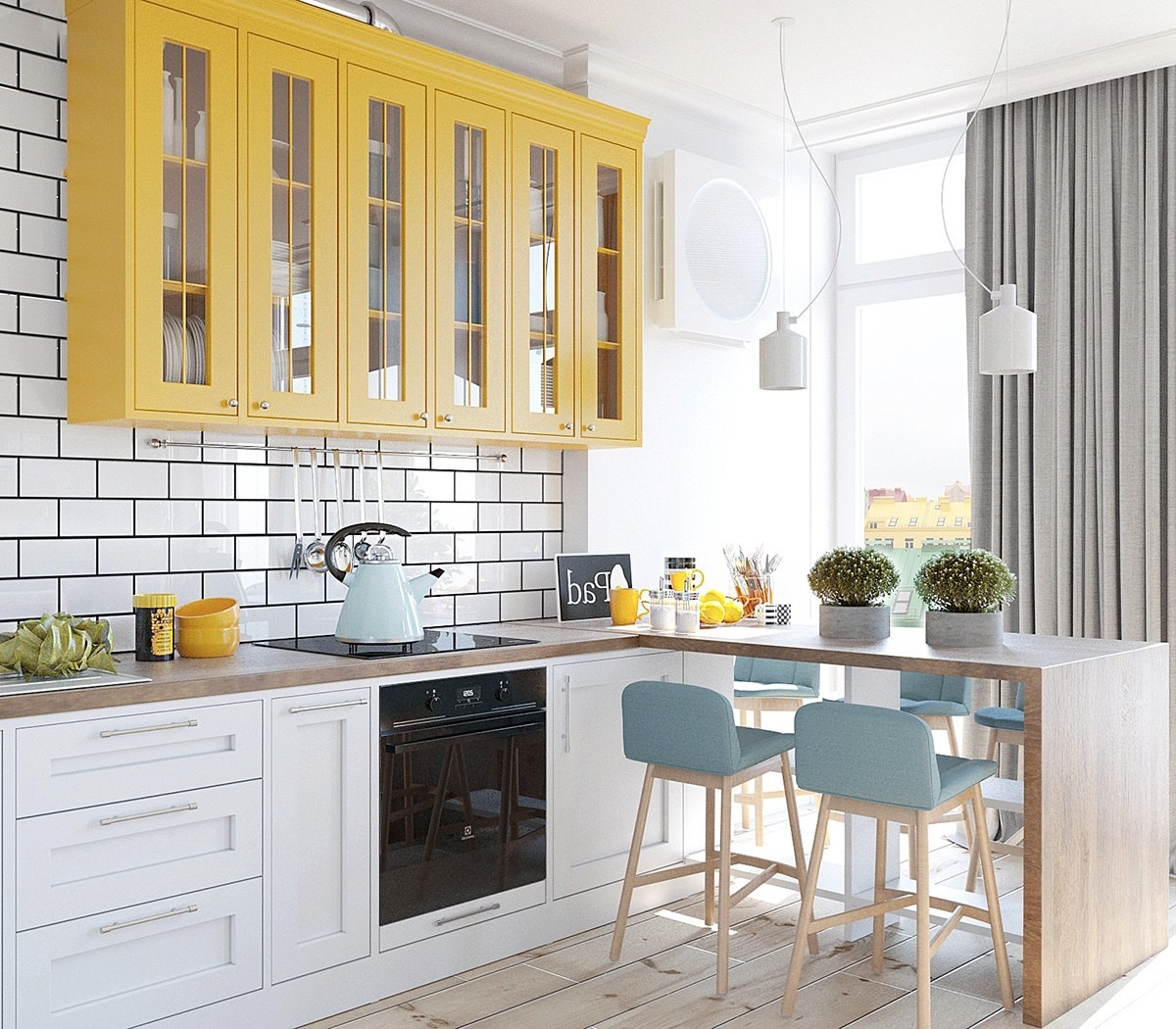
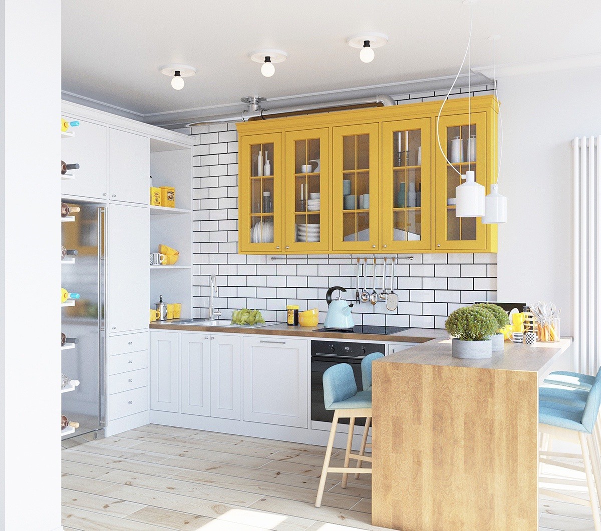
A view towards the kitchen shows a similar pattern. Starting with bold mustard cabinetry and utensils, simple white French doors with a light grey frame allow a black-and-white inlet and oven to take dominance. Balanced by white cabinetry and hanging lights, pastel tones in the kitchen stools and kettle add a playful element. Necessities are drowned out in white and light wood.
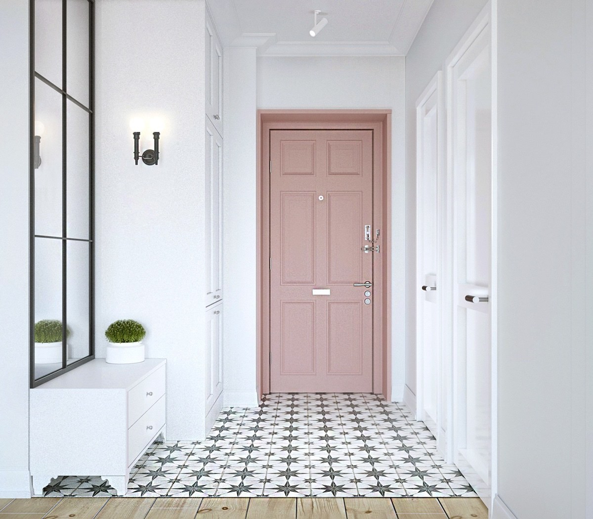
A pretty hallway provides a break that looks more Manhattan than Scandinavia. Using a pink pastel door as a feature, a striking star-linoleum floor makes the black-framed window less dominant. White offers a canvas.
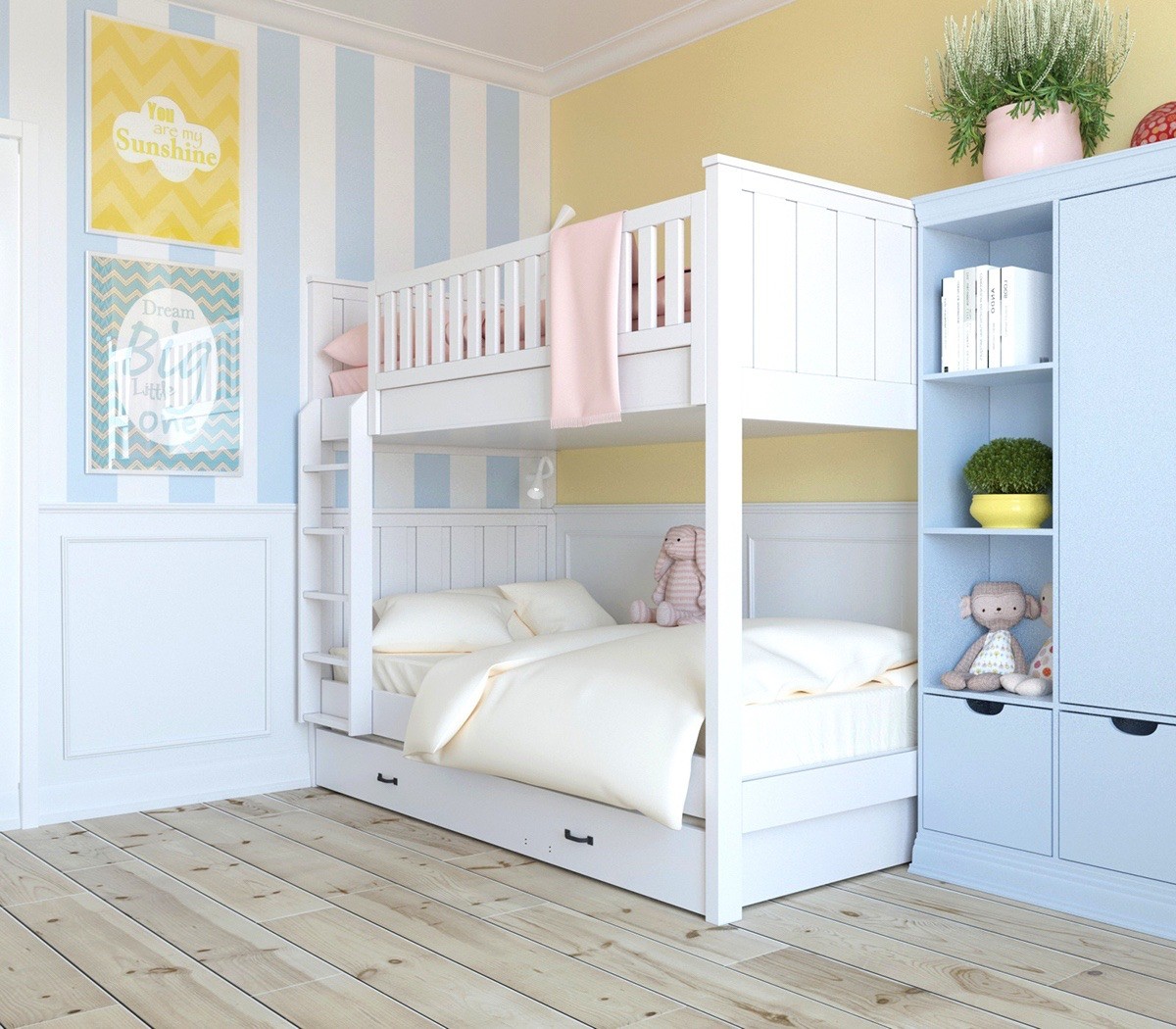
The kids’ bedroom is a perfect place for pastels to play. Using the same white background, zigzag and striped patterns rule in mustard, blue and green. Elements of pink in toys and potted plants contrast with a baby blue bookcase, made soft by white bunkbeds and light-wood flooring. A touch of green introduces nature.
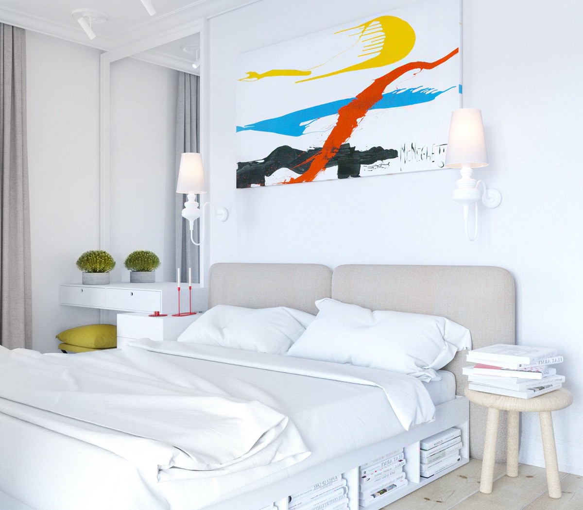
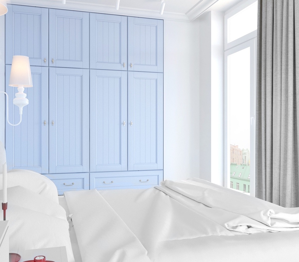
Dominant colours are made adult in the master bedroom, which bathes itself in pure white. Using soft beige elements to transition to a striking abstract piece, potted plants and a large baby blue armoire help pan out colour. A subtle bookshelf holds white-bound books.
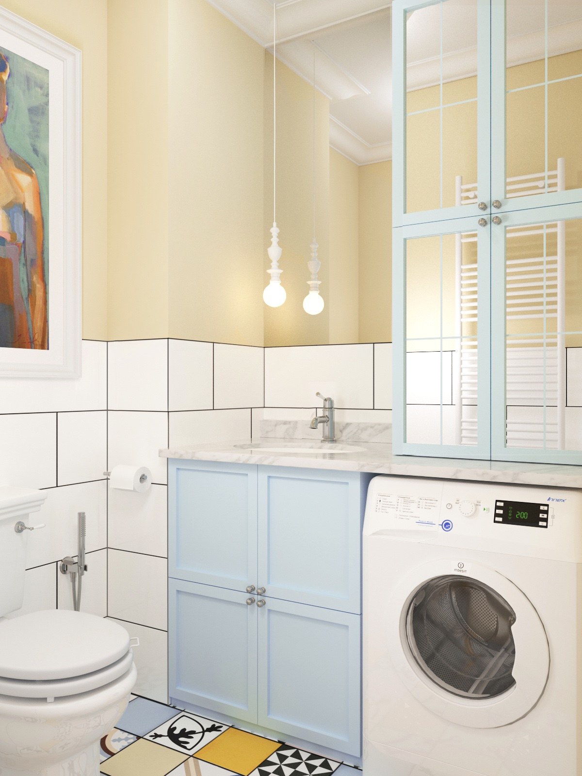
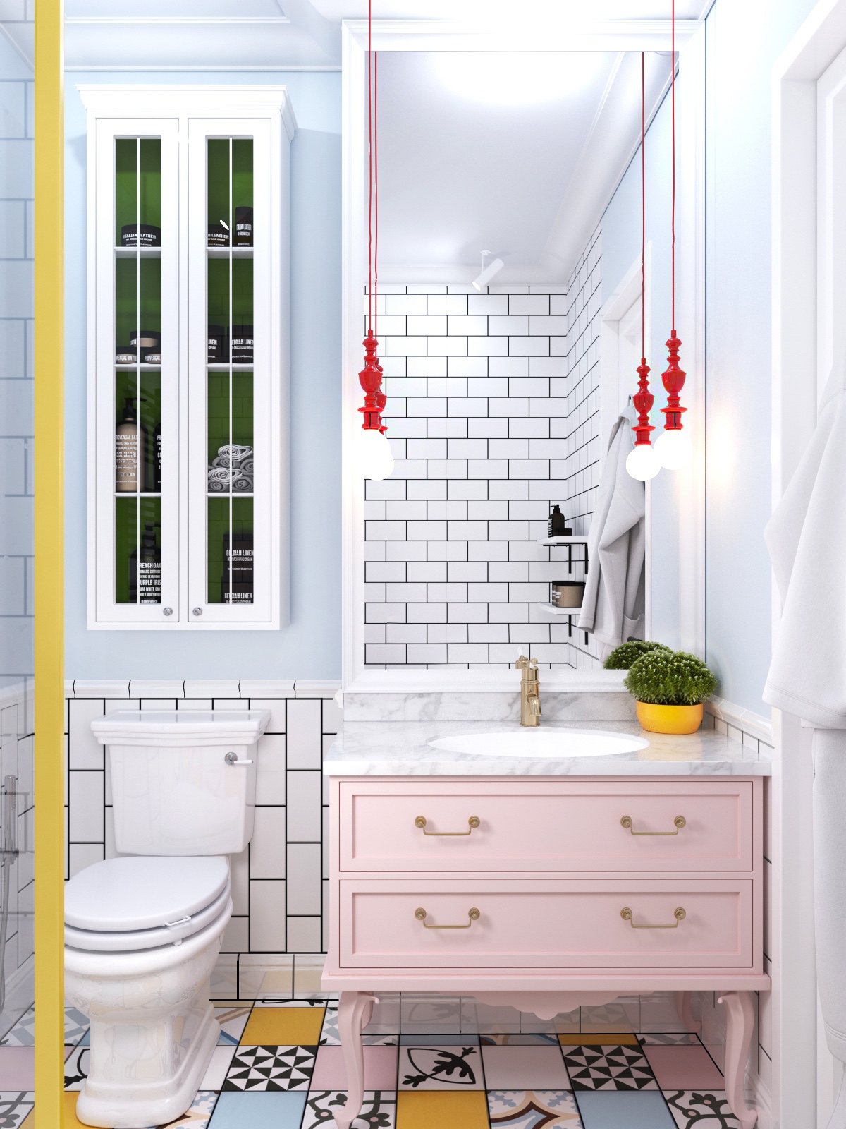
The bathroom and laundry use the kitchen’s black and white tiling with another multi-faceted design. Halved in black-and-white tiling and a beige upper, the laundry’s walls align with white fixtures to let multi-coloured tiles shine among pastels. The bathroom’s baby blue and pinks sit on the same tiling, made more elaborate by pops of red from the living room. Mustard details tie in the total space.

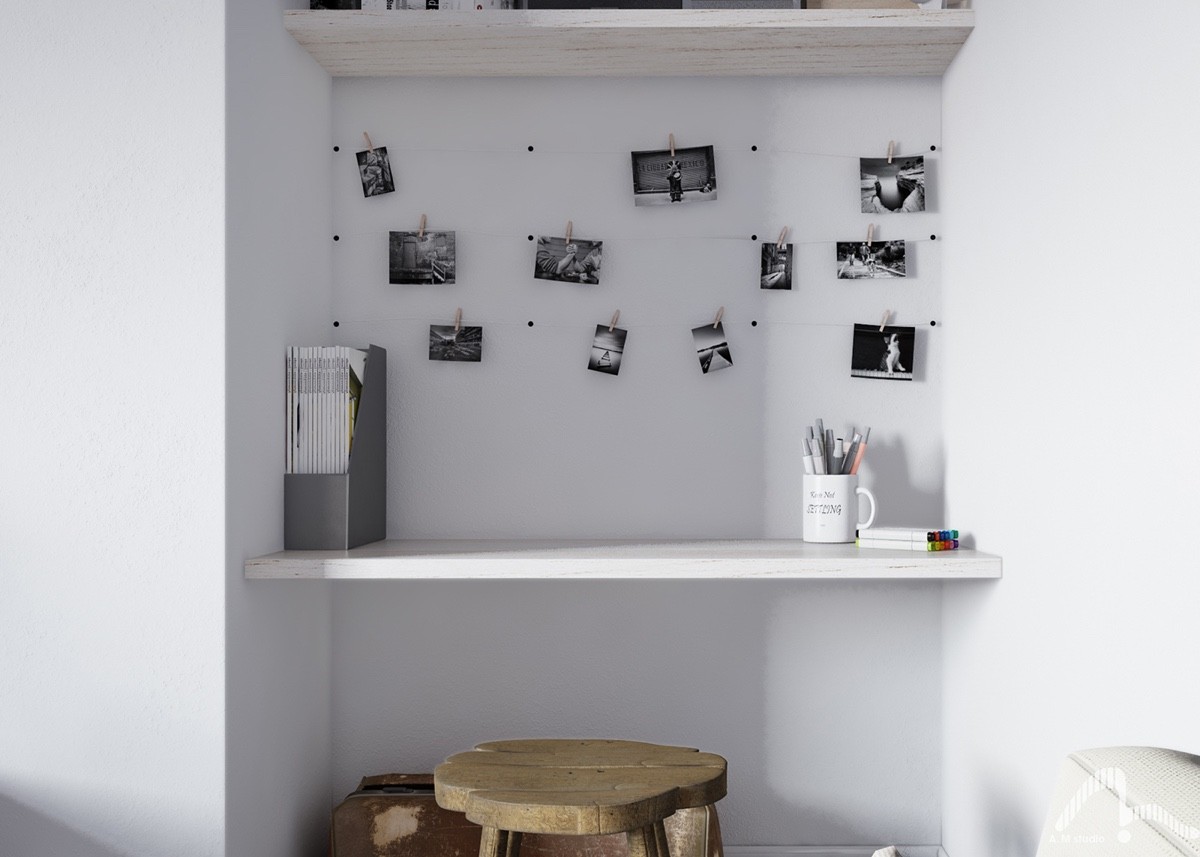
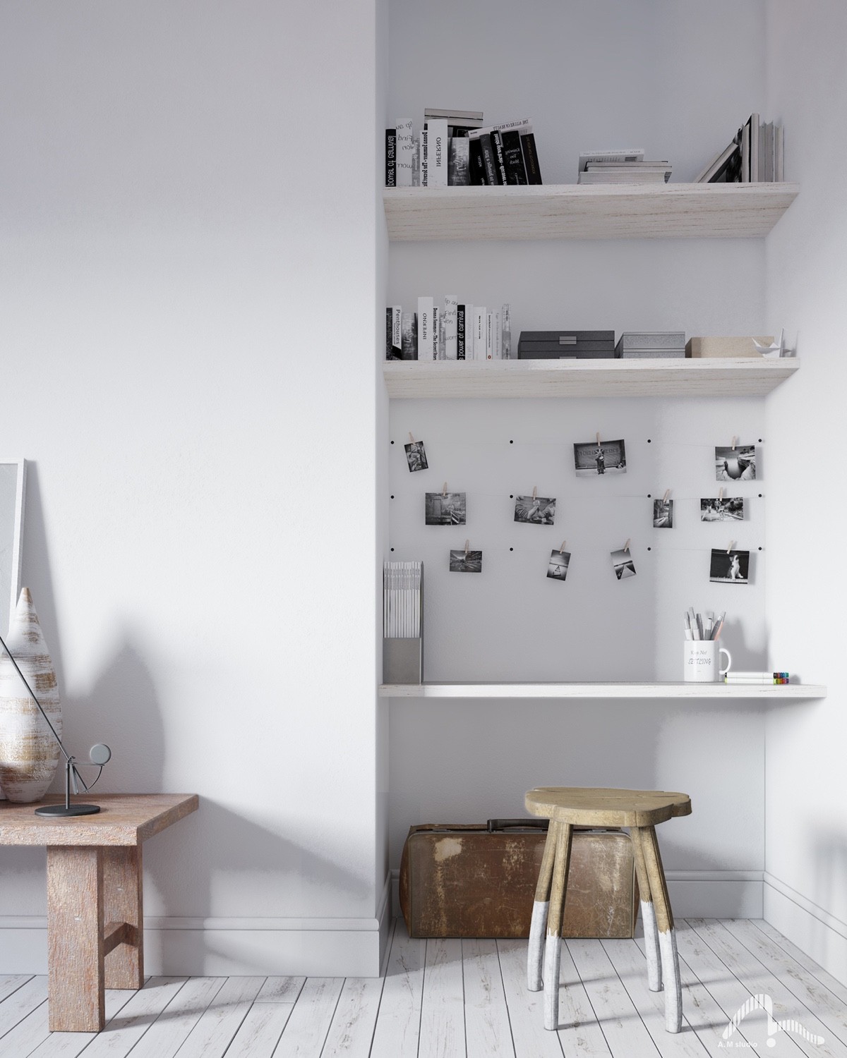
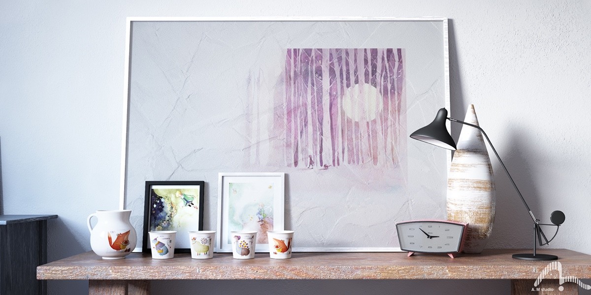
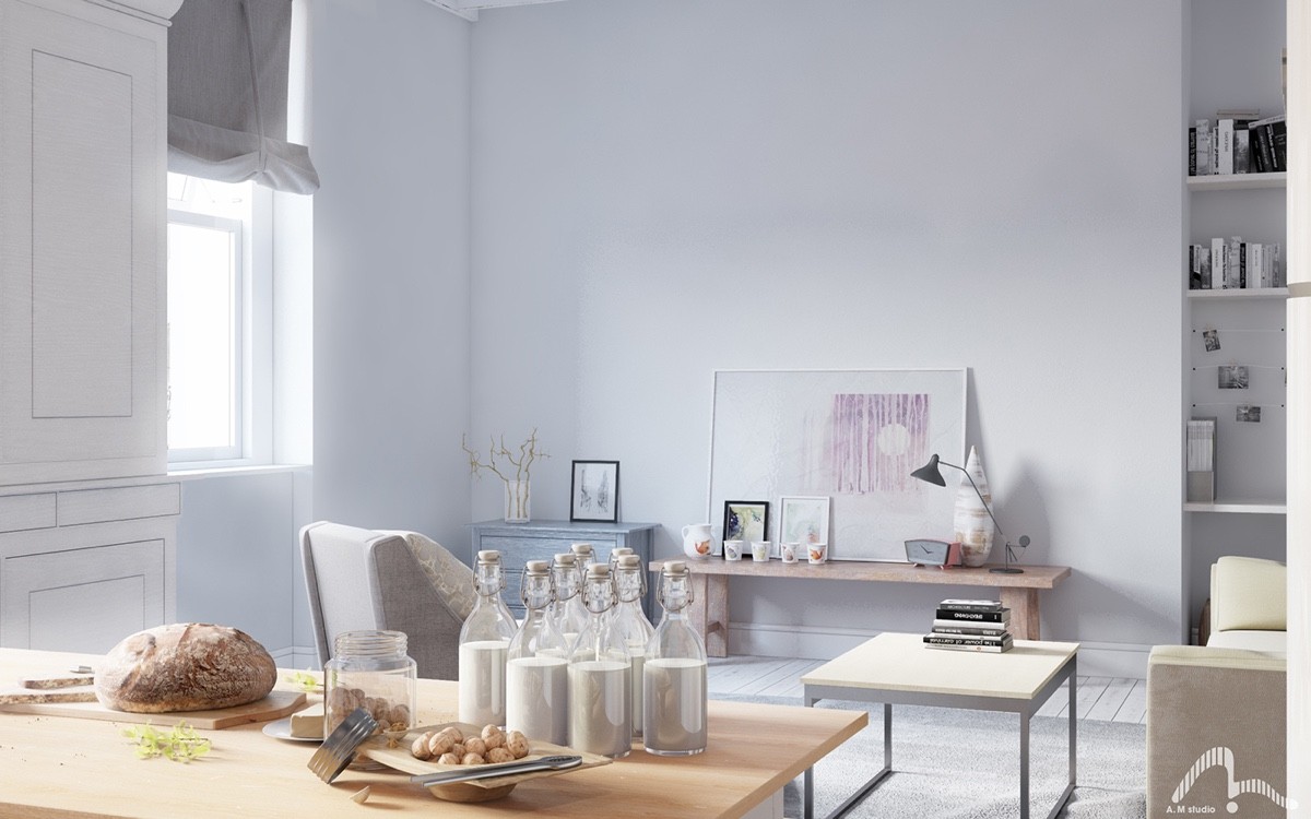
Our next space shows how a Scandinavian framework makes many accessories uncluttered. Using trademark white walls with an almost-white wooden floor, beige couches and a chair make little impact in the living room – leaving room for the small elements. Sitting and pegged above white shelving, black-and-white photos show memories, while grey-and-white stationery chills beside. Books in black and white, and small boxes in charcoal and beige, sit above. Sitting on one of four differently-coloured wooden elements, a leaning abstract art piece sits among animated cups, a jug, vase, clock and small prints.
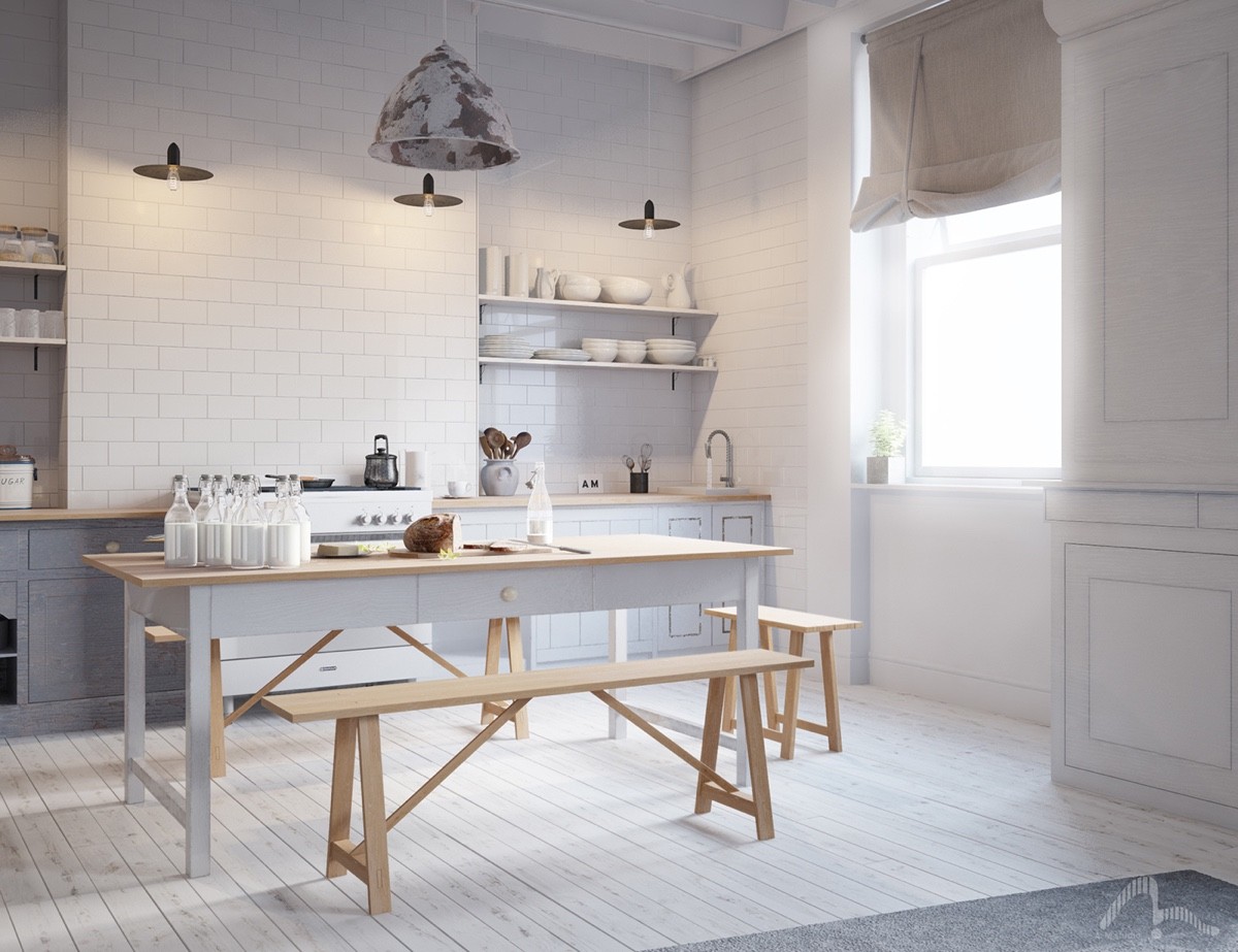
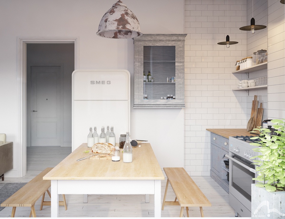
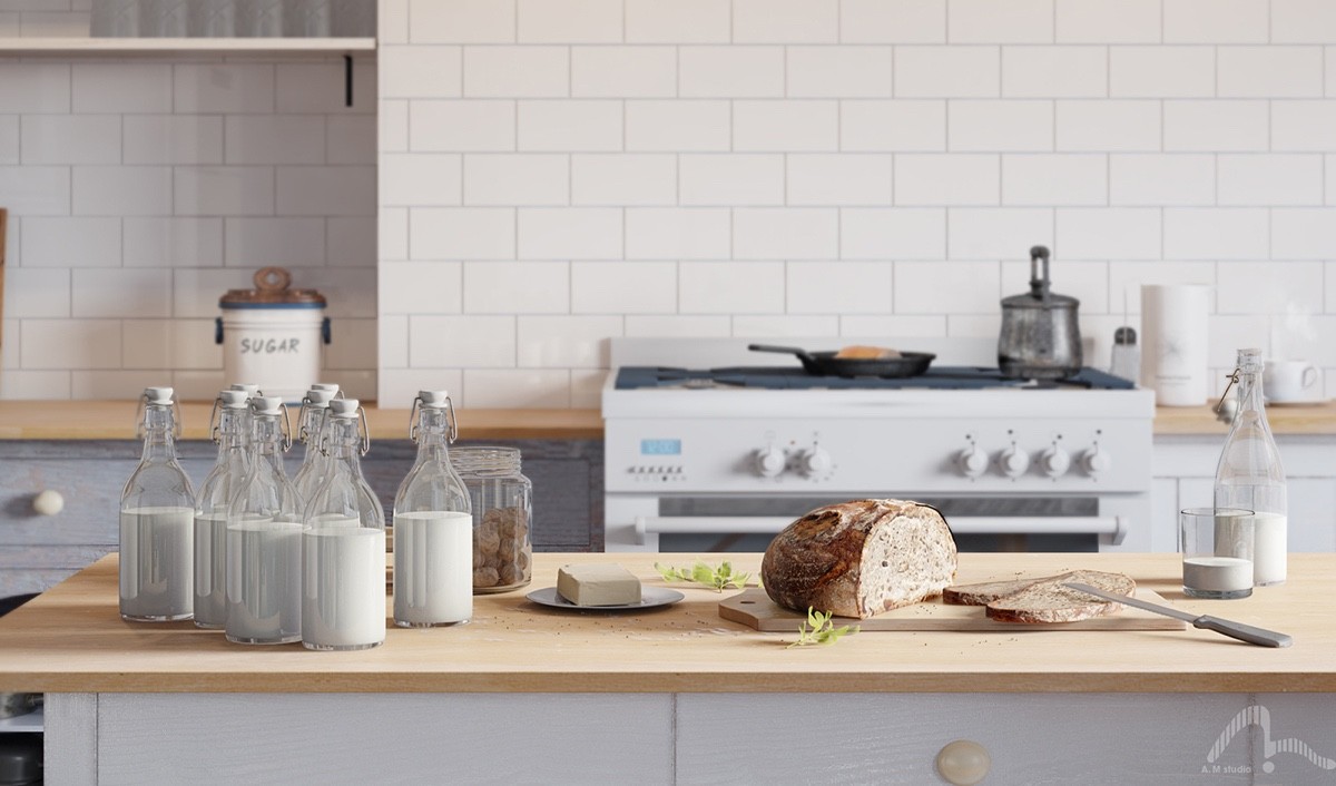
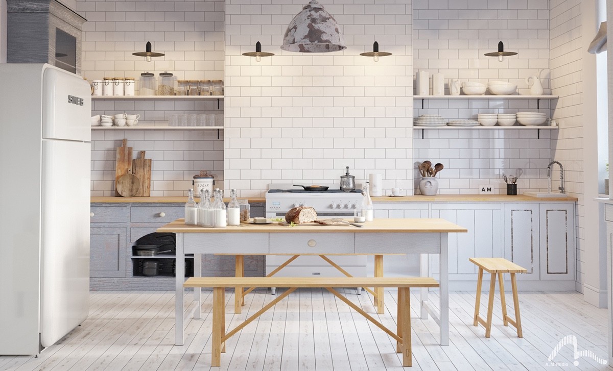
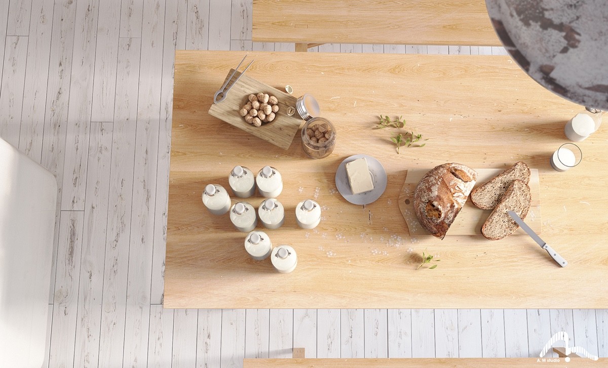
The kitchen adds warmth to the room, through warm wooden tables and freshly-baked bread. Matched by Scandinavian bench seating, wood sits happily upon white cabinetry, brick and wooden flooring. Interspersed with minor elements of grey and greenery, a camouflage lamp lights up a series of milk bottles and matching white mason jars. From far away, cabinetry takes on a soft baby blue below four copper lamps.
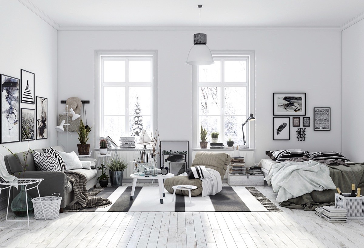
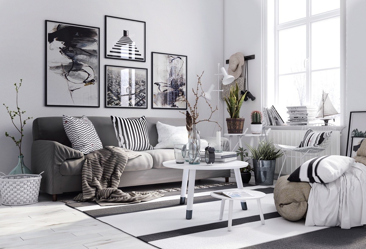
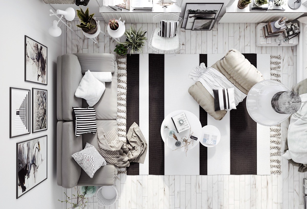
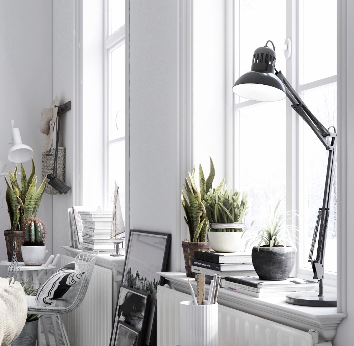
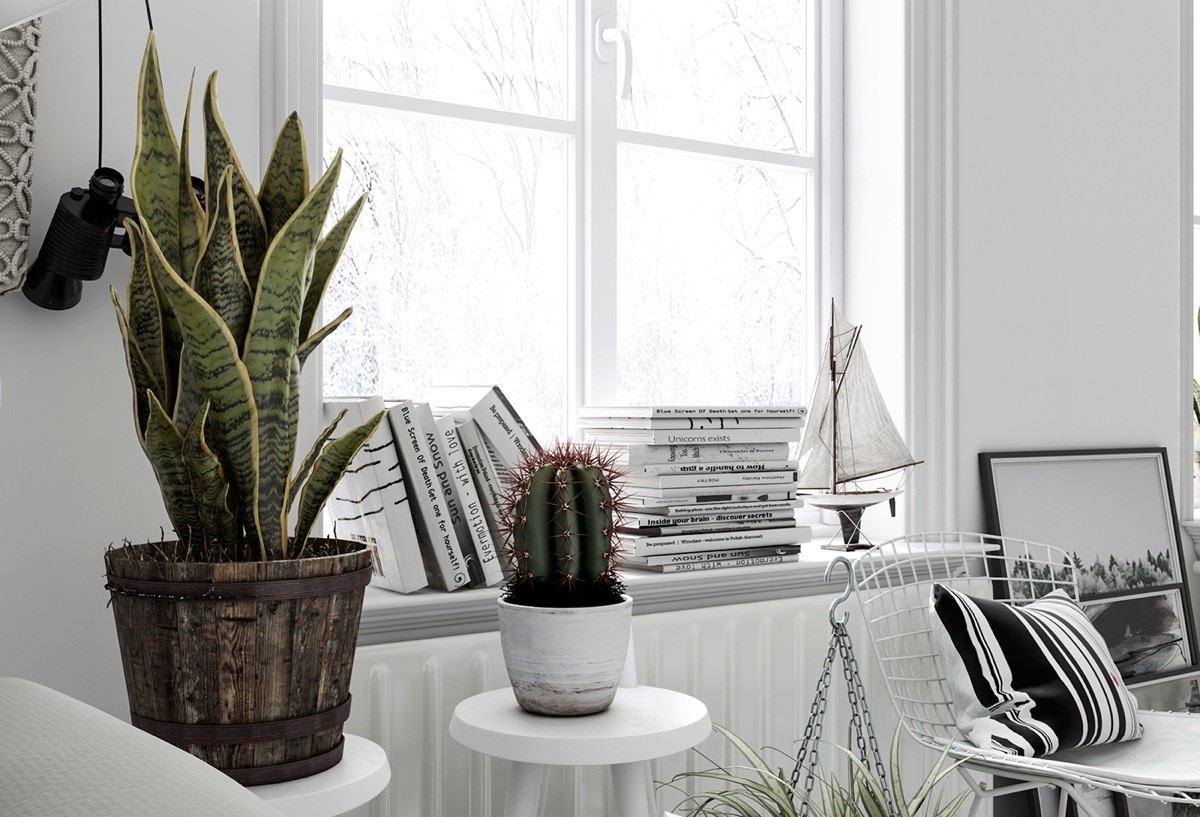
Our last space uses many elements in the one space - successfully. Bathing them in neutral tones of taupe, beige and white, their patterns fill the room with character without filling it with colour. Using just the one living space, patterns demarcate different living spaces. The lounge’s charcoal couch offers comfort in a similarly-hued striped blanket. A multitude of monochromatic prints offer a range of views, lit by simple white French windows. Patterns in cushions, scattered around the space, tie to one other – striped cushions to the mat and art, zigzags to the woven elements. Three small white tables and a chair house twigs and cacti in simple glassware.
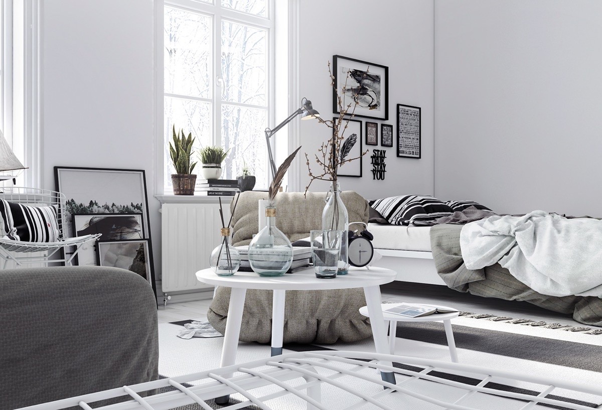
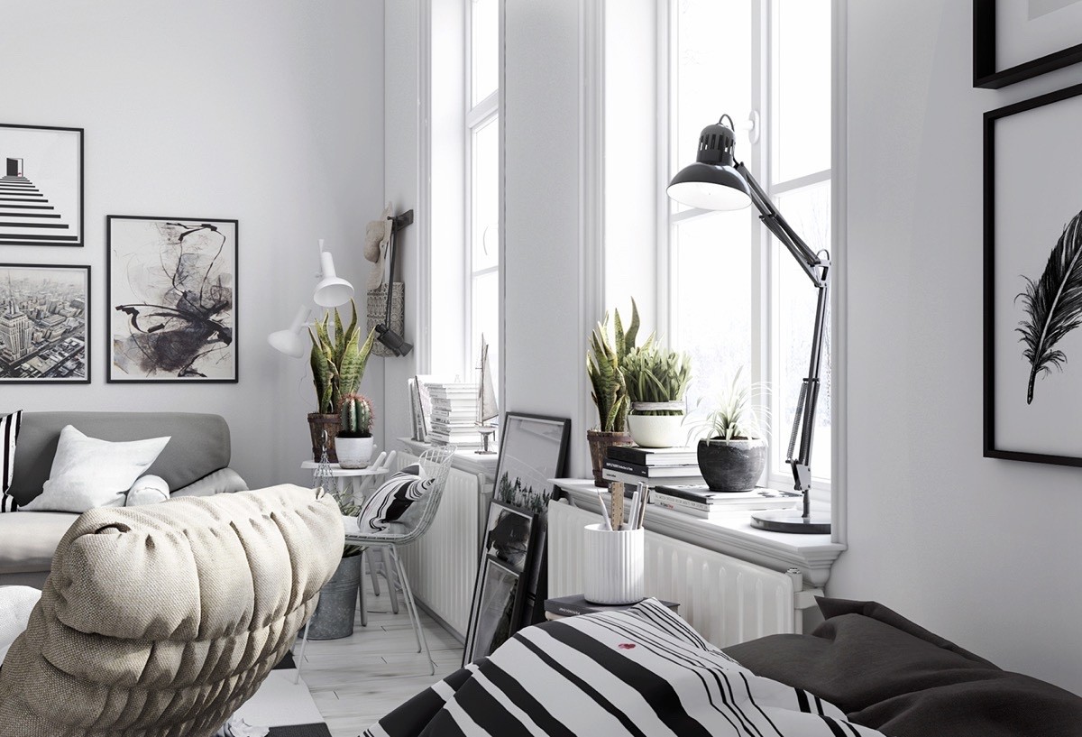
The bedroom offers a similar structure reflected through the rest of the space. Many small frames hang above its bed, similar to the lounge. From the bed, stripes tie again to cushion and print elements. A black hover lamp adds focus to the bedside table, which turns towards a window ledge acting as a bookcase. Potted plants beside and surrounding tie the space together.
