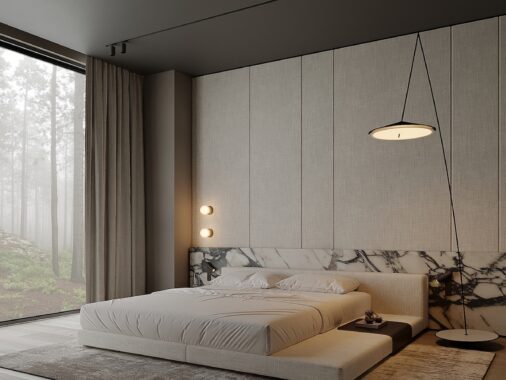
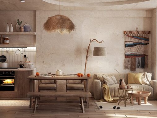
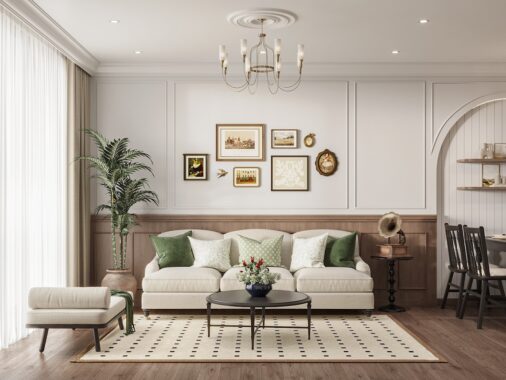
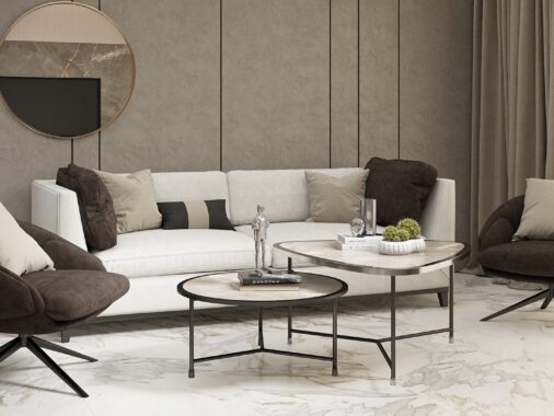
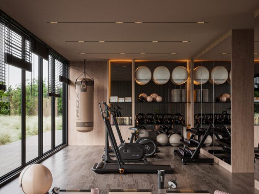
These dark and moody living rooms embody a style that magazines might even describe as a masculine decor aesthetic, but just about anyone can appreciate any one of them. This post opens with a sleek industrial interior that takes a minimalistic approach. The second space demonstrates an efficient studio layout with a warm modern theme and the third embraces a similar style but ramps up the luxury factor. And finally, the last interior integrates just a touch of tradition to create a relaxing and welcoming environment. Each one caters to different tastes – so if you're looking for dark palette inspiration, you just might find ideas below.
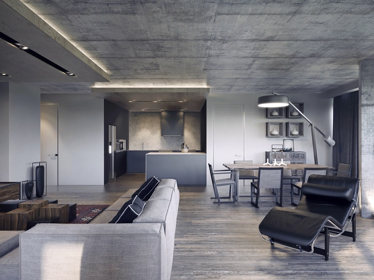
First, let's check out a home on the lighter end of the spectrum. This clean industrial interior feels open and airy with its light greyscale color theme, its abundance of concrete softened by a mix of wood accents.
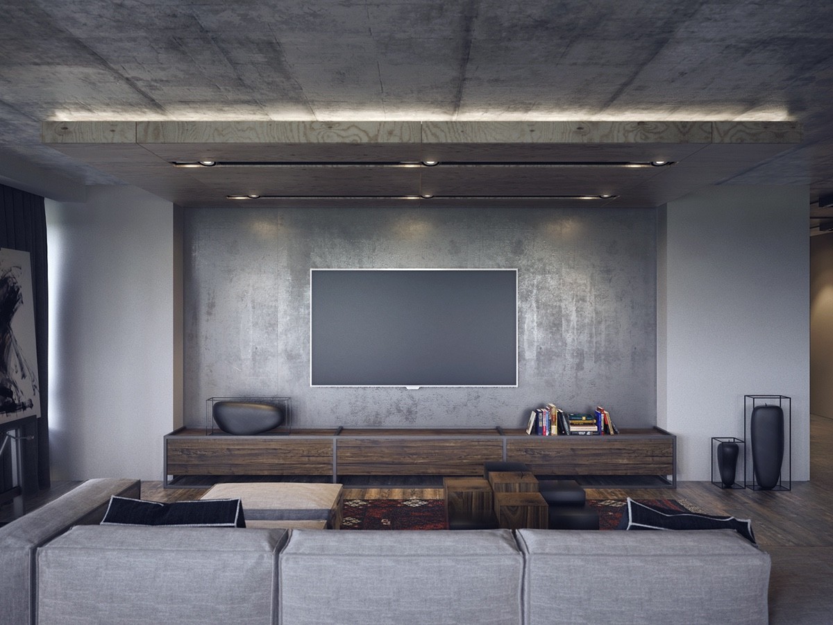
Both feature materials really come into their own at the media center. Concrete is a wonderful unobtrusive backdrop for a television screen, while the wood above and below cozy up the space for late night movies.
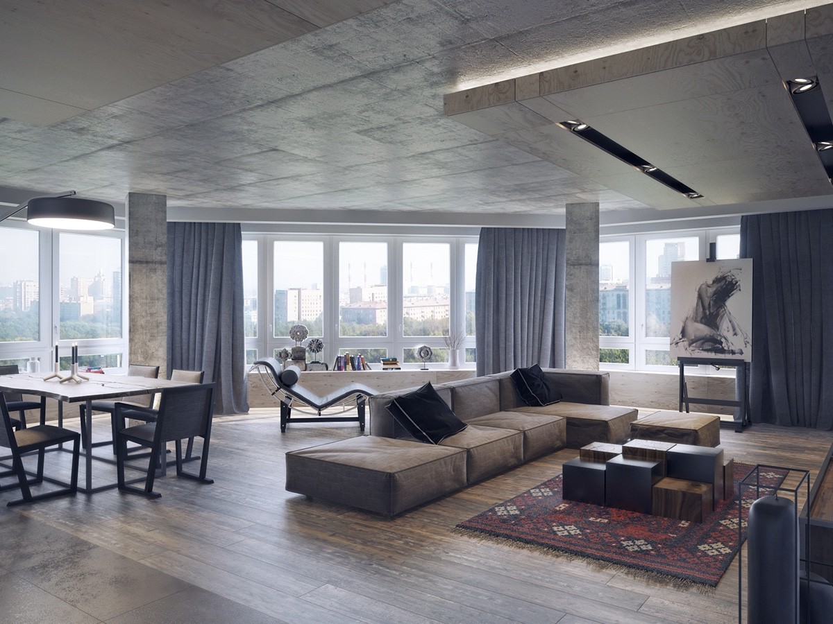
Within an open interior like this one, focal points become even more important. Here the red patterned rug draws the eye against the interior's mostly-cool palette.
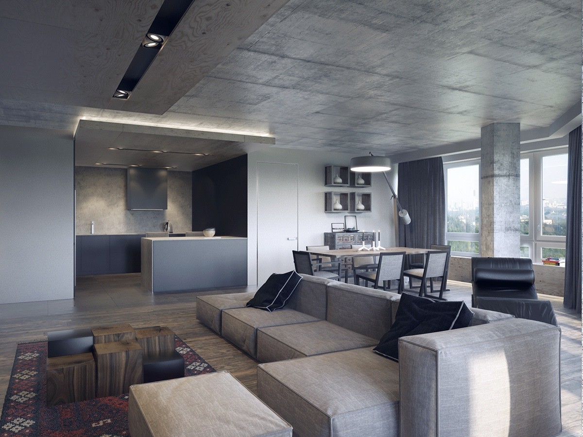
The kitchen enjoys the comfort of its own little niche yet still maintains visual contact with the rest of the room – an ideal arrangement for entertaining guests.
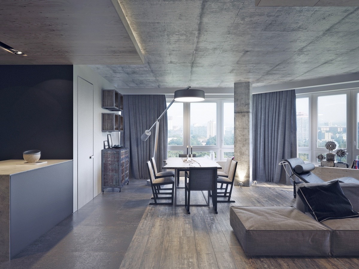
Oversized floor lamps offer a flexible alternative to the pendants and chandeliers that usually hang over a table. This one can pivot and turn, or can be moved out of the way so they resident can have more space for projects or entertaining.
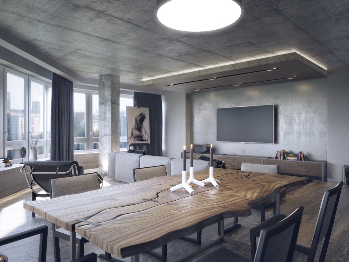
A live edge table adds an incredible organic aesthetic to any space. This one plays a powerful in this interior, its flowing lines standing in defiance of the crisp angles found throughout the rest of the home.
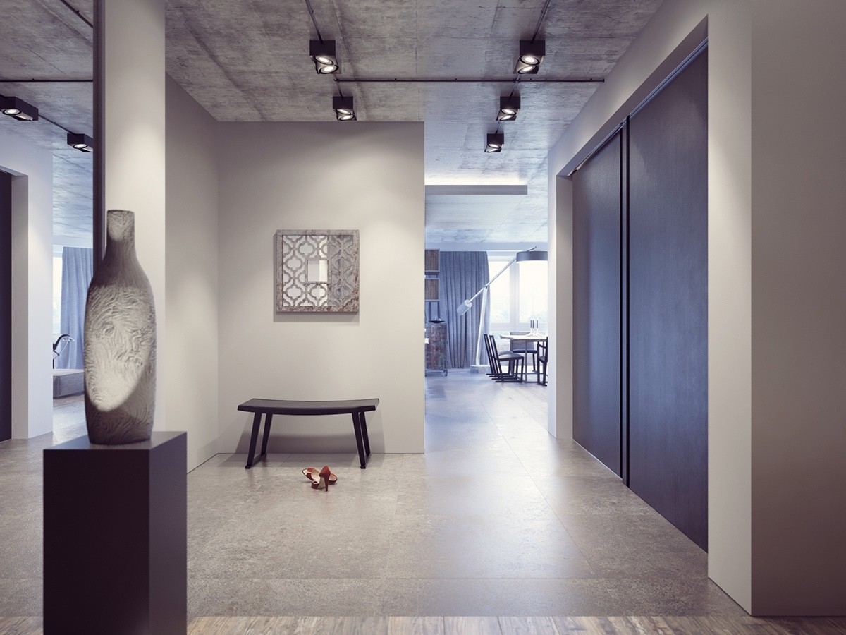
The hallway continues this theme of subtle contrast, with dark focal points and surprising curves amongst the cohesive backdrop.
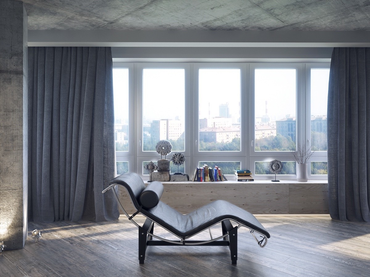
Le Corbusier designed the LC4 chaise in 1928, but it remains an undeniable design icon. It's impossible to ignore this chaise lounge chair – guests will want to try it out every time they see it.
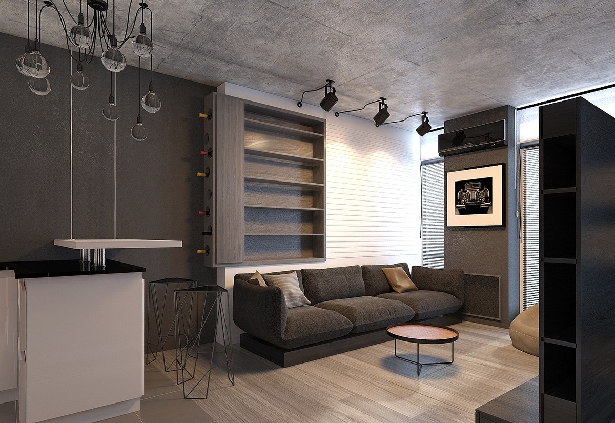
Dark themes aren't limited to industrial interiors. This apartment has a very earthy and comfortable vibe – the designer created this streamlined and relaxing space with a bachelor in mind, and the resident surely wouldn't be ashamed to host friends at this stylish abode.
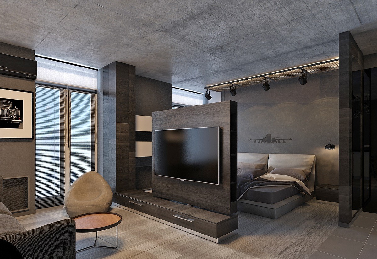
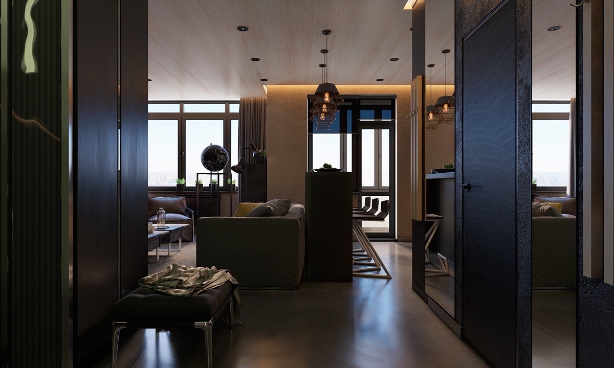
As this angle reveals, the interior is actually fully open – a freestanding structure provides support for the television and a small degree of privacy for the bedroom area.
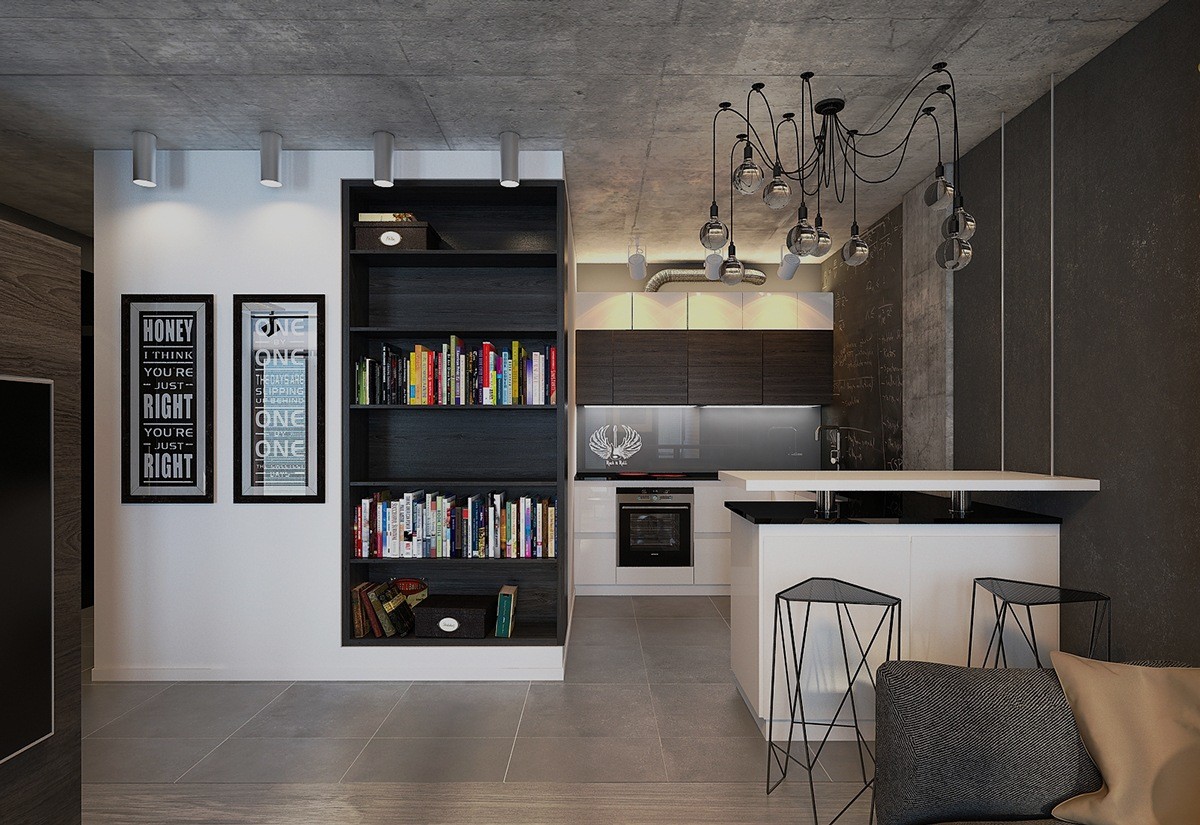
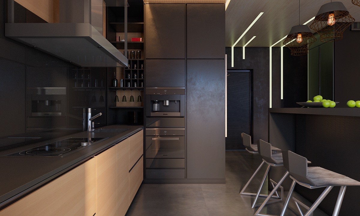
The kitchen enjoys the convenience of an island that doubles as a breakfast bar. A central volume conceals the bathroom within while extending usable wall space in the living room and kitchen.
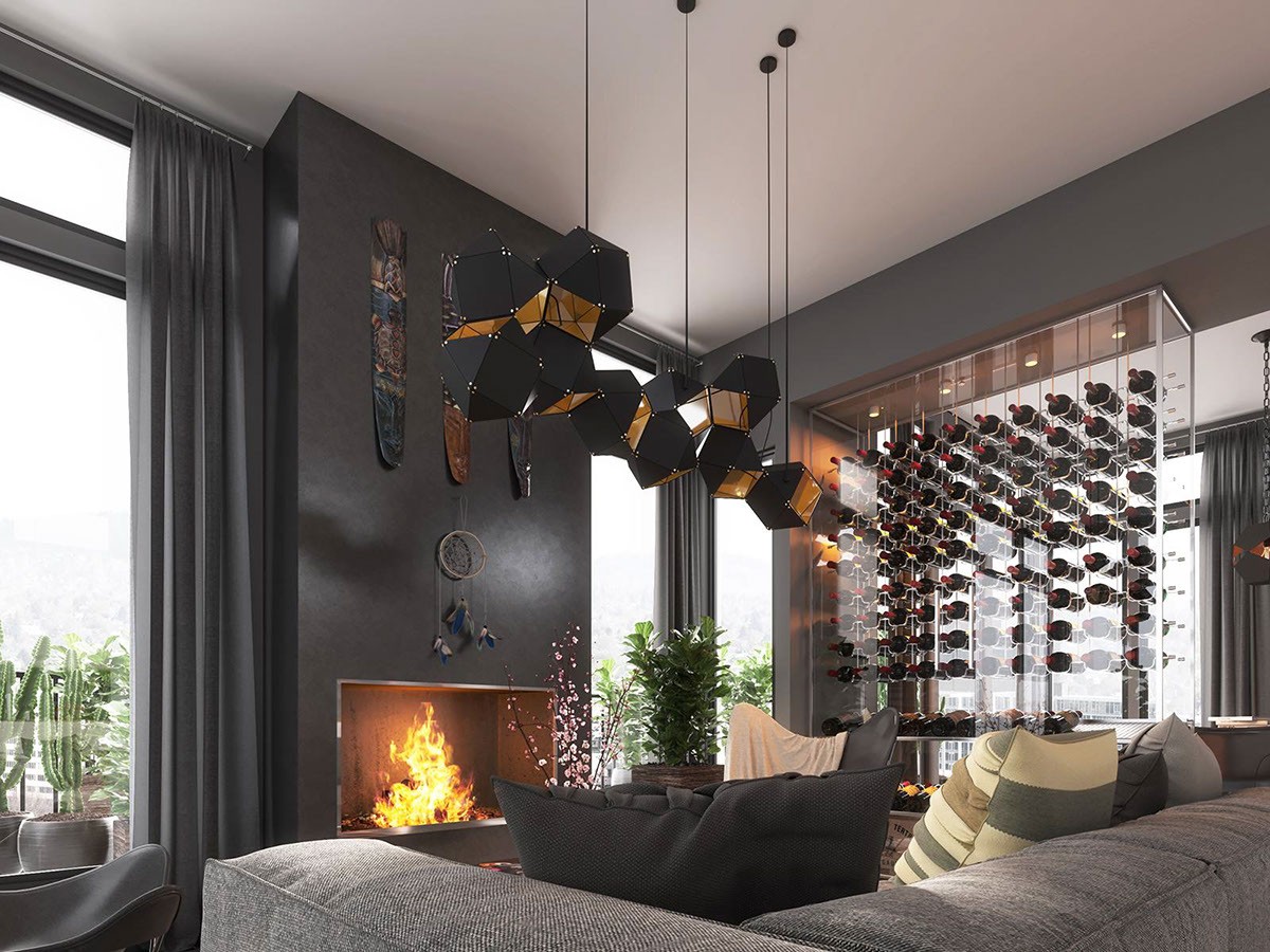
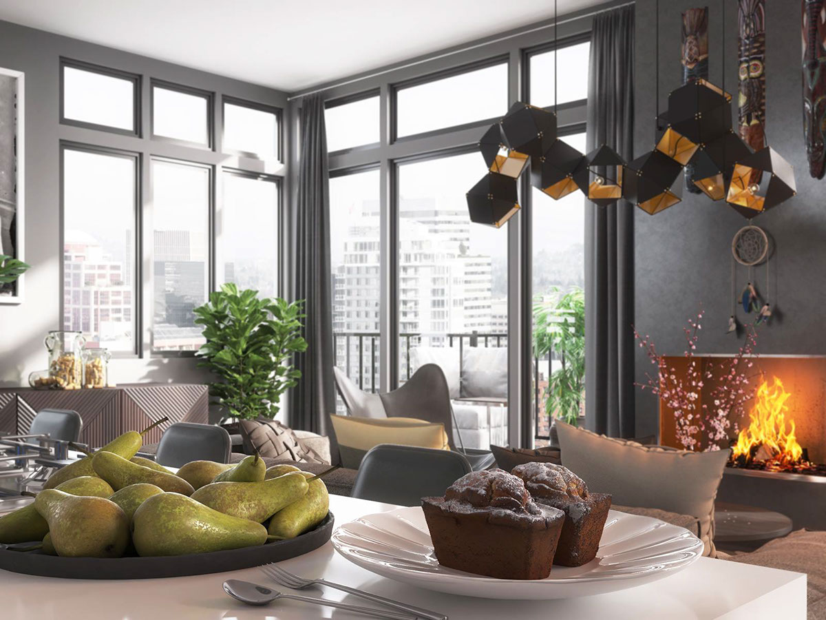
Here's a dark interior that embraces luxury more openly while highlighting the interests of the occupant. Cultural crafts and artwork stand apart from other spaces like this one, and the sculptural lighting and creative layout solutions are sure to leave a memorable impression on guests.
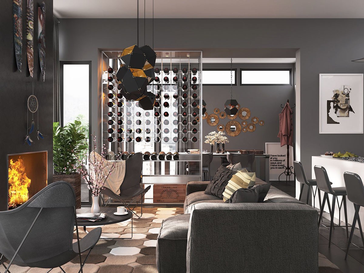
One distinctive layout feature is obvious directly upon entering the home – a transparent floor to ceiling wine rack separates the open living and kitchen areas from the formal dining room.
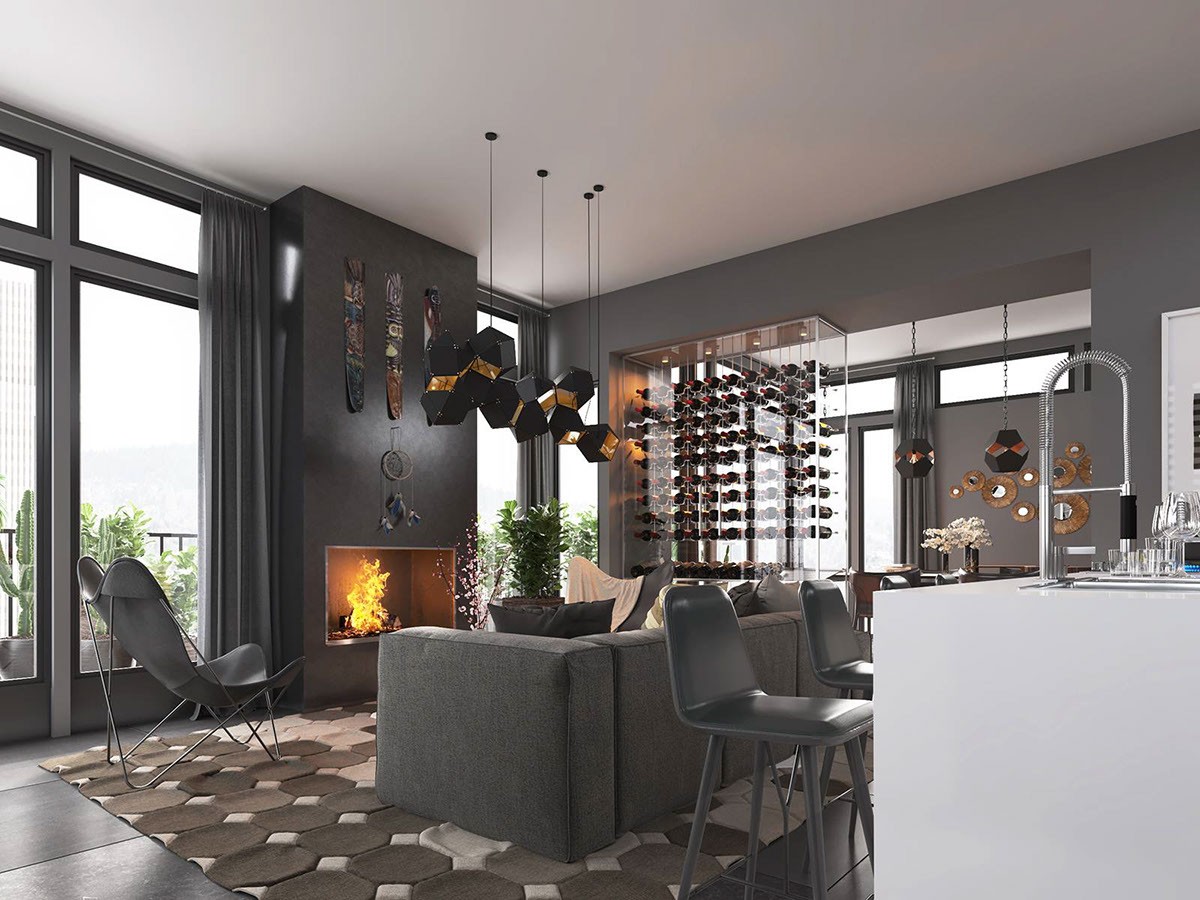
Interplay between interior objects helps create cohesion from variety. Furniture sticks to a greyscale palette but uses an earth-toned carpet to soften the atmosphere, and the geometric chandelier's copper details reflect the aura of the fireplace.
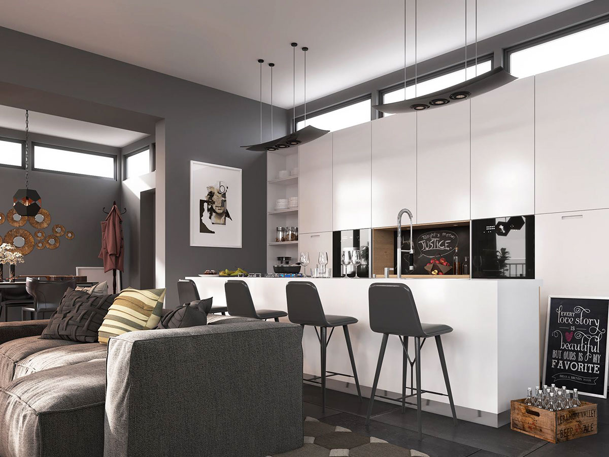
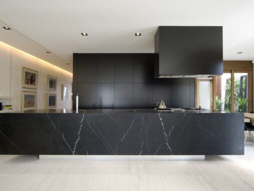
The kitchen's white cabinetry serves to reflect the sunlight back into the interior, allowing the home to feel bright and spacious despite its primarily dark color theme.
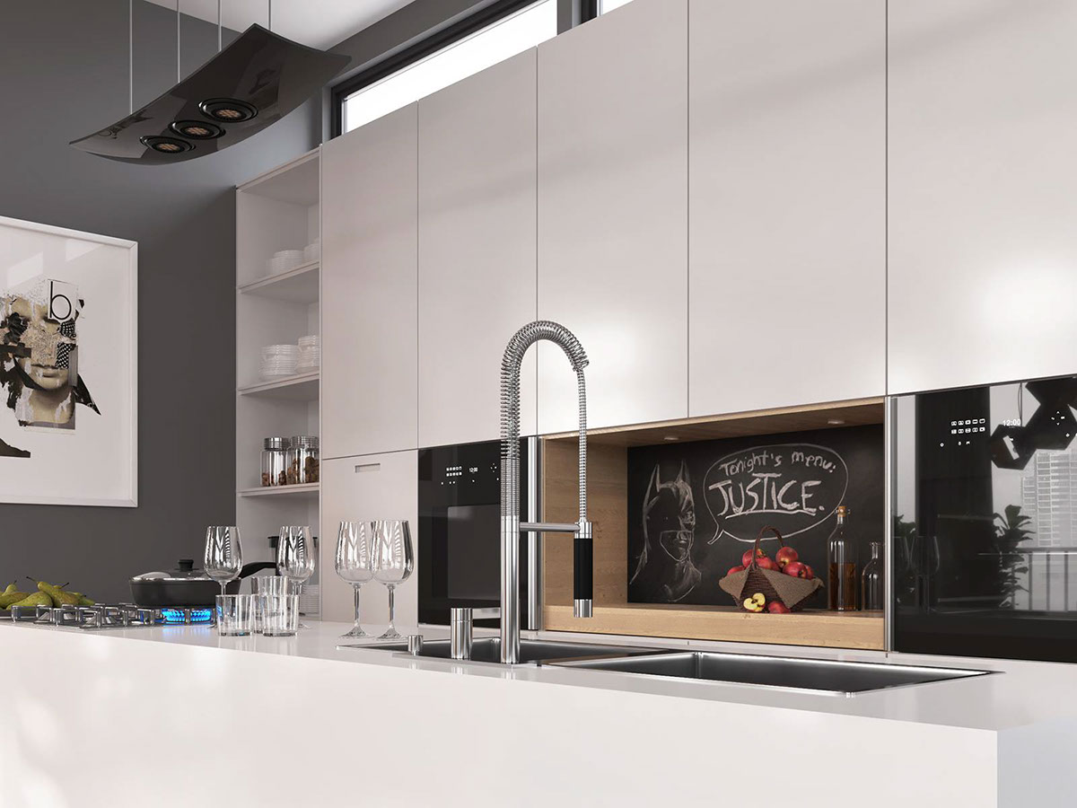
Where a sink and backsplash would normally be, this kitchen includes a wood chopping black area with a cool chalkboard backing – and the Batman sketch just shows one of the many fun possibilities.
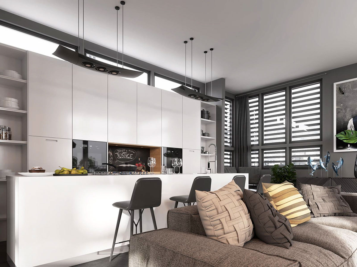
Transom-style windows above the cabinetry banish shadows from any angle. As you can see, natural lighting is a super-important part of this home.
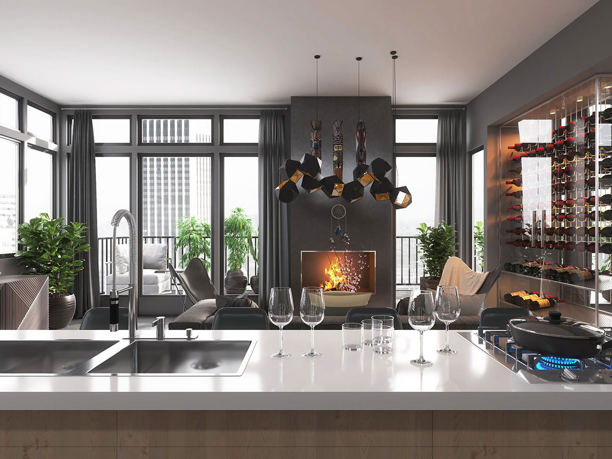
Have you ever wondered why designers use darker paint near the windows? These walls are often prone to harsher shades, so a dark coat of paint makes the effect look stylish and natural.
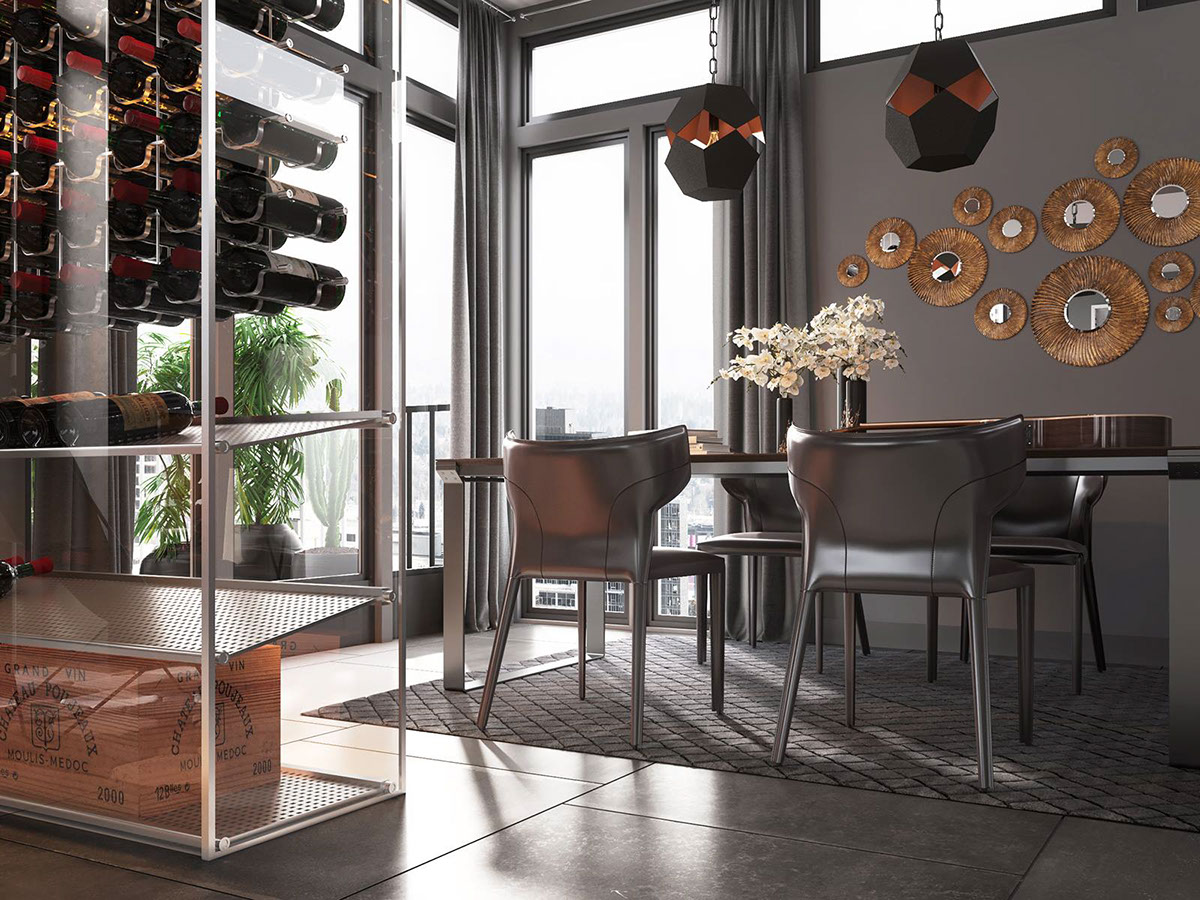
The dining room takes an especially luxurious approach to industrial influence with chairs in smooth metallic upholstery. The wine rack matches well with its perforated steel shelves.

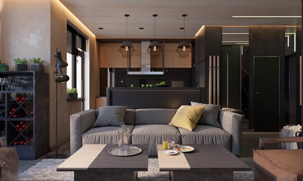
Sensibility rules this home. The dark color theme feels welcoming and cozy while its neutral basis allows for colorful accents as needed – in this case, color comes from useful items like throw pillows and wine bottles. A few verdant houseplants further the organic influence.
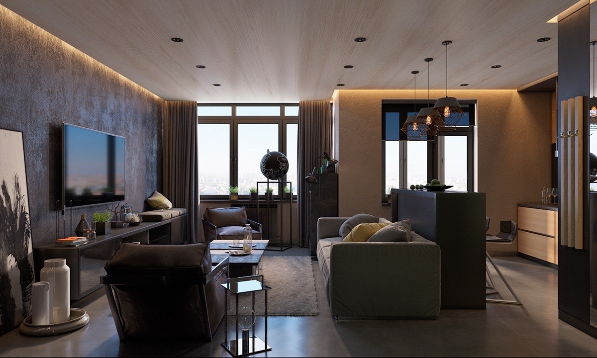
Traditional influences are apparent throughout. The relaxed atmosphere makes a statement with its casual yet tasteful furniture, sure to remain relevant over the years to come.
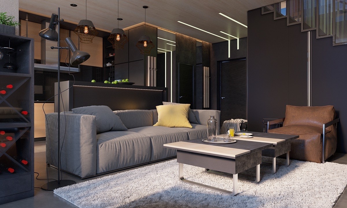
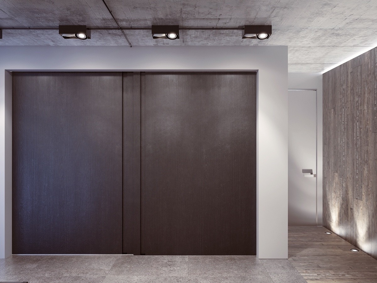
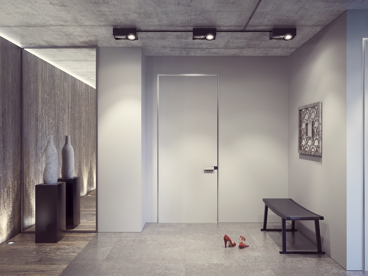
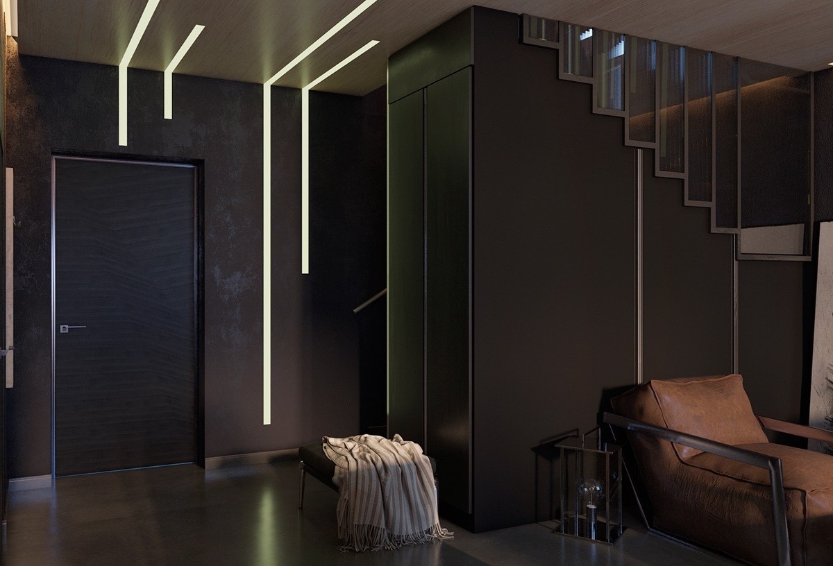
No portion of the living room escapes careful consideration. Floor-to-ceiling mirrors and unique inset lighting illuminate the darkest corner of the home, near the entrance, easily avoiding the risk of feeling too "gloomy".
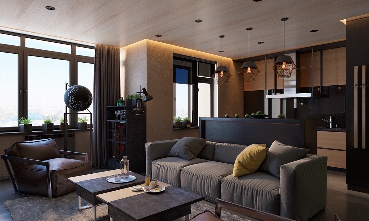
The layout is definitely compact but very functional, suitable for a bachelor or a young couple alike. A group of friends socializing in the living room can maintain open communication with the host in the kitchen.
