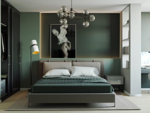
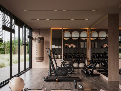
While bedrooms are the perfect place to experiment with color palettes and decor choices that might seem too bold for the social areas of a home, these bedrooms take a more practical approach. Dark themes help to center the mind, creating an atmosphere of relaxation to help lull the resident to sleep each night. But not only are dark themed bedrooms practical, they are a great candidate for sophisticated design themes – restrained color palettes show a sense of discipline and targeted attention difficult to achieve with a more whimsical or playful approach.
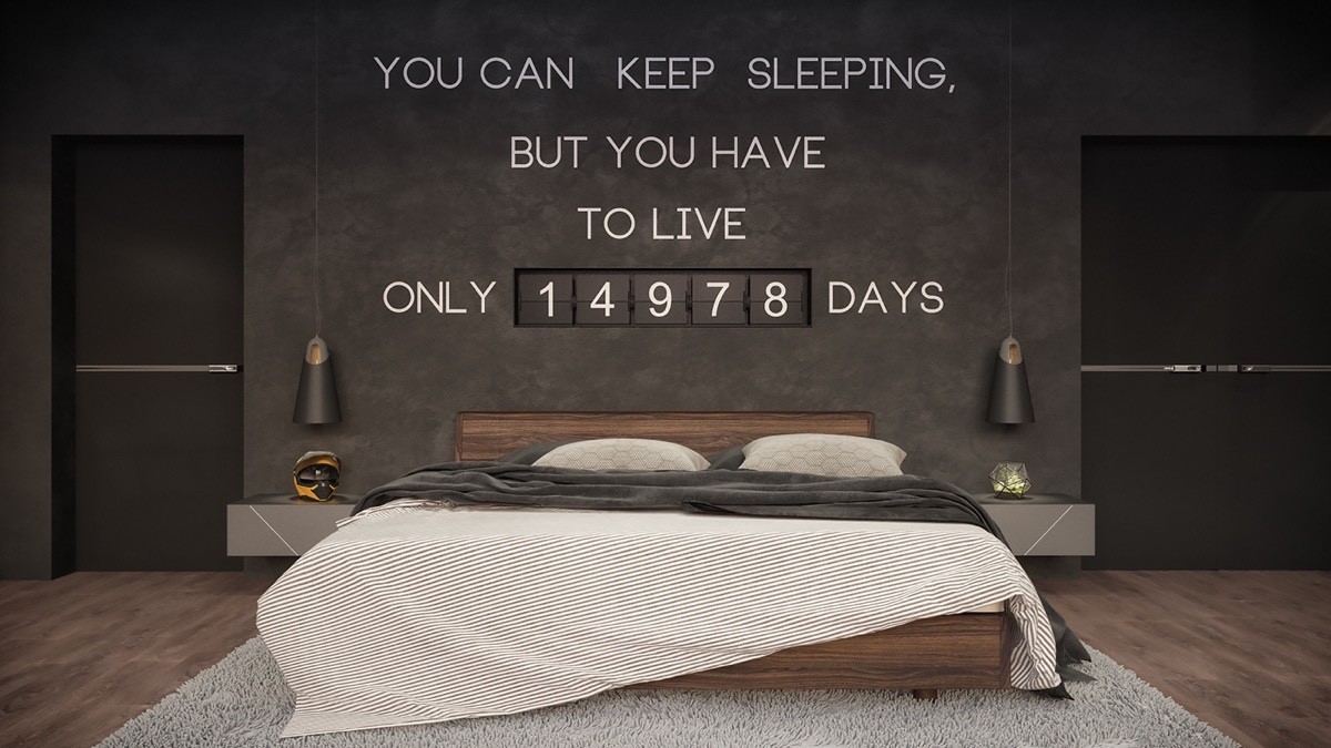
The countdown idea is reminiscent of the "Death Clock" webpage that became popular on the early web around 1999. The number of the counter works out to around 40 years and readily drives home the fleeting nature of life.
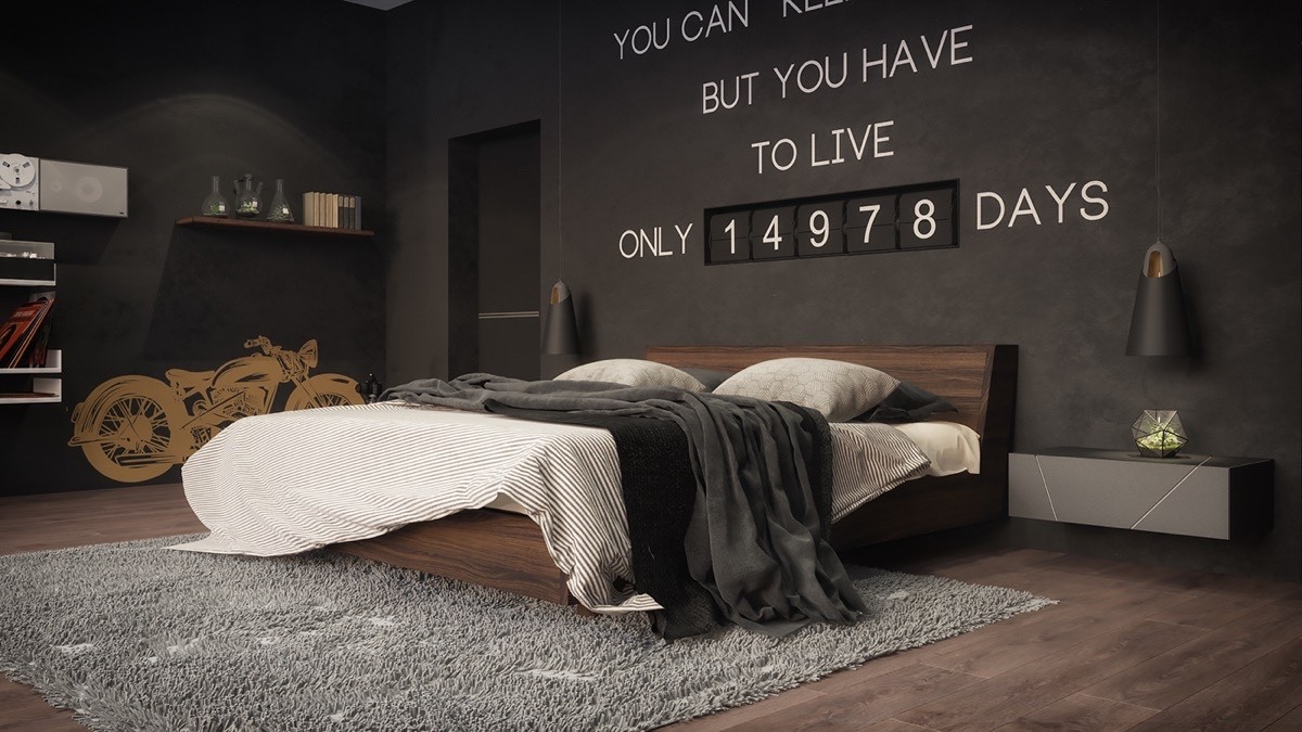
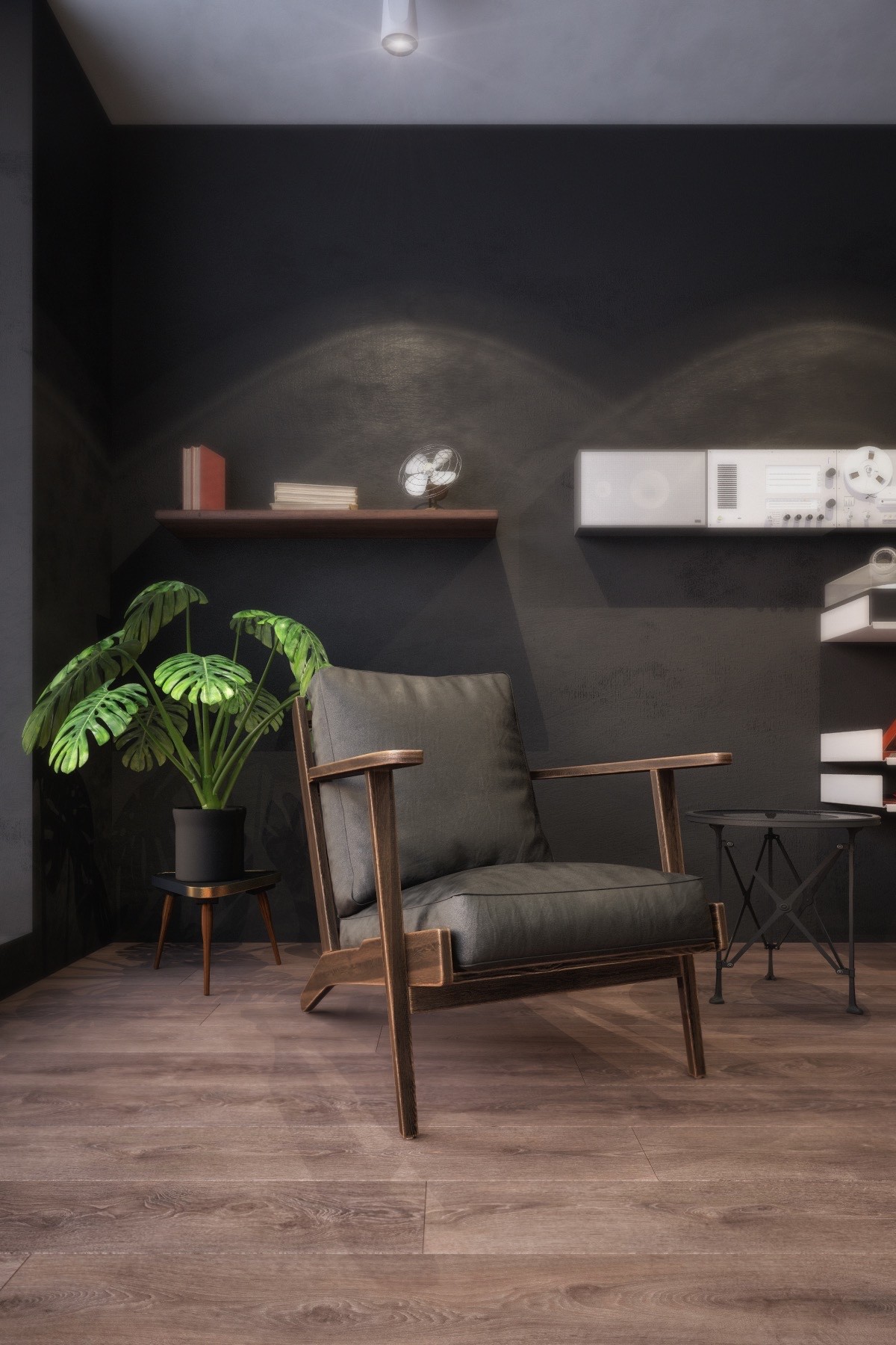
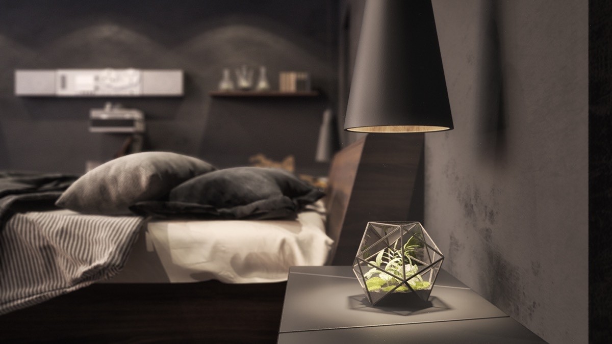
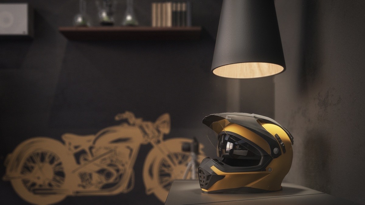
To close out the bedroom tour, here's a look at a room that is exceptionally dark in terms of both palette and theme. The matte black backdrop highlights a typographic installation that counts down the resident's "days left to live", presumably based on an average lifespan. The designers created this bedroom with a bachelor in mind, stripping down furniture and personal affects to only the most necessary objects and personally representative decorations. Decorative themes include motorcycles and vintage media – with a little creative planning even the most basic lifestyle staples can become ornament.
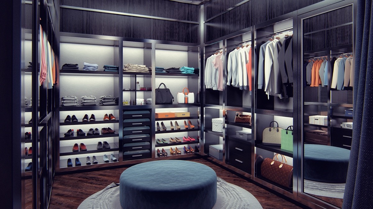
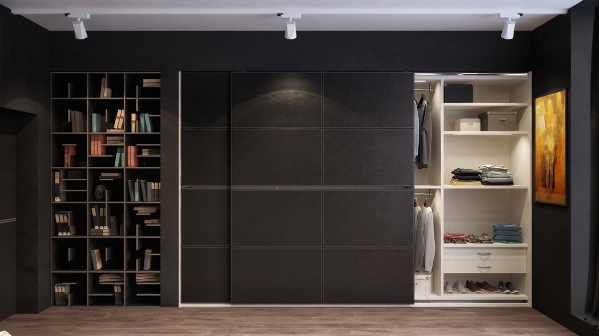
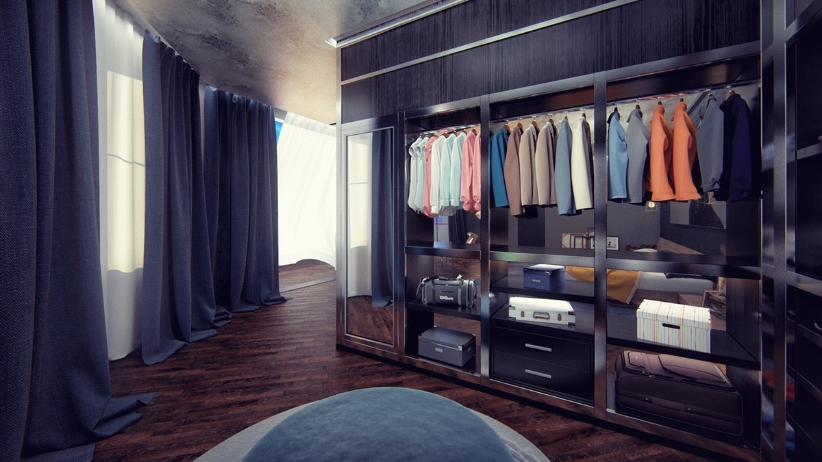
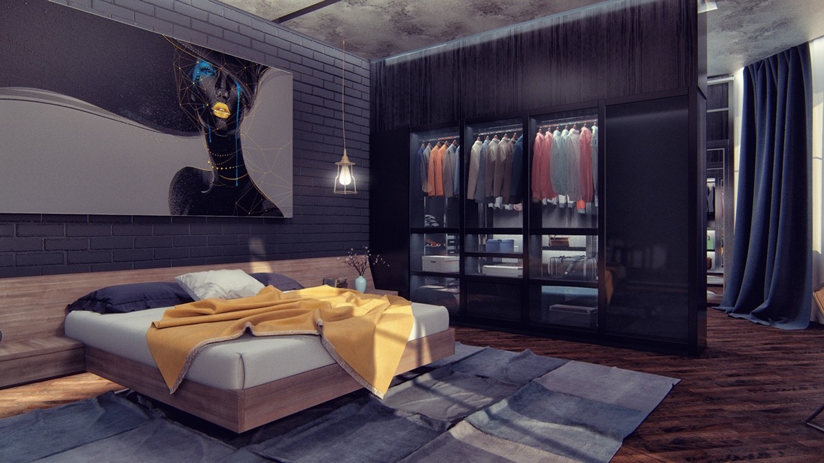
Of course, it's hard to close out this tour without a peek at the bedroom wardrobe. This level of color coordination would definitely belong to somebody who would contract a bedroom like this.
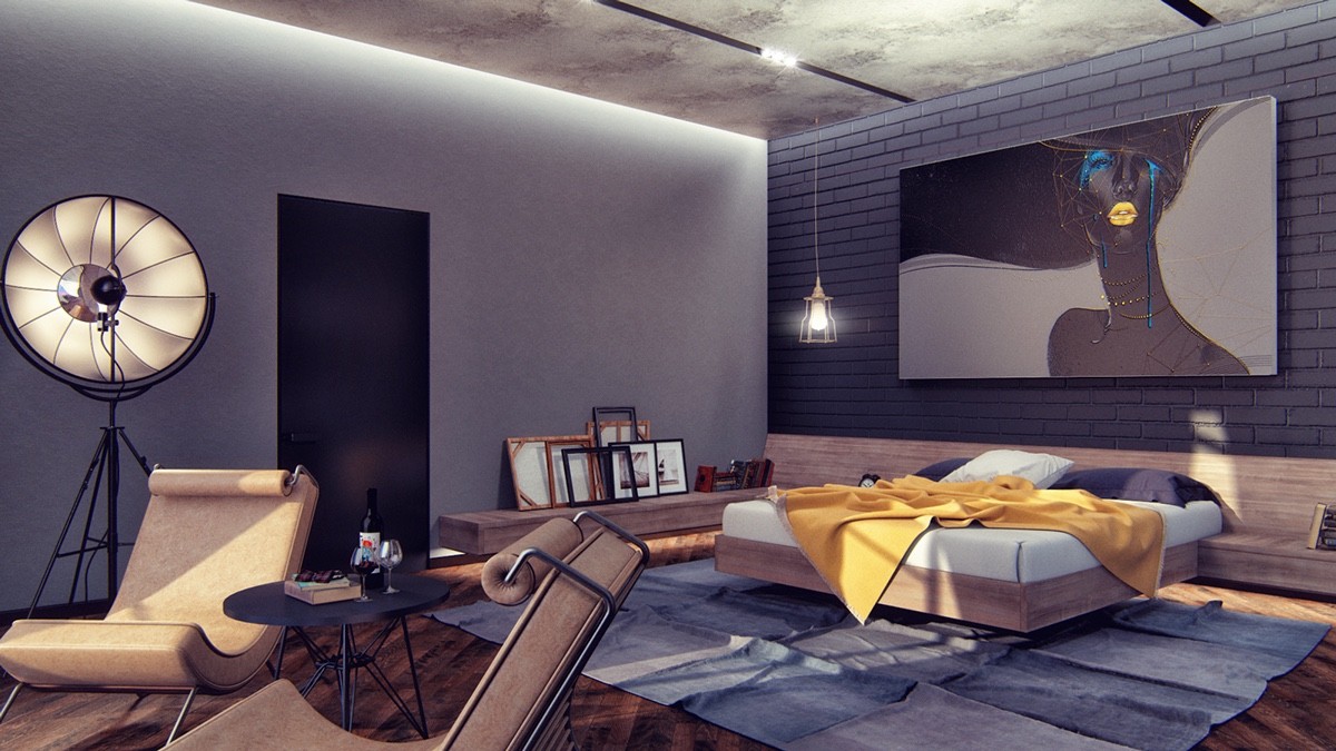
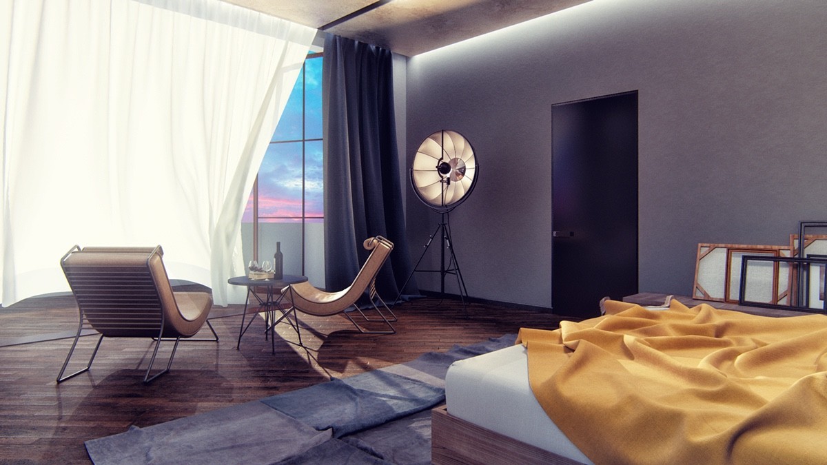
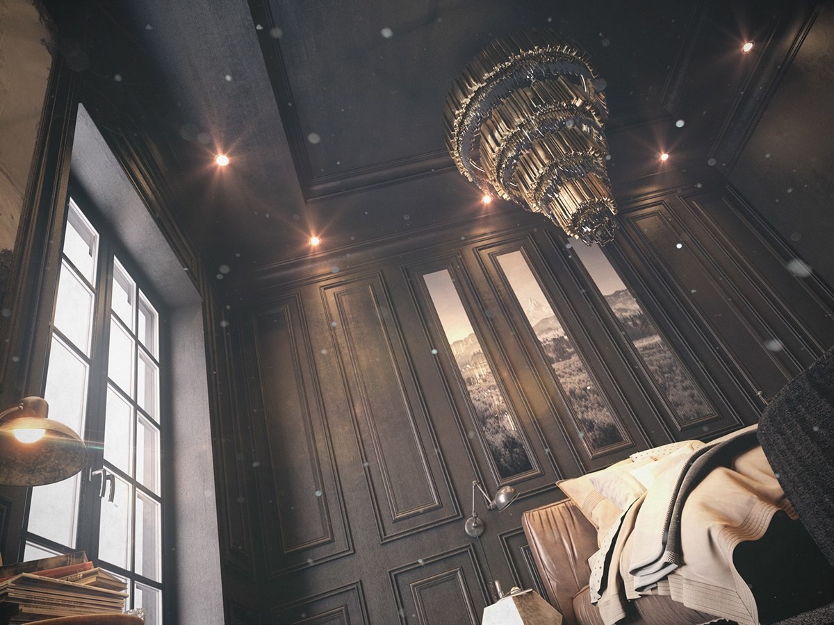
The lamp to the far left is the classic Fortuny lamp by Mariano Fortuny, designed in 1907. It's always amazing how historical designs constantly reenter the realm of relevancy.

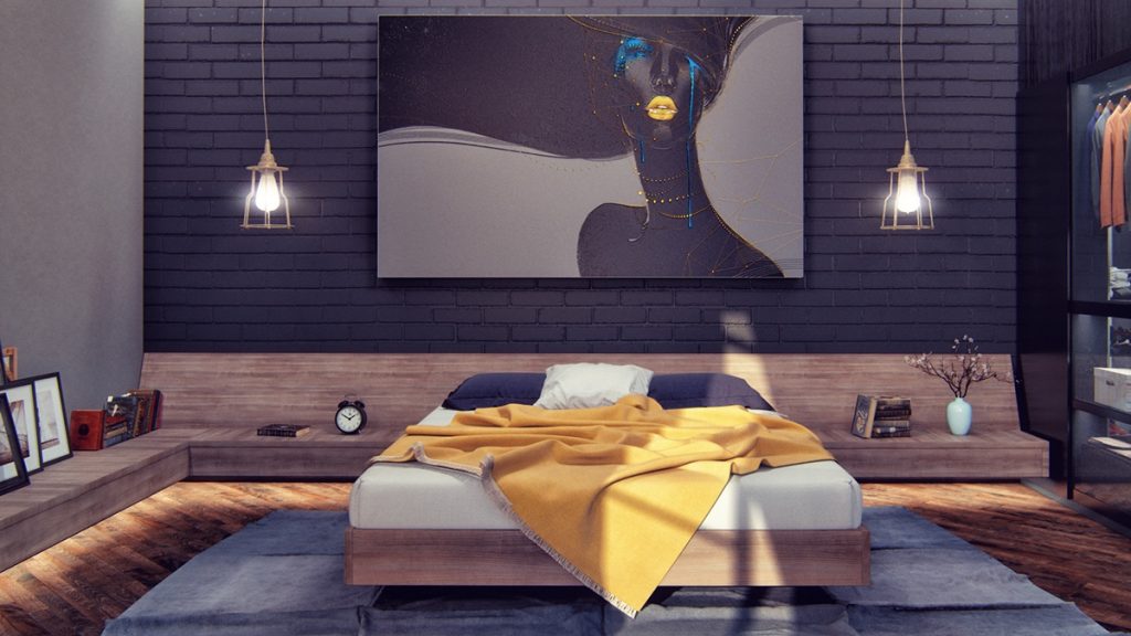
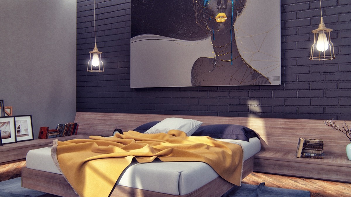
The designer dubbed this apartment "Hello-Yellow" and this beautiful bedroom gives a good example of the name's intent. Artwork, accent wall, and even the floors are dark, lending even more drama and pop to the soft yellow accents like the lips on the painting and the dandelion gold throw blanket on the bed. The painting, of course, brings the distinctive color theme together flawlessly – its colorful details much more vivid than the textile palette it mimics. To balance out the room's surreal style, straightforward industrial lighting and furniture remain relics of the world outside.
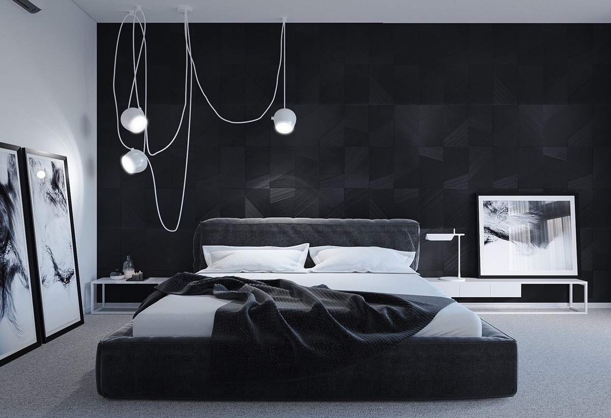
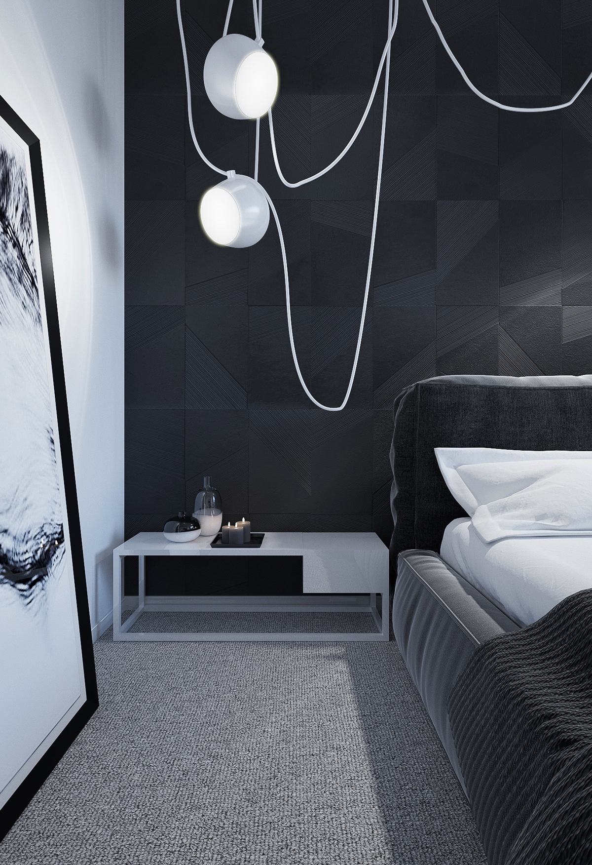
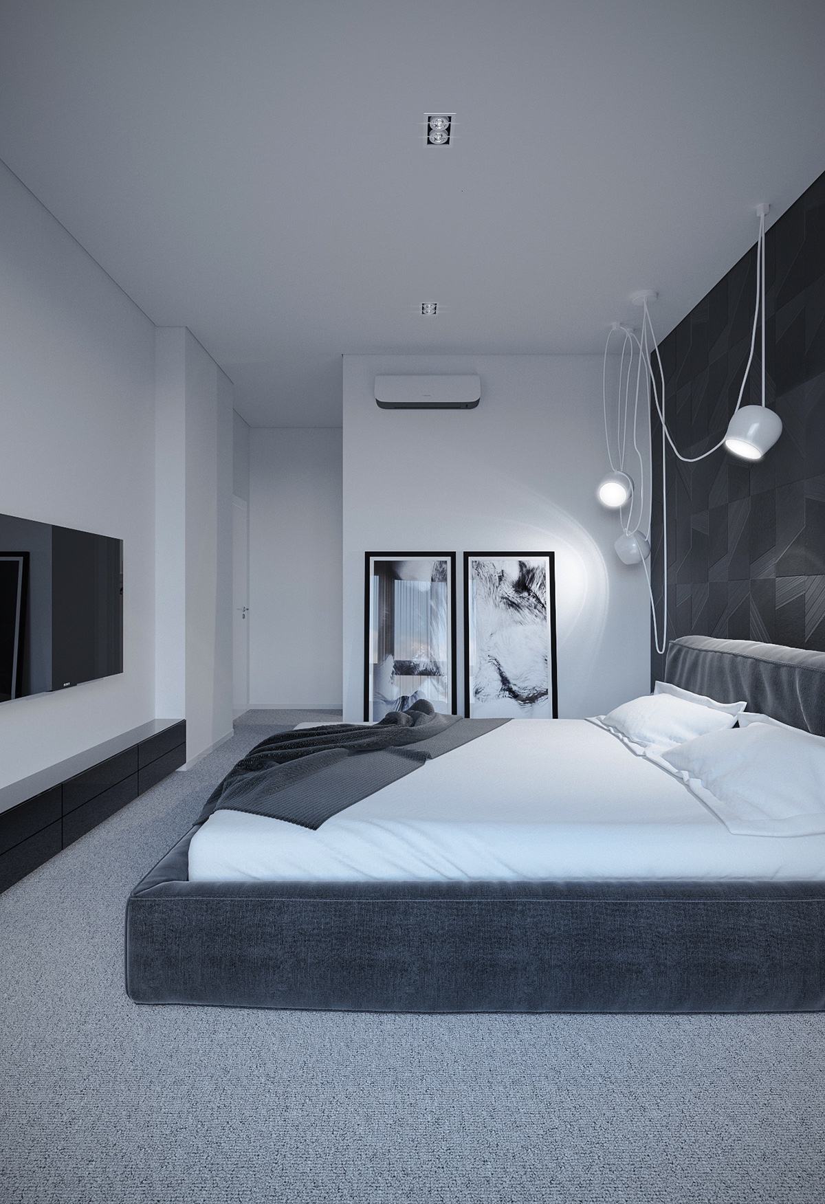
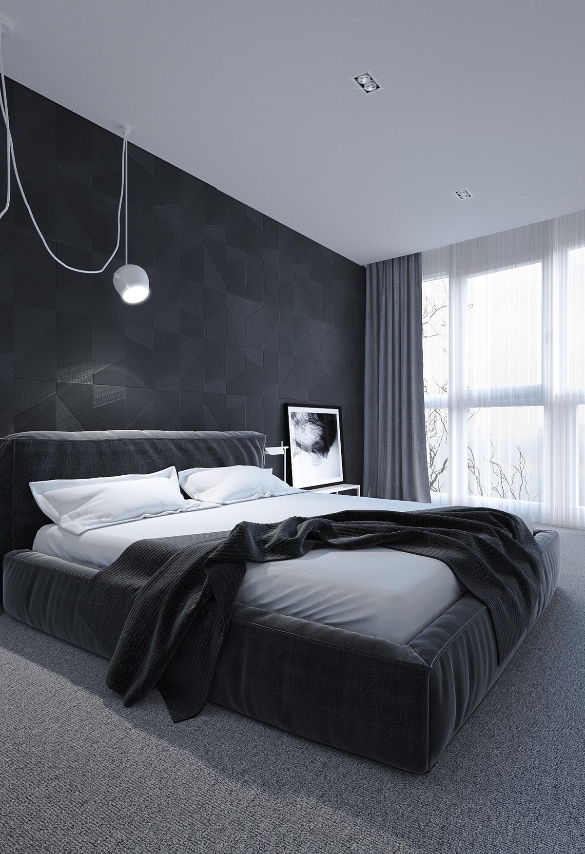
Such a bold and limited palette can make almost any space feel minimalistic, but here, the smart use of subtle texture helps the bedroom remain interesting and immersive throughout. The clever use of artwork continues this practice of contrast by breaking up expanses of sharp angles with smooth flowing lines. Bold black and white meets greyscale only through the effect of light and shadow (with a few exceptions, like the carpet and details on the paintings). Overall, the room looks richly dark but not gloomy thanks to the abundance of pristine white surfaces to counteract the black features.
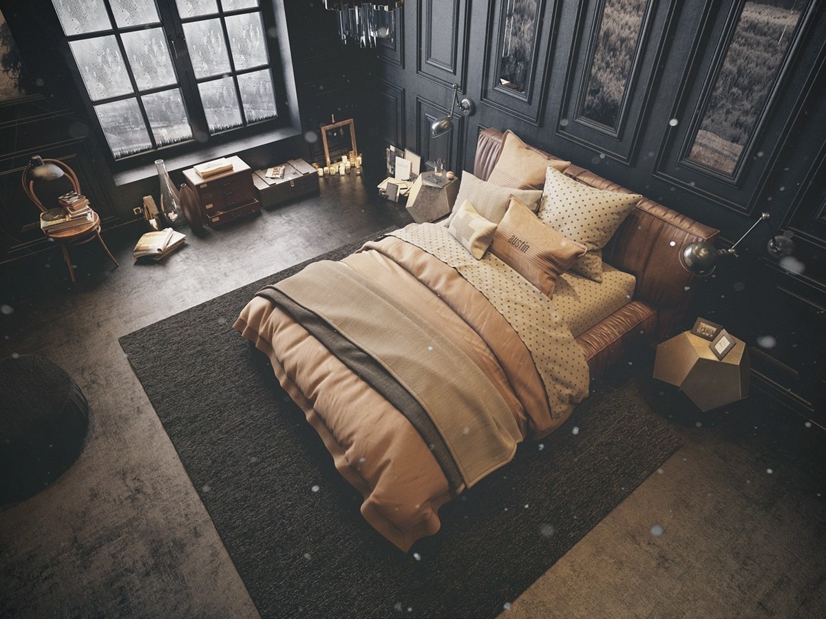
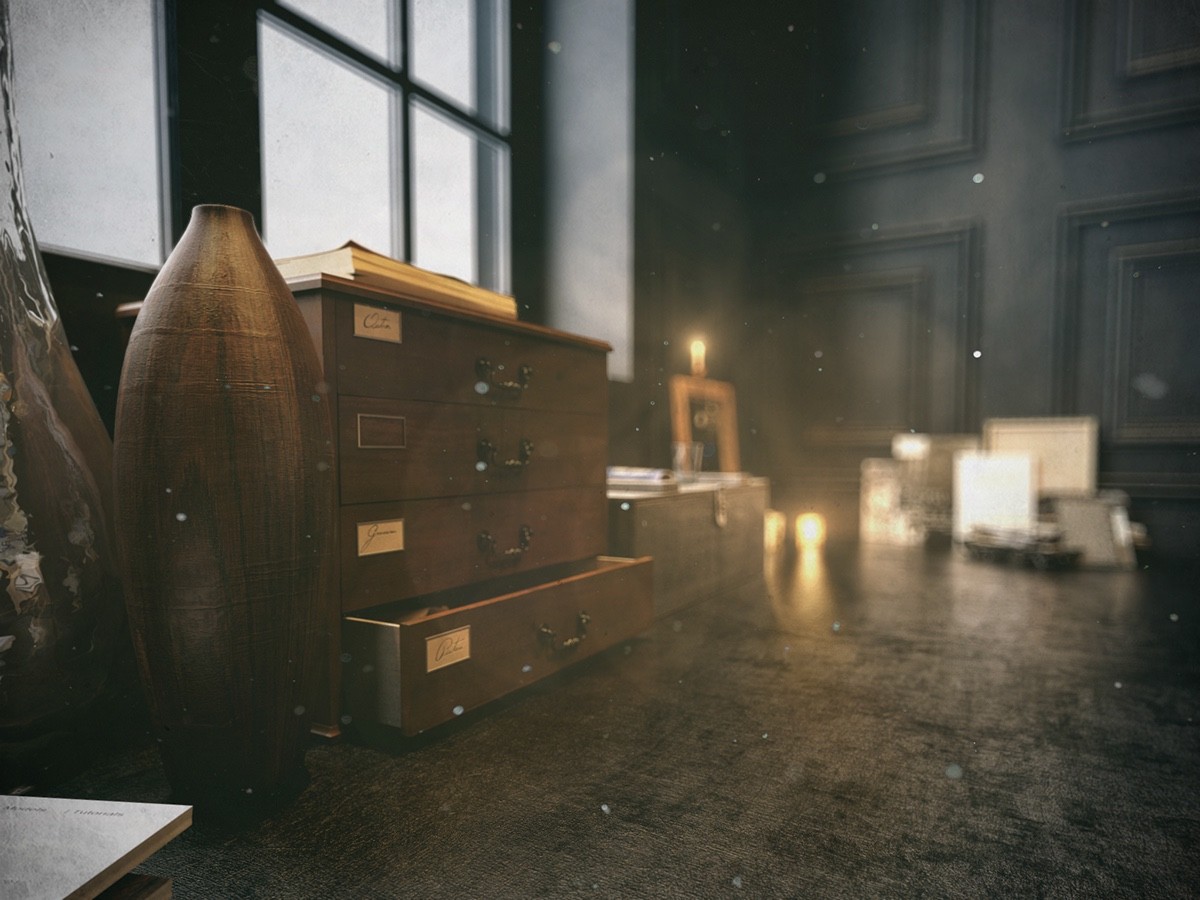
The side table lamps are very similar to the iconic Jieldé style, or perhaps one of its many reinventions. Let's also take a moment to appreciate the incredible ambiance the visualizer has captured with the floating dust motes.
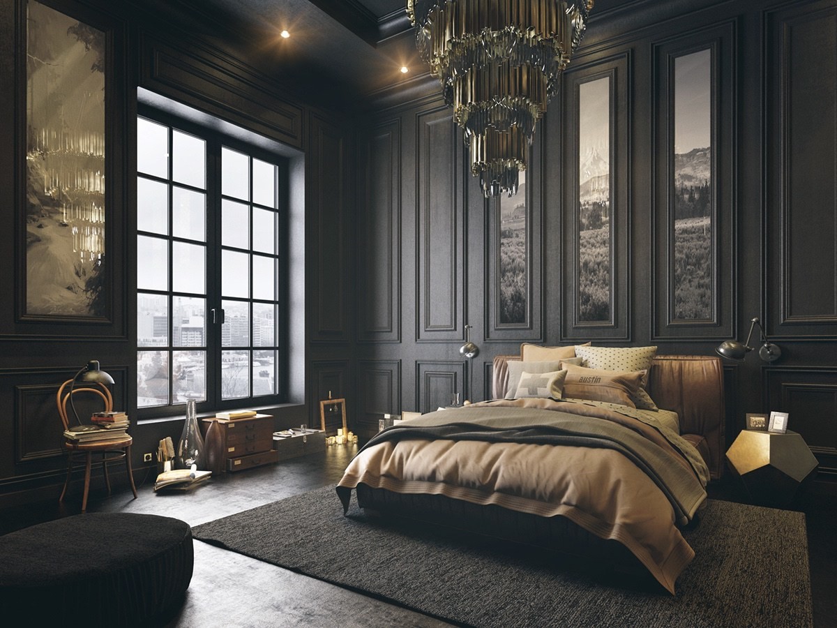
Classical features like intricate boiserie and a grand antique-style chandelier lend a sophisticated character to this dark and sumptuous bedroom. A triptych of black and white photographs fit into the panels directly above the headboard, almost like a window to another time and place, easily reflecting an old-warm charm this bedroom seems to personify. It's hard not to love the little collection of curios beneath the window, too. Other features stand out as decidedly modern including the brassy geometric side table and the practical recessed lighting above.
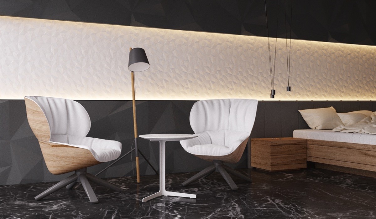
These distinctive bedroom chairs are from the Tabano collection by Patricia Urquiola. In the background, the pendant lights are the work of Jordi Vilardell and Meritxell Vidal, from the Match collection.
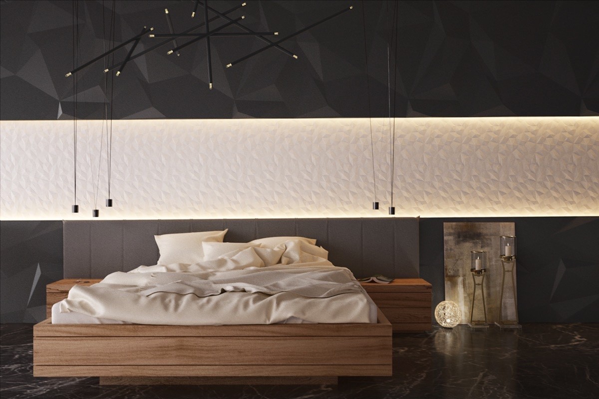
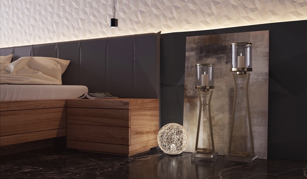
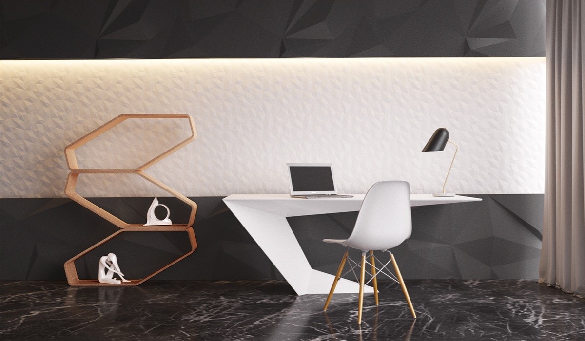
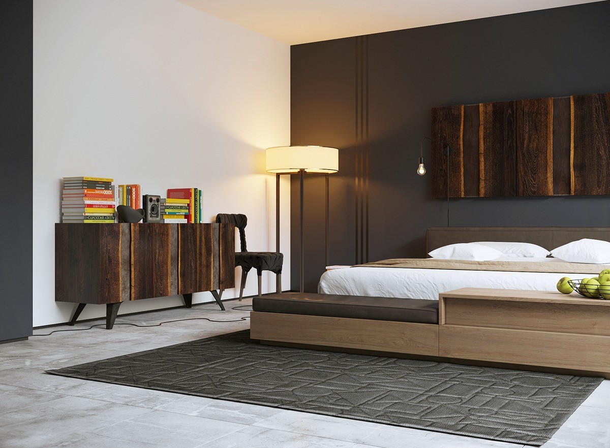
Geometric paneling takes this dark bedroom to the next level. The black and white feature wall creates the illusion of middle greyscale tones thanks to the creative play of light and shadow, transforming an otherwise strict palette into a dramatic feature that draws the eye immediately. Indirect lighting on the white stripe makes this effect even more powerful. In the foreground, warmer neutrals make their stand with strong contrast in terms of both hue and texture – smooth woodgrain and organic brushstrokes versus sharp geometry.
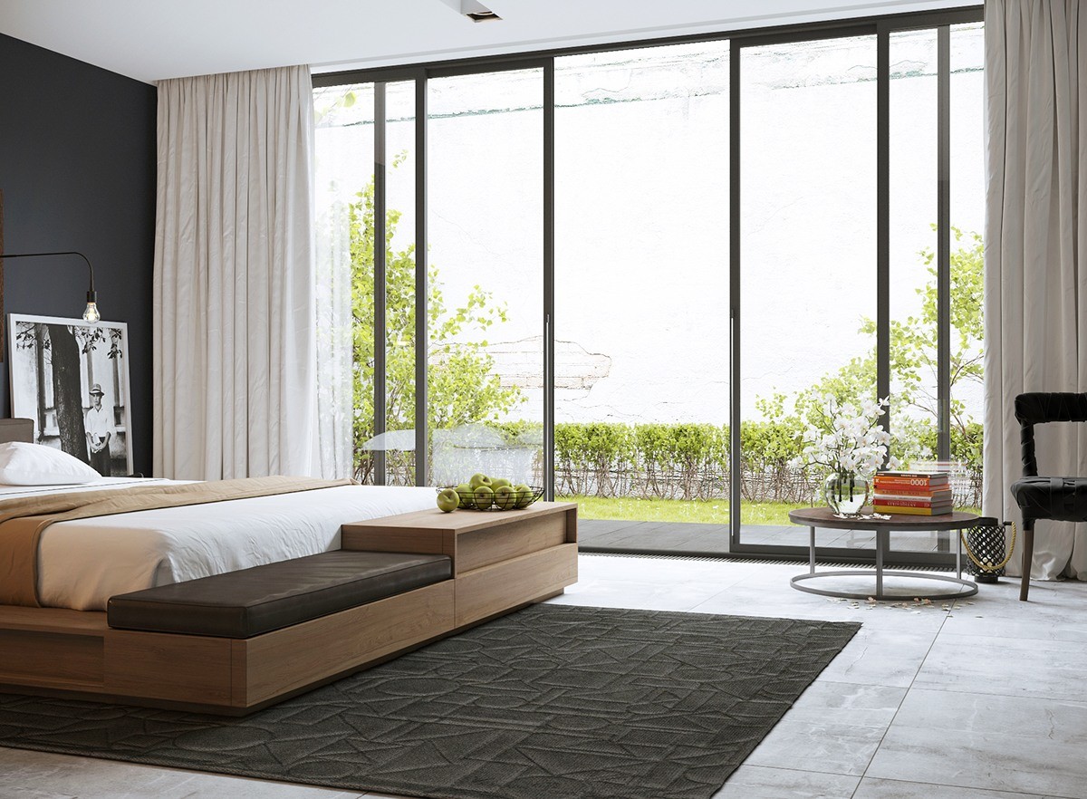
The versatile bed frame suits this simple bedroom quite well. It includes a table, drawers, and even a padded bench. The rug speaks to the geometric theme while maintaining the subtlety of a black-on-black theme.
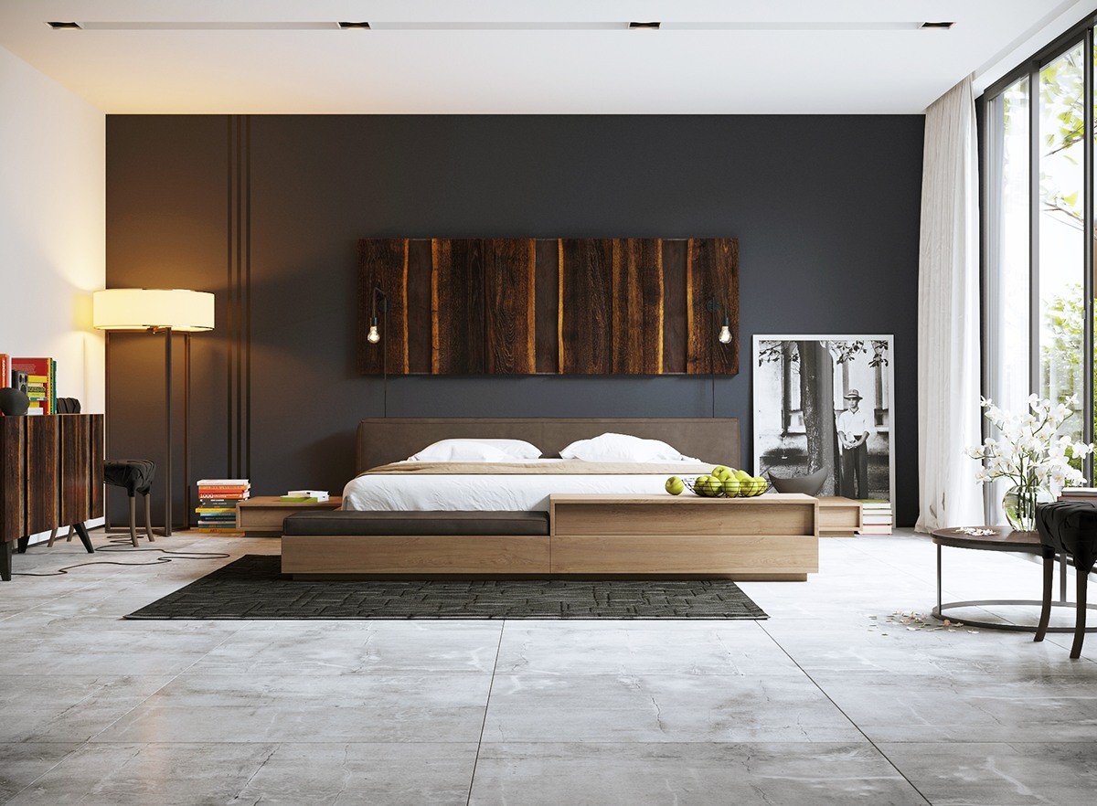
Comfortable mocha tones take on a luxurious personality paired with this bedroom's dark palette. Bold natural materials stand in organic contrast to the matte black accent wall – rich striped wood features and stone floors balance the emphasis on clean lines with their own organic flow. These natural features also help to tie the interior to the small courtyard visible through the expansive sliding doors to the right hand side of the room, emphasizing the natural elements over the clean modern backdrop against which they stand. The black and white photograph? It's the perfect finishing touch for a space like this one.
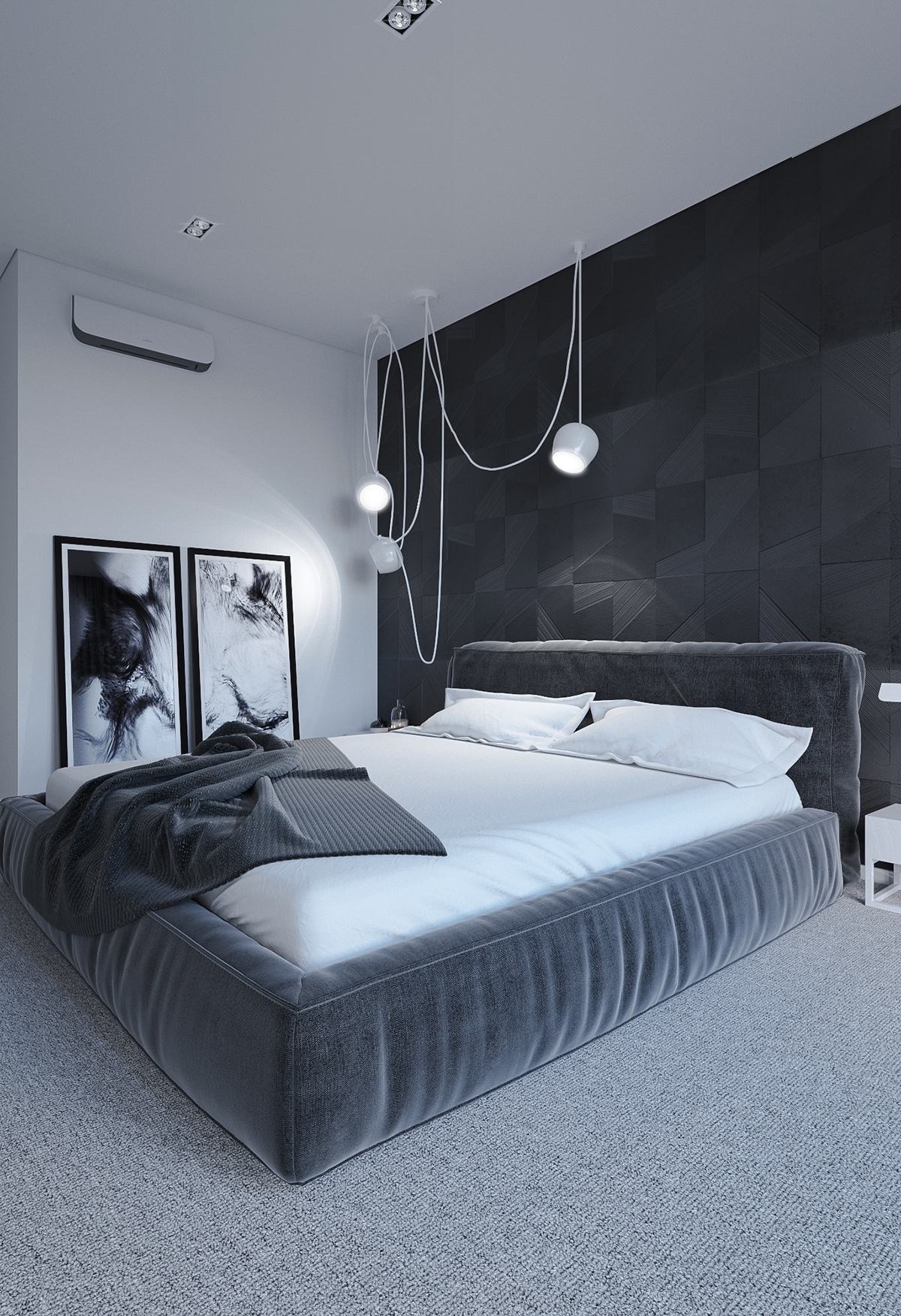
The directional bedroom pendant lights are from the AIM series by brothers Ronan and Erwan Bouroullec. It's perhaps the only "sculptural" element in the room besides the wall panels, making it a perfect blend of ornament and function.
