Located near Kiev, Ukraine, this home boasts a creative and effective 105 square meter floor plan to accommodate a family with one young child and one infant. Designer Yevhen Zahorodnii opted for a minimalist interior theme to suit the busy lifestyle of the residents – minimalism grants simplicity and convenience by erasing some of the material complication from the home, a practical choice with two little ones running around. Some rooms do boast a bit of color though, namely the child's bedroom and a small office dedicated to study and play. Are you planning to adopt a minimalist style? This home will inspire!
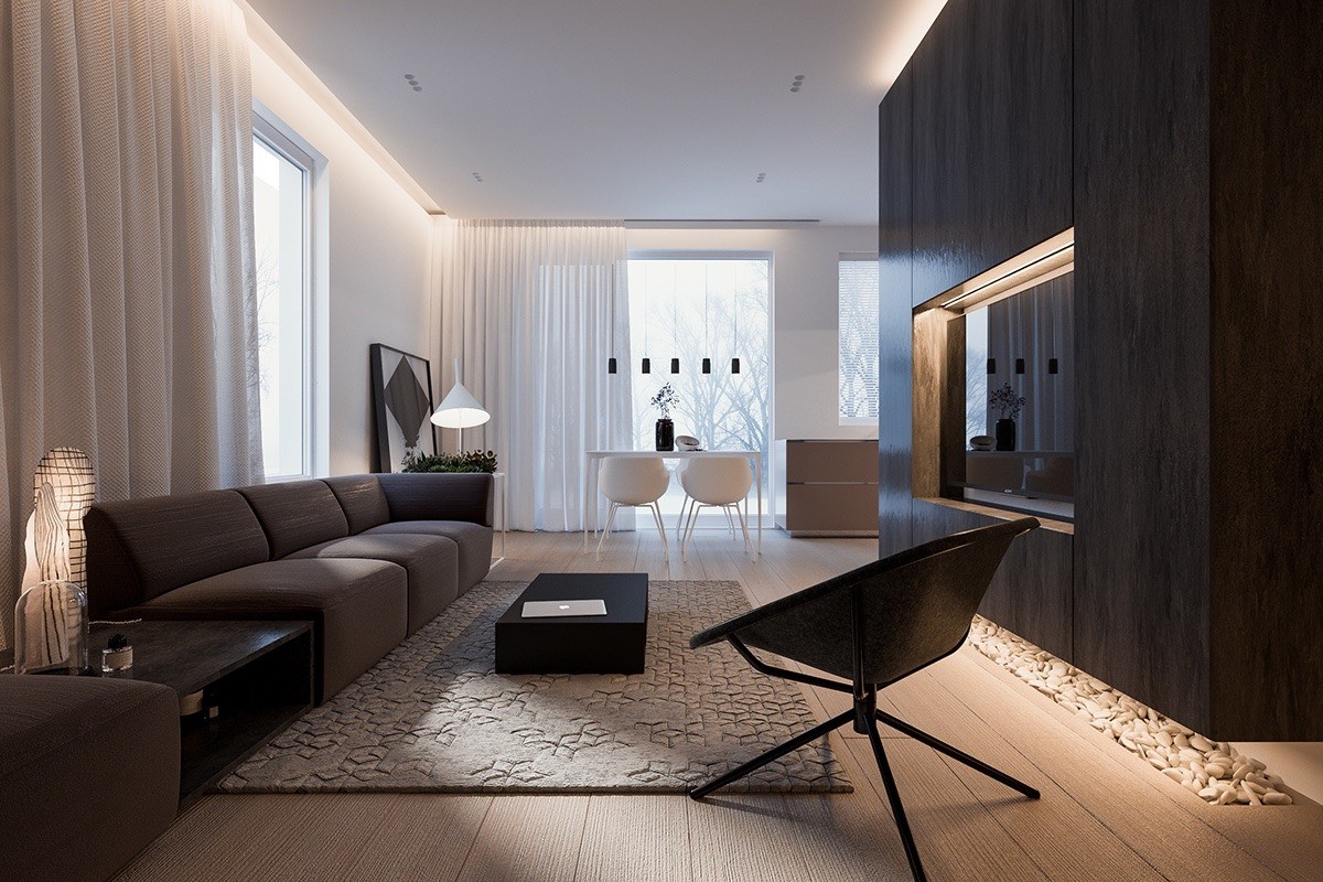
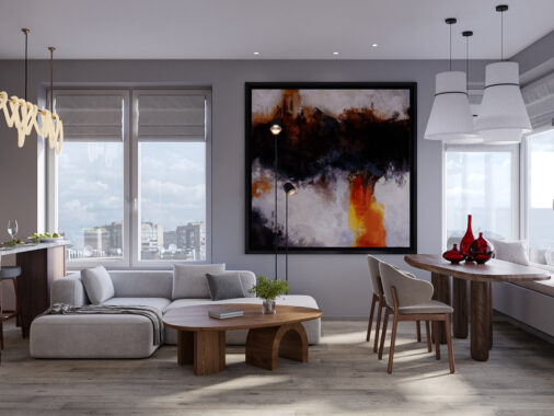
The practical L-shaped layout consists of white walls that surround a freestanding volume in dark plywood panels, light floorboards guiding the eye along the length of the living space and toward the dining room.
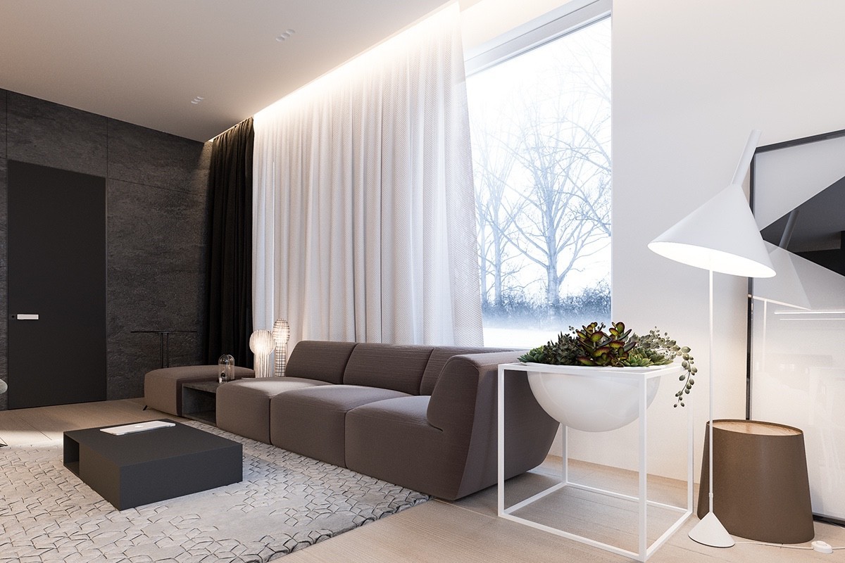
Simple furniture combines sharp angles and smooth rounded forms. Geometric themes are most noticeable in the functional decor like this cubical plant stand and cone-shaped floor lamp.
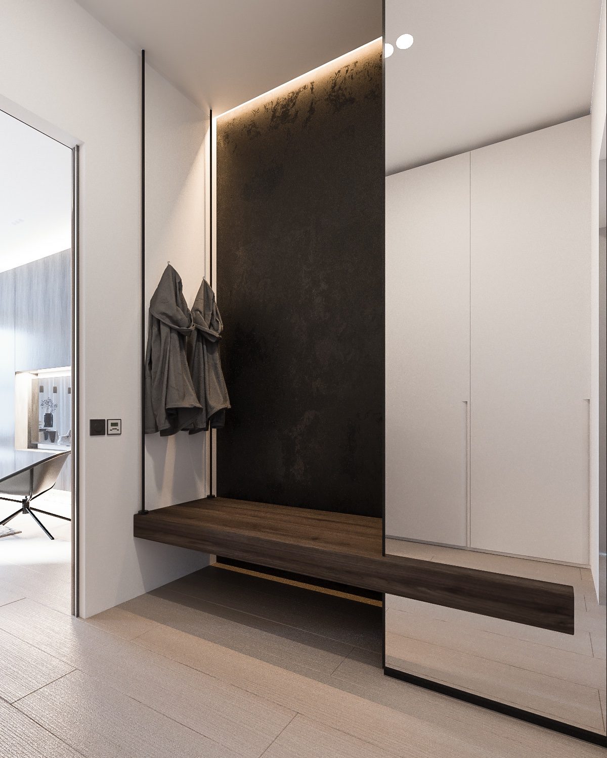
Even the entryway is effective and stylish. A full mirror allows last-minute checkups to make sure that outfit or makeup is still on point and the built-in seating leaves rooms to store shoes.
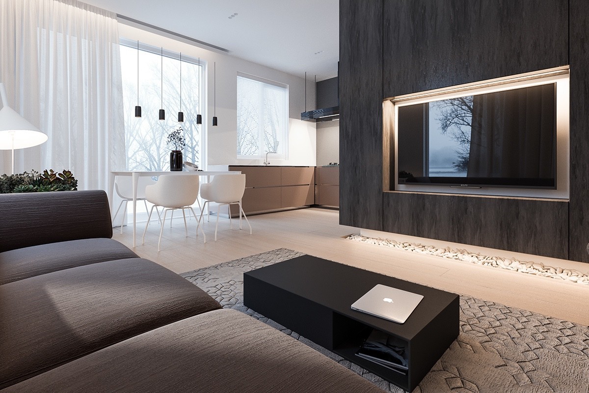
Around the corner, a beige-toned kitchen hides just out of sight from the main living area. A neutral take on color blocking works wonders to separate each functional space. The slim black dining pendant lights adds contrast to this otherwise very white space.
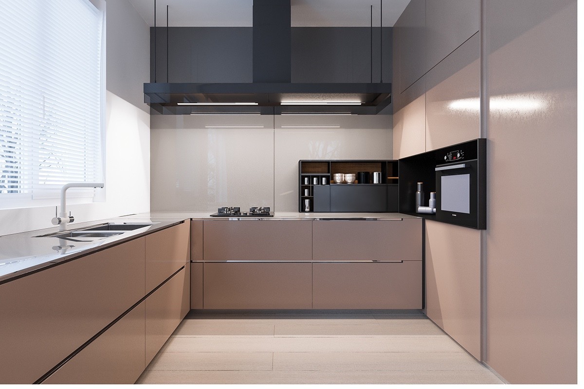
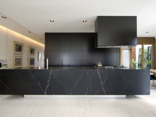
The kitchen is just as simple as the living room. Cabinetry hides behind sliding panels to avoid the need for overhead storage, allowing light to touch every surface.
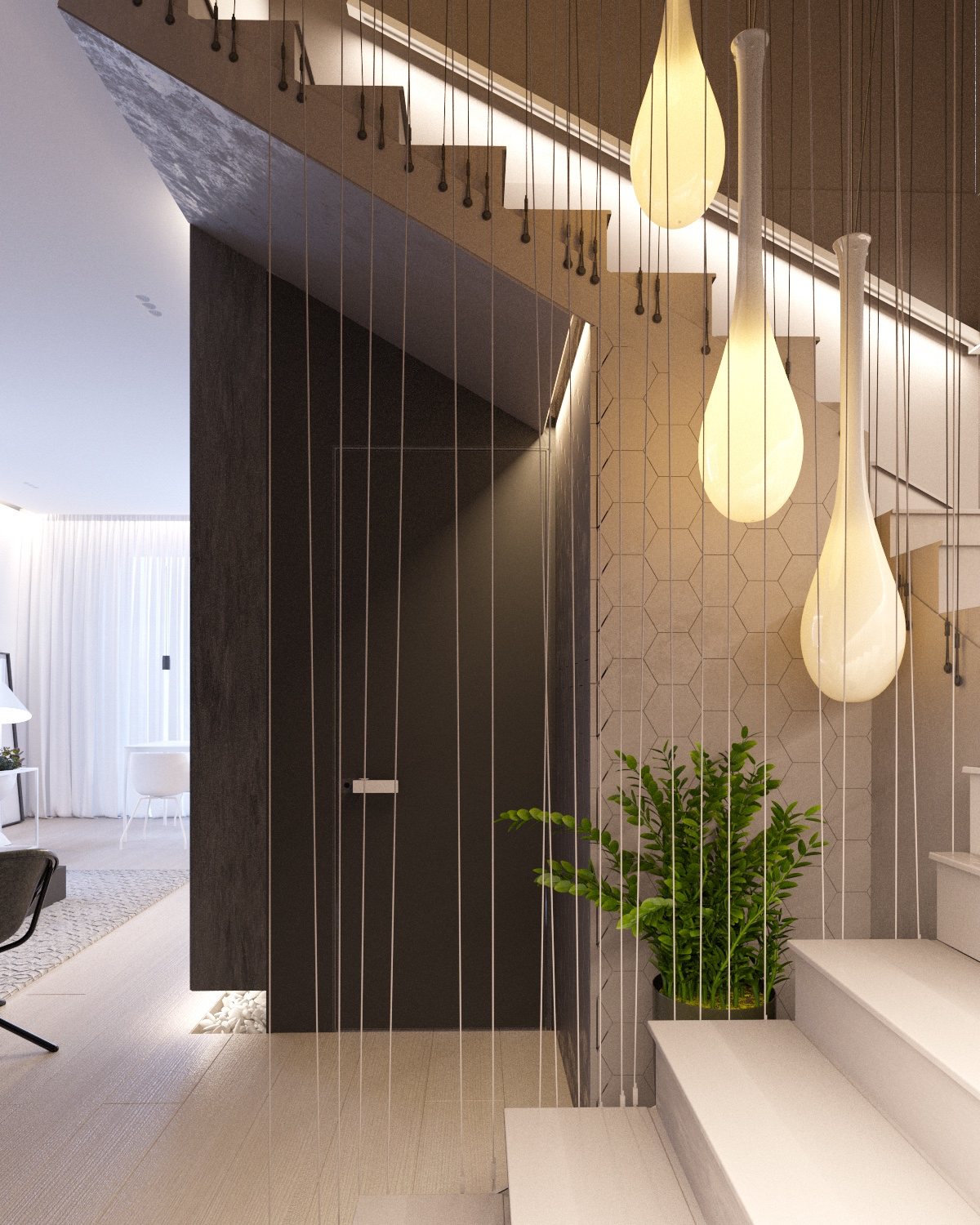
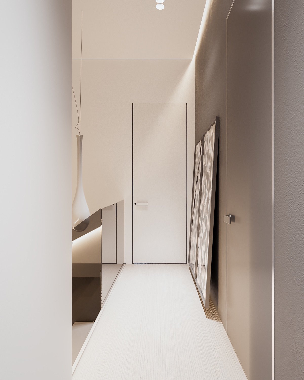
Rather than ordinary handrails, the staircase makes use of white wires that run the length of the atrium. Large drop-shaped pendant lights illuminate the way.
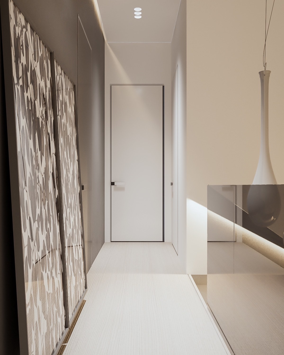
Wires transition to mirrored bannisters toward the top of the stairs. The floors here are especially unique – white plywood offers a smooth uninterrupted plane of textural wood grain.
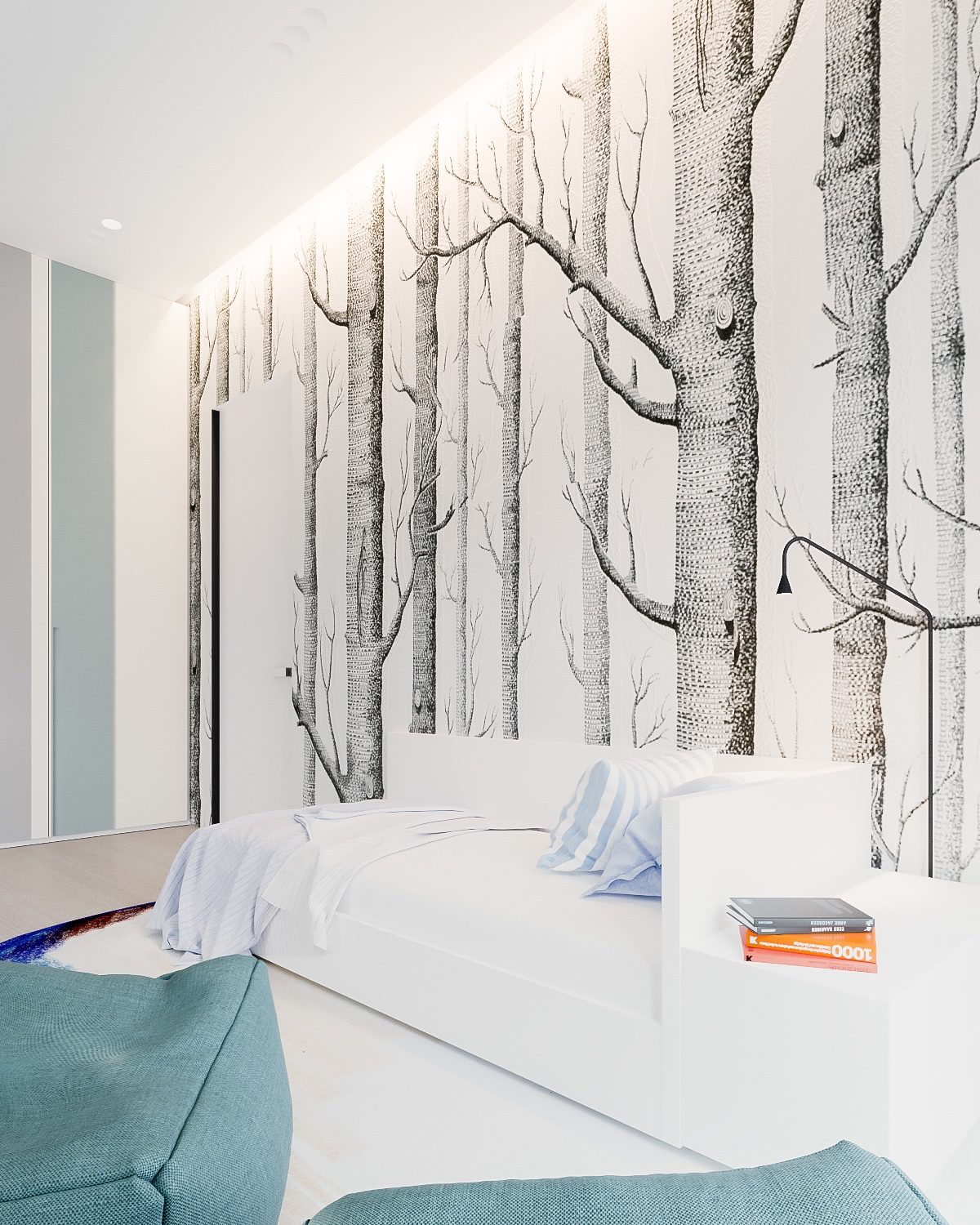
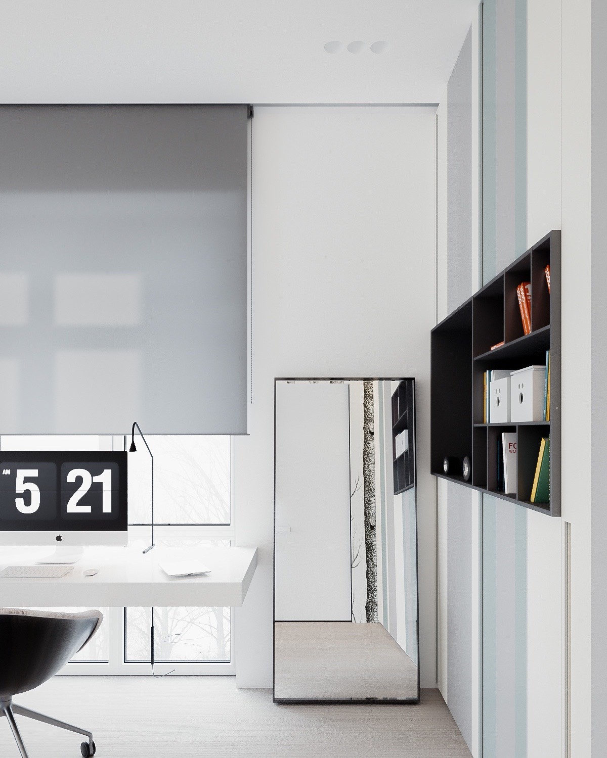
One of the offices is for the child, complete with woodcut style wallpaper. Light blues and bright white create a comfortable atmosphere for study and homework.
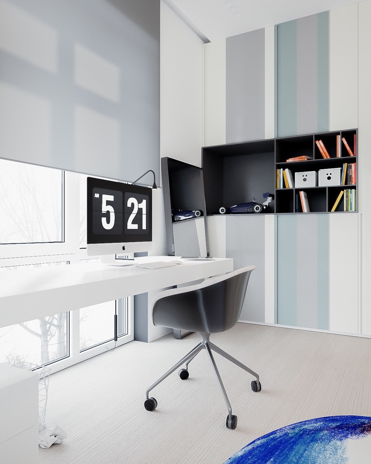
Attractive shelves leave room for books and study material in addition to toys and other inspiring decor. The stylish stylish desk chair perfectly matches the minimalist desk here.
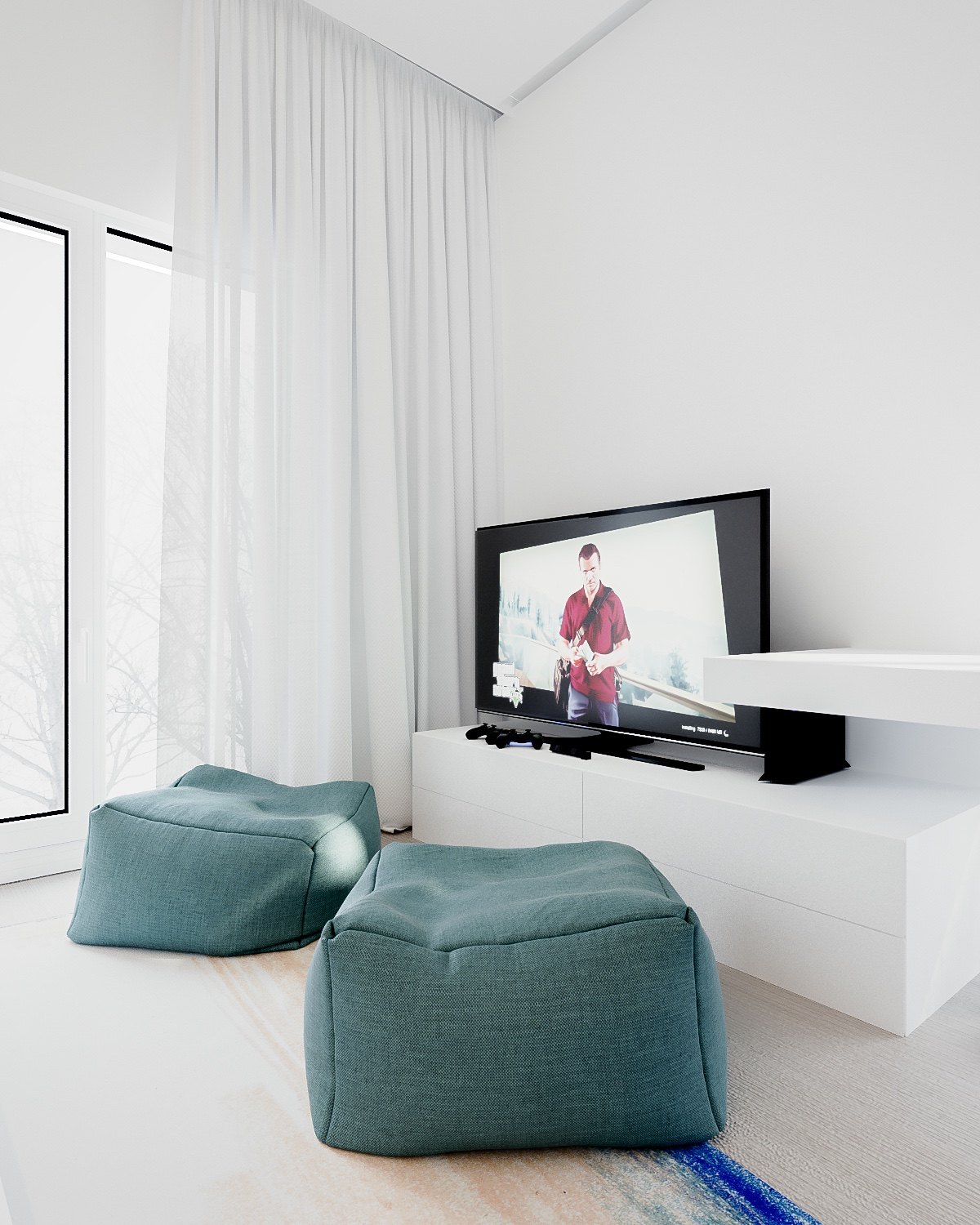
Once all of the day's homework is complete, the young resident can snuggle up in one of these big cozy poufs for some multiplayer gaming with mom or dad.
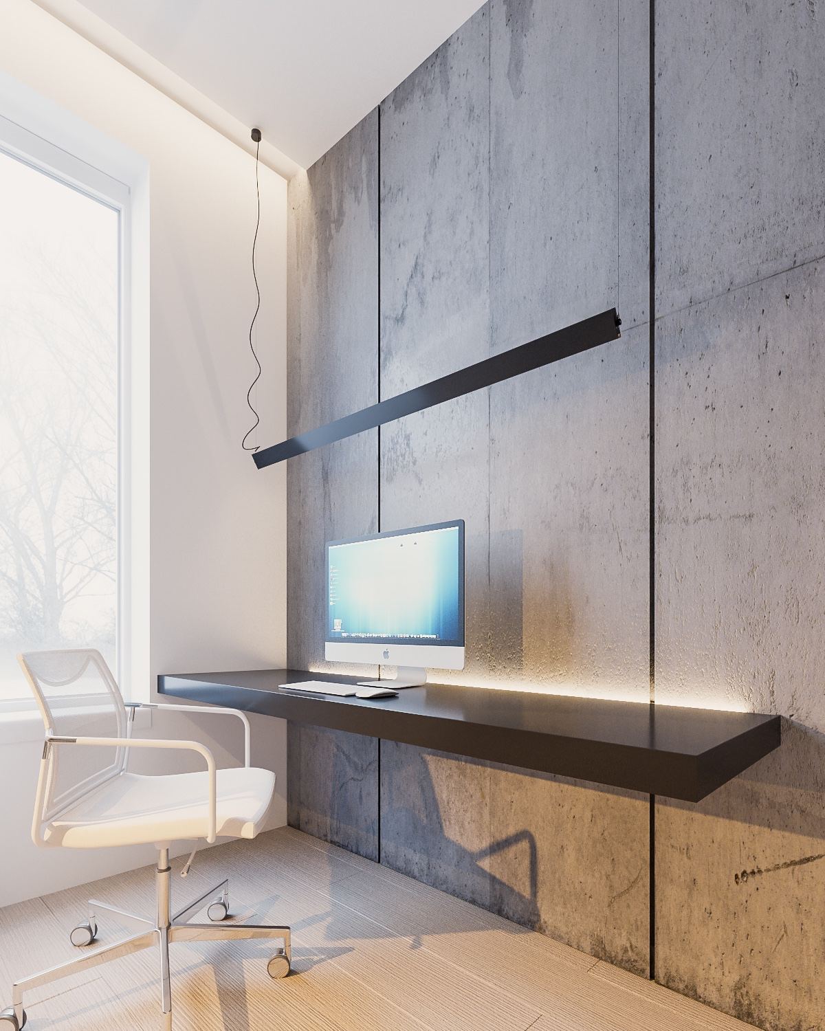
The main office is more professional. Concrete walls offer a hint of industrial influence, heightened by the strip of indirect lighting that emanates from the back of the cantilever desk.
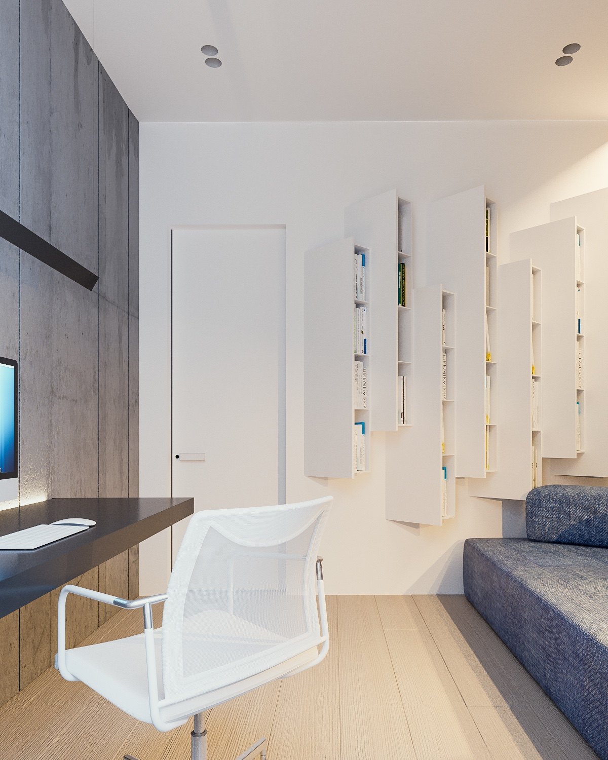
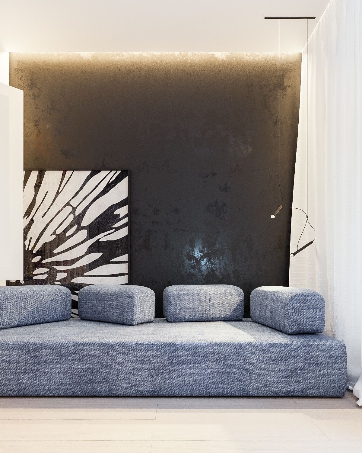
Creative angled shelving makes it easy to browse the library selection right from the sofa. If the resident uses this as a meeting room, this arrangement would definitely ease the boredom of waiting clients.
Even the entryway is effective and stylish. A full mirror allows last-minute checkups to make sure that outfit or makeup is still on point and the built-in seating leaves rooms to store shoes.
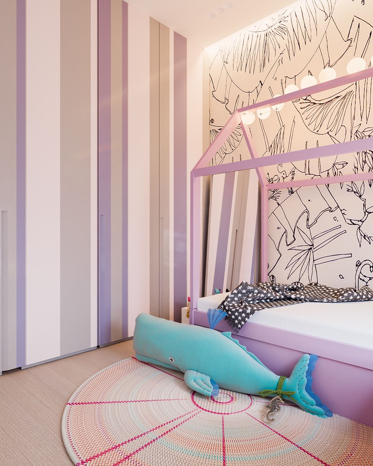
Now, here's the fun part! The child's bedroom diverges from the home's minimalistic theme with colorful walls and furniture, with playful characters like this whale to keep things interesting.
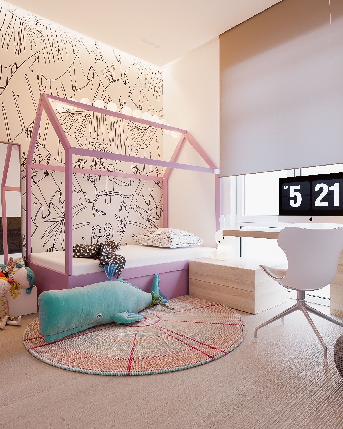
Illustrated jungle wallpaper fills the room with smiling animal faces. House-shaped bedframes are a popular trend for kids rooms, and this lavender frame fits especially well with this design.
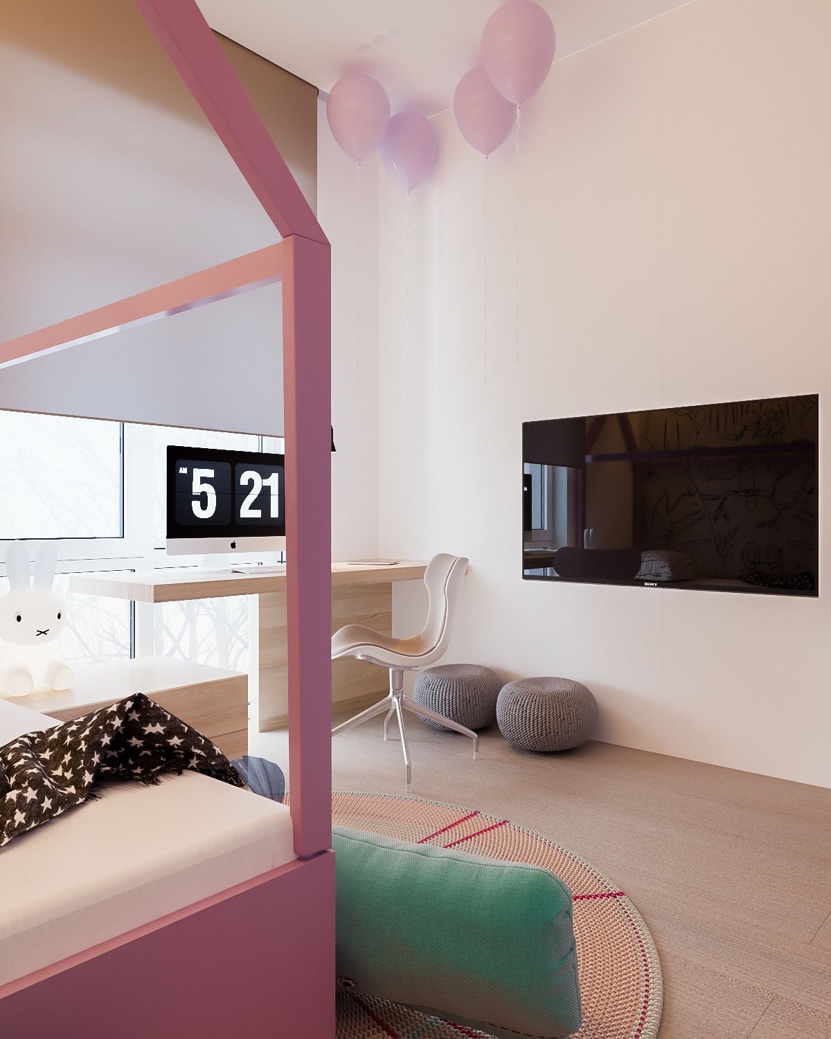
Although the child does have a separate office, this desk allows for PC gaming or making quick corrections to homework before bedtime.
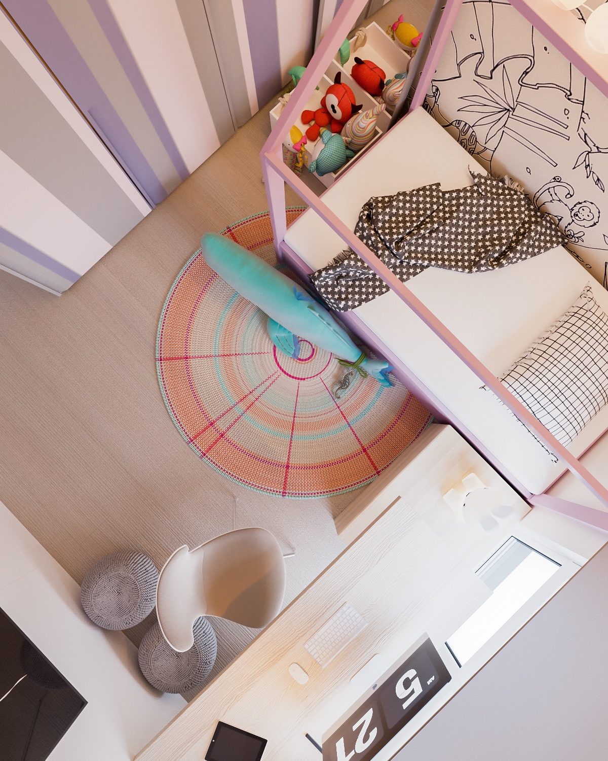
Overall, it’s a very fun space with plenty to do and plenty to keep the young occupant's eyes and mind occupied.
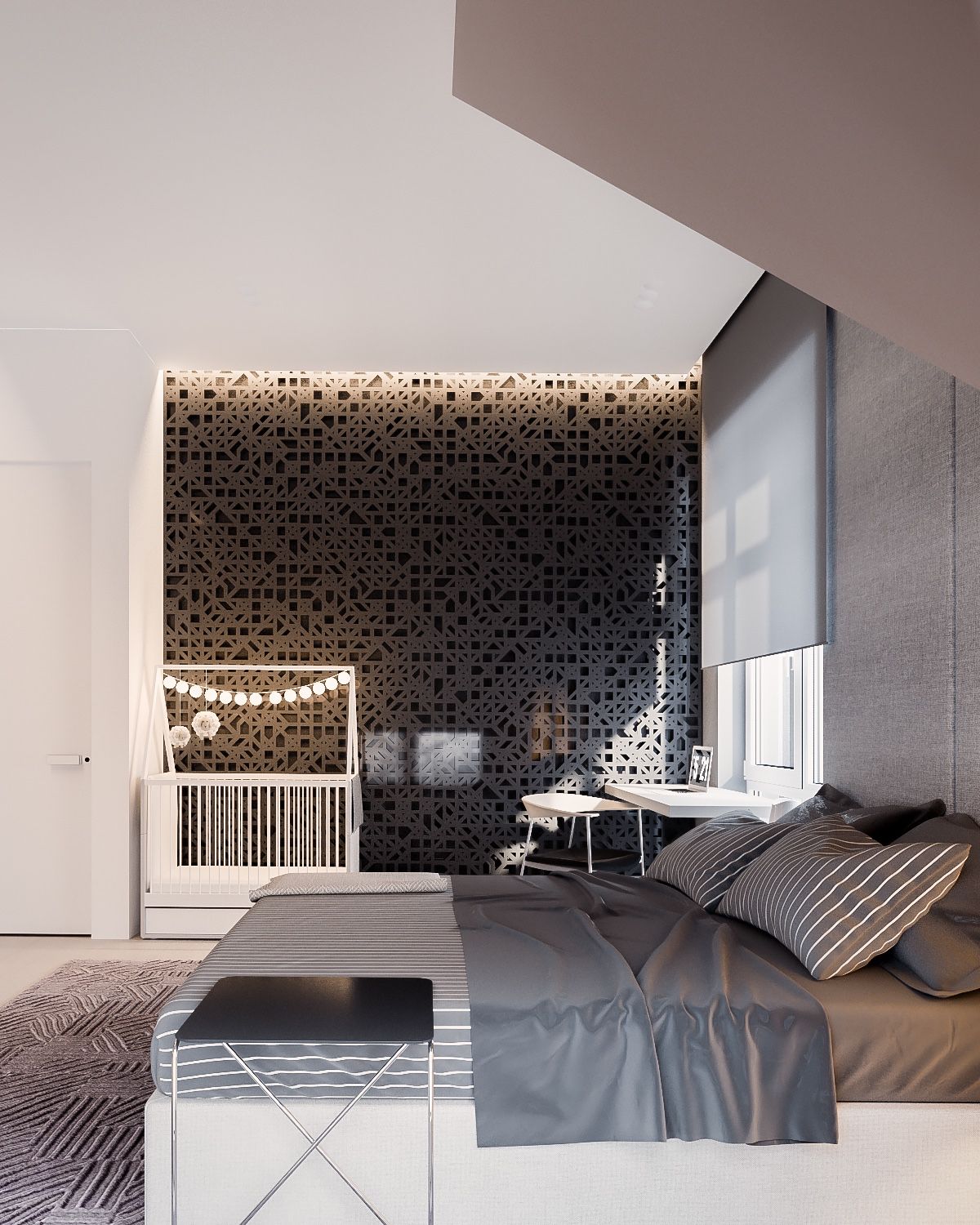
The master bedroom doubles as a nursery for the family's newest resident. Just like the older child's room, the small crib includes a "roof" strung with adorable lights just out of the infant's reach.
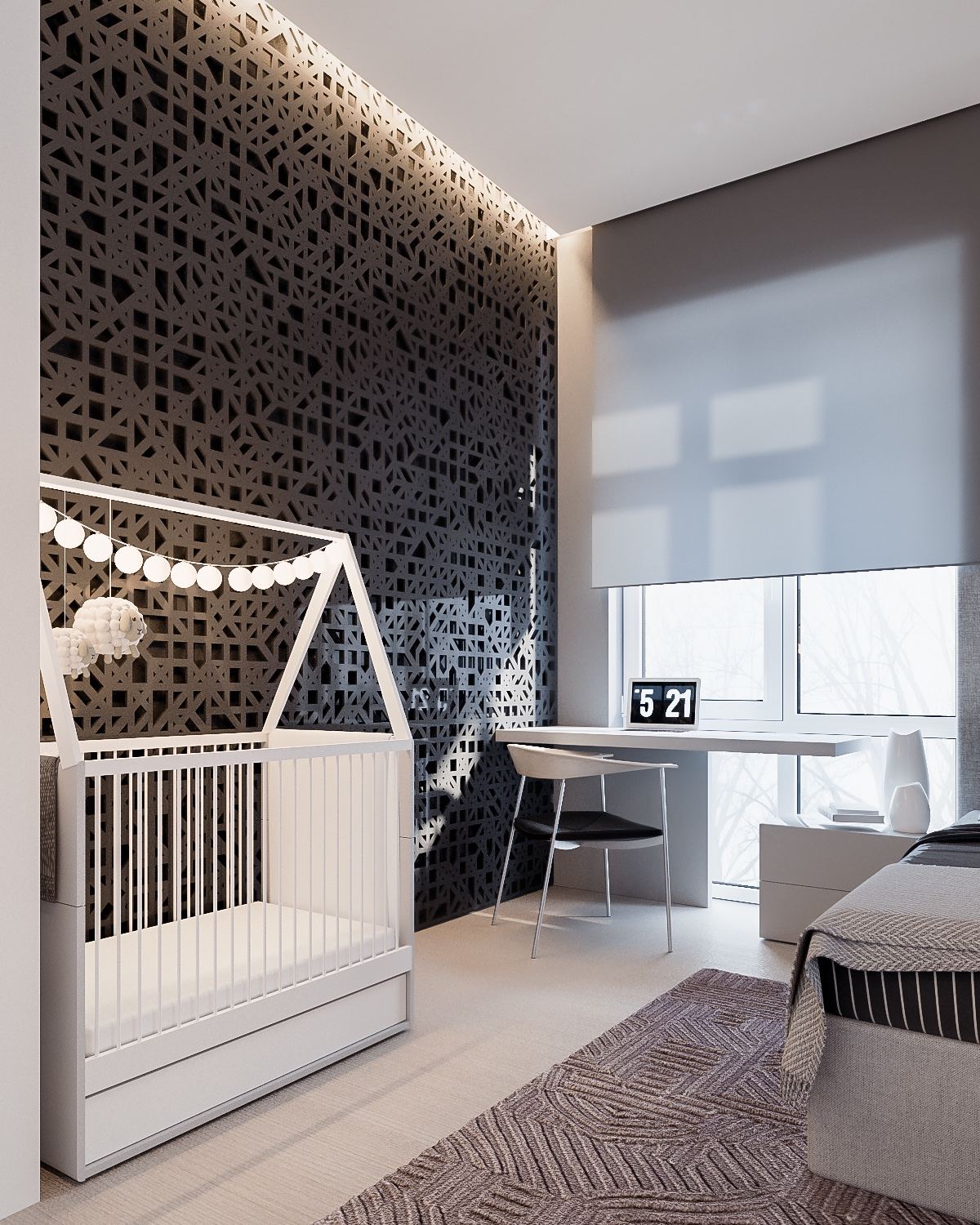
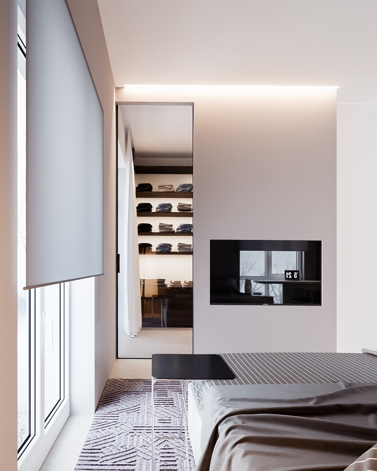
While decor remains minimal, the textures are impossible to ignore. An intricate accent wall, a stylish rug, and layers of blankets are a soothing contrast to the smooth surfaces of the main furniture pieces.
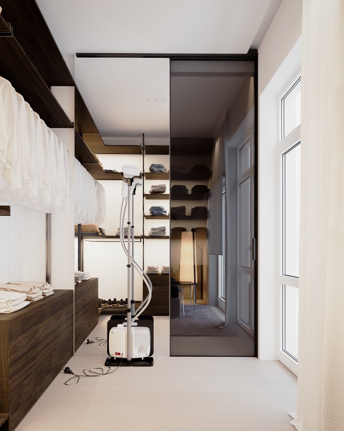
Inside, a full-length mirror makes it easy to see the day's outfit at a glance. Abundant natural lighting is a hugely important feature since artificial lighting can change the appearance of fabric sheen and color.

Wood drawers and shelves have classic appeal. Ever-so-slightly notched corners modernize the choice of materials to avoid seeming overly rustic.
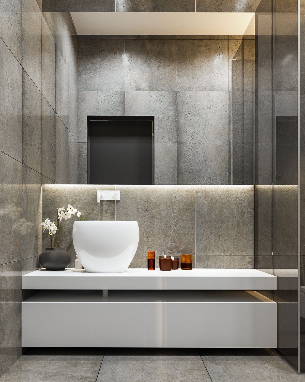
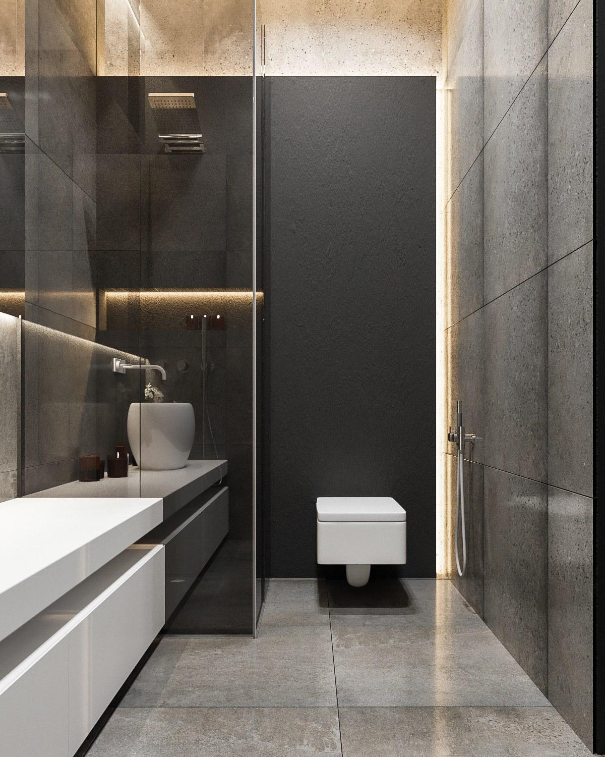
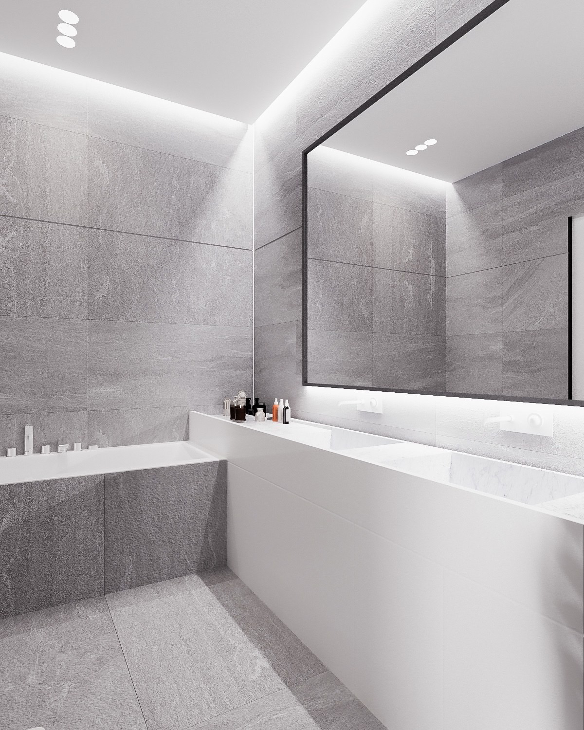
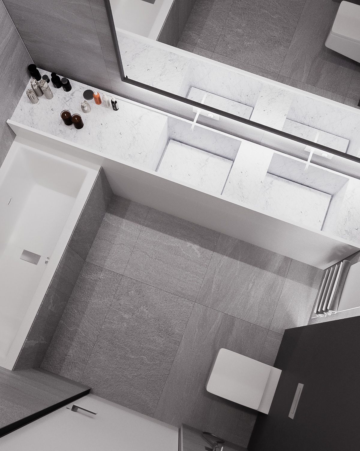
The bathrooms are perfection. This low vanity rises to the occasion with a tall vessel sink, a focal point in an otherwise very consistent and minimalistic design.

