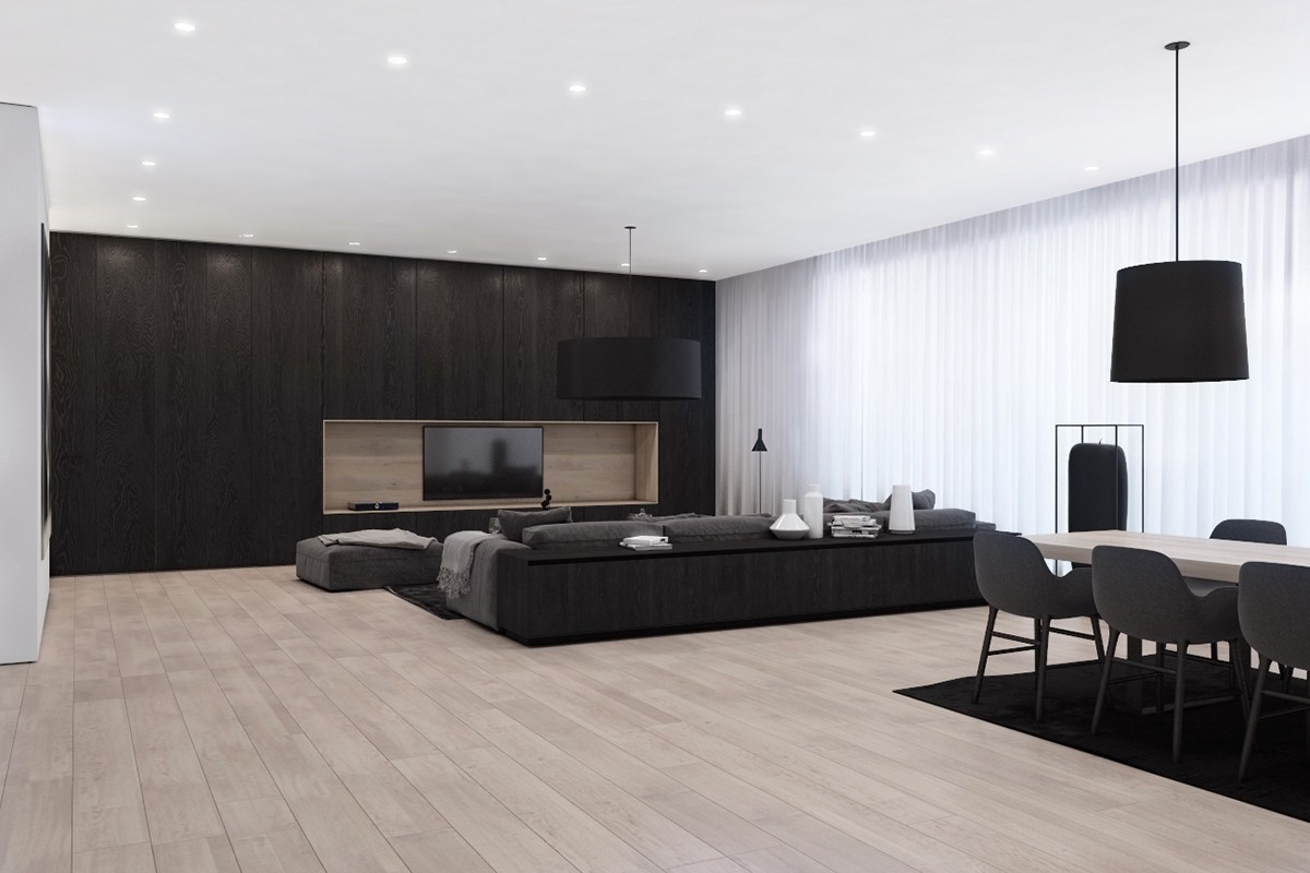
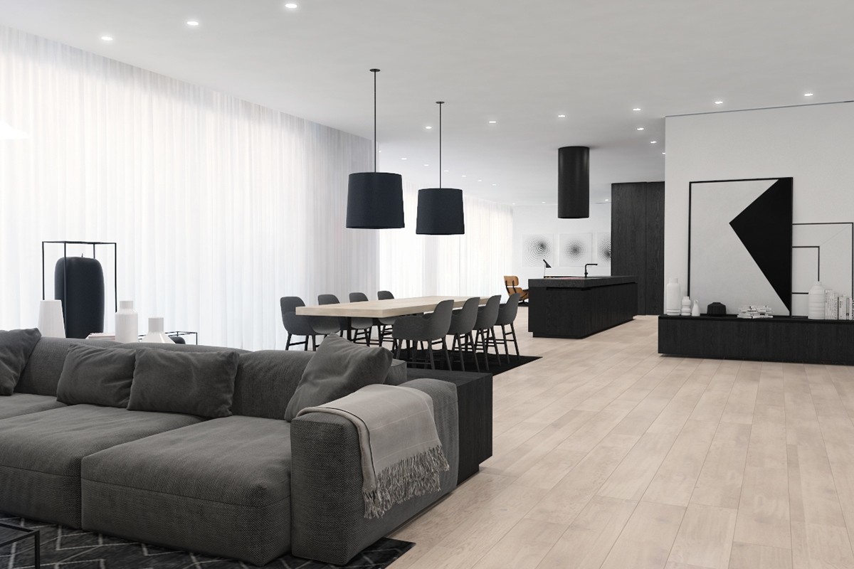
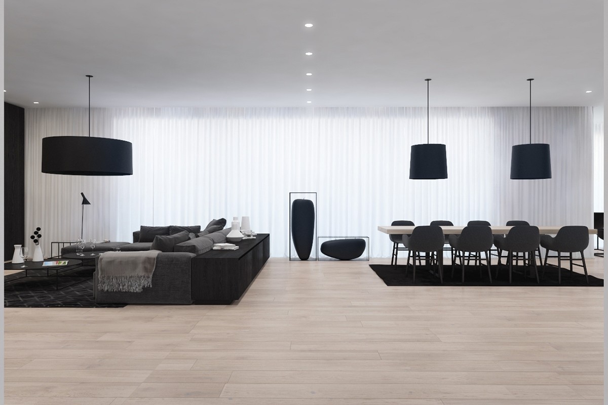
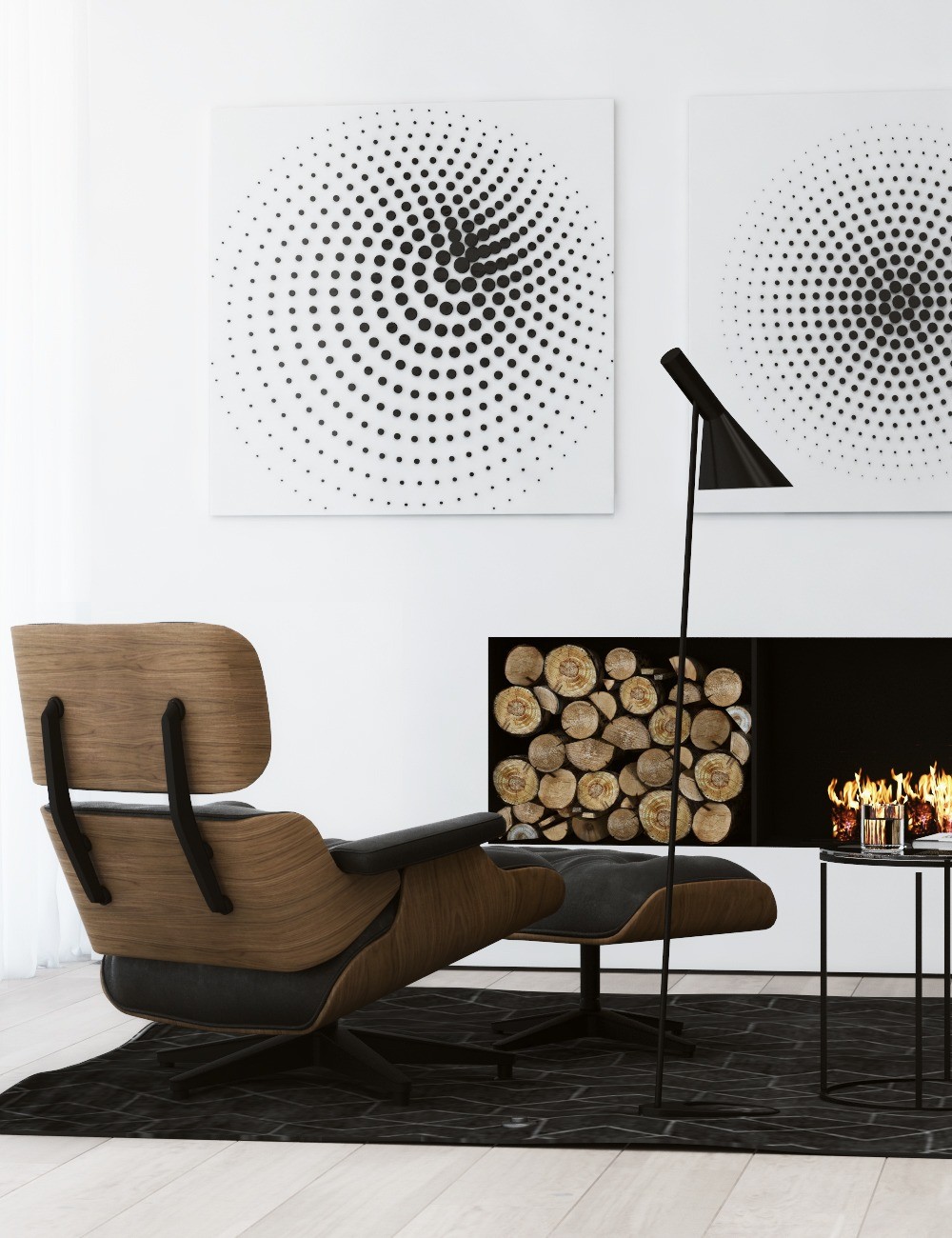
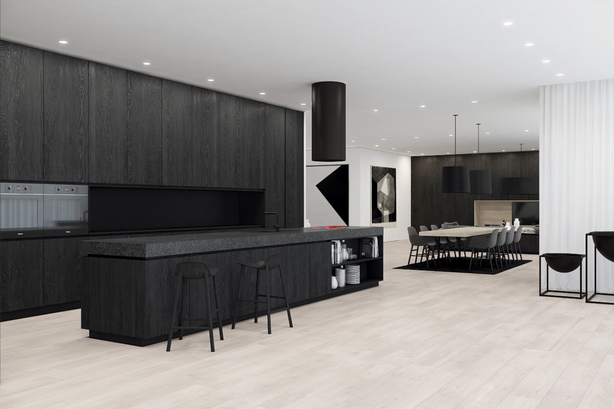
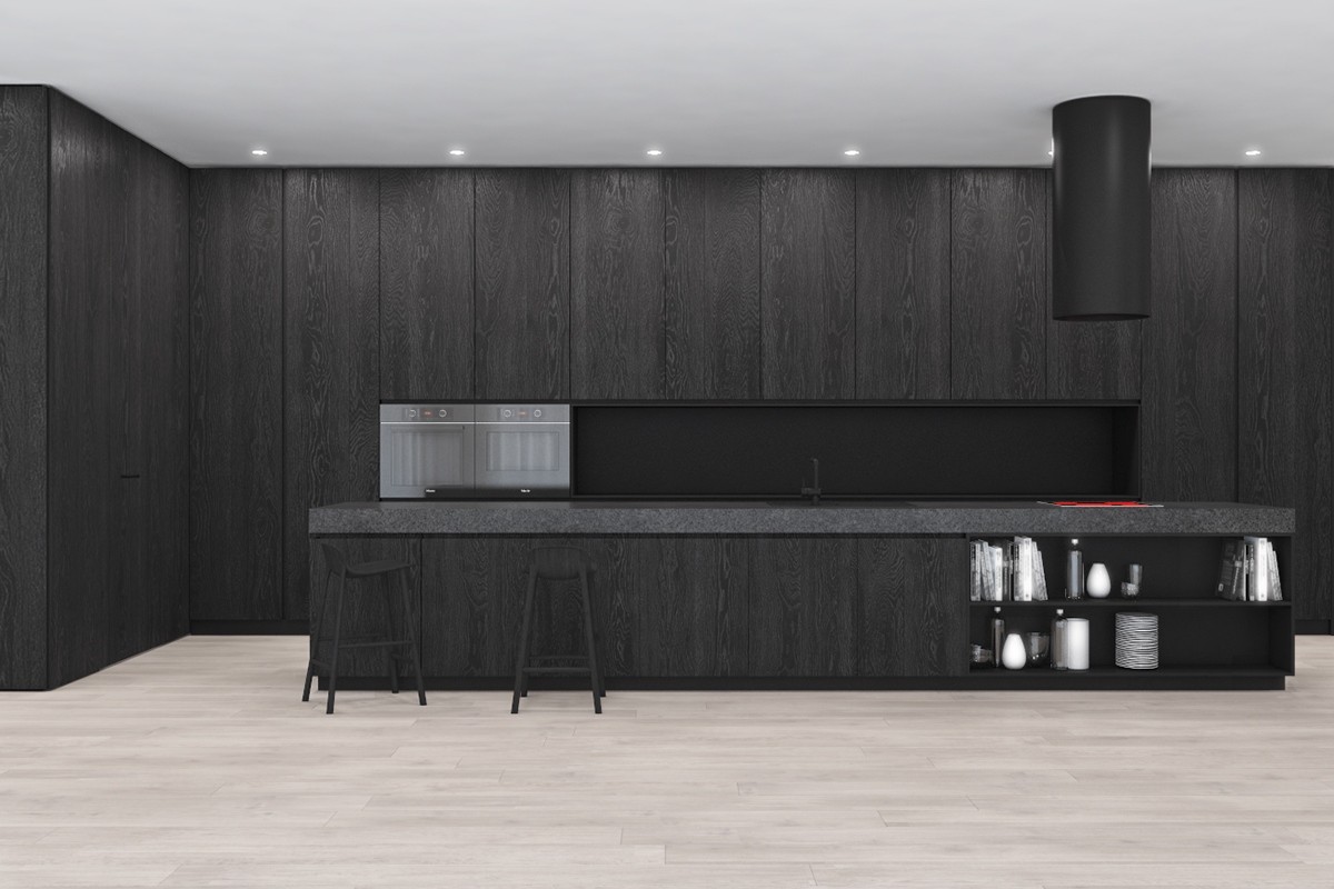
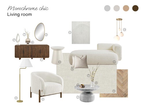
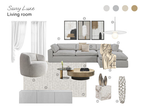
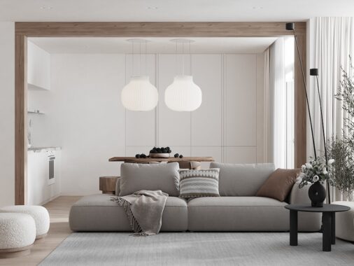
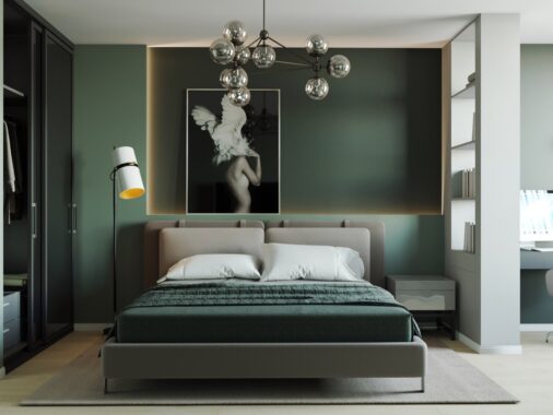
are an easy way to create contrast within a space. Linked to silver screen icons Marilyn Monroe, Audrey Hepburn and Charlie Chaplin, using black and white in your home or office can have the effect of old-world glamour – or a home lacking imagination. These three spaces from across Europe, illustrate ways to spice up your interiors with black, white, and some subtle colours in between - and make it work. Using luxurious materials, surfaces and points of interest, each space shows how two colours can easily create class and simplicity.
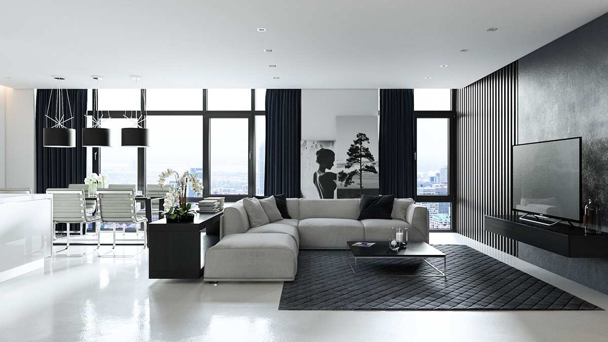
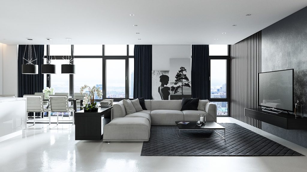
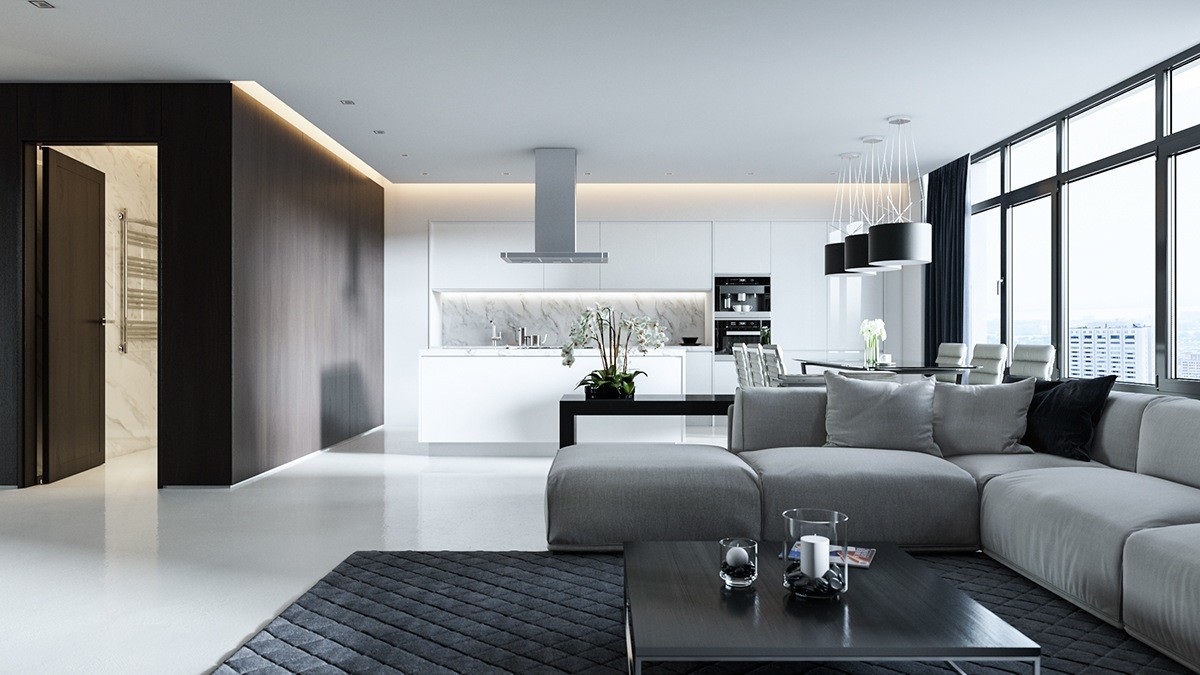
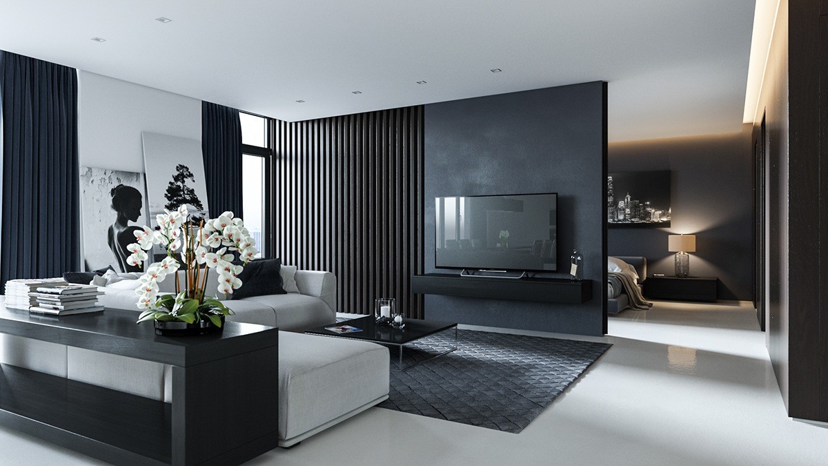
Sergey Baskakov’s visualisation of a private interior in London, England, shows how imagery and shapes can add spice to simple materials. In this lounge and dining area, two wide-panned photographs centre the room, while rounded white and grey surfaces contrast against rectangular black. White orchids add life.
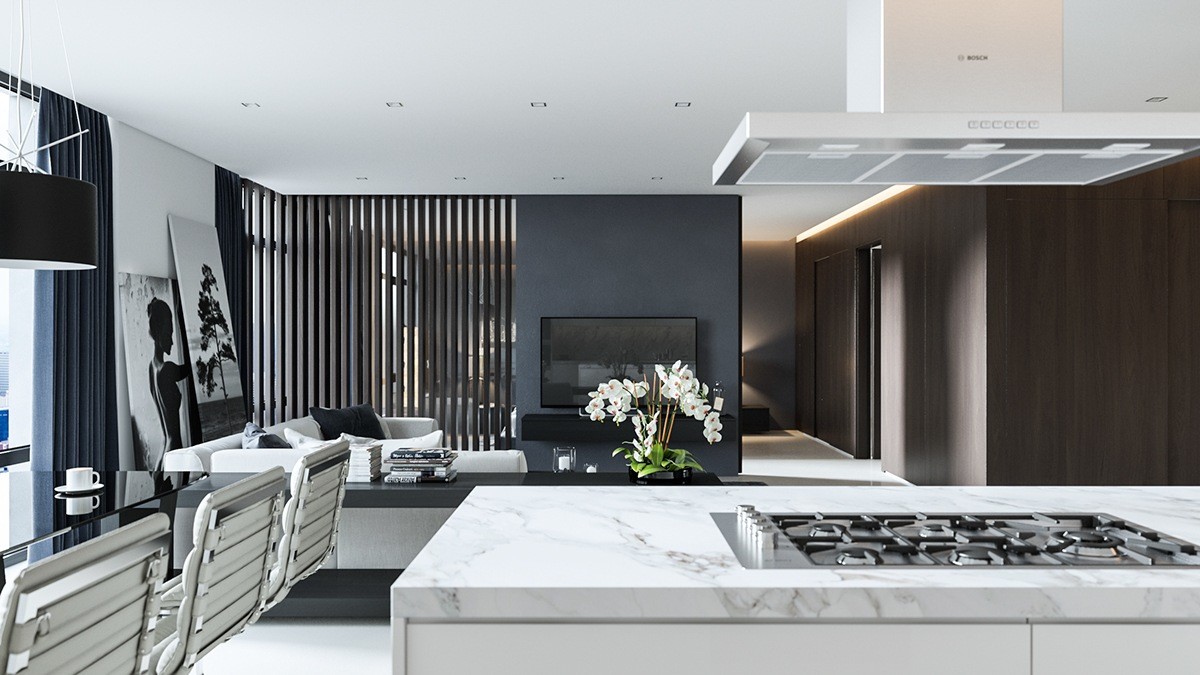
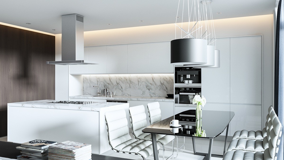
The white kitchen adds relief, while the marbled splashback continues the monochromatic theme. Looking to the black wooden slat partitions, light is let in.
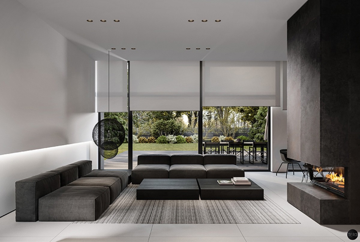
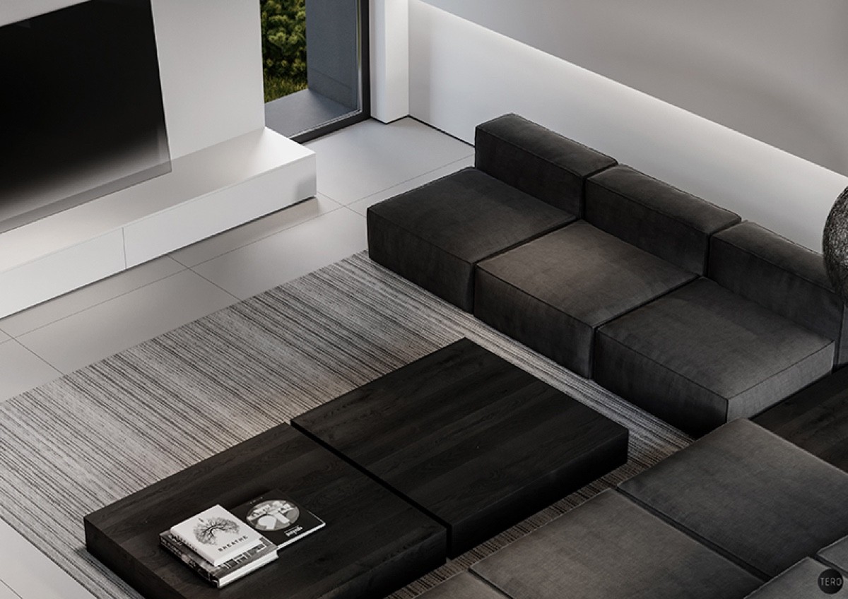
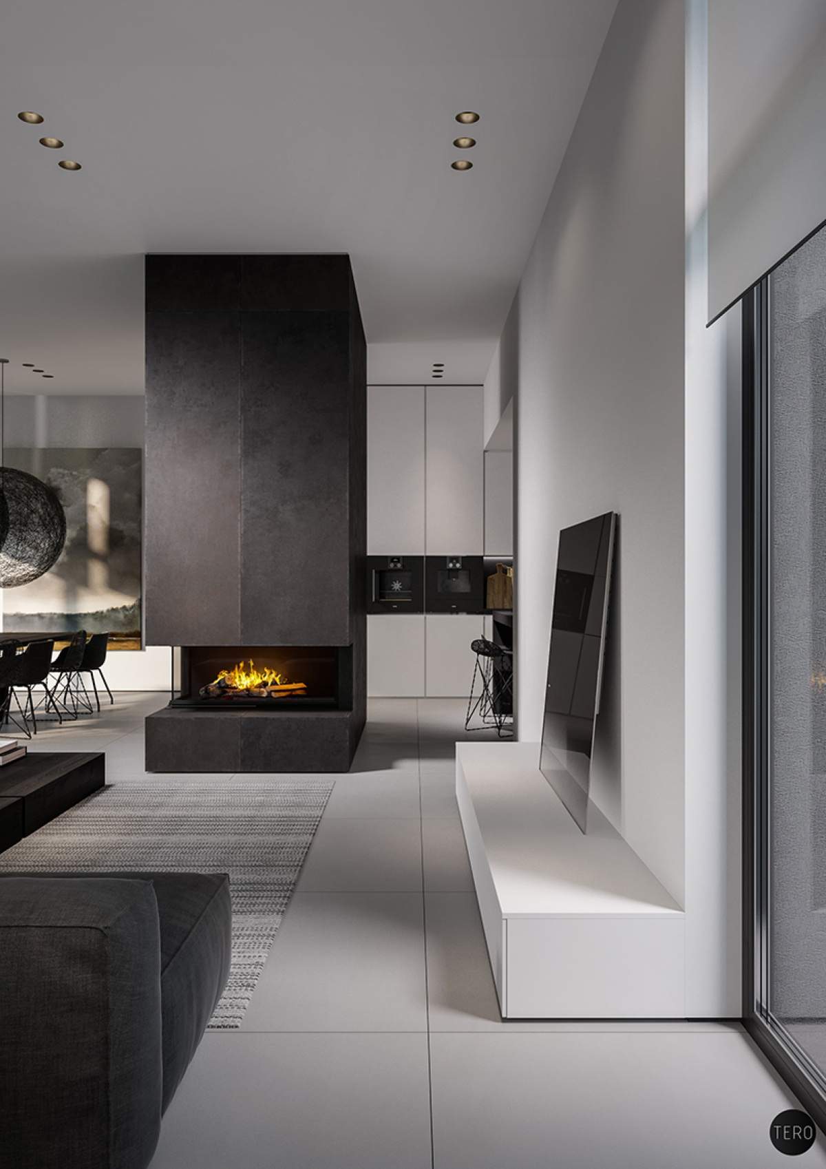
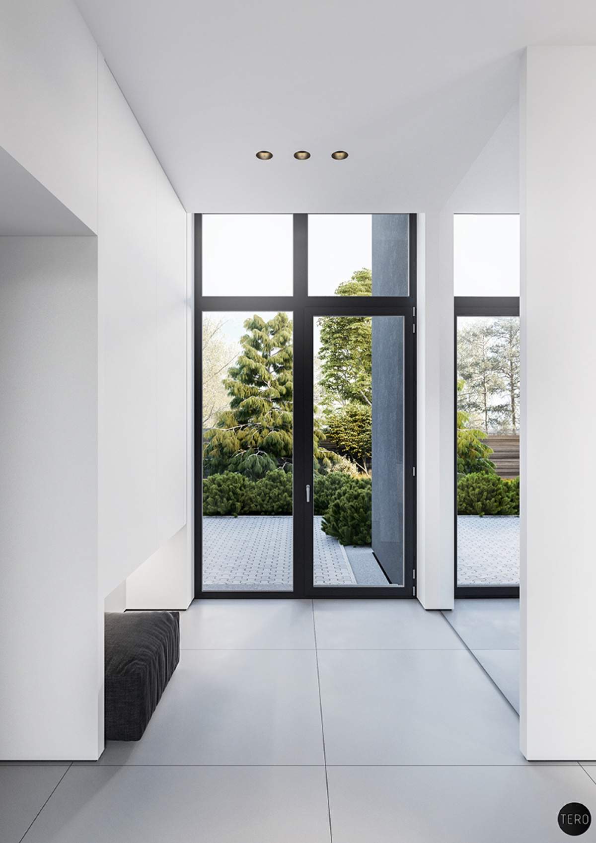
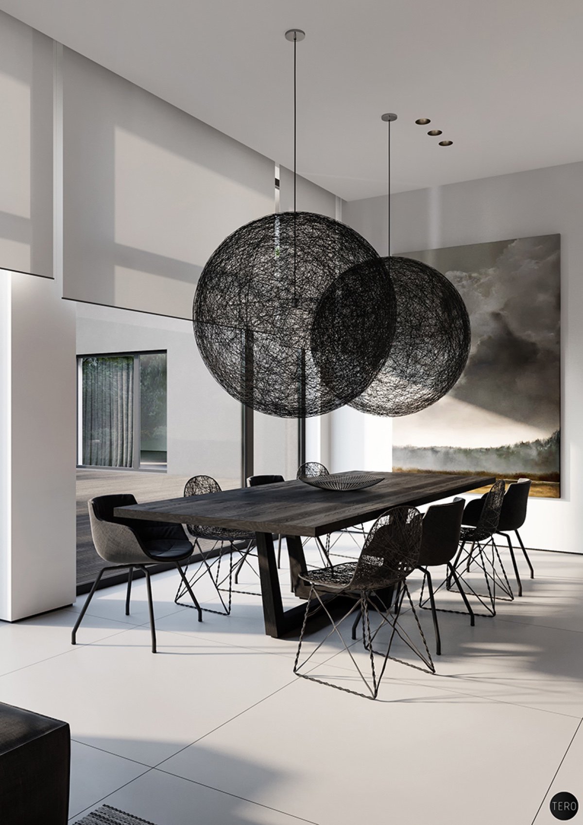
Dmitry Tereshchuk’s house design in Olsztyn, Poland, uses large, wide surfaces to effect, with woven materials taking centre stage. In the lounge, two orbs hang in the corner, while a woven carpet ties black, white and grey together.
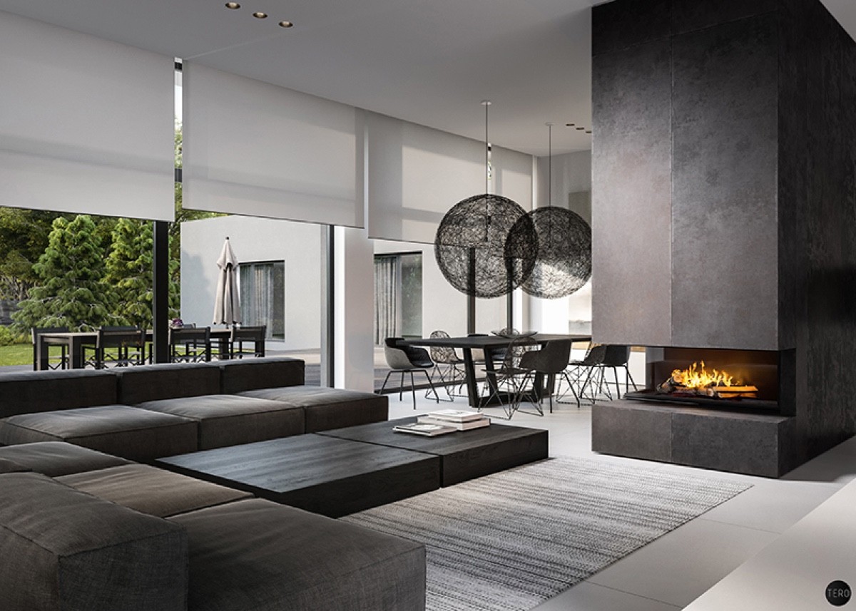
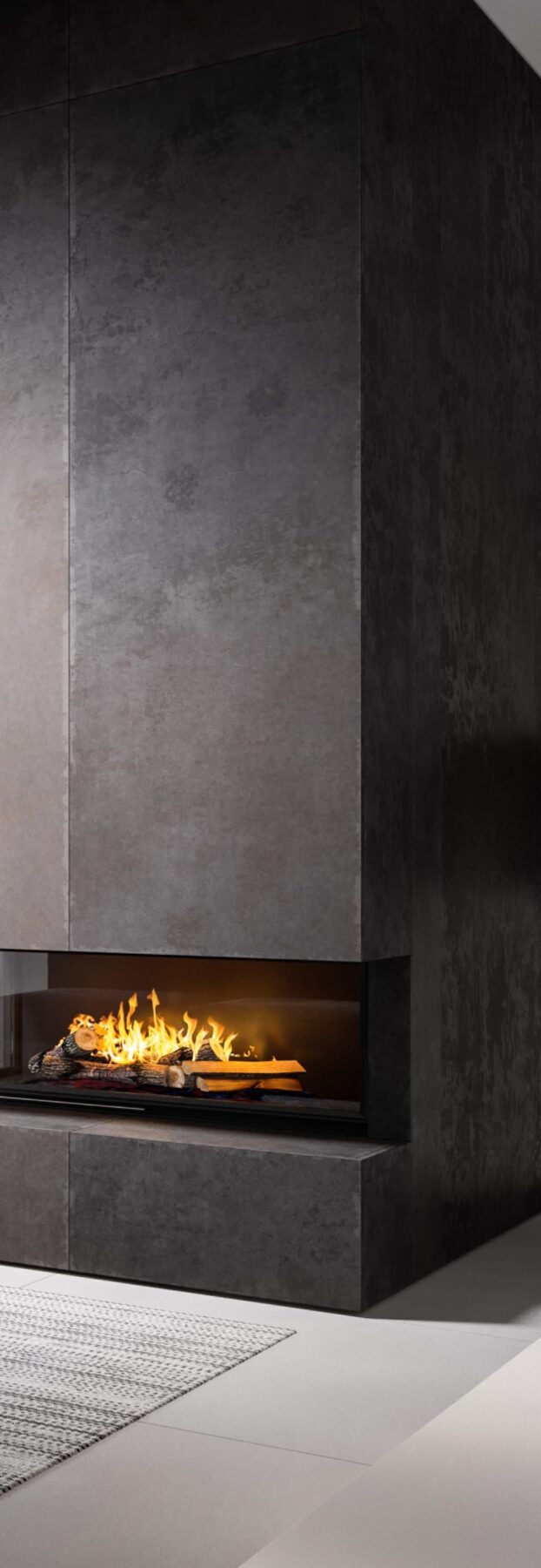
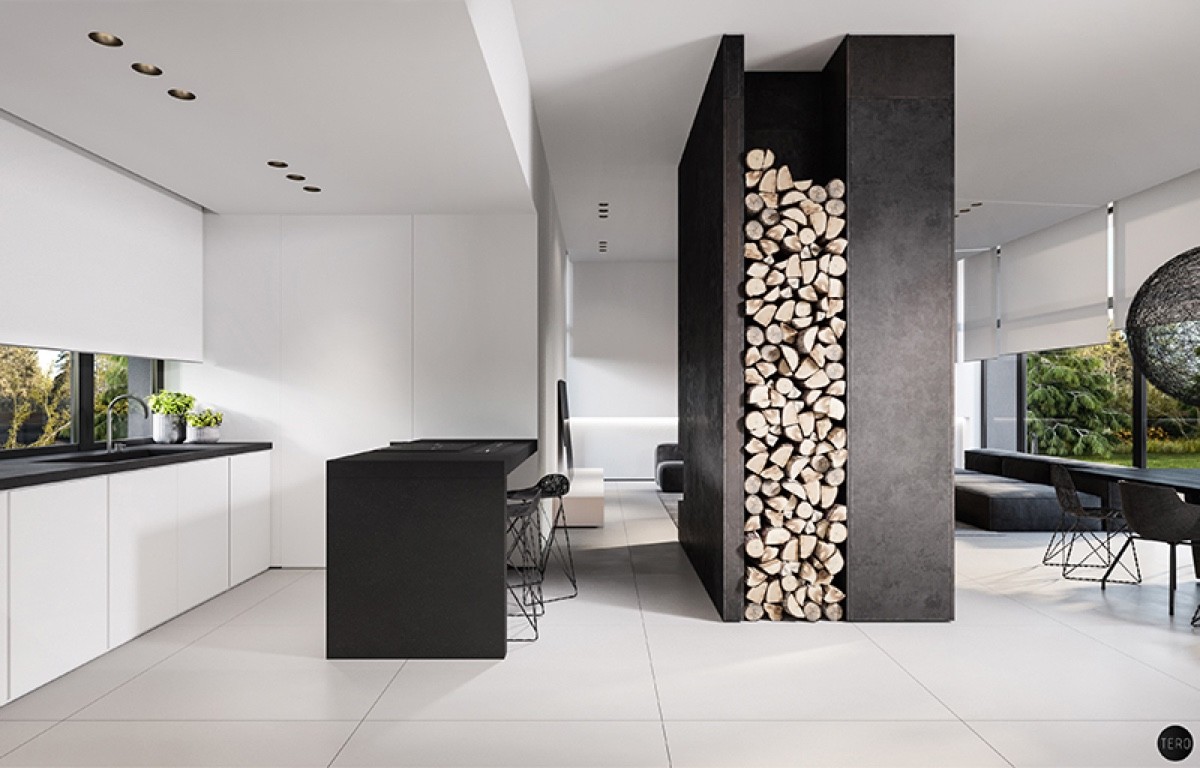
Woven orbs hang in the dining area and continue through to the fireplace. Within a high vertical iron shaft, a burst of orange flames adds cosiness to the scene. Green touches outside add a touch of nature, bordering the rooms’ flat monochromatic furniture.
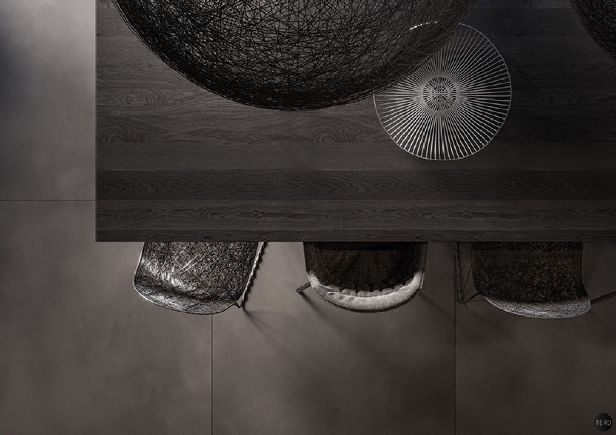
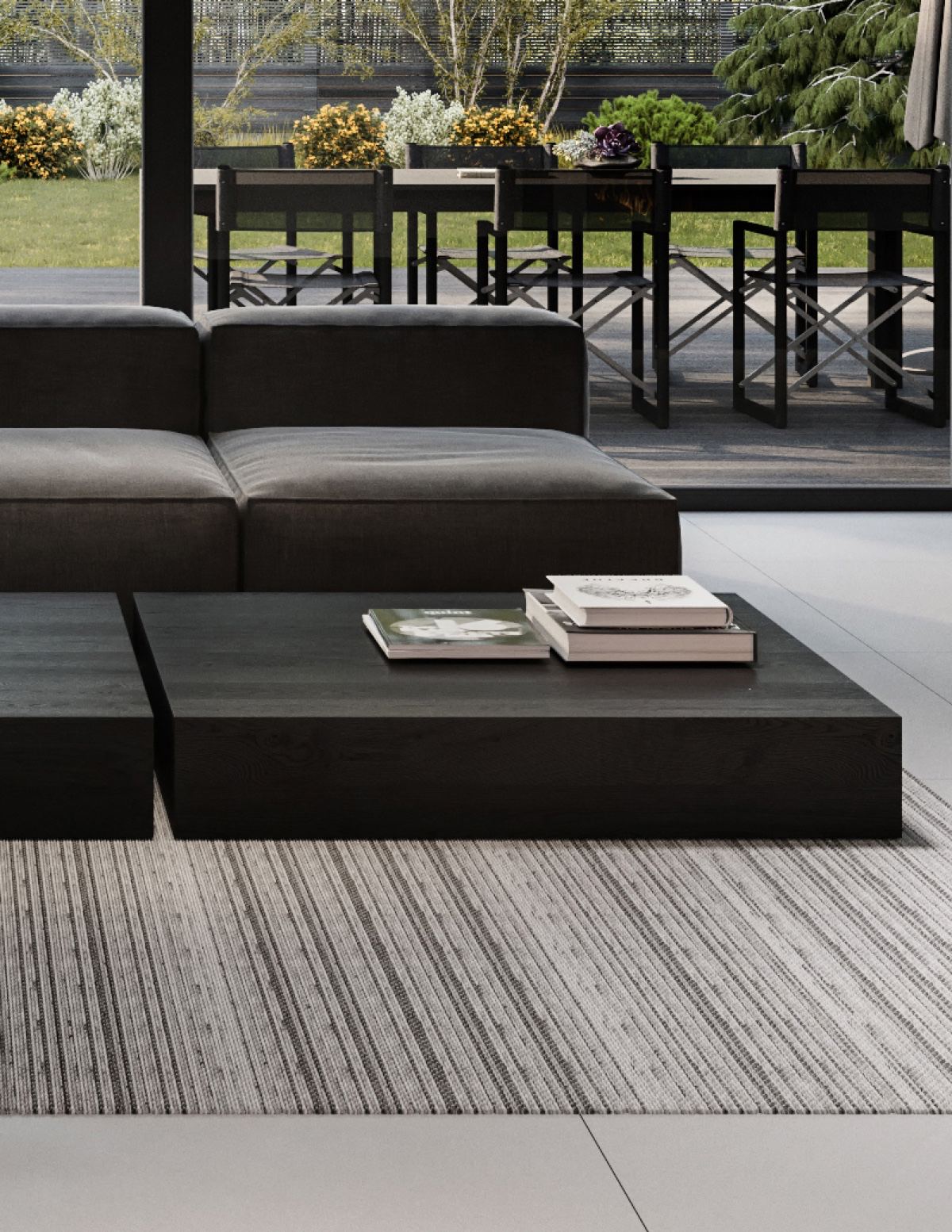
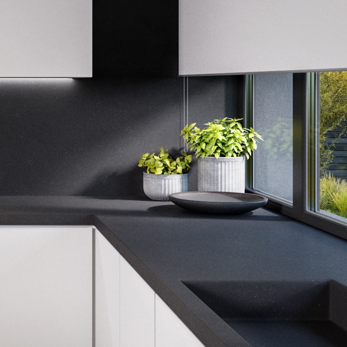
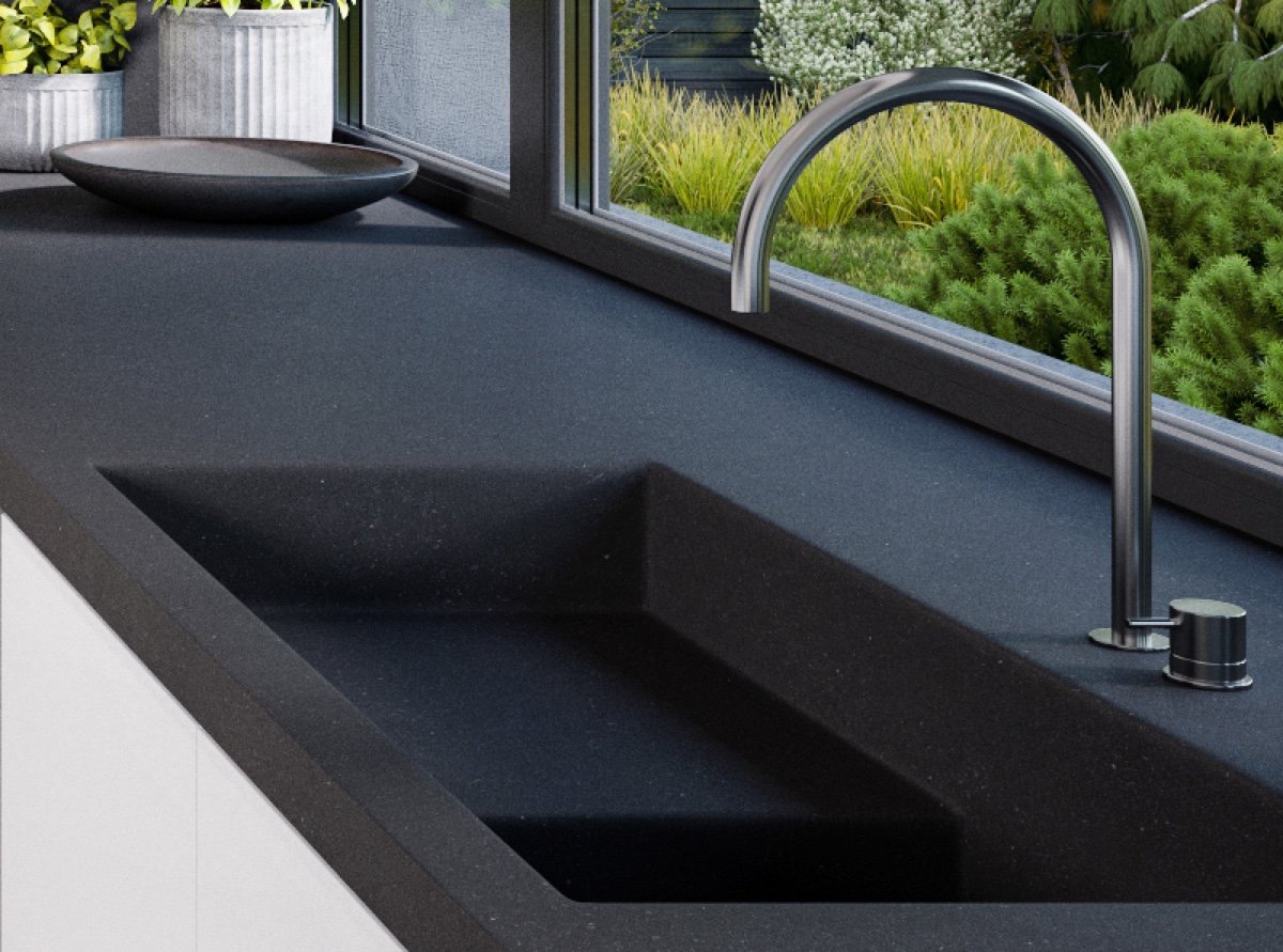
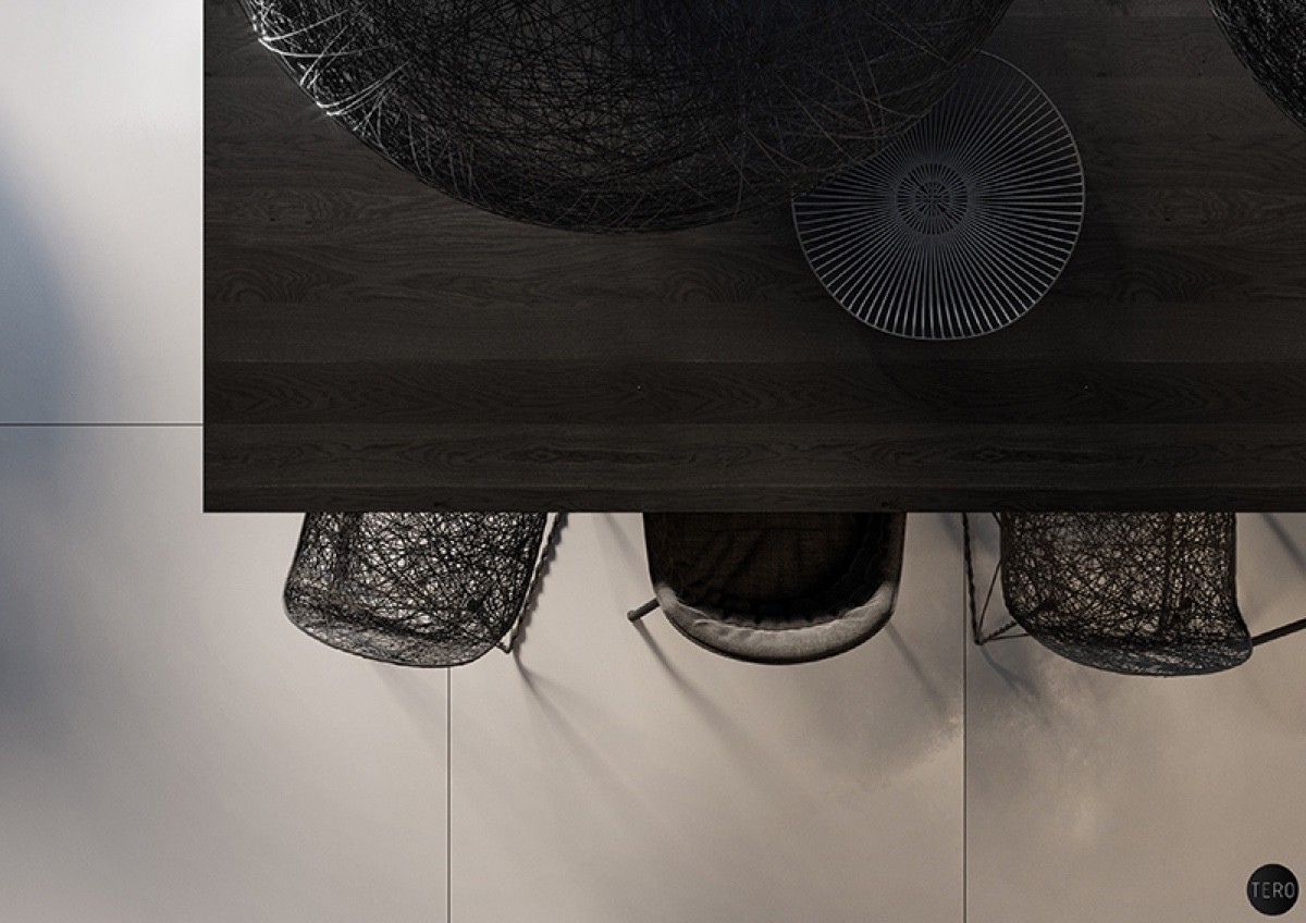
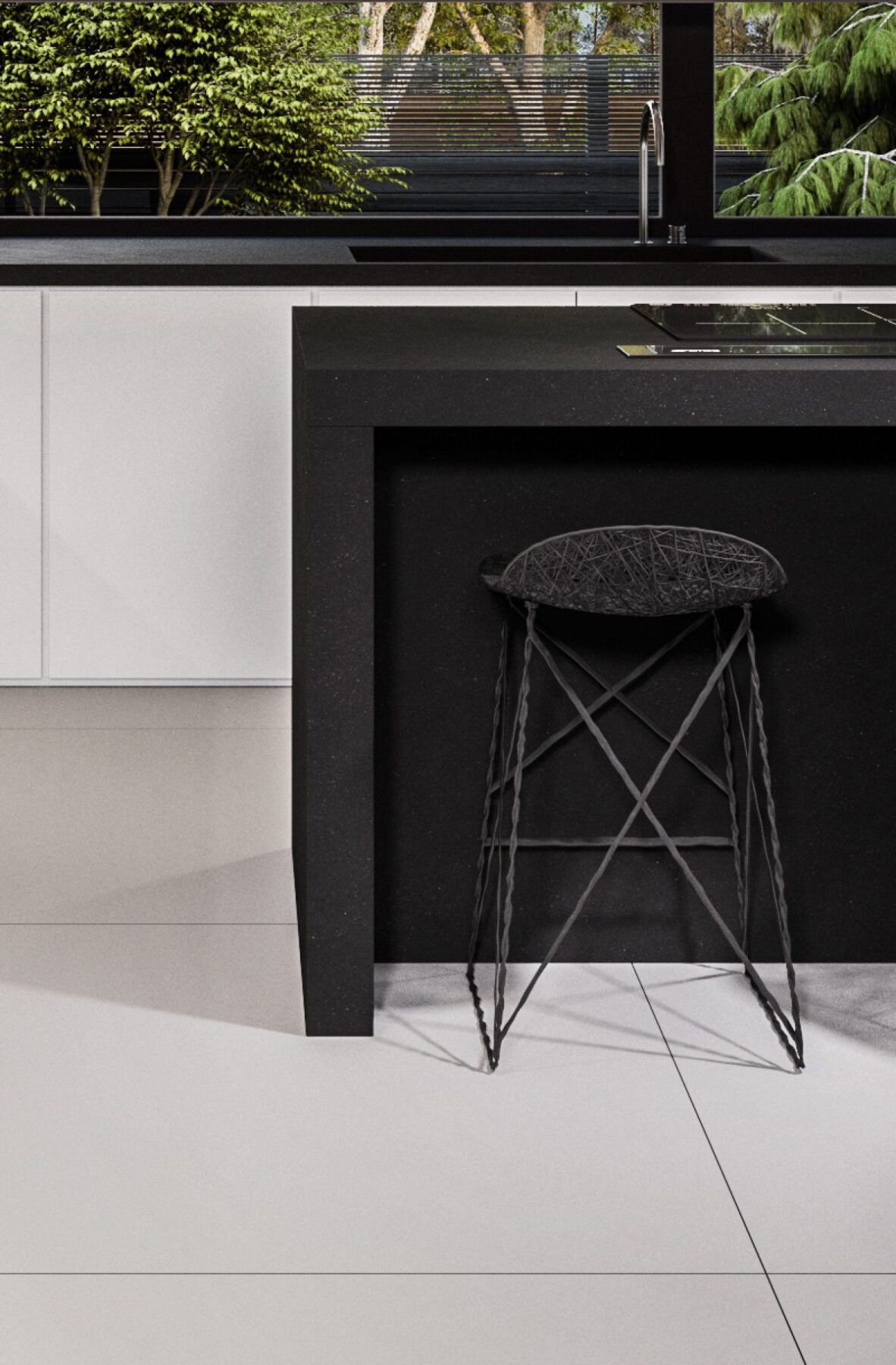
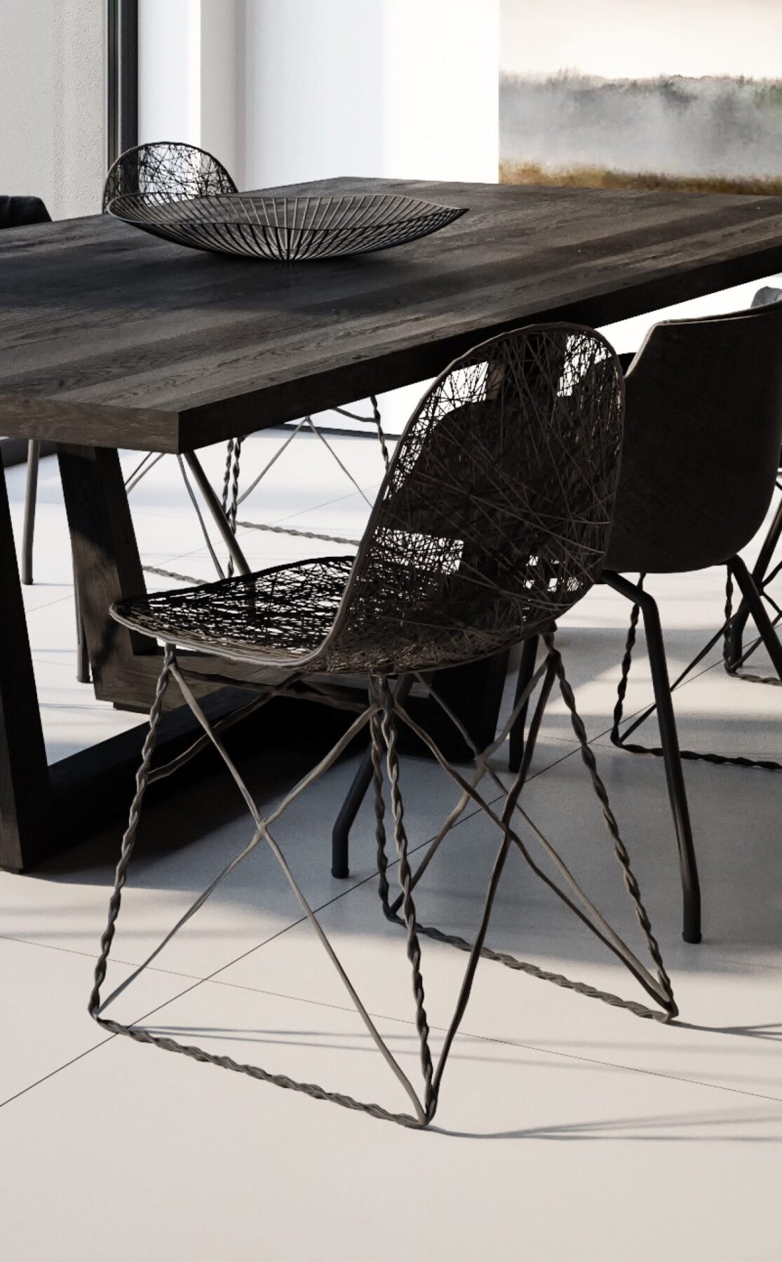
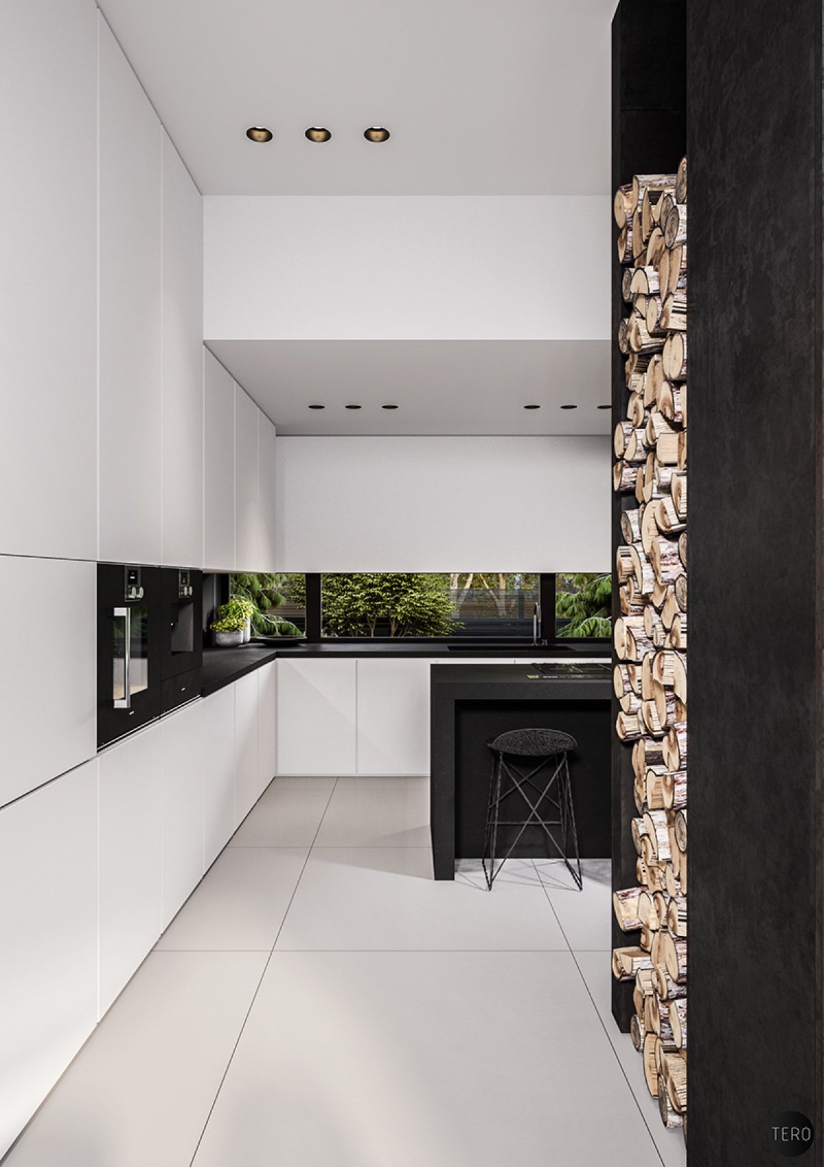
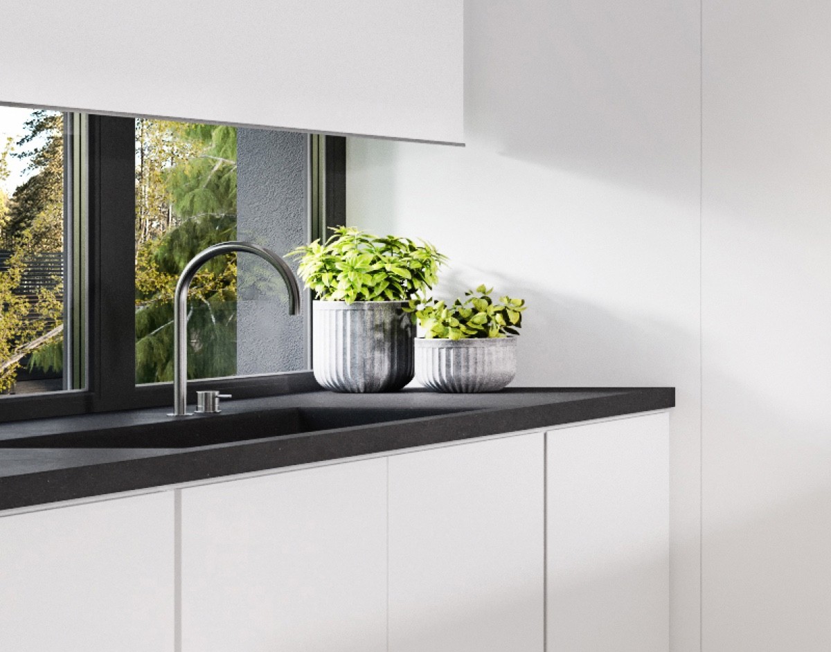
Details in the woven chairs reflect the orbs, an act of thoughtfulness, while a large-tiled floor adds textural contrast. Stacked wood and potted plants tie in the outdoor to the indoor, while the granite kitchen bench harks back to the texture of the outside pavement.
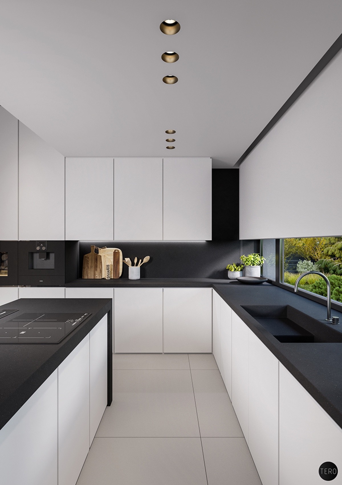
If you are considering a black and white kitchen theme, do check out our post: 40 Black And White Kitchens.
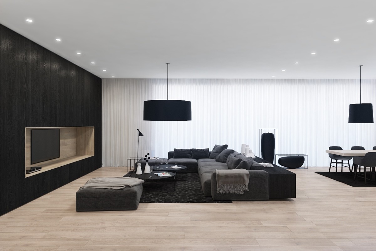
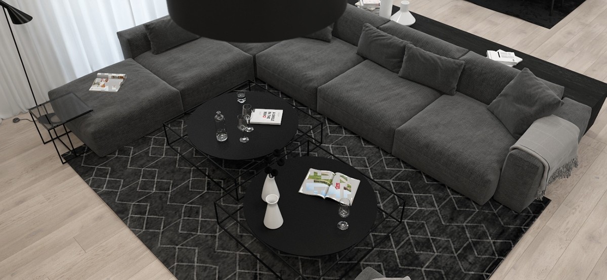
Bulgarian visualiser Velizar Dimitrov’s apartment mingles black, white, and complementary tones in single surfaces. The living room feature wall combines light wood and black, while the rug beneath carries a white and grey stencil pattern, mimicked in the design of the accompanying tables.
