Many people think of dark spaces when they hear the description “loft.” Well, these four duplex lofts are anything but dark! With massive windows and duplex floor plans, each of these homes is open and full of natural light. High ceilings, open kitchens, and staircases enclosed with glass, make these homes look bright and inviting. Another aspect to the design is the use of darker neutrals. Even though each of the spaces uses black or charcoal, they still look less “cold” because of the sunshine pouring through the floor-to-ceiling windows. Some go a step further and add green pillows and red love seats to add more life!
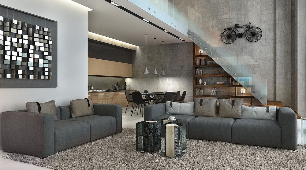
This duplex loft located in Moscow used to be a furniture factory! Two gray couches match perfectly with the art on the wall.
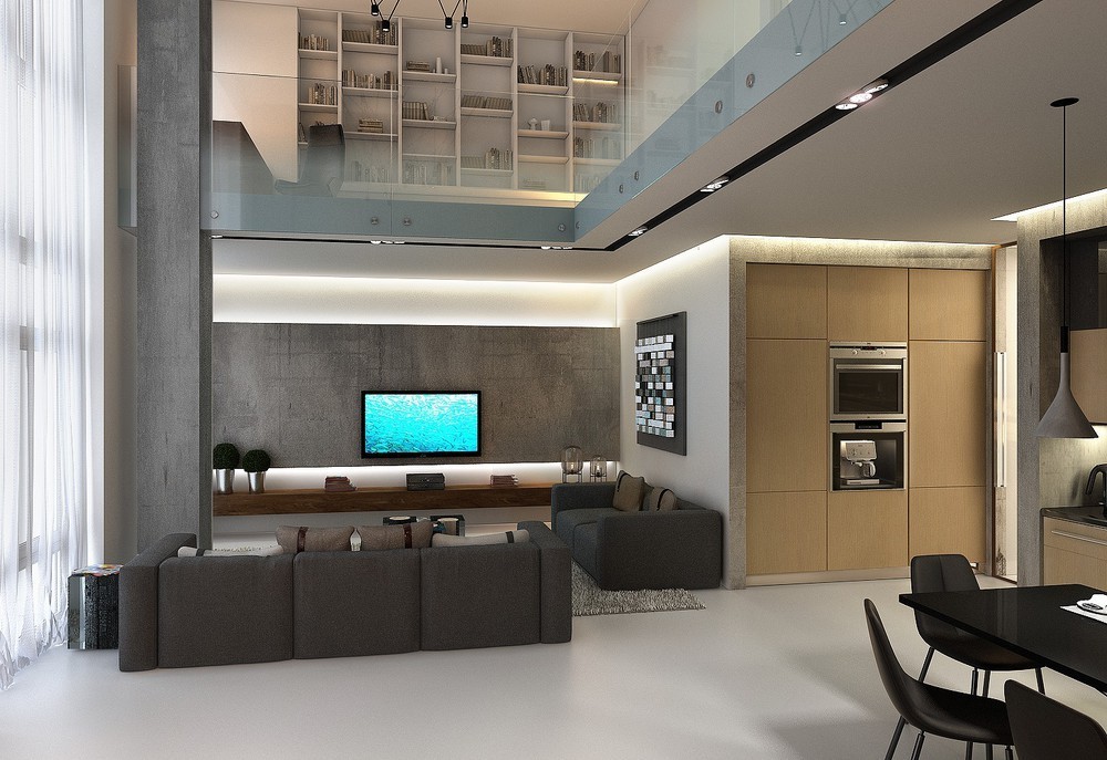
If you look upwards you'll notice there's a beautiful lofted space above the living room. Bookshelves are built in and books are artfully displayed. The glass used instead of a wooden rail makes the space feel larger.
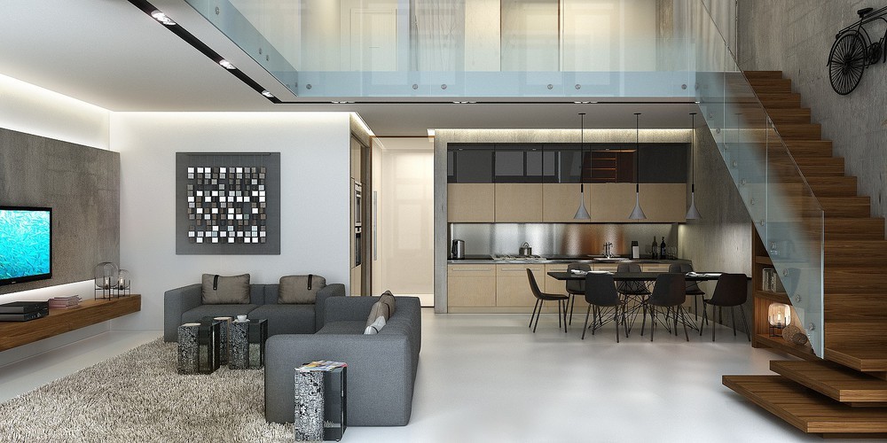
In this image, you can see the stunning dark wooden staircase. The black bike contrasts well with the concrete walls and the glass railing adds a modern aesthetic to the old furniture factory.
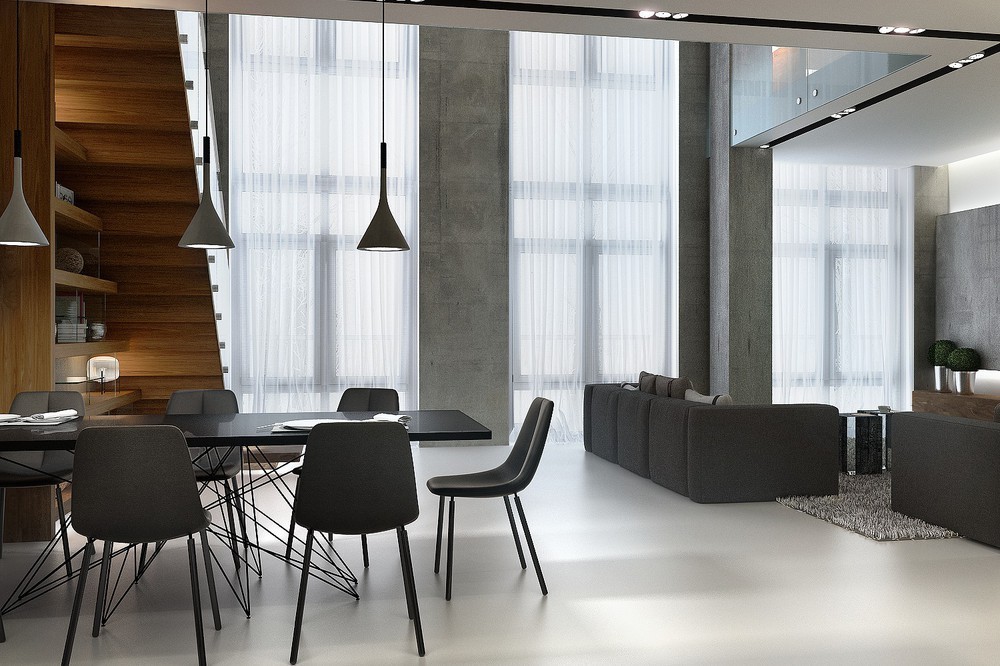
Large industrial windows are softened up and transformed into livable space with white drapes. This allows the light to come into the space diffused softly.
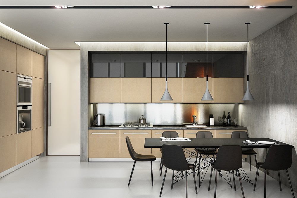
Each kitchen in these lofts is sleek and doesn't have a lot of hardware. If you look closely, you'll notice the appliances are built-in. The black kitchen table and chairs contrast well with the light wood cabinets.
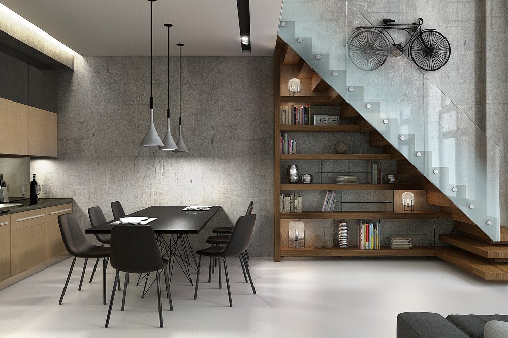
This picture captures the dramatic beauty of the glass railing on the wooden staircase. Underneath you can see that the space is used for storage. The bookshelf shortens in length as it rises up with the stairs. Some pops of color are used to warm up the dining room with accents on the bookcase.
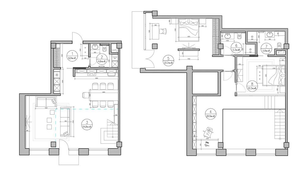
Curious how an old factory was turned into a home? This floor plan lets you get a feel for what the home looks like when you're walking around inside.
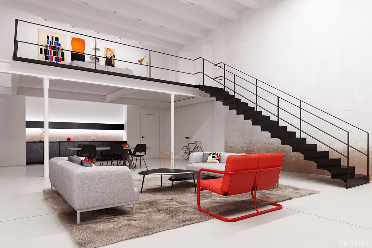
The red loveseat is the perfect addition to this room! It's energy changes the feel of the room and is picked up by other accents. You notice the red in the paintings, throw pillows, and even kitchen accessories.
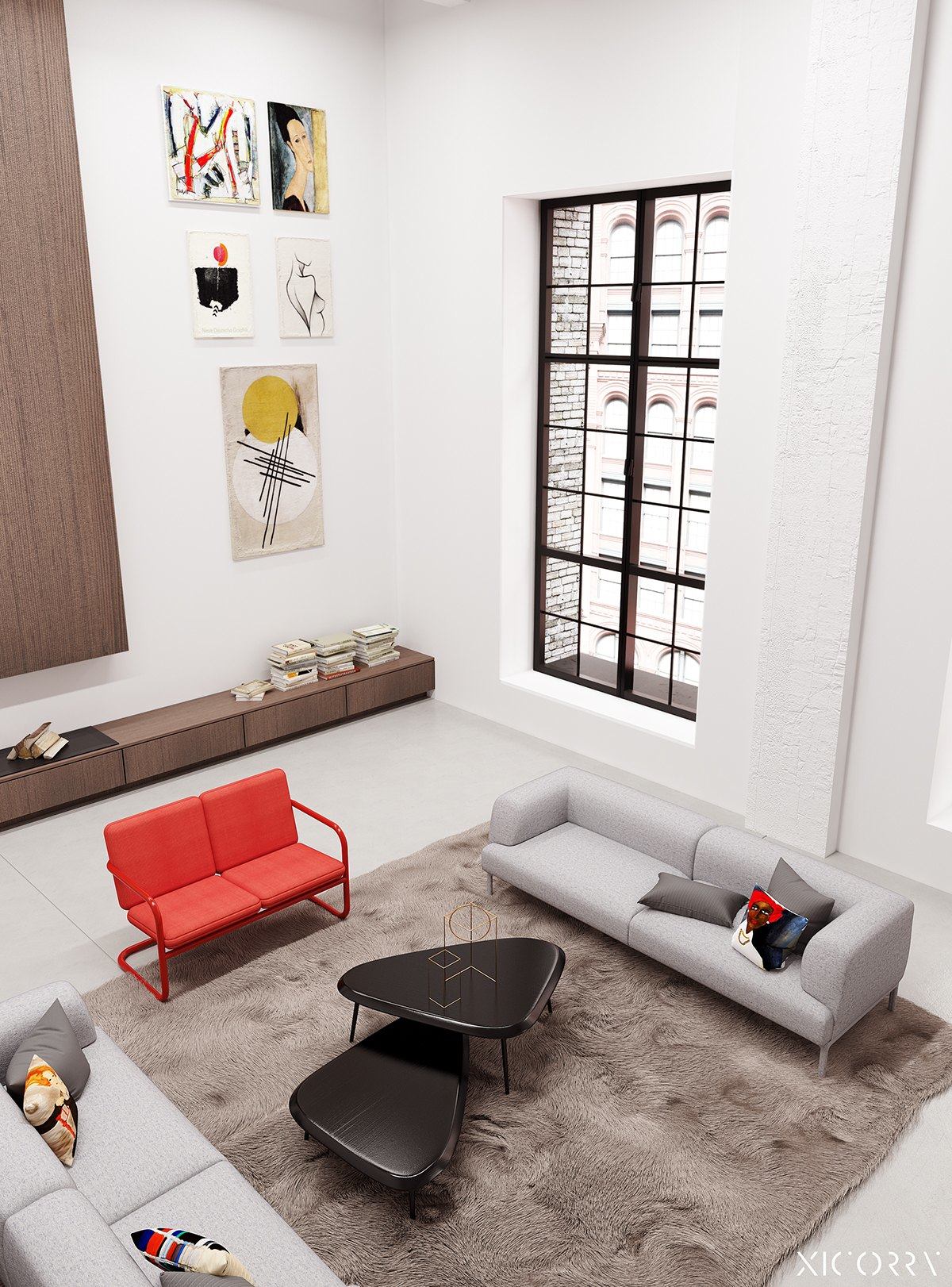
Lower-to-the-ground furniture pieces contrast well with the large black-framed window. Art is hung higher than the window and makes the space seem even larger!
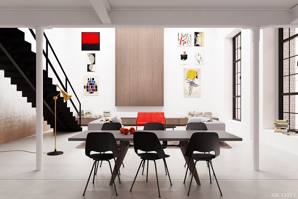
A black staircase, dining chairs, and window frames all work in this bright white space. If the space was any other color, these colored items may look too heavy. The whiteness of the room is anchored by the darker pieces.
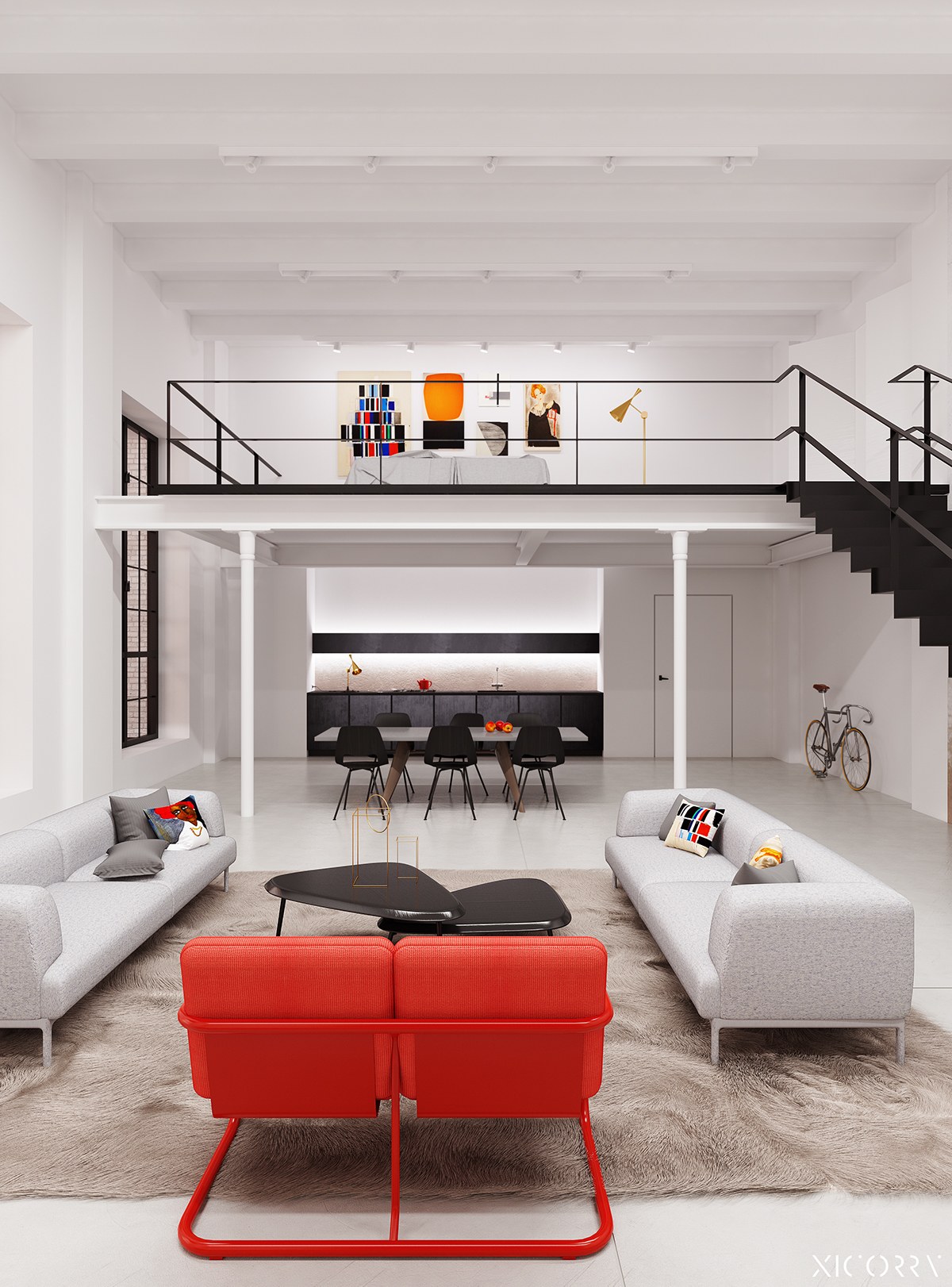
The use of symmetry in this duplex loft brings attention to the few anomalies in the room. The couches on either side of the red love seat mimic one another and the black chairs in the kitchen look symmetrical. This makes the black staircase and red love seat stand out.
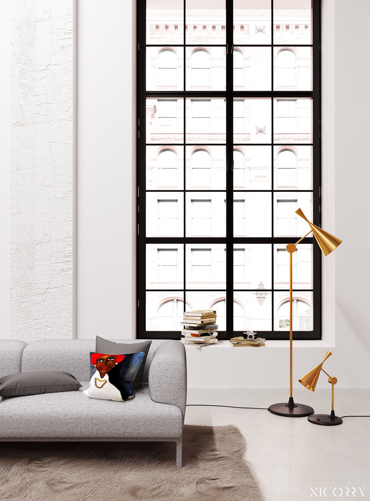
An oversized window makes for a fun place to sit and watch the world go by. A stack of books and a few lamps encourage lounging and making the most of this space.
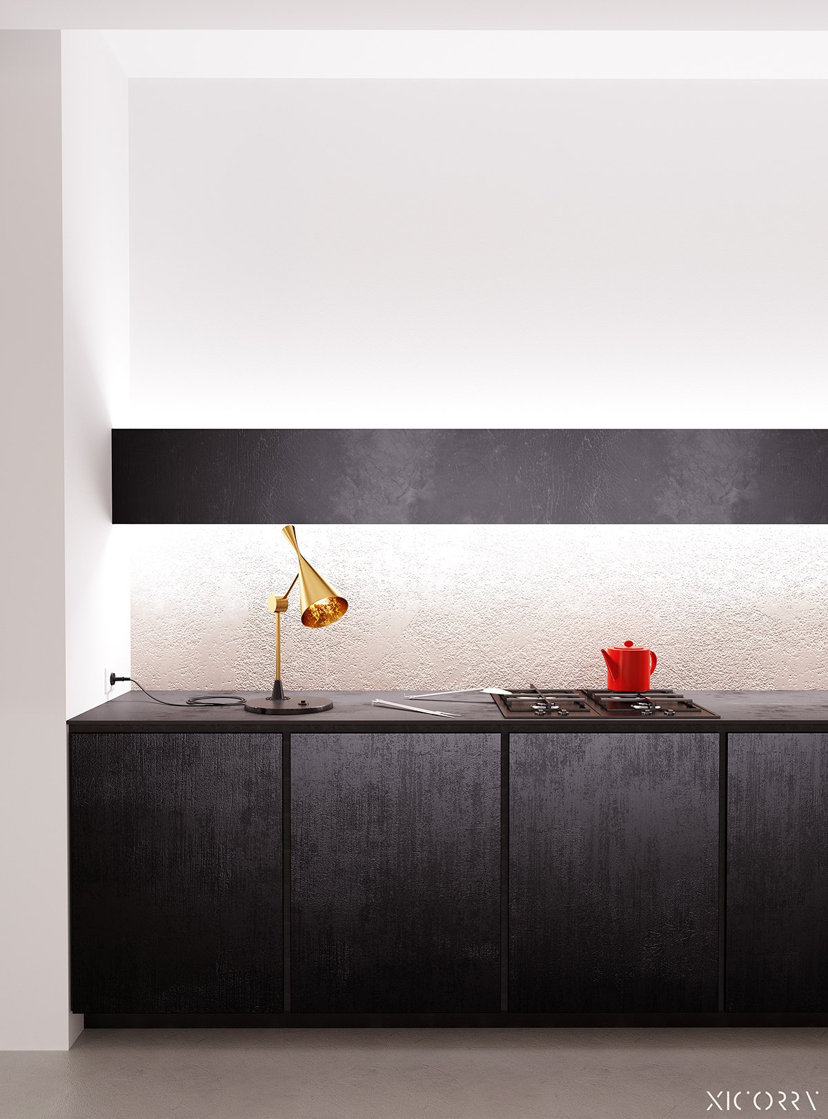
Even though the kitchen is chic and streamlined, the two accents work with the rest of the loft. The gold lamp matches the others used by the window and the red tea kettle matches the red love seat.
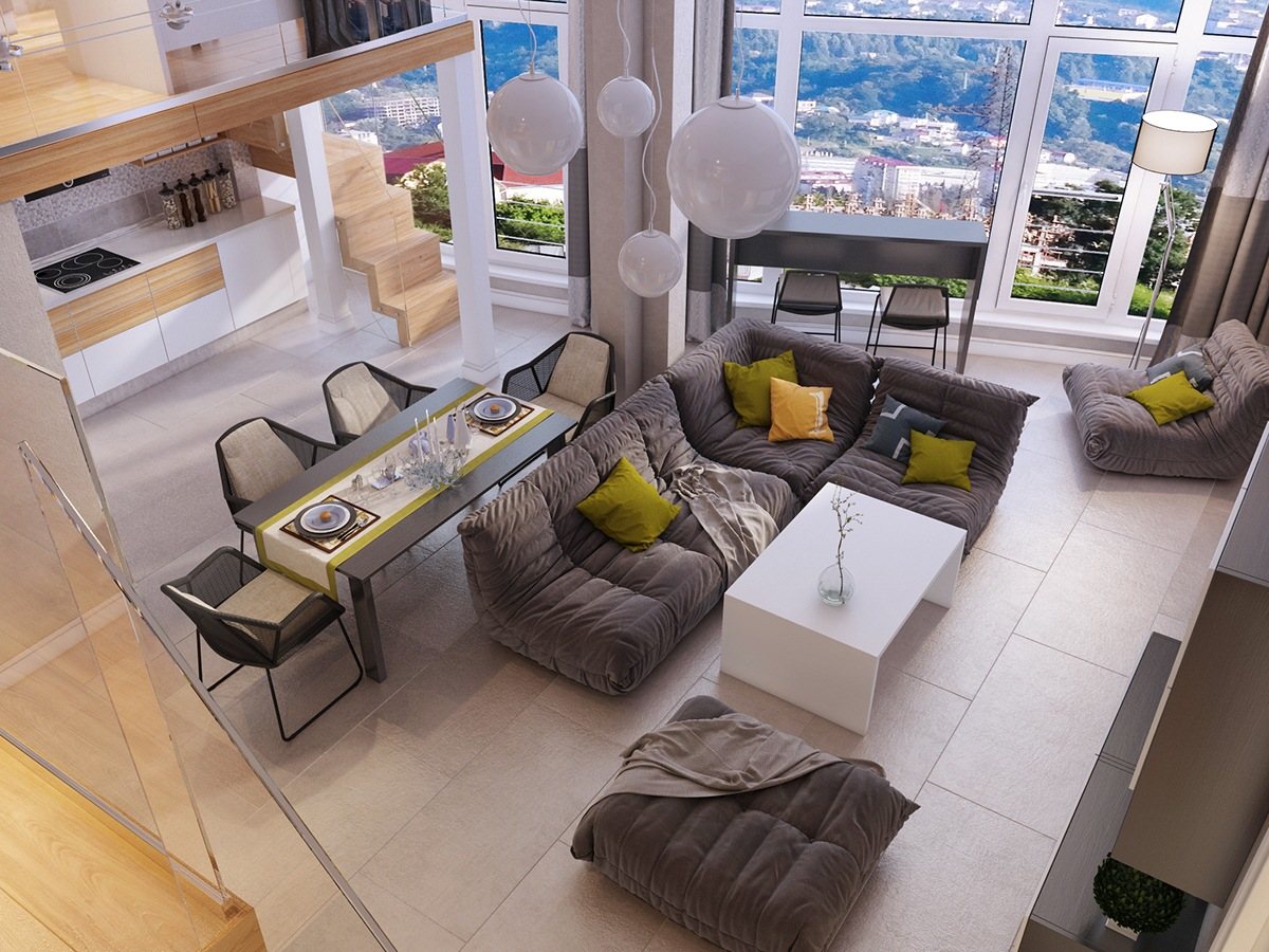
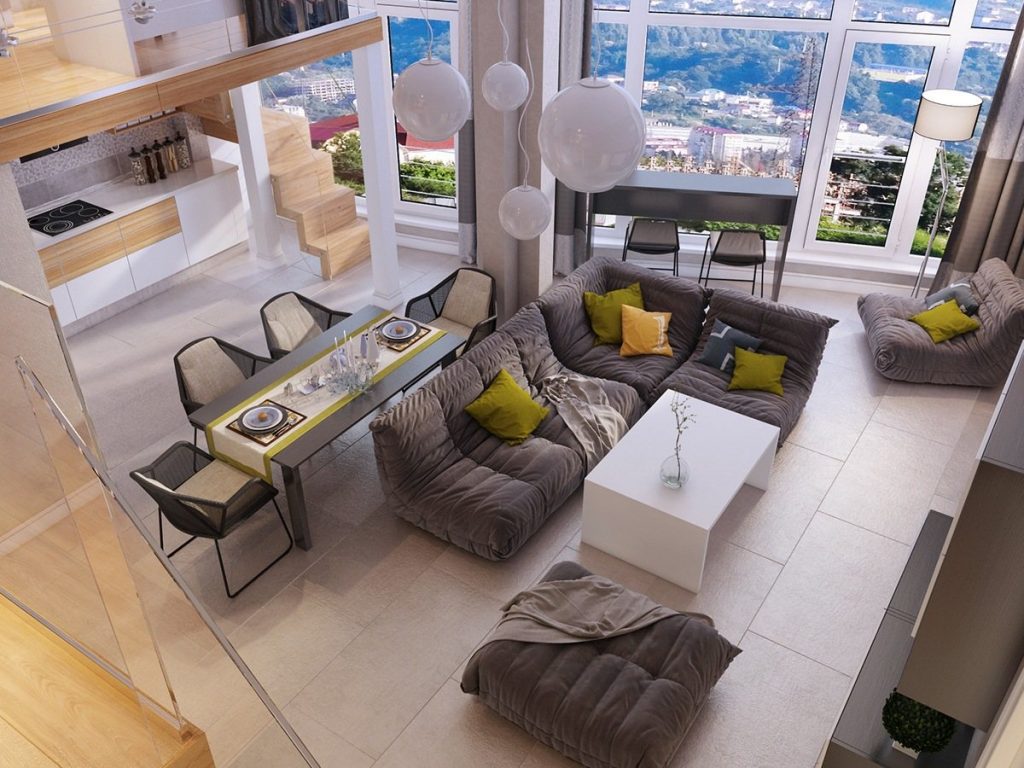
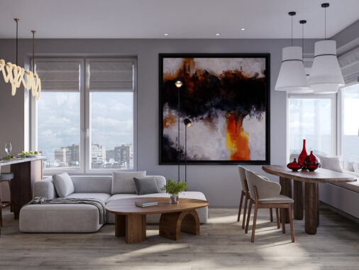
Looking down on this gray and white loft you can see that there is a lot going on in this open floor plan. A dining table and chairs buts up against a floating couch. There is more seating facing the large white framed windows and you can see a glimpse of the kitchen in the back.
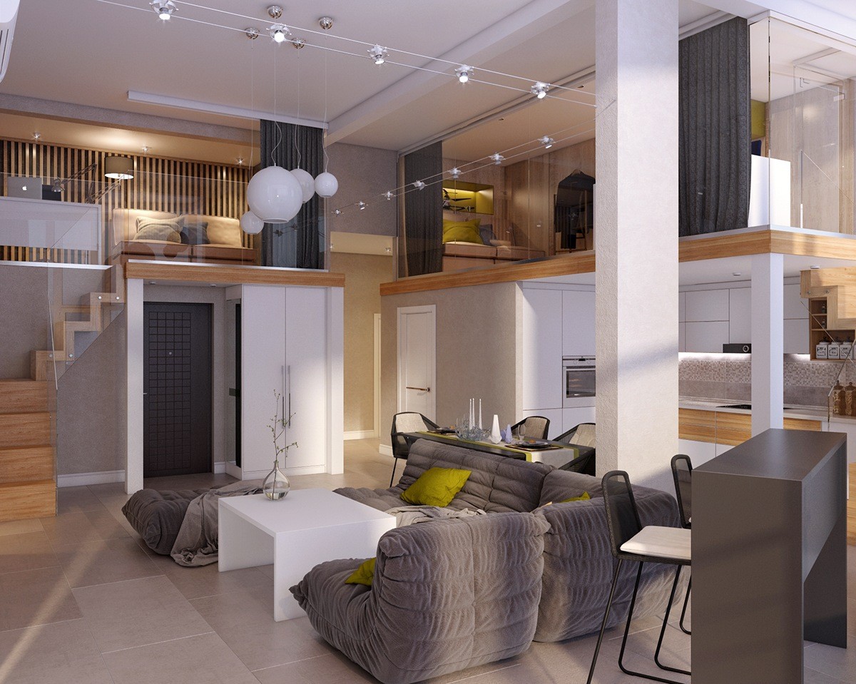
In this new angled image, you can tell that the living space has a lofted upstairs. There is room for a bedroom and an in-home office. The use of glass walls makes the home look open and architecturally stylish.
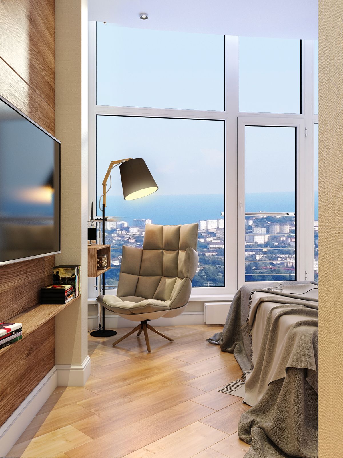
This bedroom makes the most of its large windows. The angled wood flooring leads the eyes straight to the back of the room where the wall is filled with windows. A chair is placed in front of the windows with a lamp for reading.
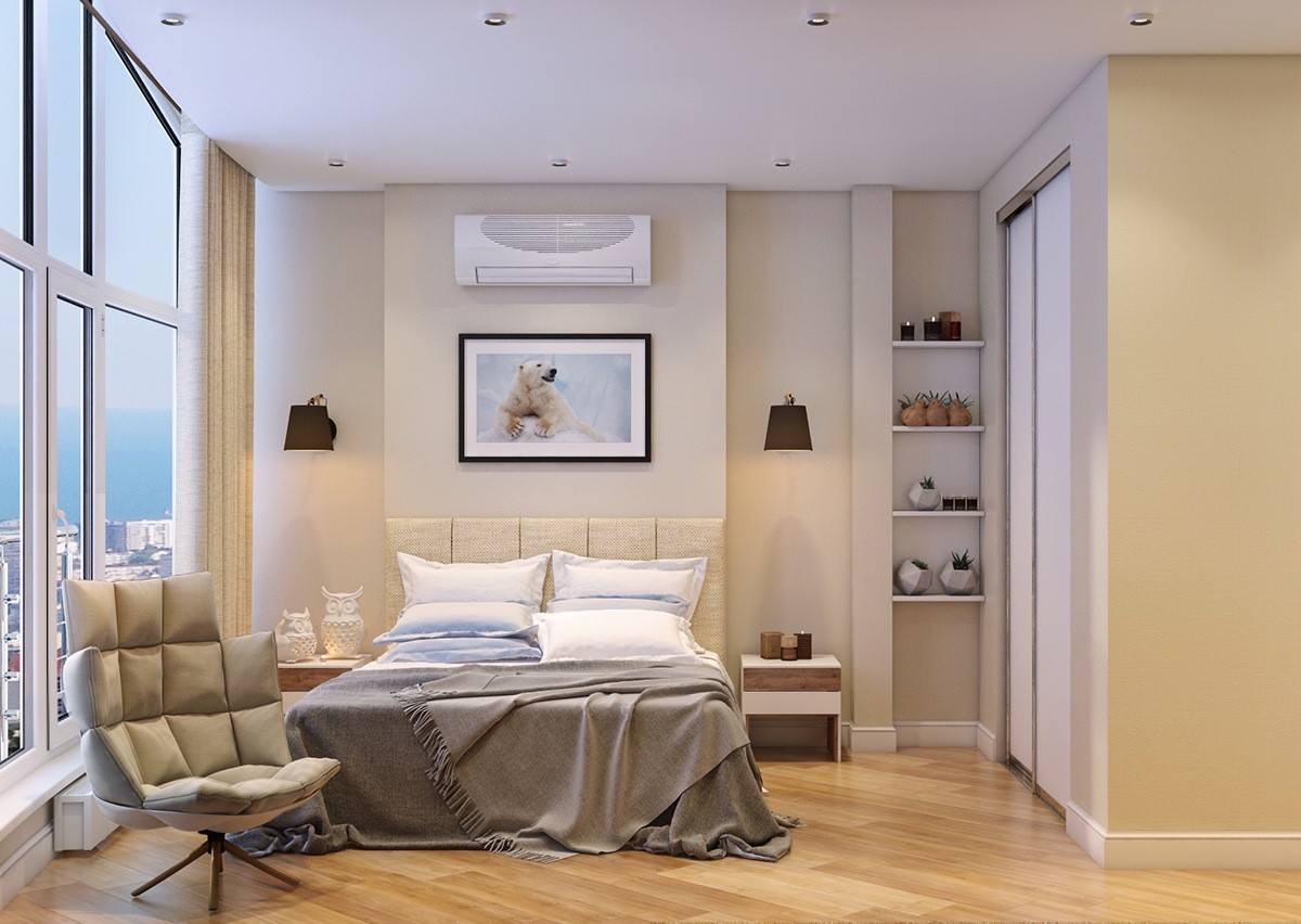
This tan bedroom is kept neutral to draw the attention to the large windows and view. A simple piece of framed art is hung above the bed and there are built-in bookshelves to hold items on the right.
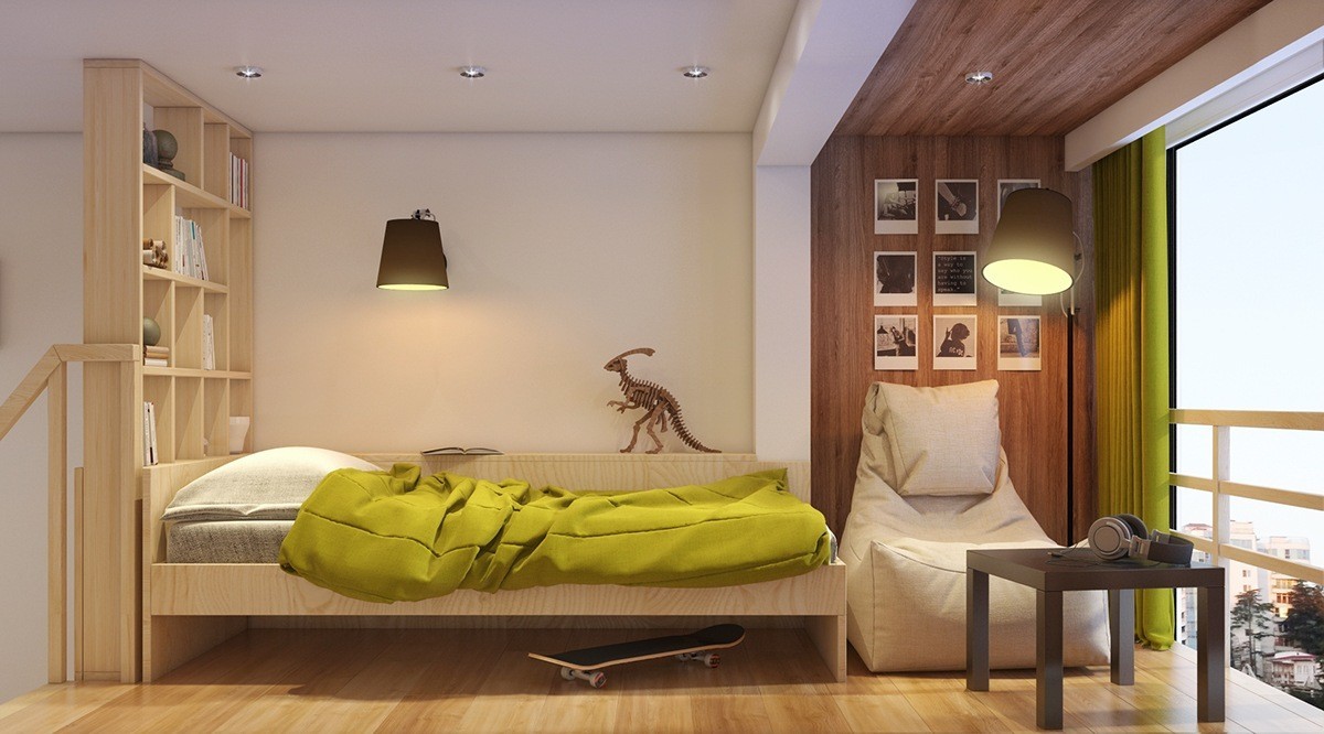
This space could be for an adult or a teen. The floor-to-ceiling bookshelf separates the space from the rest of the home and the dinosaur statue gives the room a sense of adventure. The view doesn't hurt either!
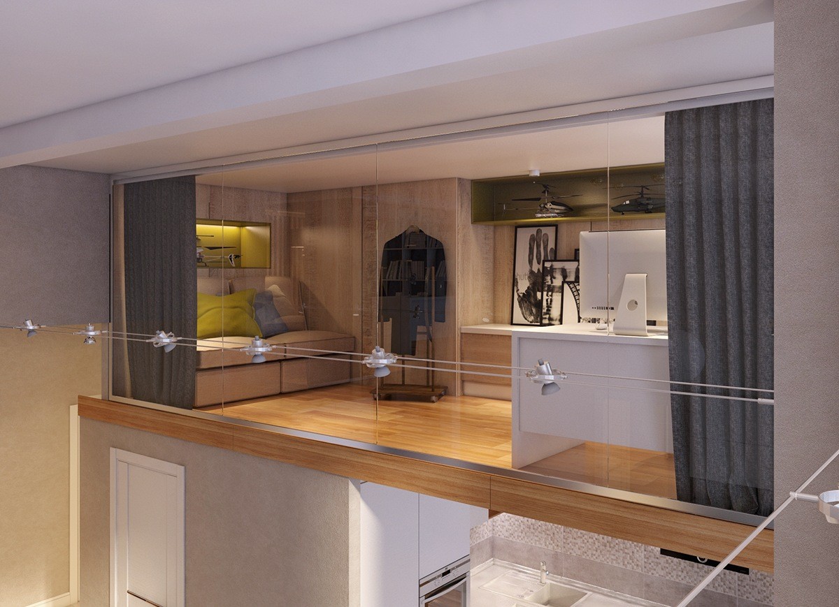
This home office has a great view of the windows downstairs, even though it's elevated on the second floor. Large glass walls open up the space but also give the owner the ability to pull the drapes for privacy.
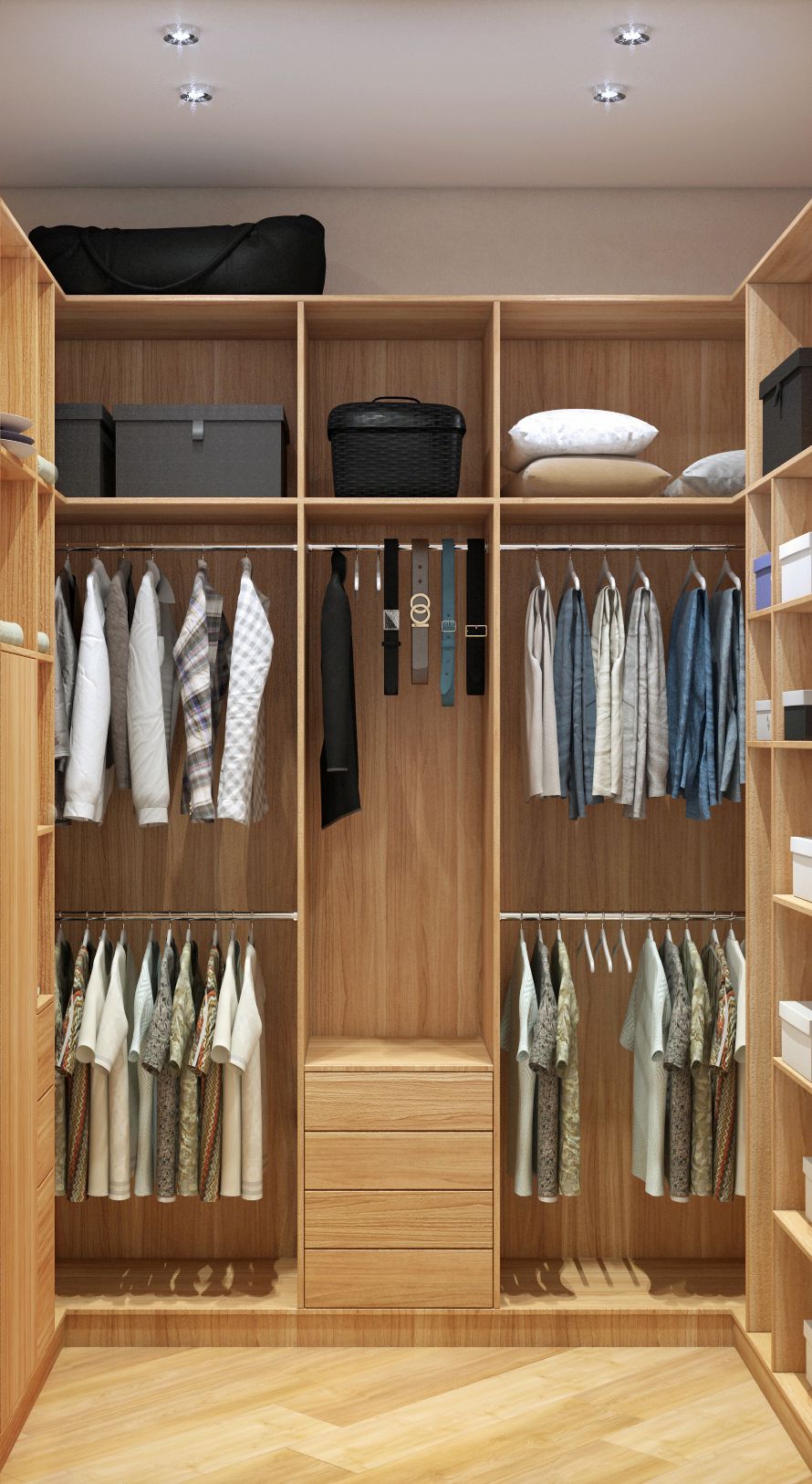
The angled wood floors continue into the curated walk-in closet. This closet has a space for everything and is perfect for those who like to see all of their clothing options in one place.
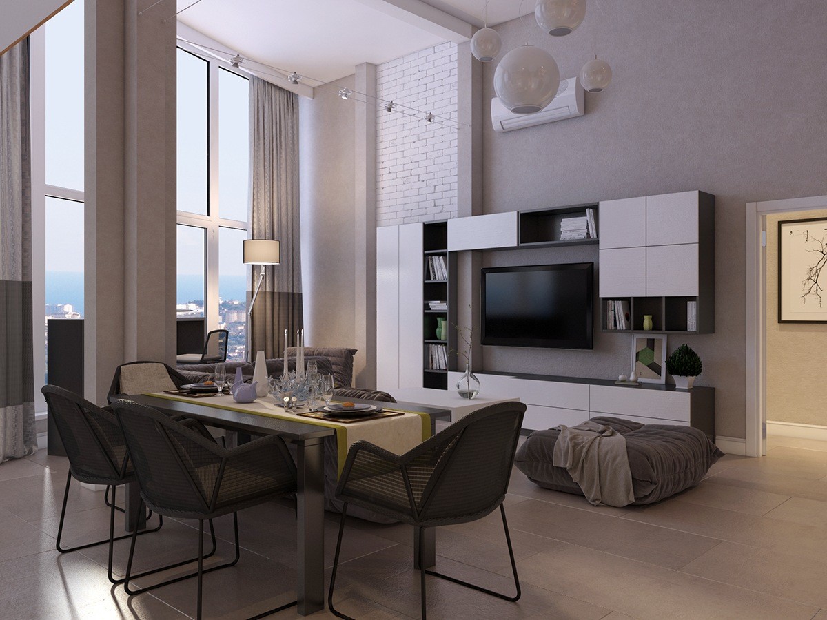
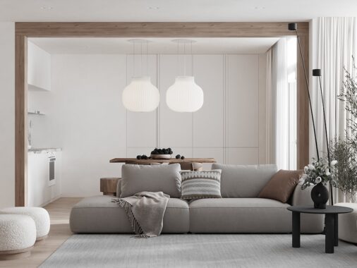
Yet another angle of the downstairs highlights the entertainment center. A flatscreen TV is mounted in the center of storage blocks. White lanterns hung in the center of the living room match the white framing of the large windows.
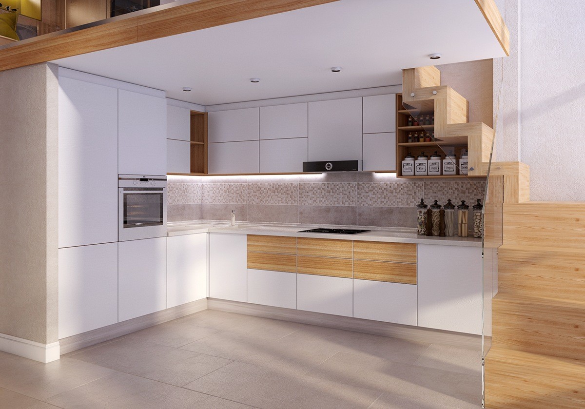
Sleek and simple, this kitchen works with the rest of the space perfectly. There is no hardware and the appliances are built-in. The staircase is worked into the architectural design and shelving is placed between the steps.
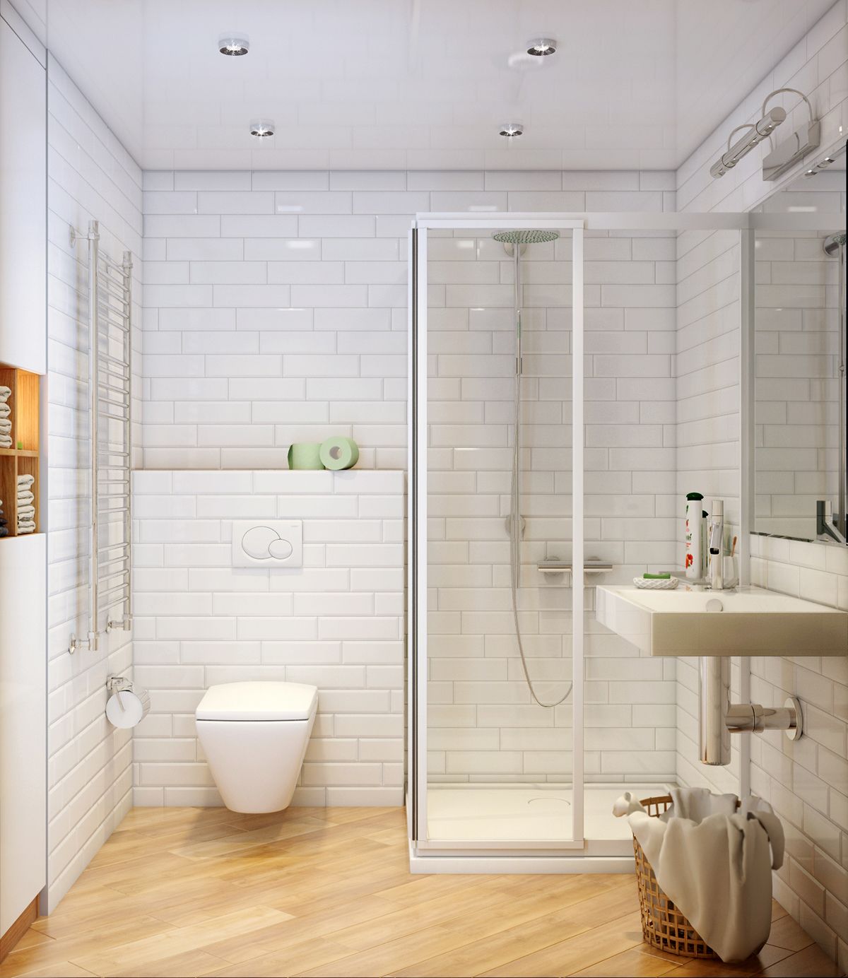
White subway tile lengthens this understated bathroom. With lack of storage space, a basket is placed to catch dirty towels and clothing.
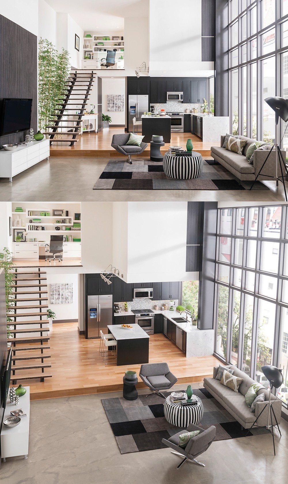
This last space makes the most of its large windows. A platform elevates the kitchen and dining space and adds more tiers to the room. Upstairs you can see there is a home office with built-in shelving. The windows are the highlight and the natural light is expanded by the whiteness of the walls.
