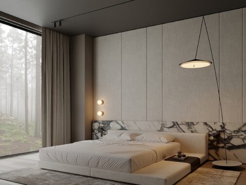
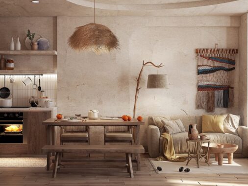
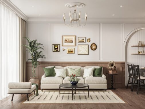
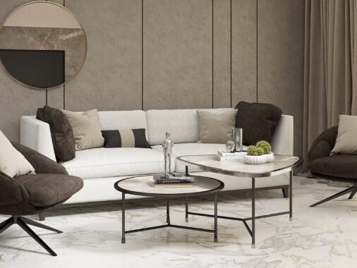
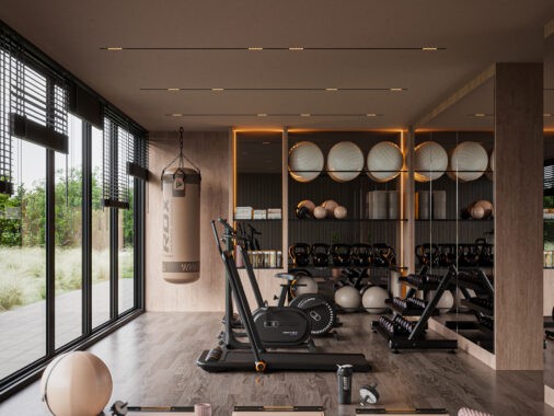
When you think of neutrals in an interior design context, which colors do you imagine? Beige and wood typically make a lovely duo, as do white and grey – but the homes in this post break up these archetypal pairings by demonstrating the beauty of wood cladding and grey together. If you're looking for a neutral color combination that takes some risks but doesn't feel over-the-top, these homes provide a nice baseline to consider. Wood elements and grey-based palettes definitely offer a flexible base to start with, allowing endless experimentation opportunities for those who want to introduce a third or even fourth accent color.
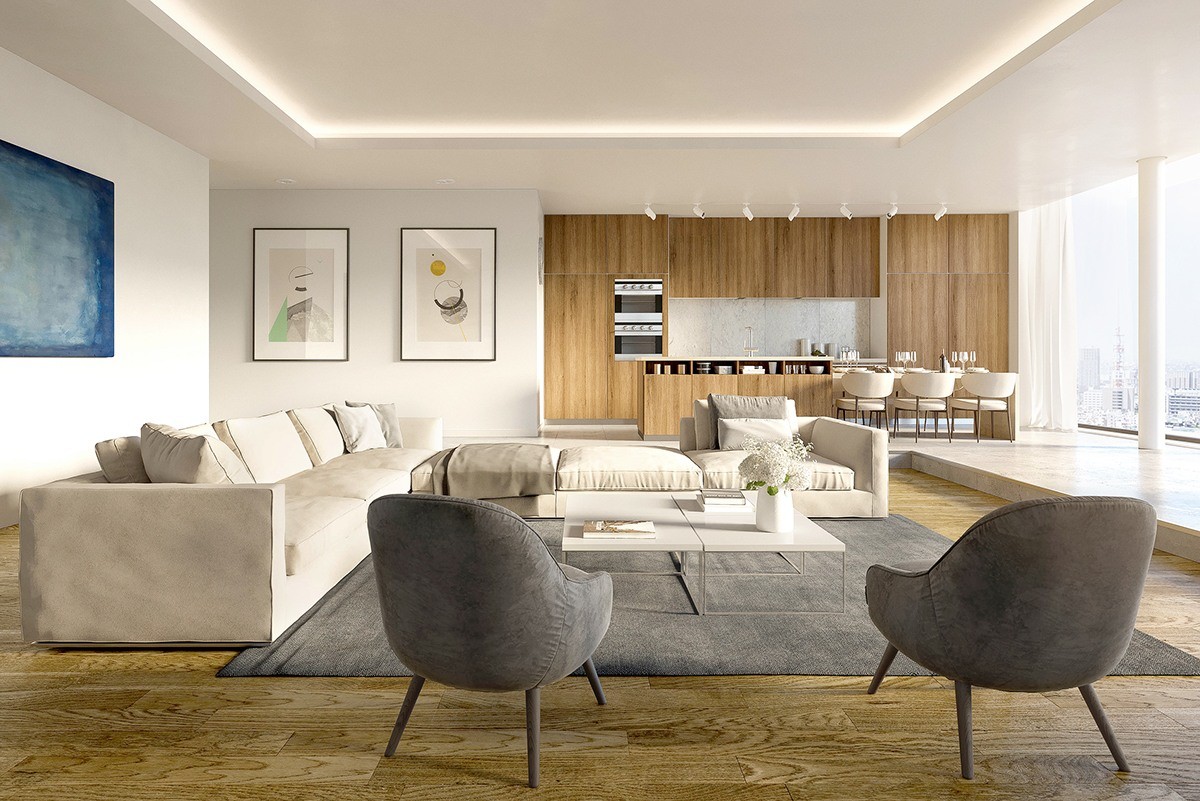
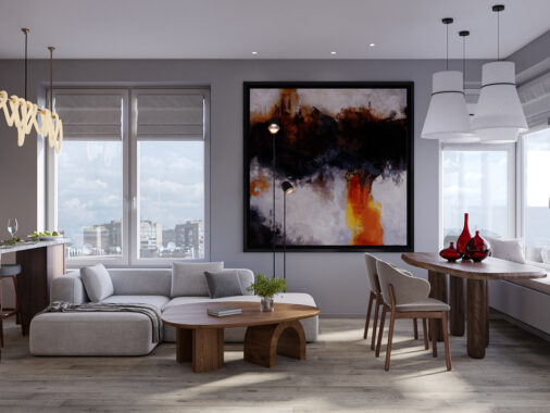
Warm yellow toned wood, neutral grey furniture, and colorful artwork set the stage for this beautifully adaptable style. Its wide-open layout works well to accommodate the range of organic shades used throughout.
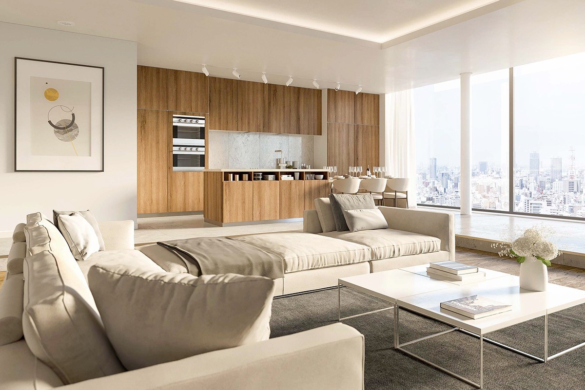
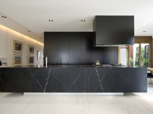
Although all of the walls are white, the kitchen cabinetry still exerts tremendous influence over the rest of the interior.
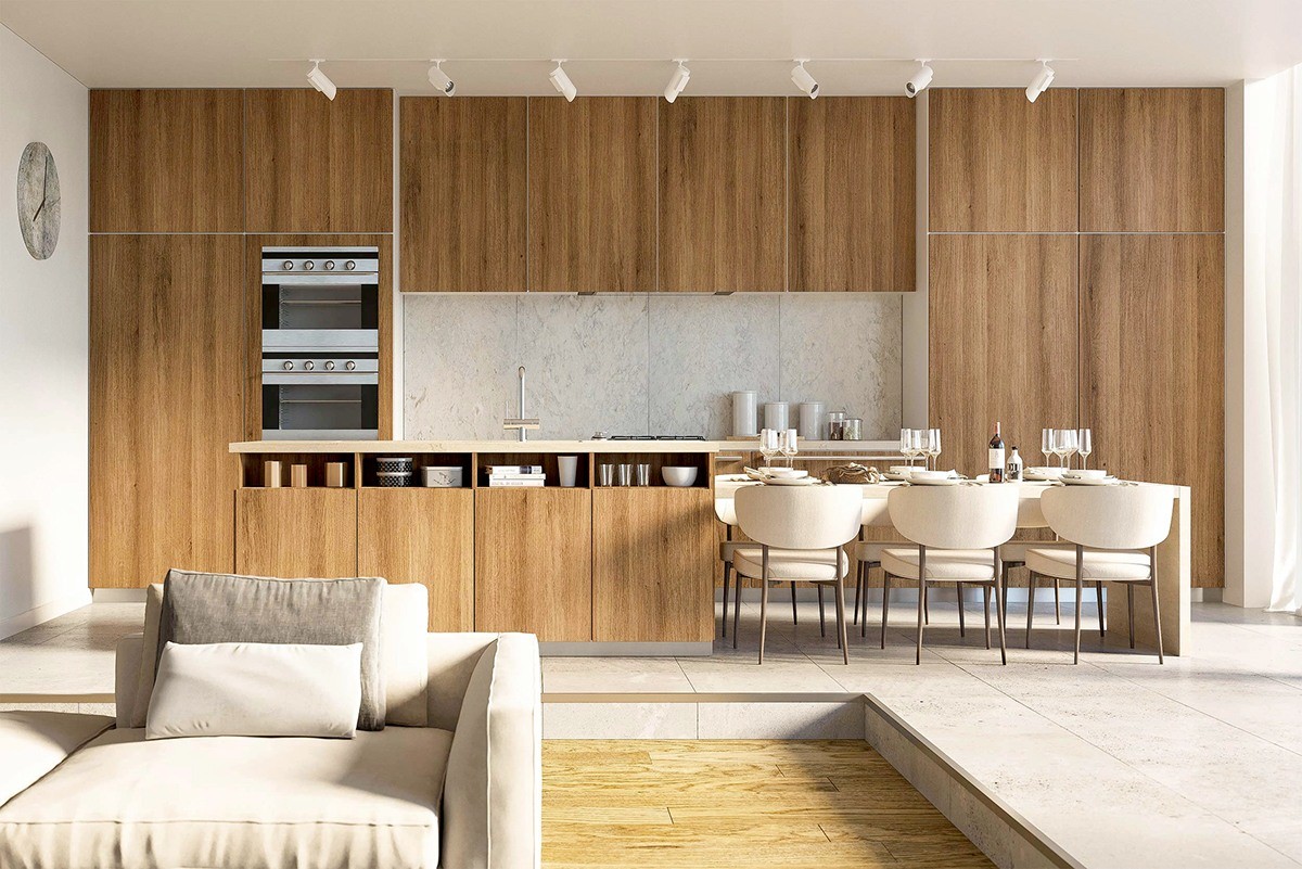
But check out this immense amount of storage – all of the kitchen, except for the backsplash, is framed with storage space. Even the island has open shelves and closed cabinetry.
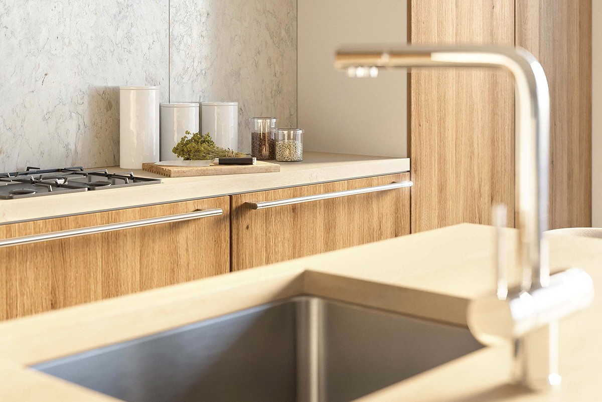
In terms of material, marble and wood are always an interesting combination. It's the clash between luxury and humility – always a fascinating juxtaposition.
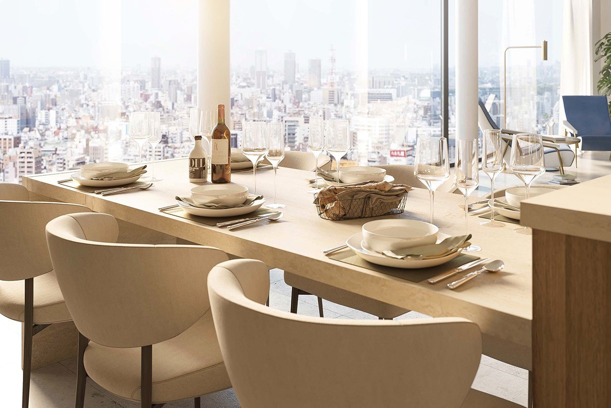
Imagine dining before such an incredible view! The table arrangement keeps things simple, emphasizing the world outside.
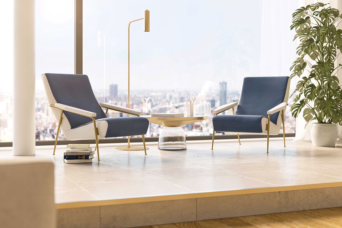
Brass, white, and blue – this nautical combination can look extremely luxurious in the right context. This breathtaking social area ensures every guest will leave with fantastic memories.
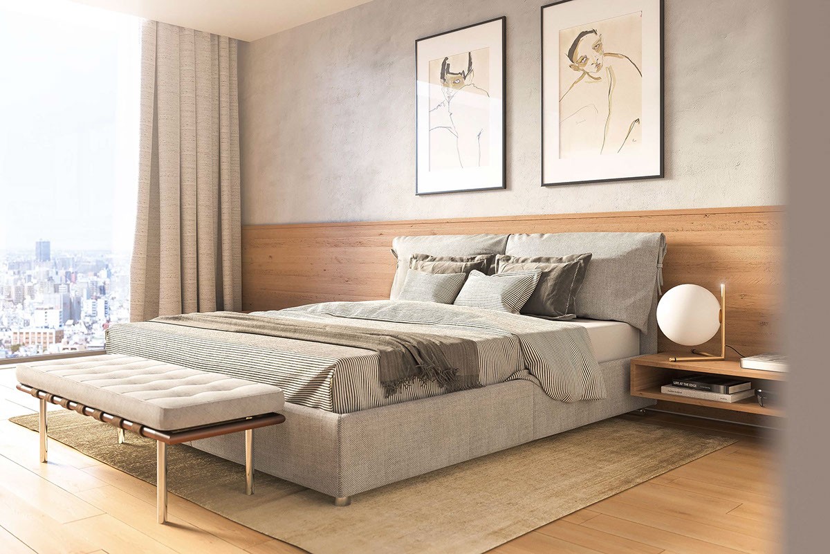
Neutral pinstripes and warm colors contribute to the sense of rich texture that makes this bedroom special. Loose artwork draws the eye toward the grey concrete accent wall.
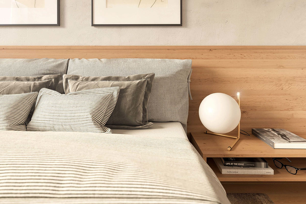
This designer table lamp is from the IC Collection by Michael Anastassiades.
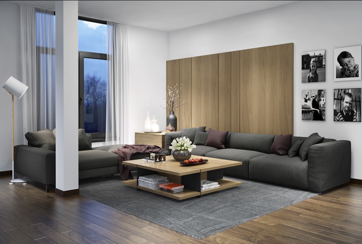
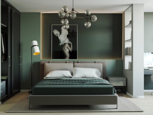
Dark and moody, this interior uses a deep grey to de-emphasize the furniture in context of the gorgeous interior material theme. The deep plum accents are an interesting touch – a subtle nod to the natural colors that draw the eye throughout the home.
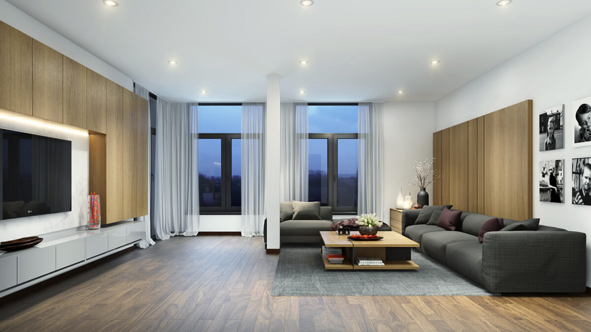
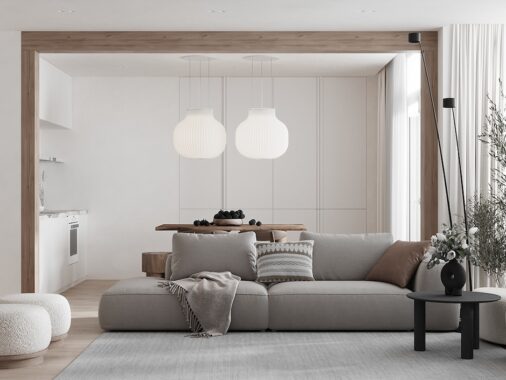
The living room is otherwise minimal. Can you imagine decorating around that central beam? This arrangement doesn't fully avoid it, but the aesthetic effect is dramatic.
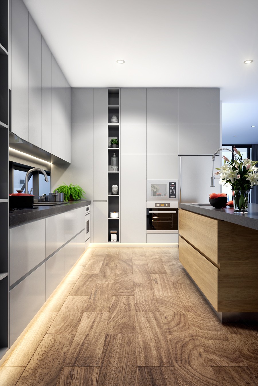
On the other hand, the kitchen is beautifully utilitarian. Work surfaces progress logically, leaving plenty of workspace free for invention.
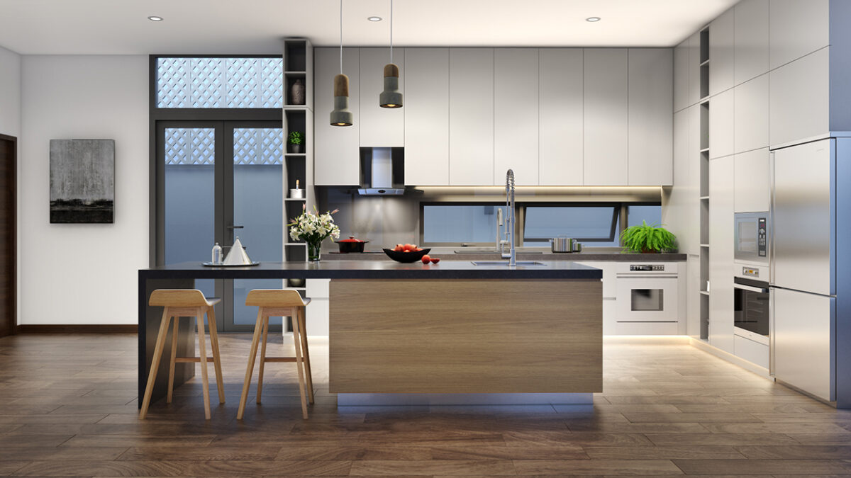
Wood floors, white cabinetry, stainless steel, and concrete pendants embrace the full spectrum of industrial materials adapted for modern interior design.
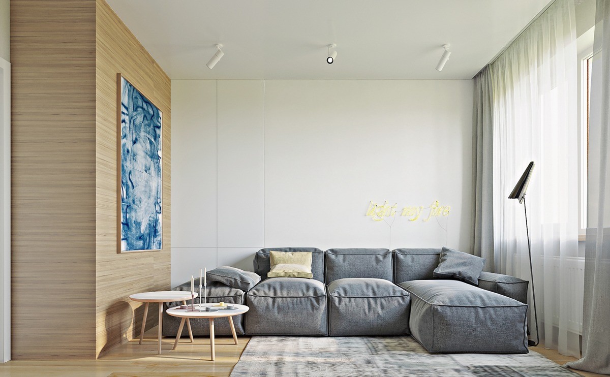
So simple and comfortable! This interior centers on an overstuffed grey sofa that sits low to the floor, warmed by an area rug and surrounded by rich wood grain. All of the furniture sits low with the exception of the blue painting to the left – a sure and effective focal point.
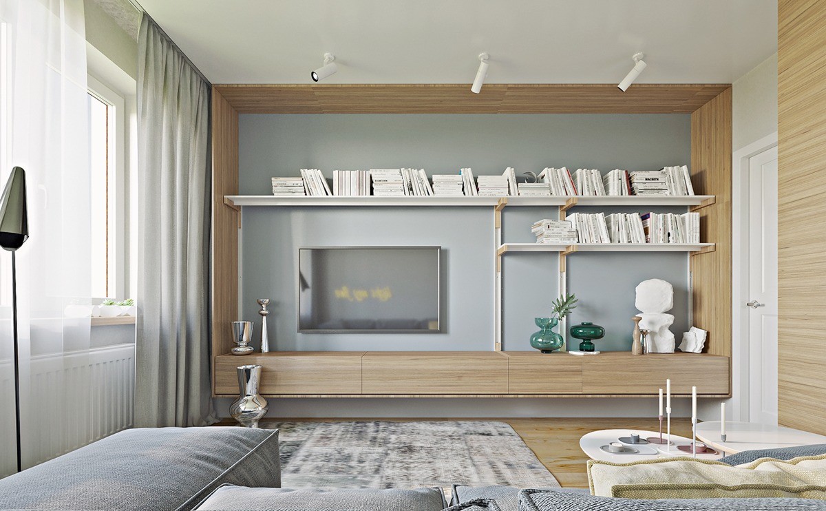
Even the media wall continues the grey and wood theme. Unique storage supports introduce a touch of industrial influence.
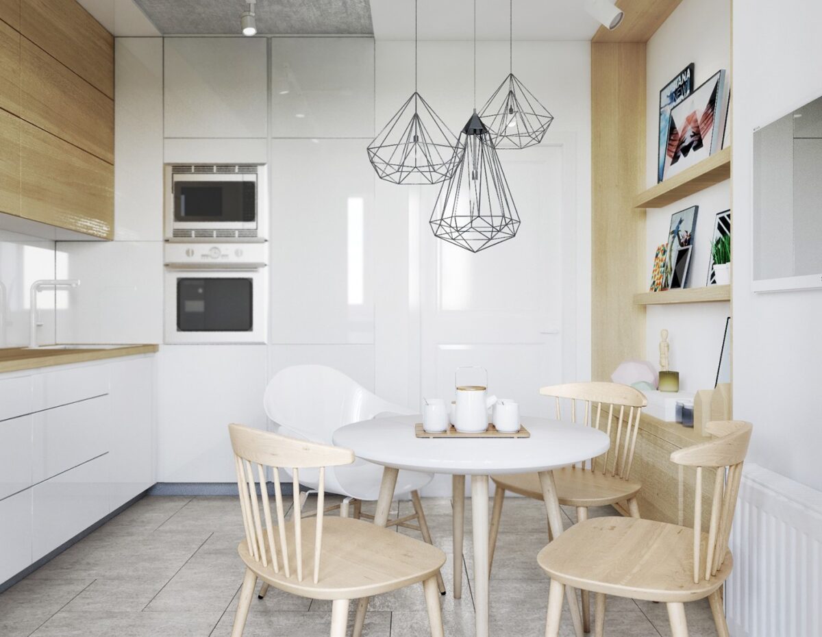
The kitchen looks effortless: bright and airy. The only grey accent in this area is the tiled floor, while the work surfaces and walls remain white for easy clean-up.
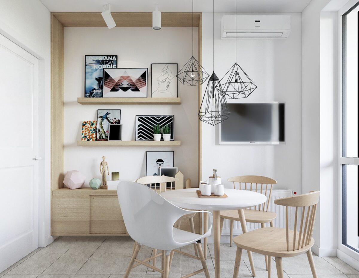
Graphic prints, geometric decor, and simple furniture are all this dining room needs to make an incredible impression.
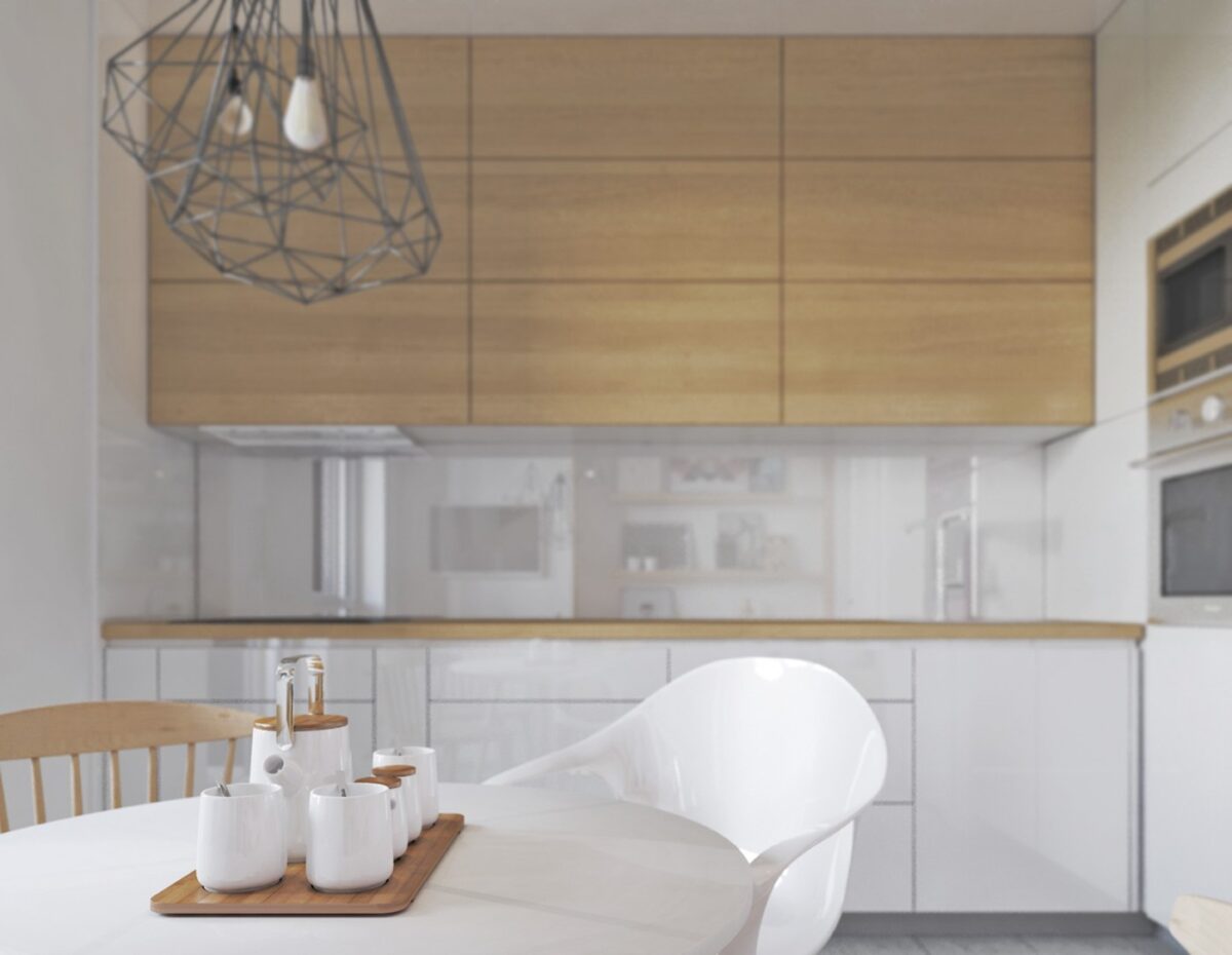
White and wood tea service completes the theme. It's hard not to love a perfectly coordinated kitchen.
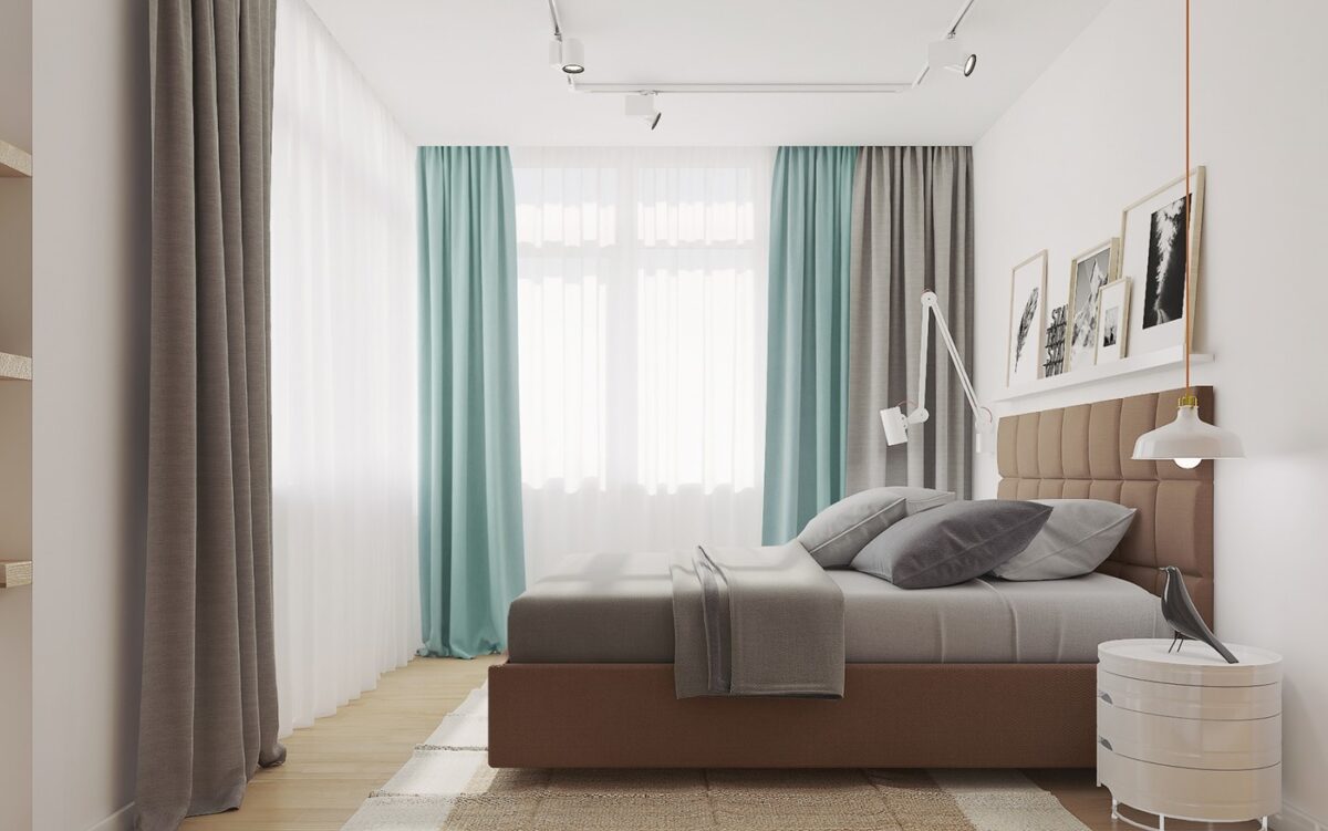
Light blue offers a comfortable counterbalance to the warm tones. Creative curtain arrangements are an oft-overlooked way to introduce color blocking to an interior.
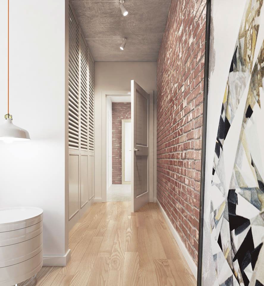
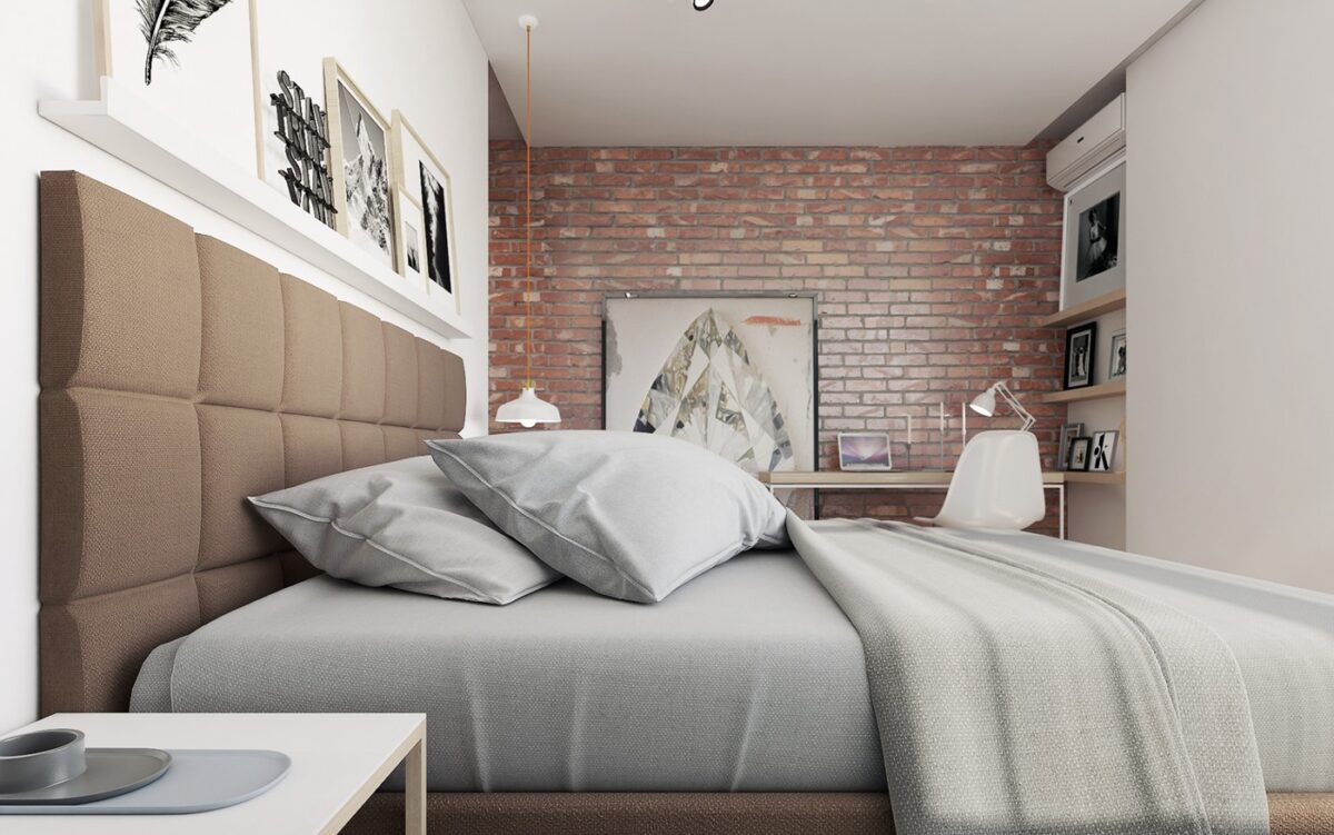
Red lamp cord echoes the exposed brick that leads down the hallway. Extra storage ensures the bedroom remains neat and tidy in every circumstance.
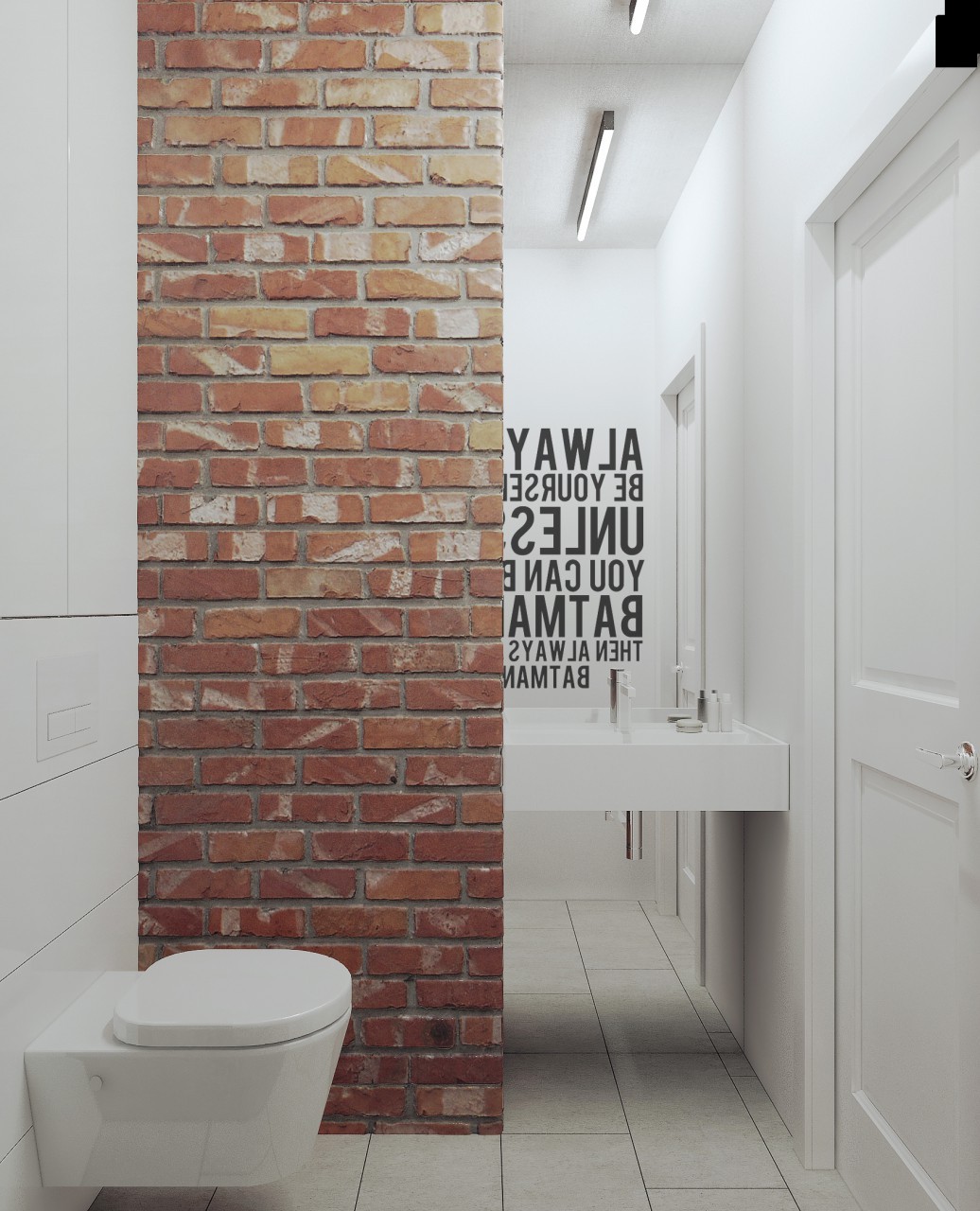
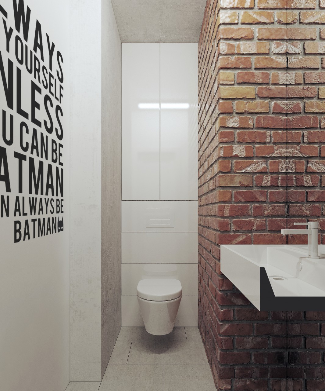
Brick again becomes a major focal point in this clean and minimalistic bathroom. Typography offers the only other overt source of decoration.
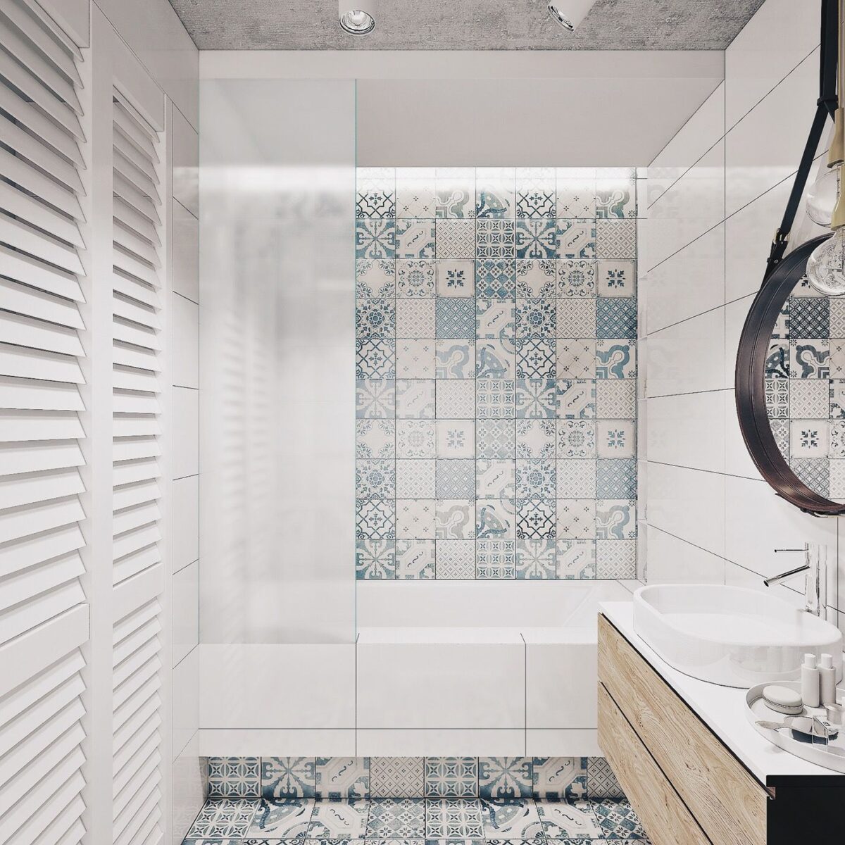
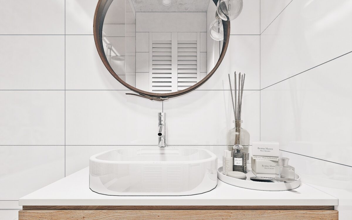
In this bathroom, eclectic blue tiles energize the space. Varied patterns make the limited color scheme feel endless.
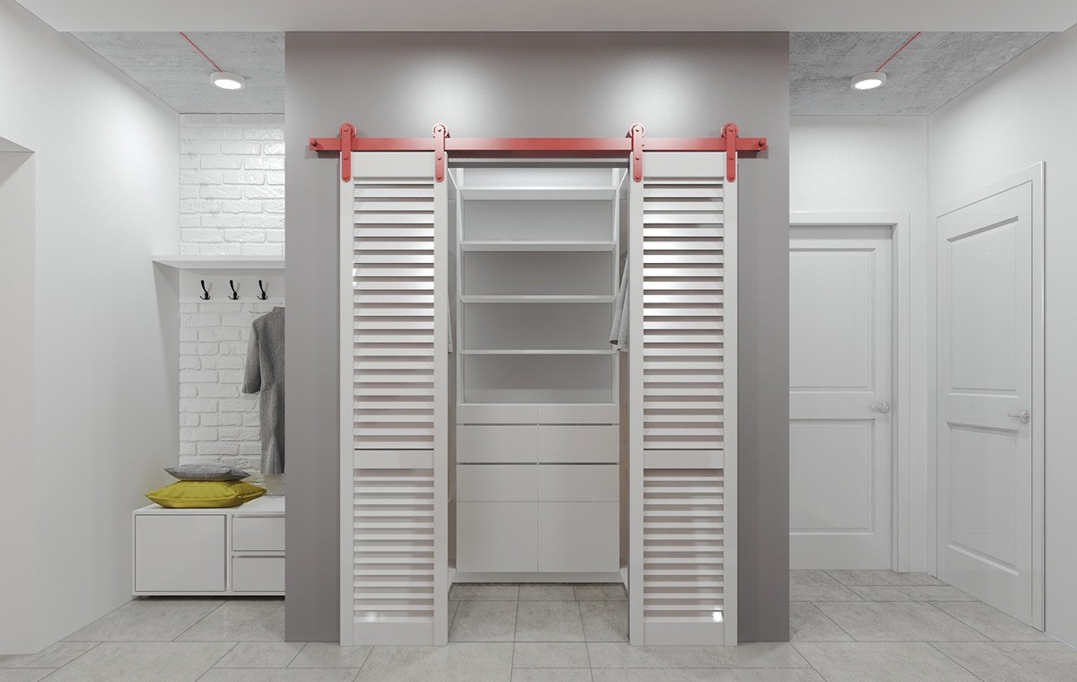
An entryway offers the first and last impression a guest will gather. Colorful architectural and decor details capture the eye in a memorable way.
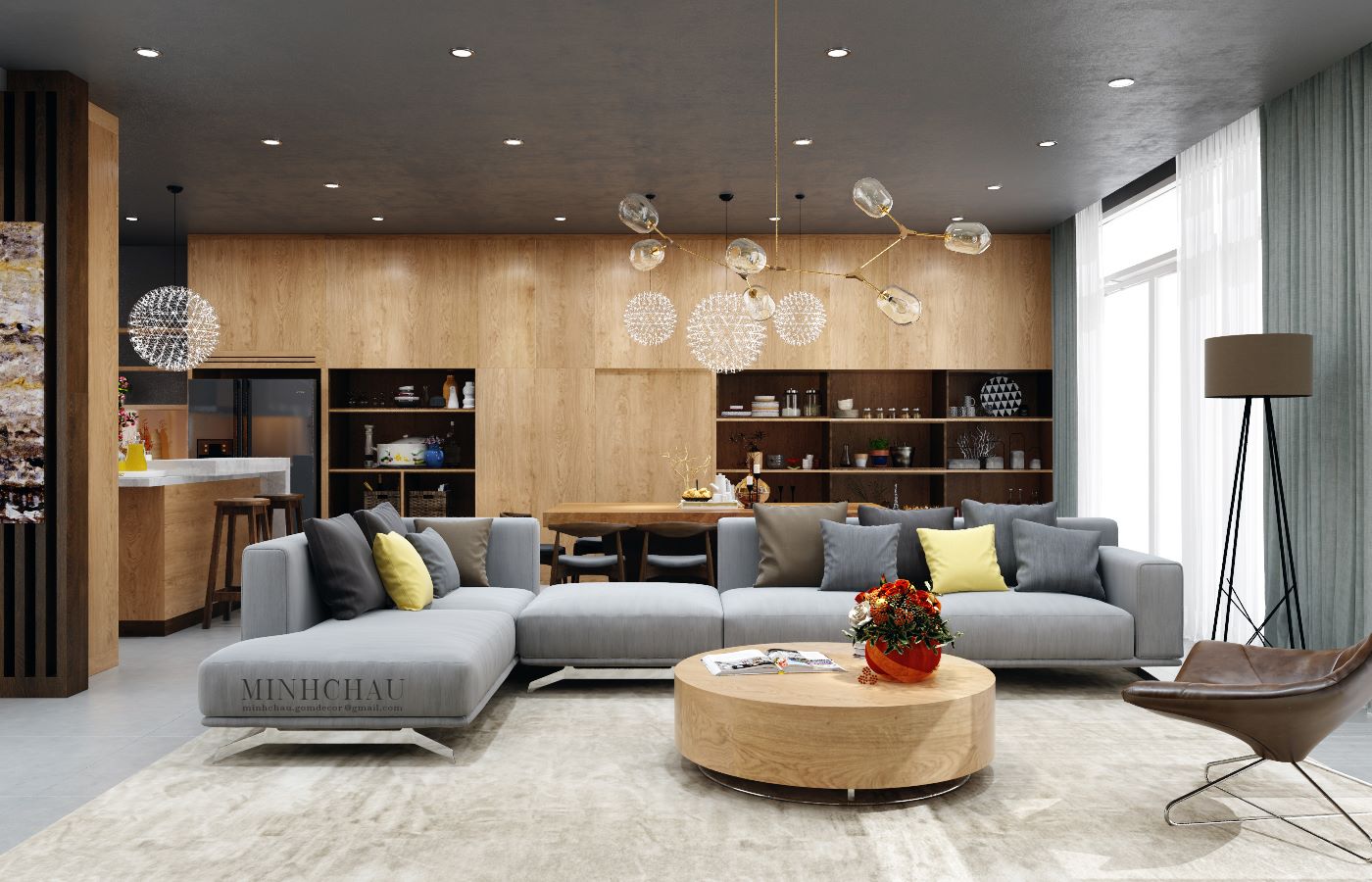
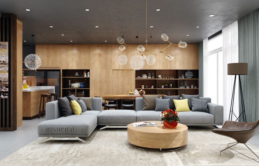
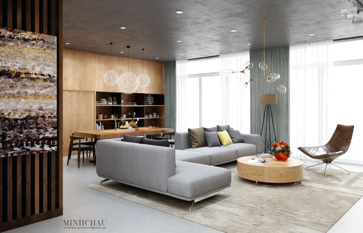
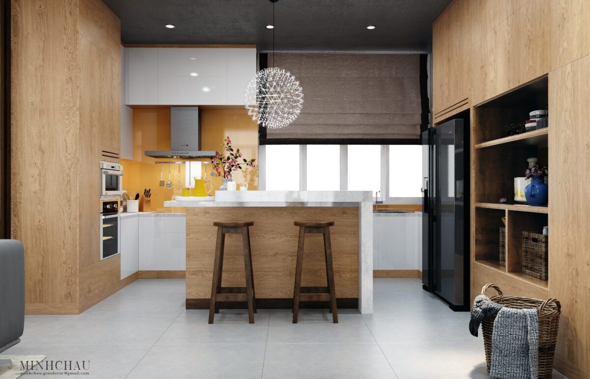
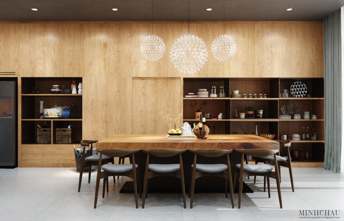
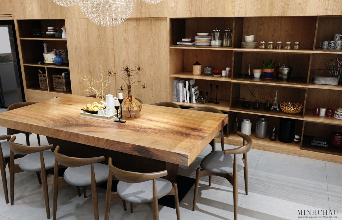
Grey floors, curtains, and sofa set the decor theme against a backdrop of rich wood grain. A leather chair and marble countertop contribute to a luxurious aesthetic, while starburst pendant lights invoke magical modern inspiration. This open layout is certainly inspiring – especially for those who have an eye for detail.
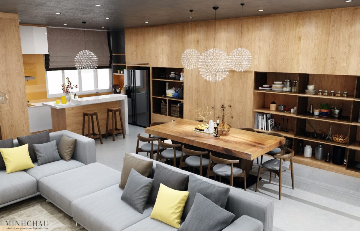
Splashes of pale yellow offer a cheerful accent, serving as a modern contrast to the neutral tones and a perfect complement to the warm lumber cladding throughout.
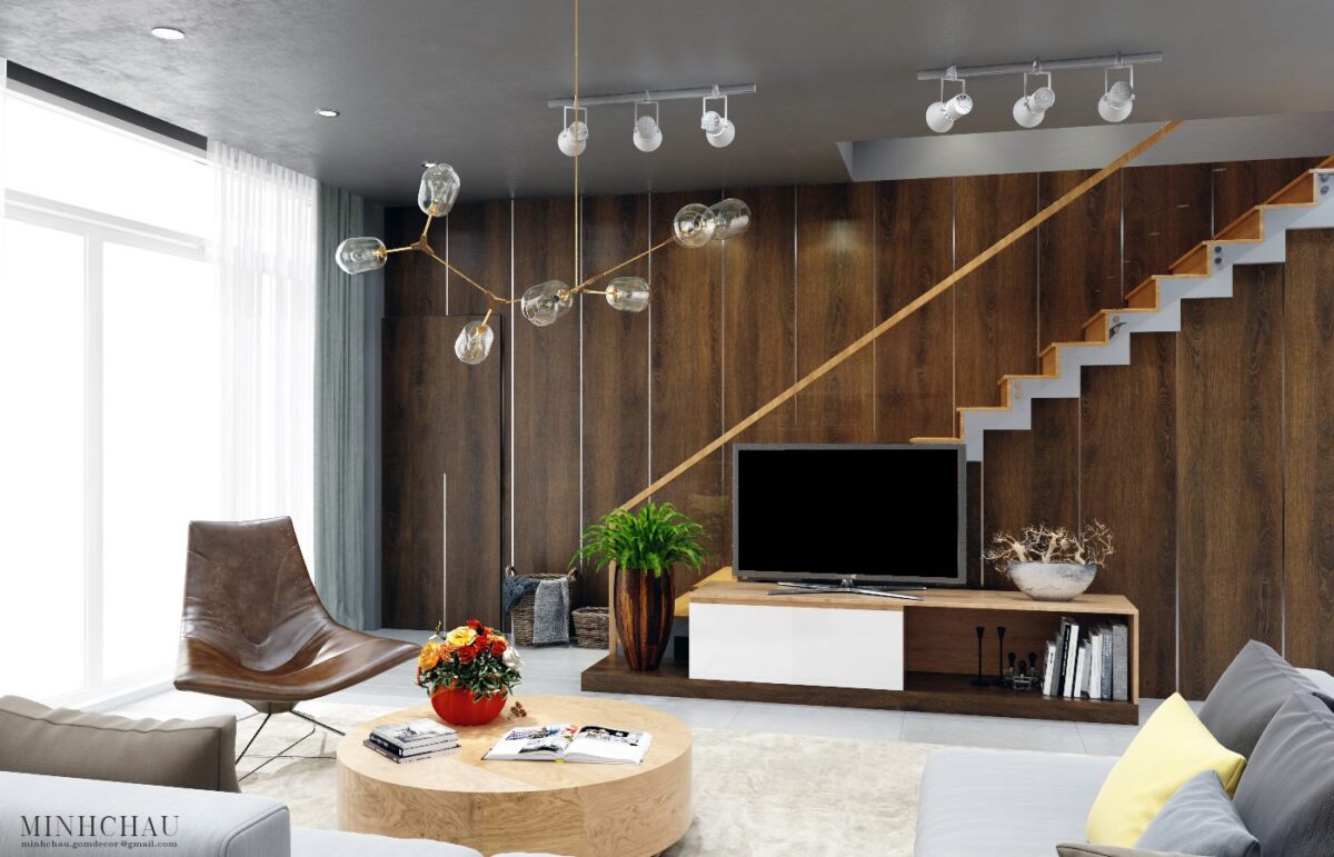
The brass chandelier is the work of Lindsey Adelman – a master of fixtures that blur the line between industrial influence and luxury. This design offers a modern reinterpretation of the classic sputnik chandelier design.
