Combining modern minimalist style, luxurious themes, and a hint of urban industrial influence, this handsome apartment could serve as a stunning showcase of today's most loved interior design trends. This flexible interior is the work of Iqosa who used materials ranging from humble to opulent resulting in a delicate balance that seems simple on the outside but unfolds to reveal intriguing complexity with every second glance. Each individual room isn't exactly large by luxury standards, but each makes the best of its floor plan with integrated storage and plenty of features that serve both functional and decorative purposes.
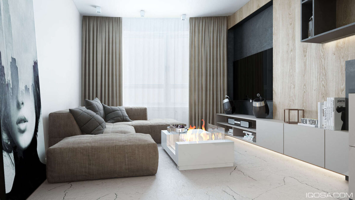
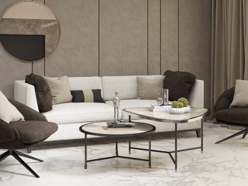
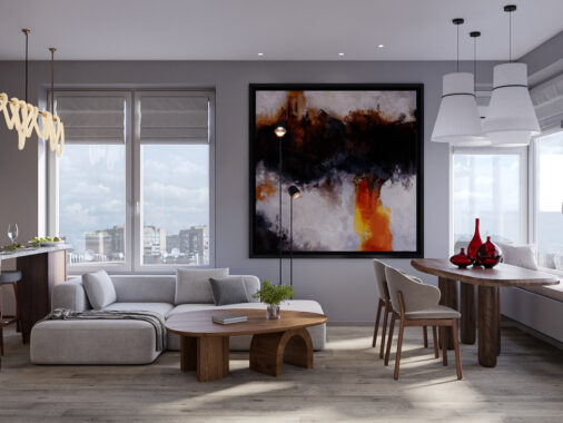
This otherwise simple and streamlined interior uses an organic palette to soften its elemental themes, like the coffee table fireplace and attractive marbled stone floors. Large form artwork reflects the theme in a more symbolic way by highlighting industry and humanity in one form.
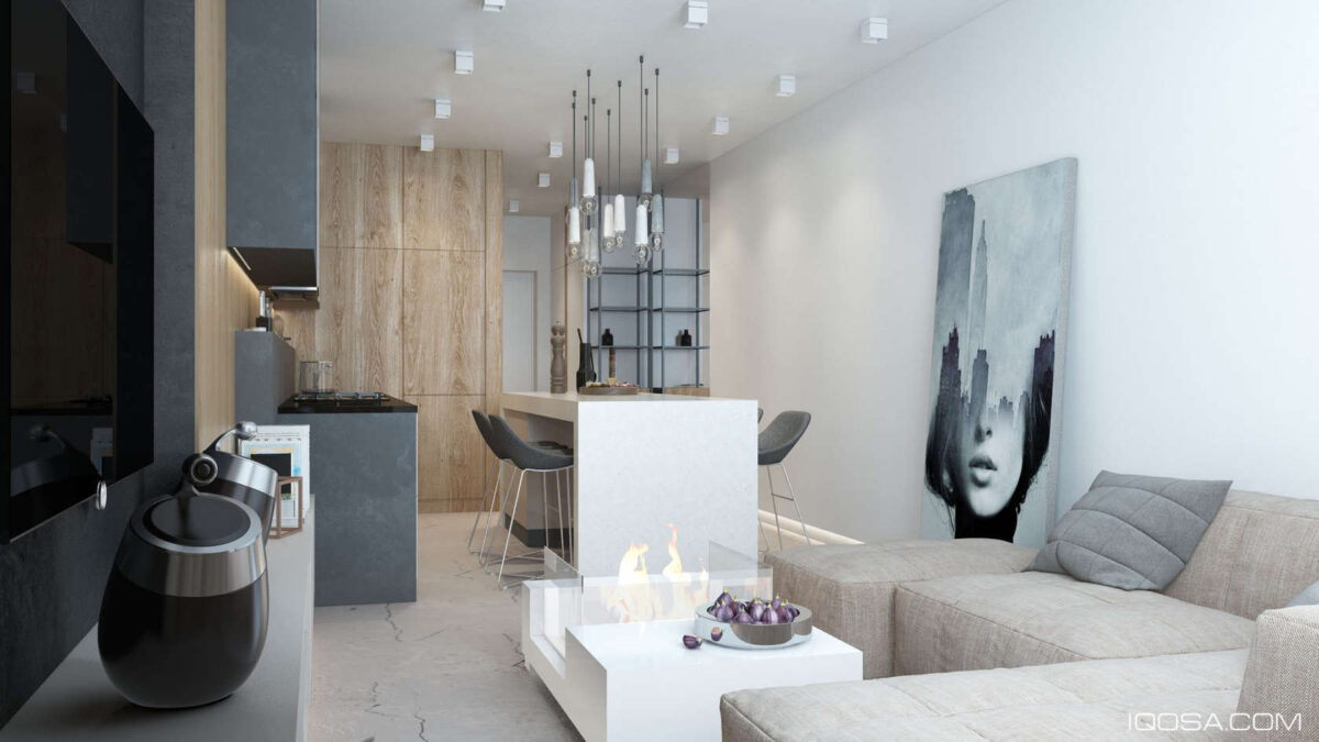
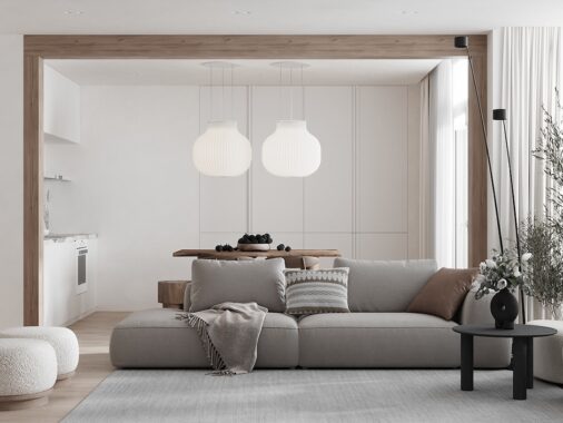
In terms of layout, it's amazing how such a small living area can accommodate so many important gathering hubs without feeling crowded or overwhelmed. This layout is perfect for small apartment owners who love to entertain.
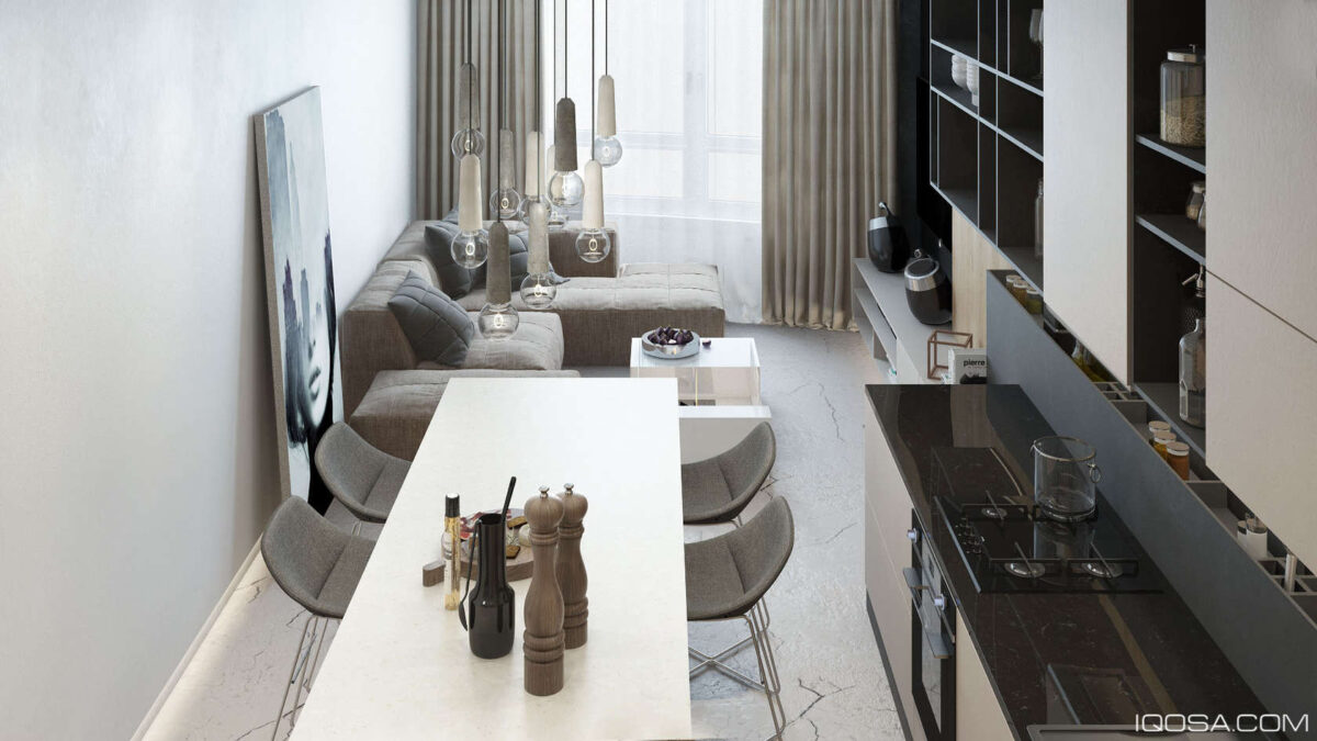
This close-knit layout allows residents to remain in communication with guests or one another while preparing meals or watching television.
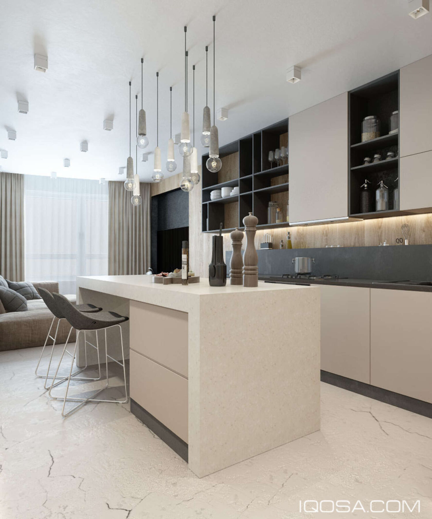
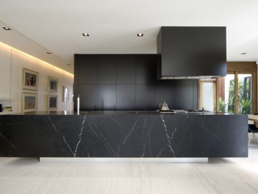
Considering the closeness of the space, the kitchen needed to retain the same wood and stone theme. The backsplash solution is a nice touch: it serves as storage for everyday utensils.
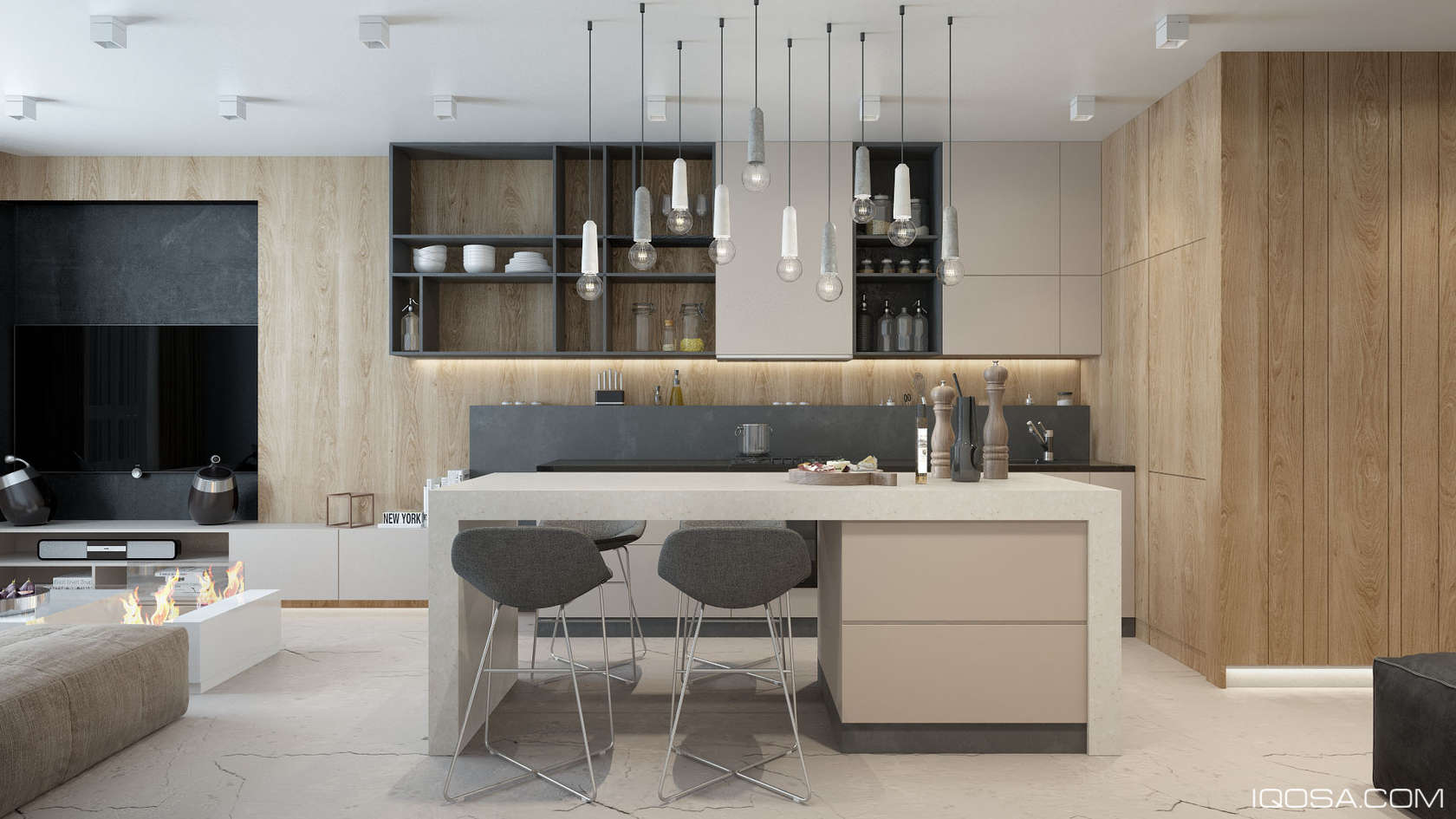
White and concrete-effect pendant lights use their playful color variation to tie the kitchen's greyscale theme together.
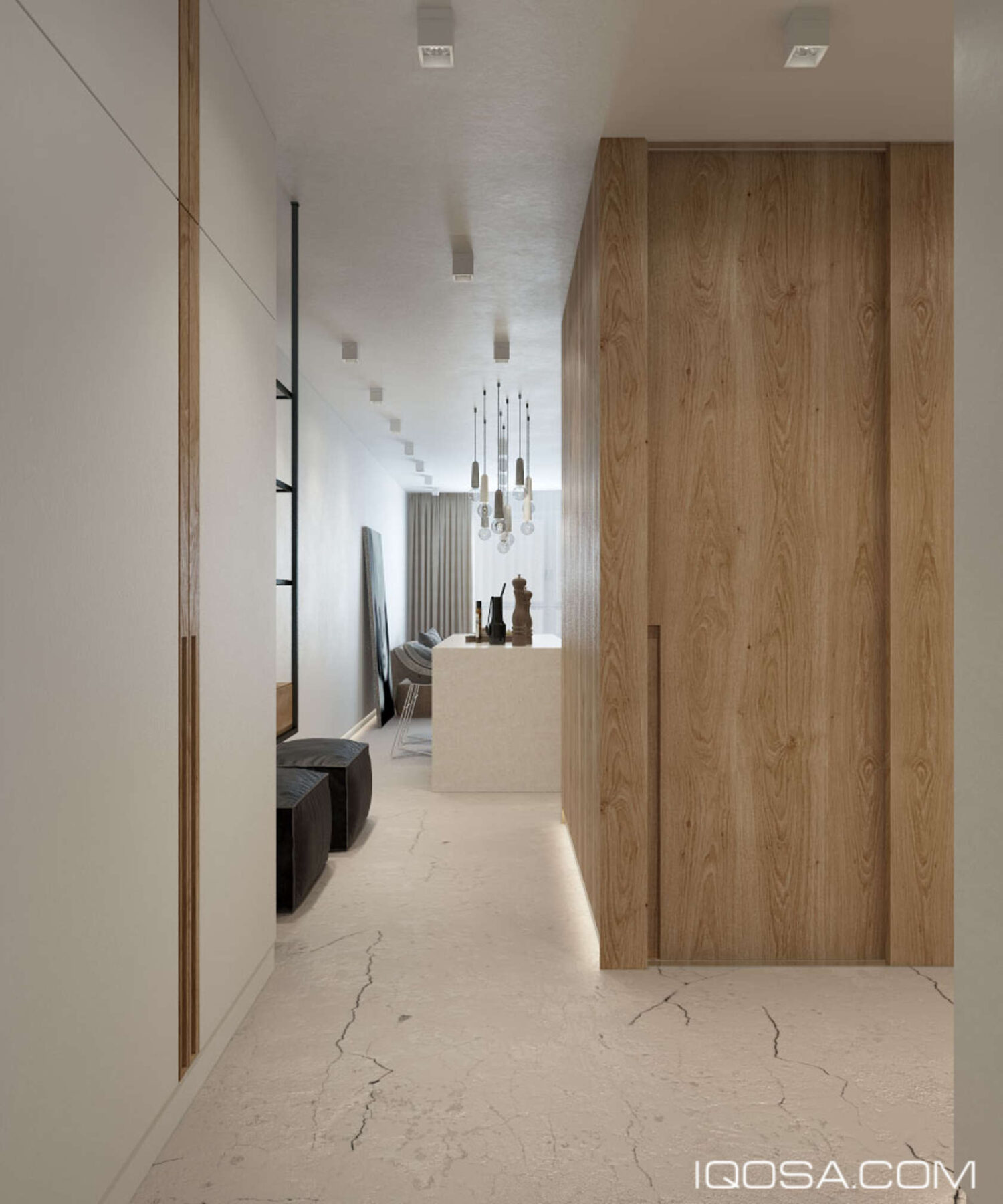
Those kitchen mini pendant lights even create a stir from the hallway, the different lengths arranged to offer a nice view from any angle.
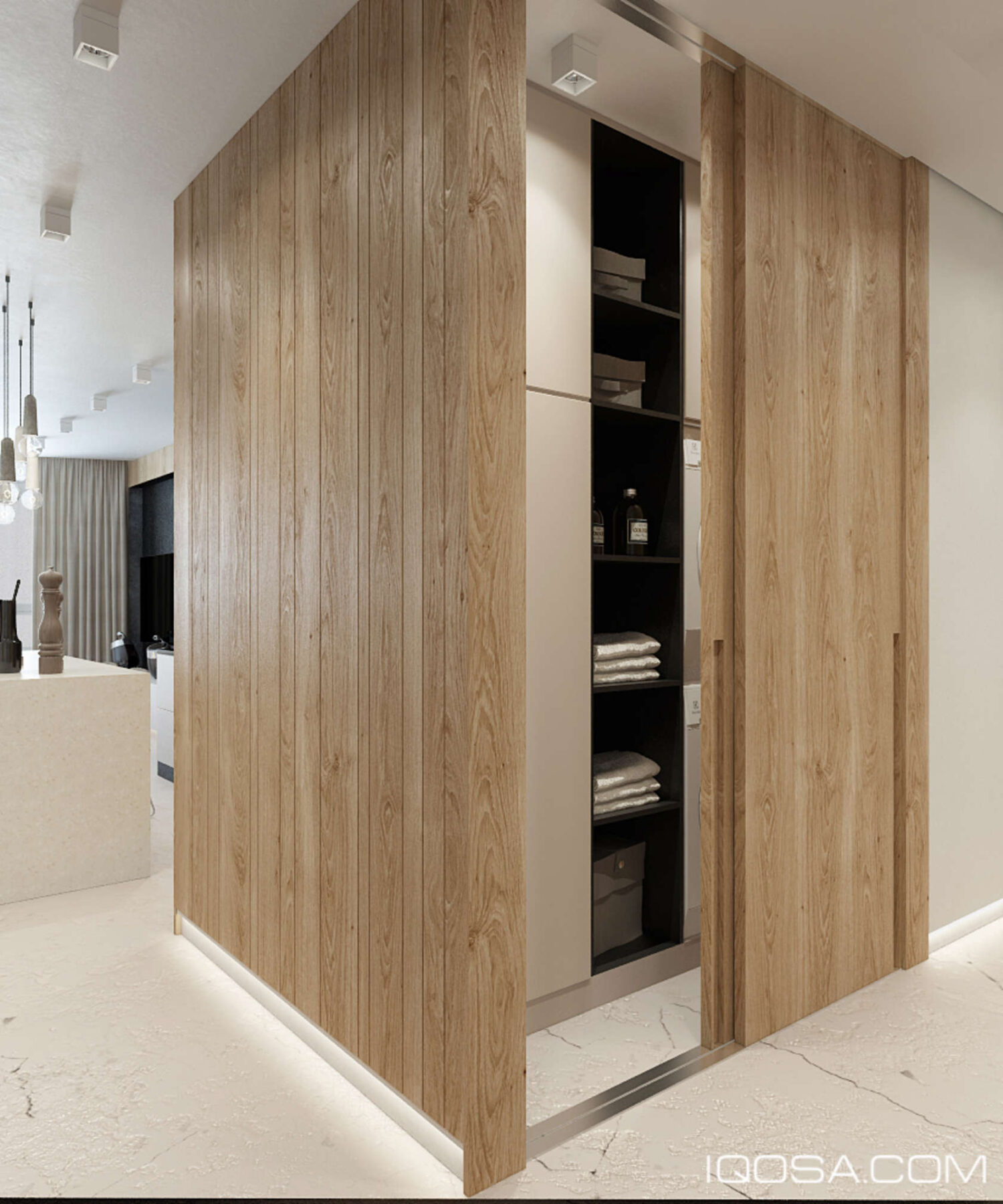
General storage occupies a small room hidden behind sliding doors in the hallway. Its design is creative, with a narrow hallway providing access to even more cabinets.
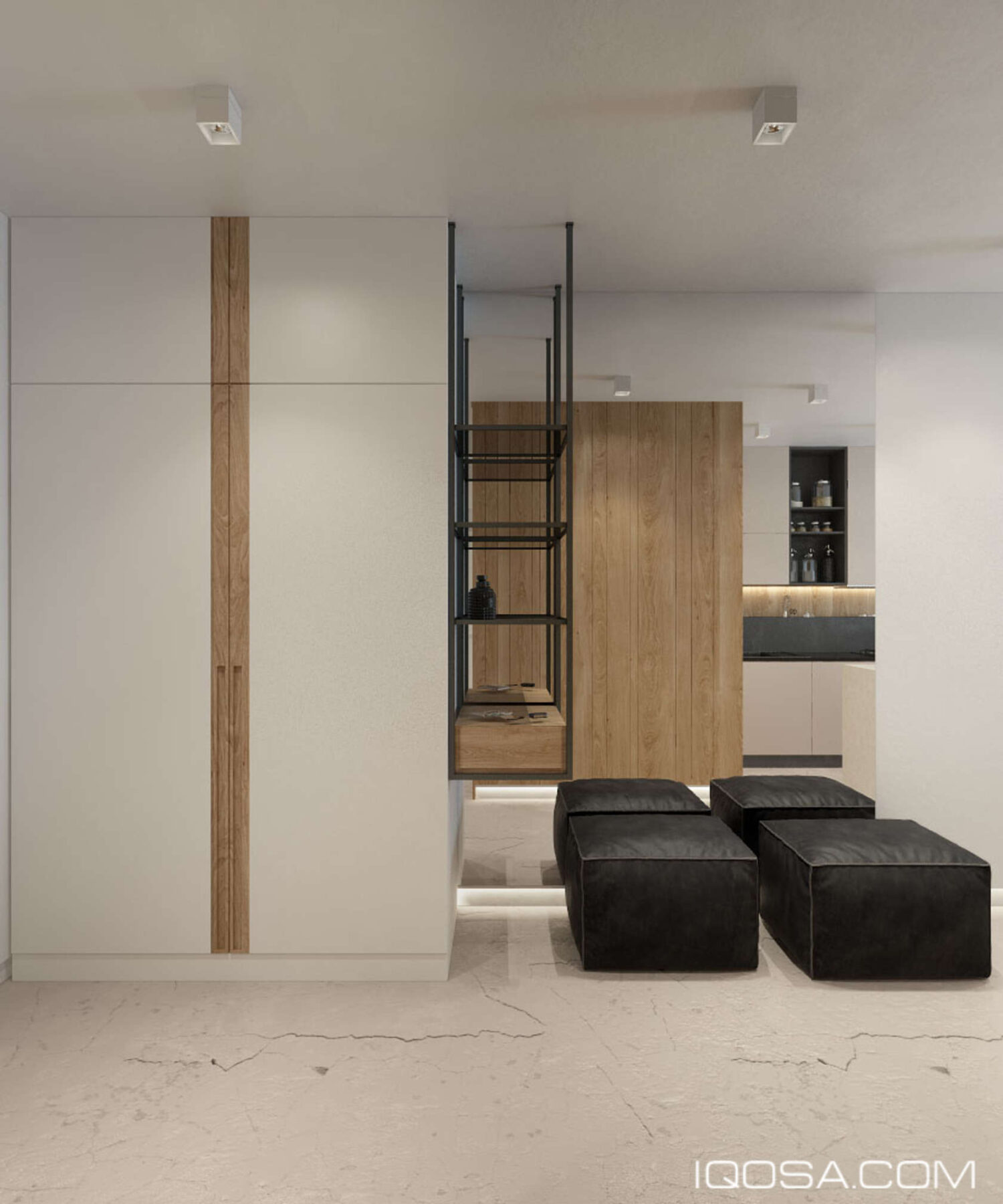
And near the entrance, two poufs give residents a place to sit and remove their shoes, with a convenient catch-all shelf to keep keys and other pocket necessities within an organized place to rest.
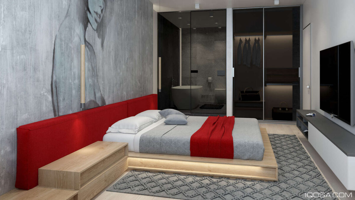
For the bedroom tour, let's start with this striking master bedroom decked out in modern grey and red. The minimalist wood bedframe and tinted glass doors maintain a streamlined appearance, softened by a whitewashed wood accent wall and textural carpet.
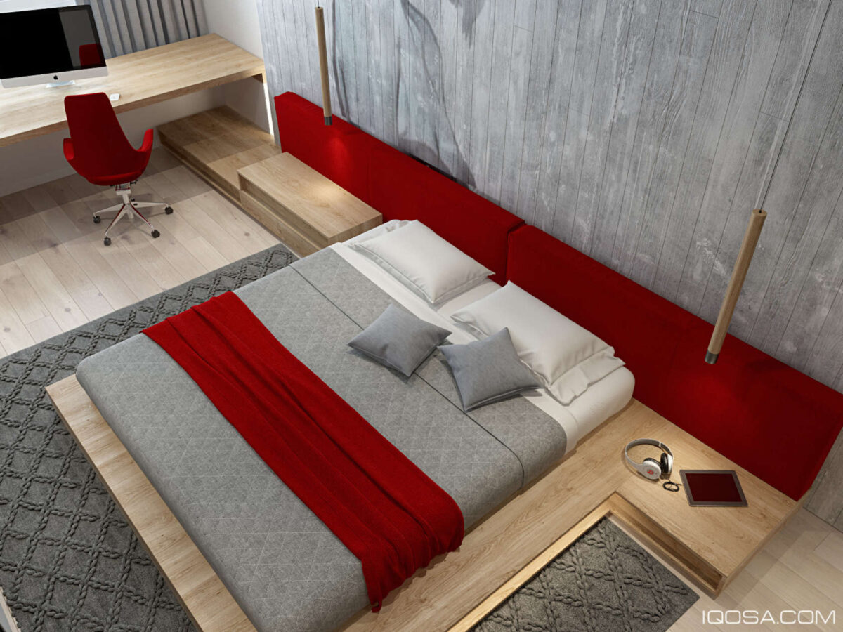
Integrated side tables provide functional storage without sacrificing the sharp edges and clean lines of the bed layout.
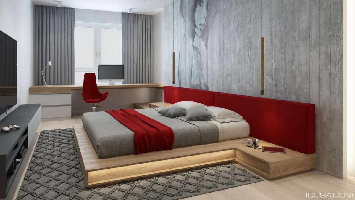
A small desk occupies a prime location near the window for instant inspiration during working hours.
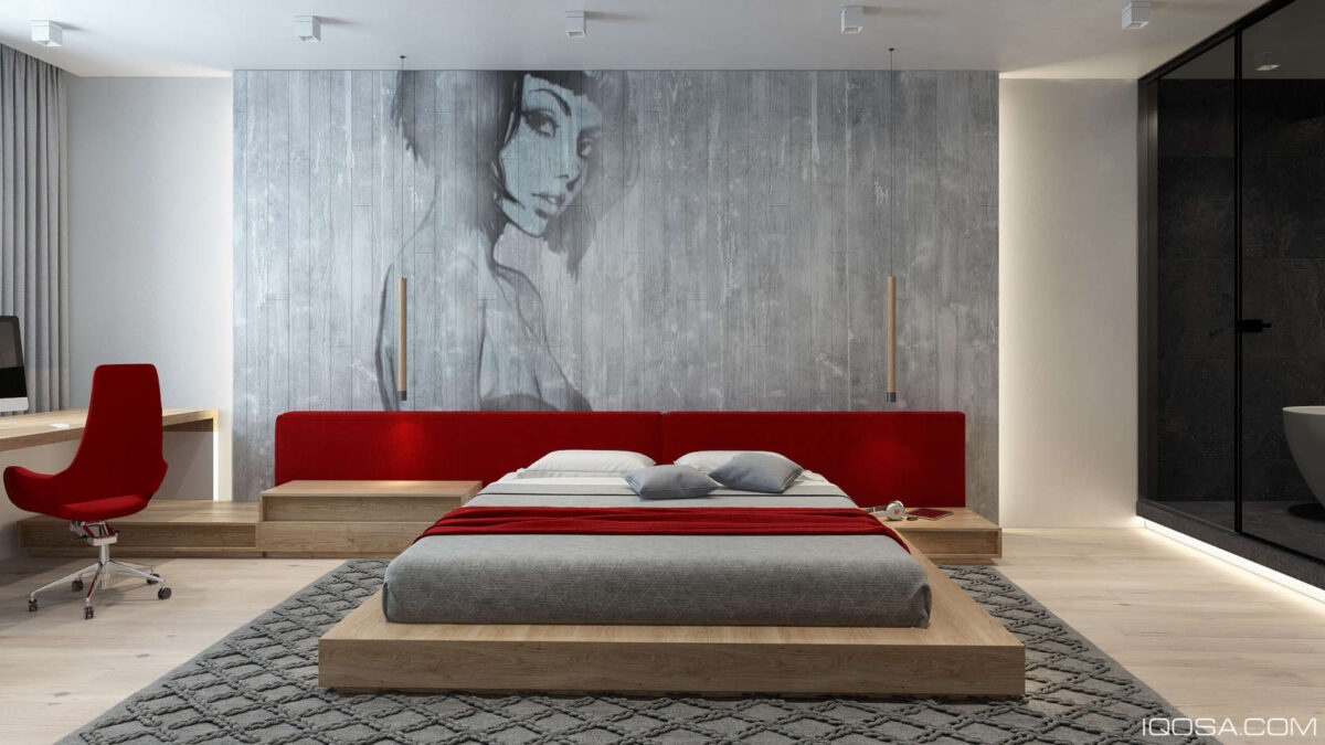
With an intent gaze, the woman in the mural immediately captures the eye. Her pop-art style keeps things looking modern and fun.
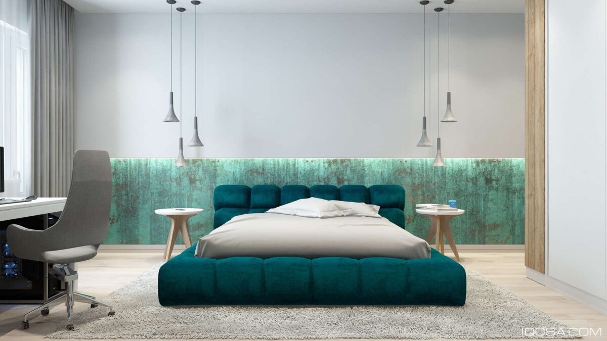
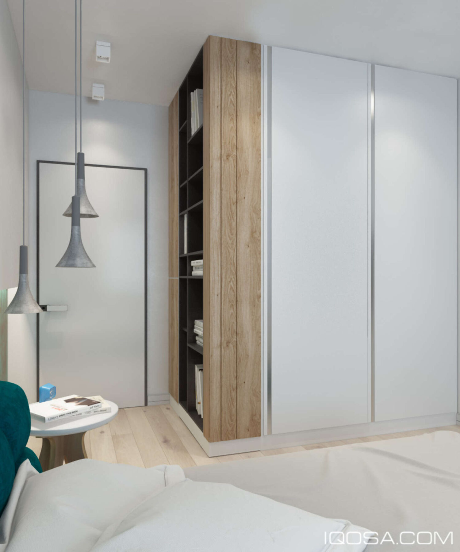
Another bedroom makes a bold impression with blue and teal accents popping out from a light grey canvas.
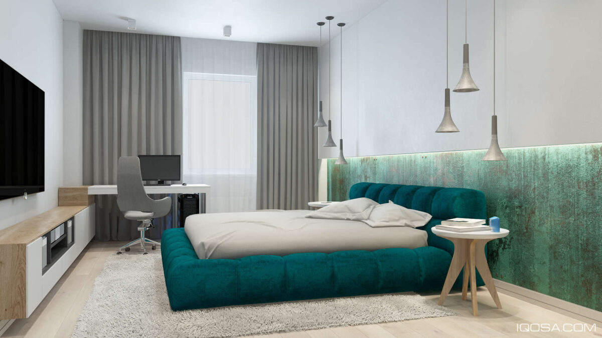
Flared concrete pendants offer a functional and artistic lighting solution above each side table. The side tables themselves utilize a Scandinavian-influenced style with strong mid-century curves.
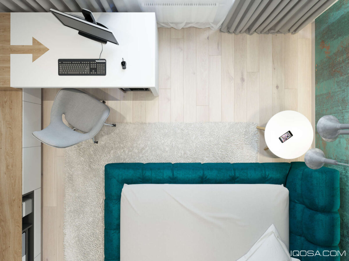
Check out that cool arrow detail on the desk! When the mind begins to wander, the arrow brings the mind back to the task at hand.
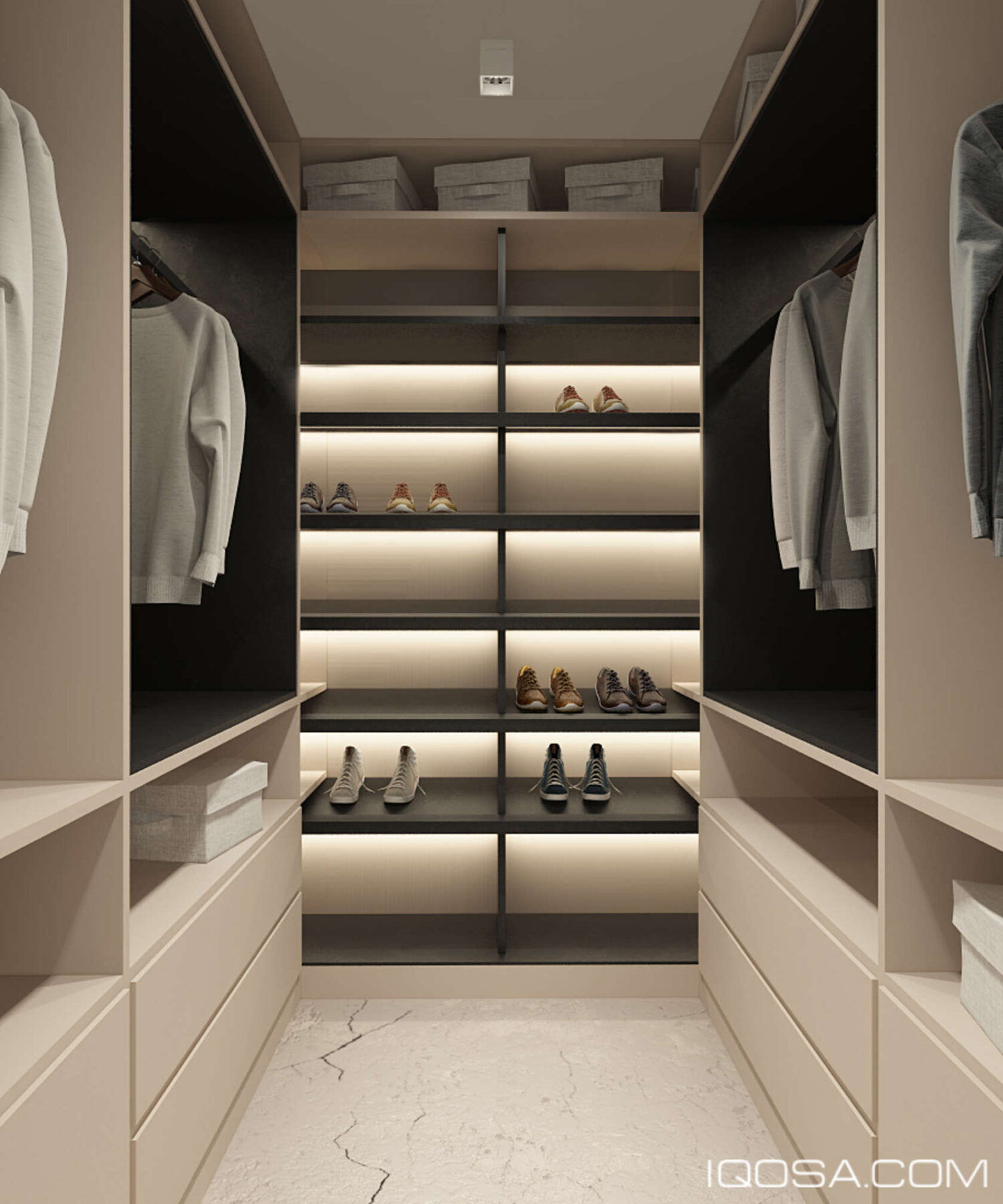
Marble floors reappear in the walk-in closet to enhance its luxury. Backlit shelves on the far end could serve as a stylish display for a shoe collector, as pictured here, or as storage for casual pants or undershirts.
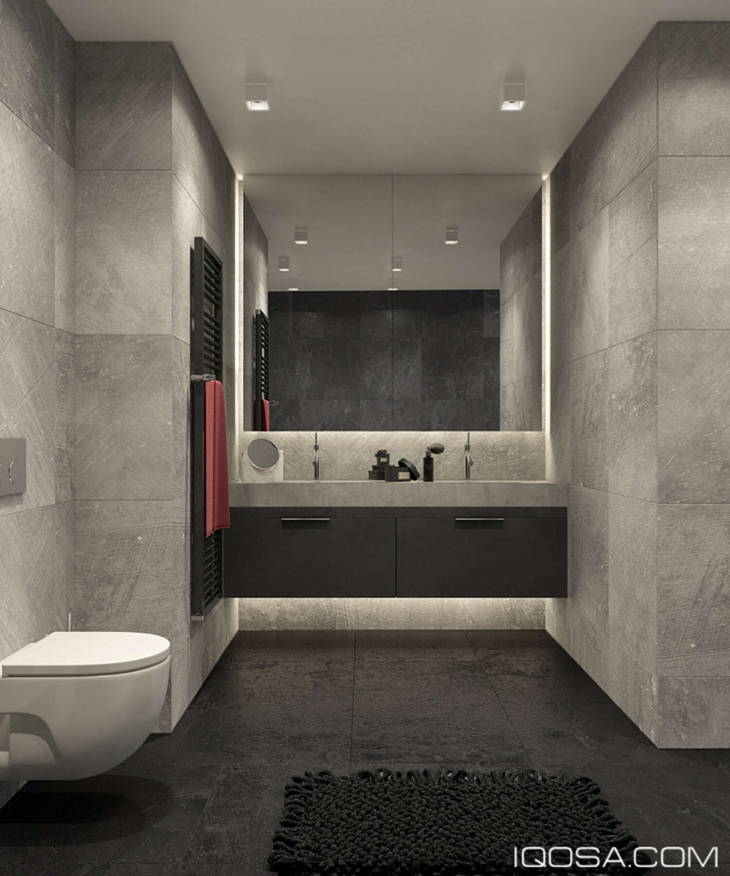
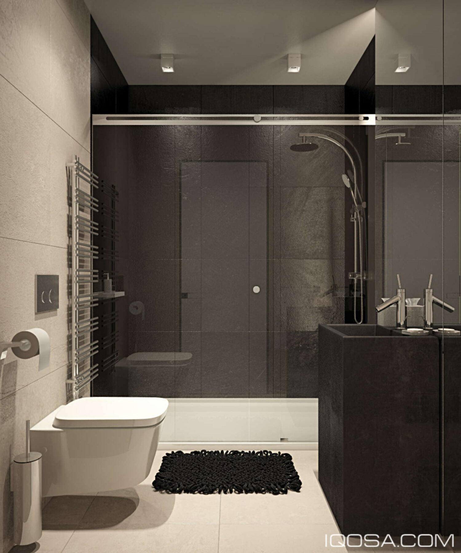
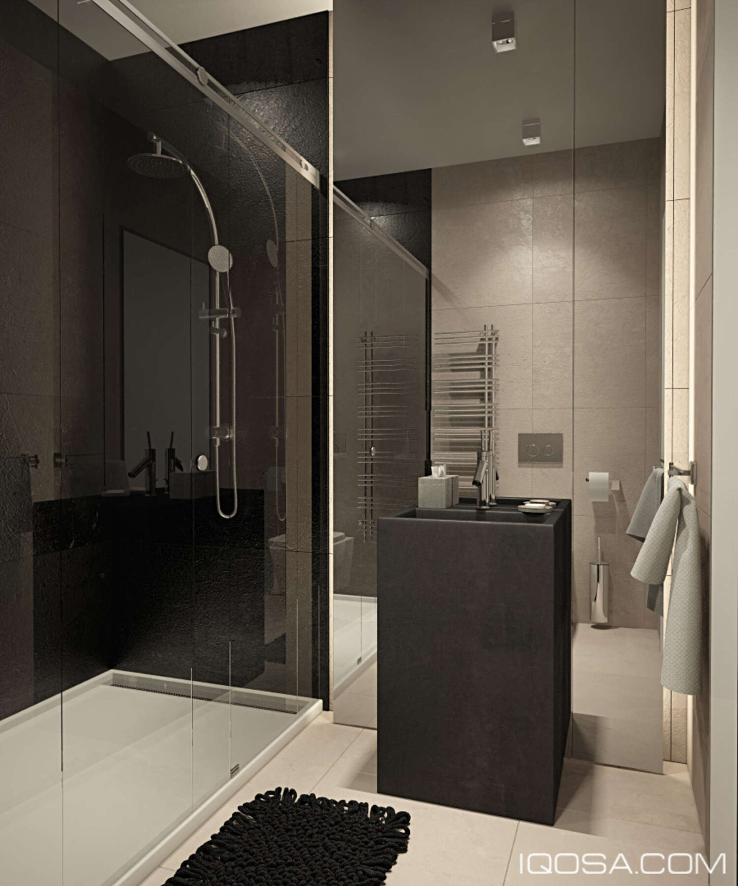
Even the bathrooms make a bold impression. Here, dark floors and rugged concrete walls embrace two of today's biggest modern design trends.
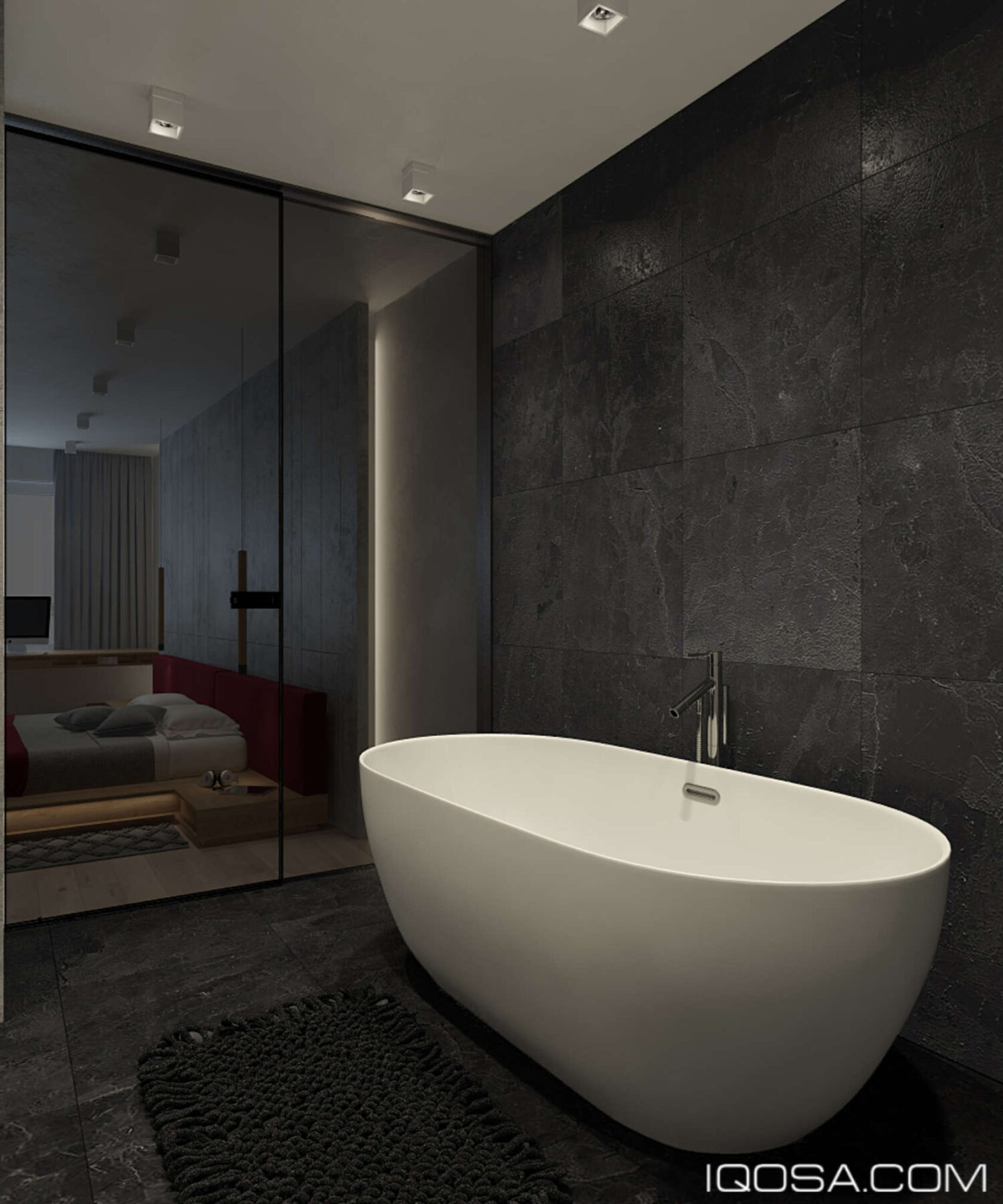
Looking through the tinted glass door, you can see that this bathroom belongs to the master bedroom and maintains intimate visual contact with it.
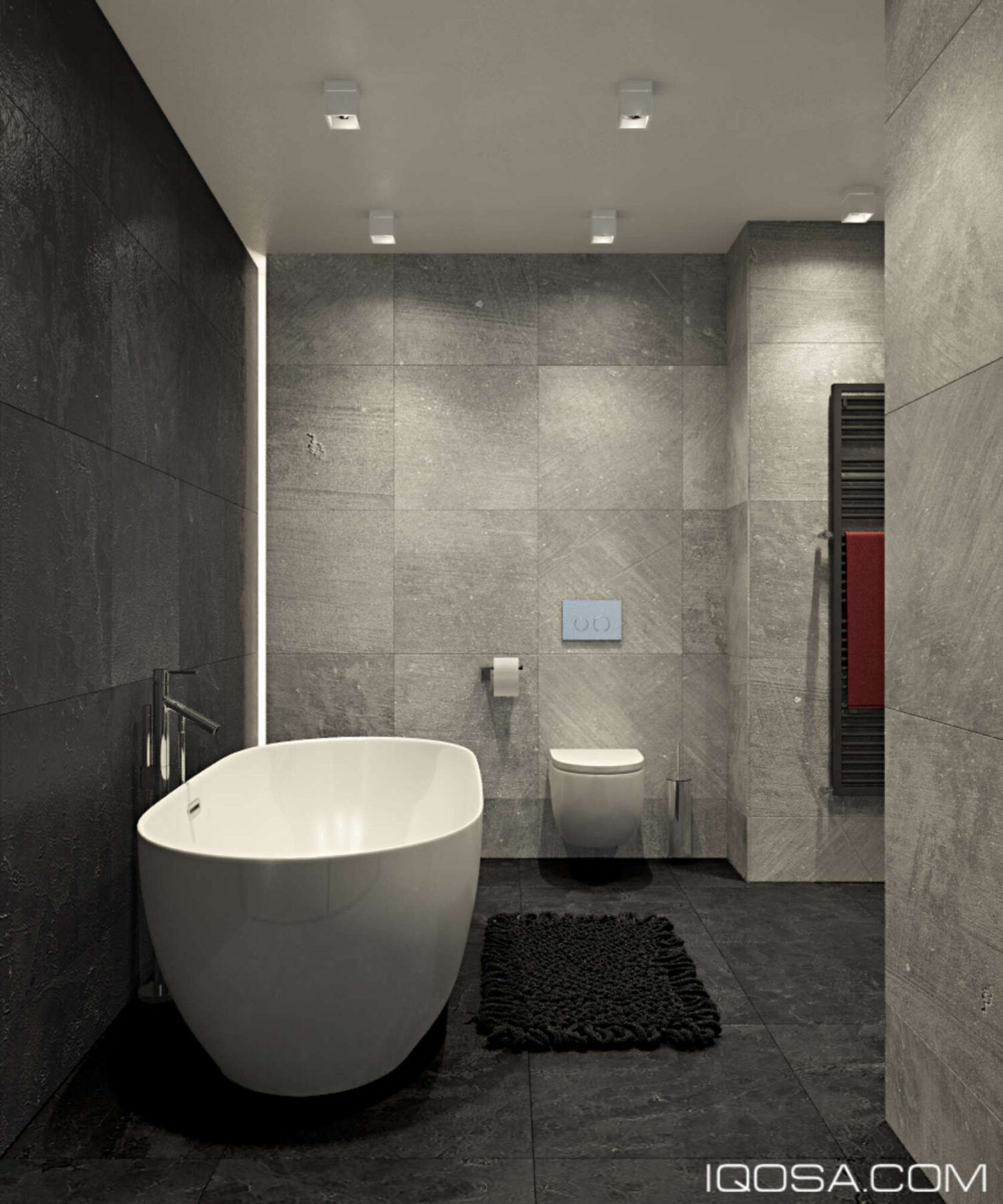
Note the variation in the wall tiles – bold textural strokes with angular variation soften the palette, eliminating the harsh industrial feeling concrete can sometimes create.

