An 18th century Polish fort is breathing new life thanks to its new inhabitants and a stellar architect. What was once old and decrepit is now fresh, sleek, and modern thanks to innovative design. The dark masculine theme of the space plays on the stronghold this property once was -- although with a family of 5 moving in, the old fort has to be strong in new ways. The design team has done this by using entirely natural materials such as oak, concrete, and natural stone such as basalt, marble, and glass. You won't believe how they've transformed this space, so get exploring.

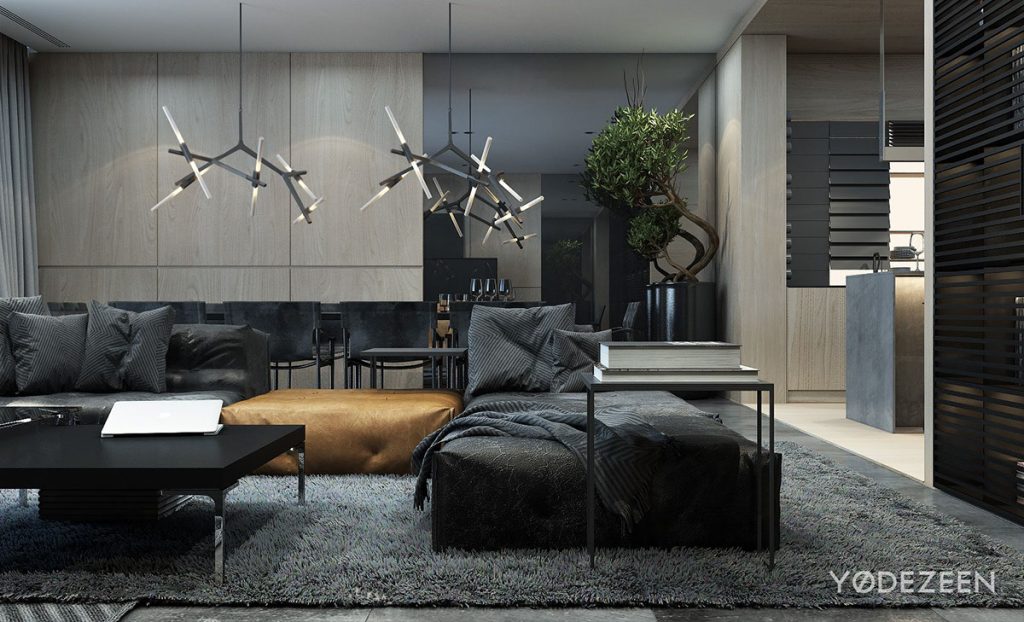
This dark and masculine color pallet takes advantage of all the natural light that flows into the space. Hearty textures and deep colors play well with that bright light.
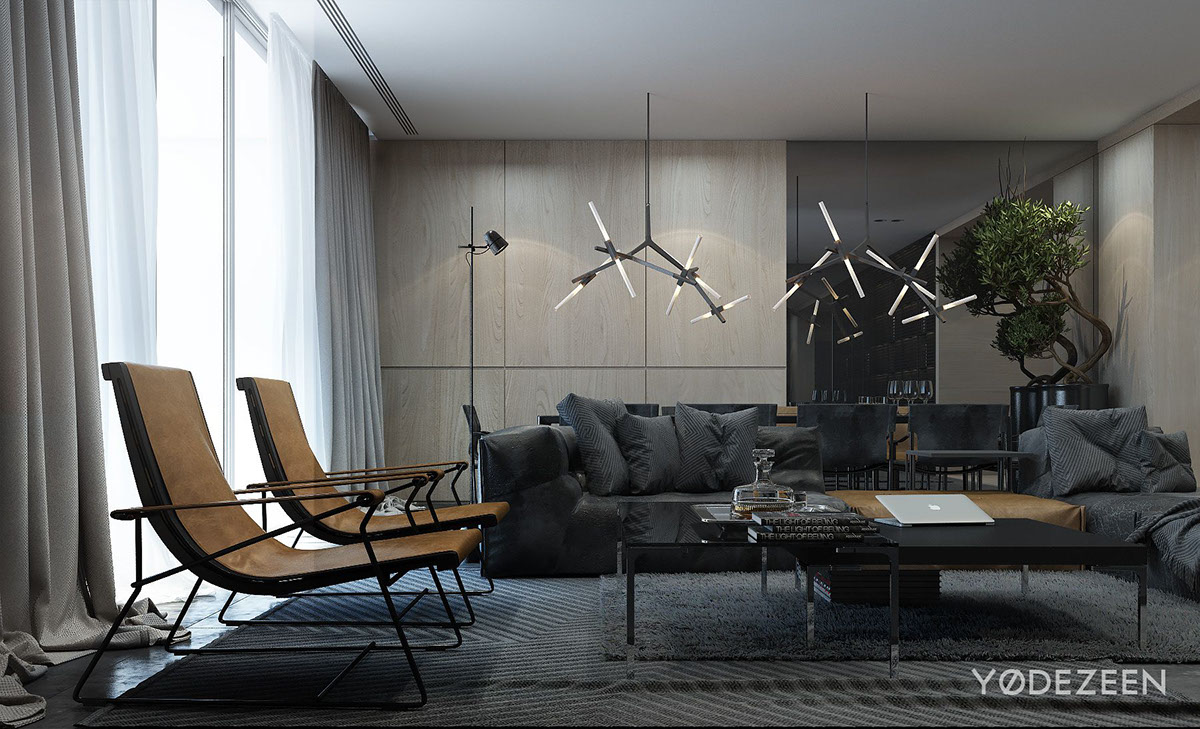
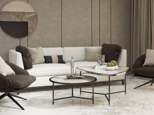
We love the death accent pieces in this space. They add a real warmth to the environment, not just in color, but in their smooth buttery texture.
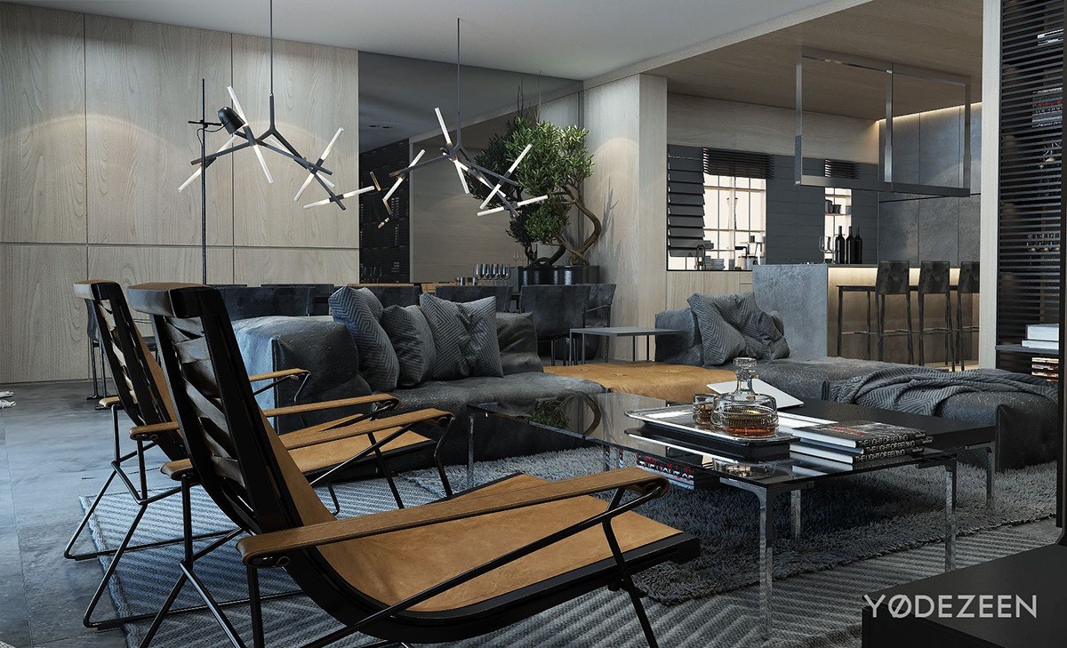
Keeping the furniture, including the chairs and coffee tables, nice and low really draws your eyes up to those hanging light fixtures and lofty ceilings.
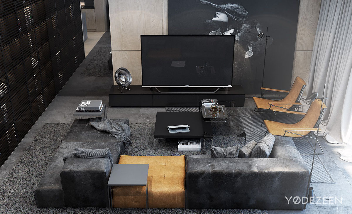
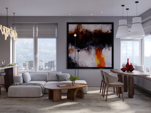
From here you can see how the grays all form together — from the rug to the couch — making the entire living space feel like one big cozy space.
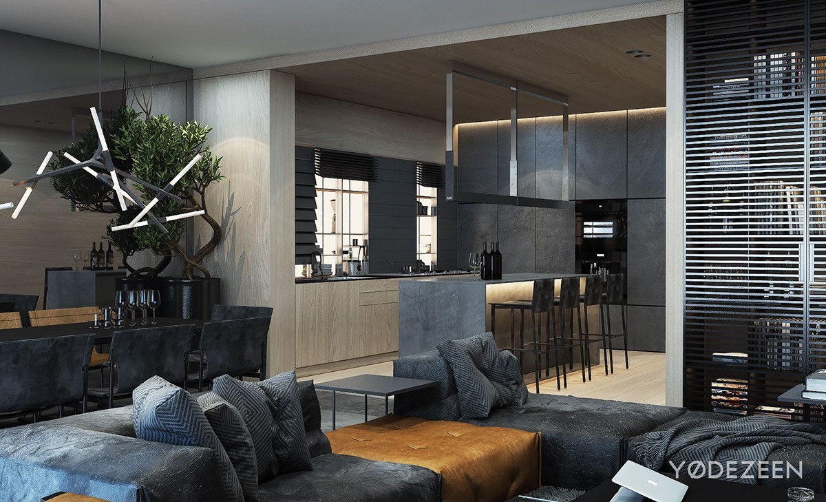
The open concept living kitchen space continues to play on the cool masculine feel, this time extending an ashy wood tone from the floors over into the kitchen and up onto the cabinets.
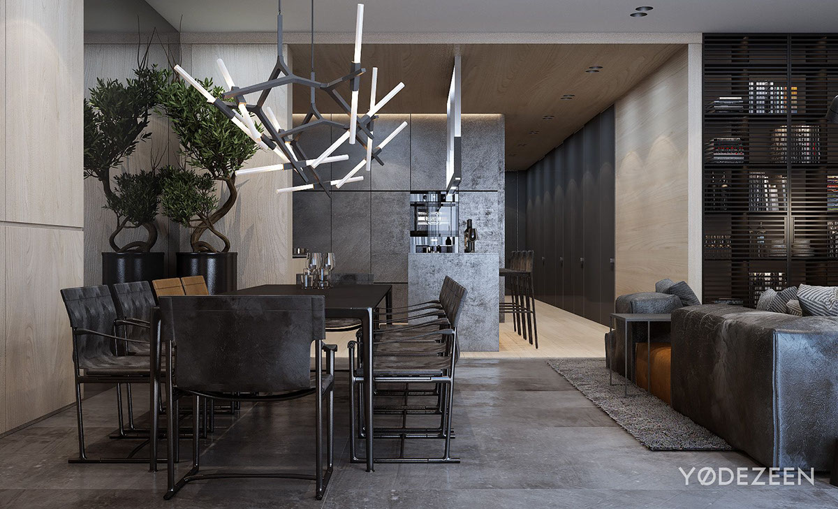
These chairs are phenomenal. The finish makes them look entirely metal, and their sleek design with a bit of curved arms mirrors the lines of the chandelier above.
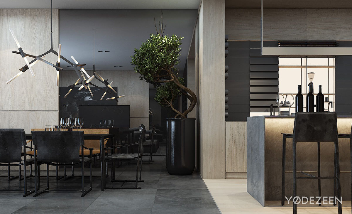
For such a cool space, the apartment does boast some nice warm light. The underlit island, the the hanging lights throughout the space add the warm glow that makes this space not feel so stark.
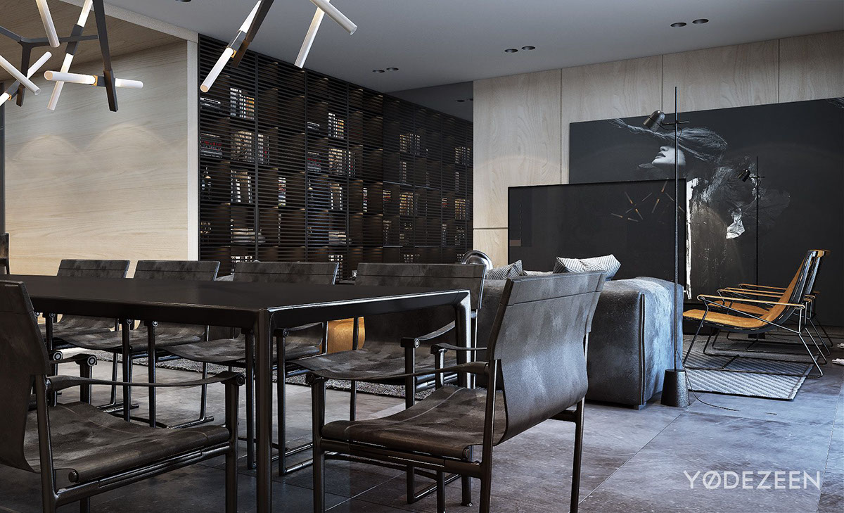
We love the book cast along the back wall. It’s unique because it’s not open like most book cases are, and the grated doors look great with the backlighting provided.
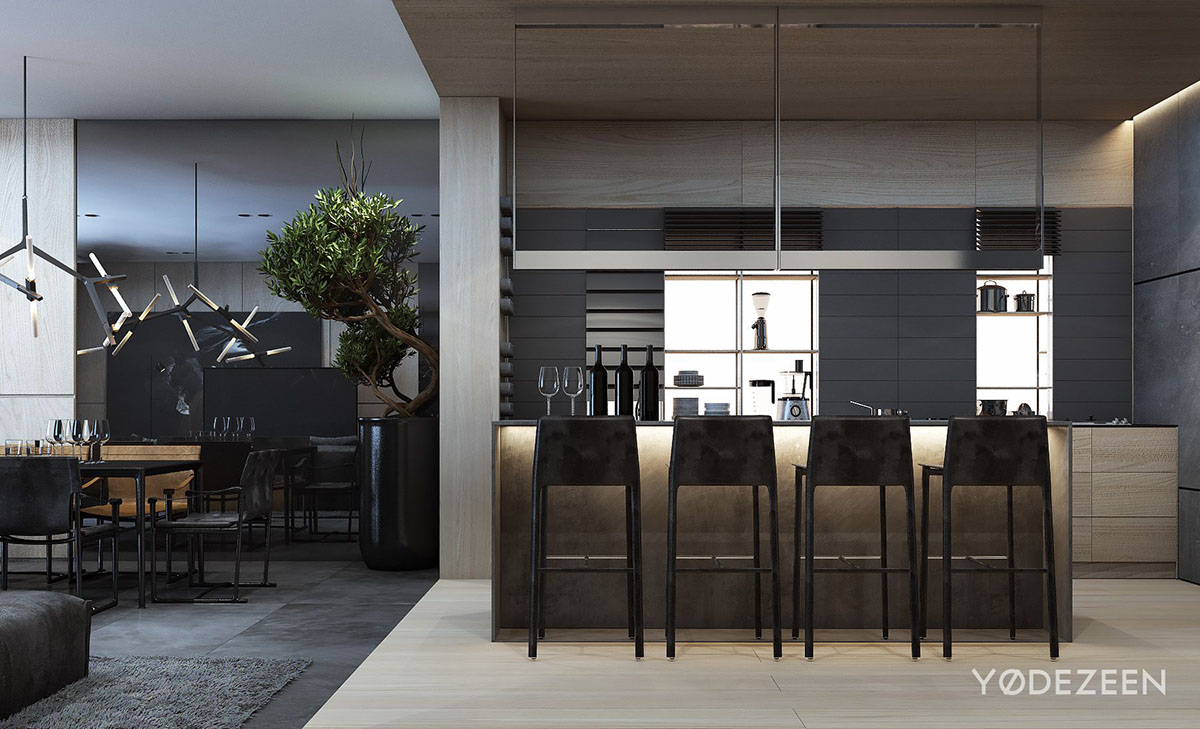
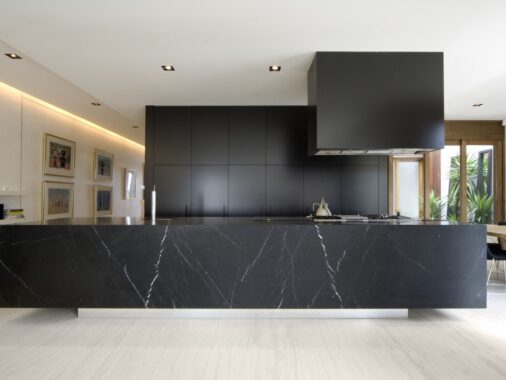
What a kitchen! The big island with plenty of seating, let alone the stunning design, is the perfect place to try out some new recipes.
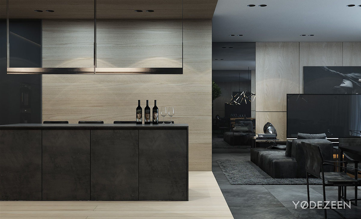
They’ve also warmed up the space by adding wood paneling to the walls. We mention this a bunch on this website, don’t be afraid of wood walls! They don’t have to be your grandparents 1970’s wood planks any longer. Big, beautiful wood — light or dark — can really add character to a room.
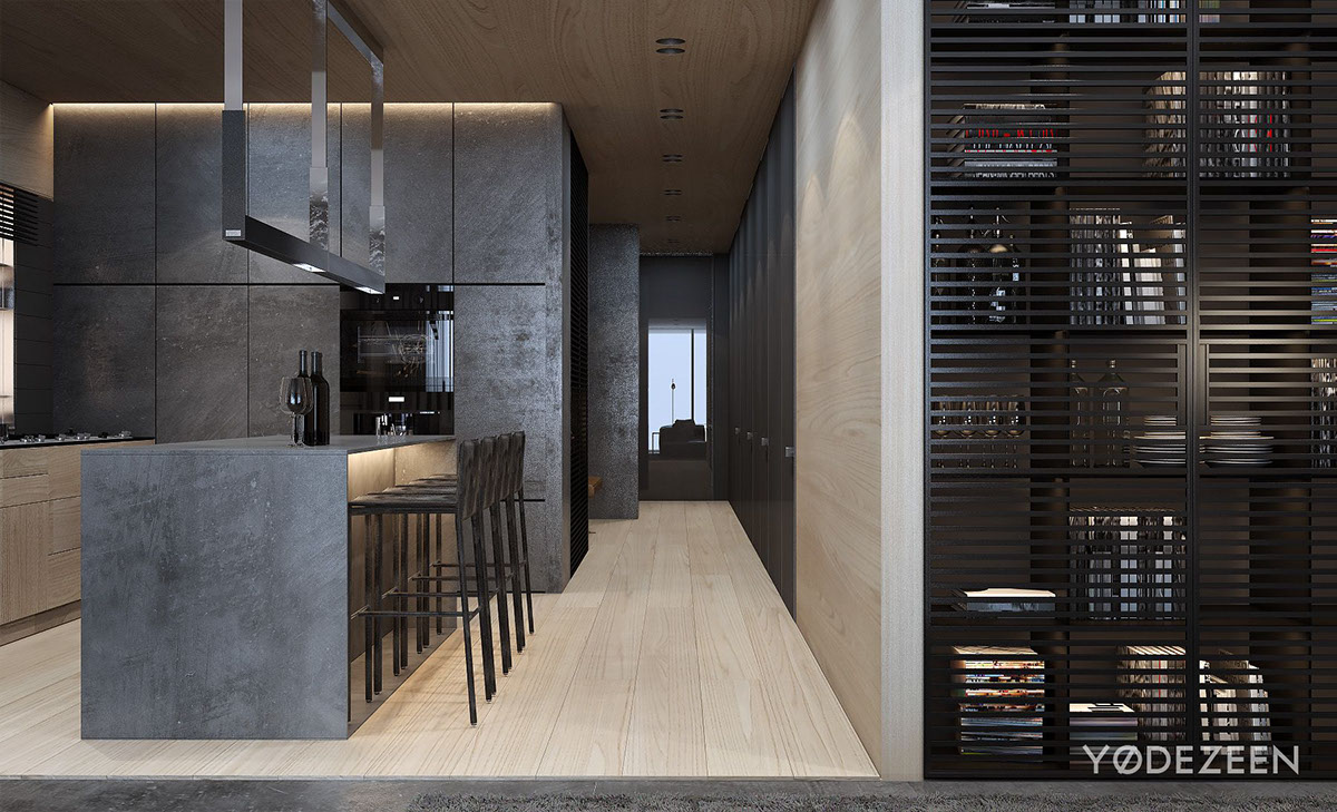
Up close here you can see the detail in that book shelf. The lighting, the slits, the and matte black finish all play into the rest of the decor. It’s definitely a great focal piece in the room, and draws your eye down the hall.
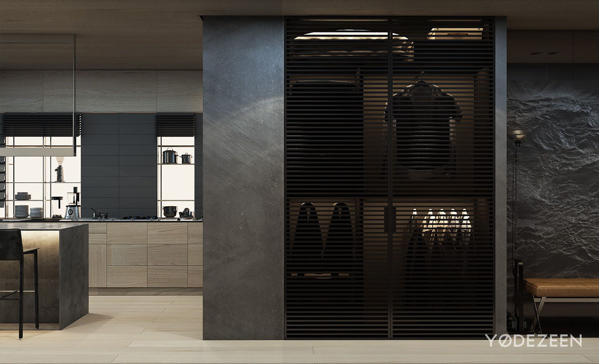
They continued that design here for the coat closet, making a normally very dull area super modern and chic.
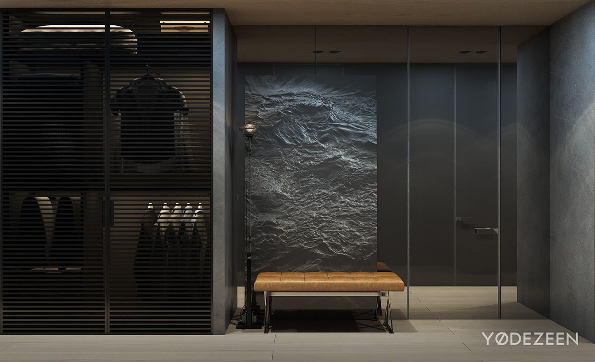
This foyer doesn’t lack any design or intrigue. They’ve brought the leather from the living room right to the front door, and that coat closet is beyond boring.
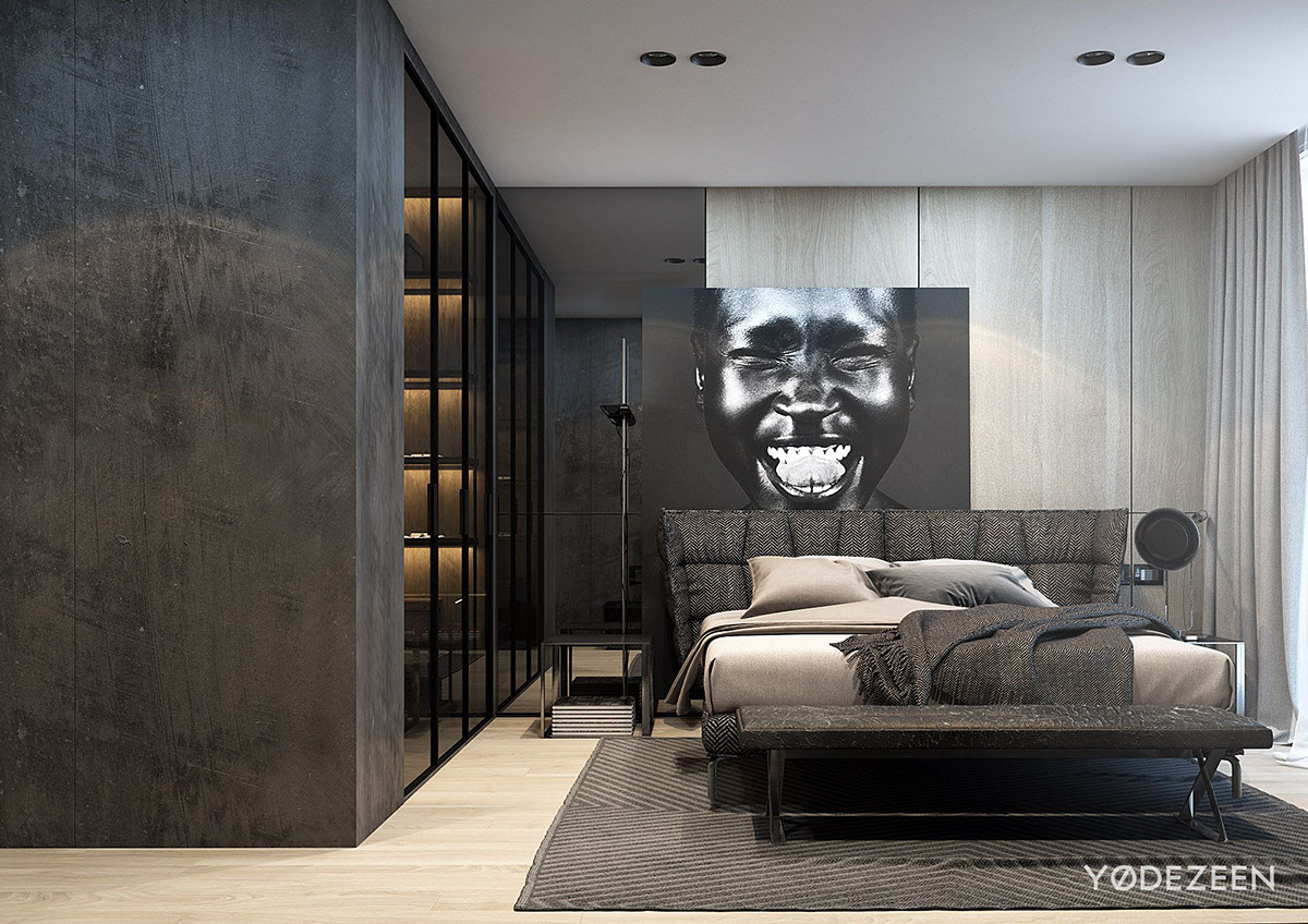
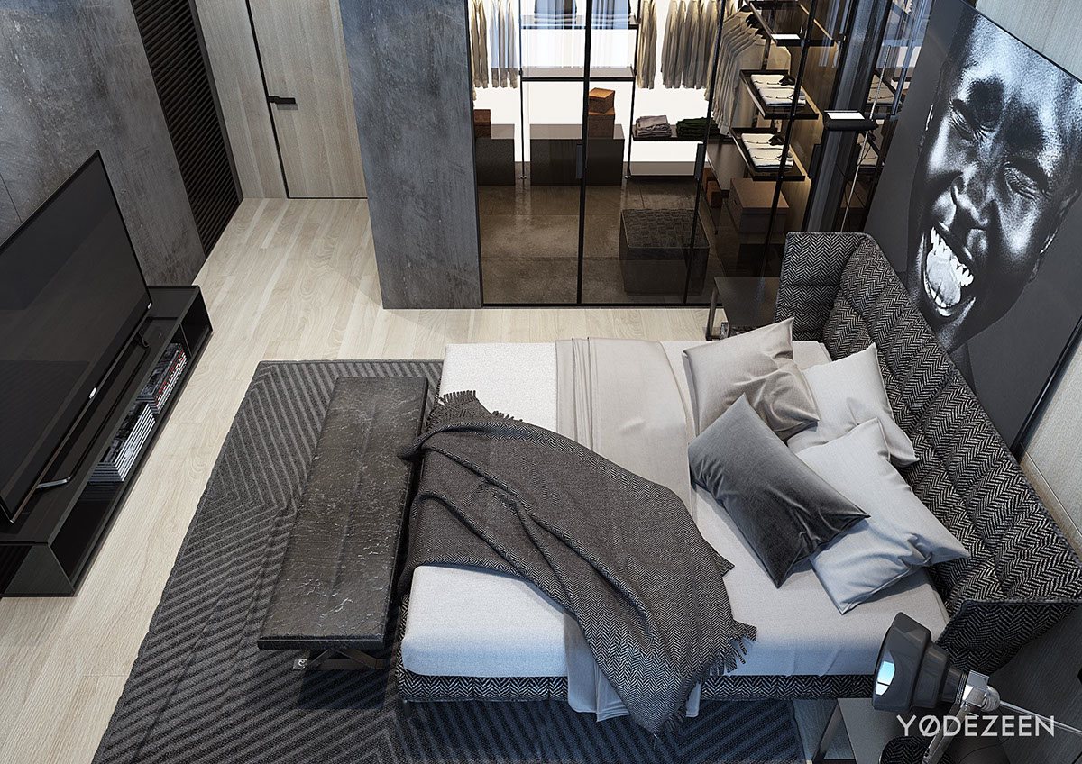
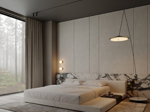
The master suite is all about contrast. Light and dark, warm and cool. You can see this not only in the contrast of the colors, but the lighting.
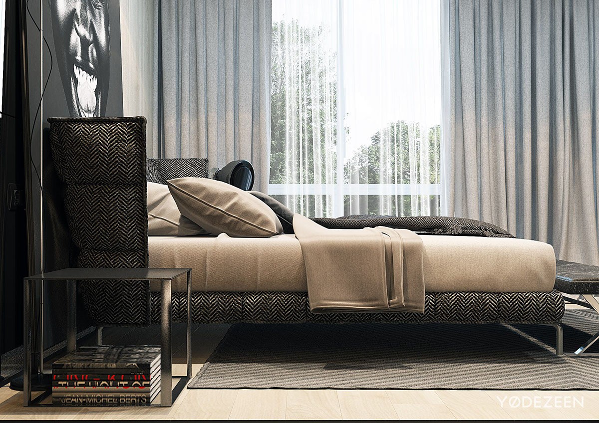
Light camel sheets against a gray herringbone bed is a beautiful warm and cool contrast that adds a lot of texture and dimension to the bedroom.
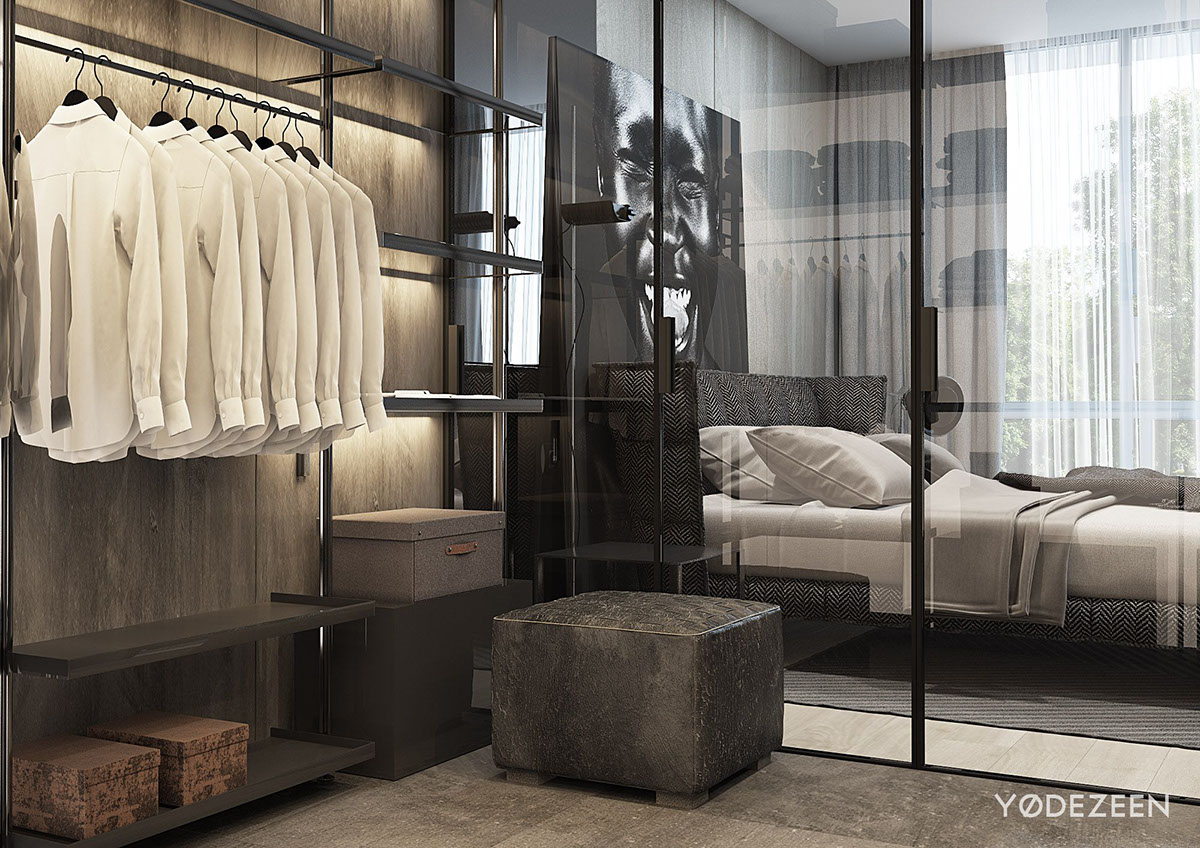
This closet warm and inviting, yet cool and refined. The glass doors display the wardrobe like pieces of art and the golden lighting once again adds a warm dimension to the space.
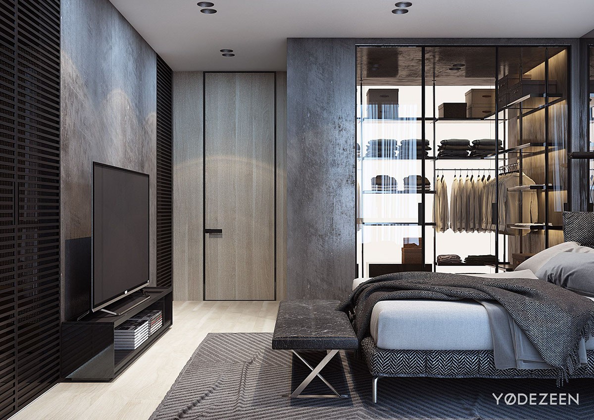
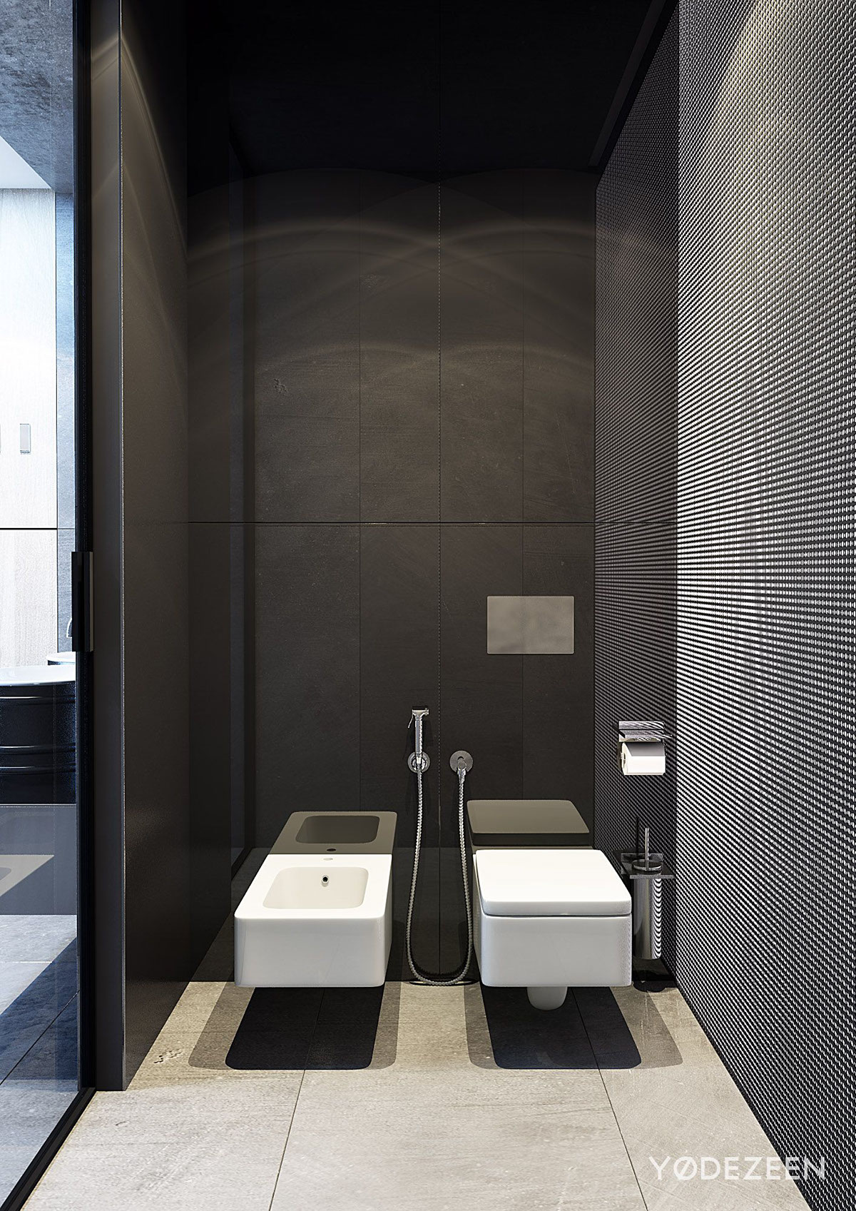
The grate pattern is also carried into the bedroom as you can see behind the TV. Accent walls don’t have to just be colors, textures also play an important role in defining a space.
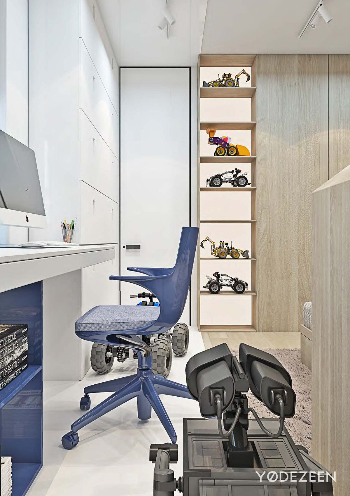
This kids room makes the tike look like a tiny engineer. The way the toys are displayed like fine creations, and the stunningly modern desk, really make this space feel refined.
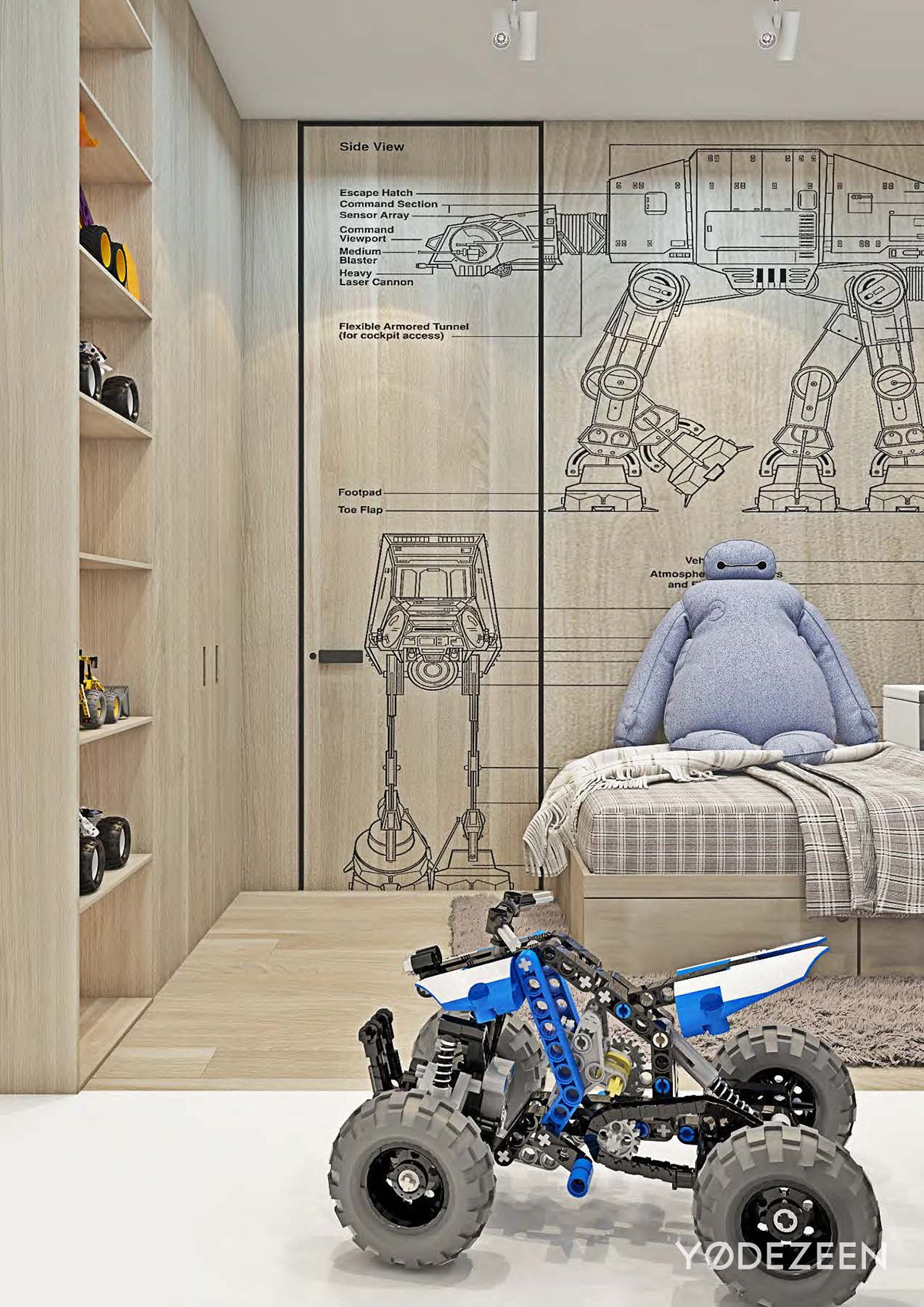
Custom art for a kids room is a great way to personalize the space for them, especially in one like this which is very tied into the rest of the homes look and feel. We love how they did it here, as a linear drawing with the wood tone still on full display.
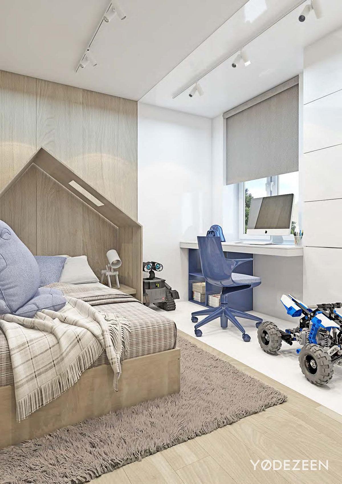
Giving kids space to play, but also clean up properly is important — and this space does both. There’s ample place to lay out the toys but also display and put them away.
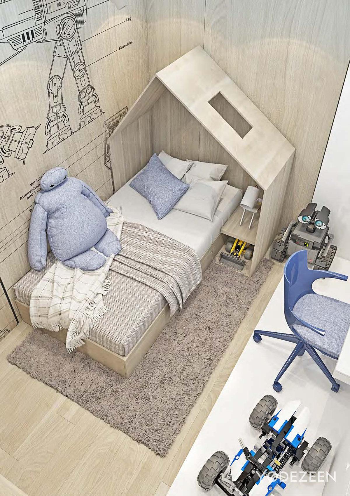
Small elements like the headboard are also great for kids. Something like this is simple, and could be an easy weekend DIY project — and it doesn’t have to look like on either! This headboard house is quite nice!
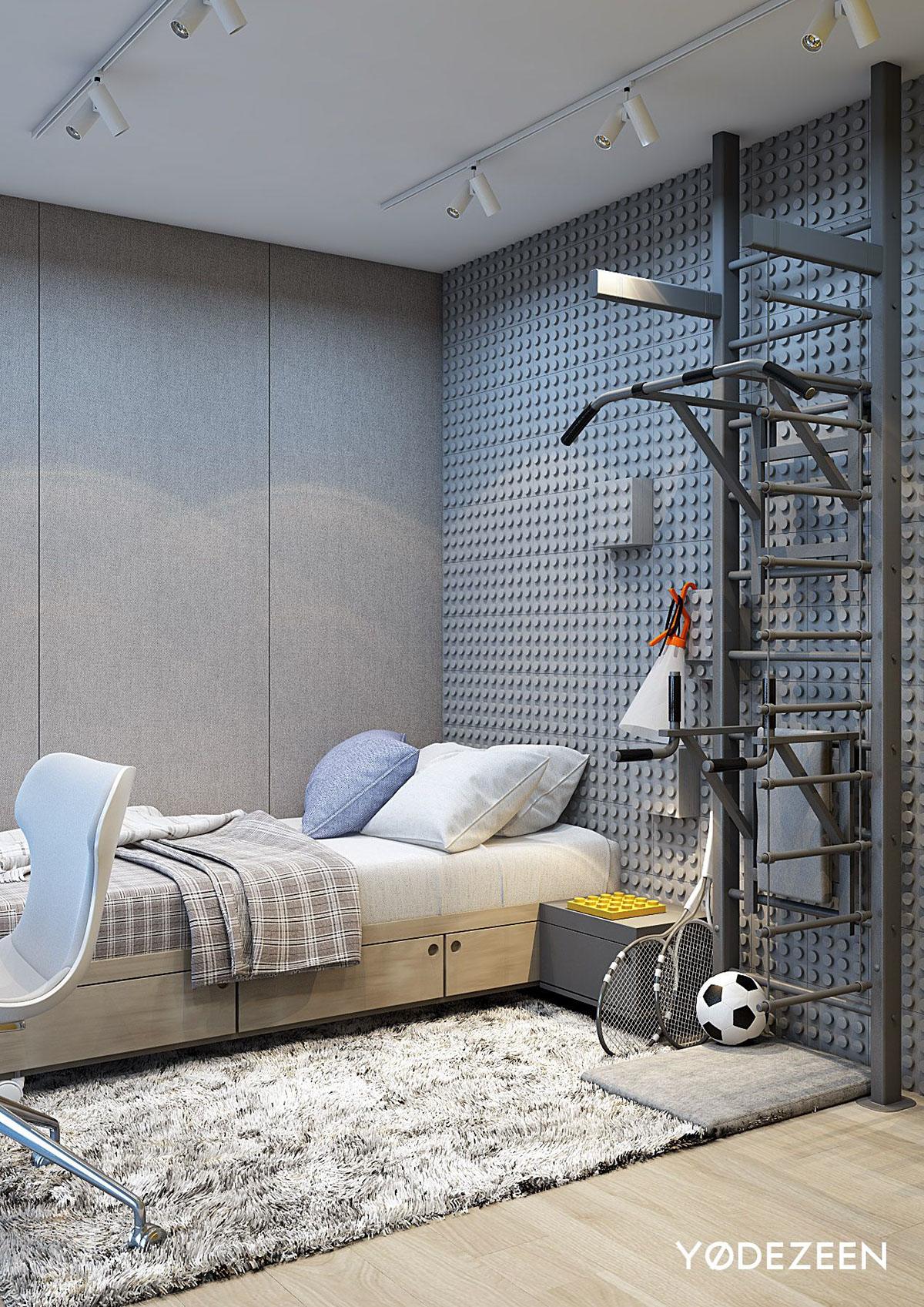
Maybe we spoke too soon when we mentioned interesting feature walls! This wall in the kids room looks like it’s out of a lego box, and we love it because it plays on a kids whimsy while also looking modern and chic like the rest of the home.
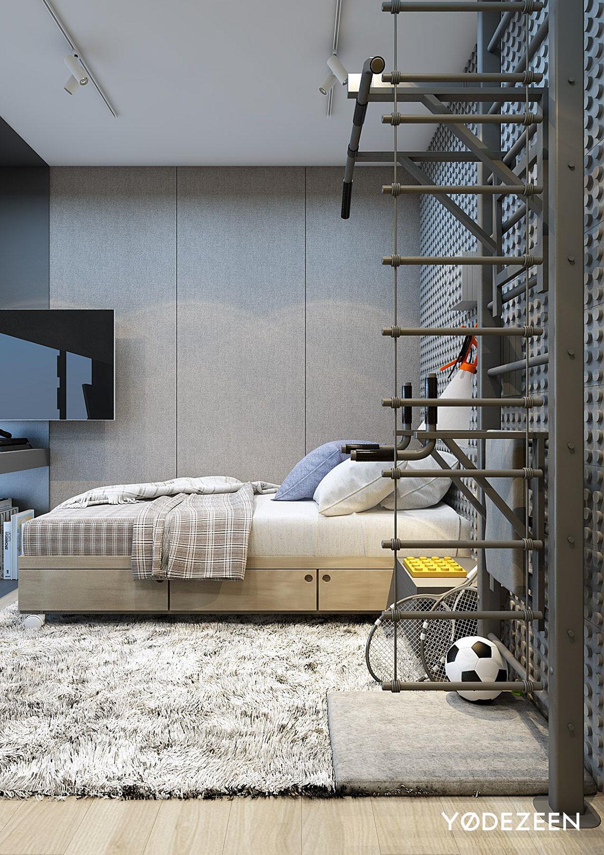
This space shows you can go for a kids room sport theme without making it cliche. Especially when you know a kid may grow out of a theme room, make the major design elements of the space something that they can adapt too. Like here, it would be easy to remove the equipment and put up a book shelf instead.
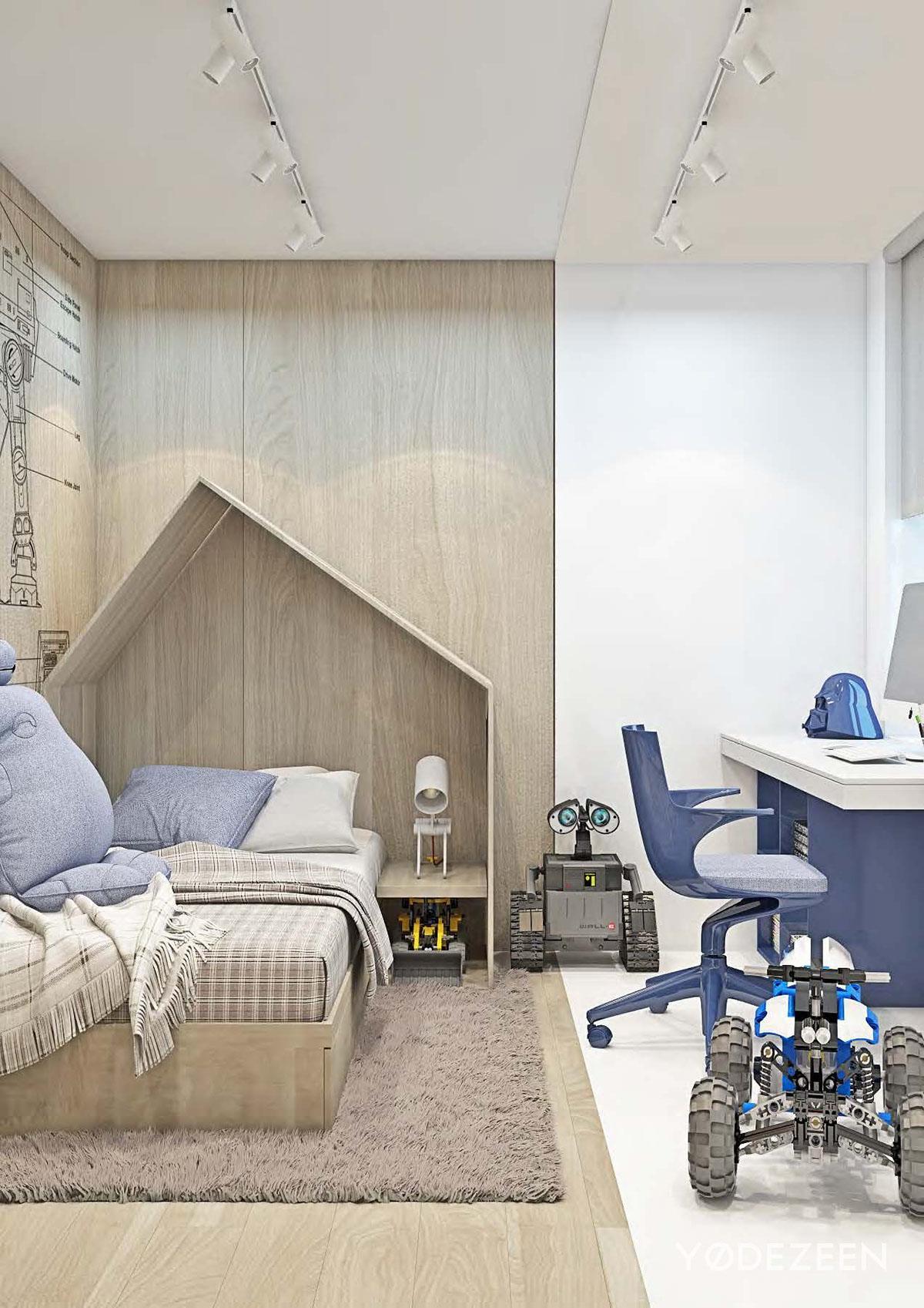
From here you can see how they’ve split the play and sleep area of the room with that beautiful ashy wood on the floor and walls. It’s a unique way to separate the spaces and it is a bold design feature.
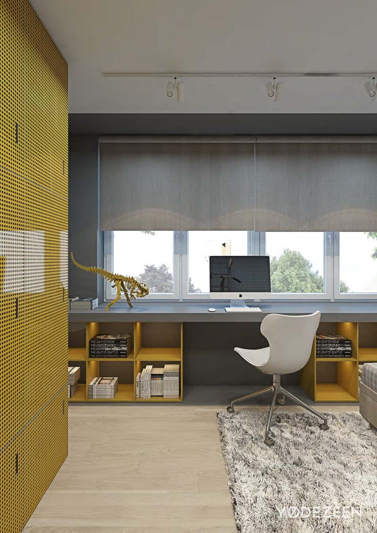
We love the gray and mustard yellow contrast. It works so well together because they’re so different, yet they seem to bring out the brightness and muted elements of one another.
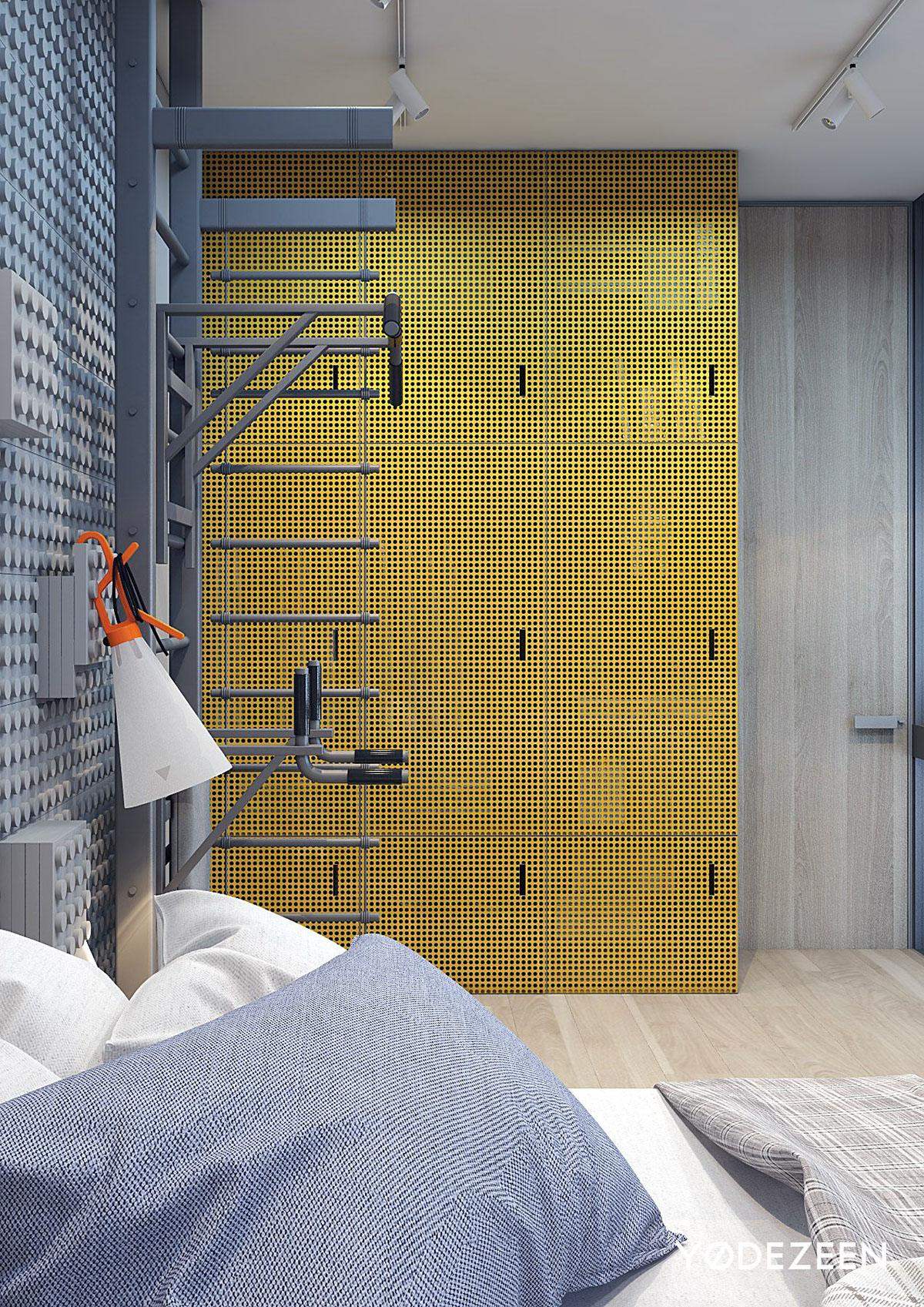
Blue and yellow may be on the opposite ends of the color spectrum, but bringing them together in this kids room was a great idea.
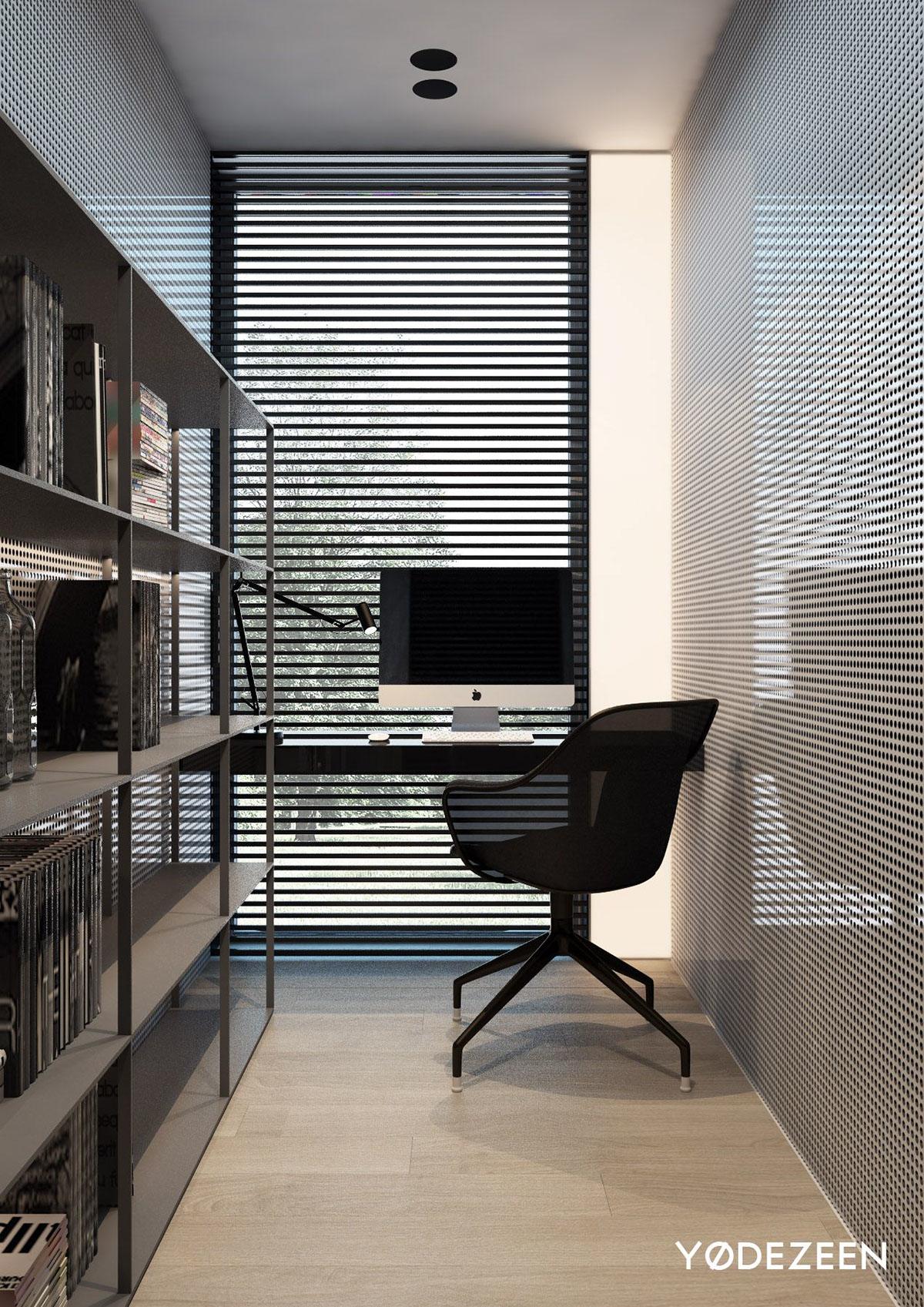
From here you can see the real transparence of the walls, and it looks stunning against the slits for the window shades — one big play on light.
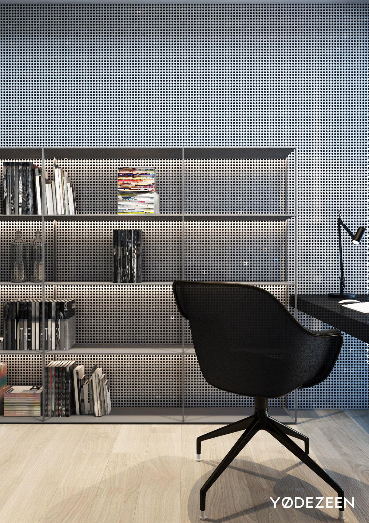
We are obsessed with this feature wall. It’s not only interesting and visually appealing but it allows for light to flow through it, and the way the light hits it too is also quite unique.
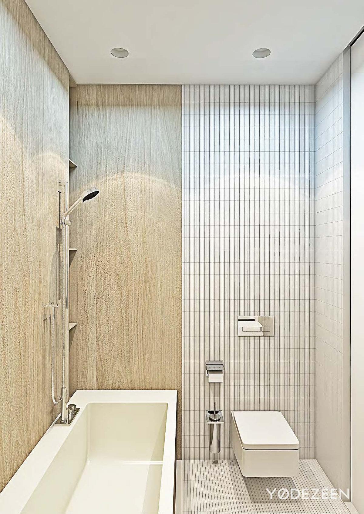
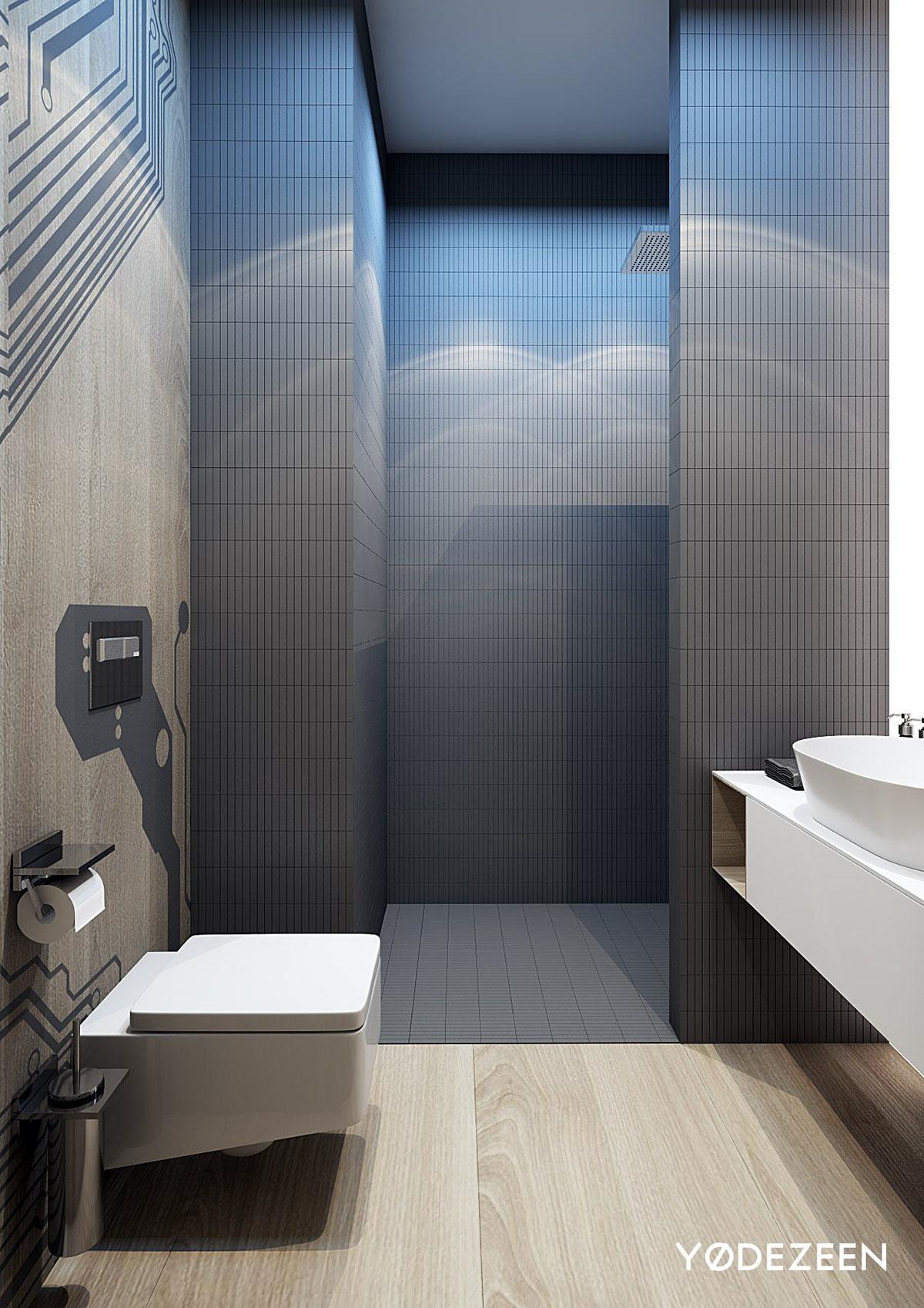
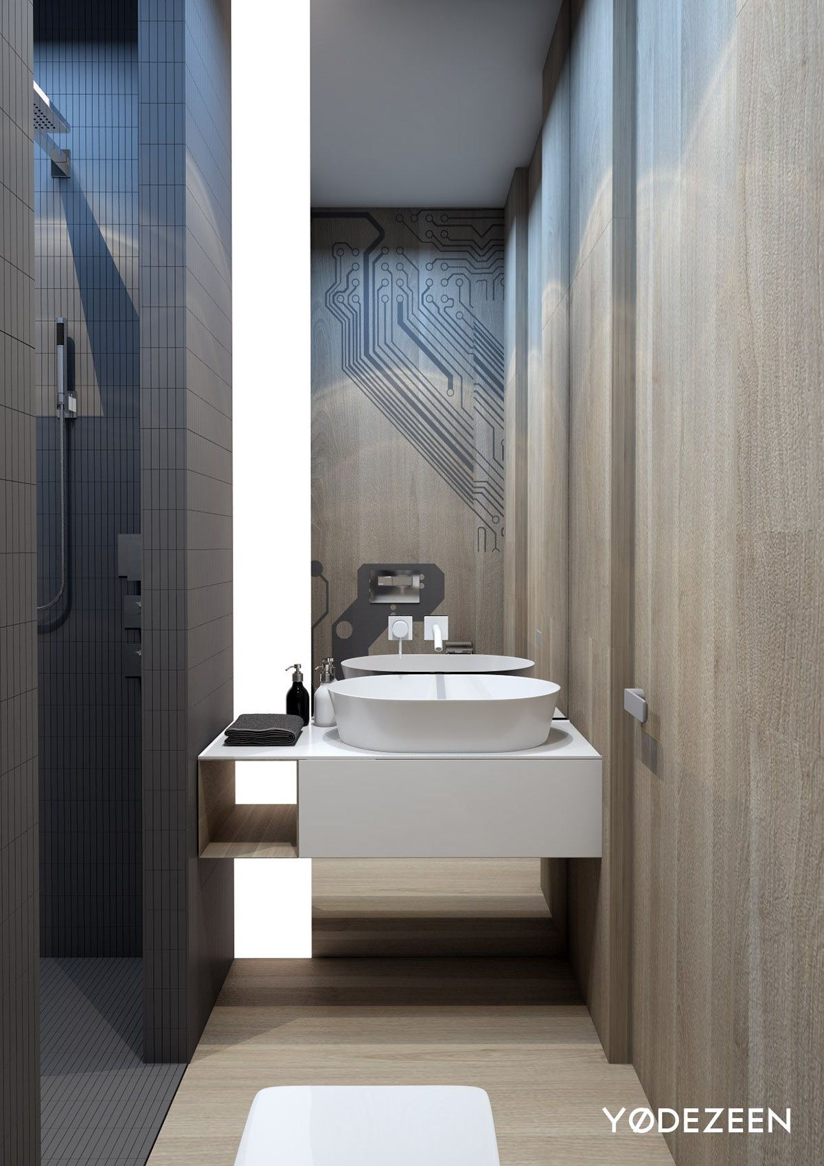
The faux wood in the bathroom is a surprising element, given that the rest of the home loves to play on the dark gray colors. But we love the choice here because it’s a small bathroom, so the wood and the white tiles really look great together and make it feel much more open.
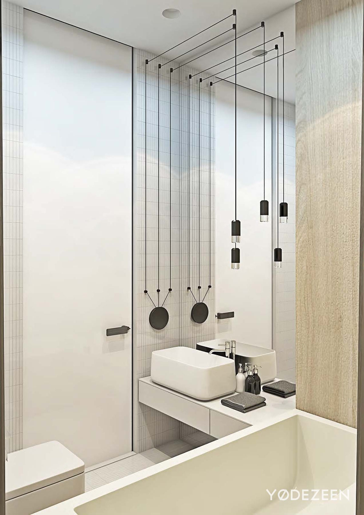
These super modern linear lighting elements are to die for. We love how they hang in front of the giant mirror and how they draw your eyes down to the low sink and tub.
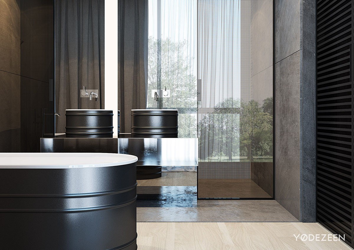
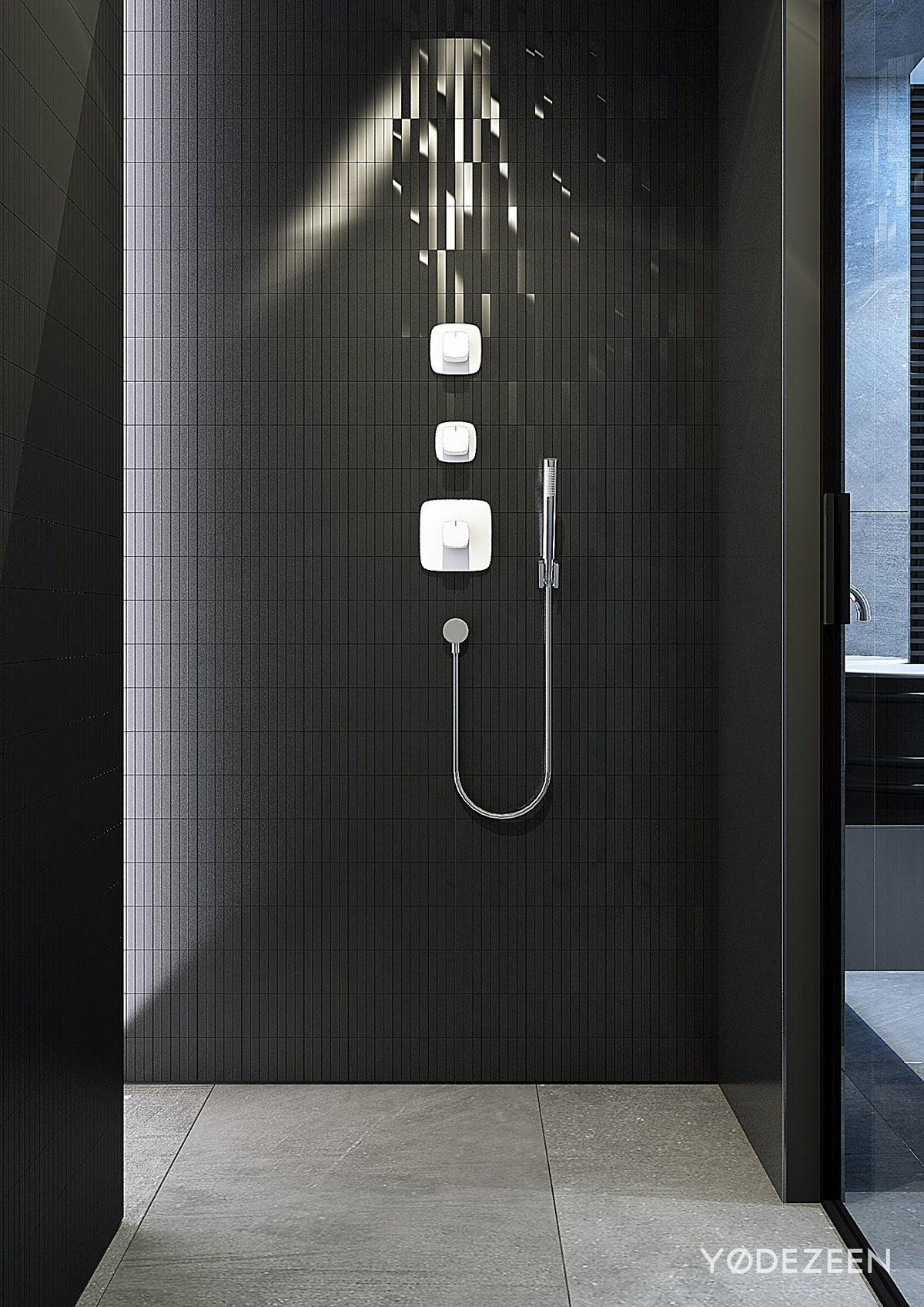
While the colors in the maser bathroom are probably more along the lines of what you were guessing, the shapes definitely throw you for a loop. That’s not to say we love it any less! The sinks and bath, which almost resemble oil drums with their rings and curved lines, are a welcomed surprise to the very linear and angular space.
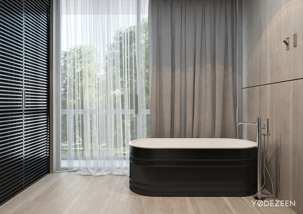
Once again we’re surrounded by this ashy wood, and it works well in the space despite it being a bit of a surprise. The warm wood tone is inviting and makes you feel automatically relaxed.
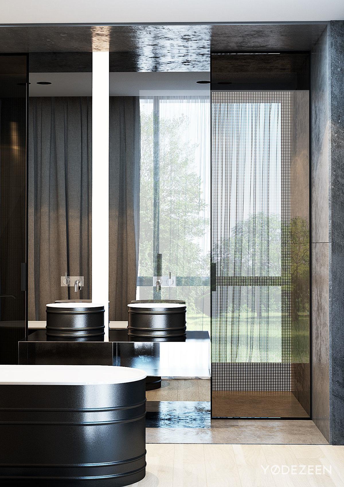
We can’t forget about that massive floor to ceiling mirror either. The mirror reflects tons of amazing light that’s coming in through the large window, and it looks luxe as it leads your eye up to the tall ceilings.
