Is there a color more universally associated with happiness than yellow? It can represent energy, excitement, and strength too – but as far as cheerful accent colors go, yellow is possibly the strongest candidate out there. This post looks at two homes with otherwise neutral palettes effectively brightened by small yellow accents. The first home enjoys a creative and artistic style with vivid lemon yellow accessories and architectural details. The second home shows off a minimalist all-white interior with a single pale yellow focal point that transforms the entire atmosphere.
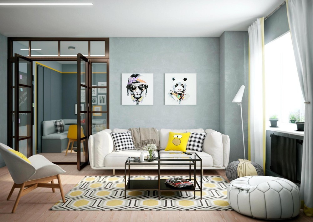
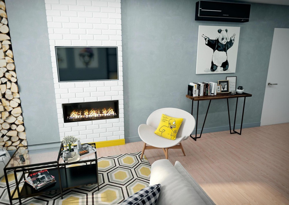
First, let's take a tour through an apartment in Minsk. Olya Berkova visualized this interior style for a young family with an active lifestyle and that intense energy reflects through every detail. Its neutral palette utilizes the blue side of the grayscale spectrum, using its natural contrast value to make the exciting yellow accents stand out even more. It's filled with artwork and fabulous geometric patterns, soft furniture and sharp decoration.
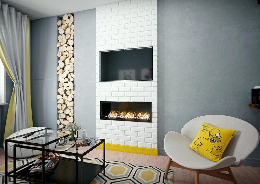
It's also incredibly current on a number of trends, taking the vertical wood niche to the next level by stretching it from floor to ceiling and including a warm faux fireplace beneath the television. The poufs and nesting tables are always in style.
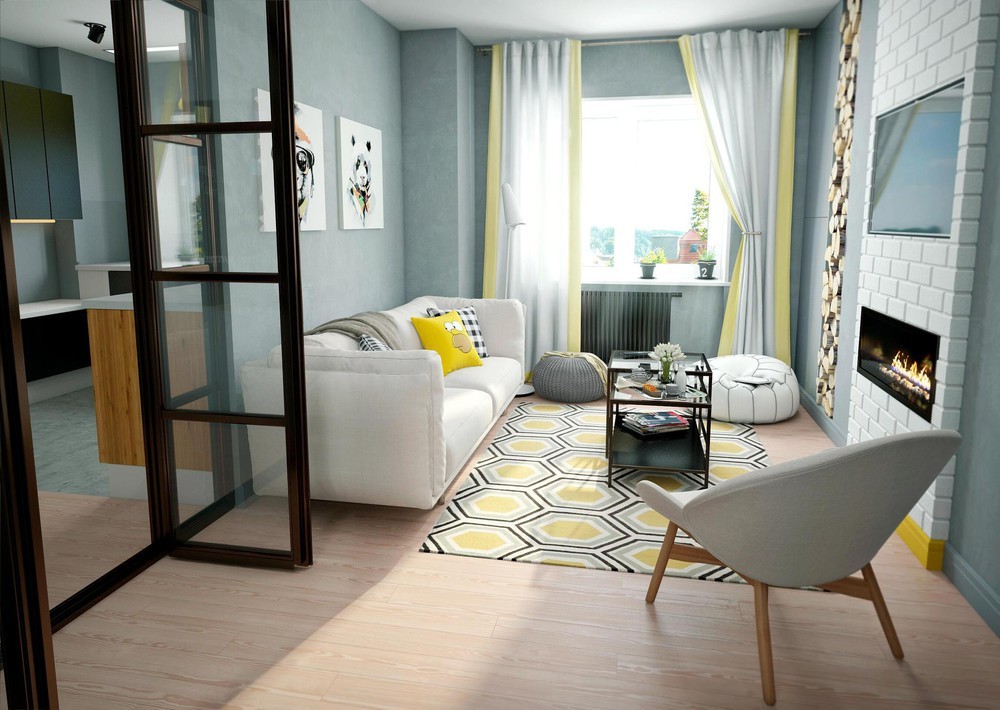
Brighter yellows emphasize functional focal points, like the sofa and the television housing. Lighter yellows make up the primary accents such as the pale tones used on the rugs and curtains.
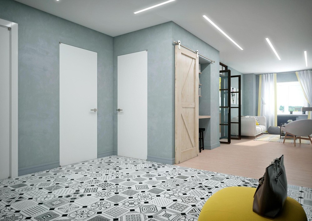
Throughout the home, you'll notice creative fixtures from the prolific lighting company XAL. Featured here are long panels from the MINIMAL LED line.
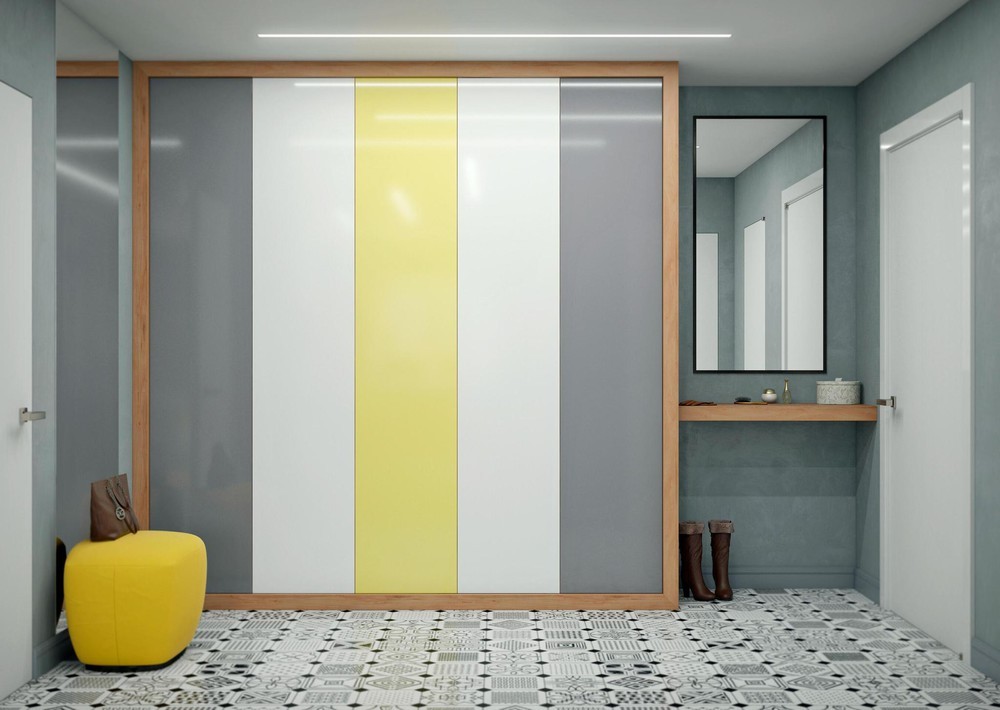
Very cute! This spacious closet uses bold blocks of color for a bold effect – rather than trying to make the storage blend in like so many minimalistic homes, this one uses its utilitarian features for artistic expression.
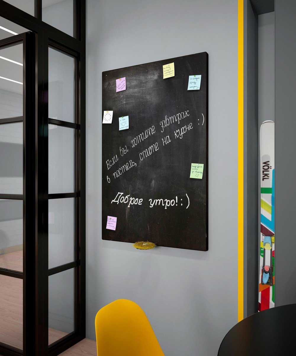
You don't need to paint a wall to participate in the chalkboard wall trend. This chalkboard is made from a simple painted board or canvas, easy to recreate at home.
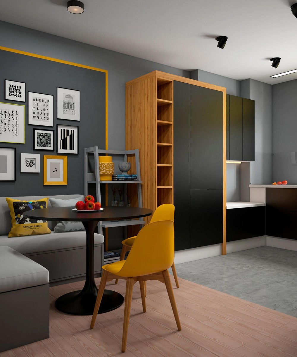
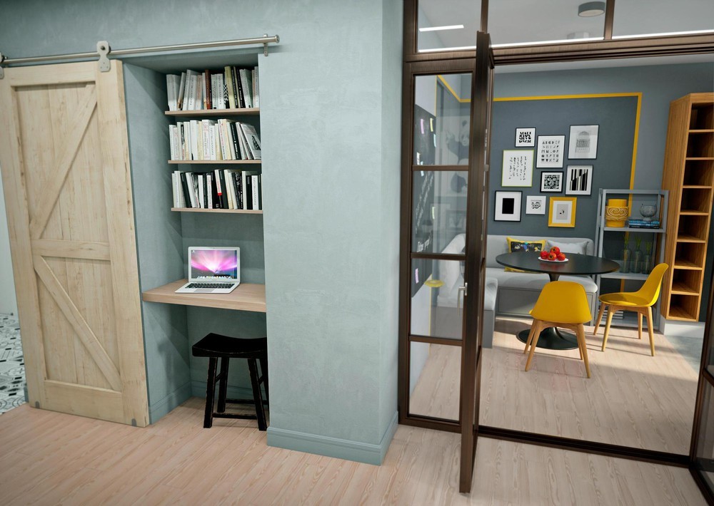
In close proximity, the kitchen and dining spaces remain distinctly divided by the transition of flooring materials and a bright yellow border that outlines the table area. The two spaces do share some elements, like the bookshelf that could be used to store items intended for use in either area.
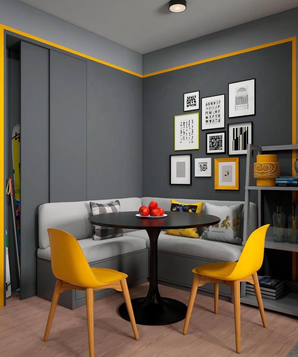
Small prints of typography, architectural drawings, abstract art, and symbols make an interesting focal point above the cozy corner bench.
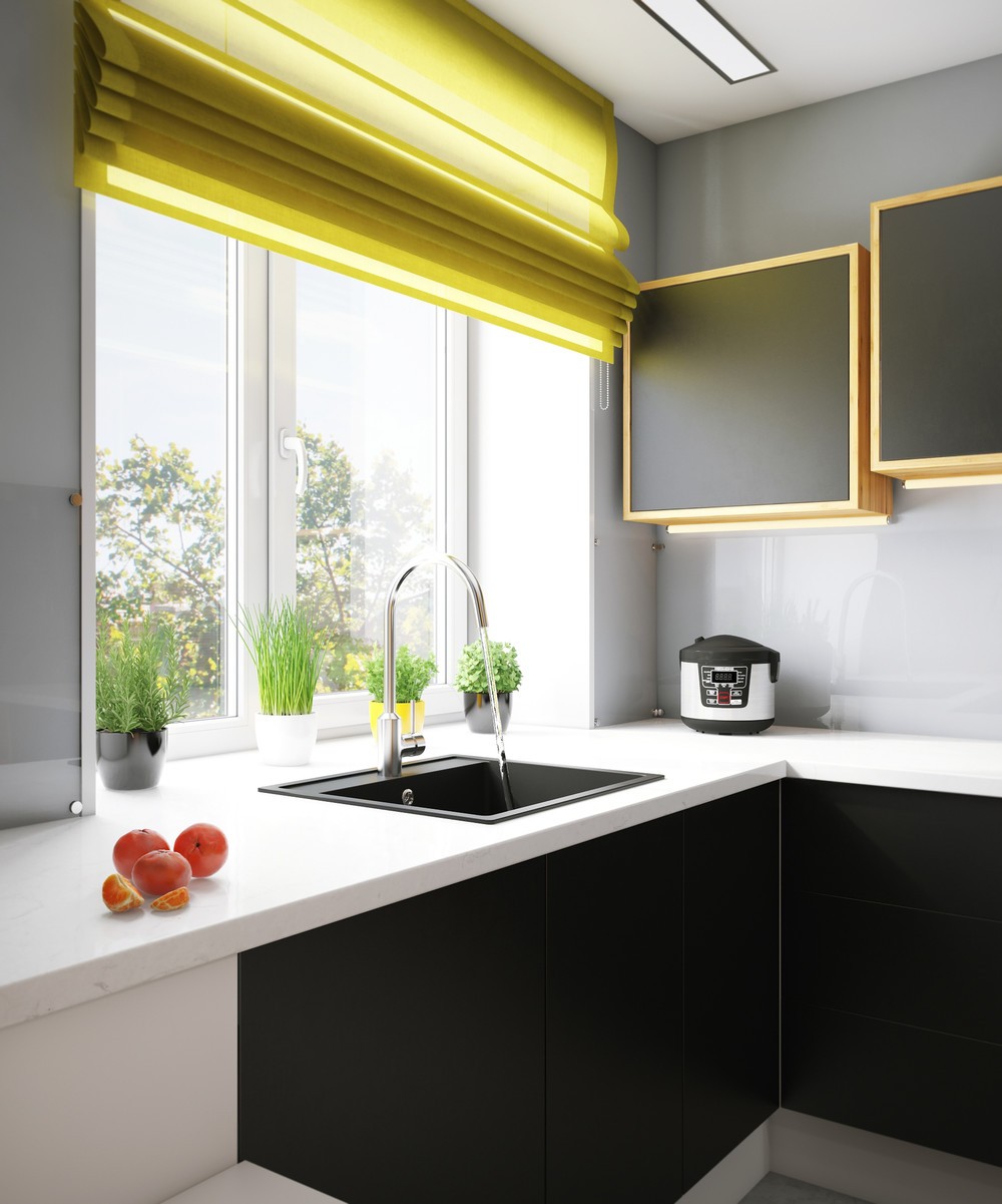
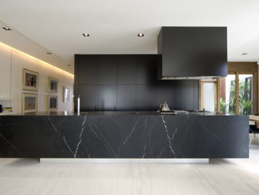
A small herb garden brightens the windowsill. Subtle marble countertops draw a sharp contrast against the matte black cabinet faces below, making the marble look even more radiant in the sunlight.
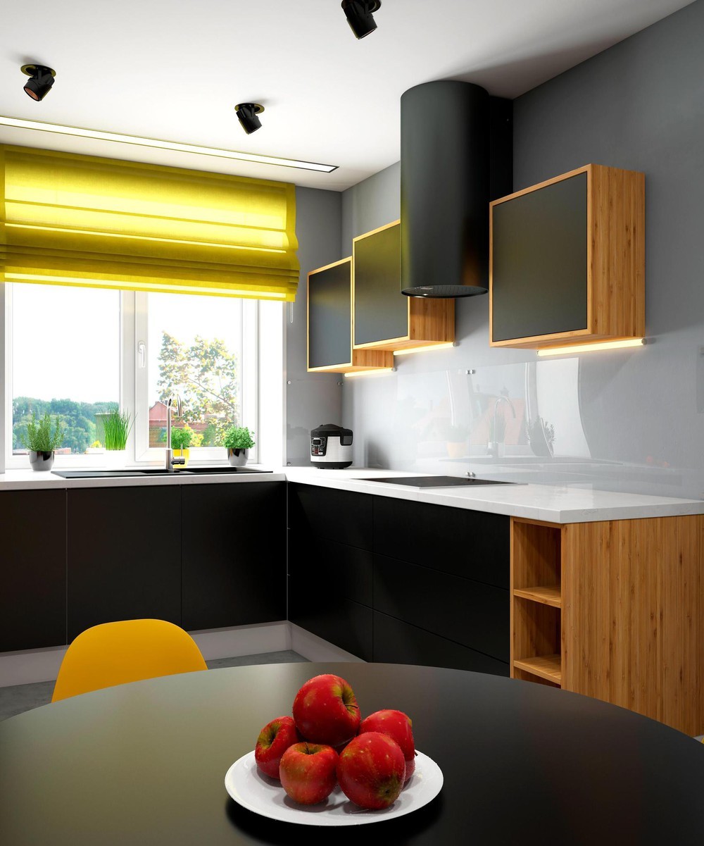
Another smart source of contrast comes from the square overhead cabinets and the cylindrical stove hood.
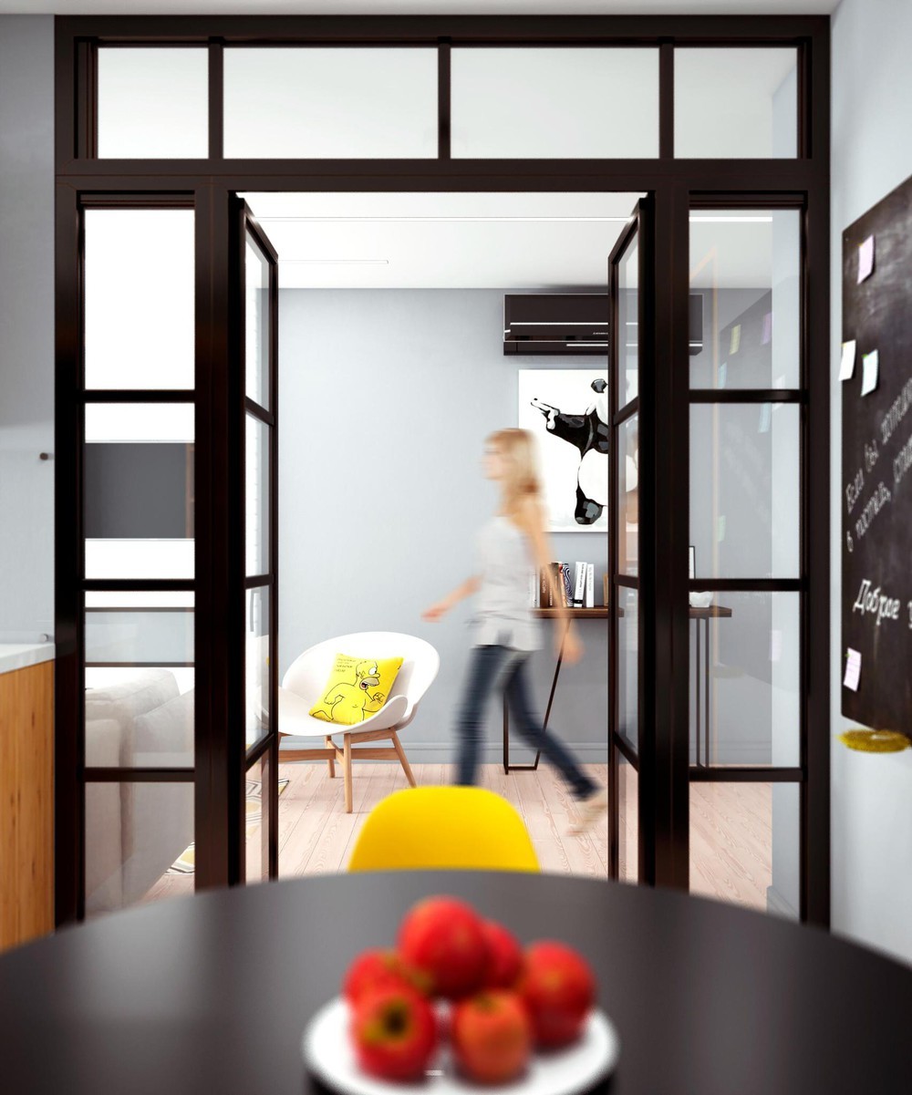
Glass doors maintain an open line of sight between the dining and living spaces while adding a sound barrier to use when needed.
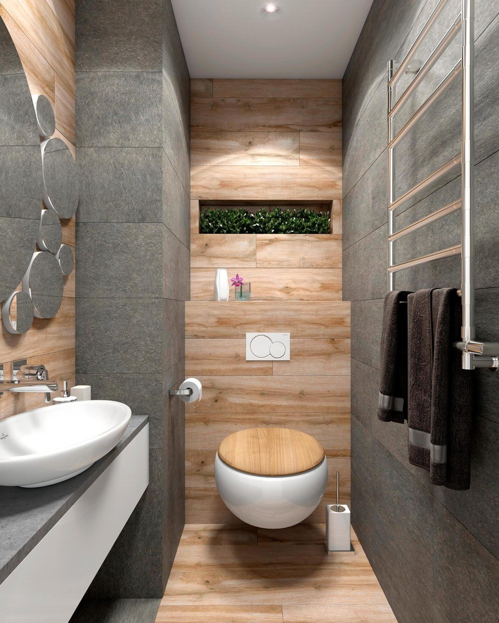
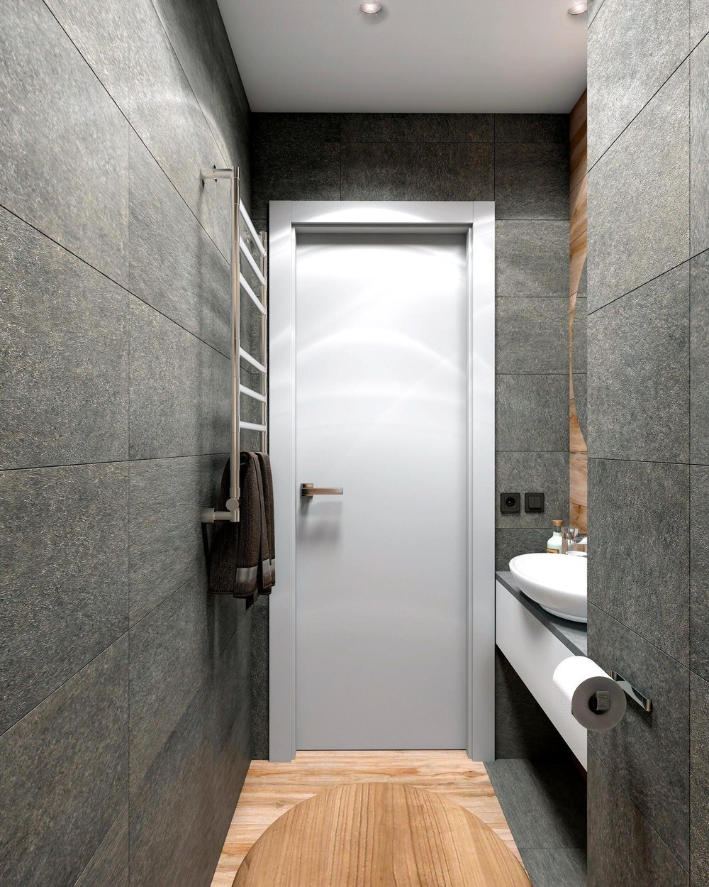
Wood and stone give the compact bathroom an outdoorsy vibe updated with contemporary fixtures and minimalistic hardware. Its organic theme stands apart from the pop art vibe throughout the rest of the home.
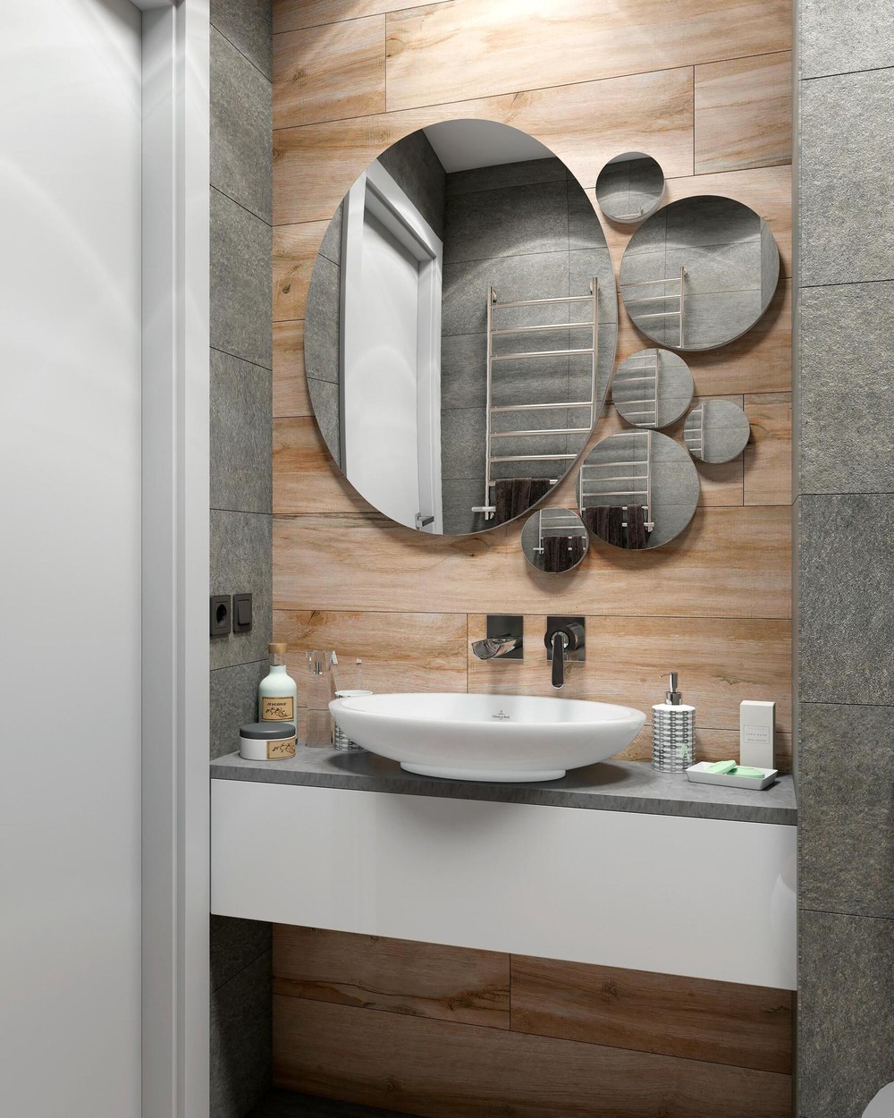
Angular elements ensure the bathroom retains its streamlined aesthetic. Circular features like the vessel sink and the creative mirror arrangement contribute to its lighthearted appeal.
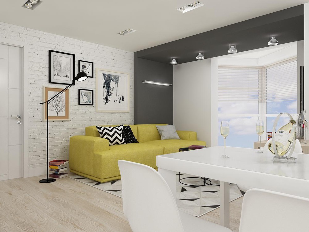
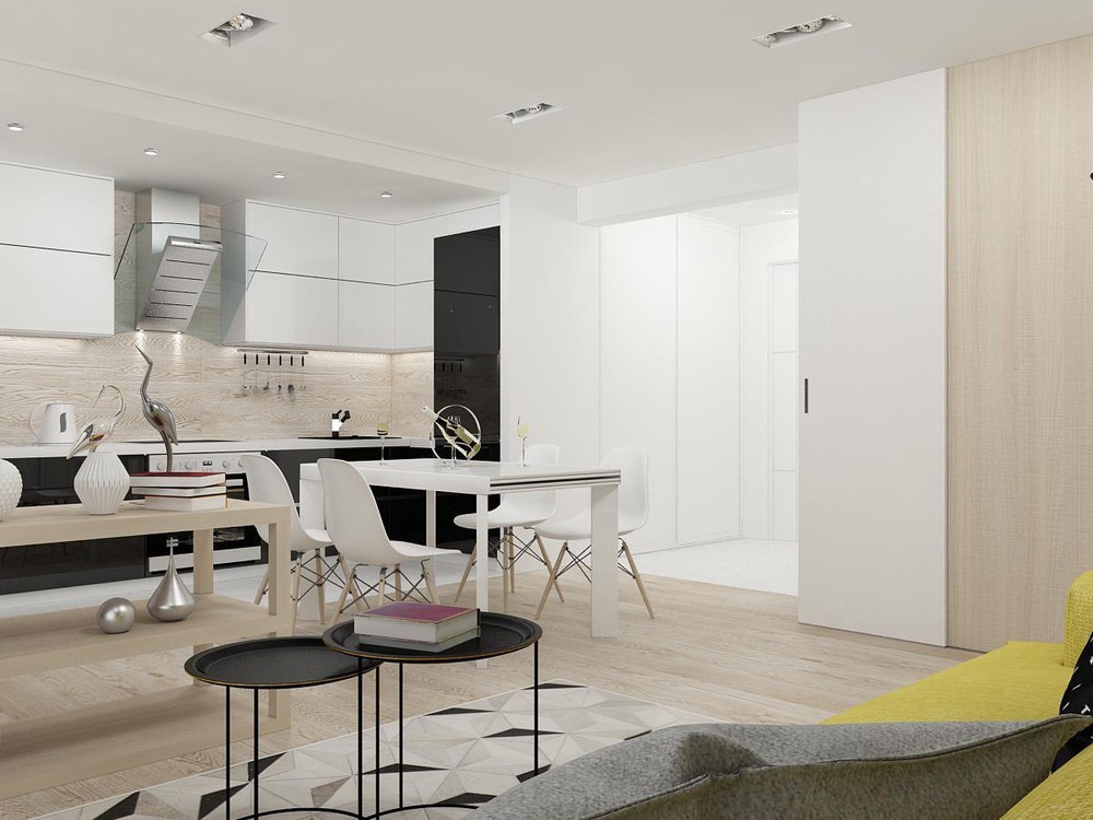
This next apartment concept was visualized by Alain Ponkratova for a young man with smart tastes. Exposed brick and light wood floors set a comfortable scene, its monochromatic interior brightened by the presence of a delightful lemon yellow sofa. The only color comes from this single sofa and a few vibrant stacks of books but these expertly applied details make all the difference. Fine art and sculptural accessories accentuate certain focal points where needed.
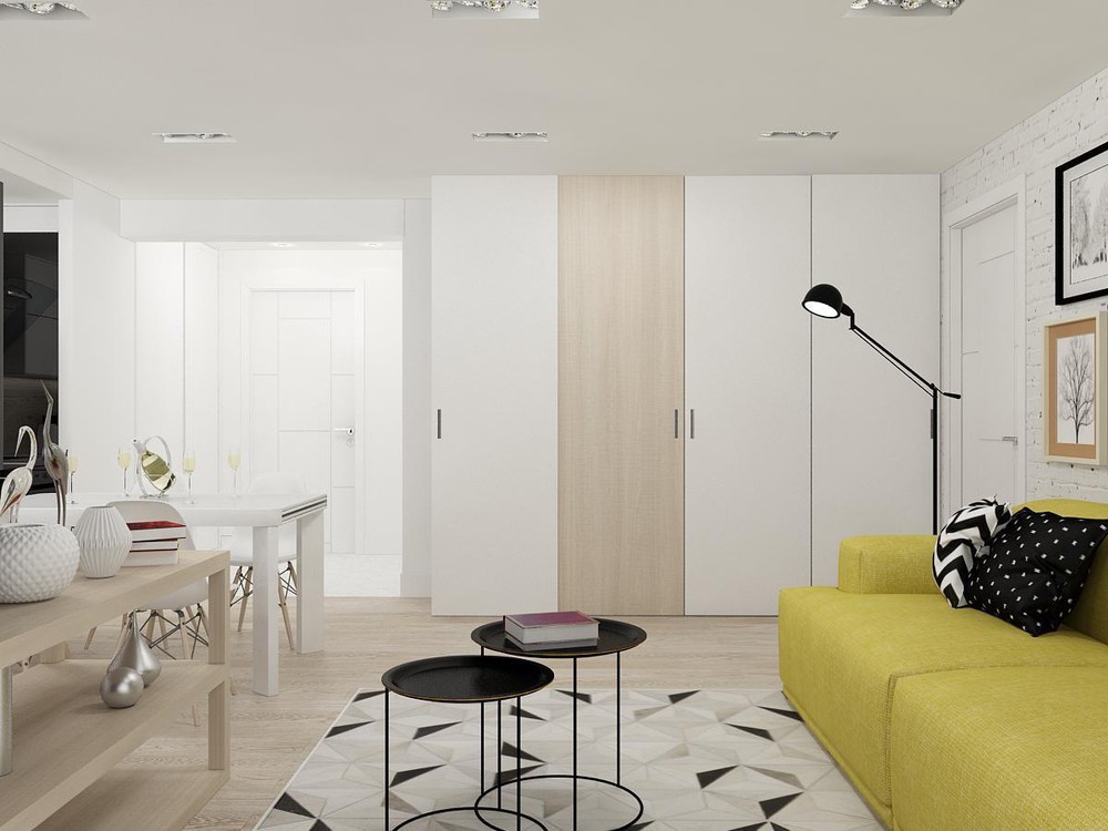
Fun patterns keep things exciting, from the bold prints on the pillows and rug to the subtle shape of the ceramics. Stylish nesting tables ensure the space retains its fresh and open feeling with streamlined legs for a lighter look.
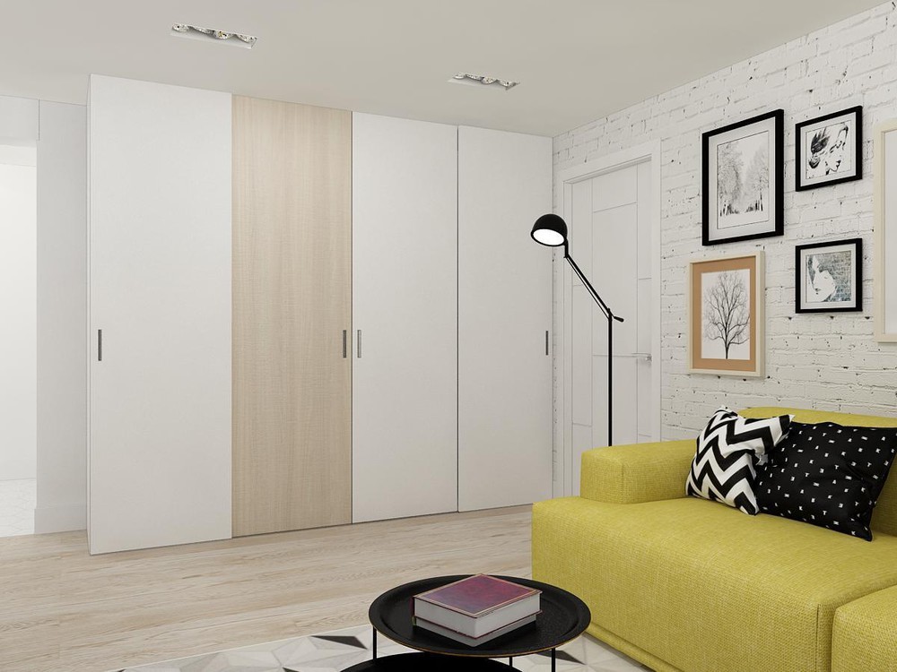
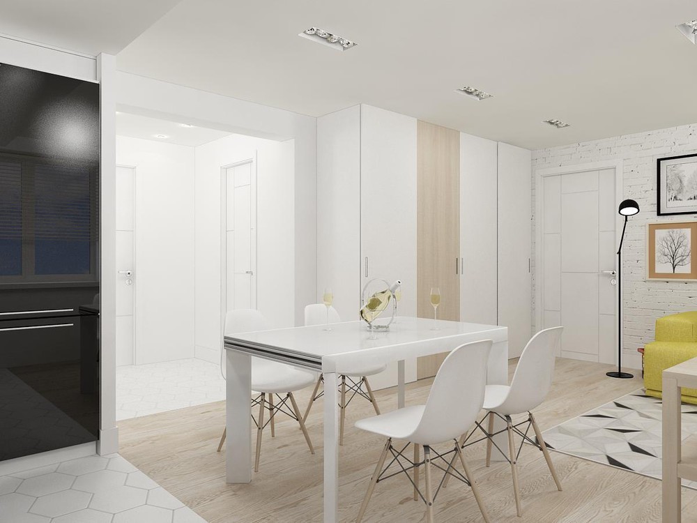
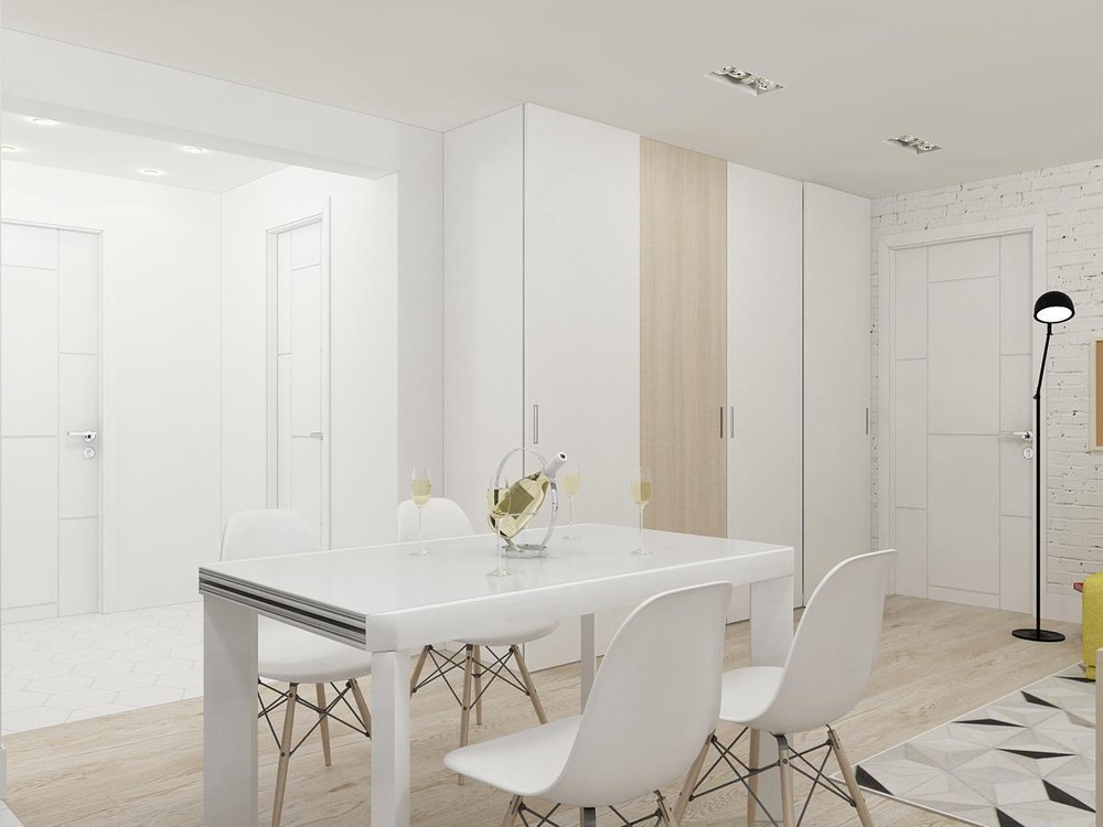
Of course, it's hard to have a home this sharp without some extra space for storage. These cabinets are sleek and simple with a single wooden panel to spice things up.
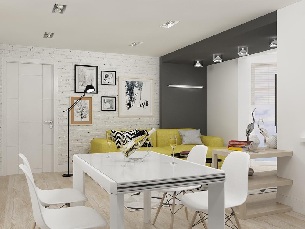
The circular wine holder makes a nice display piece. Decor that serves a purpose is a welcome addition to any table.
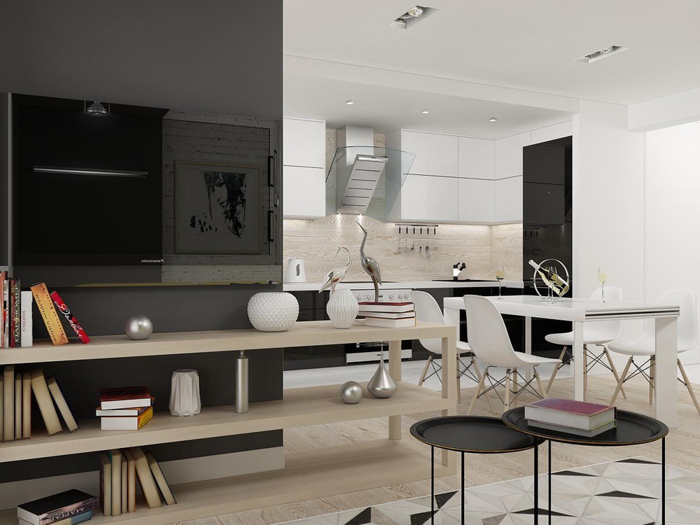
A bookshelf beneath the television shares some of the living room's decor with the dining room, while creating an implied division between the two areas.
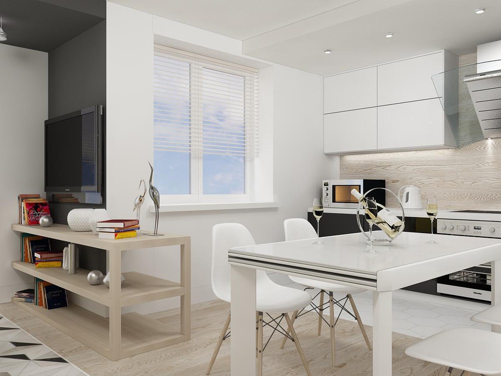
Another implied boundary comes from the transition from the living room rug to the stripe of wood flooring for the dining space and finally geometric white tiles in the kitchen.
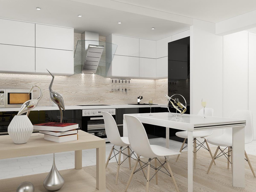
Much like how the living room featured a bold stripe of black, the kitchen also makes a striking impression with its row of black cabinet faces that frame the workspace so well.
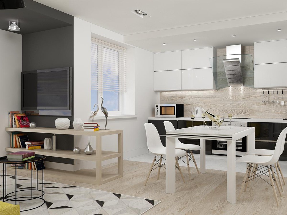
Glossy white cabinets, a glass range hood, and wooden backsplash perfectly follow the apartment's material theme.
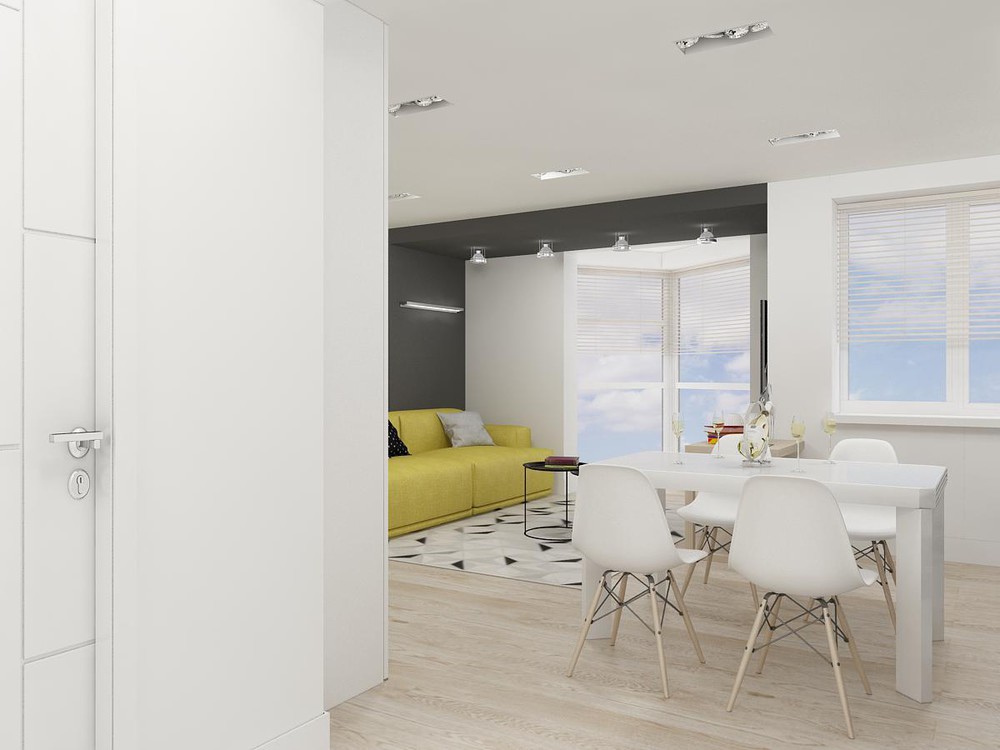
From this angle, it's easy to see that the home doesn't have a sprawling floorplan. Yet it pulls off a spacious aesthetic through simplicity and carefully tailored design.
