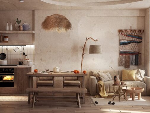
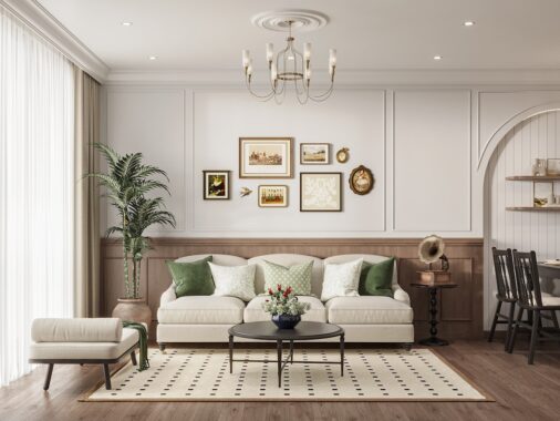
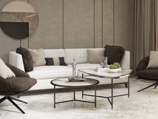
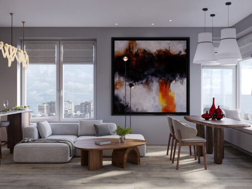
Why are natural neutrals such a good starting point for an interior design project? Organic themes offer so many choices and almost every natural hue coordinates well with the others. Plus, natural materials are easy to adapt when it's time to change to something more vibrant. It's the ultimate win-win decor theme! If you're looking for ways to decorate your home with relaxing organic tones, the stylish interiors below are sure to inspire. These designs show how flexible and versatile a natural home design can be: the first home is light and chic, while the second is moody and super modern.
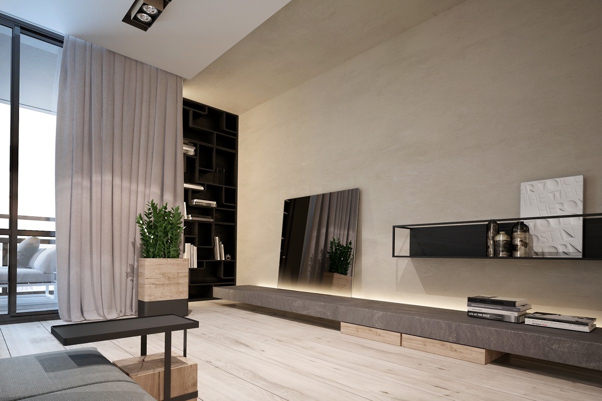
Cantilever furniture and indirect recessed lighting both contribute to the free and spacious feeling this apartment invokes. These details certainly make an interesting contrast with the heavier materials in use, especially the stone slab shelf running parallel to the floor. The shelf looks like it would make a convenient spot to sit while browsing through the books stored in the black bookcase.
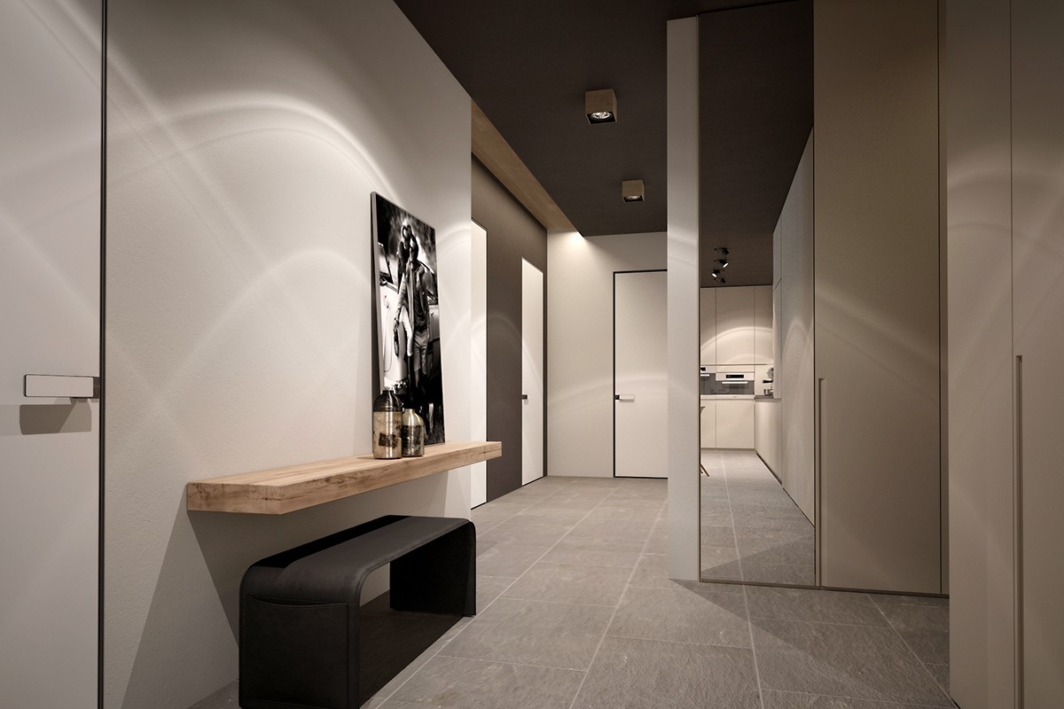
To compensate for such a carefully refined approach to furniture, this home design makes every detail count. Even the door knobs are fabulous!
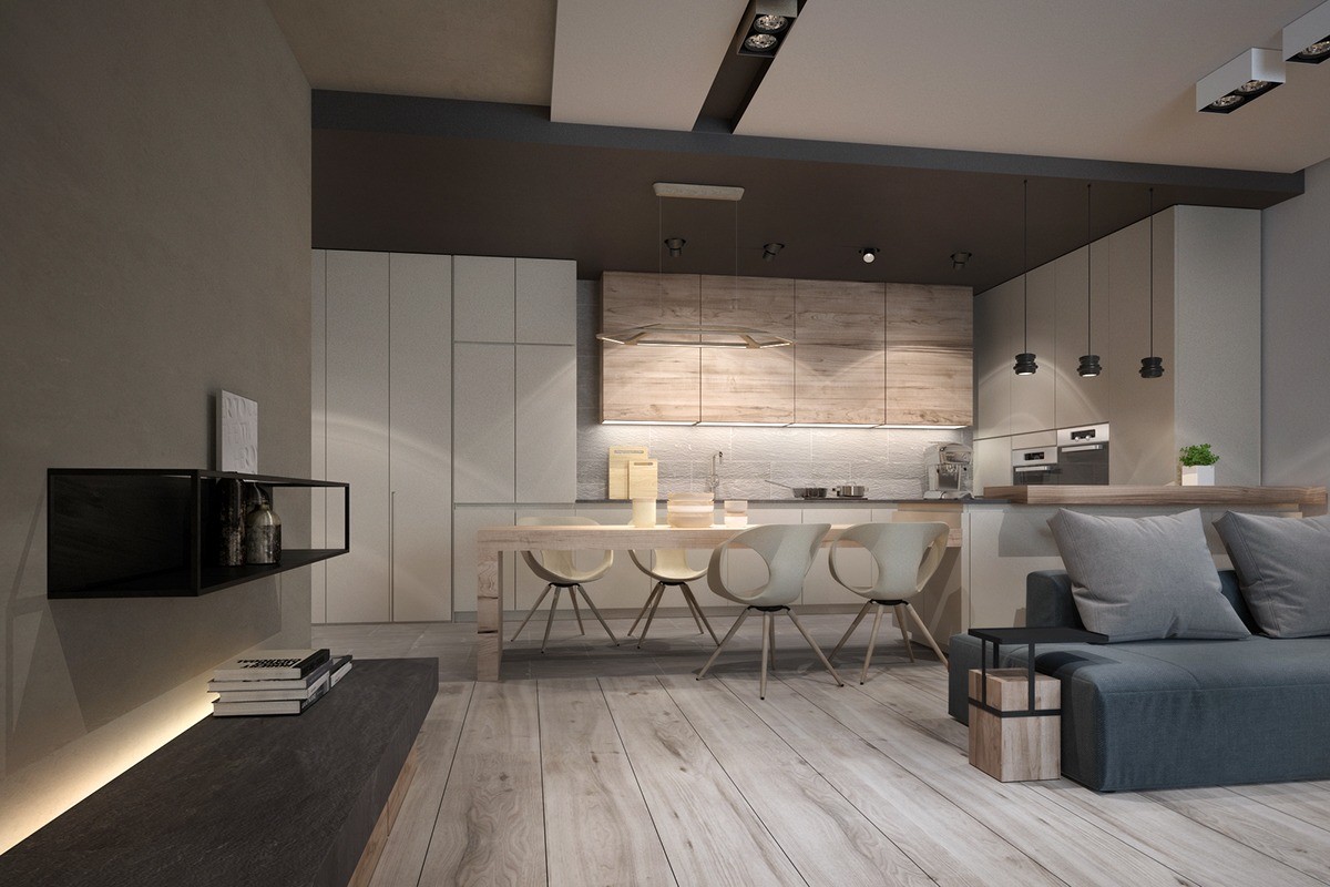
Partially open geometry is a recurring theme – not only the chairs, but the black shelves and side table too.
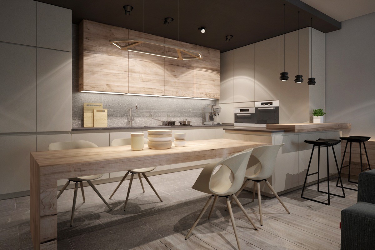
Tonon Chairs by Martin Ballendat embrace the organic theme through form rather than material. The geometric Aki Lamp by Studio Dreimann is made of wood and illuminated by LED inserts, its natural aesthetic achieved through material rather than form.

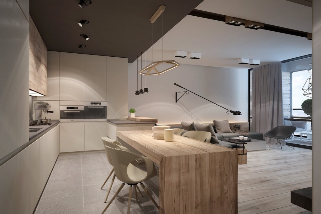
A dark drop ceiling defines the kitchen space – here, wood furniture takes the spotlight with a large slab table and matching cabinetry.
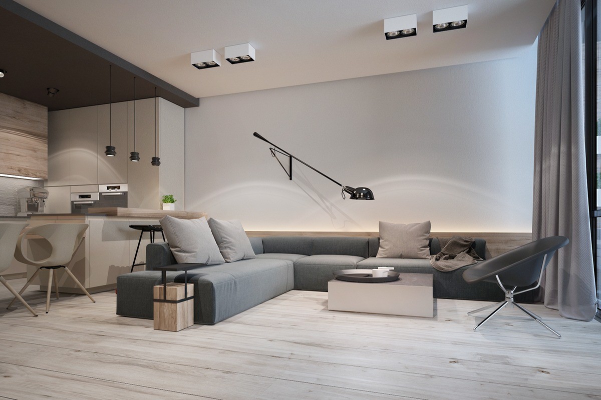
The furniture arrangement makes the best possible use of its view out the window to the right. It's nice to see a seating scheme that takes advantage of the home's natural assets rather than centering everything on the television as so many other interiors do.
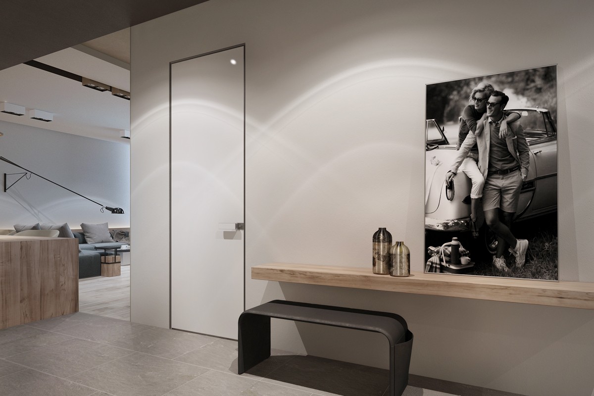
Each touch of unfinished wood adds an important organic element to an otherwise minimalistic home. If it were overly glossy or stained another color, the interior would seem more "standard modern" and might lose a crucial ingredient that makes this look so unique.
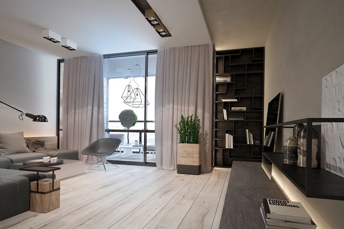
The unfinished wood details are worth a second look. Each one combines modern finishes with raw natural materials for a striking contrast.
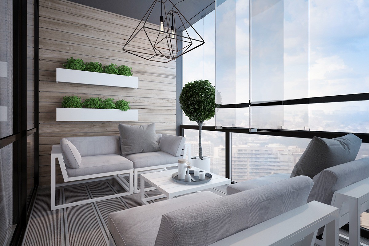
Here, an adorable vertical garden takes its place hung on a wooden accent wall – both the containers and the wood slats feature a horizontal alignment for a smart and clean look. The terrace sort of takes the natural color palette from the interior and brings it to its logical conclusion.
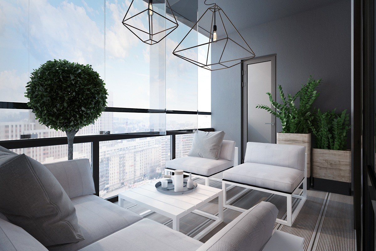
Geometric themes define the terrace, a varied combination of shapes including the spherical topiary tree, gem-shaped wire pendant lights, and square framed chairs.
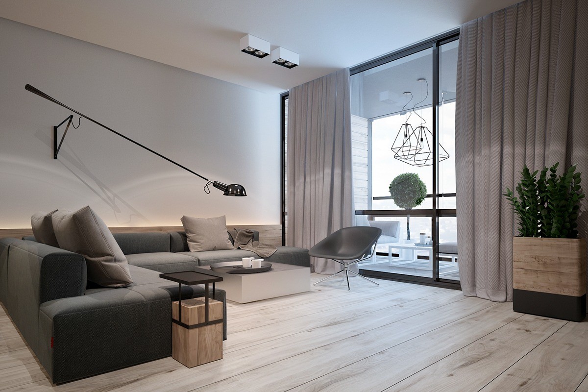
Providing conveniently adjustable task lighting is the Paolo Rizzatto 265 Lamp, composed of sturdy steel and a cast iron counterweight.
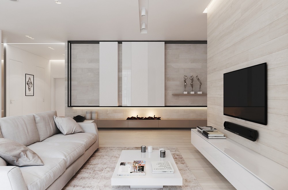
This lovely Moscow apartment embraces minimalism with natural materials and simple forms – the color theme feels perfectly fluent, derived from the wood and textiles themselves for a truly organic appearance. It's clear that the designer curated the furnishings and decor very thoughtfully yet the result feels effortlessly smooth.
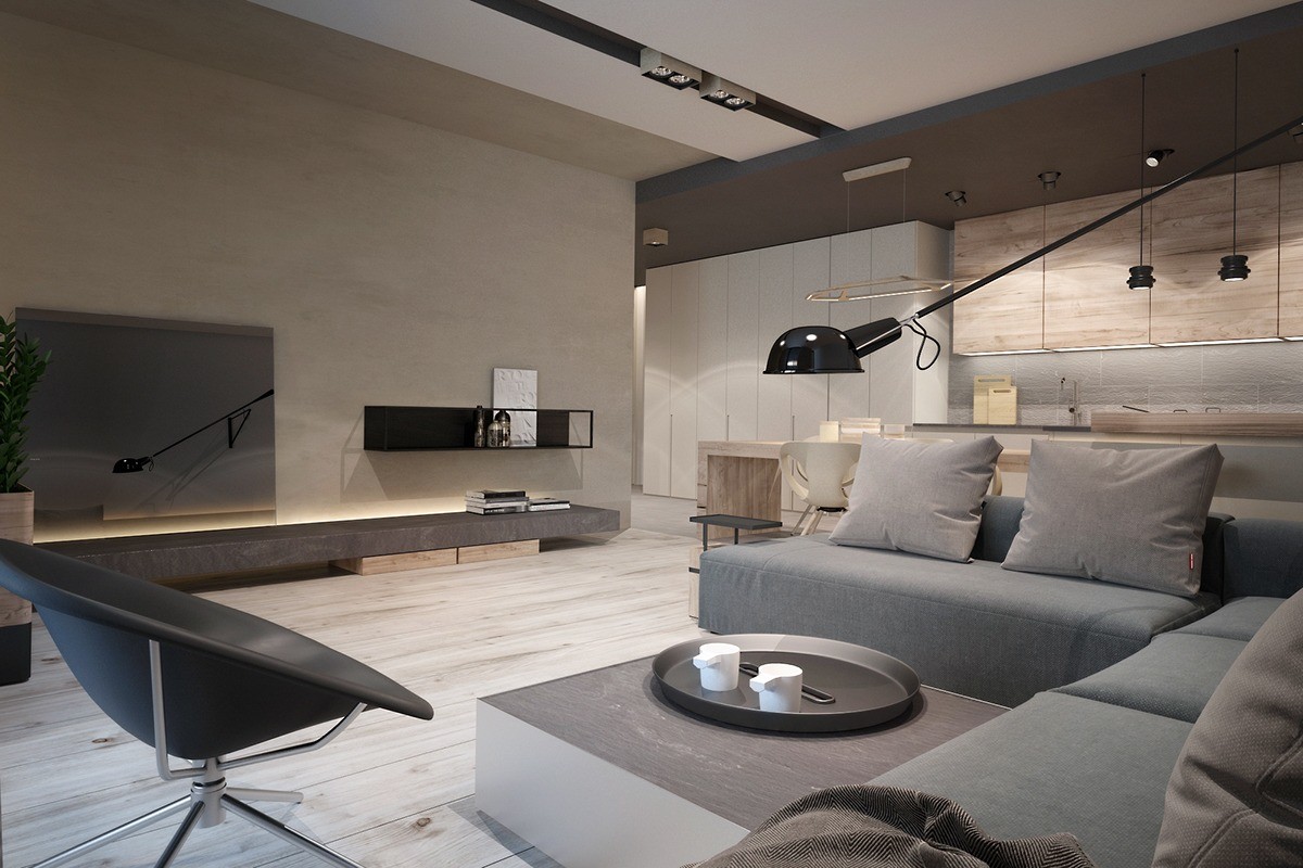
This interior by Ukraine-based designer Yana Osipenko features a more rugged natural theme based largely around the soothing colors of wood, sand, and stone. These elements work well with the industrial – almost Bauhaus – furniture pieces used as accents throughout. Although the interior is sleek and streamlined, it shines through its impressive subtle details.
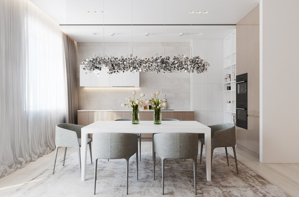
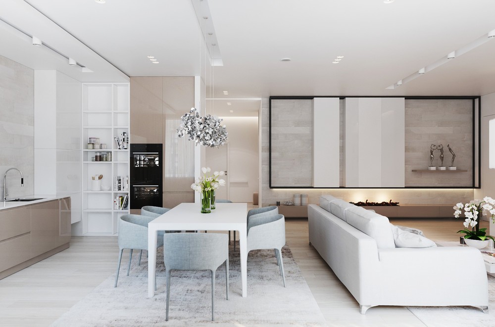
The petit kitchen stays low key with a subtly textured backsplash, wood lower cabinets, and glossy overhead storage.
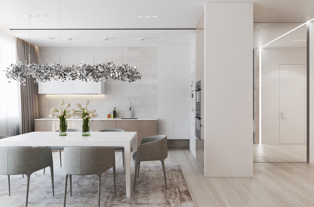
The dining chairs are especially neat because the upholstery extends all the way down to cover the legs for a completely unified and cohesive look. It rounds out the soft aesthetic started by the flowing drapes and chic rug.
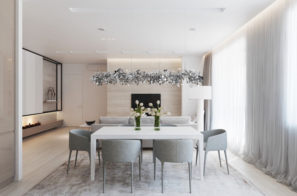
Glitter! Confetti! This suspension lamp definitely brings an irresistible pop of excitement to the subdued dining room area.
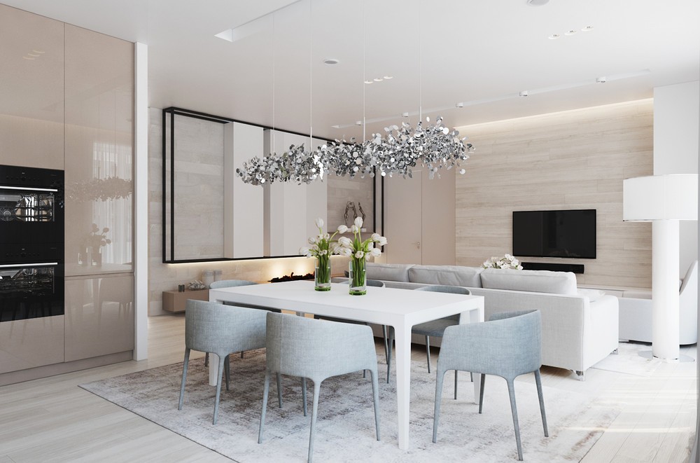
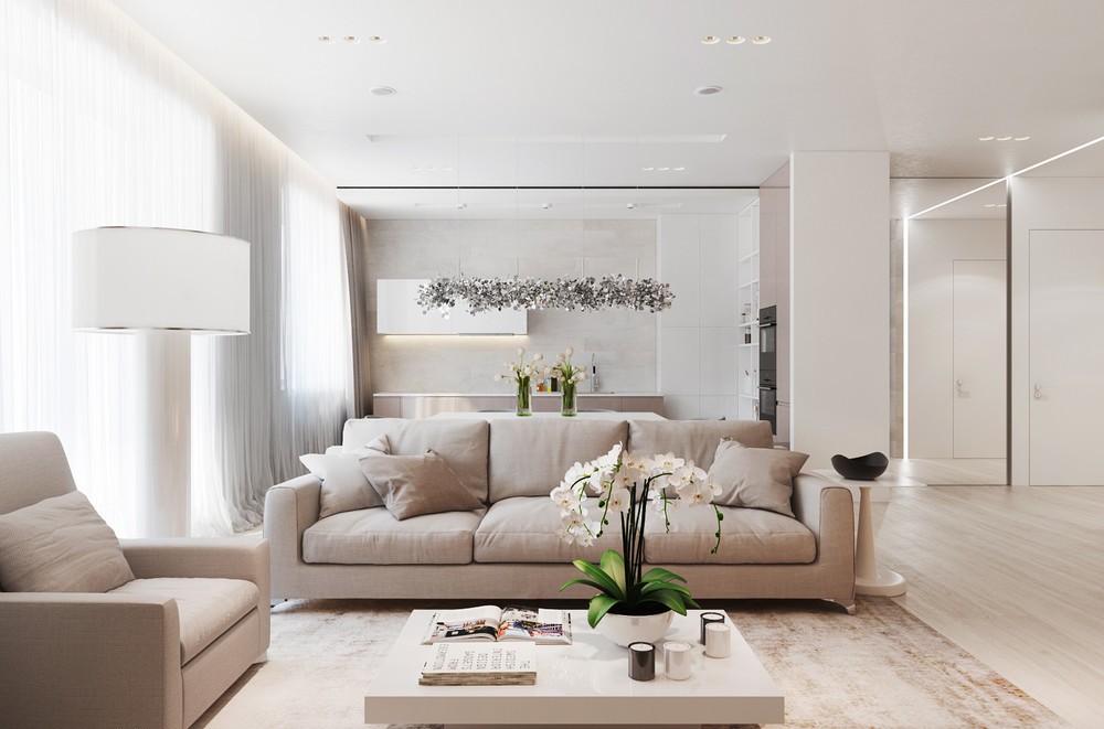
Love the rug under the dining table – its distressed texture has the same charm as lovingly worn whitewashed wood, a cool contrast to the flawless floorboards.
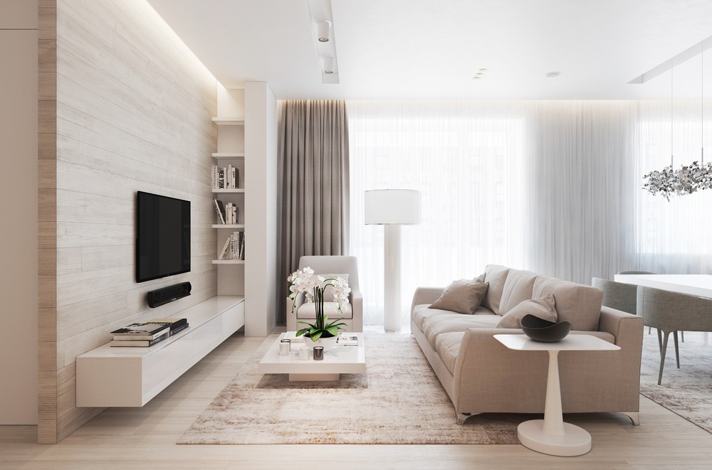
While most of the furniture is composed of clean lines and crisp corners, the occasional round element makes its presence known. Note the circular base on the tapered square topped table – such a neat design, and a very nice way to tie into the rounded dining chair and cylindrical lamp.
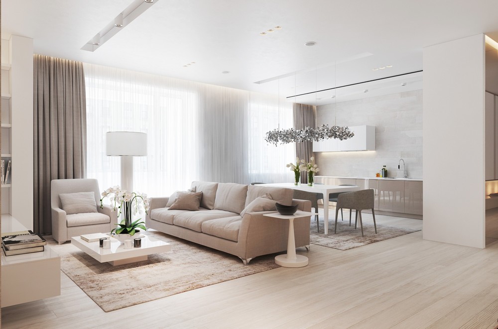
With a floorplan just under 100 square meters, the single large window provides more than enough light to brighten the entire home. Two layers of curtains offer a choice between blackout beige and gossamer white. They gather in a gentle bunch on the floor and slim niche hides the hardware above for an incredibly clean look.
