One of the most fascinating parts of studying interior design is to see how one designer plays with different spaces. Each space tells a story and each is designed with a different concept in mind. In these four interiors by Juliya Butova, we explore a variety of shapes, colors, textures, and design elements that combine together to form family-friendly spaces. One might picture these spaces as a way for the designer to get in touch with her inner child.
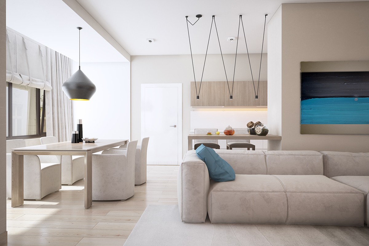
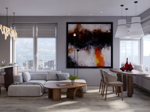
The first apartment makes smart use of bright colors and simple shapes to create an atmosphere that's both welcoming and modern, but entirely family-friendly. In the main living area, which showcases and open floor pan, neutrals are complemented by black metal lighting fixtures in unique shapes and pops of color in the artwork.
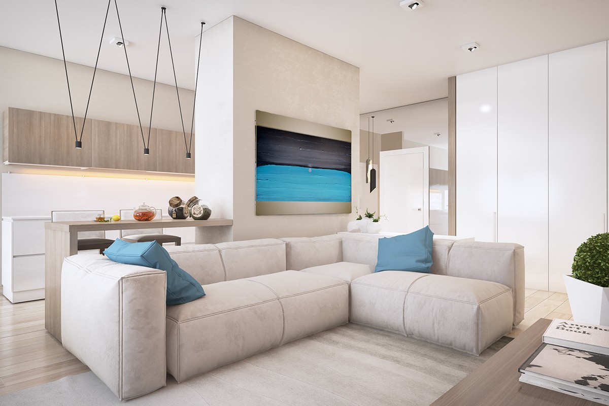
The large sectional offers ample space without making the room feel small or cramped. Each furniture piece is carefully curated to offer both form and function.
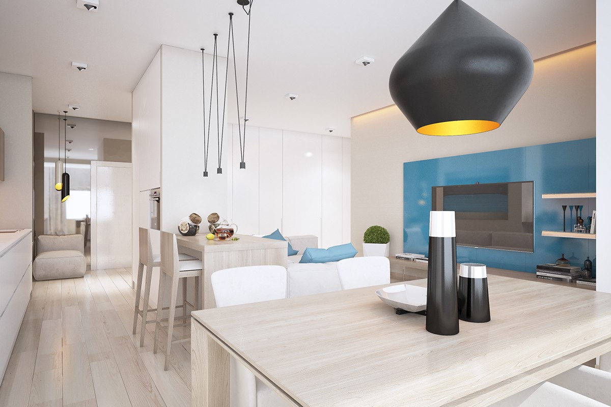
Along the opposite wall of the main living area, the same blue found in the art and sofa pillows shines as an accent wall behind the media center. There's plenty of seating for entertaining in the kitchen and dining areas.
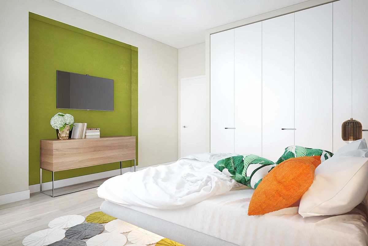
In one bedroom, the designer again plays with shapes and colors while adding in smart storage. Floor to ceiling storage closets line the room to keep it uncluttered. Pops of green and orange make the room feel warm and welcoming.
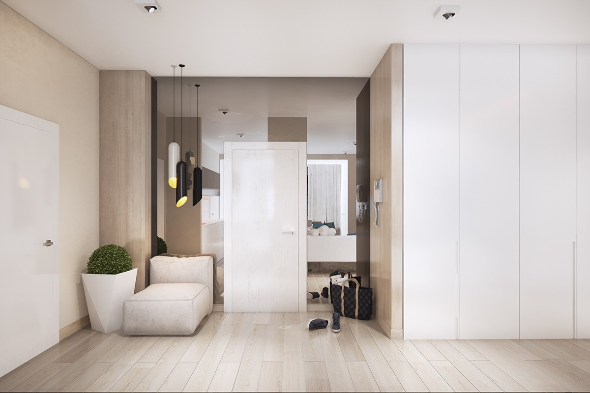
The hallway, while more subdued in its use of color, still plays with shapes through the pendant lights and use of mirrors to make the space feel larger and more open.
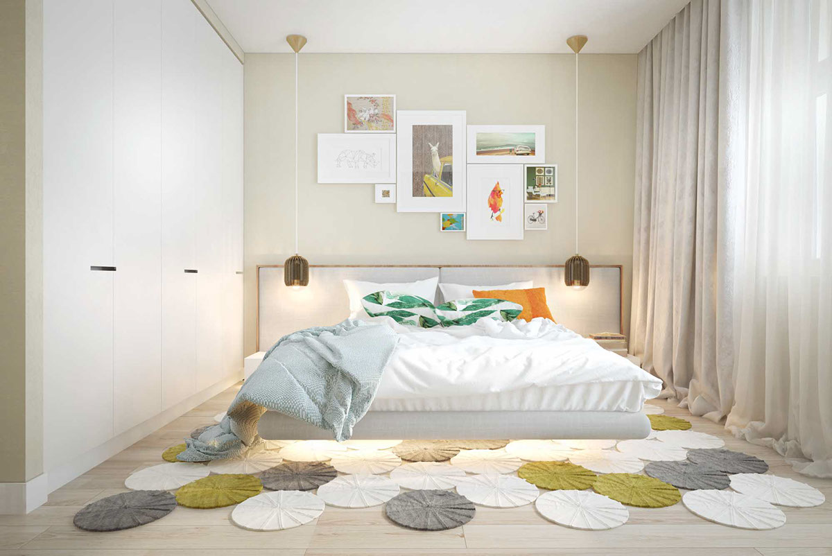
A gallery wall of art and a unique rug add interesting focal points to the otherwise minimalist room. Again, there's a strong sense of play here.
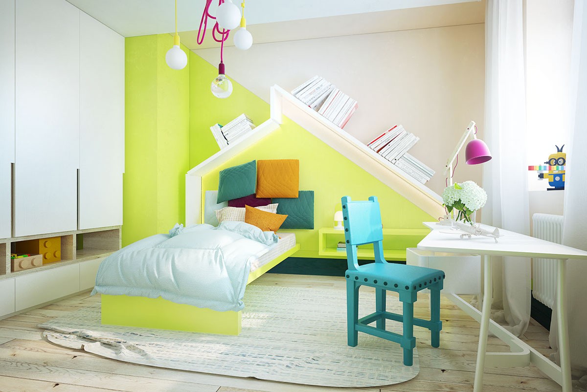
In this child's bedroom, bright colors and whimsical shapes show off the designer's sense of fun. This is a room built for play and exploration. The desk along the wall offers a canvas for creation.
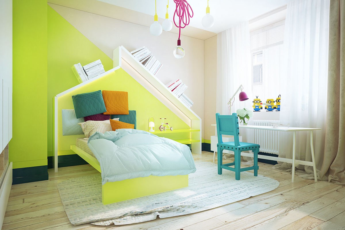
Geometry plays an important role throughout the space, as evidenced by the color blocking along the back wall and custom headboard. The room and all of it's pieces while full of sharp angles and interesting shapes, surprisingly flows well.
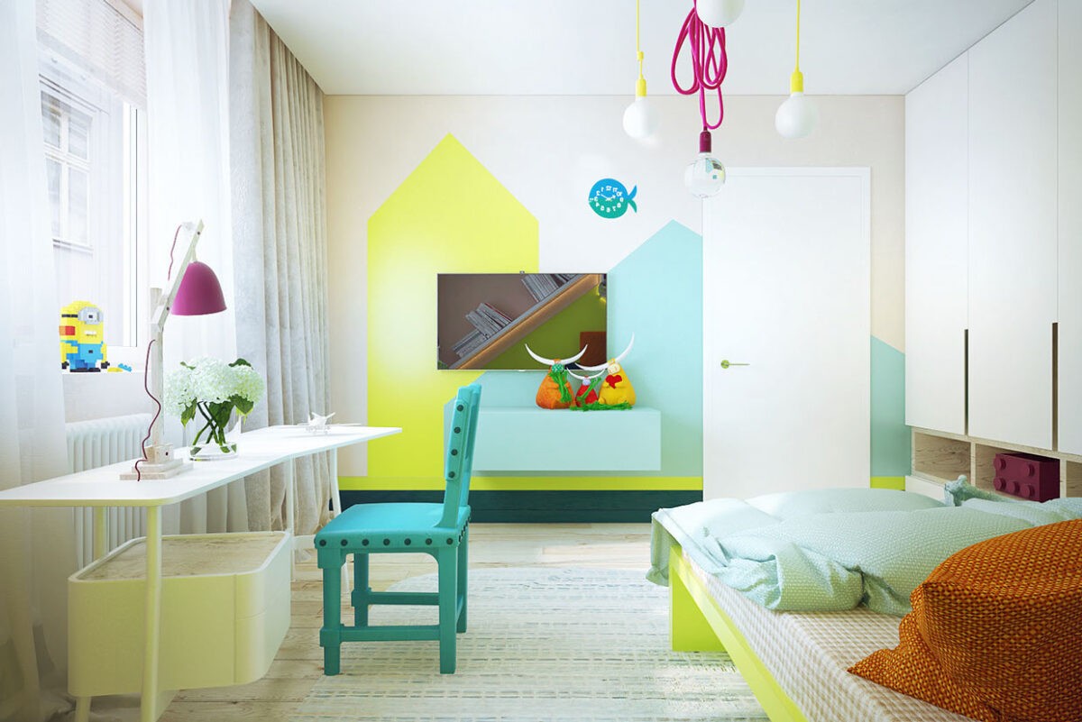
Over the bed, fuschia and yellow pendant bulbs hang down like new ideas. Whimsical shapes in bright colors decorate the opposite wall. Smart storage lines the room for toys, books, clothing, and other belongings, so there's no clutter.
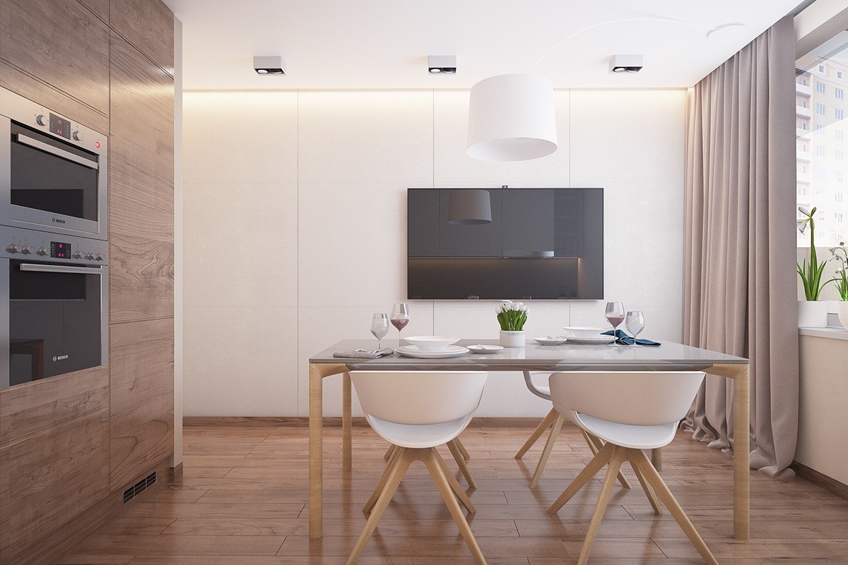
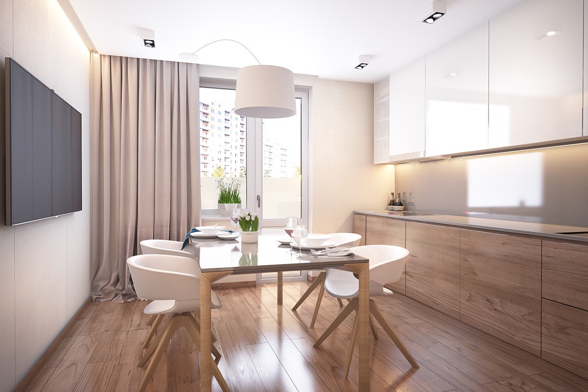
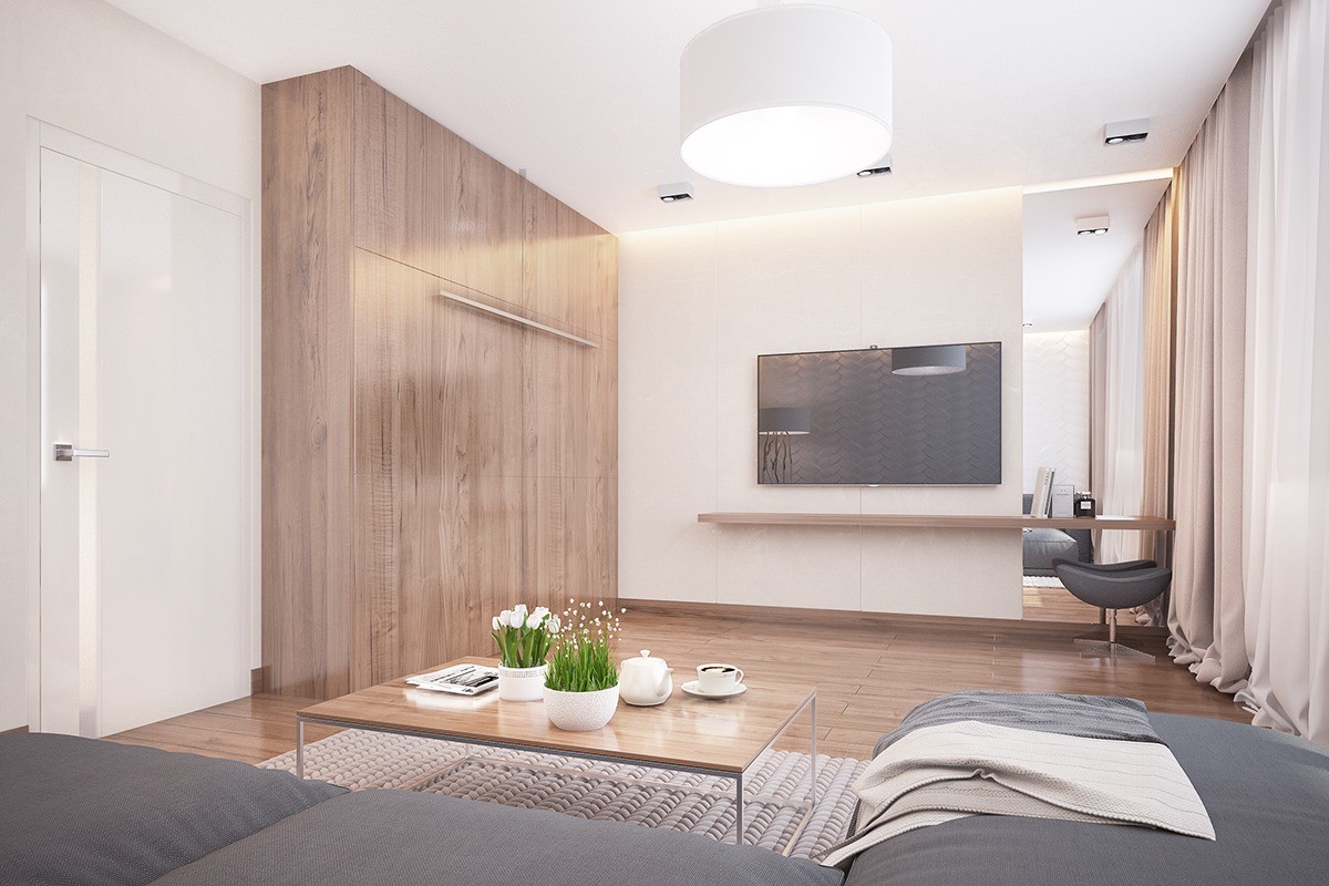
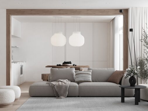
In another design, Butova gives the apartment more of a calming and luxurious feel, with color choices and soft textures that are reminiscent of a spa escape while still remaining practical for everyday living. The kitchen and dining area showcases white walls, plenty of natural light and wood accents. It's minimalist but feels far from sparse with textured curtains and uniquely shaped dining chairs.
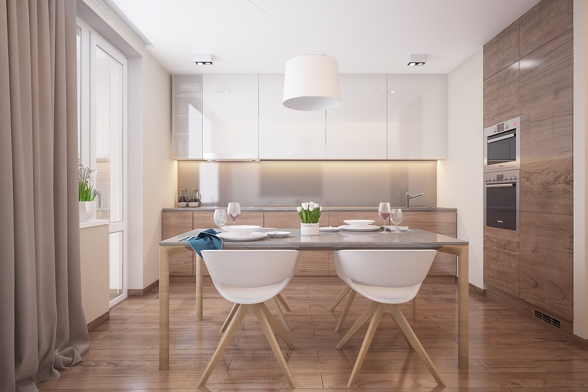
The dining and kitchen areas mirror each other. There is no clutter, both figuratively and visually. This is a soothing space.
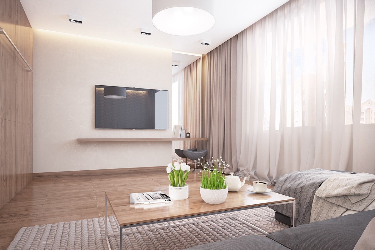
Large windows with sheer panels allow light to flood the room, giving a sense of warmth in spite of the minimalist furnishings.
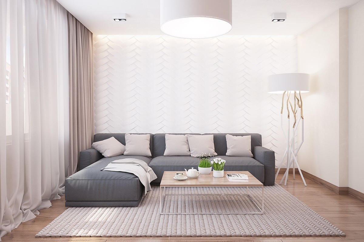
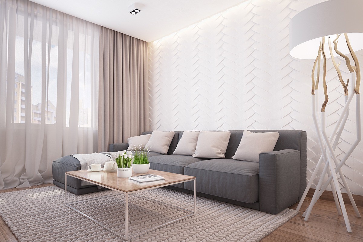
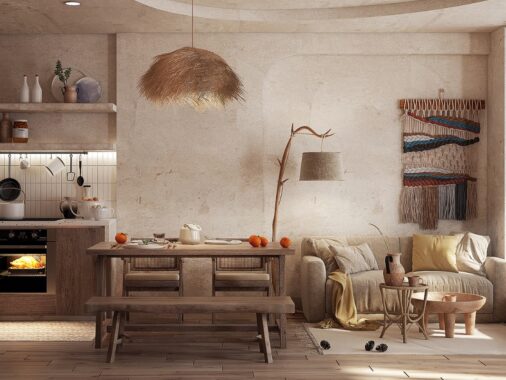
In the living area, the furnishings are a bit more whimsical. There's a beautiful textured wall behind the sofa, a branch lamp, and woven rug that all create a very cozy feel in the room while sticking with the same color palette and feel as the rest of the home.
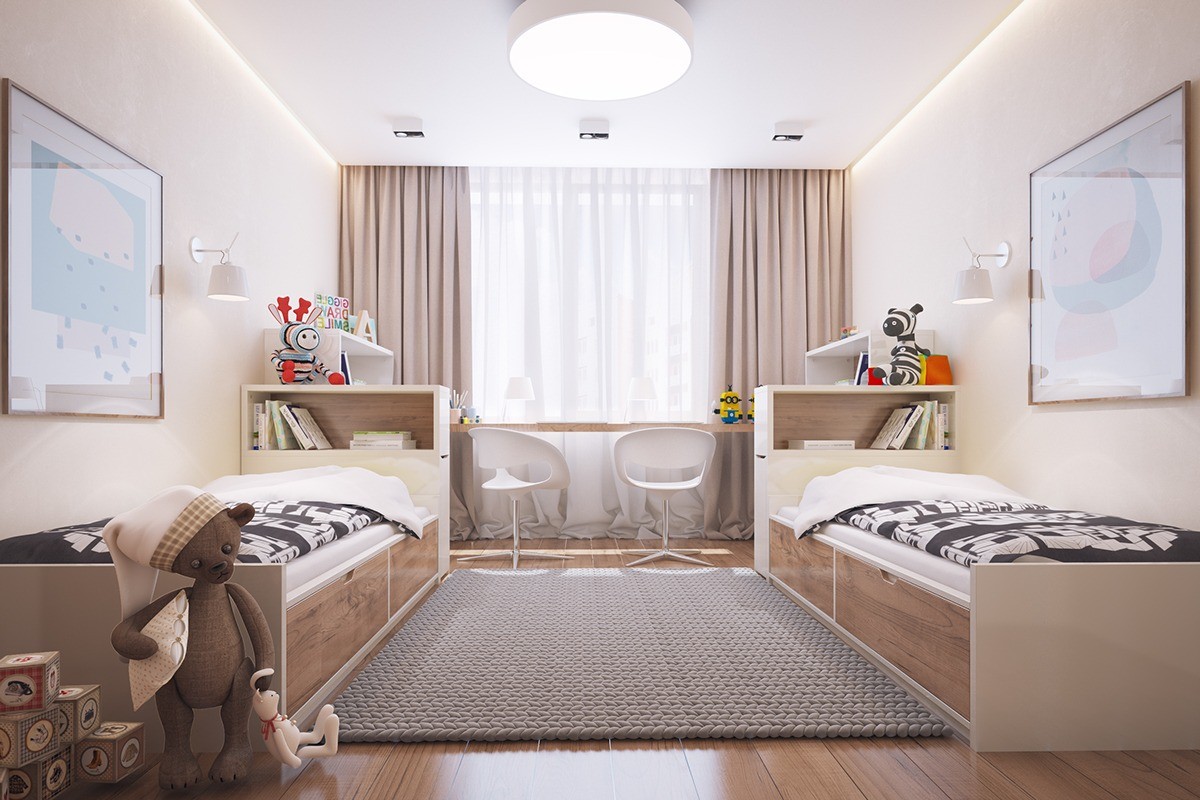
In a children's bedroom, twin beds bank along each wall with smart storage built underneath. Matching chairs and bookcases ensure perfect symmetry.
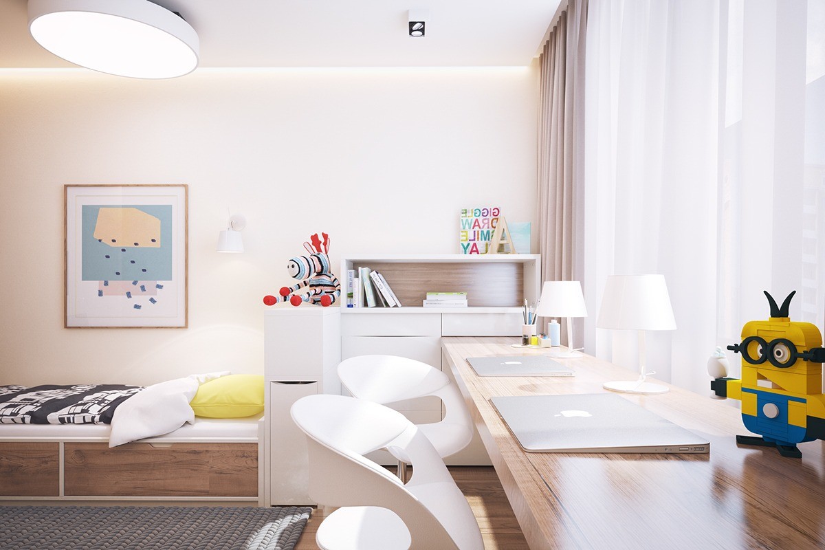
Here, as in the other spaces, whites and woods are carried throughout while curated furnishings are meant to add a bit of color. Soft window treatments keep the rooms from feeling stark.
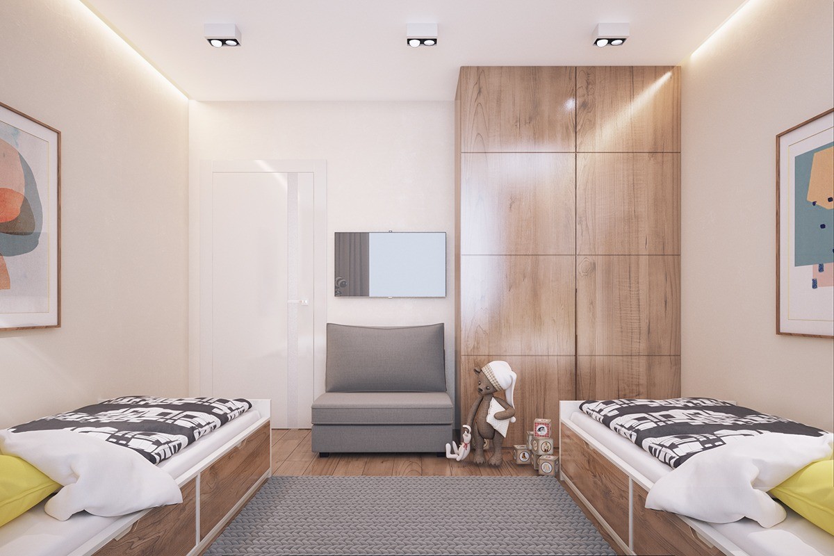
Smart storage is found throughout the home. For example, in the children's bedroom, built-in wood closets and under the bed drawers give plenty of room for clothes, toys, and other items.
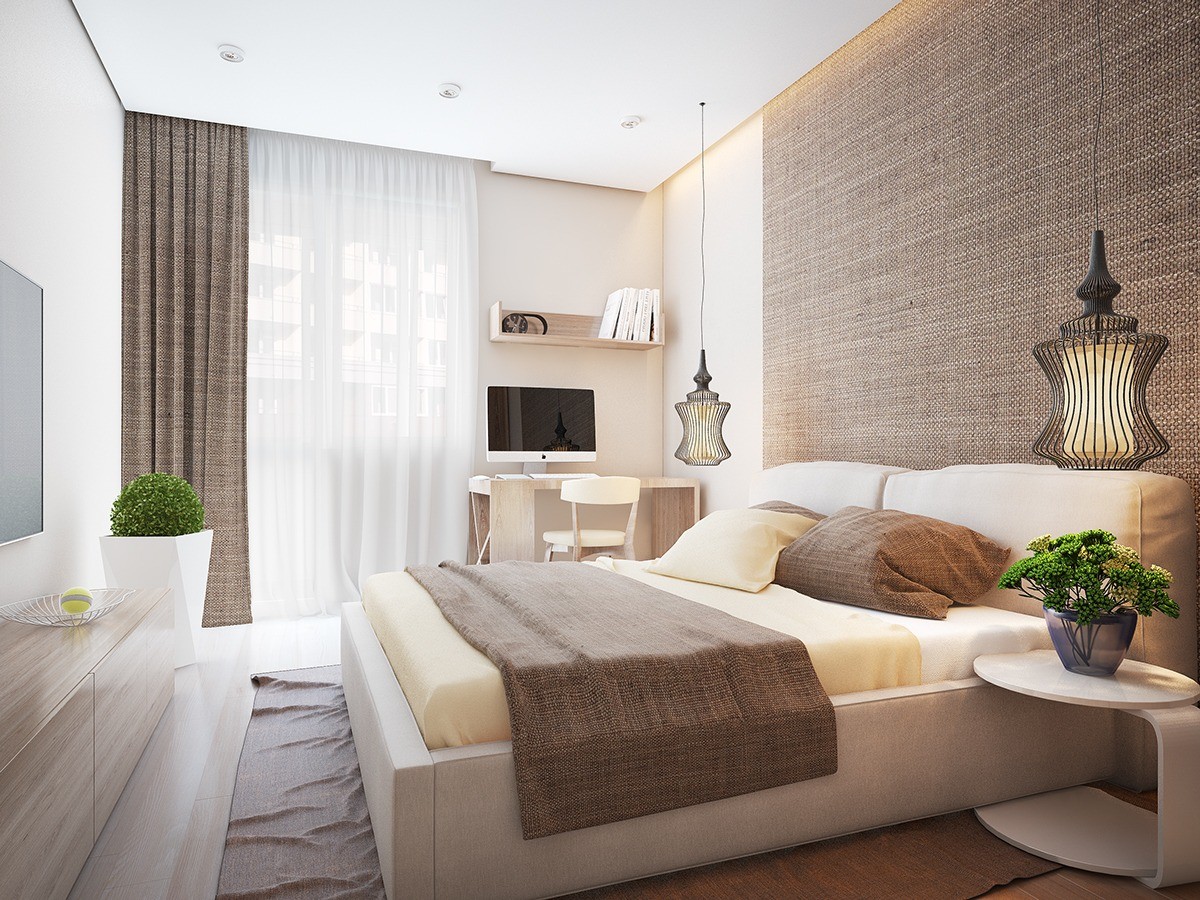
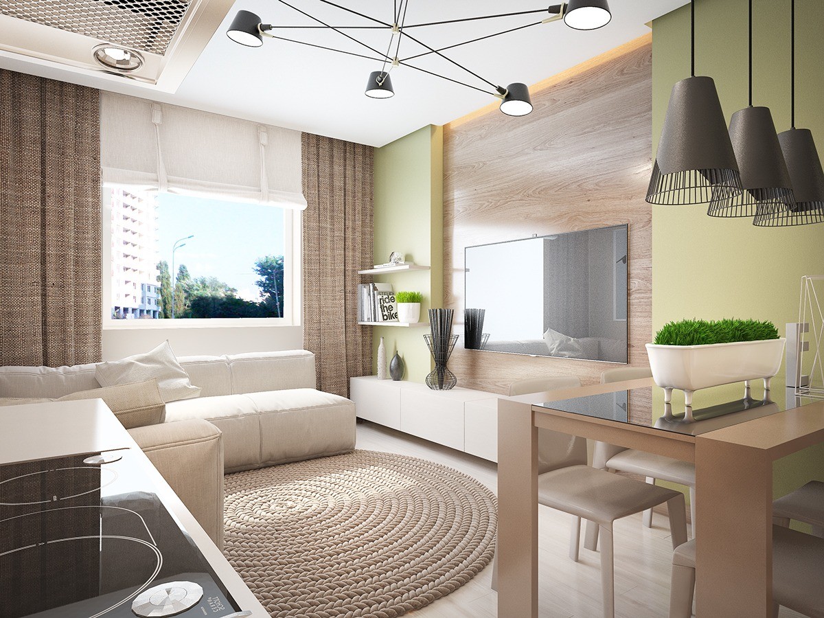
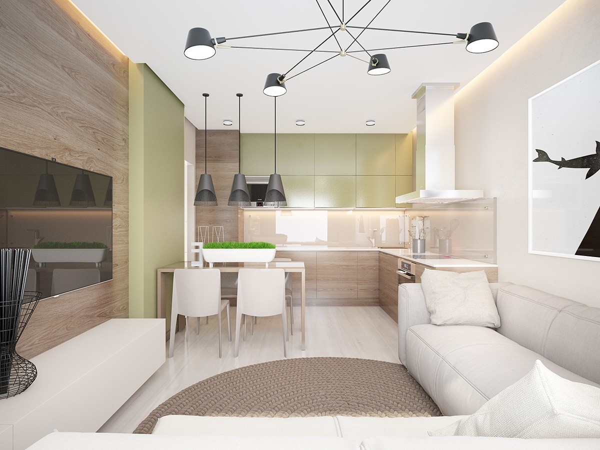
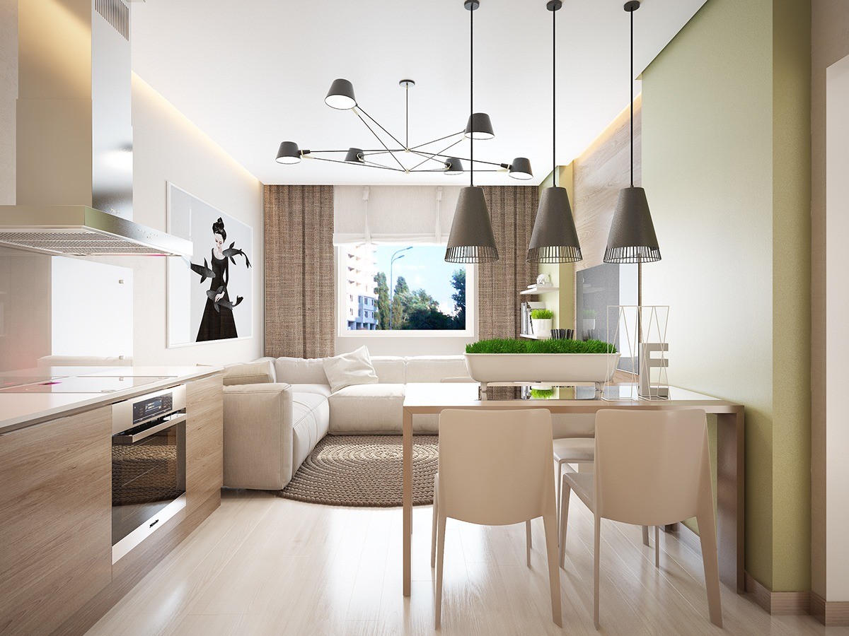
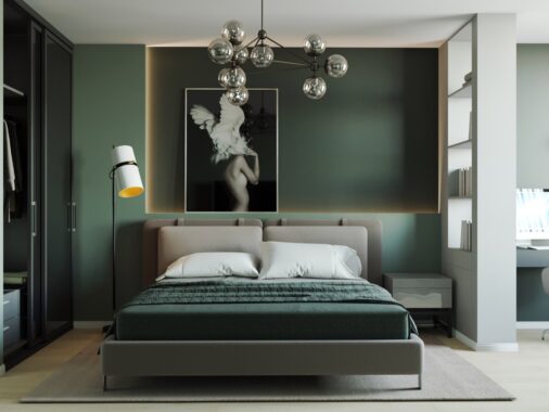
In this interior, the designer again plays with texture, but takes a more natural feel. The textiles and colors found throughout are reminiscent of those found in a newly sprouted potted plant. In the bedroom, exotic looking pendant lights pair perfectly with pops of green from plants and a natural, almost burlap-type texture found in the bedding, curtains, and wall behind the headboard.
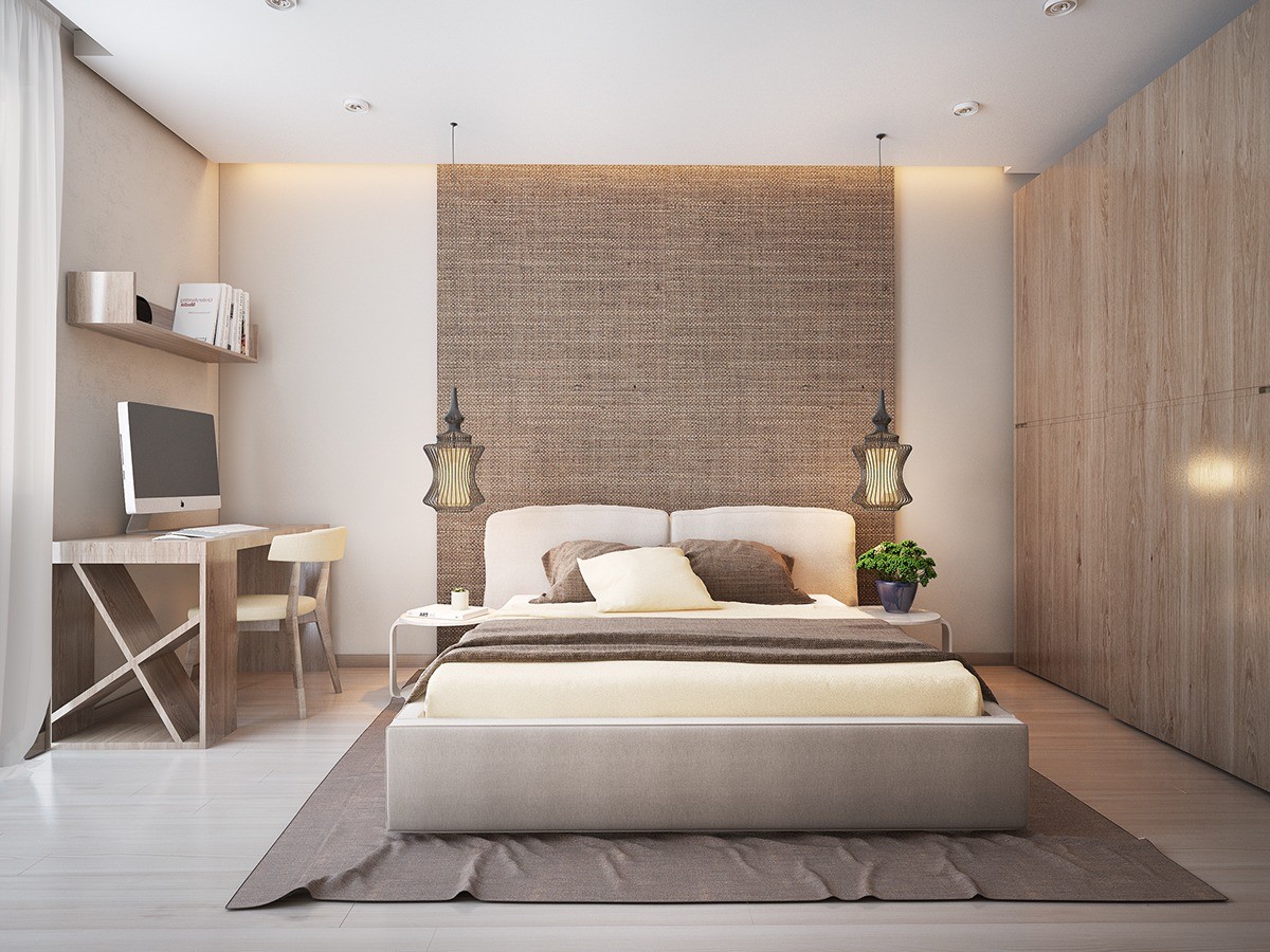
The bedroom plays with texture and shape here also, with a natural backdrop behind the headboard, layered linens, and an exotic looking set of pendant lights.
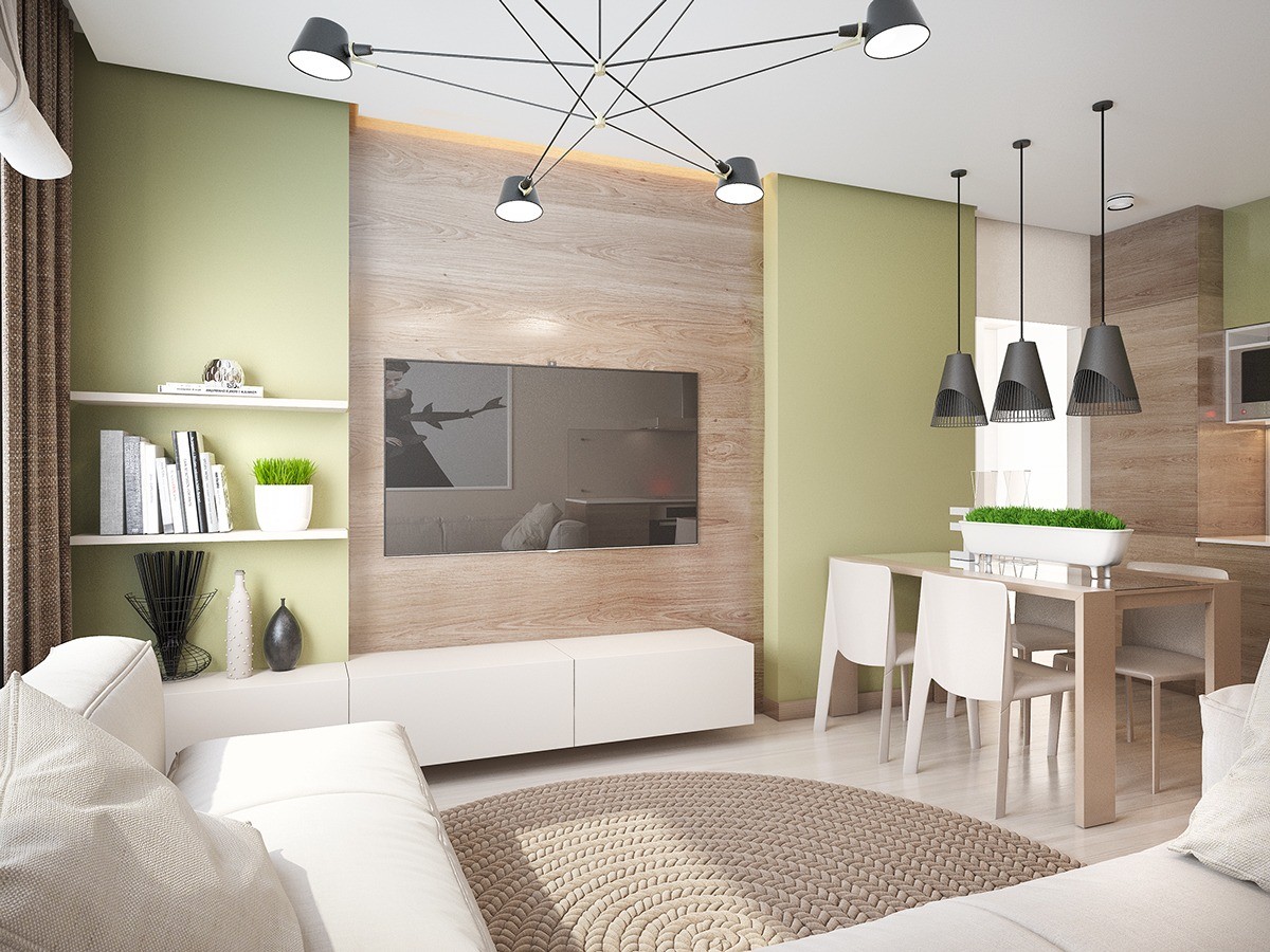
The small footprint of the space itself presents a unique challenge in that it's important to strike the right balance between furnishings and design elements. Here, they marry well as each curated piece captures that freshness the designer may have been going for.
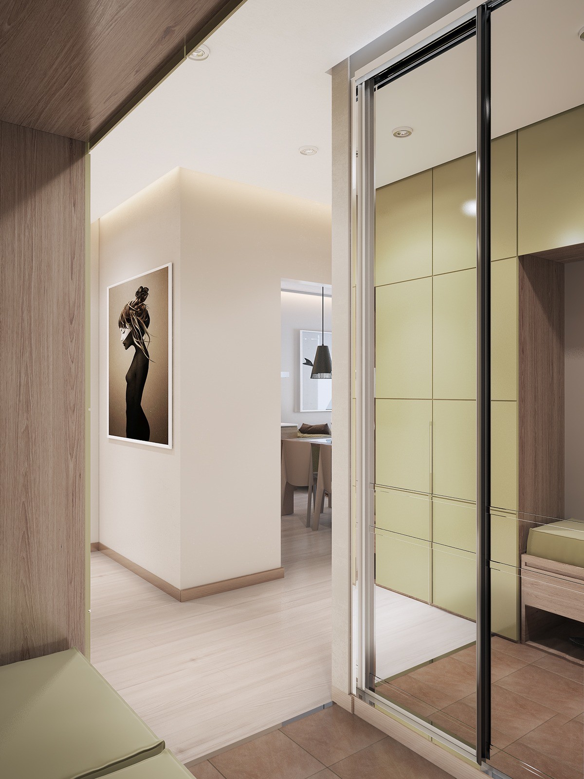
In the hallway, mirrors make the space seem larger and more smart storage takes the stage in a pale green.
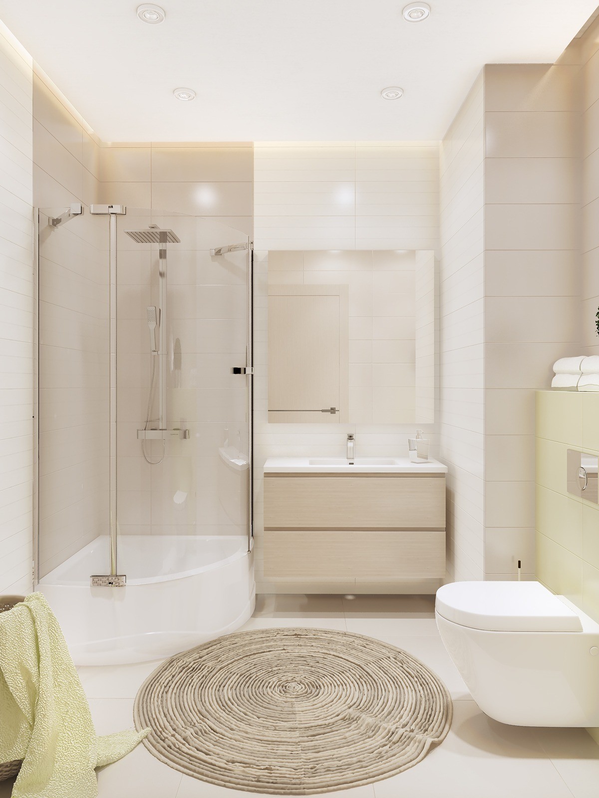
In the bathroom, a natural woven rug acts as a focal point in the otherwise minimal - but still beautiful - space.
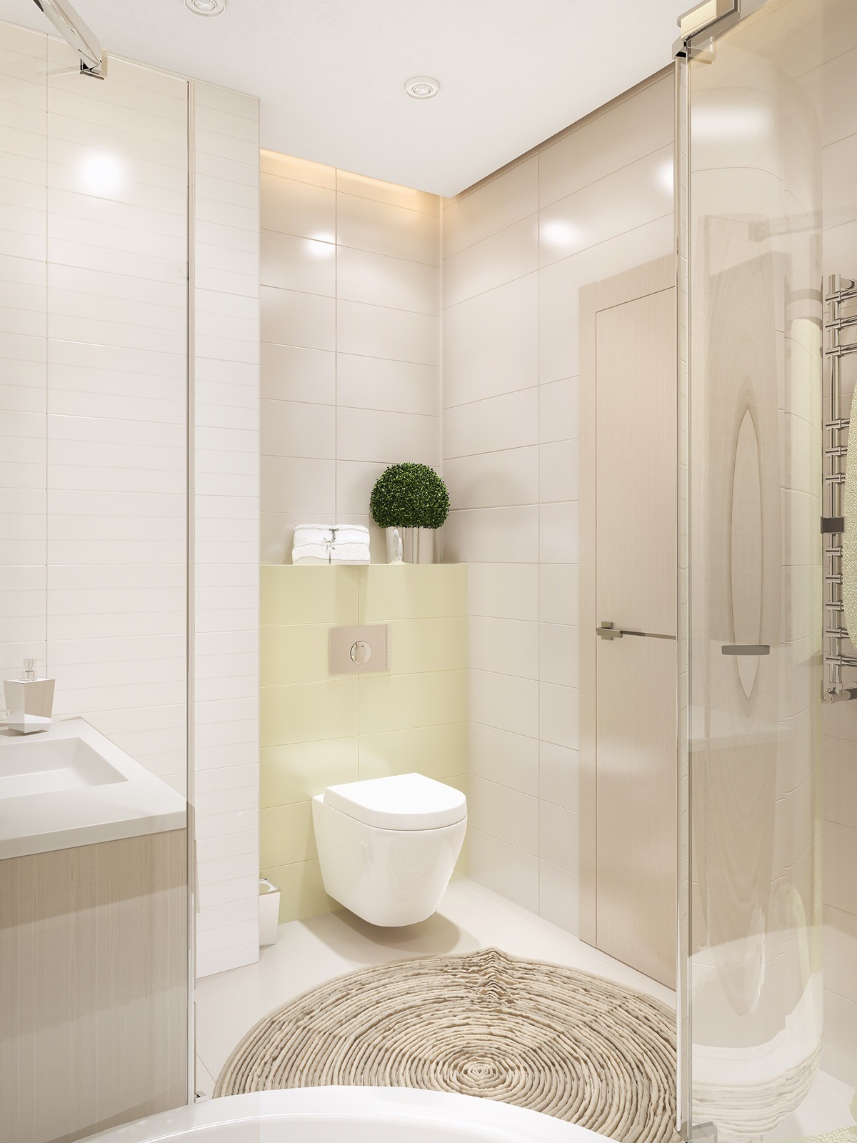
Green accent tile in bathroom" width="600" height="800" /> The greens even work their way into the tile choices.
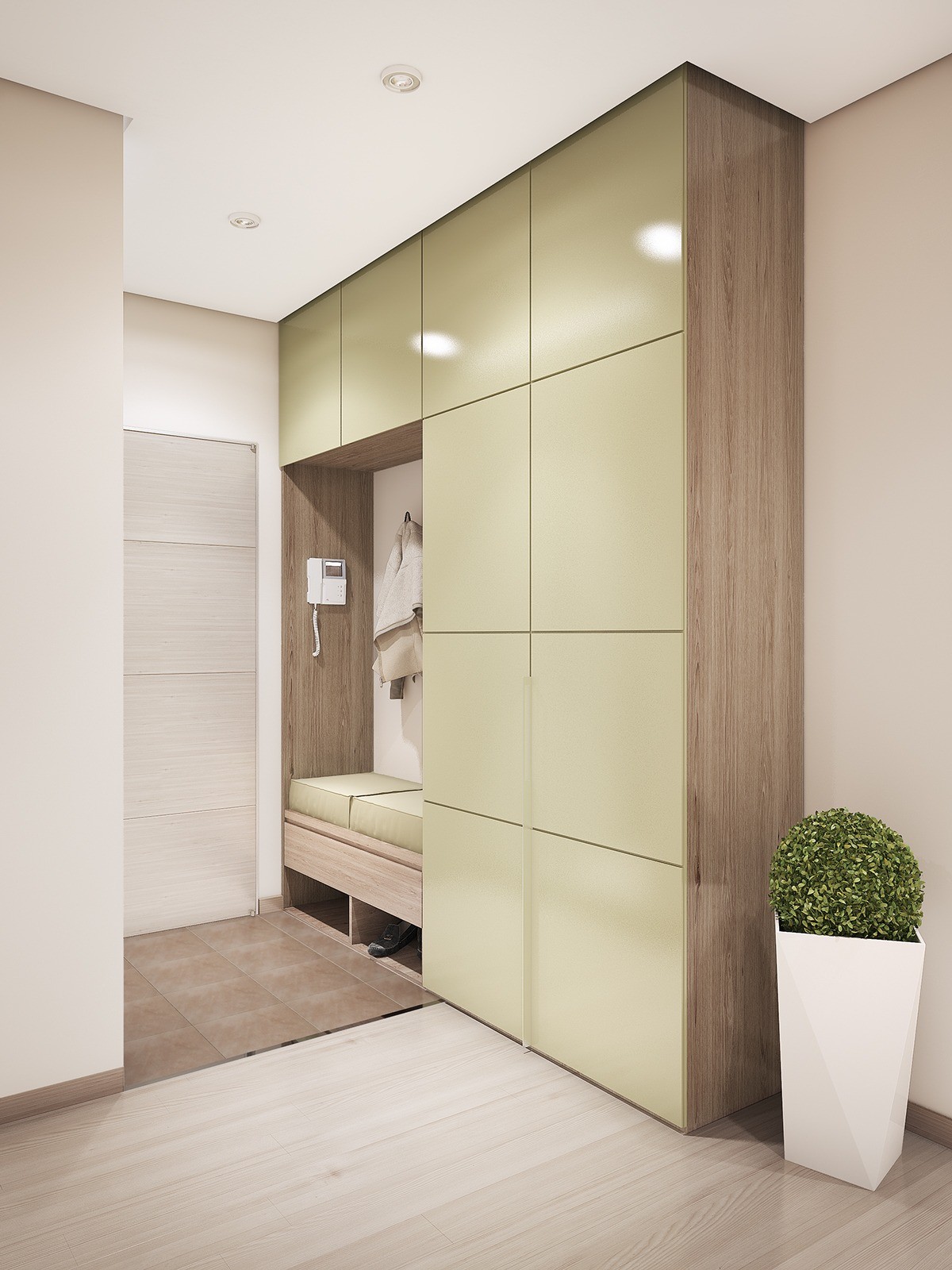
Greenery can be found in just about every room - whether it's in the form of a topiary, a small houseplant, or a rug made from a natural woven fiber.
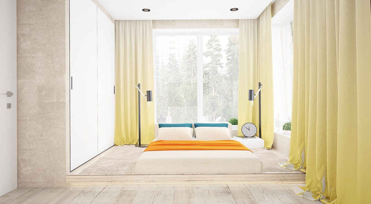
And finally, in this fourth interior, bright colors take center stage as the designer explores yet another whimsical side. The bright orange coverlet pops against the soft yellows, natural woods, and whites of the bedroom area. As for the windows and light potential? Simply sublime.
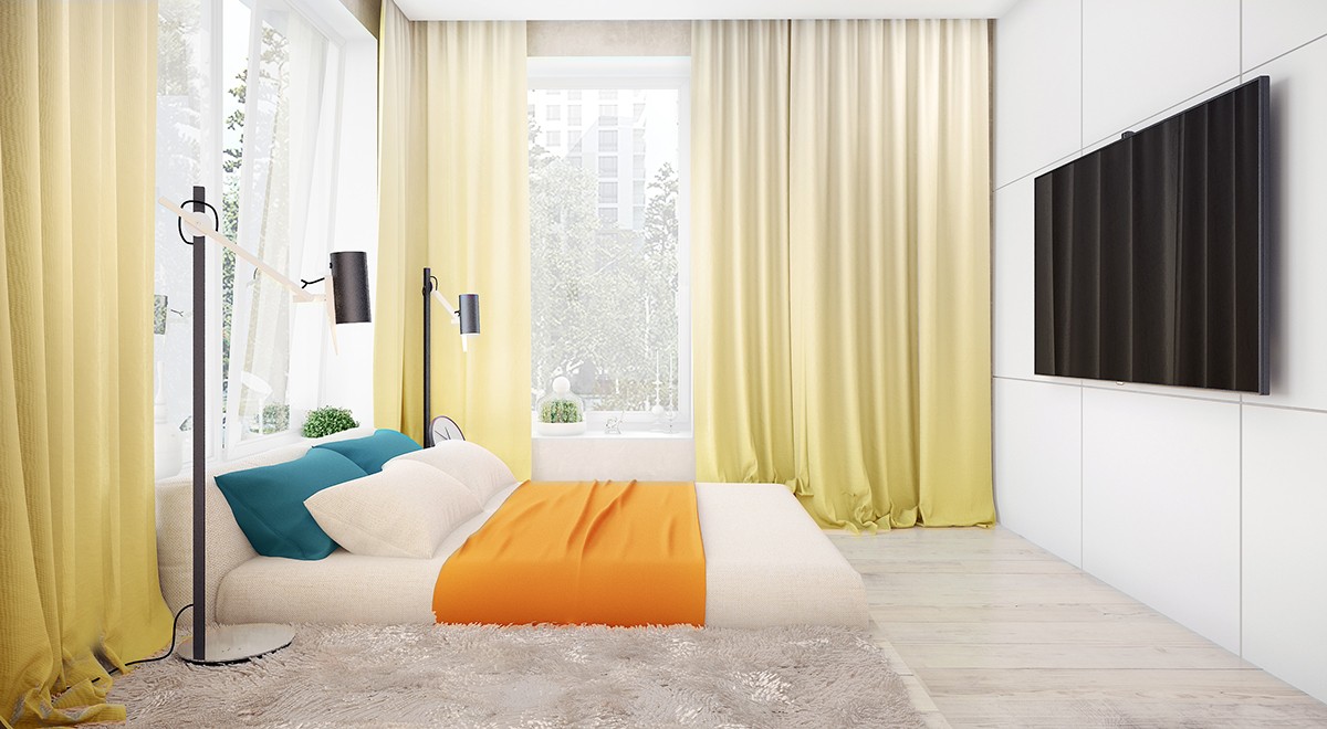
Color plays an important role throughout the space, with a neutral and clean backdrop to play off of in every room.
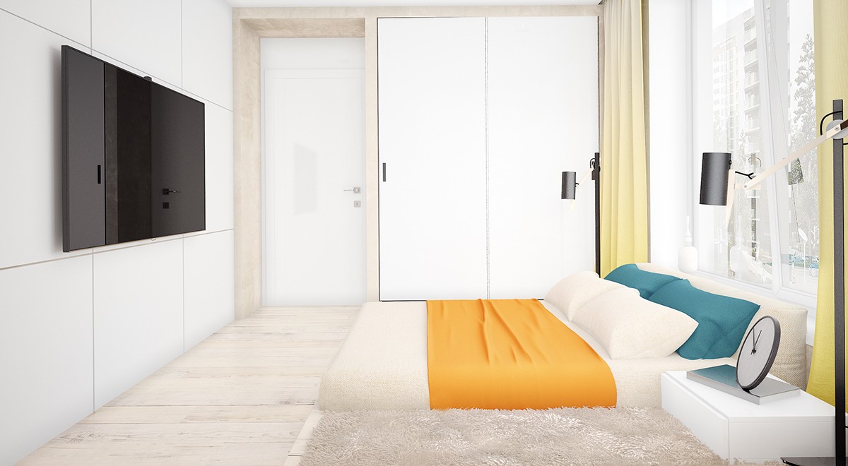
And, as shown in other spaces, storage is ample but low profile. Windows the outside take shape in both the use of media and the placement of furnishings around the large windows.
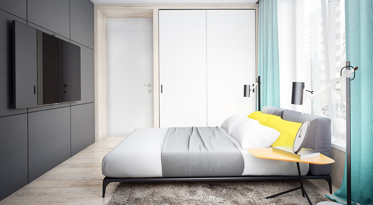
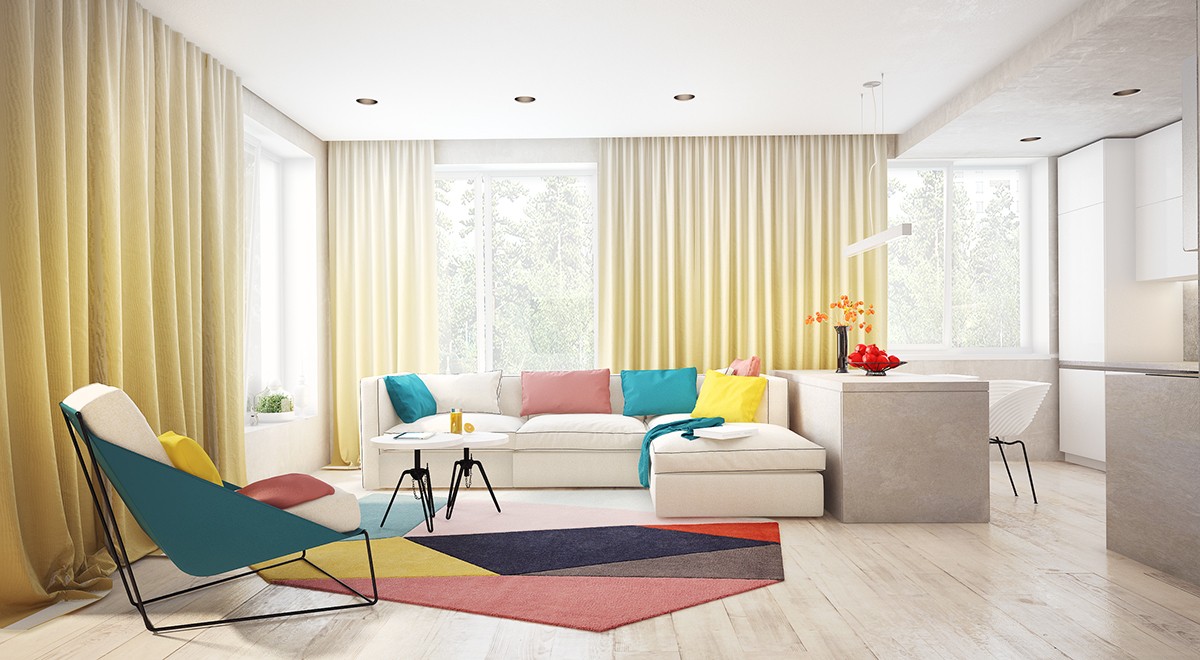
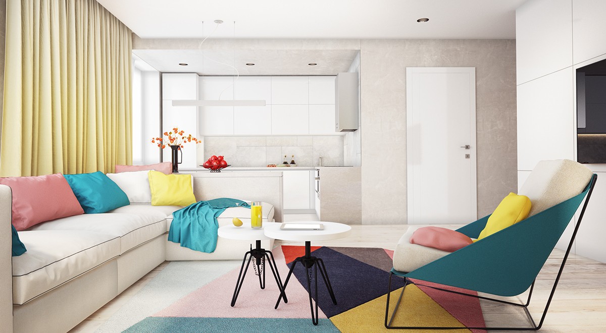
The designer has such a grasp of color and how light can play with different environments. Imagination is clear in every room.
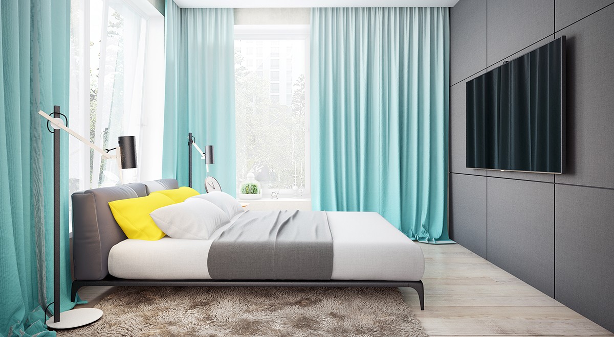
Curtains too play a starring role in this space. With such dramatic windows, the use of these fabrics is a natural fit.
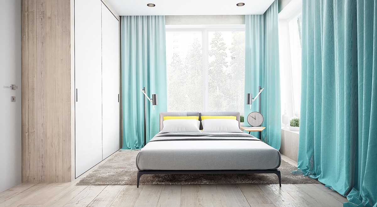
Yellows and blues complement the grays and whites in this other bedroom. Like the previous space, lots of light from the large windows gives this room an almost ethereal feel.
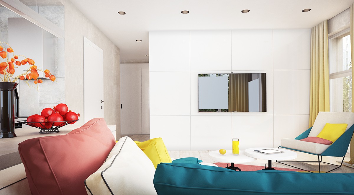
In the main living area, primary colors pop but aren't glaring. There's playfulness in the use of shapes and detailing.

