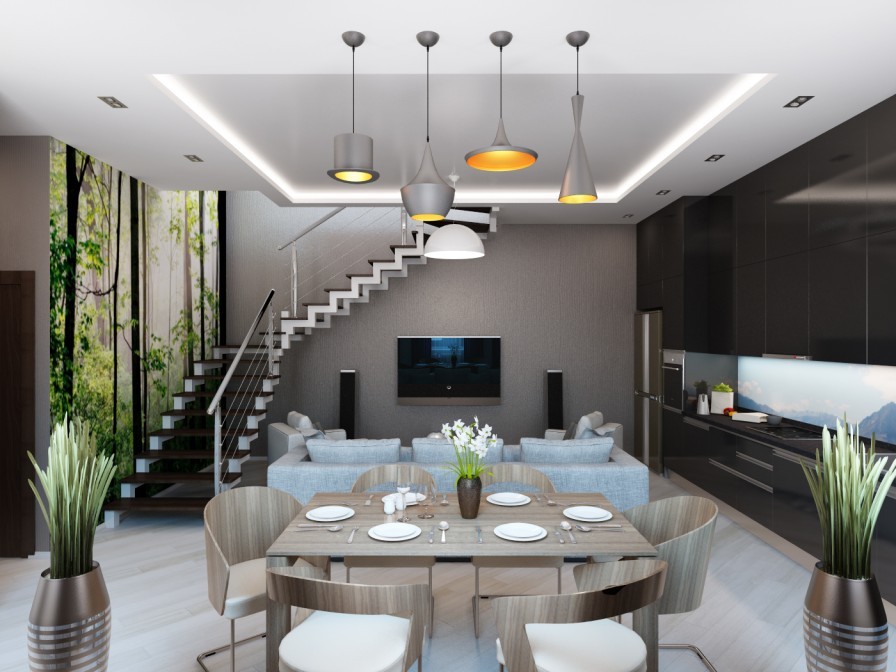
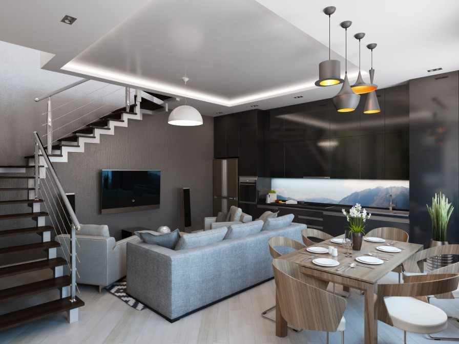
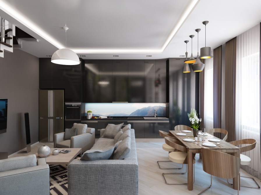
This is a great exercise for any home: imagine decorating your existing space first on a small budget (as most of us do!) and then on an ideal budget. Although the end results of each will look very different, both can look fabulous in their own way, just like these two design visuals for the same space by Boris Alexandrov.
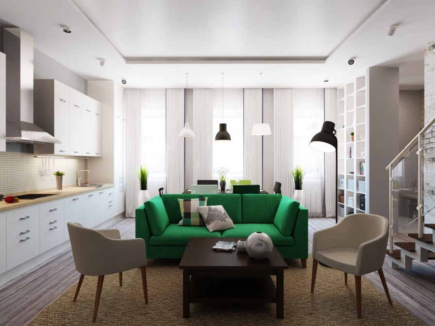
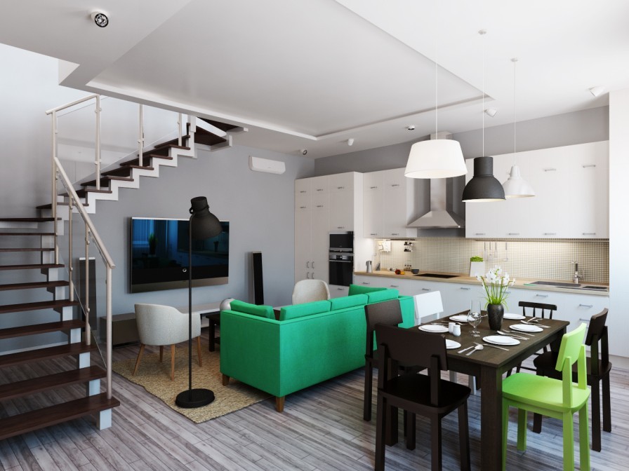
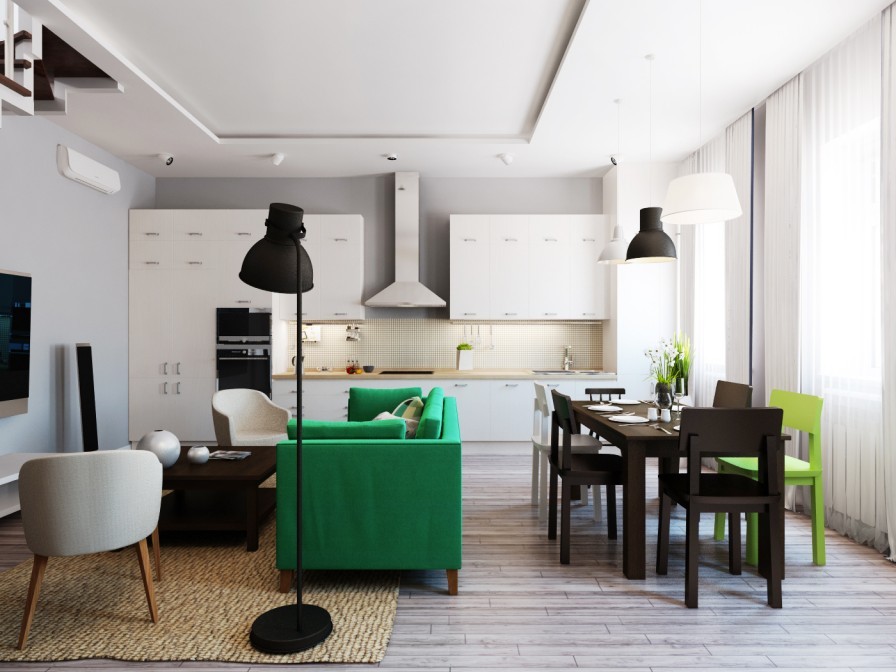
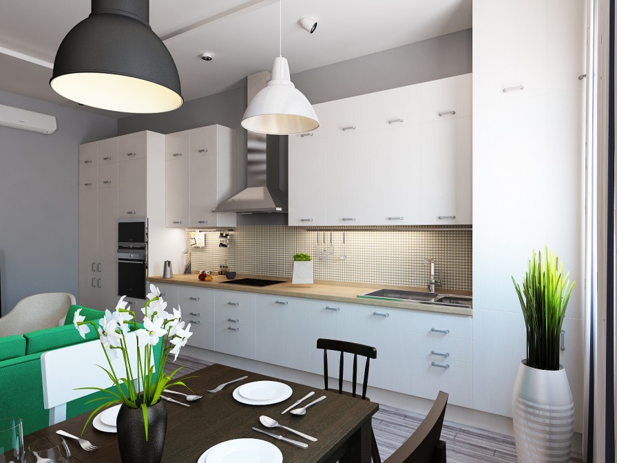
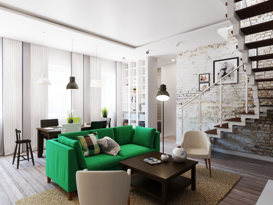
Option one gives the open plan layout an IKEA style makeover, complete with chunky dining chairs, cheerful accents, and flat weave area rug.
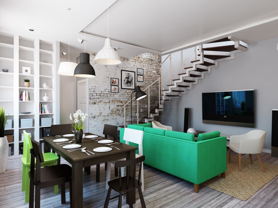
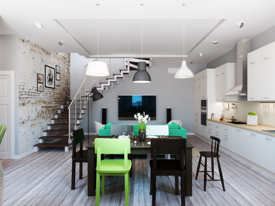
The trio of dining pendant lights are a sweet mismatch of conservative designs that can be picked up cheaply in many home stores.
Exposed brickwork becomes a design feature ascending the staircase, softened by a small gallery of family photographs.
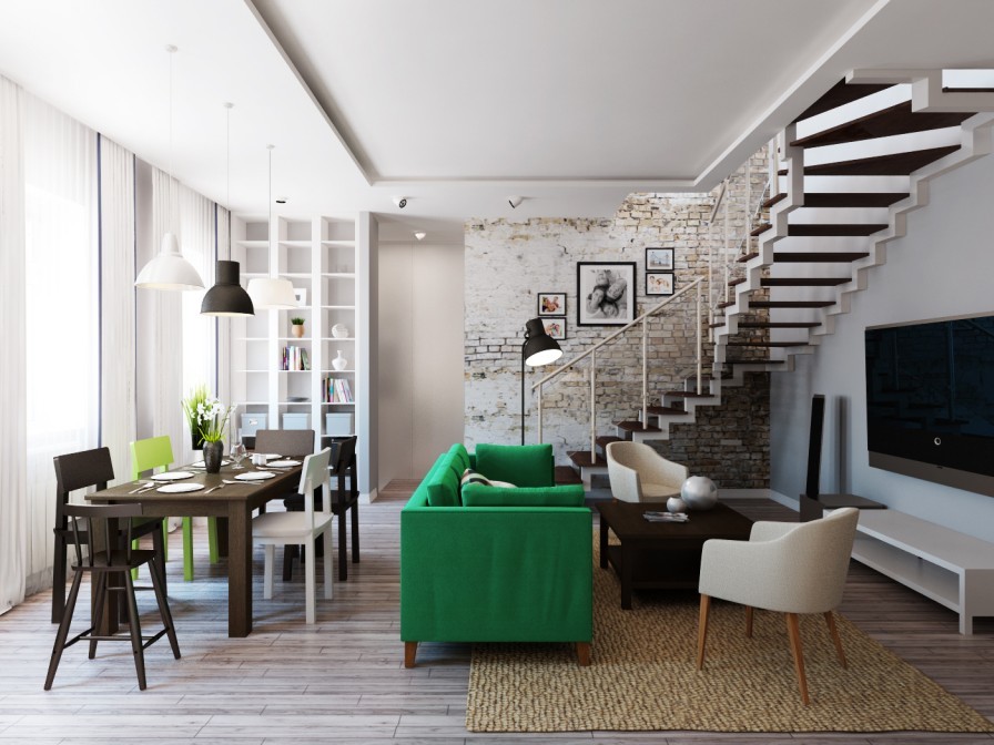
A vivid green sofa provides some design oomph in the center of the room, a color that is then picked up by one accent dining chair and some scattered household plants.
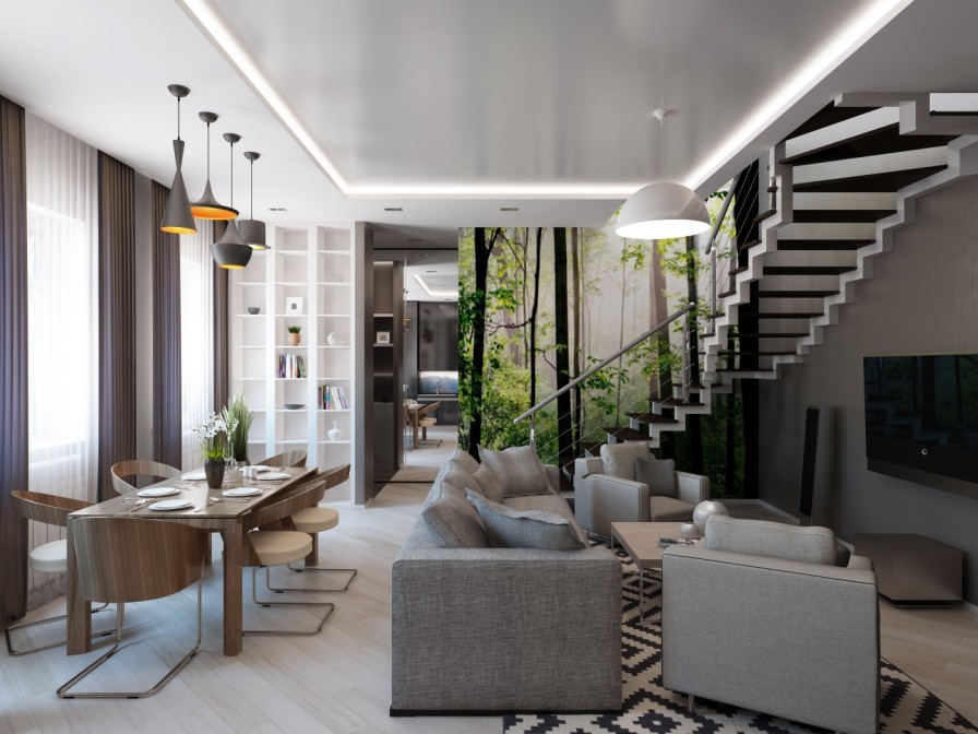
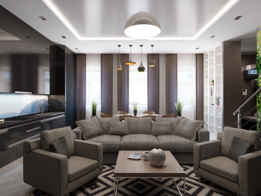
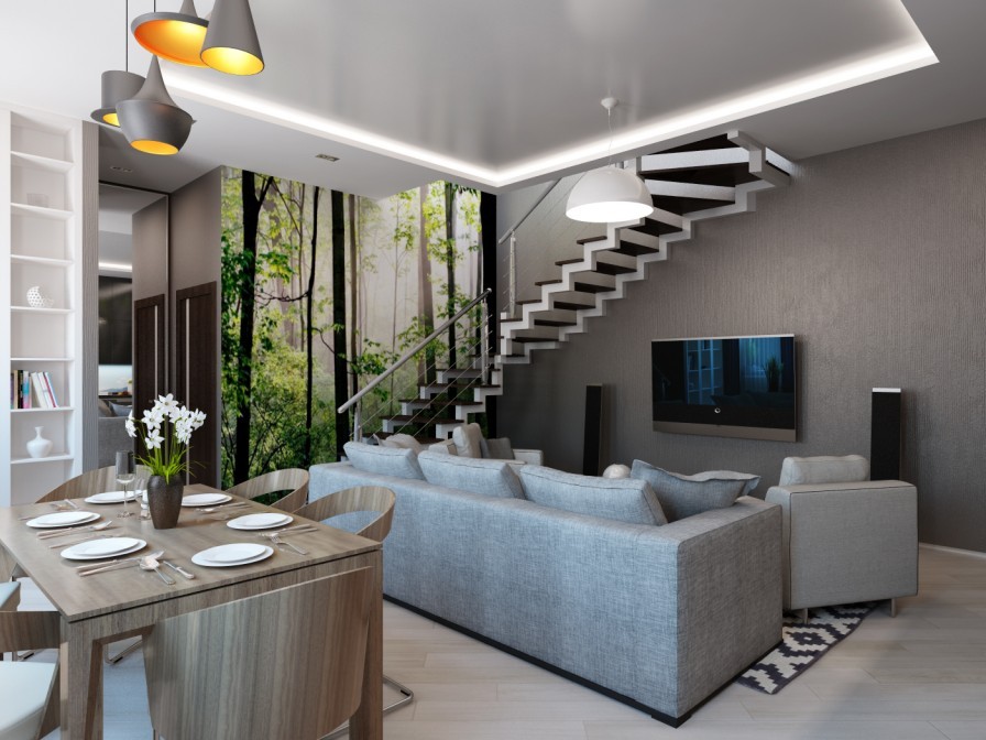
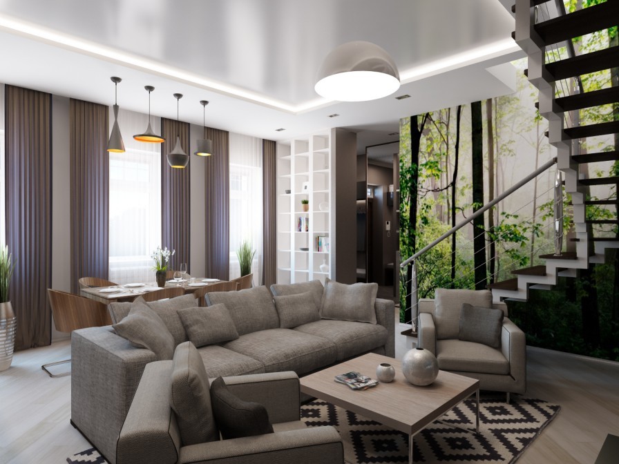
Whilst following the same layout, the second option is a much more plush affair with a completely different atmosphere. You can almost hear the acoustics of the room softening with the addition of deeper lounge chairs, heavier curtains and designer wool rug.
