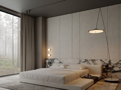
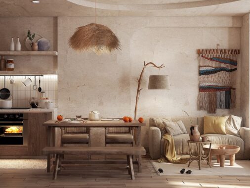
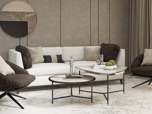
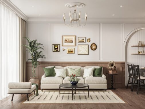
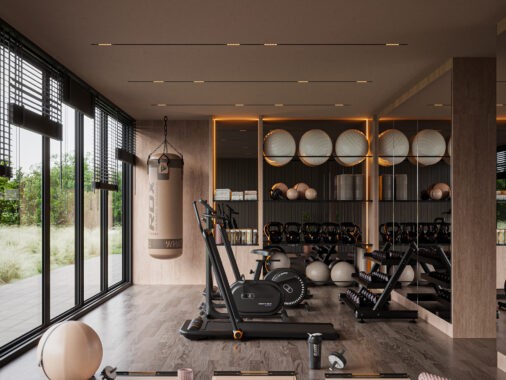
Step into any high-end, designer-created space and one of the first things you’ll feel is a sense of calm sophistication, often brought to life through a palette of soft, neutral tones.
Shades like cream, taupe, and light gray quietly set the stage, inviting a timeless, elegant atmosphere. For top designers, neutrals are a strategic choice—they bring depth and refinement without shouting for attention.
So, why do designers rely on these understated colors in luxury spaces? What is it about neutrals that make them feel so elevated? Let’s explore what draws designers to these shades and why they’re such a fixture in high-end interiors.
Setting the Stage: What Are Neutrals?
Before we go into all the reasons why designers love neutrals, it’s helpful to understand what “neutral” really means in the world of design. People who talk about neutrals usually refer to colors like beige, gray, white, taupe, and brown. But in some cases, softer tones of blue, green, or even blush can fall under neutrals if they’re used in a subtle way. The beauty of these tones is that they’re incredibly versatile. They complement nearly any style, whether it’s modern, traditional, rustic, or something in between, which is why designers can’t get enough of them.
1. Timeless Appeal: The Secret to Longevity in Design
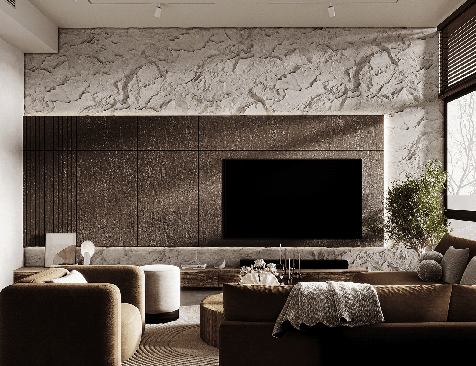
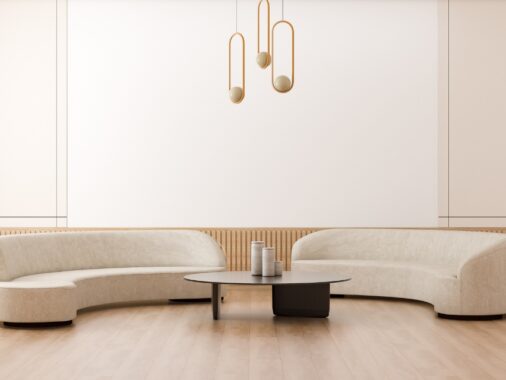
One of the biggest reasons high-end designers turn to neutrals is their timeless appeal. Neutral colors transcend seasonal trends and, in many ways, defy time itself. A sofa upholstered in a soft dove gray, a wall painted in creamy beige, or floors in a warm, muted oak—they all contribute to a setting that feels luxurious and enduring.
High-end clients often look for design investments that don’t need a refresh every few years. With neutrals, designers can create a foundation that will remain stylish and elegant for decades. This is especially appealing for luxury homes, where clients are investing not only in high-quality pieces but also in a lasting aesthetic. Neutrals offer the assurance that a room’s design will hold up beautifully over time, regardless of passing fads or changes in taste.
2. Calming and Inviting Ambiance
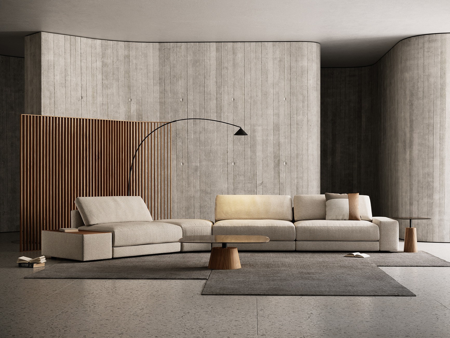
Neutral colors have a way of making a space feel calm, grounded, and inviting—all at once. For designers, this isn’t just about creating a pretty room; it’s about curating an experience.
Imagine entering a living room bathed in soft beige with accents of warm ivory. The whole atmosphere feels like a gentle embrace, encouraging relaxation and a sense of comfort. This calming effect is particularly essential in spaces meant to be a retreat from the outside world.
In today’s fast-paced environment, many clients seek homes that feel like sanctuaries. Neutral palettes allow for just that. They’re less jarring, easier on the eyes, and lend themselves to an almost meditative quality, which is exactly what luxury spaces aim to achieve.
3. Versatility: A Foundation for Creativity
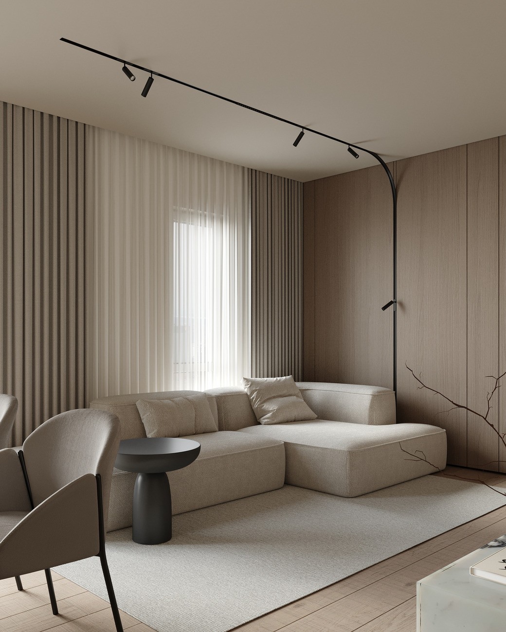
Some might think that neutrals limit design possibilities, but the opposite is true. Neutrals offer unmatched versatility, acting as a blank canvas that designers can layer with textures, patterns, and materials. When designers start with a neutral palette, they can play with rich textures like velvet, linen, or silk, and incorporate materials like wood, stone, or metals without overwhelming the eye.
With neutrals, designers are free to add bursts of color or unique pieces that stand out and add personality without clashing with the rest of the space.
This versatility means the palette can adapt to the client’s evolving taste. Maybe the client wants to add vibrant artwork down the line or seasonal decor. A neutral background allows these elements to shine without competing for attention, making it a favorite among designers who value flexibility.
4. Enhances Natural Light
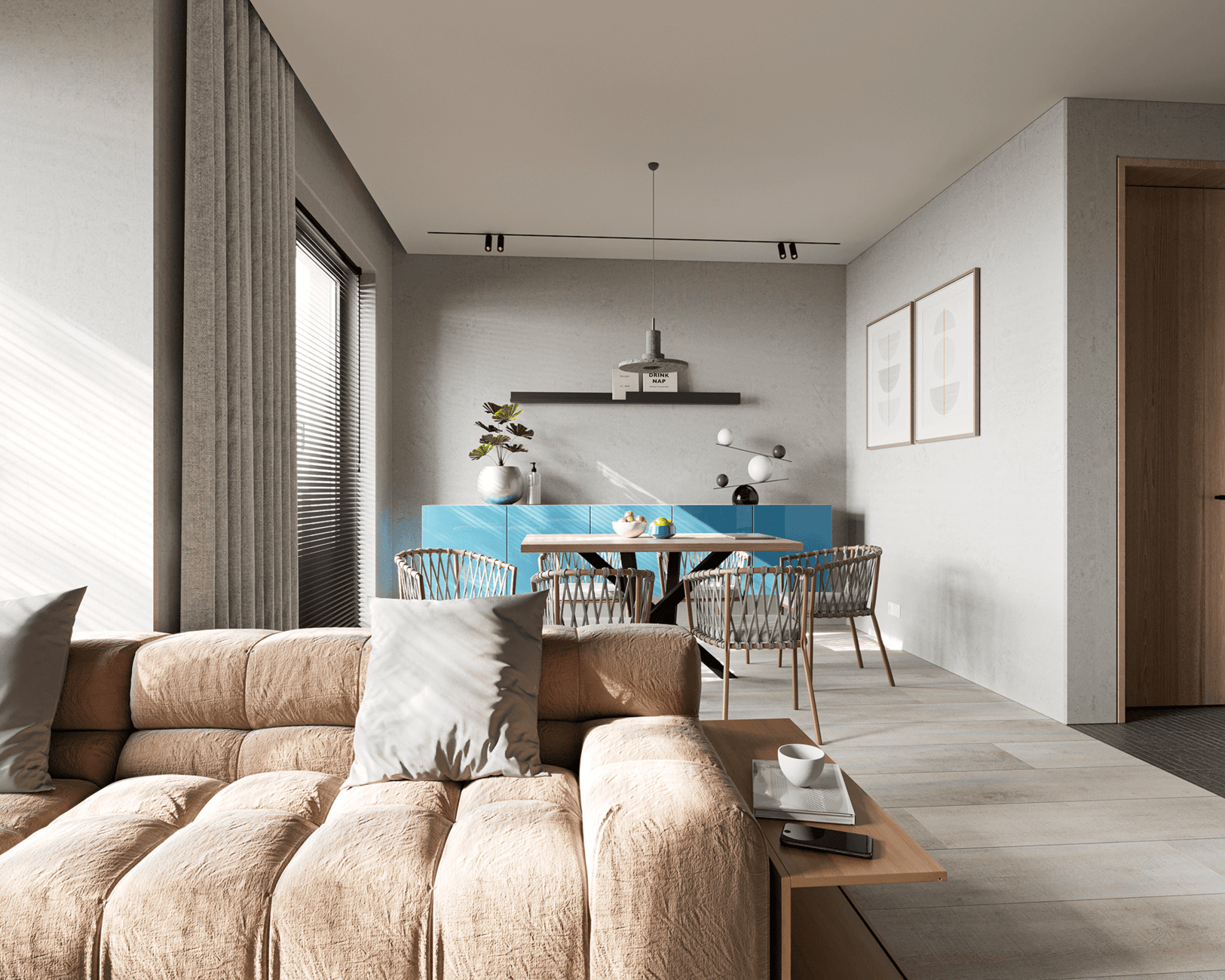
One of the little-known benefits of neutrals is how beautifully they play with natural light. In rooms with big windows, neutral colors reflect light around the space, making it feel open, airy, and almost glowing.
Imagine a living room with soft gray walls and big windows that let the sunlight stream in. The light bounces off the walls, giving the room a warm, spacious feel.
High-end designers understand how important lighting is in creating the right mood, and neutrals amplify this. This subtle play of light is something designers love because it adds a dynamic quality without needing any bold colors.
5. The Ultimate Flexibility: Neutrals Go with Everything
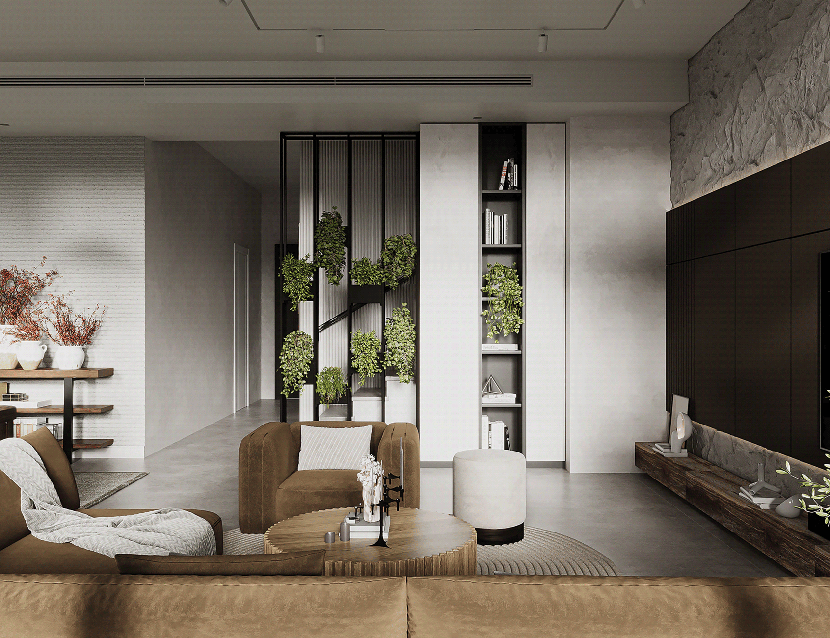
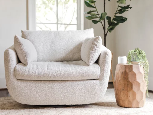
One of the best things about neutrals is that they’re endlessly adaptable. They provide a backdrop that lets other design elements shine. Think of a light gray wall or a creamy beige couch—both can be dressed up or down.
A pop of deep blue? Looks stunning against gray walls. A bright yellow throw pillow? It adds a cheerful vibe without clashing. The beauty of neutrals is that they’re not competing with your other design elements. They provide the perfect background to let your furniture, art, and decor stand out without feeling like too much. It’s like a quiet stage where all the best actors get to shine.
6. The Art of Layering Neutrals: Monochromatic Mastery
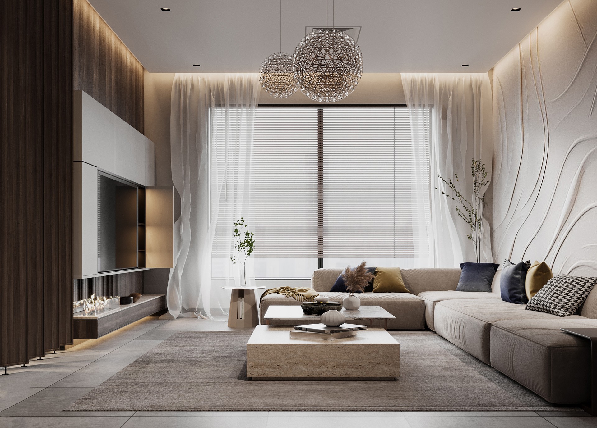
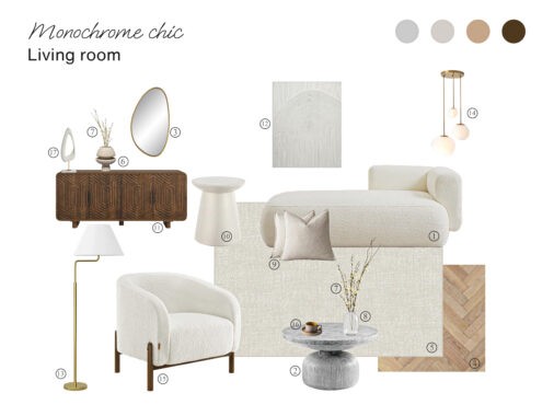
Using neutrals doesn’t mean a room has to look flat or one-dimensional. High-end designers often layer different shades of the same color family to add depth and interest.
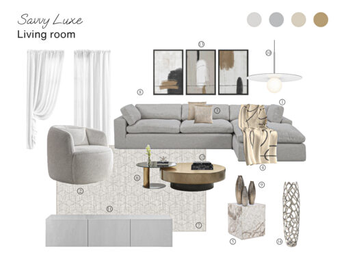
Imagine a living room where the designer has used multiple shades of gray—from a light dove-gray wall to a charcoal couch and smoky gray accents. This monochromatic layering creates a sophisticated, cohesive look that’s anything but boring.
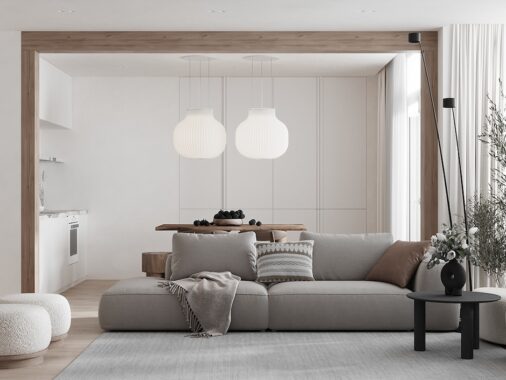
Think of a room that combines a stone-gray sofa with soft cashmere throws, silk pillows, and a nubby wool rug. The variety in textures, combined with the neutral shades, creates a space that’s visually interesting yet harmonious.
7. A Blank Canvas for Showcasing Collections
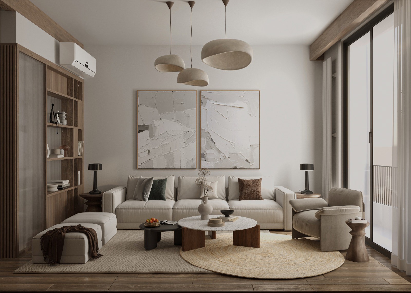
For clients who love art or have treasured collections, a neutral palette is often the perfect choice. A gallery wall in a creamy off-white allows paintings, photos, or sculptures to take center stage.
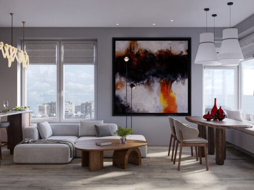
Imagine a space where a collection of colorful artwork is framed by soft, muted walls—the art becomes the focal point, and the room feels like a curated gallery. Designers use neutrals in this way to let a client’s personal items shine, creating a space that’s both stylish and personal.
In the end, neutrals are more than just colors—they’re a design choice that brings elegance, flexibility, and a sense of peace to a room. Far from being “safe,” neutrals are actually one of the most thoughtful and intentional choices a designer can make, allowing each element in a room to stand out while working together in harmony.
8. The Minimalist Vibe: Less Is More
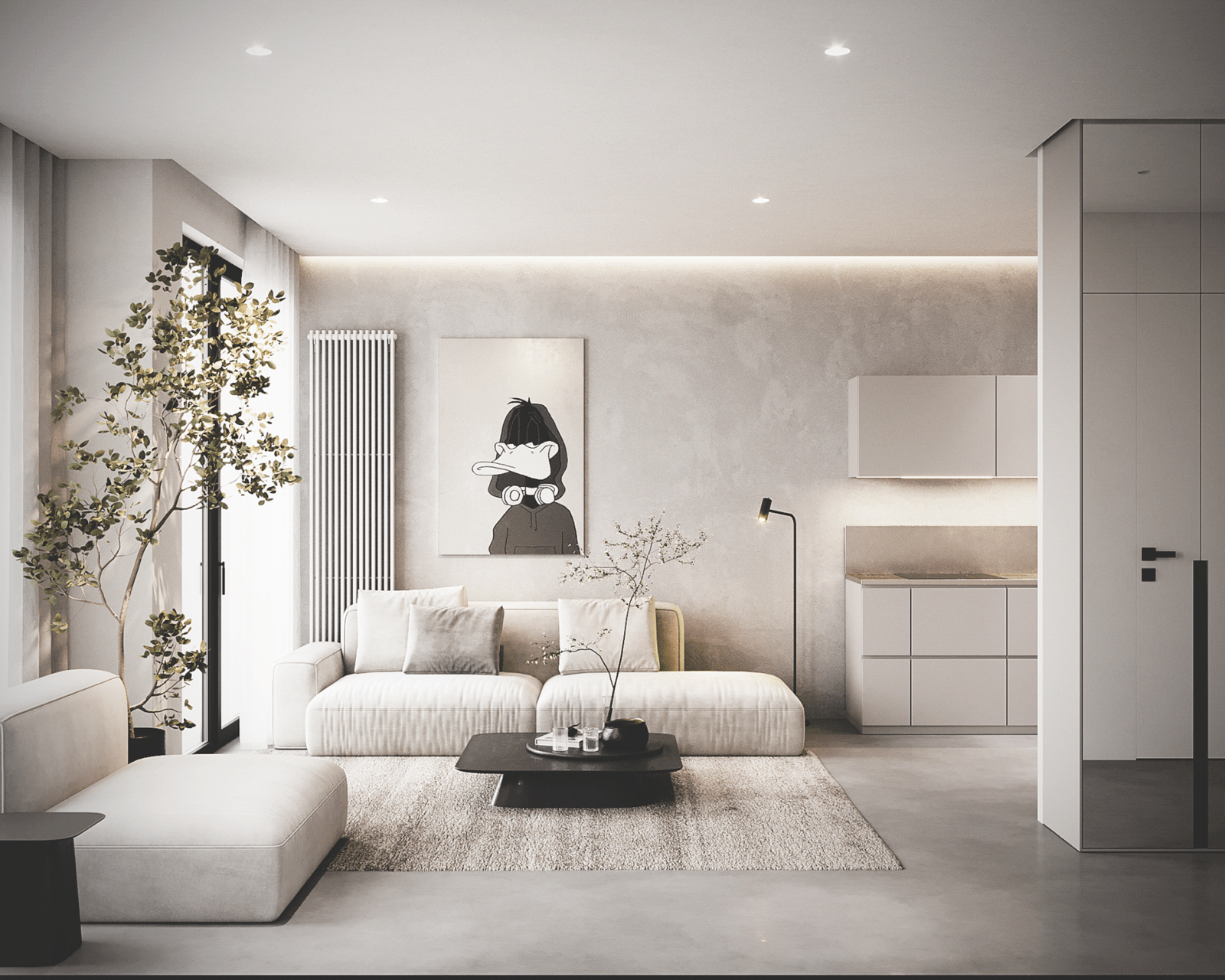
High-end design often leans toward a minimalist aesthetic, and neutrals are the perfect partner for this style. With a neutral palette, it’s all about quality over quantity. There’s no need to overcrowd the space with too many patterns or colors—each piece is carefully selected and placed to create harmony.
Minimalism isn’t about stripping everything away; it’s about making intentional choices. Neutrals allow for this kind of intentionality. The furniture, the decor, the art—they all speak for themselves without the need for loud, competing colors. It’s the beauty of simplicity, elevated.
9. Telling a Story Through Subtlety
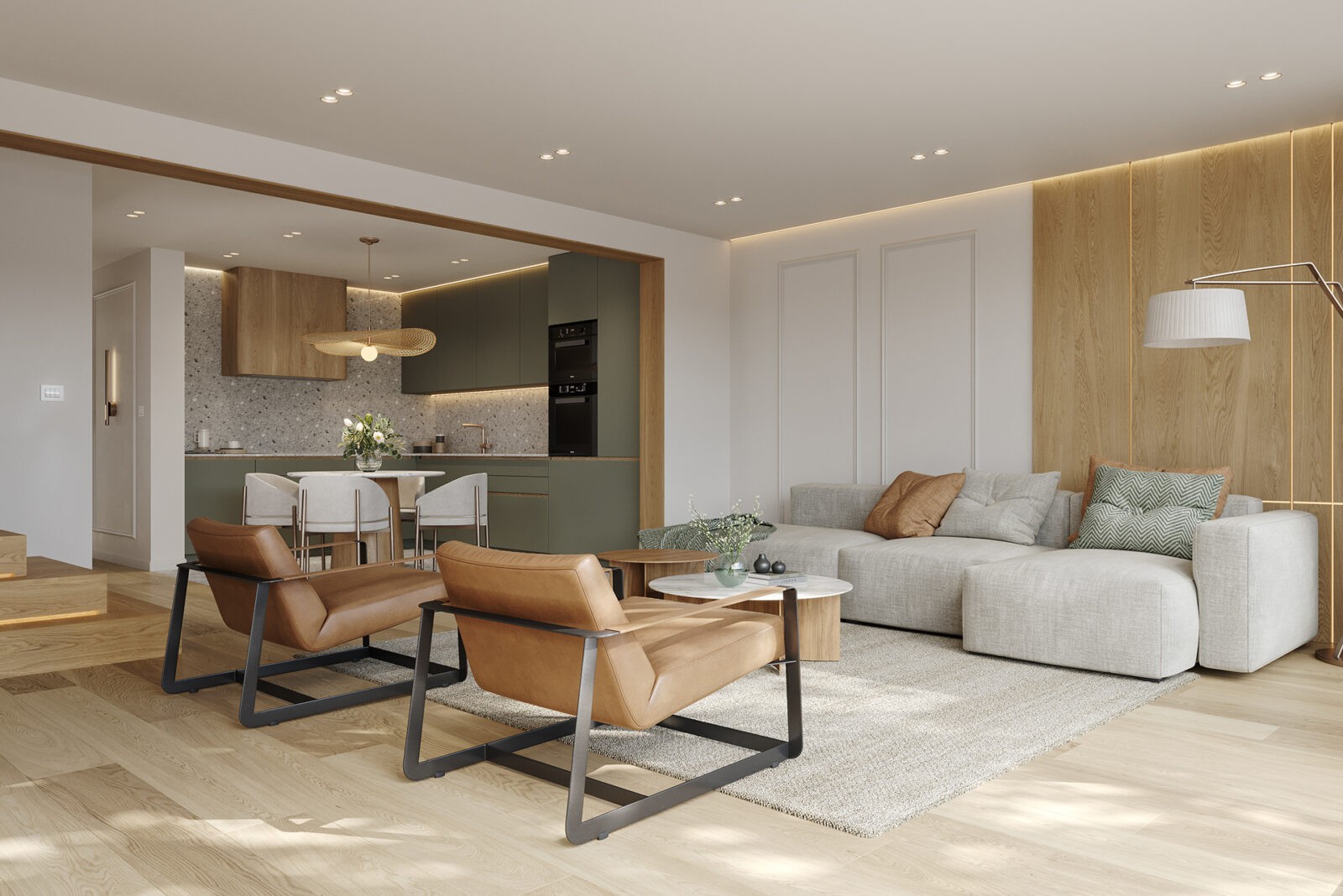
Finally, neutrals have this subtle way of telling a story. There’s a quiet luxury in the way they create a refined, sophisticated atmosphere. High-end designers understand that luxury doesn’t always have to be loud or attention-grabbing. Sometimes, it’s about the careful, thoughtful use of materials and colors that come together to form a cohesive, elegant space.
In a neutral-toned room, every element feels purposeful. The subtle hues allow the textures, the shapes, and the details to stand out, telling a story of calm sophistication and understated luxury.
10. A Room That Grows with You
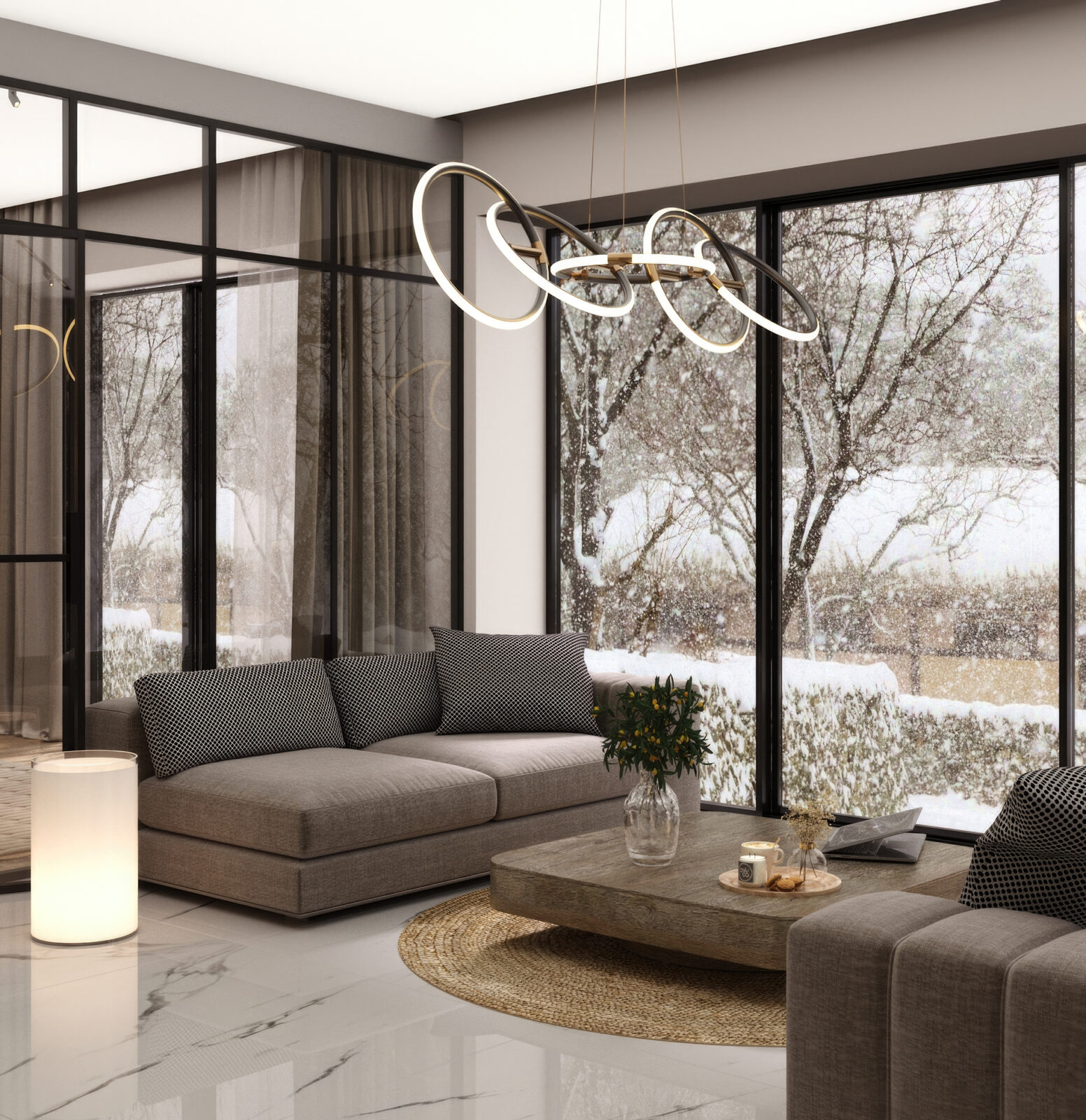
Another thing that makes neutrals so popular in luxury design is how adaptable they are. Unlike bold colors, which might feel out of place as your tastes change, neutrals can grow with you. Want to swap out your decor in a few years? No problem. Those light gray walls? Still work. That tan sofa? Still chic.
With a neutral base, you can easily update a space by adding new decor or a fresh accent color. A few new throw pillows, a different rug, or even some vibrant flowers—suddenly the room feels brand new without needing a complete redesign. It’s a great option for people who love variety but don’t want to deal with a full makeover every few years.
11. Emotional Warmth
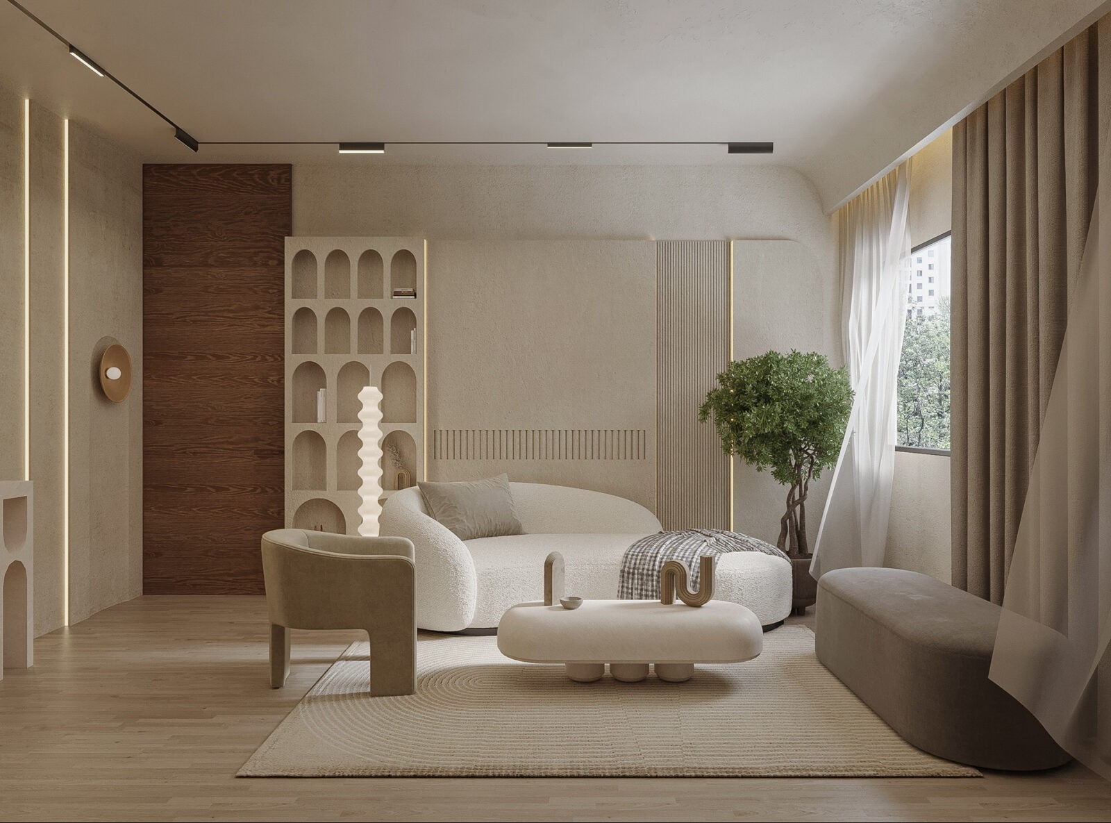
Beyond aesthetics, neutrals bring warmth to a space. Warm shades like taupe, beige, and soft gray make a room feel cozy and inviting, creating an emotional connection to the space. It’s not just about how a room looks; it’s about how it makes you feel. Designers use these tones to create spaces that feel welcoming, like a sanctuary rather than just a display.
This emotional warmth is what makes neutrals feel human. They’re approachable, making rooms feel comfortable and inviting, which is the essence of a luxury home.
12. Authentic and Raw Materials
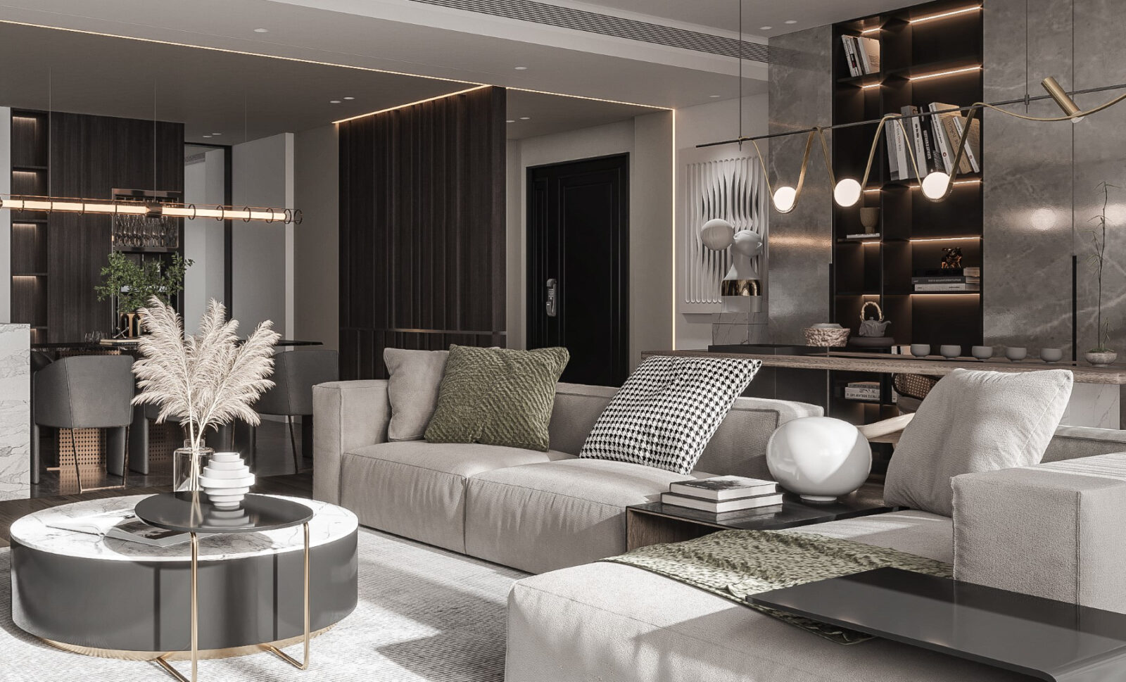
Neutral palettes naturally complement raw, authentic materials. Think natural stone, untreated wood, and woven textiles. In a neutral room, these materials bring an organic charm that feels both grounded and luxurious
High-end designers often source these materials for their durability and their beauty, knowing that they add a timeless quality to the space.By pairing neutrals with raw materials, designers create rooms that feel real and tactile, like a piece of art in themselves.
Stone and wood, for instance, age gracefully, developing a patina that adds character over time. A leather sofa in a warm neutral shade will soften and wear in, developing its own story as it ages.
13. A Cohesive Transition Between Rooms
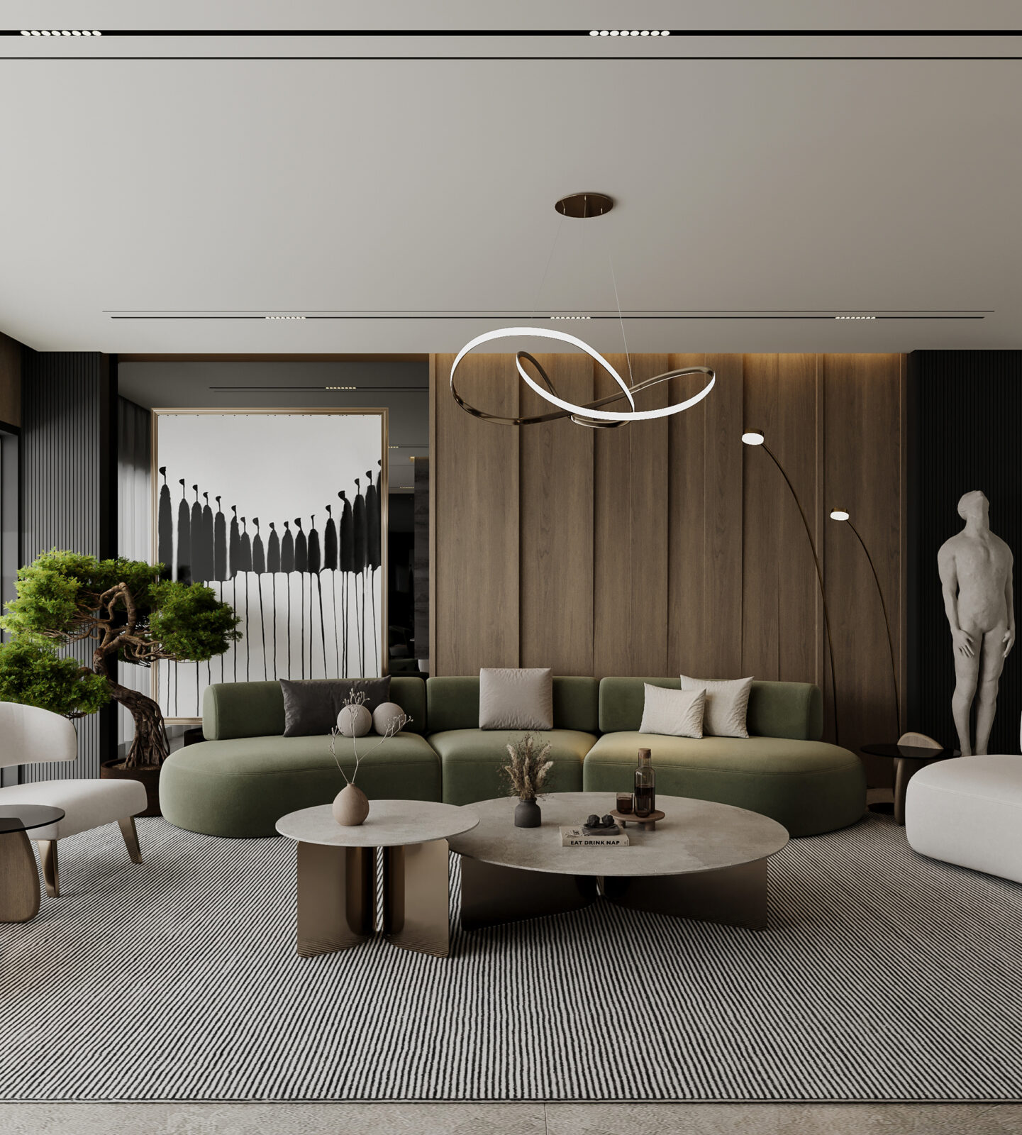
Neutral colors also help create a sense of flow in a home, especially in open-concept designs. By using variations of the same subtle color palette throughout, designers can establish a cohesive look that makes different rooms feel connected. This flow is particularly effective in larger homes or open layouts, where rooms blend into each other.
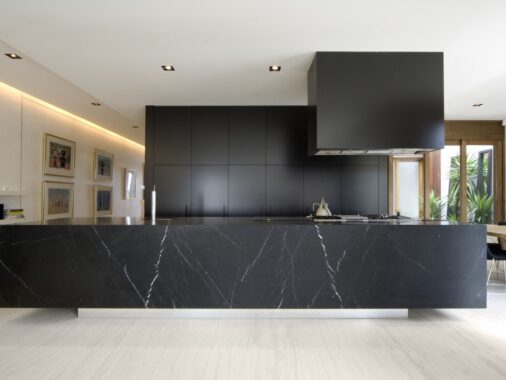
For instance, a living room with soft gray walls might transition into a kitchen with light gray cabinetry, keeping the color scheme unified while still giving each space its own character. This continuity is key in creating a harmonious, polished feel in luxury interiors.
Finishing Notes
At Home Designing, we believe that great design isn’t about filling a room with things—it’s about creating a space that reflects your style and feels like home. And with neutrals, you can do just that. Their ability to bring harmony, let natural light flow, and highlight the beauty of textures makes them a designer’s best friend. So, whether you’re just starting to redecorate or embarking on a full renovation, consider embracing the power of subtle palettes. You’ll be amazed at how a soft color scheme can transform your space into something truly extraordinary.

