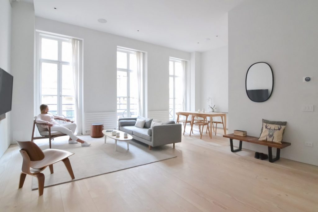
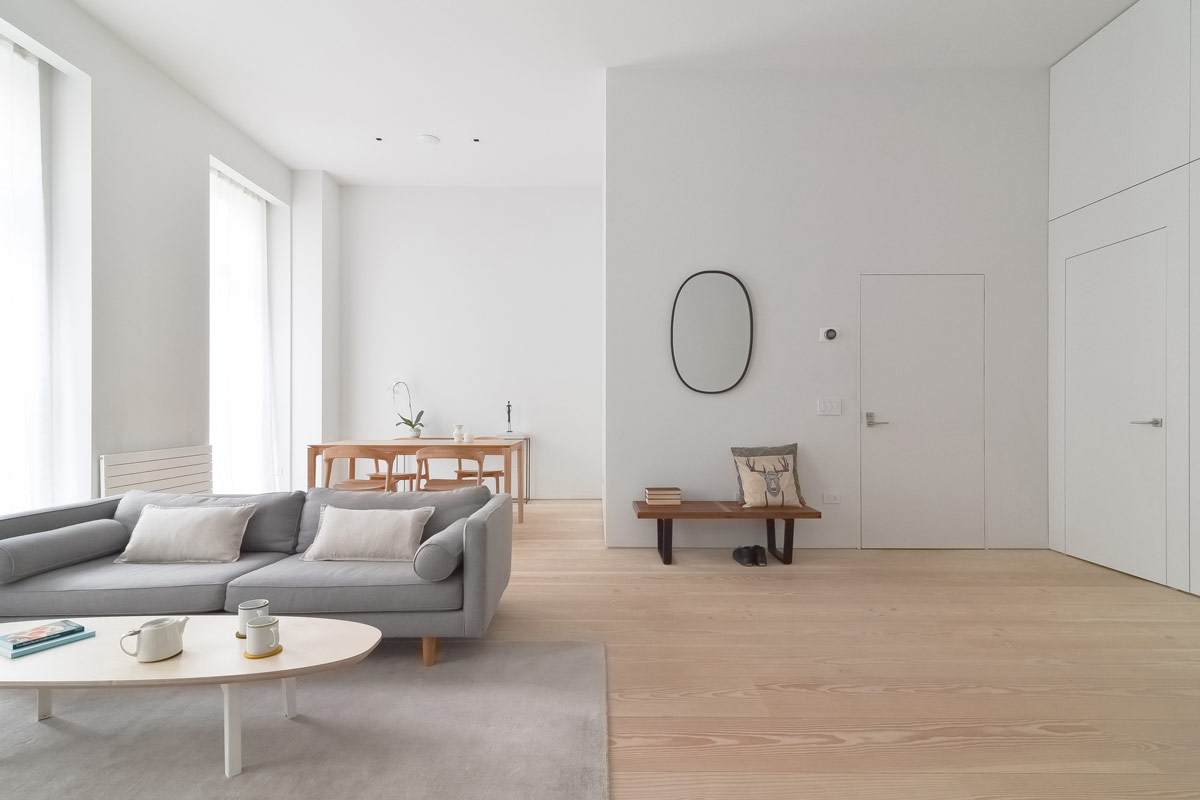
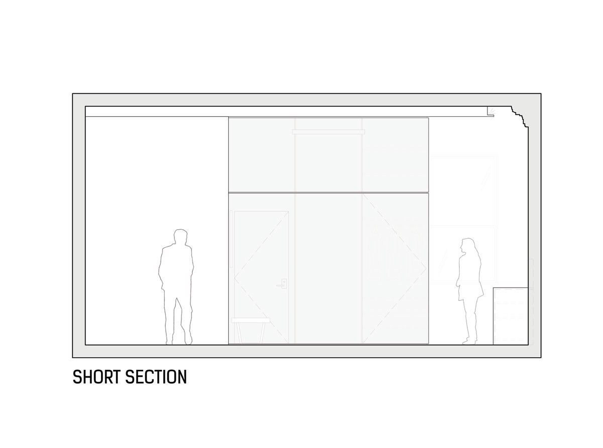
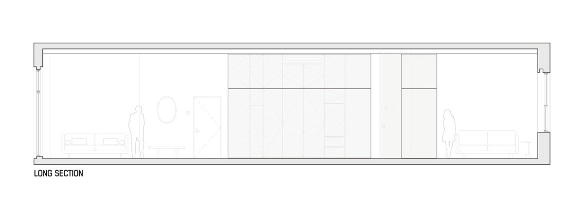
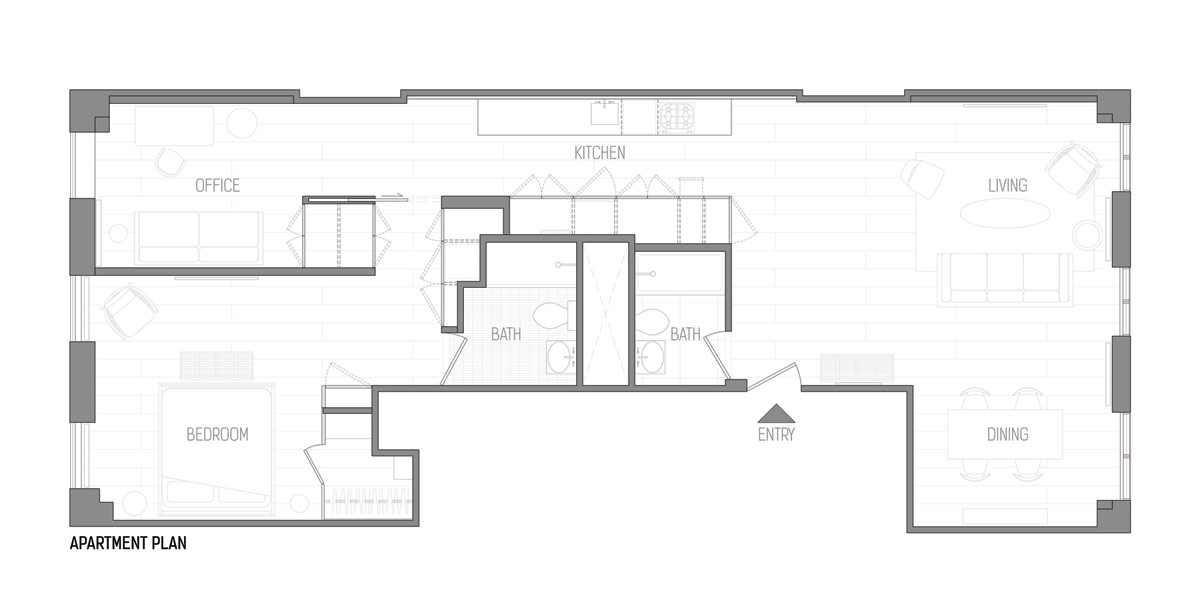
These pure white and wood interiors belong to an unique apartment, designed by Echo Design + Architecture. Light decor, combined with minimalist furniture and layout create a peaceful retreat from New York’s busy city streets, and the owner’s entrepreneurial lifestyle. Utilitarian ideals and a peaceful aesthetic connect as one ‘cube’ in the centre of the interior. Each face of the cube serves amenities and storage to the three defined spaces of the home: The lounge & dining room, a bedroom with office, and the kitchen. Twelve foot high ceilings and original 1846 crown molding have been preserved, which bring wonderful old New York moments to Scandinavian inspired minimalism and Japanese interconnectedness.

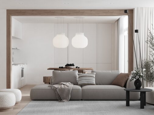
The renovated space expands the original single bedroom apartment from a half floor to the entire third floor of the building. The client desired a place to wind down after a long and taxing day, so the cornerstones to the home design became wellness and efficiency. The living room is a fresh space with a pared back furniture layout. An Eames wood lounge chair, a grey modern sofa and an additional lounge chair edge a plain rug. A wooden dining set gently melds with natural plank floors. The high pile rug and window curtains reduce the infiltrating hum from the Flatiron District.
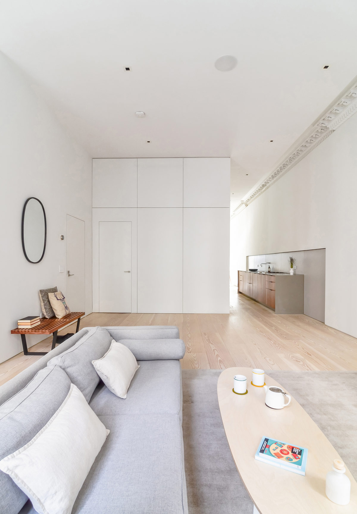
An oval coffee table pairs up with the modern sofa. A teapot has been carried over from the adjacent kitchen that’s set just around the corner of the ‘cube’.
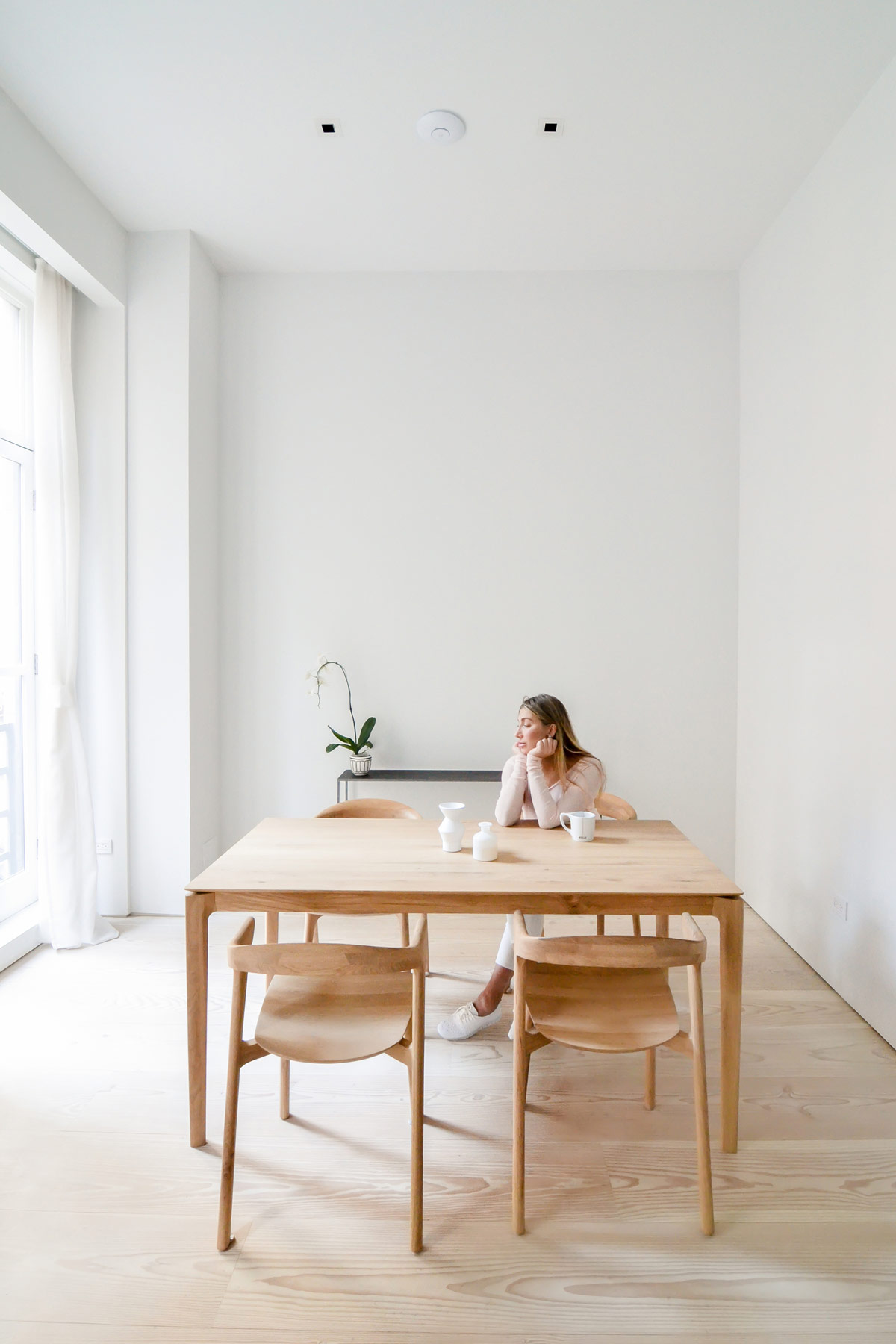
The minimalist dining room design is devoid of wall art or family photography, but an elegant orchid adds just a touch of decoration.
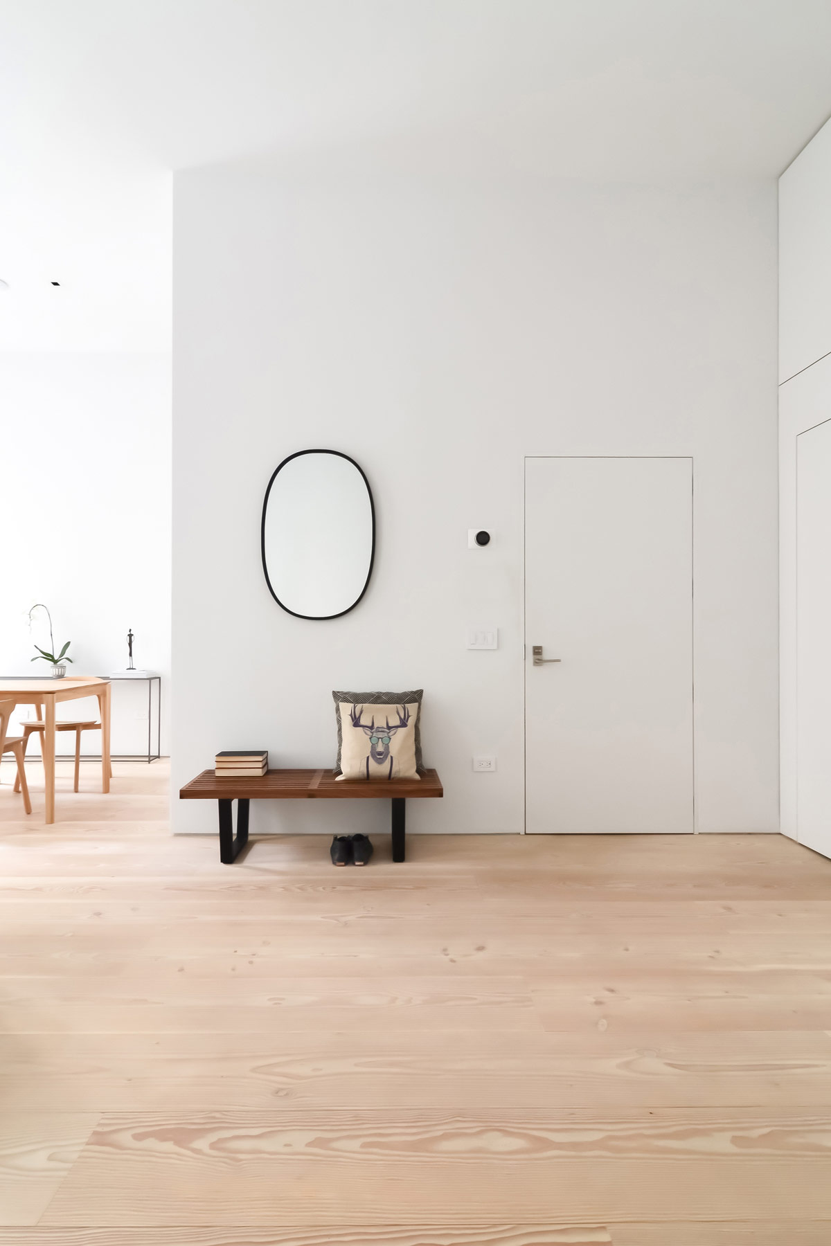
Novelty cushions dress the entryway bench, extending its height to close the gap between the wall mirror.
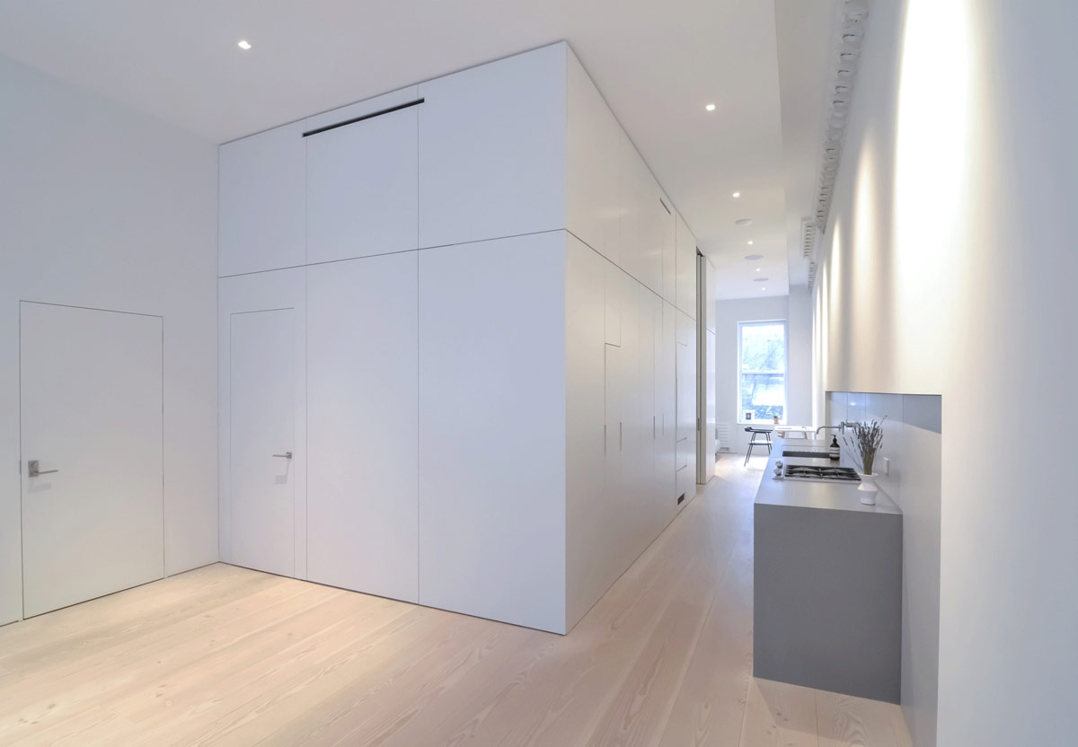
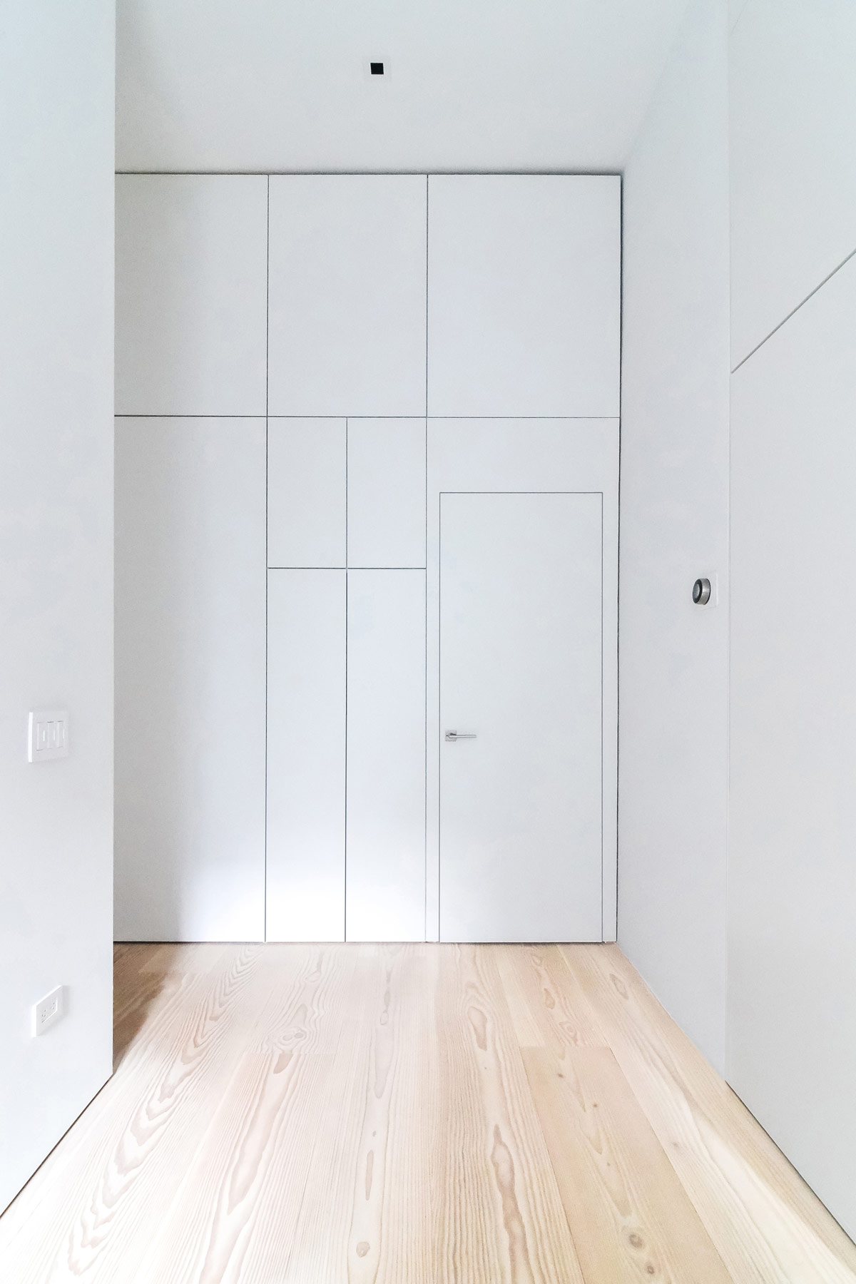
We get our first 3D glimpse of the centralised cube design here, and some of the storage solutions it offers.
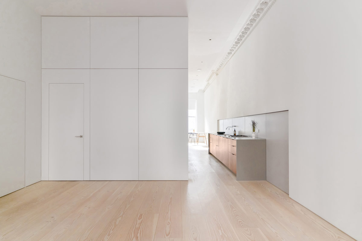
The cube’s flat white panels, along with the Douglas Fir plank floors, provide a continuity throughout each space in the home.
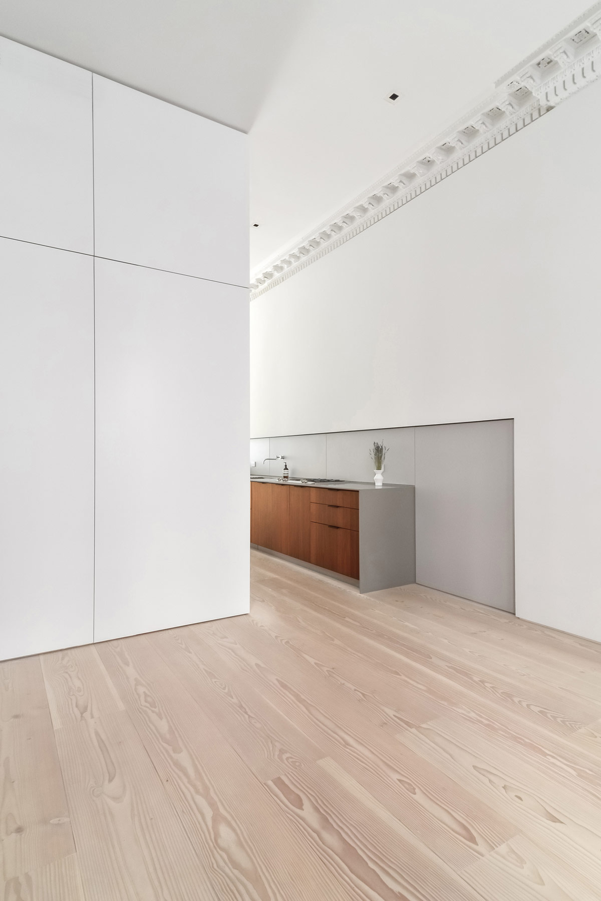
The simple look promotes calm and tranquility, building a sanctuary within a tourist hotspot of New York.
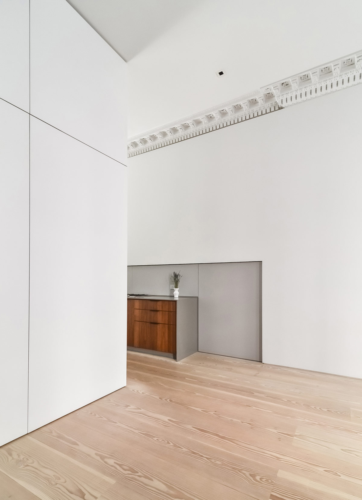
Minimalist design foundations are combined with an understated focal point in each room. In the kitchen, grey backsplash panels are recessed into a flat white wall to create a modest moment of interest.
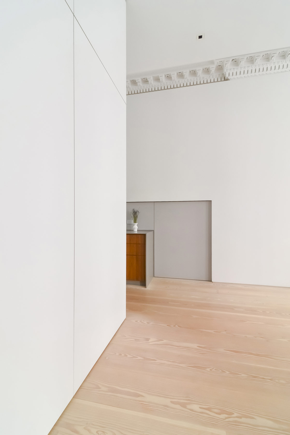
Uncomplicated furnishings allow the original decorative crown molding to really shine, which dates all the way back to 1846.
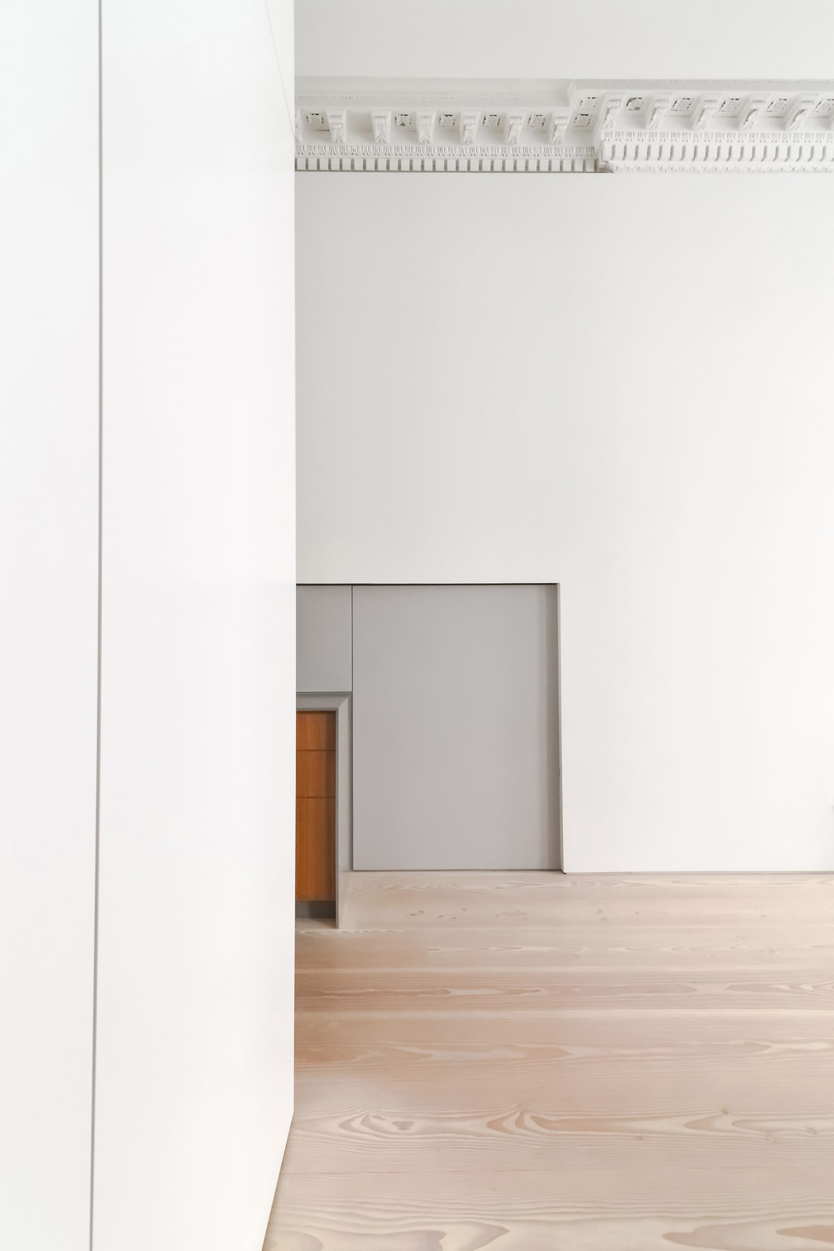
Warm oak and walnut pieces were introduced into the scheme to contrast with the white washed wood floors, without adding undue distraction.
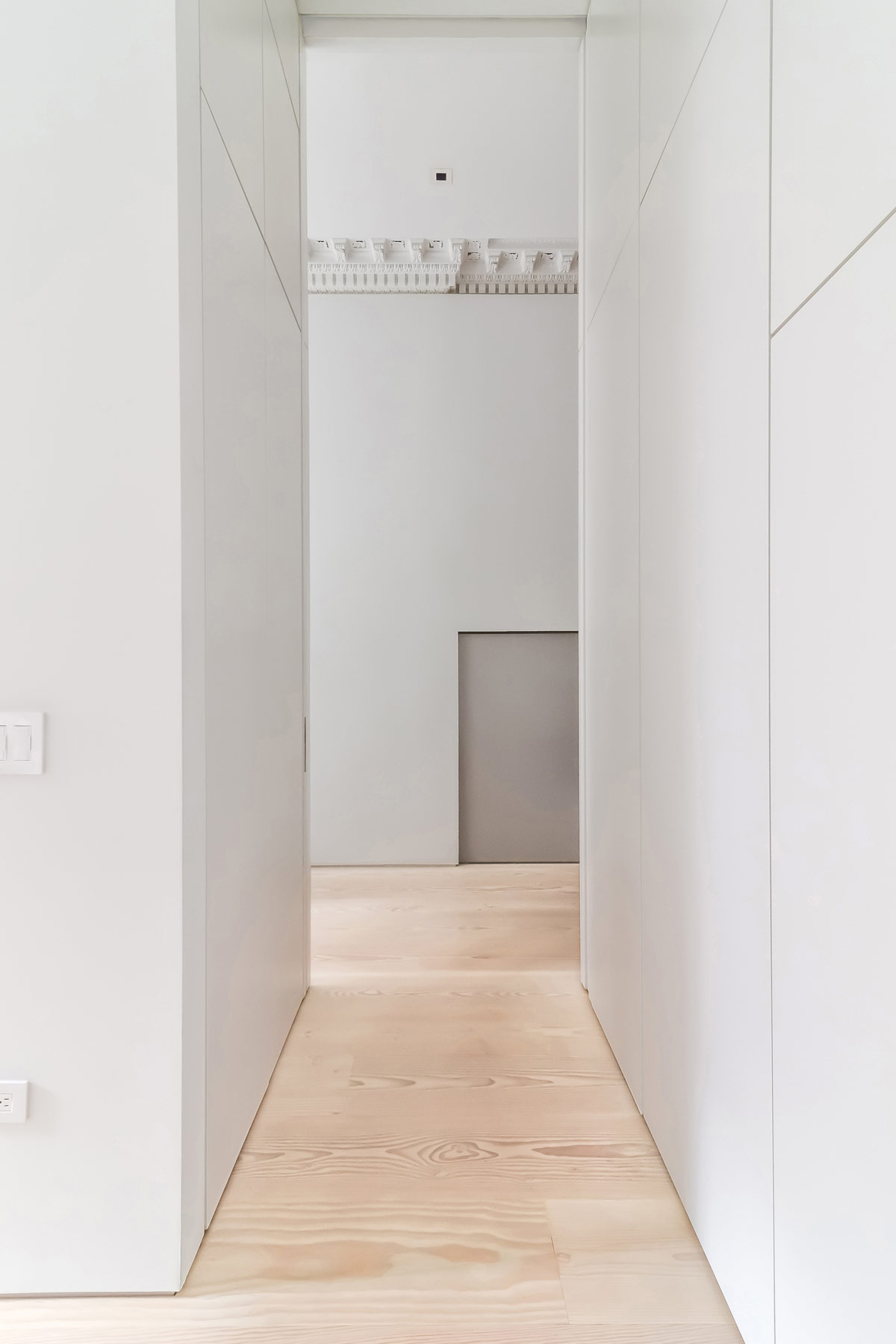
Efficiently organised space avoids unwanted distraction, and allows peaceful recovery from a working day’s challenges.
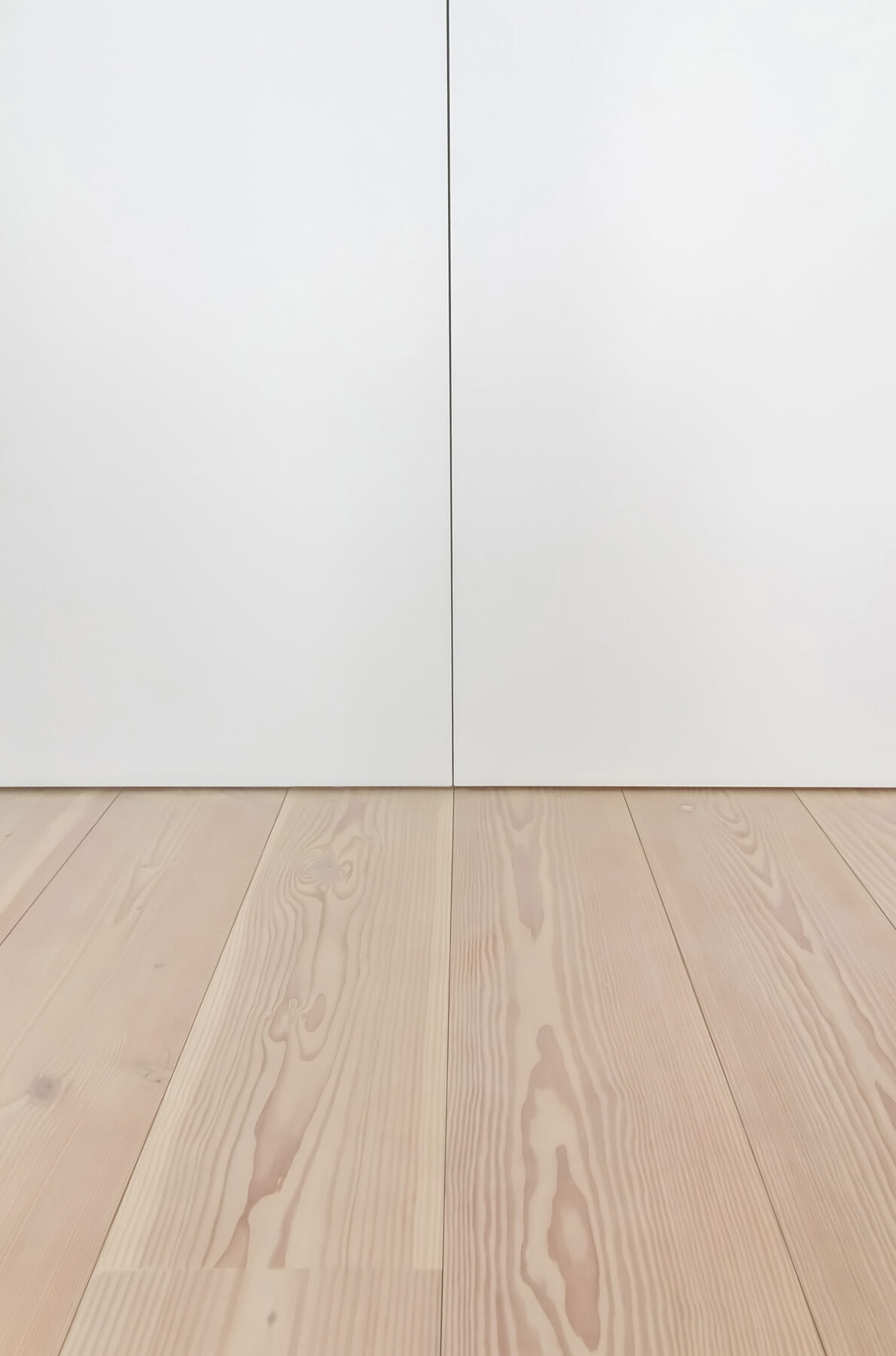
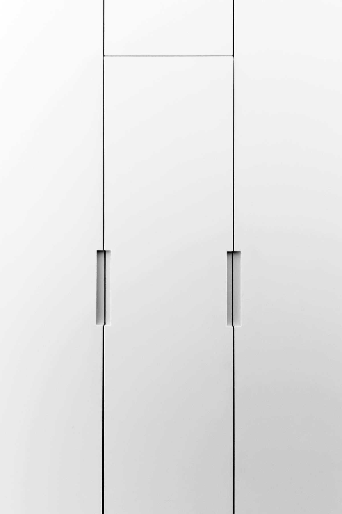
The doors that conceal storage areas on the cube run flush to the floor, avoiding added lines from baseboards.
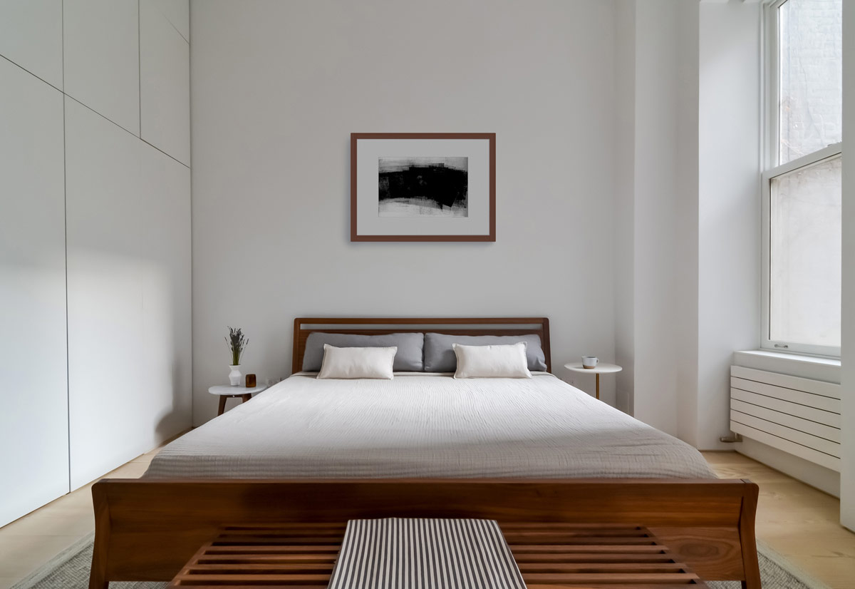
In the minimalist bedroom, the wardrobes are designed in the exact same aesthetic as the flat fronted white cube. For the first time in the apartment, a piece of art is used to add interest to one of the white walls. Its wooden frame brings an element of added warmth.
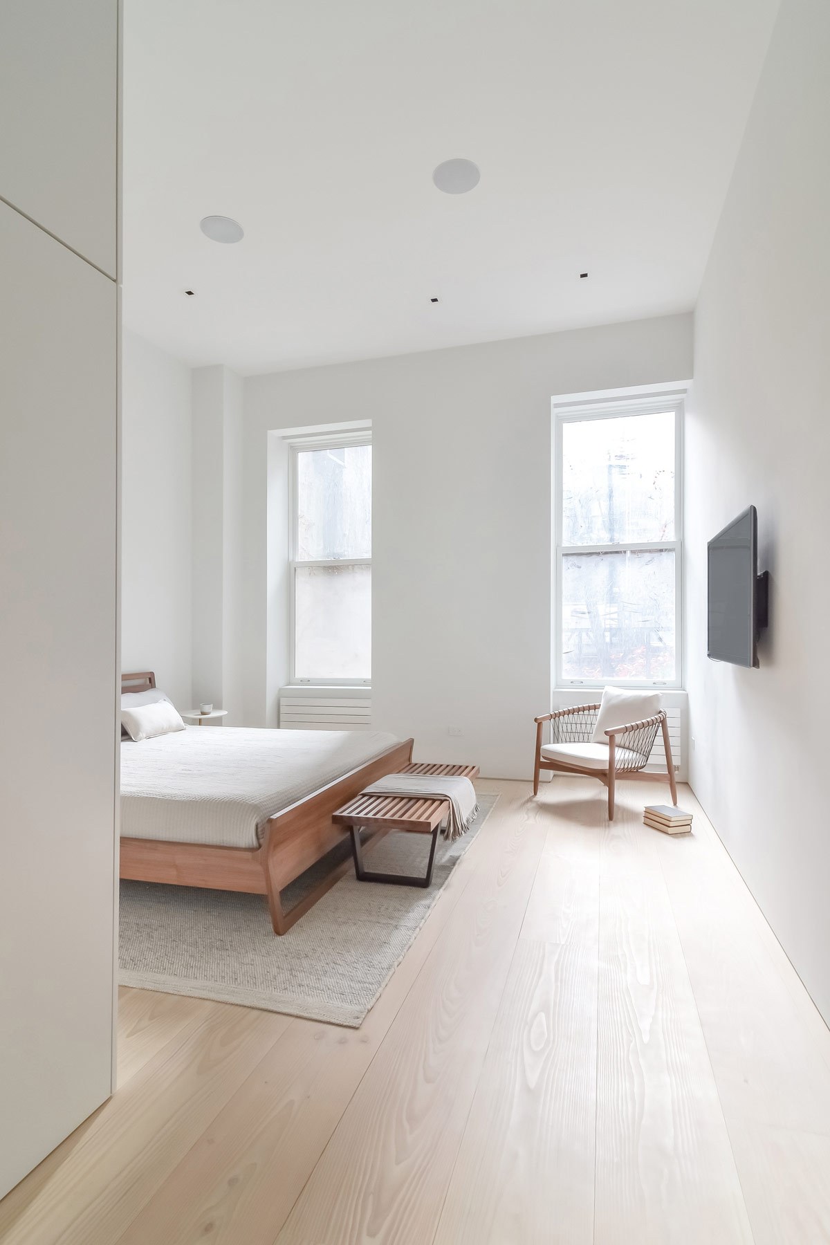
Each room consists of a loose collection of furniture but commonality makes links between them. The bedroom chair is a repeat of the lounge chair, and the end of bed bench is the same as the entryway. You can find a cheaper alternative here.
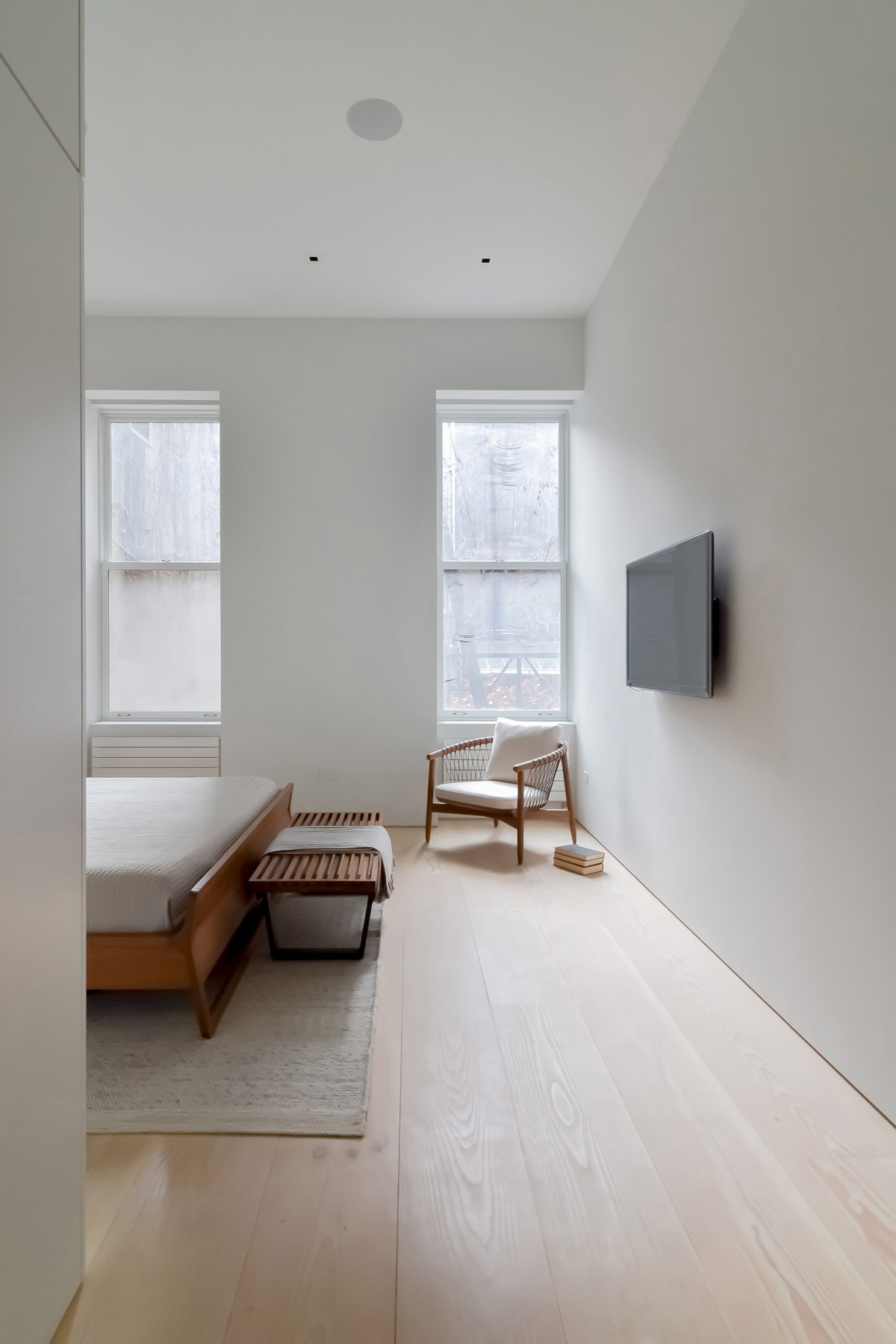
Within the basic palette of white, wood and grey, key elements are highlighted without causing over-embellishment.
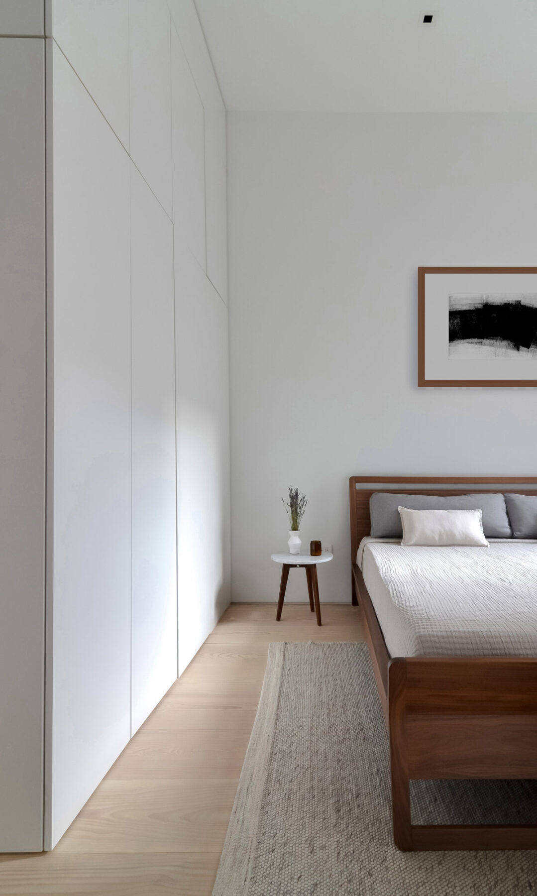
A small bedside table, with a mini decorative vase and a candle holder, is just enough to make the spot look homey.
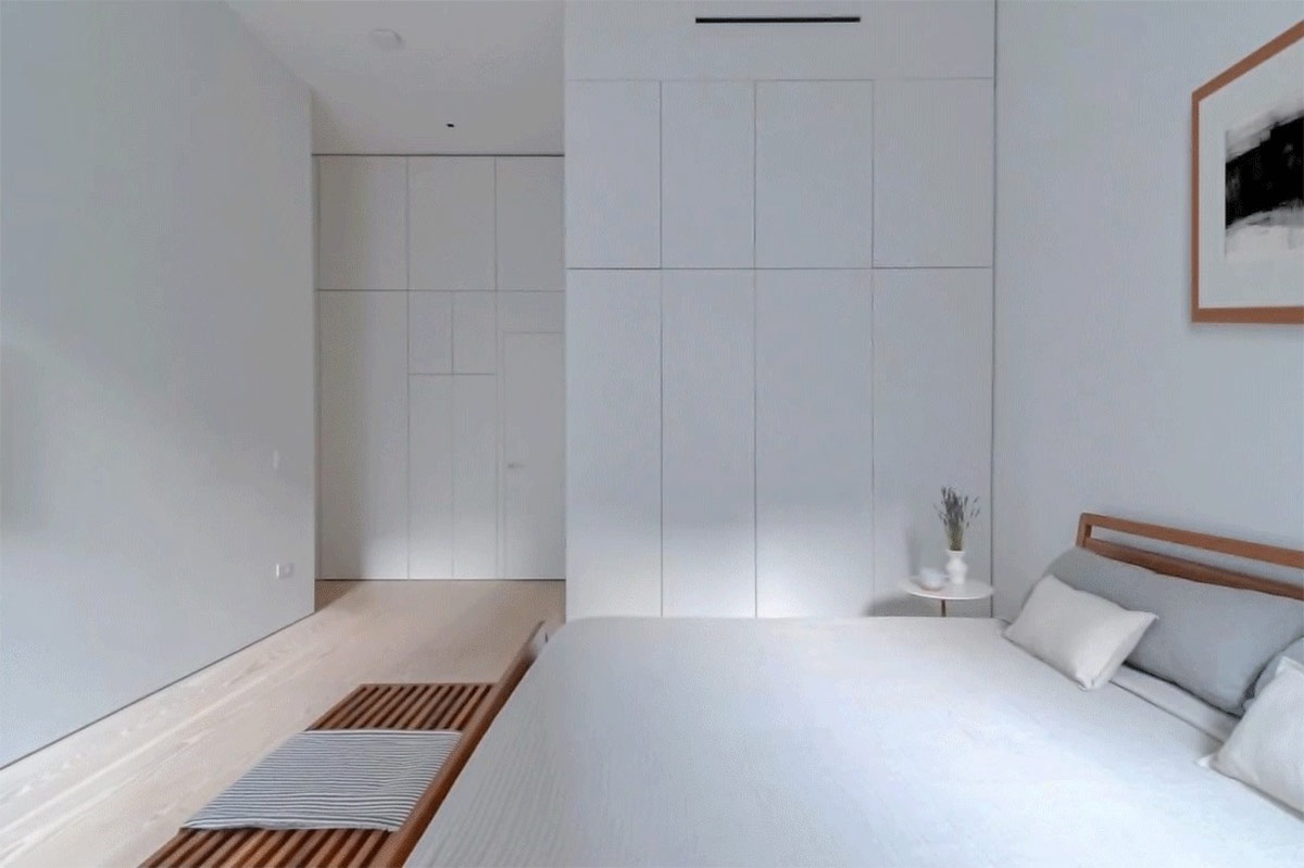
An understated throw softens the wood bench and tones with grey accent pillows on the bed.
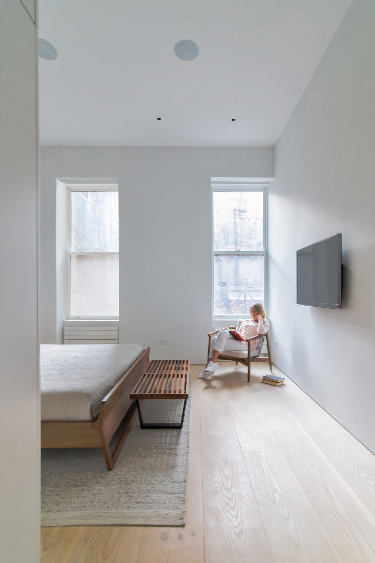
Stark windows let in maximum daylight, though a sheer screen obscures the pane of glass closest to the bed.
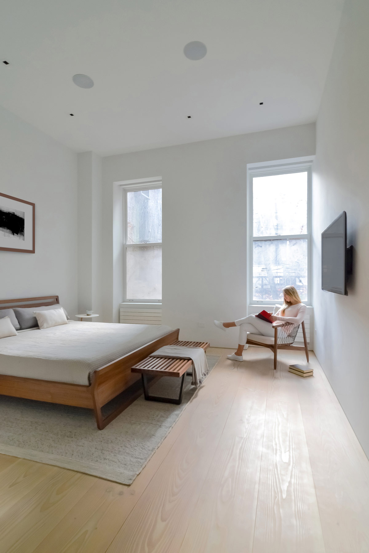
Books simply rest on the floor by the comfortable reading chair, avoiding any unnecessary over-crowding from an extra table or bookshelf.
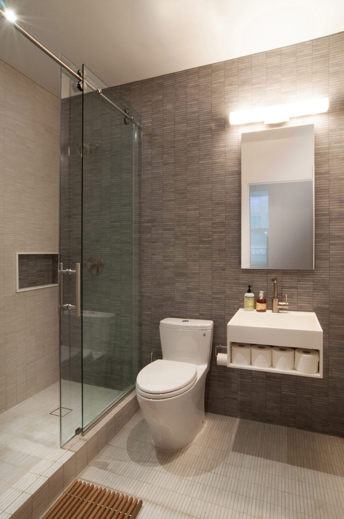
Two shower rooms are concealed within the central cube. One is accessed close to the entry door of the apartment, whilst this one is located just off the hallway by the bedroom. Contrasting graphite and stone coloured tiles line the walls and floor of the room to play with its modest proportions. A small floating vanity unit has a towel shelf underneath, which is currently being utilised as a nook for spare toilet rolls.
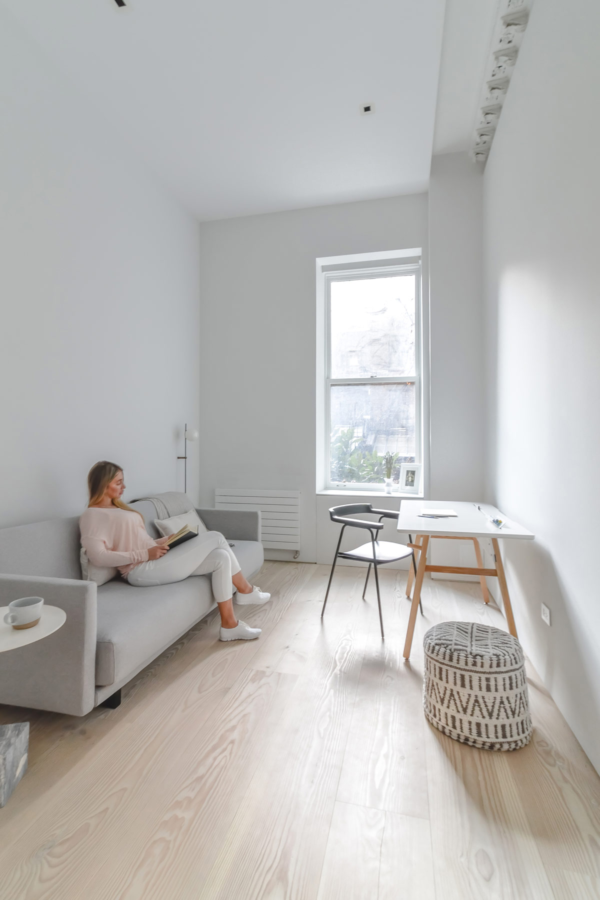
Next door to the bedroom there is a dedicated workspace. A white and wood modern home office desk is paired up with a black desk chair in the light of the window. A pale grey contemporary couch takes up the other half of the room. A small floor lamp and a side table makes the sofa into a comfy spot for reading through paperwork or just taking a well deserved break.
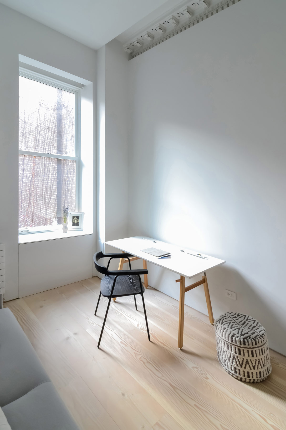
Infinite white walls rush up to meet more of the beautiful classic coving. A monochrome pouf adds tribal inspired spice to the plain minimalist decor.
